#sketch im not happy with will turn into a finished piece im not happy with
Explore tagged Tumblr posts
Text
i need 2 stop drawing static stuff . white bg . front facing pose. <will do it again
#i looked thru my media tab 2day .horrific#WHERES THA PURPOSEEEE E#there doesnt have 2 be any . of coursies .#but thats smt i want to work on rly hard T_T 2024!!!!!!!!!#smth smth reflection but i am happy with what ive done in 2023#definitely havent finished as many things as id hoped but thats okay.kind of touched on it w that one trgn comp a few months ago#but i tried 2 be more confident in areas i wasnt so sure abt before and it paid off in a way that im happy with T__T❤️#like despite all my gloom & burnout and artblock . i had a lot of fun . and im rly fortunate that ive been able to meet the nicest ppl#through it T__T#idk what jm talking abt anymore but j think . i am happy w the direction im headed in and i just need to work harder now on variability#and concept and composition. not rly sure where to start but i think compiling some of my favs in a single place#and studying them will help. :3.. AND NOT GIVING UP A SKETCH IF ITS FRUSTRATING ATM😭😭😭😭#some of them ..that one w meryl and vash . i ould not for the life of me figure out and i was like soo done w it#but then i was likeno OK just do it who cares . and then i found a workflow that worked and it WAS SOO MUCH FUNNN AND I STILL RLY LOVE HOW#IT TURNED OUTTT ..#and the one w knives . the beautiful universe one . i rmbr being so annoyed by a similar attempt that inwas lkke fuck it im just gna use the#biggest brush ever and play arnd with stuff bc its not gna see the light of day and fhen j agonized abt sharing it and everyone WAS SOOO#NICE TO ME !!&2&2 LIKEEE it was one of my earliest trgn pieces so kind of new 2 da scene and lkke . idk man it helped me enjoy my art from#an outside perspective after struggling w the doubt and its now one of my favorites ever too …#ORRR .. the vash and wolfwood one w the silly blue sky bg .. the textures were so mindless and fun#or the elendira . SOOO MANY FUN ELENDIRAS.. the perspective nail gun one is still a fav bc i shy away from perspective bc its hard as shit#but it worked out and i luv it tew .#sory anyways . very happy. and thankful^__^ ik when j post stuff like URRG MY ART!!!it mostly jst comes from .like GAAH want 2 push myself#harder bc i know itll be fun once i get 2 where im going T_T#anyways if u got 2 this point u r lkterally angel my angelll~ hamtaro pic#tys
15 notes
·
View notes
Text

He'd probably be happy to know that i haven't stopped thinking about him
Finally finished this big piece, and im really happy with how it turned out!! I dont actually know if I'll post here more anytime soon or at all haha. (Im being a bit dramatic ill still be around i just tend to burn myself out quickly with art) Thanks to everyone thats followed me and liked my tkatb art on this blog <3 Heres my progress sketches because i think its fun to see these! ^^


I think his face was cuter in the first sketch i did but i reworked it so much i lost it (i still think its pretty nice looking in the end though ☺️)
#sol brugmansia#tkatb fanart#tkatb sol#tkatb vn#katb vn#the kid at the back vn#tkatb#resurrected art#yandere vn
640 notes
·
View notes
Text
book!l&co character lineup
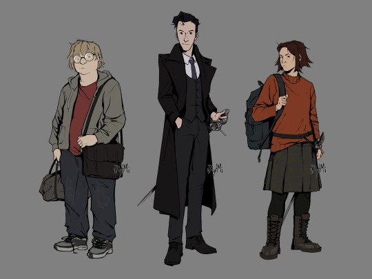
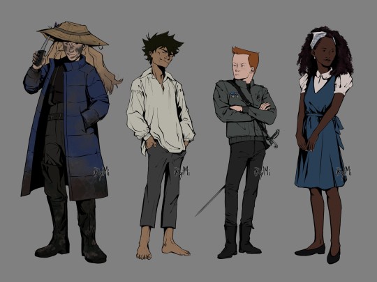


finally finished extended version of my L&Co designs, based on their book descriptions! it took months, but im happy with the results
ID of designs + thumbnail-sketch under the cut
[image ID: two digital drawings of characters from Lockwood and Co books, done in semi-realistic style, black lineart and plain colour against grey background.
image 1: from left to right there are full body drawings of George Cubbins, Anthony Lockwood and Lucy Carlyle. George is standing facing left, slouching, he's looking at the viewer with indifferent expression. he's fat, light-skinned and has medium length fair hair. George's wearing round glasses, red t-shirt, baggy jeans, unzipped grey hoodie and sneakers. he has a grey sport bag in right hand and a black messenger bag across left shoulder. next to him there's Lockwood, he's standing half turned to right, he's facing the viewer with a gentle smile. Lockwood is paler than George, almost a head taller and slim with short, slightly wavy, black hair. he's wearing a grey three piece suit with white shirt underneath, as well as smart black shoes and a purple tie. on top of it is a black greatcoat. Lockwood stands with one hand in pocket and another resting on rapier's grip. the sword is in its scabbard attached to Lockwood's belt. furthest on the right is Lucy, she's standing half turned to right, head facing left with a curious look directed at the viewer. her skin is light and her hair is warm brown, slightly uneven and spiky with middle parting. she has a wide frame and is the same height as George. Lucy's wearing a baggy orange sweater, plaid grey skirt, black leggings and tall dark-brown work boots with iron patches. she's holding onto a strap of her rucksack that is on her right shoulder. there's also a belt on top of the sweater which holds her rapier.
image 2: from left to right there are full body drawings of Flo Bones, human version of the skull, Quill Kipps and Holly Munro. Flo is standing half turned to left, facing towards the viewer with a smirk. she's light-skinned with long dirty-blonde hair, and her face has smudges of mud all over. compared to previous pictures, she's almost as tall as Lockwood, but not quite. Flo is wearing long blue puffer jacket on top of her darker clothes that resemble one of fisherman's with mudded thigh-high rainboots. she stands with one hand in jacket pocket, one raising a brim of straw hat with a knife. said hat has a fishing hook stuck on its brim and two lavender stems attached to hat band. next to her is the skull in his human form. he stands half turned to right, slouching, hands in pockets, with head thrown back with a wide smirk across his face. skull is very thin and not really tall, he is tanned and freckled with spiky dark hair. skull is wearing ill-fitting clothes: a white old-timey shirt that is slightly too big and grey trousers that are too small and short. he stands barefoot. third from the left is Quill Kipps, he stand half turned to right, crossing his arms, head facing left with a look of annoyance. Kipps is short and slim, he has ruddy and freckled skin and short ginger hair. Kipps is wearing a grey leather jacket with Fittes logo on it as well as two medals, tight black jeans and chelsea boots. his rapier scabbard has a baldric type of belt. rapier itself has green gems on a hilt. finally, there's Holly Munro, she's standing half turned to left, head facing right with a gentle smile. she's pretty tall and slim with deep rich black skin tone and black shoulder length curls. Holly's wearing a white short lantern sleeve shirt with a blue dress with a cloth belt wrapped around and tied into a bow at the back, as well as low heel shoes. she has a light-blue scarf wrapped around her head. Holly also has white small earrings and beige nail paint. all of the characters have artist’s watermark at the lower right side of them./end ID]
bonus sketch

#lockwood and co#l&co#character lineup#character design#illustration#digital art#fanart#lucy carlyle#anthony lockwood#george cubbins#holly munro#the skull#skull in the jar#quill kipps#flo bones#lockwood and co books#jonathan stroud#described#image description in alt#artpost#dont mind my silhouette practice#imho it's an upgrade from that one posts from almost 2 years ago (though designs haven't changed much)
666 notes
·
View notes
Text
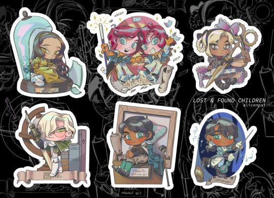

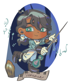


lost and found children stickers - coming soon... very happy to get some more original merch underway!! learn more about my ocs, if you want, sketch below + some lore tidbits!!
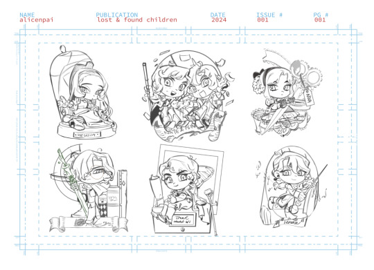
i would love to become more of an original artist over time but putting ocs out there feels like im running out into the world nude LMAO T__T my ocs are so personal to me, and i put pieces of myself in all of them, that it feels so nerve wracking to post.. one day a comic will come..
funnily enough i started this sheet back in june but didnt have time until off-con season to finish em.. i really want to be like those crazy oc creators with 129045894589 illustrations and little trinkets of ocs. soon. some lore: trent & terence are brothers, the twins are fraternal twins (smiles). also there IS a ship in here and once i get over my embarrassment of drawing ships it's gonna be so over for you all!! (joke) i was so brazen with ships pre-2019 but i cant draw it anymore T_T
-- some trivia that didn't make the cut, i was gonna turn this into an info sheet but i couldn't fit all this text in the layout. sorry the trivia is a bit snarky im in a big sam & max phase right now
--
☀
Melissa of Giacosa (name pending??) Age: 30 Height: 5'4" (WITH heels) Gender: F Occupation: Noble/ scholar/ philanthropist
Helpfulness: 5 Occultic knowledge: 5
A general people pleaser, and excellent at reading people, but sometimes the responsibilities are all too much… sometimes a girl just wishes to watch the world burn!
--
✨
Flynn & Nate of Medeis (real names unknown) Age: 17 Height: 5'6", 5'3" (respectively) Gender: M & F twins Birthday/Asc: Nov 25 (Sagittarius) Occupation: Travellers/ scholars
Luck: 1 Resourcefulness: 5
Uh oh… beware these theatre kids. As travelling magicians (LICENSED), they bring smiles and laughter to all throughout the land. No one really knows who they are, where they're from, or… how many germs they have.
--
🎹
Terence Nightingale Age: 18 Height: 5'8" (looks shorter due to posture) Gender: M Birthday/Asc: Feb 11 (Aquarius) Occupation: Pianist
Fame: 5 Energy level: 2
Knowing the taste of fame at a young age, Terence now has to carry that burden into adult life. Will age turn prodigy into mediocrity? Will he be crushed under a piano? Will he let himself be sandwiched between twenty bedsheets and a pea?!?! Find out in the next exciting episode…
--
🖋
Jack Lockhart Age: 25 Height: 5'7" Gender: M Birthday/Asc: Jan 3 (Capricorn) Occupation: Historian
Knowledge: 4 Strength: 4
With a sharp wit and tongue, and an even sharper blade, it might be best to steer clear of this one. Unfortunately, cats like him, so he never gets any peace, ever. --
🧵
Noa (real name unknown) Age: 17 Height: 5'1" Gender: F Birthday/Asc: Oct 30 (Scorpio) Occupation: Seamstress
Scornful gaze: 5 Fashion sense: 5
The word "smile" does NOT exist in her vocabulary. Blending old trends with the new, Noa is an up-and-coming innovator in the world of textiles and fashion. But what tricks does she have up her sleeve… literally?
--
🔬
Trent Nightingale Age: 25 Height: 6'2" Gender: M Birthday/Asc: Jun 1 (Gemini) Occupation: Biologist
Knowledge: 4 Gift of gab: 5
A rock that ties people together-type of personality, and tries to get along with everyone, maybe to his own detriment. Trent has an unassuming look, but is quite the scholar - he can often be seen with his nose in a book or scribbling away, disappointing those who vie for his attention more as a social butterfly.
#my ocs#lost and found children#original characters#original#original merch#melissa#flynn & nate#noa#jack#trent#terence
57 notes
·
View notes
Note
How do you art, and where do you art?
hi my name is moe! i've doing digital 2d art since about 2017 and here's a big post about the how and where of it!
the program i use for my 2d art is firealpaca! the version i use is free to download with the exception of a popup ad that shows up when you start up the program! it's a great, very consistent, program that has updated a lot and improved since i started and i don't think i can vouch for it more. everything i include in this post applies to firealpaca specifically though you can probably do similar things in other programs im a college student on a budget and im very comfortable working with this program.
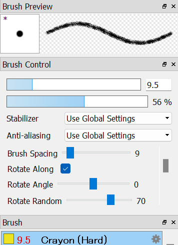


the three main brushes i use i got off firealpaca's brush marketplace! they're all free crayon brushes the first one hard one being the one i use for lineart, the second sort brush i use for sketching, and the third hard one i use for coloring. i think this might be the reason why i get some stuff about people associating my art with childhood/ children's illustrations, im a big fan of using texture where i can and these help to add a lot of visual interest.

seawatt jumpscare
you may see that my finish pieces don't have a lot of flat colors if you zoom all the way in. that's because i use a lot of noise to make the colors look less flat. it sort of reminds me of construction paper, gives a little bit of a fuzziness to it.


i have it set to color at usually around 50. i turn it down sometimes if im working on something smaller. my canvas sizes usually are about 1500 x 1500 just to keep a more consistent square shape across most of my drawings.
another thing i do to make my art pop is i duplicate my lineart layer, use protect alpha to color the duplicated layer another color that's usually brigther than the original layer, put some gaussian blur on it and add multiply or add to the blending on that layer.
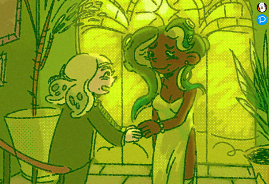
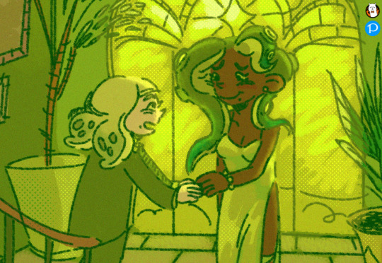
with versus without the added layer! i have this set to add on 31% opacity and ill add more or less if i want the effect to be more or less subtle. it's not very noticable but i think it helps a lot with line clarity and can make something almost glow if you wanted that effect.
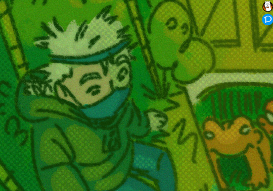
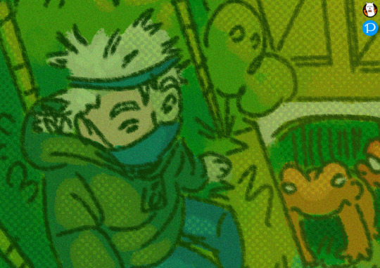
here's another example with a multiply layer (i turned up the opacity to give a better example) subtle and it fights a lot with tumblr image degradation but it makes me happy.
i also make a lot of use of halftoning as you can see in the examples above. I usually only use it to make shadows darker and highlights stand out but they're also really good at filling up dead space like backgrounds to make them more visually appealing


with versus without halftoning! in firealpace you achieve this by using a 8-bit layer (one highlighted) once you add the layer hit the gear icon by the layer and use that to modify the halftoning to your choosing


i usually have mine with a density of 40 but you can tweak it to your choosing. you can also change the blending type on these types of layers i usually just use multiply/ add and occasionally overlay. mess around with the opacity! make it more or less subtle! have fun!
halftoning is tricky to use in firealpaca however due to the way it works. usually i apply it with my soft crayon brush since it hangs around 35% opacity. you can get a more dense halftoning using more or less opacity on your brush and can go back and forth over the halftoning to layer more on. you can also layer two different layers of halftoning to create interesting effects

two different halftoning layers laid on top of each other ^

more opacity + two different halftoning layers laid on top of each other ^
when you go to combine all your layers however because 8bit layers when combined with regular layers lose their halftoning properties. my way around this when combining everything is going layer > merge all when going to finish up and convert everything to png.

that, for the most part is all the technical stuff. i wish i could tell you how i knew what colors to pick but for me i usually pick some variation of green and just go with it. i usually pick the lineart color with my background colors in my mind and go from there until i get bored. complimentary colors such as blue/ orange and red/ green are usually good picks.
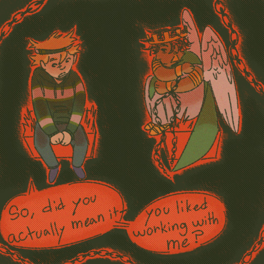
did you notice the background/ lineart is green in this picture? that's because the red cancels it out. i sneak it in there sometimes C:
that's pretty much the how of it all, as for the where, usually my bed
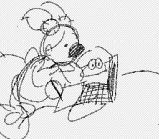
that's all
24 notes
·
View notes
Note
any advice 4 when u want to keep drawing 2 improve but u cant get over perfectionism ? like when u just dont care how its gonna turn out, if its bad its bad yknow?
ahh yes lowkey ive struggled with this a lot. not as much now as in the past tho, and honestly its beecuz ive developed a more neutral view on myself/my art in general. its going to take time to get to this state of mind, so dont be too hard on yourself when you find yourself falling into bad habits.
advice under the cut (kind of long winded) ⬇️⬇️⬇️
the first thing ive done to overcome perfectionism is focus less on details and more about overall shape and form. when i sketch im trying to get roughly what i want, and i limit the strokes i do in certain parts of my sketch to like 1-3 depending on what im drawing (im ngl i also am very impatient and have created a workflow that makes it so i am able to start and finish pieces as fast as possible LOLOLOL. shrugs. i just like drawing fast).
a good example would be this thing i just drew:
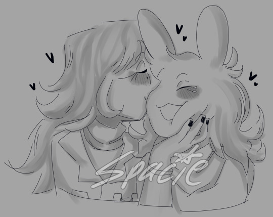
in all of my sketches i tend to use as few strokes as possible and just get the basic idea down. good for not overly focusing on teeny tiny details and worrying about them later (i also use the same technique for lineart, but just end up connecting the lines. thats another tip i have, if you like your sketches more than your fully lined pieces, just line the same way you sketch! or you could also use your sketch as your lineart :P)
another tip i have is to draw from references, and once again, focus mostly on shape/form/the big picture of your subject before going into details (do you know how many planes there are on the human face....i still dont know howta draw faces properly but im not mad at myself anymore about it, i just open up a reference and try to learn). i also recommend having a drawing session where the goal is to draw awfully. draw something you want to draw, but that you're not sure if you'll draw it right, and draw it. dont try to correct it, acknowledge that what you made isnt perfect, and then draw something else. you're learning! of course its not gonna be perfect. but inevitably, you're going to get frustrated. just remember if its something you really want to go back to, you will be able to revisit it in the future. feel your anger and frustration, but do your best to not direct it inward.
small side tangent about shading- I AM SO SHIT AT SHADING SKFHSAFDJHS. people dont tend to notice (surprising), since ig my shading style is considered "beautiful" or something, but if you looked at it on a technical level, there are mistakes everywhere. i havent really tried to improve it. i dont really care most of the time b/c i just like shading for fun. and especially when im shading my sketches, i already have it in my mind that its not supposed to be perfect. its a sketch. this is where im supposed to make all of my mistakes. once i start making my way to the final product is when i start worrying more about if i did the lighting correctly (even then ik im not good at it im not trying to be a god im just trying to draw things that make me happy).
additionally, i really rec u dont try and fudge a sketch until its better if you're deep in a Perfectionist moment. keep the old sketch and start over on a new sketch taking bits and pieces you liked from the original, and improving on those that you dont (shitty thumbnails are also good if you have a vague idea in mind but need ta figure out howta place subjects in your scene). honestly drawing the same thing/idea over and over gets me a better understanding of my subject each time, so naturally each iteration looks better. it doesnt take me that long to sketch tho, so if sketching takes you forever (sometimes if sketching takes you forever its b/c you're a perfectionist skjfskdjf) just think about how much time you're willing to spend on something. remember☝️ its okay to give up/take a break on something and try again later. sometimes you just needta stop looking at your art and like. look at a tree or something lmfao.
i will also say that im not looking to go into a career in art, im more of a hobbyist. ik school environments dont exactly.....help with perfectionism lol. there are certain expectations put on people who go into the art field that are inescapable. if this is the case for you, i still think what ive discussed before can help you, but i also think that you may need to lean more on the mental tips i have also provided below.
alright! mental health tips in regard to art:
so, i have c-ptsd, and with that comes a lot of self image issues that ive had to work on. my feelings about myself extended to the way i felt about my art. it was shit, it was awful, i cant draw like this other person can so why bother, if its not perfect i shouldnt draw at all, etc. and honestly, something thats helped is affirmations. my affirmations are c-ptsd related, but ive noticed a shift in the way i view myself, and by extent, my art since ive started repeating them to myself daily. and honestly, i think a requirement of overcoming perfectionism is telling yourself that your art doesnt hafta be perfect, A LOT. LOL. LIKE YOU ACTUALLY HAFTA ACTIVELY TELL YOURSELF YOU'RE NOT AWFUL LMAOOOO. its funny, we dont think much about how we naturally are self critical about ourselves, and we dont realize that we are basically repeating negative affirmations about ourselves over and over and thats why we're not improving (mentally).
even when you're not drawing, i think it would benefit some people to have some kind of notification on their phone to remind them to tell themselves that their art doesnt hafta be perfect daily/however often you feel you might need it. and then with that affirmation, practice Shitty Drawing. one of the best tips ive ever gotten for this was from one of my friends monnie. get out your sketchbook or some printer paper, take out a shitty pen, and DRAW. and then any mistakes you make are permanent and you cant just endlessly try and fix them. it forces you ta sit with this uncomfortable feeling that something you made isnt perfect. eventually your brain will realize that when your art isnt perfect, you can still draw and you're ALLOWED to continue to draw even if what you make isnt spectacular. if you dont want to repeat an affirmation daily, try to remember to at least repeat it before you sit down to draw. something along the lines of "my art doesnt hafta be perfect in order for me to want to draw. im allowed to draw even if its not perfect" or something else. it depends on what you most struggle with in regards to your perfectionism. im ngl its probably going to feel cringe at first, but i promise you, it really works if you put it into practice longterm.
shoot for neutrality instead of positivity first. let me tell you thats where i am now and its so much less exhausting drawing lmfaooo. i make something that looks like shit and im just like. i dont fucking careee i dont give a fuccckkkkk
those are my tips :] i hope this was helpful!
#spacie spoinks#art tips#kind of?#art advice#i would have added more art but i dont have my art saved on this device KSHFSKJDFH#i copy and pasted my art above from my tumblr post 💀💀💀💀💀💀#anyway#have a great day anon!!
10 notes
·
View notes
Text
God of Death ♡💀σ(≧ε≦σ)
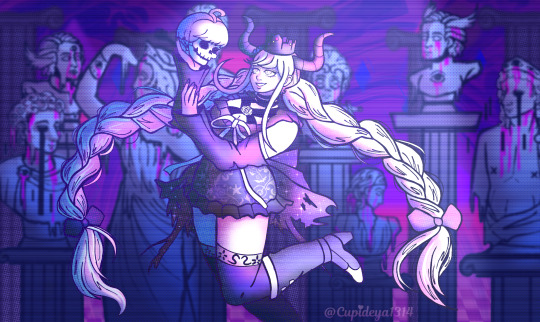
Its your lenient, troublesome, mean and adorable Shinigami-chan ♡♡♡
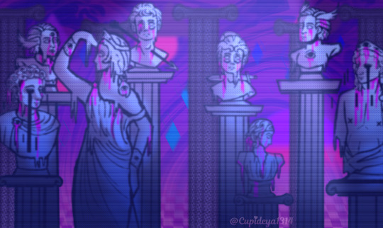
Classical beauty with some psychadelic-vaporwave(?) features It was hard doing the bg sjkssksk its gonna get covered up anyway :'>
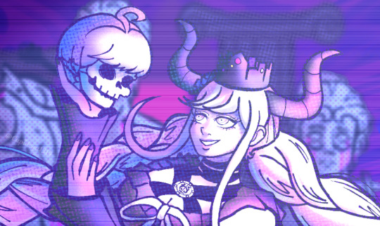
But im super happy with this piece cuz look at herrrr I can feel my program at the verge of crashing cuz there's so many layers sksksksk but it's soooo worth ittttt Had this last Jan. And i got the motivation to finish it Glad it turned out well but honestly I would have done a lot lot more, but clip studio kept loading so thats the sign for me to CHILL on the effects I'm really in love with the bg, why did i put so much effort, the sketch of it was just bust statues on pillars.... then i went overboard cuz i saw those cool edits on Pinterest ohwell here's a close-up anddd the BG itself And and edit I made cuz I really wanted it as a loop
#master detective archives: rain code#rain code#illustration#shnigami#shinigami raincode#shinigami-chan#god of death
39 notes
·
View notes
Text
Progress update
Edit: laptop broke (hard drive issue), so thing will either be delayed a week or A Lot depending if my shit is recoverable. Back up your files regularly yall
Realised I should probably update yall on how things are going! Things are almost ready, just need to stich the book together together and finish a couple things, then I can order a sample of the book. I don't want to start the kickstarter until I have a book sample in hand that I'm happy with.
Admittedly looking like my original timeline isn't quite going to fit but such is life. its a close enough timeline so im not too annoyed just not in time to advertise it this weekend
to thank yall for your patience with this, here a sneak peek of the stickersheets made because I'm very happy with them and also because I just approved the proofs the manu sent me for those samples:
disclaimer: colours may vary depending on how the samples turn out (converting rgb to cmyk, my beloathed).
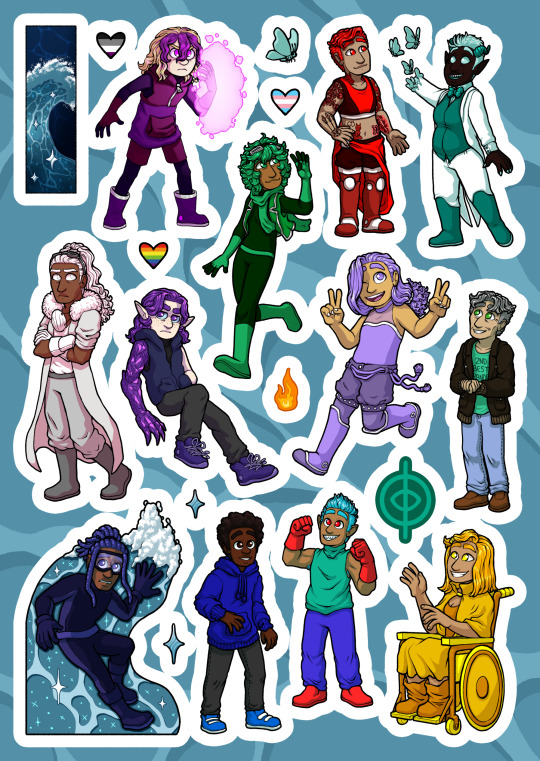
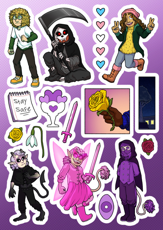
[id: two stickersheets, one of characters from chapter 1, and the other chapter two: chapter 1 sheets has: rami (civilian clothes), his whole team, tsunami, inkmaster, swarm, sound flood, and mori. as well as some smaller stickers: a sparkling wave, rami's logo, two diamond shaped sparkles, a small fireball, swarm's butterly, and three hearts with the ace, trans, and rainbow pride flags. chapter 2 sheet has: lewis and sound flood (both in civilian clothes), iris, faete, mindforce, and omen (super costumes). also several smaller stickers: mindforce's eye, a yellow and pink rose, a snowdrop, faete's sword, iris's notebook (with the words "stay safe"), a starry sky with city view, rami's hand holding a rose, and 5 blue pink and white hearts. end id]
also here's the cover (minus the blurb)
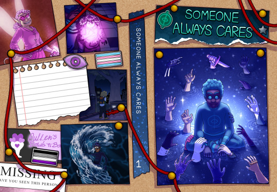
[id: image of the cover design, layed flat. aka the front cover is on the right side, back on the left, and the spin inbetween. designed to look like a corkboard with photos pinned to it, and red sring connecting things. on the back there are photos that are from various panels in chapter 1 and 2 (redrawn, specifically faete after transforming, cam readying her forcefield, lewis on the roof, and tsunami riding his wave. the back also contains enamel pins: a trans flag, an ace flag, and mindforce's eye. as well as the corner of a missing persons poster, a business card for "cullen's bowls 'n' bowls", and a blank sheet of notebook paper where the blurb should be. the spine has some starry washi tape with the title written on. the front has a piece of blue paper torn off at the end with the title on it, and stickers of a silver star and rami's logo. below is a large image of rami sitting in the water staring intestly at the viewer, light emerging behind him. around him, hands all strech out towards him, hands belonging to the significant character significant in chapters 1 and 2 of sac. end id]
so specifically what is left (no particular order):
spellchecking
adding page numbers to the bottom
finishing the rest of the not comic pages (aka the thank you note, about the author, deciation and the bit where im going to add names of people who pledged to the kickstarter) 75% done
character bios (admittedly optional i just want to do them)
bonus pages for art and sketches (i have collected all the art and sketches, its just deciding which ones to ue and which ones to save for next time because it makes more sense to put them with the more spoilery chapters 3-5 specific arts)
assembling these and sending a sample off to print
actually starting the kickstarter (once i have decived book sample back and am happy. i am not starting it without knowing 100% that i can fufill it right then and there)
(in the intrest of transperency: while these are all easy and mostly quick (aside from character bios. havent started that one yet), i also have some upcomign events that will have to take priority. that being a convention this weekend, next weekend, and my sisters wedding the weekend after (and the wedding gift, which is custom artwork of my sister and future brother in law. like a wedding painted but not on the day and also digital. so that will take up a bit of time after [another reason i wanted to get this done before then but ah well])
for real though one day i hope to be able to do art stuff full time because i am. so tired of doing a day job
also also there are versions of lewis and rami stickers in super outfits, they'll be seperate stickers
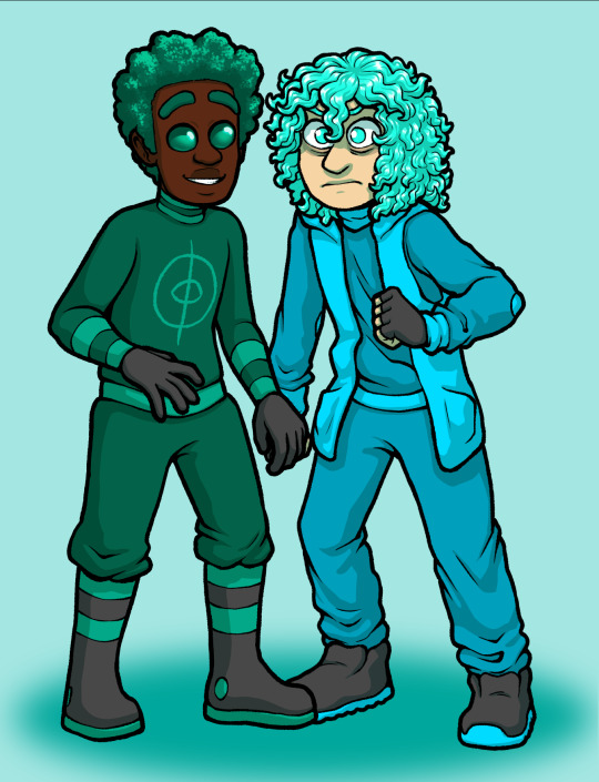
[id: drawings of lewis and rami, same as the stickers in the sheets, just seperate and in different outfits, the drawings have been placed close together, so it looks like thye're holding hands. end id]
you can make them hold hands :)
#also if you're already planning on going to london or bristol anime and gaming con#please feel free to say hi!#if you're not planning#best not to bother you don't want to give them your money#company sucks and i'm not going back#also you can just sneak into the bristol one this weekend its super easy apparently#oh yeah also theres versions of rami and lewis sticker in super outfit but those will be seperate stickers on their own#you can easily make the stickers hold hands
12 notes
·
View notes
Text
Its been hell of a week with ockiss- im really happy with how much i managed to do, five drawings and a fic is a whole lot, even if inevitably most of my big pile of sketches didnt turn into finished pieces. I do have a few concepts for my own ocs that i will finish at some point, and possibly one or two gifts, but for now i need to crash hard...
Oh shit Art Fi-
#thebirdspeaks#not to mention i also did the Tesoro fic and all the brainstorming for that and a commission#and went out to meet my friends twice#so yeah#hell of a week#i'm crashing harrd#mentally and physically i am the /playdead emote#was loads of fun tho!#im so happy everyone loved their gifts<3#and i really like what i did between my own ocs
7 notes
·
View notes
Text
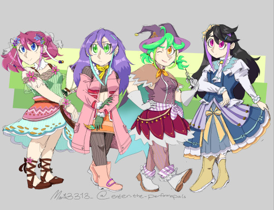
Hi hello I'm back! I got myself lost in the hype of Rune Factory 3 rereleasing so I disappeared for a bit. But Im back now! Heres the Bracelet Girls dressed as some of the bacholorettes!
Standalones and inspirations under the cut!

Yuzu! I was debating between going for either Shara (flower girl vibes) or Pia (in reference to my mermay piece, pink hair, and the fact that shes the girl im going for in my current run), but ultimately thought Shara fit her better.I absolutely adored Shara as a kid, and when RF5 came out last year, I always wore the Shara outfit. And Yuzu looks great in it! Im very happy with how it turned out, it really fits her aesthetic.
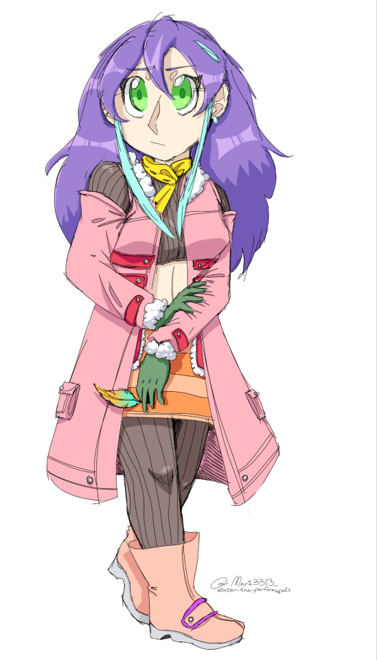
There was only one of the bacholorettes that I was gonna go for with Serena, and that was Raven. They have the exact same vibe in my opinion. I dont know if Raven's outfit really matches her color pallet, but eh. I like drawing Serena with her hair down.

RINRIN♡ Rin started this whole idea for me. I originally compared her to Carmen, and then thought she was quite a bit like Marian as well. I decided to go with Marian because Wind Witch vibes. This started out as my least favorite when Id sketched it, but i ended up really happy with the details when Id finished the coloring!
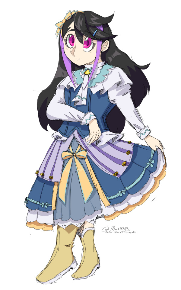
In my opinion, Ruri doesnt really have a bacholorette in RF3 that I can compare her too. She reminds me more of Felicity in RF1 or Leann from RF2. So it was down to whichever RF3 bacholorette I thought her aesthetic matched to the best- Sofia or Sakuya. I went with Sofia because I think the colors of the outfit would go better with the rest of the girls. I feel like im not really great at drawing Ruri though, so I hope to draw her more in the future.
If youve made it this far, thanks for reading! Next piece of fanart, Id like to draw Yuya dressed up as RF3's main protagonist, Micha. Thanks for sticking with me :3
#also might change my pfp to shara!yuzu lol#ygo arc v#yugioh arc v#crossover#rune factory#rune factory 3 special#original art#rf3 au#hiiragi yuzu#shara rf3#serena arc v#raven rf3#rin arc v#marian rf3#kurosaki ruri#sofia rf3
50 notes
·
View notes
Note
hi!! so im getting back into drawing after like,, a couple years of not drawing and i was wondering if u have any tips! they can really just be general tips- like how to get better, if this makes sense?
peace xx
Hello! I’m always more than happy to give advice! I’m so honored you would come to me for help :D
Here are some things that have helped me improve a lot over the past few years
Don’t be afraid of making bad art. Whenever you start drawing it can be intimidating because there’s this mental pressure we put on ourselves to make it perfect so if it doesn’t look exactly how we imagine it we get upset. So when drawing, don’t pressure yourself to make it perfect and learn to be okay with not everything becoming a masterpiece. (95% of my sketchbook is just messed up half-finishes sketches that didn’t turn out lol).
Using references helps a TON. I had this weird thing for years where I didn’t want to use references because I was convinced I could figure it out myself and sometimes the idea of having to find a reference sounded aggravating. But it is SOOO worth it. My art literally skyrocketed in quality the second I decided to use references when I was struggling.
Follow artists who work in your medium! You can learn something from every artist but it helps to find people who use the same medium as you because you can pick up their techniques that are specific to those tools. So if you draw in pencil, follow other pencil artists, etc etc
Draw every day or as often as you can, starting as soon as you can. Allow yourself to have drawing sessions without the goal of making a finished piece, but rather with the goal of just practicing and making mistakes. Just draw draw draw as much as you can!
If you’re trying to learn to draw something (or improve on it), try mastering pieces incrementally. As an easy example, if you want to improve at faces, try learning to get better at lips, then nose, then eyes, then eyebrows, etc. Focused effort on each detail will eventually make all the pieces come together and improve your finished product.
This ties into #2 a bit, but try all kinds of poses/angles etc. This is still something I’m trying to improve at, because I stuck with the same 3-4 basic poses for so long it got to the point where I couldn’t draw much else. Try new things and regularly practice different things you’re not as good at
That’s all I can think of for now; anyone reading this can add on! I hope these are helpful! Thank you soooo much for the ask it’s seriously an honor <33
24 notes
·
View notes
Text

part 2 of this ask
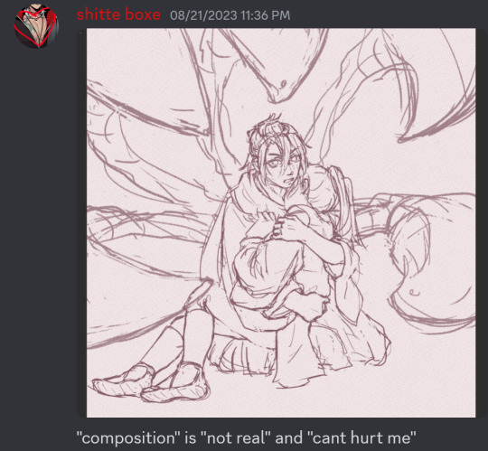
📝Process for hurt mezu drawing
here are the steps i dug out of an art server's wips channel lol
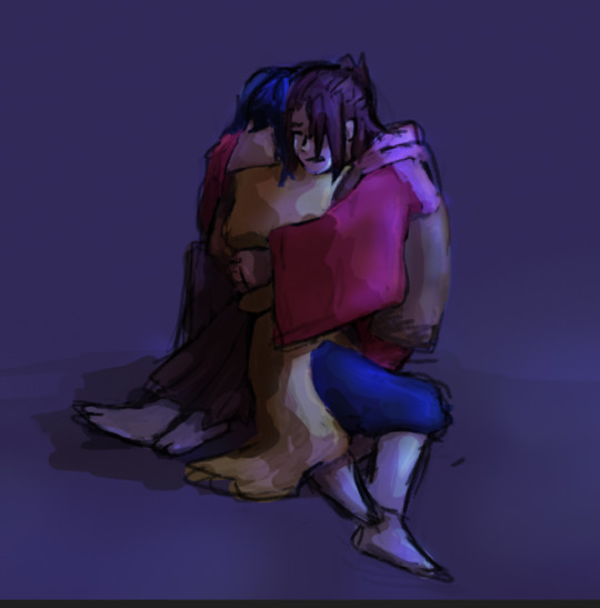
1. initial sketch
2. refine sketch. thats lines now babey. (omitted "the sleeves are KILLING ME WAHHH" stage that led to this)
3. grayscale, to use with gradient map (this is a more polished grayscale than I started with, i dug the working file out to get better images)
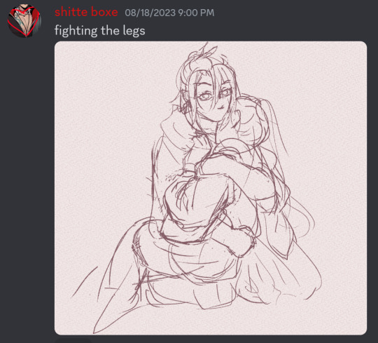
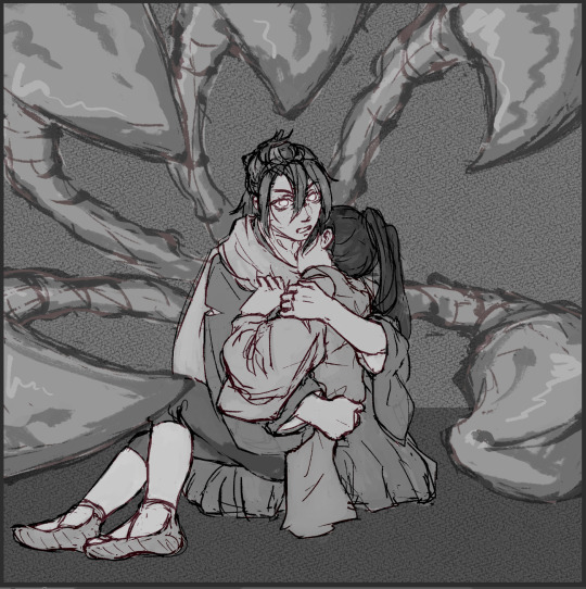
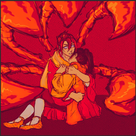
4. find nice gradient map (ended up being the same one I'd used for the piece i made right before. the goal is to make what's essentially an underpainting, not to color the whole thing with one map)
5. tweak and add colors that arent in the map with hard light layers & also sneak in a layer for special effect and atmospheric/ scenic perspective while you're at it
6. shading & more finishing effects. pretty much all of the shading was done with hard light layers! the only non-hard light layers I used for the shading were the particle effect layers & like one faint glow layer to fix some values. blood was done with linear burn
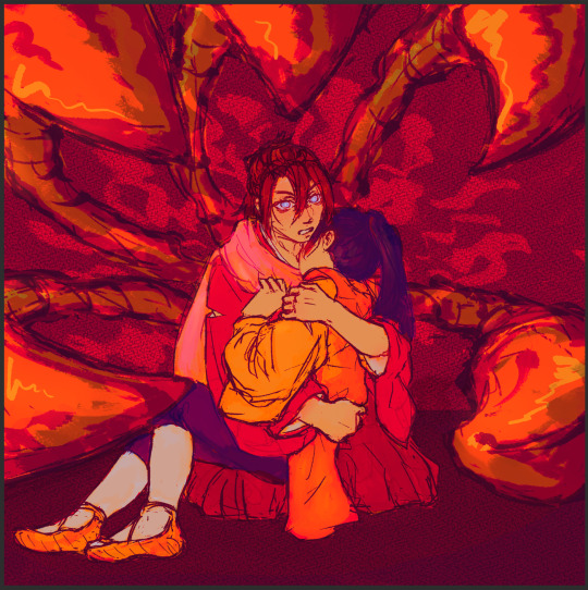
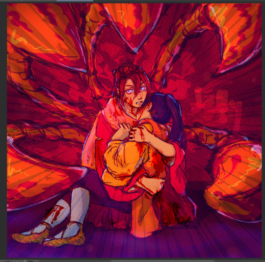
✨Inspiration for hurt mezu drawing
the coloring method (grayscale -> saturated gradient map underpainting -> additive color adjustments) is something I tried out with the piece i'd made right before (the one where gozu is holding mezu from behind) & turned out really well, so I wanted to keep going with it
I also wanted to draw them angstily again because it'd been a very long time. like half a year at least. angsting them is very enriching for my soul so I try to do it regularly, this one was overdue
subconsciously referenced the poses in the initial sketch from this old thing (feb 2021). i love doing this. all my for-fun works recycle old elements in some way. my favorite game is "what old art reminds me of what im doing rn" im so good at digging stuff out of my archives for it. everyone loves when i do this
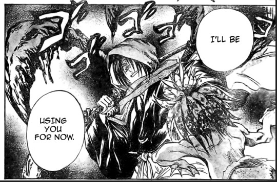
the gangi-kozou panel also
i went through a "shade in bold red-orange & dark blue with hard light layers" phase in like..april/may of 2021. i still like that stuff a lot so I wanted to revisit it
💚Things you like about hurt mezu drawing
repasting the link there but the sixth image in the process is essentially the final so you can just look at that
the colors are nice!! I'm real happy with using more saturated colors n I think the warm vs cool balance works really well
the sleeves (man being dramatic on the sand meme)
no like fr look at the 2021 piece's kimono sleeves vs the one I just did 2.5 years later. so satisfying
Gozu's expression came out nice
i think the claws and flash lines successfully added Emphasis to Gozu's expression & the piece overall
the poses … the drama …. the brush textures are also good
⏳Things you’d do differently with hurt mezu drawing
add in a liiitle more contrast...aka use a wider range of values. Some lighter lights and darker darks. I miss my 2021 hard neon lighting
a bit more distinction between the characters and the background also
the composition isn't bad but it could be better. Should've thought more about the way the eye would flow around the image in the drafting stage (solid b&w color block thumbnails are good for this)
Moar Sparkles. (I put a solid amount of large & low opacity light bubbles in there & some finer brighter dots especially around the claw stems, but I think more clusters of tiny bright lights on the characters themselves would've gone hard)
💌Some favourite feedback on art
as the wise man Austin Kleon once said: keep a "praise file" of all the positive feedback you get (if you've never read "Steal Like an Artist," you must). so. i am prepared for this question hold on
tastes like sugar glass
multiple people have told me my art is soft & dreamlike
jayce you reblogged my touchstarved art with nice tags on april 10th ive got that saved love uou
umm theres a lot...anytime someone keysmashes or feels emotional because of my art i get happy ,,, lys messaged me about the hurt mezu piece that made me happy also,,,,,there is so much joy in the world
#shitboxposting#asks#shitbox drawn#JM SORRY I FEEL LIKE THE FORMATTING ISNT EASY TO READ NO MATTER WHAT I DO....AUGH#all my class work with actual conecptual meaning is monochrome what am i doing...man.......#i need to post more art and i also need to make more art. aghhh. boots up ultrakill and magical drop again#im actually Not sure how im going to afford the next few years of my life 😭😭 a bitch gotta have time to do fuck all but i need money..!!!!#whatever its fine. i have time to do fuck all right Now and thats what matters
5 notes
·
View notes
Note
happy talk shop tuesday! in terms of larger projects, how many wips do you have at any given time? do you like to focus on one piece and see it to the end before moving on, or do you tend to jump around between pieces?
the thing about wips is that i can never know which ones will get out of control and turn into full fleshed pieces until i start working on one. i'd say currently i have about 7 big projects that i want to tackle this summer and rn im drawing none of them :l
(technically one is half way done, and others are in early sketch stages so i dangle those in front of me to motivate myself)
i jump around wips all the time because i get tired of working on the same thing for too long but also feel bad for dropping it at a halfway point. but sometimes a new idea sweeps me away and has me in its chokehold until i finish it here and there. or i get lost in doodling and drawing for myself and suddenly rememeber of big scary unfinished work that's gathering dust
#fingers crossed i'll finish something pretty soon but also im giving no promises#thanks for the ask!!#talk shop tuesday#inbox#blogposting
6 notes
·
View notes
Note
ive yet to finish an art project since december bc ive been so down abt my work. im startjng to feel like a one trick pony, like i can only make one good art im proud of and never again. each type i set out to make something it just doesn't turn out good so i delete it and start again and rinse and repeat. its nice to know that its not just me who feels this way
baby you are NOT alone!! at a time where most of the art we consume is through the norms of social media it can be so hard to remember that art is not just about making a good 'finished product' and that your value as an artist isn't about your work looking like those of the people you see with thousands of followers. feeling proud of your work comes from feeling proud of yourself. i have so many pieces that objectively are Not good but i feel filled with so much love when i look at them because i remember how happy i was while creating it. but then i have pieces that have gotten thousands of reblogs but i physically cannot bring myself to look at them for too long because while i was drawing it i was constantly thinking about whether it will look good, whether it will fit the idea i had in my head, etc. etc.
I don't know if it's any consolation to hear this, but the feelings triggered in you when you see a result you don't like are not concrete nor are they a true depiction of who you are. you are a wonderful, skilled, creative artist and i can say this to you without knowing who you are and knowing your work because to be that kind of person is to think you are that kind of person. the more you tell yourself not to be nervous about your art not turning out good and focus on creating the things that make you feel joy with confidence, the more your art WILL start to look good, i promise.
i wanted to share some examples with my own art and my feelings about it so if you're not interested don't worry qjkskw im just putting it under here

i think this was my most reblogged piece in 2022 but i dont think ive seen it closeup since then because it does not make me feel good when i look at it. when i sat down to draw this i was so stressed about making it look a certain way. i was trying to use all this technical knowledge like forumlas to make it look 'perfect' but at the end it just felt like a drawing that wasn't even mine. i do like the sky a lot though because painting skies like that have always made me feel really happy.
same situation with this piece. i had the vague idea in my head but it felt like i had to make it a chore to make sure it looked good. i kept trying to find the 'perfect' references and trying to copy tutorials id seen about anatomy to force it to look good but again this just doesn't feel like my art because i think so much of it came from what i thought i shouldve been doing rather than what felt good. it felt like i was trying to prove myself

i did this in an hour and a half and i thought it was going to be a warmup ahkdka. i completely switched off my brain while i did this. i loved this pose from ikari gozen and so i sketched it out really fast in a way that felt so. easy? natural? the rest of the details sort of just fell into place. that's not to say i didnt try to use the same techniques that i did for the other two, but this time i trusted that those techniques that i learned would naturally come to me while i worked while i had the end result in my mind. when i look at this piece i just remember how intuitive the process felt, how i would zoom out of the canvas and look at it and think 'omg wait what if i try that thing i saw on that youtube tutorial...' and how i wasnt trying to prove to myself this was a good drawing, but for the way i felt natural and happy prove it to me instead
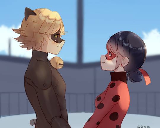
this one too ❤️ i have improved my anatomy a lot since this piece but i still use it on all my portfolios and commission examples because it feels like such a good depiction of how i want MY art to feel to me when i see it. i love ladynoir so much and i love oblivio so much and that's genuinely all i was thinking about while drawing this. i didn't want to make it perfect, i just had a vague image of what i wanted it to be like in my head but i was just so excited to be doing oblivio art that i totally forgot about stressing about everything else and just let the brainrot power me HDKDKA. the process was so messy but it felt a lot like solving a puzzle, you know? i didnt need to force any techniques onto it to make it look good because i trusted that the image would already be there, i just needed to find it
6 notes
·
View notes
Note
Hey there! (I loved your comic about Quinn even tho I had no context cause im a pretty new follower)
Just wanted to say if you wanna post something everyday but you feel burnt out, its still good if you post once in a couple days or even a week, or maybe if you show wips so you dont have to finish one piece every day ^^
You probably already know its okay, so if its about making followers happy/not lose them we are already hooked! If its about some personal goal or other stuff, i hope you can work it out and be gentle with yourself /gen
Take breaks and drink lots of water, here s a peanut that can turn into your favourite food 🥜
I just threw up in my mouth (unrelated to the ask)
Anyway, there isn’t much more context for the Quinn comic that I’ve posted, but I’m glad you like them :)
This is a good idea but I’d hate to go through my art tag and see a bunch of unfinished stuff. So I think I’ll just post less. Most of the stuff I post are already sketches/uncolored stuff anyway :P
It’s not really for followers or anything. I’m not like a #influencer this blog is half diary half hobby.
16 notes
·
View notes
Note
List 5 things that make you happy, then put this in the askbox for the last 10 people who liked or reblogged something from you! Get to know your mutuals and followers! - tag you're it! lol
IM SO LATE SORRY MY BELOVED <333333
ill list 5 different things than the last one, but thats fine since a lot of things are good in this world and its worth fighting for, mr. frodo. LMAO
sketching. just randomly doing doodles that turn into something!
finishing a good book and put it on my storygraph. idk, its just so satisfying to tick off the box??? and give it a good rating, too.
finding a new manga to read, and then ive found it several years after it started releasing, so that i can binge read and continue to next chapter almost eternally, lmao. following an on-going release is also fun, but binge reading manga is just So Good for my Soul (the one im currently binging is the guy she was interested in wasnt a guy at all)
when radwimps releases new music!!!
small, sweet treats. i can be sort of a glutton with candy, but i have diabetes, so i really gotta watch it. so once a day i usually allow a sweet little something (tho not every day, just capped it there). it can be a small handful of gummy bears, a few pieces of chocolate or a pastry, its just soooooo good!!!
#nohr.talks#lovenote: tori🗡✨#sorry if thats the wrong sword <- the emojies look weird on my pc versus my phone#ask games ✨
1 note
·
View note