#size increased with photo cropping found on tumblr
Explore tagged Tumblr posts
Text
#lettering font design: tattoo design app#ecw#self made old school ecw logo#size increased with photo cropping found on tumblr#wrestling#wrestling fans#write calligraphy
3 notes
·
View notes
Text
How to gif without photoshop (second method)
Hello! A couple months ago I made a tutorial on how to gif without photoshop using the website ezgif. I got a really great response for it and received some requests for the other giffing program I use when I don’t have access to photoshop. The program is called instagiffer; this is a software so it needs to be downloaded but I have never had any trouble with my version.
Warning that this is VERY text and image heavy because I know how frustrating it can be when a tutorial feels like it’s skipping steps and I want this to be as clear as possible. Also please read this on desktop, tumblr mobile kills the quality of gifs inside text posts.
Please reblog if you found this helpful!
This is the video I will be giffing and here is the gif I will be making!

What you need:
Instagiffer
This program has been around since 2013 and I have used it since 2016. Unfortunately, it hasn’t been updated since 2016 and the download link on the official website is broken. That being said, there are a few other websites that still have a working download, which is what I linked to above.
ezgif
Although we aren’t going to use this website to make the gif, we are going to use it to add more color and brightness to the gif.
A video downloader
This is the video downloader I use but basically any youtube/video download website works. There are two ways to gif on instagiffer; using a video and using the built in screen recorder. I will show you how to use both.
A video to gif
This program is a lot more forgiving about video quality than ezgif is, but for best results 720p or 1080p is still the standard. Scenes with good lighting and bright colors turn out the best, but you can still make good looking gifs from darker or unsaturated scenes if you know what you’re doing.
1. Making a gif with a downloaded video
Step One: Getting the frames
First, you download the video you want to gif. Then you open up instagiffer and click on “load video.” Scroll down until you find the video you want to gif and click on it.
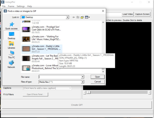
The video will appear on the screen in the right hand side. Go ahead and put “smoothness” up as high as it can go. This increases the frames per second and makes the gif look smoother. It also makes the gif longer, so you may have to bring it down later so it doesn’t go over tumblr’s size limit, but I always start as high as possible then work down.
Next, find the moment in the video you want to gif. You can either use the sliding bar or just type in the start time (you can use hours, minutes, seconds, and millisecond). You also want to put how long the clip you want to gif is. 3 seconds is the default but I usually bump it up to at least 4 (unless I know it’s a really short clip) just because it’s a lot easier to delete frames than add them.
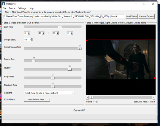
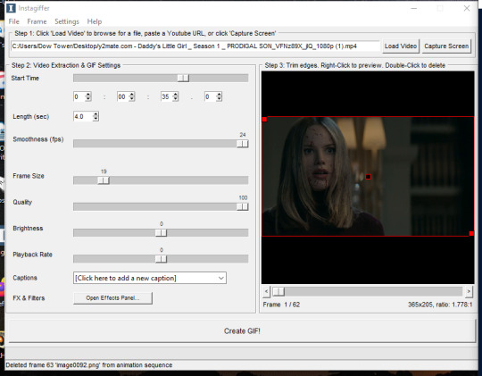
If you do this, you’ll quickly realize your gif has extra frames that appear slightly before and slightly after the moment you want to gif. It’s really easy to get rid of those frames; just click on them until you only see the frames you want in the gif. Use the scroll bar at the bottom of the gif to move around the frames, and use it to make sure the only thing on screen is the clip you want included in the gif.
Step Two: Resize the gif, brighten the gif, change the speed and add captions
Now, it’s time to size, brighten, and color your gif! First look at the “frame size” option. Using the correct gif size for tumblr is one of the easiest ways to make sure the gif looks good. For gifs that take up a whole row, the size should be 540p wide. For two gifs in one row, the size is 268p each. For three gifs in one row, the sizes are 177p, 178p, and 177p in that order. Here is a visual of it. You can see what the width/height of the gif is in the bottom right hand corner of the gif screen. I am making this gif 268p. Get the frame size as close to the width you want as possible; right now, it is 269x151. To get it down to 268 exactly, go up to the top of the program, click on “frame” > “manual crop”. This little box will pop up. Just set the width to 268 and make sure the size is listed as 268 under the gif as well. The height can stay the same.

Keep quality up to 100 obviously. I almost always brighten by 2. Unless you’re giffing something with a huge spot of light, 2 is basically standard. Going up any higher usually makes the gif just look grainy, but if the scene is REALLY badly lit, you can go up to 3. Playback rate is usually -1, just to make the gif look smoother. Unless it’s a super long gif or a super short gif, I don’t mess with it further.
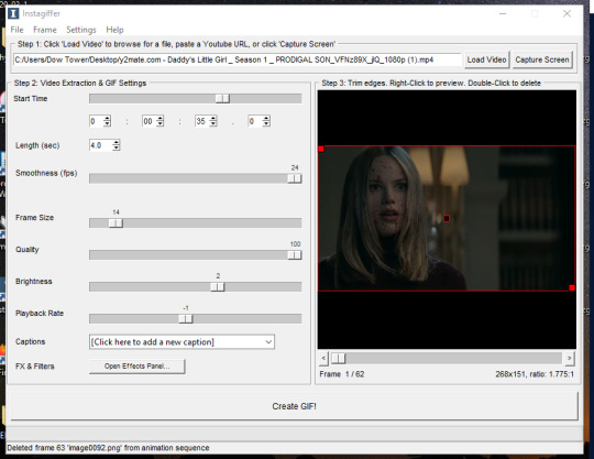
Captions are obviously optional but if you want to add one, click on “click here to add a new caption.” A box will pop up with options of how you want the text to look. I only use this to “caption” gifs (aka add dialogue). The settings I use are 12pt font, calibri, white, bold italic, bottom of gif, outline up to 3. You can also chose what frame you want the caption to start/end on if you want. Since this gif doesn’t have talking, I’m not going to include the caption in the final gif, but I wanted to show how to use this function.
Step Three: Color the gif
There are two parts to this. The first place I color the gif is on instagiffer, and then I use ezgif to add more effects. The second part is totally optional but they have more choices for coloring there.
Click on the “open effects panel”. A window will open showing what the gif currently looks like, along with a variety of filters you can use. Ignore how grainy it looks, it won’t look that way when it’s finished.

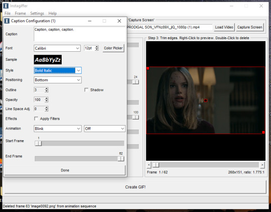
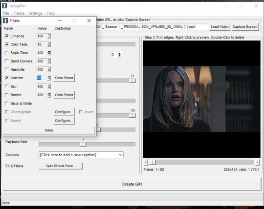
First thing is keep “enhance” up to 100. This is basically a sharpening function and without it the gif will get super blurry. There are a ton of filters you can play around with, but the only two I focus on usually are “color fade” and “colorize.” For color fade, I click it on and set it at 10. Obviously, if you’re trying to make a desaturated gifset, you can raise it up for a faded color effect, but I use it more for color balance than desaturation. Next click on colorize, and then color picker.
I almost always pick a light shade of blue, purple or pink; it brings out the color in the gif and tends to keep skin tones from being washed out. This is usually my default:
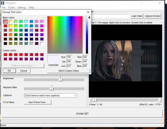
Then, I bring the “colorize” option down to 90 to increase the effects of shadows.
Last thing to do is click create gif! It’ll take a few seconds, especially for longer gifs, so be patient. ALSO there is a good chance you’re going to get a message saying something to the effect of “this gif is too big for tumblr’s photo limit.” Feel free to ignore that; the software being old means it still has the photo limit as 2gb when now it is 5-6gb so almost any gif you make will be considered “too big.”
Your gif now shows up in a preview tab! It should also show up as a file labeled “insta” on your desktop.
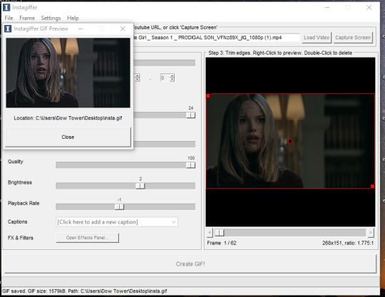
Here is the gif so far.
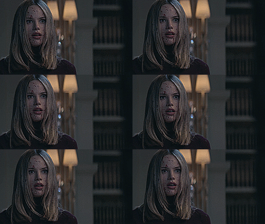
You can end here if you want. But when using instagiffer, I always go to ezgif to brighten up the colors further.
This part is basically the same as how you would color a gif you made in ezgif (see this tutorial) but I’ll quickly walk through what I do.
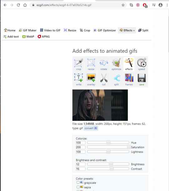
Go to ezgif.com/effects. Click chose file and upload your gif. First, you’re going to want to up the saturation, brightness, and contrast. You have to play around with these functions a lot because every scene is different, but in general, I have my saturation up pretty high and my brightness and contrast at at least 8. For a scene as dark and desaturated as this, I put saturation at 200, brightness at 12, and contrast at 16.
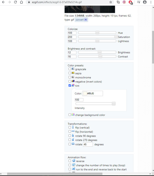
Afterwards, you want to go down to “color presets” and select “tint.” In my other tutorial, I recommended tinting with a light red or light blue, but for gifs made on instagiffer, I tend to use a light yellow/gold. I already tinted the gif purple in instagiffer so adding yellow in ezgif tends to balance it out. The shade I used for this gif is #fffcf0.
If the gif ends up looking too yellow, either decrease saturation, or click the “effects” button under the gif and add a layer of light purple to balance the colors more.
Your final gif should look like this.

2. Making a gif with the “capture screen” feature
This only changes the method of how you get gif frames. Everything related to resizing, coloring/effects, and adding captions is the same as above.
What if you don’t have a download of the thing you want to gif? The great thing about instagiffer is it has a built in screen recorder so you can gif any video you want, even if you can’t download it (or if you’re like me and don’t want to deal with downloading a 45 minute episode of something just to gif one scene).
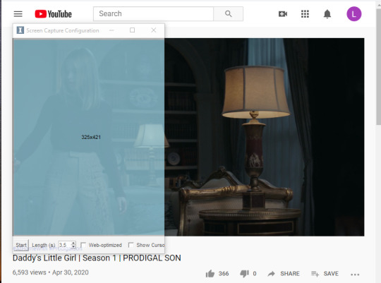
To use this tool, click on the “capture screen” button on the top right corner next to “load video.” Then this screen will pop up.
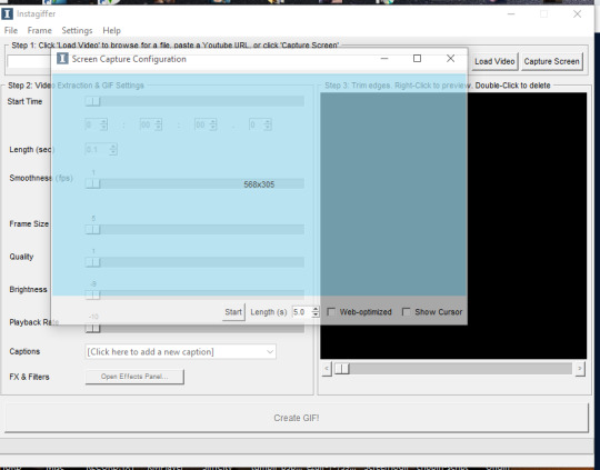
You’re going to want to take this blue screen over to the screen you want to capture. I’m going to put it over the youtube video I am giffing. Adjust it so the only thing it’s focused on is the video and set the length in seconds. I usually set it for longer than the clip is just because it’s easier to remove extra frames than rerecord a scene. There is also sometimes a lag so starting it right before the scene you want to gif helps with that. For example, if the clip I’m giffing is 3 seconds long, I set it to 3.5. Then start running the video and click “start” on the screen!
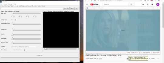
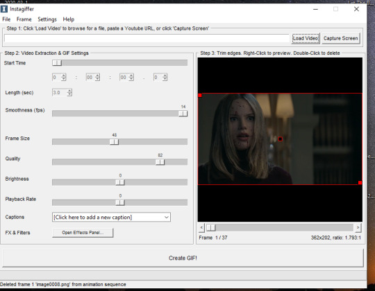
Your frames will now show up on instagiffer. Everything is the same, except you can’t change the frame rate or timing. Go ahead and delete frames that you don’t need by clicking on them. After that, just use the same resizing, and coloring method I outlined above.
Some notes:
When using the video download option, the effects you use will save, as will the size of the gif. So if you gif one part of a video, then move the time stamp to another part, it will stay in whatever size you put the gif as. However, when using screen capture, you have to resize the gif and go to the effects menu each time because they reset after each use of the screen recorder.
You can also just paste a youtube link into the white bar at the top of instagiffer to gif it, but I’ve found that the quality is much better if you download or use the capture screen.
To crop a gif, move the red box around (just make sure it stays the right width size!)
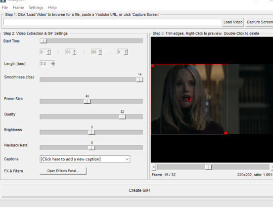
If you are using the screen recorder and only want to record part of the video (like just a characters outfit) size the gif recorder so it’s just surrounding the part of the video you want to see.
I hope this made sense lol, it took me a few days to write it all so please let me know if you have questions or need anything clarified! Support me on Ko-Fi if you’d like and are able 💕💕💕
#gif tutorial#giffing tutorial#giffing#gifmaking#mine#my gifs#blood //#long post#@ anon hope this helps!
82 notes
·
View notes
Text
Fx photo studio pro tutorial

#Fx photo studio pro tutorial for mac os#
#Fx photo studio pro tutorial full#
#Fx photo studio pro tutorial pro#
The program supports simultaneous recording from multiple 16 and 24. You can record and playback a virtually unlimited number of audio and MIDI tracks.
#Fx photo studio pro tutorial for mac os#
N-Track Studio for Mac OS v.0.5 An audio & MIDI multitrack recorder that turns your computer into a full-fledged recording studio.State of the art DSP based reverb algorithms Suite of 4 separate reverb units: Plate, Room, Hall, and Inverse Classik Studio Reverb for Mac OS v.1.1 A suite of four high-end studio-quality reverbs modeled after popular outboard classics.Get started immediately using dynamic help. Quickly and easily create manga and comics with Manga Studio's drawing tools, filters and special effects. Manga Studio Debut Mac v.4.0 Manga Studio Debut 4 is your all-in-one solution for stunning, ready-to-publish manga and comics.Save time and increase productivity with customizable tool palettes. Manga Studio EX Mac v.4.0 Manga Studio EX 4, the world's leading comic and manga creation software, delivers powerful art tools for every manga and comic artist.We use the latest real time 3D processing techniques to provide users with the most complete virtual tool that accurately emulates the behavior of light and shadows.
#Fx photo studio pro tutorial pro#
Photo Light Pro v.2.5 Our goal is to meet the needs of time and money for photographers.With very little feature differences, the standard version (with a couple of less features) seems like a very attractive choice. While the FX Studio Pro version is available for $40, the standard version (shown in this review) is only for $9.99. While you can’t do exactly everything in iPhoto on FX Photo Studio, individuals looking for a nice iPhoto companion in terms of the available filters, FX Photo Studio is the application for you. Your photo will be perfect for your Facebook profile, or the next holiday greeting card. From choosing amazing, high quality filters to cropping. ConclusionĪll in all, FX Photo Studio allows you to do a ton of things with your photos. But, you must remember that when share through email, it will launch the Mail application, so make sure you have that set up or if you even wish to do that. Along with sharing the photo onto various websites, FX Photo Studio allows you to have the photo exported to iPhoto and onto your Mac. FX Photo Studio allows you to share it on Facebook, post it onto your Tumblr, upload it to Flickr, post to Twitter, and even email it to your friends. Once you are done editing your photo, you are now able to share it with your friends and family. FX Photo Studio allows you to crop and rotate your images, as well as add other features, turning your photos into great masterpieces. While some people refer to it as the “Instagram of Mac”, FX Photo Studio has many more features from filters. For this reason, FX Photo Studio has a “favorite” feature, allowing you to like some of your most used filters and effects for quicker referral. You have a choice for a ton of filters and effects, so many that it took some time to go through and try all of them. Features and FiltersįX Photo Studio has various features and filters that make for having an easy experience when editing. The first region page is for effects, second is focused on cropping, and another for adjustments etc. The interface has three regions, all selected on the top right side.
#Fx photo studio pro tutorial full#
You can compare the two photos (original and edited), as well as view the application in full screen. You then have a region for zoom, fitting the photo to its true size, and fitting the screen. Next to that, you have options for undoing and redoing your edits. The very top of FX Photo Studio is where you’ll find an area for loading the photo, saving the photo, and sharing it onto the web. The application takes many of the lessons found with other multimedia editing applications like iMovie and Final Cut Pro, where you have a dedicated region for seeing the editing process, a bottom region for the dirty work, with the right side dedicated for editing options. The interface used with FX Photo Studio is almost dead simple to use, there are no special manoeuvres that you have to take when editing photos.

0 notes
Note
would you ever be willing to do a short tutorial on how you edit your icons? i love yours and I can never quite get the ones I try to make right...
Ahh, sure!!
For this tutorial, I’m going to assume that you’re using some version of Photoshop and already know the basics of cropping, layers, etc. If you need any clarification on that, send me a message! :)
Anyway, here’s my process for getting from here to here:


And using Rena Rouge because she was beautiful in Sapotis and I was going to make icons of her anyway!
(Side note: there are some parts of icon making I have a lot of trouble with, like cropping and adding extra decorations like stars and hearts, so I can’t really talk about those ^^)
First, starting out with the screencap, higher resolution always helps! Icons for Tumblr don’t have a reason to be larger than 300x300, but when you’re only working with a small section of, say, a 480p screenshot, there’s a good chance you’ll be sizing up rather than down!
So starting with the screenshot, I crop it in a square and cut it down to 280x280.

Then, I erase the background around Rena with a hard eraser brush set on 100% hardness. (x)
I cut out all my icons manually like this rather than using magic wand or quick selection! It’s a bit of a hassle, especially working with just a trackpad, but I’ve found that it gives you much more solid, clear lines on icons. There’s no white “halo” around the character that might happen when you’re resizing.
(On a side note, I’ve heard that the pen tool is good for this too, although I haven’t gotten the hang of that yet.)

Anyway, this is what I consider the major thing that makes my icons look "good” ish. You don’t have to do it to get a nice icon, but if you’d like to try it out, here are some tips I’ve gathered!
Left bracket and right bracket keys make the brush bigger and smaller, saving time.
On parts where the cut is straight, you can draw a straight line with the eraser by clicking a start point, holding down shift, then clicking an end point. This saves effort!
To remove the “halo” around the character, cut into the character a little bit! This removes borders (like on Rena’s ears here) and makes the icon look clearer overall.
When you’re done, you can make a layer underneath in fuschia or another bright color to see if there are places you’ve missed.
Cutting out Rena took about three minutes btw :P
Next, I pick some color in the photo (here, some gray from Rena’s hair) and make it the background in a layer underneath Rena’s cutout. This just helps me visualize the next part: coloring!

I like to do pretty different colorings depending on how I’m feeling and I go quite overboard on them :P But here’s what I did this time, in case you’re wondering ¯\_(ツ)_/¯
+ curves layer to increase brightness

+ selective color layers that make the icon more reddish and Rena’s lips a brighter pink


+ another curves layer, also brightening+ selective color to make the white of Rena’s ears darker


+ channel mixer trick to take the bluish purple out of the background

+ increase saturation (in the vibrance layer)

+ a dark gray layer set on exclusion at 62% that puts soft grayish filter over everything


Aaand that’s pretty much it for coloring! Then, I turn all the coloring layers off and use the gradient tool (by pressing G), and make several new gradients with colors in the picture.
For example, a gray-to-gray and red-to-red!


With a gradient selected on a blank layer under Rena, I draw lines across the icon (often diagonally!) to get something that looks alright.
Finally, I move Rena around a bit:


And that’s about it! *confetti*
This tutorial turned into quite the rant haha, but I hope it helped you out somewhere in there! Good luck on your icon-making adventures! ^-^
#tutorial#icon tutorial#photoshop tutorial#icons#calyspso#ml spoilers#ask#yep this is definitely too long xd#i'm kinda tired so i think i'll post the icons later#*tutorial
71 notes
·
View notes
Text
How to start an Instagram app business and earn a good revenue

Wondered! The way Instagram has changed the world of technology. Platforms like Facebook and Twitter were missed out for general individuals. Because it isn’t as impacted as Instagram did. Instagram has well-kept consistency and ends up the most grounded stage for engagement ever made in the history of social media. The calculation behind this is constantly present newly upgrades to have interaction. One of the foremost surprising change Instagram brought other than innovation is, the rise of photography, upgrading the camera in smartphones, utilize of augmented reality. Innovation began upgrading the quality of cameras. It gives an instrument for engagement whether it is almost a commerce account or a private account. Tools that never come up short to surprise their clients. It has numerous functions.

If you check statistics, the number of users increasing over the years. Instagram has the foremost elevated engagement rate putting down Facebook, Twitter, and Snapchat. As per the survey, it’s measured that the U.S. has most supporters around 120 M. It’s most likely to say that 37% of customers often use it throughout a day. The number of users increasing day by day. Have you ever well-versed its features? Ever thought to make an app like Instagram? What amount of time will it need to make such an app? What will be the development cost? To develop such an app, you must have a clear vision towards it, an Associate in-depth description of utility, and also the platform you’d wish to place in your project, and budget.
Instagram Business profile
Instagram Bits of knowledge gives a breakdown of execution, counting modern users, profile sees, impressions, and the number of posts, reach, site clicks, and e-mail clicks. Plus, you’ll be able to see point by point statistic information.
Instagram Verified Profile
A one who is a celebrity, brand, or commerce confirmed their account to other users, this is a public figure and none others can make the same. Per single account can send confirmation to ask. Instagram has an approach for account verification which is must responsible and measured.
Instagram Private account
Many of us do not like to be social with a stranger. So, they keep it as a private user. It is also believed that if you want to gain your followers then put it as a private account.
COVID-19 & Instagram
Amid widespread of COVID-19, Instagram came up to protect trade substance with its upgrade. They improved stickers such as Supporting Small Business. If any person adds in their story, it will highlight as a prompt. So, no one can miss out. Moreover, it declared online shopping specifically from Instagram with designated criteria. It has taken the support of social distance with sticker upgrade.
Instagram TV/IGTV
Later time productive upgrade Instagram ever given is Instagram TV with both horizontal and vertical views. The client can upload a maximum of 15 minutes long with a size of 650 MB. While a desktop form of application permits up to most extreme of 60 minutes and 3.6 GB of data.
Live chat
Live communication either alone or with other users. Whenever any following user started a live chat its follower will get a notification to connect and see. A person can see them; send comments or react to them.
Instagram Story
The Instagram story has a wide engagement ratio. It is effective, engaging, and most particularly funny. There are numerous modes like live, create, boomerang, super-zoom, hands-free, and music. Individuals cherish various ways to express their thoughts, feeling, wishes, and amusing moments. It gives coordinate GIF, stickers, face channel filter, and emoji. If you’re inventive intellect, Instagram gives you draw & hand-write alternatives. It has a marker, adjusts in size, and select color mode. You’ll be able to alter font type, text style estimate, text color, highlight your text. This story has a life span of 24 hours. But, you can be enlisted in your profile as highlights.
Security
Instagram provides the security of the user’s account, enables it to your convince. There are two-factor authentications, login activity, email/SMS notification.
Locations
Geographics is one of the widespread upgrades Instagram made for user’s. Nowadays many individuals checklist other users, explore a variety through locations. Adding the right locations for your content can play an essential part in making a uniqueness to expand your reach.
Notifications
Notification plays an imperative part, you’ll get an update most quickly and easily.
Discover
The Instagram discover page enables you to lock in other user’s posts. You’ll be able to investigate your interest using a title, hashtags, title, watchwords, individuals, and nametag.
Social interactions
Users can upload 10 snaps or videos in a single post. Moreover, you can adjust brightness, crops and other edit functionality, filter them, onward you can add your thoughts, add locations, tagged people, and from there if you wish to share over another social network such as Facebook, Twitter, and Tumblr.
Report an Account
In case the user found any post or account which isn’t secure, irritating post, harassing content, or comments at that point client can report to Instagram.
Instagram DM
A treasured advantage everyone looking for is Direct Messaging function. An individual can have secret chat.
Manage multiple accounts
You can easily access your multiple accounts from the same device at the same time without signing out.
Video calling
Instagram is not just only the photo/video sharing app, you can live chat too. This function allows a maximum of up to 4 people.
Technology stack of Instagram
It has continuously been advisable to keep the app straightforward and sober. One needs to understand the fact that development cost depends on many factors such as the object of an app, budget, user functionality and features, technology platform, UI/UX design, and hybrid/native platform.
If you have gone through an Instagram technology stack, then you will get that they have used vast numbers of technologies. It includes the following tools. Amazon web services for computing capacities and load balancing – Amazon EC2, Route 53, EBS, Gunicorn as an interface between web servers and applications. Ubuntu Linux 11.04 as its operating system. As an application web server, they imply the Django framework (Python language). Which is run on high-CPU machines, and assisted by NGINX, a free HTTP and reverse proxy server. PostgreSQL for data storage, it accommodates everything from user data and photos to Metadata, tags, etc.
Platform selection to build an app like Instagram
As a cross-platform, they have used to React Native. But nowadays Flutter is gaining popularity over React Native. Flutter developed by Google and they are working on spreading desktop adaptation. It’s free and open-source SDK based on dart language with the same design as React. What makes Flutter unique about is its widgets. Drawn from its high-performance rendering engine- these are quick, appealing, and customization. Vacillate has incredible looks and feel.
The most well-known app made from Flutter: Alibaba, Hamilton app, Google Ads app. Time for a showcase for this is often much speedier than React Native. The most excellent advantage of utilizing flutter is you’ll be able to reuse the same code. Also, JavaScript layer communication with native components simpler. Flutter contains a wide extend of expressive and adaptable UI components, tasteful hot reloading for quicker change implementation, advanced, improved, and adaptable approach to coding. In addition, Google support and community.
CONCLUSION
Presently, we have found out what Instagram and it’s unique features. It has to gotten to be clearer what endeavors it might take to make an app like Instagram. Be that as it may, such a thought is destined to disappointment if it needs development and allure for the target audience. So, learn from the pioneers of the industry and be imaginative!
We offer support towards such social apps using Flutter because this way we can manage the best user-friendly and highly attractive UI. The fastest way to develop an app and excellent native performance.
Have a confusion between Flutter and React Native? Click here for detail description.
#mobile app#mobileapplication#mobile app development#mobile solutions#remote solutions#android#ios#it solutions#instagram#social app#social app development#instagram app#instagram app development#flutter#flutter development#flutter developers#technology#mobile technology#technolovers#technology stack#whitelion infosystems
0 notes
Text
Create Brush Presets from Fan Site Logos
More and more fan sites are specifying that they do not allow logo cropping. To encourage creators to follow fan sites’ policies, this tutorial will share how keeping logos intact and highly visible can take seconds for future works.
Please direct questions to admin Tiffany at @deartaetae instead of to @btsgfx.
First, find a fan-taken photo that has your desired logo with the highest possible contrast between the logo and background (white logo on black or black on white). You want a crisp logo, so avoid having similar shades in the background touching the logo. Use the photo’s largest image size since a large brush preset is an advantage.
The example logo used in this tutorial is closed fansite, EHEH V’s logo.
1. Crop down to the area around the logo.

2. Now the goal is to increase the contrast so the logo is the only truly white/black object on your truly black/white background. You can achieve this through multiple ways, which will not all be outlined here.
The simplest way is to keep applying +100 in contrast through Image or Layer > Adjustment > Brightness/Contrast until the logo is truly white (#ffffff) or black (#000000) and the background is the invert. In this example, the background still did not reach truly white after 2 adjustments.

Continuously applying Brightness/Contrast adjustments may cause the edges of your logo to be jagged. Other methods you can use are Levels, Exposure, Replace Color, Selective Color adjustment on white (-100 blacks) and black (+100 blacks) channels on absolute mode, etc. These can all be found under Image > Adjustment or Layer > Adjustment Layer.
3. If there are other distracting objects the same color as the logo, cover the object with a round brush in the background color.
4. When you’re ready to create a custom brush from your logo, make sure the logo is black and the background is white. If the logo is white instead, select Image > Adjustments > Invert (CTRL or Command+I).
5. Next, select the logo area only (CTRL or Command+A if there are no distracting objects). Select Edit > Define Brush Preset at the top of the Photoshop window.

6. A dialog box will pop up to name the brush. Brushes in the dropdown menu are small preview icons. Give a useful name so in the future you can hover over the brush for the name to appear.

7. Now you have a 100% opacity brush for that logo to stamp on any future original works in whatever color you desire.
You can find your new brush at the very end of the brush options menu after selecting the brush tool. When applying do not increase the brush’s size above default to avoid pixelation. In this example the default size is 86px.

8. If you did not get the logo truly black, but did get the background truly white, you can click multiple times when you are applying the brush to get the logo to 100% opacity. This may look like fake bold on text however and lose the logo’s legibility.
Keep in mind these important notes.
1. The @btsgfx team interprets fan sites’ “do not crop logo" policy as you may move the logo, but it must be:
easily noticeable,
readable from the Tumblr dashboard without zooming in on the image,
and appear on each canvas with a fan-taken regardless if the fan-takens used are from the same fan site.
2. The best place to find out whether fansite does not allow logo cropping is on their data hosting site or a pinned tweet on their Twitter. Look for 로고크롭 (logo crop) followed by an X/하지 마세요/지���니다 or O/✓. Resources and details about our fan site policies can be found on our Policies page.
3. Do not share your brush presets with others. Fan site logos are fan sites’ intellectual property so these brushes should be only for personal usage.
119 notes
·
View notes
Text
Social Media Image Sizes: A Quick Reference Guide for Each Network
It can be frustrating to keep up with social media image sizes when social networks change their design every few months. One moment you’ve got the perfect cover page for your account. Next thing you know, it’s been resized, and now it looks all pixelated and wrong!
Worst of all, information about official dimensions and image sizes can be a chore to find.
But not if you consult our guide to social media image sizes first!
Here are the most recent social media image dimensions, as of 2018:
Social media image sizes in 2018
Instagram image sizes
Twitter image sizes
Facebook image sizes
LinkedIn image sizes
Pinterest image sizes
Tumblr image sizes
Google+ image sizes
Bonus: Get the step-by-step social media strategy guide with pro tips on how to grow your social media presence.
Instagram image sizes
The platform supports horizontally and vertically-oriented images, in addition to the square images it originally preferred.
This increases your options, but also makes image dimensions a little trickier to get right. Follow these guidelines to make sure your images end up looking their best:
Instagram profile photo size: 110 by 110 pixels
Tips: These are displayed as a circle, so make sure any logos you use are centered and don’t get cropped out when you upload. Profile photos are stored at 320 x 320 pixels, so make sure to upload an image at least that big, to future-proof.
Instagram feed photos size:
Landscape: 1080 by 566 pixels Portrait: 1080 x 1350 pixels Square: 1080 x 1080 pixels Supported aspect ratios: anywhere between 1.91:1 and 4:5 Recommended image size: width of 1080 pixels, height between 566 and 1350 pixels (depending on whether the image is landscape or portrait)
Tips: If you want your images to look their best on Instagram, aim to upload an image that is 1080 pixels wide. (Larger images will be sized down to 1080 pixels, and images less than 320 pixels will be sized up to 320 pixels wide.)
If your image is between 320 and 1080 pixels wide, Instagram will keep that photo at its original resolution, “as long as the photo’s aspect ratio is between 1.91:1 and 4:5 (a height between 566 and 1350 pixels with a width of 1080 pixels).” If the aspect ratio of your photo isn’t supported, it will be “cropped to fit a supported ratio.”
Instagram thumbnail size:
Display size: 292 by 292 pixels Recommended upload size: 1080 pixels wide
Tips: Instagram stores versions of these thumbnails that are as large as 1080 by 1080 pixels. To future-proof your Instagram, upload images that are as large as possible.
Instagram stories image size: 1080 pixels wide, 1920 pixels tall (recommended)
Tips: These images are highly dependant on the device that the story is being displayed on (each story is tailored to the resolution of your device) so it’s hard to suggest an exact image size. For best results, upload an image that is 1080 pixels wide and 1920 pixels tall.
Instagram ads sizes:
Landscape: 1080 by 566 pixels Square: 1080 by 1080 pixels Minimum width: 320 pixels Maximum width: 1080 pixels Supported aspect ratios: anywhere between 1.91:1 and 4:5
Instagram stories ads sizes: 1080 pixels wide, 1920 pixels tall (recommended)
Tips: Because the exact dimensions of stories are highly dependant on the device they’re displayed on, Instagram recommends leaving roughly “14% (250 pixels) of the top and bottom of the image free from text and logos” to prevent them from being covered. Also remember that images that consist of more than 20 percent text may experience reduced delivery, due to Instagram’s rules around text in images.
Twitter image sizes
Tweets that include images consistently get more clickthroughs, more likes, and more retweets than non-image tweets. So it pays to get images right on Twitter. If you’re unsure which image dimensions to use, stick to the recommended sizes below:
Twitter profile photo size:
Recommended image size: 400 by 400 pixels Minimum image size: 200 by 200 pixels
Twitter header image size: 1500 by 500 pixels (recommended)
Tips: Twitter will accept an image as small as 1024 by 280 pixels, but it’s best to use the maximum available size.
Twitter in-stream image size:
Recommended size: 1024 x 512 pixels Supported formats: .GIF, .JPG, .PNG Maximum file size: 5MB for photos, 3MB for animated gifs
Twitter summary card image size:
Size: 280 x 150 pixels Supported formats: GIF, JPG, PNG Maximum file size: 1MB
Twitter ad image size:
Website card image: 800 x 418 pixels for 1.91:1 aspect ratio, 800 x 800 pixels for 1:1 aspect ratio App card image: 800 x 800 pixels (max 3mb) for 1:1 aspect ratio. 800 x 418 pixels (max 3mb) for 1.91:1 aspect ratio Single and multi-image tweets: Minimum 600 X 335 pixels, use larger images for best results Direct Message card: Minimum width 800 pixels
Facebook image sizes
Facebook updates its design and image dimensions constantly, so the best strategy to use on the platform is to future-proof. Always upload the highest-quality image you can, and stick to Facebook’s recommended file formats for best results.
Facebook profile photo size: Width of 720, 960 or 2048 pixels, 1:1 aspect ratio (recommended)
Tips: Your profile picture will display at 170 x 170 pixels on desktop, and 128 x 128 on smartphones. To avoid any compression, upload a .JPG or .PNG image less than 100 KB large with a width of 720 or 960 pixels and avoid any cropping.
Facebook cover photo size:
Recommended size: 851 pixels by 315 pixels Display size desktop: 820 pixels by 312 pixels Display size smartphone: 640 pixels by 360 pixels Minimum size: 400 pixels by 150 pixels
Tips: To avoid any compression or distortion, upload a .JPG or .PNG file (experiment to see which works best) less than 100 KB, and don’t drag to reposition once you’ve uploaded your cover photo.
Resource: More tips on creating great Facebook cover photos.
Facebook timeline photos size:
Recommended size: 1200 pixels by 630 pixels Minimum size: 600 pixels wide, 315 pixels tall
Facebook event cover photo size: 1920 by 1080 pixels (16:9 ratio)
Tips: Images narrower than 1920 pixels will be enlarged to fit, images wider than 1920 pixels will be cropped on both sides. Images taller than 1080 pixels will be cropped from top and bottom.
Bonus: Get the step-by-step social media strategy guide with pro tips on how to grow your social media presence.
Get the free guide right now!
Facebook panorama or 360 photo size:
Minimum image size: 600 by 600 pixels
Tips: Facebook automatically recognizes and processes these images based on “camera-specific metadata found in photos taken using 360-ready devices.”
Facebook ads size:
Facebook timeline ads size: at least 1200 by 628 pixels, 9:16 to 16:9 aspect ratio
Tips: Facebook recommends that you upload “the highest resolution image available” in either .JPG or .PNG format, cropped to a supported aspect ratio. Also remember that images that “consist of more than 20 percent text may experience reduced delivery,” as per Facebook’s text in images rules.
Facebook right column ads size: at least 1200 pixels by 628 pixels, 9:16 to 16:9 aspect ratio
Tips: Same rules as timeline images (upload highest resolution possible, keep text to a minimum). Remember that right column ads are a desktop-only format.
Facebook instant articles ads size: at least 1,200 by 628 pixels, 9:16 to 16:9 aspect ratio
Facebook Marketplace ads size: at least 1,200 by 628 pixels, 9:16 to 16:9 aspect ratio
LinkedIn image sizes
Pairing your Linkedin updates—whether it be through your personal profile, or through a company page—been consistently shown to increase comments and sharing on the platform. Stick to the recommended sizes below for best results, and always make sure to look at your profile and content on multiple devices before finalizing.
Linkedin profile photo size: 400 by 400 pixels or larger (recommended)
Tips: Linkedin can accommodate large profile photo files (anything up to 8MB) so upload as large as you can to future-proof.
Linkedin profile cover image size: 1584 by 396 pixels (recommended)
Aspect ratio: 4:1
Tip: Cover photos are cropped differently on mobile and desktop—make sure to view your profile on both kinds of display before finalizing.
Linkedin company page sizes:
Cover photo size: 1536 by 768 pixels Company logo size: 300 by 300 pixels Overview tab image size: 360 by 120 pixels Overview tab cover image size: 1192 by 220 pixels Life tab hero image size: 1128 by 376 pixels Life tab custom modules image size: 502 by 282 pixels Life tab company photos image sizes: 900 by 600 pixels
Tips: When posting image updates to your company page, make sure to use .PNG or .JPG images and an aspect ratio of 1.91:1 (1200 by 627 pixel images are ideal).
Linkedin blog post link image size: 1200 by 628 pixels (recommended)
Linkedin photo share image size: 1200 by 1200 pixels for desktop, 1200 by 628 pixels for mobile (recommended)
Linkedin ads size:
Company logo size for ads: 100 by 100 pixels Spotlight ads logo size: 100 by 100 pixels Spotlight ads custom background image: 300 by 250 pixels Sponsored content images: 1200 by 627 pixels (1.91:1 aspect ratio)
Pinterest image sizes
Pinterest profile photo size: 165 by 165 pixels (recommended)
Tips: Your profile image will be scaled down to 32 by 32 pixels elsewhere, so make sure to preview on desktop and mobile before finalizing.
Pinterest pin image size: between 600 and 735 pixels wide, 2:3 aspect ratio (recommended)
Tips: Remember that in previews and on boards, pins are 236 pixels wide and cropped vertically (make sure nothing important is cropped out when uploading pins that are particularly long/tall).
Promoted pins, one-tap promoted pins, promoted app pins size:
Recommended size: 600 by 900 pixels (aspect ratio between 2:3 and 1:3.5) Minimum width: 600 pixels Minimum height: 900 pixels Maximum height: 2100 pixels Recommended format: .GIF, .JPG or .PNG Thumbnail sizes: 69 by 69 pixels for small thumbnails, 216 by 146 pixels for large thumbnails
Tumblr image sizes
Tumblr profile photo size:
Recommended size: 128 by 128 pixels Minimum size: 64 by 64 pixels
Dashboard view image:
Minimum size: 500 by 750 pixels Maximum size: 1280 by 1920 pixels
Tumblr photo set:
One image: each photo 500 pixels wide Two image: each photo 245 pixels wide Three image: each photo 160 pixels wide
Tumblr images in a shared link or text post:
The thumbnail image in a link will display at 130 x 130 pixels.
Images in a text post display at a width of 125 pixels, but expand when clicked on.
Tumblr audio post image size: 169 by 169 pixels
Tumblr link post image size: 130 pixels by 130 pixels
Tumblr ads image size: 1280 by 1920 pixels (recommended)
Google+ image sizes
Google+ profile photo size:
Recommended size: 250 by 250 pixels Minimum size: 120 by 120 pixels
Google+ cover photo size:
Recommended size: 1080 by 608 pixels Minimum size: 480 by 270 pixels Maximum size: 2120 by 1192 pixels
Google+ shared image size:
Recommended size: 530 pixels wide Thumbnail size: 150 by 150 pixels
Snapchat image sizes
Snapchat ads image size: 1080 by 1920 pixels (recommended)
Aspect ratio: 9:16
Snapchat Geofilter image size: 1080 by 1920 (recommended)
Aspect ratio: 9:16
Resource: How to create a custom Snapchat geofilter
More advice about social media images
Beyond sizes, here are some other important things to know about creating images for social media:
Can I Use This Photo on Social Media? Understanding Image Copyright
Expert Design Tips for Social Media Images
How to Use Stock Photos to Up Your Social Media Game
20 Free Stock Photo Sites For Your Social Media Images
An Epic Guide to Creating Social Media Visuals
How to Choose Social Media Images
Bonus: Get the step-by-step social media strategy guide with pro tips on how to grow your social media presence.
Don’t feel like memorizing all this info? Our photo editing app, Hootsuite Enhance, offers cropping templates that make it easy to resize images for specific social networks.
Download for Free
The post Social Media Image Sizes: A Quick Reference Guide for Each Network appeared first on Hootsuite Social Media Management.
Social Media Image Sizes: A Quick Reference Guide for Each Network published first on https://getfblike.tumblr.com/
0 notes
Text
Evaluation Question 4: How did you use media technologies in the construction and research, planning and evaluation stages?
Throughout the course of producing my media product, I used a variety of media technologies throughout each stage of the creative process, from software to websites, services and presentation methods. A lot of the research was internet based, hence the main medias I used were Tumblr, YouTube, Spotify, Twitter and other social medias and Microsoft word. During the planning stages, I ostensibly used Tumblr again to document my findings, but I also made use of technologies such as Google Maps. I also used my iPhone to take images pertinent to my planning and integrated these on Tumblr. During the evaluation stages, I used a different method of presentation for each question, to show ability with a variety of media technologies. Within the construction process, I utilised many different media technologies, primarily the cameras Nikon DSLR and iPhone SE, iMovie, Final Cut Express and Adobe Photoshop. Photoshop proved to be vital in the post-production stages as much of my music video relied on the drawings that I created.

Much of my planning took place on Tumblr, it’s multifunctional aspect becoming highly important. I used Tumblr to update my progress and ideas and note down the planning aspects of my music video, including casting, shooting schedule, locations, equipment, editing, props and so on. Tumblr was particularly beneficial as it enabled me to upload images or screen shots of my actress and props within the actual video to demonstrate their importance and significance. This also became beneficial when planning for my digipak, as I could upload photos that were ideas or potential images for my digipak/advertisement and document my progress during the term. This allows for a visual representation of my progress to be apparent.
During my location planning, I utilised Google Maps to give a visual representation of all of my locations. I had used Google Maps before, but I had some difficulty using the "pin" function to drop a pin on each location. This created a spacial link that showed that some of my potential locations were incredibly close together in my village, but the others were miles away, and hence this had to be taken into account during other aspects of planning such as the shooting schedule- the shots that were filmed far away required a separate date where everyone could get there whereas shots in the local area could be filmed quite spontaneously. I found this beneficial to give a visual representation of where all of my locations actually are, and once I was accustom to the method, using it was very easy. I then took screen shots of these images to use on Tumblr.
One of the pieces of equipment used was the Nikon DSLR Camera; I found it was easy to use, and was provided by the sixth form and so was practical. I could film in high quality with the camera and allowed for smooth, steady shots to be filmed, and it is manoeuvrable so it was easy to film in the main locations and capture some interesting shots. For smaller, impromptu shots when the main camera was not available, as it was being lent out to other students, I switched to my iPhone SE camera. This camera shoots in a similar quality, but is less stable and more susceptible to smaller movements and other subtle changes in the composition of the image, such as the brightness- the iPhone implements an auto-focus technology wherein if the camera is moved, the image will re-focus, often leading to a period of blur. Hence, I used the application Movie Maker on my computer at home which automatically stabilises video footage with the purpose to make time-lapse videos, but with the option to slow the video down to it's original speed using the phones accelerometer. This allowed me to film both close up shots for the start of the video and then shots from smaller shoots that were simply dropped into my timeline on my choice of editing software, Final Cut, as the core of the shots were there from the main camera. The downside of this was the constant rendering of these clips. The stabilisation was crucial as these shots were handheld and hence this feature was incredibly important to making sure shots were steady. The small sacrifice is definitely worth the practicality and improved structure of the shots.
I used iMovie on the Sixth Form Apple Macs for my AS project and found the interface easy to use, however I decided against using iMovie for my A2 coursework due to the restrictions that it entailed and meant that I could not add the drawings over the shots which was a vital part in my A2 narrative. This is because iMovie does not allow you to add multiple layers to a video and instead uses just one. I used Final Cut Express as I, too, was familiar with the software as I used it during my AS preliminary task, hence not needing to have to learn how to use alternate software, however I found that YouTube helped greatly wen trying to work out additional things in relation to Final Cut Express. The clips from the Nikon Camera did not need to be constantly rendered and re-rendered, making it easy and quick to create, and I only used the iPhone shots for supporting shots which would render quickly.
When creating the drawing/animatic effects, I screenshot the relevant shots from my music video and uploaded them to Adobe Photoshop to enable me to draw over the shots to know exactly where each drawing would be placed. I then took away the background and saved each drawing as a PNG, which enabled the drawings to be placed transparently. Despite this taking a wide range of time, ultimately, it was worth it to create the desired aesthetic. I also made use of other editing features available in Final Cut in my project. I used a variety of dissolve transitions throughout where I found jump cuts were not necessary due to the pace of the song and nature of the instrumental, and then preferred the use of jump cuts in the faster sections, for instance slow fades are used during the first verse and quick jump cuts for Leanne’s cutting up of polaroid’s section.
I also used different media technologies when creating my Digipak and Magazine Advertisement. For these products, I also used Adobe Photoshop, which was installed on the Sixth Form Macs and which I later installed at home over the Easter break to help me finish all the necessary adjustments. I had previously used Photoshop prior to this project during my GCSE period, and had basic knowledge over the tools and functions, however this needed to be touched up on as it had been over a year since last using it. I found that YouTube was a particularly helpful tool in finding tutorials for specific things I needed and I asked other classmates to help me with any concept I was stuck working on.
In Photoshop I edited the photo by cropping it to the desired size but keeping the original ratio. I then proceeded to edit the Levels to bring the colour out more, before adding a cooling filter at a low level of 10% to make the image seem cooler. For the magazine cover, I also used the same photo as the one in the digipak, however had to add more colour to it to increase the page ratio. I then used a paintbrush tool to add the paintbrush splash effects of a colour lighter than the background to give the magazine poster more definition and effect.
YouTube, the popular video sharing service, was vital in my research, particularly into music videos. The service, now almost dominated by VEVO, allows artists to upload their music videos and reach a global audience of all demographics, and now receive financial profit if it gets a certain number of views. Youtube enabled me to view many different genres of music video to help gain wider knowledge of the conventions. I also produced an online survey using the website "SurveyMonkey", with 9 questions that would help me get a better idea of what my audience expects from a music video and hence what they would want to see in my video. Linking to my other aspects of research in technologies, I distributed the link to this survey on social networks like Twitter, on Facebook chats and on my Blog to maximise the amount of people completing it so I can have a larger sample to analyse and hence more accurate findings. This site was very easy to use, and despite not having used it last year for AS audience research, it was easy to get used to.
In my voiceover blogpost, I further discuss the technologies used in my animatic/drawing scenes.
In conclusion, I have used a large variety of media technologies in each stage of the creative process, selecting those that were most apt for the tasks I needed to complete by planning and thinking about what each technology allowed me to do in regards to the purpose of the task. Throughout the duration of the course, I have learned a great deal about various technologies that I otherwise wouldn't, and have developed my skills in editing video and photos a lot since AS, as well as evaluating the effectiveness of different platforms I have used in other aspects of the course. I feel I have benefited greatly from gaining an increased understanding of each of these technologies through using them extensively in this project.
0 notes
Text
E-waste in Agbogbloshie Ghana
Background:
Location: Agbogbloshie Ghana Africa
“In the late 1990s, electricity from the Akosombo Dam led to demand for electric and electronic appliance consumption. As electricity from the Odaw dam increased demand for functional second-hand televisions and computers, these were imported from the West by Africa's Tech Sector to help 'bridge the digital divide'. They need these technology to develop their country. Ghanaians welcomed these donations, because these computers cost one-tenth the price of a new one. Nowadays, The workers, children and adults alike, sell the metal scraps to earn a living.”

Figure 1: Global flow of legal and illegal e-waste trade (Source: Greenpeace, Basel Action Network)
The graphic above shows that North America and the Western Europe countries transport to Eastern Europe, China, India, Egypt, Africa, Pakistan as well as Vietnam.
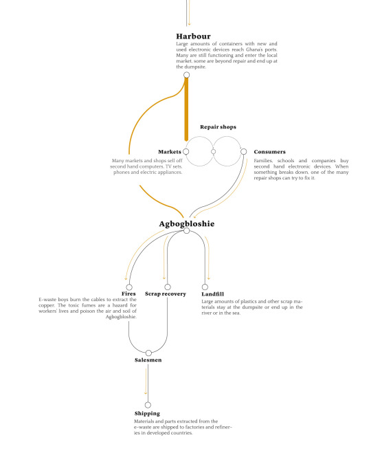
Figure 2: The flowchart of how to deal with the E-waste in Ghana(Source:E-waste Republic, ALJAZEERA)
Figure2 shows the whole flowchart of the African how to deal with the E-waste from the developed countries. Firstly, large amount of new and used devices ,most of them are used devices, are transports to Ghana. Devices which still can be used are put into the second-hand markets and others are going to the repair shops and the fixed devices are selling to the consumers. Then the E-waste are transported to Agbogbloshie and the way to deal with them is to burn the E-waste, and then doing the scrap recovery. The remaining waste are plastics and other scrap materials are stayed at the dumpsite or end up in the river or in the sea.
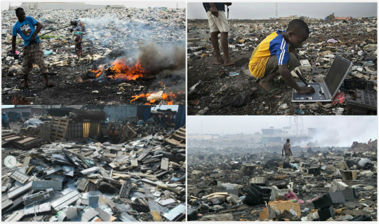
Figure 3: The photo of current situation in Agbogbloshie

Figure 4: Urban features related to the e-waste processing industry within the Agbogbloshie and Old Fadama neighborhoods

Figure 5: The Agbogbloshie e-waste processing site in Accra and its surroundings
Environment:

Air: An air control station installed in the Agbogbloshie dumpsite has detected iron, lead and copper. 1.5 milligrams per cubic metre of copper (the allowed threshold is 1.0 mg), 7.8mg/ m³ of iron (threshold: 5.0) and 0.72 mg/ m³ of lead (threshold: 0.15) have been found. These thresholds are meant for work areas, but Agbogbloshie is actually an entire area of Accra with about 90,000 inhabitants. (Journal of Health and Pollution, 2011)

Soil: Out of 100 soil samples collected in Agbogbloshie, more than half have shown an amount of lead which is over twice as much as the standards allowed by the United States Environmental Protection Agency (USEPA).The detected values range from a minimum of 135 ppm (parts-per-million) to a maximum of 18.125 ppm. The threshold indicated in the USEPA guidelines is of 400 ppm. (Journal of Health and Pollution, 2011)
Other impacts to air,soil and water:
“The practice of manual dismantling using hammers and stones and open-air-burning of e-waste has the potential of releasing several toxins and hazardous chemicals including carcinogens and neurotoxins (e.g., dioxins and furans) into the air, soil and water.
With e-waste containing significant amounts of toxic or hazardous chemicals such as mercury (Hg), lead (Pb), arsenic (As), cadmium (Cd), brominated flame retardants, and polychlorinated, in un-engineered landfills these could leach into soil, surface and groundwater causing serious environmental damage to crops and aquatic and human life.”
Humanity:

Blood:A team of researchers from Ghana and the United States have collected and analysed blood samples from Agbogbloshie workers. “The samples have revealed high levels of lead,” explains team researcher Onallia Osei, “and the amount of time in which one is exposed to e-waste seems to determine the amount of lead present in the blood.” (International growth centre)

Urine:Traces of iron, lead and antimony have been detected in the e-waste boys’ urine samples. Scientists speculate that these heavy metals originate from the fish and seafood around which the eating habits of Agbogbloshie’s inhabitants are based. (Science of The Total Environment – Volume 424, 2012)

Milk:Disturbing amounts of polychlorinated biphenyls (PCB) have emerged from the analysis of breast milk in the Agbogbloshie area. PCBs are highly toxic compounds found in old electrical appliances. The analysed samples have shown levels ranging from two to 34 times the threshold allowed by international PCB standards. (Environment International, 2011)
Inhabitants often suffer from chronic nausea, headaches , chest and respiratory problems.Workers often inhale lead, cadmium , dioxins , furans , phthalates and brominated flame retardants .
Children:
Exposure to these fumes is especially hazardous to children, as these toxins are known to inhibit the development of the reproductive system , the nervous system , and the brain in particular.
80% of the children have dangerous levels of lead in their blood.
Stakeholder:
Primary Stakeholder:
countries: United Kingdom, United States, Italy, Germany, Korea, Spain, France and other West Europe countries.
Companies: Philips, Canon, Dell, Microsoft, Nokia, Siemens and Sony.
The United States is definitely not the leading exporter.
Secondary stakeholder:
Workers in agbogbloshie
"We get a lot of health problems here, but we manage, because we need the money."

Figure6: Television monitors in tones to different African countries
Precedent 1:
http://ewastecenter.com/
Challenges:

As we can see that this website page is too simple, it cannot attract the attention of readers, the font is not formal and too dense. The color of the background and image are not enough contrast.

This part it looks too much confusion, e-waste and recycling is the most important part, but it put them under the Recent Events. The type font is too small and it is too difficult to read. And the page is too simple.
potential solutions:
I think the people should know more about the e-waste information, it should put the information content at the beginning, and it better to change the type font, because it is too difficult to read. The website contrast is not enough, it should add more images to make audiences’ interest. And the website not enough information for audiences, it should add more informations and add more data to convince audiences to do the recycle stuff, information on the content is not convincing, it should use more figure to attract readers.
Precedent 2:
http://www.e-wastes.com/locations.html
Challenges:

This banner is too simple , there is only a logo and Facebook link and it seems like it doesn’t have its own background, and the white background is own by the whole page. The words beside the Facebook logo is redundant. Too much words makes it not concise and those information is unnecessary.
Too much blank space between the website logo and the Facebook logo, I think the designer need to put more information(eg: other SNS logos like twitter and youtube) but less unnecessary text.

All the four page are in the same form. Let’s use the homepage as an example. Firstly, the font size of the menu bar and the main body is too small. The picture on the left side is look like an advertisement and the black text on this picture is not easy to read. Both the font and the color have some problems.
The layout of this page is simple, which is not bad, and it uses lines to separate the different part clearly, but it put everything in three little boxes which seems too crowded.
potential solutions:
Delete the text beside Facebook logo, and put more links like twitter, Tumblr and youtube logos there with the Facebook logo side by side and make them a little bit smaller.
Move the menu bar to the banner to fill the blank and give the banner a background color which is match to the whole page.
Make the layout to a vertical one, and give more space to every part. Therefore, the font size of the main body also has space and can be changed to a bigger one. Then find a proper place and move the picture to that place. Give every part of the main body a icon may makes this page more lively and improve the problem of inflexible feeling.
Put more information at the bottom of page. It can be the logo of SNS and repeat the logo this webpage. Put the address and the phone number in two different lines so that can be more readable.
Precedent 3:
http://interactive.aljazeera.com/aje/2015/ewaste/index.html
Effective: We think this website is very good, there are many we can draw lessons from.

As we can see this title, design is very vivid, images and fonts are showed images of electric burn.Let audiences interested in this web page. It is very attract readers, let them have a desire to look down.

it used many various data such as histogram analysis diagram, very persuasive, and simple, reader easy to understand.

This website has lots of part, Each part has a transition diagram. The classification is clear, it will not cause readers confusion, and easier to understand and it looks cute, let people interest in the following part.

Each part has a video to show the e waste situation, video will be more persuasive, because people see this place‘s real situation, compared with images and text, video is more to know the seriousness of the matter.

Text and images mix together have a very good feeling, because when the topic change, then the photo will change too, it is like you are being in that situation.
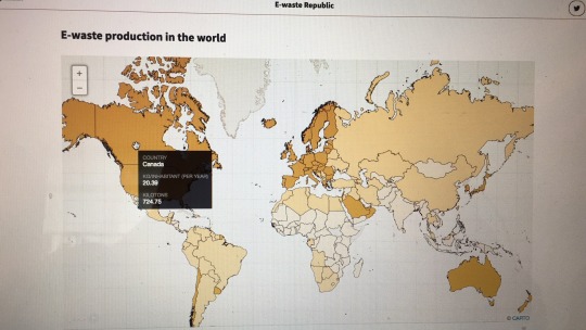
The mouse point to the map, will display the name of the country and the pollution degree. It is very convenience to the people to know more information about the world pollution.
Reference
https://www.theguardian.com/environment/gallery/2014/feb/27/agbogbloshie-worlds-largest-e-waste-dump-in-pictures
http://interactive.aljazeera.com/aje/2015/ewaste/index.html
https://en.wikipedia.org/wiki/Agbogbloshie
http://www.scidev.net/global/digital-divide/multimedia/electronic-waste-dump-supplies-ghana.html
http://www.smithsonianmag.com/science-nature/burning-truth-behind-e-waste-dump-africa-180957597/
Kyere, V. N. (2016). Environmental and Health Impacts of Informal E-waste Recycling in Agbogbloshie, Accra, Ghana: Recommendations for Sustainable Management (Doctoral dissertation, Dissertation, Bonn, Rheinische Friedrich-Wilhelms-Universität Bonn, 2016).
0 notes