#sitting in my drafts for a while
Explore tagged Tumblr posts
Text
Meeting Jake Kim for first time
You start working on Big Deal street
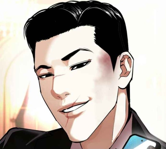
You're a fashion student at Jaewon High, and unlike most of your classmates, you have a genuine interest in fashion.
However, you're not learning much these days and all you seem to have are self study sessions. The teachers never turn up half the time.
Trying to gain some actual work experience, you've applied to some of the bigger fashion houses all the way to dinky back street stores but you never get very far.
Luckily, there's a friend of a friend of the family that said they know somewhere that could help you. There won't be any pay but you'll pick up some skills in no time.
.
.
You come out of the tailors with a spring in your step. The interview went well and they said you can start next week! You happily make your way back to the bus stop.
The commute is a pain and Gangseo is a bit far from your house, but you need the experience.
"... Erm, I think I have nice eyes..."
"Yeah Jerry!! You do!"
"Girls love nice eyes!"
"You know what they say, they're windows to the soul."
You overhear the 4 guys talking in front of you.
"Well I don't think I have a best feature," A pause. "I'm perfect everywhere."
You hear that and scoff immediately. This person has no shame.
He notices your reaction and turns to look at you.
"What, you don't agree?" He flashes you a smarmy smile and you notice the scar over his mouth. "Well what do you think it is?"
"Your shamelessness!" you blurt out.
That's one way to get them to notice you. All 4 thugs now turn their attention on you and you realise that your big mouth has gotten you into trouble again.
They look intimidating and strong as shit. Fuck, there's no way you can fight them off and if you run they would definitely catch you.
The street looks empty.
There's no one around to help you.
"Well sometimes it's good to be shameless," The 'perfect' guy gives you a wink right before noticing your nervousness and fearful expression.
"Sorry miss, just making conversation... Come on guys let's go," he signals at them. "Let's go get some noodles."
"Again, Jake?! I'm so sick of noodles!" one of them moan as they walk off.
.
.
You're working another shift in the shop today. It's been a month since you've been employed at the tailors and you've picked up some basic dressmaking skills.
A nice patient old lady owns the shop and she likes filling the silence with stories about the history of the street and Big Deal.
You have since learned who Jake is and cringe every time you think about how you 2 first met.
The door bell jingles, signalling a customer.
"Oh hey, it's you!" Speak of the devil. In walks the leader of Big Deal.
It's the first time you've seen him since then, and you're surprised he still remembers you. You were hoping he had forgotten your face and how rude you were.
"H-hello! How can I help?"
"Oh I was just wondering if there was anyway to loosen this area here?" Jake turns around, "I think my butt has gotten bigger and it's a bit uncomfortable."
It's a bizarre request but you don't have the luxury of being able to turn away business.
"Erm, that is a difficult area but I can have a look..."
You check out his behind, purely for professional purposes of course.
"Huh, it is pretty perky... " you mutter to yourself, "...maybe this is your best feature-"
SHIT. Blood rushes to your face. You can't believe you actually said that outloud. You quickly look at him, hoping that he didn't hear you... and find him staring back.
You seem to have caught him offguard, his eyes widen as your words sink in.
You're on the receiving end of another wink, "If you think so, then it must be true!"
Dear god, just let me die.
"...So I'm Jake. What's your name?"
"Y/N..." You were pretty sure you are as red as a tomato. "Erm, I know who you are..."
"Don't believe everything you hear, Y/N." Jake gives you a soft smile. "I'm looking forward to seeing you around."
#sitting in my drafts for a while#cheesy but jake makes me cheesy#lookism#lookism headcanons#lookism hc#lookism x reader#jake kim#kim gimyeong#kim gimyung#jake kim x reader#lookism fanfic#lookism fic#lookism manhwa#lookism webtoon#wannaeatramyeon
333 notes
·
View notes
Text
86K notes
·
View notes
Text
are we still doing bill cipher angst ?
#this was sitting in my drafts for a while#gravity falls#bill cipher#the axolotl#the book of bill#fanart#art#digital art#animatic#animation#artists on tumblr#hummise art
1K notes
·
View notes
Text
---
#dnd#dungeons and dragons#artists on tumblr#art#ocs#marsilio#had this redraw in mind for a while#mid pose is from “Paolo and Francesca” by Frank Dicksee (1894)#another couple that ended well............#old piece thats been sitting in my drafts
2K notes
·
View notes
Text
mc releasing their inner alpha
#obey me#obey me nightbringer#mc#this has been sitting in my drafts for a while now so here y'all go
1K notes
·
View notes
Text
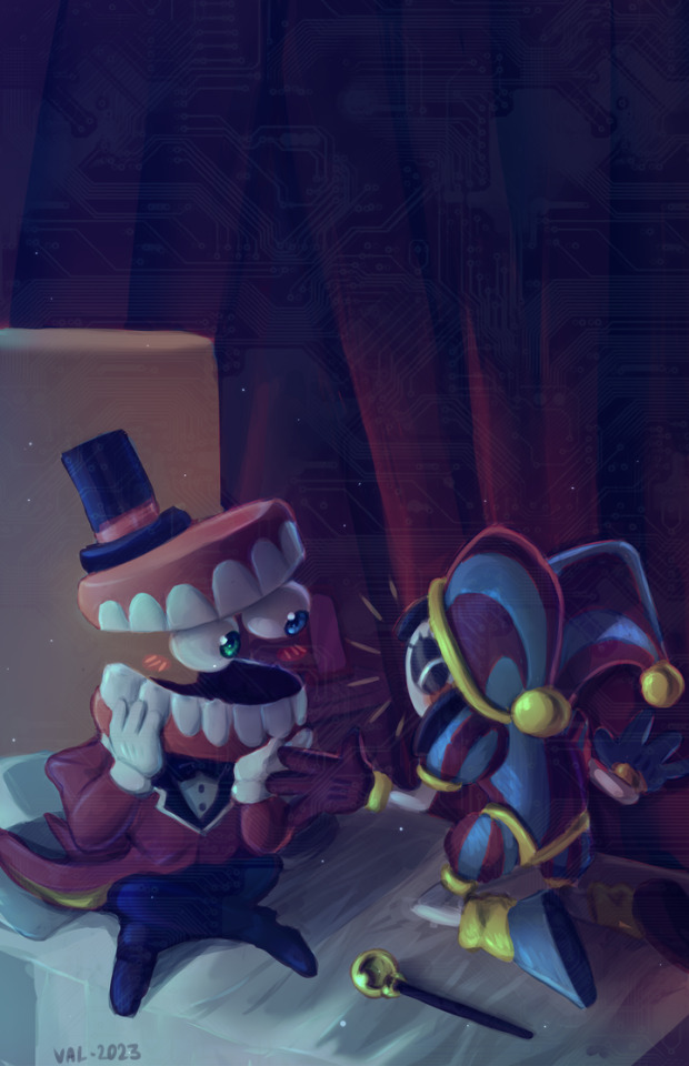
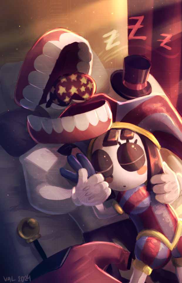
You have my whole (digital) heart
#tadc#the amazing digital circus#tadc caine#tadc pomni#caine#pomni#showtime#caine x pomni#pomni x caine#tadc showtime#showtime ship#showtime shipping#my art#FINALLY I've finished this set!!!!!!!!!!!!#pardon the quality change this has been sitting in my drafts for a while#anyway. they should cuddle#pretend there's some semblance of a real day/night cycle in the digital world
3K notes
·
View notes
Text
Den and her new friend deserve a nap after dealing with that tunnel man
#slay the princess#the long quiet#stp den#stp fanart#kekdoobs#fanart#stp spoilers#spoiler tag as a more a tentative thing#but better safe than sorry ig#kinda the reason it's been sitting in my drafts for a while
537 notes
·
View notes
Text
They're the best of each other!
#Something that was meant to be just a quick little drawing of Pete and Steph#I really havent drawn them all that much#and i wanted to work on my steph design#I have a ton of art in my drafts that I have yet to post#so i'm just posting these while I work on more pulp art#idk i thought this was cute#Oh guess what- i got a new facts book#so i'm gonna start doing the fun facts again!#fun fact: squirrels can climb trees faster than they can run on the ground#there are so many squirrels where I live and just about everytime I'm driving in my neighborhood I get scared I'll hit one#the little shits just really love sitting in the middle of the road until the last second smh#hatchetfield#starkid#team starkid#nerdy prudes must die#npmd#starkid npmd#steph lauter#stephanie lauter#mariah rose faith#mariah rose faith casillas#pete spankoffski#peter spankoffski#joey richter#my art#lautski
985 notes
·
View notes
Text
"...I will never be that girl of four years ago. Half of me... will always be pain." "Are you certain you will ever be happy again?" "No. But what if- someday- I was."
#My art#I am once again asking you to read Kill Six Billion Demons#Kill Six Billion Demons#KSBD#K6BD#CW Nudity#This had been sitting in my drafts since May and I suddenly felt inspired to finish it (=read as: ''hit with procrastinitis'')#I'm allowed to draw a lil tiddy every once in a while. As a treat#I know Allison doesn't have abs shhhhhh I'm also allowed to draw a lil abs as a treat
872 notes
·
View notes
Text
tfw you fall in love with your computer
(I imagine Connor transfers his program into a body at some point after androids are invented because I need them to have a happy ending lol)
#detroit become human#dbh#hankcon#dbh fanart#detroit become human fanart#hank x connor#hannor#dbh connor#dbh hank#detroit become human connor#detroit become human hank#Hank Anderson#Connor rk800#glass art#noodle art#ive had this sitting around for a while in my drafts and im just gonna post it!!! im too tired to colour it all lol
503 notes
·
View notes
Text
jakey + dirkjake sandwiched between my organic chem notes. a poem in there somewhere
#homestuck#hom3stuck#home24uck#home2t4ck#jake english#dirk strider#erisolsprite#brobot#dirkjake#admin draws#fanart#ok so the latter two are. a bit old and drawn in a rush because as usual i had thoughts about dirkjake and hair BUT ALSO#while reading the post-timeskip chatlogs i was like hm jake's hair looks kinda long here. i might be crazy tho#and then i continued thinking. because Ive had jakes haircut and t has to be trimmed often and i dont trust his ass to competently do that#so i think brobot helped out there and post entry it fell on dirk to trim it#and i think as their relationship worsened the first thing to properly go was the haircuts. because jake couldnt be assed to sit in dirk's#company for the duration of a haircut. direct line of strider word vomit while ur held captive basically (massive overdramatization)#so. its a good thing he got interrupted after trying to cover the tattoo up. because i guarantee you he wouldve been waking up on that#quest bed with breakup bangs.#finally formatted this one in drafts to post so im not leaving yall too high and dry again#i see my askbox and i appreciate it btw! its terraria night but i hope to be drawing tomorrow :]
763 notes
·
View notes
Text
Austin with Benny’s tattoos
#austin butler#benny cross#the bikeriders#this has been sitting in my drafts for a while#interview#its an old one but so pretty
457 notes
·
View notes
Text
Tried my hand at a human Raph design, figured I should share :)
#rottmnt#my art#why is coloring digitally so hard :’)#I’m still very new to it lol#rottmnt raph#not really proud of this but it’s been sitting in my drafts for a while
4K notes
·
View notes
Text
✨ Simple Gif Colouring for Beginners ✨
I wrote up my basic gif colouring process for a friend recently, but a couple of people here mentioned they'd also find it helpful! so, as requested, this is a beginner-friendly walkthrough of the way I colour my gifs :) it's aimed at brand new gif makers with no prior experience with photoshop or photo editing.
when I first started gif making I found colouring and photoshop in general suuuper daunting, so I've tried to simplify everything here as much as possible. hopefully this will be relatively easy to follow and not too intimidating!
a couple of things to begin with:
I'm only talking about colouring here - this is not a full gif making tutorial. I've linked to some of my favourites of those here!
I personally like to make bright, 'clean' looking gifs with vibrant but natural colours, so that is the style of colouring this tutorial is geared towards. most of gif colouring is subjective and about personal taste - the only thing that I'd say is possible to get wrong is skin tones, which I talk about a lot in this guide.
as I mostly gif Thai dramas, most of the advice is geared towards colouring for East Asian/South East Asian skin tones - but the techniques should be fairly universally applicable (and here are some tutorials that talk about gif colouring for other skin tones).
I'm not an expert! I'm not claiming this is the best or the only way to colour gifs - it's just how I do it.
this post is very image-heavy. if the images aren't loading (or the gifs are running slowly or cutting/looping weirdly), then try viewing the post in its own tab (rather than on the your dash or someone's blog) and refreshing the page.
okay, full walkthrough beneath the cut!
contents:
1. intro a. natural gif colouring goals b. very very basic colour theory 2. super simple colouring (the essentials) a. curves b. selective colour (and skin tone correction) c. hue/saturation d. saving and reusing colouring e. another simple colouring example 3. other adjustment layers a. brightness/contrast b. levels c. vibrance d. colour balance e. channel mixer 4. troubleshooting a. curves b. saturation 5. fin!
1. intro
the colouring part of gif making can be super overwhelming, especially if (like me when I first started!) you're completely new to photoshop and/or have no experience with colour theory or photo/video editing.
if you're opening photoshop and making gifs for the first time, I highly recommend getting used to making a few basic, uncoloured gifs to begin with. just to practice, rather than post anywhere (though you can always come back and colour them later if you want) - but it'll make the rest of the process much easier if you're already beginning to get used to working in timeline mode of photoshop. give yourself a bit of time to practice and get a feel for things like how many frames you tend to like in a gif, where you like to crop them for the best loop, what kind of aspect ratio you like etc* - so that you're not trying to navigate all of that for the first time on top of everything else!
* frames: for me between 60-90 frames is ideal, but 40-120 frames is the absolute min-max I'd personally use in a normal gifset loops: for the smoothest loops, try to avoid cutting someone off mid-movement or mid-word if possible. aspect ratio: for full-size (540px) gifs, I tend to go for either 8:5 (slightly 'skinnier' gifs), 7:5, or 5:4 (particularly big, thick gifs lmao)
✨ natural gif colouring goals
part of what can be so daunting about starting gif making is not knowing where to start or what you want to achieve. this is definitely something that gets easier with practice - the more gifs you make, the more you'll get a feel for what kind of look you like and the more instinctively you'll know how to get there. it also helps to see if any gif makers you like have made "before and after colouring" posts - these can help with getting a sense of the kinds of changes made through gif colouring. here's one I made!
in general, I like to make my gifs bright and 'clean' looking, with vibrant but natural colours. these are the things I'm usually hoping to achieve with colouring:
brighten dark scenes
remove muddy, yellowish lighting or filters
saturate colours
correct any skin lightening filters or overexposure
make lighting and colours as consistent as possible between gifs within a single gifset, especially gifsets featuring gifs from multiple scenes/episodes/videos
this guide is focusing on natural colouring, but of course there are many cool ways to make stylised/unnaturally coloured gifs. imo you'll need to master these basics first, but if you want to learn how to do things like change the background colour of gifs or use gradients or other cool effects, then @usergif's resource directory has loads of super helpful tutorials!
✨ very very basic colour theory
[disclaimer! I don't know shit about fuck. I do not study light or art. this is just an explanation that makes sense to me exclusively for the purposes of gif making.]
the primary colours for light/digital screens are red, blue, and green. having all three colours in equal measures neutralises them (represented by the white section in the middle of the diagram).
so to neutralise a colour within a gif, you need to add more of the colour(s) that are lacking.
in practice this usually means: the scene you want to gif is very yellow! yellow is made of red and green light, so to neutralise it you need to add more blue into your gif.
it can also mean the reverse: if you desaturate the yellow tones in a gif, it will look much more blue.
looking at the colour balance sliders on photoshop can make it easier to visualise:
so making a gif more red also means making it less cyan.
removing green from a gif means adding magenta.
taking yellow out of a gif will make it more blue.
tl;dr:
neutralise yellows by adding blue (and vice versa)
neutralise reds by adding cyan (and vice versa)
neutralise green by adding magenta (and vice versa)
2. super simple colouring (the essentials)
starting with a nice sharpened gif in photoshop in timeline mode. (these are the sharpening settings I use!)
some scenes are much harder to colour than others - it helps to start out practising with scenes that are bright/well-lit and that don't have harsh unnaturally coloured lights/filters on. scenes with a lot of brown/orange also tend to be harder.
I usually save a base copy of my gif before I start colouring just in case I end up hating it, or find out later that it doesn't quite fit right into a set and need to redo it etc.
so here is my base gif!
it's an okay gif, but it has a bit of a yellow tint to it that I want to reduce.
colouring is easiest to do in adjustment layers, which can be found under layer -> new adjustment layer - or for me they are here:
there are lots of different types of adjustment layers that do lots of different things - but for me the absolute essentials for colouring are curves, selective colour, and hue/saturation.
I also use brightness/contrast, levels, exposure, vibrance, colour balance, and channel mixer sometimes, depending on the gif - but I use curves, selective colour, and hue/saturation on every single gif.
✨ curves layer
the first thing I always do is a curves layer. when you first open one it will look like this:
first I usually click the ‘auto’ button, just to see what happens. sometimes it makes a big difference (it usually brightens the gif a lot) - but on this gif it didn’t do much.
if it had made the gif look nicer then I would have kept it and added a second curves layer on top to do the rest of these steps.
the next step is selecting the white and black points with the little eyedropper tools.
the bottom eyedropper lets you pick a white point for the gif. click somewhere super light on the gif to see what happens - for this gif, I clicked on the lampshade on the left. if it looks weird, I just undo it and try somewhere else - it usually takes a few goes to find something that looks good.
here's what that did to the gif:
then I pick the top eyedropper and use it to pick a black point by clicking somewhere really dark, again playing around until I find a black point that looks good.
here's what the gif looks like after picking the white and black points:
this can take some experimenting, but you can make super easy drastic changes to your gif just with this. in this case, the curves layer took out a lot of that yellowy tint.
and this is what the curves graph looks like now:
you can click and drag those lines to make further changes if you want - I usually leave them alone though. the colours of the lines indicate which colours have been changed in the gif - for example, you can see from that steep blue line on the graph that blue has been added to neutralise those yellows.
next I usually do another curves layer and just press the ‘auto’ button again to see what happens. usually it brightens the gif a bit more, which I like.
‼️if nothing is working: usually with a bit of fucking about a curves layer works well - but sometimes you can’t find a good white and black point anywhere, and instead your gif turns wacky colours and nothing looks good. this happens more often with very heavily colour tinted scenes :( the troubleshooting section at the end goes over some options, including starting with a levels layer instead.
✨ selective colour (and skin tone correction)
skin tones are made up of a mixture of yellow and red.
removing yellow (or adding blue or red) to a gif will make the skin-tones too red - and removing red (or adding cyan or yellow) to a gif will make the skin-tones too yellow.
adding blue to this gif with the curves layer took out the yellowy tint, which I wanted - but it also took the yellows out of Kim's skin tone, which I don’t want. so I need to put yellow back into the skin tones specifically - without putting it back into the rest of the gif.
selective colour layers let you select an individual colour and adjust the levels of other colours within that colour. you can change how yellow the green shades are, or how much cyan is in the blues, for example.
I need to add yellow back into the red tones to correct the skin tones on this gif. this is the case for most gifs in my experience - the vast majority of the time, unless a scene is very heavily tinted in another colour, a curves layer will add blue/remove yellow.
in the 'colors' dropdown, select the 'reds' section and drag the 'yellow' slider higher - this will add more yellow into just the red shades within the gif.
the amount of yellow you need to add back into the reds depends on how much yellow was taken out of the gif initially - I just play around with the slider until it looks right. if you're not sure, it helps to have some neutrally-coloured (not white-washed!) reference photos of the people in your gif to compare to.
here's the result. Kim's skin is a lot less pink toned and much more natural looking:
✨ hue/saturation
this adjustment layer lets you adjust the hue and saturation of the gif as a whole, and also of each colour individually.
I don't use the hue or lightness sliders unless I'm trying to do something more complicated with the colouring.
clicking the dropdown menu that says 'master' lets you edit the saturation of each colour individually. this is useful if your gif is still super tinted in one colour.
I thought the yellows on this gif were still slightly too bright, so I switched to the yellow channel and desaturated them slightly. (remember if you do this then you need to go back to selective colour and add more yellow into the red skin tones to balance out the desaturation!)
then I increased the 'master' saturation of all the colours to +5:
I usually find the right amount of saturation is somewhere between +5 and +12, but it depends on the gif.
‼️if the gif feels undersaturated, but the saturation slider isn't helping/is making the colours worse, try a vibrance layer instead.
done!
✨ saving and reusing colouring
you can copy and paste adjustment layers between gifs to make your colouring even across each of your gifs for one scene - so if you're making a set of multiple gifs of the same scene, or you think you might want to gif the same scene again in the future, you can save it as a psd so you can reuse the colouring again later.
each gif's colouring will then still need tweaking - different cameras/angles/shots of the same scene can still start out with slightly different colouring.
I recommend uploading the gifs as a draft post on tumblr so you can see what they all look like next to each other and catch any inconsistencies.
✨ another one! (speedrun!)
HI KEN!
the white point for the curves layer was in the window behind them.
the curves layer removes the muddy yellow tint, but again it makes their skin tones (especially Ken's) very red toned, which is adjusted by the selective colour layer.
3. other adjustment layers
imo many many gifs can be coloured really nicely with just those three adjustment layers, but some need different adjustments.
✨ brightness/contrast
pretty self explanatory!
I personally usually avoid using the 'brightness' slider because I rarely like the effect - I only tend to use the 'contrast' one.
the 'auto' button is sometimes useful though, especially if you’re struggling with the curves layer.
✨ levels
levels alters the white and black points of the gif, like curves - but unlike curves it doesn't also alter other colours.
use the sliders beneath the graph to alter how dark/light the gif is. you can slide the black slider further to the right to make the blacks darker, and the white slider to the left to make the whites lighter.
levels is a good place to start if your curves layer isn't working.
(I'm going to hit the image limit for this post lol so here are some screenshots of a table I made to demonstrate this rather than actual gifs. sorry!)
on both sides, I dragged the sliders up to where the big jumps are on the graph - this is usually a good place to start!
✨ vibrance
vibrance... makes the colours more vibrant. it's more subtle than saturation.
it's really helpful for gifs that feel grey. sometimes adjusting saturation just makes the greys kind of weirdly tinted, but a vibrance layer can fix that.
vibrance is much more subtle!
✨ colour balance
colour balance affects the overall balance of colours within a gif.
it's good for scenes with heavy tints.
I tend to stick to the 'midtones' dropdown, but you can also alter the colour balance within the shadows and highlights if you want.
✨ channel mixer
I avoided channel mixer for such a long time because it scared me. but it's great for scenes that are very heavily tinted in one colour.
basically, it works with the levels of red, green, and blue within a gif. you select an output colour and then play around with the levels of the colour you selected within each other colour.
kind of the reverse of selective colour?
so in the 'blue' channel, the levels of blue are at 100%, and the levels of red and green are at 0% - but you can impact how much blue is in the reds and greens and blues.
this tutorial explains it well - but imo the best way to get to grips with channel mixer is just to play around with it a bit (sorry)
(when I made this guide for my friend, I also made a slightly more complicated gif colouring walk-through that included using channel mixer. there isn't space to include it within this post, but if anyone is interested I could always upload it as an 'intermediate' gif colouring tutorial - lmk!)
4. troubleshooting
‼️curves
usually with a bit of fucking about a curves layer works well - but sometimes you can’t find a good white and black point anywhere, and instead your gif turns wacky colours and nothing looks good. this happens more often with very heavily colour tinted scenes :(
for example, with this base gif:
using many of the brightest points as a white point turn it wacky colours, like this:
yikes :(
some options for these cases:
try brightening the gif first with the 'auto' button on the curves layer or with a levels layer. having a brighter gif to start with can give you better options for picking a white point.
try finding an alternate, whiter/brighter white point. look for places the light reflects - on this gif, using the light on Porsche's cheekbone works well as the white point. it also helps to find places that would be white if the scene wasn't tinted - the lightest part of a white shirt is often a good place to start, for example.
skip the curves layer, and instead use a levels layer to alter your white/black points, and colour balance or channel mixer to balance the colours.
‼️over/undersaturation
if your gif (especially the skintones) is looking a little washed out or lifeless, it might be undersaturated. boost that saturation - or if that's not working, try a vibrance layer.
oversaturation is often easiest to spot in the mouths and ears of any people in a gif. if the mouths are looking unnaturally, vibrantly red, then you've gone too far with the saturation.
5. fin!
and done! I hope this was coherent helpful to somebody.
if there's anything that I've missed or that doesn't make sense pls feel free to shoot me an ask or a message and I'll do my best to help! I've also collated a bunch of additional reading/resources below.
happy gifmaking 🥰
✨ some links!
photoshop basics by @selenapastel
gifmaking for beginners by @hayaosmiyazaki
gifmaking guide for beginners by @saw-x
dreamy's gif tutorial by @scoupsy-remade (includes instructions on how to blur out burned-on subtitles or annoying video graphics)
beginner's guide to channel mixer by @aubrey-plaza
how to fix orange-washed characters by aubrey-plaza
colour correcting and fixing dark scenes by @kylos
does resampling matter? by usergif
how to put multiple gifs on one canvas by @fictionalheroine
watermarking using actions by @wonwooridul
resource directory by @usergif
#i got a couple of asks about this so i figured i'd type it up as a post#it's been sitting in my drafts for a while now though i'm so sorry omg.#i had to replace my laptop and it took me a while to get round to downloading photoshop on the new one#but i hope this is helpful!!#gif making#tutorial#photoshop tutorial#colouring tutorial#coloring tutorial#gif colouring#gif coloring#photoshop resources#gif tutorial#gif resources#userbunn#uservik#darcey.txt#darcey.gif#usergif
676 notes
·
View notes
Text
what if a duck and an alien were lesbians together
[ID: a drawing of della duck and penumbra from ducktales. penumbra looks surprised as della wraps around her waist for a hug. end ID]
#this has been sitting in my drafts for a while now so I thought I'd post it#ducktales#ducktales 2017#della duck#penumbra#fan art#lesbian#sketches#digital art#art#gay#lieutenant penumbra#dellumbra#<- is that their ship name?
372 notes
·
View notes
Text
take this silly thing while I struggle with animation
#showtime#showtime tadc#showtime ship#caine x pomni#pomni x caine#this has been sitting in my drafts for a while Im glad the concept has been acknowledged#here it is in meme format#also small update on the animation thing. I'm learning music theory just for it.#the things these two idiots in love make me do#my art#meme
3K notes
·
View notes