#singapore 2010
Explore tagged Tumblr posts
Visit Tumblr Blog
Explore Tumblr blogs with no restrictions, modern design and the best experience.
Last Seen Tumblr Blogs


Fun Fact
Tumblr is used by 21% of adults online aged 18-29 years.
Text


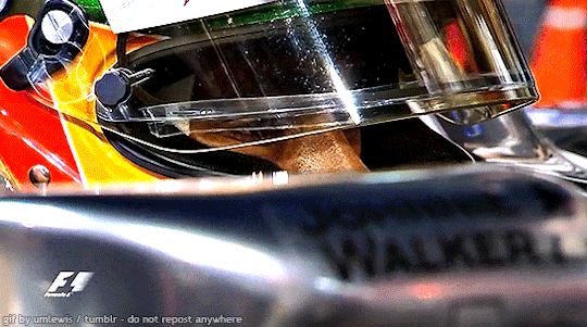
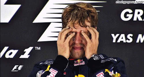
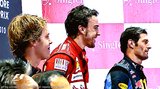
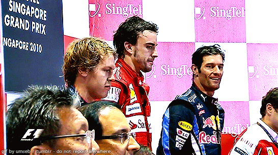
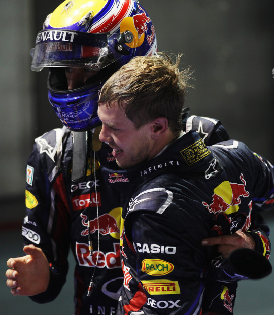
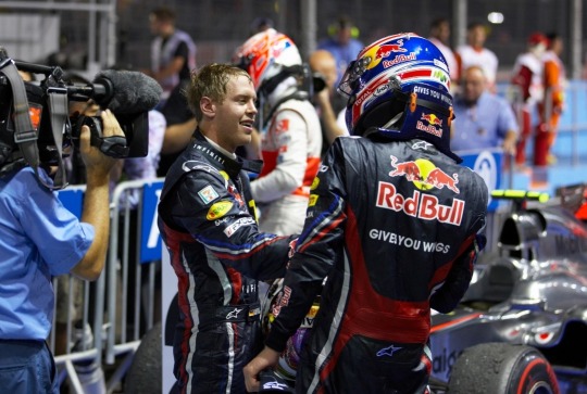
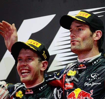
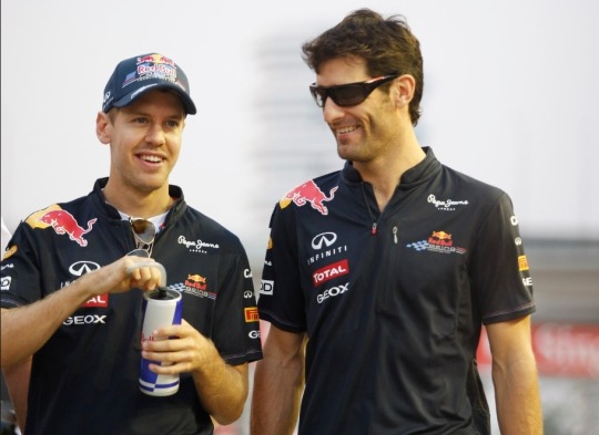
sebastian vettel, p2, in the cool down room after the race, singapore - september 26, 2010
#sebastian vettel#f1#formula 1#singapore gp 2010#flashback fic ref#flashback fic ref 2010#singapore#singapore 2010#singapore 2010 sunday#tw flashing#tw transphobe
166 notes
·
View notes
Text


Vintage SoohoDabi please be real to me
#olympic mascots#foolonthesubmarine#mascotverse#olympic mascot au#olympic mascot headcanons#olympic games#pyeongchang 2018#singapore 2010#gangwon 2024#ship#ship art#soohorang#Bandabi#soohodabi#moonlitguardian#lyo and merly#lyo#merly#moongcho#70s#60s
14 notes
·
View notes
Text
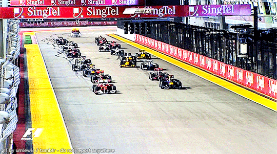
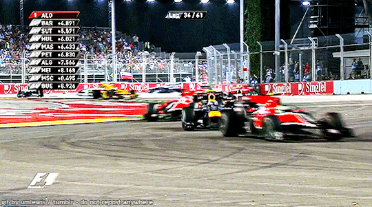
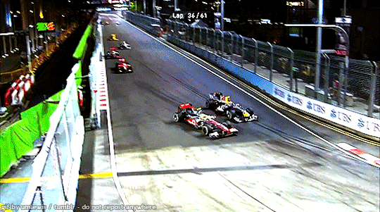
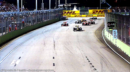
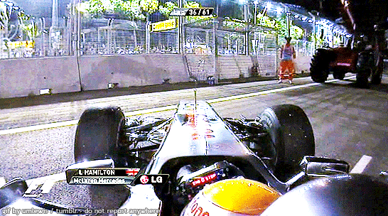
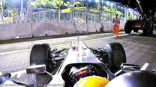

singapore, p19 // september 26, 2010
#lewis hamilton#f1#formula 1#singapore gp 2010#flashback fic ref 2010#singapore#singapore 2010#singapore 2010 sunday#tw crash
19 notes
·
View notes
Text
Cannot stop thinking about how Fernando was the first one to hug Seb after Monza 2008:
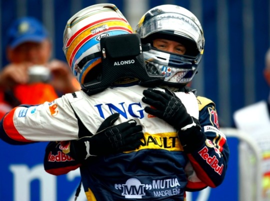
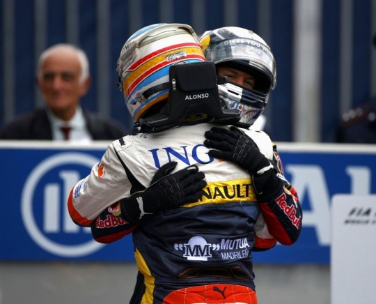

#two men who are not afraid to hug with both arms sjfklfl#but seriously fernando especially is always going full in on hugs(rather than the typical one handed) and i respect it#BUT GODDDDDD THAT HE WAS THE FIRST!!!!!! LITERALLY MURDERED ME#ive literally watched this race before and i didnt even notice#i think i wanted to see if there were pics of them from before 2009 and came across this and was so OH?????#fun fact if you look at my gallery from during the past gp +#its literally a mix of sad reaction pics and vettonso pics. what singapore does to a man. :')#but god i feel so abnormal about this hug. its just veru sweet to me okay!!!#vettonso is fun bcs theres not as much content so every little bit is very precious and important to me <3#likeeeeee how close they hug each other and the way theyre still close when they pull back to look at each other!!!#i wonder what theyd be like if they hadnt been rivals. but tbh on the other hand their animosity is why I like them !#but ofc very sweet to see them when the slate was blank bcs then im like hmmm how long until 'fuck you my boy' happens#well! you guys know theyre my brainrot nowadays :D#watching 2010 will be fun bcs its literally primetime for all my ships#f1#formula 1#sebastian vettel#fernando alonso#vettonso#we do a little bit of f1#2008 italian gp
310 notes
·
View notes
Text


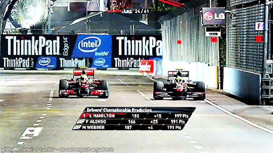
Sir Lewis Hamilton after DNF in Singapore (2010)
#lewis hamilton#sir lewis hamilton#mclaren lewis#mclaren hamilton#mclaren racing#mclaren#singapore gp#singapore grand prix#Singapore 2020#Singapore gp 2010#Singapore grand prix 2010#f1#formula 1#formula one
18 notes
·
View notes
Text

71 notes
·
View notes
Text
yall let's chat tell me in the tags what your comfort race is (i.e., what race/set of races do you go back to watch when you need a boost)
#I'll go first : pretty much any seb win . unsurprisingly#monza 08#malaysia 2015#AD 2010#singapore 2019#brazil 2012#india 2013#formula 1#f1
32 notes
·
View notes
Video
youtube
Pastel Power - Candyhearts
2 notes
·
View notes
Text
this race is like getting a glimpse into an alternate universe where this season was actually good
#f1#singapore gp 2023#imagine if ferrari mclaren Red Bull and mercedes were evenly matched#it would have been like 2010
20 notes
·
View notes
Text

everybody moved on i stayed there
my comfort races..
#the gifs aren’t mine#only the sao paulo one is mine#charles leclerc#f1#f1blr#f1edit#f1 fandom#f1 ferrari#sebastian vettel#lewis hamilton#monza 2019#brazil 2021#abu dhabi gp 2010#singapore 2019#turkey 2020#bahrain 2022#sv5#cl16#lh44
97 notes
·
View notes
Text
No. 27 - Airline Alliances (oneworld, SkyTeam, and Star Alliance)

@imjustanobsessedjew asked me to follow up on my thoughts on airline alliance liveries, so I'm here to do that.
I struggle to find a good way to describe airline alliances. Examples I've pondered over and ultimately rejected on some or other technicality include fraternities, record labels, and TikToker content houses. But maybe it doesn't matter. I'm not here to talk about how they function broadly. It's not important to this post that you can use American Airlines miles to get tickets on flights operated by British Airways.
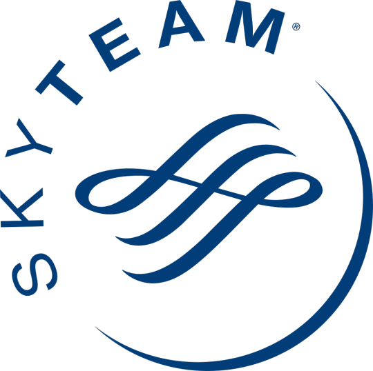
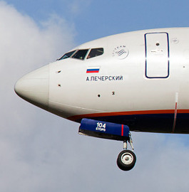
Generally, member airlines will have a symbol from their alliance painted on their planes. I showed an example in my SAS post of the Star Alliance logo on an airframe (center), but here are examples for the other two: an Aeroflot plane wearing the SkyTeam symbol (left) and an Iberia plane with a very, very small oneworld logo (right).
But sometimes this isn't enough for them. The three major airline alliances have a habit of painting planes in special alliance liveries. Because who cares if you're flying on Delta, XiamenAir, Kenya Airways, or TAROM - what's important is that they're part of SkyTeam.
I sort of just don't understand the purpose. I don't think anyone is going to see a Star Alliance livery and think "wow, I am reminded to specifically spend my money with these 26 otherwise completely unrelated airlines!" because that's...that's just really silly. While airline alliances can make it a lot easier to use frequent flier miles and neatly book multi-leg trips on the passenger's end, I've always been under the impression that these must do more for the airlines than they do for the end consumer, because otherwise they probably wouldn't exist. I'm not sure what the need is to advertise them to someone who has no say in their existence and probably picks their flights based on what Google tells them is cheapest anyway. Nobody has, like, brand loyalty to alliances, and there's no reason they should, since their member airlines will offer wildly different qualities of service and cover entirely different regions of the world.
So why the special liveries? Is it a hazing ritual? I can't really imagine what benefit they might offer over just putting your symbol somewhere else on the plane. Some kid sitting in the window seat of a plane that's delayed by an hour at a massive airport isn't even going to notice or care about a SkyTeam livery, and I honestly really should have put airline alliances on the questionnaire in some form because I'm not sure how many people know or care that they exist. I don't understand the point, and the only thing I do understand, really, is that I hate it when airlines which have gone through the trouble of designing their own livery, even if that livery is terrible, would then paint a plane in a way which makes it interchangeable with everything else on the tarmac. But they're fully developed (mostly) liveries, so they're the sort of thing I'm here to talk about. Without further ado: SkyTeam, oneworld, and Star Alliance.
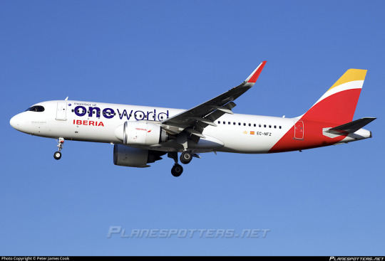
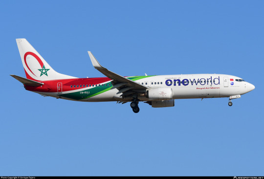
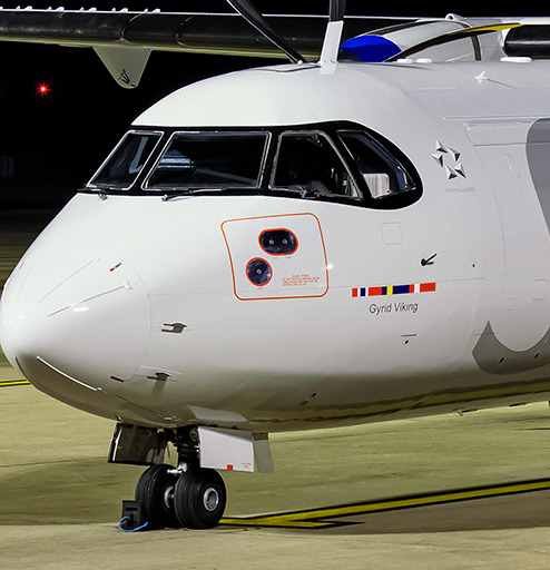
oneworld goes first because it's a bit different from the others. (Yes, the correct way to write it, as seen in all company literature, is with the first half bolded.) oneworld was founded in February of 1999 and is the third-largest of the major alliances.
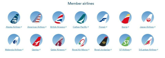
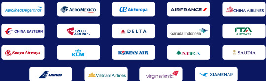
Currently, there are thirteen active oneworld members, shown above, plus their regional subsidiaries; S7 Airlines is currently suspended, as is the case for all Russia-based airlines in major alliances, and Oman Air will be joining the alliance by the end of 2024. Fiji Airways is also nominally involved as a 'connect partner', which as far as I can tell means situational benefits from the alliance when working with its member airlines. It feels like they're scrambling for a foothold a little despite having some absolute powerhouses among their ranks because they keep getting their members bought out by other alliances and/or merged into each other. I think I prefer it that way.
To begin with, the logo is atrocious. Blue-to-white airhrush gradient circle with big yucky sans serif lettering, half of which is bold and half of which is standard width, which leaves you unable to tell which half you hate more. This logo is really painfully early '00s website and not in the cute nostalgic way. It's not stylized in a way that provokes nostalgia, it's just so inept that it could fit in during the era where web design wasn't really a field that had been fully invented yet.
But as a livery, it's sort of hard to review. A oneworld paint job changes less than the average logojet.
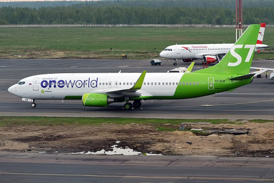
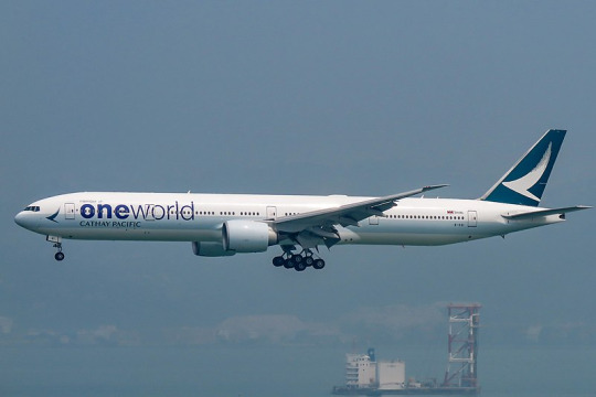
I'm not entirely sure if I can even consider this a special livery. It's just an extra line of text. Ugly text, sure, but I wouldn't call it a different design. This doesn't change the fact that you can immediately recognize these as an S7 plane and a Cathay Pacific plane because none of their livery is fundamentally changed.
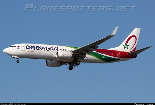
There's just a limited amount I can say about what's a glorified sticker. RAM gets to keep its nice little swirlies, all is right with the world, they get to keep the normal text on their other planes, this is not a big deal. Maybe they keep losing members because they can't tell them apart from other planes in the airport without a big, all-encompassing custom livery to make a select few unlucky planes airline-ambiguous. oneworld, more like...dumbworld.
Moving on in alphabetical order, SkyTeam is the second largest of the alliances.
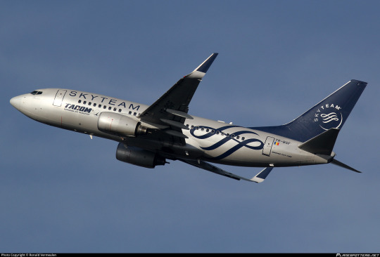
SkyTeam has 20 members: the above pictured, plus Aeroflot, which is temporarily suspended for the aforementioned Russian reasons. It also has its own elaborate system of 'associates' and 'affiliates', and a dedicated cargo alliance, SkyTeam Cargo.
I actually enjoy the SkyTeam logo. The wordmark is just a yucky thin monospace sans serif, but they have that nice flourishy design that's aesthetically pleasing and easy to recognize, and I can't knock that.
Still, this is where we get into proper airline alliance liveries. You have to zoom in pretty close to tell that the above planes are TAROM on the right and Korean Air on the left. I didn't have to specify, when covering oneworld, that the logo was framed by Iberia and Royal Air Maroc, because their branding was left intact. This is not so for SkyTeam, which takes over its hosts in full, creating SkyTeam planes with a tiny mark denoting their actual airline instead of the other way around.
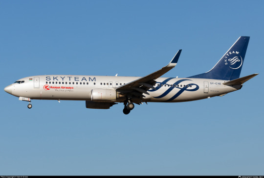
This could be a lot worse. It's got recognizable logos, legible text, and I think most crucially the main fuselage body is painted a mid-light grey. The opposite of something like the SAS belly stripes, which are cheapened by the proliferation of Eurowhite, SkyTeam sort of gets a free boost from the fact that their non-white fuselage is a rarity. I do really like the relatively lowered contrast between the main body and the logo, because this shade of blue is usually paired with stark white. The SkyTeam curlicue is big and visible on the fuselage. I would have made it bigger, but it's not terrible as is. The airline's logo is placed below the window line while SkyTeam's wordmark is above it, hypothetically giving them equal weight (though in reality I think people obviously read SkyTeam's first).
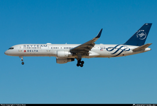
It certainly has Detached Tail Syndrome, but for my tastes the lower contrast and placement of the curlicue make it far more tolerable. Northing here is ostentatious or overdesigned, and while it falls short of true minimal elegance I truly can't say it's ugly and I don't think it's lazy, either. This is one of the few times the detached tail does feel at least slightly deliberate, given the non-blankness of the rest of the fuselage. The bits feel a bit separate sometimes, but it's nowhere near as bad as that effect can get.
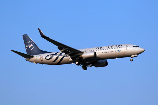
I'm going to give SkyTeam a B-.
I sincerely, earnestly, emphatically do not dislike the way the SkyTeam livery looks. But I still think it should not exist. Airlines should wear their own liveries. If you have 20 airlines, you should have 20 distinct fleets. I would rather have a bunch of mediocre or even bad liveries than one decent livery which doesn't belong to anyone at all.
Regardless, I do have to leave off on a fitting note. SkyTeam...more like WhyTeam.
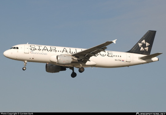
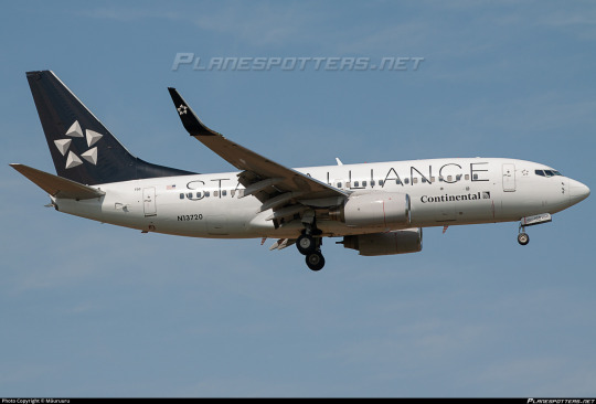
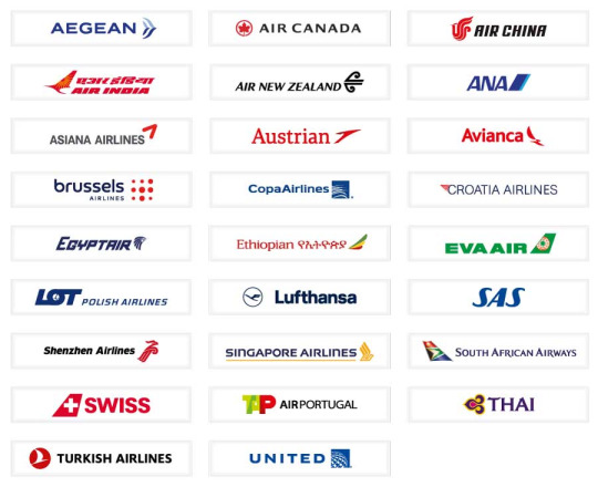
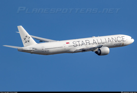
Star Alliance is the largest of the three alliances, with 26 member airlines.
In my SAS post, I introduced the Star Alliance Test, a metric by which I judge the the absolute worst designs which end up on this blog. The test consists of one question: would I prefer that all instances of this livery be replaced with a Star Alliance paint job? As I mentioned there, I chose Star Alliance because, like SkyTeam, it entirely overwrites the original airline's livery. Not only do I like it less than SkyTeam, it is also more prolific, with an entire six more airlines with planes begging to be ruined.
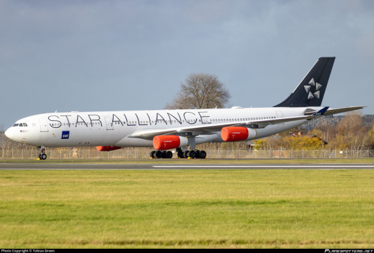
It is inoffensive nearly to the degree that it becomes offensive again. Big, ugly sans serif wordmark, though it at least has the decency to occupy the majority of the fuselage to prevent it from just being a white expanse. Detached tail. Teeny tiny airline logo that you have to squint to see.
Star Alliance liveries are both functionally identical to blank planes and dangerously close to actually being them. But they have just enough design that to me they avoid being nothing and graduate to minimalist. I think it's the large text and the fact that the actual logo is actually decently designed, but it doesn't evoke the sheer dread in me that something like Lufthansa does. It's not uninterrupted, unbalanced white, it's just...really, really boring.
I...honestly think it's a C-.
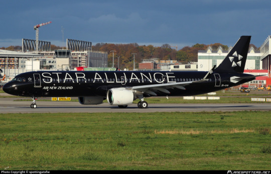
Air New Zealand and Singapore Airlines both have a variant livery, all black and all white respectively. I would rate them the same, I think. Maybe Singapore's is a little more boring while also feeling like more of a statement, while Air New Zealand's makes me very happy by being a primarily black plane (I am one of the few Airplane People who is also a consummate goth) but suffers from thin white-on-black text being fairly eyestrainy. In general, the Star Alliance wordmark is somewhat difficult to read. These two belong with the rest of the liveries, even though I think I ultimately like Singapore's a bit less than the default and Air New Zealand's a bit more.
While not a vehement condemnation, C- is not exactly a shining endorsement. When I devised my scale I did envision it as something of a normal distribution. Most liveries are going to be somewhere in the C range. This is cromulent. This is satisfactory. This does not make me angry.
It just makes me sad, thinking about all these airplanes wearing identical liveries. Sure, Copa and United already match, but this is an extremely varied set. It ranges from the painfully boring to the somewhat ugly to the actively nice, and all of them get replaced with identical stock liveries...an inter-fleet Scar Alliance.
While I rate these as competent liveries in terms of their appearance, I cannot pretend I do not hate everything they stand for. In my opinion, to paint your airplanes in a livery which makes it impossible to tell that the planes flanking the logo fly for Croatia Airlines and Continental respectively without zooming all the way in is the very definition of failure.
#tarmac fashion week#grade: b-#grade: c-#era: 2000s#era: 2010s#era: 2020s#royal air maroc#iberia#air new zealand#singapore airlines#s7 airlines#non-airline liveries#cathay pacific#compilations#requests#I only tagged the airlines that appear in liveries that are noticeably theirs
17 notes
·
View notes
Text

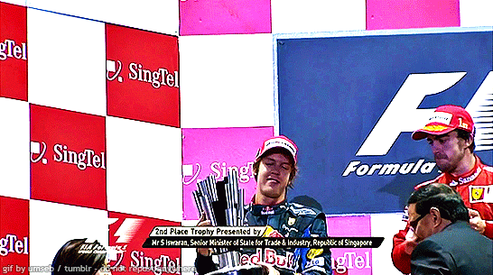
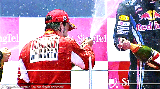
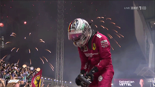
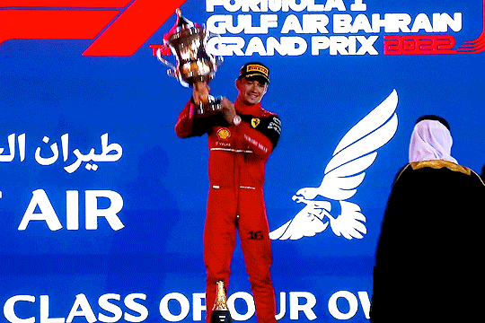
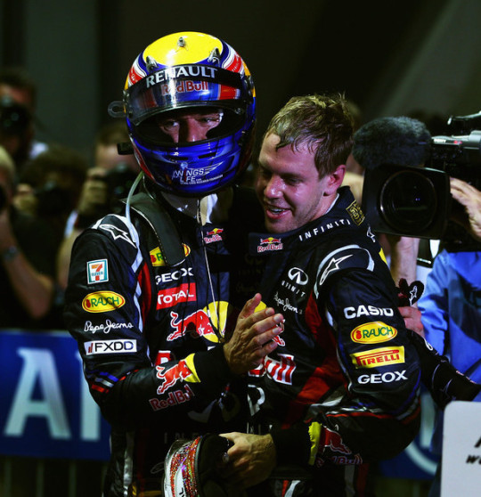
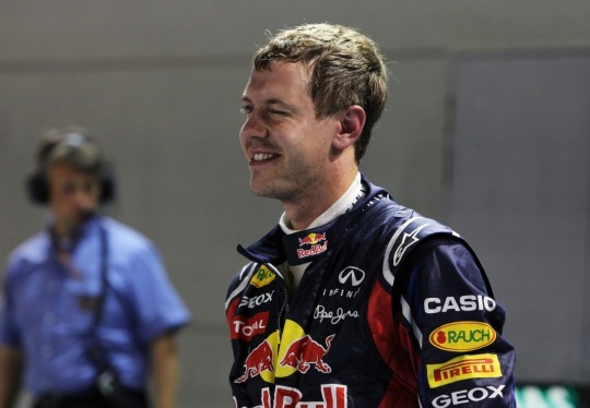
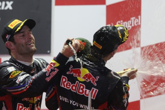
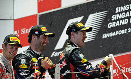
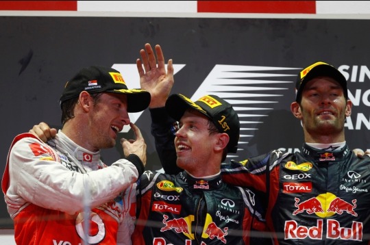
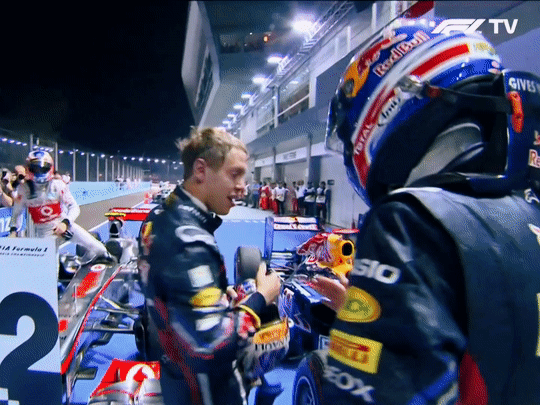
sebastian vettel, p2, celebrates on the podium, singapore - september 26, 2010
#sebastian vettel#f1#formula 1#singapore gp 2010#flashback fic ref#flashback fic ref 2010#singapore#singapore 2010#singapore 2010 sunday#fernando alonso#tw flashing#tw transphobe
70 notes
·
View notes
Photo

Pedro Pascal photographed by Doug Inglish for Augustman Singapore, October 2019.
#pedro pascal#doug inglish#augustman singapore#2019#fashion photography#photo shoot#fashion#photography#2010s
45 notes
·
View notes
Note
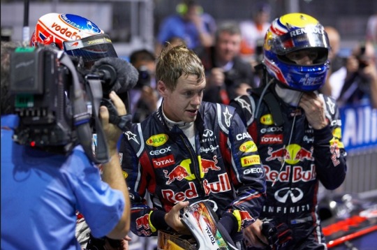
oh and. omg i’m gonna be so annoying spamming ur ask box i’m sorry but don’t be shy drop those 2011 singapore photos bestieee
no worries you're not being annoying at all!! It's fun to be able to actually use my horrible F1 pic folder for something hehe, so ty for inciting me
In the tags I was referencing these pics specifically:


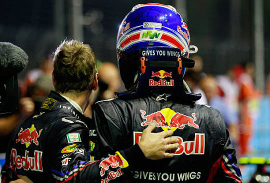
But please take all of these assorted pics as well:


*I forgot I made this gif lol
#their height difference when its seb in the middle makes me insane#LIKE LOOK HOW TINY SEB LOOKS AAAAAAAAAA#but seriously feel free to come and ask me abt any pictures i have way too many#some day youll see a gif post of this race but i have to get through 2009 and 2010 first lol#i like the pics of him and mark in the team pic bcs i feel like they didnt often sit directly next to each other so its sweet to me#catie.asks.#2011 singapore gp#mark webber#jenson button#sebastian vettel#sebson#martian#sebmark#f1#formula 1
129 notes
·
View notes
Text
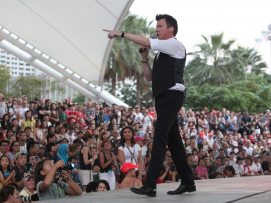
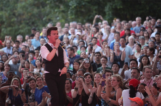
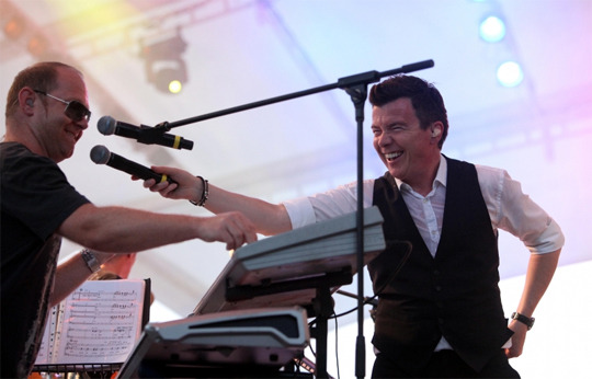
Images courtesy of Formula One.
From September 25th, 2011
"Rick flew out to Singapore last week for the much talked about Formula One Grand Prix. He was one of the many performers on the entertainment programme also including Shakira, Boy George, Linkin Park and Shaggy. Having travelled to Singapore in 2008 and 2010 to perform at Singfest, Rick tells us he’s always enjoyed himself when he’s visited and so decided to go a week early for some leisure time. “It’s been an amazing week so far. The Marina has been buzzing with excitement and I’m delighted to be here in the centre of it all.” Rick is a big fan of Formula One and was delighted to watch the qualifying from the Mercedes Petronas pit.
His first performance was on Saturday evening at the Esplanade Outdoor Theatre. Having serviced his voice on English Breakfast Tea, he opened his set with Together Forever before taking his audience down memory lane with his catalogue of hits including She Wants To Dance With Me and It Would Take A Strong Strong Man.
Every concert has it’s own special moments and this one delivered Formula One’s very own Eddie Jordan playing drums as Rick performed Never Gonna Give You Up. Thanks to a member of the audience, we can see a clip on YouTube."
#rick astley#2010s#full body#vest#singapore#2011#additional text#F1#accidentaly posted instead of putting it to queue so here have it#😳👍#smile
3 notes
·
View notes
Text

50 notes
·
View notes