#she was inspired by a mix of Betty boop
Explore tagged Tumblr posts
Text

esme even more of a baddie than she was before
2 notes
·
View notes
Text
Lost In You: Part One
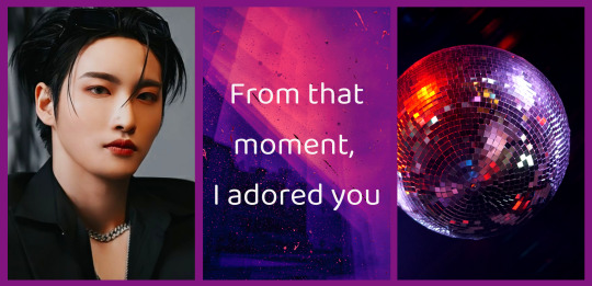
Plot: When attending your friends costume party, you keep getting complimented on your couples costume. But you can't help but be confused, after all, you came to the party alone.
-Part Two-
Pairing: Park Seonghwa x Gn!Reader* *A/n: Obviously had to go with Star Wars costumes lmao, and even though the costumes are of a male and female character, I believe it doesn't matter the gender of the character, you can still dress up as them anways. So besides the reader dressing "as" Rey, everything else is Gender Neutral, so please dont let that effect how you enjoy the story. The readers costume is not mentioned in detail, only vaguely to give a rough idea :)
-Meet-Cute Series-
Warnings/Notes: Brief mentions of alcohol, drinking, and drunk people. Reader is referenced to have drank, but is not drunk. Reader is a bit of geek (helps them bond with Seonghwa).
Words: ~2.4k

Walking around the fairly crowded house, your eyes scanned over the mix of recognizable, impressive, unusual, and downright lazy costumes that people were wearing.
When you had been invited to your friend's birthday, being told it was a costume party, you were excited. You had been wanting an excuse to wear your costume for ages, having missed the opportunity the previous Halloween.
Waving to some people you knew, your eyes scanned the crowd for more of your friends.
Nearly bumping into someone, you said excuse me before you recognized them as an acquaintance.
"Oh hey!" you greeted cheerfully "Nice costume" you smiled down at their bright yellow kill-bill inspired jumpsuit.
"Thank you!" they grinned as they looked at yours "Oh! Love that you went with a couples costume!"
You furrowed your brow "Huh?"
Having not heard you they waved to someone nearby before smiling at you "Sorry, gotta go, I'll talk to you later yeah?"
"Oh yeah, bye" your voice was still laced with confusion as they walked away.
Couples costume? You hadn't matched with anyone, none of your friends were really into Star Wars, so they wouldn't have matched with you.
You shrugged it off, figuring they just mistook your costume for someone else as you walked through a small group of people, before spotting one of your best friends.
Grinning, you snuck up on her "Hey!"
Gasping, she turned around with a glare "Stop doing that"
You chuckled as you grabbed yourself a drink before looking around "A lot more people came than I thought would."
"Yeah, I guess adults really do love an excuse to dress up like kids again."
You smiled and nodded, agreeing with the thought. "I thought you were going to go with Harely Quinn?" You asked as you eyed her Batwoman costume.
"It was trash" she rolled her eyes "Tore as I was putting it on."
"That's what you get for ordering cheap"
She waved her hand dismissively "I know, I know"
"Where did you get this one?"
"Last minute favor from my cousin, luckily we're the same size, otherwise I would have shown up in that slinky red dress I have and called myself Marilyn Monroe"
"You have black hair, Betty Boop is more accurate"
Just as she opened her mouth to retaliate, a drunk girl stumbled up to the drinks table before the spotted your costume.
"Ooh, that's why he brushed me off" she pouted before her eyes rose to meet yours.
You rose your brow before you glanced at your friend who gave you a similar look of confusion.
The drunk girl took a step closer "You wore a couples costume, that's so cute, mm'jealous" she slurred with an even bigger pout before she spotted someone, squealed and ran towards them.
You let out an awkward chuckle as your friend looked at you "What the hell was that?"
"I don't know, but that's the second time someone said I was wearing a couples costume with someone."
She looked you up and down, "Well, since you're dressed as Ren-"
"Rey"
"...Rey, then someone is dressed as that tall evil black haired guy right?"
"Kylo Ren, or Ben Solo" you stopped yourself from explaining as you recalled your friends lack of interest in the franchise before you began looking around the crowd of people "I haven't seen anyone in an outfit like that so far."
She hummed before she glanced around as well "I wonder if they're cute."
You scoffed but couldn't help but wonder the same thing. Shrugging it off again, you turned around, just missing the cloaked figure walk past and into the next room.

After a while, you parted ways with your friend. You made your way through the crowd again, having begun to grow tired of being bumped into, and having to strain your ears to hear anything anyone tried to say to you.
Your friend had clearly over-invited guests or overestimated how many people would show up, as the room grew hot and almost claustrophobic.
Spotting the doors leading to the backyard, which seemed surprisingly empty, you slid through a group of dancing people, desperately wanting to escape.
Feeling your costume catch on something, you had to tug yourself away, before accidentally running into someone just as you reached the doors.
"Oh sorry!" your voice almost mimicked the strangers, as you both apologized as your eyes met.
You smiled, "Excuse me" you added on.
"It's okay" he smiled sweetly, his voice soft.
Your eyes drifted down to catch his costume, and you felt yourself freeze as you noted the lightsaber hooked on his belt. His eyes grazed over you as well as he had the same exact reaction.
Your eyes quickly met again as your voices called out at the same time "You!"
You rose you brow in surprise and he chuckled "I've been hearing all night about someone I wore matching costumes with."
You smiled and let out a soft laugh "So have I!"
His smile widened a bit, and you realized just how attractive he was. He was intimidatingly attractive, actually, you told yourself as you suddenly felt a bit shy.
You cleared your throat a bit "Nice costume, it looks like really good quality"
He grinned down at his costume before he looked at you "Thank you. Your's too!"
You smiled, starting to feel a bit self-concious as his eyes seemed to have looked you over slowly.
Suddenly, he spoke up, his voice full of excitement "You're lightsaber! I have the same one at home!"
"You do?" you asked intrigued as he nodded with excitement "I collect a lot of Star Wars stuff" he confessed, and you saw a tinge of embarrassment cross his features.
'Cute' you thought as you grinned, "I collect a lot of stuff too! From Star Wars and other movies"
His face seemed to brighten a bit, as he wondered what else you might have in common.
As a loud song came on, you winced a bit as you looked towards the now cheering group of drunk people.
Seonghwa cringed as well, before he looked over at you and leaned closer. You turned and met his gaze, alarmed by his sudden closeness.
"Were you heading outside?"
You nodded, unable to find your voice as your eyes remained locked with his.
"Me too." Hearing a drunken scream you saw him wince as he motioned his head towards the door "Shall we?"
You let out a soft chuckle and nodded. You watched him opened the doors, stepping aside so you could go out. You muttered a thanks as you made your exit, your heart hammering in your chest.
The cool night air washed over you and seemed to sober any ounce of drunkenness you might have held before.
There were only a few people scattered around the back yard. A few in the pool, and some playing a nearby fooseball game.
You looked back at the house and shook your head softly, "I'd hate to have to clean up after this."
The man laughed and agreed, as he stopped beside you. Looking back over at him, your heart jumped a bit as he was already looking at you.
He seemed to realize this too before he adjusted himself "I'm Seonghwa by the way."
You smiled at him "I'm Y/n."
His smile widened as you introduced yourself. Seonghwa's heart was beating fast, as his face felt hot, he hadn't drank much at all, so he knew it must just be you affecting him this way.
His eyes glanced over at a nearby couch surrounding a firepit. Feeling a bit brave, and far too intrigued by you to just walk away, he met your eyes again.
"Want to go sit?"
You looked back at where his eyes lingered and you smiled before nodding softly. Following him over to the couch you took in a deep breath, calming yourself.

It hadn't taken long for you and Seonghwa to fall into deep conversation. You had a lot in common and found subject after subject to rant about to each other. From movies, to music, to friends and dreams, you wouldn't be surprised if you lost your voice the next morning with how much you seemed to be talking
So lost in each other's conversation, you hadn't noticed when the music died down, or how the back yard had emptied, leaving you two alone. Inside the house, nearly 70% of the people had gone home.
Nor had you noticed how much closer to two of you had become, literally.
When you sat down, you had sat on the seperate chair beside the couch, feeling too shy to sit beside each other. But now, you were both leaning forward, sitting beside each other on the couch now, faces merely a foot apart as you raved about a recent move you had both seen.
Seonghwa's arm was draped across the back of the couch, behind your shoulder, something he hadn't even noticed because it felt so natural already. When his knees brushed yours as you sat facing each other, you barely noticed.
"Y/n!"
Your voice cut out mid-sentence as you heard a familiar voice call out. Looking over, you see her walking across the yard, red solo cup in hand.
Her eyes moved to Seonghwa and you saw the look on her face that screamed 'Holy shit, he's gorgeous.'
Seonghwa however, did not see this, as his eyes became glued to you again, after only having glanced towards your friend when she first came out.
"Oh, hey!" you greeted.
She leaned on the back of the couch before Seonghwa finally looked over at her. They introduced themselves to each other before your friend looked him up and down.
"Oooh, you're the one that people kept thinking matched with Y/n."
Seonghwa chuckled and nodded his head "Yes, that's me."
She met your eyes, and a knowing look passed over her face, that you promptly ignored.
"I was surprised to see you out here though, you never stay at parties this long."
"What do you mean, what time is it?"
She rose her brow "One in the morning"
Your eyes widened as you looked over at Seonghwa, who had a similar look on his face. He took out his phone and you saw the time flash across his screen. 1:14am.
"I got here at nine" you said out loud to no one in particular.
She nodded, "And you've been out here...chatting" she glanced at Seonghwa "for about three hours."
You and Seonghwa locked eyes and he smiled somewhat shyly as he looked down at his lap.
"Oops." You chuckled as you looked back at your friend who wiggled her eyebrows.
"You said you were only staying until eleven, since you have work tomorrow"
"Oh God, I have work tomorrow" you put your hand on your face as fatigue washed over you, surely only because you now knew what time it was.
Seonghwa smiled as he watched you, thinking of how cute you were. Though, he also had to work tomorrow, and showing up to early morning dance practice after a late night was not his ideal.
You met his eyes, "I should go."
Seonghwa nodded his head "I should too, I also have work tomorrow." he chuckled.
You smiled at him as mutual shyness seemed to wash over both of you. Your friend looked between the two of you and smiled before standing up straight.
She tapped your shoulder, "Come find me after you say goodbye we can get a ride together."
You nodded at her as you looked back at Seonghwa. Both of you began to rise as you let out a soft groan.
"How did I not realize it had gotten so late?" you chuckled softly.
Seonghwa smiled, "We were busy."
He hadn't felt as though time had passed at all when he was with you. He got so lost in talking with you, so lost in you, that he didn't realize there was anything going on around him at all.
The way he was staring fondly as you made your breath hitch. You smiled at him as you felt your ears burn a little hotter.
"Yeah. It's been a while since I've met someone I could talk to about all of that stuff."
He grinned, "Me too."
Seonghwa, realizing you were about to say goodbye, felt panic rise in his chest. He didn't want to say goodbye, at least not forever.
"Uh- can I- do you think I could get your number?"
Your heart leapt as he asked, and you resisted the urge to respond with as much excitement as you felt.
You nodded, "Yeah"
"Great. And maybe...we could go see that movie next week?" he asked, referencing the movie you shared excitement about earlier.
You nodded a bit more fervently this time, "That would be fun"
He nodded in agreement as he pulled out his phone. When you exchanged numbers you began heading inside, noticing immediately how the party had ceased since you were last inside.
Music was no longer playing. Empty cups and plates were scattered around, two people were passed out on the couch as the disco ball spun slowly on the ceiling.
You winced, "Yikes"
Seonghwa laughed before you looked back over at him "I should go find my friend"
He nodded, "I'll text you tomorrow?"
You nodded with a bright smile and Seonghwa almost felt like swooning at the sight. As he began to walk away, he gave you another glance as he waved.
You waved goodbye before you spotted you friend watching you with a grin from across the room.
When Seonghwa disappeared out the front door, you made your way to your friend who rose her hand.
"If you tell me you didn't get his number, I swear to God-"
"I got his number" you cut her off.
"Yes!" She cheered dramatically "I cannot believe how gorgeous he is."
"Right!?" You said with a restrained excitement.
"Are you going to see him again?"
You nodded, "He asked me to see a movie next week."
She clapped her hands as she led you to the door "You have to tell me all about him on the ride."
You nodded as you thought back on your night, and Seonghwa. You had never clicked with someone so fast before, it almost felt too good to be true. Almost.
xx End xx
-Part Two-
Ateez General Taglist: @soso59love-blog
Series Taglist: @bubblesreplies, @halesandy, @why-am-i-sad, @acciocriativity
#Seonghwa#Seonghwa x reader#seonghwa/reader#ateez x reader#ateez imagine#ateez/reader#seonghwa imagine#seonghwa fic#ateez fic#meet cute#meet cute series#ateez meet cute#seonghwa x gn!reader#seonghwa fluff#ateez fanfic#park seonghwa imagine#park seonghwa/reader#park seonghwa fic
238 notes
·
View notes
Text
Did you know!
Betty Boop was based on an African American jazz singer named Esther Jones, pictured below!
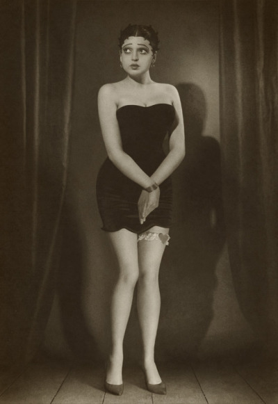
Despite this, Betty Boop has been consistently portrayed as white, and Esther Jones' likeness was used without her permission.
And if you've actually read this far and not just nodded and scrolled on, congratulations! I was lying to you, that entire thing was bunk.
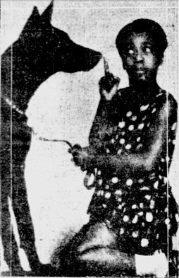
Esther Jones, better known as Baby Esther or Lil Esther, was only a child when Betty Boop made her debut, her exact age is a mystery due to a lack of records. That image I showed you before? That's of a model named Olya P. for the magazine Retro Atelier in 2008. Also Olya’s not even black, she’s white and either Russian or Ukrainian.
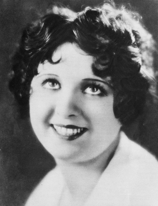
Betty Boop was indeed visually based off a jazz singer and actress, but it was Helen Kane, a white woman. Clara Bow, another white singer, is also sometimes cited as an inspiration, but with less evidence.
It was Helen Kane who found out her likeness was used without permission and filed a lawsuit against Max Fleischer and Fleischer Studios for it. While he would later wholeheartedly admit it, he denied the likeness as part of his testimonies. In the process, he argued that Kane had taken most of her songs and style from Baby Esther. However, according to Wikipedia it’s possible a lot of the evidence for that was fabricated in an attempt to discredit Kane.
So to be more precise, Betty Boop was based off a white woman who might have based her image off a little black girl.

Also, the topic of Betty Boop's intended race gets a little silly regardless given that she was first conceptualized as an anthropomorphic poodle. While it's not exactly unheard of for the 1930s, I don't think they were really focusing on coding her as a specific race at that moment.

The cartoon Minnie the Moocher (remember this) would even depict Betty Boop as coming from a German immigrant family. Many speculated she was even Jewish due to this as well as the Fleischer brothers and her voice actress Mae Questel both being Jewish, but Benjamin Ivry of Forward pointed out that her family's meals were not Kosher so this was unlikely.
Now you might be thinking; okay but what's the harm in portraying Betty Boop as black? Can’t black people reclaim this one character for themselves? And honestly, I kinda agree. Personally I think Betty Boop is one of those characters that can be ANY race, not just white or black, given her ambiguous and stylized features. I love seeing black women cosplaying Betty Boop or her being portrayed as black in art.
However, the reason I bring this up is because I personally think false or misleading information does not make for good representation. Especially when it leads to situations where artists have to explain themselves for giving Betty Boop light skin when the reason cited otherwise is blatant misinformation. Though thankfully the one interaction I have had about it before posting this was very polite.
Not to mention, this kind of thing maybe not necessarily buries but distracts from the very real contributions and accomplishments of black people in Betty Boop's history.
Let's talk Cab Calloway, for example.
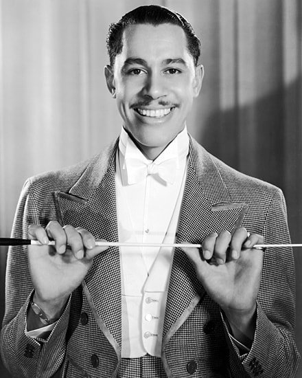
Cab Calloway was a singer and bandleader acclaimed for mixing jazz with vaudeville. He was the first African American to sell one million copies of a single record, and collaborated with Fleicher Studios for three animations, Minnie the Moocher, Snow White, and The Old Man of the Mountain. In these, he would perform a song, the first and last even being directly named after his music, and he was even directly rotoscoped while dancing.


I can't find any sources for who approached who for these collaborations, but I feel its needless to say there's an inherent respect for Calloway and his work in these cartoons. For a black man in the 1930s. And they didn’t even hide it, Minnie the Moocher and The Old Man of the Mountain features live footage of Cab Calloway and his very visibly black band.
These cartoons bleed passion from both the singer and the animators. And if you’ll excuse the sidenote, I watched those cartoons as part of my research and even today his music is still absolutely enchanting.
And Calloway was not immune to racism just because of his success either. He and a friend, Felix H. Payne Jr. were even victims of police brutality by officer William E. Todd in 1945 when they were attempting to visit Lionel Hamptom at the whites-only Pla-Mor Ballroom.
His work matters. Betty Boop was only one small part of his career, the man did a lot in his time, but he brought something truly amazing to the table.
There are real people whose accomplishments deserve to be recognized, but I feel they often get pushed aside in the efforts to make up representation that was never actually there under the false belief that there was none in the first place.
Hell, this entire thing is a discredit to the real life of Esther Jones herself!
She was a literal child who’s date of birth and especially death are unknown. She gained fame in her hometown Chicago which led to her becoming an international celebrity, touring Europe as an honored representation of African Americans alongside Josephine Hall. Then she basically retired as a teenager and disappeared from the public eye.
And what is her memory nowadays? As a sexy flapper that supposedly inspired Betty Boop’s creation.

Even knowing this was false, I had to fight back so much misinformation while making this. This photo right here? I was led to believe this was a photo of an adult Esther Jones, but it’s not! We don’t have photos of her as an adult! This is a completely different, unidentified, woman photographed by James Van Der Zee!
And quite frankly, as a white woman I feel like a jerk having to be the one to tell black people that actually no Betty Boop was based on Helen Kane, not Esther Jones.
So in conclusion, STOP MAKING SHIT UP.
[Sources:
Betty Boop - Wikipedia
Cab Calloway - Wikipedia
Baby Esther - Wikipedia
Модель Оля | BETTY BOOP Wiki | Fandom
Dizzy Dishes (1930)
Minnie the Moocher (1932)
Snow White (1933)
The Old Man of the Mountain (1933)]
#if I got anything wrong in this I take full responsibility#the tough thing about trying to disprove misinformation is that you have to wade through so much of it to get the truth#so sources were also somewhat limited#but yeah this started as me doing research for my Call of Cthulhu investigator#and then my autism led me down a rabbithole#and for the record Fleischer Studios' cartoons were not free of racism#they apparently had less compared to other studios but still had offensive caricatures of black and native people#but I struggled to find exact sources for it so I didn't think it would be a good idea to include#I haven't seen every talkartoon and mostly just watched the ones I mentioned#Old Cartoons#Betty Boop#Esther Jones#Baby Esther#Helen Kane#Cab Calloway#Max Fleischer#Fleischer Studios#Essay#my post
29 notes
·
View notes
Text
It's been a while since I did any digital art so here's you guys go! Some rubber-hose animation inspired ocs!
(Image IDs in the alt text)

Meet Laressa Daimon and her husband Brian the Angel!
Laressa is inspired by Jessica Rabbit and Betty Boop (and a teensy bit of Morticia Adams). I actually took a Jessica Rabbit pose to use for her for this. She was meant to be an antithesis to Alice Angel but she has become more of a friend to her as she has evolved
Brian was meant to be an antithesis to Bendy and I had a mini AU where they were brothers, but now he's just a guy. The Gomez to Laressa's Morticia, if you will (also, he originally was going to be Alice's bf but you can clearly see that the idea was scrapped for his hot demon wife)
More info about them below the cut AND a colored version!

Laressa is a movie star with tons of fans. She's kind of a nepo baby because I have a whole thing where her parents were famous (at least her mom was). She is a succubus mixed with a different type of demon (not currently decided on because I'm working on changing these two a bit more). She is pretty sweet and adores her fans and her family dearly
Brian works a 9-5 office job and adores his wife. He supports her in every way he can and is a great stay-at-home dad when they do have kids
Their kids are going to be next, BTW! They have four kids and they're cute kids, I love them
1 note
·
View note
Video
youtube
Blues Brothers - Minnie the Moocher (Cab Calloway)
This was not only entertainment, this was movies were still made and were still good. Not a bunch of graphics, stunts, trying old, tired jokes for laughs, special effects, or even raised ticket prices. I was a baby when this came out, and saw this when I was a kid. This movie is the Blues Brothers. This was when studios could still get away with the shit you can’t get away with today.
Cab Calloway’s dance movies were drawn over by Max Fleischer, of Betty Boop and Popeye fame. Trust me, when you see those moves in his cartoons, those were Cab Calloway, Buster Keaton (who was the Jackie Chan of his day, he did all of his own stunts), Charlie Chaplin were the inspiration behind a lot of those moves. Cartoons were drawn and animated by hand, not by computers back then. The technology hadn’t been invented.
Fun fact: Slimer from The Ghostbusters was not only based on John Belushi, it’s a tribute to John Belushi. Dan Ackroyd and Bill Murray were once on SNL way back in the 1970′s-and SNL got away with a lot more shit back then, than they do now-and John Belushi was supposed to be Peter Venkman, not Bill Murray. But John Belushi died from a drug overdose, a speedball (a mix of cocaine and heroin) in 1982, so the part was then passed on to Bill Murray. Plus, Cathy Smith, who supplied John Belushi with the speedball, was sentenced to 15 months in prison for second degree murder when she confessed that she supplied him with the speedball that killed him.
0 notes
Text
A Conversation On Cartoons & Anime
Me: <Watching Avatar: The Last Airbender>
Mom: “Jeez, anime is so whiny.”
Me: <Internal screaming of an animation nerd> “Um… I-it's technically not anime.”
Mom: “But it's imitating anime. I've noticed anime characters tend to whine a lot… The waterfall tears are just ridiculous-- and hearts popping out of them when they're in love!”
Me: “Cartoons do the heart thing, too…!”
Mom: “Yeah, now that they're copying anime. Anime just exaggerates emotions too much, it's annoying.”
Me: “As if everything including your clothes turning pure white when you're scared or literal steam coming out of your ears when you're mad like in the old Looney Tunes cartoons is realistic…??”
Mom: “That's completely different.”
Me: “Only in that they're different emotions!!”
Mom: “Exactly.”
Me: “…So, what, it's okay for a character to be angry or scared, but not for them to be sad or in love??”
Mom: “Yes.”
Me: <Dies laughing> <Makes mental note not to watch Fruits Basket around her> <Continues to mix cartoon & anime emotes in own art>
…
But seriously, to everyone who says animation is automatically and exclusively for children (my mom is not one-- nor is she anti-anime, despite the above conversation), and to enjoy it makes one childish:
“Critics who treat ‘adult’ as a term of approval, instead of as a merely descriptive term, cannot be adult themselves. To be concerned about being grown up, to admire the grown up because it is grown up, to blush at the suspicion of being childish; these things are the marks of childhood and adolescence. And in childhood and adolescence they are, in moderation, healthy symptoms. Young things ought to want to grow. But to carry on into middle life or even into early manhood this concern about being adult is a mark of really arrested development. When I was ten, I read fairy tales in secret and would have been ashamed if I had been found doing so. Now that I am fifty I read them openly. When I became a man I put away childish things, including the fear of childishness and the desire to be very grown up.” ~ C.S. Lewis
So there, haha. Enjoy whatever you enjoy. There are many animated movies/series that aren’t intended for children (e.g. Betty Boop, Princess Mononoke (1997), etc), but that doesn’t mean you have to watch them now that you’re older. You don’t see me hiding my Mickey Mouse and Pucca stuff, pft.
And, besides... the Basic Character Design principle of “The Rule of Silhouettes” (“if you can tell who a character is from NOTHING BUT THEIR SILHOUETTE, it’s a good character design”) is a big accessibility tool for prosopagnosics like myself who genuinely cannot recognize people by their faces (for that matter, so are exaggeratedly unique and recognizable voices like Mel Blanc was able to acheive). It seems like most live-action movies just pick a bunch of super similar-looking-and-sounding actors/actresses because they're popular and “attractive,” then I just end up sitting there like:
“…Which of the five thin, short-haired brunette characters is she…?” (・–・;)ゞ
But I can identify every single one of THESE characters in a heartbeat-- and three of the shows I don’t even watch:

Heck, that emotional exaggeration is also an accessibility tool-- for autistics like myself who struggle to read emotions (the general rule of thumb is literally “take what you think this emotion normally looks/sounds like… AND CRANK IT UP TO 💯 BECAUSE YOU NEED TO COMMUNICATE THE EMOTIONAL IMPACT OF THIS SCENARIO TO THE ENTIRE AUDIENCE”). That’s part of why I selected chibis and rubber-hose cartoons as the inspirations for my @neuromenagerie art style; I wanted to mix the two most expressive styles I could think of and make the characters as empathetic and lovable as possible, no matter their neurotypes.
It’s fine if you don’t like animation. But, basically… shaming people for liking it is not only childish in and of itself, but also ableist. Not cool. Animation is for everyone, don’t be a jerkwad. This has been a PSA by me.
#anime#cartoon#emotions#emotive#emotes#fruits basket#rubber hose cartoon#chibi#animation#actually autistic#prosopagnosia#neurodiversity#end ableism#rule of silhouettes#mel blanc#pucca#mickey mouse#fleischer cartoons#hanna barbera#animaniacs#cartoon network#animation is for everyone#accessibility#accessible art#neurotypes#betty boop#studio ghibli#c.s. lewis#avatar: the last airbender#looney tunes
129 notes
·
View notes
Text
Lana Del Rey Unreleased Ranking (3)
This is a re-ranking of Lana's unreleased songs, after making a first a few years ago. This is all my opinion, which I don't mind anyone disagreeing with but don't come for me for it - honestly, I like every song, despite any criticism, and this ranking is very vague. It's based on objective and subjective opinion.
This is the third of five posts, with the middle songs.
Dreamgirl
Purely wholesome and dreamy, Lana adds some very fifties “shoo-wops” to play a fifties starlet whispering, her vocals soothing and soft along with the looping piano that guides the song.
Jimmy Gnecco
Breathless over the brisk guitar, Lana gushes over Jimmy – mixing her adoration of her lovers with wannabe-starlet fangirling. It’s one of her best acoustic tracks as she smirks and requests a trip to the park.
Elvis
Lana’s acoustic dedication to her icon Elvis Presley is memorable despite how stripped back it is. It could have been cleaner but Lana’s sorrowful desperation to be close to this man who she is such a fan of works well in being decent output from her.
Boarding School
It’s a difficult listen, considering Lana’s nostalgia is for a “pro-ana nation” and a school where “makig love with your teachers” is revered, but it may just be a satirical look at her time in boarding school when she was younger. I don’t enjoy listening to such worrying topics being handled in an upbeat song but the song itself has well-written lyrics and a great instrumental.
Television Heaven
This song is incredibly sweet, with lovely lyrics, dreamy verses and a distinctive pop feel, but it is definitely a strange mash of instrumentals. It’s not too jarring but it does make the song fall lower in ranking. It feels indecisive as it goes from sugary pop to a slightly darker feel in the choruses, and the lyrics aren’t the most imaginative in Lana’s library of tracks.
Be My Daddy
Lana’s full on sex-kitten in this song that opens with twangy guitars and her hushed “what’s up?” as she greets her potential “daddy”. With dirtier lyrics that she’s “open like a Christmas present” and how she’ll “fuck you”, Lana avoids keeping the sex in just the vibe of the song.
Break My Fall
Another song made for another artist, Lana this time sounds like she’s doing her own track. The pop sound is still ideal for actual music charts but Lana pulls the song off well, playing a strong woman far removed from the tragic women of many of her songs. It’s strong in quality and doesn’t stray into more experimental territory where many of Lana’s unreleased songs reside.
Hit and Run
With three versions to pick from (the poppy original, the Born To Die style slower version and the demo Criminals Run The World that’s a little more overt about Lana’s violent intentions), all three of these songs have something special about them. The pop version is bouncy and chaotic, perfect for a wild spree of gun fights and car chases. The slower version is much more seductive and measured, but a little too reflective compared to the manic power of the upbeat version. Criminals Run The World ranks much lower, not as smooth compared to Hit and Run but still with that insanity that makes Hit and Run a wild ride.
Heavy Hitter
With a jazzy introduction, Lana gives us a glamorous tale of a star having an overdose (somehow she makes it glitzy). However, following the suggestive chorus in which Lana asks her man to open his butterfly doors of his car (to drive her to get help, somehow delivered with seduction rather than horror), the lyrics get lost in Lana’s generic praising of herself and her wicked ways. However, it’s a staple of Lana’s unreleased music, even if I do skip after the (if you think about it) harrowing first verse and chorus.
Behind Closed Doors
The instrumental is a little bit all over the place, but it does work when Lana details her ill-received romance to her lover, then jumps right in the chorus to eagerly tell him how much she enjoys sleeping with him.
Gangsta Boy
Lana is inspired by Betty Boop as she croons and gasps her way through the track. The vibe is great, though the music falls a bit, but Gangsta Boy is playful, light-hearted fun.
You’re Gonna Love Me
Lana may be raw in her vocals and basic in her instrumentals (only a guitar) but Lana takes control, self-assured she will make the listener adore her. Her confessional whisper that she might just want to be loved gives this song a knowing edge despite the pondering questions and realism-on-the-edge-of-pessimism feel tone.
Living Legend
Lana’s Living Legend was intended for Ultraviolence, and whilst the song fits in it is definitely one of her more slumbering songs. Yet her sentiment is strong, her lyrics thoughtful and thoroughly enjoyable. All of the versions bring something a bit different but it is underlined by great song-writing.
Hey You
Lana has fun greeting a potential lover with this track and I have as much fun listening to it. The chorus is sparse and repetitive but Hey You is all about grabbing your attention rather than going to deep.
Is It Wrong?
Claustrophobic and guided by a smart riff and technological glitches, Lana pulls off the perfect unhinged groupie as she questions whether or not she is wrong for wanting the star of her dreams so much. The glitching is great for really seeing how Lana teeters on the edge of sanity for this guy she can’t resist, going from being the starlet to the foaming-at-the-mouth fangirl.
Playground
Lana becomes a rapper apparently in Playground and hits back at anyone who doubts her and her music. With a cloying chorus that compares the music industry to a playground of bitchy comments and school yard, Lana’s verses are smooth and her references overall decent. It can be a little bit clunky in places but it doesn’t take itself too seriously.
Motel 6
A cute little dance track which namedrops Jim and her sister, Chuck, Lana brings the party to her favourite motel, downplaying her glamour to throwback her ‘lore’ and her old life pre-fame. Though it’s very much just describing one night rather than anything complex, it’s harmless fun.
Dynamite
Like the explosive dynamite itself, this song is punchy, restless and powerful. Lana layers this dominating track with innocent references to ice cream and pillow fights whilst also not holding back from the sexual references.
Afraid
Neat and mournful, Lana finally breaks off from her toxic partner. Lana is either sick of being worried for the future or terrified of her partner, and its reflective sadness as she plans to go back home still leaves hope that she will be able to be happy.
Wayamaya
Rolling calmly like a beach wave, Lana takes us straight to Hawaii and paints us an image of handsome surfers and Mercurys. Wayamaya is simply a soothing, short, cute little track that keeps very much surface level.
Hawaiian Tropic
Plinky music paired with non-stressful verses and imagery of Hawaiian shirts, this is the (in my opinion) better version of Every Man Gets His Wish (which shares the same chorus). The subtlety of this track compared to Every Man Gets His Wish helps to convey the hurt feelings a lot better, with the nostalgic feel and mournful longing in the vocals.
Dum Dum
Lana plays the alcoholic star who name drops Scarlett O’Hara and Bugsy Malone as part of her identity. These lyrics are pretty witty and the song snappy but, like some of her unreleased music, is a bit too overproduced and not cohesive. The verses and choruses don’t quite gel which doesn’t make for a song that flows well but with tweaking it could be even better.
Hollywood’s Dead
Lana fits perfectly into the era of fifties with this mid-20th century driven track. It sounds perfectly in place for the decade she frequently romanticises (with a modern twist) and Lana’s crooning, tearful references to her icons drips with glamour.
Fake Diamond
For an anti-romance song, Fake Diamond is quite upbeat. Lana complains of her ‘lover’ who is one way with her, a different way with others, whilst comparing their relationship to all manner of Lana-themed aesthetics (diamonds, movie projectors, etc.). Comparing herself to a child, she practically has a tantrum in the chorus, stamping her feet lovingly as she demands he loves her. I do think this song is joyful, making fun of her inattentive lover whilst keeping one step ahead of his games.
I Must Be Stupid
Lana’s live unreleased track lets Lana enjoy her life despite the hurt that surrounds it, showing strength in the face of heartbreak and other such topics in her music. It was performed post-Lust For Life, an era in which Lana embraced the light side rather than simply the dark.
Live Or Die
The version that is a little bit more lowkey and, in some ways, mature in that it matches a lot of her early albums sound is good but it’s not my favourite. There’s the heady, ultra-pop second version that has plenty more sexy references, a little meow (iconic) and an overall vibe of just having fun on the run. The former version is a bit more serious, but the second is – though less good in terms of production – full of soul.
Velvet Crowbar
Velvet Crowbar is a song that shows the dark side of fame and bad boys, namely the way they self-destruct to the point that their adoring lovers (already addicted to these gangstas of course) are falling with them. This song is a warning to these destructive souls that they aren’t invincible, and an equal warning to the people that love them that they might just fall apart and lose them. Lana puts her emotion across so well, with her stark lyrics, anxious guitars and growling third chorus. Even her more flowery imagery doesn’t cover up the overt fear that runs through this song.
Your Band Is All The Rage
Probably one of Lana’s saddest songs (which could be a great deal many since she knows how to tug heartstrings), Lana lets go of her rock star lover despite still loving him in this acoustic track. She makes soulful promises to be there when he needs him, her love lingering until he wants her back, and utilises the country music theme to her advantage.
1949
The studio version is my favourite but the charm of the original, acoustic demo is unmatched. Despite the controversial inspiration for this track, Lana puts us straight in the world of the 1950s, with American motels and Kmart. It has a note of sadness – perhaps because of the unfortunate tale of Lolita that much of this song seems based on – but it works as one of Lana’s aesthetically pleasing and classic tracks.
Because of You
The spoken intro is a little bit cringe but the song is lovely. Lana plays an immature brat who fell in love with a good man who essentially tamed her (a little bit questionable for some in 2021). It’s got some of her most flowery imagery and it details how her relationship bought out the best of her. The casual comments she throws in throughout the song give this a real bedtime story feel, though this song is anything but sleepy.
Resistance
Frustrated but fun, Lana’s catchy and upbeat Resistance brings to mind surfers and sunny days set in the noughties. Even though she’s furious with the guy who’s causing her so much trouble it still, for a change, stays perky and pleasant. A song that needs more attention, it’s the type of song that gets people singing and dancing along to it.
Dangerous Girl
With a rock-feeling patriotic opening, Lana launches into a track about her prowess as a dangerous girl, like a deranged beauty queen with a gangsta on her arm. It’s simply fun, complete with wolf-whistles and an impression of a siren.
20 notes
·
View notes
Text
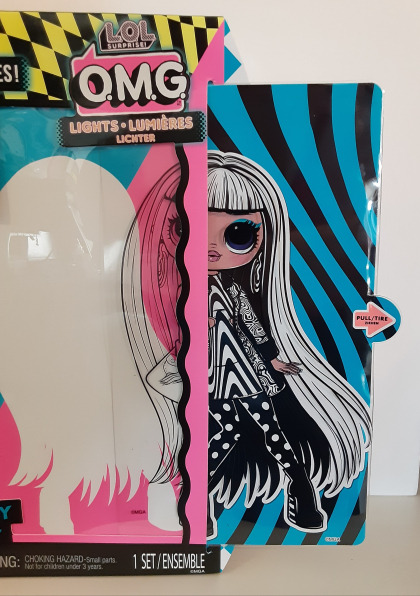
Very excited to get my first LOL OMG doll. I’ve been eyeballing these dolls ever since they came out, read a lot of reviews, people talked about how great the details on the dolls are and along with decent articulation, it was an irresistable combo.. The strange chibi heads put me off at first, but I’m always a sucker for a fully articulated doll, and these are actually chubby looking! .. or at least plumper than the usual fashion doll.
Groovy Babe is from the latest wave of LOL OMG dolls, called Lights. They all have some kind of UV-reactive element on their face and/or clothes and each doll is inspired by a different type of 60s fashion. I don’t know an exact reference to point out other than Twilight Zone, but Groovy Babe is clearly evoking a whole black and white psychedelic/hypnotic vibe. I feel like there’s a film reference here that I’m not aware of. She is also supposed to be a beatnik poet.
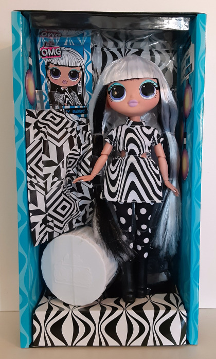
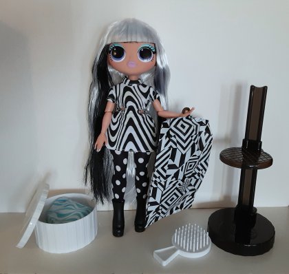
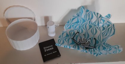
I kinda love the little hatbox, it fits all her accessories except the comb. The little white cylinder is a tiny blacklight, with battery included. The “book” is a single sheet of paper folded in half.
Hair: super thin rooting on the top of her head, can see scalp through the hair (including black lines presumably there to guide the rooting but clearly totally ignored). The long hair feels soft, but it’s a little plasticky – is it nylon? Bangs are one solid mass of gel plastered to her forehead.
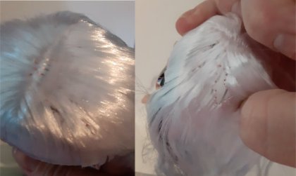
Clothing: Cutout in dress is poorly sewn and bunchy. Jacket is pretty nice but was carelessly stuffed into the garment bag, so now the lining is sticking out in the front and the collar is permanently popped (which also shows a white mesh lining).
Fully dressed, she looks like maybe she made her clothes herself, and isn’t terribly good at it.
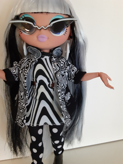
Tights and boots are perfect. Earrings are adorable! They spin! Hypnotic! But they’re hard to see when she’s wearing them; they kind of face sideways and her hair covers them. Also, the paint has started coming off already, the first time I put them on the doll. Sunglasses are odd and not very 60s mod, but pretty damn cool; they’re made of a softish, almost rubbery plastic, so they’re very easy to put on and take off without having to worry about breaking them. The long narrow glasses look funky and cool with the round eyes of the doll; makes me think of Novi Stars.
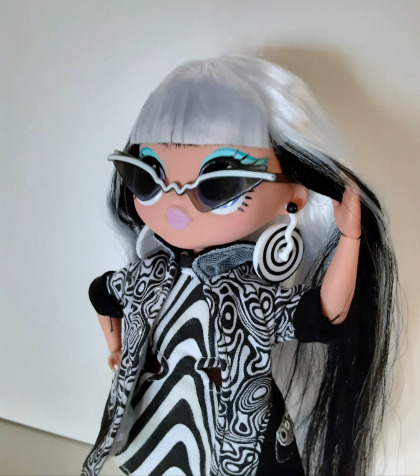
Body: Love those curves! These dolls have wonderfully chonky butts and thighs. Butt dimples! Still has a thigh gap though, for some damn reason. Also, extreme hourglass waist and sculpted abs, just in case you might be afraid this doll is a nasty fatty fatfat. Beautiful curvy legs, but sadly they have very old-fashioned jointing – hips have zero rotation and knees are crappy click joints that are hard to use and barely bend.
Why these dolls come with chair-like stands is totally beyond my comprehension, since they can barely sit. Feet are en pointe like a ballerina – not just tiptoed high heel feet, these are almost torturously pointed. Wonderfully sculpted little toes though. Smallish pointed breasts with just a hint of nipples. Painted-on bikini undies match her pale turquoise eyeshadow. Hands pop off for ease of dressing and are gracefully sculpted, with cute little dimples on the knuckles (which would make more sense on chubby hands, but whatever). The hands actually go off and on really nicely, no fear that I’m going to break the joint doing it. Fingernails are pointy and painted white; the paint is actually quite well-done here, they’ve done a pretty good job of keeping it only on the nails without overspray onto the fingers (unlike some other OMG dolls I’ve seen).
Face: Bizarre LOL round-eyed face; almost Bratz-like in the lips and near lack of a nose, but the eyes are absolutely enormous and perfectly round. The proportions of the features put me off at first, but there’s something about the way they’re done that’s surprisingly appealing. This doll has a very matte faceup in solid colors; edges are mostly clean and the paint is almost completely within the lines of the sculpt. Her lips remind me of a certain iconic stomach medicine. Eyeshadow is a light turquoise color with a darker turquoise line above it, with a cat-eye black liner and spiky lower lashes that mimic the drawn-on lashes people used to do in the 60s. Somebody did their homework on 60s mod makeup. Eye color is an indigo blue, complements the makeup nicely; a little boring, but more detail in the eyes might just make them look creepy since they’re so very large.
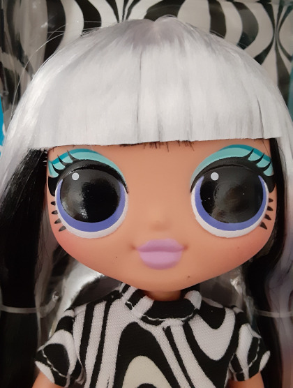
My doll has three tiny black spots on her face, and a handful of faint white spots on the black of one eye (the paint seems thinner on this eye for some reason – the swirl is more obvious in regular light). Head has an unfortunate tendency to tilt slightly back, and not because of the weight of her hair. She can tilt her head just fine when she’s looking to the side, but facing forward, she can’t look up or down at all. The vinyl of her head is slightly more orangey than her body?
Gimmick: It’s a fail, at least with this particular doll, at least with the tiny black light included with her. The black and white overall color scheme looks cool under black light, but the specifically UV-sensitive stuff is mostly barely there. The UV-sensitive? stripe on the dress is rather visible in regular light, and yet indistinguishable with the black light. The “hypnotic” twirls in her eyes are barely visible even with the black light right up against them. I tested all of this in the dark btw.
The makeup is the one thing that actually does change noticeably. The lips are still pretty much the same color, but they’re super bright neon under the black light. The eye makeup changes color and has an extra layer of eyeliner that’s mostly invisible under regular light.
It’s a pretty underwhelming effect overall, but if I had a blacklight room I’d display her in it, after finding her some new clothes. I’d rather they’d just made things better quality and not done the stupid gimmick, but whatever; their goal is to sell toys to children and the LOL brand is kind of rooted in gimmicks.
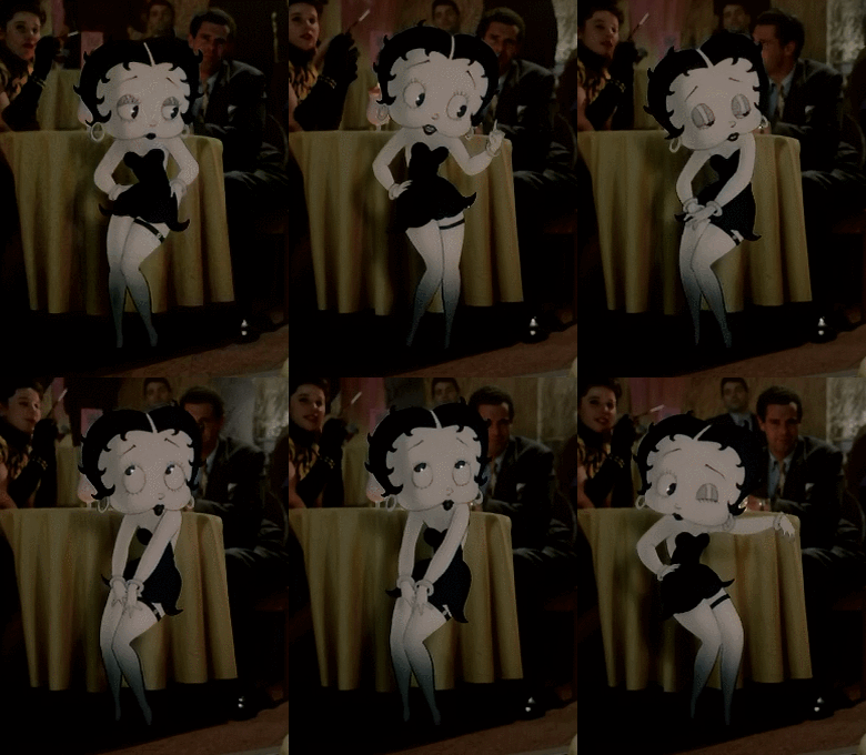
These dolls are extreme caricatures of a “sexy” human female (if you like big butts – and do not lie). I do wonder if they were inspired by Betty Boop; they have almost an identical silhouette, with the big round heads, tiny waist, and big hips. Their proportions are so cartoony and absurd and clearly very thoughtful choices were made that sacrificed functionality for form – the terrible click joints in those smooth, shapely legs, for example. Though why the hip joints couldn’t rotate is a choice I can’t understand..
She’s a cute little doll, to be sure, but not display-worthy, or even something I’m really excited about photographing (which is the only real surprise involved in opening this box that supposedly contained 15 surprises).
Real talk about the surprises, actually – the things included in this box that are not pictured on it are: the stand, the garment bag with plastic hanger, the plastic hatbox with patterned tissue paper, the sunglasses, and a folded piece of paper pretending to be a notebook of poems. So the only real bonus item that you wouldn’t expect to receive by looking at the box is the sunglasses. At least there’s something.
Anyway. I’m left with mixed feelings, honestly kind of disappointed? Is the doll I got sub-par or is this typical? Am I just hugely, stupidly picky? I want to rehair her; she’s crying out for it, really. Maybe I’ll fall in love with her once her worst flaw is gone. Maybe I’ll rip her head off and try some other ones. Maybe she can be my big-booty guinea pig.
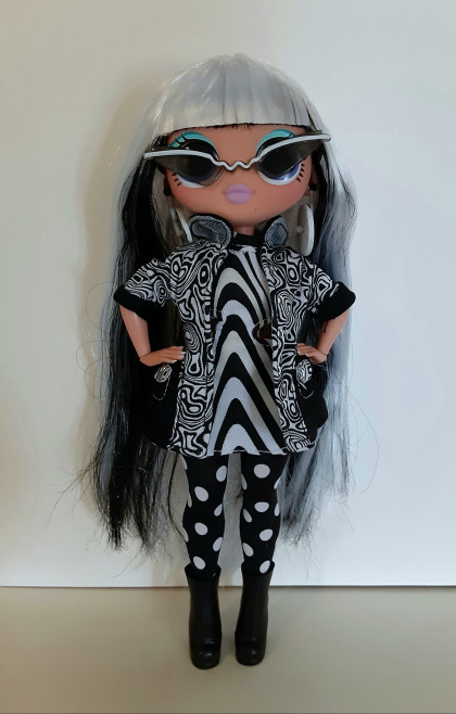
This is the best I could get her clothes to look in a photo.. Unless she’s holding it shut like this, the jacket keeps flapping open with that white mesh stuff flopping out.
Still excited for Angles. I’ve had a thing for Mondrian and his right angles for a long time and it’s really fun to see his art referenced with a fashion doll.
Review: Groovy Babe LOL OMG doll Very excited to get my first LOL OMG doll. I've been eyeballing these dolls ever since they came out, read a lot of reviews, people talked about how great the details on the dolls are and along with decent articulation, it was an irresistable combo..
11 notes
·
View notes
Photo

Shiver Me Timbers! (1934 short)
As animated short films emerged from the silent film era, the major Hollywood studios acquired or partnered with animation studios to quickly produce shorts that could be shown before or in between movies. One of the most important names in American animation in the 1930s was Fleischer Studios – co-founded by brothers Max and Dave Fleischer – partnering with Paramount. The Fleischer shorts, unlike their competitors across town, usually concentrated on human characters – their filmography more commercial than artistic for art’s sake. Due to messy rights issues and modern-day corporations not seeing the value in the older movies they have acquired, much of the Fleischer filmography is unknown to audiences. That includes the films of Betty Boop, whom younger generations have a superficial knowledge about (the upstart company Olive Films has recently remastered some of the non-public domain Betty Boop shorts for home media), and the seventeen Superman shorts released from 1941-1943.
Surviving this mélange of media acquisitions, mergers, and dismissive attitudes to older media is Popeye the Sailor. Popeye, introduced in a comic strip in 1929 and first appearing in cinemas in 1933, has outlasted in the public imagination anything else that Fleischer Studios ever released. The visibility of the muscular, spinach-loving, pipe-smoking sailor has been kept intact because of the character’s rights belonging to Turner Entertainment (whose properties include Cartoon Network – which used to air Popeye regularly – and Turner Classic Movies, TCM) by way of Warner Bros. With Halloween nearing, the subject of this write-up is the twelfth of 108 Popeye shorts released by Fleischer Studios from 1933-1942 (Fleischer’s successor, Famous Studios, increased that total to 230 through 1957), Shiver Me Timbers! The film is credited to Dave Fleischer as a director, but research has shown his duties were closer to being a producer and creative supervisor. Most of the directorial work probably fell to credited animators Willard Bowsky and William Sturm.
Released in midsummer 1934, this is an early Popeye piece: in black-and-white, well within the era of rubber hose animation, the sound mix imperfect. After presumably being out in the ocean, Popeye (voiced by William Costello), Olive Oyl (Mae Questel; if you are unfamiliar with the Popeye series, Olive is Popeye’s longtime love interest of varying ambiguous relationship statuses... Questel is also an underrated voice actress), and Wimpy (Lou Fleischer) stumble upon a ruined, beached ship – its sails tattered, its wooden planks falling apart. Popeye immediately recognizes this to be a ghost ship and decides to investigate – against Olive’s better judgements. This film would not be interesting if they decided against climbing onboard, so of course they climb up the ladder that magically unfurls itself onto the ship’s deck! The ship moves itself off the beach, out to sea, and the spooks haunting the ship start toying with the too-curious mortals.
What makes the Fleischer animated shorts so difficult to judge compared to their peers from Walt Disney Animation Studios (partnered with Columbia, United Artists, and RKO at separate times across the 1930s; Disney did not become a major studio until the 1990s) and Warner Bros. (their animation arm an in-house body of the studio) is that they are largely formulaic. Popeye might be the most formulaic of all the Fleischer series, especially the later years under the Famous Studios moniker. The narrative usually follows this order: Popeye finds himself chasing or with the love of his life in Olive Oyl; arch-nemesis Bluto enters the scene and proceeds to abduct or, with dishonorable intentions, flirt with Olive; Olive winds up in trouble; Bluto beats the living daylights out of Popeye in ways that would otherwise kill any normal person; near unconsciousness or death, Popeye eats his spinach and proceeds to give Bluto (and his minions, if applicable) a walloping outdoing anything Bluto did to him; Popeye gets what he wants; and he sings the following or a variation of it: “I’m strong to the finich/finish, ‘cause I eats my spinach, I’m Popeye the Sailor Man!”. Toot, toot!
Shiver Me Timbers! is a refreshing take because Bluto is not here to bluster his way through the plot. Instead, the film revolves around a bunch of ghosts having their way with Popeye, Olive, and Wimpy – playing with the characters’ personalities that Bluto might exploit for nakedly nefarious purposes. Separating this Popeye��entry from many others in this decade is the time given to the supporting characters. Though it criss-crosses between Popeye, Olive, and Wimpy, the film always feels cohesive, with all of its jokes landing. For Olive, some of the early Fleischer Popeye shorts show her as very capable of physically holding her own against those who might want to harm her (one of my favorite gags including her is near the end of 1933′s Blow Me Down! – where she is closing her eyes, calling out for Popeye’s help, not realizing she has hammered Bluto senseless with a wooden club, saving herself). At one point in Shiver Me Timbers!, Olive is abducted by the ghosts, but their form of “torture” is the funniest moment in the film. The gluttonous J. Wellington Wimpy (better known as just “Wimpy”; his role in the comic strip downsized in cinematic adaptations of Popeye), in a rare development, actually has lines to deliver – completely fitting in with his cowardly character. The tricks played on Wimpy are tailored to his weakness for food. It is utterly ridiculous with flourishes of physical absurdity often found in 1930s animation and that would be less emphasized in later decades.
No, Shiver Me Timbers! will not scare anyone, but one still would not want to experience what Popeye and his friends go through on this boat ride from hell. Well, the funnier side of hell, even down to Sammy Timberg’s musical direction (Timberg worked for many of the Fleischer short films, but also contributed songs to their features: 1939′s Gulliver’s Travels and 1941′s Mr. Bug Goes to Town). From an animation standpoint, Bowsky and Sturm make use of glass plates and miniature sets to make their animation look less flat – this process was a relatively new feature in 1934, and gave their backgrounds dimension. This technological accomplishment would be perfected by the Fleischers’ primary rival, Walt Disney, in 1937 with the introduction of the multiplane camera.
The film is one of the best from Popeye’s early days at Fleischer because of its willingness to defy the typical Popeye narrative (if just for a few minutes). The ridiculous situation and the inventive animation – a moment with skeletons might have been inspired by The Skeleton Dance (1929) from Disney – results in several minutes of ghostly chaos and entertainment one wants from an animated short like this. Animated characters exploring haunted locations has long been a staple in animated films and television, with Shiver Me Timbers! one of the best early entrants to that venerable tradition.
My rating: 8.5/10
^ Based on my personal imdb rating. Half-points are always rounded down. My interpretation of that ratings system can be found here.
#Popeye#Shiver Me Timbers!#Fleischer Studios#Dave Fleischer#Olive Oyl#Willard Bowsky#William Sturm#Max Fleischer#William Costello#Mae Questel#Lou Fleischer#Wimpy#Sammy Timberg#TCM#My Movie Odyssey
2 notes
·
View notes
Text
Med 1443 Design for Animation- Pre-production of an Animation
Storyboard: Scene 1- https://vimeo.com/418403045 Scene 2- https://vimeo.com/418403894
Indisputably pre-production is an extremely key yet a lesser talked about stage of the animation process. The pre-production encompasses several stages overall, though is in simple terms everything that comes before the actual production of the animation itself that will be needed to successfully communicate the visions for the final product to those who will work on it. In the very beginning of the pre-production stages an animation is nothing more that a simple idea. In the real world, one may have an idea and wish to bring it to reality, however, are unable to do it alone. In these situations the idea may be pitched to a client who will be able to provide the resources to take the idea further. In these situations it’s best to bring as many visual resources as possible to the pitch as to better to communicate your idea and know what ultimate goal you have for the project, ensuring it’s possible to achieve your vision. This aspect includes how one plans to incorporate design decisions into the animation which will keep the animation possible to achieve while also still appealing to the client. To emulate this scenario a theme was given, “trapped”, and we were expected to pitch our individual ideas to the class on how we interpret the theme and would create an animation based on it. It remanded answers to a range of questions: What is the plot? Who is the main character? The setting? How does the story resolve? Ect.

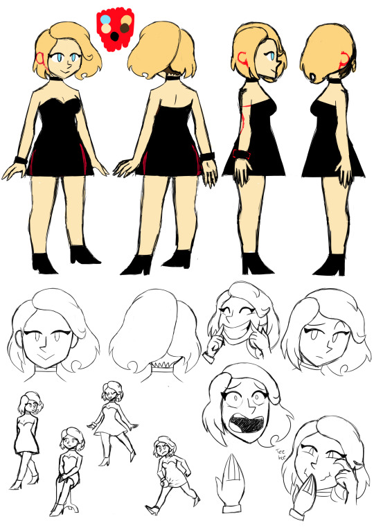
For my own pitch, there were in fact two characters: Sebastian and Christie. Sebastian is a geeky aspiring scientist who gets easily flustered and is quite smart, though he also has a bit of an attention-seeking streak to a fault. Christie can be easily summed up as the trendy popular girl, being social and fun to be around with a sense of humour but perhaps a little hot-headed. Christie is also interested in science but to much of a lesser degree compared to Sebastian.
Within the animation itself, Sebastian, Studying the sciences, finds himself performing chemistry at a science fair and impressing the masses with it. From there he sees Christie over in the distance and is taken aback, and after Christie takes notice of him he decides to try and impress her only to mix the wrong chemicals by mistake. This results in him being covered in liquid and making a mess. While cleaning up, totally defeated, a love letter is handed to him, and looking up the letter belonged to none other than Christie who wasn’t put off by Sebastian’s failure at all. This plot is meant to interpret the theme in a more metaphorical sense in that Sebastian fails his goal of impressing the girl he has a crush on and so is stuck socially, at least until the resolution.
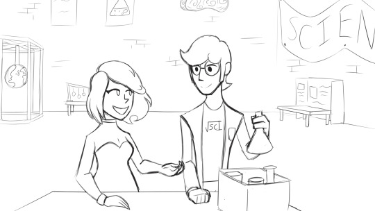
When performing the pitch, at the time, the character boards were incomplete but the storyboard was finished. However, due to error the storyboard used in the pitch wasn’t exported and was just the raw file, which lead to the inability to show the storyboard during the pitch and that had to be resolved though verbally explaining what was pictured on the storyboard. For feedback concerns were raised over how much planning would be needed for my project as I use multiple characters and also with different shots taken I’d have to draw all the backgrounds alongside them. Moreover, It was mentioned that with how I initially wanted to portray background characters as being simply a universal set of silhouetted figures that there might be the the issue of the animation looking cheap. The feedback given was taken into account, and the way I personally dealt with these issues will be mentioned later.
As we could only make 30-35 seconds for the completed animation design decisions had to be made to reflect that. Any complicated and details for the plot couldn’t be done as there is the heavy risk of going over the allocated time or being unable to complete the animation by the deadline, especially given the project could only be done as an individual and not as a group. A wide range of settings would also be unideal as those settings had to be planned and the backgrounds drawn. Complicated character designs are generally a poor choice for projects with only a single person behind them that have to hit a deadline. Characters should be able to properly convey an idea to the viewer as well as fit in among the setting. Character backstories and backgrounds can’t be too complicated in this instance as there would only be 30 seconds to tell the audience the character background along with the main plot. There were, indeed, many decisions that had to be made.
In answer to the plot and characters, I knew I would be unable to make something extremely complicated so story-wise decided upon a simple concept that had been used time and time again. The concept is the typical cliche of a nerd, possibly a social outcast, falling for a pretty girl who is popular and out of his league. This concept is a popular theme in rom-coms but also appears in many other genres, such as the superhero genre in the form of Spiderman in the Marvel Cinematic Universe, Action-comedy in Scott Pilgrim vs. The World, and even books and movies aimed towards children such as Dairy of a WImpy Kid. Though one should often try to avoid cliches when they can, especially in regards to the main plot, in this instance I felt as though it would be a good element of the story as it’s very simple, recognisable and wouldn’t be especially hard to incorporate into a 30 second animation. As for character designs both Sebastian and Christie were more designed to be recognisable in their stereotypes as opposed to aiming towards anything especially remarkable. Sebastian is a geek type character and, like a lot of geek stereotypes, wears glasses and is designed to appear a bit lanky and tall as far as his body type is concerned. He also wears a lab coat, fitting of his interest in science, and wears a shirt with a design that looks like a mix between the inscription “sci” (which is supposed to be shortened from “science”) and a square root symbol incorporated in. He notably still looks unprofessional though even with the lab coat, which leads back to the idea he’s an aspiring scientist and not a real one. Christie on the other hand was designed to appear more pretty and fashion-conscious than Sebastian, and wears a low-cut dress, high heels, and a few accessories in the forms of a bracelet and a choker collar. She’s also notably blonde hair-blue eyed, which is another stereotypical quality, this time of attractive girls.
The artstyle I was aiming for for the animation is one that incorporates mostly simple shapes and lines. The character’s bodies are supposed to be easy to construct and very angular in places. From this decision it became much easier to keep characters consistent and animate them. The concept of designing characters that can be drawn using simple shapes is nothing unusual as the ability for a group of animators to replicate the design in their own drawings is always taken into consideration, as well as how well the design can be quickly drawn and its capacity for flexibility and mobility. Notable designs that use simple shapes include many designs that incorporate the “rubber hose” artstyle, which is characterised by simple body shapes and long, seemingly boneless limbs, and in more modern times cartoons such as Ren and Stimpy, Spongebob and Steven Universe also use a lot of basic shapes in their character designs.
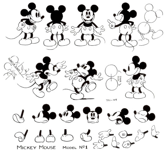
Original Mickey Mouse design (an example of a rubber hose artstyle design)
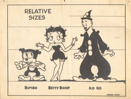
Character designs from Betty Boop (another example of rubber hose artstyle designs)
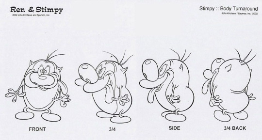
Stimpy’s design from Ren and Stimpy
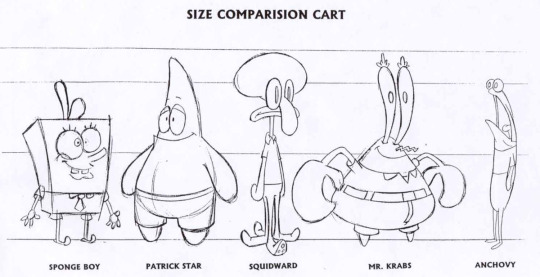
Character designs from Spongebob
Other small design decisions were also made when I was creating the character designs, such as eyes being drawn as a single line to represent the top eyelid and a circle, Sebastian’s glasses sometimes obscuring one or both eyes, eyebrows only being presesnt when needed to express emotion and characters’ hands only having individual fingers drawn when there is distance between it and other fingers, otherwise simply being represented as a single shape with lines across to represent the fingers. These design decisions mean less time is spent animating as less detail in the drawings is demanded and also helps maintain more consistency.
The settings made for the animation are another area to talk about. There are two settings present in the animation, the first one being the outside, external shot of the building hosting the science fair, a shot only present in the very beginning of the animation, and the inside of the building where the science fair is being hosted itself. From first creating the storyboard I already decided how I want the settings to look. The external shot would show that the science fair would be taking place in a large industrial looking building, possibly a warehouse of some kind, while the interior would have an array of science themed attractions and decorations. This inspiration was directly inspired by my own experience attending the Big Bang Science Fair a few years ago which itself was hosted in a large warehouse-like building. A detail added to the background of the external shot are distant buildings and skyscrapers which was a touch added to add to the industrial atmosphere that warehouses tend to have.
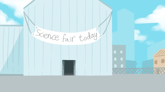
As for the internal shot, the perspective is taken from a high perspective overlooking the area, in which you can see figures in the room and various science attractions. A crowd of people are gathered around a particular table, and as the camera zooms into that area and the shot cuts to Sebastian mixing chemicals together, it implies that he is the person at the table:
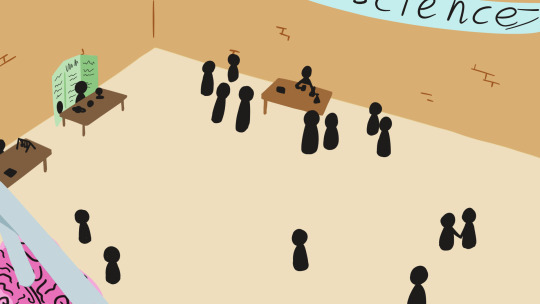
In order to design these settings some research was necessary, and so I created two mood boards in order to better understand what was wanting to be incorporated into the settings.


Both of the resulting artworks for the setting were drawn in an external program rather than straight into Harmony. The reason for deciding this is because the setting is the main focus of these shots and so it is important that more control can be possibly given to make the settings look appealing, which would be better achieved in an art program as opposed to in Harmony itself which is instead designed with mainly animating in mind. Instead of Harmony the art was created within Paint Tool SAI, which was the only available option for drawing within at the time of writing. Comparatively to the industry standard Photoshop, SAI is a very flexible art program, very user friendly and achieved the purpose I wanted to use it for, however possesses some limitations such as the inability to type text and insert it into an image and having only basic image editing options available.
The completed art was kept simple partly due to stylistic choice and partly due to being aware of potential time constraints. By keeping the setting art simple it meant that the backgrounds could also be simple without looking out of place. Moreover, a notable feature of the internal shot is that there is a lot of empty space in the room even with the people present, which allows the backgrounds to remain simple even as shot angles change within the animation as very few background elements have to be drawn. The art uses mostly pastel colours, which are easy on the eyes, help portray the tone of the animation as being lighthearted and not particularly serious, and are also different enough from the colours used on the characters to have them stand out but not so much so that the characters look out of place.
The animation process itself had several issues appear that needed to be addressed during production. From the beginning on of the main issues that appeared was in regard to the way I created my storyboard. Though the storyboard itself was easy to follow and there is very little difference between that and the final animation, I separated the animation into two scenes in the hopes that animating could be more easily done bit-by-bit. In itself this isn’t a poor idea, however Storyboard Pro separates scenes into individual Harmony files when exporting. Partway through the production process I became no longer able to access any editing software that could be used to edit the two scenes together, which meant that I had to leave the two scenes separated. The other issue that arose was that I didn’t know at the time how long exactly my storyboard was in relation to the animation, especially after editing the length each storyboard cell plays for. When finally exporting the storyboard I found that the animation would only come to 27 seconds if I followed it scene for scene so some adjustments were made to extend certain shots, maintaining the accuracy to the original plan while also hitting the correct time for the animation. Generally between the storyboard stages and the animation stages of production is an intermediate stage in which animatics are created. Animatics, as stated by Boopanimation.com, are defined as “an animated storyboard [...] with the correct timing and pace of the film”. In regards to this, an animatic is a more detailed storyboard and in particular is often used as the main foundation that animations are created from. All the main features of what the animation includes and its flow is already there as it should be able to successfully communicate the intricacies of the way the finished animation should animate like. Also the animatic should often include sound effects and any spoken dialogue. In the case of my own project this step was missed in part due to a lack of knowledge on how to create an animatic and how to use particular programs to assist me. This lead to a flexibility in the way I can adjust my animation and what it features even after exporting the storyboard, however, it did have a heavy toll on the way the animation flows in my opinion as everything feels like it’s going too fast.
During the actual production itself I structured the way I made the animation by focusing on a particular scene, and then doing one shot at a time. The way the animation was created was through the use of mostly pose-to-pose animation, so creating two keyframes and then planning, and later refining, the motion of the in-betweens. When animating the characters I focused on animating the character’s bodies first before adding details such as the hair in which it’s necessary to animate in a slightly different way as principles such as follow-through and overlapping action are more easily applied to them. Exceptions to using pose-to-pose exist within the animation however in minor details, such as the liquid in the “do not mix” flask after Sebastian Picks it up, liquids as they pour out of flasks, the burst of blue smoke that appears in scene 1 and the love hearts that appear around Sebastian as he’s waving to Christie. All the given examples use straight ahead animation because animating this way tends to offer a more natural, organic flow to the animation that’s suitable for elements such as smoke and liquids but at the potential cost of consistency and time. In comparison, pose-to-pose was mostly used because once an end point is decided for where a character will move to comparatively less time is spent attempting to ensure it flows well and adding details such the rebounding action an object with follow through might have. The overall method I tended to stick to for animating was to draw the key frames, move the image in the key frame slightly frame by frame, and only notably manually drawing in betweens when a reasonable level of motion happens or parts of the body are angled in a way that I was no longer able to use the same base drawing between frames. On one hand this was a great choice to further cut production time and keep consistency, but on the other hand the animation feels mildly stiff and flat. Along the same lines tweening was also used at times when only a single drawing was needed for a scene, again cutting production time but at the expense that the animation looks flat.
Colouring, backgrounds and the finalisation of particular details were some of the last aspects added to the animaton. The backgrounds weren’t particularly hard to make as, like what was previously stated, the setting had key background elements given a lot of space between them so very little had to be drawn in a lot of the shots beyond the walls and floor. One of the more troubling shots that had to be drawn was in regards to when Sebastian looks up to see Christie in the distance for the first time. In the shot established a few seconds before, the setting is represented as having a lot of people present. In this first shot the individuals were represented as vague blobs with circle heads, which I decided upon in the end to save time and felt could be excused due to it being a distant shot. However, in the later scene, the shot is looking out at part of the room on ground level and any people seen that close have to be able to be recognisably people otherwise the animation quality might suffer. In answer to that two background characters are present, one talking to Christie and one closer to Sebastian, clapping at him and keeping some level of consistency between that particular scene and the one right before. Aside from that there are no other people present however, not even any silhouettes, which lead to the scene overall feeling very empty especially given the setting. As for colouring that aspect was surprisingly hard and tedious. With how I created most of the animation, manually moving the same image across multiple frames and only redrawing when necessary, consistency between frames became even more important as the slightest change could potentially be extremely noticable. If I had coloured the keyframe beforehand and then used that same coloured image across frames, adjusting as necessary, the issue might not have been so troublesome. Regardless of this flaw I still dealt with it, either manually using the fill tool across different frames or copy-pasting some of the same elements from previous frames to future frames and transforming them as necessary.
Overall I would say I made a decent attempt at the planning and production of an animation. I succeeded in hitting the deadline, planned the character designs and made reference sheets, added some artwork for the settings, and thought about how I would overcome the issues of time constraints and only being a single individual working on this project. Regardless of that though, many mistakes were made in planning and production that might have done more harm than it was worth. From going through the process of planning and producing the issues found include the following:
The character designs are good for portraying their cliches but could be much simpler
When creating the animation I used the standard 24fps, which meant more frames had to be accounted for that were probably unnecessary
The animation feels flat due to the animation process
Because of the nature of having multiple shots, several backgrounds had to be drawn
The principles of animation weren’t used that extensively due to the animation process, leaving the animation feeling somewhat dull
All of the issues mentioned could have been easily solved if I had thought out the pre-production better. Though I succeeded in making the final animation, unnecessary complexity meant that other areas, notably the animation itself, had to suffer. To mitigate this I would firstly have to reflect on story elements and ask myself whether two characters are really necessary if I were to tweak the story in some way. On top of that, would it be possible to have a single shot used, and use a single background that had more time and focus put into it? The artstyle could be changed, as it mostly keeps characters maintaining somewhat lifelike proportions and body shapes. Do they have to be human at all? If the characters were drawn in an even simpler way then manually drawing more inbetweens might be more plausible which would solve the issues of there not being many animation principles present and the animation feeling flat. In conclusion, when trying to go through the pre-production process again, I’ll need to ask more questions and find better ways of keeping hitting deadlines possible without making quality suffer so much.
0 notes
Text
Hot Short Hairstyle for Black Women from Ashlee Gradic in Charleston, SC

African American women have had an intense love affair with short hairstyles for quite some time. Over the years, every major celebrity has donned a well-coifed short hairstyle at one time or another. This elegant short hairstyle for black women was created by one of Charleston, South Carolina’s top professional hairstylists, Ashlee Gradic. Ashley infused a hint of the past with her tight curls in the top that are reminiscent of the Betty Boop hairstyles of yesteryear. She also clings to today's hottest trends with a precision haircut that tapers the sides close to the scalp. Ashley added soft waves over the close-cut sides to soften the look also.

This image showcases the height of the tapered sides flowing up into the tight curls in the top.

This model is wearing an elegant short hairstyle for black women from Ashlee Gradic in Charleston, SC Stylist: Ashlee Gradic Salon: Kuttin It Up Kuts & Styles, Charleston, SC Salon Ph: (843) 425-9865 Model: Voquon Makeup: Deirdre Clay
Dramatic Short Hairstyle for Black Women
What sets this particular short hairstyle for black women apart from the rest is the way Ashlee Gradic created motion in the hair with the tight curls in the top and soft waves on the sides. The combination blends old and new trends together to create a totally new creation. Ashlee added two commercial tracks of human hair to the front to add volume to this look also. The hair additions are used to create a faux pompadour look that is covered in tight curls. This short hairstyle for black women is specifically designed to enhance this model’s facial structure and highlight her soft cheekbones. It is a hairstyle that is daring in its bold lines, yet commercial enough to be worn at any type of event.

The left view of this short hairstyle for black women showcases the tight curls in the top and soft waves on the side.

This short hairstyle features tight curls in the top and tapered sides.
Creating the Look
Ashlee Gradic began by giving her model a precision barber cut around the sides of this hairstyle. The close-cut sides create a contrast to the full top that is overloaded with curls. To ensure that the top had the desired volume Ashlee wanted, she also added some human hair additions. Ashlee chose to use human hair additions because of the versatility it gave her during the styling process. She was able to use any manner of heat or curl technique she wanted in order to achieve this short hairstyle for black women. To create movement around the hair, Ashlee also created soft finger waves along the sides of the hairstyle. The haircut, mixed with the tight curls and finger waves combine to form a hot hairstyle for today that pays homage to the past also.

This hairstyle is cut close on the sides and left longer in the top. Hair additions are added as well for volume.

The top of this short hairstyle for black women is left longer and filled with tight curls. 35 Perfect Pixie Haircuts for Black Women in 2020 You Need to See!!! Over 100 Bob Hairstyles from Top Hair Salons to Inspire Your Next Look Jennie Richardson’s Sassy Reds Short Haircut with Hair Color and Extensions
Taking Care of This Short Hairstyle for Black Women at Home
Ashlee Gradic wanted to ensure that taking care of this hairstyle at home would not be too complicated for her clients. She designed this short hairstyle for black women in such a way that her model only needs to wrap her hair at night with a silk or satin bonnet and use some type of oil sheen every morning also.

Ashlee Gradic created this short hairstyle for black women. Ashlee used two commercial hair pieces in the top for volume.

The back of this hairstyle features tons os tight curls and a tapered nape area.
Introducing Ashlee Gradic from Kuttin It Up Kuts & Styles in Charleston, SC
Ashley Gradic is an award-winning, professional hairstylist whose work has graced the pages of some of the largest black hair publications in the United States. Ashley is the owner of Kuttin It Up Kuts & Styles, located at 2366 Ashley River Road in Charleston, SC also. Feel free to stop by the salon or give Ashley a call at (843) 425-9865 and let her create a beautiful short hairstyle for you. Short Hairstyle with Highlights from Katina King Short Quick Weave with a Tapered Neck from Tamyka Malcolm Over 180 Ponytail Hairstyles for Black Women You Need to See Read the full article
0 notes
Text
Boop-Oop-a-Doop! It’s MAC Betty Boop Lipstick
MAC Betty Boop Lipstick ($17)
Boop-oop-a-doop!
OK…that’s all I know about Betty Boop, LOL! I just never went through a Betty Boop phase, but I did envy her skinny brows somethin’ fierce in the ’90s.
That, and her signature red pout was/is perfection. It inspired MAC’s sassy new Betty Boop Lipstick, which comes to town on Valentine’s Day for $17. It’s an opaque bright red online exclusive, and it looks a little like MAC Red Lipstick.
Wearing the new $17 MAC Betty Boop Lipstick
Ya know, I’ve really been into MAC mattes lately. I think they totally stepped up their game in terms of their matte lipstick formula, and even though my lips are ragged as hell in this pic (I’ve got flakes for days), you can’t really see them. The lipstick lounges magically on my lips without hugging any flaky bits, and it avoids my vertical lip lines, too.
Is it just me, or does this finish have a lazy luster? It’s isn’t completely flat, is it? There’s a subtle shine up in the mix… I think. Hard to say. I like it, though. It keeps things interesting.
I love this color, but gosh, MAC, couldn’t you have done a little something with the packaging? I mean, come on. It’s Betty Boop! Sure, the box is cute, but what about the tube?
Missed opportunity.
If you rock reds with a slight blue hue a la MAC Russian Red, I bet you’ll love MAC Betty Boop. Check it out on the MAC website (remember, online exclusive) February 14th through March 31st.
Buttons and hems
OH! So you know how I’m going to my HIIT classes at night now, right? Well, it’s been kind of weird, because I got to know the people the people I was in the morning class with, but I don’t know anyone in the night class yet.
You know how you get to know people after you’ve sweat with them for a few months. You develop a sense of camaraderie, but it was kind of weird sweating in a room filled with people I don’t know…
OK, yeah, I know that sounds strange.
Anyway, I tried to get myself to socialize, so I was chatting with a lady who told me that she belongs to a sewing group, and she said that their project this week was a makeup bag.
“Makeup?!” I asked. You said the magic word, girl. LOL!
They meet every day, sew together and hang out. Isn’t that cool?
I have no idea how to sew, but I’ve always wanted to learn how. When I was 14, I asked for a sewing machine for my birthday, and I got it. Of course, I never figured out what to do with it, so I got tired of it in about two months. I’d load the thread, and stitch random pieces of fabric together, LOL!
In retrospect, I wish I’d done more with it. I still have Project Runway dreams of sewing my own clothes.
Do you know how to sew? I can probably manage a button and maybe an emergency hem, but that’s it.
Your friendly neighborhood beauty addict,
Karen
The post, "Boop-Oop-a-Doop! It’s MAC Betty Boop Lipstick," first appeared on Makeup and Beauty Blog | Makeup Reviews, Swatches and How-To Makeup. from Makeup and Beauty Blog | Makeup Reviews, Swatches and How-To Makeup http://ift.tt/2kYOuYd via IFTTT
0 notes
Video
youtube
Greg Beebe is a self-taught, mixed media artist who describes his work as “a mixture of abstract expressionism, pop and graffiti street art”. Get up close and personal with Greg's painting "Blood, Sugar, Sex Magik"
Title: Blood, Sugar, Sex Magik
Medium: Mixed media (acrylic, spray paint, sugar packets [source: throughout Europe], photograph, resin) on canvas, signed by the artist.
Edition: Original
Year: 2018
Size: 122.0cm x 122.0cm x 3.8cm
Arty-Fact: This work is inspired by the Red Hot Chili Peppers’ "Blood Sugar Sex Magik" album. The infamous Betty Boop is wearing the vintage Mickey Mouse sorcerer hat ("Sex" and "Magik"), with a background of various quotes by Betty Boop and others. In addition, Betty Boop stands next to a bloodied skull ("Blood") which hints she's been on a hunt - the cash surrounding the skull indicating exactly what she was hunting. The base of this piece is made from actual sugar packets collected from various locations throughout Europe ("Sugar").
#greg beebe#art of the day#artist of the day#pop culture#street culture#street art#pop art#graffiti#mixed media#collage#art gallery#online gallery#collect art#art collecting#art collector#home decorating#interior decorating
0 notes
Text
Inspirational Moodboards
27/06/18
In this post I highlight the characteristics and identity of one brand and one designer (Lazy Oaf + Kate Morris), through visual mood board expression interpreted in my own style. This demonstrates how I aim to adopt my contemporary based collection from observing their product range and print inspiration.
Lazy Oaf:
Lazy Oaf is a London-based, independant streetwear brand. The label features a range of clothing and accessories which demonstrate bold colours, patterns and humorous graphic prints. The brand continuously work on many special collaboration projects some of which have already included Vans, Looney Tunes, Betty Boop, DC Comics, and Dreamwork's. Lazy Oaf was founded in 2011 by Illustrator and designer Gemma Shiel, and has since attracted the youth with its nostalgic themes and teenage rebellion. The brand aims to showcase a sense of apathy towards conforming to the norm through their illustrative prints, style and visual aesthetic.
Below I have put together an arrangement of images and prints from Lazy Oafs campaign collections. This board illustrates a selective colour pallet, print inspirations, pop cultural t-shirts and simplistic styled photoshoots.

Kate Morris:
Cruelty free, knitwear designer and first price winner of the 2017 Redress design competition, Kate Morris created her very own label called CROP. Her brand provides fun filled, vegan knitwear using zero-waste and minimal seam production techniques on plant fibres. Her garments and accessories are designed to be worn across multiple seasons and all year round. Pattern making, surface and silhouette techniques are all determined during the knitting process, primarily focussing on cutting out waste and improving manufacturing efficiency. Kate achieves this by incorporating a minimal seam amount in her garments, from creating singular pattern pieces that are comfortable and can be subtly adapted by the wearer.
Kate covers all ethical and sustainable elements when making her collections. CROP intends to break expectations with plant based knitwear that can be worn across multiple seasons, relevant to the global needs and beliefs of today’s generation. The full life cycle of each item has been considered, leading to decisions such as using one fibre type per piece for recyclability and incorporating care labels into the jacquard patterns to make a design feature out of promoting low impact use.
https://www.wearecrop.com/about
Kate’s most recent collection was inspired by our changing attitudes towards food. She produces simplistic pattern designs composed from pop art visuals of salad jellies, all day breakfasts and pick ’n’ mix sweets.
Below I have created another board featuring Kate’s sustainable, knitwear pieces. This mood reveals a colourful, geometric emerging trend.

0 notes
Text
20 Stylish Birthday Gifts The Woman In Your Life Will Love
http://fashion-trendin.com/20-stylish-birthday-gifts-the-woman-in-your-life-will-love/
20 Stylish Birthday Gifts The Woman In Your Life Will Love
It’s a universally acknowledged truth that nothing quite takes the edge off growing yet another year older than receiving a stonkingly good birthday present. Even the birthday naysayers who like to ignore their own special day are secretly happy when presented with a thoughtful gift.
Which is why we have trawled the shops to bring you the best birthday presents in the land for the woman in your life, guaranteed to score you some serious brownie points. From fashion to foodstuffs, there’s something to suit even the fussiest of birthday girls. Now all you have to do is master the wrapping up.
A Blouse Top
Remember cult London label Antipodium? Nope, well you can bet that the fashionista recipient of this gift will. And so she’ll be thrilled to receive something – anything – from Creative Director Geoffrey J Finch’s latest project.
Initially launched exclusively at MatchesFashion, the power of Blouse – AKA deconstructed shirts and printed tops – can now be felt at Selfridges, too. With his tongue firmly in his cheek, Finch’s references run from Keeping Up Appearances’ hilarious Hyacinth Bucket to Shania Twain and RuPaul’s Drag Race’s Alyssa Edwards (natch), and he splashes them across the front and back of his perfect – and mindfully manufactured – cotton tees. Safe to say, if her sense of humour is as strong as her sartorial nous, she’ll be into it.
Buy Now: £65.00
Lingerie That She’ll Love
For far too long the lingerie market was dominated by designers that catered more to the male gaze than to the woman who would be wearing the damn underwear. But not any more; there is now a slew of brands creating undies that women will actually want to wear. So wave goodbye to cheap red lace and nasty crotchless knickers, and instead gift her pretty (and comfortable) silk pants, delicate bras in unexpected colour combos and bold bodysuits that are so achingly cool she’ll want to wear them as outerwear.
Basically, if it could get her accused of solicitation, take it out of your basket.
Buy Now: £45.00
A Cult Gaia Bag
If there was a bag that owned the past 12 months it was the bamboo ‘Ark’ clutch from LA-based brand Cult Gaia. We’re not sure how you didn’t notice – it was all over Instagram, cluttering up your feed. Just large enough to carry an emergency Mexican chicken wrap in it (pro-tip: this is an important requirement for a lot of women), it has a vintage feel while remaining ladylike.
While the OG is still relevant, designer Jasmin Larian has expanded her portfolio, introducing the kind of new shapes and materials that will ensure the brand isn’t a one-hit wonder.
Buy Now: £300.00
A Dainty Ring
Contrary to popular belief, women aren’t just hanging around desperate for a hunk of glass to be put on their finger – they like other jewellery too. Especially if it’s a sleek, Scandinavian-style piece that’ll fit in with the rest of her magpie haul.
Of course, the only thing to be careful of when it comes to ring shopping is the size. If you have access to her jewellery box then try one of her rings on your little finger and see how far down it goes, or if she doesn’t notice when things go missing, take a ring to the jewellery shop with you.
If you prefer to do your shopping from the comfort of the sofa, go for a pared-back design that would look good on any finger.
Buy Now: £109.99
A Pair of Shoes
Flats, heels or mules, nothing says, “I actually listen to you and pay attention to your style” as an on-trend pair of shoes. And with fast fashion ever-increasing in speed, Topman’s big sister brand Topshop is never a bad place to start. One of the best high street stores to translate pieces from the catwalk into something altogether more affordable, you can count on them to have her well-shod.
Buy Now: £56.00
A Silky Shirt
By its very nature fashion is transient, but while trends come and go there are some things – like a Chanel handbag – that will always be appreciated. Yet they don’t have to be bank-breakingly expensive.
Eternally relevant, a silk shirt (or even just a silk-feel shirt) will always have a place in a stylish woman’s wardrobe. Smartened up for work or paired with jeans at the weekend, it’s the chameleon of the closet. Right now, pyjama-style shirts are having a bit of a moment and it’s not hard to see why. After all, given half the chance who wouldn’t want to wear their PJs all day?
Buy Now: £29.99
A Bottle Of Gin
Unlike its Scottish cousin, whisky, which has to be matured for an age, gin doesn’t take very long to make, which is partly why there has been such an explosion in the gin market. It’s not just being manufactured in the UK and US either; from Japan to Norway, new gin producers are emerging across the globe.
It’s the ease of manufacture which lends itself to independent, craft booze makers, so now you can probably pick up a bottle that’s been made within a five mile radius of your house. Supporting the local economy never tasted so good.
Buy Now: £30.00
Pyjamas
Similarly to underwear, when shopping for pyjamas you have to think about what she’d want to wear and not what you think looks good. Comfort is absolutely key. But that doesn’t mean nightwear has to invoke the spirit of Wayne and Waynetta Slob; from silk pyjamas that cost hundreds to breathable cotton designs on the high street, there are plenty of options to pick from.
River Island is currently offering an excellent collection of embroidered PJs – we’re particularly into this nightshirt, which proves they’re not just for Scrooge.
Buy Now: £26.00
Charlotte Tilbury Products
British makeup artist Charlotte Tilbury has worked her magic on a number of famous faces, with Kate Moss and Kim Kardashian both benefiting from her skills. Having worked in the industry for over 25 years, she launched her eponymous makeup and skincare range in Selfridges in 2013, and it was an instant success.
As prettily packaged as it is effective, we’re convinced that most women would be happy to receive something from the Charlotte Tilbury range – in fact, she’ll probably be impressed that you even know who she is.
Buy Now: £60.00
Champagne Bowls
The design of the Champagne saucer has been variously attributed to both Marie Antoinette, the last Queen of France, and Madame de Pompadour, the chief-mistress of King Louis XV. Although neither of them deserve the honour as the glass was in fact invented in England, a good while before either of them were born.
While they’re not quite as practical as flutes – which were developed to maintain the bubbles – we think that it feels far more luxurious to drink fizz from a cope glass.
Buy Now: £32.00
A Silk Pillowcase
If there’s anyone with a Netflix account who isn’t currently obsessing over Queer Eye’s fab five, then we’ve yet to meet them. While everyone might argue over who their favourite is, there’s one thing we can all agree on: the majesty of grooming expert Jonathan’s glorious mane.
Apparently he keeps his locks looking so smooth and shiny by sleeping on a silk pillowcase, much like this one. Additional benefits include protecting and hydrating the skin, while also preventing split ends. Best. Gift. Ever.
Buy Now: £79.00
A Simple Tee
We’ve said it for a good while now, but Japanese brand Uniqlo really has nailed the art of the basics. But while its menswear offering has always been on point, its fairer sex collections have sometimes erred on the side of frumpy.
No longer. Since Christophe Lemaire took the reins as artistic director, Uniqlo’s womenswear offering has improved exponentially and it’s now a great place for artfully simple tops, T-shirts and jumpers. Head there for a birthday present that will put on a smile on her face but won’t have you weeping into your wallet.
Buy Now: £12.90
A Sleek Watch
There are so many things to consider when buying a watch for yourself, but when shopping for someone else it’s best to set all of the technical stuff to one side. Play it safe and opt for something that’s unobtrusive; a cool, minimal timepiece that will fit in with her style, whatever that may be.
And make sure you take a look at her jewellery collection before you pull the trigger – people can be quite particular about mixing metals, so if she only wears silver then get a silver watch; if she’s a gold type of girl… you get the drift.
Buy Now: £255.00
Simple Summer Sandals
Footwear brand Ancient Greeks takes its inspiration from Greek mythology and legend, meaning its sandals are the very essence of classic – meaning they’ll be on her shoe rack for years to come.
This season, the label has collaborated with Italian designer Fabrizio Viti, who has added a hint of feminine prettiness with his daisy decorations. If you’re feeling extra generous, book her in for a pre-sandal-wearing pedicure, too.
Buy Now: £195.00
MAC Makeup
With its ever more frequent – and always interesting – collaborations, MAC will always be a great go-to option for birthday presents. Always first with fresh new colours, its impressive archive is full of classics, too. There are few women who haven’t pledged allegiance to a MAC lipstick shade.
It has recently brought out collections with designer Nicopanda, makeup artist Patrick Starrr and cartoon Betty Boop, while an Aaliyah-inspired range is also promised, proving that even death is no obstacle to a good collaboration.
Buy Now: £19.50
A Gin Serving Set
What to buy for the gin-loving lady who has it all? A serving set dedicated entirely to that clear liquid, of course.
Gin’s popularity over the last few years means that ever more ingenious ways of serving it are being found, while drinkers are becoming more particular about the sort of gins they will and will not drink. Then there’s the perfect garnish; from peppercorns and lavender to the humble cucumber, gin is served numerous ways and deserves something to do it justice. This handsome kit from Polish glassware company LSA should to the trick.
Buy Now: £300.00
A Go-To Bottle Of Perfume
We know, buying a bottle of perfume as a birthday gift doesn’t exactly constitute thinking outside of the box, but when bought correctly, there can be few presents that are quite as thoughtful.
If you know what her favourite scent is, then just buy her a top up and watch the brownie points come rolling in. If you’re not sure or she doesn’t already have one, then we recommend going with something new to impress her. And if you’re really stumped, go for a well-designed bottle that’ll look nice on the shelf – she’ll think of you every time she sees it.
Buy Now: £72.00
A Sleek Coffee Table Book
Buying a novel for someone can be fraught with difficulty. Books are so incredibly personal that unless you know the recipient incredibly well – and specifically what type of literature they’re into – it’s best to steer clear.
However, coffee table books exist more on the surface level – as long as it’s beautiful to look at and based on her interest then you should be on safe ground. This stunning tome from Italian fashion legend Anna Dello Russo is designed like a keepsake box and should make even the snarliest of fashionistas smile.
Buy Now: £97.50
SAD Light
If you’re shopping for someone who lives in the Northern Hemisphere, there really is no more thoughtful gift than a SAD lamp. Proven to help alleviate the symptoms of Seasonal Affective Disorder in just seven days, it encourages the brain to reduce the production of melatonin – the hormone that makes you feel sleepy – while encouraging the production of feel-good hormone serotonin.
All this means is that even on the darkest, most dreary of winter days, she’ll spring cheerily up out of bed. Probably.
Buy Now: £90.00
Designer Sunglasses
When it comes to shopping for designer sunglasses, there are a couple of things to think about. First of all is face shape – if you’re unsure what hers is exactly, opt for a classic frame like cat eyes or Wayfarers, which suit most mugs.
Secondly, and rather boringly, is full UV protection. They’re not just there to accessorise her face, they have to protect her eyes too. Which is why we’re big fans of New York eyewear brand Moscot, which has been producing sleek frames since 1915.
Buy Now: £265.00
0 notes
Text
New York City: Artist Scott Ewalt’s life-long passion for burlesque is unparalleled. It inspires his art, has guided his career, and has lead to many friendships, but it’s perhaps most apparent in the spectacular interior of his East Village apartment. In 2000, when Giuliani’s mission was to clean up Times Square, Scott’s mission was to save as much of it as he could possibly store. His one-of-a-kind collection celebrates the trailblazing performers and venues of New York City’s legendary burlesque scene. In his own work Scott continues this obsession, blurring the lines between collector, historian, and visual artist. His last show at Participant Inc. was a grand installation that mixed theatre signage, wallpaper, and memorabilia. The star pieces were his depictions of gangs of seductive devils roaming through intricately detailed cityscapes of Time Square at the height of it’s sleazy chaotic glory; a decadent zone where all pleasure is encouraged. Talking with Scott is a brilliant web. His back-stories have back-stories. He’s obsessed with the origin of ideas. As he speaks he connects lines through history in order to explain where concepts in fashion, art, music, and culture began. His militancy about this has made him a leading expert in downtown subculture, some of which he’s lived first hand, playing a leading role in what are some of the city’s best moments. Scott’s fairy tale introduction to New York began with being discovered by Thierry Mugler while still an architecture student at Princeton. He became Mugler’s muse for his iconic Vampire collection, starting a collaborative friendship, and long wild ride through the height of the acclaimed designer’s dominance in fashion. Let’s start with Betty Boop. Was she your first introduction to burlesque? Probably. I was a big fan of Max Fleischer cartoons. He created her, Felix the Cat, and Popeye. I had a special interest in him because my great aunt was his nurse. Why were you so fascinated? I read that when Betty Boop danced, every tenth frame she would be nude. You can only see it if you stop and actually look at the individual frames. That made Max my hero. So, that I love strippers so much now makes perfect sense. Also, in the early cartoons, the backdrop for Popeye was always the Bowery, and I thought, ‘That looks great. I wanna live there’. How did you end up getting this apartment? The worst possible way. I was close friends with Luciana Martinez de la Rosa. I helped her move in here. She was only in the apartment for eight hours and she caught spontaneous meningitis and basically exploded. She had the boy in the bubble disease, but before they had even discovered it. Had they diagnosed it she would have had to live her whole life in germ free seclusion but instead she had this insane career as a Carnaby St. DJ, glam rock muse (Roxy Music), punk rock muse (Vivienne Westwood), and then she was the queen of the Blitz. As much as I miss her, out of everyone I’ve ever known she crammed the most into the fewest years. Yikes, how strange. Luciana was a painter. I know she would have been happy that a friend and fellow artist took the space. Yeah, so that’s the story. What was it like when you moved in? It really was the encyclopaedia of CBGB’s. You’d go to the deli and you’d see Suicide or two of the Ramones, and on the other corner, Gerard Malanga Lenny Kaye lived next door so Patti Smith was always around. And all the old beatniks like John Giorno, Robert Frank, who I’d see hanging out with that Broadway legend Uta Hagen. Almost anyone that wasn’t a bum was someone quite celebrated. I was in hog heaven and then all of a sudden it felt almost like someone unplugged a drain and all my heroes slipped through it. Everyone that made it special for me got pushed out. But you stayed? Well, in 2000 the building went up for sale for a ridiculously low price. Today I would get something the size of this bed for that amount of money I paid. So the other tenants and I pulled together to buy the place. We knew it was a once in a lifetime opportunity, plus I’d already collected all this burlesque signage and there was no way I’d be able to put this puzzle back together anywhere else. So, I decided to bite the bullet. I did everything I could, sold things, ran credit cards to the limit and borrowed. Even Thierry Mugler lent me money to close. I just barely made it. Once it was yours did you renovate? We had to. That’s when we found all the goodies. When we opened the walls they were stuffed with human hair because the top floor used to be a wig factory and when they would sweep the left over hair from the wigs would get trapped in the walls. Eventually it filled up the entire negative space of the whole building. It insulated great but at the same time it was kind of horrifying. And isn’t this place also rumoured to be the notorious Suicide bar? There was some debate about whether it was across the street or here. But when we excavated we found bottles of benzene which they used to make the cocktail so… Can you explain the bar? In the 1870s they served the Suicide cocktail, which was benzene, cocaine and rum, and it was served to prostitutes. One would make you high, and two would kill you. A lot of women would drink two and then jump out the windows… Dark… Let’s talk burlesque. At what point did you start collecting stuff? The first time I visited New York I stayed in Times Square and I was completely blown away. It was at its Koch-era peak of sleazy broken-down-ness. Everything was a hostess house, there was still taxi-dancing, and porno theatres that people lived in. I even saw a topless shoeshine booth. It was the Wild Wild West but in the middle of the city. And it was all based around Burlesque? Yeah, the girls didn’t have pimps. The majority of them weren’t even sex workers. I became fascinated with them. They didn’t sing or have a band but they were like: I’m starring in a show and that show is just ME! That takes such confidence. I have a lot of admiration for those performers because I wouldn’t be able to do it if my life depended on it. Do you remember buying your first piece of memorabilia? Around 1987 I became friends with Paula Klaw. She’s know for beating Betty Page with a hairbrush in all those famous pictures. She and her brother ran the notorious Movie Star News. They made those iconic Klaw movies with Paige, Tempest Storm and Blaze Starr. I started buying photographs from them. Paula saw I was hooked and said, ‘You know I have an actual Tease-o-Rama poster from 1955, do you want that?’ I told her I would kill to have it. She sold it to me for six dollars. Today it’s worth something stupid like $6000. That was my first piece of burlesque memorabilia and I still have it in the other room. How did you jump from that to signage? Giuliani started ‘cleaning up’ Time Square and with the space I have in this apartment I finally had the room to store stuff, so I made friends with all the Greek women that ran all these theatres. I told them, ‘I’m on your side, Giuliani sucks and I think your business is fantastic, so if you are ever in a position where you want all of this excellent stuff to go to a great home where it will always be preserved and eventually end up in a museum, then call me and I’ll pay you good money for it’. One by one they all called and that’s how I got everything. I also would go down to the south side of 42nd street and go to all the construction and… Pull stuff out of the trash? No. I would ask for whoever was supervising the demolition. And it was, you know, a construction guy that would always ask, ‘Why do you want this crap?’ And I’d say, ‘You’re just throwing it out, but I’ll offer you 50 bucks for it’. The next thing you know I had a team of construction scouts that would call me whenever they thought I might like something. I heard your collection has the oldest male strip club sign in New York. I think it’s the oldest in America period. (He points to the sign to right of his bed) That is the first outdoor sign that advertised showing all male films. They used to show Vapors by Andy Milligan at the Eros Theatre. That movie kept people coming to the theatre for fifteen years because a guy takes his towel off and goes off screen and you could see his blurry cock for like three tenths of a second. So, obviously when you put this house together it was about showcasing your collection. It was my therapeutic way of dealing with Giuliani. I thought if he is going to remove this amazing world from our city then I’m gonna make my own Time Square and sleep in the middle of it. Plus, I think it’s sexy. As I get older it may get creepy, but right now I still find it very sexy. I love that you collect both the male and female history of burlesque. It’s post-gay. My gender politics have always been that I like everyone. Gender equality for strippers? Exactly. I have definitely seen just as many of both. I like the exaggeration no matter what sex it is. They never look the same in real life as they do under a pink and blue light with music and costume. It’s a living illusion. Were you recently inducted into the Las Vegas Burlesque Hall of Fame? No, I was honoured with what they call a ‘Sassy Lassy’ award for outstanding contribution to the world of burlesque, and for my work helping the ladies figure out what the original soundtracks to their acts were. Some of them only had a memory of what they used to dance to. A lot of them hadn’t performed in over 30 years. It was a perfect symbiotic relationship, I got an inside track on the true history and they would get their act back together and a new friend. How did they feel about the Museum? Some of them, especially the ones that got married and found God, had guilt about their life in burlesque. The nicest thing about the Burlesque Hall of Fame is that it alleviated their shame and made them realise they were important sexual revolutionaries. Out of all the ladies you worked with who was your favourite? My favourite strippers of all time: Are Zorita, Kitten Natividad, Lilly Christine, Marinka, Liz Renay and Tempest Storm. Thanks to John Waters, Liz Renay and I struck up a friendship long before I started working with the museum. We were close for about fifteen years until she past away in 2007. She was like Debbie Harry and Mae West all at once, and super sexual. Up until she died she scheduled three dates everyday. She told me once that she was truly blessed because she never walked into a room where she wasn’t the most beautiful woman. I’m sure it was true. I met Tempest Storm through the Hall of Fame. That was a big moment for me. She did not disappoint. How old was she when you met? 80. She still looked absolutely unbelievable. She’s a real spitfire too. The ones with the names like Tempest and Satana have intensely strong personalities, and the ones with the softer names like Kitten really are the sweeter ones. They’re like comic book characters. They completely live up to their character’s names. Do they also honour male performers? Not yet. Male burlesque has been going on just as long as female burlesque but being a male stripper is even less socially understood. Not only are you a sex worker but you’re a sex worker based on a female profession. There’s double guilt so the history has been pushed underground. Many of the famous male performers still won’t talk about it. Is that something you try to correct in your own artwork? I have been working on the same series of images forever. I started off wanting to document what Time Square looked like. I didn’t want them to look like Edward Hoppers or nostalgic ‘70s photo-realistic paintings, because the whole thing about Times Square that made it magical for me was the confusion and chaos and the constant overlapping of pop culture. I needed something to inhabit these cityscapes and I decided the only logical occupant would be devil versions of the male strippers that I hire to work my night at The Cock. Obviously. So you combined all your loves? Yeah, that’s what I think art is about. It’s like a potion. You put in all the ingredients that you love in order to get what you want. I shopped the show around for years and got practically laughed out of town. Then, thanks to encouragement from Charles Atlas and Kembra Phafler, Lia Gangitano from Participant offered me the show last spring. It was super fun. I got to do everything I wanted to do. The press release mentioned ‘psychotronia’.What’s that? It’s the more exaggerated version of pop culture. If Marilyn Monroe and Elizabeth Taylor were the norm, then Jayne Mansfield and Liz Renay were psychotronia. It’s this whole attitude of life where everything is completely turned to eleven. The violence is ridiculously violent and the sex is ridiculously ridiculous and all the people that made the movies were incredible hustlers. The most successful psychotronic filmmakers were Russ Meyer and Roger Corman. For me psychotronic movies were actually closer to reality than what Hollywood was doing, trying to imitate reality. I’ve always loved this definition of camp: the lie that tells the truth. That is what psychotronia is. I never heard that definition. I love it… OK, one last topic. Is it true that you were one of Thierry Mugler’s muses? Hmm... Well. He heard about me form a mutual friend. When he approached me he said, ‘You’re the person I’ve been looking for this vampire collection I’m about to do. I heard you study architecture and you’re clearly a vampire’. (Laughs). He liked the way I cut my hair at the time because it was cut to a point and completely flat, when everybody else had their hair moussed as high as they cold get it. My group of friends were all going against that. We had flat hair-dos and were working outfits with unadorned silhouettes, basically black body stockings. He became fascinated with all of us. I was still in school at Princeton and he started sending me sketches of ideas for the vampire collection and invited me to come to Paris and model in the show with Jerry Hall. Wow. A New York City fairy tale! At the time I was a wallflower. I never considered myself good looking at all. He was the first person to say, ‘I love the way you look and that you go to this prestigious school and you’re a swimmer’. All the things I thought were social spurs he thought were super great. When we finally hung out I knew all of his references and he knew everything about everything. I fell completely under his spell. If he wanted to see a certain colour of red, he would take a Concorde to China and go see a parade. In that period he was really, really strong and his fragrance made him incredibly wealthy. From ’88 to ’98, he had his finger on the pulse more than anyone else in fashion. Why was he coming to New York so much? He was bored with the aesthetic repetition of Paris. At that point his entire social life was seated dinners with half men and half women and everyone dressed in Mugler, telling him, ‘Yes, you’re the greatest’. He needed to shake things up and find new inspiration, and he found us. We were all wild kids that lived ‘pedal to the metal’. It was really exciting because he took all of our suggestions seriously and could really make anything happen. He would ask, ‘Who’s really making a wave in pop-culture right now?’ And I’d tell him, ‘Everyone is in love with Traci Lords and Crybaby and the next thing you know, Traci Lords was on the runway. I was about 22 and he was 40. It was funny, we used to take a limousine that was a block long to Boy Bar. For a while, his New York family actually equalled his Paris court. Did he dress in his own clothes? He actually was the caricature of the Mugler man. I always felt that I could be brutally honest with him because I had nothing to lose. He once showed me a couple of the tapes from his shows so I told him, ‘The only thing that’s not incredibly excellent is the music’. At that time, fashion show soundtracks were either disco or classical. Those were our two options. Maybe, jazz if you were really feeling wild… (Laughs). So he said, ‘OK, you want to take the challenge. Here are the different themes for my next show’. So in ‘91 he invited me to Paris and we did a burlesque themed show starring Diana Ross, and everyone thought that it was the most revolting thing that they had ever seen in their entire life. Were you fired? No, it became the beginning of a new era for him. His Vampire and Atlantis collections had both done amazingly well. And by the third time we collaborated he was comfortable with my perspective and let me include all these odd bits of music. Some of my choices then, I would never dare do today. Like when in 1991 when I played Welcome to the Jungle by Guns n’ Roses as the woman that was about to become the First Lady of France walked the run way. At another show I used all this super racist, Chinese music from the ‘50s because the theme was ‘Hong Kong Honky Tonk’. Are you still friends? You said he loaned you money. He’s always been super, super generous with me and he’s just always been the most amazing guy, but unfortunately, when he became Manfred Mugler he started to pull away from most of us. That’s too bad. So now you know nothing about the apartment and everything about me. Perfect. As a nightlife veteran do you have any parting wisdom for the new kids? My advice for living in New York is to keep your overhead low. Also, this city is an endurance test. If you don’t pace yourself you’ll burn out. That elasticity that you have when you’re in your 20s really ends. After that you have to have six drinks instead of 20, and if you’re gonna do drugs, do them once a month. You have to realise your health and your time are extremely important.
0 notes