#secondly there's shape and silhouette
Explore tagged Tumblr posts
Visit Tumblr Blog
Explore Tumblr blogs with no restrictions, modern design and the best experience.
Last Seen Tumblr Blogs


Fun Fact
12.7% of mobile users access Tumblr.
Text
obsessed. OBsessed. finally some good fucking food
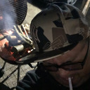
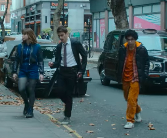
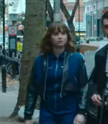
#ignore lockwood he's whatever but george and lucy (ESPECIALLY LUCYYYYYYY LOOK AT HER) i love costume design#also do quite like lockwood's coat allowing for his sword but its the blue tights#its the blue vs orange its the . you know what ? its the fucking costume design#especially pitted against the other ghost show i've seen recently like#first of all we have real people wearing real outfits#secondly there's shape and silhouette#then theres just the storytelling in how george wears his clothes vs how lucy wears hers#(again ignore lockwood for a sec bc in his case its more of an overt story thing and im talking about like#the actual 'this is what costume design is for' type of story detail)#like this is just so good and im so obsessed with this outfit making lucy's shoulders and chest so much bigger & broader#COOL! happy:)#although i do hate her hair i mean its gorgeous and i cant comment bc its not my job but#i do feel like hair and makeup gets to be even less creative or real than costume does
1 note
·
View note
Text
why Aurora's art is genius
It's break for me, and I've been meaning to sit down and read the Aurora webcomic (https://comicaurora.com/, @comicaurora on Tumblr) for quite a bit. So I did that over the last few days.
And… y'know. I can't actually say "I should've read this earlier," because otherwise I would've been up at 2:30-3am when I had responsibilities in the morning and I couldn't have properly enjoyed it, but. Holy shit guys THIS COMIC.
I intended to just do a generalized "hello this is all the things I love about this story," and I wrote a paragraph or two about art style. …and then another. And another. And I realized I needed to actually reference things so I would stop being too vague. I was reading the comic on my tablet or phone, because I wanted to stay curled up in my chair, but I type at a big monitor and so I saw more details… aaaaaand it turned into its own giant-ass post.
SO. Enjoy a few thousand words of me nerding out about this insanely cool art style and how fucking gorgeous this comic is? (There are screenshots, I promise it isn't just a wall of text.) In my defense, I just spent two semesters in graphic design classes focusing on the Adobe Suite, so… I get to be a nerd about pretty things…???
All positive feedback btw! No downers here. <3
---
I cannot emphasize enough how much I love the beautiful, simple stylistic method of drawing characters and figures. It is absolutely stunning and effortless and utterly graceful—it is so hard to capture the sheer beauty and fluidity of the human form in such a fashion. Even a simple outline of a character feels dynamic! It's gorgeous!
Though I do have a love-hate relationship with this, because my artistic side looks at that lovely simplicity, goes "I CAN DO THAT!" and then I sit down and go to the paper and realize that no, in fact, I cannot do that yet, because that simplicity is born of a hell of a lot of practice and understanding of bodies and actually is really hard to do. It's a very developed style that only looks simple because the artist knows what they're doing. The human body is hard to pull off, and this comic does so beautifully and makes it look effortless.
Also: line weight line weight line weight. It's especially important in simplified shapes and figures like this, and hoo boy is it used excellently. It's especially apparent the newer the pages get—I love watching that improvement over time—but with simpler figures and lines, you get nice light lines to emphasize both smaller details, like in the draping of clothing and the curls of hair—which, hello, yes—and thicker lines to emphasize bigger and more important details and silhouettes. It's the sort of thing that's essential to most illustrations, but I wanted to make a note of it because it's so vital to this art style.
THE USE OF LAYER BLENDING MODES OH MY GODS. (...uhhh, apologies to the people who don't know what that means, it's a digital art program thing? This article explains it for beginners.)
Bear with me, I just finished my second Photoshop course, I spent months and months working on projects with this shit so I see the genius use of Screen and/or its siblings (of which there are many—if I say "Screen" here, assume I mean the entire umbrella of Screen blending modes and possibly Overlay) and go nuts, but seriously it's so clever and also fucking gorgeous:
Firstly: the use of screened-on sound effect words over an action? A "CRACK" written over a branch and then put on Screen in glowy green so that it's subtle enough that it doesn't disrupt the visual flow, but still sticks out enough to make itself heard? Little "scritches" that are transparent where they're laid on without outlines to emphasize the sound without disrupting the underlying image? FUCK YES. I haven't seen this done literally anywhere else—granted, I haven't read a massive amount of comics, but I've read enough—and it is so clever and I adore it. Examples:


Secondly: The beautiful lighting effects. The curling leaves, all the magic, the various glowing eyes, the fog, the way it's all so vividly colored but doesn't burn your eyeballs out—a balance that's way harder to achieve than you'd think—and the soft glows around them, eeeee it's so pretty so pretty SO PRETTY. Not sure if some of these are Outer/Inner Glow/Shadow layer effects or if it's entirely hand-drawn, but major kudos either way; I can see the beautiful use of blending modes and I SALUTE YOUR GENIUS.
I keep looking at some of this stuff and go "is that a layer effect or is it done by hand?" Because you can make some similar things with the Satin layer effect in Photoshop (I don't know if other programs have this? I'm gonna have to find out since I won't have access to PS for much longer ;-;) that resembles some of the swirly inner bits on some of the lit effects, but I'm not sure if it is that or not. Or you could mask over textures? There's... many ways to do it.
If done by hand: oh my gods the patience, how. If done with layer effects: really clever work that knows how to stop said effects from looking wonky, because ugh those things get temperamental. If done with a layer of texture that's been masked over: very, very good masking work. No matter the method, pretty shimmers and swirly bits inside the bigger pretty swirls!
Next: The way color contrast is used! I will never be over the glowy green-on-black Primordial Life vibes when Alinua gets dropped into that… unconscious space?? with Life, for example, and the sharp contrast of vines and crack and branches and leaves against pitch black is just visually stunning. The way the roots sink into the ground and the three-dimensional sensation of it is particularly badass here:

Friggin. How does this imply depth like that. HOW. IT'S SO FREAKING COOL.
A huge point here is also color language and use! Everybody has their own particular shade, generally matching their eyes, magic, and personality, and I adore how this is used to make it clear who's talking or who's doing an action. That was especially apparent to me with Dainix and Falst in the caves—their colors are both fairly warm, but quite distinct, and I love how this clarifies who's doing what in panels with a lot of action from both of them. There is a particular bit that stuck out to me, so I dug up the panels (see this page and the following one https://comicaurora.com/aurora/1-20-30/):

(Gods it looks even prettier now that I put it against a plain background. Also, appreciation to Falst for managing a bridal-carry midair, damn.)
The way that their colors MERGE here! And the immense attention to detail in doing so—Dainix is higher up than Falst is in the first panel, so Dainix's orange fades into Falst's orange at the base. The next panel has gold up top and orange on bottom; we can't really tell in that panel where each of them are, but that's carried over to the next panel—

—where we now see that Falst's position is raised above Dainix's due to the way he's carrying him. (Points for continuity!) And, of course, we see the little "huffs" flowing from orange to yellow over their heads (where Dainix's head is higher than Falst's) to merge the sound of their breathing, which is absurdly clever because it emphasizes to the viewer how we hear two sets of huffing overlaying each other, not one. Absolutely brilliant.
(A few other notes of appreciation to that panel: beautiful glows around them, the sparks, the jagged silhouette of the spider legs, the lovely colors that have no right to make the area around a spider corpse that pretty, the excellent texturing on the cave walls plus perspective, the way Falst's movements imply Dainix's hefty weight, the natural posing of the characters, their on-point expressions that convey exactly how fuckin terrifying everything is right now, the slight glows to their eyes, and also they're just handsome boys <3)
Next up: Rain!!!! So well done! It's subtle enough that it never ever disrupts the impact of the focal point, but evident enough you can tell! And more importantly: THE MIST OFF THE CHARACTERS. Rain does this irl, it has that little vapor that comes off you and makes that little misty effect that plays with lighting, it's so cool-looking and here it's used to such pretty effect!
One of the panel captions says something about it blurring out all the injuries on the characters but like THAT AIN'T TOO BIG OF A PROBLEM when it gets across the environmental vibes, and also that'd be how it would look in real life too so like… outside viewer's angle is the same as the characters', mostly? my point is: that's the environment!!! that's the vibes, that's the feel! It gets it across and it does so in the most pretty way possible!
And another thing re: rain, the use of it to establish perspective, particularly in panels like this—

—where we can tell we're looking down at Tynan due to the perspective on the rain and where it's pointing. Excellent. (Also, kudos for looking down and emphasizing how Tynan's losing his advantage—lovely use of visual storytelling.)
Additionally, the misting here:

We see it most heavily in the leftmost panel, where it's quite foggy as you would expect in a rainstorm, especially in an environment with a lot of heat, but it's also lightly powdered on in the following two panels and tends to follow light sources, which makes complete sense given how light bounces off particles in the air.
A major point of strength in these too is a thorough understanding of lighting, like rim lighting, the various hues and shades, and an intricate understanding of how light bounces off surfaces even when they're in shadow (we'll see a faint glow in spots where characters are half in shadow, but that's how it would work in real life, because of how light bounces around).
Bringing some of these points together: the fluidity of the lines in magic, and the way simple glowing lines are used to emphasize motion and the magic itself, is deeply clever. I'm basically pulling at random from panels and there's definitely even better examples, but here's one (see this page https://comicaurora.com/aurora/1-16-33/):

First panel, listed in numbers because these build on each other:
The tension of the lines in Tess's magic here. This works on a couple levels: first, the way she's holding her fists, as if she's pulling a rope taut.
The way there's one primary line, emphasizing the rope feeling, accompanied by smaller ones.
The additional lines starbursting around her hands, to indicate the energy crackling in her hands and how she's doing a good bit more than just holding it. (That combined with the fists suggests some tension to the magic, too.) Also the variations in brightness, a feature you'll find in actual lightning. :D Additional kudos for how the lightning sparks and breaks off the metal of the sword.
A handful of miscellaneous notes on the second panel:
The reflection of the flames in Erin's typically dark blue eyes (which bears a remarkable resemblance to Dainix, incidentally—almost a thematic sort of parallel given Erin's using the same magic Dainix specializes in?)
The flowing of fabric in the wind and associated variation in the lineart
The way Erin's tattoos interact with the fire he's pulling to his hand
The way the rain overlays some of the fainter areas of fire (attention! to! detail! hell yeah!)
I could go on. I won't because this is a lot of writing already.
Third panel gets paragraphs, not bullets:
Erin's giant-ass "FWOOM" of fire there, and the way the outline of the word is puffy-edged and gradated to feel almost three-dimensional, plus once again using Screen or a variation on it so that the stars show up in the background. All this against that stunning plume of fire, which ripples and sparks so gorgeously, and the ending "om" of the onomatopoeia is emphasized incredibly brightly against that, adding to the punch of it and making the plume feel even brighter.
Also, once again, rain helping establish perspective, especially in how it's very angular in the left side of the panel and then slowly becomes more like a point to the right to indicate it's falling directly down on the viewer. Add in the bright, beautiful glow effects, fainter but no less important black lines beneath them to emphasize the sky and smoke and the like, and the stunningly beautiful lighting and gradated glows surrounding Erin plus the lightning jagging up at him from below, and you get one hell of an impactful panel right there. (And there is definitely more in there I could break down, this is just a lot already.)
And in general: The colors in this? Incredible. The blues and purples and oranges and golds compliment so well, and it's all so rich.
Like, seriously, just throughout the whole comic, the use of gradients, blending modes, color balance and hues, all the things, all the things, it makes for the most beautiful effects and glows and such a rich environment. There's a very distinct style to this comic in its simplified backgrounds (which I recognize are done partly because it's way easier and also backgrounds are so time-consuming dear gods but lemme say this) and vivid, smoothly drawn characters; the simplicity lets them come to the front and gives room for those beautiful, richly saturated focal points, letting the stylized designs of the magic and characters shine. The use of distinct silhouettes is insanely good. Honestly, complex backgrounds might run the risk of making everything too visually busy in this case. It's just, augh, so GORGEOUS.
Another bit, take a look at this page (https://comicaurora.com/aurora/1-15-28/):

It's not quite as evident here as it is in the next page, but this one does some other fun things so I'm grabbing it. Points:
Once again, using different colors to represent different character actions. The "WHAM" of Kendal hitting the ground is caused by Dainix's force, so it's orange (and kudos for doubling the word over to add a shake effect). But we see blue layered underneath, which could be an environmental choice, but might also be because it's Kendal, whose color is blue.
And speaking off, take a look at the right-most panel on top, where Kendal grabs the spear: his motion is, again, illustrated in bright blue, versus the atmospheric screened-on orange lines that point toward him around the whole panel (I'm sure these have a name, I think they might be more of a manga thing though and the only experience I have in manga is reading a bit of Fullmetal Alchemist). Those lines emphasize the weight of the spear being shoved at him, and their color tells us Dainix is responsible for it.
One of my all-time favorite effects in this comic is the way cracks manifest across Dainix's body to represent when he starts to lose control; it is utterly gorgeous and wonderfully thematic. These are more evident in the page before and after this one, but you get a decent idea here. I love the way they glow softly, the way the fire juuuust flickers through at the start and then becomes more evident over time, and the cracks feel so realistic, like his skin is made of pottery. Additional points for how fire begins to creep into his hair.
A small detail that's generally consistent across the comic, but which I want to make note of here because you can see it pretty well: Kendal's eyes glow about the same as the jewel in his sword, mirroring his connection to said sword and calling back to how the jewel became Vash's eye temporarily and thus was once Kendal's eye. You can always see this connection (though there might be some spots where this also changes in a symbolic manner; I went through it quickly on the first time around, so I'll pay more attention when I inevitably reread this), where Kendal's always got that little shine of blue in his eyes the same as the jewel. It's a beautiful visual parallel that encourages the reader to subconsciously link them together, especially since the lines used to illustrate character movements typically mirror their eye color. It's an extension of Kendal.
Did I mention how ABSOLUTELY BEAUTIFUL the colors in this are?
Also, the mythological/legend-type scenes are illustrated in familiar style often used for that type of story, a simple and heavily symbolic two-dimensional cave-painting-like look. They are absolutely beautiful on many levels, employing simple, lovely gradients, slightly rougher and thicker lineart that is nonetheless smoothly beautiful, and working with clear silhouettes (a major strength of this art style, but also a strength in the comic overall). But in particular, I wanted to call attention to a particular thing (see this page https://comicaurora.com/aurora/1-12-4/):

The flowing symbolic lineart surrounding each character. This is actually quite consistent across characters—see also Life's typical lines and how they curl:

What's particularly interesting here is how these symbols are often similar, but not the same. Vash's lines are always smooth, clean curls, often playing off each other and echoing one another like ripples in a pond. You'd think they'd look too similar to Life's—but they don't. Life's curl like vines, and they remain connected; where one curve might echo another but exist entirely detached from each other in Vash's, Life's lines still remain wound together, because vines are continuous and don't float around. :P
Tahraim's are less continuous, often breaking up with significantly smaller bits and pieces floating around like—of course—sparks, and come to sharper points. These are also constants: we see the vines repeated over and over in Alinua's dreams of Life, and the echoing ripples of Vash are consistent wherever we encounter him. Kendal's dream of the ghost citizens of the city of Vash in the last few chapters is filled with these rippling, echoing patterns, to beautiful effect (https://comicaurora.com/aurora/1-20-14/):

They ripple and spiral, often in long, sinuous curves, with smooth elegance. It reminds me a great deal of images of space and sine waves and the like. This establishes a definite feel to these different characters and their magic. And the thing is, that's not something that had to be done—the colors are good at emphasizing who's who. But it was done, and it adds a whole other dimension to the story. Whenever you're in a deity's domain, you know whose it is no matter the color.
Regarding that shape language, I wanted to make another note, too—Vash is sometimes described as chaotic and doing what he likes, which is interesting to me, because smooth, elegant curves and the color blue aren't generally associated with chaos. So while Vash might behave like that on the surface, I'm guessing he's got a lot more going on underneath; he's probably much more intentional in his actions than you'd think at a glance, and he is certainly quite caring with his city. The other thing is that this suits Kendal perfectly. He's a paragon character; he is kind, virtuous, and self-sacrificing, and often we see him aiming to calm others and keep them safe. Blue is such a good color for him. There is… probably more to this, but I'm not deep enough in yet to say.
And here's the thing: I'm only scratching the surface. There is so much more here I'm not covering (color palettes! outfits! character design! environment! the deities! so much more!) and a lot more I can't cover, because I don't have the experience; this is me as a hobbyist artist who happened to take a couple design classes because I wanted to. The art style to this comic is so clever and creative and beautiful, though, I just had to go off about it. <3
...brownie points for getting all the way down here? Have a cookie.
#aurora comic#aurora webcomic#comicaurora#art analysis#...I hope those are the right tags???#new fandom new tagging practices to learn ig#much thanks for something to read while I try to rest my wrists. carpal tunnel BAD. (ignore that I wrote this I've got braces ok it's fine)#anyway! I HAVE. MANY MORE THOUGHTS. ON THE STORY ITSELF. THIS LOVELY STORY#also a collection of reactions to a chunk of the comic before I hit the point where I was too busy reading to write anything down#idk how to format those tho#...yeet them into one post...???#eh I usually don't go off this much these days but this seems like a smaller tight-knit fandom so... might as well help build it?#and I have a little more time thanks to break so#oh yes also shoutout to my insanely awesome professor for teaching me all the technical stuff from this he is LOVELY#made an incredibly complex program into something comprehensible <3#synapse talks
808 notes
·
View notes
Text
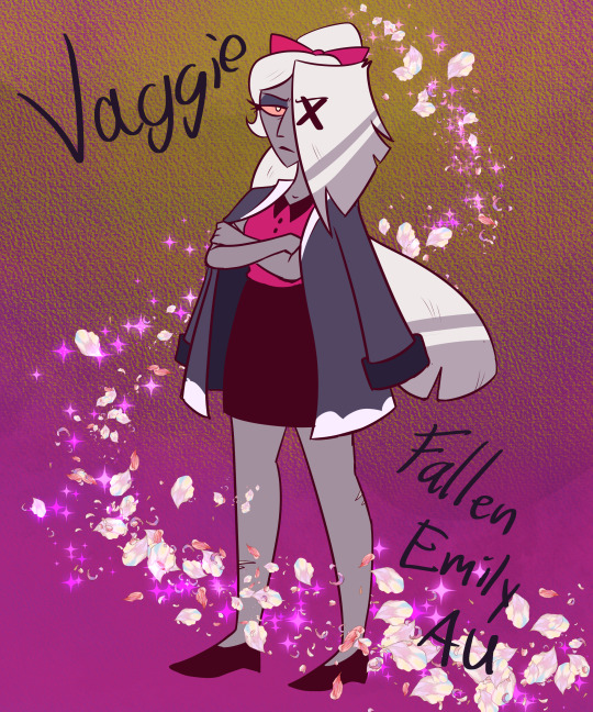
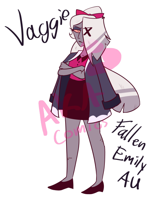
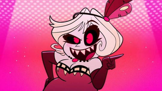
Secretive Moth
Usually, Hazbin redesigns aren't my cup of tea. I feel it's a bit much for me to claim I know how to make a design 'better'? I do, however, feel like Vaggie's design could have used another pass.
Gonna talk more about it under the cut but essentially, Vaggie doesn't have a bad design! This is just my design for the Fallen Emily AU! I needed a reference for poses/design so I didn't forget anything.
Fallen Emily AU
Commission Me!
Ok so! I am a huge art nerd and am gonna be art nerding here for a bit! I'll talk about my issues with Vaggie's cannon design and then go into my reasoning for the changes I made.
My Issues
This list won't be long, don't worry, and I understand there's nuance and room for interpretation (and that mine isn't perfect either).
I dislike her hair as is. It does evoke the shape and feel of moth wings, but it swallows her silhouette & makes the bow on her hair look like an afterthought.
I also dislike the thigh highs. Yes I know they're sexy, yes I know they go with the arm sleeve things. However they make the arms and legs a bit busy for my taste, especially with the hair coming down to her legs. (I also just prefer her without sleeves but that's a minor thing)
However, I like most other elements! Her hair stripe is a cool detail, her skin color is really pretty/compliments her, and her skirt fits her better than pants do! She looks a little out of place among the cast but that seems intentional. Her design also hints to what she truly is, especially with the x over her eye!
My Changes
The biggest thing you'll notice is that I gave her a coat. This had two reasons to it. Firstly, for story reasons, I wanted to give her something like a blanket to comfort her. Secondly, I wanted to keep the moth wing silhouette, but reduce it from the original. The coat is kind of like a pair of fake wings.
Color wise, I brought the blue/white from her thigh highs to the coat and I made the red a bit cooler. This is so she can stand a bit in contrast with Charlie, who's a warmer red/yellow. It's also to imply she's covering up some of her impulsiveness and passion with logic and a cool head. (Also cause blue gay x red gay)
Her hair, I tied back (Like in the finale) and made it more curved. Kinda to imply a softer personality despite the harsh edges. In shape language terms, I tried to include all three, with the coat being more square, the body being more sharp, and the hair being more curved.
Speaking of body, I also changed her body type. Not much but enough to where I'd consider her chubby. I really like the redesigns that do this and I feel it'd help bring some variety to the lineup of twinks lol
#vaggie hazbin hotel#hazbin hotel redesign#hazbin hotel#vaggie#character design#my art#artists on tumblr#art#fanart#character redesign#reference sheet#hazbin vaggie#art critique#(In a good way I promise)#I talk about things I like
157 notes
·
View notes
Note
Hi, I hope you’ve been doing well!
I love your art and interpretations of the characters, especially in regard to your ideas about each senshi’s fuku design. I was wondering if you had any particular opinions on the official Classic, Super, and Eternal forms? Anything like design elements of the fuku to even the colors for each senshi? Apologies if you’ve been asked something like this, I just really enjoy your thoughtful responses you give in your asks.
Thank you so much! Means a lot.
I don’t have a lot of opinions on the forms past the Classic forms, I don’t hate them, but I just feel a bit.. indifferent. I know people like them, but I don’t tend to think about power-up forms very often, I just love the base forms too much.
Regarding if I have any problems with them, yeah. They do tend to fall a bit under the redesign upgrade problem a lot of shows and even games characters have. When trying to freshen up a design, a lot of them tend to trip over themselves and just take “redesign” as “over design” aka add more shit or overcomplicate shit.
Now Sailor moon does NOT have too much of that, overall the upgraded designs are not too bad. Not my favs, but not bad.
Let’s take a look at them shall we. (For the sake of brevity I’ll just keep this discussion on Sailor Moon’s design and not the other senshi. Mostly cause she gets changes the most and secondly cause their changes are not as prominent)
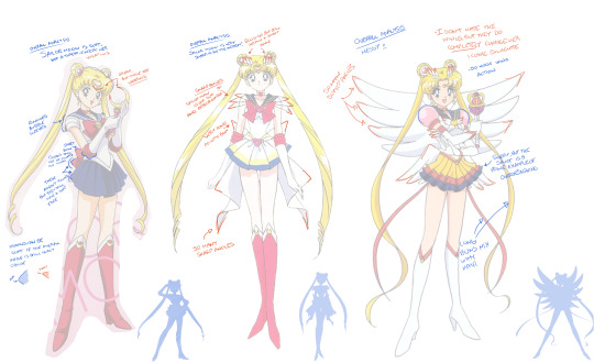
I LOOOVE Sailor Moon’s original design, her classic fuku is Classic for a reason. The deep navy blue and magenta red fit her so well and they help make the blonde of her hair, tiara and smalldecorative moons pop.
Her silhouette is very simple, it has a very nice flow with her hair being the only long element, allowing for fluidity but most importantly clarity. Her nice soft hair buns, bangs and lack of sharp angles in her uniform work amazingly through shape language (made a post about it here) to make a comforting and friendly appearance.
Also small note but I adore how her bangs and tiara come together to form a quite subtle but present heart shape. (She’s so cute)
Now her Super form is honestly.. pretty good! Doesn’t beat the original, but I like the direction. The stronger incorporation of white ties nicely to the element of her becoming queen in the future, adorning a white gown. The splashes of color on the skirt are also a nice touch, reminds on of bleeding soft watercolor runnning down a blank page, fits with her butterfly theme too (this part makes sense in my head, hopefully u get it).
Now to the not so good part, the shape.. she’s so sharp. It’s NOT a dealbreaker, I think it could work with the theme of her growing more into her role as Sailor Moon, gaining confidence and thus allowing herself to appear a lil more dangerous, but still soft. It’s important that the sharp angles present in her uniform do not interfere with the hair shape, the buns are still there, as soft as ever.
And now to her Eternal form. I don’t hate it, but I don’t like it either. Weirdly enough my main problem with it is not what seems to bother everyone else, the bubble sleeves, but the colors. I don’t like the colors. The blonde of her hair is now mixed in her skirt, the classic soft magenta red is turned into sharp deep red, the color of her bubble sleeves is really distracting cause it’s the only pink element present and the skirt triple layer ending up of the darkest color does not allow the eye to slide off it to the shoes easily (unlike say if it was darkest color to lightest from top to bottom, instead of the opposite).
The color reversal on the shoes is not a deal breaker either, again that “white taking over” theme is nice, but it’s like.. broken. Her skirt is back to being colored more than before so the thematic washing of the colors is undone in this form, instead taken over by a various assortment of bold colors.
I also think that the angel theme was slightly overdone, the 2 pairs wings on her back pair with the wings on her broach are just a bit too much for me and overcomplicate the simplicity of her broach. It’s like, do you get she’s an angel yet?! Here, have another pair of wings!
Lastly, it rlly bums me to see her nice simple silhouette being muddled by the wings, even though I don’t hate the wings themselves. Just what they do to her silhouette.
Overall I think I tend to have more problems with the uniforms than most people cause they do follow a theme that most people LIKE in sailor moon, which is a regular average girl becoming something larger than life, but idk.. the original uniform just gives off that vibe of the friendly down to earth girl who everyone knows in town. It brings a sense of unity and space in a way, cause it feels more urban, while the other uniforms start incorporating more and more abstract themes which, to me, take a bit away from the flawed but relatable comfort of this messy, imperfect, but trying her best Usagi Tsukino who’s wearing a uniform to help the people she loves around her.
#ask me stuff#sailor moon#ty for the ask <3#srry for the wait#Redesigns are tough#Design talk#IM NOT AN EXPERT IN CHARACTER DESIGN DONT HOLD MY OPINIONS AS NOTHING MORE THAN THAT
42 notes
·
View notes
Text
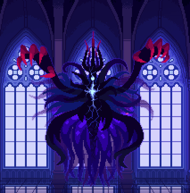
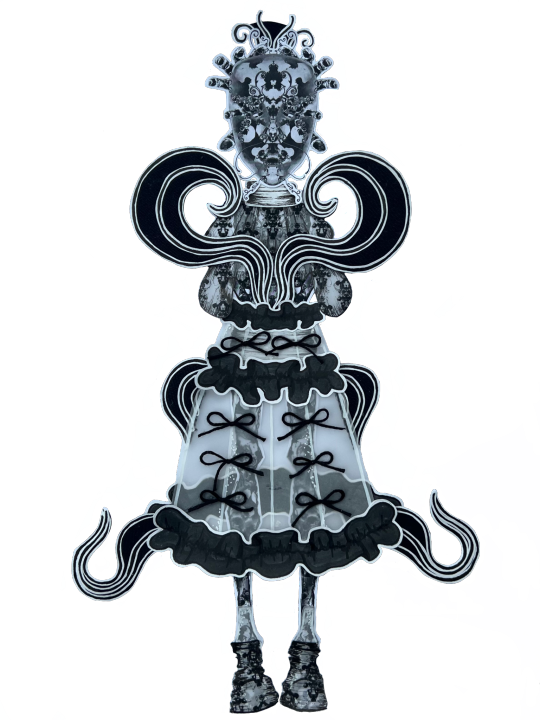
Update on The Dark Queen of Mortholme!
Phase one is now essentially completed for art, code and dialogue. Onwards to phase two; because every good boss fight needs that part where the boss gets unhinged and gains a whole new set of attacks.
I too have chosen to be unhinged and made a design for the Queen's final form that gobbles up animation work hours like nothing I've done before with pixel art.
Concept sketches under the cut:
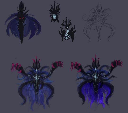
Initially I didn't have any ideas beyond doing a more monstrous design that amps up the Queen's features and takes cues from the shapes and colours of her original spell animations. However after writing the dialogue leading up to the transformation I immediately landed on a specific concept.
The transformation is an outburst. It's a manifestation of the Queen's terror and defiance towards her approaching death. She's unraveling, and in doing so she's channeling more of her innate violent power that she doesn't usually let out. She's essentially been having a long argument with the Hero about who they believe they are. Thus far she's gotten by being all smug and detached, but now she's losing and forced to reveal more of her true self to continue.
So her final form's design should convey 1. an outburst, and 2. the unraveling of a false front. Her base design's spikes, hair and skirt all erupt out into the wilder shape language of her shadowy spell-tendrils. They can handily be used to draw the eye from all directions towards the center of her chest, where I wanted to have this cracking pattern, like something hidden inside her is coming out. It's bright as if blindingly powerful, yet the cracks make her seem more damaged and vulnerable than her base form.
Continuing with the theme of an inner self showing through, the skirt's interior is also more visible than before. The flared jellyfish-esque shape connects with the deep sea vibe of the tentacles and contributes to the drama of a nonhuman silhouette.
A big thing for the silhouette is of course the massive hands. What's the thematic explanation for those? Absolutely nothing, I just think they look cool and dangerous.
Finally, lot of asymmetry was also introduced, both to increase the visual interest of such a large sprite, and to make her look like she's really losing it.
---
A note on animating this monstrosity: I've been trying to come up with a whole lot of cheats to keep a complex sprite like this as animated as possible without spending the rest of my life making this game. Early on I decided she should float, just so her idle animation can also be a moving one.
Secondly, the sprite is cut up to pieces so that I can keep reusing the loop of the writhing tentacles while moving her hands, for example. This is not something I like doing because in believable animation, motion in one part of the body always affects the other parts of the body. Treating a character as one entire whole when animating will make them feel more tangible, but alas, it's a compromise to avoid spending a hundred years in pixel-pushing jail. Like, I would love to see those tendrils flutter around behind her as she swoops across the room for her attacks, but... it'll be a lot more reasonable to move her as little as possible and instead add oomph to her attacks with some effects animations.
Anyways thank you for reading about monstrosity, she might be a pain in the butt to move but she brings me joy
#I have not been very good at making this dev blogging a regular thing#busy enough making the game and whatnot else#but if you enjoy reading this then I'm glad!#pixel art#animation#character design#game development#the dark queen of mortholme
168 notes
·
View notes
Note
Hi, I really like the way you draw the fight club guys. The looks reflect the character, as I've noticed from your work. So I have a probably stupid question, what do you see in Tyler's physique? I mean, maybe you put some habits, character traits or something else into his body that isn't in the book or that is spelled out implicitly? Thanks for the reply!
ouhhh thankkk yoy so much im glad you like my designs for them. i try to keep their core characteristics while also adding onto their designs because not going to lie, i get bored drawing generic white guys....
pitt is a generally small guy, even though hes 180~cm his stature is very small and hes not much bigger than the narrator, ed is taller than him, and only way youd present him as bigger is by manipulating the camera. i do think tyler being the stronger one fits better, so instead of his boyish looks i prefer to draw him a bit tankier... stockier... depends on the day i might draw him with a bit of fat or just keep him wide and bulky. its stereotypical for douchebags.
as for the height difference, well, firstly, its cute, secondly i make him visibly shorter because it feels like a massive blow to the narrators ego that a guy shorter than him is more desirable.... or in the other sense, narrators height makes his body fat distribute in an unappealing way so tyler being more compact makes him look better . less ghoul-like
i exaggerate his tan because , again, its more fun, and also he canonically has a strong fake tan (in the movie at least) so i like to make it Super Visible to contrast wih the narrators anemic ass. tyler goes to nude beaches so i imagine he in general has no shame in sunbathing and frying himself under the sun.... now you might say, no he isnt tan, the promotional art is very pasty... those were shot before the movie. he is tan in the movie.
another thing i like is his hands ... i usually dont put effort into hands (i will one day.. specifically draw their hands) but i imagine them as calloused and stubby from either fighing or doing physical labor. again to contrast the narrators rake fingers
for all the other junk, and most of these are just consequences of his situation, or exaggerations of canon charafteristics: mullet (makes a great silhouette! the spikes are fun), ear piercings/necklaces alongside his rings, stretch marks from working out, more hair because why the fuck would he be hairless ? theres no reason for him to be... toothgap that flip flops between natural and chipped (from fighting), a small stache, i like making his eyebrows connect a bit.... freckles from the sun, random tan lines (i usually draw ones tht are boxer shaped even tho he doesnt wear boxers) and chest well. the whole movie talking about toxic masculinity anf how it can make one spiral is personal to me. so i like to project my prior experiences with it onto them and how theyd behave about it.... Also! queer people in the 90s are interesting to me
i dont keep any book characteristics for tyler (visually) because to me, thats another version of tyler i simply do not find appealing... his generic blond hair along with his pale skin is understandable, but doesnt fit the conditions of his house, or life in general, in my opinion
15 notes
·
View notes
Text

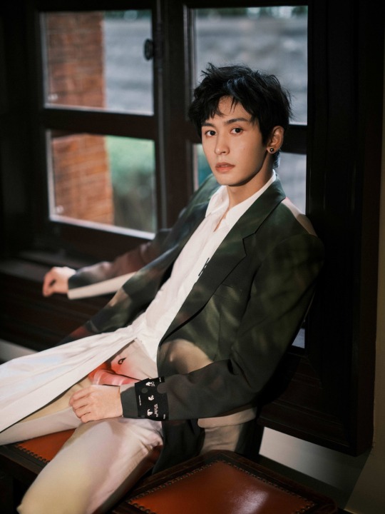
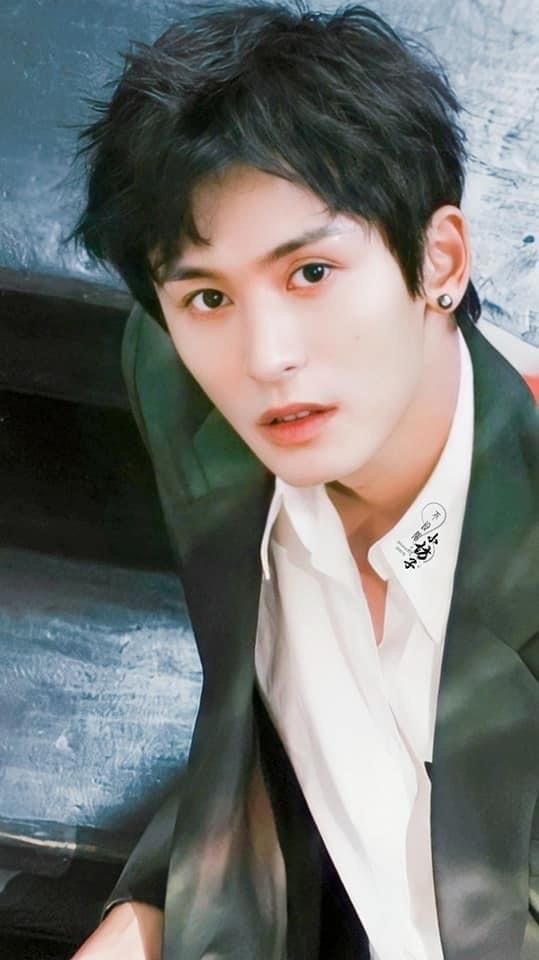
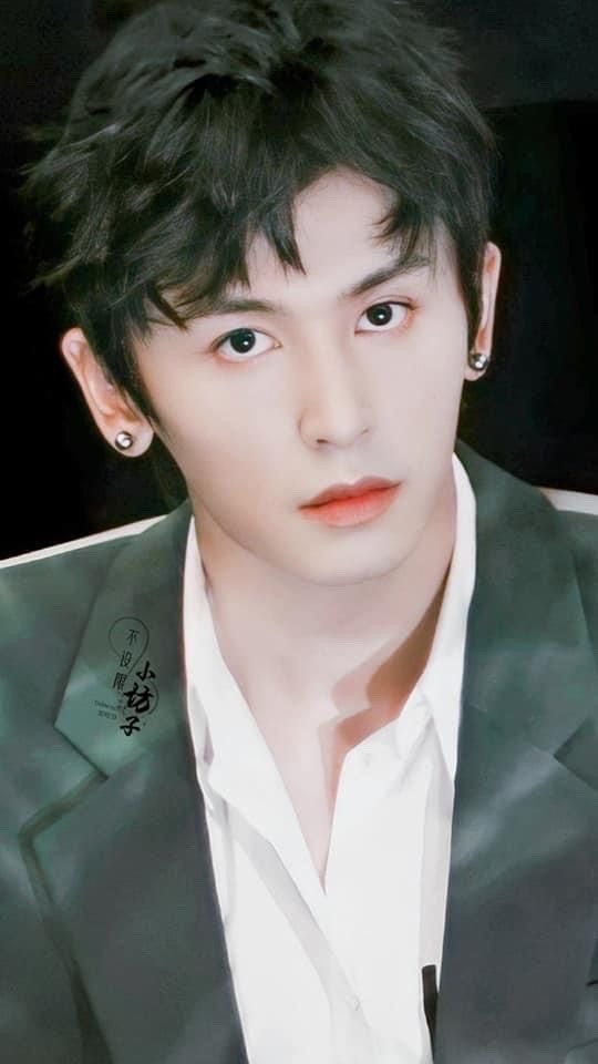
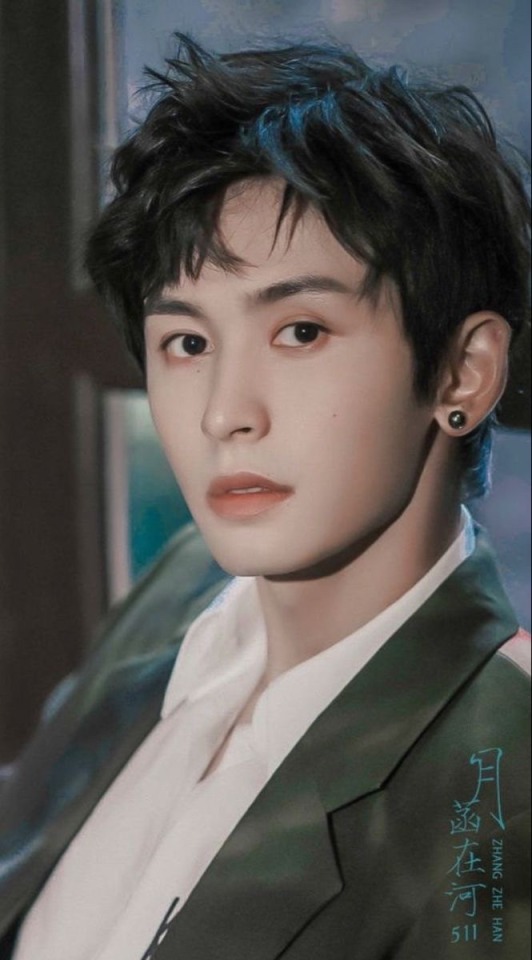
August 12, 2021. ZZH's last official photos and last public appearance during a livestream for the One Of Leaf brand. Due to the color scheme associated with the brand, ZZH was partially dressed in clothes that were green. Green in some shades and tones is a difficult color, many people look bad in it. Here, for the purposes of this session and livestream, ZZH wore a dark green shaded jacket with light brown inserts. The suit had a classic cut, but due to this interesting color scheme, it drew attention. Even more interesting was the shirt, which had a longer part on one side with pleats in the front. Generally, looking at this styling, you can say that there is too much here, but looking at this styling from a distance, you have to say that it looks great on ZZH. Firstly, it does not overwhelm his figure, secondly, that ZZH's beauty matches this color scheme of clothing. Yes, ZZH's beauty means that there are few colors in which he looks unattractive. This dark green color combined with his dark brown hair and dark brown eye frames and his hazel eyes gave a fantastic effect. If I hadn't seen it, I would never have guessed that ZZH looks so good in this shade of green. This color is dark and can dominate everything and overwhelm the model. This is not the case here. ZZH clearly shines in this styling. From the many photos from the photoshoot, I chose this one. The one that shows how much light there is in ZZH. ZZH is standing here on the stairs, facing the photographer. The distribution of light causes this light to focus mainly on ZZH's face. There are only some reflections of light on ZZH's silhouette. This treatment causes the viewer's attention to focus on ZZH's face, a part of which is clearly illuminated. We see ZZH's huge dark eyes, thick eyebrows, straight, graceful nose and shapely, slightly parted lips. He must admire his thick, elegantly styled hair and charming dark green earring resembling a pearl. There is a trace of sadness in ZZH's eyes, he looks at us as if he is aware that this is his last look towards the light, because when he turns around, he will see darkness that is drawing him in. It seems to me that this photo is a kind of symbol, his farewell and a silent request that viewers remember him exactly as he is in this photo, before the darkness swallows him. Or maybe it is just my interpretation.


14 notes
·
View notes
Text
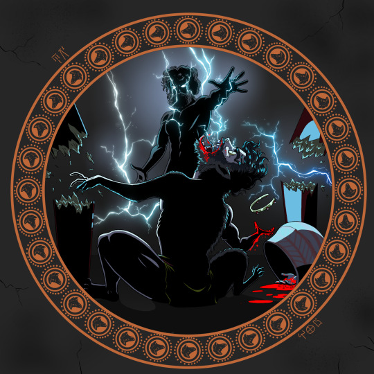
Classicstober Day 4: Lycaon (𐀬𐀏𐀃)
Lycaon was an Arcadian king who tried to get one over on Zeus by feeding the god the flesh of one of his own sons. Zeus was enraged by the attempt and the kinslaying and turned Lycaon into a wolf who would eventually devour all of his living sons.
Lycaon is often called 'the first werewolf' but I reject that label for a few reasons. Firstly is because the concept of 'werewolf' as we think of it today (ie full moon and silver bullets) is a very modern concept so by definition Lycaon is not one. Secondly Lycaon never turns back into a human; for his deeds he is turned into a slavering animal and he never comes back. There are ancient greek werewolf-adjacent stories, but I don't think Lycaon should qualify.
For a little behind the scenes stuff, I always struggle with how to depict the divine, but in this case a silhouette with lightning both allowed me to set the tone and keep the mystery.
A fun thing about the linear B is that, while most of the time it is my best guess at how the Classical Greek would have been rendered (eg RU-KA-O instead of Lycaon) we actually do have Zeus' Linear B name preserved: 𐀇𐀺 (DI-WO) (PIE Sky Father represent).
The shattering wood columns are actually a fun thing I know about the Minoans; they would build inverted columns out of wood and paint them. I'm not sure if the Arcadians would have been so up to the fashions of the richer Mycenaeans/Minoans, but I needed to add something to make Lycaon's surroundings look kingly. I also don't know if the Mycenaeans wore crowns or diadems, but I decided to add one anyway. The pot is based on the shapes and patterns of Mycenaean ceramics.
Last but not least is Lycaon himself. When I was doing research for this piece I found some pictures of Lycaon half-turned, but they all felt to controlled and elegant (maybe just as an artifact of the time they were made). Here, since it is a punishment, I wanted to make it look horrifying, energetic, and painful. The hand-to-paw on the left was purely an accident that I decided to keep. I'm not sure if Lycaon partook of the horrific meal he meant to serve Zeus, but I don't think he would have objected, all things considered. That's why I gave him a bloody mouth in addition to the blood-covered hand. You can also see that his hair is turning from a dark, human color on his scalp to a lighter more lupine coat further down on his body, but the effect is a bit hard to spot considering the lighting.
#classicstober#greek mythology#mycenaean#lycaon#linear b#zeus#zeus greek mythology#zeus deity#tw cannibalism#tw blo0d#tw body horror#tagamemnon
119 notes
·
View notes
Note
oasis, melody and silk, galaxy. ur answers would be fascinating on anyy but here! hello
first of all 🥹 tysm!! secondly!
oasis; dream destination?
pretty much anywhere i’ve never been before but i have to say i really want to go outside of europe as i’ve only been once (to vietnam) and bc i loved that so much i’d love to repeat it, and i really want to visit japan and thailand (specifically its north!), and if we were really getting dreamy and unrealistic with it i wanna see hawaii and the north pole
melody; favorite artists?
the way shinee have a song called melody 🥹 anyway. shinee! and all the soloists but especially taemin & jonghyun. and if we’re talking all time, also meg thee stallion, pierce the veil, my chemical romance, one direction (and harry styles i must admit) + getting there slowly are stray kids & orville peck
silk; what outfit makes you feel confident?
ALL BLACK always. black leather 🖤 anything structured and beautifully tailored and monochromatic (especially if it’s all black or all white and Especially if i get to play with textures and silhouettes). i loooove a super mini skirt in which i can only hope to be able to bend down. and heels of any kind shape or form i love being two meters tall. i usually get stares no matter how you flip it but being That Tall really turns heads and idgaf most days but i also love it sometimes. to provide visuals:


galaxy; what fascinates you?
oh my god. everything. especially life itself like it will mess me up if i get into it right now but how a cell knows how to do what it needs to do to keep us alive. the synergy between the compartments of a cell and then between the cells of multicellular organisms. like my prof used to say biologists all become physicists and physicists all become philosophers bc you CAN’T begin to comprehend it. it’s crazy and it makes me lose my mind. also carl sagan’s pale blue dot quote and the concept of the universe being ever expanding. the big bang while we’re at it. evolution in general. tldr; consciousness and sentience and life in general! and literally everything
#i Notoriously cannot stay brief jdhskdk hope u liked this 🫶🏻#btw funny but true all three of those outfits contain a tall pair of black leather boots and they are all Different black leather boots#I’m giggling clearly i like something and stick with it!#ask game
6 notes
·
View notes
Text
Ok so somehow I’m only just now seeing the “male light fury” design and holy shit I love it
I know sexual dimorphism isn’t something commonly shown with dragons in httyd but I like the idea of this slightly pointier looking light fury being a male of the species - firstly bc it lets me Think about designs and I love that and secondly bc it gives additional cute points since it means the light fury (aka Toothless’ mate, who I personally nicknamed “Ivory”, and will probably refer to her as such throughout the rest of this post just to avoid confusion between her & the rest of her species) specifically chose Toothless over males of her own species - as it’s shown in httyd 3 that there’s more light furies than just Ivory, she’s not the last of her kind like Toothless supposedly is and didn’t need to mate with him for the sake of saving both their species from extinction, she specifically CHOSE him.
Anyway the main point of this post was actually to talk about my theory that night furies (and any other fury species) have a similar kind of distinction between males and females - with males having a kind of “sharper” look with their fins and wings while females have “softer” features like the heart-shaped tail fins on female light furies (like the pair seen in the hidden world before the appearance of the supposed male light fury - both seem to have heart-shaped tail fins like Ivory which makes me think they’re both female, perhaps a mother and daughter since one is significantly smaller than the other and could be an adolescent). Also the “male light fury” seems to have longer ear nubs than Ivory and the other possible females so I think this is also a part of their dimorphism, and female night furies also have shorter nubs than males.
Also for anyone who has no clue what I’m talking about: this is the “male light fury” (left), compared to Ivory/a female light fury (right) - as you can see there are quite a few notable differences
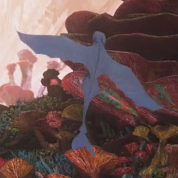
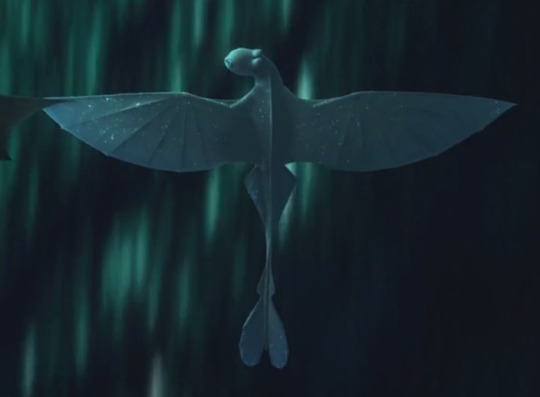
And the other two light furies seen earlier in the same scene as the male, who I suspect are both female (or at least the bigger of the two is)

And just for reference: here’s Toothless’ silhouette (aka a male night fury)

So I’m thinking a female night fury would likely have similar features to Ivory, while still clearly being a distinctly different species from her.
Anyways this post is my long and rambly way of saying I’m probably gonna draw a speculation of what a female night fury might look like based on this theory
#sammy rambles#how to train your dragon#night fury#light fury#httyd#httyd 3#toothless#ivory#headcanon: you are my best friend
12 notes
·
View notes
Text
Currently reading Napoleon and the Empire of Fashion: 1795 - 1815 and it's just so so bad. The pictures are beautiful, but only 30 pages in an all the alarm bells are ringing for bullshit claims about fashion history.
Take this:
In addition the shape of a women [sic] of 200 years ago is very different to those of today. These women had been brought up in the world of corsets; even if these were cast aside, the changes to their body shape was permanent. The ribcage of a lady in this period was both smaller and more rounded and their shoulders were drawn back, partly by the corsets and partly by the rules of deportment.
There's a lot to unpack here. Firstly, oh my God the writing in this book, the sentences. So many typos, so many sentences without predicates. But I digress. Women were wearing stays in the late 18th/early 19th century you absolute idiots!! Yes, it's true that women at the highest, highest level of fashion went at times with stays (not corsets, btw). But like, we're talking about the elitest of the elite when it comes to fashion.
And I get that this collection is about the trendsetters of the Napoleonic Era. But you have to put this stuff in its historical context. OR else people will think that everyone was just walking around with no bust support in circa 1795, and like, that's not true. I'm not out here wearing my 1790s reproduction dress without stays. That'd be stupid.
Also corsets did not change your body!!!! Oh my God, we're still having this stupid stupid debate!!! I mean, firstly, this was the era of stays, or right on the cusp between stays and corsets. So the undergarments that these women (again, elite women) 'discarded' were stays. Stays continued to be used - pretty obviously I feel - throughout the Napoleonic Era. They were less heavily boned, but they existed. Also tight-lacing will not be a thing for literal decades, and even then tight-lacing is always exaggerated but c'mon guys!!
Have you guys collecting these incredibly fashionable dresses not considered that there is survivor bias? Why don't these fit the mannequins!! Well firstly, that rounded silhouette is like, literally undergarments at work but you've decided they don't exist now. And secondly, whose dresses are surviving? The ones that were worn the least. And these dresses are thus probably going to distort the way we look at the average body.
Also the shoulders back thing is not just stays, but is the result of how the shoulders themselves were attached to the dress - being set farther back than the way we set ours now. Like, I'm new in this fashion history circle, I have so much to learn. But you cannot be out here collecting antique dresses and acting like such asses about where they come from.
You say you love this period prove it!! Don't perpetuate myths for the sake of whatever you're getting out of it!!
Rant over
10 notes
·
View notes
Text
Allow me to unveil an unpopular opinion, if you will.
I absolutely despise mermaid dolls. From the depths of my soul, I do not comprehend why people gush over them so much. I have never seen a mermaid doll that fully makes up for the inherent downsides it has by virtue of being a mermaid.
First off: the tails. Plastic, fabric, silicone, they are always in one way or another frustrating to display, pose, or style with the rest of the doll. They remove half of the potential the doll has by eliminating any other kind of fashion creativity with the whole bottom half. If you’re lucky you’ll get a tail with an intense theme or style that can make up for that, the Monster High Scarrier Reef dolls are actually good examples of this. But usually you have the same few fin shapes and shiny colors with little variation. And the articulation joints on tails? I’m not one to find articulated joints ugly in general, but they never look good on tails. They’re bulky and break up the silhouette, and they barely do anything anyway.
Secondly: the top half. The basic mermaid shell bra/top can die a burning death in a deep sea lava vent. They are so boring it brings me to tears. Slight variations on one theme that’s played out for far too long.
Secondly part two: even when a mermaid doll gets an actual piece of clothing for the top half, it barely ever makes sense. Mermaze attempted strong theming with the tails, even if it was weird as hell at times, but winter coats? Slumber party?? Color changing car??? (That ones not clothes but it’s just so much) What even are these themes for a line of fish girls????
Third: the very concept of a mermaid fashion doll is working against itself from the start. Dolls are intended for kids, who want to play and have fun and may get a little rough with them. Mermaids inherently imply underwater adventure and play. Fashion dolls have a focus on removable and swappable clothing pieces and styling of hair. Water play + fabric clothes = damage, potential mold. Elaborate stylized fins may be more prone to breaking if they have smaller/thinner pieces (see again Scarrier Reef). This is the reason Barbie dreamtopia mermaids still exist despite being a blight on creativity. They’re cheap, cheerful, and all plastic. And again even when individual pieces or whole dolls are cute, they are as boring as day old toast.
Even when mermaid dolls are not intended for kids, and are explicitly collector dolls, you still have the design working against itself. Less fashion, more bulk plastic with limited choices for articulation depending on the type of tail you go for, harder posing and display, and even full blown collector dolls rarely go as crazy creative as they could with all their potential.
And that’s the worst part, at last: I love sea creatures. Sea monsters, crazy and beautiful fish, deep sea abominations, coral and eels and sharks and whales and all kinds of insane stuff is there for the taking of inspiration. And nine times out of ten all of that is left off the table to instead make way for the same silhouettes, the same themes, and the same type of mermaid that’s been overdone since the Little Mermaid released.
In summary, a mermaid doll murdered my dog and stole my credit cards, sometimes you just have to pick a thing to be irrationally angry about to let it all come out, and personally I don’t vibe with mermaid dolls. More on the shelves for all the rest of you!
#please don’t take this too seriously#i stand by my opinions but I’m happy other people find joy in these things#I feel about fairy dolls the way other people seem to about mermaids#we all just have something we disproportionately hate for no great reason#doll collecting#doll talk
3 notes
·
View notes
Note
Tbh, I could *eat* your art and I was wondering how the frick did you manage to make anything not dummy thin look good in the Hazbin style. Like, I love my twigs but when you're not thin yourself and need roundness, I have *no clue* how to translate that as well as you did. Any tips? I'm in Spain without the S rn trying to figure it out.
HELLO DARLING oh my gosh first of all thank you so much oh my gosh I could cry 🥺
Secondly, YEAH...Hazbin has so many amazing characters and fun designs for them but all of them are as wide as a pencil and it's hard to imagine a fat character in the style.
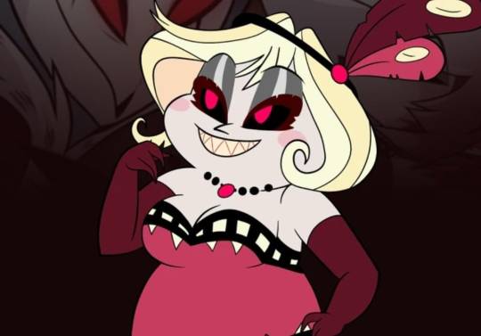
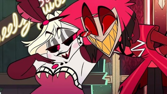
My main reference that I used in designing Dazzler was this absolutely beautiful bitch!!!
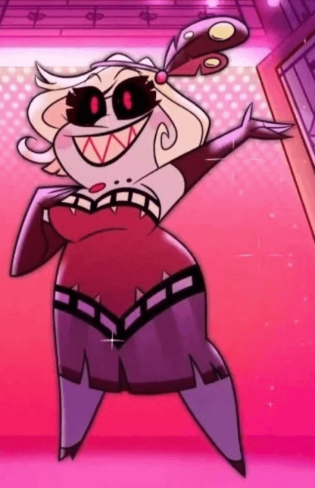
Seriously when I first started designing Dazzler... gosh thinking on it takes me back actually, she used to be named Doris and was totally different (I was going the fallen angel route) but still a fat woman! There's early art of Viv's that I referenced heavily, of Mimzy's design early on and it helped me a lot in visualizing a fat character. I think she was intended to be a bigger character, pre-pilot, because there's a LOT of old art of her!

I still take some liberties because I know how I prefer to draw fat women, I always have fat self inserts because I'm fat irl, and I have fat OCs, so I just. Have my methods I guess.
A few key things I took away from studying Mimzy's design as The One Fat Character in Hazbin (that I know of and can remember) is that she has big round cheeks, her legs and arms have shapely silhouettes that still end in points to match the pointy and angular style, and, in the show, sometimes, the complete lack of a neck weirdly lmao Mimzies below as examples!

Though I do give Dazzler a visible neck sometimes, but often I draw her head sitting very close to her shoulders. I actually just took a second to draw Dazzler in a very rough and quick sketch, as a representation of my points here, so hopefully it's a good visual to go along with my explanations!
I feel like there should be more fat characters in Hazbin, Mimzy's such a good representation of fat women imo (she's literally so fucking cute and funny and has a spicy personality as opposed to Typical Fat Girl who is either shy and reserved or obsessed with food) and I'd love to see more, but I know the style is tailored more for tall skinny boiz lmao so I won't hold my breath.
I hope this made sense and like is actually helpful LMAO this is maybe the second time in my life anyone's ever asked me for art advice so I really sincerely hope it reads well and helps you out!!!
2 notes
·
View notes
Text
FINAL ILLUSTRATION - DESIGN 4
Klex
HERMANN RORSCHACH'S NICKNAME - THE GERMAN WORD FOR INKBLOT
This is design 4 from my collection 'What Might This Be?' named 'Klex'. For this design, I feel like it portrays this very feminine energy. it feels very elegant and fluid in comparison to than my other designs however it still has that cohesive feel to it. So, to begin you have the skirt layered over a mini stitch skirt you have the structured mesh skirt, adorned with velvet frills and then little bows down the centre side seams. For the top I created this more so "throw over" design where there is a tight stretch turtle neck and then this chiffon circle that just drapes down across the bodice enhanced by my print forming this whimsical, delicate feel to it. However the main element of this design, are these large structural shapes presented across the body coming of of the garment. The main ones taking centre stage over the chest and swirling back inwards. These are firstly inspired by the funky fluid shapes present in art nouveau but secondly also represent the silhouettes in inkblots and the wonders of the mind as it trickles down the garment it encapsulates this kind of crazy delusion. In conclusion I feel this design is a bit different to my others however I believe it still shows that clear link back to the theme and I am happy with how I illustrated it.

0 notes
Text
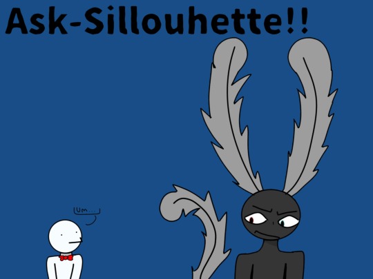
[💙This is the mod, An-Artist-N-Shambles.💙]
[This is a pinned post, if you haven't already seen. I will be talking like this as a mod. The point of this is to explain ground rules and behaviors ECT.]
-----------------------------------------‐-----------
[Okay, first things first, please don't get mad at Silhouette for saying something wrong, because sometimes in role-playing, I don't realize I'm crossing boundaries.]
[Secondly, yes, you can be inappropriate all you want, but just know I'm a minor, so don't go too far. Now, onto Silhouettes abilities.]
[Silhouettes abilities are: Floating, becoming a shadow(duh), glowing, forming into different shapes and sizes, teleporting, summoning fire, and I'll add more along the way.]
[His behavior: Anxious, worried, afraid, and nervous.]
[Sometimes I accidentally post things on my main account to here, so I apologize for that.]
[💙I'll add more to this post when I can, toodles!💙]
0 notes
Text
Vivienne Westwood's Fashion Designs in the 80's: The Impact of Tartan
Vivienne Westwood, the iconic British fashion designer, is renowned for her bold, innovative, and unconventional designs. In the 1980s, Westwood's fashion creations took the world by storm, with her distinct use of tartan fabric becoming a defining element of her style. This unique incorporation of tartan not only revolutionized fashion but also had a significant impact on the industry, challenging traditional norms and redefining the concept of punk and rebellion.
One of Westwood's most iconic tartan looks from the 80s was her collaboration with Malcolm McLaren for their influential fashion boutique, "Sex." Together, they created a collection called "Pirates," which introduced a new wave of punk-inspired fashion. This collection featured an array of tartan garments, including kilts, trousers, jackets, and corsets, all reimagined with a punk twist. Firstly, she challenged societal norms by appropriating a fabric associated with tradition and corrupt its meaning by using tartan in unconventional ways, she brought a sense of rebellion to her designs, reflecting the punk of the time. Tartan became a symbol of and a way for individuals to express their unique identities.
Secondly, Westwood's incorporation of tartan brought this fabric into the mainstream fashion scene. It was no longer confined to Scottish kilts or traditional attire but became a dynamic and versatile textile used in high fashion. Her innovative use of tartan opened doors for future designers to experiment with traditional fabrics and challenge the boundaries of fashion.
Westwood's tartan designs also played a crucial role in shaping the aesthetics of the 80s punk movement. The fusion of tartan with other punk elements, such as safety pins, leather, and provocative styling, created a visual language that defined the punk subculture. This unique blend of rebellion and sophistication became synonymous with Westwood's designs and influenced a generation of fashion enthusiasts.
Furthermore, Westwood's tartan looks in the 80s had a lasting impact on the fashion industry as a whole. Her bold experimentation with patterns, colors, and silhouettes not only redefined the concept of punk fashion but also inspired other designers to push boundaries and embrace individuality. Tartan became a symbol of empowerment and self-expression, transcending its traditional associations.
Today, the legacy of Vivienne Westwood's tartan designs in the 80s can still be seen in contemporary fashion. Tartan continues to be a popular pattern, embraced by designers and fashion enthusiasts alike. It has become a symbol of rebellion, nonconformity, and a celebration of individual style.
0 notes