#screentone effect
Explore tagged Tumblr posts
Text

thinking, mending
Print here (hopefully no more c0pyright str1kes 🙌)
#garak x bashir#star trek ds9#elim garak#julian bashir#garashir fanart#garashir#fanart#traditional art#pencil drawing#art#transmasc artist#artists on tumblr#drawing#edited drawing#screentone effect#kukalaka#sorry I forgot to tag kulalaka#also idk how to describe shit if anyone wants to describe my drawings feel free
698 notes
·
View notes
Text
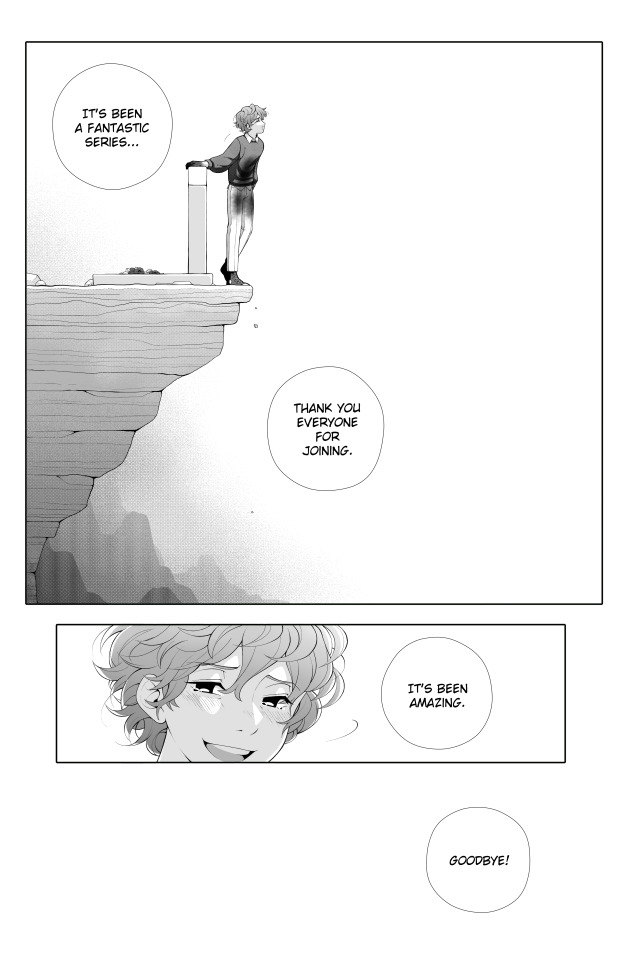
Grian fell from a high place.
3rd Life (manga ver.) — End
#... haha i uh. sorry#this composition came to me in a vision and i couldnt rest until i made it real#manga adaptation when....pls.....they deserve it......#(the stains on his thighs and torso are from cradling scar in his lap btw. if u were wondering.)#3rd life#3rd life smp#third life#third life smp#trafficblr#life smp#grian#my art#sorry to my friend who had to witness my layer structure for this with admittedly warranted horror#at one point i had almost every lock of hair on its own layer lol#but waaahhh why did the screentones export w that weird stripe effect ;-; idk how to prevent it...#tw suicide#mouseposting
970 notes
·
View notes
Text
look at this dumb thing I drew

#listen the comic functions are insanely good#but i am ALSO very lazy KJHFHKKHF#i really like effect lines tho HAHA#even shading and using the screentones was alr like a drag for me so there's no way i can commit a full comic#i mean look at Price i basically just drag an image of him into the panel LOL#also i apologize to any comic writers/artists stumbling into this post bcuz of the horrendous speech bubble text placements#I HAVE NO IDEA HOW TO MAKE THE TEXTS FIT#but it DOES looks like a passable manga panel...A SHITTY ONE HAHA#gummmyart#doodle#sona#?? idk what to tag this LMAO#csp
69 notes
·
View notes
Text

@these-godforsaken-halls showed me a preview of her fic and I was very delighted and entertained by Grian's newfound knowledge of pirate mothers.
Joke dialogue is below the cut
Haha

#hermitcraft#pixie hollow au#grian#don't mind my very inconsistent art style and playing around with screentone effects#hermit hollow
12 notes
·
View notes
Text
sometimes I feel shitty about not being great at comics but I've literally never done this before and learning to create, write and format comics is an entirely different beast from knowing how to draw them
#art#art stuff#artblr#i just want to experiment a lot#mostly with how many colours I use and screentones and special effects#i go back and forth between what brushes i use and how many shades of grey i'm gonna put in and all that crap#i'm trying to keep my BASE colours to five#and then when i shade it'll end up being more...#...i also need to figure out what my characters faces look like#i have a general idea but it changes little by little every time i draw one of them
7 notes
·
View notes
Text

"You actually pulled it off...."
"We call it Operation Catnip❤️"
".............."
[Part 1]
#informantau#informant au#amamiya ren#niijima makoto#shumako#kurusu akira#Makoto's stress level=max#more like#wtf is this#how did this plan even work?#Ren and Mona later#your feet are dirty don't do that#fck you Joker I'm NOT a cat!#I kinda use this whole series to practice my screentoning#at the very least I got the effect to look okay
79 notes
·
View notes
Text

Kusanagi Nene (Wonderlands x Showtime) - Backstage Operator (Untrained) ★★★ (Set: Release Celebration Gacha)
#wonderlands x showtime#kusanagi nene#set: release celebration gacha (wonderlands x showtime)#OMG THIS IS THE ONLY UNTRAINED 3STAR IN THE WXS RELEASE CELEBRATION SET THAT DOESNT HAVE THE SCREENTONE EFFECT#card of the day#project sekai#2020
1 note
·
View note
Text
Iku (and "friend") spotted!
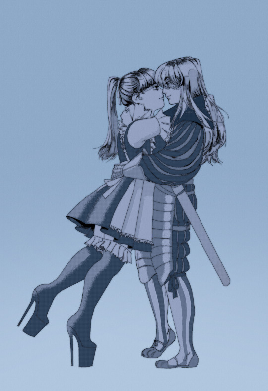
last knightmaid for the time being i think...
#Iku and Friends!#oooooohh Fuck yeah the lesbians#I love the screentone effect used for the shading#esp on the hair!
48 notes
·
View notes
Text

A slightly older piece of Muriel, who first appears in The Butterfly Effect’s Bloodline.
#my art#original art#oc#digital art#art#character art#artists on tumblr#i literally just randomly did this#i was like “hey why not do a grayscale piece and use those screentones”#so i did and here we are#moonlightgardens - the butterfly effect
0 notes
Text
i see... chartpak's screentones zip-a-tone maxon and letratone are all defunct...... there doesnt seem to be any other companies that made them other than deleter... there seems to be people selling them secondhand but that defeats the purpose of a cheaper alternative....
#i bet deleter ones are cheaper in japan...#but i dont live in japan....#i dont wanna do digital art :(#i will though probably.#i can hatch but thats not the same effect...#hmmm#alas.#im bad at digital art and it feels worse to draw digitally but.#does anyone have any good csp screentones.#for me to use until march when my free license expires~
0 notes
Text

practicing using screentones
no color/effects version under cut:

431 notes
·
View notes
Text
Art style breakdown /tutorial(??)

Some friends asked so here we go : disclaimer im bad at explaining (so feel free to send an ask or smth)
Final art (long read so theres a timelapse at the end)


If its not for something important (commissions), i dont usually make a lineart for a drawing but just clean up the sketch , it wont be used anyway

I usually separate them by colors , mostly so i can Alpha lock them and not worry about coloring over parts
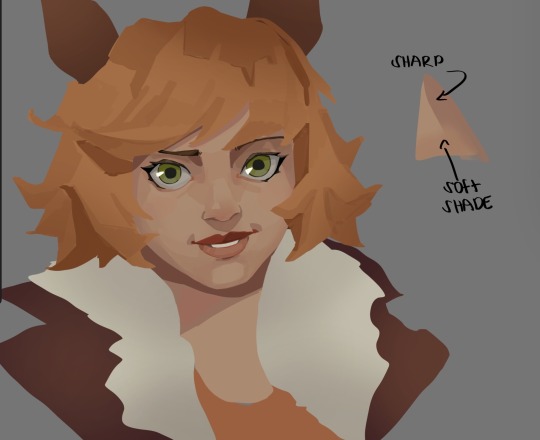
When coloring i use a soft airbrush to have gradients within the shading , so its not one solid color . How i shade is very blocky , lots of triangles lol (if im using CSP i love using the lasso fill tool ) but there are parts especially in the skin where I keep it smooth and blended, usually nose and cheek area . Using an asaro head is usually a good start to learning how to shade faces with planes in mind

Depends on the character, but I like adding shadows on the lashes/brows itself , make it look solid and 3d , it makes the eyes pop more imo

Using multiply layer to make the shadows darker for more contrast
At some point I’d merge everything together so i can just paint in one layer, easier to fix things with liquify too ; if im in CSP i keep the separate layers in one folder just in case i need em later but i cant really do that in Procreate cos of layer limits

This is the part where i make the shading more painterly .,To make the shading look sharper , i like adding lines on the edges .
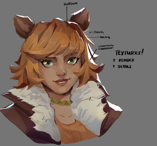
The fun part : adding the ✨
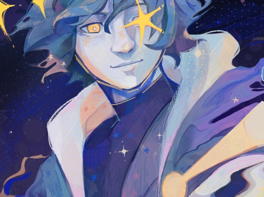
This is the part where I add textures , either from texture images or with screentone/hatching brushes. This is also around the part where i add the character’s accessories and stuff like scars and freckles (its just easier to add smaller things near the end than having them accidentally painted over at the start)
Whenever I feel like the drawing looks too much of a similar shade / temperature , I use a gradient map+layer effects (masked) on parts to give it variety . Technically you can do this by just having a layer effect on and manually adding colors but gradient maps make me go “ooooh didnt think of that color there “
CSP also has a posterization filter that i like using when i feel like some part looks too smooth to me.
I sometimes add in sketchy lines , and seeing how cool it looks in Marvel Rivals art ive been adding it more lol
Artists that influenced me are : Nesskain, Toni Infante , Valorant’s 2d art(their main artist is Suke) ,Arcane , Spiderverse and the most recent one ive been obsessing over is Marvel Rivals ( its got everything i want my art to be when it grows older lmao )
356 notes
·
View notes
Note
Hello! I stumbled upon your color palette challenge today and I got to say I absolutely love it!!! It’s so good!!! Like i love all the tiny details and the textures! And your style! If you’re still taking requests I think it would be cool to see 53 and Scar (maybe as HotGuy). Also if you don’t mind me asking, what art program do you use??
Have a good day/night!!

AH THANK YOU FOR YOUR KIND WORDS!! This was actually so fun because I got to lean into the Screentones for the comic book effect :))
And I use Photoshop! I’ve used it so long, I’m just too stubborn to learn a different program. Monitor wise, I use a Huion that I plug into my laptop. Thanks for asking!! :))
#leaf doodles art#asks#color palette challenge#gtwscar#HotGuy#HotGuy Fanart#hermitcraft fanart#hermitcraft#gtwscar fanart#goodtimeswithscar fanart#goodtimeswithscar#I tried doing a more personalized design#but shoutout DDVAU for being so influential
843 notes
·
View notes
Note
hi! absolutely love your art!! can i ask how you get the screentone effect (like on the fool card), is it something built into procreate? hope you have a nice day :)
hi thank you!! for that card i used the Halftone filter in the adjustments menu

for other artwork I've also used specialised halftone brushes (such as those found at true grit texture supply).
220 notes
·
View notes
Text
Maybe that's too specific I may be the only jackass who checked the manga for moiré. In my defense it looks really cool
I love it when Berserk goes so insane with the crosshatching and shading that when you zoom out too fast your phone screen translates it like the old moiré effect you got in old manga where the artist was still figuring out screentones c:
#in theory moiré is an effect you wanted to avoid when using screentones#but to me it was so charming
9 notes
·
View notes
Text
Animation Night 189: Nonphotorealistic
There is a funny trend in animation-related terminology to define things by what they aren't. Animation is any technique for creating film that isn't live action. Limited animation is any style of 2D animation that doesn't follow the conventions of Disney's 'full animation' on 1s and 2s - a category that includes a wildly diverse range of approaches and techniques, as this wonderful history by Animation Obsessive describes.
In 3DCG circles, there is a similar term: nonphotorealistic. Which describes, naturally, anything that isn't trying to look like a photograph of a real scene. There has been a real boom in this of late, and just like the other terms, it really doesn't narrow it down very much. Other terms like 'hybrid animation' add a bit more hints.
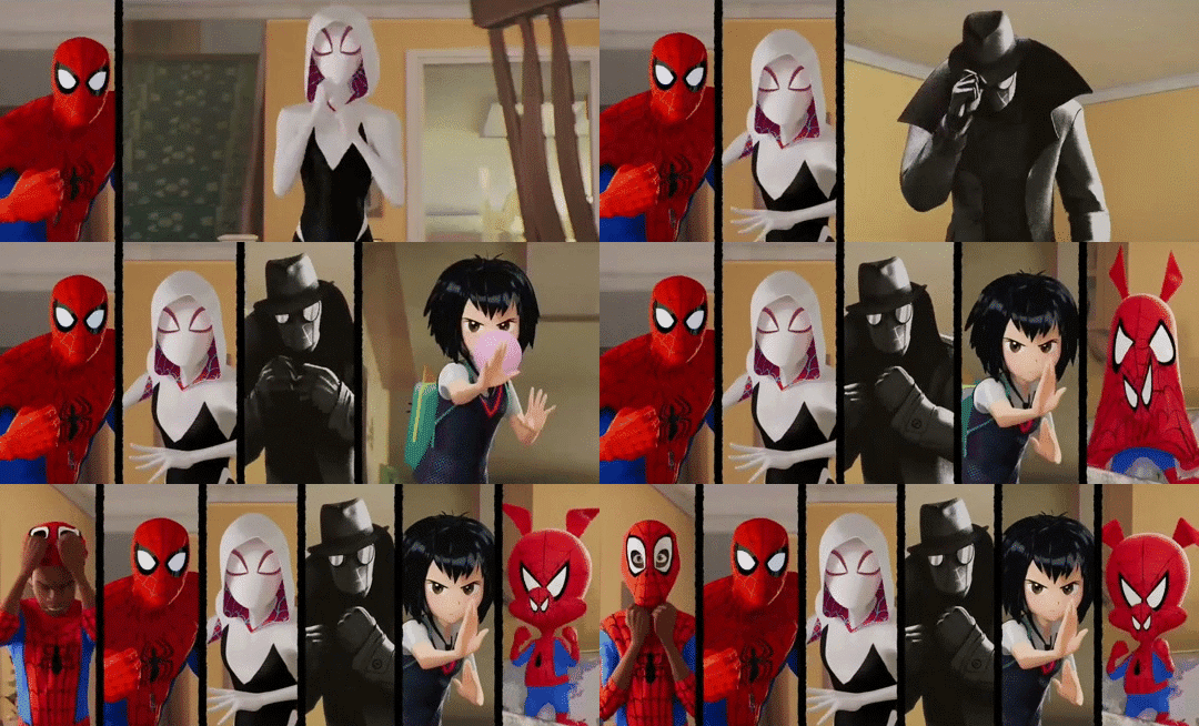
Of course, if you've been anywhere near animation in the last few years, you'll probably know another term: 'Spiderverse style'.
There is no denying that Spider-Man: Into the Spiderverse (2018) by Sony Pictures Animation was an absolute landmark for animation. (I wrote about it way back on AN21, focusing more on the cultural angle.) The ludicrously stylish film pretty much set the direction for animation in the 2020s - making a bunch of money and awards and thus finally throwing open the door to 3DCG animation that doesn't look like the style set by Pixar/Dreamworks in the 2000s. Its sequel, Across the Spiderverse (2023), was even more ambitious and successful (despite a troubled production involving a lot of needless crunch). We'll be showing that soon in a Spiderverse double bill so look forward to it!
So perhaps not surprising that when people see the use of graphical styles, 2D elements, limited framerates and the like in 3DCG these days, Spiderverse comes to mind. In its wake have come various films and series that apply these and related techniques: 3DCG animation is more varied than ever, and it's cool.
It isn't really a style, tho.
youtube
Here I'm indebted to youtuber Camwing who has made a nice video overview breaking down the animation of recent movies in this vaguely defined paradigm. Among them we have The Mitchells vs the Machines (2021, also Sony), Puss in Boots: The Last Wish (2022, Dreamworks), and Teenage Mutant Ninja Turtles: Mutant Mayhem (2023, animated at the French/Canadian studio Mikros animation), and of course over on Netflix you got the wildly popular League of Legends spinoff series Arcane (2021, Fortiche Productions), and the romance film Entergalactic (2022, DNEG), tying in with an album of the same name.
None of these films has exactly the same style, but they all pull from a related bag of tricks. The core techniques are animating on reduced framerates for a 'snappy', high-clarity feeling, the combination of 2D and 3D elements in some fashion, and taking inspiration from traditional media such as paintings or comic books.
For example, Arcane and Entergalactic both use the trick of 2D backgrounds/projecting paintings onto 3D geometry, inhabited by 3D characters with a stylised shader. Arcane is dripping with 2D visual effects. Puss in Boots drops the framerate during its action scenes - the opposite of the old paradigm of full animation, where fast actions would get more frames. Spiderverse draws 2D expressions onto its 3D models to push them further, and is full of all kinds of colourful stylised rendering - screentone effects, kirby dots, outlines, the works.

It's tempting to link this to 2D-in-3D animation, and certainly many of these films apply this technique - this is the major niche where Blender has found its way into industry pipelines. But using 2D isn't mandatory to count here. For example, TMNT Mutant Mayhem has an incredibly striking storybook-painting style, accomplished largely by clever shader work and a strong sense of graphic design. Genndy Tartakovsky's canned 2014 Popeye project was planning to use a ton of 2D-style posing and squash-and-stretch, accomplished largely with rigged 3D models. There are many paths to take!
And mind you, I haven't even covered one of the biggest angles here. Search for nonphotorealistic 3DCG on Youtube and what you'll probably find most is information about cel-shading - aka 'anime style'. This has also advanced considerably in the last few years, with the techniques pioneered by Arc System Works in Guilty Gear such as editing the normals of characters for more precise control over shading, and minute adjustments to break up the mechanical feeling of 3D, becoming widely copied in both games and films. (And particularly, animated porn.)
youtube
Vtubers in particular have really run with this technique, generally speaking using cel-shaded models with edited normals, inverted eyes, etc. etc. to try and get the feeling of an anime character come to life. [You can see a lot of these state of the art techniques if you download Pixiv's free VRoid Studio software and import the model into Blender using the VRM plugin.]
Naturally this kind of cel-shaded approach has found a particular home in Japan. In anime, the biggest champions of it are certainly Studio Orange, whose hybrid approach involves planning out shots with 2D animation before matching them with the rigs. We've covered their adaptation of Houseki no Kuni in great detail on Animation Night 97; their Trigun reboot was perhaps even more popular. But cel-shaded techniques, 3D previs and the like have also made their way into big films like Eva 3.0+1.0 (AN66).
Although this type of rendering aims to recreate the look and feel of 2D animation as much as possible, it always ends up being something new: character models that would be too complex to draw, an ease to 3D movements and camerawork that would be challenging in 2D, and generally a new hybrid style. This is good! 2D animation is already very good at being 2D animation - it's fascinating to see what 3DCG becomes with that inspiration.
So with that brief overview, where does that take us tonight?
I'm not quite ready to do a Spiderverse double bill tonight, so instead the plan is to check out a couple of recent American franchise films that are taking on the new suite of techniques. I've mentioned them up above, but let me introduce them more fully here.

Puss in Boots: The Last Wish is a sequel to a fairly unpopular spinoff about a side character of the Shrek franchise (AN75). Not, on its face, very promising - which is why it is all the more striking that I was told on all sorts of sides that I must watch this movie. I'm finally going to make good on that.
The title character is a kind of feline musketeer type, now facing the end of his swashbuckling career as he's lost 8 of his 9 lives. Not wanting to hang up his hat, he goes on a quest to restore them. What makes it stand out its the action scenes, which go all in on the anime-influenced, extreme perspective and lighting, limited framerate style that we're discussing above. Apparently it looks sick as shit.

Teenage Mutant Ninja Turtles: Mutant Mayhem is a fresh reboot of the venerable TMNT franchise, which pretty much describes itself in the title: four turtles (named after Renaissance painters, of course!) live in a sewer as ninjas, led by their aging master who is a rat. Starting as a comic book, it became one of the iconic toyline-driven TV shows of the 80s - but it's still going! Indeed, Turtles has been on a roll of late (at least going by animator scuttlebutt), with Australian studio Flying Bark Productions turning a lot of heads with their neo-Kanada School style (and for really stretching the definition of 'storyboard').
This new film takes a different approach to the bombastic action of Rise. It focuses on a new origin story for the turtles, telling a kind of coming of age story - but what makes it unique is the animation style and cinematography. Cinéma vérité is not a phrase you really expect to be associated with ninja turtles, but the film seems to really go all out in a way you wouldn't really expect from a franchise movie, shooting the young turtles in a handheld style and focus heavily on character. Marcel Reinhard's shader work, allowing the animators to isolate lights to specific objects and characters and introducing graphical elements of cross-hatching, stippling, etc. etc. to the lighting, gives it a uniquely painting-like feeling, augmented by a lot of 2D creativity in lighting and effects.
Turtles has never really been my thing, but this film looks unique enough that I really want to see it - and I hear it's a good film too.
So that's our bill for tonight! Puss and Turtles. Let's see what the big studios have been cooking of late...
Animation Night 189 will be starting around 10pm UK time (roughly three hours hence) and carrying on til about 2-3am same! We'll be on twitch.tv/canmom as usual. Hope to see you there!
155 notes
·
View notes