#same little quote in the same font in the blog description
Explore tagged Tumblr posts
Text
Ed, Edd n Eddy Series Bible (1996) -Analysis-
You can all finally read/download Ed, Edd n Eddy's official Series Bible right here! Thanks again to Chuckletons for sharing this with me and to Joey/Kongiscool0518 for sharing it in the first place, the Holy Grail of lost Ed, Edd n Eddy trivia!
One of the first posts I made for this blog was the Series Bible page. It was a composite of every source we had ever seen reference the series bible so far-- storyboarders in interviews, CN's old character guides, and the biggest source, an old CN UK posting about the show. Well, I figure now that we have the official source, I better update the old page (so everyone knows it's out of date), and make this new Series Bible post using the official source! Not much new information, but I was intrigued to finally learn the true phrasings of some things we had only heard paraphrased, as well as at least one detail from the movie that I couldn't believe came up this early in conception...
Unfortunately, Tumblr has apparently updated its post system to only let me add 10 images? Gonna try and only use images for what I need since you can read the actual document above, I guess I'll transcribe it too for easier reference and so we don't ever lose some archive of this.
Quickly, let's review what a series bible is:
A series bible is how creators pitch shows to networks. They can be called “pitch bibles” as well. Bibles do not usually get posted publicly, because they are initially under a strict Non-Disclosure Agreement by the network; also the creator may simply not wish to share it because it reflects the earliest stages of development.
The pitch materials typically include early concepts for characters, locations and episodes. Sometimes it exposes secrets, in this case, Ed and Eddy’s home lives, and sometimes the stuff in it is completely abandoned because it’s so early in production, in this case, casual references to school and adults.
Alright, everybody, it's time to gather 'round and read the Ed, Edd n Eddy Bible!
THE YEAR IS 1996.
YOUR NAME IS LINDA SIMENSKY. YOU WORK AT CARTOON NETWORK. A FRIEND OF YOURS, DANNY ANTONUCCI, IS WRAPPING UP A SHOW ON MTV. YOU GET THIS FAX.

Linda Simensky immediately fell in love with this concept because as a child, she was best friends with 2 other Lindas for seemingly no reason other than the shared name.
I love how Danny decided last second to pencil in the correct names over each Ed, since they're arranged out of title-order.
"They're friends because they have the same name."
-the Logline for the series.
Fun fact: one storyboard artist for the movie observed that the movie is essentially all about challenging the series' original notion that the Eds are friends ONLY because of their name.
"A Danny Antonucci Cartuna"
-the label Danny used to use under announcements of new productions.
PAGE 1:
Ed, Edd n Eddy
They're best friends because they have the same name.
A gag laden, beat generated CARTOON bumper car ride of 3 misfit youths on a cul-de-sac in the suburbs of America.
Through summer vacation, part-time jobs, or just hang'n out at the corner mail box, they want to belong....but CAN'T.
From home chores, helping neighbors or eating jaw breakers, they want to fit in...but CAN'T.
Ed is into "B" monster movies, model kits and is quick to break out into rashes.
Lots of luck...
Edd is into chemistry, biology and prone to crushes.
Later...
Eddy is into pranks, is stylish and flaunts himself to the world.
Ya Right...
Ed, Edd n Eddy is a show about confusion and contradiction, that awkward part of youth, pimples, big feet, oily hair and... girls???.
Puberty is unforgiving.
I was fascinated by the lack of art on this page, it makes the pitch feel very focused. AKA logo in the corner, the title logo again up top, then the logline appears again below.
I really love the breakdown of Danny's vision of the show. "Gag-laden, beat-generated, CARTOON bumper ride." Very accurate, and I think "beat-generated" is the phrase that interests me the most. I typically think of "animation beats" as sort of a give-in-- technically all things fit a rhythm, so all stories are essentially just a montage of beats. But this does make me realize how important the strength of the beats and their rhythm are to the pacing of a cartoon and making you feel like "that was a good one." I feel like the "seasonal rot" viewers feel over the course of a show, and the way that perception differs from person to person, depends on the type of beats you want. Even though I am very into the experimental beats of a show in its later seasons, I can definitely see how season 1's beats are more typically appealing to a wide-audience, and how important a focus on that is to the longevity of a show.
I found it really interesting how the scams are initially conceived of here as "summer jobs." It adds to the sense that adults were originally meant to be present. Honestly a little surprised nobody with access to this bible had ever thought to mention that-- scams are not referenced ANYWHERE. Their image in the Series Bible is that they have summer jobs and help neighbors, which is certainly a much cleaner reputation than the Eds ended up with in the show. Makes me realize though, were some of the early scams, like Ed's Hive Bee Gone and their newspaper routes, supposed to be leaning into this early idea of them with almost legit jobs for unseen adults?
I was very amused by the repeated phrase that the Eds simply CAN'T fit in.
Loved to finally see the official phrasing for the confirmation that Peach Creek is in America. Not much different than I was led to believe, but still nice to have the true quote.
Also love Eddy being described as "stylish and flaunting himself to the world." The bold-print reactions to each micro-description is a cute idea too, I truly wonder who we were meant to picture saying those things in reaction. Each Ed? Kevin?
The "corner mail box" is an oddly specific phrase-- the Eds do hang around mailboxes throughout the series, especially seasons 1-3, and I believe the canon map does have a corner mailbox, but the idea that the Eds hang out at one specific mailbox went the way of Bro's supposed secret treehouses.
PAGE 2:
Ed, Edd n Eddy
Show Description
Gag laden. True cartoon style, inventive, non parody, fast paced, stretch and squash
Beat driven. (even when characters stop they hold with a bounce cycle. Adults never bounce. Music can play important part, not just fill.) But not a musical.
Cartoon surrealism. (viewers see the show as Ed, Edd n Eddy would, less important things tend to blend into the background, while objects of Ed, Edd n Eddy's desires are focused. Premise driven.)
The school year's over, (yeah!!!!) and the long HOT summer vacation begins (gulp). What to do?
Stuck on a cul-de-sac in the suburbs of America is the last place you want to spend summer break, especially when you find life confusing and contradicting.
Ed, Edd n Eddy is about friendship, and serves to remind us that they're no "good ole days," just smelly runners.
You can tackle anything, when your with your pals.
Their days are spent, for knowledge, acceptance and some cash for jaw breakers. Armed with pimples, big feet and oily hair the three amigos trek into the unknown.
Ed, Edd n Eddy are dying to be grown-ups, but they're kids, and attack adulthood as only kids would. Simple situations turn into a manic rollercoaster ride. (Don't forget your barf bag).
They just want to belong, and they're willing to pull off any insane stunt to prove it. First they need to figure out what it is they want to belong to.
Found it interesting that on this page, the show's logo is replaced with the title written in a jumbled font. Seems like the font from the show's end credits.
Hehe, the continued reactions to the descriptions. Allow me to be Double D for a moment and point out the increased use of parentheticals on this page, as well as one wrong "your".
I love Danny's insight that season 1 is framed by the context of how hyped everyone still is just to be out of school, but also the sense of pressure to make use of their break.
I really appreciate Danny getting further into the details of his summary of the show's style on the previous page. It only makes sense that he had this much of a vision that early.
A second confirmation of the cul-de-sac being in America! I'm also really into the repeated focus on the Eds finding the world "contradicting." I always loved how EEnE's inexplicable cartoon antics supported that sense that the Eds are highly aware of contradictions in both societal things and the actual characters.

WOW, so I'm fascinated by this dual reveal. Before the wiggling outlines, which Danny usually calls a "boiling line" and describes as a tribute to wiggling inking in early animation, the series bible instead refers to him wanting the characters to do the iconic Fleischer "bounce," which is a much more commonly recognized rubberhose animation technique. Very interesting that Danny decided not to stick to that. Did it feel too out of place? Or was the overseas team not willing to animate a weight-shifting for every single held pose? Haha, guess I can see why boiling was an easier compromise. I wonder if he had any other ideas for how to make it more of a 1930s cartoon.
The other reveal to me here is that the movie's choice, that adults don't always wiggle in the show, was an idea from the very beginning! I guess I can better understand now why it's just too difficult to communicate a stylistic choice like that overseas-- no point making Bro not wiggle, that'd just create confusion.
Also, really disappointed that my wish for a musical is officially squashed in the series bible itself. That's a tragedy. The show's over, ya couldn't let me dream, Danny!? Conversely, I love Danny's forethought to say "non parody," I definitely noticed and appreciated EEnE's avoidance of derivative parody humor.

My spouse had to point out to me that Danny probably means sneakers here, lol. Canadianisms!
The comments about the Eds wanting to grow up but needing to figure out what they want to belong to are so great and relate to the movie so well. I've heard those comments before, but the correct phrasing was cool to see.
PAGE 3:
Ed, Edd n Eddy (image of Ed in right corner)
Character Description
Ed
Attention deficiency syndrome.
He has trouble...
He can't....um...
OK, he draws all day in class.
When Eddy gets a bright idea...Ed's in.
Ed is easily talked into doing Eddy's "hard work". He has great physical strength.
Ed's happiest with his Model kits and B-monster movies. He draws his knowledge from his movies.
Ed smells. Flies are attracted to him.
Ed has sayings for all situations
ED: "you can change your shirt, and Bingo was his name..."
Ed's perpetually a slave to his younger sister's whims and whines.
Ed may have to baby-sit his sister, or let her watch whatever she wants on TV, or let her dress him up in mom's clothes.
Ed breaks out in Rashes. He's allergic to practically everything, especially Guinea Pigs.
Ed's Mom xerox's his sketches and doodles for her therapist.
Ed's Dad hopes to pass on to his son, his knowledge on "pre-owned" auto sales.
Very cute bit wasting the space at the top of the page. Danny seems very invested in Ed's personality already. The old sources we used to have definitely tried to condense these down to simpler blurbs.
Weird how Danny wants to essentially diagnose Ed with ADHD here (phrasing it very poorly, but it was the 90s and... Canada?). I don't know enough on the subject to debate it, but I still gotta point out Ed's canonical cracked skull!
Interested in the comment about Ed being most allergic to Guinea Pigs. I don't think that animal was ever even mentioned in the show. Eddy mentioned an old gerbil once....
Neat to finally have the real phrasing of the official word on Ed's parents! I saw someone comment earlier that this seems to be hinting Ed's Dad is selling stolen cars. I've never thought to question the legality of his apparent second-hand-car dealership (I imagined he works with Eddy's dad, who has received a legitimate award for his salesmanship), but those quotation marks are certainly making Mr. Ed's practices questionable! Best case scenario, Danny meant that more like italics or something, but maybe Ed's dad IS up to no good...
PAGES 4 & 5 (Ed's turn sheet and expression sheet)
PAGE 6:
Ed, Edd n Eddy (image of Edd in right corner)
Character Description
Edd
is really smart.
is really quiet.
Edd is unnaturally-- polite.
Edd hasn't been allowed to take gym ever since the Dodge ball incident. He's been excused to free study time in the library.
Edd doesn't like it when people touch his things.
EDD: "You may enter in my room, but don't touch my Lego robot. Thank you."
Edd's learning to play Peddle steel guitar. (his Mom makes him)
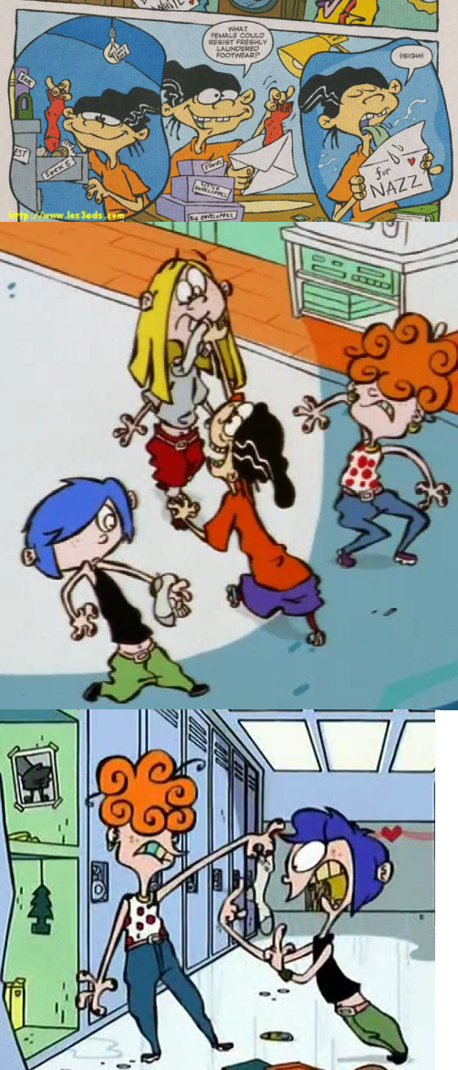
Edd's prone to "crushes". Girls in School, in his neighborhood, TV, anatomy books. He mails "true loves" his socks.
Edd is always ready for action, even though he can calculate the implications.
Edd constantly mumbles.
No one ever sees Edd's parents. They both work nights. They communicate to their son solely through Post-it notes. Edd's not allowed to touch anything in the house while they're gone. Anything.
Interesting how Danny slightly differentiates the barely-used space at the top here from Ed's description, to characterize Edd as more quiet and mumbly, adding an awkward "--" mid-sentence, perhaps to create the impression that Edd halts to choose words carefully.
Everything on this page feels familiar, from the character guides and other old sources. The most interesting thing to me here is that Edd's Mom forcing him to practice Pedal Steel Guitar is established this early, don't think I knew that, but I had noticed that it existed in his room from ep 1.
I love how the explanation in the beginning for why Edd goes along with their dumb schemes even though he's smart is basically just "he's always ready for action." ?!? I guess in a way???
That weirdly phrased Edd quote amuses me because it references Lego, just like the original concept background for his room before somebody nixed the copyright-namedrop.

Edd's prone to crushes thing has been reaffirmed over and over in character bios even though it really doesn't come up outside of the cupid magic in HPH and the pilot-episode heart eyes at Sarah that are barely canon. Still, I've always loved the truly disturbing statement that he mails "his true loves his socks" and how that managed to make it into canon with a comic book example, a cel animation example and a digital era example.
PAGES 7 & 8 (Edd's turn sheet and expression sheet)
PAGE 9:
Ed, Edd n Eddy (image of Eddy in right corner)
Character Description
Eddy
Exhibitionist.
Megalomaniac. (quote from his report card)
Eddy is the unofficial leader of the trio.
He's always got a plan, a stunt or a weird noise.
Eddy's the "class clown". He loves showing off. He loves being the centre of attention-- no matter how stupid the reason is.
Eddy is the only kid in his grade to have been expelled for aw hole week from school. It was his turn to set up the video for science class. He switched "Our Friend Yeast", for a video he "borrowed" from his parent's room.
Before Eddy's brother went....away, he enlightened Eddy with the "legends" of the neighbourhood. Eddy knows where all the abandoned tree houses are, which sewer pipers are safe to spelunk, and the secret recipe for the "El Mongo Stink Bomb" (it's been in the family for years).
He is the one who is most able to pretend that he knows it all... and doesn't care what anyone else thinks about him.
His genes are working the fastest.
Eddy's Dad is constantly concerned that Eddy may grow up to be a ...figure skater.
Eddy's Mom never believes his little darling was involved in such a heinous act.
Funny choice that Eddy's wasted-top-space is just two one-word descriptions, and allegedly lazily swiped from his negative report card.
Wow, we knew the report card quote and the "Our Friend Yeast" story from the UK show guide, but now we also know Ed's page says that Ed draws in class, and now I realize that Ed and Eddy have series bible school blurbs to match Edd's classic dodgeball incident blurb. Anyway, it's great that Eddy's showed his entire school some sort of sex video his parents have.
Very interested that the phrasing for the Bro/El Mongo Stink Bomb blurb even seems to suggest it's a family recipe. Eddy's Dad did have prankster stuff in his closet in JJJ... did Bro learn his prankster ways from Dad?? The neighborhood's secret tree houses have come up in other descriptions (at best, I'd say this could be related to that creepy shack the Eds found in the woods), but I think it's new info that Eddy personally learned the sewer routes from Bro. Interesting...
Thankfully, I had already heard about the Bible's awkward reference to Eddy being the most pubescent as "his genes are working the fastest," lmao.
Once again the Double D in me comes out to point out that the description of Eddy's Mom seems to switch to the Dad's pronouns.
PAGES 10 & 11 (Eddy's turn sheet and expression sheet)
PAGES 12-14 (Sarah, Jimmy, Rolf, Jonny, Nazz, and Kevin lineup of all 6, then 2 zoomed in lineups of the first 3 kids and last 3 kids)
(Funfact: the kids' designs were allegedly freelanced to an outside studio, hence why their refined later-season designs are so different from these lizardy starting places, lmao)
PAGE 15: (images of Sarah and Jimmy next to their blurbs)
SARAH
Ed's baby Sister.
It's her way or the Highway.
She has everything done for her, if NOT she'll "make" them do it.
She can be quick to judge.
Whinney.
A tatrum for every occasion.
More than a handful for Ed...or Edd and Eddy.
Thinks Edd is kinda cute.
Wants Eddy to MOVE...to another planet.
JIMMY
Sarah's best friend
He is always playing with girls, boys are just too tough.
He is accident prone, when ever we see him he has a different affliction, ie: band-aids, patches, casts, lumps...etc.
He is very clean.
The Ed's frighten him, "They're such brutes".
I'm surprised how much of the UK guide was accurate to what was really in the bible for them! Also surprised Danny misspelled "whiney" and "tantrum," one right after the other. Is this how Sarah spells them? ...Sorry, Danny, I yam what I yam.
PAGE 16: (images of Rolf and Jonny next to their blurbs)
ROLF
First generation of a landed immigrant family.
Nationality not important.
He's proud of his heritage.
He has peculiar traditions and/or customs.
He eats "weird" things.
He has hair on his back..... "yuck".
He confuses the Ed's to no end.
He confuses the other kids to no end.
JONNY 2x4
He is a wanderer and very inquisitive
From early morning to supper time, he is always outside playing, with his buddy, "Plank".
"Plank" is a wooden board that Jonny drew a face on with a crayon.
Jonny has wonderful conversations with Plank. ...Plank is a piece of wood.
Jonny makes himself very "accessible" to the Ed's.
Found it interesting that Rolf's bio is less clearly phrased than the UK bio set it up to be-- there they made it sound more like he mixes up who the Eds/kids are, here it's unclear whether it means that or (more likely) just means the obvious statement that everyone finds him confusing. If it's that, what a lame hollow bio Rolf got. This kid's based on you Danny, show some of that personal side!
Always loved Jonny's description, his life sounds so cute. Playing outside literally all day. Interesting to have it confirmed that Jonny drew Plank's face, I preferred to think the Eds drew him and sold him to Jonny, but whatever.
"Accessible" has always been an important vague description of Jonny to me. It really only applies to how chummy they could be with him in season 1, but it still sorta applies to his personality throughout the series as well.
PAGE 17: (images of Nazz and Kevin next to their blurbs)
NAZZ
She's cool, calm and assertive.
She is the most matured of the kids, or so she thinks.
She's into make-up and fashion magazines and Boys.
Sarah thinks she's awesome, wants to be just like her when she grows up.
When she enters a scene, all activity stops... boys freeze, they sweat, their hearts beat faster and faster. They lose their ability to talk. When she leaves, they recover and conclude it was something They ate.
She thinks the Ed's are funny.
KEVIN
He is cynical and sarcastic.
He thinks he knows the "routine". That's because he watches "60 Minutes".
It got a big laugh out of me that Kevin's description is only 2 sentences long. Nazz even has a more detailed character description from inception than Kevin. Love this for them.
Who's the Eds' rival? Well, he's cynical, sarcastic and he watches 60 Minutes, doesn't that tell you enough!?
I love the "mature... or so she thinks" remark about Nazz, a grounded flaw for her to have, being a little overcommitted to being mature like Eddy. It also perhaps suggests naiveté that makes it a little more reasonable that they didn't notice they were dumbing her down at the end of the series, but I do think the movie version of her better reflects the Bible's concept.
PAGE 18:
The Other Neighborhood Kids
Lineup of May, Lee and Marie.
The Kanker Sisters
These gals are tough. They bother, bully, provoke and bewilder everyone.
They live in a motor home park on the other side of the Cul-de-sac. The other kids have never been there.
They are proud of their Tammy Faye Baker memorabilia.
Their project "Cooking with Ketchup" closed down their school for a whole week.
No one likes them, especially the Eds.
They are determined to marry the Eds. They want them to do their dishes.
Amused that the Kankers are essentially being labeled backgrounds characters here, the role they mostly fell into in season 5. "Other" neighborhood kids...
I love that the Kankers have a school blurb to match each of the Eds', and that theirs has similar destructive-intentions to Eddy's video premiere story.
I believe all of this was all known from the UK guide as well, but still, neat stuff!
PAGES 19 & 20 (zoomed in Kanker lineup and their height chart with the Eds)
PAGES 21 & 22 (early promo art that used to be on CN's old Eds webpage, the art of the Eds eating jawbreakers at the end of ep 1 with the overhead text "Ed, Edd n Eddy love JAWBREAKERS!!!", and the art of the Eds all running with overhead text "Ed, Edd n Eddy see something shiny...."Jiggers." That weird "jiggers" statement at the end was normally edited out and I don't know what it means. Looked it up and it seems to be Chinook jargon (like when Ed said he was "skookum at X's and O's") usually said in the same sense as "CHEESE IT!")
PAGES 23+:
The rest of the pages in that bible download are from a 2004 storyboard test. The storyboard sample "It's Raining Eds," which we've seen some submitted samples of before, interpretations with Ed attempting to fly or chew gum and Edd making radioactive gum, I was surprised to find out the outline is just the original outline for the opening sequence to season 3's 'For Your Eds Only', seemingly Jonny was not written into the original outline (or was excised for easier testing purposes) but Kevin's brief cameo was. Now I wonder if they knew this would be used for a test when they wrote it, and if they would've come up with a less random way to include him if weren't forced to be a concise bit for testing's sake. (Your limit is typically 40 storyboard pages in my experience.)
I also noticed that in the included background references, the anonymous adult neighbor house next door to Ed's is officially just referred to as a "generic house."

My analysis ends here, but be sure to download that sometime and enjoy all the raw storyboard sketches at the end of the document!
117 notes
·
View notes
Photo
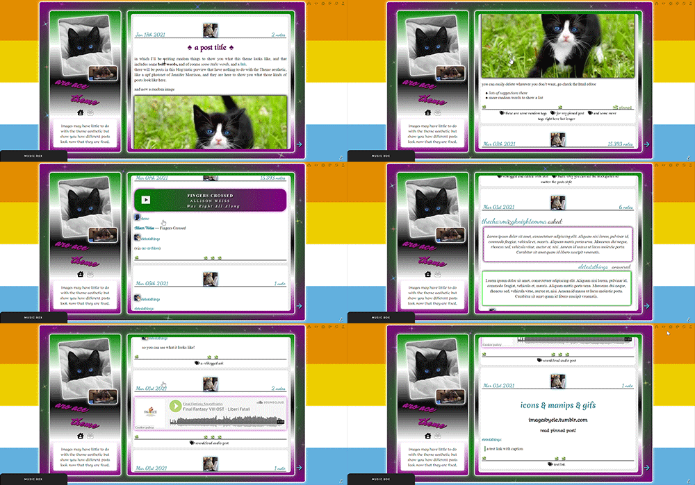
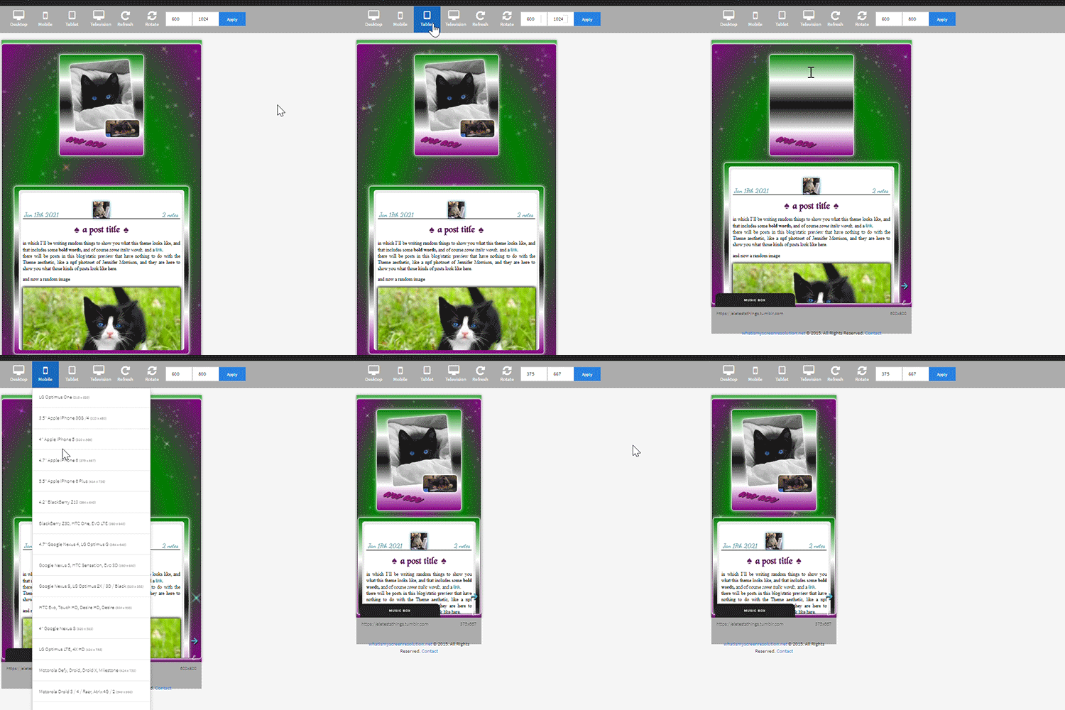

the theme I don’t know how to describe because it has too many things featured in it and it will take a year or
aro-ace theme!
note that you are allowed to use the theme for whatever you want, change all colors, images (you want to make it a marvel thing? go for it! It’s personal and you want to use other flag colors? go pick those rainbow colors!), but my inspiration was, well, not having seen aro-ace themes before and wanting to make one. I didn’t upload background images but you have the option. Feel free to edit as you please, just don’t remove the credit or claim it’s yours!
as always in the source you’ll find the link to the post with static preview, code and instructions/extra credits.
theme is contained, responsive, super customizable. It’s free! But as always consider donating to my ko-fi as this was a lot <3 like or reblog if you use! (or just if you like it, if you want to!)
this post will have: what you can edit from custom page, the widgets/scripts used with credits and some explanations. Asterisks * next to something will indicate that more about it will be said in the linked post. I’d apologize for the length but it’s due to how many things I added to the theme and that you should know about.
now, what can you edit from your customization page:
-nearly every font and its color and size, so that if a font is by default bigger than others you can easily reduce the size. There is a select menu for the body font with all the fonts present in this blog, so you know what they are and can type the one you want for other eleents. I think I only left a couple to be edited from the editor, like your quotes posts if you reblog them a lot. This includes h2 as it’s what you use as ‘big font’ in your posts and h3 in case you want to personalize it and use it for something on purpose, as it has to be added to the html of the post.
-one of the new things:I used a gradient for the backgrounds of the big container, the sidebar and the posts container, but also of tumblr’s default music player (latter done initially following @octomoosey‘s tutorial then messed with by me hence no album art). See static preview posts. You can type the colors straight from the costomization page like this:
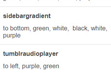
if you want one solid color you can just write, for example: black, black as it needs at least two. To bottom/To left/to top/to right change the direction. The only thing you need to edit from the html is if you want to go from linear-gradient (like you see in the sidebar) to radial-gradient (like in the big container which has green in the center and purple on the outside) and vice versa, if you want.
-you can also upload background images of the sidebar, container and bigcontainer and select the optional blending with the colors, which can be none and you only see the images or something like screen or hard-color and check the results (bigcontainer as an overlay gif on Screen now) -more typing: you can paste the symbol or the symbol code for the list items and the decorations around the post title, right now both being spades. *
-you can upload up to five background images if you enable the ‘changing background’ function otherwise only the first one counts. They will change when you refresh the page, thanks to @lmthemes
-you can turn on and off the music box (player3 by @glenthemes ), and if it’s enabled you can add two songs from the customization page (or go to the html editor and up it to four before it can get messy as it shows on hover), typing url, author, url of the album art, and song title. You already have We Are Golden by Mika as an example (takes a second to start due to the recording, watch out not to get scared if there is silence and then the first note)*
-optional searchbar in the sidebar with optional suggestions when you click on it (if you want them though you’ll need to go to the editor to type links and names, but you can turn it off and just keep the searchbar, like I said) also by glenthemes’ tutorials.
-the separator between text posts image is also optional and if turned on, you can also turn on and off whether the image is the avatair/portrait of the person who made the post, with a link to the original if it’s a reblog, or if you want the image to be one you upload yourself, 50x50px and it should resize to fit in (also with a link, in this case to the post itself so you can open it from the top of the page). One is the toggle button ifshowtinyimage, and the other is ‘tinyimageisthesource’, if you turn that off you upload the image yourself. If you add a source to your posts, it will appear among the permalinks regardless.
more under read more!
-besides all normal colors and borders you can pick the color of the border/glow/shadow (call it as you want) of three different categories, or turn it off: the mainglow for big elements like containers and sidebar and sidebar images, the audios glow for players like spotify, regular one or soundcloud. Finally the images shadow when inside your posts. The latter is set on inherit because it means that if an image is also a link like your tiny-image it will be of the same color of your links and change on hover. That is something you can only change on the editor by searching for color:inherit and change it to what you want, if you don’t want to turn it off.
-askbox colors have been changed with @eggdesign‘s tricks! look for ask_form in the editor and try changing the number of filter there to see more effects. Also the askbox never shrink, a fix by @whateverhtml -pinned post has a little banner, styled like permalinks.
-you can pick a color for top-info which are the date and notes. I left it empty because it automatically gets the default links color but you can pick it yourself.
-turn on and off unnested captions looks for textposts and for all other posts (as people who use xkit to edit previous posts will get blockquotes anyway and may not like the final result) thanks to @annasthms code. -blockquotes are of alternating colors, by @bychloethemes. You can obviously choose the same color if you want them to just have the one. You can also select the type of blockquote, if a solid line or dots or dashes. -you can choose if your smaller sidebar image, sidebarimg2, is an image you’ll upload or if it’s your avatar/portrait by toggling it on and off. If you don’t want sidebar images and you don’t upload any, there are instructions on top of the html to delete the border so you only see the sidebar bg. (basically just delete their box-shadow) -speaking of which, your title will wrap around the second image like in the preview. If that doesn’t work for you you can try changing sizes and font or by going to the editor and changing the margin-top so it’s out of the sidebar image’s reach and can be a “straight line” again (in case it doesn’t fit and the long title is cut in the wrong place)
-you can turn on and off a copy link of the post button on the far left of your permalinks bar, so people can copy the permalink from dash - also by glenthemes.
-navigation links have two alternating colors, odd links right now are black, even links are white, and their hovers are the opposite of that. You can make them all of the same color, in which case you’ll need to look for .navilink a:hover and change the hover color for both. If you have custom pages and enable the link to show it will be automatically added. To change the cat icons just search for ‘cat’ and replace as pleased. To change the ask icon because maybe you don’t have them enabled look for ‘envelope’ with your ctrl + f. You can type urls and titles of navi links from the custom page, the first two are automatically home and ask, there are three more under the description. All icons from font-awesome have a black border so the white ones don’t disappear on light backgrounds, you can change that looking for .fas
-you can select post-sizes: 400, 450, 500, 540. Whether the sidebar is next to the container or on top will depend on your post size and the screen width as at some point they may not fit. They always do fit on desktop though, and on screens that are smaller than 800px the sidebar is assumed to be on top and will have a max height of 300px (but you can scroll down). I couldn’t make the bigcontainer get bigger for giant screens as I can’t calculate the right size in which all post-sizes + sidebar will look good.
-lightboxes show images with a glow too. Speaking of which you get lightboxes as always, pxu photoset fix and video resizing fix all by @shythemes and with the bychloethemes fix. npf photosets fix by glenthemes. No href.li addition from tumblr when you add a link to a post by @magnusthemes.
-soundcloud player is minimal and its play button is the same color of your permalinks icons thanks to shythemes tutorial. spotify is also minimal, instructions to change it are there.
-tumblr controls are small and semi-transparent until you hover, also dark regardless, followed painthemes tutorial.
-chats are styled like imessages by ncrthlanes now deactivated, submit posts have at least the submitter’s url recognizable, reblogged asks also get a background for the answer as well as borders, link posts are styled as much as a link-post can be styled.
-there are already links and similar things written to be an example in your customization page but in any case you get instructions in the editor and everything is divided in sections as much as possible. Also I’m here for any questions.
#asexuality#aromance#aroace#lgbt#aro-ace#themes#free themes#free resources#evansyhelp#dailyresources#rp themes#rph theme#rpc#main theme#lgbtqia#dustyresources#onlyresources#completeresources#my themes#tumblr theme#rp theme#theme 08#mine
60 notes
·
View notes
Text
THE MAGRUDER AND GLENCOE CASE, PART V
[Note: If the reader has taken up reading this blog with this posting, he/she is helped by knowing that this posting is the next one in a series of postings. The series begins with the posting, “The Natural Rights’ View of Morality” (February 25, 2020, https://gravitascivics.blogspot.com/2020/02/the-natural-rights-view-of-morality.html). Overall, the series addresses how the study of political science has affected the civics curriculum of the nation’s secondary schools.]
This blog is currently attempting to provide the reader a sense of what image of governance and politics the best-selling government textbooks present to high school students. This posting will rely on Magruder’s 2013 edition. In that edition, Magruder’s veers toward providing a set of inserts that instruct students about how to perform various engaging practices in relation to their local political community, including the local government.
These inserts are entitled Citizenship 101 and while the feature was dropped by the 2019 edition, it does give the reader a taste of how an establishment publication treats political engagement when it chooses to address this topic. Before starting, the reader might ask how inspiring the effort is or how likely students are, upon reading the material, apt to engage themselves with local political action.
Each insert is dedicated to a different topic: debates, evaluating leadership, juries, letters to the editor, political campaigns, political roots and attitudes, polls, television news programs, using the internet, volunteering, and writing to public officials. Perhaps the reader can add to what should be included, such as organizing a “grass roots” campaign.
Each insert takes up about half a page (the entry might take up the entire page, but a lot of the space is taken up with a photo or titling, leaving a good deal of empty space). Given the font size and spacing of its usual text material, the information in these inserts would take up a good deal less than half a page if it were presented as part of the usual text. The format is the same for all individual inserts.
That format begins with a quote or an overall description. Then there is an introduction to the topic, followed by a list of things to do in order to perform some action in relation to the topic. For example, the list for evaluating leadership has three steps: “decide what factors are most important to you;” “match the skills to the job;” and “compare their qualifications.” For each step, there is a short “how to” explanation to help the student accomplish the step.
Are these topics written in such a way as to bolster or enable social capital[1] or are they written to promote self-interest agendas as those would be more in line with a natural rights perspective? This writer is disappointed that these entries are given such small emphasis, but some of the topics are related to social capital. They are: letters to the editor, political campaigns, political roots and attitudes, volunteering, voting, and writing to public officials.
Next is a closer look at the six of the twelve topics this writer feels should be highlighted, although whatever one finds in these entries, they are a very small part of this book. That alone conveys the notion that what they contain is not considered sufficiently important.
This review begins with the insert topic of “Writing a Letter to the Editor.” The institutionalized practice of local newspapers dedicating space, usually on their editorial pages, to letters from their readers is a way to encourage average citizens to voice their opinions, knowledge, and beliefs about current public issues. It promotes active, public-spirited citizenry.
So, how does Magruder’s treat this topic? The insert begins with a sample letter to an editor:
Editor:
Regarding the article on additional budget cuts to public education (“Government Proposes Slashing School Funding,” May 9), I believe that every penny spent is a necessary investment in the future of this community. As a junior at Westfield High School, I know that these cuts would place students’ futures in greater jeopardy. Last year 15 percent of the teaching staff and 10 percent of all elective courses were eliminated due to severe reductions in funding. These cuts ultimately impacted the quality of our education, and that is a sacrifice this town should not be willing to make again.
-Thomas Grey, St. Clairsville[2]
This letter couldn’t be a better example of lobbying.
Take a public policy that negatively affects your interests, manipulate the pitch so as to provide a general welfare angle, and use language that denotes a concern for the community. Interesting is the fact that textbook funds come out of the same pot of money as those funds affecting the budget cuts referred to in the letter. Couldn’t another example been used?
Anyway, this writer believes this example to be well within the guidance of the natural rights construct – a construct that promotes self-interest. This judgement is further supported by the introduction: when writing a letter to the editor choose a topic that “affects you” – this writer’s emphasis – “and your community.” Notice the advice does not use the word “or” between “affects you” and “your community.”
The rest of the insert lists steps one should take in writing his/her letter: briefly summarize the issue, explain one’s position, make a suggestion, and identify the writer of the letter. Given this advice, there would never be letters from middle class citizens about, for example, the plight of the poor or what we should do about undocumented citizens or the space program. Why? Because these sample issues are too far removed from a typical middle or upper-class individual or community.
In short, in terms of writing to the editor, Magruder’s is far less than a promoter of community development. It basically presents the topic as just another way to help students get what they individually deem to be their self-interests. That is, it is addressed with little concern for motivations stemming from a more communal perspective.
A more directly related topic to community welfare or one that advances social capital is “Volunteering.” This insert begins with a call to volunteer by President George W. Bush. A few organizations are mentioned as well as the federal government’s efforts to facilitate volunteering. This includes USA Freedom Corps that acts as an information distribution service and as a connector between non-governmental organizations and citizens interested in volunteering.
The insert informs the reader that while 20% of young people engage in some sort of volunteering, the overall number of people volunteering has decreased. The description does mention several sorts of activities that volunteers perform such as tutoring and maintaining hiking trails. This information is presented in a matter-of-fact tone without any real effort to sell this “obligation.” The information includes – as with the other inserts – a list of steps that an interested party should follow to hook up with a volunteering effort.
They are: make a list of interested activities, seek out opportunities in potential organizations that might recruit those interests, and make contact by emailing or calling. As for seeking out opportunities, apparently teachers are a source of information to help a student find an appropriate organization or, in addition, a student can research using the Internet to find opportunities. In making contact, the student is warned that he/she might need a resume or references.
The opinion here is that the insert could do a lot more to encourage this “opportunity.” It could present case studies of actual volunteers. It is a topic that should be given a lot more space. Part of the insert mentions how the system depends on volunteers to provide services that are important but are not mandated by law or covered by government programs. Perhaps a discussion about whether government should or should not provide some of these services might be suggested.
In any event, the whole topic is treated as something quite inconsequential. While the overall text benefits from having something about volunteering, it does not warrant the judgment, “well done.” As a vehicle to promote social capital, Magruder’s effort on this topic does not reach even the level of adequacy. This review of these inserts will continue with the next posting, but the reader can already ascertain the general efficacy of them in encouraging social capital among a young audience.
[1] Social capital is a societal quality characterized by having an active, public-spirited citizenry, egalitarian political relations, and a social environment of trust and cooperation. See Robert D. Putnam, Bowling Alone: The Collapse and Revival of American Community (New York, NY: Simon & Schuster, 2000).
[2] William McClenaghan, Magruder’s American Government (Florida Teacher’s Edition) (Boston, MA: Prentice Hall/Pearson, 2013), 631.
#social capital#Robert D. Putnam#William McClenaghan#Magruder's American Government#civics education#social studies
1 note
·
View note
Text
Final Brand Style Guide Project
Inspiration
Using what we have learnt from the entire module, alas the final project provided us with an avenue to create a brand identity either for ourselves or for the CNM department. I chose to create a personal brand guide because I realised that I have never really thought of making something for and out of myself (literally), and while the entire month of ideation and creative process was definitely not easy (not an understatement), I am still thankful for such a wonderful opportunity to give my abilities a test run.
So before embarking on a personal brand, I had to perform research on my own self. Using guiding questions provided in the lectures and understanding the essentiality of performing critical reflections on oneself, I knew that I wanted to create something minimalist, professional and classy. Magazine layouts and editorial designs have always attracted me, and hence, in the first FP consultation I displayed some inspirations of vintage magazines and editorial typefaces. However, a part of me realised that this idea was something I desired, but it didn’t represent me as a whole. Taking some time off to reflect again, I made my final decision to anchor my brand based on something that I really loved: food -- and in particular, BREAKFAST. Now, I was ready to start planning for my brand guide; starting off with the most important elements -- the logo, color scheme and typography.
Logo
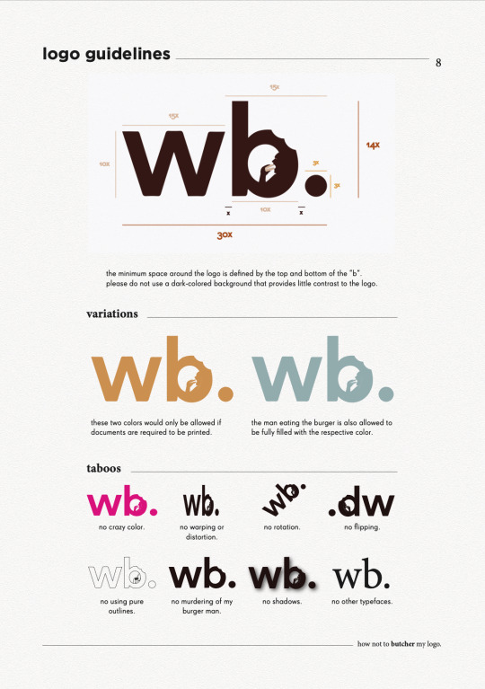
Incorporating the vibrant and light-hearted nature of food with the minimalist and professional attributes of an editorial theme was an extremely difficult task. Thanks to the feedback of my peers, as well as inspirations on logo designs, I decided to use this logo here to helm the brand guide.

Here, the typeface of my logo provides the professional outlook, and the bite marks and the man eating the burger in the letter “b” injects the more casual and slightly fun direction using the design concept of negative space. The full stop at the end was a creative decision I performed to tie the entire logo together.
There were feedbacks from my instructors that the man in the logo may be too small and hence become unnoticeable when downsized, and that the burger’s color could possibly take on that of the entire logo. Unfortunately, I decided to stay on with my original logo format as I felt that firstly, enlarging the man makes it too distracting in my opinion and I generally feel comfortable with the spatial relations between the man and the space inside of the “b”. Secondly, I chose to change the color of the burger primarily due to contrast and recognisability, and I felt that filling it with the same color as the entire logo would not make the “burger” itself obvious.
Color Scheme
Next, for my color palette, I was looking for an overall scheme that revolved around bread, eggs and tea (my most favourite components of breakfast). Hence, using these self-took images below, I composed my color scheme as shown below.
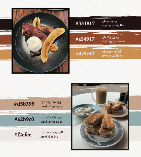
The colors mostly evoke the vibrant and palatable nature of food, with the only exception of the blue, which was a decision I made to include an accent color that could provide a touch of professional contrast to my overall color scheme.
Typography
Lastly, for my typography, I planned to use a sans-serif font as my character style, coupled with a serif font to provide a good contrast. As I was looking up Google for certain combinations suitable for magazine themes, I came across this pair that really caught my attention.

The article was right. Super Grotesk was the unique sans-serif typeface I needed to embody the dynamic spirit of my layout, accompanied by the serif typeface, Minion Pro, to support my characters with neat and outstanding paragraph headers or prominent quotes. Thereafter, I decided to employ Gotham as the strong title typeface to ground my pages together.
Now, with all my base elements, I was ready to embark on my creative process. After long hours of looking up inspiration from Pinterest and Behance, I embarked on a food magazine theme as the layout of my brand style guide.
Front Cover
Performing a playful rendition of Time Magazine, I came up with the title “Time ...to eat” to introduce my brand guide. Using InDesign, I demarcated the margins of the magazine’s signature red borders using the Layout settings and drew out the borders using the Rectangle Tool and the Pathfinder function as shown in the screen shot below.

As my logo contained bite marks on it, I wanted to incorporate this similar design element on my cover page and hence, I decided to use donuts. Using the Quick Selection Tool on Photoshop, I traced out the donuts from the images I took, created a new layer, and exported this image as a PNG file. With this, I could attach these donuts unto my cover page without worrying about additional backgrounds.

Page 2
Inspired by a design I found online that held a photo frame with a simple quote, I decided to create one to introduce the specific theme of my brand guide. Borrowing the guide lines from InDesign, I created the base and content of the frame, and employed Drop Shadow function in the Effects panel on various elements, as seen in the screenshots below, to create a 3D effect to stimulate the frame hanging on a wall.
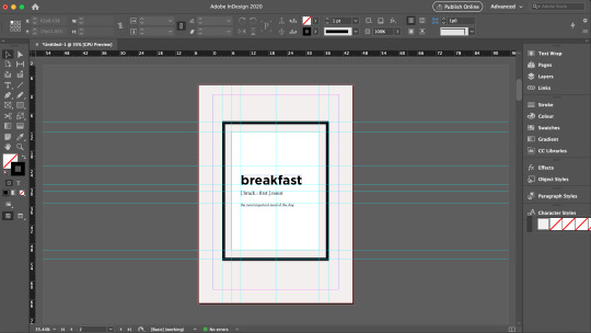


Words from the Editor
To formally introduce myself, and also inspired by magazine preface pages that usually feature the author/editor’s message, I also created a page to welcome readers in into what I am about to show them.
Resume
Naturally, I felt that the first thing I wanted to showcase was information about myself. Hence, the first collateral I presented was the resume. Using InDesign’s margins and guide lines, I created the various sections in a typical resume, but added my own touches, and employed the use of various “eaten donuts” to represent my various skill levels. These donuts were also used to demarcate the various pointers under my job responsibilities, to replace the typical “bullet points”. The final product will be showcased at the last segment of this blog.
Logo Ideation Process
While thinking of how to best present my logo, I was inspired by a senior’s work that featured the step-by-step logo creation process. I borrowed this idea and suddenly had this thought of using noodle strands to help the audience visualise the order of my logo ideation. These noodle strands and the fork was vectorised using Illustrator so as to efficiently remove their backgrounds and to be easily embedded unto InDesign like a clipart.

Business Card
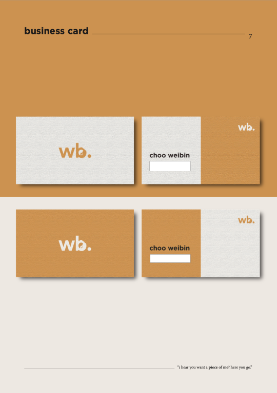
For the name cards, I wanted to create a light and dark version, and maintain a professional and minimalist outlook. Firstly, I made use of the Rectangle Tool on Illustrator to create the bases of the cards. While I shortlisted a yellow and blue background this collateral, many of my peers found that the yellow would best represent the vibrancy of the brand and hence, I decided to employ this color.
For the front, while inserting my logo, I found that the contrasting burger color looked very uncomfortable when downsized. Hence, I made the decision to fill the logo with a full color just for this purpose. For the back, I only wanted to retain minimal information being my name, phone number, email, and linkedin account. But after finding that it might seem a little too plain, I sought to make use of design principles of asymmetrical balance to provide a more wholistic design.
In order to create the paper-like feel for my name cards, I applied a Texturised effect unto the name cards, and dropped a small shadow to create contrast between the product and the background. I borrowed the guide lines on Illustrator to standardise the dimensions and locations of each element.
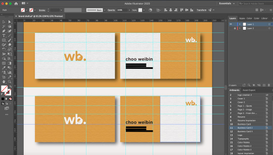
FINAL BRAND STYLE GUIDE
With that, here is my final and end product. Primarily, these pages were designed and collated on InDesign. As I wanted to stimulate a magazine-feel as much as possible, I created an A4-sized rectangle background on Illustrator, applied the Texturised filter, and pasted them on relevant pages. Other than the two donuts seen in the front and back cover that were edited using Photoshop, the remaining pictorial elements were vectorised using Illustrator.
Do observe that for the second half of the brand guide, I inserted a few quotes below the pages as my form of small interactions with the readers. However, bearing in mind also that I could not fulfil similar formatting with the “resume” section as the entire resume took up a large margin of the page, do kindly note that the titling and quote is placed in a slightly different fashion as compared to the rest.

(cover page - comments were made from my final presentation to include my logo at the front, hence I placed it below and structured it to suit the theme of a magazine front cover. I also received feedback that the background was too heavy in contrast, hence, I decided to change it to a color from my color scheme.)
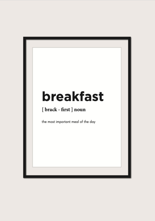

(food image - this image of breakfast was used to complement the previous page with the quote on breakfast)
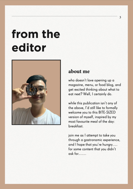

(food image - another breakfast food image to accompany and support the previous page that introduces my message to the readers)

(resume - vectorised donuts were used here to indicate my various skill levels, and as bullet points to my job descriptions. I received feedback from my final presentation to bold the institutions and my company and role, as well as to enlarge the relevant dates, which I rectified in this draft above.)

(logo - vectorised fork and pasta strands were used here to guide the audience’s vision to my logo ideation process, with the final logo presented the biggest at the bottom.)


(typography - for my final presentation, while many noted that the simplicity of the page was its charm, some also felt that maybe I could incorporate some visual designs to compliment the other pages. Hence, I borrowed the vectorized image of a man holding a chopstick as my symbol for “placing” and “picking” the right typography for the entire magazine. The image has also been edited to 80% opacity to not take over the spotlight of the page)

THE END
I really hope you have enjoyed this as much as I really had fun creating this. It was a rather intense month coming up with all these ideas and discerning what was effective in communicating my brand, but overall I was very grateful especially to my TA, Zicheng, for entertaining millions of my annoying emails and still being able to deliver the best advices to me, as well as my peers who constantly pointed out the rooms for improvement. It’s really a bittersweet end to this journey, but I’m forever grateful for being able to learn this in CNM and also to retain a project that I would be able to at least be proud of for a long time :-)
0 notes
Photo

The essential Tumblr marketing guide
When it comes to social media marketing, the instinctive reaction is to think of popular networks, such as Facebook, Twitter, and Instagram. And that’s not surprising at all. While these three networks have dominated much of the discussion—and traffic—online, many brands have started looking at other social channels as viable marketing platforms, as well. Among them, Tumblr has slowly been rising in popularity over the last few years. Consider this: Tumblr, at one point, had over 738 million unique visitors worldwide. In fact, Tumblr claims that its users actually spend more time on the website than they do on Facebook or Twitter.
But what is Tumblr really? And is it a good idea for your brand to invest in the network at all?
Tumblr is essentially a microblogging social media platform, designed with an emphasis on sharing content. It’s free to join, and allows users to create multiple blogs, and post various types of content, such as text, images, quotes, links, and even music or video. What makes it different from the networks that you know? Tumblr will allow you to customize the color, theme, and layout of your blogs. The amount of control you get is unparalleled, and you can easily find Tumblr blogs that look absolutely nothing like each other.
With regards to social media marketing, the instinctual reaction is to consider well-known organizations, like Facebook, Twitter, and Instagram. Also, that is to be expected by any stretch of the imagination. While these three organizations have overwhelmed a significant part of the discussion—and traffic—online, numerous brands have begun viewing other social channels as feasible marketing stages, too. Among them, Tumblr has gradually been ascending in notoriety throughout the most recent couple of years. Consider this: Tumblr, at a certain point, had more than 738 million extraordinary guests around the world. Truth be told, Tumblr claims that its clients really invest more energy on the site than they do on Facebook or Twitter.
However, what is Tumblr truly? Furthermore, is it a smart thought for your image to put resources into the organization by any means?
Tumblr is basically a microblogging social media stage, planned with an accentuation on sharing content. It's allowed to join and permits clients to make numerous websites and post different kinds of content, like content, pictures, statements, interfaces, and even music or video. What makes it not quite the same as the organizations that you know? Tumblr will permit you to redo the tone, topic, and design of your online journals. The measure of control you get is unrivaled, and you can undoubtedly discover Tumblr websites that look literally nothing like one another.
Regardless of whether your image ought to be on Tumblr is a question that only you can reply to. It will rely upon the crowd that you're focusing on and the sort of content that you need to post. Tumblr would function admirably for a brand that is focusing on a more youthful crowd—near 70% of the userbase are between the ages of 18-34. The site would function admirably paying little mind to the sexual orientation you're focusing, as the socioeconomics sits at half each.
In case you will assemble a presence on the channel, notwithstanding, you should remember that the content you make must be somewhat not the same as different organizations. While you can utilize a professional tone and be fruitful on networks like LinkedIn or Facebook, the Tumblr people group rewards innovativeness and humor. That is the sort of content that you should zero in on in case you will set up your image here.
Marketing on Tumblr
Given how characteristically extraordinary Tumblr is from other social media stages, formulating a marketing plan for the organization can appear to be overwhelming. Where do you start? What sort of content do you post? What should your attention be on? Fortunately, it doesn't need to be troublesome—indeed, assuming we keep our eyes on a portion of the fundamentals and, construct a technique around it, we'll see it very clear to explore. Here are a few things that you'll have to remember while making your technique for Tumblr:
Set your intended interest group and objectives
Likewise with some other organization, one of the primary things that you'll have to do prior to chipping away at your Tumblr marketing technique is to characterize your intended interest group and your objective.
For your intended interest group, I'd suggest that you make the persona of your "optimal client." Get as explicit as possible when you do this. Attempt to get a total profile of your client, including things like age, sex, pay level, interests, and even diversions. This will help you focus on your content all the more precisely. You could likewise investigate the profile of your present clients, and utilize that information to create your intended interest group, also.
You'll additionally have to set your marketing objective. What would you like to accomplish through marketing your image on Tumblr? There are numerous objectives that you can set for yourself, for example,
Producing leads for your business
Making brand mindfulness
Giving client care
Given the idea of the channel and the conduct of its clients, building brand mindfulness would be a characteristic for any business here. Be that as it may, you can likewise pick any of the different objectives relying upon what your business needs.
In the event that you know who your intended interest group is, and the objective that you're attempting to accomplish, you've done a large portion of your work. With this information, you'll have the option to think of your posting system, including things like:
Sort of content you need to make
The measure of content you need to make
Recurrence of posting
Extraordinary, you currently have a procedure prepared for your Tumblr marketing endeavors!
Making and advancing your Tumblr account
Joining on Tumblr is very basic. Simply visit the homepage, and afterward click Get Started. Presently, you should simply enter your email address, pick a username, and afterward select a secret key. It's that simple!
While choosing a username, attempt to get an accurate counterpart for your image's name. On the off chance that that isn't accessible, you could likewise attempt to get a username corresponding to your site URL. Ensure that the profile picture that you pick is consistent with the one that you're utilizing on different channels, like Facebook or Twitter. It's a smart thought to utilize your image's logo as the profile picture on every one of these channels, as this will make it simpler for your devotees on other social media stages to discover you.
Once this is done, you can proceed onward to choosing a subject for your blog. This is the thing that your supporters will see when they visit your page, so ensure you pick one that accommodates your image consummately and will establish an extraordinary first connection.
Tumblr has a gigantic collection of subjects—some of them paid, and a ton of them allowed to utilize. Basically, peruse the various classes that are accessible and pick the one you like best.
Independent of the topic that you decide to go with, Tumblr will offer you tons of customization options that are not difficult to utilize, even with no programming information. Here is a portion of the options that are accessible on Tumblr.
Title: You can give a title to your Tumblr blog that will be shown at the highest point of the page.
Description: In certain topics, you can show a short description just underneath the blog. You can depict yourself, your image, your blog, or whatever else you need your devotees to know.
Foundation tone: This setting permits you to change the connection tone just as the title tone.
Font: You can utilize this section to change the body and title font of your blog.
Header Image: Here, you'll have the option to add a custom header picture to your blog.
Pages: This will permit you to make additional pages for your blog. You could have one page only for your content, and afterward make separate pages to feature your best posts, or to exhibit client-created content, too. This is an extraordinary technique to showcase your content on Tumblr. Tumblr web journals should be perfect, basic, and simple to explore around, however with only one page on your blog, individuals may think that it's hard to look through the interminable stream of content.
To battle this, you make separate pages so your content is more smoothed out and simpler to explore. You can make pages like "Generally well known," or "Should see" to cause you to notice your best posts, or you can even make various pages for various sorts of content. This is a decent method to guarantee that your devotees don't pass up anything you distribute.
Also, these are only a portion of the customization options that are accessible on Tumblr. You can get truly granular and tweak the boundary tone for the hunt bar on your page, and even change how posts load on screen—from a limitless look to having a manual "load more" option. We'd suggested that you mess with these options to sort out what you need to change, and how.
Goodness, and we should mention that every one of the progressions you make can be immediately sawed to the correct side of the customization segments that you see.
Presenting content on your Tumblr
Before you post any content onto your page, it's a smart thought to put the time in discovering Tumblr online journals that are applicable to you and your industry. Also, there are a ton of networks that are dynamic on Tumblr. You'll have the option to discover pretty much anything—there's even a page for felines that resemble Ron Swanson. At the point when we say that you can discover totally anything on Tumblr, we would not joke about this.
At the point when you post on Tumblr, attempt to keep it as outwardly captivating as could really be expected, as these sorts of posts perform best on the stage. Fortunately, posting on this channel is quite instinctive, and you shouldn't have any issues here. Once you're prepared to get moving, you'll notice that there are various kinds of posts that you can make on Tumblr:
Text: Text is the most fundamental type of content on the site. There's no greatest character limit, and these posts can likewise contain pictures and other media. In case you're OK with HTML, you can even add arranging to your posts and alter them however you see fit. Consider Tumblr contributing to a blog apparatus, and use it to give information about your items, administrations, or any new updates for your organization.
Given the youthful segment that Tumblr clients belong to, it could be a smart thought to join humor into your posts.
Photograph: Photo posts are the absolute most mainstream sorts of posts on Tumblr. Here, you can post a few photographs at once, as a collection, and add some illustrative content to it too.
Statement: A statement post allows clients to feature a specific statement they appreciate or find inspirational. This can be utilized in a business context to make a commitment with your objective market by featuring something that you feel is significant for your devotees to observe.
Connection: Link presents are comparable on quote posts, however, they're utilized to feature a particular connection. Your image can utilize this component to cause you to notice any promotional offers that you might be running, or you can even utilize this to attract individuals to your business landing page.
Talk: A visit is a kind of post that is interesting to Tumblr. Clients can mimic a conversation between at least two individuals and it will appear in an exchange design. You can conceivably utilize this for item descriptions or sharing information about your organization, and this can be utilized to add another dimension to your posts. This element can be helpful, as it will give you a lot of freedoms to be humorous
0 notes
Text
7 First Class Tips to Increase Your Pinterest CTR to Boost Sales & Readership

With the strong growth of Pinterest, the platform is becoming increasingly competitive. While it is still possible to get quality organic traffic from day one, nowadays you have to strategize more before you will get the results.
Every digital marketer has the matra of keywords, ranking, and backlinks deep in his head. This approach has to shift to be successful on Pinterest.
Pinterest is a visual search engine, and though we can apply many similar strategies as for other search engines, we have to think differently.
In this post, we will go over several points to make sure your pin design is as optimized as possible for clicks.
Create Multiple Pin Designs
As in everything marketing related - testing is the key. For every link that you are trying to promote, create several designs, I go with 5 - 10 depending on the importance of the link.
In many cases, I am surprised which Pin works the best. As the one that just seems a bit off, usually will outperform all others. This can be attributed to many conditions but when you see the same design (that you initially did not like) work again and again - always an interesting experience.

Notice that all the designs are different. From 7 designs on average, 1-2 will be winners that I will keep working with. In the following point, we will go over what makes a winning design.
Make the Pin Stand Out
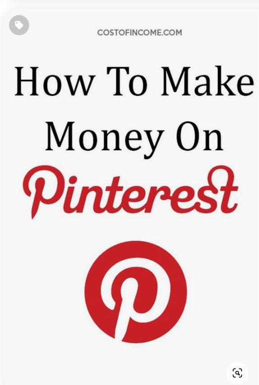
Ugly right? Well, it works. CTR on this one 14%. What makes it stand out is ...that it is ugly. If you put “how to make money on Pinterest” in Pinterest search, you will be greeted by this:
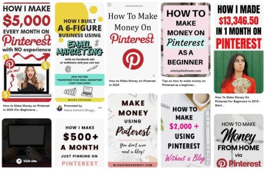
Those are the pins of well-established accounts. For example, the first one belongs to FinSavvyPanda which has over 2mil. monthly views and 18k followers.
Sure, there is nothing bad in getting inspired by pins of others, but it was obvious to me that my (fairly young) account will not be competing for the first page.
To stand out at least a little bit. And it seemed to work. By now you may have noticed a common denominator between all those pins.
Big letters. I would like to get this message over to you - do not be afraid to make big letters and all in all - make the text dominant, if appropriate for the topic.
Choose an appropriate image
In many cases, Pinterest is alchemy. You never know which pin/topic/title/board combination will give you the best results. So you test and test and test until you have the golden formula.
Wondering where to get new images for all of your pins ideas, we got you covered. Here are a few resources where you can use images for free:
Unsplash
Pixabay
Pexels
...and other 20+ free resources
You can find their pictures for any occasion. In case you are looking for something specific or just want to have some genuine pictures made for your needs, I suggest going to Fiverr or Upwork. There you can get to choose from a wide array of photo professionals.
As I told in the previous sections, I am all about testing. You start easy, A/B/C titles testing, design but You want to grow so you start testing new things. Some of them do not work, that is one of them.
One of the popular Pinterest searches is “Habits of successful people”. I had many pins with this title and would like to share a testing result. It might seem obvious for some, but better to know it.

After clicking on any of the pins you have, Pinterest will also suggest some “More Like This” pins, for the image above these are the “similar” images:
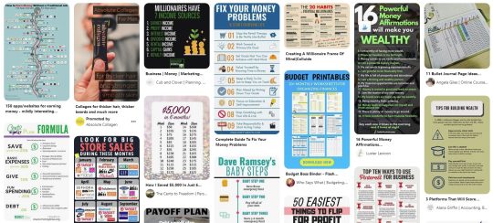
All is well. The pin is about having money and the similar pins suggested by Pinterest are about money. Budgeting, saving, debt issues.
Here is another pin with the same title:

Similar logic as in a previous pin. But check out the pins that interest suggests:
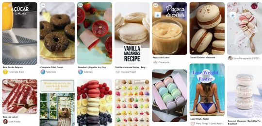
Macarons recipes, weight loss, desserts, etc.
This means two things:
The title is not clear enough. While in the first example Pinterest clearly understood what the topic is, and provides relevant pins to accompany it, the second one is completely off.
The image is not relevant to the topic. This mistake is at number two, this was caused primarily by the title. (If it wasn’t, why did Pinterest not put “similar pins” of bags, etc?). But retrospectively, the image is not relevant enough to complement the topic.
These two issues caused lower impressions of the pin, not enough repinning, and all that resulted in the low overall clicks.
2. Do Not Overuse Templates
You created 50 designs, 5 seem to work well, so you make a template out of them and just keep re-pinning similar designs again and again.
Do not do it. There are several reasons why you should not go overboard with templates.
Pinterest likes new content and new images. Whenever I load new pins with new designs I can see a bump in the overall impressions, which will slowly fade out as I am re-pinning the same image again and again. Keep it fresh.
Popular Pinterest profiles completely revamp their designs from time to time. Sure, they keep some elements that reflect their branding, but they are constantly trying to come up with something different.
Tools like Canva can help, as they offer you figuratively speaking - an infinite amount of choices and combinations to try for your Pins.
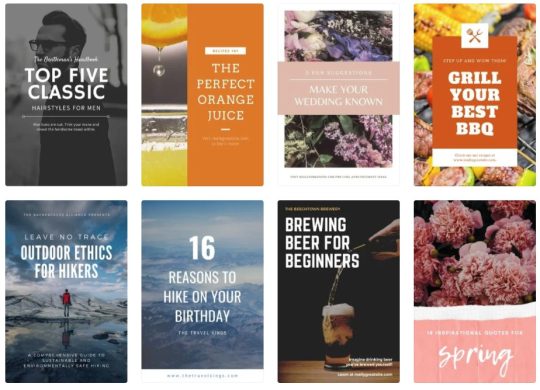
Let’s have a look at one of the more successful profiles on Pinterest of The Savvy Couple:

Notice that while they keep the same branding, the designs are always different. You can see that they share similar features, but from the perspective of Pinterest - these are completely different designs that will get good traction.
Need help increasing sales with social media?
Book a free call to learn how our team of marketing experts can help you create high converting social media campaigns today.
3. Use The Text To Your Advantage
Yes, Pinterest is a search engine that heavily relies on the visual side of things, but that does not mean it ignores the keywords.
First of all, Pinterest reads the keywords that are on the picture, and second (but equally important) users are reading it too.
To get clicks from your Pins you have to get users to do a “Close-up” which means that somebody clicks on your Pin to have a closer look at the description.
Use several fonts, but no more than 2-3
Emphasize (in bold, or a dominant font) the main keyword
Make sure the size of all the text is sufficient so users can read it without problems
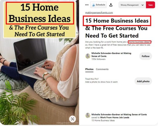
The keyword here is Home Business Ideas. So if we would quickly through this example we would see:
The keyword is on a pin (2 fonts are used, or rather one font but subtitled in cursive).
Keyword is repeated in the title.
For the third time the keyword is repeated in the description.
If you will proceed to that particular Pinterest account (with several millions of viewers per month) you will notice that there are many pins like that - meaning that these types of design work.
When matched correctly you can be looking at the following results with some of your pins:

There are not so many impressions, but what is important that the vast majority of the ones who clicked, continued to post on the site - which is the main goal here.
4. Test Your Texts
We talked about testing the designs of your pins, but I would like to also emphasize the importance of testing the texts that you put on them. The goal is to get traffic on your site, so you must test several calls to action.
I recently conducted a small experiment on a post of mine. I compiled a list of over 640 Inspirational quotes, with various categories. Quotes seemed to be a good middle ground between what Pinterest likes and the overall theme of my site.
15 Pins were drafted to test the best angle.

Here are the keywords that were used for testing:
Inspirational quotes
Positive Wise Words
Success Quotes
Quotes Positive Happiness
Life Quotes
Motivational Quotes For Kids
Motivational Quotes For Life
Motivational Quotes for Success
Quotes About Strength
These keywords both matched the content of the post but also most importantly they matched the search queries and trends on Pinterest.
After a couple of days, these were the best performers in terms of Closeups

This means that:
Inspirational Quotes For Kids
Inspirational Quotes Positive Wise Words
have quite a strong performance that should be developed further (creating more pins focused on these keywords). Unfortunately, I create a very weak generic description, so even though Pins had a good amount of closeups, the CTR rate was minimal (under 0,1%)

So take my advice - I will be working with variations of these two pins testing multiple descriptions, so make sure that the future closeups convert into clicks.
5. Do Not Give The Answer In Your Pin
Your goal with Pinterest is to get clicks. Remember it when designing a pin. The visual has to be interesting enough for the user to want to know more.
If the viewer will receive the answer right there on the pin...why would he/she click to your site?
Let’s have a look at some account examples. Here are pins from MakingSenseOfCents which have over 2mil. viewers.

The goal of your Pinterest endeavors is to get traffic. So you talk about a topic that will interest your audience, but you do not explain it on the pin or in the description - you rather ask them to come to your site for more information.
Let’s take the pin of “How blogging paid off my student loans” a bit of clickbait, but nothing too bad about it. It is interesting, how could blogs pay for the loans? Users click and read the info on the page.
If that pin would also say “With ad-networks, affiliate marketing and growing my blog for 6 years” the CTR would drop. The answer is already there, no need to go any further.
Have you ever noticed that when you are googling for translation? Let's say “manufacturing in Spanish” and go you go past Google Translator results, you see this:

Notice that none of those “snippets” gives you an answer. The reason is still the same, they want you to go to the website to get your information.
What about videos?
“How to make a bow from ribbon” is one of the most popular Pinterest search queries. These are the first few top results:

20% are videos with detailed explanations of how to make a bow from a ribbon. Others are pictures that are there with the goal of getting you to click through to the site.
In the case of videos, you can also get clicks as users will want to see description and other details, but some will just watch it, save the pin and that is it.
What about Infographics?
A nicely done infographic will work well both on Pinterest and outside of it. With SEO you may get backlinks, on Pinterest you may get many repins, saves, and maybe even new followers. So they can be used to grow your profile in the future, but they will not get you to click in the short term.
In conclusion to this section - make pins that are related to the search queries and further lead users from Pinterest to your website.
6. Use Warm colors
While the blues, greens, and yellows can work well. In my opinion red, orange, burgundy, dark pink worked the best.
This study shows that red, orange, and brown performed better than blue 2:1 in repins.
According to, Curalate(published on Wired.com) this is scientifically the best-colored pin:

While this post was written in 2013, do you want to see what is my most successful pin?

Sure, it is not an exact match, but I am sure you can see some resemblance.
What if “warm” colors are completely incompatible with your brand? Well, do not change your whole brand because of Pinterest. See if you incorporate the more “Pinterest friendly” colors.
If that is not possible, keep in mind that color pallets are just one part of the whole “alchemy” of Pinterest algorithms. What you will lack in color you will pay back in content, titles, descriptions, and much more.
7. Avoid Faces
While the strategies of different pinners are different, this study shows that brand images without faces receive 23% more repins. Even though the study is possibly outdated (Pinterest trends change very quickly) I usually tend to avoid them, as I feel that people want to imagine themselves on the pin.
On average the pins with faces will get up to 1% CTR for me, while pins without a face will be higher. On The other hand, these are some of the recent pins of Chasing Foxes (over 10mil monthly viewers).

They repin them constantly - meaning that it works. But they also have over 360k followers, strong boards with high engagement...so you will just have to test for yourself and see if it works for your brand.
Examples Of Successful Pins
In this section, we will go over examples of pins that worked well for me. I will illustrate how various pins behave in different niches so you can plan your Pinterest strategy accordingly.
Recipes
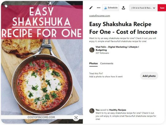
Recipes are one of the top categories on Pinterest. So it is no wonder that I had to try how it works. Though recipes are completely off the main topics of my website, I needed to do some pins and post for testing.
With 8% Closeups, 1% Saves, and 4% CTR this is one of the best pins I had tried. By best I mean that it delivered the most clicks.
As you can see this checks all the boxes in terms of design and color. Red themed picture with a red text background.
In this case, the topic is of great importance. Recipes, fashion, decor, design, travel are all hugely popular on Pinterest.
“Shakshuka recipe for one” is quite a niche search query on Pinterest which does not have many exact results. As you can see the keyword is on the pin, in the title, and description, these all help Pinterest algorithms to discover and further share your pin.
Good Habits
Lifestyle is one of the most popular niches on Pinterest where you can find a wide array of topics. One of the “classics” are topics “Habits of people who…” you can complete with interesting Pinterest trends such as who has money, who stays confident, who stays healthy, who are happy, and so on. Seeing this being a topic on many profiles I had to try for myself.

3% Closeups, 1.5% CTR and 0 Saves may not seem like a hugely successful result. The interesting thing is that the potential of this topic (and related ones) is possibly limitless.

You may see that there are just slight changes but this pin (pinned at nearly the same, on same boards) received 2% closeups, 1% Saves, and 1% CTR.
No matter how many times you will pin for this topic, you will receive constant results. It does not seem to die out.
Continuing on the topic of habits, this fairly simple pin receives over 5% CTR. Which is quite over the average CTR on Pinterest, for your comfort on the right you may see the “scientifically perfect pin” that we discussed earlier.

Personal Finance
Another of the favored topics on Pinterest and I of course had to try how a very basic pin will do.

With 3% closeups and 3% CTR this design seems to be easily replicable. Meaning that changing it to different topics and varieties is not an issue.
As in Good Habits sections, these topics (while less popular than their recipes/fashion/lifestyle counterparts) are bottomless. There are so many angles to take when you are discussing money management, savings, how to manage debt, etc.
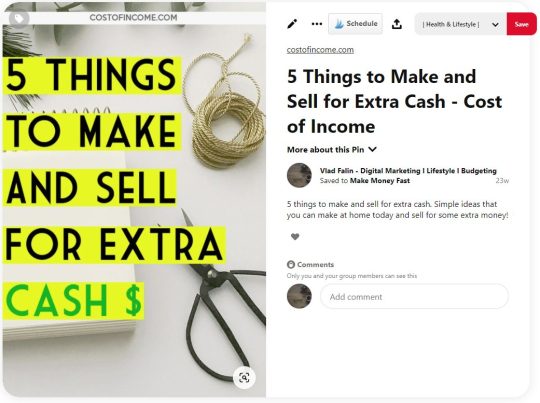
This is just another use of the same design, delivering similar results. 2% closeups, 1% saves, and 1% CTR.
Personal Development
Personal development and motivation are very solid choices of a topic for Pinterest, so I wanted to give it a shot with a post on leadership qualities. This pin delivered 1% closeups, 0.5% saves (one of my top repined images by total number), and 1,5% CTR. That can be considered a good result for a topic that is not “dominant” on Pinterest.
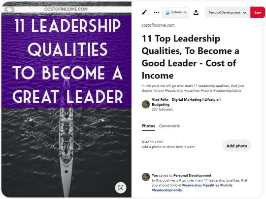
This pin delivered 1% closeups, 0.5% saves (one of my top repined images by total number), and 1,5% CTR. That can be considered a good result for a topic that is not “dominant” on Pinterest.
Digital Tools
The main topics of my site are digital tools and creating a business online. So of course I took my knowledge of Pinterest to the test on these topics too. Some time ago I created a post about webinar tools.
While my expectations for this topic were quite low, there were quite a few positive surprises. 2% Closeups, and close to 1% CTR. Saves were under 0.5% so something to work on in the future.
Another example of a simple design that worked even in the digital marketing tools niche is a pin about comparing email marketing services.
These were the testing pins:

After a couple of weeks, the best percentual rates were on this pin:
Closeups rate of 2%, save rate of 1%, and CTR of 2% is a great result for a pin in a more difficult niche.
The issue with these Pins is that they get impressions very slowly, digitals tools is a true niche sector on Pinterest. It takes the right boards and a lot of time to get the pin going. That being said - you can see that it is possible to drive clicks even in niches like this one.
Main Takeaways
We had a look at some pins that worked well for me, now I would like to provide the main takeaways and actional steps that you can take with your pins.
Do 5-10 testing pins for each post. Out of them, 1-2 will be performing above average.
While warm colors seem to be performing well (and better in some niches) do not limit yourself to this rule.
Test your pins with and without a face. While statistics speak clearly, it seems that some niches work better with faces, some do not.
Keep your pins 2:1 or 1000:1500 size. It is the optimal pin size for mobile, which is the dominant platform for Pinterest users.
Modify your keyword to be in line with search queries and Pinterest trends.
Text on the pin should be readable, do not go overboard with fonts.
Check the Pinterest search bar and Pinterest trends for search query suggestions.
Keywords should appear on the pin and in the title and description.
The pin should hint that the question will be answered in the post.
Conclusion
In this post, I shared the tips that I use when creating a pin. Pinterest is growing and changing, and the successful pins change too. Still, some basic rules remain the same.
While we went over the design of the pin and most of its intricacies. I strongly suggest that you read more on the topic of Pinterest boards. After all, if your great pin is pinned on a bad board, you will get nowhere.
Pinterest is a lot about experimenting with designs, descriptions, topics, time of pinning, and boards. While it may be tedious to try to combine all these, once you succeed you will experience an immediate inflow of traffic. This feeling will never let you go, so you might consider yourself “pinned” for life (pun intended).
You might want to check:
10 Amazing Pinterest Board Examples Critiqued (with Best Practices)
Pinterest SEO: A Guide for Businesses
How 5 Businesses Are Using Pinterest Boards to Creatively Promote Their Products
About the Author
Vlad is a founder and a blogger at Costofincome.com a blog about online business and video converters and digital marketing tools.
from RSSMix.com Mix ID 8230801 https://ift.tt/33fthyz via IFTTT
0 notes
Text
URL:
verreprincesse ( title is Completely Wonderful )
SUBTITLE:
completely wonderful can go here if it looks better as a secondary title.
DESIRED QUOTES:
There you’ll see your dreams unfold, Cinderella, Cinderella In the sweetest story ever told
DESCRIBE YOUR MUSE:
A sweet girl with a fierce determination for loyalty and to just want to be loved by her family and to respect the wishes of her dead parents. She’s not a pushover but she’s not about to arm-wrestle you for no reason. Soft is the word I would give her. Soft-hearted as she forgave her step-sister Anastasia and even helped her get with the baker. Soft with her words as she knows how harsh words can feel. She measures everything she says before she says it, especially if she is upset as she never wants to say something she doesn’t mean. She is also independent. Because she lived on so little, she was able to pull herself from abuse and instead of returning home from the ball she instead stays in town and begins a new life for herself. She opens her own dress shop and over time becomes very wealthy over the success of her business. She also takes back her father’s trading business ( as it was supposed to go to her but her stepmother kept the will from her ) and because of her promise to her father, she never let her stepfamily go without.
DESIRED FONTS:
For titles I like flowy cursive fonts, for body I like georgia as its still soft but readable.
DESCRIPTION:
This is an independent, private & selective multiverse/ship roleplay blog for Disney’s 1950 adaptation of Cinderella. Movie based from all three movies with heavy headcanon influence. Please remember to read the RULES ( link ) & ABOUT ( link to the verses page showing my main as the first about ) pages before following / interacting.
She/Her 21+ Becca 9 years on tumblr.
DESIRED TEXTURES:
I think of the Palace of Versailles when I think of my portrayal of Cinderella but instead of gold, I think silvers, some rose golds, and blues , but more of a Pacific Ocean blues. The textures being something like:
the previous three images reminded me of this phot of cinderella from WDW.
AESTHETIC:
I keep going back and forth on if I want a light or dark theme but I have always liked pastel too. It tends to be my fall back.
COLOUR SCHEME:
Definitely not limited to these two color schemes, but I really love this photo and thought it could be a good base to start with?


THEME TYPE:
I really seem to like Mix Oriented the most as I like the image to not scroll when I scroll down.
IMAGES:





LINKS:
I really like how my verses page is set up ( not necessarily that theme ) but in the aspect that my aus are tabbed and that the links pertaining to that au are under the au name. I also would like the au name at the top and to have an image behind the au title
Each AU needs a link to the au tag ( which the au title can be that link ), the About Page, Relationships, and a Navigation page as for the Navigation page it will link to all the links pertaining to that particular verse.
Navigation needs at least links for:
written
anonymous
answered
drabbles/one shots
closet:
gowns
shoes
jewelry
etc
other:
hates
likes
loves
music
misses
images
For the relationship pages I would like a spot for an image of the character, a link to their blog ( if its someone I’m writing with, if its a character I made up or is canon to the movie but I don’t have someone to write with the link can stay free ), a link to their tag, and a place for a short bio of how the two met or they type of relationship they have.
When it comes to the mun page, I would like all my ooc links on that page please.
ooc answered asks
ooc answered anonymous
mun images
ooc posts
I don’t usually do images for links as I’m never happy with what I pick so its usually just the word for the link.
RESOLUTION:
1536 x 864
OTHER DETAILS:
I would like a music player, but not autoplay.

and possibly and mouse that has sparkles or glitter?? Unless there is sparkles or glitter in any other aspect of the blog then I don’t need a sparkle mouse but I would like glitter/sparkles on the blog ♥. I do like the smaller mouse though.
( OPTIONAL ) COMPLETE PACKAGE DETAILS:
I really like on some of the themes you’ve done where the posts have like flowers or other pieces of art behind them and thought about like pumpkin and mice to go around mine at the bottom of each post??
for the asks i really like this concept of the ‘dreamed’ and having an image for the ask.

Dash icon
Mobile banner / dash banner
Promo
oh! I really like my icons to match my theme too, and the psds i was looking at were these colors

They don’t have to be these colors, but in case you were wondering. I do have the psds in case you want to see what they look like too.
I would also like my ask and submit page on the same page.
i think that is everything, if not, please, of course, ask me! ♥ Thank you so much and I can’t wait to see the beautiful piece of art you bless me with.
1 note
·
View note
Text
Today we’re talking something I’m definitely passionate about and well-versed in: Instagram.
I know for a fact that I waste too much time on that app, so balance is definitely a goal for this year. But social media can also have really awesome impact!! I have met all of my best friends through this app…seriously. The first time I reached out to my best friend was some reply to her story saying that she looked super cute. I eventually worked up the courage to DM her and ask if she wanted to hang out some time…and here we are!

I met my other very best friend and future bridesmaid on Instagram as well. If you haven’t already read my “Meeting My Internet Friend IRL!” blog post here, you definitely should! The Internet, and social media especially, has opened me up to a world of possibilites, places, ideas, people, you name it! So I’m eternally greatful for that. ♡
As soon as I started my Instagram, I knew I wanted to be “aesthetic.” Yes, my account was private, and yes, my only followers at the time were my parents. My first post had a whopping 12 likes – including good ‘ol Mom & Dad, my aunts and uncles, a few close friends and even my friend’s mom. #therealones
I was always so focused on my “look,” growing up in the age of influencers, watching YouTubers do brand collabs and take trips to Bali. I knew I wanted my life to be like that. Which, granted, is a dream that I’m pretty sure every girl from 10 to 20 has wanted.
But seriously speaking, through Instagram I also began to develop my passion and figure out my career path. I’m no influencer yet – believe me, I know! But Instagram has become my creative playzone, a place to share about myself and my life and have a good time with it. Kinda like this blog!
I love spending time taking & editing photos and videos, figuring out color schemes and design along the way. One of the coolest things I think, is scrolling through somone’s Instagram and seeing how their theme and style has changed throughout the years! You can definitely see lots of different looks on mine…
LIGHTROOM
I’ve used a lot of photo editing apps and tricks throughout the years, but I’m currently hooked on Lightroom Mobile. As the beginner noobie I was when I switched from VSCO I was like what…the heck. What am I supposed to do with all these buttons?! And no filters!?
Turns out Lightroom is super easy to use, and filters here are called “presets.” I have finally curated my own preset that I’m pretty dang happy about (it only took me forever), but there are literally a million availble to purchase and some even for free.
Since I’m a cheapskate I’m obvi going to talk all about the free stuff today! So, when I started using Lightroom, I started with this free preset from Tara Kellie Smith.
my feed with the free Tara Kellie preset
Not only did I love it, it was free, and downloading it and accessing it turned out to be a piece of cake. I’ll leave a link to her video about it here, she goes step-by-step through the process and the link for the preset is in the description!
When I wanted to switch it up a bit, I started looking around on YouTube for free presets or free editing tutorials. I found this AMAZING goldmine of a playlist that I definitely recommend you check out! It’s got tons of presets for almost any influencer you could want: Aspyn Ovard, Jaci Marie Smith, Jess Conte, Marla Catherine, Zoelaz, and Brandon Woelfel, just to name a few. 😉 I’m not kidding, this playlist literally has over 100 videos on it. It also has lots of general presets for different themes and color schemes as well!
The way to maintain a cohesive Instagram feed is to edit all your photos similarly. You can use the same preset on every photo, just keep in mine that it may need to be tweaked a little bit depending on what the light level is, colors, etc.
PICSART

I love bringing my own creative elements into the picture (pun intended!) and playing around with different techniques. My favorite app to do this on by far is PicsArt.
It’s had its ups and downs for sure, but it’s a free app and has lots of amazing capabilities. In the past I used it when I went through my “doodle” stages and wanted to add drawings to my photos. Lately I have been using it for the “sticker” and “collage” options.
Having taken a couple of photography and design classes in high school, I got really used to Photoshop and Illustrator and loved them. Upon graduating, however, I was not willing to pay the hefty price tag just yet. PicsArt is the only app I’ve found so far that has so many Photoshop-like features yet is completely free!
So, when doodling on a photo I simply opt to go with the “draw” option. When making collages, I’ll pick the “freeform” option and select usually the max amount of photos allowed.
Processed with VSCO with c1 preset
some photos from a cruise that I then doodled on after
my *very* bright doodle feed
Then comes the really fun part. The “sticker” button essentially is a cut-and-paste selection type of tool. Take a photo of yourself for example, and you can completely cut out the background. PicsArt even has some pretty decent facial recognition, which comes in handy when doing portraits!
a couple of collages I have made, all on PicsArt. I simply gathered photos and tumblr posts/quotes from Pinterest and cropped and arranged as needed!
There are also thousands of stickers added by other people into the app that you can use for free, as well. You can search anything, from “tumblr” to “aesthetic” to whatever color scheme you’re going for. So get out there and spruce up your feed!
PHONTO
If you love creating Instagram stories, iPhone lockscreen quotes, or just tasteful memes, I highly recommend Phonto. It’s a super basic app that lets you put text on your photos. Free and simple, it has everything you need. You can even download fonts off the Internet and add them to the app super easily. I have my own growing library of fonts of all kinds.
a collection of various wallpapers, lockscreens, and blog post photos I have made with Phonto
UNUM
UNUM is a fantastic app if you really want to plan out how your feed is going to look or even schedule Instagram posts. I mostly just use it to see how a certain photo will match up with the rest of my feed before posting, but you can also set up your caption and hashtags and post directly through the app!
UNFOLD

Unfold is the app you’ve probably seen influencers use but never knew what it was. With Unfold, you can create really gorgeous little setups of photos, videos, and text for your Instagram stories. I love to do it especially when I have story posts to make about my blog and blog posts.
————————————————————————————————————————–
And those are pretty much all my photo editing tips & tricks! Everything I talked about is 100% free to get started with. I don’t use all of these apps on a daily basis, but they’re super helpful from time to time. I hope you enjoyed these post and found it super helpful, till next time, cheers!
Kindly, Kenzie Marie
HOW I EDIT MY INSTAGRAM PHOTOS Today we're talking something I'm definitely passionate about and well-versed in: Instagram. I know for a fact that I waste too much time on that app, so balance is definitely a goal for this year.
#adobe#aesthetic#camera#collage#collages#do it for the gram#doodle#doodles#edit#feed#filter#free#free presets#gram#insta#instagram#instagram photos#instagram stories#instagram story#instagrammable#instagrammer#iphone x#layout#lightroom#lightroom mobile#lockscreen#memes#phonto#photo#photography
0 notes
Text
Best WordPress Tumblr Style Themes | Templified
New Post has been published on https://templified.com/best-wordpress-tumblr-style-themes/
Best WordPress Tumblr Style Themes
This is a strong, comprehensive list of the best Tumblr style themes, inspired by the incredibly popular social media site, perfect for blogs, for creative portfolios and other amazing sites. Tumblr has taken the world by storm and it’s now among the biggest, most popular social media networks on the planet. Tumblog style is pretty unique, with it’s infinite scrolling and multiple post types, but WordPress offers all of that same functionality and more, if you want to create a Tumblr style blog on the WordPress platform. If you’re not down with the Tumblr knowledge, it’s a new kind of microblogging platform and it allows users to make a wide variety of micro-blog posts in just about any kind of multimedia format there are, like audio, video, image, GIFs and more. Tumblr is also a new style of social networks, allowing users to reblog other peoples posts, follow one another and also comment on people’s posts. It’s the wave of the future!
This is a strong, comprehensive list of the best Tumblr style themes, inspired by the incredibly popular social media site, perfect for blogs, for creative portfolios and other amazing sites. Tumblr has taken the world by storm and it’s now among the biggest, most popular social media networks on the planet. Tumblog style is pretty unique, with it’s infinite scrolling and multiple post types, but WordPress offers all of that same functionality and more, if you want to create a Tumblr style blog on the WordPress platform. If you’re not down with the Tumblr knowledge, it’s a new kind of microblogging platform and it allows users to make a wide variety of micro-blog posts in just about any kind of multimedia format there are, like audio, video, image, GIFs and more. Tumblr is also a new style of social networks, allowing users to reblog other peoples posts, follow one another and also comment on people’s posts. It’s the wave of the future!
Dulce
Dulce is a sweet, tasty WordPress theme that supports 7 different post formats, kind of like Tumblr does. There are 4 different color variations, three layout options for gallery posts and the theme options panel is simple, to-the-point and very easy to manage. You get a built in lightbox for images, video content can be posted using oEmbed, there are multiple options for showcasing gallery posts and plenty more. If you need a smart looking, stylish, user friendly and creative blog theme, this one is a great starting point. Some folks say this style is for microbloggers, and I guess I can see that being a pretty apt description. The Dulce theme gives you a variety of post types, it’s versatile and attractive, flexible and it makes your content the most important thing on the page.
Demo More Information Get Hosting
Aside
This theme is called Aside. This theme is a great way to migrate your content from an existing Tumblr page to your very own WordPress website. With all of the features that are included, this theme can be a stylish and presentable way to make that happen. Key features include a page builder, font awesome icons, multiple language support and clean, fast loading bootstrap code. You get access to all of the latest Google fonts, infographics, jQuery lightbox Evolution, slider Revolution, Ajax portfolios and even WooCommerce.
This Aside theme is a full-featured theme with quite a number of pre styled designs. In terms of support and documentation, this responsive portfolio and Blog theme offers access to an online support form with loads of information about customizing your website and adding those little touches that help separate your website from the competition. There’s even a video guide to help you get started quickly. You get support for 7 different post formats, standard, video, gallery, image, audio, quote and Link post types. That’s one of the first and foremost things that Tumblr offers that many WordPress themes don’t. You get 9 portfolio templates, a fully responsive design, unlimited colors and more. For a full screen theme, this one does a great job of displaying all of your content to make it the center of attention.
Demo More Information Get Hosting
Memoir
Designed with a clear focus on blogging, the Memoir WordPress theme makes your writing the center of attention. This theme has a really neat typography setup, it’s ggot a couple different blog layouts and three distinct footer widgets for adding social media, featured posts, contact forms, links or something else. There’s pretty much nothing that can’t be put into a widgetized area to expand the functionality of your website. Memoir is clean, it’s functional and professional. For a personal or travel blog, a journal or a site for keeping in touch with old friends, this theme has a nice design and plenty of features. One of the things that makes this a solid Tumbr style theme, the array of post types available to you. There are 9 in total: links, status updates, gallery, image posts, quotes, asides, audio, video and a general blog post for mixed content. This is a strong theme overall and the familiar Tumblr style makes it great for all kinds of bloggers.
Demo More Information Get Hosting
Anew
A classic Tumblog style theme, Anes is a great way to create a variety of content, since it features 10 different post types. There’s pretty much no type of post that you can’t create with Anew. With a perfect 5 star rating, it’s proven to be quite popular as well. Anew offers both boxed and wide screen layouts, it’s 100% responsive, so it looks ideal on all devices. This is a high resolution theme, it provides awesome, sharp displays on large and small screens alike and it’s got all the post formats you could want. With extensive styling options and unlimited widget areas, you can create all the sidebars you want, widgets can be assigned to individual pages, posts or standard WordPress sections. In terms of fonts, you can select any Google font you want, you can add your social links to keep in touch with readers on all the popular social networks. There are a lot of back-end options, Anew is SEO optimized and the code is really well commented and straightforward. This is a solid theme if you’re looking to migrate a Tumblog to the world of WordPress.
Demo More Information Get Hosting
PixelPower
PixelPower is a WordPress creative theme that works really well for portfolios, blogs and more. For more creative WordPress themes, check out this collection. Pixel power is a clean and modern WordPress Tumblog style theme that I think works great for personal bloggers and portfolio sites. This perfectly responsive theme adapts its layout to all screen sizes. While it is not a mobile-first design, it still displays perfectly on all size and shape screens.
Now, some of the bad news. Well this theme has exactly a 4.5 rating, which is the bare minimum that we used to recommend themes, it has not been updated in almost six years. Frankly, that is not acceptable to me. In fact, I think that WordPress themes absolutely must be updated quite often. The reason is security. WordPress is continuously updating its code and hackers are continuously working on ways to defeat that code. If you leave yourself open to attack, you could easily have your website hacked and that is not a good feeling, believe me. Now, if you are quite experienced with WordPress, you can always take care of those updates yourself, but I don’t believe that that is something that you should have to do. I think that you should be able to count on the developer to update their site to keep it relevant, to get rid of bugs, to keep it secure and to provide continuing support for new features.
Anyway, this is a look at this template, it has a distinct look that is very reminiscent of Tumblr. Tumblr seems a bit outdated to me, to be perfectly honest, but some people are still looking for that style. If that’s you, you’re in luck. Assuming you’re steady and knowledgeable WordPress user. Okay, check out more WordPress personal blog themes in our full collection. It’s the place to find the absolute best personal blog themes anywhere.
Demo More Information Get Hosting
FastBlog
This theme is called Fast Blog, it’s a really interesting looking theme that has, honestly, a bit of a retro or throwback look about it. Maybe it’s for you, maybe not? The point is, it’s a really solid choice for many webmasters. Fast Blog has some features that are reminiscent of Tumblr, which is really interesting. If that’s still a style you want to emulate, then this is a great choice. Fast Blog works really well as a more traditional blog theme too. Six post types are included, article post type, images and links, audio and video post types and, finally, quote post types. That’s pretty much exactly what Tumblr includes, right?
Want to see a few more personal blog WordPress themes? Our collection is a really solid place to start. This theme has over one hundred and six different social media icons, five short codes with over 100 different variations, a full-width page template and Ajax powered contact form, just to name a few. Fast blog is certainly one of the oldest themes that I would still recommend, it was released in 2010. As such, it is sort of a throwback to an older era, or more simpler time of WordPress. But, I think that it is still going strong and worthy of consideration.
Demo More Information Get Hosting
X
Despite its enigmatic name, the X WordPress theme has won kudos as one that is very non-coder-friendly since even those with no knowledge in web design and coding can use it to make highly-responsive and attractive websites. One of the things that make it stand out is the sheer number of extensions it comes with, which are designed to greatly improve site functionality. More code-savvy users will appreciate its clean code, which eliminates unnecessary code that can cause the site to load slowly. It is a great theme for both amateur and professional web developers. The package comes with four unique designs (called “stacks”) that come with their own unique skins, functionality, features and styles. But, don’t worry; these stacks are customizable simply by overwriting the styling using a child theme that you create. Each stack is designed to be most effective for particular users, although anyone can use them. The Integrity stack, for instance, is best for entrepreneurs and small business owners since it is multifunctional and can be adopted for a host of requirements. Each stack has its own demo content, which you can download so that it can be quickly applied to the website you’re designing; there are 33 demos in all that you can choose from.
X features a proprietary page builder tool dubbed Cornerstone. Cornerstone is designed to be intuitive and easy to use, so that anybody can use it to create custom page layouts. The newest version comes with a host of new extensions, including UberMenu, Superfly, Typekit Integration, ConvertPlug, Envira Gallery, Essential Goal and Content Dock, for no extra cost. There are also plug-ins for integrating the site with Google Analytics, Facebook Comments and MailChimp. Other features include free support and updates, 20 training videos on Internet marketing, 400 vectorized icon fonts, 41 built-in short-codes and video and text tutorials on WordPress and how to use WordPress themes.
Demo More Information Get Hosting
Grido
Joining the already sizable lineup of Tumblr style themes from Themify, this one is called grido. It’s sort of a blend of Pinterest style design with classic Tumblr functionality. Grido has a nice looking masonry grid layout, it’s perfectly responsive, there are a load of post formats, three different layout options and an overall style that is classic and classy. I’ve removed several other themes that are a bit older, but Grido is still going strong, so here it remains. If you want a user friendly theme for replicating a Tumblr style blog, this one is a wonderful solution.
Demo More Information Get Hosting
Minblr
This is Minblr, a Tumblr style WordPress theme brought to you by Themeify.me, one of the oldest and most trusted developers of WordPress themes around. Minblr has a clean, classic style, plenty of post types and it’s easy to use. if you need a simple, clean way to present your posts and pages, this is a great one to get started with. As a bit of an older theme, it doesn’t have all the bells and whistles of some newer themes, but it does have enough to provide a fast loading, attractive platform for your posts, no matter what type of content you’re generating.
Demo More Information Get Hosting
Sans
This theme is called Sans, it’s a blog theme that’s reminiscent of Tumblr in it’s style and functionality. Fully responsive and looking great on all devices, Sans has a home page screen that’s got tons of features and flexibility, it supports embedded or self hosted videos, just like Tumblr does. There are options for filtering portfolios, there’s a responsive jQuery slideshow, built in lightbox for image galleries, 4 widget ready sidebars, 3 custom widgets, Twitter and Flickr feeds, contact forms and more. This is an intuitive theme with an unbranded and user-friendly theme options panel for customization. All in all, the style is what you want and the features are what you need if you want to set up a blog that looks just like your Tumblog. Here are some additional portfolio themes you might like.
Demo More Information Get Hosting
0 notes
Text
Scoping the Project (S2)
Meeting the Client:
I would firstly like to clarify the fact that I will be my own client and I will create this magazine under my own supervision and using my own skills for me to achieve the final outcome. I however think that working along with a business owner or a client other than me, it would have given me the opportunity to experience what working in the media industry really feels like. I also think that working by myself towards this project, will allow me to do my own research on the topic that excites and and interests me the most. This way I can really aim to collect as much information as possible. Overall, I think that both ways have their own ups and downs, but either way, I am confident enough that my artefact will meet my expectations.
Identifying clients previous multimedia experience:
Previous Experience - My very first professional experience in Media was back in secondary school when I chose to study Photography for my GCSE for two years. During that time, I had the opportunity to use DSLR cameras both outside the school and within the school campus, and also explore different techniques using various software (mainly Photoshop) to edit the photos with. A few of the projects that I managed to create were based on landscape photography, subject cloning, close up photography and portraiture. Along with this, I have, for the first time, learned how to use studio lights and do risk assessments. Several project required me to ask my classmates to take part in my projects, which I believe it has been successful, due to the fact that my ideas were pretty creative, also thanks to my teacher for supporting me through all the work. Along with all the work, towards the end of my GCGS’s, I have also learned how to present artwork in a unique and creative way. I have done this by creating a photo collage of one single picture, using small glass tubes, inside a cardboard box. The other portraits and photographs were for instance, several clones of myself within the same image, close up photography of the human eye (studio work) inspired by Suren Manvelyan, different types of portraits of my classmates, and self portraiture, followed by re-working the lighting and adding special effects by using Illustrator. All this has been delivered onto PowerPoint presentations, along with documentation and techniques and resources used. Also, just for the record, I still own every single bit of work from my GCSE’s.
Previous Experience - The second professional experience I had was during college. After having received a C in Photography for my GSCE, I felt more confident and thought that I could take my creative skills to the next level, and chose to study 'Interactive Media’ in college. While studying this course, a few of the units that I have come across were pre-production techniques, communication skills, research techniques, creative media production management, working to a brief, digital graphics, working freelance, advertisement production, stop motion, producing video installation, photography and photographic practice, interactive design, sound, page layout and design. For each one of these units I have had to create a specific artefact. However, I must mention that the work required was not expected to be fully professional, but as I was eager to push my limits, according to my diplomas, the best things I was best at were pre-production techniques, working to a brief, production management, digital graphics, advertisement production and page layout and design. A few of the project I was entitled to create, and have created were a mobile app design, a stop motion animation film using a little plastic figure toy, a perfume advert, which I filmed and edited using Adobe Premiere Pro, a short film production, advertising for my teacher’s website (banners/business cards) and many more. The ones stated above were the most successful projects that I carried out.
Current Experience - After having finished college, I chose to carry on this route, by taking a degree in Digital Media at university level. Before carrying on elaborating this experience, I must admit that many of my previous units at college are very similar to the ones being studied at university. The only difference is that university level coursework require much documentation and evaluation on our projects, along with enough relevant research made on your preferred topics, and a much more professional outcome. I have managed to improve my professional look during the first year of university, by completing units such as creative coding, digital graphics, e-portfolio, film and sound etc.. I have to admit that they were not the best units I’ve come across, but they taught me a lot of things, especially how to step up from the type of work I did in college to working professionally to a brief and slowly getting to understand and experience what the media industry has to offer, along with raising my standards when working on my own/other’s projects. My previous units are relevant to this project because since I’m creating a magazine, it will involve branding, which can be taken forward to creating a website/blog for this magazine. Along with this, the digital graphics unit has made me want to explore how software such as Illustrator and InDesign work, therefore, according to my current knowledge, I have decided that creating a magazine would be just perfect for me to show how I can apply those skills. Since finishing the first year of university, my interest in Adobe Illustrator has increased, and because of this, I have spent a whole summer working on unique pieces of art posters. This demonstrates that I have high potential in this area and I could publish some of my current artwork in my magazine.
I believe that I have the required skills and experience, and all the information stated above will result in me submitting a successful, one of a kind artefact.
Mind Map -
Content
Cover Pages (Front/Back - Inside/Out) - Title, Background, Issue Title, Adverts
Index/Credits - Page number/Topic, Editor, Design, Special Thanks, Contact, Printing/Publisher, Copyright, Directory
Editors Letter - Aimed to readers, Personal, Black and White
Sticker Page - Custom Sticker, City List
Portfolio - Own Artwork, Photography
Other Artists Portfolio - Profile, Background, Images, Description
Adverts - Independent Products, Clothing Brands, Software, Technology
Articles/Interviews - Own Experiences, Art Galleries, Stories, Lifestyle/Culture, Social Media
Directory - References
Design and Layout
Cover Pages - Magazine Title , Issue number, Original artwork featured
Background Colours - White, Black, Custom
Fonts
Headlines
Sub-Heads (Issue Name - Amongst Few
Body
Paragraphs
Q/A’s
Borders
Images
Captions
Credits
Quotes
Understanding the breadth and depth of the project:
BREADTH:
By analyzing the brainstorms above, I came to a conclusion that both of them will require the same amount of attention and research, and that they both have a huge role in this project. I also believe that all the elements above will be mixed with one another to create a final look for each page/section of the magazine. In my case, every element from the ‘Content’ section will include most of the elements from the ‘Design and Layout’ section. This way, every page and article will have its own ‘personality’, by the use of COMPOSITION. In order for me to complete logical articles, I will have to use current knowledge of the main four subjects (Art, Music, Fashion & Culture) and further research on many other relevant areas of those topics. Since this is the first magazine I’m establishing, I will have to thoroughly ensure that I follow all the pre-production stages and be aware of all the things that might go wrong, such as schedule, quality of the product, and finances.
DEPTH:
I will make sure that all the elements in the ‘Design and Layout’ have been thought about carefully, after conducting further research on all the different elements that a magazine can include. In this case, further research stands for exploring other magazines of such kind, and relating thoughts and ideas made both by me and other writers/editors etc... By proceeding forward in this project, I should have already gained enough knowledge about the type of work I will be creating and all the types of elements I will be using to create my artefact, from aspects such as fonts or colours to all the intricate details of each object. I will be managing this project mainly by the use of different work schedules, such as a GANTT Chart. I will have to analyse the strengths and weaknesses of this project by using a SWOT analysis template. Lastly, but most importantly, I will conduct a Risk Assessment, so I will make sure no one (in this case, especially me) will not get hurt while out working on this project.
Questionnaire:
The magazine:
1. What will be the title and the issue name for the magazine?
2. What software will you be using to produce this magazine?
Collaborations -
3. Who will you collaborate with?
4. Are they relevant to the chosen topics?
Audience -
5. Who would be interested in your magazine?
6. Why would the audience be interested in your magazine?
7. How will your audience find out about your magazine?
Design and Layout -
8. How many pages will your magazine include?
9. What is the style and layout of the magazine?
10. What is the size of your magazine?
11. What kind of paper will the magazine have?
Content -
12. Is copyright required?
13. What current knowledge do you have related to magazines?
14. Will you magazine have any special features?
Selling and Distribution -
15. How will you distribute this magazine?
16. What are the production and delivery costs?
17. What is your budget?
Answers:
1. What will be the title and the issue name for the magazine?
My magazine will be titled as ‘EAZZY’. The reason for this is because I own a sticker that says ‘Easy Does It’. Therefore, the magazine was initially meant to be called Easy, but after doing some research, it has already been taken, therefore I have changed the ‘S’ to a double ‘ZZ’ so it can be distinguished from the other magazine. This way it gives it a personality and originality. The issue name will be ‘Amongst Few’, because I would like to present the featured artists in my magazine as ‘unique’, ‘rare’ and ‘talented’.
2. What software will you be using to produce this magazine?
I will be mainly using ‘Adobe InDesign’ to put all the elements together. I will install the ‘Blurb’ plugin onto my software and I will then choose the size of the magazine and type of paper. I will then be watching tutorials and other tips from fellow editors, and try to accumulate as many skills as I can while producing the magazine.
3. Who will you collaborate with?
I am going to get in touch with as many students as I possibly can. They will be students that study in the creative faculty, in Eldon Building, on courses such as Fashion, Art, Music, Architecture etc..I will get in touch with them by both, email and face to face, and explain what their roles are along with why I want them to be featured on my magazine. Moreover, I believe I will also require a few adverts in between articles, therefore I will have to get in touch with certain business and ask for copyright permission. I will be doing this by sending formal emails that will include a brief description of the project and my aims with the magazine, along with required material.
4. Will the featured artists/students be relevant to the chosen topics?
The reason I chose them to be featured in my magazine is because I believe they have a very high potential and their work needs more credit. Therefore, since some of them are my friends, I have been amazed by the amount of great work they did, so I decided to give them an opportunity and let them open up to the public, and present their work in a very distinctive way. They are suitable for this magazine, because the main topics that my magazine is based on is Music, Art, Fashion, Culture/Lifestyle. After making a list of people and their key skills, they have all matched my chosen areas of exploring.
5. Who would be interested in your magazine?
I believe that after releasing the first issue of the magazine, the public would be pretty curious to find out what the type content it holds. Overall, I am aiming this magazine to be specifically delivered to young artists, preferably students, who have high potential in their field and want to share their talent with the world. Through the issues of Eazzy Magazine, people such as other popular artists, such as painters, graphic designers, DJ’s, fashion designers etc. will be able to use the magazine as a source of inspiration and news in the latest trends in those fields.
6. Why would the audience be interested in your magazine?
They will find my magazine interesting because I, as the Editor in Chief, will have to make sure that every element is presented in a unique way and the composition has a decent overall look, because any person looks at the style and layout before they get digging into the contents. However, I will probably struggle creating real articles for each of the featured artist, because I have no main key skills in journalism. The main reason my audience will probably have an interest in my magazine is because the magazine will present artwork that has not yet reached a lot of attention yet and artists who are looking to collaborate and show off their hard work. This way, the magazine will become personal to the audience and hopefully, whoever gets their hand on it, will stay interested until the other issues will be released.
7. How will your audience find out about your magazine?
I believe that it is not about who you know, but about who they know. After the first issue will be released, the word of mouth will be the main way the magazine will be going round. But for people to actually view it and give feedback, it’ll be using Blurb.co.uk (or issuu.com) to upload a PDF version of the final artefact, which can be then forwarded to anybody just by sending a link.
8. How many pages will your magazine include?
I am aiming to have in between 5-10 articles. Each article would have an average of 4-5 pages, excluding all the double spreads for adverts, features, portfolios, directory, and Q/A pages. As an overall, I would like it to contain at least 50 pages (25 double spreads).
9. What is the style and layout of the magazine?
The style of the magazine will be modern, but simple. It will have simple, but effective key features, such as clear quotes, that stand out and paragraphs that will not have broken words, by deactivating the ‘HYPHENATE’ tool. Each article will have an intro double (or single spread) that will basically give an overview of that particular artist and the topic name. Each one will have a different look, layout, background, colours etc.. depending on the person and its chosen area of study. Every other element such as the table of contents, directory , credits will be plain and easy for the audience to read (strong big fonts, black on white).
10. What is the size of your magazine?
According to blurb.co.uk, the most popular magazine size would be 8.5in x 11.5in, which is a portrait style magazine. According to the research I made on other types of magazines, I found out that this is the most common size for a magazine.
11. What kind of paper will the magazine have?
I am aiming to produce high quality content for my magazine, therefore I’m expecting it to be delivered in a high quality type of paper. According to blurb.co.uk, they can provide standard or premium matte paper, and only softcover for the 8.5in x 11.5in magazines.
12. Is copyright required?
In order for me to feature other brands or companies, will firstly need their approval to use material created by them. I will create a copyright form and send it out to whoever it may apply to, for instance, the brands featured in the advert sections, or the artists whose work is featured in the magazine.
13. What current knowledge do you have related to magazines?
Before I started this project, I made a lot of research related to the type of magazines available on the market, their style and layout, what elements put together make a magazine complete and how to get started on actually making a magazine. I have been using Adobe software for many years, and yet I am about to find out what Adobe InDesign really feels like. I have put a lot of time into research while creating the project proposal, and it allowed me to find out things such as what happens during pre-production stages, schedule and time frames, how to plan things ahead and how to find content, how and where I can get the magazine printed etc.. The last thing remaining is putting all the things I’ve learned together for my final artefact.
14. Will you magazine have any special features?
To make the magazine stand out from the other magazine, I have decided to personally attach a sticker with the issue’s name on the 2nd page of the magazine. This way, the magazine will have a gift attached for the audience.
15. How will you distribute this magazine?
Since blurb.co.uk has a special feature for selling and distributing, I could use that as an e-store and get my magazine to be sold on there, and add a higher price than showed, for me to get a commission out of it.
16. What are the production and delivery costs?
Production costs at blurb.co.uk start at £3.99 for 20 pages(premium). From there onward it will cost £0.20p per page. Standard delivery would cost somewhere around £8.50
17. What is your budget?
My current budget to get the magazine printed and delivered is up to £50. However if the magazine will end up being cheaper than expected, I will order a few copies.
0 notes
Text
What’s the Matter With Lonely Planet?
When I decided to quit my job and travel the world, I walked into a bookstore and bought Lonely Planet’s Southeast Asia on a Shoestring. I was in Thailand and was eager to get started. Buying that guidebook made my impulsive decision seem real. Thumbing through its pages on my flight home, I was hooked. I loved its emphasis on budget travel and backpacking, the offbeat destinations, and its quirky and funny writing. As I planned my trip, LP’s “shoestring” guides were stacked high on my desk — and I became a permanent customer of Lonely Planet guides. Their personality matched mine and I was hooked.
Dubbed “the backpacker’s blue bible,” Lonely Planet’s guidebooks focused on unique destinations and budget travel, which made them a staple of travelers worldwide. For good or ill, Lonely Planet often made destinations, hostels, and restaurants.
Sure, its guides became synonymous with mass tourism, but for me, they were a great resource to thumb over while on a bus or train, or in a hostel. I navigated with LP maps and used LP guides for basic activity information and to figure out transportation.
But, lately, their quality seems to have gone down a lot. The last couple of times I’ve used their website and guides ended in frustration and disappointment and made me ask myself:
“What the heck is the matter with Lonely Planet?”
While it’s still the largest guidebook company in the world with 25% of the market, it’s fallen from its perch as “the bible” for budget travelers. After being sold to BBC in 2007 and then sold again to a reclusive billionaire named Brad Kelley in 2013, Lonely Planet is a shell of what it used to be. Kelley hired a 25-year-old photographer named Daniel Houghton, who came on board and “invested heavily in a digital revamp and laid off nearly one-fifth of the workforce.”
To further quote that Outside article, “I [the author] ask what the market research says about all that. ‘I didn’t really look at it,’ [Houghton] says, lowering his voice conspiratorially. ‘I don’t really go with market research. I kinda go with my gut.’”
And that’s where much of the blame lies.
What the market really says
As I sat down to write this article, I asked readers on social media what they thought of Lonely Planet. While most people still used Lonely Planet (and guidebooks in general) for preplanning, they reiterated what I kept hearing on the road: the books seem to get more out of date, the writing has lost its edge, the guides have gotten more upscale and less about offbeat and budget destinations, the website is hard to use, and blogs are often better. Here’s some examples of common responses (click here to see them all):
Over the years, travelers I’ve met in person have echoed the same complaint: that LP’s special je ne sais quoi is long gone. In fact, I’ve had some good bonding sessions over the topic!
Clearly, the market has a different opinion about the guides than management. Travelers, while still using the guide, don’t like it as much. I still see people using guidebooks on the road so the problem isn’t that people don’t use guidebooks.
The problem is Lonely Planet itself.
Last year, the CEO was interviewed in Amuse and talked about how he was making LP an uncurated (my word) travel content company: “We’ve never looked at Lonely Planet just as a book company, or a guidebook publisher — in fact my first interaction with Lonely Planet actually was on our website, probably when I was in college — we’ve always looked at it as a content company.”
But guidebooks are not content companies, they are curated resources from experts. We buy them because we don’t want a TripAdvisor or a generic source of information — we want someone who has been there and done that to help us do the same. Whether app, e-book, or paperback, consumers want a trusted source of information. We want someone to cut through the noise for us. If LP is just another generic content company that lists everything and exists to generate ad revenue, then what makes them unique? Are they just a bigger version Condé Nast Traveler or Afar?
It’s true Lonely Planet had problems long before the current management. Tony and Maureen Wheeler, the company’s founders, will be to the first to tell you they failed in the digital space. This is part of the reason they sold LP to the BBC. The BBC in turn just didn’t do much with the company and let Thorn Tree — LP’s forum and the best part of the site — struggle, as there were many mishaps and closings, as well as poor management.
Yet that was in 2013. The current problems are owned by the current management. Their desire to turn Lonely Planet into a content company is a terrible decision that is out of touch with what travelers want.
A rapid decline in quality
The decision to ignore market research and go with their gut explains much of the decline and why the books are a shell of what they used to be. When the company was last bought, most of the old execs were fired, bought out, or driven out. In their place was installed a management team with little knowledge of the industry they were now in.
Multiple sources reached out to me for this article to describe their experiences with Lonely Planet since the buyout. Authors complained about LP’s lack of communication, respect, and input, and about policy changes that communicated to their contributing experts “please go away.”
It’s something I’ve been hearing for years from my LP friends. (When you’re a travel writer, many of your travel-writing friends will be LP writers.)
I’ve long heard rumors and whispers about LP’s recycled content and desk updates (i.e., information written in the office, not from research at the destination), and that seemed to be corroborated by current employees. Often, I’ve heard, Lonely Planet contributors are told to use Google and TripAdvisor to create content.
LP has this giant content management system, where the author submits their research and, from that, they make the guidebook. But I’ve been told that now, after writers enter information into the database, another person — who may have no knowledge of the destination — comes along and assembles a book. So, in the end, you get this disorganized — and often wrong — book.
Because of these changes, writers seem to have developed a disdain for the company and merely deliver what’s “just good enough.” They aren’t paid a lot, work under tighter and tighter deadlines, and don’t feel part of the company anymore.
How much of this is “sour grapes,” I don’t know, but I’ve heard this complaint for enough years by enough sources that I believe it. I don’t blame the writers. I’ve seen my friends on assignment. They have a lot to do and little time to do it in – plus, the pay is terrible. So, it’s no surprise that if you treat the content creators poorly, you’re going to get poor content.
I – and many others – see that reflected in the quality of the guides.
A terrible website
And this decline can be very clearly seen on the LP website. After Houghton first took over, the website looked like this:
I mean, what is this? It’s a bunch of squares (for ants!*). Who thought this was good? It would take me ages to find the square I needed. Often I gave up and simply found a blog instead.
Now, while I like many things about the new Lonely Planet website — the larger pictures and bigger font — the content sections are hard to follow, and navigating the website is just as difficult as ever. I was trying to find information when I was in Lyon recently — and it was just scrolling and scrolling and scrolling. Why? They list like every place in the city – every church, attraction, park, or restaurant. (They do it for all their destinations.) I don’t want every restaurant or attraction — I want guidebooks and experts to give me the best. Distill the information down for me! If I wanted an endless list, I’d go to TripAdvisor or Yelp!
Plus, the information is so hard to find now. Here’s an example of LP’s California page in 2010 and now:
2010:
Now:
(Well, the page is so long and empty that I can’t take an accurate screenshot so here’s a link to see for yourself.)
In the old version, all the essential information is on the page (and if you go to the link for the page, you’ll see that essential information is just below the fold). It was easy to get to where you wanted to go, there were no endless lists, and they gave you the facts you needed. It had what you wanted. In the new version, you scroll, scroll, and keep scrolling. There’s a lot of space, not a lot of curated information, and it’s really hard to find what you are looking for.
It’s not just the California page. One just has to go to Paris to find that Lonely Planet’s “top list” is never-ending. And the descriptions of attractions, restaurants, and bars are even less useful than what Google or Yelp offers. Here’s a description of the Prescription Cocktail Club in Paris (one of my favorites):
With bowler and flat-top hats as lampshades and a 1930s speakeasy New York air to the place, this cocktail club — run by the same mega-successful team as Experimental Cocktail Club (ECC) — is very Parisian-cool. Getting past the doorman can be tough, but once in, it’s friendliness and old-fashioned cocktails all round.
That basic information doesn’t really tell me much about the décor, ambiance, or incredible drinks: the cucumber water you get when you sit down, exposed brick walls and dark wood bar, the jazz music, or the inventive cocktails. (Also, there’s no doorman. That’s simply wrong.) I’d take a Yelp review over the above any day.
When I was searching for things to do in Lyon, it was so difficult to find basic information (again, it’s just endless lists) and suggestions that I just gave up and consulted Yelp and blogs. These sites were better organized, gave me a curated list of places, and provided more detailed descriptions.
So what is the matter with Lonely Planet?
LP’s desire to be a “content company” is clear: the increased articles on the site that seem to exist to only drive page views, the sponsored content from the places (and companies) it reviews, the funneling of people from content to booking sites, the TripAdvisor–style listing of everything (more page views), and the plethora of ads that now litter the site. Additionally, the heavy emphasis on selling tours to destinations seems to go against the grain of independent travel that the company was founded on. You can tell the company has changed simply by what they focus their online content on.
We consumers go to travel blogs and guidebook companies because we want an expert to tell them what’s best. We want someone to distill it all down for them so we don’t have to do the work. It’s why we carry LP guides and not Condé Nast Traveler or Outside magazines on the road. Those are great for inspiration, but not on-the-ground information.
By losing that focus, trying (in my opinion) to appeal to everyone, and attempting to compete with sites like TripAdvisor (and even blogs to an extent), LP has lost what made it great.
I believe companies are better off when they have one thing they focus on. Andrew Carnegie once said, “ ‘Don’t put all your eggs in one basket’ is all wrong. I tell you, ‘Put all your eggs in one basket, and then watch that basket.’ ”
Lonely Planet should be a guidebook company. Being a guidebook company doesn’t mean you have to focus on physical books, but it means you focus on your one thing. Its shift from its singular mission to becoming a “digital content hub” means that it’s no longer unique — and when you are no longer unique, consumers have no reason to stay loyal. As Simon Sinek once said, “People don’t buy what you do, they buy why you do it.”
You used to know what the Lonely Planet brand meant and what they stood for. Now, I don’t know what the company stands for.
LP still is king because of its sheer size. It is the Microsoft of guidebook companies. Not one person I talked to had any loyalty to the brand anymore. They often bought the guides simply because there was no one else selling one to their destination.
I’ve been a loyal LP customer since 2005. Their guidebooks are all over this website. I still buy them. They are often the only game in town to where I want to go. But, lately, I’m not so sure about them anymore. I haven’t given up on them – but I’m getting closer to doing so. It’s hard to watch them morph into something so….forgettable.
So what’s the matter with Lonely Planet?
In short, just about everything.
* Zoolander reference: “What is this? A center for ants!” Ahhh, never gets old!
P.S. – Ever wondered how you can stay around the world for free? Find out how our upcoming Q&A with TrustedHousesitters! Housesitting is one of the best ways to stay long term in the places you’re visiting!
The post What’s the Matter With Lonely Planet? appeared first on Nomadic Matt's Travel Site.
0 notes
Text
7 First Class Tips to Increase Your Pinterest CTR to Boost Sales & Readership
With the strong growth of Pinterest, the platform is becoming increasingly competitive. While it is still possible to get quality organic traffic from day one, nowadays you have to strategize more before you will get the results.
Every digital marketer has the matra of keywords, ranking, and backlinks deep in his head. This approach has to shift to be successful on Pinterest.
Pinterest is a visual search engine, and though we can apply many similar strategies as for other search engines, we have to think differently.
In this post, we will go over several points to make sure your pin design is as optimized as possible for clicks.
Create Multiple Pin Designs
As in everything marketing related - testing is the key. For every link that you are trying to promote, create several designs, I go with 5 - 10 depending on the importance of the link.
In many cases, I am surprised which Pin works the best. As the one that just seems a bit off, usually will outperform all others. This can be attributed to many conditions but when you see the same design (that you initially did not like) work again and again - always an interesting experience.

Notice that all the designs are different. From 7 designs on average, 1-2 will be winners that I will keep working with. In the following point, we will go over what makes a winning design.
Make the Pin Stand Out

Ugly right? Well, it works. CTR on this one 14%. What makes it stand out is ...that it is ugly. If you put “how to make money on Pinterest” in Pinterest search, you will be greeted by this:

Those are the pins of well-established accounts. For example, the first one belongs to FinSavvyPanda which has over 2mil. monthly views and 18k followers.
Sure, there is nothing bad in getting inspired by pins of others, but it was obvious to me that my (fairly young) account will not be competing for the first page.
To stand out at least a little bit. And it seemed to work. By now you may have noticed a common denominator between all those pins.
Big letters. I would like to get this message over to you - do not be afraid to make big letters and all in all - make the text dominant, if appropriate for the topic.
Choose an appropriate image
In many cases, Pinterest is alchemy. You never know which pin/topic/title/board combination will give you the best results. So you test and test and test until you have the golden formula.
Wondering where to get new images for all of your pins ideas, we got you covered. Here are a few resources where you can use images for free:
Unsplash
Pixabay
Pexels
...and other 20+ free resources
You can find their pictures for any occasion. In case you are looking for something specific or just want to have some genuine pictures made for your needs, I suggest going to Fiverr or Upwork. There you can get to choose from a wide array of photo professionals.
As I told in the previous sections, I am all about testing. You start easy, A/B/C titles testing, design but You want to grow so you start testing new things. Some of them do not work, that is one of them.
One of the popular Pinterest searches is “Habits of successful people”. I had many pins with this title and would like to share a testing result. It might seem obvious for some, but better to know it.
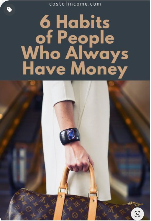
After clicking on any of the pins you have, Pinterest will also suggest some “More Like This” pins, for the image above these are the “similar” images:

All is well. The pin is about having money and the similar pins suggested by Pinterest are about money. Budgeting, saving, debt issues.
Here is another pin with the same title:
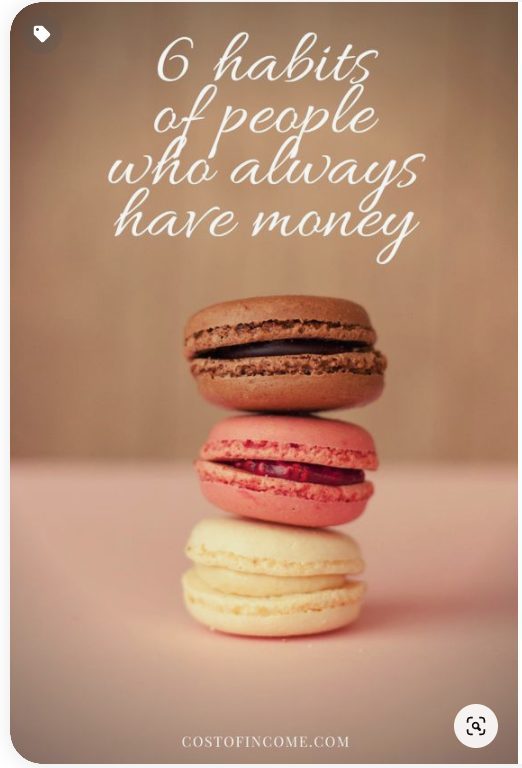
Similar logic as in a previous pin. But check out the pins that interest suggests:

Macarons recipes, weight loss, desserts, etc.
This means two things:
The title is not clear enough. While in the first example Pinterest clearly understood what the topic is, and provides relevant pins to accompany it, the second one is completely off.
The image is not relevant to the topic. This mistake is at number two, this was caused primarily by the title. (If it wasn’t, why did Pinterest not put “similar pins” of bags, etc?). But retrospectively, the image is not relevant enough to complement the topic.
These two issues caused lower impressions of the pin, not enough repinning, and all that resulted in the low overall clicks.
2. Do Not Overuse Templates
You created 50 designs, 5 seem to work well, so you make a template out of them and just keep re-pinning similar designs again and again.
Do not do it. There are several reasons why you should not go overboard with templates.
Pinterest likes new content and new images. Whenever I load new pins with new designs I can see a bump in the overall impressions, which will slowly fade out as I am re-pinning the same image again and again. Keep it fresh.
Popular Pinterest profiles completely revamp their designs from time to time. Sure, they keep some elements that reflect their branding, but they are constantly trying to come up with something different.
Tools like Canva can help, as they offer you figuratively speaking - an infinite amount of choices and combinations to try for your Pins.

Let’s have a look at one of the more successful profiles on Pinterest of The Savvy Couple:
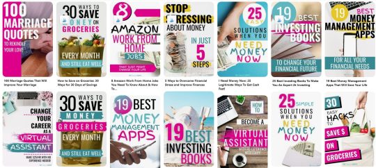
Notice that while they keep the same branding, the designs are always different. You can see that they share similar features, but from the perspective of Pinterest - these are completely different designs that will get good traction.
Need help increasing sales with social media?
Book a free call to learn how our team of marketing experts can help you create high converting social media campaigns today.
3. Use The Text To Your Advantage
Yes, Pinterest is a search engine that heavily relies on the visual side of things, but that does not mean it ignores the keywords.
First of all, Pinterest reads the keywords that are on the picture, and second (but equally important) users are reading it too.
To get clicks from your Pins you have to get users to do a “Close-up” which means that somebody clicks on your Pin to have a closer look at the description.
Use several fonts, but no more than 2-3
Emphasize (in bold, or a dominant font) the main keyword
Make sure the size of all the text is sufficient so users can read it without problems

The keyword here is Home Business Ideas. So if we would quickly through this example we would see:
The keyword is on a pin (2 fonts are used, or rather one font but subtitled in cursive).
Keyword is repeated in the title.
For the third time the keyword is repeated in the description.
If you will proceed to that particular Pinterest account (with several millions of viewers per month) you will notice that there are many pins like that - meaning that these types of design work.
When matched correctly you can be looking at the following results with some of your pins:

There are not so many impressions, but what is important that the vast majority of the ones who clicked, continued to post on the site - which is the main goal here.
4. Test Your Texts
We talked about testing the designs of your pins, but I would like to also emphasize the importance of testing the texts that you put on them. The goal is to get traffic on your site, so you must test several calls to action.
I recently conducted a small experiment on a post of mine. I compiled a list of over 640 Inspirational quotes, with various categories. Quotes seemed to be a good middle ground between what Pinterest likes and the overall theme of my site.
15 Pins were drafted to test the best angle.
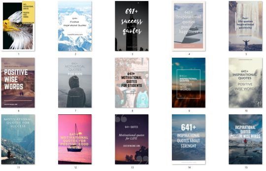
Here are the keywords that were used for testing:
Inspirational quotes
Positive Wise Words
Success Quotes
Quotes Positive Happiness
Life Quotes
Motivational Quotes For Kids
Motivational Quotes For Life
Motivational Quotes for Success
Quotes About Strength
These keywords both matched the content of the post but also most importantly they matched the search queries and trends on Pinterest.
After a couple of days, these were the best performers in terms of Closeups

This means that:
Inspirational Quotes For Kids
Inspirational Quotes Positive Wise Words
have quite a strong performance that should be developed further (creating more pins focused on these keywords). Unfortunately, I create a very weak generic description, so even though Pins had a good amount of closeups, the CTR rate was minimal (under 0,1%)
So take my advice - I will be working with variations of these two pins testing multiple descriptions, so make sure that the future closeups convert into clicks.
5. Do Not Give The Answer In Your Pin
Your goal with Pinterest is to get clicks. Remember it when designing a pin. The visual has to be interesting enough for the user to want to know more.
If the viewer will receive the answer right there on the pin...why would he/she click to your site?
Let’s have a look at some account examples. Here are pins from MakingSenseOfCents which have over 2mil. viewers.

The goal of your Pinterest endeavors is to get traffic. So you talk about a topic that will interest your audience, but you do not explain it on the pin or in the description - you rather ask them to come to your site for more information.
Let’s take the pin of “How blogging paid off my student loans” a bit of clickbait, but nothing too bad about it. It is interesting, how could blogs pay for the loans? Users click and read the info on the page.
If that pin would also say “With ad-networks, affiliate marketing and growing my blog for 6 years” the CTR would drop. The answer is already there, no need to go any further.
Have you ever noticed that when you are googling for translation? Let's say “manufacturing in Spanish” and go you go past Google Translator results, you see this:

Notice that none of those “snippets” gives you an answer. The reason is still the same, they want you to go to the website to get your information.
What about videos?
“How to make a bow from ribbon” is one of the most popular Pinterest search queries. These are the first few top results:
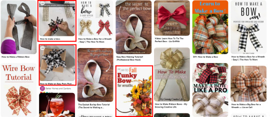
20% are videos with detailed explanations of how to make a bow from a ribbon. Others are pictures that are there with the goal of getting you to click through to the site.
In the case of videos, you can also get clicks as users will want to see description and other details, but some will just watch it, save the pin and that is it.
What about Infographics?
A nicely done infographic will work well both on Pinterest and outside of it. With SEO you may get backlinks, on Pinterest you may get many repins, saves, and maybe even new followers. So they can be used to grow your profile in the future, but they will not get you to click in the short term.
In conclusion to this section - make pins that are related to the search queries and further lead users from Pinterest to your website.
6. Use Warm colors
While the blues, greens, and yellows can work well. In my opinion red, orange, burgundy, dark pink worked the best.
This study shows that red, orange, and brown performed better than blue 2:1 in repins.
According to, Curalate(published on Wired.com) this is scientifically the best-colored pin:
While this post was written in 2013, do you want to see what is my most successful pin?
Sure, it is not an exact match, but I am sure you can see some resemblance.
What if “warm” colors are completely incompatible with your brand? Well, do not change your whole brand because of Pinterest. See if you incorporate the more “Pinterest friendly” colors.
If that is not possible, keep in mind that color pallets are just one part of the whole “alchemy” of Pinterest algorithms. What you will lack in color you will pay back in content, titles, descriptions, and much more.
7. Avoid Faces
While the strategies of different pinners are different, this study shows that brand images without faces receive 23% more repins. Even though the study is possibly outdated (Pinterest trends change very quickly) I usually tend to avoid them, as I feel that people want to imagine themselves on the pin.
On average the pins with faces will get up to 1% CTR for me, while pins without a face will be higher. On The other hand, these are some of the recent pins of Chasing Foxes (over 10mil monthly viewers).

They repin them constantly - meaning that it works. But they also have over 360k followers, strong boards with high engagement...so you will just have to test for yourself and see if it works for your brand.
Examples Of Successful Pins
In this section, we will go over examples of pins that worked well for me. I will illustrate how various pins behave in different niches so you can plan your Pinterest strategy accordingly.
Recipes

Recipes are one of the top categories on Pinterest. So it is no wonder that I had to try how it works. Though recipes are completely off the main topics of my website, I needed to do some pins and post for testing.
With 8% Closeups, 1% Saves, and 4% CTR this is one of the best pins I had tried. By best I mean that it delivered the most clicks.
As you can see this checks all the boxes in terms of design and color. Red themed picture with a red text background.
In this case, the topic is of great importance. Recipes, fashion, decor, design, travel are all hugely popular on Pinterest.
“Shakshuka recipe for one” is quite a niche search query on Pinterest which does not have many exact results. As you can see the keyword is on the pin, in the title, and description, these all help Pinterest algorithms to discover and further share your pin.
Good Habits
Lifestyle is one of the most popular niches on Pinterest where you can find a wide array of topics. One of the “classics” are topics “Habits of people who…” you can complete with interesting Pinterest trends such as who has money, who stays confident, who stays healthy, who are happy, and so on. Seeing this being a topic on many profiles I had to try for myself.
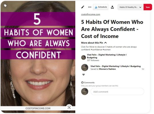
3% Closeups, 1.5% CTR and 0 Saves may not seem like a hugely successful result. The interesting thing is that the potential of this topic (and related ones) is possibly limitless.
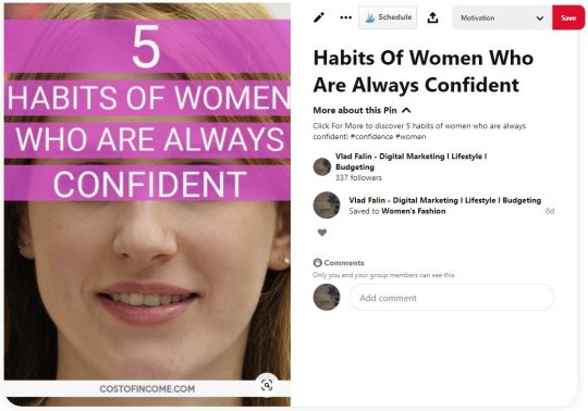
You may see that there are just slight changes but this pin (pinned at nearly the same, on same boards) received 2% closeups, 1% Saves, and 1% CTR.
No matter how many times you will pin for this topic, you will receive constant results. It does not seem to die out.
Continuing on the topic of habits, this fairly simple pin receives over 5% CTR. Which is quite over the average CTR on Pinterest, for your comfort on the right you may see the “scientifically perfect pin” that we discussed earlier.
Personal Finance
Another of the favored topics on Pinterest and I of course had to try how a very basic pin will do.
With 3% closeups and 3% CTR this design seems to be easily replicable. Meaning that changing it to different topics and varieties is not an issue.
As in Good Habits sections, these topics (while less popular than their recipes/fashion/lifestyle counterparts) are bottomless. There are so many angles to take when you are discussing money management, savings, how to manage debt, etc.

This is just another use of the same design, delivering similar results. 2% closeups, 1% saves, and 1% CTR.
Personal Development
Personal development and motivation are very solid choices of a topic for Pinterest, so I wanted to give it a shot with a post on leadership qualities. This pin delivered 1% closeups, 0.5% saves (one of my top repined images by total number), and 1,5% CTR. That can be considered a good result for a topic that is not “dominant” on Pinterest.

This pin delivered 1% closeups, 0.5% saves (one of my top repined images by total number), and 1,5% CTR. That can be considered a good result for a topic that is not “dominant” on Pinterest.
Digital Tools
The main topics of my site are digital tools and creating a business online. So of course I took my knowledge of Pinterest to the test on these topics too. Some time ago I created a post about webinar tools.

While my expectations for this topic were quite low, there were quite a few positive surprises. 2% Closeups, and close to 1% CTR. Saves were under 0.5% so something to work on in the future.
Another example of a simple design that worked even in the digital marketing tools niche is a pin about comparing email marketing services.
These were the testing pins:

After a couple of weeks, the best percentual rates were on this pin:

Closeups rate of 2%, save rate of 1%, and CTR of 2% is a great result for a pin in a more difficult niche.
The issue with these Pins is that they get impressions very slowly, digitals tools is a true niche sector on Pinterest. It takes the right boards and a lot of time to get the pin going. That being said - you can see that it is possible to drive clicks even in niches like this one.
Main Takeaways
We had a look at some pins that worked well for me, now I would like to provide the main takeaways and actional steps that you can take with your pins.
Do 5-10 testing pins for each post. Out of them, 1-2 will be performing above average.
While warm colors seem to be performing well (and better in some niches) do not limit yourself to this rule.
Test your pins with and without a face. While statistics speak clearly, it seems that some niches work better with faces, some do not.
Keep your pins 2:1 or 1000:1500 size. It is the optimal pin size for mobile, which is the dominant platform for Pinterest users.
Modify your keyword to be in line with search queries and Pinterest trends.
Text on the pin should be readable, do not go overboard with fonts.
Check the Pinterest search bar and Pinterest trends for search query suggestions.
Keywords should appear on the pin and in the title and description.
The pin should hint that the question will be answered in the post.
Conclusion
In this post, I shared the tips that I use when creating a pin. Pinterest is growing and changing, and the successful pins change too. Still, some basic rules remain the same.
While we went over the design of the pin and most of its intricacies. I strongly suggest that you read more on the topic of Pinterest boards. After all, if your great pin is pinned on a bad board, you will get nowhere.
Pinterest is a lot about experimenting with designs, descriptions, topics, time of pinning, and boards. While it may be tedious to try to combine all these, once you succeed you will experience an immediate inflow of traffic. This feeling will never let you go, so you might consider yourself “pinned” for life (pun intended).
You might want to check:
10 Amazing Pinterest Board Examples Critiqued (with Best Practices)
Pinterest SEO: A Guide for Businesses
How 5 Businesses Are Using Pinterest Boards to Creatively Promote Their Products
About the Author
Vlad is a founder and a blogger at Costofincome.com a blog about online business and video converters and digital marketing tools.
from RSSMix.com Mix ID 8230801 https://ift.tt/33fthyz via IFTTT
0 notes
Text
What’s the Matter With Lonely Planet?
When I decided to quit my job and travel the world, I walked into a bookstore and bought Lonely Planet’s Southeast Asia on a Shoestring. I was in Thailand and was eager to get started. Buying that guidebook made my impulsive decision seem real. Thumbing through its pages on my flight home, I was hooked. I loved its emphasis on budget travel and backpacking, the offbeat destinations, and its quirky and funny writing. As I planned my trip, LP’s “shoestring” guides were stacked high on my desk — and I became a permanent customer of Lonely Planet guides. Their personality matched mine and I was hooked.
Dubbed “the backpacker’s blue bible,” Lonely Planet’s guidebooks focused on unique destinations and budget travel, which made them a staple of travelers worldwide. For good or ill, Lonely Planet often made destinations, hostels, and restaurants.
Sure, its guides became synonymous with mass tourism, but for me, they were a great resource to thumb over while on a bus or train, or in a hostel. I navigated with LP maps and used LP guides for basic activity information and to figure out transportation.
But, lately, their quality seems to have gone down a lot. The last couple of times I’ve used their website and guides ended in frustration and disappointment and made me ask myself:
“What the heck is the matter with Lonely Planet?”
While it’s still the largest guidebook company in the world with 25% of the market, it’s fallen from its perch as “the bible” for budget travelers. After being sold to BBC in 2007 and then sold again to a reclusive billionaire named Brad Kelley in 2013, Lonely Planet is a shell of what it used to be. Kelley hired a 25-year-old photographer named Daniel Houghton, who came on board and “invested heavily in a digital revamp and laid off nearly one-fifth of the workforce.”
To further quote that Outside article, “I [the author] ask what the market research says about all that. ‘I didn’t really look at it,’ [Houghton] says, lowering his voice conspiratorially. ‘I don’t really go with market research. I kinda go with my gut.’”
And that’s where much of the blame lies.
What the market really says
As I sat down to write this article, I asked readers on social media what they thought of Lonely Planet. While most people still used Lonely Planet (and guidebooks in general) for preplanning, they reiterated what I kept hearing on the road: the books seem to get more out of date, the writing has lost its edge, the guides have gotten more upscale and less about offbeat and budget destinations, the website is hard to use, and blogs are often better. Here’s some examples of common responses (click here to see them all):
Over the years, travelers I’ve met in person have echoed the same complaint: that LP’s special je ne sais quoi is long gone. In fact, I’ve had some good bonding sessions over the topic!
Clearly, the market has a different opinion about the guides than management. Travelers, while still using the guide, don’t like it as much. I still see people using guidebooks on the road so the problem isn’t that people don’t use guidebooks.
The problem is Lonely Planet itself.
Last year, the CEO was interviewed in Amuse and talked about how he was making LP an uncurated (my word) travel content company: “We’ve never looked at Lonely Planet just as a book company, or a guidebook publisher — in fact my first interaction with Lonely Planet actually was on our website, probably when I was in college — we’ve always looked at it as a content company.”
But guidebooks are not content companies, they are curated resources from experts. We buy them because we don’t want a TripAdvisor or a generic source of information — we want someone who has been there and done that to help us do the same. Whether app, e-book, or paperback, consumers want a trusted source of information. We want someone to cut through the noise for us. If LP is just another generic content company that lists everything and exists to generate ad revenue, then what makes them unique? Are they just a bigger version Condé Nast Traveler or Afar?
It’s true Lonely Planet had problems long before the current management. Tony and Maureen Wheeler, the company’s founders, will be to the first to tell you they failed in the digital space. This is part of the reason they sold LP to the BBC. The BBC in turn just didn’t do much with the company and let Thorn Tree — LP’s forum and the best part of the site — struggle, as there were many mishaps and closings, as well as poor management.
Yet that was in 2013. The current problems are owned by the current management. Their desire to turn Lonely Planet into a content company is a terrible decision that is out of touch with what travelers want.
A rapid decline in quality
The decision to ignore market research and go with their gut explains much of the decline and why the books are a shell of what they used to be. When the company was last bought, most of the old execs were fired, bought out, or driven out. In their place was installed a management team with little knowledge of the industry they were now in.
Multiple sources reached out to me for this article to describe their experiences with Lonely Planet since the buyout. Authors complained about LP’s lack of communication, respect, and input, and about policy changes that communicated to their contributing experts “please go away.”
It’s something I’ve been hearing for years from my LP friends. (When you’re a travel writer, many of your travel-writing friends will be LP writers.)
I’ve long heard rumors and whispers about LP’s recycled content and desk updates (i.e., information written in the office, not from research at the destination), and that seemed to be corroborated by current employees. Often, I’ve heard, Lonely Planet contributors are told to use Google and TripAdvisor to create content.
LP has this giant content management system, where the author submits their research and, from that, they make the guidebook. But I’ve been told that now, after writers enter information into the database, another person — who may have no knowledge of the destination — comes along and assembles a book. So, in the end, you get this disorganized — and often wrong — book.
Because of these changes, writers seem to have developed a disdain for the company and merely deliver what’s “just good enough.” They aren’t paid a lot, work under tighter and tighter deadlines, and don’t feel part of the company anymore.
How much of this is “sour grapes,” I don’t know, but I’ve heard this complaint for enough years by enough sources that I believe it. I don’t blame the writers. I’ve seen my friends on assignment. They have a lot to do and little time to do it in – plus, the pay is terrible. So, it’s no surprise that if you treat the content creators poorly, you’re going to get poor content.
I – and many others – see that reflected in the quality of the guides.
A terrible website
And this decline can be very clearly seen on the LP website. After Houghton first took over, the website looked like this:
I mean, what is this? It’s a bunch of squares (for ants!*). Who thought this was good? It would take me ages to find the square I needed. Often I gave up and simply found a blog instead.
Now, while I like many things about the new Lonely Planet website — the larger pictures and bigger font — the content sections are hard to follow, and navigating the website is just as difficult as ever. I was trying to find information when I was in Lyon recently — and it was just scrolling and scrolling and scrolling. Why? They list like every place in the city – every church, attraction, park, or restaurant. (They do it for all their destinations.) I don’t want every restaurant or attraction — I want guidebooks and experts to give me the best. Distill the information down for me! If I wanted an endless list, I’d go to TripAdvisor or Yelp!
Plus, the information is so hard to find now. Here’s an example of LP’s California page in 2010 and now:
2010:
Now:
(Well, the page is so long and empty that I can’t take an accurate screenshot so here’s a link to see for yourself.)
In the old version, all the essential information is on the page (and if you go to the link for the page, you’ll see that essential information is just below the fold). It was easy to get to where you wanted to go, there were no endless lists, and they gave you the facts you needed. It had what you wanted. In the new version, you scroll, scroll, and keep scrolling. There’s a lot of space, not a lot of curated information, and it’s really hard to find what you are looking for.
It’s not just the California page. One just has to go to Paris to find that Lonely Planet’s “top list” is never-ending. And the descriptions of attractions, restaurants, and bars are even less useful than what Google or Yelp offers. Here’s a description of the Prescription Cocktail Club in Paris (one of my favorites):
With bowler and flat-top hats as lampshades and a 1930s speakeasy New York air to the place, this cocktail club — run by the same mega-successful team as Experimental Cocktail Club (ECC) — is very Parisian-cool. Getting past the doorman can be tough, but once in, it’s friendliness and old-fashioned cocktails all round.
That basic information doesn’t really tell me much about the décor, ambiance, or incredible drinks: the cucumber water you get when you sit down, exposed brick walls and dark wood bar, the jazz music, or the inventive cocktails. (Also, there’s no doorman. That’s simply wrong.) I’d take a Yelp review over the above any day.
When I was searching for things to do in Lyon, it was so difficult to find basic information (again, it’s just endless lists) and suggestions that I just gave up and consulted Yelp and blogs. These sites were better organized, gave me a curated list of places, and provided more detailed descriptions.
So what is the matter with Lonely Planet?
LP’s desire to be a “content company” is clear: the increased articles on the site that seem to exist to only drive page views, the sponsored content from the places (and companies) it reviews, the funneling of people from content to booking sites, the TripAdvisor–style listing of everything (more page views), and the plethora of ads that now litter the site. Additionally, the heavy emphasis on selling tours to destinations seems to go against the grain of independent travel that the company was founded on. You can tell the company has changed simply by what they focus their online content on.
We consumers go to travel blogs and guidebook companies because we want an expert to tell them what’s best. We want someone to distill it all down for them so we don’t have to do the work. It’s why we carry LP guides and not Condé Nast Traveler or Outside magazines on the road. Those are great for inspiration, but not on-the-ground information.
By losing that focus, trying (in my opinion) to appeal to everyone, and attempting to compete with sites like TripAdvisor (and even blogs to an extent), LP has lost what made it great.
I believe companies are better off when they have one thing they focus on. Andrew Carnegie once said, “ ‘Don’t put all your eggs in one basket’ is all wrong. I tell you, ‘Put all your eggs in one basket, and then watch that basket.’ ”
Lonely Planet should be a guidebook company. Being a guidebook company doesn’t mean you have to focus on physical books, but it means you focus on your one thing. Its shift from its singular mission to becoming a “digital content hub” means that it’s no longer unique — and when you are no longer unique, consumers have no reason to stay loyal. As Simon Sinek once said, “People don’t buy what you do, they buy why you do it.”
You used to know what the Lonely Planet brand meant and what they stood for. Now, I don’t know what the company stands for.
LP still is king because of its sheer size. It is the Microsoft of guidebook companies. Not one person I talked to had any loyalty to the brand anymore. They often bought the guides simply because there was no one else selling one to their destination.
I’ve been a loyal LP customer since 2005. Their guidebooks are all over this website. I still buy them. They are often the only game in town to where I want to go. But, lately, I’m not so sure about them anymore. I haven’t given up on them – but I’m getting closer to doing so. It’s hard to watch them morph into something so….forgettable.
So what’s the matter with Lonely Planet?
In short, just about everything.
* Zoolander reference: “What is this? A center for ants!” Ahhh, never gets old!
P.S. – Ever wondered how you can stay around the world for free? Find out how our upcoming Q&A with TrustedHousesitters! Housesitting is one of the best ways to stay long term in the places you’re visiting!
The post What’s the Matter With Lonely Planet? appeared first on Nomadic Matt's Travel Site.
via Travel Blogs http://ift.tt/2fbqobC
0 notes
Text
What’s the Matter With Lonely Planet?
When I decided to quit my job and travel the world, I walked into a bookstore and bought Lonely Planet’s Southeast Asia on a Shoestring. I was in Thailand and was eager to get started. Buying that guidebook made my impulsive decision seem real. Thumbing through its pages on my flight home, I was hooked. I loved its emphasis on budget travel and backpacking, the offbeat destinations, and its quirky and funny writing. As I planned my trip, LP’s “shoestring” guides were stacked high on my desk — and I became a permanent customer of Lonely Planet guides. There’s personality matched mine and I was hooked.
Dubbed “the backpacker’s blue bible,” Lonely Planet’s guidebooks focused on unique destinations and budget travel, which made them a staple of travelers worldwide. For good or ill, Lonely Planet often made destinations, hostels, and restaurants.
Sure, its guides became synonymous with mass tourism, but for me, they were a great resource to thumb over while on a bus or train, or in a hostel. I navigated with LP maps and used LP guides for basic activity information and to figure out transportation.
But, lately, their quality seems to have gone down a lot. The last couple of times I’ve used their website and guides ended in frustration and disappointment and made me ask myself:
“What the heck is the matter with Lonely Planet?”
While it’s still the largest guidebook company in the world with 25% of the market, it’s fallen from its perch as “the bible” for budget travelers. After being sold to BBC in 2007 and then sold again to a reclusive billionaire named Brad Kelley in 2013, Lonely Planet is a shell of what it used to be. Kelley hired a 25-year-old photographer named Daniel Houghton, who came on board and “invested heavily in a digital revamp and laid off nearly one-fifth of the workforce.”
To further quote that Outside article, “I [the author] ask what the market research says about all that. ‘I didn’t really look at it,’ [Houghton] says, lowering his voice conspiratorially. ‘I don’t really go with market research. I kinda go with my gut.’”
And that’s where much of the blame lies.
What the market really says
As I sat to write down this article, I asked readers on social media what they thought of Lonely Planet. While most people still used Lonely Planet (and guidebooks in general) for preplanning, they reiterated what I kept hearing on the road: the books seem to get more out of date, the writing has lost its edge, the guides have gotten more upscale and less about offbeat and budget destinations, the website is hard to use, and blogs are often better. Here’s some examples of common responses (you here to see them all):
Over the years, travelers I’ve met in person have echoed the same complaint: that LP’s special je ne sais quoi is long gone. In fact, I’ve had some good bonding sessions over the topic!
Clearly, the market has a different opinion about the guides than management. Travelers, while still using the guide, don’t like it as much. I still see people using guidebooks on the road so the problem isn’t that people don’t use guidebooks.
The problem is Lonely Planet itself.
Last year, the CEO was interviewed in Amuse and talked about how he was making LP an uncurated (my word) travel content company: “We’ve never looked at Lonely Planet just as a book company, or a guidebook publisher — in fact my first interaction with Lonely Planet actually was on our website, probably when I was in college — we’ve always looked at it as a content company.”
But guidebooks are not content companies. They are curated resources from experts. We buy them because we don’t want a TripAdvisor or a generic source of information — we want someone who has been there and done that to help us do the same. Whether app, e-book, or paperback, consumers want a trusted source of information. We want someone to cut through the noise of us. If LP is just another generic content company that lists everything and exists to generate ad revenue, then what makes them unique? Are they just a bigger version Condé Nast Traveler or Afar?
It’s true Lonely Planet had problems long before the current management. Tony and Maureen Wheeler, the company’s founders, will be to the first to tell you they failed in the digital space. This is part of the reason they sold LP to the BBC. The BBC in turn just didn’t do much with the company and let Thorn Tree — LP’s forum and the best part of the site — struggle, as there were many mishaps and closings, as well as poor management.
Yet that was in 2013. The current problems are owned by the current management. Their desire to turn Lonely Planet into a content company is a terrible decision that is out of touch with what travelers want.
A rapid decline in quality
The decision to ignore market research and go with their gut explains much of the decline and why the books a shell of what they used to be. When the company was last bought, most of the old execs were fired, bought out, or driven out. In their place was installed a management team with little knowledge of the industry they were now in.
Multiple sources reached out to me for this article to describe their experiences with Lonely Planet since the buyout. Authors complained about LP’s lack of communication, respect, and input, and about policy changes that communicated to their contributing experts “please go away.”
It’s something I’ve been hearing for years from my LP friends. (When you’re a travel writer, many of your travel-writing friends will be LP writers.)
I’ve long heard rumors and whispers about LP’s recycled content and desk updates (i.e., information written in the office, not from research at the destination), and that seemed to be corroborated current employees. Often, LP contributors are told to use Google and TripAdvisor to create content.
LP has this giant content management system, where the author submits their research and, from that, then make the guidebook. But I’ve been told that now, after writers enter information into the database, another person — who may have virtually no knowledge of the destination — comes along and assembles a book. So, in the end, you get this disorganized — and often wrong — book.
Because of these changes, writers seem to have developed a disdain for the company and merely deliver what’s “just good enough.” They aren’t paid a lot, work under tighter and tighter deadlines, and don’t feel part of the company anymore.
How much of this is “sour grapes” I don’t know, but I’ve heard this complaint for enough years by enough sources that I believe it. I don’t blame the writers. I’ve seen my friends on assignment. They have a lot to do and little time to do it in – plus, the pay is terrible. So, it’s no surprise that if you treat the content creators poorly, you’re going to get poor content.
I – and many others – see that reflected in the quality of the guides.
A terrible website
And this decline can be very clearly seen on the LP website. After Houghton first took over, the website looked like this:
I mean, what is this? It’s a bunch of squares (for ants!*). Who thought this was a good? It would take me ages to find the square I needed. Often I gave up and simply found a blog instead.
Now, while I like many things about the new Lonely Planet website — the larger pictures and bigger font — the content sections are hard to follow, and navigating the website is just as difficult as ever. I was trying to find information when I was in Lyon recently — and it was just scrolling and scrolling and scrolling. Why? They list like every place in the city – every church, attraction, park, or restaurant. (They do it for all their destinations.) I don’t want every restaurant or attraction — I want guidebooks and experts to give me the best. Distill the information down for me! If I wanted an endless list, I’d go to TripAdvisor or Yelp!
Plus, the information is so hard to find now. Here’s an example of LP’s California page in 2010 and now:
2010:
Now:
(Well, the page is so long and empty that I can’t take an accurate screenshot so here’s a link to see for yourself.)
In the old version, all the essential information is on the page (and if you go to the link for the page, you’ll see that essential information is just below the fold). It was easy to get to where you wanted to go, there were no endless lists, and they gave you the facts you needed. It had what you wanted. In the new version, you scroll, scroll, and keep scrolling. There’s a lot of space, not a lot of curated information, and it’s really hard to find what you are looking for.
It’s not just the California page. One just has to go to Paris to find that LP’s “top list” is never-ending. And the descriptions of attractions, restaurants, and bars are even less useful than what Google or Yelp offers. Here’s a description of the Prescription Cocktail Club in Paris (one of my favorites):
With bowler and flat-top hats as lampshades and a 1930s speakeasy New York air to the place, this cocktail club — run by the same mega-successful team as Experimental Cocktail Club (ECC) — is very Parisian-cool. Getting past the doorman can be tough, but once in, it’s friendliness and old-fashioned cocktails all round.
That basic information doesn’t really tell me much about the décor, ambiance, or incredible drinks: the cucumber water you get when you sit down, exposed brick walls and dark wood bar, the jazz music, or the inventive cocktails. (Also, there’s no doorman. That’s simply wrong.) I’d take a Yelp review over the above any day.
When I was searching for things to do in Lyon, it was so difficult to find basic information (again, it’s just endless lists) and suggestions that I just gave up and consulted Yelp and blogs. These sites were better organized, gave me a curated list of places, and provided more detailed descriptions.
So what is the matter with Lonely Planet?
LP’s desire to be a “content company” is clear: the increased articles on the site that seem to exist to only drive page views, the sponsored content from the places (and companies) it reviews, the funneling of people from content to booking sites, the TripAdvisor–style listing of everything (more page views), and the plethora of ads that now litter the site. Additionally, the heavy emphasis on selling tours to destinations seems to go against the grain of independent travel that the company was founded on. You can tell the company has changed simply by what they focus their online content on.
We consumers go to travel blogs and guidebook companies because we want an expert to tell them what’s best. We want someone to distill it all down for them so we don’t have to do the work. It’s why we carry LP guides and not Condé Nast Traveler or Outside magazines on the road. Those are great for inspiration, but not on-the-ground information.
By losing that focus, trying (in my opinion) to appeal to everyone, and attempting to compete with sites like TripAdvisor (and even blogs to an extent), LP has lost what made it great.
I believe companies are better off when they have one thing they focus on. Andrew Carnegie once said, “ ‘Don’t put all your eggs in one basket’ is all wrong. I tell you, ‘Put all your eggs in one basket, and then watch that basket.’ ”
Lonely Planet should be a guidebook company. Being a guidebook company doesn’t mean you have to focus on physical books, but it means you focus on your one thing. Its shift from its singular mission to becoming a “digital content hub” means that it’s no longer unique — and when you are no longer unique, consumers have no reason to stay loyal. As Simon Sinek once said, “People don’t buy what you do, they buy why you do it.”
You used to know what LP meant. Now I don’t know what the company stands for.
LP still is king because of its sheer size. It is the Microsoft of guidebook companies. Not one person I talked to had any loyalty to the brand anymore. They often bought the guides simply because there was no one else selling one to their destination.
I’ve been a loyal LP customer since 2005. Their guidebooks are all over this website. I still buy them. They are often the only game in town to where I want to go. But, lately, I’m not so sure about them anymore. I haven’t given up on them – but I’m getting closer to doing so. It’s hard to watch them morph into something so….forgettable.
So what’s the matter with Lonely Planet?
In short, just about everything.
* Zoolander reference: “What is this? A school for ants!” Ahhh, never gets old!
P.S. – Ever wondered how you can stay around the world for free? Find out how our upcoming Q&A with TrustedHousesitters! Housesitting is one of the best ways to stay long term in the places you’re visiting!
The post What’s the Matter With Lonely Planet? appeared first on Nomadic Matt's Travel Site.
from Travel Blog – Nomadic Matt's Travel Site http://ift.tt/2fbqobC via IFTTT
0 notes
Photo
When I decided to quit my job and travel the world, I walked into a bookstore and bought Lonely Planet’s Southeast Asia on a Shoestring. I was in Thailand and was eager to get started. Buying that guidebook made my impulsive decision seem real. Thumbing through its pages on my flight home, I was hooked. I loved its emphasis on budget travel and backpacking, the offbeat destinations, and its quirky and funny writing. As I planned my trip, LP’s “shoestring” guides were stacked high on my desk — and I became a permanent customer of Lonely Planet guides. There’s personality matched mine and I was hooked.
Dubbed “the backpacker’s blue bible,” Lonely Planet’s guidebooks focused on unique destinations and budget travel, which made them a staple of travelers worldwide. For good or ill, Lonely Planet often made destinations, hostels, and restaurants.
Sure, its guides became synonymous with mass tourism, but for me, they were a great resource to thumb over while on a bus or train, or in a hostel. I navigated with LP maps and used LP guides for basic activity information and to figure out transportation.
But, lately, their quality seems to have gone down a lot. The last couple of times I’ve used their website and guides ended in frustration and disappointment and made me ask myself:
“What the heck is the matter with Lonely Planet?”
While it’s still the largest guidebook company in the world with 25% of the market, it’s fallen from its perch as “the bible” for budget travelers. After being sold to BBC in 2007 and then sold again to a reclusive billionaire named Brad Kelley in 2013, Lonely Planet is a shell of what it used to be. Kelley hired a 25-year-old photographer named Daniel Houghton, who came on board and “invested heavily in a digital revamp and laid off nearly one-fifth of the workforce.”
To further quote that Outside article, “I [the author] ask what the market research says about all that. ‘I didn’t really look at it,’ [Houghton] says, lowering his voice conspiratorially. ‘I don’t really go with market research. I kinda go with my gut.’”
And that’s where much of the blame lies.
What the market really says
As I sat to write down this article, I asked readers on social media what they thought of Lonely Planet. While most people still used Lonely Planet (and guidebooks in general) for preplanning, they reiterated what I kept hearing on the road: the books seem to get more out of date, the writing has lost its edge, the guides have gotten more upscale and less about offbeat and budget destinations, the website is hard to use, and blogs are often better. Here’s some examples of common responses (you here to see them all):
Over the years, travelers I’ve met in person have echoed the same complaint: that LP’s special je ne sais quoi is long gone. In fact, I’ve had some good bonding sessions over the topic!
Clearly, the market has a different opinion about the guides than management. Travelers, while still using the guide, don’t like it as much. I still see people using guidebooks on the road so the problem isn’t that people don’t use guidebooks.
The problem is Lonely Planet itself.
Last year, the CEO was interviewed in Amuse and talked about how he was making LP an uncurated (my word) travel content company: “We’ve never looked at Lonely Planet just as a book company, or a guidebook publisher — in fact my first interaction with Lonely Planet actually was on our website, probably when I was in college — we’ve always looked at it as a content company.”
But guidebooks are not content companies. They are curated resources from experts. We buy them because we don’t want a TripAdvisor or a generic source of information — we want someone who has been there and done that to help us do the same. Whether app, e-book, or paperback, consumers want a trusted source of information. We want someone to cut through the noise of us. If LP is just another generic content company that lists everything and exists to generate ad revenue, then what makes them unique? Are they just a bigger version Condé Nast Traveler or Afar?
It’s true Lonely Planet had problems long before the current management. Tony and Maureen Wheeler, the company’s founders, will be to the first to tell you they failed in the digital space. This is part of the reason they sold LP to the BBC. The BBC in turn just didn’t do much with the company and let Thorn Tree — LP’s forum and the best part of the site — struggle, as there were many mishaps and closings, as well as poor management.
Yet that was in 2013. The current problems are owned by the current management. Their desire to turn Lonely Planet into a content company is a terrible decision that is out of touch with what travelers want.
A rapid decline in quality
The decision to ignore market research and go with their gut explains much of the decline and why the books a shell of what they used to be. When the company was last bought, most of the old execs were fired, bought out, or driven out. In their place was installed a management team with little knowledge of the industry they were now in.
Multiple sources reached out to me for this article to describe their experiences with Lonely Planet since the buyout. Authors complained about LP’s lack of communication, respect, and input, and about policy changes that communicated to their contributing experts “please go away.”
It’s something I’ve been hearing for years from my LP friends. (When you’re a travel writer, many of your travel-writing friends will be LP writers.)
I’ve long heard rumors and whispers about LP’s recycled content and desk updates (i.e., information written in the office, not from research at the destination), and that seemed to be corroborated current employees. Often, LP contributors are told to use Google and TripAdvisor to create content.
LP has this giant content management system, where the author submits their research and, from that, then make the guidebook. But I’ve been told that now, after writers enter information into the database, another person — who may have virtually no knowledge of the destination — comes along and assembles a book. So, in the end, you get this disorganized — and often wrong — book.
Because of these changes, writers seem to have developed a disdain for the company and merely deliver what’s “just good enough.” They aren’t paid a lot, work under tighter and tighter deadlines, and don’t feel part of the company anymore.
How much of this is “sour grapes” I don’t know, but I’ve heard this complaint for enough years by enough sources that I believe it. I don’t blame the writers. I’ve seen my friends on assignment. They have a lot to do and little time to do it in – plus, the pay is terrible. So, it’s no surprise that if you treat the content creators poorly, you’re going to get poor content.
I – and many others – see that reflected in the quality of the guides.
A terrible website
And this decline can be very clearly seen on the LP website. After Houghton first took over, the website looked like this:
I mean, what is this? It’s a bunch of squares (for ants!*). Who thought this was a good? It would take me ages to find the square I needed. Often I gave up and simply found a blog instead.
Now, while I like many things about the new Lonely Planet website — the larger pictures and bigger font — the content sections are hard to follow, and navigating the website is just as difficult as ever. I was trying to find information when I was in Lyon recently — and it was just scrolling and scrolling and scrolling. Why? They list like every place in the city – every church, attraction, park, or restaurant. (They do it for all their destinations.) I don’t want every restaurant or attraction — I want guidebooks and experts to give me the best. Distill the information down for me! If I wanted an endless list, I’d go to TripAdvisor or Yelp!
Plus, the information is so hard to find now. Here’s an example of LP’s California page in 2010 and now:
2010:
Now:
(Well, the page is so long and empty that I can’t take an accurate screenshot so here’s a link to see for yourself.)
In the old version, all the essential information is on the page (and if you go to the link for the page, you’ll see that essential information is just below the fold). It was easy to get to where you wanted to go, there were no endless lists, and they gave you the facts you needed. It had what you wanted. In the new version, you scroll, scroll, and keep scrolling. There’s a lot of space, not a lot of curated information, and it’s really hard to find what you are looking for.
It’s not just the California page. One just has to go to Paris to find that LP’s “top list” is never-ending. And the descriptions of attractions, restaurants, and bars are even less useful than what Google or Yelp offers. Here’s a description of the Prescription Cocktail Club in Paris (one of my favorites):
With bowler and flat-top hats as lampshades and a 1930s speakeasy New York air to the place, this cocktail club — run by the same mega-successful team as Experimental Cocktail Club (ECC) — is very Parisian-cool. Getting past the doorman can be tough, but once in, it’s friendliness and old-fashioned cocktails all round.
That basic information doesn’t really tell me much about the décor, ambiance, or incredible drinks: the cucumber water you get when you sit down, exposed brick walls and dark wood bar, the jazz music, or the inventive cocktails. (Also, there’s no doorman. That’s simply wrong.) I’d take a Yelp review over the above any day.
When I was searching for things to do in Lyon, it was so difficult to find basic information (again, it’s just endless lists) and suggestions that I just gave up and consulted Yelp and blogs. These sites were better organized, gave me a curated list of places, and provided more detailed descriptions.
So what is the matter with Lonely Planet?
LP’s desire to be a “content company” is clear: the increased articles on the site that seem to exist to only drive page views, the sponsored content from the places (and companies) it reviews, the funneling of people from content to booking sites, the TripAdvisor–style listing of everything (more page views), and the plethora of ads that now litter the site. Additionally, the heavy emphasis on selling tours to destinations seems to go against the grain of independent travel that the company was founded on. You can tell the company has changed simply by what they focus their online content on.
We consumers go to travel blogs and guidebook companies because we want an expert to tell them what’s best. We want someone to distill it all down for them so we don’t have to do the work. It’s why we carry LP guides and not Condé Nast Traveler or Outside magazines on the road. Those are great for inspiration, but not on-the-ground information.
By losing that focus, trying (in my opinion) to appeal to everyone, and attempting to compete with sites like TripAdvisor (and even blogs to an extent), LP has lost what made it great.
I believe companies are better off when they have one thing they focus on. Andrew Carnegie once said, “ ‘Don’t put all your eggs in one basket’ is all wrong. I tell you, ‘Put all your eggs in one basket, and then watch that basket.’ ”
Lonely Planet should be a guidebook company. Being a guidebook company doesn’t mean you have to focus on physical books, but it means you focus on your one thing. Its shift from its singular mission to becoming a “digital content hub” means that it’s no longer unique — and when you are no longer unique, consumers have no reason to stay loyal. As Simon Sinek once said, “People don’t buy what you do, they buy why you do it.”
You used to know what LP meant. Now I don’t know what the company stands for.
LP still is king because of its sheer size. It is the Microsoft of guidebook companies. Not one person I talked to had any loyalty to the brand anymore. They often bought the guides simply because there was no one else selling one to their destination.
I’ve been a loyal LP customer since 2005. Their guidebooks are all over this website. I still buy them. They are often the only game in town to where I want to go. But, lately, I’m not so sure about them anymore. I haven’t given up on them – but I’m getting closer to doing so. It’s hard to watch them morph into something so….forgettable.
So what’s the matter with Lonely Planet?
In short, just about everything.
* Zoolander reference: “What is this? A school for ants!” Ahhh, never gets old!
P.S. – Ever wondered how you can stay around the world for free? Find out how our upcoming Q&A with TrustedHousesitters! Housesitting is one of the best ways to stay long term in the places you’re visiting!
The post What’s the Matter With Lonely Planet? appeared first on Nomadic Matt's Travel Site.
What’s the Matter With Lonely Planet? http://ift.tt/2fbqobC
0 notes
Text
New Post has been published on https://www.annotatedbibliographymaker.com/bibliographical-information-definition-types-and-all-you-need-to-know/
Bibliographical Information: Definition, Types, and All You Need to Know
Foremost Factors Not to Miss about Bibliography
Many of the students and even experienced professionals have to go through the phase of conducting research papers at least once or many times in a life. It is considered as an important part of completing any degree program to assess the thinking ability and learning skills of the students. The bibliographies (bibliographical information) are important in any way for all kinds of research papers. You can’t neglect this part by replacing the section with any alternate option. This is the only method of adding sources of the gathered data in an appropriate manner.
.autofoot text-align: center; font-weight: bold; font-size: 13px; color: #B63300; margin: 0 -10px; .autohead text-align: center; font-weight: bold; font-size: 20px; line-height: 18px; padding: 10px 0; color: #E20000; .autobanner border: 1px solid #DFDFDF; border-radius: 15px; background: #FFF; padding: 0 15px; width: 600px; margin: 20px auto; .autobanner ul li list-style: none; padding: 12px 0 12px 70px; border-bottom: 1px solid #F3F3F3; width: 320px; margin: auto; color: #00457C; font-size: 20px; font-weight: bold; .autobanner ul margin: 0; padding: 0; .autobanner ul li span display: block; font-size: 11px; font-weight: bold; color: #999;
How an Annotated Bibliography Is Created
search for relevant sources3 min / source
skim through the referencefrom 7 min / source
read info about the authorfrom 4 min / source
write an annotationfrom 6 min / source
format the referencefrom 2 min / source
Are you sure you want to waste over 20 minutes of your life on bibliography?
A few decades ago, the styles of writing bibliography were quite simple. However, the present era is an exception. We have a variety of ways to write or include bibliographies in the research papers, there is even Chicago style bibliography maker. It is mostly suggested by the experts to keep it all simple without making the bibliography adding process complex indeed. Many students who conduct research papers for the first time definitely face difficulties in writing bibliographies as per the exact format. However, it can be simpler with the policy of ‘practice makes you perfect’.
Bibliographical Information Definition: How to Type a Bibliography?
According to bibliographic information definition, the Sources of gathered data that is added in a specific section of conducted research paper is said to be a bibliography. There can be either a single source or multiple sources. However, it is hard to find any research study with the single quoted bibliography. The paper based on multiple pages document cannot be prepared by gathering data from a single source. The individuals who conduct research and work on data collection process keep all the sources info saved for use in the final sections of bibliographies. It is quite simple to type a bibliography in any format. Here are some steps to find it uncomplex.
The page number of sources is important to add in the respective section of any research study.
Show the date when you have the copies of published paper.
Sources that helped you in publishing the paper along with their names and locations.
A title of your work definitely matters and it should not be missed.
The name of an author is also important to be added.
Keep all of these five points in mind when you start adding bibliographic information in the paper. It will become quite simple for you by following the shared steps of writing. Try some excellent and quick ways to type bibliography.
Image credit: pexels.com
Types of Citations and Bibliography: What Is a Bibliographic Source?
The bibliographic source is the place from where you gather all the required information for writing a bibliography. You can’t miss even a single alphabet in mentioning links or info on such sources. The bibliography or citations have some major types that should be in knowledge of everyone who conducts research papers.
The three common types of citations are being shared below.
The one used in psychology, sciences and education is known as APA.
The style used by conducting research studies related to humanities is called MLA.
The academic studies of fine arts, history, and business follow citation style of Turabian/Chicago.
These three styles are highly popular these days among the researchers. MLA is Modern Language Association while APA stands for American Psychological Association.
Image credit: custom-writing.org
Suggestions to Know When to Use MLA or APA
Students mostly get confused by choosing one style from MLA and APA to add citations in their conducted research papers. Here are some quite useful tips that can help you out in getting when to use mla or APA. This can be easier for you to identify the right choice of bibliography style for the paper you conducted some days before.
When you write papers in the field of social sciences, education, psychology, laboratory reports and scientific studies, the ideal option is definitely APA style for adding citations. This major style has actually been developed for assisting research authors in the year 1929.
Academic studies included in the field of humanities and literary research rely upon the MLA style. The work related to multimedia, audiovisual material, literary documents, anthologies, and books mostly depend on this citation style. The manuscript formatting rules are followed by this style of bibliography.
The Bibliographic Form: Significant Included Information
The information that said to be as important in the bibliography is fully based on the specific style. Whatever kind of info you are adding in the bibliography must be written by following the suitable style (MLA, APA or Chicago) in a proper manner. Here are some important information included in the APA style of bibliography.
Double spaced footnotes and endnotes
Centered title one inch beneath the top most side of page
Page numbers
Double-Spaced Lines
In-Text citations in parentheses
Capitalized titles.
Italicized Titles
Names of referenced authors in alphabetical order
List of references
The things included in MLA style of citation are also shared below.
Footnotes
Double-Spaced lines
In-Text citations in parentheses
Referenced Authors
Centered Titles
Alphabetical Order by author
Cited list of bibliographic work
youtube
How to Write Annotations for Journals and Books?
Whether you write annotated MLA bibliography or APA cited paper, the important thing to consider is to follow the regulations of adding references to sources in books and journals accordingly. The procedure of adding annotation isn’t different from books and journals. It is mostly said to be an as critical annotation. Have a look at them.
The first step is to write a detailed short paragraph about an author.
Here, you have to discuss the actual purpose of conducting the research.
Mentioning about targeted audience seems more helpful. It is mandatory as well.
The actual context of study based on evidence-based data is important for sure.
The results are also significant to be discussed but in a concise manner.
Don’t forget to add the conclusion of the study as well. If you are still confused, then the feasible annotations writing format is ideal to clear all the concepts.
How to Find Bibliographic Information on a Website?
For adding annotations in APA style, you need to follow the given method.
“Peter, D. R. (2009). Ways to describe a psychopath from a sociopath. Sociology Nowadays. Collected from https://www.psychologytoday.com/blog/wicked-deeds/201401/how-tell-sociopath-psychopath.”
The MLA style of adding annotation is given here.
“For instance: “Overview and Quotations related to Therapy of Music.” Musical Therapy Association of U.S. MTA, y.l. Site. 15 May. 2011. <http://www.musictherapy.org/about/quotes/>.”
The Chicago style bibliography maker will always follow this procedure.
“Suppose:John, Keith. “Rise of Art Sales.” The Sunday NY Magazine, June 10 2012. Used in Sep 08, 2014. http://artsbeat.blogs.nytimes.com/2015/03/11/art-sales-on-the-rise/?_r=0”
All of these three methods of adding annotations in a website would help you to make your bibliography section more engaging and authentic. Learn more by going through an example.
Some Useful Tips for Bibliographical Information Collection and Writing
The bibliographical information can be gathered and added by relying on some effective tips. Here are some tips to help you out in making your work more legitimate. Also, try to share these tips with others as well.
Never try to use punctuation symbols as per your choice. Following the format is strictly important for everyone.
The order of info isn’t changed as well. Again, you have to follow it in exactly the same manner given in the format.
The style and size of the font should be same in the entire list of annotations. The paper will be rejected in case of making different font styles of the referenced sources.
This is it. Once you follow these tips, you would be then able to impress your supervisor. Like the whole written paper, the ending sections including bibliographies has equal significance in sight of the supervisors. This is how you can excel in research writing and can call yourself an expert of including annotations in quotations.
Things to Remind in the End
The overall guide of adding annotations in bibliography shows the higher importance of this little change in academic citations. Although, it seems not difficult but adding a description of the each source can’t be considered as hassle-free activity. Remember that bibliographic annotations for books/journals and web pages are two different things. In the case of trying to create a new style by combining their formats, you would actually create a disastrous situation for the conducted paper.
People who follow the step-by-step guide to adding annotations actually get success in making this procedure free of errors. Otherwise, the multiple rejections can turn it into a negative impression of your paper. Now, it is fully your choice either to make the method of adding annotations enjoyable or turning it into the hardest activity ever did. So, what’s your point of view?
Find out the treasure of bibliographical information for adding annotations in the effective yet simplest way. Save your time by choosing best guide for it.
#bibliographic information definition#bibliographical information#how to find bibliographic information on a website#how to type a bibliography#how to write annotations
0 notes