#rexan's art
Explore tagged Tumblr posts
Text


silly guy is so fun to draw
edit: part 2! :D
#hazbin hotel#rexan's art#lucifer morningstar#hazbin hotel lucifer#hazbin lucifer#hazbin hotel lucifer morningstar#hazbin lucifer morningstar#for the curious: the Charlie screenshots are from ep 2 while Alastor's beating up Sir Pentious :3#Charlie's going 'Uh Alastor I think he's had enough' and then Angel says smth
991 notes
·
View notes
Text
<3 MY BROTHER IS AWESOME and i've been meaning to post the rest of the cake photos to my main blog for some time and now is the time!! IMAGE SPAM
OH WAIT BUT FIRST: SHORT STORY MY BROTHER TOLD ME
he picked up the cake from the bakery, and the worker was TRYING to tell him how to transport the cake and information like that
but she could barely talk because she was grinning too much about the cake design. the whole bakery loved it
THAT'S THE STORY! NOW IMAGE SPAM!!!


THE CAKE WAS FILLING OF MY CHOICE (from a provided list), AND I PICKED SPICED APPLE BECAUSE I WAS LIKE "OH MY GOSH THERE'S AN APPLE OPTION I NEED IT" AND THE SECOND FILLING WAS CREAM CHEESE BECAUSE THAT SEEMED LIKE IT'D GO WELL WITH THE APPLE
(or was the cream cheese filling because Jeremy Jordan [Lucifer's voice actor] ate a bagel with cream cheese in his second livestream? maybe a combination of both reasons. I DON'T REMEMBER IT'S BEEN A COUPLE MONTHS LOL)
IT WAS DELICIOUS AND AMAZING AND MY BROTHER ALSO MADE A BONUS LUCIFER GIFT WHO'S MY LITTLE DESK BUDDY


MUST POST
MUST SHARE
MY BROTHER GOT ME THE BIRTHDAY CAKE I'D HOPED FOR AND EVEN WENT FURTHER THAN MY IMAGINATION:
HE USED DUCKY CANDLES
("LUCIFER WITH DUCK" IMAGE FROM THIS POST)
#hazbin hotel#hazbin lucifer#and i'll be generous this time and NOW count the cake pic as:#rexan's art#(i didn't tag the post with the digital art as such but this cake was so cool :') tremendous thanks to my brother and the bakery)#long post
95 notes
·
View notes
Text

Quick sketch 🎶✨
#fanart#belle#belle movie#belle 2021#ryuu to sobakasu no hime#the dragon and the freckled princess#studio chizu#mamoru hosoda#uta yo#gales of song#竜とそばかすの姫#my art#BELLE#REXAN
132 notes
·
View notes
Text
@cazaui-rexan replied to your post “ART.”:
A R T
A R T
5 notes
·
View notes
Photo


I GOT SUPER EXCITED AND HAD TO DO AN EDIT MYSELF I LOVE THEM
there's probably a lot of inaccuracies to what you imagined but i had to make this as fast as humanly possible
(also the "no red on the 'i' stalks" in the logo is GENIUS. LOVE the mushroomy touch)

cottagegore Villainous AU called Villatic coming when
38 notes
·
View notes
Photo

“Love of Beauty is Taste, the Creation of Beauty is Art” . And to awake real beauty of your skin, we have invented simple (Shhh, It's our secret word) Cream which works for all skin types. Make you skin tone real with REXAN... . . . . #beauty #love #beautiful #fashion #makeup #style #Skin #Care #Cream #Cosmetic #Art #Women #Girl #Lady #nature #skincare #happy #smile #myself #life #mother #girlpower #shopping #Secret #Formula
2 notes
·
View notes
Text
pre-fallen tiny little itty bitty body Lucifer? YES PLEASE
this was SO FUN to make
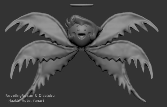
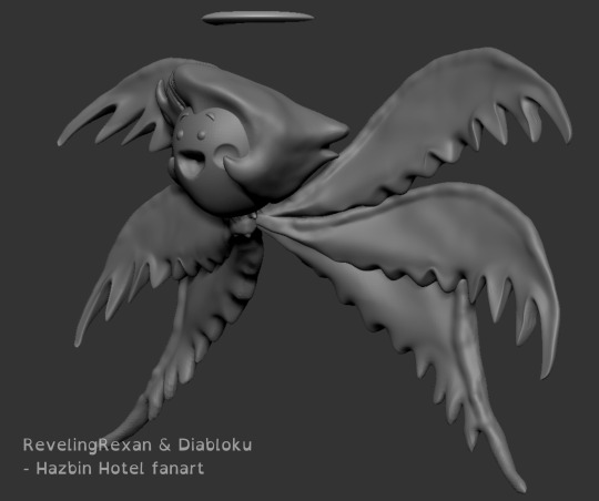
modeled by me for an assignment, design originally by @diabloku in their "ALASTOR'S VICIOUS MOCKERY" video
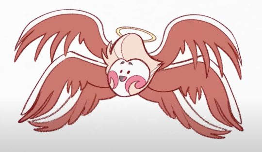
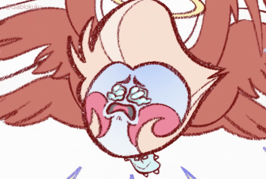
youtube
(some more angles and a bonus cursed alternate version under the cut)
_______
some more angles to answer a question some people might have, like "HOW DID YOU EVEN GET THOSE WINGS TO FIT ON HIS BODY" (a few people asked me that lol. or at least one person did. i think a second person--ANYWAY)
answer: curve the wings out A LOT away from the body and give them tiny bases
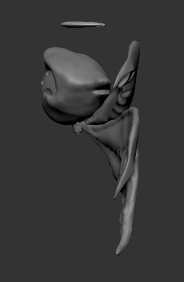

BONUS: I HAD TOO MUCH FUN AND FORGOT THE ASSIGNMENT WAS ACTUALLY TO CREATE A BUST (HEAD AND SHOULDERS), NOT A WHOLE BODY, AND I DIDN'T KNOW HOW PEDANTIC MY PROFESSOR WOULD BE, SO I MADE THIS VERSION TOO
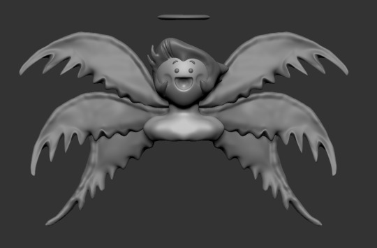
i wish i remembered to include his collarbone and some neck muscles. it would have been even more cursed
(more bonus info: i'm new-ish to the program we're using [ZBrush], so i didn't realize there's a torus -- a ring -- object i could have used for the halo. so i squashed a sphere and tried to cut a circle out from the center, but the program didn't cooperate. so i instead gave him a semi-halo thing lol)
#hazbin hotel#hazbin lucifer#lucifer morningstar#hazbin hotel lucifer#rexan's art#zbrush#3d modeling#3d art#computer modeling#it was so silly that i collected a bunch of bird wing references and then hardly used them or my knowledge from past projects lol#Youtube
450 notes
·
View notes
Text

he
oooo look! the grain of the sketchbook page gave ‘im a li’l nose!! or a surprised “:o” face with a gigantic chin
Everybody who sees this post I need you to stop what you’re doing and draw moomintroll no reference no sketch as fast as you can. I’ll start.

#moomintrolls#plunking this down with the tag:#rexan's art#because true beauty#beaitufl#nolongerraining#roadsidefool#apidgedraws#phew i queued this to the wrong blog two times. had to retype the tags each time
47 notes
·
View notes
Text


silly guy continues to be fun to draw (part 1! :D)
bonus Lulu under the cut!


#not as happy with the one under the cut but i still wanna share the little guy :D#hazbin hotel#hazbin lucifer#lucifer morningstar#hazbin hotel lucifer#hazbin lucifer morningstar#hazbin hotel lucifer morningstar#rexan's art#I TOTALLY MISSED OUT ON POSTING FOR LUCIFER WEEK (WHICH IS GOING ON RN) BECAUSE I AGGRAVATED AN INJURY AAAAAAAAA#I EVEN HAD SKETCHES FOR ALL SEVEN DAYS READY TO GET DIGITALLY CLEANED UP#SO I HOPE TO HAVE A BELATED PERSONAL LUCIFER WEEK SOME TIME BEFORE THE YEAR ENDS#might post my sketches tomorrow tho!! some of them are REALLY rough LOL
112 notes
·
View notes
Text

#A FATHER'S DAY DRAWING RAAAHHHH#no matter your relationship with your dad or father figure i hope it's a nice day for all of you <3 <3#hazbin hotel#lucifer morningstar#hazbin hotel lucifer morningstar#hazbin lucifer#hazbin hotel lucifer#charlie morningstar#hazbin lucifer morningstar#rexan's art
160 notes
·
View notes
Text
HAZBIN LUCIFER WEEK - PART 2 / 2
(Part 1 here!)
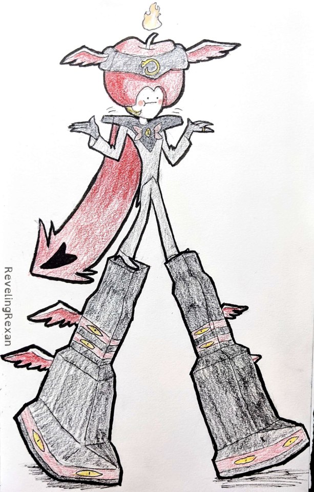
Day 4: Business
Cosplaying as Lord Business means he got stilts

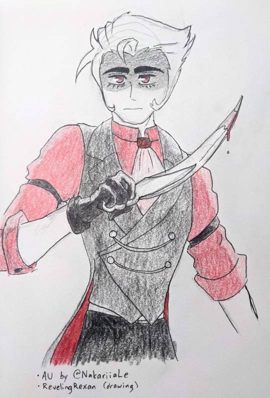
Day 5: Human
Human Lucifer design from NakariiaLe on Twitter, from his Spy x Family AU (Spy x Family screenshot referenced on right)

Day 6: Dressed to impress
I collected lots of fancy suits for reference, but then YouTube reminded me Jacques ze Whipper exists, and his outfits always rock
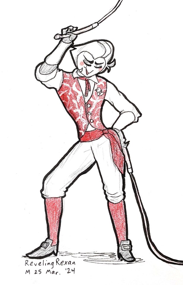

Day 7: Free day
Ever since shortly after the Hazbin Hotel season 1 finale, I've really wanted to make pancakes 'cause of Lucifer. Made cinnamon apple pancakes!
Some good tips I found: use buttermilk instead of milk and add some malt. :)


#CAPS LOCKING THE TITLE FOR THIS POST BECAUSE LUCIFER WEEK RAAAAAAAAHHHH#lucifer morningstar#hazbin hotel#hazbin hotel lucifer#hazbin lucifer#rexan's art#i honestly don't understand how people do these week or month challenges and do nice digital art every day.#digital art with clean lineart often takes me literal hours.#people are crazy [talented]. i can roughly understand how people might do a cool digital painting each day#but my skill's not there (yet? lol that'd be cool someday)
82 notes
·
View notes
Text

"...not very clever!"
and then Alastor cusses for the first time in the show :D
#made on my olde Nintendo DSi's Flipnote Studio :)#hazbin hotel#hazbin lucifer#hazbin hotel lucifer#lucifer morningstar#i LOOOOOOVE the snappy animation of Lucifer's eyes and mouth at the end of this moment#aaaaaaghghghghgh he's so fun to draw and animate aaaaghggghghhgh#i actually wanted today's submission for my personal impromptu Lucifer week to be a character sheet i put together out of screenshots#because Lucifer is THE most inconsistently drawn character in the show. and it was so upsetting when i just wanted to have#a brief doodle session for the first time and yet i couldn't even figure out his eye shape D:#but on the bright side he's pretty much accurately drawn no matter how a fanartist might draw him lol#this might be my last Lucifer submission for a bit (got six out of seven days! woo! :) ) but i do hope to submit that character sheet and#its accompanying design rambles soon-ish ('soon-ish' ranges from a week to a month+ lol)#rexan's art
106 notes
·
View notes
Text

got hit with strong inspiration one morning and drew dino birb man :)
#hazbin hotel#hazbin hotel lucifer#hazbin lucifer#hazbin hotel lucifer morningstar#lucifer morningstar#hazbin lucifer morningstar#rexan's art
22 notes
·
View notes
Text


RAAAAAAHHHH GOT A REAL FUN "DRAW ALASTOR AND SURPRISE ME" COMMISSION
the picture got put on a credit card, inspired by my own silly Lucifer debit card sticker!!!
made a second version of the image just in case the "creepy Alastor doll" turned out not preferable for something as public as a credit card lol, but it clearly wasn't a problem :)

#hazbin hotel#alastor#hazbin hotel alastor#rexan's art#hazbin alastor#artists on tumblr#used radio symbols rather than the canon voodoo-based ones 'cause -- short explanation -- i'd just rather not use sacred symbols usually#and the radio symbols can look arcane and fitting enough lol
24 notes
·
View notes
Text
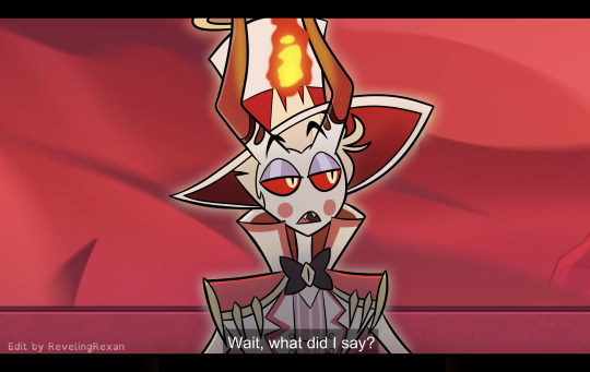

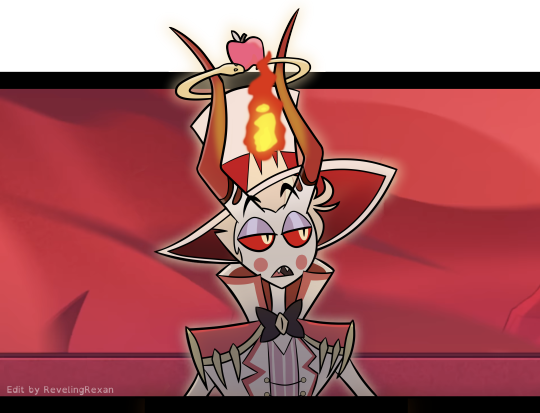
a silly screenshot edit i made of one of my favorite moments :)
...because i organized my bank accounts and wanted to give one of my cards a special cover!!
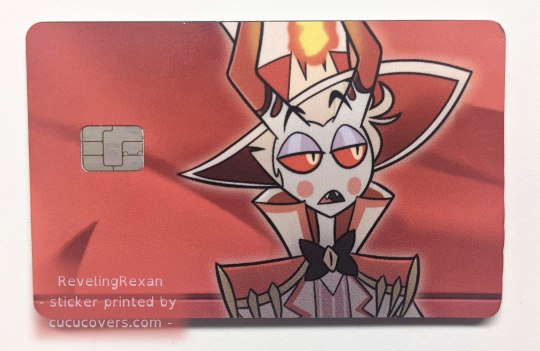
a brief note about applying the sticker to the card: the directions said to line up the sticker to the opening for the chip, but it went better for me when i lined the sticker up to one of the long sides of the card. (but of course make sure the sticker would be in the right part for the chip)
bonus behind the scenes on my making the pic under the cut :)
_____

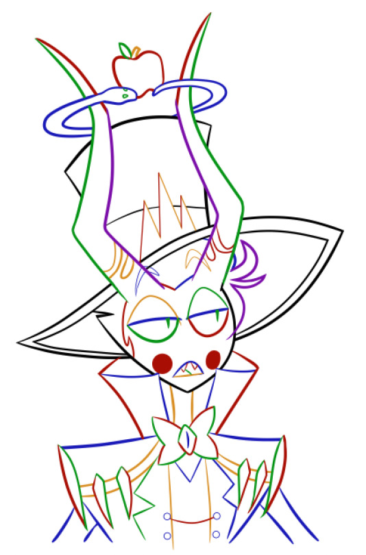
i tend to make several lineart layers when doing REALLY CLEAN lineart so i can more easily erase overlapping lines. (the first screenshot has lines that "overshoot" because that gives nice sharp corners and line width variety, but i need to erase the extra parts of the lines)
(i like these screenshots because Lucifer looks extra clowny with the outlines' colorfulness)
i realized on this project, since the final lineart is just going to be black anyway, that i can use different colors for each layer and then LATER make the lineart black. (realized it after already making some lineart, so you see some black here) that way, i can easily know what layer everything's on, instead of going through a bunch of layers and clicking them off and on to find a specific part

SO, RIGHT. VERY EASY TO THEN GET BLACK OUTLINES: JUST SET BRIGHTNESS TO ZERO. i usually use a program called FireAlpaca, and the way you do that there is: Filter > Hue… > drag the Brightness cursor all the way to the left

in this screenshot, you can see some of the effects i added to Lucifer to give him the nice shadowed look that Hazbin Hotel has, as well as where i covered Charlie at the tip of Lucifer's hat lol
i included my layers on the right of the screenshot to show how i set up the outline layers in the final version: as you saw above, i named my outline layers with the color used for them, then, once i was done with the outline, i placed the "outline before color change" folder above the base black "outline" folder. that way, if i later notice a mistake, i can simply turn on the colored outline folder and i'll see what color that part of the outline is and jump to the necessary layer, rather than going on a quest turning off and on a bunch of layers each time
since i duplicated my outline folder before changing the outlines in one of them to black, the base outline folder already has the color names included in the layer names
NOT ALL DIGITAL ARTISTS USE AS MANY LAYERS AS I DO LOL. I GO WILD WITH THEM SOMETIMES. MANY OF MY PROJECTS HAVE WAY MORE THAN 80 OR EVEN 500 LAYERS. people just tend to figure out what works for them. i wouldn't be surprised if i end up using fewer layers in the future. or a lot more. or go either way depending on the project
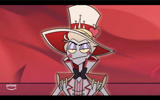
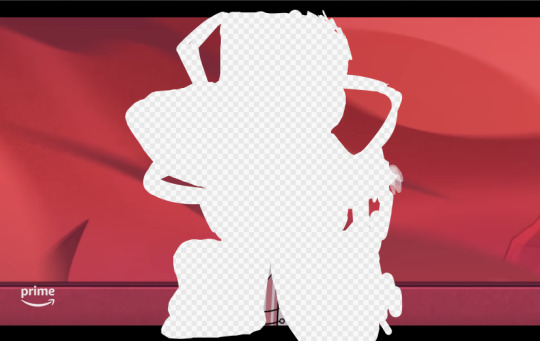
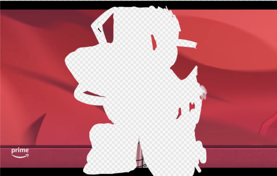
so, yeah, this is a screenshot edit, so i traced the main part of Lucifer's body. for the background, i used two screenshots. had to cut together and cover some stuff. here's the two screenshots unedited followed by a scribbled version to make things work lol and then the scribbled version that includes some extra touch ups/covers

and some screenshots i took while working on this, when i unexpectedly got some cool-looking versions :3 first one reminded me of Day of the Dead looks (he DOES need to be more colorful to be more accurate) and the second is just rad


ANYWAY probably the most helpful thing to most people would be the colored outline thing talked about at the start lol, the stuff i bolded. that was IMMENSELY useful and i love black outlines more than ever XD
#hazbin hotel#hazbin lucifer#lucifer morningstar#hazbin hotel lucifer#screenshot edit#i feel like there's something else i wanted to mention under the cut but i'm forgetting lol#oH. IT WAS ABOUT CHANGING THE IN-PROGRESS COLORED OUTLINES TO BLACK LOL. GOT IT WOO#rexan's art#i got the sticker like two months ago and i STILL sometimes take my card out only to look at it XD#one of my best purchases ever lol#(it was about $15 in the U.S. and that includes shipping. i really wanted a Lucifer card)#(so worth it)
62 notes
·
View notes
Text
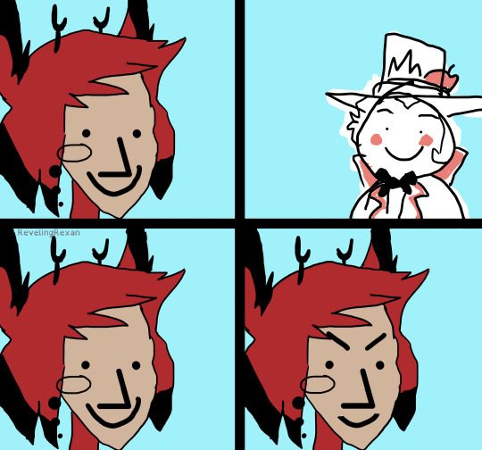
Episode 5 in four frames
[ Image ID: a digital redraw of the four frame "angry NPC wojak" meme, but with roughly drawn and colored Alastor and Lucifer from Hazbin Hotel as the two people. there is no dialogue.
in the first frame, Alastor is smiling. the second frame is just Lucifer, also smiling. the third frame is the same as the first frame, with Alastor smiling. the fourth frame is again Alastor, only changed so now he has angry eyebrows and a slightly smaller smile. /end ID ]
#hazbin hotel#alastor#hazbin lucifer#lucifer morningstar#alastor hazbin hotel#hazbin hotel alastor#hazbin hotel lucifer#rexan's art
53 notes
·
View notes