#reports power bi
Explore tagged Tumblr posts
Visit Tumblr Blog
Explore Tumblr blogs with no restrictions, modern design and the best experience.
Last Seen Tumblr Blogs


Fun Fact
Tumblr is used by 21% of adults online aged 18-29 years.
Text

Cyber Looper offers comprehensive Power BI training in the United States, empowering individuals and businesses with essential skills for effective data analysis and visualization. Our expert-led courses cover Power BI fundamentals, advanced techniques, and real-world applications, ensuring participants gain a competitive edge in harnessing the full potential of this powerful business intelligence tool.
1 note
·
View note
Text
Power BI UI Framework on Bootstrap 5 - A Dashboard with visualisation.
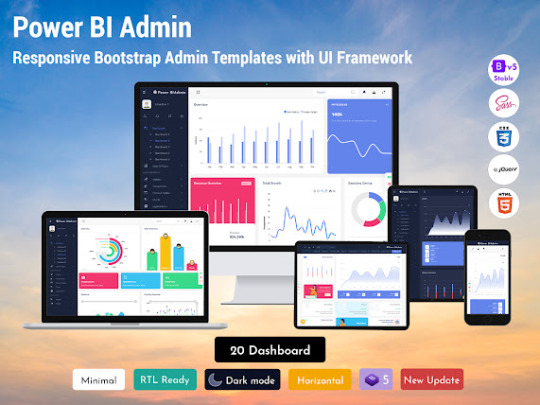
An Introduction to Power BI UI Framework
Microsoft’s Power BI dashboards data analytics service that enables professionals to process, analyse, and visualise vast volumes of data. It helps extract insights, draw conclusions, and share results in the form of reports and dashboards across various departments. It provides an easy drag and drops feature with a range of interactive data visualisations to generate reports and Dashboard UI Design.
What is a Power Bi UI Framework on Bootstrap 5 Admin Panel?
Power BI Dashboard is a single page visualisation to tell a story. The visualisations on a dashboard are generated from reports, and each report is based on one dataset. A single page Software dashboard is known as a Canvas.

Read More : Power BI UI Framework
Like Us


#Power Bi UI framework#Reports Power BI#Power BI Template#Power BI#Power BI Admin Template#Software Dashboard#Software ui framework#Software Design Dashboards
0 notes
Text
every time I have to use Power BI for work I have to fight for my life to not make jokes about how I’m the real power bi here
#niche humor#also power BI is a pain in the ass right now just give me my normal reports i am begging you
2 notes
·
View notes
Text

“If it be your will that I speak no more. From this broken hill all your praises they shall ring”
I’m not shutting up it’s ironic juxtaposition of radical song with a radical feminist reference!!!
#radical feminists do touch#female predator#female dominance#female manipulator#female hysteria#feminism#sex offenders#cest la vie#be your true self#too true#true dat#bi bros#gay bros#bro chill#this is cnn#fuck cnn#liberal hypocrisy#leftist hypocrisy#report#girl power#gay problems#gay culture#drag queen#trans queen#trans woman#southern men#gay ally#male reader#real men#real shit
1 note
·
View note
Text
The shipboard power system market is evaluated at a valuation of $1.78 billion in 2024 and is projected to expand at a CAGR of 7.33% to reach $3.61 billion by 2034.
#Shipboard Power System Market#Shipboard Power System Report#Shipboard Power System Industry#Electronics and Semiconductor#BIS Research
0 notes
Text
Acumatica Power BI Solutions: Driving Data-Driven Decision Makin
Leveraging data to make informed decisions is more crucial than ever. By integrating Acumatica with Power BI, businesses can unlock the full potential of their data, empowering them with real-time analytics, interactive dashboards, and actionable insights.
Acumatica Power BI Solutions bridge the gap between raw data and strategic decision-making, ensuring that organizations stay ahead of the curve.
Streamlining Insights with Acumatica and Power BI
Acumatica, a robust cloud-based ERP system, manages core business processes seamlessly. When paired with Microsoft Power BI, this integration takes analytics to the next level. With features like interactive dashboards, real-time monitoring, and customizable reports, businesses gain a comprehensive view of their operations.
From tracking inventory and financial performance to monitoring production efficiency, the synergy of Acumatica and Power BI ensures actionable insights are always at hand.
Key Benefits of Acumatica Power BI Solutions
1. Real-Time Analytics: Stay informed with up-to-the-second updates through Power BI’s real-time monitoring, allowing for swift responses to dynamic business environments.
2. Enhanced Visualization: Transform raw data into visually compelling reports and dashboards that simplify complex information for better understanding.
3. Seamless Integration: Power BI integrates effortlessly with Acumatica, connecting to multiple data sources, including Excel, SQL Server, and Azure.
4. Improved Collaboration: Share secure and insightful dashboards across teams to ensure alignment and foster collaborative decision-making.
5. Cost Efficiency: Automate reporting processes and reduce dependency on IT teams, making it a cost-effective solution for businesses of all sizes.
Driving Smarter Decisions with Acumatica Dashboards
With Power BI, Acumatica Dashboards have become more than just data visualization tools. They transform into strategic assets, providing insights into operational bottlenecks, market trends, and customer behaviors. Businesses can leverage these insights to optimize operations, improve customer satisfaction, and drive profitability.
Conclusion
Integrating Acumatica with Power BI is not just about accessing data—it’s about transforming it into a strategic resource for decision-making. By adopting Acumatica Power BI Solutions, businesses can stay agile, data-driven, and poised for growth in an ever-changing market. Ready to revolutionize your data analytics? Connect with Power BI Solutions today and discover how real-time insights can drive your success.
#power bi solutions#dashboard#power bi integration#power bi consulting services#power bi reporting#power bi service
0 notes
Text
create custom business intelligence dashboards in power bi
#data visualization#data analytics#data analysis#power bi services#power bi reporting#power bi service#power bi consulting services
0 notes
Text
Al-Hiyal Automation LLC
Al-Hiyal Automation LLC: The Best IT Services Company. Al-Hiyal Automation LLC offers the essential services to meet your needs: 1. Azure Services 2. Software Consulting 3. RPA Services 4. Power BI Reporting 5. Application Development 6. Web Development & Maintenance.
1 note
·
View note
Text
Al-Hiyal Automation LLC
Al-Hiyal Automation LLC: The Best IT Services Company. Al-Hiyal Automation LLC offers the essential services to meet your needs: 1. Azure Services 2. Software Consulting 3. RPA Services 4. Power BI Reporting 5. Application Development 6. Web Development & Maintenance.
0 notes
Text
Al-Hiyal Automation LLC
Al-Hiyal Automation LLC: The Best IT Services Company. Al-Hiyal Automation LLC offers the essential services to meet your needs: 1. Azure Services 2. Software Consulting 3. RPA Services 4. Power BI Reporting 5. Application Development 6. Web Development & Maintenance.
1 note
·
View note
Text
TRANSFORMING DATA MANAGEMENT: HOW POWER BI INTEGRATION STREAMLINES YOUR BUSINESS
Power BI's real-time analytics capabilities allow businesses to stay ahead of the curve. In an environment where market conditions fluctuate rapidly, having access to real-time data is crucial. Power BI’s dashboard updates instantly as new data comes in, enabling businesses to make informed decisions promptly. This immediacy ensures that your strategies are always aligned with the latest market trends and organizational data. Visit our blog for more information!!
1 note
·
View note
Text
7 Essential Tips for Our Most Effective Power Bi Dashboard

Power Bi Dashboard serve as powerful tools for data visualization and decision-making in various industries. An effective dashboard not only presents information in a clear and concise manner but also offers an intuitive and visually appealing user interface (UI) design. In this article, we will explore seven essential tips for creating compelling Dashboard UI Design that enhance user experience and enable users to derive valuable insights effortlessly.
Prioritize Data Relevance and Hierarchy
The first step in designing a successful dashboard UI is to prioritize data relevance and hierarchy. Identify the key metrics and information that are crucial for your users and place them prominently. Organize the dashboard in a hierarchical manner, emphasizing the most important data at the top or center. Use visual cues such as size, color, and positioning to guide users' attention to the most critical information. By focusing on data relevance and hierarchy, you can ensure that users quickly grasp the key insights without being overwhelmed by unnecessary details.

Read More : Power Bi Dashboard
Like Us


#Reports Power BI#Power BI#Power BI Template#Power BI Admin Template#Power Bi UI framework#Power Bi Dashboard#Dashboard UI Design
0 notes
Text

Leverage Intune Power BI reports to gain deeper insights into device management and security. These reports offer interactive visuals, real-time data tracking, and easy-to-read dashboards, empowering smarter decision-making for businesses.
#intune power BI reports#intune reporting solution#intune reporting#intune reports#intune custom reports
0 notes
Text
Master Power BI: How to Build and Customize Reports for Powerful Insights
youtube
0 notes
Text
The global inductive power transfer system (IPT) market is evaluated $27.5 billion in 2024, is projected to expand at a CAGR of 26.1%, to reach $280.5 billion by 2034.
#Inductive Power Transfer System Market#Inductive Power Transfer System Report#Inductive Power Transfer System Industry#Electronics and Semiconductor#BIS Research
0 notes
Text
See the Future Clearly: Vision & Direction with PowerBI Dashboards
Power BI has revolutionized how businesses understand and use data with its powerful data tools. Whether you're a retail manager keeping an eye on stock levels or a marketing executive checking the success of your latest campaign, Power BI makes decision-making easier and smarter. It transforms complex data into simple, interactive visuals that anyone can understand. This not only saves time but also gives you insights you can act on, fast. With Power BI, data isn’t just numbers on a screen it’s a clear path to better business decisions!
Dashboards and reports are key features that make Power BI such a powerful tool. Both serve different purposes in analyzing and visualizing data. To get the most out of Power BI, it’s important to understand how they differ. In this blog, we’ll explore Power BI dashboards, reports, and useful techniques. Stay tuned as we break it all down in simple terms!
Power BI Dashboards
What are Power BI Dashboards? In the context of Power BI, dashboards are visual representations of data that offer a consolidated view. They give customers the ability to quickly obtain high-level insights, track performance, and keep an eye on important data. Dashboards are typically made to show data in real-time or almost real-time. They can provide current information by connecting to a variety of data sources, including databases, cloud services, and streaming data.
Dashboards can employ a variety of visualizations, although they primarily use gauges, cards, charts, and graphs. These graphic components give a brief synopsis of company measurements and serve as key performance indicators (KPIs). As a result, dashboards are usually contained on a single page and enable users to view several visualizations simultaneously. Users may easily understand the entire success of their firm because of this simplicity.
Furthermore, dashboard interactivity is restricted to maintain simplicity. Even after a dashboard is published to Power BI Service, developers can adjust specific visual components or filters for a subset of end users.
Because of this, dashboards will be consulted whenever a fast analysis is required on any kind of screen, including presentation screens, mobile devices, and computer monitors. It is imperative to consider the end user's workflow while creating your dashboard's visualizations.
Power BI Reports
Power BI reports are thorough, intricate documents that offer profound analysis and insights. When it comes to features, they are more advanced than dashboards.
Users can execute ad hoc analysis, delve deeply into data, and examine numerous dimensions with the help of reports. They give consumers a thorough understanding of the data, enabling them to respond to intricate business queries. Interactive elements like filtering, highlighting, and drill-through make this possible. By engaging with the visualizations, users can go deeper into the data and discover new insights.
Reports should ideally be divided into numerous pages or tabs with varying visualizations, tables, and interactive components because they contain so many visuals and other elements. Users can use buttons and bookmarks to go between pages and investigate different parts of the data.
Building A Dashboard With Power BI
You've already won half the fight once your data is organized. All that's left to do is configure a dashboard in Power BI. To construct your Power BI dashboard, take these 6 steps:
Obtain Power BI Desktop
Fill in your Mammoth data
Construct visualizations
Describe connections
Create the dashboard of your dreams
Exchange and work together
Obtain Power BI Desktop
Install Power BI Desktop first. If you're using Windows, you can also get it from the Microsoft Store. As of the time this page was written, the Power BI desktop was not compatible with MacOS; however, Power BI's online service was still available.
Load data from Mammoth
After that, open Power BI Desktop and select "Get Data" to begin importing data. There are numerous ways to import data into Power BI, such as Excel, different databases, and other files.
You must first export the prepared data from Mammoth before it can be brought to you. Mammoth provides several export choices that work with Power BI. The simplest method for importing data into Power BI is to download it as an Excel or CSV file from Mammoth and upload it straight into the program.
Additionally, you have the option to export your data to Google BigQuery or any other database. Alternatively, make a live CSV connection in Mammoth to import the most recent data into Power BI.
Create Visualizations
You can begin visualizing your altered data once you import it from Mammoth. With PowerBI, you have a plethora of options at your disposal to produce the ideal report.
To begin, take these actions:
Select "Create" from the menu on the left.
Data import from a source of data
Select a type of chart; options include bar graphs, tables, maps, and more.
Mark the fields in the data that you wish to see visually.
Use the formatting options to adjust these images until they have the exact appearance you want.
Go to File>Save or Save as> to save the report. Give the report a name, then click Apply.
Define Relationships
Create connections between tables if your data is sourced from several sources. Building meaningful insights across various datasets requires relationships. The relationship diagram view allows you to arrange and establish relationships between tables.
Create The Dashboard Of Your Dreams
When your reports are prepared, you can construct your Power BI dashboard by pinning them as a tile on the canvas. Take a look at these Power BI dashboard templates to get ideas for your design.
By including slicers, filters, and drill-through options, you can make your dashboard interactive. With the ability to dynamically explore the data and concentrate on particular areas of interest, these capabilities enhance the readability of a report for your stakeholders.
Collaborate and Share
Once the design is just right, you can publish the dashboard and let your teammates see it. In Power BI, publishing a dashboard is as simple as clicking the "Publish" button, which causes the dashboard to be uploaded to the PowerBI service. Again, sharing the dashboard is quite easy: you can embed it on websites and other applications, or you can share a direct link to it.
Best Techniques to Make an Effective Dashboard
Here we have outlined the important techniques for the PowerBI dashboard:
Recognize your audience.
Tell the tale right away.
Utilize the full screen.
Emphasize the most pertinent information.
Put the most crucial details in the upper left corner.
Make use of the appropriate visuals.
Employ fewer filters and slicers.
Don't cut the number too thin. i.e., Finish the number rounding.
Conclusion
A Power BI dashboard is a strategic tool that gives your company direction and vision, not just a tool for seeing data. Power BI services assist you in determining a clear and well-informed strategy direction by integrating various data sources, providing real-time insights, enabling predictive analytics, and encouraging collaboration. Use Power BI's capabilities to envision your company's future and steer it toward long-term success.
#Power BI reports#What are Power BI Dashboards#techniques for the PowerBI dashboard#Power BI services
0 notes