#reference notes on helmut lang
Explore tagged Tumblr posts
Text
Hi (nyfw thoughts)
Ok so first I just want to say that this fashion week was so boring and really sums up the kind of good idea drought we’re living in. BUT there was a fair share of discussion over some things so! instead of trying to fit my thoughts about everything on the app formerly known as twitter, I’m just gonna tell y’all here.
Shows talked about in this post; Proenza Schouler, Eckhaus Latta, AREA, Luar, Helmut Lang, Elena Velez and Tory Burch
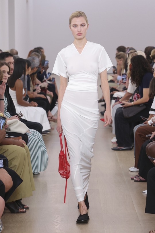
Proenza Schouler
There��s no way Proenza was going to ruffle any feathers this season. They have a loyal following (which I’m sure has nothing to do with the celebrity affiliations of the brand) and a consistent history of people pleasing so they’ll always get their praise from Vogue. They dropped a new monogram which is the only “newness” they wanted to introduce. Jack McCollough said they wanted to continue last seasons narrative and they sure did! (Only thing different was no Sevigny). The clothes are obviously well made and evoke wealth in that special kind of iykyk way. Many people said this looked more like Helmut Lang than Helmut lang did (I’ll get to that later) and they’re not entirely wrong. Not gonna act like I wouldn’t wear this collection but definitely nothing groundbreaking.

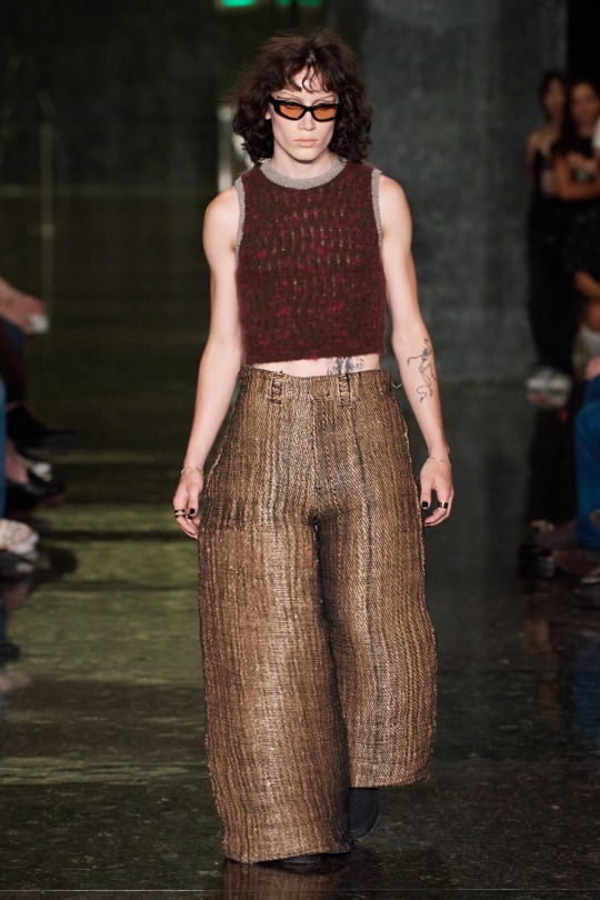
Eckhaus Latta
Eckhaus latta is a brand that has always had a special place in my heart (maybe because I’m from the city that the two designers met and started the brand together in)(maybe). My style has definitely evolved since I first became aware of the brand but I’m always interested in what they’re doing. This season they got experimental! They worked with a 3D printing company named “Unspun” where they came up with jeans made from all different materials like hardware store twine and ikea plastic bags. The way they combined tech innovation and sustainability is not just commendable, it’s very forward thinking, which is a staple in the brands identity. With that being said some of the collection felt directionless in comparison to all of the innovation. The sheer (which dawned their new EL monogram) was very MNZ store to me but not in a bad way. I like that they’re not trying to be trendy and come up with new things however a-lot of brands were doing that so it makes me wonder if that’s a good thing or not.
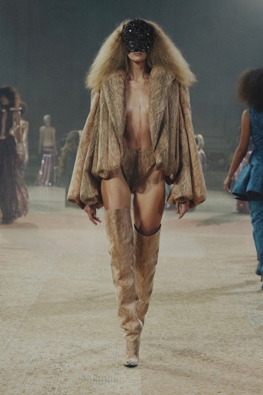
AREA
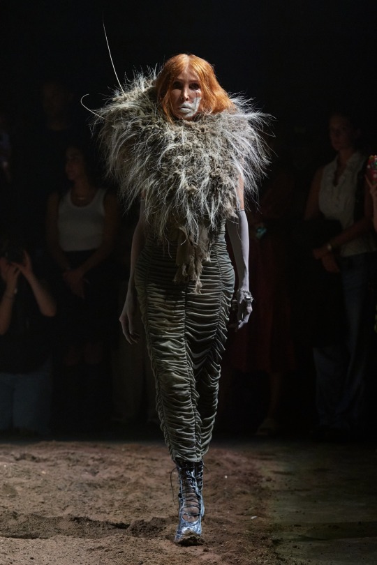
I loved their modern Stone Age ladies. I think it was one of the only luxury focused shows where I was like wow! This is different. The fur printed coats were so gaudy and held its shape in the way good ol’ fur coats used to. I think this collection was really cohesive, adventurous, new. Everyone saw Saweetie wear it at the VMAs and even the unfashionable general public could see the yabba dabba reference. The prehistoric influence was chosen because as Piotrek Panscyzk said “pelts and bones were the first things humans had to build an identity around”. There’s definitely a case for a narrative about how much luxury (the hunger, the status) mirrors pre historic, pre civilized behaviors.
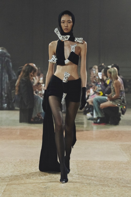
Luar
Raul Lopez is a diamond. This collection kind of came of as a continuation of last season as well but I like this brand so much that it feels good to me. I feel like Raul is constantly playing with this really restrictive, God-fearing way of being and an inhibition-less eternality. Padded shoulders, the top draped from the eyewear, perfect collared shirts, jeans and leather, it had all the perfect Luar moments for me. No notes.

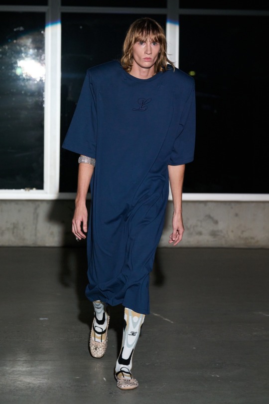
Ok.. now on to the “controversial” shows
Helmut Lang
When Peter Do was announced as the new creative director of Helmut Lang, everyone rejoiced. Why? His strengths as a designer seemed like a natural fit for the brand. Expert tailoring, black and white as a main color palette, maybe a little overlap in philosophy.. but as the outfits came out people’s reactions… were… unfavorable to say the least. People saw the reference to key Lang moments like seat belt bondage, the use of Ocean Vuongs poetry (which I felt was terribly misunderstood), the classic button up and jeans as disappointing instead of nostalgic. For me, personally, I think everyone’s expectations were rooted in something that Peter Do could not have delivered. That expectation being Helmut Lang himself. People saw Do as the second-coming and that’s just the truth but where do we draw the line with our expectations on reliving the past and how do we honor the kind of openness necessary to evolution? I myself had to sit with the collection and came to the conclusion that maybe Peter is just defining a clear end to the Helmut era of yesterday and the start of his own journey now. After closely looking at the collection and it’s details you can see how wonderful the clothes really are. It is everyone’s responsibility to question and examine the things they “care” about and I think this fashion public is not patient enough for that. It wasn’t the greatest debut but it also wasn’t the worst. Anyway we’ll see what comes next.

Elena Velez
Mud gate ss24! Since her NYT article last year, people have been really fed up with Elena (I learned only after the mud fight started to circulate) and she doesn’t really seem to mind, she seems to like it actually. She argues online, she argues IN lines, she doesn’t pay people adequately and the list apparently goes on and on. This collection is called “the longhouse” and in her press release she says a lot of things about the commercialization, sanitization, condemning and control of womanhood, she talks about anti-heroines and contemporary female evil (which she loves to embody I guess) and she says that this show was ritualistic catharsis from oversocialization. I think it’s pretentious when someone has to use so many complex, institutionalized words to convey their message. She’s speaking in code. To be honest I like her clothes but I don’t think her designs are that original. I really want to raise the question who does her message benefit? We should all be allowed our multiplicity in this life, that’s true, but being a bad person in practice is something I’m personally not attracted to. I’m a little confused but it is what it is.
SPECIAL SHOUT OUT TO TORY BURCH!!!!
Who I think should be receiving a cease and desist from Miuccia Prada any moment now. This collection is such a departure from the Tory Burch we all grew up with. This must be that post divorce clarity. I like it! It’s 60s. It’s Prada. It’s miu miu. It’s Tory Burch now too!

If you made it this far I really appreciate you ♡ this was just for ki’s sake. It’s not my most critical thinking to date but there was discussion and I loved that. I wanted to contribute and this was the best way I could think of. Lmk if I should do this again with lfw!!
#nyfw#new york fashion week#eckhaus latta#proenza schouler#area#ss24#spring summer 2024#helmut lang#peter do#elena velez#luar#tory burch
48 notes
·
View notes
Text
What's the vibe? #54

Supreme is collaborating with MM6.
Cote D'Ivoire won AFCON on Sunday.
2024 LVMH Semi Finalists have been announced.

NYFW FW24:
I think this is slowly becoming my favourite Fashion Week - away from the hype and conglomerate madness, it's about the weird, the experimental.
INTERVENTION: Mall of Anonymous (Berlin btw) by Shayne Oliver featuring Anonymous Club, Olly Shinder `refucked by NOVACAINE,´ a selection of Hood By Air ‘MUSEUM’ archive pieces and Gerrit Jacob. Presented by Reference Studios as part of Berlin Fashion Week, set design by Tor Studio.


Sandy Liang - 10th year anniversary of the brand - it's about going from girlhood to womanhood


Helmut Lang - again Peter creates another collection about the immigrant experience - the Ghana Must Go prints, the bubble wrap texture, the body as a travelling vessel - protect and project


Collina Strada - titled "STRONGER" - pushing back against maybe weaker depictions of women


Proenza Schouler


Eckhaus Latta - beauty by Daniel Sallstrom
About the self - some text from their show notes
"YOU ARE A LOGO
BE THE LOGO
MAYBE YES MAYBE NO
I WANT TO PREACH WITHOUT SPEAKING
AND NO LONGER FEEL
THE TIGHTENING OF MY CHEST
WHEN THE IDEA OF TIME
COMES INTO MY BODY
HOLDING THE DOOR FOR A GHOST
IN THE TECHNOCRACY
IT IS ALL SPINNING
THE HOLES ARE GOOD
(HOW MANY HOLES IS TOO MANY HOLES?)
YOU LIKE THESE HOLES?"


Things to look forward to culturally?
Beyonce! Going cowboy!
youtube
Museum as performance space - gaining legitimacy in one of a kind performances in a unique setting. I guess similar to what the ICA are doing but they're getting the good stuff in terms of curation.


I think that alongside the high costs of everything, the audience that artists have to deal with today are much more either segregated class-wise or not used to seeing continuous art and being able to evaluate it/ seeing it as a "little treat". (see for example: The TikTok kids who saw Steve Lacy or Mitski's current tour) For example, think of any major exhibition today in the UK and the cost of tickets usually range between £16-20 esp London. Meaning people usually see the extremely popular things that have been tried and tested and the more experimental/local/DIY things are left behind. It also means that the general public's tolerance for maybe I'd say the "Avant Garde" has decreased over the past 10 years. If TV is the most accessible medium, think about what's on regular tv sans Netflix (which is already extremely sanitised)...there's this extreme lack of maybe kooky music/culture programming that explores and interviews artists of the day in an accessible way or just regular toned programming which allows people to know about each other (See Raven's Row exhibition from last year?)
Things coming up this year:
Reading List:
1 note
·
View note
Text
Helmut Lang Spring 2024 Fashion Show
Peter Do’s Helmut Lang Revival
Helmut Lang, known as a designer’s designer, quit at the tip of his career after alleged disputes with Prada Group's CEO Patrizio Bertelli on how the brand should be continued. And after Mr. Lang had sold his remaining shares to Prada in October 2004, he left his label in January 2005. The high-end luxury brand was later acquired by Fast Retailing and went into several changes.
The appointment of Peter Do earlier this year, a designer hailed as one of America's most exciting and promising new talents, signaled the company's ambitions to make the brand relevant. Now Do is filling the shoes of one of the most famous and influential designers of the past quarter of a century.
Peter Doe was overcome by the "A's" syndrome, he wanted to be Helmet Lang's best student ever. Do used several archival references in the show, although he insists it is all from scratch, yet it is noticeable in the collection – slim suits, bubble dresses, indigo denim, tank tops - he made sure to incorporate elements of his background as an Exotic Vietnamese-American designer. Yet, the collection was a bit flat and lifeless IMO. Nevertheless, it is well known that the first collection is always a sketch, a libretto. Debut shows tend to be a bit superficial. That is normal. Hopefully, by next season, Do will find the strength to put the method book aside and start doing it the way he feels it should be.
The show's highlight and emphasis were on tailoring. The collection's sharp suits, clean shirts, and rugged denim create a foundation that Do will build upon as he continues to make his mark on the heritage brand.
In lieu of show notes, Do offers a poem by his friend the Vietnamese poet Ocean Vuong, in which he muses about things like cars, the American dream, and family — One of the models also carried a book by Ocean Vuong. A series of crisp white poplin shirts and T-shirts were printed with snippets of an original poem. In the show, every five models wore one of the stanzas, some printed in Vietnamese. Do said that they sampled 30 different poplin shirts to find the right fabric.
The set was a minimalist industrial space, empty except for excerpts from Vuong's essays projected on the runway before the show. Earlier this week, the brand introduced the show with taxis displayed with Helmut Lang's logo (he was the first designer in the '90s to advertise on taxis). Do also photographed the famous Helmut Lang taxi advertisement and turned it into a print on sheer shirts.


1 note
·
View note
Text
“The label is not in the business of reissuing the founder’s designs but iterating on them—from a distance. It’s been 16 years since Lang left the company, so what’s familiar now could be Old Lang or After Lang. It really depends on who is looking. “I think someone who’s 25 maybe doesn’t know Helmut Lang from back in the day, but they like [the brand],” observed one of the team members. “Why? I think it’s because Helmut Lang always designed things you could live your life in, like five-pocket jeans. We’re not following this other path a lot of fashion brands are going down, which is hype and fast and crazy. We’re giving you really accessible things that can always evolve every season, that you wear every day, but there’s something special to it. You can wear something Helmut from 1995 today; it will still look amazing. I think that was the magic that he had.”
//
Helmut is known for having redefined the 90´s fashion scene with his minimalist designs. He was the head of a movement that represented a generation of young artists in their mature phase, dressing them up with monochromatic garments while adding some fine technical touches with most of his pieces made out of common materials.
In this post we focus on his iconic ballistic vest, which was released within the SS 98 Collection. What made this piece stand out once it was presented is the fact that it is a technical garment which comes from a diametrically opposed world to fashion. Helmut transformed it, creating a subtle and elegant piece. The range of colors chosen for the vest is very sober, which has helped to build up the timeless image that characterizes this piece. Among them, we find black, olive green, white, white/navy, black/navy and navy/white. In the FW 98 Collection the vest also appears in an off-white version as well as in a silk grey finish.
//
“Quintessential minimalism” springs to mind when thinking of Helmut Lang, the namesake label of Austrian designer Helmut Lang. He is arguably one of the most influential designers of the last three decades (although Lang himself retired from fashion in 2005 to fully focus on his art career,) and his legacy still resonates across runways today. The iconic designer pioneered minimalism in the ’90s with his sharp-cut tailoring and androgynous, utilitarian pieces adorned with bondage straps and harnesses.
He introduced streetwear to high-fashion, invented the designer jean, modeled garments on bullet proof vests and was a trailblazer experimenting with technical fabrics, fabricating the military bomber jacket. He was also one of the first designers to show co-ed shows, and he broke new ground in 1998 as the first designer in history to stream a runway show online.
Lang created a new design language, changing the idea of what luxury is, and his oeuvre is still shaping fashion to date – inspiring everyone from Calvin Klein to Raf Simons and Kanye West, along with a string of streetwear brands.
Helmut Lang was born in Austria in 1956, and began designing in his hometown Vienna in 1977 despite lacking formal training. He first showed in Paris in 1986, which is also when he founded his label.
He later teamed up with the now legendary British stylist Melanie Ward (who had discovered and put a teenage Kate Moss on the cover of The Face in 1990), and she became his creative director and muse for 13 years, proving instrumental in ushering in the golden era of minimalism. They relocated to New York in 1997, and the already influential mover and shaker Lang decided to show ahead of the New York season, with other designers following suit, and because of this to this day New York designers show first.
Between 1990 – 1999 jeans, underwear, footwear/accessories along with perfumes were added to the brand, and Lang was the first in the fashion industry to place ads, as well as in National Geographic.
Then in 1999 Prada bought 51% of Helmut Lang, at a time when the company was doing about $100 million in revenue. But by 2004, that total had plunged to about $30 million, which – according to the New York Times – was a result of Prada cutting back on the profitable denim line. Lang left his own label in 2005, and Prada sold the company the following year to the Japanese Link Theory holdings.
Helmut Lang the label was in decline and saw several designers at the helm since Lang’s departure. The turning point came in 2017, when the label announced a relaunch to return to its former glory. Reverting back to the original logo along with a black and white campaign shot by Ethan James Green and a shiny new digital identity, the relaunch was spearheaded by Dazed and Confused’s editor-in-chief Isabella Burley. She was appointed as the first ever editor-in-residence, to oversee all creative aspects of the brand and tap individual designers for solo collections. The label also announced the “Helmut Lang Re-Edition” – authentic reproductions of some of the brand’s staple pieces – and fashion critics and fans all over the world rejoiced.
Shayne Oliver was the first one out debuting in September at New York Fashion Week that year with a diverse cast of underground models sporting gender-fluid silhouettes with bondage influences. He was followed by Mark Thomas (creative director of menswear and womenswear) and Thomas Cawson (creative director of Helmut Lang jeans) for two seasons, and together they have provided a contemporary take on the classic, minimalistic Helmut Lang-style from the ‘90s. Casting the likes of Kanye West and Solange Knowles for the Exactitudes campaign and tapping Travis Scott for a capsule collection has no doubt helped the label to reclaim its position at the forefront of fashion.
/
Precise, intriguing and quietly subversive, Helmut Lang's original output (1986-2005) is recognised as one of contemporary fashion's defining moments. Striking an extraordinary balance between modern tailoring, vintage militaria, cutting-edge streetwear and avant-garde conceptualism, Lang's influence continues to have a lasting impact among the fashion community today.
THEORY
Founded on the principle that a piece of clothing can—and should—be both comfortable and alluring, Theory creates styles lauded for impeccable fit with a modern point of view. Emphasizing superb craftsmanship, the brand's classic silhouettes are refined by current trends and interesting fabrics, resulting in pieces that wear well and remain relevant season after season.
3 notes
·
View notes
Photo

New arrivals in the archive: #HelmutLang tops in bias cut fine plastic from S/S 1995, a collection inspired by 'Parisian chic, Hawaiian surf culture and the beat of techno'. 🍭 I sometimes see these pieces referred to as 'Bowie' tops. To me, Helmut Lang's references are never this literal. The neon colours and sporty angular shapes remind me more of retro windsurf sails. The fabric is a finely woven plastic material with a lustrous surface that has been subjected to various printing methods, resulting in opaque, translucent and transparent sections. Heavier versions of this fabric type are commonly seen in market bags, geotextiles. Note the hand-sewn engraved metal branding and subtle finishing variations - even though both tops are from the same collection, their constructions are completely different. 💙 #endyma #helmutlangarchive #helmutlangvintage #vintagehelmutlang (at ENDYMA) https://www.instagram.com/p/CbdBx2pNMdz/?utm_medium=tumblr
12 notes
·
View notes
Text
Peter Do Spring 2022 Ready to Wear
New York Fashion Week loves a debut show. Anyone and everyone from press offices to marketers greet the occasion with a flurry of attention in hopes to capture what may be a defining moment in modern history. For Peter Do and his team, their debut offering for their New York-based label reflected on the celebratory relationship of their immigrant status and the place they call home- New York City. Well, at least that is what they hoped to show. Each founding member of the brand has an Asian heritage where China, Korea, and Vietnam are represented with pride. Per the collections show notes, the team wanted to ensure viewers realize that despite the event marking their runway debut, this endeavor was indeed their 7th ensemble to date. Given this, the 46-look’s presented took on a format similar to Charles Dicken’s novel A Christmas Carol. Concepts marking the past, present, and eventual future work were explored in hopes of reflecting on and furthering the early legacy of the city's hottest label. “Lighter and Fluid” are the defining characteristics outlined by the team and epitomize a look that intensifies formalities for those obsessed with the pristine and kept. In short, Do’s outing was an aesthetically pleasing montage of chic clothing that renders itself to a clientele focused on an architectural wardrobe. Though, the result had many a reference to a past not entirely established by Do. They say the greatest form of flattery is copying, but when viewers are unaware of historical references, perceptions will trickle down into a dangerously falsified version of reality no matter how progressive it appears on the surface.
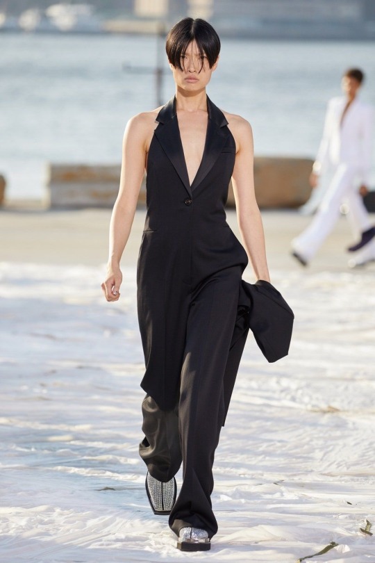
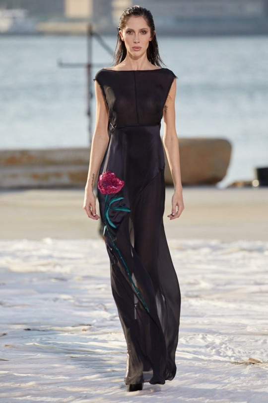
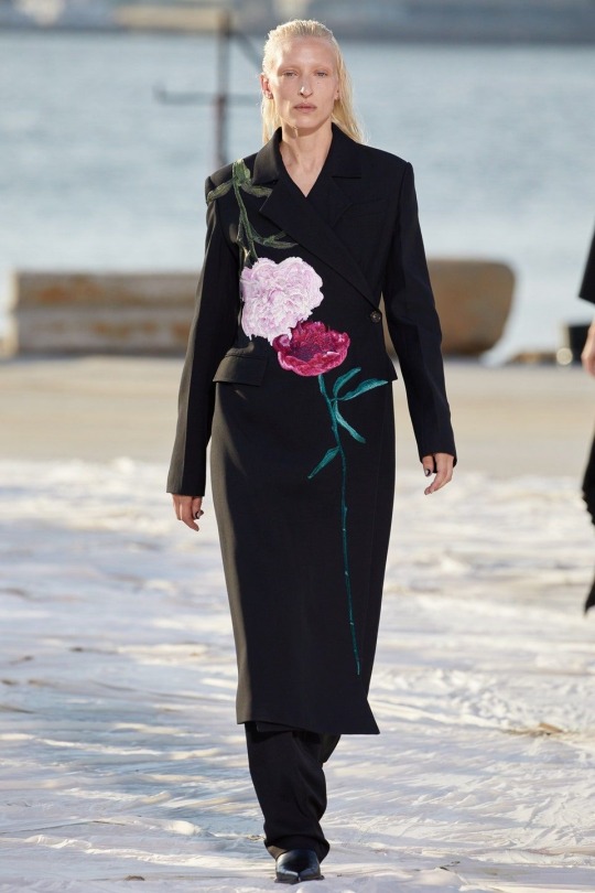
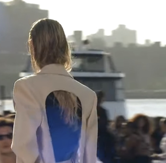
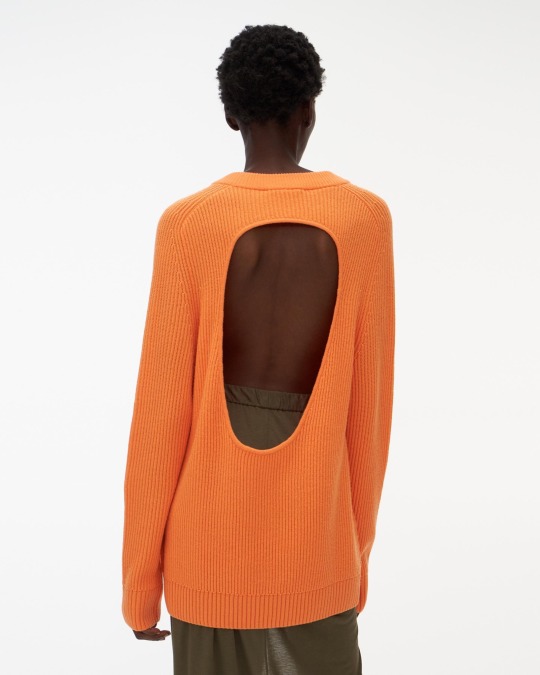
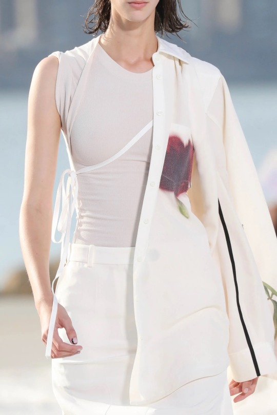
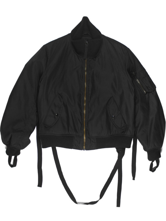
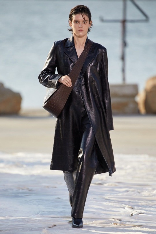
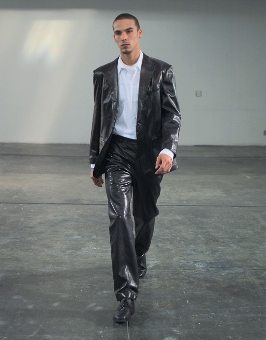
New York City indefinitely has the most magnificent skyline to accompany its picturesque views. Set in Green Point Brooklyn and facing the West Side of Manhattan, a clear September evening painted an image of peacefulness and absolute beauty for the stage. The collection opened on familiar territory. Lean overcoats cut to the calf resemble a style now synonymous with "The Do" silhouette. These classic lines, representative of a reflection of the past, included variations of functional vents. Formed through slits placed on the back and along the side, the pieces allow for an appropriate seasonal functionality as the weather begins to warm. Oversized suiting was an option all but present in former collections. Missing out an opportunity to showcase involved tailoring, the option to include the XL fit felt a little too close to a style exercised by Helmut Lang in the early 2000s. The cracks in the showcase began here. Unbeknownst to the viewer, the display began to take on a second act of the Helmut Lang universe. Wide jackets and two-toned or combo trousers made an appearance, yet the shape again felt too related and tried. Look 7- a white blouse with a decorative pocket- revisited a method of applying straps of fabric to support the garment on the body- another direct reference all too familiar to a style imposed by the Austrian turned Long Islander. A transparent knit dress in white styled over a pair of trousers also felt inspired by Lang, as did look 15’s leather pant and trench combination. Back cutouts found in the outerwear take shape in a circular motion. Curios but edgy in detail, the placement, and surprise of such a pattern unveil's interest, yet upon the realization Lang did it first, the style is anything but original and fails to appeal once again. It is easy to access a tone of disapproval for the striking similarities. Much of what Do provides has been done and seen before. American fashion is built on sportswear and a style that craves function and utility. By tapping into this look for the season, viewers feel a jolt of pride and understanding knowing such an aesthetic is profoundly relevant and would be praised for its minimal response to life’s current challenges. But not here. What has been done in the past is history. Realizing this and failing to acknowledge the former work of someone as influential as Helmut leaves a poor taste in the mouths of fashion enthusiasts who do not deserve such blatant, forced association.
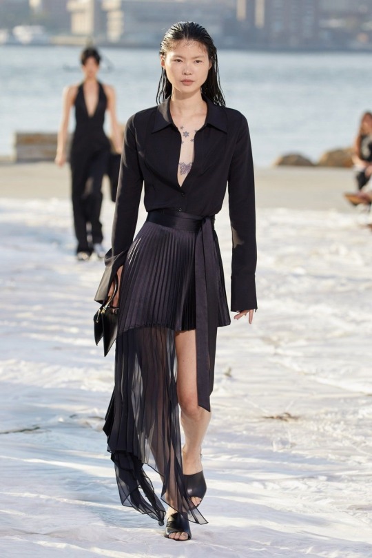
For the present timeframe, a mealy of oversized t-shirts with dropped shoulders breathed something fresh and contributed to the simplistic, fluid direction of the proposed thesis. More inclusive of the brand’s trademarks was an asymmetrical pleated wrap skirt extended to the ankle and a finely tailored jumpsuit that pooled to the floor- the latter being a proposal unfamiliar to the label. Finishing the collection on a high note was important. What started as a scene all too familiar concluded on an uplifting key. The future looks offered a detailed oriented and more personal feel- an element largely missing at this time in fashion. The last ten or so looks granted viewers an ultimatum of direction. A minimal past or a decorated future? The answer proved to be the latter. Through decorative embroideries and finishes, a luxurious undertone swept away any lost hope that change was out of the coming equation. Embroidered into overcoats, fitted blazers, and on the side of a bias cut evening dress, large and colorful floral motifs point to a more decorative era in the house of Peter Do. Newness is always good, and when the addition of accouterments relates to a narrative- the result borders on the terrific.
In a slight twist of irony, the revival of the label Helmut Lang took place just days after this runway presentation. The unfortunate actuality is that Peter did Lang better than the label that bears his name had. Given the hype placed on this debut and the resulting work, one may hope the label would have strived for an actionable approach that is current and pertains to the present. T-shirts are not enough. The flashback to seasons past seemed unimportant as fashion is at a critical juncture. Anticipating an authentic voice to stir the waters of change and representation, this letdown resulted from Do failing to seize this moment and deliver upon the notion that he is the voice of the next generation. Although, the conclusion of the show did prove he has more to offer. Here is to hoping he will find his voice and be back on track come next season. New York fashion desperately needs it.
5 notes
·
View notes
Text

With this piece I was focusing on the lining which I think went pretty well and I do like the over all piece, but if possible it’d be cool if I could get some help with the jacket? Something looks quite off about it, maybe the sleeve? (it’s supposed to be a windbreaker) the highlights also don’t really look as good as I’d hoped, if you could give me some tips on making them look more seemless or less out of place maybe? Thank you!

https://www.grejfreak.dk/shop/57-overtoej-til-maend/958-5-11-packable-jacket-windbreaker/


Windbreakers are rather crinkly material. Not very flexible, so the lines forming over a coat like this are usually pretty geometrical. ( See the triangular folds on the reference above). You’ve already made note of that around the shoulders and sleeves. However, with the material being as thin and “crisp” as it is, I would make the edge of the outline of the coat look a little bit sharper/pointier.
Personally, I think less is more in terms of textile folds in the drawing. That’s why I’d probably focus my folds and wrinkles around points of compression, as it gives a clear image of where the fabric is being tugged in or twisted. Thusly, I haven’t drawn in that many lines on the coat where there is little to no tension ( chest, left side of the lower quadrant of the torso. arms minus the crease of the elbows ). This vetting also makes sense with the detail level in the rest of your drawing.
My main points of interests being the nook of the elbows, the armpits and the slight stretch that is going on in the dent between the character’s left side and arm, as he is turning ever so slightly in the image.

In terms of light. Polyester ( which is typically part of the blend of a windbreaker, along with nylon ) is relatively reflective. Meaning that it’ll receive light and spread it through what we in more digital terms call ambient occlusion ( the spread of light on an object from an ambient light ).
This fabric blend doesn't typically boast highlights unless the textile is coated with some type of glossy overlay ( like some raincoats are )

https://www.italist.com/dm/men/clothing/coats-jackets/raincoats/helmut-lang-long-pvc-raincoat/10492875/10662514/helmut-lang/
However, if you want to add highlights for the aesthetic, then I recommend you first laying out the ambient light across the figure. In your original drawing, the source of light was included as a mid-tone. The direction the light came from was not abundantly clear to me, so I followed the shadow from the coat’s midsection and build my way from there ( somewhere slightly off-centre of the character).

Adding highlights after localizing the ambient light a bit more made me able to dot in some highlights. Now, highlights just like ambient light, all follow the same direction. In case of the example above- they would all be situated facing towards the light ( every highlight sits towards the right, but can stretch to the left depending on how they’re orientated towards the light).
If you want your material to look really glossy - you can add rim light to your drawing. The rim light is a small local light that doesn't necessarily face the light-source itself but outlines the character or object on the darker portions.

https://www.pinterest.es/pin/301952350012266432/?lp=true
Rim light is often used as a stylistic means rather than a genuine lighting-technique. Often as a means to superimpose characters on top of a background for clarity, or to invoke some feeling of aura. It gives the character in question a slightly graphic look.
- mod wackart ( ko-fi )
120 notes
·
View notes
Text
S/S 2020 Fashion Month: A Basic, Uneducated Fashion Heaux’s A-Z of Everything Noteworthy (Part 2/3)
Hi to anyone reading,
Back at it again with the giving my unsolicited opinion on 2020′s spring/summer offering, I’m gonna hop straight into part 2 of my fashion month review!
Sorry to start with an underwhelming few but my compulsive tendencies are making it really hard to break out of this alphabetical structure (cry laughs whilst thinking about how long it took me to face up at my retail job last night because it would give me vaguely homicidal urges and make my fingers tingle every time a customer moved something slightly out of line), so I’m gonna whizz through a handful of collections. First up, Halpern:
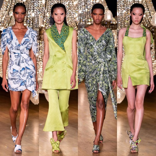
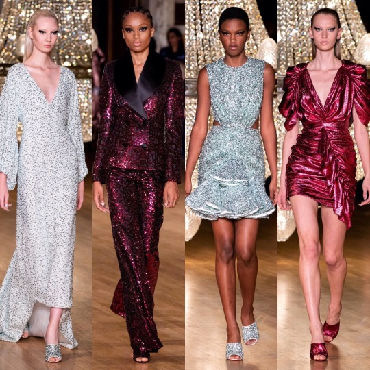
Not much to say but I’m envious of the heavy liner (my hooded eyes could never) and I like the colour scheme. As for the 80s style metallic pink dress?

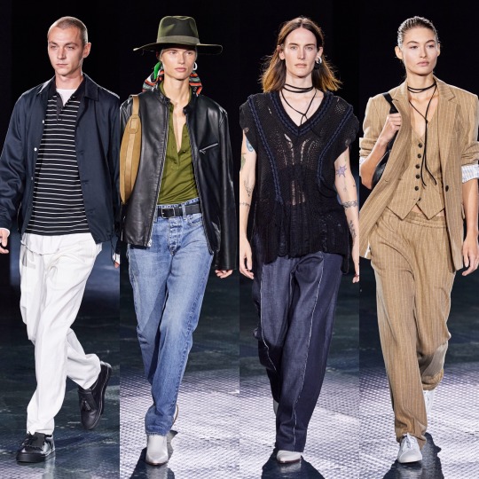
Helmut Lang:

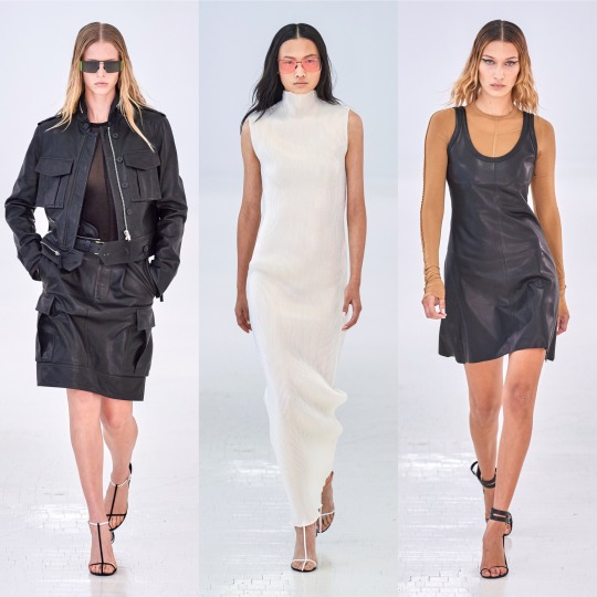
And Hermes:


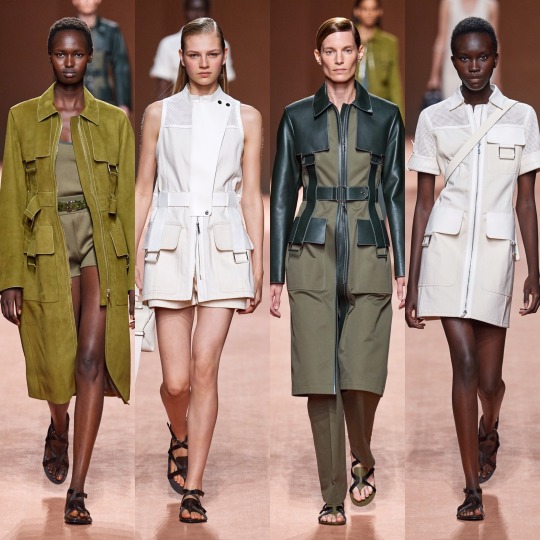
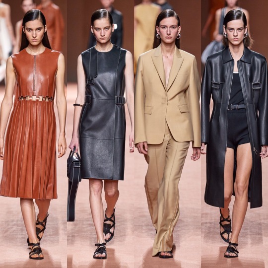
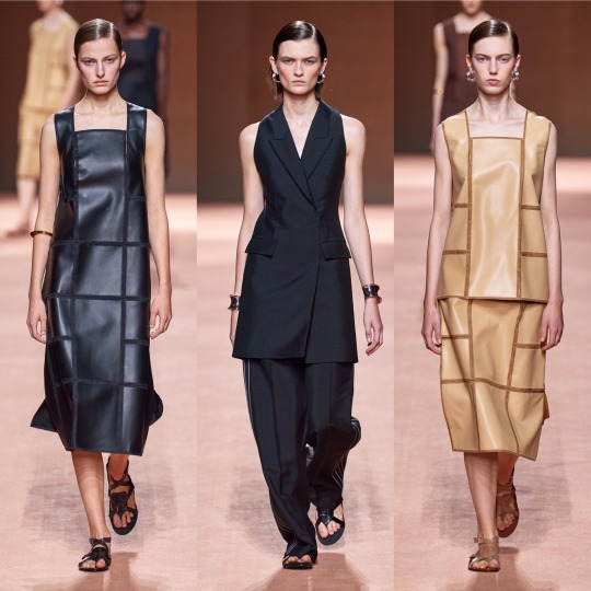
Of these 3 collections, Hermes is definitely the most interesting. I like the colour scheme and the utilitarian shapes and the tan coloured jackets are an absolute shoot. This is how you make safari look fresh, D&G take note.


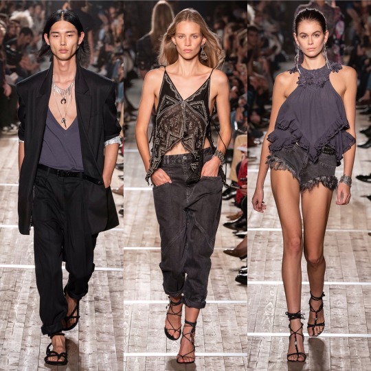
Isabel Marant was okay. It’s cute, sure, reminds me of something Mary-Kate and Ashley would’ve come out with/worn in the 2000s, and there’s definitely some things I would wear, but I wouldn’t say it looks all that luxury. Pricey, sure, but like, Free People pricey, not designer pricey. As a collection, it’s not all that conceptual, unless the concept is L.A girl does a Starbucks run after her bikram yoga class. What I will say though is that some of the S/S 2020 commercial trends are becoming clear: white cheesecloth pieces, peasant blouses, cowboy boots, scrappy sandals, neutral tones, and bandana print.
Now onto the darling of high fashion Twitter: Jacquemus.
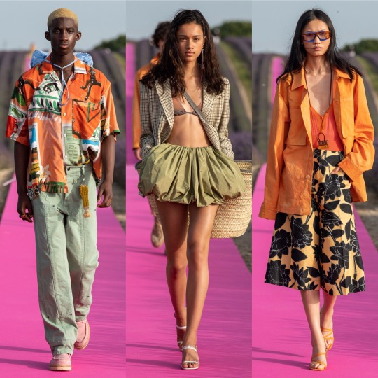

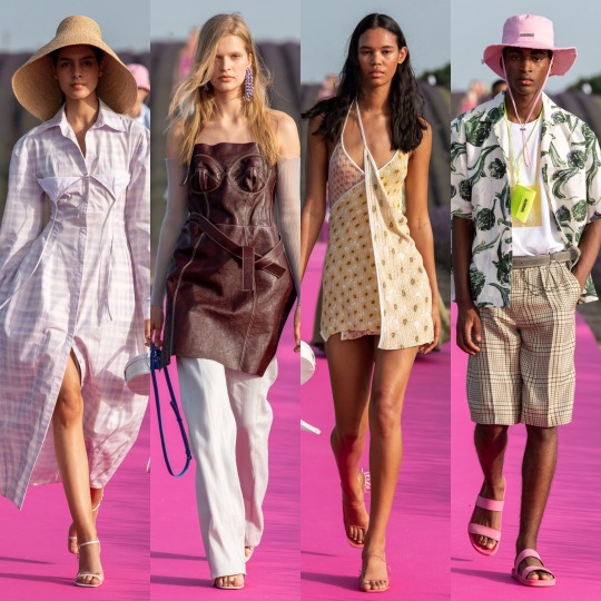
As far as presentation goes, this has to be one of my favourite set-ups of the season; a hot pink runway running through a lavender meadow is as canny and serene as those who sing the praises of Simon Porte Jacquemus would have you expect, and the clothes were easy, breezy and beautiful, even if there is an element of getting dressed in the dark going on with the styling which put me off including a few otherwise gorgeous pieces. It might not be 100% my style but you can tell this is a brand of the future which is only going to go from strength to strength.


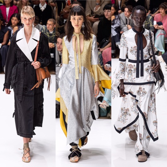
And everything was beautifully and purposefully crafted on the runway with J.W Anderson this year. The pieces are graceful and timeless whilst still easy to envision as something a modern woman would throw on to (very fashionably) run some errands in the city. This was also one of the handful of shows (IIRC! This might be a case of extreme deja-vu!) where we saw the sandal straps tied over the trousers, I’m guessing to accentuate the ankles, and...I’m surprisingly here for it? Though in a sense it kinda resembles when I accidentally get my work trousers tucked into my slipper socks, it’s an interesting touch and adds a bit of a shape to otherwise billowing bottom halves.
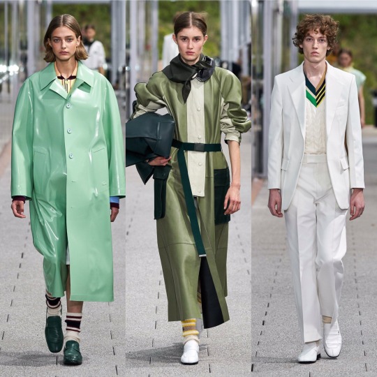

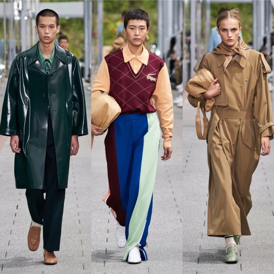
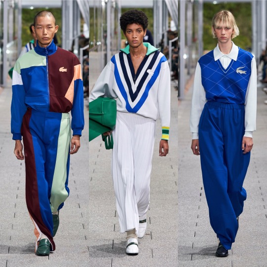

Following Jacquemus’ lead (or vice versa, I’m way too deep into this fashion month haze to work out who went first at this point), Lacoste also put on a co-ed show. Otherwise crisp and preppy as per, the neckerchiefs (even if seeing them all next to one another does give off a bit of a Disneyland Main Street barbershop quartet vibe) and vinyl/wet-look/PVC/I’m still not sure what differentiates the 3 coats were an out of the box touch for them and I really liked it. It’s athleisure, but more like something Hayley Bieber would’ve worn as part of her Princess Diana inspired shoot than anything I’d wear to the gym.
LMAO, as if I go the gym. But you get my point. Next, Loewe:
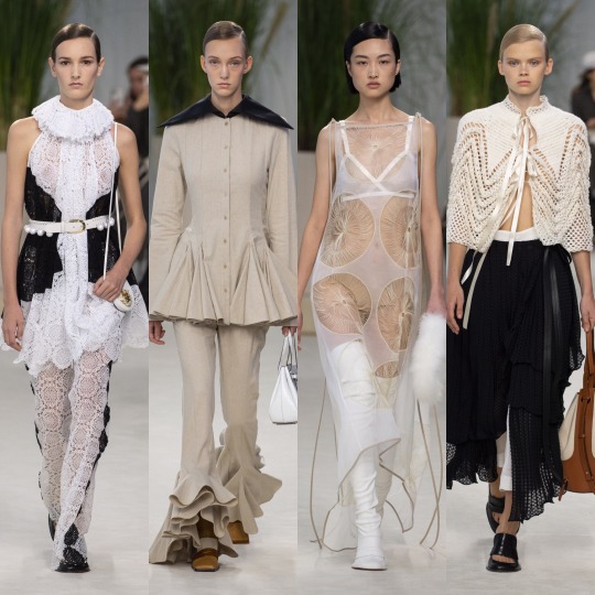
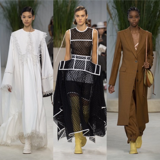
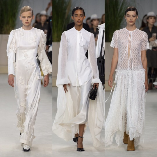

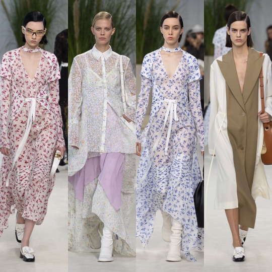
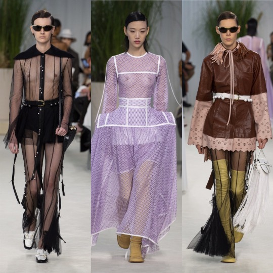
Delicate, feminine and all around delightful, the S/S 2020 Loewe collection is up there with Chloe and Brock when it comes to most spring appropriate. More chiffon, lace and doily-like detailing, please, the old woman in me lives for this kinda thing made fashionable. Like with J.W Anderson, you can tell the design team wanted to do something different without just throwing shit onto their pieces for the sake of being wacky, and so we end up with these dramatic, slightly geometric waistlines and almost angelic Victorian nightgown inspired dresses that kinda make me wished that 1). ghosts existed and that 2). I lived back in that era so I could die some tragic death wearing any one of the dresses on the left in the top 3 rows and then haunt the shit out of everyone. That would really be an iconic fashion moment. Also wonderful, imo, was Louis Vuitton:
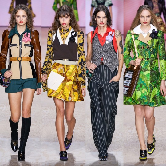
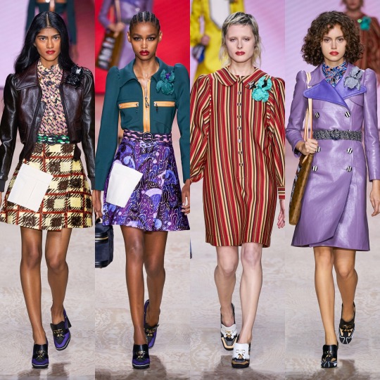

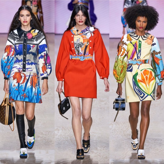

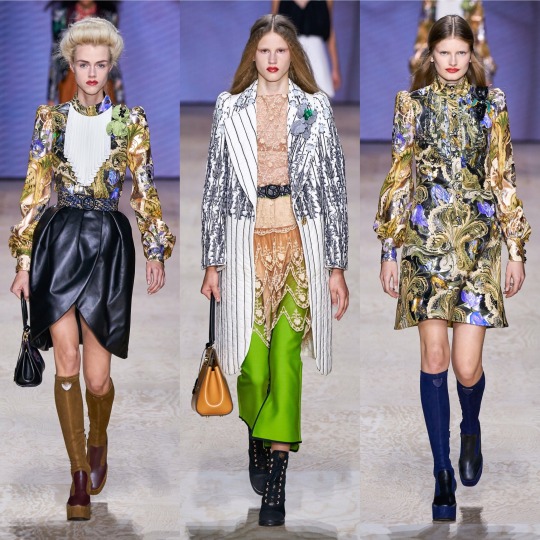
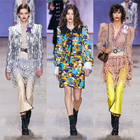
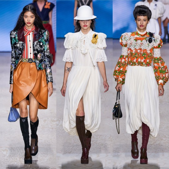
The mix between 60s and Edwardian I never knew I needed, as opposed to Gucci’s forward thinking take on the former decade, Louis Vuitton takes it back even further and throws in late 19th/early 20th century structures and references. I adore the what seems to be a mix between brocade and paisley print and the exaggerated collars are a very cute touch. The jacket on the top left is a highlight, a more neutral version of the similar catsuit seen at the Longchamp show (I couldn’t personally pick enough highlights from that to include it), and I now more than ever really want to try and pull off a sweater vest. The shoes might not be the most exciting thing ever but they’re also a personal favourite, from the knee high boots to the loafers with the LV moniker.


Maison Margiela was very cool and again, I’m in love with the shoes and just the accessories in general, ESPECIALLY those hats. I don’t know if I’m way off base here but this show is almost a modernised, fashionable version of a 1940s period drama about WW2 pilots and evacuees. Yes, maybe I am just getting that solely from the trench coats and the naval influences and the exaggerated collars but I think with that list I made quite a case for that perspective, right? Right.


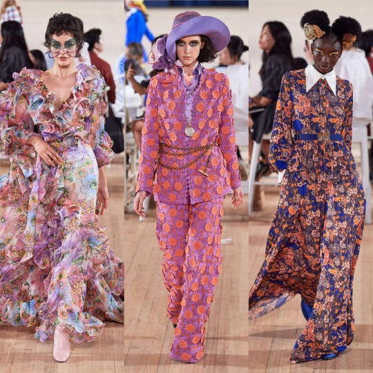


And completing this holy trinity (appropriating the term I usually reserve for Emma Watson, Emma Stone and Emma Roberts is not without careful consideration) is Marc Jacobs. One of my ultimate favourites of this season, this collection is absolutely EVERYTHING: kitschy, dream-like, whimsical, over-the-top, and totally appropriate for your slightly eccentric aunt who always drinks too much wine and talks a lot of shit every time she comes over for dinner. I really feel like I walked into wonderland looking at this collection, and in the best way possible, it gives me a female Russell Brand in the 2000s’ wardrobe on crack. On the one hand we have these insanely beautiful and ethereal chiffon floral dresses but then we also have fricken top hats. Basically, it’s everything I love about fashion and I don’t know if anything can top it. Periodt (and I type that with a totally straight face).
Next, onto another personal fave, Marchesa:
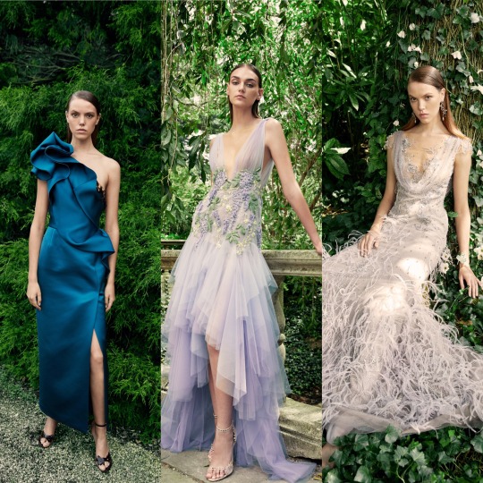
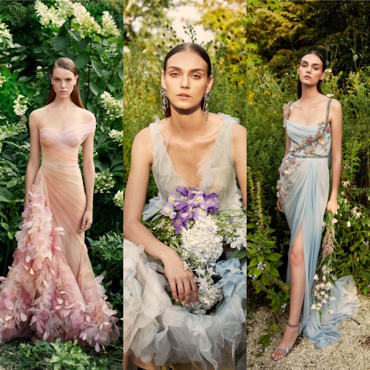
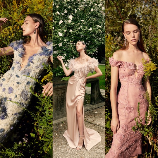
Which is as always, beautiful. I was going to write that if Disney princesses came to life and lived in the modern world (so, in other words, Elle Fanning), they would be wearing Marchesa and then I remembered that the film Enchanted exists and had a lightbulb moment and thought OH MY GOD IF THEY REMADE THAT IN 2019, THE DRESS ON THE RIGHT IN THE MIDDLE ROW WOULD BE A PERFECT LEVELLING UP OF THE CURTAIN DRESS.
Anyways, favourites of the favourites are the bottom row; I would die for that feather trim.
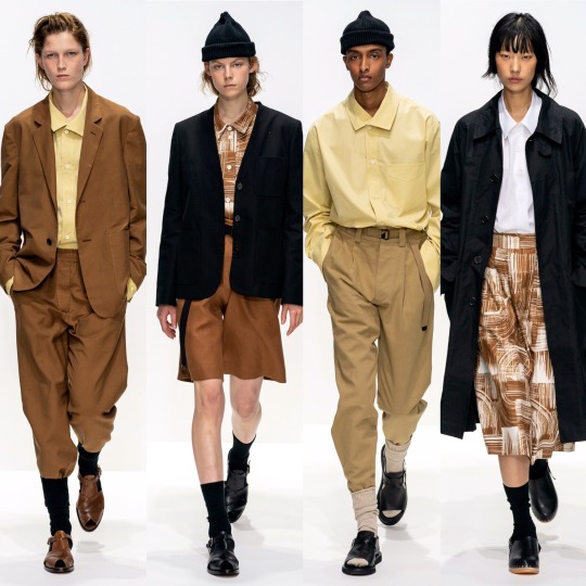
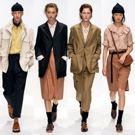

BUT where Marchesa is everything opulent, overly ornate and err-ing on “fussy”, Margaret Howell’s S/S 2020 collection is completely stripped back and just as effective, if not as to my taste. Very cool, very current, and altogether effortless (in a good way!), with this show Margaret Howell made mid-20th century utilitarianism relevant. I never thought I’d be praising the combination of bermuda shorts, crew socks and a beanie and yet here I am. Character development.
Next is Marine Serre:


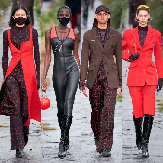
Which I really like! The bottom row isn’t really to my personal taste but I can acknowledge that if I saw somebody wearing any one of those outfits I’d think they looked sick, and as for the first two rows, those mesh tops and the slightly chintzy florals are right up my alley.
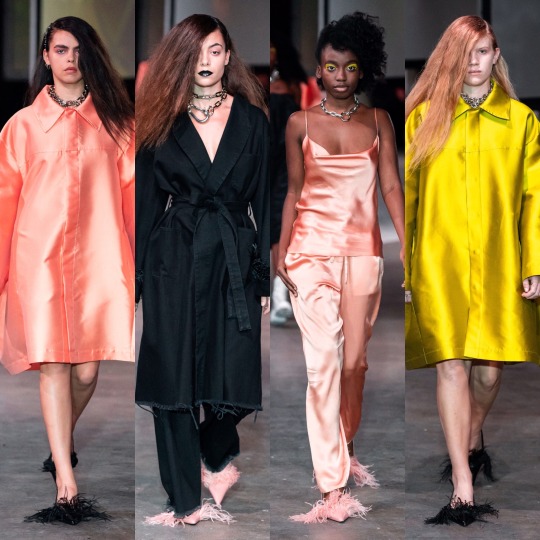

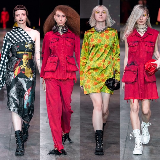
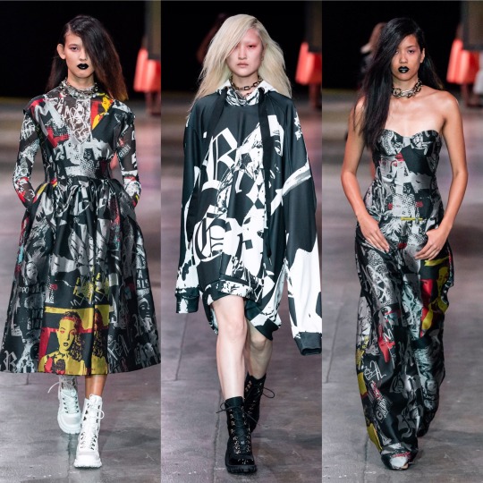
Marques Almeida put out a really strong collection, imo. The blending of luxurious silhouettes and fabrics with street wear inspired prints and styling is a really interesting and unique contrast and if Billie Eilish ever decided to stop wearing those tweenie clothes and wanted to actually seduce somebody’s dad (I LOVE BILLIE EILISH AND I KNOW WHY SHE DRESSES THE WAY SHE DOES, IT’S A JOKE, PLS DON’T HATE ME), I’d love to see her wearing something like this. It’s a blend of punk, urban, and 2019 e-girl and has the kind of edge that Topshop has lost over the past couple of years that used to make it so aspirational to my 13 year old self. Of all the shows, it also probably has the most personally wearable accessories, and a shit tonne of cool make up looks I’d love to try if it weren’t for my lack of visible eyelid, lol.
Make up looks were a highlight of the Max Mara show too, for me anyway.
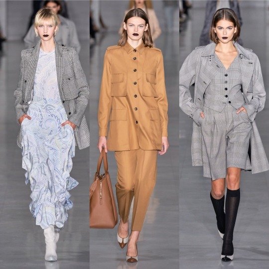

I otherwise wasn’t hugely keen on the collection, it being a little too matronly/Miss.Trunchbull-esque for my liking (wild card fashion inspiration of 2019, apparently?). The light paisley print dresses are very dreamy, though, and I can never resist a good suit.

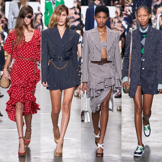
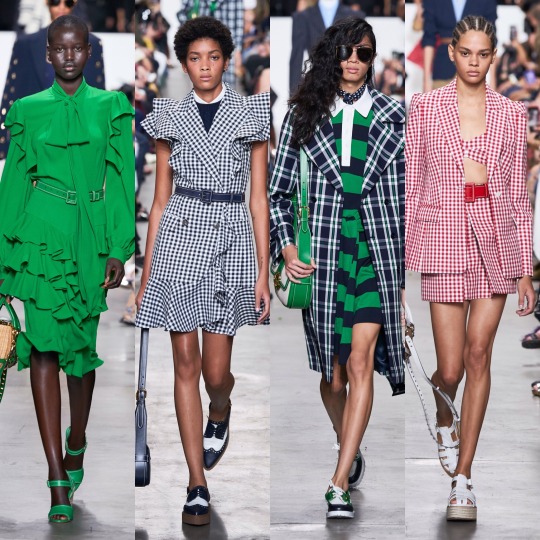
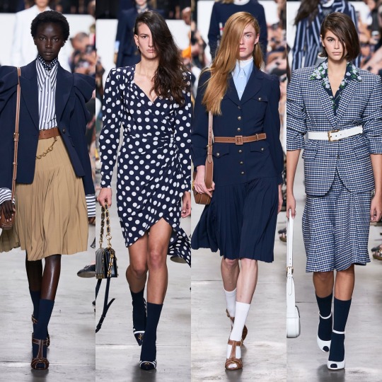

As for Michael Kors, dare I say it, but the basic bitch in me loved it. I know as a designer he’s not held in very high regard by the fashion community and I'm not saying it’s at all original but it did what it set out to do well; I mean, it’s quite fitting that he cameo-d in an episode of Gossip Girl because every outfit would be perfect for the Constance attending incarnation of Blair Waldorf, which is probably why I like the collection. Like yeah, it’s a bit of a Polo Ralph Lauren/Lacoste rip off but it’s daintier and more feminine and so I’m not gonna lie, I’m on board with it.
Next, Miu Miu.
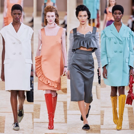
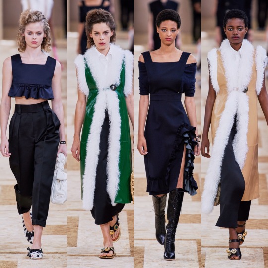
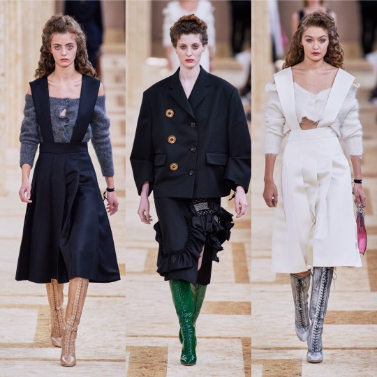


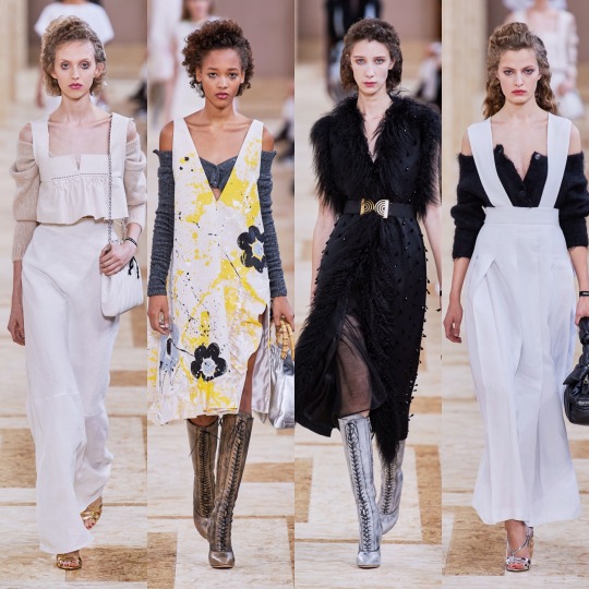

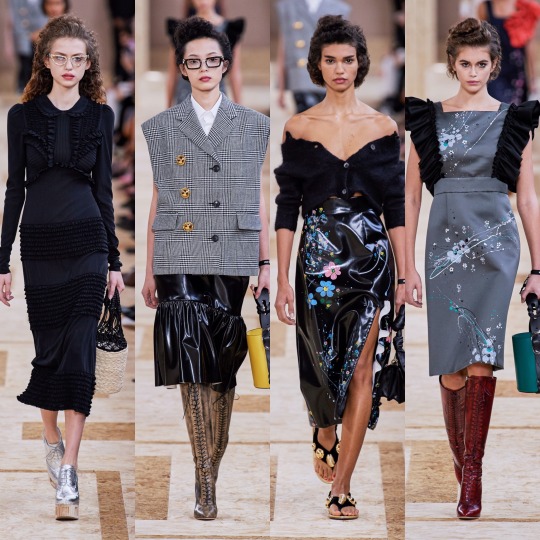

One of the collections I was most excited for, I was a little disappointed. Don’t get me wrong, I really like the collection, but I have never once disliked anything Miu Miu and I usually love it. There are things I love about this line too: the cream, floral lace-up boots, the off-the-shoulder cardigans, the houndstooth oversized coats and of course the fur-lined gilets. My mum used to buy me similar ones when I was a little girl and so they give me childhood nostalgia in the best way possible. I mean, the collection is as girly and eccentric as ever. I think it’s just a little too on the primary school librarian side for me, this time round. Sorry Miu Miu xoxo
Now I’m just gonna speed through a couple, starting with MM6 Maison Margiela, the younger sister to the more expensive regular Maison Margiela line:


And Monique Lhuillier:

So that I can get to one of my other ultimate favourite collections for S/S 2020: Moschino.
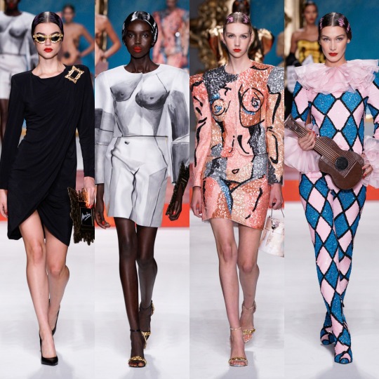
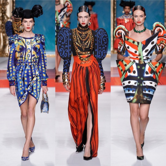
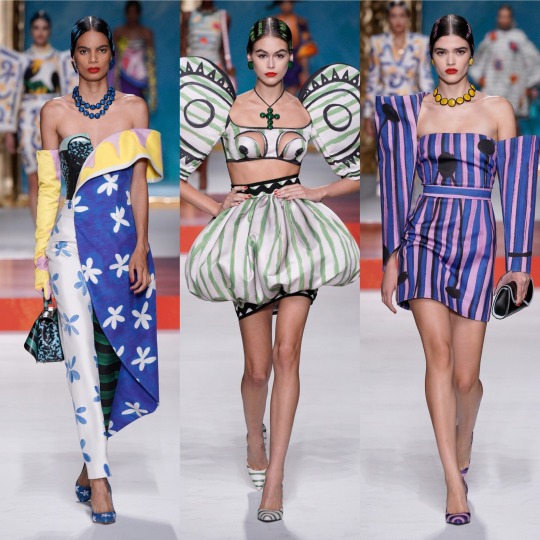
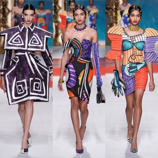

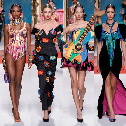
Oh my god, where to even start. Firstly, I might be reaching, but if this show is even remotely to thank for art nouveau mesh tops showing up in the Urban Outfitters new in section, then a very sarcastic thank you to Jeremy Scott. You just made ethical shopping a lot harder. HOW am I supposed to not buy an Alphonse Mucha top? HOW!? I mean, I’m sure I’ll manage (I’m on month 3 without a shopping spree I can’t actually afford now and yes, I am very much patting myself on the back), but HOW!?
But on a serious level, if renaissance was the print of 2019, which I’m still very much into BTW, bring on modern art as its 2020 replacement. The Pablo Picasso inspired show not only livened up a generally pretty predictable fashion month but it’s also got me searching up other times art has met fashion on the runway and thrown me down a particularly aesthetically pleasing wormhole I’m not sure I ever want to escape from (https://frontrowmagazine.ca/art-inspired-looks-were-all-over-the-runways-of-fashion-week-a74e8bc7ff0d and https://www.vogue.com/article/spring-2017-ready-to-wear-fine-arts-trends are good starting points!).
Mugler was also up there with the best of them, imo:
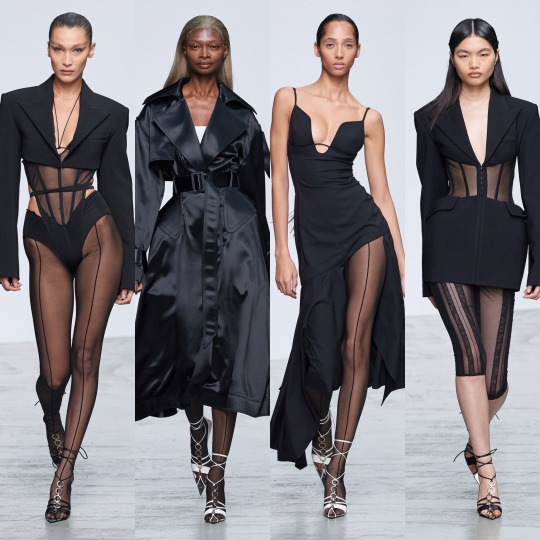
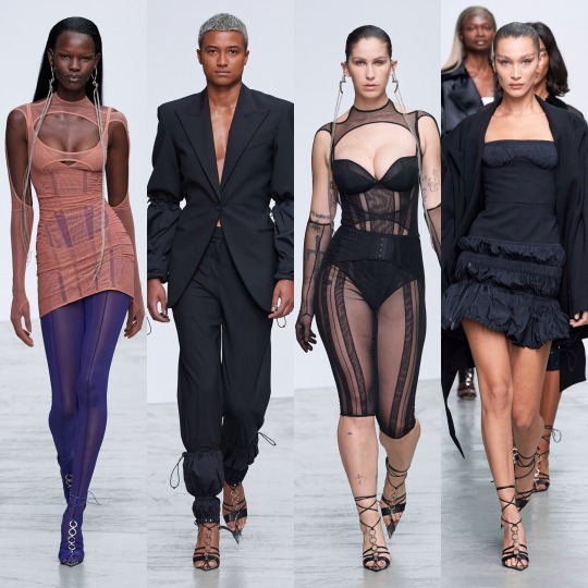

See, if the Moschino collection was all about dabbling in art class, Mugler’s S/S 2020 collection is its more mathematically inclined sister, all about sharp lines and deconstructed silhouettes and symmetry all whilst looking hot as fuck. So very Mugler, basically.
Now, this reference might be slightly off because I haven’t actually SEEN Ex-Machina yet but I imagine if Kim Kardashian were to channel that movie for a costume party she’d end up wearing something from this collection. That sounds like a roast because Kim has worn some questionable outfits but I blame Kanye for most of that and I’m referring to her on a good fashion day, alright!?
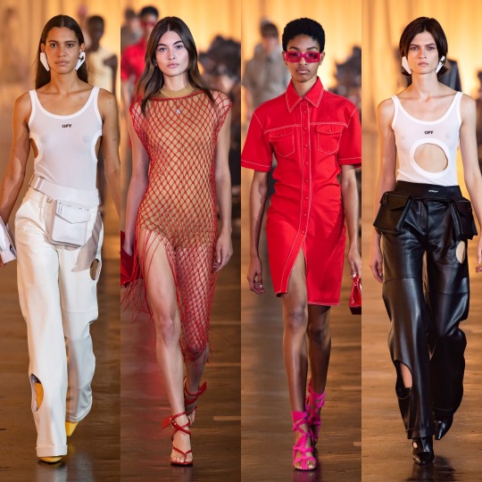
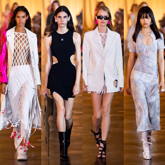

As for Off-White, it’s obviously a lot more commercial than most of the lines I’ve reviewed so far. Like, I can see a lot of these outfits on a mannequin in Urban Outfitters (no, I am not being paid to namedrop them, about 3 people in total read this Tumblr so any kind of sponsorship money would be severely wasted on me). That’s not necessarily a bad thing, and I love all of these looks; it just seems unfair to compare them to the the Mugler or Moschino collections, for example.
The stand outs for me are all on the bottom row: I would buy the utility vest, leather blazer and the all mesh turtleneck under washed-out tie-dye on the spot if I saw them in a high street store. Unfortunately, I feel like that’s kinda where they belong. You just expect collections to be a bit more conceptual, and this one is a little watered down, as much as it’s my style.


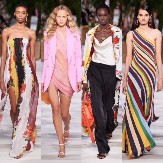

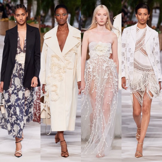
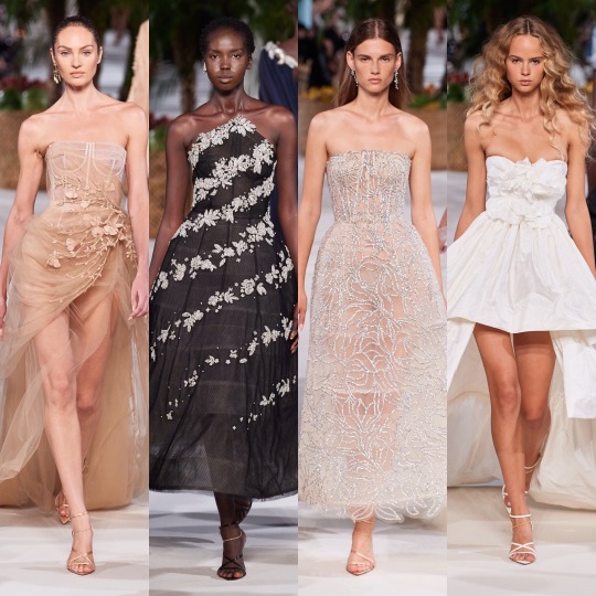
Oscar de la Renta was beautiful, of course. Not like I’m shook by how beautiful it is but kinda just what you’d expect from a brand with a name as poetic and fun to say as Oscar de la Renta. The silhouettes are dreamy and the details are as fit for a fairy princess (lmao) as ever. Plus can I just say how happy I am to see butterflies on dresses for adult women again!? And dresses worn by Blanca Padilla nonetheless!? Very here for it.
Next up is another on one of my fashion month highlights: Paco Rabanne.

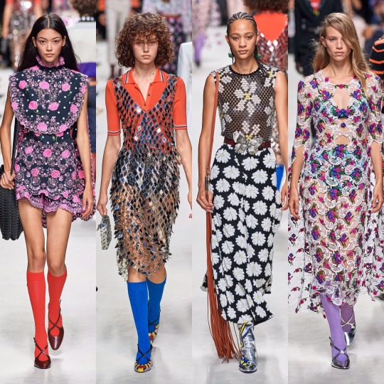


LOOK AT THIS SHIT!
I mean, don’t get me wrong, something about this collection (I’m pretty sure it’s the knee high coloured socks) is giving me primary school teacher vibes, but I'm not mad about it. It’d be the kind of teacher who’s actually really good at their job and has loads of cool hobbies and a really hot boyfriend or girlfriend or wife or husband who you secretly want to be then you grow up/and or have a huge crush on.
Like with Marc Jacobs, there’s obvious flower child elements here, and whilst on the whole the former took my breath away slightly more, this is a lot more wearable. My favourites are the paisley print dress and cape on the left in the very bottom row and all the chainmail pieces (which remind me of the dress Naomi Smalls wore in that whole club ninety-sixxxxx skit on drag race), plus that floral cut out dress with the trailing flute sleeves, which is absolute PERFECTION.
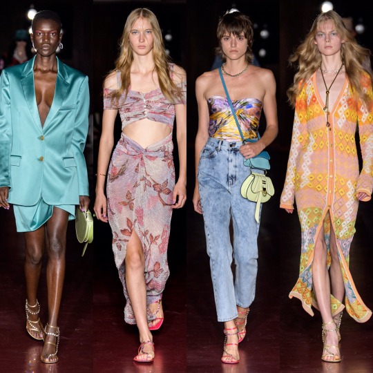
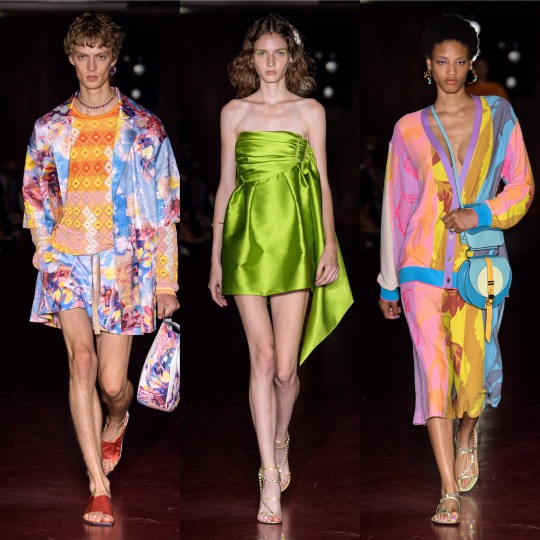
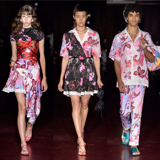

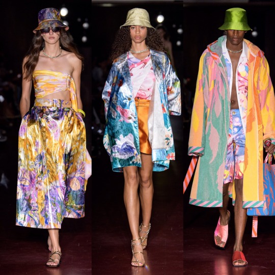
The 70s influence was clear in Peter Pilotto’s S/S 2020 collection too from the abundance of tie-dye to the knit v-neck dress, zany colour and print being the very on-brand focus. That being said, this is definitely more of a street-style inspired collection than usual and whilst the floral suits and dresses on the 3rd row down are very typical Peter Pilotto, the tie-dye corset and combat trousers on the far right, second row from the bottom, are very Jaded London. As for the reoccurrence of the bucket hat, I’ve remained steadfastly against them for several years now (even when our Lord and Saviour Miss Robyn Rihanna Fenty started wearing them) but the way they’re done in this collection even I could definitely get behind; all in all, the show surpassed my expectations.
The same goes for Ports 1961, which was a lot more eccentric than I gathered is the norm from a few google searches. Honestly, I hadn’t really heard of the brand which, upon reading up on it, I feel very dumb for considering it has been around since (in the shock twist of the century) 1961.
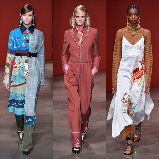

Yes, I know how that sounds! But forgive me, I’m still learning:)
Anyway, the fishnet detailing alone pretty much sold the looks I picked out. Seriously, I got a pair of those bloody tights, like, 2 years ago when they became a thing again and now any outfit where I have my legs out feels incomplete without them.
Next is Prabal Gurung, which, as far as presentation goes, was fucking STUNNING:
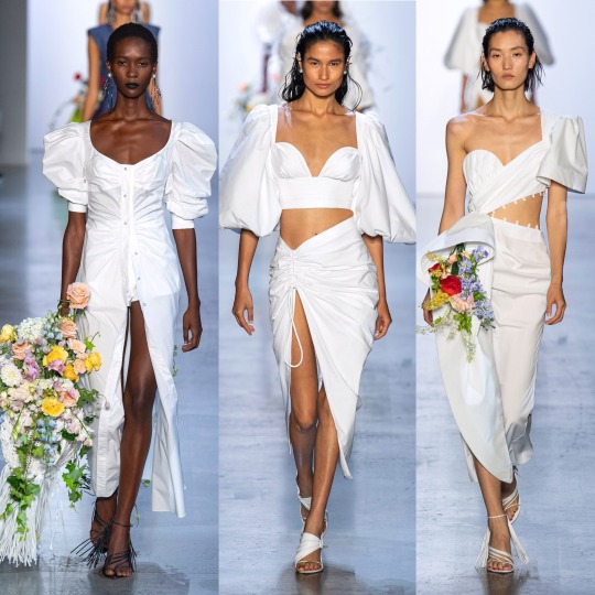


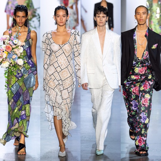
I mean, you could say that I’m easily impressed and that the presence of the bouquets won me over (and you’d definitely have a point there), but it’s also this year’s Givenchy haute couture-esque feathers, the trailing pearl necklaces, the exaggerated shoulders, the dreamy colouring, the everything looking like it could’ve grown off a very fashionably-inclined tree. Like, there’s a lot to love here, from the naturalistic elements, to the context behind the show, an ode to American fashion history and those cast out of it (and the notion of “being American” in general) for so long.
Going from a high to a (personal) low, however, next we have Prada:
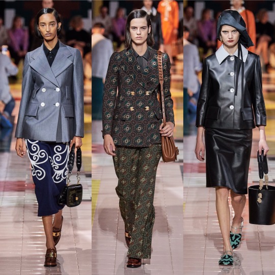

I don’t know, I get that it’s supposed to be simple and stripped back and dignified and whatever and I like the looks I picked but it’s just a bit blah for me. The bonnets that kept cropping up just didn’t do it for me and almost ruined what is an otherwise nice skirt suit (top right). Nonetheless, I like the silhouette of the sheer black dress and the the brocade print suit is really luxurious looking, even if the pattern is a *little* Wetherspoons carpet.
Anyways, here’s a quick overview of Rag and Bone:
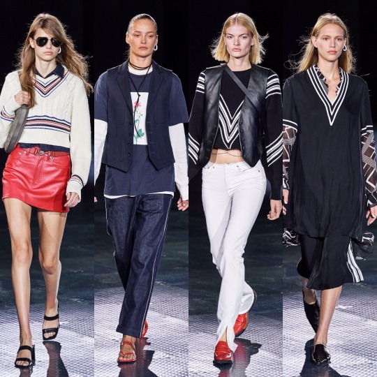
So that I can stop moaning and get onto a collection I REALLY liked:


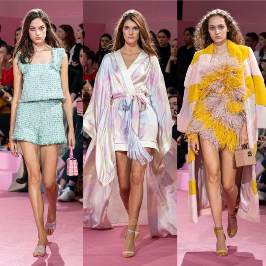

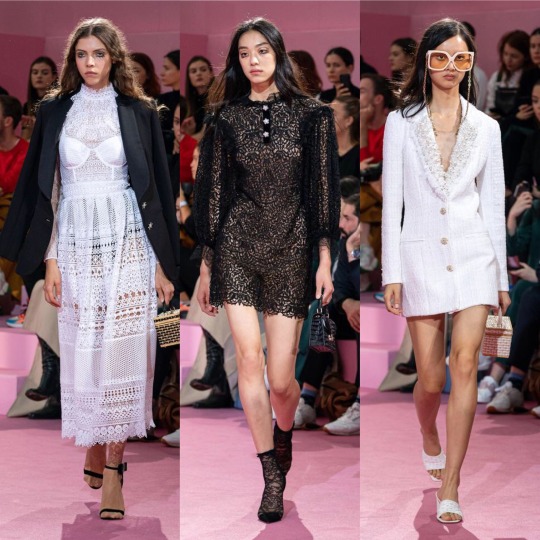
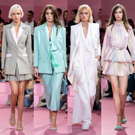

I am of course talking about Ralph and Russo. See, this is kinda what I expected from, like, Chanel and yet it’s Ralph and Russo that delivered. Also, it gives me Alessandra Rich vibes which is very much a compliment considering how much I love her designs. I mean, if Valley of the Dolls were to get another film remake in 2019, this is exactly what I’d like to see the female leads wearing, from the pastel suits to the satin kaftan style dresses. The yellow feather trimmed dress is practically a copy of something Marchesa has already done but it’s cute all the same. In my top 10 collections of the season, for sure.

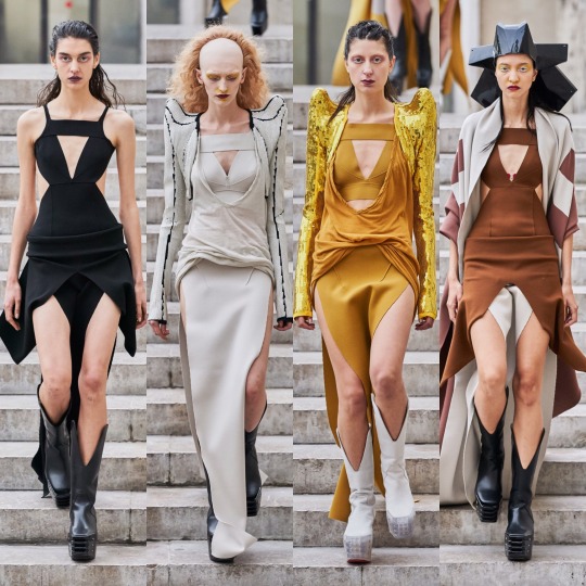
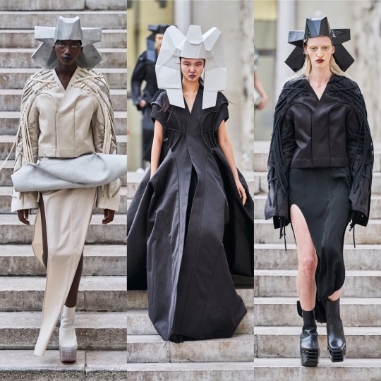
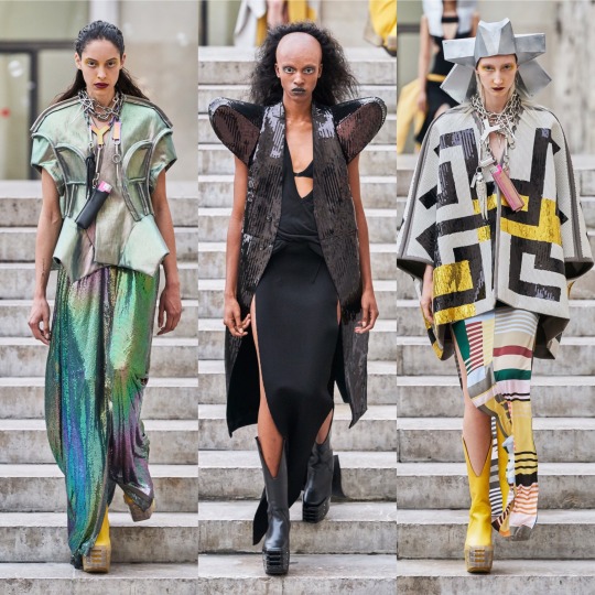
Rick Owens was another strong collection; it goes without saying that it’s not the most wearable but that’s not really what Rick Owens is known for, so I wouldn’t expect anything else. If you want fashion on an alien planet, or something Lady Gaga would’ve worn in 2010, he's your man.
Next, Rodarte:
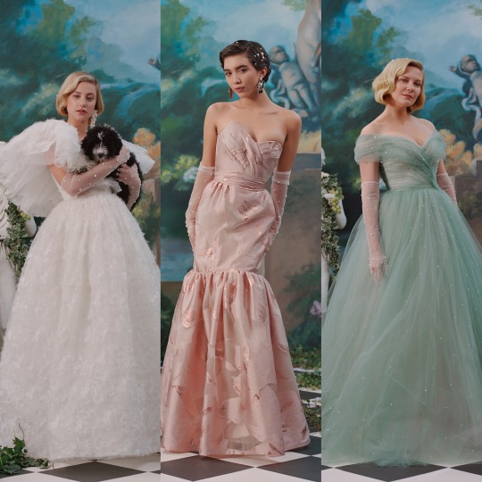
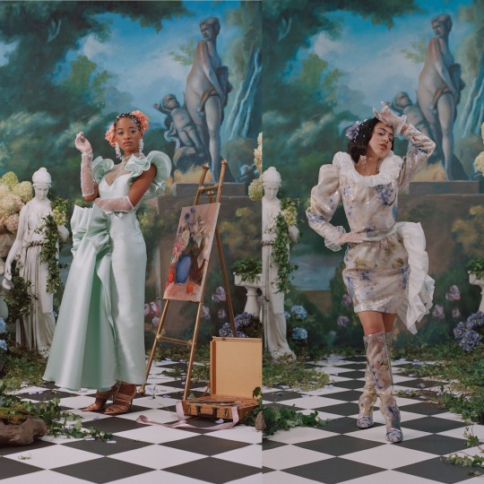
Obviously the dresses are beautiful and the set is magnificent, BUT...I’m really not a fan of the whole celebrities filling in for high fashion models thing. I like Lili Reinhart and I adore Kirsten Dunst, she’s been in a load of my favourite films, but in a similar vein to Dolce and Gabbana’s influencer show, it’s just distracting from the actual garments, if even worse because I don’t WANT to be distracted here (the same can’t be said for the D&G show, lol). If anybody has read this far, let me know your thoughts!
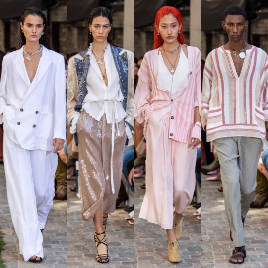
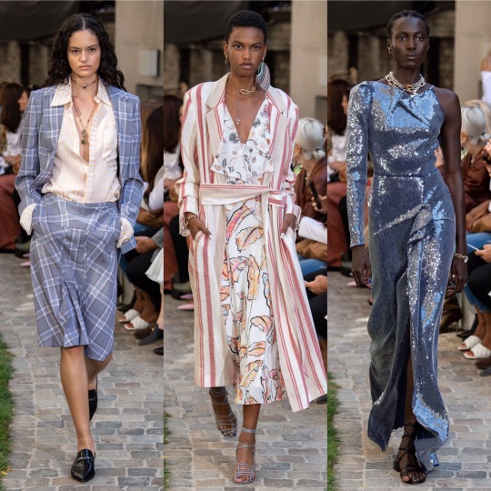


Roland Mouret was nice, and I always like a coed show, especially when a designer isn’t afraid to blur the lines of masculine and feminine. It’s fresh, lightweight and luxurious looking, Cannes film festival street style eat your heart out, and I love the colour palette.
Similarly, colour was my favourite thing about Sally LaPointe’s S/S 2020 collection.

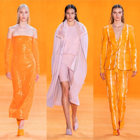
I would never think that teal and burnt orange would work together, let alone in some kind of faux leather, and yet here we are. Orange is in itself always an interesting colour choice, perfect for the summer with a tan, and I really love monochrome outfits, even though they’re something that ends up being quite pricey to put together; slight differences in tone are okay but if you just randomly throw together a few things and they’re too off, it really doesn’t work and you’d have been better off wearing contrasting colours. For that reason, I’m just gonna admire that all-pink outfit from a distance.


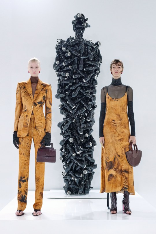
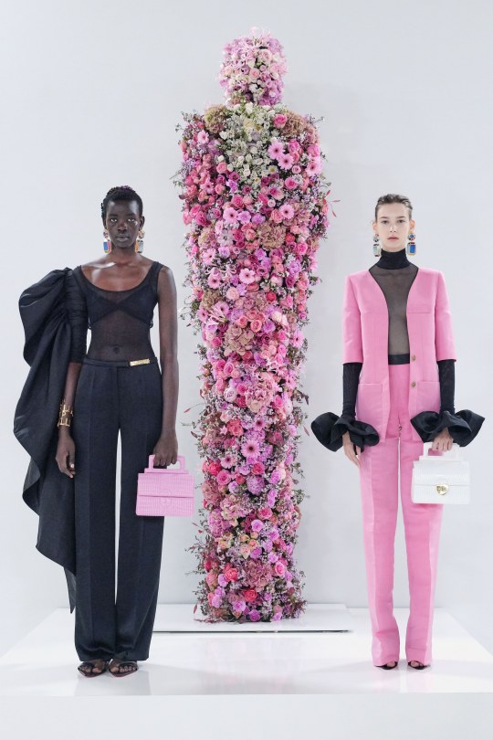
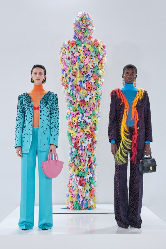
As for Schiaparelli, it’s one I always look forwards to for the sheer weirdness. RTW isn’t quite as kooky as haute couture but still, the interesting choices are still there; what at first glance appears to be flame print is actually coils of hair, and paired with a water print suit is a sequinned jacket emblazoned with a paradisiacal mirage. Ornament-like facial decorations as seen in the over-exaggerated glasses worn with the pony hair suit are also one of my favourite new things to happen in the high fashion scene in the past couple of months and I can’t wait to see how they get watered down to become more approachable for us...regular, non-structurally blessed folks who can’t pull off anything and everything.
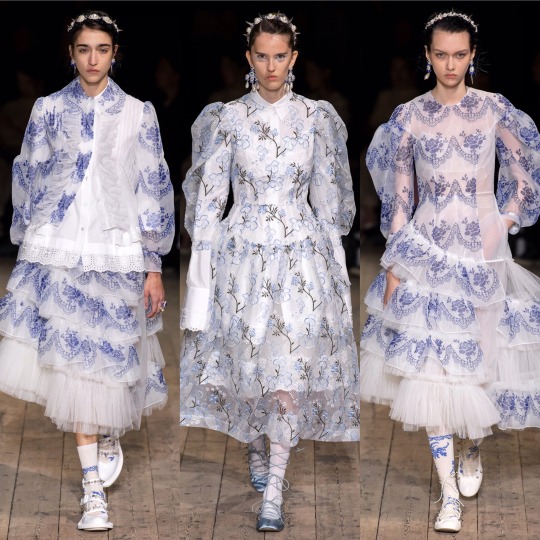
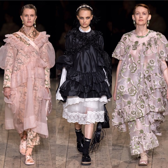
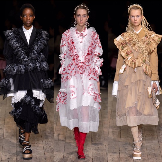
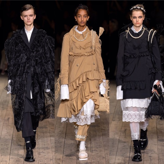
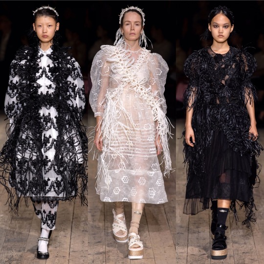
Simone Rocha was STUNNING. Romantic and ethereal, it’s druid goddess crossed with upper class Victorian woman of leisure, equal parts delicate and grungy, like a modern, fashion version of Lady Gaga’s Scathach in the Roanoke season of American Horror Story. You know, in the flashbacks, not in present day when she was all gross and like...scalping people and shit. Each dress is so ornate and has such an interesting structure, and the fabric choices give off an organic kinda vibe that create a handmade feel; the collection is, imo, really worthy of being shown under a haute couture heading. When it comes to my favourite element of the show, I’m torn between the petticoats and the hair accessories. I’m just gonna give a cop-out answer and say both.
Stella McCartney on the other hand, is very much a clear ready-to-wear collection.


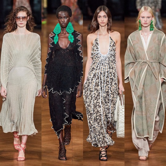
It’s pretty, for sure. The pastel blazers paired with delicate white mesh tops underneath are a gorgeous combination for spring and I like the reoccurrence of the chain glasses (Gucci, right?). But I mean, when you go from Simone Rocha to this, it’s a bit anticlimactic. Plus, if I’m honest, kaftans are always going to remind me of Honey Mahogany from season 5 of Drag Race. Don’t get me wrong, I’m sure she’s a lovely person but her runway looks aren’t really ones I look back fondly on, and you’re lying if you say you enjoyed them for anything other than meme purposes.
Temperley is equally meh, though the return of the Erdem-style boating hats is getting me excited that high street retailers might actually pick up on the trend and bring out some cheap ones for me to embarrass myself by wearing.
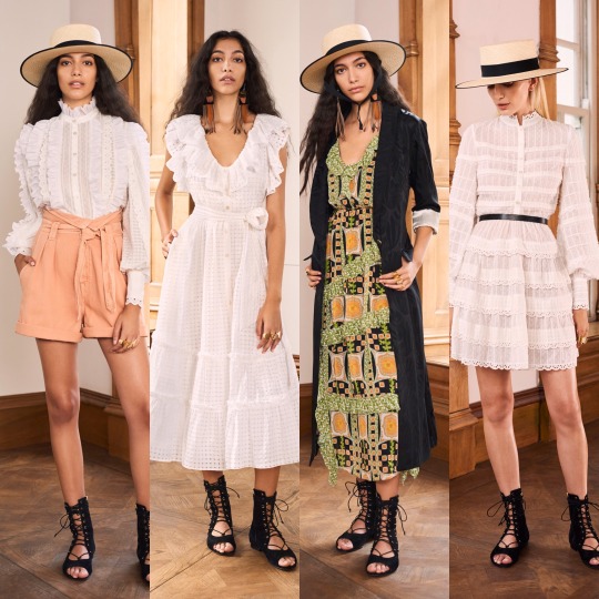
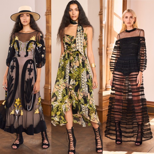
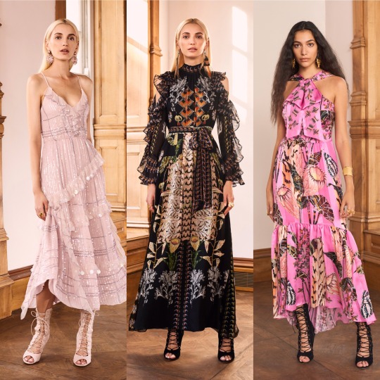

I also love a good 70s suit, the neckerchiefs are cute and there are some really delightful prints here that are a more unique approach to florals for spring.

Coming towards the end now, next is Thom Browne:
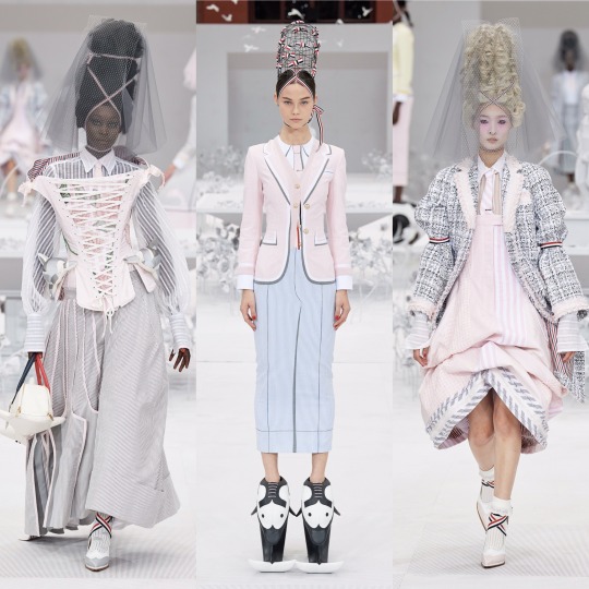


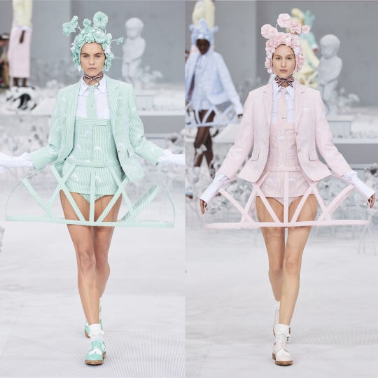
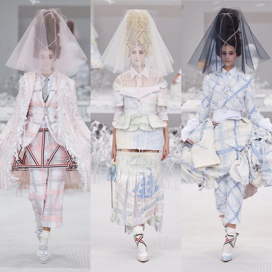
I LOVE this. Like, don’t get me wrong Rick Owens was cool but I adore how on the nose the concept is here; time to bring back all the Marie Antoinette puns I didn’t get to use in my Versailles Instagram post. I don’t know if it’s the history buff in me or the Sofia Coppola Stan but I will always be willing to sign any kind of treaty for anything related to the excesses of the 18th century French monarchy, and this is that turned up to 1000 infused with a dash of the Teletubbies, which sounds like a nightmarish concept, I know, but as high fashion it WORKS.

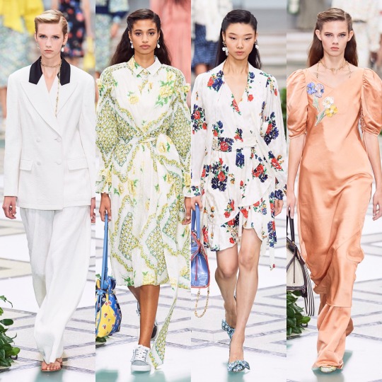
Tory Burch was very commercial, seemingly half inspired by Monterey yoga moms and the other half by Hamptons socialites.
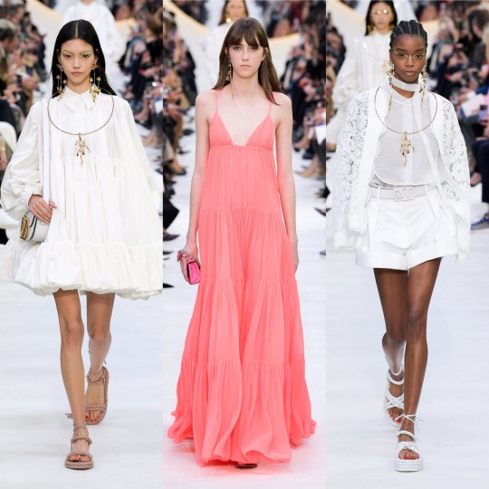
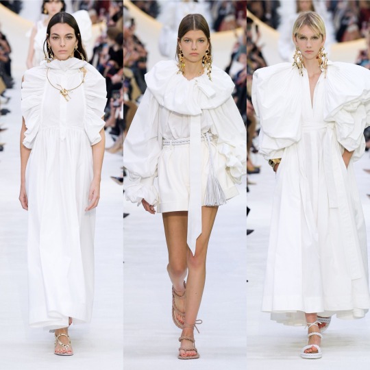
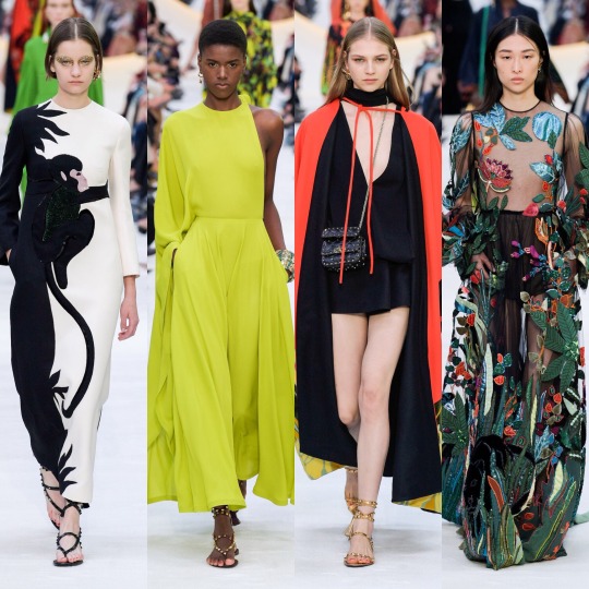

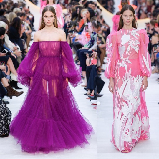

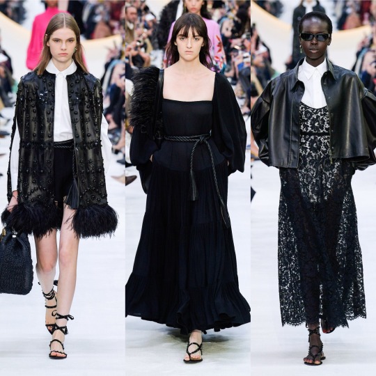
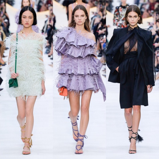
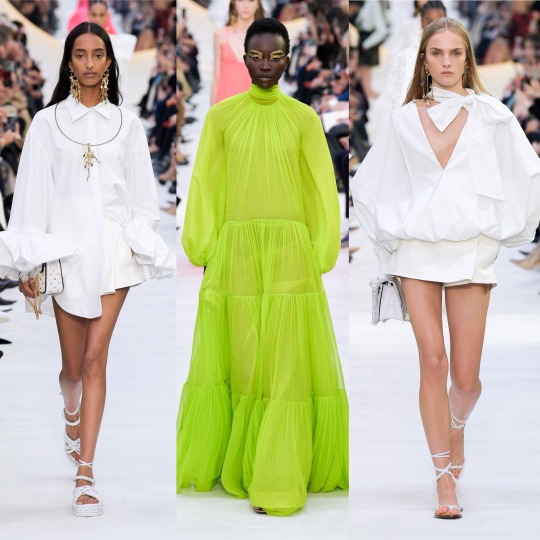

And then there was Valentino, which was fucking exquisite, imo. LIKE, CALLING DOCLE & GABBANA: THIS IS HOW YOU MAKE TROPICAL PRINT INTERESTING. YOU MAKE THE VELVET MONKEY’S ARM THE FRICKEN WAISTBAND.
Seriously, though, I am enamoured with this colour palette; all the whites and golds are angelic and fr, I didn’t know until now that you could make neons this elegant. I’m also getting an almost clerical feel from a lot of these looks, with the plaited waistband on the black dress that’s 7th row down in the middle, the stunning red cape and the multitude of exaggerated neck ruffs. I think I’ve mentioned before but I always love religious references in clothing-I don’t think I’ll ever get over the 2018 Met Gala-and so whether I’m reading too much into it or not, this collection really did it for me.
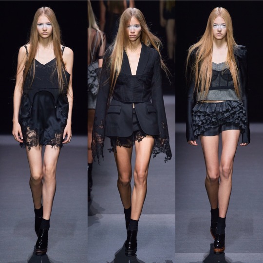


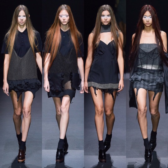
Whilst it’s probably as far removed a collection from Valentino’s S/S 2020 contribution you can get, I also loved Vera Wang this season. It might purely (I PROMISE THIS IS MY LAST GOSSIP GIRL REFERENCE) be because it gives me Jenny Humphrey vibes and *controversial* she did have my favourite style of any of the main characters, but sue me, this is just the right amount of late 90s/early 2000s grunge. Deconstructed trashy goth it girl is an interesting concept to see on the runway and I completely support it.
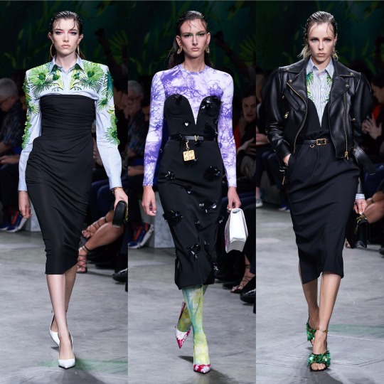
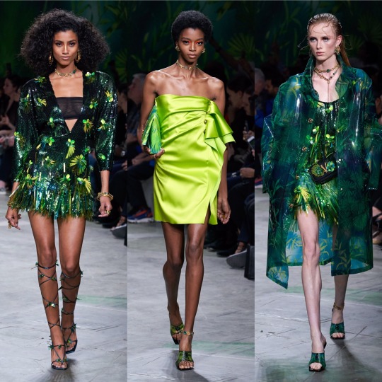

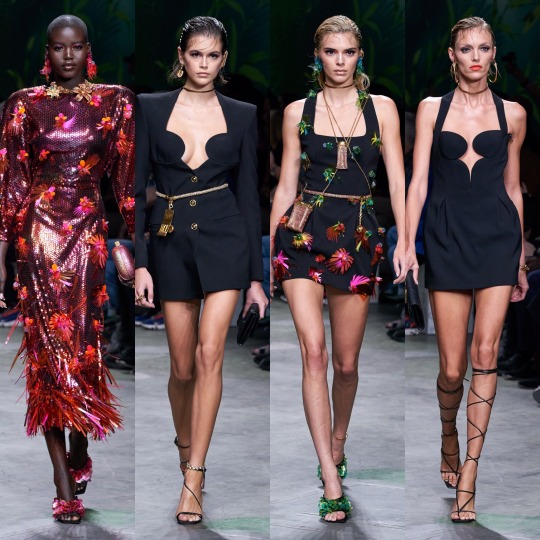
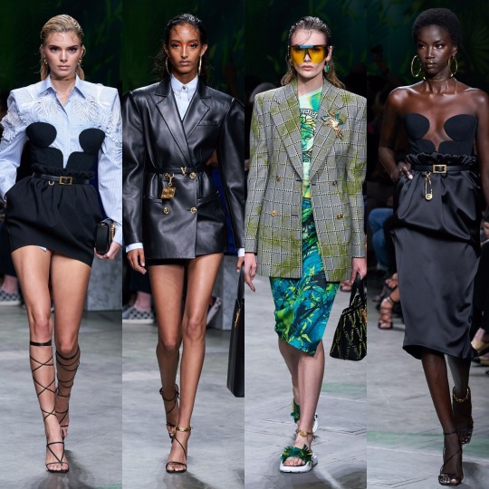
Versace on the other hand was very hit or miss. The looks I picked out I really loved but ultimately, for one of the household name brands, a lot of the actual garments were a bit pedestrian. I will say though that for me, it’s a case of the whole being greater than the sum of its parts. The slicked back mermaid hair and the pops of colour in the makeup and the interesting necklines meant that when it was good, it was GOOD. However, overall, still a bit too 80s Miami businesswoman, and please GOD, can we leave that hideous J-Lo dress in the past, it should really not be the climax of the show in 20-fucking-19!


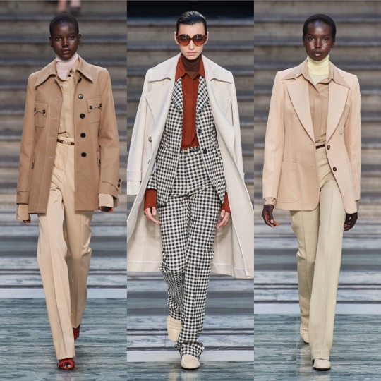
As for Victoria Beckham, I liked it, but it’s a bit of a Gucci copy, no? And no way near as interesting?
And on that note, I’m gonna have to cut this off. Super annoying but with only 5 collections left that I want to talk about, Tumblr is being a little bitch and will not let me add anything more to this post. So, see you in 5 for the final post!
Lauren x
#valentino#ss20#fashionmonth#nyfw#pfw#lfw#mfw#versace#rickowens#rick owens#simone rocha#schiaparelli#moschino#mugler#style#fashion#runway#details#trend#ralph&russo#off-white#oscar de la renta
12 notes
·
View notes
Link
YouTube has always been a hub for an often-voyeuristic form of conspicuous consumption, but for the diehard devotees of influential designers like Raf Simons and Helmut Lang, there's now a veritable abundance of channels dedicated to nuanced discussions of niche men's clothing. Though far from being the most-followed men's fashion accounts, these channels have slowly built sizable audiences by geeking out over a set of hyper-specific references familiar to anyone who's put in time lurking on a particularly heated r/streetwear subthread. Unboxings and shopping hauls still abound, but they're complemented by lengthy commentary on, say, the latest Rick Owens collection or a breathless breakdown of a seminal Margiela show from the '90s.
Like the men behind #menswear, the movement birthed on the blogosphere that peaked in popularity in the early 2010s, these YouTube "creators" are often friends IRL, appearing in each other's videos to compare notes on their latest cops or pal around the local flea market looking for covetable vintage finds. More recently, like some of their #menswear predecessors, many of the creators behind these channels are launching their own clothing brands that mimic the cadence of streetwear drops and sell out almost as quickly. These collections go far beyond branded merchandise: They typically debut in small batches at premium price points and are seamlessly marketed across social media to relatively small but highly devoted followings.
Leveraging the spending power of an existing audience to sell product that's sure to be a hit is a symbiosis the fashion industry is already betting big on. There's Danielle Bernstein of WeWoreWhat's multimillion-dollar design partnerships with Nordstrom and Onia; Aimee Song of Song of Style's collection with Revolve; and Arielle Charnas of Something Navy, who is ending her Nordstrom licensing deal this year to kick off her own lifestyle brand after a $10 million investment, valuing her brand at roughly $45 million. Increasingly, these types of relationships look like the future of the industry. Yet for the most part, retailers have yet to tap into influencers in the menswear space. YouTube represents a new frontier.
In the summer of 2018, Jacob Keller and Cole McBride released the first drop under their Bare Knuckles brand. Keller is a certified YouTube OG: His channel, though now largely inactive, was one of the first to capitalize on the opportunity for menswear-oriented content on the platform, and he's frequently shouted out as a big brother of sorts by other YouTubers. Keller shares an unusually strong connection with his fanbase, many of whom have been interacting with his content since day one. Scroll deep enough through his timeline and you're bound to come across old images of him in full Mishka 'fits, some of which Keller occasionally reposts as a winking nod to his followers.
Bare Knuckles's debut collection featured a medley of washed denims, vintage looking tees and cropped work jackets — an authentic extension of the aesthetic Keller began to hone on YouTube and later made his signature via the 'gram, where he has almost 90K followers. On any given post there's dozens of comments asking where to buy what he's wearing, which today, more often than not, is Bare Knuckles. The collection was a near-instant success, selling out entirely shortly after it released online.
For influencers, profiting off of their online presence is par for the course. Keller and his cohort, however, are pioneering a more creative alternative for a group of guys weaned on a steady diet of conventional fashion content coupled with obscure menswear memes. Many of them cite similar reasons for launching their own lines, as well as a desire to maintain a certain degree of separation between their cut-and-sew collections and the YouTube channels that, they readily concede, in no small way helped make those collections a reality. "Cole and I wanted to start Bare Knuckles so that we could make clothing that we’ve wanted to wear for years but could never find," says Keller, who still largely keeps his collections separate from his channel.
For Ken Iijima, who started uploading videos to YouTube documenting snippets of his life after moving to Tokyo in 2018, keeping that sense of separation is crucial. When Iijima co-founded Vuja Dé earlier this year with Ringo Chang, the two of them agreed to keep the brand at a distance from Iijima's rapidly growing channel, though both acknowledge YouTube as a powerful tool for engaging with their audience. Their first drop included paint-splattered sweatshirts (acrylic, applied by hand) and bondage cargo pants, all made from Japanese-milled cotton and available exclusively through their website, where each size sold out quickly.
"We always knew what we ourselves have wanted and liked to wear, though we were unsure if our preferences directly translated into products an audience would purchase," says Iijima. "In order to realize this, interacting with our audience was a form of validation in allowing us to gauge viewer support… [and] proceed with the project altogether." YouTube, the two note, has "facilitated interaction and provided a way for our audience to get to know us and see we are just as clothing-obsessed as them."
When Magnus Ronning set about launching his eponymous label, he saw his collection as an organic extension of his wardrobe: well-made, approachable basics with a twist, like a denim jacket in a green paisley print, or twill work pants in a dusty pink hue. Ronning is similarly appreciative of the platform his YouTube presence affords him. "YouTube has without a doubt been the most significant incubator for the brand. It has essentially given me a platform to share my interest in clothing, Ronning and everything else with a larger audience than I could ever imagine," he says. "I love the community on YouTube, and I find it amazing recognizing names of people who consistently interact and comment on [my] videos."
Ditto Owen Hyatt, who started posting videos on YouTube in the summer of 2017. Hyatt always wanted to be a YouTuber, even as a kid. "All my idols back then were YouTubers," he remembers. "It was amazing to me that recording videos about your interests could be a job." In early 2019, he debuted Colette Hyatt, a collection that openly pulls inspiration from some of Hyatt's favorite and oft-referenced designers. (Hyatt dutifully shouts them out in the product descriptions on his site.)
The brand's aesthetic skews slightly avant-garde: Its first collection included hand-distressed hoodies with detailed, gothic-looking graphics and an embroidered vegan leather crossbody bag that wouldn't look out of place hanging on the dimly-lit racks of some iconic institution of downtown cool. "At the end of the day I just design clothes that I love and want to wear, and if my audience and customers love it too then even better," Hyatt says. "Getting input and seeing people's reactions to new pieces is always great insight but it doesn't have a major impact on what I create." Yet Hyatt maintains YouTube still holds a lot of value for him "when it comes to showcasing Colette Hyatt, since it's hard to get 'personal' on Instagram."
Hyatt could've just mocked up a few graphic tees and called it a day. Instead, he (and Iijima, Keller, Ronning, et al.) are creating thoughtful, high-quality clothing by aspiring to a level of craftsmanship on par with the luxury labels they admire. For the most part, these guys are making product they like and figuring their followers will, too, all the while responding in real-time to a constant stream of feedback from fans. Internet influence, though, is fickle and fleeting. Pivoting away from content creation is a great way to guarantee a degree of career longevity beyond making a quick buck promoting another company's products. Tapping into the rapidly growing market for men's clothing is a savvy way to capitalize on demand from followers who are constantly clamoring for an "ID on the 'fit, bro?!" Why promote another brand when you could be promoting your own?
Keller sees his brand and others like it as a natural progression of what he was already doing on YouTube. "We go from consuming products, and showing off other people's creations, talking about other people's designs and details. Eventually, we want it to be our product and our details that we're showing off," he says. "We consume so much product and buy from so many brands that we start forming a vision as to what we want our own clothing to look like and take cues from those clothes we've bought in the past." The easy thing to do, Ronning points out, is to release a limited-run of a few cutesy printed t-shirts. In his opinion, the channels currently churning out some of the most exciting menswear content out there are defined by a "want to do better." The bona fide brands he and his friends have started are "well past the point of [T-shirt] blanks and are developing actual cut-and-sew collections."
Vuja Dé's Iijima and Chang share a similar sentiment: "We think there is a common misconception that all YouTube brands are automatically categorized as 'overnight sensations' or 'cash grabs.' We wanted to distance ourselves from this association… It would not do Vuja Dé justice." Hyatt wouldn't be surprised if the nature of menswear content on the platform changes, too. Videos will become "more oriented around our brands," he predicts. "There will be less pickup videos and more behind-the-scenes videos. How our next lookbook photoshoot was shot, how to take product photos, that sort of thing."
Despite the handwringing caused by an Instagram personality with over 2 million followers who couldn't sell 36 T-shirts, influencers still move a lot of merchandise. Keller and McBride have since dropped two more Bare Knuckles collections, further developing the ideas they introduced in earlier designs and expanding into new product categories each time. Most pieces currently in stock on the brand's site are still available, but there's no reason to assume that's cause for concern. Keller uploaded a video to his YouTube channel in early August, just over a year after his last update. Among the hundreds of comments — largely roasting Keller good-naturedly for his inactivity — one fan noted: "As weird as it sounds, every time I watch your videos... it's like seeing an old high-school friend. Crazy it's going on 7-8 years since I've been watching your videos! Glad to see Bare Knuckles doing great bro!"
1 note
·
View note
Text
Marvel Cinematic Universe: Captain America: Civil War (2016)
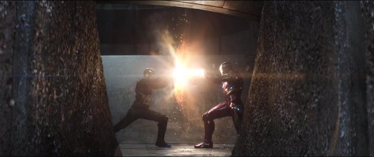
Does it pass the Bechdel Test?
No.
How many female characters (with names and lines) are there?
Seven (30.43% of cast).
How many male characters (with names and lines) are there?
Sixteen.
Positive Content Rating:
Three.
General Episode Quality:
Exciting and full of strong fodder for discussion and debate; by the same token, potentially frustrating.
MORE INFO (and potential spoilers) UNDER THE CUT:
Passing the Bechdel:
Natasha directs comments to Wanda in Nigeria, but Wanda addresses her response to the team as a whole.

Female characters:
Wanda Maximoff.
Natasha Romanov.
Maria Stark.
Mrs Spencer.
Sharon Carter.
Mrs Zemo.
Aunt May.
Male characters:
James Buchanan Barnes.
Steve Rogers.
Sam Wilson.
Brock Rumlow.
Howard Stark.
Tony Stark.
T’Chaka.
Vision.
Thaddeus Ross.
James Rhodes.
Helmut Zemo.
T’Challa.
Everett Ross.
Peter Parker.
Clint Barton.
Scott Lang.
OTHER NOTES:
My immediate thought on the concept of the Avengers being directed by a United Nations panel is the Rwandan genocide; follow from that, any number of other major atrocities that have taken place while the rest of the world sat back umm-ing and aah-ing over whether or not they should intervene. Anyone who knows a speck of history should be very reticent about the idea of being shackled by such political whims.
Ross refers to the unknown locations of Thor and Bruce Banner as being like ‘misplacing a couple of megaton nukes’, as if they’re objects and not autonomous sentient beings who can go where they please without having to declare their intentions, and that should really be the first major red flag to everyone that this guy ain’t on the level.
Vision’s equation about causality is a false equivalence, and an irrelevant one anyway, since oversight doesn’t do anything to hamper his theory about strength inviting challenge. You’re not actually reducing your strength, you’re just making yourself less able to meet those challenges as they come. I feel like Vision should be a Hell of a lot smarter than this absence of logic (also, looking at the threats themselves in previous films, the only ones which can be considered ‘strength inviting challenge’ issues in which the actions of any Avenger characters have ‘bred catastrophe’ are the Iron Man films, and Age of Ultron, all of which are examples of Tony’s hubris coming back to bite him, specifically. The conflict of every other film stems from either 1) trouble predating Iron Man (most of it SHIELD/Hydra related), or 2) other-worldly overspill where Earth becomes the battleground for something uninvited (Asgardian and/or infinity stone bullshit). And even when Tony is the one creating his own demons, he usually doesn’t do so actively through his Iron Man tech or persona (Obadiah Stane’s villainy is what led to Iron Man’s creation, not the other way around; yes, Tony’s grandstanding did directly invite competition in Iron Man 2, but he didn’t make an adversary out of Ivan Vanko, that was his father’s legacy; and Tony’s particular cruelty may have incited Aldritch Killian, but that event predated the creation of Iron Man by nine years, so it’s not a response to that strength. Only Ultron was genuinely a catastrophic consequence of Tony’s (and Bruce’s) abuse of power, but hobbling the Avengers’ ability to operate does nothing to prevent that sort of thing from happening again, it just stymies their ability to halt the onslaught after it begins. You solve that one with legislation limiting what anyone can recklessly create and unleash (which includes Vision himself, incidentally)).
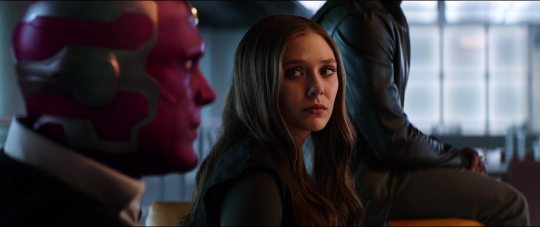
And see, Steve is right; the Sokovia Accords just shift the blame when things go wrong, functionally it makes the Avengers less accountable for their actions by allowing them to play the ‘just following orders’ game. And the point he makes about the panel still being run by people with agendas is exactly what I’m talking about in that first dot point; when decisions are being made on a political basis instead of according to need, you get atrocities, and any person working for the United Nations is a political agent by default. Sokovia is actually a great example of the kind of place that falls through the cracks on the political stage, as it was noted to be ‘nowhere special’, i.e. not politically valuable, and therefore unlikely to receive a swift response from powerful nations who have no vested interests in the good of the country.
Tony’s argument here is extremely personal and emotion-driven; it’s all his own guilt about Ultron and Sokovia and his decision to stop manufacturing weapons, etc, and none of that is relevant to the rest of the team’s situation or their choices. He’s also utterly oblivious to his own privilege here, in that it’s super easy for him to handwave the particulars of the Accords, because he’s a filthy-rich white American whose main ‘thing’ is new technologies, which are not being restricted at all by these Accords; he has the luxury of just signing on and hoping to negotiate amendments later (and also, of having the resources to be able to thwart anything he disagrees with and just do what he wants regardless if he decides he’s right). He’s not taking a moment to consider what the Accords really mean for those members of the team with powers they can’t just ‘put down’, who don’t have the kinds of options and opportunities he has, up to and including the bargaining power to have the Accords ‘fixed up’ later. I really do my best to see both sides of this situation because there IS merit in the idea of the Accords, but no one in favour of it makes a good argument for it and it’s really frustrating.
Who tells someone that a close beloved friend is dead in a fucking text message??? The real villain of this film.
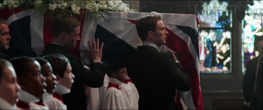
It goes without saying but I’m gonna say it anyway: it’s very hypocritical of T’Challa to support the Accords while also donning his super-suit and taking matters in foreign countries into his own hands. All of the destruction that occurs in Romania after Bucky escapes from his apartment building is because of T’Challa’s involvement (because he was trying to commit a literal murder!), and that kinda gets glossed straight over here.
Tony falls for Ross’ trick by referring to Wanda as a ‘weapon of mass destruction’ in the process of his efforts to justify her internment. It’s all really solid writing, really, vernacular choices that highlight the dehumanisation at the rotten core of the Accords and how good people can be suckered into it without realising until it’s too late (even when things like, say, denial of legal representation should definitely be red-flagging up the wazoo right now). But honestly, it’s such a wild leap from ‘Wanda can’t go on missions anymore’ to ‘we’re going to forcibly deny her the ability to go out in public’. Keep trying to tell yourself that’s not a fucked up situation, Tony.
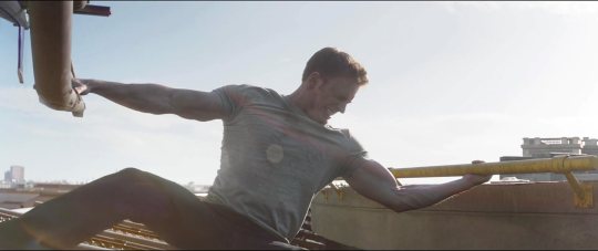
Steve Rogers holding down a fucking helicopter is just...peak Captain America and I’m so glad.
The part where Tony recruits an actual child who is not involved in this situation at all, spiriting him away to another continent to fight supersoldiers, that’s just...beyond, honestly. I hate this as an introduction for Spiderman because it’s so wildly irresponsible of Tony, it’s an unforgivable thing to do. He’s a kid. This has nothing to do with him. This is where Tony officially loses me in this movie. You can take your self-righteous attempts at justifying your actions and shove ‘em, buddy. You’re actively endangering a child.
We really don’t need Steve to kiss someone every Cap movie. We didn’t need him weirdly mackin’ on his recently-deceased ex-love’s niece. Seriously.
Spiderman’s particular brand of quipping while fighting really irritates me, also. It’s altogether a big no from me on the Spiderman front.
Still love Ant-Man, though. He’s delightful. I also enjoy Hawkeye so much more here than I have in the Avengers films.

C’mon, T’Challa. You can’t attack and attempt to kill a guy outright and then play the ‘you must be guilty because you ran away’ schtick. Do a brain about it.
See, everyone else knows why they’re there and what they’re fighting for, they know the stakes. Scott is the only one on Cap’s side who isn’t already part of the situation anyway, but he’s read in on why he’s being asked to get involved and he’s a grown adult person making an informed decision. Peter doesn’t have that, he’s there fighting because Tony said so, and that’s just fucked up.
Heavy sigh. And here we go with the emotional Tony thing. Yeah, he just saw how his parents were killed by the Winter Soldier. That’s rough. It’s really rough. But he doesn’t just have an immediate emotional outburst, he has a sustained homicidal rage, which includes not only trying to kill Bucky, but also beating the Hell outta Steve, who, y’know, did not kill Tony’s parents. The fight scene lasts way too long and involves too much opportunity for cooler thought to prevail (both in problem-solving and in conversational moments), and someone whose emotions can send them reeling so completely out of control - even when they actively know they’ve been manipulated into it! Zemo literally just told you to your face that this was his plan! - someone with so little impulse control should never be given the power to make decisions for others or wield anything over them. This is all just a really, really great case for why Tony is ill-equipped to be an Avenger at all.
Watching Bucky digging the repulsor out of Iron Man’s chest with his metal hand is...so exciting. Rest in peace, awesome metal arm.

Zemo’s just a regular human, but he gets locked up under utterly inhumane circumstances. Again, the Accords involved a deal with a pretty insidious devil, and they didn’t actually have to prove that Steve’s position was the correct one to such a strong degree (we could have had a more nuanced conversation about the subject of accountability if the two sides were more evenly presented), but damn, the red flags, guys. It shouldn’t have taken Tony until he was horrified seeing his friends in the raft prison to finally clue in.
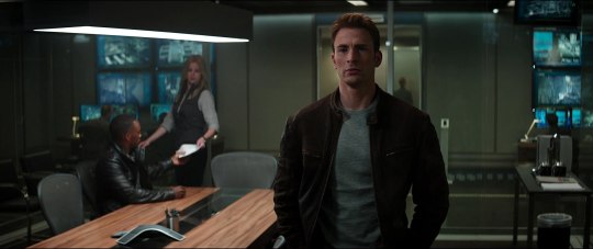
Ok, so, I know I already played the ‘I’m pregnant’ card to explain away my meandering commentary for Ant-Man, but it’s still true and only getting more significant as time goes on, so I regret to announce that - despite having looked forward to disassembling this movie since I started on this Marvel adventure - we’re now only a day out from publication and I haven’t written anything yet. I know, the deadline isn’t exactly set in stone and I could just hold off publishing until I’m ready, but that’s a slippery slope and if I start telling myself to just ‘get to it when you get to it’, who the fuck knows when it’ll happen. This isn’t supposed to be stressful, so I’m just gonna ramble a bit and see what comes out. There’s a thing wriggling in my guts and I have a house to paint. I’m doing my best.

First things first: my stance re: Accords is that the best method of oversight is the one which emphasises accountability, rather than permission (with acknowledgment that this is a fictional universe with threats and powers which do not reflect the real world). The kinds of issues our Avenger characters get involved with are typically of the sort which has to be nipped in the bud right-quick before it becomes untenable, and also not infrequently, the types of problems which do not offer them bountiful evidence to present to a board for evaluation before they get the ok to counter it. Faffing about with diplomacy and bureaucratic carrying-on is a great way to, say, allow Hydra to launch the Insight helicarriers and wipe out all dissenters to their rule before you have the chance to stop them, or (if Zemo’s apparent plan with the Winter Soldiers had been his real plan after all), to be stuck mopping up the global damage as an elite death squad roams around destabilising governments. I’m not a supporter of the adage ‘it’s better to ask forgiveness than permission’ in the real world, but in a comic book universe, with the supervillains and the world domination and the plots which consistently include chronic time-sensitive action and little if any concrete evidence? The Sokovia Accords are woefully inadequate. By all means, the Avengers should be answerable to someone, and being required to submit reports justifying their actions (and face disciplinary measures or even criminal charges if they cannot explain themselves to a satisfactory degree) is a completely reasonable thing to convene a United Nations panel to oversee. Maybe Tony can hop down off his high horse and face actual consequences for the Ultron fiasco. That’s fine with me, and it’s a logical thing for the world to clamour for. Shifting responsibility to a panel of UN politicians who will then no doubt be reticent to send the Avengers into anything pre-emptively (or within any kind of useful time frame) for fear of backlash is a terrible solution, and even more so when you’re being pushed into it without any time to evaluate and amend the original document before it becomes law.

(It’s worth noting that the person most likely to appreciate how easily the UN panel could be hijacked by political machinations not in the interest of the public good is Steve, owing to his personal role in uncovering and thwarting Hydra’s plans; Sam was roped into the Avenging world through that event, and thus it’s unsurprising that he would have the same concern chief in mind when refusing to sign. While Natasha does sign on to the Accords, she explicitly does not do so because she thinks the Accords are a good idea; she’s playing the political game and ‘reading the terrain’, as she says, and that’s consistent with her character. Tony being impulsive and dangerously emotion-driven is also unfortunately consistent, as is his self-righteousness about imposing his will on others to assuage his own guilt. Vision really has no excuse for being so bad at logicking his way to signing the Accords, but it’s no surprise to me that the most clear-headed staunch Accords supporter would be Rhodey, since following orders from others and unquestioning trust in your governing body is dead-on character for him as a career military man. I think he’s categorically wrong, yes, but I’m not mad at Rhodey for being a True Believer any more than I am at Natasha for being mercurial; both are in-character choices and ones which involve evaluative thought processes, and while ‘in-character’ may still be in play for Tony, evaluative thought processes are not, and that does make me mad. As I’ve noted before, he tends to work as a likable character despite his MANY flaws when he’s in his own movies, because acknowledging those foibles and working to fix them is a core part of his personal arcs in each Iron Man film; it was an essential quality missing in Age of Ultron, and one which made a monster of the character which I AM glad this movie is addressing with fallout; still, there’s a lack of tangible self-reflection and making amends from Tony in this movie, alongside some of his worst personal decisions, and I sincerely do not love him by the end of it.)
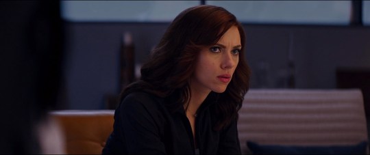
The good thing is, despite a few lazy elements - Vision! You tool! - and despite some very frustrating decisions, the central dilemma of the film is a strong and nuanced conversation-starter (and perhaps, argument-inducer). Even though the specific scenario and the people involved (Ross (both of them) and the floating Guantanamo, et al.) skews the narrative definitively against the Accords by the end, there is still fodder there for an intelligent debate about the merits of the concept if not the execution. And, most importantly, Steve’s position on the matter is the MCU’s Captain America to a T - a political story about the appreciable and essential difference between doing one’s duty to a concept, vs adherence to a moral code. Disobedience is a core part of Steve Rogers’ dilemmas - not that disobedience IS the dilemma for him, but that it is at odds with the patriotic good-ol’-boy image he is expected to inhabit from outside. Every Captain America film carries with it the idea that to do the highest good can mean rejecting everything that the people and institutions around you try to insist is right; refusing to play a role that has been prescribed to you; always making the choice for yourself, by your ethos, no matter how hard it is. Refusing to compromise when you see the compromise as an evil; planting yourself like a tree, and saying ‘No. You move’ (a great way of keeping Peggy’s influence alive and moving in the plot, by the way, and a key demonstration of how she and Steve met on the same wavelength. Lots of strong details in this movie, tbh).
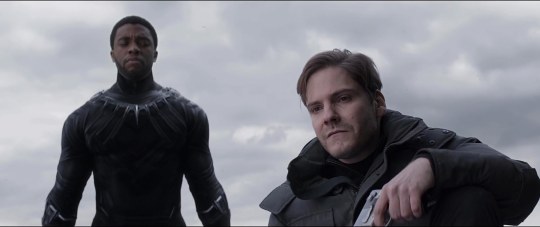
My primary complaint, however, is that this is also too much like an Avengers film; nearly all of the other major characters are there, and Tony especially gets a LOT of screen time, and since Cap and his films are my uncontested faves I am pretty salty about having to share the stage for his last outing. The tone and the subject matter are still totally on-brand, but the focus is split, and that’s particularly annoying for what it leaves behind. While Bucky is made central to the drive of the plot, Steve finally being reunited with him, bringing him in, getting the cathartic other side to what was so exquisitely set up in The Winter Soldier, it falls by the wayside a bit and comes off underdone. Sam is certainly there, being wonderful as always, but he doesn’t get a lot to actively influence, he’s mostly just That Other Guy, and it’s a real shame since he was a highlight among super-stiff competition in his introductory film. The touch of Peggy that shines through the film is poignant, but Sharon Carter gets the bad end of the stick with under-developed characterisation and a very ill-advised zero-chemistry attempt to stir a speck of romance in a story with no room for it, and altogether, the kinds of quiet character moments which added so much depth to The Winter Soldier are very much lacking here. We’ve got so many other characters on deck already, plus the introduction of two new major players (T’Challa has a solid, sombre presence which suits the film, and even his hypocrisy fits snugly into the plot so as not to be a barb against him, but as I’ve mentioned already, I am squarely against Peter Parker’s squeaky excessive comic-relief inclusion and the dire implications it has for Tony Stark’s moral compass), and we’re already spending so much time on beefing up Tony’s side of the Civil War. I don’t personally think the movie is bloated, overlong, or incoherent, but it definitely wanders close to all three and I wouldn’t be inclined to argue very strenuously with anyone who wanted to denounce it on any of those fronts. It has a lot going on, not quite too much for an ensemble movie, but more than it should as a story with a single character’s name in the title. I’m still mostly-satisfied by it, and consider it one of the stronger MCU films to date, but as a third Captain America, specifically? A bit of a let-down.
#Marvel Cinematic Universe#Captain America: Civil War#Bechdel Test#female representation#MCU#Captain America#Civil War
5 notes
·
View notes
Text
Military Jackets: How to Choose and Style the Right One for You
fyi: This article may contain affiliate links (details)
Military-inspired menswear has always been prevalent in the fashion scene. Take one look at current style trends – it’s having yet another moment in the spotlight.
In that spirit, let’s explore the most iconic pieces – including military jackets.
Editor’s note: While we go through each style, we will also provide you with a range of models to choose from. Ones that are more “OG”, some a modern take on the original, and of course, “grail” pieces (ones you may need to spend a bit more on). Enjoy!
Field Jackets
Before we go too far, a little background on the numbers you see attached to these field jackets. Rather than a random product number, this number actually refers to the year that specific garment became standard issue.
In this first case, ‘M-51’ indicates that the style was released in 1951. Simple enough!
The M-51 Field Jacket
The M-51, along with the M-65 (discussed next) is what most likely comes to mind when you think of classic men’s military jacket. It’s iconic, and for good reason.
Made from a midweight canvas, the M-51 is most commonly found in olive green. Its shirt-jacket style collar lends itself to more casual settings than the M-65.
The M-51 is usually seen sans hood, although one was included, which buttoned on to the jacket collar. You’ll notice other details like:
4 pouch pockets
Removable liner
Snap closure
Button cuffs
The OG
While a lot of the M- issued military jackets are still made by Alpha Industries, they don’t carry the M-51. You’ll have to scour vintage stores or eBay to find something truly authentic.
The Modern Take
J. Crew Cotton Field Jacket Price: $150 Buy Now
This interpretation of the M-51 by J. Crew keeps the vintage look of the original military jacket, but with a trimmed down fit, cotton fabric, and a few stylish details.
The Grail
Mr. P Field Jacket Price: $525 Buy Now
I’m not sure if there is one go-to ‘splurge’ for an M-51. But if you’re going for high-fashion, look no further than this version from Mr. Porter.
The M-65 Field Jacket
The M-65 was created as an upgrade to the M-51 field jacket. It keeps many of the same characteristics, but with a few key changes.
The color is usually classic ‘army’ olive green and it comes with four pouch pockets.
Apart from the hood, big changes were made to the collar. It became a stand collar rather than a pointed shirt collar. The button cuffs and collar closures were replaced with velcro fasteners.
As indicated by the name, the M-65 was released in 1965 and then widely used by American troops through the Vietnam war.
Over the years, the M-65 army jacket has been featured on the backs of pop culture icons, the most memorable of which was Robert DeNiro as Travis Bickle in Taxi Driver.
The OG
Alpha M-65 Field Coat Price: $225 Buy Now
The original supplier of a wide variety of U.S. military gear, Alpha Industries, is still pumping these bad boys out for the general public today (now offered in both a slim and standard fit).
The Modern Take
J. Crew Field Mechanic Jacket Price: $198 Buy Now
Even the Alpha Industries ‘slim fit’ version tends to be oversized. If you want something truly slim and modern, the J.Crew version is the way to go.
The Grail
Belstaff Roadmaster Price: $795 Buy Now
This black waxed cotton version from Belstaff does not disappoint. They’ve done some incredible work transforming vintage military jackets into edgy “rock star” pieces.
Flight Jackets
Alright, quick disclaimer: While I had that fun fact regarding the numbering on field jackets, the numbering (and lettering) on flight jackets remains a bit of a mystery to me.
If I have any enlisted readers or military enthusiasts, please feel free to fill me in via the comments!
Regardless, flight jackets are some of my favorite military jackets. And lucky me, they’re definitely having a moment in modern men’s fashion.
A-2 Flight Jacket
While there was an A-1 predecessor, many consider the A-2 to be the definitive style of American flight jacket.
Introduced as standard issue to Air Force pilots in 1931, this jacket was originally very hard to come by for any non-air crewmen. As such, it was worn with intense pride by pilots. They would often add patches and other embellishments to signify accomplishments, camaraderie, and rank.
After being discontinued in 1943 in favor of newer cloth-shell jackets, the style became popular among the general public. Still, truly accurate replicas or vintage originals are rare and expensive.
The jacket itself is distinguished by a leather shell with a lightweight silk or cotton lining, a shirting-style collar, and knitted ribbing at the cuffs and waist.
Additionally, they have a flap pocket on either side of the chest. But no hand-warmer pockets – they were considered too undisciplined for military personnel. Today, these details vary model-to-model, but the silhouette remains a winning classic amongst military jackets.
The OG
Rough Wear A-2 Flight Jacket Price: £1,099 Buy Now
One of the original manufacturers, Rough Wear, can still be found at a few outlets like British suppliers Eastman Leathers.
The Modern Take
All Saints Aviator Coat Price: $585 Buy Now
The shearling collar stands out as a modern touch to this All Saints jacket that’s otherwise steeped in the original style.
The Grail
Our Legacy Shearling Bomber Jacket Price: $1,700 Buy Now
This impressive jacket by Our Legacy has the luxurious details it takes to stand out – and it’s built to last.
MA-1 Bomber
The MA-1 Bomber is another iconic military style jacket that you’re sure to recognize and see everywhere.
The MA-1 was originally created as a response to the development of jet aircraft. Since they flew higher and faster, they subjected pilots to colder conditions. The MA-1 wouldn’t freeze if it got wet like previous leather iterations (like the A-2).
Additionally, the new jet cockpits were much smaller. Previous men’s military jacket styles were too bulky and stiff to be comfortably mobile.
After replacing the leather with a nylon or polyester shell, the MA-1 was cut waist-length with the same knit ribbing around the cuffs and waist. Instead of a shirting style collar, the MA-1 utilizes more knit ribbing around the neck. And it includes hand-warmer pockets along with a signature pocket along the bicep of one sleeve.
Popular in civilian fashion since the 70’s, the MA-1 bomber military jacket has seen a resurgence thanks to it’s heavy use by high fashion designer Helmut Lang. And – more recently – it’s been adopted into street style by celebrities like Kanye West and A$AP Rocky.
The OG
Alpha M-1 Flight Jacket Price: $150 Buy Now
The classic by Alpha Industries is still going strong today.
The Modern Take
Schott NYCA MA-1 Flight Jacket Price: $155 Buy Now
Like all things leather, Schott makes some of the best – and they’re cheaper than finding something vintage.
The Grail
Rag & Bone Manston Nylon Bomber Jacket Price: $595 Buy Now
This jacket from Rag & Bone gets it right – the balance between OG and modern, the sleek look, and the classic details.
Naval Coats
The Duffle Coat
The term ‘Duffle Coat’ has come to indicate a distinct style. But the name originally referred to the specific type of fabric used, a thick wool developed in Duffel, Belgium.
Now you can find duffle coats made from a wide variety of fabrics – though usually still wool-based. And the defining characteristics have become the toggle closures. They’re fashioned from wood or horn fastened to rope or leather loops. Most duffle coats are hooded, thigh-length and feature a more boxy fit.
The OG
Gloverall Monty Duffle Coat Price: £450 Buy Now
Originally a British creation, Gloverall took up production after acquiring a boat-load of surplus originals issued to the British Royal Navy during WWI and WWII – and they continue to make one of the best models out there.
The Modern Take
Uniqlo Wool-Blend Duffle Coat Price: $129 Buy Now
Japanese brand Uniqlo took the Gloverall original, clipped the sides, replaced the wood and rope closures with horn and leather, and gave it a price that is much easier on the wallet.
The Grail
For the duffle coat, it’s all about the OG version! Doesn’t get better than the original, in my humble opinion.
The Pea Coat
Like the duffle coat, the pea coat is a staple of naval wear. It originated within the British Royal Navy and was later adapted by their American counterparts. Mentions of the garment appeared in American newspapers as early as the 1720’s.
The pea coat is crafted from similar (if not identical) fabric and designed for the same function as the duffle coat. So the differences lie in the details.
Pea coats are characterized by a double-breasted closure, with broad lapels and shorter length. Knee-length options do exist – they’re usually referred to as an ‘officer’s coat’, named for their use in the uniforms of high-ranking naval officials.
As for the origin of the name, opinions differ. Many attribute it to an abbreviation of ‘Pilot-Cloth’ (which pea coats were often made of in their early forms) to ‘P-Cloth’ and then to ‘P-Coat.’
The OG
Sterlingwear of Boston Authentic Peacoat Price: $295 Buy Now
Today, Sterlingwear of Boston is the official supplier of pea coats to American naval forces.
The Modern Take
Ok, this is a cop out, but the pea coat can be found at practically every modern menswear brand, from J.Crew to Bonobos to Club Monaco and everyone in between.
The Grail
Todd Snyder + Private White Manchester Pea Coat Price: $895 Buy Now
For something more ‘lux’, look no further than this version from Todd Snyder + Private White V.C. and embellished with a swaggy fur collar.
The Crew Coat
The N-3B Snorkel Parka
This one goes to show you: You never know it all!
Here I was, thinking that the N-3B parka discussed below had to be either a ground troop or maybe even a naval issue. But my research into military jackets proved me wrong.
The snorkel parka was intended for flight crews. Those were the folks manning the runways in frigid weather.
The N-3B Parka is characterized by a ¾ length (at mid-thigh), a weatherproof shell, and an insulating liner. Originally, the shell was nylon with a wool liner. Later iterations moved to a cotton/nylon blend shell and a padded polyester lining that’s warmer and lighter weight.
The truly defining characteristic is the hood. It’s fully attached with a high collar closure – when fully closed, the hood leaves only a small tunnel or ‘snorkel’ for the wearer to see out of. This, along with a fur lining (real fur on the vintage and quality modern versions) make this military jacket a real weapon against the cold.
The OG
Alpha N-3B Parka Price: $200 Buy Now
Again, Alpha Industries takes the cake as the original military supplier.
The Modern Take
J. Crew Parka Price: $400 Buy Now
Water resistant, lightly insulated, and warm, this J. Crew parka is both stylish and functional for the cold, wet weather.
The Grail
Parajumpers Right Hand Waterproof Jacket Price: $1,125 Buy Now
I love that this Parajumpers parka is built for warmth on the coldest of days but can still turn heads on city streets thanks to its grail worthy touches – like that coyote fur trim.
So, which military jacket do I get?
First, consider the temperature. All of the military jackets above give pretty decent protection from the elements. But there’s variation in how that protection is provided. The best way to think about it is to look at who they were originally intended for.
Field jackets were given to ground troops of all types – they’re the most versatile style.
In civilian life, I’d stick to these for transitional seasons and milder climates. They’ll be generally wind and water resistant, with a medium level of insulation. That makes these military jackets great for a Northeastern fall day. Or for year-round use in a city like San Francisco. But probably not the best pick for surviving a Chicago blizzard.
Flight jackets tend to offer more insulation since they are meant to withstand the pretty-darn-cold temps inside the cabins of airborne fighter jets.
That said, they are also cropped. That’s useful for pilots – it doesn’t get in the way of the seating positions and allows more in-flight mobility. But it’s also less useful for keeping your legs and butt warm and dry.
For that reason, I’d be more likely to opt for a flight jacket if I’m living in a car-prevalent city, rather than one where I’m doing a lot of walking.
Naval jackets, designed for nautical use, are the warmest of the bunch here.
Pea coats and duffle coats are often made from Melton Wool, a thick fabric known for its durability, wind resistance, and water resistance. Parkas typically combine a protective shell with a decent amount of toasty-warm down filling.
Duffle coats and parkas really take the cake over pea coats, if only for the inclusion of a hood.
Along with that, you’ll want to consider your personal style.
How to Wear and Style Military Jackets
While every coat and jacket listed here comes from a military background, they each have a distinct style.
Field coats, while issued in large quantities to new recruits, come across as more rebellious than regimental. Over the years, they’ve been worn just as notably by military and counterculture representatives.
Bomber jackets carry some rock-star ‘cool’ edge. Leather iterations bringing to mind bad-boys on motorcycles. And thanks to Kanye West (an influential style icon, regardless of your personal feelings about him) the nylon MA-1 bomber has become a favorite of the hip-hop crowd.
Pea coats and duffle coats are associated with a classic nautical style. Their adoption by ivy-leaguers has given the coats a preppy reputation. These wool pieces lend themselves to more formal looks as they resemble a traditional topcoat.
A parka has a rugged, outdoorsy feel to it that says ‘I can survive anything’ – and means it. They’re often worn with flannels and sturdy pants. But the fashion-forward crowd has started rocking them over suits to great success.
Tell me
Do you have a military style jacket in your wardrobe? Which one of the above is your favorite?
clothing cold weather outerwear
<![CDATA[.post-footer-optin border:5px solid #8dbabf;padding:2.5rem; .post-footer-optin h2, .post-footer-optin p color:#8dbabf; text-align:center !important; .post-footer-optin h2 margin-top:0 !important; .post-footer-optin p font-size:1.4em;margin-bottom:1.3em !important; ]]>
DRESS BETTER TODAY
Grab the free Lean Wardrobe eGuide and also get these articles sent straight to your inbox.
SEND ME THE FREE GUIDES
Source: https://effortlessgent.com/mens-military-jackets/
2 notes
·
View notes
Text
Best Of New York S/S 18 Runway
We have put together a comprehensive analysis of the best collections showing at New York Fashion Week.
Calvin Klein

Drawing on iconic cultural references, Simons looked to the cinema and America’s fascination with horror films. Prints were inspired by Andy Warhol's Death and Disaster artworks. "It’s about American horror and American beauty,” says Raf Simons. The collection embraced semblances of 1950s silhouettes, reworked in industrial materials and drenched in bold colors.
Fenty X Puma

A trio of motocross drivers circling through the air set the pace for the Fenty x Puma collection. Inspired by X Games with a hint of surf, Rihanna sent out a collection of youth-centric pieces, as hardware-strapped anoraks met panelled scuba onesies, while swimwear curved high over the hips, under low-slung cargo pants. Rihanna ramped up her game in bold colour contrasts of navy, pink and lime.
Victoria Beckham

Victoria Beckham’s notes read "soft, strong, honest, easy – this collection reflects the many powers of femininity." Silhouettes were delicate, confident, and powerful, achieved through her choice of sorbet colors, materials and cut. Pencil skirts were paired with oversized shirts, while the delicate transparency of dresses was emphasized with asymmetrical cuts, skimming over the body with effortless drape.
Marc Jacobs

The Marc Jacobs program notes pointed to “a reimagining of the seasons past, somewhere beyond the urban landscape of New York City.” Oversized daisy prints and exaggerated color were seen along with show-stopping turbans. Beaded tops, bold psychedelic-print harem pants and a yellow beaded evening gown that closed the show were an exotic finale to an energetic presentation.
Michael Kors

Michael Kors' collection was soft and relaxed in a palette of sun-bleached colour: tints of wisteria, rosewater, pearl and cornflower blue, which worked beautifully into the subtle prints of palm tree fronds and tie-dye. The items were just as light: an asymmetrically cut silk dress, an oversized jacket with stripe trousers and dresses to catch the faintest breeze on a summer night.
Tom Ford

Tom Ford’s dazzling collection saw him revisit his past, with echoes of Gucci and Saint Laurent emerging in flamboyant recreations. Broad-shouldered jackets cut with bespoke precision were drenched in powerful pink. Sex appeal came in low-slung trousers, revealing maillots, sequinned tunics and slithers of body-skimming shirred dresses. Shorts and satin jackets added to the glamorous 1990s appeal.
3.2 Phillip Lim

Phillip Lim’s spring wardrobe was a study in streamlined asymmetry and downtown playfulness with flamenco iterations. This marriage of opposites saw menswear references reworked into linear silhouettes such as sleeveless trench coats, skirts, and workwear jackets. The color palette of navy, white, red and lime was equally edgy, while ruffles updated classic shirting or appeared in modern layers of skirts.
Sies Marjan

Sander Lak of Sies Marjan showcased his spring line in the brand’s atelier, filled floor to ceiling with giant spools of colourful thread. He masterfully paired raspberry with salmon pink, and washed-out lilacs with lime cream or sky blue. Metallics were introduced confidently into a laminated trouser suit or a crinkled pyjama set, while sweet-colored satins made for an array of charming evening dresses.
Tory Burch

Tory Burch presented a 'true summer collection' in every sense; models meandered quietly through manicured gardens at the Smithsonian Design Museum, where the backdrop of intense greenery lent an appealing foil to her colorful line-up. Burch took inspiration from David Hicks, the celebrated British interior designer, infusing his dynamic use of geometric prints and bold color into her easy silhouettes.
Delpozo

Josep Font presented a collection inspired by Slovakian photographer Maria Svarbova’s Swimming Pool series and the bandleader Xavier Cugat. Colour and romance were key to this lovely presentation – the result had a certain charm, played out in dresses with crafted precision and flamenco touches which in turn bore a striking contrast to the more sculpted pieces.
Designers To Watch

The designers at Solace London played with colour and silhouette, showing a sophistication beyond their years. Matthew Adams Dolanstruck gold with statement shirting. Having previously honed their skills at Helmut Lang, the Colovos sent forth a covetable collection of timeless, contemporary staples. Maryam Nassir Zadeh presented a light and zesty collection of separates, perfect for the youth market.
#fashion#fashion bloggers#fashionista#Fashion Blog#Fashionable#style#styles#styling#stylist#stylish#nyfw#new york style#new york fashion week#new york#collections#Marc Jacobs#fentyxpuma#michael kors#delpozo#calvin klein#tory burch#tom ford#sies marjan#3.1 phillip lim#Victoria Beckham#fashion stylist#wardrobe#wardrobe stylist#style addict#potd
2 notes
·
View notes
Text
Bella Hadid Helmut Lang Pre-Fall 2020 Ad Campaign
https://ift.tt/2O2Mvz7
This might just be the year of Bella Hadid. So far in 2020, Bella has four Vogue cover appearances under her belt and numerous campaigns for major fashion houses (think Burberry, Missoni and Moschino). Now Thomas Cawson welcomes Bella back as the face of Helmut Lang for the brand’s Pre-Fall 2020 collection. In the stunning studio images, Bella morphs into her doppelgänger Carla Bruni (once again) for the 90s-inspired campaign captured by photographer Ethan James Green.
IMAGE: HELMUTLANG.COM
The campaign hit all the right notes on our forums. “Ugh, these images are annoyingly stunning,” admitted dodencebt.
“Very 90s Carla Bruni by Patrick Demarchelier,” mikel pointed out.
“I guess the pitch was Carla Bruni for Vogue Italia by Steven Meisel in 1993,” said Lola701. “That being said, it’s all very beautiful even if it has nothing to do with Helmut Lang. Helmut Lang is now an American brand so it’s difficult to get the European edge without having that culture.”
[ Not a tFS forum member yet? Click here to join! ]
Marc10 was also an admirer: “The references are obvious, but this is quite stunning. Some of the strongest shots I’ve seen of Bella, she looks incredible.”
“I am ALL for this, honestly have zero complaints. A truly stunning campaign — just a classic studio setting, simple styling and Bella transporting us back to the 90s by morphing into Carla Bruni. What more could I possibly ask for?” asked vogue28.
“Beautiful. I’m impressed how much Ethan James Green has evolved as a photographer. It feels like yesterday when his modeling days were just starting and some years later he’s channeling Meisel like a pro,” praised an equally impressed Legolas.
IMAGES: HELMUTLANG.COM
Are you in love with the campaign as much as we are? Share your thoughts here.
Source link
قالب وردپرس
from World Wide News https://ift.tt/2BIWuHf
0 notes
Text
library
alternatives , systemic change , the future is dark , a good society
identity politics
feminism
words
human rights law , the right to be human
political participation , direct action , self determination
propaganda , so this is how liberty dies
the physical body , memory
autonomy , excellence , the art of logic , cognitive impatience
immigration , refugees , borders , reparations
the algebra of infinite justice , nostalgia
climate change , ecology
marxism , communism
palestine , afghanistan , philippines
loving better , atom or wave , the heart is a museum
surveillance , how to disappear , permanence
capitalism , to be living today , neoliberalism
mental health , to lose a life , anti-psychiatry , mental health institutions , loneliness , fetch the boltcutters : people can only climb to positions of power by demonstrating at each level that they are willing to accomodate to the values of the system. One does not reach the top because they are a renegade or insurgent. The system disciplines you until you conform or are spat out.
on making art , art , ways of seeing , like illuminations , false art , what can art be?
dystopian cities , cyborg dreaming , do androids dream
we contain multitudes
a theory of color , foxfire , wondrous things
how to live? , profiles , we go on , grief : "to stay human is to break a limitation" – margaret atwood
we are at our best when we serve others
autumn , spring , winter
the turing test ; a tag for what it means to be human or machine; organic or inorganic; for technology recalibrating our sense of selves.
no clocks no masters
reference notes
on helmut lang
the american dream , american psycho
cultural analysis , squid game , arundhati roy
community safety training notes
0 notes
Text
Being Human- Assignment

Scenario
What it means to be human is at the centre of art and design practice, from depictions of the human form to considerations of the ergonomics of a chair. Over the next six weeks, you will be exploring this theme independently, working more within your area of specialism.
Whilst still experimenting and taking risks, you should see this assignment as a project to cover all areas of creative practice in depth- exploring context, primary and secondary research, artist research, problem solving, ideas generation, materials and processes and reflection and evaluation. You should record all of this in your journal, sketch book and/or blog, and you should have a final piece. This will enable you to get an idea of the grade you might get in preparation for the FMP.
Below are suggested starting points for the Being Human project-you might have ideas of your own you would like to pursue
1- The body manipulated

This assignment is concerned with exploring methods used to distort and manipulate the body in all genders, ethnicity and ages, from a range of time periods. Some examples could include:
· tribal rituals- Kayan neck rings,
· body modifications such as scarification, piercing,
· corsetry, padding, stiletto heels
· hairstyling, facial hair
· prosthetics
1.To start, make twomoodboardsof methods used to distort and manipulate the body. Use the examples about as a starting point. Secondly, make a moodboard of artists and designers whose work involves manipulating the human form:
· Bart and Hess, Comme de Garcons, Issey Miyake…. The list is endless
2.Now develop a range of experimental surfaces based on your research that explore processes involving manipulation, contortion and distortionusing a variety of materials, from fabric to plastics. These samples should be well crafted. Explore tension, folding, stitch, transparency, pattern, colour, embroidery, feltmaking……
3.Working with a dance student, or someone who is willing to pose for you,design and make a garment/ structure/ surface that can be worn or used in movement which should involve distortion/ manipulation of the body in some way. You should make at least three drawn/ collaged designs as part of the process. This should be recorded through film and photography.
2: Phrases and idioms

William Kentridge
Every language has it’s own collection of sayings. They offer advice about how to live and also transfer some underlying ideas, principles and values of a given culture / society. These sayings are called "idioms" - or proverbs if they are longer. An idiom's symbolic sense is quite different from the literal meaning or definition of the words from which it is made. Idioms have great intensity and make a language interesting and dynamic. They have a sense of mystery and fun about them.
“A groupof wordsestablishedby usageas having a meaningnot deduciblefrom
those of the individualwords” Oxford English Dictionary
Produce a body of work which explores the theme of written phrases that relate to the body: Idioms, sayings, proverbs and so on. The phrase may feature as a series of letterforms, but you do not need to include the phrase within the work at all. More likely it will be the starting point or theme for a body of development work exploring form, structure, narrative etc. Don’t necessarily just illustrate the figurative elements of the phrase, but you should also consider it’s meaning and context, both social, historical and cultural. Examples include:
A slip of the tongue - Bend over backwards - Blind leading the blind - near the knuckle - Itchy feet - Eat your heart out - twist someone's arm - Tongue in cheek
This could develop into printmaking, painting, sculpture, theatre design, advertising, photography, film, animation,packaging design, costumes, interior spaces, fine art installations, jewellery, furniture design, repeat patterns …..
3) Personal space

Anthony Gormley
‘the physical space immediately surrounding someone, into which encroachment can feel threatening or uncomfortable’.
How do different spaces make you feel? Why? Consider the smells, light, temperature, noise, other people etc. Think about spaces you enjoy, spaces that make you feel uncomfortable. Think about walking through narrow alleyways/ streets/ in wide open spaces / urban/ rural. What kind of mapmaking can represent a sense of isolation, tight spaces, uncomfortable feelings?
With you at the heart of your ideas, make a personal response to the theme of personal space and your surrounding environment. Use drawings as the starting point, but take this is any direction- paint, film, audio, print, 3d, drawing….
Anouk Wipprecht’s spider dress defends the wearer’s personal space!
4: The body in motion

Duane Michels
Motion: Any movement or change in position or place
A change of position of an object with respect to time, velocity or displacement
Suggested ‘starter’ activities about movement-
· Journey/ motion drawings, holding your sketchbook in front of you produce a drawing as you take different journeys walking, running, on board a bus, train, car (a bike would be fairly dangerous, as would a car if you are the driver so please don’t do this!), as you change direction allow your drawing implement to alter course, accept and embrace jerks, stabs and any other involuntary movements. Try out a range of different media, routes and modes of transport. Add notes to your drawings explaining the journey taken, sounds, smell and sights you have come into contact with.
· Sit in one location and through line record/map the movements of others as they move around you, crossing paths, stopping, sitting, changing direction, retracing steps etc. Again through notes explain the activity that has been taking place.
· Place some paper in an interior location on the floor where it will be walked on, wheeled over and generally marked in different ways – select part of this and produce a line drawing
· Produce a further drawing from one of the above (task 9/10) using materials other than traditional drawing materials i.e., string, tape, drawing pins, nuts, pins, staples etc. Be inventive and try out a broad range of materials creatively
· Body movement: Record and observe mannerisms and body movements through a seriesof drawings, photography and observational notes (you must use all of these recording methods, challenge and experiment these forms of recording to progress your research skills). Examples might be yawning, stretching, combing hair, laughing, skipping, walking up stairs.
During this assignment you will be expected to work independently and not only organise your resources and time, but also identify your area of specialism and project focus within the overriding theme of “Being Human’. You will then be required to write a project proposal that outlines the specific topic your will be researching, primary research visits, secondary sources and an outline of what your final outcome may be. Throughout this assignment you will be expected to reflect in your journal on a daily basis.
Equality and Diversity is encouraged in this assignment as your work in your specialist area on a subject that interests you. Explore a broad range of materials and processes, take risks and do not be afraid to fail and learn from mistakes.You will be expected to be responsible for your own learning and plan on a daily basis in your journal. You will get regular tutorials from staff, but ask for help and guidance as required, from lecturers and support staff. You will now be working with peers within your specialist area, and should support this group throughout.
References- a few suggestions to get you started:
Fine Art: Tacita Dean, Mona Hartoom, Anthony Gormley, Grayson Perry, Louise Bourgoise, Sarah Lucas, Eva Hesse, Chris Ofilli, Rebecca Horn, Marcel Duchamp,
Design: The project twins, William Kentridge, Alan Fletcher, Tord Boontje, Barnbrook, Zaha Hadid, Peter Saville,
Fashion and Textiles: Issey Miyake, Yamamoto and Kawakubo, Yohji Yamamoto, Dries Van Noten, Walter Beirendonck, Dirk Bikkembergs, Alexander McQueen, Hussein Chalayan and Helmut Lang.
Suggested artists – some have been included due to the ideas they explore, others for the materials they use:-
Tacita Dean, video and drawing work, Gerhard Richter, , Damian Hirst (spinning painting), Yves Klein, Mona Hatoum, Christian Boltanski, Louise Borgeouis, Keith Boadwee, Vladimir Tatlin, Corneilia Parker, Laszlo Moholy-Nagy, , Willem De Kooning, Jean Tinguely, Alberto Burri, Antonio Tapies, Robert Rauschenberg, James Turrell, Jaume Plensa
Assignment: https://drive.google.com/file/d/1z92syQ9jRG3Mt0YC7mO2lt0Bdr8PU8WC/view?usp=sharing
0 notes
Text
How Virgil Abloh rose to the top in fashion
New Post has been published on https://latestnews2018.com/how-virgil-abloh-rose-to-the-top-in-fashion/
How Virgil Abloh rose to the top in fashion
The son of Ghanian immigrants says his first show as Louis Vuitton’s menswear artistic director, is a culmination of a lifetime of work
On the afternoon before Virgil Abloh debuted his menswear collection for Louis Vuitton — an event that drew 1,000 seated guests; an additional 1,500 specially invited students; a truckload of the designer’s global celebrity pals, boldface names like Kim Kardashian West and Kanye West, Rihanna, ASAP Rocky, Alexander Skarsgard and Rita Ora; and a handful of Chinese pop stars with social media followings numbering in the multiple millions — a flash mob gathered at Vuitton headquarters on the Right Bank near the Seine.
Tandem teams of messengers hauled in flower arrangements for the designer, so many that the reception area began to look like a wedding hall. Assistants from a 35-member menswear team did frenzied, last minute fittings on a model. The Japanese artist Takashi Murakami — one of a laundry list of global creatives whom Abloh counts among his collaborators (the two have an exhibition scheduled to open Saturday at the Gagosian Gallery here) — drifted through the space, followed close behind by a posse of assistants wearing Comme des Garcons rags and surgical face masks.
The young American influencer Luka Sabbat darted around, hauling a big Louis Vuitton shopping bag over one shoulder. And Ian Connor, the tattooed Instagram phenom (@ianconnorsrevenge) whose self-assurance may out-scale even his million-strong Instagram following, scrolled through his phone feed, barely bothering to notice that Naomi Campbell had wandered in, clad in sneakers and leggings, to perform a supermodel gavotte — trailed, as always, by her entourage.
“This is the culmination of a lifetime of work,” said Abloh, who, at 37, effectively pinnacled the luxury-goods Everest with his appointment in March as men’s artistic director of Louis Vuitton.
���Look around this room,” added the designer — a child of Ghanaian immigrants, a suburban kid raised outside Chicago, a trained architect less notable for any specific design skills than for his masterful ability to manipulate social media. “There are people around this room who look like me,” he added. “You never saw that before in fashion. The people have changed and so fashion had to.”
By people Abloh meant consumers, of course, and the change he has ushered in represents fundamental shifts not only in who buys things but also in who gets to tell the story of fashion.
Fashion, as Stefano Sassi, the chief executive responsible for the turnaround of Valentino, recently noted in Milan, is above all a narrative business: “It’s not the sneakers you’re selling, it’s the perception and the dream.”
In former times the dominant narratives were handed down from on high to a waiting public by a succession of designers. If Abloh’s hiring proves anything, it’s that the old models have lost their validity; the cult of the Great Creative is dead. Gone are the mood boards, the Yves Saint Laurent-style mood swings, the lapdog press and all the hoary antique apparatus of the business.
Though a secular saint here, Saint Laurent probably could not get arrested in the new global digital marketplace, one in which the consumer is the presiding genius and the author of a story that increasingly epitomises aspects of Adam Smith’s free market doctrine.
In the advancing digital age, being has been substantially replaced by consuming and that act itself has devolved from anything closely related to need or pleasure into a performative existential gesture. Consider the case of Connor, the New York-born, Atlanta-raised 25-year-old whose social media tentacles reach millions on Tumblr, Twitter and Instagram. “Even if I didn’t have a home, I was sleeping on the floor, I always made sure I had my clothes,” Connor once said.
Unquestionably, along with his skill at upending fashion’s exclusionary tropes, it was Abloh’s ability to connect to people like Connor and the global digital tribes that the designer referenced in a show, held in the arcaded courtyard of the 17th-century Palais Royal, that led Louis Vuitton to him. “Fashion has to speak to a generation of people who look like me,” he said.
Accordingly, his Vuitton show featured a cast of ethnically diverse models (and also musicians like Kid Cudi, Playboi Carti and Theophilus London) that would have been inconceivable on a Paris runway as recently as five years ago. And yet, if there is little reason to question Abloh’s sincere dedication to diversity, there is somewhat less incentive to imagine the same of Bernard Arnault, the French magnate who owns Vuitton as part of his LVMH Hennessy Louis Vuitton luxury empire.
It’s worth noting that suddenly the catwalks here and, before Paris, in Florence and Milan featured unprecedented numbers of models of colour. Designers in all those cities were quick to point out the change, noting how their runways now featured castings variously described to this observer as “exotic” or “coloured” or “immigrant.”
There are vast new millennial markets to exploit in China (400 million) and India (385 million), Asia representing 19 per cent of the global generational cohort, according to demographers at the Pew Research Center, followed closely by sub-Saharan Africa with roughly 13 per cent. (Only a slowly ageing Europe remains underweight in terms of pure population.)
The goal is getting at them; the surest route, the internet; and the odds are on the internet and the affable, easy-going Abloh knowing how.
Evidently he does. Titling the Vuitton show “We Are the World,” a reference to the 1985 charity single in support of Ethiopian famine relief, the designer included with his show notes maps detailing the global origins of each member of the cast.
On a radiantly sunny afternoon, he quickly put to rest any doubts about his design abilities — “People think I’m just that guy who puts a stripe on a hoodie,” he’d said earlier, at his studio — with a demonstration of his design conviction, opening with a suave double-breasted suit worn over double-pleated trousers precisely when most menswear labels are in desperate flight from tailored clothes.
This being Vuitton, it was paired with matte white crocodile sneakers and a tote. “Why do you guys even make clothes?” was the first question Abloh asked when he was hired by a house that originated as a luggage maker. “Accessomorphosis” was the term he then coined to fuse apparel with the accessories that drive Vuitton sales.
Why carry a wallet or strap on a fanny pack or burden yourself with a card holder when you can attach it to a harness, a holster or a multi-pocketed gilet? Sure you could see in those hybrid accessories a nod to ‘90s Helmut Lang (a designer once described as the Type O of fashion: its universal donor.) And you could discern in the shifting volumes — flowing suits played off tautly snug ones — elements reminiscent of screen grabs from Pinterest pages devoted to vintage Armani.
Yet all of these came neatly balanced by components from a very personal vocabulary Abloh honed at his own label, Off-White: transparency, asymmetry, ineffable skate-rat cool. Perhaps, as some suggested, the romanticism of sequinned jacket prints depicting Dorothy Gale asleep on a bed of roses (not far from Oz) were a reference to Abloh’s belief in pursuing one’s dream, but they also underscored the Midwestern gumption he shares with that girl from Kansas.
In conversation with this reporter last year in Milan, Abloh uttered what you might call a personal credo, one applicable to anyone determined to reach a goal. “I never mind when people turn me down, because I immediately start looking for solutions,” said Abloh, who appears to have attained his at Vuitton. “I always love that first no.”
0 notes