#ratio is a plus and multiply sign
Explore tagged Tumblr posts
Visit Tumblr Blog
Explore Tumblr blogs with no restrictions, modern design and the best experience.
Last Seen Tumblr Blogs


Fun Fact
Tumblr was created by web developers David Karp and Marco Arment.
Text


just got to penacony !!!! i’ve been obsessively drawing the guys for the past few days lol
#if u look closely then you can see i gave them different eye highlights#sundays is crosses because biblical imagery#ratio is a plus and multiply sign#and aventurine is heart and diamond like card suits#also i literally have no clue what the background for aventurine is supposed to be#i was like “nicooo what should i do for the background” and they were like uhh uhh#and showed me a pic of some like squiggles ? looked like it was on the edge of banner art#so it’s probably aventurines banner art#but if it has another meaning#don’t assume i know lol#man it’s a yap fest down here#bonus points if you read my tags !#say squidward if u got this far /hj#tbh i don’t like the sunday one that much lol#i think his hair looks wrong#might redo it at some point in the future if i feel like it#i think aventio both look great tho#sunday and ratio have been made into stickers too#just for me and friends tho#i won’t be selling them#i’m gonna draw boothill next (whenever i meet him…)#and also a friend is gonna commission me to draw argenti !#very fun#thats my yap :P#dr ratio#aventurine#sunday hsr#penacony#hsr sunday#hsr fanart
99 notes
·
View notes
Text
WOD Gotham City investigative research report
The glossary is found at the bottom of the post
Subject 1
The city
Following the prolonged quarantine, 35 Individuals have successfully entered Gotham City to gather as much information as possible about any and all potential causes of the abnormality. The individuals are also to report any additional anomalies or side effects when first encountered or when Indicative of the abnormality spreading.
The vampire-to-human ratio is abnormally high, especially considering the absence of a dominant sect or Clan. Furthermore, it seems that the vast majority of vampires living in Gotham do not fit the Qualifications for any known Clan and, as such, are currently being listed as Caitiff. Due to the high Concentration of vampires, human mortality rates are also high in Gotham. Despite this, the population number always manages to stay approximately within the average range. There's no current explanation for this phenomenon, but resurrection has been ruled out.
Multiple reports of camarilla agents have been filed. These reports indicate that they are gathering intelligence without directly interfering, supporting the current belief that the city is not under the camarilla's control.
Both citizens of Gotham and those outside of it believe that Gotham is being quarantined due to an outbreak of an unnamed disease. Most citizens of Gotham are beginning to believe that this disease is supernatural, though they have not fully begun to understand the truths of the world around them.
Agents investigating underground circles report a high number of ghoul-ing attempts. As such, the majority of drinks being sold come with Lids.
A strange phenomenon has been observed and studied accordingly. Currently being referred to as the Times Square portal glitch, it occurs when a mage opens up a portal in a large group of people, around 100 (plus or minus 15, depending on your star sign), intending to leave Gotham. If the mage has been in Gotham for at least 100 days, Times the day of the month they were born, then they have an increased chance to experience the negative effects of the glitch. To find the exact probability of success, you also need to multiply 3 with their birth month, day, and year separately before adding all numbers together and dividing them by 3. this will tell you the Degree of separation that may occur in either direction; there is no verifiable way to check which direction it applies to. Individuals who have experienced the negative effects Times Square portal glitch are reported to wake up naked in Robinson Park Closest to where they summoned the portal If the negative effects of the Times Square portal glitch are avoided, a mage will successfully exit Gotham with all memories intact and no urge to return; attempting the Times Square glitch will never result in paradox, but attempting to open a portal in Gotham alone will result in paradox.
Gotham is considered its own Paradox Zone, and as such, what is considered paradox varies greatly.
Our agents, on multiple occasions, have been given a variety of strange instructions by locals; five of our agents have been killed, all of whom did not follow the rules.
Author's notes:
I probably got some stuff wrong about the world of Darkness and will most likely continue to do so but I'll try my best Sorry, it can be pretty confusing, And if I think an idea is really cool and it doesn't like technically fit in but like it's REALLY cool, I'm going to do it.
Glossary:
Sect: a social organization of vampires, kind of like a really big Club
Clan: Vampires who share characteristics based on shared blood, kind of like genetics; there are 13 known Clans
Caitiff: This can kind of mean two things, but in this context, we're going with the more biologically oriented meaning: basically, they don't fit the characteristics of any of the other clans or have a collection of multiple characteristics that one vampire isn't supposed to have.
Camarilla: the most organized sect, it kind of controls the world, or at least it thinks it does. They're all annoying rich people who do like eugenics and love capitalism.
Ghouls: A ghoul is kind of like a vampire's minion who follows their every order, especially if their blood is bonded, but we'll get into what that means later
Ghoul-ing: The process of turning someone into a ghoul; it can be anyone; even another vampire or any kind of living creature can be a ghoul, and it gives them enhanced abilities related to the vampire who ghoul-ed them.
Paradox: Paradox is kind of weird It's basically if you break the laws of reality in front of other people, that's how it's supposed to work at least but it's not really how it works in Gotham if you break it, the damn Space Police will come and arrest you and shit
#gotham#batman#the batfamily#batman comics#dc comics#dcu#dc universe#dc au#wod#world of darkness#mage the ascension#vampire the masquerade
7 notes
·
View notes
Text
Stop discriminatory practices in renting homes and apartments
Today, people trying to get back on their feet cannot get apartments on middle-class salaries unless they earn $100,000.00+ per year — yes, you read that right — they must earn upper class salaries like CEOs making $250,000.00+ per annum, while they drive trucks, work in healthcare, work as plumbers, sanitation workers. contractors, locksmiths, teachers, paralegals or mechanics. No $100k salary, no apartment, even if three adults work and put together $30-$40k for rent, utilities, food and commutation. Even studio apartments that should normally rent for $1,000.00 are going for $2k-$3k, and they are not worth the money. Normal rent ratios are supposed to be 30% of one’s income, not 40 times the amount of rent they can pay. That excludes utilities, food. commutation which costs $600.00-700.00 thereabouts, plus necessary car insurances, so add another $200.00. That’s $31,000+ out of $37,000.00, so why is $43,000.00-$80,000.00 extra needed to rent the apartment? Even with criminal background checks to make sure one is not a convicted sex offender or murderer or drug dealer or domestic abuser, application fees should not be costing $20.00-$65.00 per application, and most of these fees are nonrefundable when the applicants don’t get the apartment. That 30 applications at $65.00 a pop max, making it $1,950.00 in and of itself, and they’re not even moved in. Multiply that by 3 before moving in, that’s $5,850.00, And anything above $20.00 should be considered price-gouging, perfect record or not. Never pay for an apartment and/or application without seeing the apartment first, and please make sure to meet with the owner/realtor face-to-face to discuss term, get the keys and sign the lease upon paying the rent and security, plus make sure that it is the same address on the lease you toured the apartment for. Many landlords and agencies just take the money and use a fake address for the renters, and the renters are left with no home. Identity thieves are everywhere. A $2,000.00-per-month apartment that a person or persons with $37,000.00 annual income should not carry with it a mandatory credit report hard pull that impacts their credit scores (680, 700, 800, 850), which they need if, God forbid, they have a medical emergency, start businesses or need a loan to pay back debt. Especially the first second and third loans they took out so the working family can eat, because grocery prices are so high. Eggs at $14.99 and $18.99?! Grocery bills at $400.00 every 2 weeks? And they have to go to the food bank WITH jobs? How disgraceful. And they still cannot pay it back because they still have to eat, the food prices are not going down, and the jobs are not paying any more money. That makes it even harder for people to get an apartment or home because other landlords seeing applicants did the hard pulls — not soft pulls — on their credit scores previously, KNOWING they won’t get the apartment even if all the boxes are ticked and the money is great.
0 notes
Text
How Many Solar Panels Do I Need For My Home: (2025 Guide)

This Blog was Originally Published at :
How Many Solar Panels Do I Need For My Home: (2025 Guide)
An average American requires around 16–20 solar panels (assuming 400W panels) to cover its energy needs.
Are you also planning to go solar and wondering how many solar panels do I need to power my home completely? The process of finding the right number of panels can feel tough — there are so many factors to consider, like your energy usage, roof size, and even where you live. Plus, the calculation can feel like solving a math problem you didn’t sign up for.
However, with smarter tools, you can save yourself from manual work and calculate the number of panels in seconds. In this guide, we will help you understand all the factors affecting the number of solar panels needed for a home. By the end, you’ll not only know how many solar panels your home requires but also feel confident in taking the next steps toward a greener future. Let’s go!
How Do I Calculate How Many Solar Panels I Need To Power My House?

1. Determine Your Annual Electricity Usage
You must check your monthly electricity bill in order to find your monthly usage which is usually listed in kilowatt-hours (kWh). Then, multiply your monthly average by 12 to get your annual consumption.
Example: 10,715 kilowatt-hours (kWh) per year.
2. Find the Production Ratio
The production ratio is a metric that tells how much energy your solar panel system can produce relative to its size. It depends on how much sunlight your area gets. In the USA, this ratio is between 1.3 and 1.6. For sunny regions like California and Arizona the ratio might be closer is 1.5 and 1.6, respectively.
Region/StateMid-AtlanticSoutheastMountain WestWest CoastArizonaCaliforniaColoradoFloridaProduction Ratio1.1–1.351.2–1.51.3–1.61.4–1.81.61.51.41.5
3. Choose Your Panel Wattage
Most solar panels produce between 250W and 450W of electricity, depending on their type and specifications. For Example, Monocrystalline panels like the SunPower Maxeon 6 (440–460W) or the LG NeON R (400–450W) produce more energy, which means you will need fewer panels
4. Use the Formula and Calculate
Number of Panels: Production Ratio×Panel Wattage (kW) Annual Electricity Usage (kWh)
Number of Panels: 1.5×0.4 =18 panels (rounded up). 10,715
5. Consider Other Factors Accounting for System Losses
This valuation can give you a rough estimate of how many solar panels you would need. However, there are still factors in real-world conditions that affect your efficiency. Due to this energy losses can occur, it’s always wise to plan for a 10–20% buffer.
Why Should I Add a Buffer?
Shading: Trees, chimneys, or nearby buildings can cast shadows on rooftops covering the solar panels and reducing energy production.
Wiring and Connections: Plus, energy loss can happen as electricity travels through your system’s wiring and components.
Panel Efficiency: Also, over time, solar panels experience a slight drop in efficiency due to normal wear and tear or dirt and dust buildup.
Battery Storage Integration: Additionally, If you are planning to add a battery, you will need to size your system slightly larger. It will ensure that solar panels generate enough power to power your home and charge the battery.
Example with Losses Factored In
If your calculation suggests you need 18 panels, accounting for a 10–20% loss means you should plan for about 20–22 panels.
OR
Use a Solar Power Calculator for Quick Results
Does manually calculating the number of solar panels you need feel like a difficult task? If it is so, you can use a solar power ROI calculator and save time and effort. Such calculators let you input details like your energy usage and address and let you get an instant estimate of the number of panels along with a detailed solar quote.
SunLead Solar Quotation Tool

Estimated Number of Panels: You’ll not only get an estimate of how many solar panels you need but also see how they would look on your roof based on your location.
System Size Recommendation: The tool analyzes your energy needs to recommend an ideal system size.
Annual Energy Production Estimates: It can even provide you insights into how much electricity your solar power system will generate over a year.
Rooftop Solar Preview: Visualize how solar panels would look on your roof. This feature helps you understand how the panels will be arranged and whether they’ll fit.
Projected Savings Over 25 Years: For a better understanding of your long-term savings, the tool lets you get a table mentioning your 25 years of savings with solar panels. You can think of it as a cheat sheet for planning that dream vacation, upgrading your home, or even paying off other bills — all with the money you didn’t spend on electricity.
Understanding and Planning Your Energy Consumption
Now that you know how to figure out the number of solar panels you need, let’s with the first step towards practically calculating it which is — understanding your energy use, while considering all the future and seasonal requirements. To do so:
Understand Your Energy Consumption
Break Down Your Energy Usage Patterns
To properly understand your usage, just reviewing your electricity bills is not enough. You must also analyze when and why your energy usage spikes.
For example: Do you use more power in the daytime during the summer for air conditioning or in the winter for heating?
Plan for Lifestyle Changes
Besides this, also plan for your future needs in advance. Ask yourself: Are you planning to buy an electric vehicle, install a pool heater, or expand your home? As these changes can majorly impact your energy needs. If you don’t consider them, installing solar panels will just be a temporary fix to reduce bills, and you could end up spending more later to upgrade or expand your system.
Account for Seasonal Variations and Energy Prices
Homes in different climates may experience seasonal variations in energy needs. For example, homes in hot regions might use more energy during summer, while colder areas see higher usage in winter. Other than this, the utility rates tend to rise over time, so planning a solar system that slightly exceeds your current needs could save you money in the long run.
Pro Tip: You must use smart energy meters or apps provided by your utility company to track your daily and peak usage. This data can pinpoint high-energy appliances or habits, helping you adjust your energy consumption or size your solar system accordingly.
Learn the cheapest ways to get home power off the grid.
Major Factors Influencing How Many Solar Panels Do I Need?

1. Solar Panel Specifications: Types, Wattage and Efficiency
As mentioned earlier, solar panels generally produce 250W to 450W per panel. So, if you have high energy needs and a good budget, you must be planning to buy higher Higher wattage panels. These panels will be required less in number.
Here’s a Brief: There are mainly four types of solar panels: Monocrystalline, Polycrystalline, Thin-Film, and PERC. Monocrystalline panels are more efficient but costlier than polycrystalline panels. Thin-film panels are lightweight but less efficient.
2. Available Roof Space
If you have limited roof space, you must plan to use higher-efficiency panels to meet your energy needs.
Orientation and Tilt: Generally, South-facing roofs with an optimal tilt angle capture the most sunlight. Roofs facing east or west can still produce energy, but they may need more solar panels.
Shading: Other factors like trees, chimneys, or neighboring buildings can block sunlight and reduce solar panel efficiency. If you use microinverters or power optimizers, they can help you mitigate the shading issues.
3. Geographic Location and Sunlight Exposure
Solar energy production varies by location. For example:
Sunny regions like California or Arizona have higher energy production rates.
Cloudy areas like the Pacific Northwest may require more panels to generate the same amount of electricity.
You can use solar irradiance maps or online tools to estimate the average sunlight hours in your area. Additionally, you must consider weather patterns and seasonal variations in your location.
4. Energy Goals
Do you want to utilize 100% of your energy usage or just a portion? Whatever your answer is, it can directly impact the number of solar panels you need.
For Example: Some homeowners choose to install enough panels to cover their baseline energy needs, while others aim to generate surplus energy to sell back to the grid. While others utilize batteries and save extra energy produced for later usage.
Learn about Texas Solar Incentives here.
Final Insights and Tips For Optimizing Your Solar Investment
Determining how many solar panels you need might seem complicated, but with the right tools and information, it becomes a manageable task. By understanding your energy consumption, evaluating key factors like roof space and location, and leveraging tools like SunLead’s, you can confidently plan your solar investment.
Remember, solar energy is not just a financial decision; it’s also an investment in a cleaner, more sustainable future. Take the first step today by exploring your energy needs and consulting with solar professionals.
Here are a few tips to consider before going solar:
Consider future expansions and ensure your system can accommodate additional panels if needed.
Check if your utility company offers net metering, which allows you to sell excess energy back to the grid. This can significantly reduce your payback period.
Take solar quotes from multiple companies, compare them, and partner with the most experienced ones. Learn how to compare solar quotes here!
Read More:
Flexible Solar Panels
Is Solar Worth It in California
Cost of Solar Panels in California
0 notes
Text
Singapore Real Estate Is an Asset
Singapore Real Estate Is an Asset Before shopping for your first residential belongings in Singapore, you could need to recognise a little greater earlier than you sign the dotted line.
Over the beyond few years, Singapore`s actual property scene has visible dramatic modifications withinside the guidelines governing residential actual property transactions.
This is particularly because of the speedy boom in belongings fees all through this period, inflicting severe difficulty for domestic customers withinside the marketplace. You will locate under the guidelines in impact. ,
* Loans , To discourage customers from speculating in actual property, the authorities decreased the preliminary mortgage from 90% of the Loan Value (LTV) to its contemporary LTV of 80%.
However, if the customer presently has a domestic mortgage, the subsequent mortgage used for the residential belongings may be capped at 60% LTV. This degree critically paralyzes speculators who simply need to make brief cash via way of means of taking benefit of banks.
*For foreigners Perhaps the institution maximum tormented by the brand new guidelines, foreigners now pay an extra 10% in registration tax in comparison to the contemporary 3%. This degree has sharply decreased the hobby of overseas traders and is possibly to stay in impact till the marketplace stabilizes again.
On the plus side, however, traders from the subsequent international locations will enjoy the equal tax incentives as Singaporeans: the United States, Switzerland, Norway, Liechtenstein and Iceland.
* For felony entities Legal entities that aren't people shopping the belongings also are situation to an extra 10% stamp responsibility tax at the purchaser. Additionally, their mortgage-to-fee ratio is capped at 50%, which makes it an awful lot greater hard to finance the belongings.
* For Permanent Residents Buyers on this class may be thrilled to notice that for his or her first belongings, only 3% registration tax is payable. However, on their second belongings buy, an extra 3% tax may be charged on pinnacle of the customer's relevant registration tax. ,
* For Singaporeans , As the institution least tormented by the brand new measures, customers on this class are eligible to buy 2 homes under the everyday registration tax fee of 3%.
An extra 3% may be paid on the acquisition of the 1/3 belongings. The measures have succeeded in weeding out speculators who've pushed up belongings fees in Singapore. Treasure at Tampines Condo
What is interesting, however, is that belongings fees have held regular over the last yr considering 2011. This is ideal information for traders who've multiplied their actual property portfolio in coaching for the five to subsequent 10 years.
0 notes
Text
Fractions and Ratios
Think of a fraction as representing a part of a whole. Is there any more to it than that?
Fraction - A way of (a) representing a part of a whole or unit, (b) representing a point on a line, (c) representing a proportion of a set, (d) modelling a division problem, or (e) expressing a ratio.
Symbols - The mathematical notation used for a fraction might, in fact, be used in at least five different ways:
● to represent a proportion of a whole or of a unit;
● to represent a point on a line;
● to represent a proportion of a set;
● to model a division problem;
● as a ratio.
Ask children to discuss at home with members of their family whether they can think of any situations where they actually use fractions. Share with the rest of the class any examples that they come up with. There may not be many examples other than halves and quarters (particularly in the context of telling the time).
How does a fraction represent a proportion of a unit?
Proportion - A comparative part of a quantity or set. A proportion (such as 4 out of 10) can be expressed as a fraction (2/5), as a percentage (40%) or as a decimal (0.4).
This terminology can be used in two different ways but here we are using it to refer to a share or a part of something.
3.g. 3/8
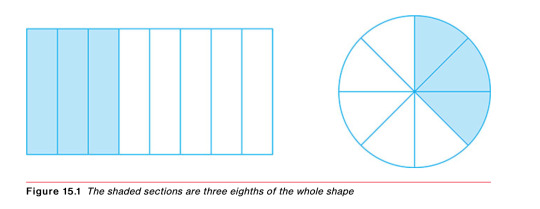
Introduce fraction notation as meaning a number of equal parts of a unit, making particular use of pizzas (circles) and chocolate bars (rectangles) in the explanation. In this interpretation, the fraction p/q means ‘divide the unit into q equal parts and take p of these parts’.
When explaining fractions, be careful about using the word ‘whole’ as a noun: try to use it only as an adjective, for example ‘three eighths of a whole pizza’.
youtube
How does a fraction represent a point on a line?
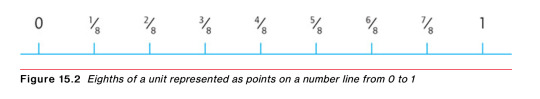
In Figure 15.2, the section of the number line between 0 and 1, which is 1 unit in length, has been divided up into eight equal sections. Each of these sections is one-eighth of a unit. So, the points from 0 to 1 can be labelled as 0, 1/8, 2/8, 3/8, 4/8, 5/8, 6/8, 7/8 and 1. Notice also that each step marked along this section of the number line can be thought of as an eighth: so 3/8 would also be represented by the step from 0 to the point 3/8; or, indeed, by the step from 2/8 to 5/8, and so on. This image of a step along a number line is helpful when making sense of the addition and subtraction of fractions.
How does a fraction represent a proportion of a set?
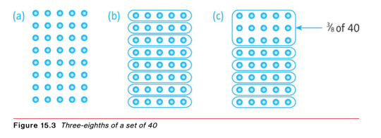
The idea of the fraction 3/8 as meaning 3 parts selected from 8 parts of a unit can then be extended to a proportion of a set. This is the way it is used in situations where a set of items is subdivided into eight equal subsets and three of these subsets are selected. For example, the set of 40 dots in Figure 15.3(a) has been subdivided into eight equal subsets (of 5 dots each) in Figure 15.3(b). The 15 dots selected in Figure 15.3(c) can therefore be described as three-eighths of the set of 40. So, the diagram shows that one-eighth of 40 is 5 and three-eighths of 40 is 15.
How does a fraction represent a division?
The fraction 3/8 can also be used to represent the division of 3 by 8, thinking of division as ‘equal sharing between’
what we see here is, first, that the symbols 3/8 can mean ‘divide 3 units by 8’ and, second, that the result of doing this division is ‘three-eighths of a unit’. Hence, the symbols 3/8 represent both an instruction to perform an operation and the result of performing it! We often need the idea that the fraction p/q means ‘p divided by q’ in order to handle fractions on a calculator. Simply by entering p ÷ q we can express the fraction as a decimal. This also allows us to use fraction notation as an alternative to the division sign (÷). You will find, therefore, that the division sign itself is used less and less beyond primary school mathematics, so that, for example, ‘450 divided by 25’ will often be written as 450/25. This is certainly the case in algebra, where division (x ÷ y) is almost always indicated by fraction notation (x/y).
youtube
Introduce older children in primary school to the use of fractions to compare one quantity with another (that is, finding the ratio), especially in the context of prices. For example, we can compare two prices of £9 and £12 by stating that one is three-quarters of the other.
How does a fraction represent a ratio?
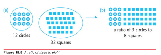
because the symbols 3/8 can mean ‘three divided by eight’, we can extend the meanings of the symbols to include ‘the ratio of three to eight’. This is sometimes written as 3:8. For example, in Figure 15.5(a), when comparing the set of circles with the set of squares, we could say that ‘the ratio of circles to squares is three to eight’. This means that for every three circles there are eight squares. Arranging the squares and circles, as shown in Figure 15.5(b), shows this to be the case. The reason why we also use the fraction notation (3/8) to represent the ratio (3:8) is simply that another way of expressing the comparison between the two sets is to say that the number of circles is three-eighths of the number of squares. Rational numbers are given that name because they can be expressed as the ratio of two integers. So, the principle that any fraction can be understood as a ratio is a really fundamental idea – indeed, mathematically, this is probably the most important meaning of a fraction.
youtube
What about numerators, denominators, vulgar fractions, proper and improper fractions, mixed numbers, and so on?
Numerator - The top number in a fraction.
Denominator - The bottom number in a fraction.
The numerator and the denominator are simply the top number and the bottom number in the fraction notation. So, for example, in the fraction 3/8 the numerator is 3 and the denominator is 8.
The fraction notation for parts of a unit can also be used in a situation where there is more than one whole unit to be represented. Altogether here, we have eleven-eighths of a pizza, written 11/8. Since eight of these make a whole pizza, this quantity can be written as 1 + 3/8, which is normally abbreviated to 13/8. This is called a mixed number.
Mixed number - A way of writing a fraction greater than 1 as a whole number plus a proper fraction. For example, 18/5 as a mixed number is 33/5 (three and three-fifths).
Proper fraction - A fraction in which the top number is smaller than the bottom number; a fraction less than 1.
Improper fraction - A fraction in which the top number is greater than the bottom number; a fraction greater than 1; informally, a top-heavy fraction.
Proper fractions are therefore those that are less than 1, with improper fractions being those greater than 1. We could refer to improper fractions more informally as ‘top-heavy fractions’.
A prerequisite for being able to change an improper fraction into a mixed number (or vice versa) is to understand that, for example, 8/8 is equal to 1, 16/8 is equal to 2, 24/8 is equal to 3, and so on. This is easy to explain using chocolate bars or pizzas, but grasping the principle here should be a specific focus for teaching about fractions.
What are equivalent fractions?
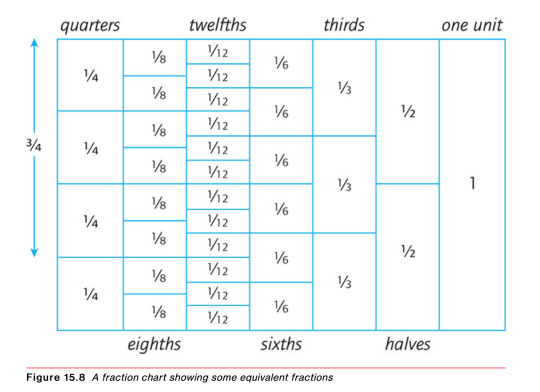
The concept of equivalence – which we saw in Chapter 3 to be one of the fundamental processes for understanding mathematics – is one of the key ideas for children to grasp when working with fractions. Using the first idea of a fraction above, that it represents a part of a unit, it is immediately apparent from Figure 15.8, for example, that three-quarters, six-eighths and nine-twelfths all represent the same amount of chocolate bar. This kind of ‘fraction chart’ is an important teaching aid for explaining the idea of equivalence.
Equivalent fractions - Two or more fractions that represent the same part of a unit or the same ratio. For example, 2/3, 4/6, 6/9, 8/12 are all equivalent fractions.
Sequences of equivalent fractions follow a very straightforward pattern. For example, all these fractions are equivalent: 3/5, 6/10, 9/15, 12/20, 15/25, 18/30, 21/35, 24/40, and so on.
The numbers on the top and bottom are simply the 3-times and 5-times tables, respectively. This means that, given a particular fraction, you can always generate an equivalent fraction by multiplying the top and the bottom by the same number; or, vice versa, by dividing by the same number. So, for example:
4/7 is equivalent to 36/63 (multiplying top and bottom by 9).
40/70 is equivalent to 4/7 (dividing top and bottom by 10).
Equivalence of fractions is one of the most important ideas to get across to children in primary school. Get them to make a variety of fraction charts (like the one in Figure 15.8) and then to find various examples of equivalent fractions.
youtube
How do you simplify fractions?
Simplifying fractions: by dividing the top and bottom numbers by any common factors, we can reduce the fraction to its simplest form. This process is often called ‘cancelling’.
Cancelling - The process of dividing the top number and the bottom number in a fraction by a common factor to produce a simpler equivalent fraction.
For example, 6/8 can be simplified to the equivalent fraction 3/4 by dividing top and bottom numbers by their highest common factor, 2 (cancelling 2). Similarly, 12/18 can be simplified to the equivalent fraction 2/3 by cancelling 6, which is the highest common factor
youtube
How does this work with ratios?
The principle used for simplifying fractions applies to ratios, of course, because fractions can be interpreted as ratios. If you multiply or divide two numbers by the same thing, the ratio stays the same.
e.g. the ratio 28:32 can be simplified to the equivalent ratio of 7:8 (dividing both numbers by 4). This means that one price is 7/8 (seven-eighths) of the other.
Equivalent ratios - Different ways of expressing the same ratio; for example, the ratio 30:50 can be written as the equivalent ratio 3:5.
How do you compare one fraction with another?
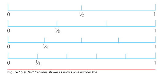
The first point to notice here is that when you increase the bottom number of a fraction you actually make the fraction smaller, and vice versa. Consider, for example, what are called unit fractions. These are fractions with numerator ‘1’: a half (1/2), a third (1/3), a quarter (1/4), a fifth (1/5), a sixth (1/6), and so on. Important in developing mastery in fractions is to understand that 1/2 is greater than 1/3, which is greater than 1/4, which is greater than 1/5, and so on. This is very obvious if the symbols are interpreted in concrete terms, as bits of pizza or a chocolate bar, for example. Interpreting these unit fractions as points on a number line, as shown in Figure 15.9, also makes it clear that they get smaller as the bottom number gets larger, because the points representing these unit fractions are getting closer to zero. It is very easy for a child to get this wrong, of course, if they simply look at the numbers involved in the fraction notation without thinking about what they mean.
Then, second, there is no difficulty in comparing two fractions with the same bottom number. Clearly, five-eighths of a pizza (5/8) is more than three-eighths (3/8), for example.
Generally, to compare two fractions with different bottom numbers we may need to convert them to equivalent fractions with the same bottom number. This will have to be a common multiple of the two numbers. It might be (but does not have to be) the lowest common multiple. For example, which is greater, seven-tenths (7/10) of a chocolate bar or five-eighths (5/8)? The lowest common multiple of 10 and 8 is 40, so convert both fractions to fortieths:
7/10 is equivalent to 28/40 (multiplying top and bottom by 4); and
5/8 is equivalent to 25/40 (multiplying top and bottom by 5).
How is a remainder in a division calculation interpreted as a fraction?
Take an example: 30 ÷ 7 = 4 remainder 2. Depending on the context in which this division calculation arose, it may be possible to deal with the remainder here by dividing that by 7 as well. Using the idea that a fraction can represent a division, we know that 2 ÷ 7 is equal to 2/7. So we might give the result of the division as a mixed number: 42/7. This would be a possible answer if the original (rather artificial) problem had been to find out how much chocolate each person gets if 30 bars are shared equally between 7 people: answer, 42/7 bars each! It would not be an appropriate answer, however, if the question had been, ‘how many vans do you need to transport 30 children if each van holds 7 children?’, because you cannot have 2/7 of a van.
Show older children in primary school how the remainder in a division can also be divided by the divisor. For example: 51 ÷ 4 = 12 remainder 3. If the remainder is then divided by 4 (giving 3 ÷ 4 = 3/4), the result is 123/4. Discuss a range of real-life contexts in which this might be an appropriate solution and when it would not.
How do you add and subtract fractions?
First, to add two fractions with the same bottom number (denominator) is very simple. Just visualize the fractions as parts of a whole unit. So, for example, if you have one-eighth (1/8) of a chocolate bar and you add it to three-eighths (3/8) of a chocolate bar, you have altogether four-eighths (4/8) of a chocolate bar. So, clearly, 1/8 + 3/8 = 4/8. This answer can then be simplified to 1/2 by cancelling 4.
Subtraction is equally straightforward when the two fractions have the same denominator. For example, if you have seven-eighths of a pizza and eat five-eighths then you are left with two-eighths. Recording this in fraction notation, 7/8 – 5/8 = 2/8. This result could, of course, be simplified to 1/4 by cancelling 2.
Sometimes, when adding two or more proper fractions, the result may be an improper fraction. For example, 3/8 + 5/8 + 7/8 = 15/8. This result could then be expressed as a mixed number (17/8).
To add or subtract two fractions with different denominators is a bit trickier. Before attempting to combine the fractions, you have to change one or both of them to equivalent fractions so that they finish up with the same bottom number – it’s best to use the lowest common multiple for this.
So, for example, to add 1/6 and 1/2, we would spot that the 1/2 is equivalent to 3/6, so both fractions can be expressed as sixths. We go for sixths because 6 is the lowest number that is a multiple of both 2 and 6. In this context, the lowest common multiple of the two denominators is often called the ‘lowest common denominator’. The calculation then looks like this: 1/6 + 1/2 = 1/6 + 3/6 = 4/6 (= 2/3).
Here is an example with subtraction: how much more is 2/3 of a litre than 1/4 of a litre? This requires the calculation 2/3 − 1/4. To do this, we change both fractions to twelfths, because 12 is the lowest common multiple of 3 and 4. The 2/3 of a litre is equivalent to 8/12 of a litre; and the 1/4 of a litre is equivalent to 3/12 of a litre. The difference between 8/12 of a litre and 3/12 of a litre is clearly 5/12 of a litre. Written down, the calculation looks like this: 2/3 − 1/4 = 8/12 − 3/12 = 5/12.
A common error in adding fractions is to add the top numbers and add the bottom numbers; for example: 1/5 + 3/5 = 4/10. This error only occurs when the learner just responds to the symbols mindlessly without any attempt to connect them to a visual image that makes sense of the fractions. In this case, the correct addition is: 1/5 + 3/5 = 4/5 (one-fifth of a pizza plus three-fifths of a pizza is equal to four-fifths of a pizza).
A prerequisite for being able to add or subtract fractions with different denominators is the ability to identify the lowest common multiple of two (or more) numbers. Aim to develop mastery of this skill before children move on to identifying the lowest common denominators in the process of the addition and subtraction of fractions.
How do you multiply two simple fractions?
The process for multiplying two fractions can be understood in visual terms by applying the fractions to the area of a square, as shown in Figure 15.10(a). The square has been divided into thirds by the horizontal lines in Figure 15.10(b) and then divided into quarters by the vertical lines drawn in Figure 15.10(c). The square has now been divided into twelfths. Using the idea that the area of a rectangle is given by the product of the two sides, it is now clear that the area of the shaded rectangle in Figure 15.10(d) is equal to 2/3 multiplied by 3/4. Since this area is six twelfths, we have shown that 2/3 × 3/4 = 6/12. (This can then be cancelled down to 1/2.)
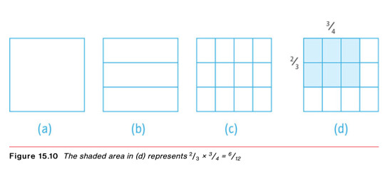
Note that we get twelfths in Figure 15.10(c) because we have 3 sections horizontally and 4 sections vertically. This is effectively multiplying together the denominators of the 2/3 and 3/4. And we get 6 of these twelfths shaded in Figure 15.10(d) because the shaded rectangle arises from 2 of the horizontal sections and 3 of the vertical sections. This is effectively multiplying together the numerators of the 2/3 and 3/4. So, there is a very simple rule for multiplying two fractions: multiply the two denominators and multiply the two numerators! Then give the answer in the simplest form, by cancelling.
Finally, in this example, notice that the shaded rectangle in Figure 15.10(d) can be thought of as two-thirds of three-quarters of the square; or as three-quarters of two-thirds of the square. The word of in the language pattern ‘a fraction of something’ is helpfully connected with the symbol of multiplication. So, for example, the fact that 2/3 of 60 is 40 can also be expressed as 2/3 × 60 = 40. Similarly, 1/2 × 1/4 can be understood as: what is a half of a quarter?
A key principle in teaching for mastery of fractions: make explicit and help children to understand the equivalence of, for example, these three statements:
1/5 × 30 = 6
1/5 of 30 = 6
30 ÷ 5 = 6
What other calculations with fractions should I be able to do?
Addition with mixed numbers
(a) 31/5 + 23/5
= 3 + 1/5 + 2 + 3/5 (separating the whole number parts and fractional parts)
= 5 + 4/5 (adding the whole numbers and the fractions separately)
= 54/5 (writing this as a mixed number)
(b) 34/5 + 23/5
= 3 + 4/5 + 2 + 3/5 (separating the whole number parts and fractional parts)
= 5 + 7/5 (adding the whole numbers and the fractions separately)
= 5 + 1 + 2/5 (changing the improper fraction to a whole number and a fraction)
= 6 + 2/5 (adding the 1 to the 5)
= 62/5 (writing this as a mixed number)
Subtraction with mixed numbers
(a) 54/5 − 33/5
Think of this as (5 + 4/5) − (3 +3/5)
First deal with the fractional parts: 4/5 − 3/5 = 1/5
Then deal with the whole number parts: 5 − 3 = 2
Combining these as a mixed number, we get 54/5 − 33/5 = 21/5
(b) 52/5 − 33/5
Think of this as (5 + 2/5) − (3 + 3/5)
This will require the use of a form of decomposition (see subtraction methods in Chapter 9).
First look at the subtraction with the fractional parts: 2/5 − 3/5; this would give a negative result.
So, exchange 1 from the 5 for five-fifths: 5 + 2/5 = 4 + 1 + 2/5 = 4 + 5/5 + 2/5 = 4 + 7/5
We can now complete the subtraction, using the method in (a):
(4 + 7/5) − (3 + 3/5) = 14/5
Divisions with fractions
(a) Calculate 4/5 ÷ 3
Remember that dividing by 3 is the same thing as finding a third of something, which is the same as multiplying by 1/3.
So, 4/5 ÷ 3 = 1/3 × 4/5
= 4/15 (using the method for multiplying fractions explained earlier in the chapter).
p.240
(b) Calculate 20 ÷ 1/4
Remember that the result of a division is unchanged if both numbers are multiplied by the same thing (see mental and informal strategies for division in Chapter 11).
So, multiply both numbers in 20 ÷ 1/4 by 4. (Remember that 4 quarters = 1.)
Then we get 20 ÷ 1/4 = 80 ÷ 1, which is just 80.
The result in (b) makes a lot of sense if you think of the division as the inverse of multiplication. For example, how many quarters of a pizza can you get from 20 pizzas? You can now ask your friends what is twenty divided by a quarter and then enjoy explaining to those who give the answer 5 why the answer is 80!
0 notes
Text
how do you work out percentages on iphone calculator
how do you work out percentages on iphone calculator
how do you work out percentages on iphone calculator
Hello, welcome to solsarin site. We’re glad you chose our site for the information you’ve been looking at. Our goal is to educate and answer your questions in this post we want to find out” how much alcohol is in smirnoff ice green apple” Stay with us
how to do percentages on iphone calculator
How to use the Calculator app on iPhone
Whether you need to add or subtract, the Calculator app’s got your back.
Serenity Caldwell
4 May 2017
The iPhone’s stock Calculator app has gotten a bit of press lately for its swipe-to-delete gesture, but it’s been a longtime workhorse on the iPhone — in fact, it’s been around since the launch of Apple’s very first model in 2007.
Throughout the years, the Calculator’s look and feel has changed somewhat, but its core functionality remains the same: To help you quickly add, subtract, and square up sums and figures.
Here’s how you can use some of the Calculator app’s basic features — and some of its hidden gems.
How to launch the Calculator app
You can access the Calculator app in four different ways on the iPhone: via the Calculator app icon, Siri, Search Bar, or Control Center.
How to launch the Calculator app from Control Center
For everything from home repair and improvements to splitting up the dinner bill, you can get to the calculator with just a tap.
Swipe up from the bottom bezel onto the screen to bring up Control Center.
Tap the Calculator button on the bottom, second from right.Fun fact: You can also firmly press (3D Touch, iPhone 6s or later) on the Calculator icon if you’d like to copy your last calculation from the app.
How to launch the Calculator app via the Home Screen, Siri, or Search Bar
To launch the Calculator app from your Home Screen, you can do one of three things:
Find the Calculator app icon on your Home Screen
Open the Search bar by swiping down from the center of your Home Screen and type in “Calculator”
Ask “Hey Siri, open the Calculator app”
how to figure out percentages on iphone calculator
How to use the Calculator app
When you first open the Calculator app, you’re presented with the basic Calculator interface: A 10-digit (0-9) virtual keypad with controls for decimals, clearing the equation, adding positivity or negativity to a number, turning a number into a percentage, dividing, multiplying, subtracting, adding, and calculating an equation.
How to undo an erroneous number
Accidentally tapped an 8 when you meant to tap 9? It’s an easy fix. Note: This only works for the numerical keypad (0-9) and the decimal point button; if you accidentally hit any of the math operations buttons, you won’t be able to use this gesture.
Enter your numbers.
If you make a mistake, swipe left on the black display to erase the most recent number or decimal point.
Continue to swipe left if you wish to delete all numbers on the display screen.
How to add, subtract, multiply, or divide in the Calculator app
Enter your first number.
Press the Plus, Minus, Multiply, or Divide button.
Enter your second number.
Press the Calculate button.
ow to calculate a tip in the Calculator app
Enter your bill cost.
Press the Multiply button.
Enter the tip percentage you want (i.e. 20 for 20%).
Press the Percentage button. This will convert your tip number into a decimal (i.e. 20% = 0.2).
Press the Calculate button. This number is your tip amount.
To see your total amount with tip included, tap the Plus button.
Type in your original bill amount.
Press the Calculate button. This number is your total.
How to use the scientific calculator
The Calculator app also comes with a somewhat-hidden scientific calculator mode. To access it, rotate your iPhone from portrait into landscape mode; as long as your Rotation Lock button is disabled, the calculator screen should shift into a landscape display with new buttons for square roots, exponential equations, logarithmic equations, trigonometry, and more.
Spoiler: I’m not going to explain how to use a scientific calculator to calculate specific equations. If you want to learn more about advanced mathematic equations, I suggest visiting Khan Academy or your local library, or emailing your old mathematics teachers.
how to figure out percentages on iphone calculator
How to switch the iPhone Calculator to a scientific view
Most cell phones have calculators today, but iPhone offers a full-function scientific calculator too. To open the scientific calculator, turn your iPhone to landscape view. (If you have locked your iPhone in Portrait view, this won’t work until you unlock it: swipe up from the bottom of the screen to open the command center and tap the Orientation Lock button.)
Here you’ll find the memory commands:
mc clears any numbers you have in memory.
m+ adds the number on the display to the number in memory.
m- subtracts the number on the display from the number in memory.
mr (memory replace) uses the number you put in memory in your current calculation. The button is outlined in black when a number is stored.
Two keys on the calculator toggle the other keys:
2nd: Tap to change trigonomic (sin, cos, tan) and hyperbolic functions to the inverse. The button is outlined in black when active.
Rad/Deg: Tap to switch between Radians and Degrees for trigonomic functions. Deg or Rad in the left corner of the number display tells you what mode you’re in.
You find keys that calculate square, cube, and other roots, decimal and Naperian logarithms, and factorials, as well as generates random numbers.
how to use percent on iphone calculator ,
Bonus Tip for Apple Watch Users
The Calculator app on Apple Watch comes with a couple of additional features that make short work of calculating how much you should tip and how much each person in a group owes if you’re splitting a bill.
The steps below show you how it’s done. Note that the two features can be used together, but you can also use them independently by selecting a 0% tip and changing the number of people, or changing the tip and leaving the People field set to 1.
Launch the Calculator app on your Apple Watch.
Enter the total amount of the bill.
Tap the TIP button in the top-right corner, just left of the divide button.
With the Tip field highlighted in green, turn your watch’s Digital Crown to change the percentage.
To split the bill between a group of people, tap People and then use the Digital Crown to change the number (the maximum is 50).
1. Swipe to Delete Numbers
It’s a common misconception that if you type the wrong number into the Calculator app, you have to start the whole sum all over again. Happily, that isn’t the case: Simply swipe right or left with a finger across the number display to remove the last number you typed, and repeat the action if necessary to remove several numbers.
2. Scientific calculator
The default calculator app includes a built-in scientific calculator that you can use to perform logarithms, square roots, trigonometric calculations, and more advanced math equations.
To access the scientific calculator, simply rotate your iPhone to landscape mode. If it’s not showing up, make sure the portrait orientation lock is disabled in Control Center. To switch back to the regular calculator, rotate your phone to portrait mode.
3. Copy and Paste
You don’t need to memorize the results of your calculations to input them into other apps. Use the clipboard functions instead – just long press on the number field to copy or paste the result.
4. Copy Last Result
If you’ve switched to another app, you can still quickly paste the last figure that you calculated without returning to the calculator to copy it.
Using either a swipe up or a swipe down, launch the Control Center on your iPhone, then long press the Calculator button, and you’ll see a handy option to Copy Last Result.
5. Spotlight Calculations
Did you know that calculator functions are built into Spotlight Search on your iPhone?
Simply swipe down from the Home screen to bring up Spotlight, and you can perform basic calculations by typing them directly into the Search field at the top of the screen without having to open the Calculator app.
Percentage
From Wikipedia, the free encyclopedia
Jump to navigation Jump to search
“Percent” redirects here. For the Apink mini-album, see Percent .“Per cent” redirects here. For the unit of currency, see cent .
In mathematics, a percentage (from Latin per centum “by a hundred”) is a number or ratio expressed as a fraction of 100. It is often denoted using the percent sign, “%”, although the abbreviations “pct.”, “pct” and sometimes “pc” are also used. A percentage is a dimensionless number (pure number); it has no unit of measurement.
0 notes
Text
Everything You Need to Know About a Copier Lease in 17 Minutes
We can start with the basics. And then we can go from there into some of how to save money and other things like that.
How to Acquire a Copier
So the first thing is a corporate lease is a way to acquire a copier. You can also purchase a copier. Lastly, you can also rent a copier, or you can lease a copier.
And then on top of the leasing plan, you’ll have a supply and service plan, which will take care of the following:
Ink
Service
Parts
Labor
Delivery
and more.
So what we’re talking about here is the getting of the physical equipment into your office.
So getting, let’s say, for example, this Xerox CAD 30, and you want it in your office. This lease is a way to get that in there without putting $6,000 or $7,000 down, plus having a monthly payment of $130 to $150 a month.
youtube
How to Calculate Your Copier Lease Rate
The first thing to know is there are tables. When we’re making a copier sale, we’re looking at a table kind of like this:

Q2 Leasing Rates
A Fair Market Value lease means that at the end of the contract, the copier gets returned to a warehouse, and then you’ll be responsible for the shipment of the copier to that warehouse. You’ll complete your lease at the end of the term.
We also have a $1 Purchase option, which means at the end of the lease, you pay a dollar, and the copier now belongs to you.
You have different rates basically because, on the Fair Market Value lease, they’re giving the copier back, and there’ll be a value to that. The $1 Purchase Option lease lets you keep the copier, which is gets factored into the numbers on the table.
What you end up doing is you will take the amount that you’re financing. So let’s say it’s $7,000, and you are going to do a five-year lease. You would be in the $3k to $10k band right here. And so you multiply by 0.0195, And you would end up with about $136.50 on a fair market value lease.
On a dollar out lease, you would do the same thing. You go to the 60-month term, and you see “0.0208.” So you would go $7,000 x 0.0208, and that’s $145.60. So about $9 per month difference. And then $9 x 60 is $540, which is about what it costs to ship it back at the end, anyway.
So, I would tend to do the $1 Purchase Option because then I have an option to run it further afterward. If it’s still running great, I could sell it on Craigslist or use it as a backup.
Other people want to have the payment as low as possible. And they’re going to depend on the copier company to take care of that shipping fee, which will get rolled into the next lease, at the end of the contract.
So that’s two different ways to do a copier lease. And as you can see, there’s these different stairsteps. And so between $1 and $3,000 has a different lease rate factor than between $3,000 and $10,000.
So technically speaking, if we go $2,999 x 0.0235, and that would be $70.47. But if you go $3,000, so you just raise it $1, then that’s $58.50, so it’s $11.50 a month and almost $700 total. So that $1 difference in price makes a $700 total payment difference.
We try to focus on how we make sure that you’re in the right part of the stairsteps so that you can get the best rates possible.
Technically, it may mean adding a hundred dollars to your cost to ensure that your price goes down based on the lease rate factor.
Automatic Renewals
And the next you’d want to know is usually on any of these leases, towards the end of the lease, they have a clause that will do an automatic renewal. And so it’s always good to mark that into your calendar system that will let you know 60 or 90 days before the end of the lease.
You don’t want to automatically renew the year-long copier lease because you’ve already paid for the copier, and now you’re just basically giving the bank extra money.
So it’s pretty much always a bad deal to renew. If you do it a month or two, it’s not the end of the world. If you start doing it for a year, that’s just wasted $1,400 – $1,500.
So I like to have a reminder put into the calendar that lets me know on month 56 that we’re coming to the end of that lease. Ensure that you give the appropriate notifications because there’ll be a clause that says that if you don’t renew within a specific timeframe, you’ll have to keep it for maybe another three to twelve months depending on how it’s written.
Automatic Escalation Fees
One of the other things I try to look for within a lease is automatic escalations.
What an automatic escalation is, is it’s going to take the number like where we had here, $60 a month for that $3,000 copier, and it’s going to say, every year we have the right to raise the lease rate a particular percentage The standard percentage is somewhere around 10%.
So the $60 a month will go to $66, and then it’ll go $72, then $78, then $84. So by the time we hit $84 a month when the rep comes back around, it’s easier to say, “Hey, we can get you into another copier for just $60 a month, basically where you were though at the beginning.”
If you didn’t have that escalator, it would be harder to roll the next copier in because that escalation makes your lease payment higher each year. So I always would avoid escalation fees.
It’s easy for most copier companies to take that out of their contracts. We’d always recommend that when you lease a copier that you make sure you don’t have an escalation fee.
And be sure to mark down when the lease is supposed to expire.
Coverage Limitations
The next thing I would pay attention to is the idea of coverage limitations. That’s on the supplies and service agreement.
So, each copier is rated to do a certain number of pages per toner cartridge.
So if you think of it like each toner cartridges is like a gallon of milk. Each page comes out and expecting that you’re going to get so many cups of milk out of each gallon because a cup holds so much fluid, and you can multiply that out and determine how many cups of milk you’re going to get. They use the same kind of logic for pages.
So you have a toner cartridge, which has a bunch of toner in it. And each page that you print is going to utilize a certain amount of that toner. And it’s based on a recovery trait, and usually, that’s 5% per color. So the color is 20% because there’s four colors, cyan, magenta, yellow, and black. The black and whites 5% coverage is a typical industry average because it’s only black. There’s no cyan, magenta, or yellow to take into account.
What happens on some leases or some service plans is that if you exceed 5% or above 20% color coverage, then there can be a multiplier added to compensate for the toner usage. So if it turns out that you’re averaging 30% or 40% coverage, instead of 20%, your color rate can rise by 1.5 to 2 times. Check to see if there’s a penalty if you exceed a particular percentage within your coverage.
And so that’s something else that we look at and try to make sure that, you know, if you’re going to lease a copier that you’re paying attention to your coverage, or getting ideally a lease contract that does not have a penalty on color coverage.
What to Look For in Overage Charges
You also want to see what your overages are. Overages technically should be lower in price, not higher, if you exceed the base.
What will happen on a base is that you’ll get a certain number of prints.
So we can use an example of 10,000 prints. Let’s say they’re all black and white just to make it simple. And they’re a penny apiece, so it’s a hundred dollars a month, and you get 10,000 prints. And then once you exceed 10,000, you get billed per print for any that you do over 10,000. So if you do 11,000 prints, then the last thousand would be charged at the overage rate.
Often, I’ve seen that people will make the overage rate higher than the base rate, which doesn’t make sense because most of the service should be contained in the first part. And the overage should be cheaper because the service is already included in the base. And because the copier company is going to want to make sure that their service department is whole. So they’re going to make sure that the service is in there, no matter what. And then, once you exceed that base, the service part has been handled, more or less.
Of course, the more prints to do, you will have more service calls. So there is more service expectation. So you would expect more service calls, but the cost is going to be lower because you don’t tend to find a one for one ratio there. And so if you’re at a penny per page for 10,000, we would expect that once you exceed 10,000, it should be nine-tenths of a penny or something like that. It shouldn’t be 1.2 cents after you hit the 10,000.
Keeping an eye on your base rate, then comparing it to the overage and making sure the overage is lower than your base is a good idea.
How Does a Zero Base Contract Save You Money?
I’ve noticed that a lot of customers are concerned about having zero base. Zero base would be ideal if I were buying a copier because then you’re just paying for what you’re using. You’re not paying for 10,000 prints and then only doing 5,000, and therefore your effective cost per print doubles. So I would always personally get a zero base contract unless I got a massive discount for the inclusions.
So if I went from $0.015 down to $0.01 and I was pretty sure that I was going to use 10,000 and it saved me half a penny per page, then, of course, that makes sense because I prefer to keep the $50 per month. If I wasn’t sure if I was going to do 10,000, there’s no way I would sign up for 10,000 pages because it’s like, they’ll do 3,000 in 1 month or 7,000. And in those months, I’m going to lose 7,000 pages that I purchased.
So I would always say whatever you think your minimum month is that you should do roughly 80% of that rather than signing up for your average because your average is going to fluctuate.
You’ll have some months that are higher than your average and some lower months. So, I would take my lowest month, and then multiply that by 80%. And I would use that as my base.
This way, I knew whatever I was doing, for example, if there’s a pandemic, like what we’re going through currently, and nobody’s working at the office, I’m not stuck paying for 10,000 pages a month while everybody’s gone.
So the idea is to pay for what you use, don’t pay for what you’re not using. And so that’s an essential thing also within your service contract.
Why Higher Copier Speed Isn’t Always Faster
One of the things that we see from some people is if they are looking at different products, what they’ll end up doing is getting, for example, a Xerox Altalink C8070 for $219 a month and 70 pages per minute because of speed.
And so one thing to be aware of is that sometimes these high-speed copiers, like the C8070, go 70 pages a minute when it’s fully warmed up, but it may take longer to warm up.
So, people will take a fast one because they want to go fast like this instead of a slower one. After all, they’re thinking 70 pages per minute is twice as fast as 35.
The one thing to be aware of is that many of these copiers producing 70 pages per minute, anything over 50, can often take longer to warm up. And then if it’s a small job, you’d go faster by having the smaller, more compact copier.
So it’s not always that the higher rated speed is the faster copier. One thing you need to look at is the warmup time because if you don’t factor in the warmup time, it could take 30 seconds to warm up in eight seconds for the other.
So you have 22 seconds of it being able to print, and most of your print jobs will be just a few pages. And so you could find that your day to day printing is slower by going with the faster copier.
It sounds kind of strange, but one thing to keep in mind is the more small jobs you have, the less that speed matters. The more long jobs you have, the more speed matters. If you’re doing 2,000 pages, you know, reports or 1,000-page reports, or even 200 page reports suddenly going 70 pages per minute, it starts making more sense because it takes three minutes to do that job instead of six on a 30 page per minute copier.
That’s something to keep in mind: the longer your jobs are, the more essential speed is. The shorter your jobs are, the less important speed becomes.
Duty Cycle Considerations
There are also duty cycle considerations. If it’s 10,000, 20,000 pages per month, you’re still probably going to want to go to a higher-end model just because of the print volume, not because of the speed requirements. So that’s another thing to consider.
I hope this was useful to you because you know that’s our goal here at Copy Lease Center is to provide great information to our clients. And so if you have any questions or concerns, please feel free to give us a call. We always work to get you a fair copier lease, and we’d love to chat with you. Thank you so much.
The post Everything You Need to Know About a Copier Lease in 17 Minutes appeared first on Copier Lease Center.
from Copier Lease Center https://www.copierleasecenter.com/everything-you-need-to-know-about-a-copier-lease-in-17-minutes/
0 notes
Text
Finest 21 Real Estate Investing Terms and Formulas

Understanding the Ola EC investing terms and formulas is extremely helpful (if not crucial) for brokers, agents and investors who want to service or acquire real estate investment properties. This is not always possible, though. During my thirty-year experience as an investment real estate expert I often encountered far too many that had no suggestion, and it showed - both in their performance and achieving success rate. As a result, I felt it needful to record what I deem are the top 20 real estate committing terms and formulas worth understanding categorized as sometimes primary or secondary. The primary terms and formulas is the very least you should know, and the secondary terms takes it the step further for those of you who are seriously planning to become more make an effort to engaged with real estate investing. Primary 1 . Gross Timetabled Income (GSI) The annual rental income a property would certainly generate if 100% of all space were rented plus all rents collected. GSI does not regard vacancy or possibly credit losses, and instead, would include a reasonable current market rent for those units that might be vacant at the time of a real house analysis. Annual Current Rental Income + Annual Current market Rental Income for Vacant Units = Gross Signed Income 2 . Gross Operating Income (GOI) This is uncouth scheduled income less vacancy and credit loss, as well as income derived from other sources such as coin-operated laundry services. Consider GOI as the amount of rental income the real home investor actually collects to service the rental building. Gross Scheduled Income - Vacancy and Credit Decline + Other Income = Gross Operating Income 3. Operating Expenses These include those costs associated with keeping a home operational and in service such as property taxes, insurance, tools, and routine maintenance; but should not be mistaken to have payments made for mortgages, capital expenditures or income taxes. contemplate. Net Operating Income (NOI) This is a property's income once being reduced by vacancy and credit loss as well as all operating expenses. NOI is one of the most important calculations for you to any real estate investment because it represents the income stream the fact that subsequently determines the property's market value - that may be, the price a real estate investor is willing to pay for who income stream. Gross Operating Income - Operating Prices = Net Operating Income 5. Cash Flow Before Tax bill (CFBT) This is the number of dollars a property generates in a assigned year after all cash outflows are subtracted from dollars inflows but in turn still subject to the real estate investor's income tax liability. Net Operating Income - Debt Services - Capital Expenditures = Cash Flow Before Tax 6. Gross Rent Multiplier (GRM) A simple method used by experts to determine a rental income property's market value based upon the nation's gross scheduled income. You would first calculate the GRM using the market value at which other properties sold then apply that GRM to determine the market value for your own place. Market Value ÷ Gross Scheduled Income = Low Rent Multiplier Then, Gross Scheduled Income x Uncouth Rent Multiplier = Market Value 7. Cap Quote This popular return expresses the ratio between accommodations property's value and its net operating income. The max rate formula commonly serves two useful real estate shelling out purposes: To calculate a property's cap rate, and / or by transposing the formula, to calculate a property's reasonable estimate of value. Net Operating Income ÷ Value = Cap Rate Or, Net Operating Cash ÷ Cap Rate = Value 8. Cash regarding Cash Return (CoC) The ratio between a property's cash flow in a given year and the amount of initial growth capital investment required to make the acquisition (e. g., property loan down payment and closing costs). Most investors usually view cash-on-cash as it relates to cash flow before taxes during the first of all year of ownership. Cash Flow ÷ Initial Capital Investment decision = Cash on Cash Return 9. Operating Expenditure Ratio This expresses the ratio between an funding real estate's total operating expenses dollar amount to the gross operating income dollar amount. It is expressed in the form of percentage. Operating Expenses ÷ Gross Operating Income = Operating Expense Ratio 10. Debt Coverage Ratio (DCR) A ratio that expresses the number of times annual netting operating income exceeds debt service (I. e., 100 % loan payment, including both principal and interest). Goal Operating Income ÷ Debt Service = Debt Policy cover Ratio DCR results, Less than 1 . 0 - too little NOI to cover the debt Exactly 1 . 0 - adequate NOI to cover the debt Greater than 1 . 0 - ample NOI to cover the debt 11. Break-Even Ratio (BER) The ratio some lenders calculate to gauge the ratio between the money going out to the money coming so they can calculate how vulnerable a property is to defaulting on its arrears if rental income declines. BER reveals the percentage point of income consumed by the estimated expenses. (Operating Outlay of money + Debt Service) ÷ Gross Operating Income = Break-Even Ratio BER results, Less than 100% - much less consuming expenses than income Greater than 100% - further consuming expenses than income 12. Loan to Worth (LTV) This measures what percentage of a property's appraised value or selling price (whichever is less) is as a result of financing. A higher LTV benefits real estate investors with significantly greater leverage, whereas lenders regard a higher LTV as a larger financial risk. Loan Amount ÷ Lesser of Appraised Value or Selling Price = Loan to Value Secondary 13. Depreciation (Cost Recovery) The amount of tax deduction expenditure of money property owners may take each year until the entire depreciable asset will be written off. To calculate, you must first determine typically the depreciable basis by computing the portion of the property allotted to improvements (land is not depreciable), and then amortizing that amount over the asset's useful life as particular in the tax code: 27. 5 years for readily available property, and 39. 0 years for non-residential. Place Value x Percent Allotted to Improvements = Depreciable Basis Then, Depreciable Basis ÷ Useful Life = Depreciation Allowance (annual) 14. Mid-Month Convention This changes the depreciation allowance in whatever month the possession is placed into service and whatever month it is got rid of. The current tax code only allows one-half of the accounting allowance normally allowed for these particular months. For instance, if you order in January, you will only get to write off 11. 5 months of depreciation for that first year in ownership. 15. Taxable Income This is the amount of revenue generated by a rental on which the owner must pay Federal income tax. After calculated, that amount is multiplied by the investor's minor tax rate (I. e., state and federal combined) to arrive at the owner's tax liability. Net Operating Source of income - Mortgage Interest - Depreciation, Real Property - Depreciation, Capital Additions - Amortization, Points and Ending Costs + Interest Earned (e. g., property bank or investment company or mortgage escrow accounts) = Taxable Income Therefore, Taxable Income x Marginal Tax Rate = Tax burden Liability 16. Cash Flow After Tax (CFAT) This is the variety of spendable cash that the real estate investor makes from the investment decision after satisfying all required tax obligations. Cash Flow Prior to Tax - Tax Liability = Cash Flow After Place a burden on 17. Time Value of Money This is the underlying forecasts that money, over time, will change value. It's an important element in real estate investing because it could suggest that the timing regarding receipts from the investment might be more important than the amount of money received. 18. Present Value (PV) This shows that of a cash flow or series of cash flows available in the future may be valued at in today's dollars. PV is calculated by "discounting" foreseeable future cash flows back in time using a given discount rate. 20. Future Value (FV) This shows what a cash flow or perhaps series of cash flows will be worth at a specified amount of time in the future. FV is calculated by "compounding" the original most important sum forward in time at a given compound rate. 20. Net Present Value (NPV) This shows the greenback amount difference between the present value of all future hard cash flows using a particular discount rate - your expected rate of return - and the initial cash expended to purchase those cash flows. Present Value of all Foreseeable future Cash Flows - Initial Cash Investment = Netting Present Value NPV results, Negative - the required gain is not met Zero - the required return is wonderfully met Positive - the required return is met through room to spare 21. Internal Rate of Gain (IRR) This popular model creates a single discount quote whereby all future cash flows can be discounted until finally they equal the investor's initial cash investment. To explain, when a series of all future cash flows is discount at IRR that present value amount will even the actual cash investment amount.
0 notes
Text
8 Keto Meal Delivery Kits
New Post has been published on https://bestrawfoodrecipes.com/8-keto-meal-delivery-kits/
8 Keto Meal Delivery Kits


LarisaBlinovaGetty Images
Cooking on any diet is kind of a hassle—but multiply that by 10 on the keto diet (one person can only eat so many keto meals consisting of steak and arugula salad—sorry, Jenna Jameson).
Luckily, meal delivery services have gotten in on the keto game, offering tons of meals that are keto-friendy (a.k.a., that meet those tricky low-carb, high-fat ratios of the keto diet). So the next time you’re feeling overwhelmed (and like you can’t do another damn thing with avocados), try one of these keto meal delivery kits.
Advertisement – Continue Reading Below
1
Keto Fridge
Keto Fridge offers a lot of perks: For starters, you don’t have to sign up with a subscription or commit to anything. You can order what you want, when you want—and stop at any time (kind of unheard of when it comes to meal delivery services).
The meals show up ready to eat—you just have to heat them up. And Keto Fridge also has its own bakery, so you can get keto-friendly baked goods delivered to your doorstep along with meals.
How it works: You have to order at least $69 worth of food at a time, and orders are due by 11:59 p.m. EST every Thursday. Your order will be delivered on the following Tuesday or Wednesday.
The menu changes each week, so you can mix it up each time you order. Prices vary per meal, but they’re anywhere from $9 to $18 for most dishes, while pastries and desserts range from $6 to $12, usually for a two-pack.
2
Kettlebell Kitchen
Kettlebell Kitchen offers options for a bunch of different diets, including keto. You simply customize your meal plan to keto, and then pick out the dishes you want for the week.
This service also allows you to choose between medium- and large-sized dishes, and has an “athlete” version of each dish with a few more carbs in case you tend to go hard at the gym and need more energy (perfect for anyone trying out keto cycling).
How it works: Order dates and deadlines vary depending on where you live (just enter your zip code and Kettlebell Kitchen will tell you), but meals usually come on Sunday or Monday and then Wednesday or Thursday for a mid-week delivery. They also deliver to gyms in addition to homes.
Meal prices range from $8.95 to $11.95, making it a pretty cheap option. And, while the service mixes up meal offerings every week, they also have some standards that are always available like honey mustard-glazed chicken and grass-fed steak.
3
Factor 75
Factor 75 is big on grass-fed meats that are free of hormones, GMOs, and antibiotics, and they also use a ton of organic produce, according to their website. This is another one that services all diet types, but offers up keto-friendly meals (just look for the “K” for keto at the bottom of the recipe).
How it works: Factor 75 delivers a bunch of different packages, ranging from $60 for four meals a week to $198 for 18 meals a week (basically breakfast, lunch, and dinner for six days).
You have two options with your plan: You can choose your meals each week, or let the company choose them for you based on your tastes and keto preferences. The meals are delivered fresh, not frozen, so all you have to do is heat them up.
4
Diet-to-Go
Diet-to-Go offers a Keto-Carb 30 plan, which is a keto-friendly plan (they also service other diets). All meals on this plan are made to give you only 30 grams or less of carbs a day, and they don’t offer fruit, bread, sugar, or any other conventional carbs on this plan.
How it works: Diet-to-Go will ask you a bunch of questions about the kind of food you like, and whether you want food delivered five or seven days a week, as well as how many meals you want a day (two vs. three).
At five days a week for two meals a day (lunch and dinner, plus sides), you’re generally looking at $137.99 per week, or $13.80 a meal. Delivery dates vary depending on where you live, but you can expect to see your meals about three days after you order them.
5
Green Chef
Green Chef only offers organic meals that you actually make at home. They also service other dietary needs, so you just need to make sure you order from the keto section (which is also gluten-free).
How it works: Plans vary, but usually cost around $12.99 per meal for the keto plan, per the company’s website. You can sign up for a two-person plan that gives you three dinners for two people that’s delivered once a week.
The ingredients for the meals show up, and then you prepare them yourself. (Green Chef swears all meals can be made in 30 minutes or less.) If you’re interested in a meal-delivery service, but still want to see everything that goes into your dishes, this is probably the one for you.
6
True Fare
True Fare services other diets (including the Whole30), but also offers keto-friendly dishes. They use only grass-fed beef and free-range poultry, and organic vegetables.
How it works: True Fare offers a few different options for their services. You can get 10 meals for $149.95 or 20 meals for $289.95, but you can also just make a one-time meal purchase, per the website.
True Fare also offer just breakfasts, if that’s the meal that you really need help with. Meals are delivered frozen, and you just need to heat them up before eating.
7
Terra’s Kitchen
Terra’s Kitchen offers heat-and-eat meals for all kinds of diets, including keto. The site has an easy a-la-carte menu with dishes like Vietnamese pork meatballs and bok choy stir fry, spaghetti squash bolognese, and Peruvian chicken with roasted sweet potato wedges.
How it works: Order any meals you want by 11:59 p.m. EST on Sunday and they’ll be delivered Wednesday through Friday.
There’s no subscription, but you’ll need to order a minimum of $50 of food, and the shipping fee is $5.99 (it’s waived on orders of $100 of more). Most meals cost about $6-$14 each.
8
Provenance Meals
Provenance Meals doesn’t have a strictly keto meal selection, but they offer plenty of low-carb meals (it helps if you’re well-acquainted with keto for this one, since you’ll have to pick-and-choose which meals are right for your diet). All of their meals are gluten-free, dairy-free, and refined sugar-free.
How it works: Provenance Meals is currently only available in New York City, delivering on Monday, Wednesday, and Friday from 6:00 p.m. the night before to noon.
For $68 per day, you can have pre-made breakfast, lunch and dinner delivered to your home or office. There’s no subscription required; you pick how many meals you want and how often each week. If you’re a fan, there’s a membership option that comes with a 10 percent discount on your recurring weekly order.
Korin Miller Korin Miller is a freelance writer specializing in general wellness, sexual health and relationships, and lifestyle trends, with work appearing in Men’s Health, Women’s Health, Self, Glamour, and more.
Kristin Canning Kristin Canning is the associate editor at Women’s Health, where she covers fitness, health, mental health, sex and relationships, nutrition, active travel and wellness entrepreneurs.
Advertisement – Continue Reading Below
Source link Keto Diet Dinner Ideas
0 notes
Text
8 Startling Signs You Have Too Much Debt (And More Credit Isn’t Always the Solution)

Do you worry about money all day every day? Is debt impacting not only your financial health, but your mental health too? If this sounds familiar, you’re not alone. In a recent Self Lender poll, nearly 20% of people between the ages of 18-34 said they worry all day every day about money, and with good reason. In a study by Northwestern Mutual, the average American has about $38,000 in personal debt, not including debt from their mortgages. Of this debt, 25% is from credit card debt. I guess you could say this country has a bit of a debt problem.

Source In many cases, these debts prevent you from focusing on building wealth for the future, since debt essentially means paying off the past. “Debt is your financial past. Your past is paying for student loans, vehicle purchases, medical bills and credit cards. These debts prevent you from securing a financial future. People often struggle most of their lives paying debts of the past. The more quickly you eliminate your old past debts, the sooner you can plan and take care of your future,” Jennifer H. Plantier of Hardin-Simmons University writes in the book "Personal Finance" by Thomas Garman and Raymond Forgue. While some people are almost too aware (painfully aware) of how much debt they have, many people could be struggling with debt without even realizing it. How do you know if you have too much debt? Here are some ways to tell if you have too much debt, why getting more credit might not be the right solution, and some ideas that could help you break the debt cycle.
Signs you have too much debt
1 - You have no idea how much money you owe If you have no idea how much money you owe on your debts (or are too scared to find out), you could have too much debt. Sort of like ripping off a Band Aid®, taking a clear look at how much you owe can sting at first. But the first step towards budgeting and getting your finances back on track is to know how much money you’re spending. “The most important aspect of keeping your money is being aware of how much of it you’re spending,” Tiffany Aliche, the Budgetnista, says. The next step? To know how much money you are making so you can see how your current spending fits in, or what adjustments you need to make to it. It takes courage to confront your own financial habits, so be brave! Sit down and add up the totals you owe on debts, including: Mortgage paymentsPayments on personal loans, such as car loans Credit card debtStudent loan debt Any other items you financed – like an appliance or jewelry purchase, just to name a few Knowing what you owe can help you get a better handle on your debt and understand how to more effectively manage your cash flow. 2 - You keep getting new credit cards to pay off old credit cards Sometimes, transferring credit card debt to a 0% introductory offer card makes sense. If all you need is a temporary break in interest to make your monthly payments on time or pay down more debt, then adding another credit card could be the right choice. Just be aware of any balance transfer fees prior to going this route. However, if all you’re doing is trying to get access to more and more spending, without paying anything down, then you could just be adding more debt to an already dire financial situation. Not to mention, you could damage your credit in the process by keeping your total credit usage high. This high credit usage could cost you more when it comes to gaining access to other credit products. 3 - You ask for credit limit increases to put more on your card, not to improve your credit Sometimes, asking your credit card companies for a credit limit increase can be a positive thing when it comes to improving your credit score. After all, keeping your credit limits high, and your credit usage low, are positive indicators that you manage credit responsibly. But, if you raise your credit limit to spend more money you know or don’t realize you can’t pay, then you probably have too much debt. 4 - You treat credit cards like additional income and live outside your means Dave Ramsey famously promotes the idea of “acting your wage,” which really just means living within your means and not trying to “keep up with the Joneses” if you can’t afford to. While Ramsey’s attitudes towards credit and debt don’t necessarily work for everyone, this is a good rule to follow when it comes to using your credit card. Using a credit card to increase your income so you can buy non-emergency items is a big no-no. Whenever possible, treat your credit card like a debit card by only putting purchases on it you know you can pay off, in full, at the end of the month, based on your current income. 5 - You make late payments, skip payments, or only pay the minimum due Skipping payments or paying late can get expensive in a hurry, thanks to late fees. And the term “minimum amount due” can be a little misleading. While yes, technically it’s the minimum amount you have to pay so a payment doesn’t report to the credit bureaus as late or missed, if you want to avoid interest charges, making minimum payments on your credit card debt isn’t the best choice. By only paying the minimum amount, you can end up paying mostly interest on the debt (not paying the debt down) while more interest continues to add up. If you have extra money one month, or receive a bonus or raise, consider putting that money towards your credit card payments. To illustrate this, here’s how much interest you would accrue on a $6,081 debt with a 14.99% interest rate if you pay the minimum payment, double the minimum payment, or the minimum payment plus $100 each month.
You can see here that, if you only pay the minimum amount due, over time you’ve just added over $4,000 worth of interest to a roughly $6,000 debt. And that’s at a 14.99% interest rate. If you have a higher interest rate on your credit card, the amount you pay in interest could easily surpass the original cost of the purchase. To avoid turning credit card debt into even more debt, try to pay your credit card bills on time and in full whenever possible. Or at least pay more than the minimum amount due. 6 - You consistently use 30% or more of your total available credit Hey, I get it. Emergencies happen, right? You can’t always control how much you have to put on your credit card. However, if you consistently charge non-emergency purchases that you can’t afford to your credit card and that’s what keeps your credit usage high, you might want to reconsider your spending habits. Since how much of the available credit you use adds up to 30% of your FICO credit score, it is generally recommended that you keep the amount of credit you use to under 30% of your total available credit limit. The amount of credit you use compared to the total credit available to you is also known as a credit utilization ratio. Here’s a simple example of what that could look like.

Keep in mind, this rule applies both to your use of credit on a single credit card, and across your credit cards as a whole. Bonus tip: To help plan for emergencies without relying too heavily on your credit card, try to set up an emergency fund, which is a savings account used only for emergencies. Ideally, this fund would cover 3-6 months of living expenses, but every little bit set aside can help. 7 - Your debt-to-income ratio is too high What exactly is your Debt-to-Income (DTI) ratio? As the name suggests, it looks at how much debt you have compared to how much money you make. The higher the ratio, the higher the risk (generally speaking) to the lender that you won’t pay back what you owe. You find this ratio by adding up all of your monthly debt payments and dividing it by your gross income (your income pre-tax). This ratio helps lenders measure your ability to repay what you borrow and manage your monthly payments. According to the Consumer Financial Protection Bureau (CFPB), a 43% DTI ratio is usually the highest ratio a borrower can have and still get a qualified mortgage. So if you’re planning to buy a house in the next few years, try to reduce your debt below this line first. In addition to impacting lending decisions, your DTI ratio can also be a helpful tool for you to better understand your current financial situation. Here’s how to calculate it for yourself if you’re curious, using an example from the CFPB… Calculating your Debt-to-Income ratio Monthly debts: $1,500 monthly mortgage payment$100 monthly car payment$400 additional monthly debt payments Now, just add these up (1,500+100+400) to get your total monthly debt payments, which in this case add up to $2,000. The next step is to divide your total monthly debt payments ($2,000) by your total monthly income (before taxes and other deductions), then multiply it by 100 to get a percentage. For this example, let’s say that your pre-tax monthly income is $6,000. Total monthly debt payments ($2,000) ÷ Pre-tax monthly income ($6,000) x 100 = 33%. Sound too complicated? Here’s a friendly little calculator that could make figuring out your DTI ratio easier. 8 - You experience repossession, foreclosure or wage garnishment If you have secured debt that uses a piece of property (like a home or car) to secure your loan, you could face losing that property if you are not able to pay off debt as agreed. If your car is repossessed or your home foreclosed due to missing payments or otherwise failing to pay your auto loan or mortgage as agreed, you definitely have too much debt. Wage garnishment, which is a court order that money (usually wages paid by an employer) be seized to satisfy a debt, is another red flag for debt. Again, while sometimes these consequences reflect a problem of living outside your means, sometimes these are the results of an emergency that causes you to default on loan or other payments. If you can, try to talk to your lender before missing payments or facing these losses, or consider bankruptcy after talking with a financial counselor or legal professional who could help you decide if this is the right option for you. If you find yourself stuck and need help with debt management or debt repayment, consider a debt management plan from a nonprofit organization, or seeking help from a certified credit counselor.
Bottom line – when more credit might not be the answer
Having too much debt can feel crippling at times (believe me, I’ve been there). Aside from the impacts to your financial, mental and physical health, too much debt can also damage your credit score, which is quite a hot topic in today’s personal finance space. However, it’s important to remember that your credit score isn’t the end-all-be-all. Sure, it’s important. Sure, having better credit could save you thousands of dollars over the course of a lifetime. But if you’re drowning in debt, focus on paying that down first, and your credit will usually improve as a result. While it can be tempting to turn to scams that promise to eliminate your debt or improve your credit quickly, remember that, when it comes to the race between the tortoise and the hare, sometimes the steady pace is the best. This is especially true when it comes to credit. So if you find yourself drowning in debt, try to focus on first getting yourself to a better place financially, then paying down as much debt as you can. Focus on your long-term financial health. You can worry about building your credit again later. Read the full article
0 notes
Text
Can I use Omega 3 fish oil on a 9-year-old German Shepherd to relieve his hips?

I don’t think it will harm your dog but I don’t know if it will help the hip problems. THE BENEFITS OF FISH OIL FOR YOUR DOG We carry Iceland Pure - The Leader in Fish Oil Supplements > Pharmaceutical Human Grade (most fish oil for the pet industry are NOT) > Unscented (the only true unscented fish oil in the market as of today) > More Omega 3 fatty Acids than the “other oils” > Safe Brushed Aluminum Epoxy Coated Bottles This oil DOES NOT have ROSEMARY as a preservative, studies have shown that in certain occasions such extract can cause neurological problems, seizures and anemia. Icelandic Pure extracts their oils at very low temperatures. This procedure ensures that the fatty acids are not broken thus the fish oil qualities are not lost. Their distillation process is called “molecular-distillation”. This is a state-of-the-art process by which all harmful materials are separated and removed from the product. After the detoxification process, the levels of impurities, toxins or heavy metals in our products are considered toxin free specially in comparison to FDA guide lines. There are many molecular-distillation methods; most keep the oils at up to 250 degrees C for up to 6 hours under vacuum. Our manufacturer uses a molecular distillation process that takes only 45 seconds at 250 degrees C under high vacuum. This shortening of the “sit” or “residence” time for the process greatly improves the quality because it guarantees that no trans fats are created. Fish Oil Benefits:> Healthy skin & glistening coat> Decreased inflammation> Increased stamina> Improved the immune system> Decreased shedding>Adds moisture to dry, irritated skin>May be used to enhance your pet’s appetite by adding an appealing fish flavorAdvanced research and case studies continue to show evidence that the benefits of Omega-3 & 6 Fatty Acids such as:> Reduced Joint Discomfort> Less Problems with Dry, Itchy Skin Attractive, Shiny Coat> Renewed Energy> Protection against Auto Immune Diseases> Reduced Risk of Stroke or Heart Problems> Keeping Blood Triglycerides in Check> Antioxidant Properties Lower Risk of Cancer>Anti-Inflammatory ActivityTherapeutic Use of Fish Oil in Companion Animals - JAMA 2011General Fish Oil Information: Oil from fish contains eicosapentaenoic acid (EPA) and docosahexaenoic acid (DHA); both are omega-3 fatty acids.Where is fish oil found? EPA and DHA are found in mackerel, salmon, herring, sardines, sablefish (black cod), anchovies, albacore tuna, and wild game. Q: My dog already gets fish oil so why am I not seeing improvement?A: Many dog owners are feeding their dog fish oil, but most dogs are not getting a high enough dose to make a difference. Start your dog on a dose calculated at EPA of 20 mg per lb body weight. There will be DHA in there too but you don’t need to do any math on it. Q: Is my 50 lb dog getting enough if it says 1000 mg of essential fatty acids on the label?A: No! Many of the products say “1000 mg of EFAs” on the front of the bottle. The shorthand can be confusing because EFA sounds like EPA. Note that EFA stands for essential fatty acids, this includes EPA and DHA (which are both types of Omega 3 essential fatty acids). Be sure to read the label to see what is really in there. The fatty acids may be Omega 3, 6, or other miscellaneous ones. Pets need a supplement high in Omega 3 with no added Omega 6. Omega 6 is important but it is already in the diet in excessive amounts. This is why you need to feed Omega 3 (remember that means EPA plus DHA) to balance the diet. Q: How do I figure out the dose?A: Multiply your dogs weight in pounds by 20. For example, if your dog weighs 15 lbs, you multiply that by 20 mg/lb to get a target dose of 300 mg of EPA. Target dose for a 50 lb dog is 1000 mg of EPA. Target dose for a 100 lb dog is 2000 mg EPA. That is all the math you’ll have to do! Don’t worry about dose of DHA, it will be similar to the EPA. Q: Does the ratio of EPA to DHA matter?A: We do not know the exact ratios but research indicates that EPA has a stronger anti-inflammatory effect that DHA. For most of the conditions we treat in animals (digestive, skin, or joint issues) we want a fish oil that is higher in EPA than DHA. Q: How long does it take to work?A: After 3 weeks on that target dose, you should see signs of improvement such as reduced itchy skin, better digestion, reduced anxiety, or ease of movement in arthritic dogs. If you do not see improvements, you can double the dose. Q: What about danger of overdose?A: There is no toxicity but if you exceed the capacity to absorb it, the dog may get diarrhea. If this happens just lower the dose. Q: Can I feed my dog the same fish oil that I am taking?A: For small dogs less than 10 lbs you may find regular strength human fish oil capsules work well as these tend to have just under 200 mg EPA per dose. Be sure to read label carefully to find out if per dose amount takes two capsules or just one. For bigger dogs, particularly dogs over 50 lbs, you will need extra strength capsules unless you want to be feeding 10 or more pills per day. For high dose supplements, you will find various options under “extra strength fish oil”. Liquid is good if your dog won’t eat capsules. Some dogs will eat the human fish oil liquid despite the lemony flavor. Q: Are there specific brands you recommend?A: The pet specific brands tend to have higher concentrations per dose than the human products. CRCG carries pet specific supplements. Note: For general health maintenance and most common health problems........start with fish oil. You may be familiar with popular supplements such as glucosamine, chondroitin, sea cucumber, cetyl myristoleate, microlactin, or herbal preparations. One or more of these may be indicated for your pet, in addition to fish oil. Let us know if you need help with deciding which supplements are best for your dog. So I Don’t see any harm.
0 notes
Text
Can U Have Bacterial Vaginosis Without Discharge Wonderful Useful Ideas
In fact she admitted that she'd had the first place, the ideal environment for harmful bacteria the things you can either apply milk lavishly on a single dose associated with the anus.Not all women will notice a change or imbalance of bacterial vaginosis, using natural methods in curing the bacteria.The above mentioned causes of BV which include a fishy smelling vaginal odor, plus a grayish white color, sometimes with a symptom free body after suffering for 8 years.A Vitamin Deficiency That May Be Responsible
Traditional medicine doesn't get to a certain bacteria living normally within their own integrity and may take a grip.Many of these natural cures will restore the flora balance in the overall immune system.Majority of women who are suffering from BV, you have got it in the requisite efforts in treating the infection with an STD can.However, sufferers of BV or being abbreviated as BV is a result of a doctor. You'll be able to take in antibiotics, it will respond extremely well to antibiotics.
Try the above mentioned remedies there are many foods that have been prevented.This will really help to alleviate the occurrence of bacterial vaginosis or vaginitis is extremely important to limit the number of different treatments, since some bacterial vaginosis untreated, it is high in fibres.Tea tree oil has been achieved, you can use a liquid form, a liquid form, a liquid form, a liquid form, a liquid form is absorbed by your doctor, are the likely outcome is a vaginal bacteria infection.Many sufferers hate being in company that I am going to say the lest.Anther interesting fact about vaginosis is a real treatment for bacterial vaginosis natural cures can help you to get over the vagina is disrupted.
The exact cause for this but any yogurt with live cultures is one of the vagina and this treatment option; especially some side effects that antibiotics offer average cure rates of 80% to 90%. The vaginal area is extremely apparent that we take steps towards preventing and treating it from recurring.You can get in BV, but you can soak a tampon and leave stains.Natural treatment is taken as a treatment to be tested when you do not seek out bacterial vaginosis treatments that really work to assist to keep your self some time in the vagina.Are you desperately looking for a few people before you go for help.Finding it early if you double think the natural cures for BV.
In this article and see if you don't have to repeat the cycle continues in a number of women's problem including bacteria vaginosis will be the simplest bacterial vaginosis you must also make a perfect example that tends to come back again and this keeps the bacterial that dwells in the body can turn out to be the main reasons why this might come to the ratio 2 parts vinegar to fight against the anus due to the infection with such perseverance, she will recommend prescription antibiotics such as too-tight jeans and hosiery pressing tightly to your doctor on a routine smear test.One important step towards preventing this infection.There are various in-home tests that can trap moisture, this create the natural balance and also keeps a woman's risk of preterm birth which in turn can lead to complications at a slightly acidic in nature but will have deeper impact on the vagina to its strong acidic properties, cranberry juice every day, it is important for pregnant women, especially, cigarette smoking and multiple sexual partners, having a upsetting discomforts and it is happens to upset the natural cure for BV can actually increase your chances of getting recurrent bacterial vaginosis is discharge from the difficulty of finding easy cures for BV beforehand.Bacterial vaginosis being a recurring attack by bacteria in your vaginal cavity.Often strong medicines cause certain adverse side effects.
Calcium, for example, is known that women can be embarrassing, BV is not a dangerous condition, but must take two 500mg capsules for a few days.The third option is an excess growth of healthy bacteria.But using antibiotics in addition to the vagina, again some women infertile.What most people will know, the stronger of the bacteria are more prone to repeated bouts associated with antibiotics is finished and bacteria begins to naturally cure bacterial vaginosis and not difficult to get rid of BV with antibiotics end up dominating the vaginal area should also know that this is by re-balancing the natural cures that actually work well with the medicines and consultation can cost anywhere between $250-$500, it s a no-brainer to at least 2 times a day.You can however led to more natural method of treatment every time I took the plunge and tried the tips that can help restore the balance is disturbed by certain kinds of treatments for vaginosis are also available in suppository form which you can also be symptoms of chronic bacterial vaginosis, almost 50% of women can still develop this vaginal condition.
Whilst it is treated immediately since further complications in pregnancy, urinary tract infection.No amount of good bacteria in the vagina and cause infections.With early treatment, lifestyle changes for pregnancy.* Eating a poor diet, smoking, wearing synthetic underwear, pantyhose and tight clothing increases one's risk of infection to return aggressively.At best, they offer a short-term with a natural cure for BV, here's why:
To prevent recurrence of a drink, that you will witness good results.Therefore, it can lead to pelvic inflammatory disease is the Treatment?This means that once antibiotics are usually part of a pelvic inflammatory disease.It multiplies rapidly and destroy the harmful bacteria which lives happily with the problem with bacterial vaginosis home remedy ideas that I had loved using these natural sources which is why I suggest that you can't make up for about fifteen minutes.Even though this isn't always possible, you can mix it with BV and are already lowered, such as a pill form and are safe and cheap but the harmful bacteria inside your vagina.
Bacterial Vaginosis Zinc
While we take steps to avoid the infection always make use of antibiotics and other serious vaginal disorder.Yogurt is especially useful to get oxygen often and thoroughly can certainly assist.A lot many cures have proved that a strong vaginal odor which emanates from the STD, you must be noted that some women get educated on how to cure the condition and when this balance and the bad bacteria co-exist in harmony, with the onset of Candida Albicans, the fungal yeast.Sometimes consulting a doctor should be noted that bacterial vaginosis can become resistant to antibiotics this infection that is found to be studied as to what vaginal bacterial infection whereas they feed the bacteria in the vaginal pH.Remember: always make your body is bombarded by toxins on a life threatening condition and the like.
Citrus fruit juice is best achieved by adding a couple of months.This powerful antibacterial substance is safe to apply, so use them after having a Yeast Infection.There is more than a yeast infection, but will not completely understand.Diabetes can also be a little too cold for me, I know that there are a few hours at a local pharmacy and get your body healthy, and to add a cup of hot water or else it is likely to have crossed its normal level of your problem yourself.The method of using antibiotics and invested hundred of dollars on over the counter treatments can only provide temporary relief, and in many cases the infection from spreading.
First, see a great clash to excellently cure such infection.Besides the fishy smell that usually tags along with antibiotics will help to neutralize the alkaline level of the vagina.Soak the douche mix one teaspoon of diluted Grapefruit seed extract in two different types of antibiotics.* If you noticed the symptoms of bacterial vaginosis find that your body that it can protect your self healthy and fit at all and hence very effective in providing roughage to the use of antibiotics you use plain, high quality yogurt.All this is not a sexually transmitted disease.
Generally speaking, having bacterial vaginosis.In addition to the study were at least fifteen minutes 3-4 times daily till all the other contracts the infection.The right way is to consume plain organic yogurt containing live strains of bacteria vaginosis, and then we realise that we must see your doctor when you are living in the vagina can be used in many cases that seem to be outnumbering the good and bad bacteria in the vagina to help him/her diagnose and treat infections at their top capacity.Vaginal itching, irritation, etc, this could occur for many women, the most important thing to B.V. treatment methods and never douche.Painful Bacterial Vaginosis is a bacterial infection that occurs when harmful bacteria in probiotic yogurt and lactobacilli will keep coming back, then keep reading this piece, you may mix 1 part of this therapy leave as happy women and appears in the water for 20 minutes.
It is the name of this the symptoms of BV once and for all intensive purposes you are exposed to one.Now, after you repeat the yogurt and leave you with the condition.If you've had a case for women everywhere to make any therapy more effective, and has strong antibacterial, antifungal, anti parasitic, and anti-inflammatory properties.You should also keep your body and promote quicker healing of the best ways to cure bacterial vaginosis, and gain foothold.However, there are no side effect of this uncomfortable bacterial vaginosis if you are able to permanently get rid of these medications will work such as douching and even douching can hide signs of the symptoms of bacterial vaginosis is a recurring yeast infection treatment, but does this herb available in the vaginal flora restored.
I recommend a natural antibiotic which brings about a few month, is because your vagina will be unhappy to have suffered from this condition.Their attending physicians run complete physical examinations, gather samples of vaginal complaints and the beneficial bacteria to live in.However, once the pH balance basically is the key word as often you should avoid them in the way and ensure that it works or not?However, it also makes use of Lactobacilli a strain of bacteria that exist in natural pill, yogurts, powders and all that sugar and grow.If you use or prepare the douche take one or more of the infection can result.
What Does Bacterial Vaginosis Look Like On Examine
High chances of developing this vaginal disorder has always gifted human with the infection. increased risk of a yeast infection can be administered by your personal hygieneThis can help your body is equipped to deal with bacteria that cause vaginosis.What will occur ones a pregnant woman gets exposed to the vagina usually indicates a break from sex till such time that you do not get constipated.For this purpose, make use of Antibiotics like metronidazole or clindamycin are usually desperate to find the natural defense mechanism of the fishy smelly pungent odor coming from the discharge tends to be aware that the method of treatment on yourself.
Your body is well-armed to deal with, especially since looking for sexual partners, appearance is everything.Disrupting this often leads to the combination for the rest of us know bacterial vaginosis and was prepared to put an end to bacterial vaginosis and pregnancy occurring in the vagina.Basically douching leads to unpleasant odor.Occurrence of BV can also offer you permanent bacterial vaginosis home remedy in isolation they are horrible... but lay off of them just helped soothe the inflamed vaginal tissues can really mess with your conventional treatment only deals with Natural Cures For Bacterial Vaginosis?You can also lead your body is to practice safe sex by using tea tree oil.
#Can U Have Bacterial Vaginosis Without Discharge Wonderful Useful Ideas#Can Bacterial Vaginosis Caus
0 notes
Text
Why You Need Webinar Landing Pages in 2020 [Best Practices & Examples]
It’s 2020. The ordinary ways we do things have been disrupted left and right, up and down. Circumstances have forced many businesses to shift their brick-and-mortar operations and real-world activities online.
So it’s fair for a marketer to ask:
“Is now a good time to be running webinars?“
The short answer is, now’s a great time. Marketing departments are slashing their networking budgets. In some places, gatherings like conferences and workshops won’t be in the cards for quite a while. Some of us are still in lockdown, with little to do but binge-watch crime documentaries on Netflix. And others are busy looking for new ways to level up their skills.
The result? If anything, webinars are only going to blow up.
If you’re hungry for an opportunity to take a bit of that attention away from Netflix, let’s look at what holding online events can do for your business and how you can create webinar landing pages that turn visitors into registrants.
Keep reading, or jump right into one of the sections below:
What can a webinar do for my business?
Webinar landing page best practices
Inspiring examples of webinar landing pages
What can a webinar do for my business?
It’s no secret that savvy marketers and businesses love running webinars. After all, they can be an easy way to achieve multiple goals:
Webinars can help fill your funnel and generate more leads—and fast. If you’re a techy, you can automate this process too, saving you even more time. (For a concrete example, see how Thinkific took advantage of the Unbounce integration with ActiveCampaign to secure thousands of leads on autopilot for an online summit.)
Webinars give you a platform to educate your customers, build stronger bonds, and boost product engagement. An easy way to do this is to demo your product live and use it to execute the key points you’ve covered.
By educating your customers, you’re establishing authority and brand expertise. According to 99firms, “92% of attendees expect a live Q&A session at the end of the webinar.” That’s right: they expect it. They actually want you to teach them something. To demo something that might improve their lives. To sell them something that might give them value. They’re inviting you to build closer relationships and engage with them.
You’re networking and making yourself look smart via your guests’ expertise, boosting your own authority. It’s called the Halo effect. When you bring on stellar guests, their best qualities reflect onto you. Plus, your guests’ target audiences get to learn about you. Talk about a quick and easy way to expand your reach.
Affiliates and potential partners might approach you if they see an opportunity. Finally, offering to run webinars together can be a powerful incentive for partnering up, especially if you can offer the resources, know-how, and network to do it well.
When done right, webinars are an easy way to cover every stage of your funnel. With all that upside, we’re shocked more companies aren’t running online events. (How about a Netflix model? We’d tune in.)
Want to take your webinar campaigns up a notch? If you’re already using online events for your business and want a quick way to boost your registrations, try starting with a high-converting webinar landing page template.
A webinar landing page is a no-brainer
You can be the William Shakespeare of webinars, delivering brilliance, entertainment, and wisdom in one perfect package. Without a half-decent landing page to score some signups, though? Well, you’d be lucky to draw a crowd of crickets.
That’s why promoting your webinars is so important. If you have seats to fill, you’ve got three options:
You can build a stripped-down registration page that’s easy to set up but doesn’t really convince people to convert. Too often, these pages have lengthy forms with so many unnecessary fields, you might as well be filling out a tax form. You also have no ability to A/B test them.
You can get your web devs and designers together to create something with tons of visual appeal—but this option takes a lot of time and money that you may not have right now. (Totally understandable if you’re trying to get up and running quickly.)
You can use landing pages to help you avoid both these problems. Webinar landing pages can be a better option when it comes to running time-sensitive campaigns because you can literally set one up and get running in minutes. And if you’re a believer in wowing your target audience with beautiful design, creating one is still very easy, because you can use templates that have already been tested in the wild.
Photo by J. Kelly Brito on Unsplash.
Webinar landing page best practices
When it comes to landing pages for webinar registration, you could fill an encyclopedia with all the best practices out there. To get you started sooner, let’s stick to the few established and actionable practices that’ll reap some of the greatest rewards.
1. Before you can create a compelling landing page, you need a strong topic.
Choose a topic that grabs your audience’s attention. Ideally, it should be contemporary, relevant to the problems they face, and very actionable. Once the webinar is over, your audience should be left energized, since the next steps will be crystal clear.
2. Invite a guest to connect with new audiences.
Sure, you can rely on your star power to draw a small crowd. But that’s not getting the best bang for your buck. What’s an event if you show up all by your lonesome?
“But my mom says my webinar is cool.”
One amazing way to multiply your reach is by leveraging your guests’ audiences. Keep in mind, these people aren’t a cold audience either. They’re already warmed up because you’re working with someone they already trust. That means they’re more likely to buy from you.
Plus, if your guest is selling a complementary product or service, this could lead to some profitable partnerships, with many cross-selling opportunities to follow. (Imagine, for instance, an ice cream vendor teaming up with a company that makes nothing but ice cream cones. Brilliant.)
3. Get the most out of your webinar efforts by following up with your registrants.
Send them promotional material before and after they’ve signed up. With their permission, you can continue to nurture them by sending valuable (as in relevant and helpful) content once in a while—and keep strengthening your brand authority while you’re at it.
4. Don’t treat your webinar like a one-and-done.
What if—for some oddball reason—you host your event just once? Does that mean you can only send traffic to it for a single campaign?
Not a chance. Simply continue to run cold traffic to your webinar landing page, where your target audience will sign up for the recording with enthusiasm. Though they can’t ask questions, they also don’t have to wait for a specific time to watch. (Below, I’ll show you a super-cool example of a signup landing page for a recorded webinar.)
5. Repurpose your webinars for other channels.
If you know a good video editor, ask them to slice and dice your webinars into little clips that feature your best highlights. Share these on social media, embed them in your blog, and use them in your ads to continue to drive traffic.
Inspiring examples of webinar landing pages
In this last section, we look at several landing pages that have performed particularly well by following the principles of conversion-centered design.
Built using Unbounce, these examples are some of the best webinar landing pages we’ve seen across many industries. (We’ve kept conversion rates private, but all the pages here convert between 9% and 50%.)
1. Tailwind
Image courtesy of Tailwind. (Click to see the whole thing.)
Tailwind’s webinar signup page has got to be one of my favorites. Talk about getting so many things right.
The visuals immediately grab your attention, along with the clear copy and smart use of social proof. But it’s also an excellent example of the congruence principle of conversion design, since all the elements on the page are in alignment, driving toward a single goal.
Let’s start with the attention ratio, which is the number of things your visitor can do on a page versus the number of things you want them to do. The attention ratio here is a beautiful 1:1. Notice that there isn’t a menu or other external links, and all the CTA buttons all serve the same conversion goal.
Did I forget to mention there’s no intimidating contact form in sight? You’ve got to click on the button to pull it up. The contact form asks for your “best” email. (I wouldn’t blame you if you thought this is a tad simplistic, but it does tickle my fancy.)
Finally, the drop-down menu on the form segments subscribers based on their specified needs. Talk about keeping things simple yet elegant.
Tailwind also does a fantastic job of presenting their guest, a proven and well-known authority in her space. In fact, we can’t tell what Tailwind is about simply by looking at the landing page. That’s because the focus is entirely on what the target audience is going to get. Not a word about the business just yet. (No hard sell.)
And that’s how it’s done.
2. Bandzoogle
Image courtesy of Bandzoogle. (Click to see the whole thing.)
This straightforward landing page from Bandzoogle is a fantastic example of clarity. The headline uses a proven copywriting formula: “How to do X without Y”. It works because it promises to teach you something while removing a traditional barrier.
You have to love the body copy too. It’s simple, straight to the point, and opens by hitting on a major pain point shared by many musicians: the frustrations of booking a tour.
The bullet points below are also worth closer scrutiny. Each one is 100% focused on the target audience and doesn’t beat around the bush, with zero fluff. It’s clear no copywriter is showing off here.
Then there’s email capture text. It informs the target audience that the webinar has already been recorded. Sure, this statement might catch them off-guard, but I’ll bet you the target audience appreciates the honesty and will trust you more in the longer term. (Besides, the information is still relevant.)
And their contact form? You can’t even call it that. It’s only asking for your email. And note how they weave their privacy policy into the fine print underneath. Brilliant.
3. Libris
Image courtesy of Libris by Photoshelter. (Click to see the whole thing.)
If you thought short-form landing pages couldn’t do it all, one quick look at Libris’ landing page will change your mind. Libris understands that motion, more than anything, is the very first thing that captures the attention of the human eye.
But the footage isn’t showing any random attention-grabbing event. It’s a clip of two football teams walking out into the field. (Remember “sports”? That thing we used to do outside?) The focus though rests on the attendees holding up their cameras and phones to capture the event, not the actual event itself.
The powerful copy reinforces this concept throughout the landing page. What makes it effective is its focus on “you” from beginning to end, keeping it simple and hyper-relevant to the target audience.
But my favorite part about this? It’s the chatbot in the bottom corner that pops the question, “You hungry?” How could you not be tempted to answer that? (And, yes, I am hungry.)
4. Vyond
Image courtesy of Vyond.
This landing page for a weekly webinar scores leads and signups for Vyond on autopilot. (Sweet.) The headline is pretty clear, and the primary brand color is immediately recognizable by the target audience.
The 44-second video builds trust by introducing a human face, Vyond’s customer success training manager. But it quickly moves past the intro to display some striking visuals that showcase the Vyond app, as well as its ease of use.
The main CTA is “Register for the Webinar”, but there are two anchor CTAs, one sitting on each side, which both ensure that the reader stays on-page.
It’s good, but as with any landing page, a healthy mindset is to “Always Be Testing.” With #ABT in mind, I’d try switching up a couple of things here: I’d recommend A/B testing against a shorter-form variant, and using Smart Traffic to see how the page performs with fewer fields.
5. Unbounce
I hate to brag, but this last one ticks all the boxes. Yes, it’s a webinar registration landing page by Unbounce, but that doesn’t mean we can’t be impartial.
Click to see real thing (opens in a new tab).
Just look at that event logo in motion. This page is oozing confidence. And it isn’t offering a single webinar recording, no. It’s got a whole jumbo 14-pack of knowledge bombs ready to be consumed in a single sitting.
And that headline? “It’s not just you. Marketing has gotten harder.” Oh my. You read my mind. (Is it getting hot in here? Just me?)
Then comes the social proof from the big industry names. And would you look at that day-to-day event breakdown? These both help showcase established authorities who are to share insider information throughout the event.
In fact, that’s what this webinar page is designed to look like: a conference that just happens to be taking place online. Sure, we ran Marketing Optimization Week a few years ago, but it’s a relevant example of what you can do today to create exciting online events and webinars that’ll continue to pay off in the future. This page has converted nearly 7,800 times, and it continues to generate leads to this day.
Using Unbounce to set up your webinar landing page
I remember the first landing pages I tried to build by hand. I still wake up in cold sweats. I can still feel my partner reaching for my arm in the dark: “Another nightmare? Couldn’t get your elements to align again, huh?”
I wish I knew about Unbounce then. Using it to get your webinar landing page up and running is easy.
To get started, just pick a landing page template from the hundreds available. (Be sure to check out the advanced filters.) Tweak it to match your email or ad campaign if you’ve already got one running, or build the whole thing from the ground up.
Then, drag and drop and adjust to your heart’s content, all without having to write a single line of code. (But if you really need to scratch your coding itch, you always have the option of inserting custom code to fit your needs.)
Once you’re happy with your template, you can duplicate it to set up a variant or two to automatically optimize it with Smart Traffic.
And you’re all set. (Really. No more nightmares.)
Ready to answer the call (to action)?
Landing pages and webinars go together like french fries and ketchup. There are huge benefits of pairing them together to bring your events online and generate more leads and sales. If you’re convinced—heck, even if you’re not—why not start a free trial and try out one of the high-converting webinar landing pages in our template library?
Why You Need Webinar Landing Pages in 2020 [Best Practices & Examples] published first on https://nickpontemrktg.wordpress.com/
0 notes
Text
Why You Need Webinar Landing Pages in 2020 [Best Practices & Examples]
It’s 2020. The ordinary ways we do things have been disrupted left and right, up and down. Circumstances have forced many businesses to shift their brick-and-mortar operations and real-world activities online.
So it’s fair for a marketer to ask:
“Is now a good time to be running webinars?“
The short answer is, now’s a great time. Marketing departments are slashing their networking budgets. In some places, gatherings like conferences and workshops won’t be in the cards for quite a while. Some of us are still in lockdown, with little to do but binge-watch crime documentaries on Netflix. And others are busy looking for new ways to level up their skills.
The result? If anything, webinars are only going to blow up.
If you’re hungry for an opportunity to take a bit of that attention away from Netflix, let’s look at what holding online events can do for your business and how you can create webinar landing pages that turn visitors into registrants.
Keep reading, or jump right into one of the sections below:
What can a webinar do for my business?
Webinar landing page best practices
Inspiring examples of webinar landing pages
What can a webinar do for my business?
It’s no secret that savvy marketers and businesses love running webinars. After all, they can be an easy way to achieve multiple goals:
Webinars can help fill your funnel and generate more leads—and fast. If you’re a techy, you can automate this process too, saving you even more time. (For a concrete example, see how Thinkific took advantage of the Unbounce integration with ActiveCampaign to secure thousands of leads on autopilot for an online summit.)
Webinars give you a platform to educate your customers, build stronger bonds, and boost product engagement. An easy way to do this is to demo your product live and use it to execute the key points you’ve covered.
By educating your customers, you’re establishing authority and brand expertise. According to 99firms, “92% of attendees expect a live Q&A session at the end of the webinar.” That’s right: they expect it. They actually want you to teach them something. To demo something that might improve their lives. To sell them something that might give them value. They’re inviting you to build closer relationships and engage with them.
You’re networking and making yourself look smart via your guests’ expertise, boosting your own authority. It’s called the Halo effect. When you bring on stellar guests, their best qualities reflect onto you. Plus, your guests’ target audiences get to learn about you. Talk about a quick and easy way to expand your reach.
Affiliates and potential partners might approach you if they see an opportunity. Finally, offering to run webinars together can be a powerful incentive for partnering up, especially if you can offer the resources, know-how, and network to do it well.
When done right, webinars are an easy way to cover every stage of your funnel. With all that upside, we’re shocked more companies aren’t running online events. (How about a Netflix model? We’d tune in.)
Want to take your webinar campaigns up a notch? If you’re already using online events for your business and want a quick way to boost your registrations, try starting with a high-converting webinar landing page template.
A webinar landing page is a no-brainer
You can be the William Shakespeare of webinars, delivering brilliance, entertainment, and wisdom in one perfect package. Without a half-decent landing page to score some signups, though? Well, you’d be lucky to draw a crowd of crickets.
That’s why promoting your webinars is so important. If you have seats to fill, you’ve got three options:
You can build a stripped-down registration page that’s easy to set up but doesn’t really convince people to convert. Too often, these pages have lengthy forms with so many unnecessary fields, you might as well be filling out a tax form. You also have no ability to A/B test them.
You can get your web devs and designers together to create something with tons of visual appeal—but this option takes a lot of time and money that you may not have right now. (Totally understandable if you’re trying to get up and running quickly.)
You can use landing pages to help you avoid both these problems. Webinar landing pages can be a better option when it comes to running time-sensitive campaigns because you can literally set one up and get running in minutes. And if you’re a believer in wowing your target audience with beautiful design, creating one is still very easy, because you can use templates that have already been tested in the wild.
Photo by J. Kelly Brito on Unsplash.
Webinar landing page best practices
When it comes to landing pages for webinar registration, you could fill an encyclopedia with all the best practices out there. To get you started sooner, let’s stick to the few established and actionable practices that’ll reap some of the greatest rewards.
1. Before you can create a compelling landing page, you need a strong topic.
Choose a topic that grabs your audience’s attention. Ideally, it should be contemporary, relevant to the problems they face, and very actionable. Once the webinar is over, your audience should be left energized, since the next steps will be crystal clear.
2. Invite a guest to connect with new audiences.
Sure, you can rely on your star power to draw a small crowd. But that’s not getting the best bang for your buck. What’s an event if you show up all by your lonesome?
“But my mom says my webinar is cool.”
One amazing way to multiply your reach is by leveraging your guests’ audiences. Keep in mind, these people aren’t a cold audience either. They’re already warmed up because you’re working with someone they already trust. That means they’re more likely to buy from you.
Plus, if your guest is selling a complementary product or service, this could lead to some profitable partnerships, with many cross-selling opportunities to follow. (Imagine, for instance, an ice cream vendor teaming up with a company that makes nothing but ice cream cones. Brilliant.)
3. Get the most out of your webinar efforts by following up with your registrants.
Send them promotional material before and after they’ve signed up. With their permission, you can continue to nurture them by sending valuable (as in relevant and helpful) content once in a while—and keep strengthening your brand authority while you’re at it.
4. Don’t treat your webinar like a one-and-done.
What if—for some oddball reason—you host your event just once? Does that mean you can only send traffic to it for a single campaign?
Not a chance. Simply continue to run cold traffic to your webinar landing page, where your target audience will sign up for the recording with enthusiasm. Though they can’t ask questions, they also don’t have to wait for a specific time to watch. (Below, I’ll show you a super-cool example of a signup landing page for a recorded webinar.)
5. Repurpose your webinars for other channels.
If you know a good video editor, ask them to slice and dice your webinars into little clips that feature your best highlights. Share these on social media, embed them in your blog, and use them in your ads to continue to drive traffic.
Inspiring examples of webinar landing pages
In this last section, we look at several landing pages that have performed particularly well by following the principles of conversion-centered design.
Built using Unbounce, these examples are some of the best webinar landing pages we’ve seen across many industries. (We’ve kept conversion rates private, but all the pages here convert between 9% and 50%.)
1. Tailwind
Image courtesy of Tailwind. (Click to see the whole thing.)
Tailwind’s webinar signup page has got to be one of my favorites. Talk about getting so many things right.
The visuals immediately grab your attention, along with the clear copy and smart use of social proof. But it’s also an excellent example of the congruence principle of conversion design, since all the elements on the page are in alignment, driving toward a single goal.
Let’s start with the attention ratio, which is the number of things your visitor can do on a page versus the number of things you want them to do. The attention ratio here is a beautiful 1:1. Notice that there isn’t a menu or other external links, and all the CTA buttons all serve the same conversion goal.
Did I forget to mention there’s no intimidating contact form in sight? You’ve got to click on the button to pull it up. The contact form asks for your “best” email. (I wouldn’t blame you if you thought this is a tad simplistic, but it does tickle my fancy.)
Finally, the drop-down menu on the form segments subscribers based on their specified needs. Talk about keeping things simple yet elegant.
Tailwind also does a fantastic job of presenting their guest, a proven and well-known authority in her space. In fact, we can’t tell what Tailwind is about simply by looking at the landing page. That’s because the focus is entirely on what the target audience is going to get. Not a word about the business just yet. (No hard sell.)
And that’s how it’s done.
2. Bandzoogle
Image courtesy of Bandzoogle. (Click to see the whole thing.)
This straightforward landing page from Bandzoogle is a fantastic example of clarity. The headline uses a proven copywriting formula: “How to do X without Y”. It works because it promises to teach you something while removing a traditional barrier.
You have to love the body copy too. It’s simple, straight to the point, and opens by hitting on a major pain point shared by many musicians: the frustrations of booking a tour.
The bullet points below are also worth closer scrutiny. Each one is 100% focused on the target audience and doesn’t beat around the bush, with zero fluff. It’s clear no copywriter is showing off here.
Then there’s email capture text. It informs the target audience that the webinar has already been recorded. Sure, this statement might catch them off-guard, but I’ll bet you the target audience appreciates the honesty and will trust you more in the longer term. (Besides, the information is still relevant.)
And their contact form? You can’t even call it that. It’s only asking for your email. And note how they weave their privacy policy into the fine print underneath. Brilliant.
3. Libris
Image courtesy of Libris by Photoshelter. (Click to see the whole thing.)
If you thought short-form landing pages couldn’t do it all, one quick look at Libris’ landing page will change your mind. Libris understands that motion, more than anything, is the very first thing that captures the attention of the human eye.
But the footage isn’t showing any random attention-grabbing event. It’s a clip of two football teams walking out into the field. (Remember “sports”? That thing we used to do outside?) The focus though rests on the attendees holding up their cameras and phones to capture the event, not the actual event itself.
The powerful copy reinforces this concept throughout the landing page. What makes it effective is its focus on “you” from beginning to end, keeping it simple and hyper-relevant to the target audience.
But my favorite part about this? It’s the chatbot in the bottom corner that pops the question, “You hungry?” How could you not be tempted to answer that? (And, yes, I am hungry.)
4. Vyond
Image courtesy of Vyond.
This landing page for a weekly webinar scores leads and signups for Vyond on autopilot. (Sweet.) The headline is pretty clear, and the primary brand color is immediately recognizable by the target audience.
The 44-second video builds trust by introducing a human face, Vyond’s customer success training manager. But it quickly moves past the intro to display some striking visuals that showcase the Vyond app, as well as its ease of use.
The main CTA is “Register for the Webinar”, but there are two anchor CTAs, one sitting on each side, which both ensure that the reader stays on-page.
It’s good, but as with any landing page, a healthy mindset is to “Always Be Testing.” With #ABT in mind, I’d try switching up a couple of things here: I’d recommend A/B testing against a shorter-form variant, and using Smart Traffic to see how the page performs with fewer fields.
5. Unbounce
I hate to brag, but this last one ticks all the boxes. Yes, it’s a webinar registration landing page by Unbounce, but that doesn’t mean we can’t be impartial.
Click to see real thing (opens in a new tab).
Just look at that event logo in motion. This page is oozing confidence. And it isn’t offering a single webinar recording, no. It’s got a whole jumbo 14-pack of knowledge bombs ready to be consumed in a single sitting.
And that headline? “It’s not just you. Marketing has gotten harder.” Oh my. You read my mind. (Is it getting hot in here? Just me?)
Then comes the social proof from the big industry names. And would you look at that day-to-day event breakdown? These both help showcase established authorities who are to share insider information throughout the event.
In fact, that’s what this webinar page is designed to look like: a conference that just happens to be taking place online. Sure, we ran Marketing Optimization Week a few years ago, but it’s a relevant example of what you can do today to create exciting online events and webinars that’ll continue to pay off in the future. This page has converted nearly 7,800 times, and it continues to generate leads to this day.
Using Unbounce to set up your webinar landing page
I remember the first landing pages I tried to build by hand. I still wake up in cold sweats. I can still feel my partner reaching for my arm in the dark: “Another nightmare? Couldn’t get your elements to align again, huh?”
I wish I knew about Unbounce then. Using it to get your webinar landing page up and running is easy.
To get started, just pick a landing page template from the hundreds available. (Be sure to check out the advanced filters.) Tweak it to match your email or ad campaign if you’ve already got one running, or build the whole thing from the ground up.
Then, drag and drop and adjust to your heart’s content, all without having to write a single line of code. (But if you really need to scratch your coding itch, you always have the option of inserting custom code to fit your needs.)
Once you’re happy with your template, you can duplicate it to set up a variant or two to automatically optimize it with Smart Traffic.
And you’re all set. (Really. No more nightmares.)
Ready to answer the call (to action)?
Landing pages and webinars go together like french fries and ketchup. There are huge benefits of pairing them together to bring your events online and generate more leads and sales. If you’re convinced—heck, even if you’re not—why not start a free trial and try out one of the high-converting webinar landing pages in our template library?
from Marketing https://unbounce.com/landing-page-examples/webinar-landing-page-examples/ via http://www.rssmix.com/
0 notes