#quality is shot bc its a screenshot from a video
Explore tagged Tumblr posts
Text
me: im completely over my dancing phase, im retired now
also me whenever there is an opportunity for an aesthetic shot:

#yes dat is me 🫣#she's somehow still got it#quality is shot bc its a screenshot from a video#the number of videos i have with only a split second good shot of an arabesque before i fall out of it lmao#anywhos lantern festival was fun#heh#my ramblings#personal
19 notes
·
View notes
Note
30. favorite / funniest / most cursed screenshot?
From the Veilguard asks!
omg wait, i was about to say i don't really have funny screenshots, but i DO have one that had me rolling for a while - not from an inherent quality from the shot itself, exactly, but bc i couldn't unsee a comparison xD


i can't fucking unsee it and every time i think about it has me CACKLING. if bioware is the marvel of video games, its fitting, right? xD
bonus: venatori liking rook rumors start early from the titty support, i guess? smth smth sir those look heavy etc etc

#genuinely the way i spluttered and nearly missed what he actually said#i don't even remember which dialogue wheel option this was. bc i was laughing#answered#dav#datv#dav spoilers#datv spoilers#dragon age rook#i thought tyr simply moonlighted in the minrathous bars for his piano skills /hj but i guess it was the tony stark audition all along lol#gif warning
7 notes
·
View notes
Text
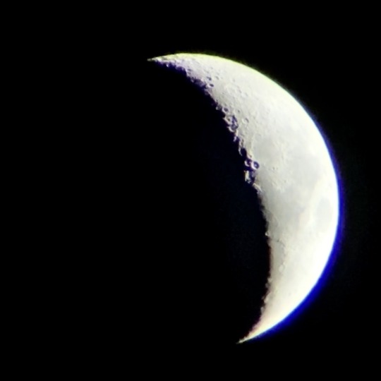
tried out more moon photos. not too satisfied. i think the problem with how blurry my photos are comes from
A. zooming in on iphone (but if i were to use my next highest magnification some parts of the moon would be out of frame, and i didnt have time to experiment anyway bc it was setting behind my neighbor’s house)
B. literally whenever i tapped my phone to take a picture, it would blur like hell. just that small little movement ruined the entire shot. in fact, this photo is a screenshot of a video, the only way i could workaround that
C. but then that introduces the quality deterioration that comes from screenshotting, so. maybe i need a way to extract individual frames but in this case i think its negligible compared to points A and B
i did take a few videos, so i’m gonna fuck around and see if i can try stacking. however due to the minuscule movements caused by me simply holding my phone (bc i DO NOT trust my phone mount to hold my phone’s whole weight) i’m not sure if stacking will improve the sharpness or actually make it more blurry. idk
i’m also gonna try and get out again when the moon’s about half full, so i guess in one week. i’m wondering if simply having more surface area will let the maria be more visible than they are here. but the sharpness is still an issue thats eluding me
#im frustrated i feel like the quality of my photos is actually decreasing the more i do this 😭#like did i just have beginners luck. why do all my photos lately suck so badly what is happening#my dad said maybe to get the sharpness i want. i need an actual camera not a phone camera#and like. yeah absolutely but also 😐 money#maybe for my birthday i will ask my parents but like thats so far away 😭#good thing is thoufh is that i enjoy taking pics in general so like. an actual camera would be used for Many things#so like. maybe its worth it since it goes beyond astrophotography even. idk#i literally have no idea how much cameras cost. 😭#brot posts#astro posting#photography
4 notes
·
View notes
Text
im wondering whether the first few riders in the 2000s were shot on digital or film so im looking this up again lol. okay edit, i did in fact find out, at least for kuuga, which basically answered the others even if its not exactly the same answer i bet.
bc like. in general, its honestly weird that we have these tv shows filmed in the early 2000s in HD today, at least compared to how shows were typically filmed in the us. japan had analog hd broadcasting starting in the late 80s but that doesnt mean it was standard, & the switch to fully digital broadcasting happened in mainly 2011-2012, although itd been around since 2003? but i think most of tv asahi's stations were still on analog broadcasting until the countrywide switch. things couldve still been filmed digitally & broadcast analog tho. kuuga & agito are both listed as being ntsc/analog format on wikipedia, but that does just relate to broadcast standards & not necessarily how they were shot. things broadcast in 1080i in countries that used ntsc like japan would have 60 fields per second, which would make the actual frame rate 30fps. itd have to be de-interlaced to become 1080p/30fps & viewable on a progressive scan screen instead of a crt one. the ryuki & blade blu ray listings mentions that, although its in hd, its been converted & upscaled from the standard definition original videos (which isn't mentioned on the blu ray listing for agito, faiz, & hibiki) & its also 1080i, or interlaced, which would make it 60i instead of 30fps & means they havent already de-interlaced it for modern screens. which could mean the "broadcast" version is the highest quality version they have of the masters, unless that IS how it was originally shot. oh my god. wait. okay holy shit i shouldve just checked the kuuga blu ray listing first bc it just answered my question, for at least that specific season.

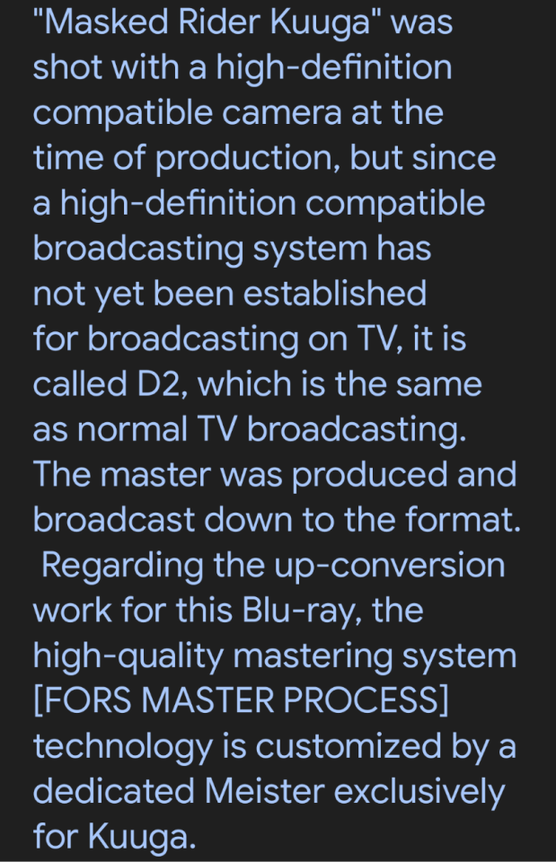

i also put it thru deepl but i cant screenshot that as well on mobile. for one, kuuga was shot in digital almost for certain, or at least the blu ray listing says it was filmed with an HD compatible camera, which was probably digital given the time & the fact that the masters for the episodes were produced in D-2 format, which is a videocassette that stores digital composite video & was used for regular analog tv broadcasting bc it being composite video made it easier to convert than other digital formats. besides the difficulties of filming a tv shown with 16mm film, itd be even worse to convert it to digital to edit & then back to analog to broadcast. So, the masters were in SD, interlaced, & letterboxed (the black bars on the top & bottom to make it the right aspect ratio for tv) since it couldn't actually be broadcast in HD. which is at least sorta what i expected, but also lol i dont exactly have enough experience comparing analog to digital to tell with just my eyes, & there were some little things with the lighting on the early shows that made me wonder in the first place.
anyway, kuuga was originally shot in hd, but the final edited product was never "saved" in hd. its a bit odd that agito & faiz don't mention the upscaling though, because if they had hd masters then its weird for ryuki & blade to need upscaling since they came after, unless something happened to their hd masters, or agito & faiz also had to be upscaled but its just not mentioned. honestly its a miracle we have hd versions at all, even the upscaled ones, bc of how lossy magnetic tapes are. hibiki's blu ray listing mentions its 1080i, which is to be expected & puts it in the same boat as agito & faiz, but surprisingly kabuto's official blu ray listing is for 1080p, so im guessing its the first one they either de-interlaced or had an HD version of the master saved separate from a broadcast version, bc this is the first one in a while that has a format listed on its wikipedia page too, where it says 1080i (hdtv). like i said, the only previous ones were kuuga & agito, where it said ntsc. actually, in a pdf i found related to tv asahi, it did mention april 2006 being when they launched "digital terrestrial broadcasting to mobile systems" so it's probably related to that, or other changes they made to broadcasting in general around that time since there's another broadcasting related milestone at the same time.

all the shows after this point have the same 1080i format on wikipedia & 1080p official release from what i can tell, altho i dont think any after the switch to digital would be broadcast only in 1080i, especially not the more recent ones, & wikipedia doesnt have a source for that claim lol. i can understand hdtv in general, but thatd include broadcasting in 1080p which would make more sense than 1080i at this point.
the seemingly back & forth levels of quality from kuuga to hibiki is intriguing but i really cant spend more time on this right now. ive used far too much effort considering i need to be writing a paper thats due today but. at least i solved one mystery lmao
2 notes
·
View notes
Text
first of all, i love the sfv backgrounds, theyre genuinely so pretty and i love the stylisation, i really wanna take more inspiration from them in my own art-
but also, the video game intrigued me, so i looked it up some more
its called "Die Schule der kleinen Vampire - Knoblauch Alarm" (School for Vampires - Garlic alarm) and seems to only be available in german
heres the amazon page
and heres another page with some more info (specifically linking to the screenshots)
the story seems to just be your typical "while the teachers are gone polidori breaks into the castle and the little vampires have to fight him off" kinda deal, but what intrigues me more are the screenshots
the art looks to be made newly for the game (or at least isnt anything we see in the show) and with it being higher quality as well as further zoomed out it provides new and better reference for stuff we only see briefly in the show itself
i attached a screenshot of gothettas "room"/the area behind her her coffin, as an example
the 3d models look kinda wonky sometimes, but honestly translate the style surprisingly well (*cough cough* looking at you, school for little vampires movie-)
since its a 2007 childrens game for a not super well known german kid series, i couldnt find any way to pirate it online but i did find it on ebay anddd ordered it- we'll see if my computer can run it (since its pretty old and i saw some reviews saying it doesnt work that well) in a couple days when it arrives ig
also added a screen shot of the inside cover bc its an image i kept seeing when looking up sfv stuff and im glad to have finally found out where its from lmao


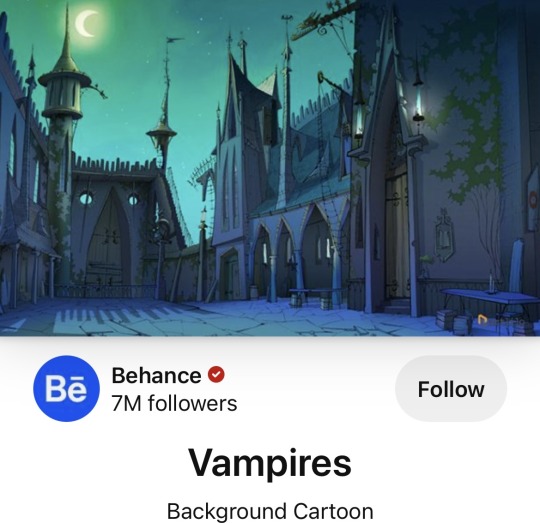
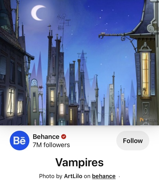
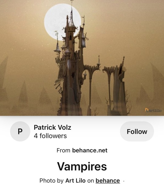
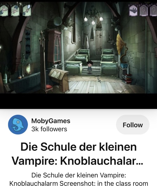
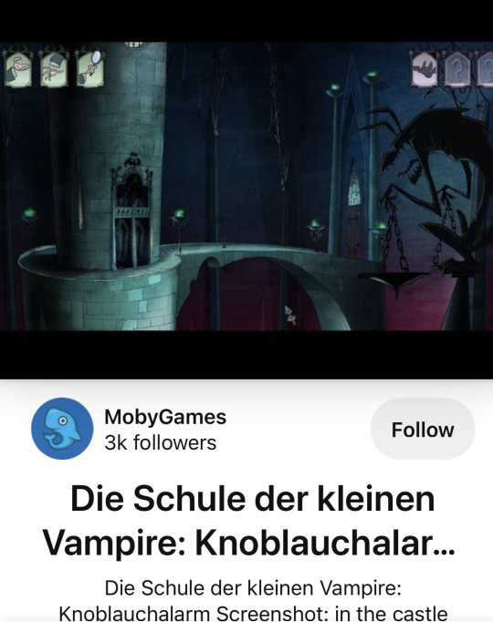
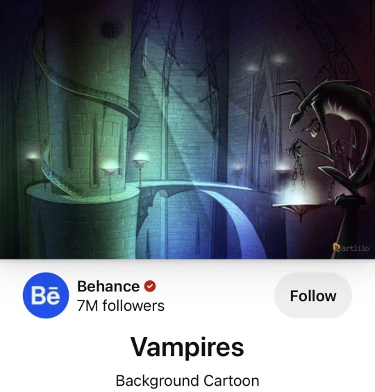
He’s more SFV backgrounds from mixed sources!
Some seem to be from a video game? That’s so interesting! It astonishes me how much patience and research had to go into each one
#school for vampires#die schule der kleinen vampire#sfv#im brainrotting over very weird niche bits of fandom lore again help
51 notes
·
View notes
Text
a few people have asked me how i take my screenshots so i thought i'd share my general like... process
so first things first i do not have the greatest rig. i wouldn't even call my rig good. what i DO have is a decent gpu -- i was lucky enough to get my grubby little goblin mitts on one when cryptocurrency mining was just starting to create a shortage, this was a few months ago when it wasn't as bad as it is now... anyway i have the gtx 1050 ti, i think 4gb?, which is a good card! it lets me run dai at a stable 40-60 fps on mostly ultra/high settings. the rest of my rig is garbage tbh. it's a cheapo dell i grabbed off the rack to replace my dying laptop years ago. a decent gpu will make a huge difference is my point. i chose to spend a little extra money to get something i wouldn’t have to replace for a while.
i have a 1080p monitor and run the game fullscreen to get the biggest screencaps i can. the bigger your resolution, the bigger your screencaps, the more detail you can jam in there. it's always better to have to scale an image down than up.
for purposes of portrait screenarchery in dai you only need to worry about 3 settings really: mesh, texture, and shader. if you want to cap scenery or combat shots etc you will probably need high settings on other options but for just portraits of faces, those 3 are all you need. you can always hide ugly background textures by making everything in the bg really blurred out. don't neglect shader. that's what gives things like hair a higher resolution so it's not this super shiny metallic oilslick look.
now, tools. you'll need the dai cinematic tools and some screencapping software. i use fraps, which i paid for, at the cost of about $37. i think you can still take screencaps with the free trial version, you're just limited to certain filetypes and you can't take video? there's free screencapping software but i thought fraps was the most intuitive and simple that i tried so i bought it. (i think dai has a built in screencap feature on pc...? but i have never used it if so. in-game screencapping usually saves as compressed jpegs which i Do Not Want.)
the cinematic tools are a free third party software you can download above. download the zip and extract it into its own folder somewhere you can easily find again. when i run the cinematic tools, i first boot up the game, then either completely load a save or a new game, then alt-tab out and boot the cinematic tools (RUN AS ADMINISTRATOR). two windows will eventually pop up. don't touch anything until the black box says something like "gui found." then alt-tab back to the game and you can start playing with the tools.
i used this tutorial as a basic how-to guide for flycamming, and this tutorial to start figuring out the settings of the cinematic tools. from there it was just playing around with the settings and trying things out.
for the most part, i usually just change the depth of field to get a nice crisp shot when i zoom in with a blurry background to bring the focus more on the subject of the picture. i also always use the cinematic tools to hide the hud (delete key) and temporarily upscale the resolution. sho talks about that in their tutorial. otherwise, i usually don't make many adjustments. i prefer to post-process my screencaps in photoshop. you can also use a reshade, but those are VERY labour-intensive on the ol' gpu, and i find the drop in framerate is a hassle i'm not willing to deal with.
i have fraps set to save screenshots as png files. this produces absolutely huge filesizes but they retain their quality without jpeg compression which is valuable to me.
there's a few other tricks i do with the cinematic tools, aside from the simple tip of going under 'misc' and setting the resolution to '2' to temporarily upscale the resolution and then returning it to '1' when you're ready to play the game again --
1. when i flycam to take portrait shots, i usually do so during cutscenes. this will give you slightly better detail on the textures and such, but it also lets you get much closer to the character. for whatever reason in the overworld if you zoom in to a certain point your character just vanishes, but in cutscenes you can get so close to them you can literally see the inside of their head and their creepy realistic teeth and eyeball models. also, overworld characters have resting bitch face somethin' fierce. cutscene shots will provide more variety of expression.
2. take several different angles, and take more screencaps than you think you'll need. you can weed them out later.
3. a good Tip to take portrait-oriented... uh, portraits (you know, vertical and not horizontal) is to use the flycam to just rotate the camera 90 degrees, take your screencap, then rotate it in any basic image editing program. this will give you a much higher resolution portrait-oriented screencap than just taking a landscape-oriented screencap and cropping it. it's the exact same thing as physically turning your camera to the side in your hands.
i also use a lot of high-resolution mods in my game. i have a list of recommended mods here, but if you just want a mod experience that's "the vanilla game, but improved," i'd recommend this mod to lessen the shininess of the vanilla skin, this one to enhance the resolution of the eyes, this one for vallasin, this one for hair resolution, this mod that slightly elongates the vanilla eyelashes (elongated lashes v03, and this eyebrow mod that totally overhauls EVERY eyebrow in the game. i can give a tl;dr about what makes some mods (imo) better than others, but basically what i prioritize is 1) realistic, 2) lore-friendly, and 3) high-resolution. in that order.
so that's how i get the quality that i do when i take screencaps -- using a decent gpu to run the game at ultra settings when possible, prioritizing mesh/textures/shader, and using the cinematic tools to take clean screenshots with the hud hidden and flycam to zoom in on faces and frame them better.
when it comes to visual interest that's a little trickier. the biggest thing i'd recommend is studying photography. that's why i got into screenarchery, i have a background in photography which i studied until i had to sell my camera due to unemployment. specifically read up a little bit about photography composition and try to apply that to your screencapping. general art composition will also apply here.
do not be afraid to experiment in terms of composition. if you “break the rules,” take a long look at your composition and think about whether or not you think it works, and why. study other people’s compositions and think about how that contributes to the feeling of a piece. some stuff is obvious common sense stuff -- want to create a feeling of loneliness and isolation? make your subject very small and off to one side so they seem almost drowned out by all the empty space... want them to look powerful and imposing? put them at a high angle so they look large.
really pay attention to your lighting. take a couple screenshots of your character in different lighting situations and try to figure out where they look better and why that is. light will bounce off your character’s face in different ways at different angles and enhance or detract from their appearance. that’s why all the youtube beauty gurus have ring lighting... because it’s SUPER flattering, unnaturally so.
angle will also affect how people see your character’s facial features. you know how when you accidentally turn the front camera on your phone on and you’re like OH GOD I’M A MONSTER? it’s bc that angle from below is ridonkulously unflattering with human facial features. it’ll make everything look bigger and bloated. remember the myspace days, when all the scene girls took selfies from like a foot above their heads pointing down? that’s bc that angle made them look thinner and longer.
i love dutch angles but uh, be careful with that. dutch angles impart a sense of drama into a picture that can be kind of out of place if you're taking just some casual chillin' shots. but you can pry them out of my cold dead hands...
that’s about it, if u have any other q’s send me an ask
3 notes
·
View notes
Note
OK SCREENSHOT DUMP TIME IM GONNA GUSH ABOUT ALL OF THESE SO THEYRE GOING UNDER A CUT <333

before this shot he was laying partially covered in sand (bc he crash landed ofc) and all I could think of was the "I hate sand. it's rough and it gets everywhere" AHDHDHDJA anyway looking beautiful as always despite crash landing on a foriegn planet with minimal armor <3

god I love this whole scene in the elevator bc they have a bunch of snarky back and forth and then loki realizes that they've been in the elevator an abnormal amount of time AND ITS JUST SO GOOD I also love the framing of this shot a lot too

"Glorious" he says,,,,,, I LOVE YOUUUU (this one is also lower quality bc for some reason this part of the video was just lower quality than the rest which was weird)

*gives him a littol kiss* I don't have anything else to say he's just really pretty here AS ALWAYS


he does his signature dramatic knife flip here but I mostly saved these bc this fit SLAPS YES PLEASE TIME TRAVEL DETECTIVE MAN <333

loki and a time travel prison guard watch The Avengers (2012)


THIS IS A FANTASTIC ENDING SHOT TOO THE FACT THAT I REMEMBER THIS FIT FROM THE COMICS,,,,,,,,CRIES ILYSM I will never stop talking abt this fit either tbh ITS SO GOODDDDD PUT HIM IN A GREEN SUIT EVERY DAY PLEASE
HEY JACK HOW WE FEELING ABT THAT LOKI TRALIER :EYES:

HE IS SO BEAUTIFUL I LOVE HIM WE ARE GONNA GO ON TIME TRAVEL ADVENTURES TOGETHER AND AAAAAAAAAAA
2 notes
·
View notes