#prototype companies
Explore tagged Tumblr posts
Visit Tumblr Blog
Explore Tumblr blogs with no restrictions, modern design and the best experience.
Last Seen Tumblr Blogs


Fun Fact
Tumblr’s reach among the 26-to-35-year-olds in the US is 11%.
Text


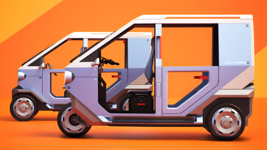
Hyundai E3W & E4W Micro Mobility concepts, 2025. A collaboration with India’s TVS Motor Company could revolutionise Indian's huge rickshaw market. The electric micro mobility concepts feature LED headlights and a small screen for displaying messages or destinations, heat reducing roof coatings and waterproof interiors. The basic structure can be easily adapted to purposes beyond passenger carrying and the vehicle's diminutive width makes it possible to access narrow alleys and crowded markets. The 4-wheeled version could be sold internationally
#Hyundai#Hyundai E3W#Hyundai E4W#Micro Mobility#concept#prototype#3 wheeler#rickshaw#electric rickshaw#TVS Motor Company#design study
255 notes
·
View notes
Text


Some 2000s "girls toys" had a curious trend of creating logos for major brands that looked like an employee had their tween throw them together the night before a presentation.
YEAH BABY, bring on the random lower case letters, squashed together words, and random font changes! Graphic design is my passion!
#toys#toy companies#Mattel#Hasbro#MGA#listen I love the G3 MLP toys#but the logo is so bad#the font is just ???#and the shape of the logo is referencing the 'double-heart' seen on the hooves of prototype ponies#but the double heart was SCRAPPED before the ponies started production#so the logo doesn't even make sense in connection to the brand#oh and the Bratz logo on its own isn't that bad#but then you add the flowery text tagline and the character art and yikes#interestingly Monster High has a very polished and symmetrical logo#and the couple 'boys toys' I looked up like Bionicle and 2001 Transformers had very slick logos too#but it's possible there are also boys toys with logos like this that I jsut wasn't thinking of
185 notes
·
View notes
Text


☆ Chii // Chobits "Soothing breeze" ☆ 1/7 / Oriental Forest ☆ May 2025 ¥18,600 ☆ Sculpt M.I.C. Paint Hajimeno
#chii#chobits#oriental forest#m.i.c.#hajimeno#scale#if shes anything like previous chiis you want to buy her now bc the aftermarket will not be kind#but also this company is VERY new so who knows! but the prototype is sooo cute#100
329 notes
·
View notes
Text


Nendoroid Haruka Sakura from Wind Breaker. Blush faces are always good. Look at his little kick. ^_^
Source:

#haruka sakura#wind breaker#figure collecting#good smile company#smile fest#smile fest 2024#smilefest#nendoroid#figure announcements#NTTUIPRN#painted prototype reveal#facial expressions
71 notes
·
View notes
Text
i woke up from a dream in the middle of the night and, for a split second, had the thought "oh huh. they forgot to make a T'lyn demonstrator. Wait."
#dream logic#Derail Valley#T'lyn#Star Trek Lower Decks#demonstrators are locomotive prototypes sent by a manufacturer to a railroad for them to trial.#in Derail Valley the demonstrators were donated to a museum and then subsequently abandoned; but they can be restored by the player#as a way of owning your own locomotives (most in the game are owned by the railroad company you are employed by)#they have custom paint jobs to differentiate them from the vanilla locos#T'lyn is a Vulcan science officer in Star Trek: Lower Decks. And not a locomotive.
26 notes
·
View notes
Text

Hatsune Miku & Kuromi // Vocaloid x Sanrio
Prototype by Good Smile Company
#hatsune miku#miku hatsune#vocaloid#piapro#crypton#sanrio#kuromi#collab#prepainted#prototype#anime figure#misc#figure#mascot#wonfes#wf2025w#upload#good smile company
12 notes
·
View notes
Text
Thinking of Dan who is soft for Ellie because she's not the first clone he's met. Him finding a girl with his face floating in a capsule filled with ectoplasm while exploring the mansion after being taking in by Vlad. Him returning again and again because even though she isn't conscious he craves human connection. Him only interacting with Vlad (screaming matches) and servants (they avoid him in fear of upsetting him) so he starts talking to her, and sometimes he can even pretend that she responds.
#the ANGST potential#he would do anything for Ellie#but does he even see her?#or is he just projecting what he wanted to have when sitting in that dark basement with only an unconscious clone for company?#just him having moments where he expects to Ellie to know what he is referring to#except Ellie has no idea what he's talking about#and she'd only notice once they’re close#and that would make it so much more painful#she expects Jazz#Sam#Tucker and Val to compare her to Danny to some degree - even if it’s just throw away comments#And she thinks that she doesn’t have to worry about this with Danny and Dan#and it turns out one of the two people she thought really saw her actually didn't#just this time they were comparing her to an idealized version of her prototype instead of Danny#danielle phantom#dani phantom#ellie phantom#dark danny#danielle fenton
13 notes
·
View notes
Text
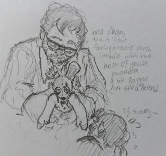
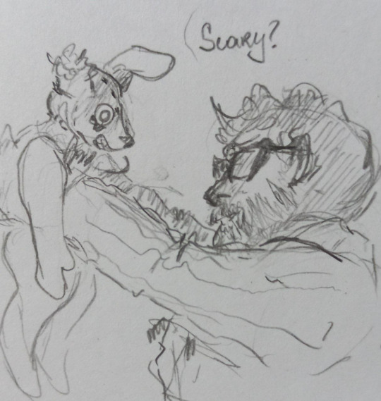
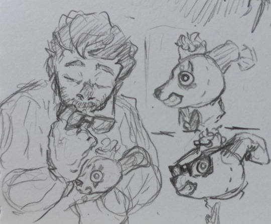
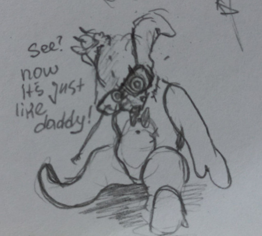
Daddy's copy.

Little Plushtrap redesign
#william afton#evan afton#plushtrap#springtrap#fnaf fanart#my art#I know i know plushtrap is not canon ooooh i dont care i wanted to try and draw him#hes mostly inspired by my mother's plush toys that she makes and winnie the pooh irl prototypes#thinking about clara and william working together to create merch for the company <3#fnaf#fnaf movie
204 notes
·
View notes
Note
So wait. Gideon k.o himself to be Hunter? Or his organic body still intact? He's pulling a Springtrap??
.
#it was a very desperate decision honestly!#Guideon had not much of his parents left besides the overwhelming responsibility for the company and an inactive Exocannis prototype#In a way it was like the universe giving him a second chance to make things right for once (and to be useful perhaps)#He could've just let the poison do its job. but just like young Gideon would he sought comfort in his mother's creations#He knew how the Exocannis worked bcs he designed them himself as a kid and gave the drawing to his mother. 'his name's Hunter!' he told her#She made his childhood drawing into reality and now- it came back to save him from this painful fate.#the poison was not something he willingly drank by the way!#maybe Guideon had grown *way* too popular since the UNITY androids granted Bortom's victory against Fusionsprunt#some people are ready to take the credits once the original creator is long gone#and he was too careless to pay attention to that#inbox
34 notes
·
View notes
Text
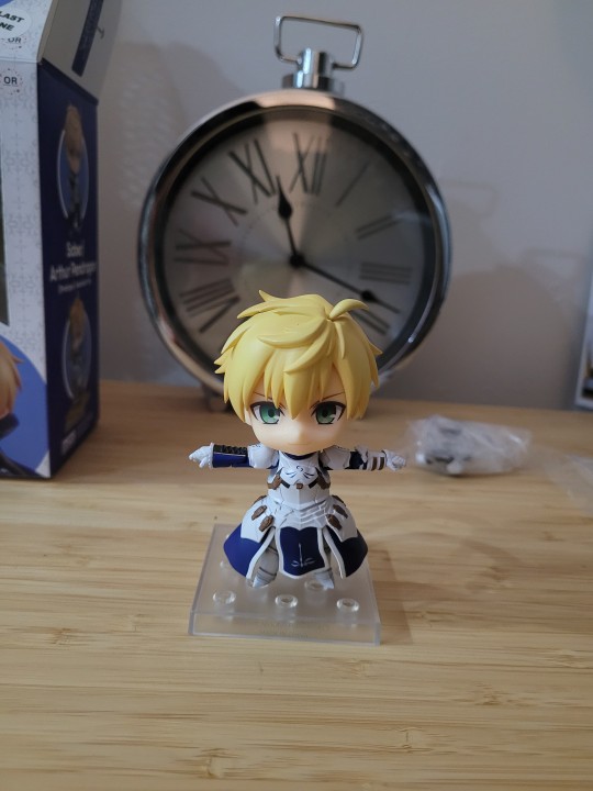

How Arthur asserts his dominance.
#fate series#fate stay night#fate prototype#fate grand order#nendoroid#good smile company#arthur pendragon#fate saber prototype
34 notes
·
View notes
Text
FINALLY the prototypes for the Trigun Maximum Nendroids have been released since their announcement a year ago.

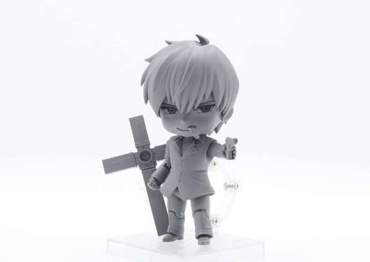

#trigun#trigun maximum#trigun stampede#vash the stampede#merch#vash#trimax#anime#not art#wolfwood#nendroid#good smile company#prototypes#toys#figures#collectables
52 notes
·
View notes
Text
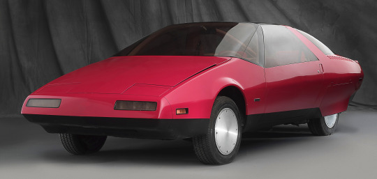
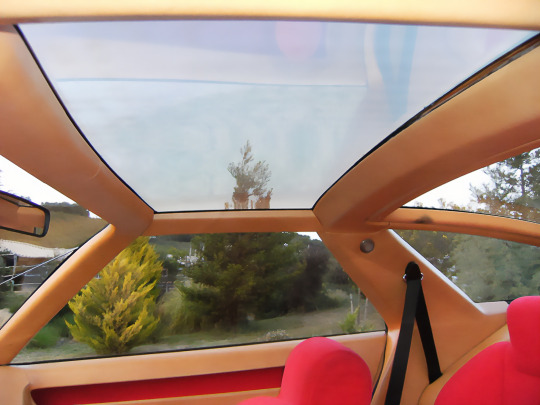
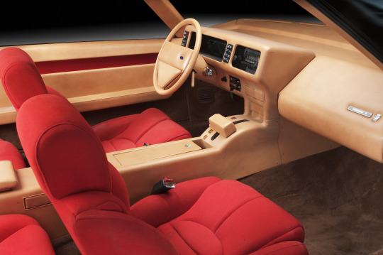
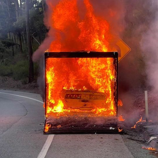

Ford Probe I, 1979, by Ghia. The first in a series of futuristic Probe concepts has been destroyed in a fire following Monterey Car Week where it had been displayed. First show at the Frankfurt Motor Show, the concept car has been owned for the past 20 years by the Scott Grundfor Company. “It is with utter sadness and a heavy heart that we have lost our 1979 Ford Ghia Probe I Prototype in an accident on the highway late in the day on Sunday after showing the car at the Pebble Beach Concoursd’Elegance,” the company said in a statement. “We are a family oriented company, and it feels like we have lost a member of our family today.”
#Ford#Ford Probe#Ford Probe I#Ghia#concept#design study#prototype#futuristic#1979#Frankfurt Motor Show#Scott Grundfor Company#destroyed by fire
393 notes
·
View notes
Photo
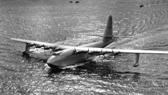
Hughes H-4 Hercules, aka the Spruce Goose, photographed November 1947 at Long Beach Harbor, California
#Hughes Aircraft Company#Prototype aircraft#H-4 Hercules#Spruce Goose#Flying boat#Sea plane#Transport#Cargo plane#Airlifter
90 notes
·
View notes
Text
CNC milling and turning machining
#design#business#autos#prototyping#prototype#prototype machining#rapid prototyping#cnc machining#precision machining#machining parts#cnc machining parts#cnc parts#cnc parts company#cnc parts factory#cnc precision machining#cnc milling#cnc turning
4 notes
·
View notes
Text
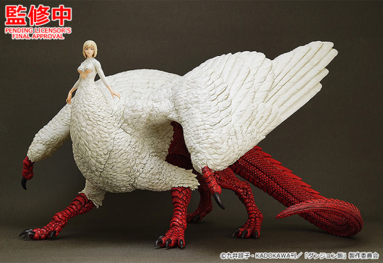
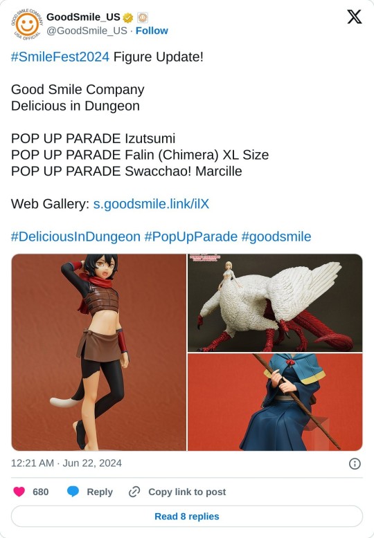
It's happening. They're making a Falin-chimera figure. And it'll be the extra large "XL" size, so it'll be massive compared to the other Pop Up Parades. Appropriate.
#falin touden#chimera falin#pop up parade#delicious in dungeon#dungeon meshi#figure collecting#good smile company#smile fest#smile fest 2024#smilefest#painted prototype reveal#figure announcements#izutsumi#marcille donato
72 notes
·
View notes
Text
meu primeiro redesign!
[ br / eng ]
[meu primeiro redesign e como isso é mto confuso/my first redesign and how this is so confusing] lição mágica aprendida hoje: paciência.
˚✧ antiseptic ݁ ੭
BR :
’ㅤㅤㅤok é estranho postar depois de algum tempo MAS EU JURO QUE TENHO FEITO COISAS!
primeiramente, percebi que eu não ia conseguir aplicar meus estudos se eu não colocasse em prática (obviamente?), então do q adiantaria estudar se eu não faria nada com isso?
eu estava navegando na minha maravilhosa shein com esse pensamento, quando eu parei pra analisar: POR QUE EU NÃO FAÇO UM REDESIGN DA SHEIN?
sim. eu fiz.
Este site é propriedade da Shein e é destinado exclusivamente para fins de estudo. Todos os direitos sobre os materiais, informações e elementos gráficos apresentados neste site pertencem à Shein e estão protegidos pelas leis de direitos autorais.
ok pra começar: eu não fazia ideia do que fazer. não pensei em nenhuma teoria ou nada, eu só simplesmente fiz???
acredito que esse post vai ser o mais curto do perfil, mas irei tentar explicar meus processos pra não ficar tão sem conteudo. ao final do post, terá o link do resultado caso queira pular!
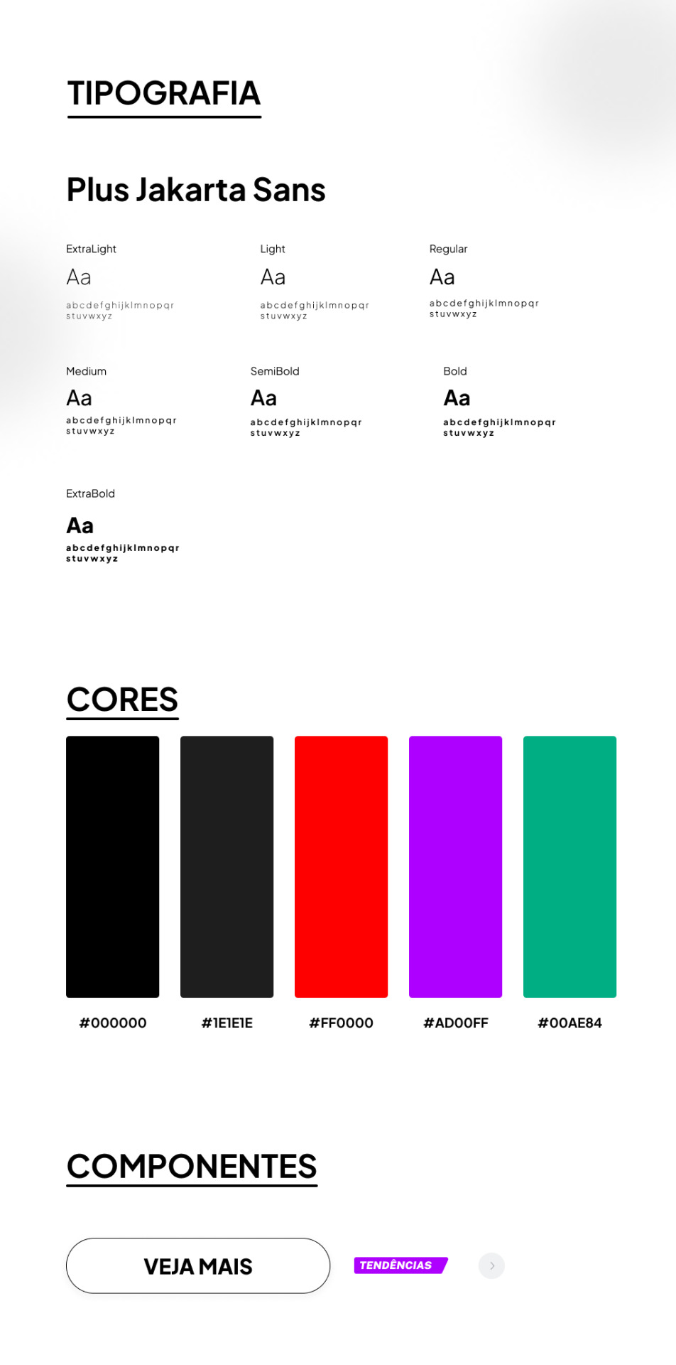
TIPOGRAFIA:
a escolha da fonte foi uma abordagem que precisava ser elegante e moderna, sabia que essa fonte foi criada sob encomenda do 6616 studio para um projeto do governo provincial de jacarta chamado ‘+Jakarta City of Collaboration’, lançado em 2020. ela se inspira em fontes como Neuzeit Grotesk, Futura e outras sans-serifs grotescas dos anos 1930, apresentando um contraste quase monolinear e curvas agudas.
a plus jakarta sans é caracterizada por suas formas modernas e limpas. ela tem uma altura-x ligeiramente maior, o que proporciona um espaço claro entre as letras maiúsculas e a altura-x. além disso, a fonte é equipada com contadores abertos e espaços equilibrados, garantindo uma boa legibilidade em uma ampla gama de tamanhos.
agora que te dei um contexto histórico dessa fonte, vou te explicar algumas razões que me fez escolher ela (não, não foi aleatorio ok). a fonte reflete uma estetica moderna e contemporânea, proporcionando espaços claros e legibilidade em vários tamanhos, tornando uma escolha versátil para diferentes elementos, desde títulos até textos menores.
CORES:
confesso que nessa parte não tenho muito a dizer, o preto é uma cor elegante e básica, tornando a comum. em termos técnicos, o preto é a ausência de luz ou cor. no espectro de luz visível, a cor preta absorve todas as cores e não reflete nenhuma delas para os olhos. legal, ne?
sobre o vermelho, é obvio que eu precisava de algo chamativo; o verde normalmente simboliza elementos da natureza, mas em alguns contextos ele também representa renovação, então, imaginei que essa era a melhor cor pra representar sobre avisos de roupas ou quaisquer coisas novas.
agora o roxo, não sei dizer o que me levou a escolher essa cor, confesso que entrei no site da SHEIN e dei uma boa olhada no motivo de ela estar ali e tudo o que me faz pensar, sinceramente, é porque ela é chamativa, o que faz o usuario ficar ansioso e pensar nossa meu deus TENDENCIA eu preciso comprar!!
CONCLUSÃO
esse foi meu primeiro trabalho concluído, de fato. tanto como webdesign como redesign, eu realmente gostei muito de ter feito e me diverti ao longo do processo, mas eu ficava ansiosa pra terminar e percebi que eu tentava atropelar algumas etapas, isso deve ser mais comum do que eu imagino e eu preciso treinar isso, mas tirando isso.... consegui trabalhar bem olhando as referencias do proprio site da SHEIN e acredito que fiz um retrabalho bom!
POR FAVOR SHEIN ME CONTRATA
dúvidas, sugestões ou críticas? me mande um ask, ele está aberto para qualquer tipo de coisa que tenha surgido durante o post. ♥︎
ah, e sobre o resultado final, claro....... eu postei no dribbble! provavelmente vai ser a plataforma que utilizarei em todos os meus posts para mostrar o design final, ent caso vc n queira ver meu monologo, basta pular direto pro final!
https://dribbble.com/shots/24251593-SHEIN-Redesign?added_first_shot=true
[meu primeiro redesign e como isso é mto confuso/my first redesign and how this is so confusing] magic lesson learned today: patience.
˚✧ antiseptic ݁ ��
ENG :
’ㅤㅤㅤok it’s weird to post after some time BUT I SWEAR I HAVE BEEN DOING THINGS!
firstly, I realized that I wouldn’t be able to apply my studies if I didn’t put them into practice (obviously?), so what would be the point of studying if I wasn’t going to do anything with it?
I was browsing my wonderful shein with this thought, when I stopped to analyze: WHY DON’T I DO A REDESIGN OF SHEIN?
yes. I did.
This site is owned by Shein and is intended exclusively for study purposes. All rights to the materials, information and graphic elements presented on this site belong to Shein and are protected by copyright laws.
ok to start: I had no idea what to do. I didn’t think of any theory or anything, I just simply did???
I believe this post will be the shortest on the profile, but I will try to explain my processes so as not to be so without content. at the end of the post, there will be the link to the result in case you want to skip!

TYPOGRAPHY:
the choice of font was an approach that needed to be elegant and modern, I knew that this font was custom made by 6616 studio for a project of the provincial government of Jakarta called ‘+Jakarta City of Collaboration’, launched in 2020. it is inspired by fonts like Neuzeit Grotesk, Futura and other grotesque sans-serifs from the 1930s, featuring an almost monolinear contrast and sharp curves.
the plus jakarta sans is characterized by its modern and clean shapes. it has a slightly larger x-height, which provides a clear space between the uppercase letters and the x-height. in addition, the font is equipped with open counters and balanced spaces, ensuring good readability in a wide range of sizes.
now that I’ve given you a historical context of this font, I’ll explain some reasons that made me choose it (no, it wasn’t random ok). the font reflects a modern and contemporary aesthetic, providing clear spaces and readability in various sizes, making it a versatile choice for different elements, from titles to smaller texts.
COLORS:
I confess that in this part I don’t have much to say, black is an elegant and basic color, making it common. in technical terms, black is the absence of light or color. in the visible light spectrum, the color black absorbs all colors and does not reflect any of them to the eyes. cool, right?
about red, it’s obvious that I needed something eye-catching; green usually symbolizes elements of nature, but in some contexts it also represents renewal, so, I imagined that this was the best color to represent about clothes warnings or any new things.
now the purple, I can’t say what led me to choose this color, I confess that I entered the SHEIN website and took a good look at why it was there and all it makes me think, honestly, is because it is eye-catching, which makes the user get anxious and think oh my god TREND I need to buy!!
CONCLUSION
this was my first completed work, in fact. both as webdesign and redesign, I really enjoyed doing it and had fun throughout the process, but I was anxious to finish and I realized that I tried to rush some stages, this must be more common than I imagine and I need to train this, but apart from that… I managed to work well looking at the references from the SHEIN website itself and I believe I did a good rework!
PLEASE SHEIN HIRE ME
questions, suggestions or criticisms? send me an ask, it is open for any kind of thing that may have arisen during the post. ♥︎
ah, and about the final result, of course… I posted it on dribbble! it will probably be the platform that I will use in all my posts to show the final design, so if you don’t want to see my monologue, just skip straight to the end!
https://dribbble.com/shots/24251593-SHEIN-Redesign?added_first_shot=true
#design#aesthetic#art#english#designinspiration#brasil#design ux#ui ux design#uidesign#ui ux company#ui#ux#redesign#shein#sheinstyle#design ui#web design#website#user interface#prototype#digital art#figmadesign#figma#creative#dribbble#dribble
8 notes
·
View notes