#processbook
Explore tagged Tumblr posts
Text

25/04/23 - Process Book Talk
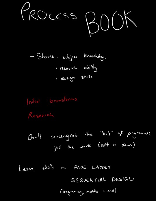
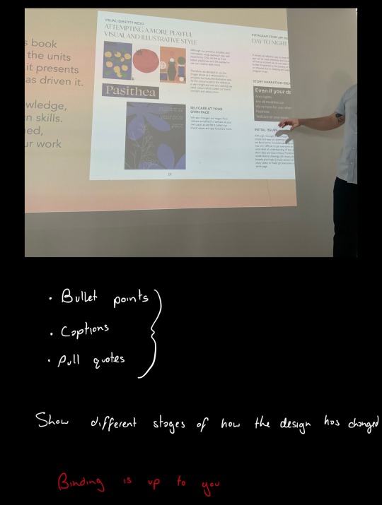
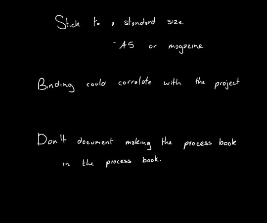
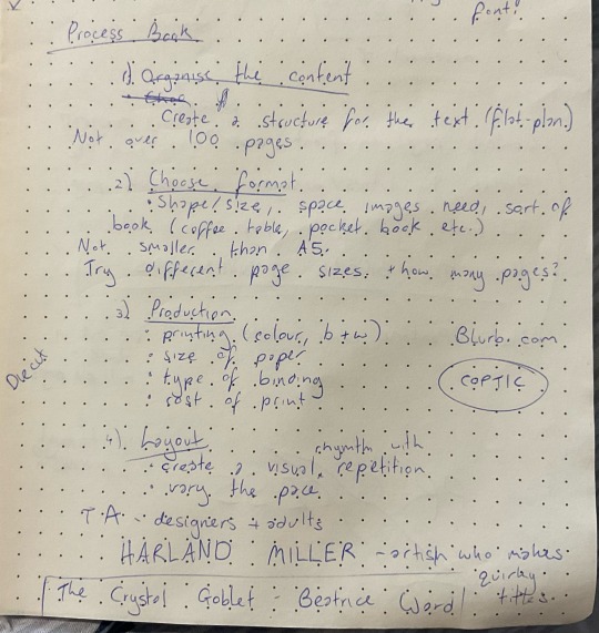
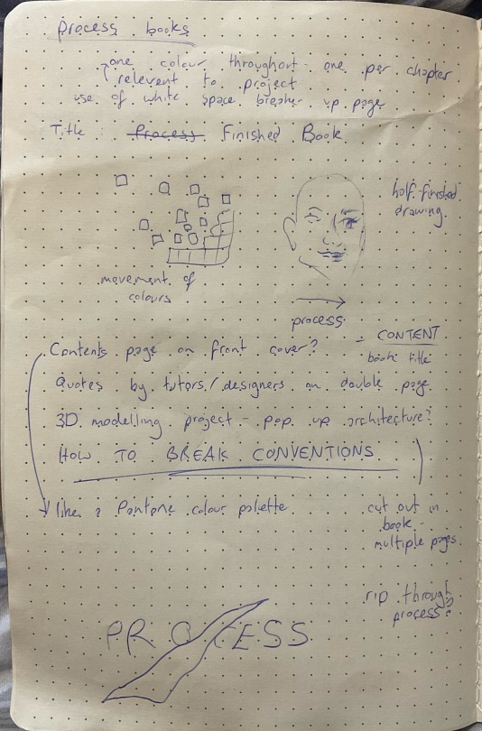
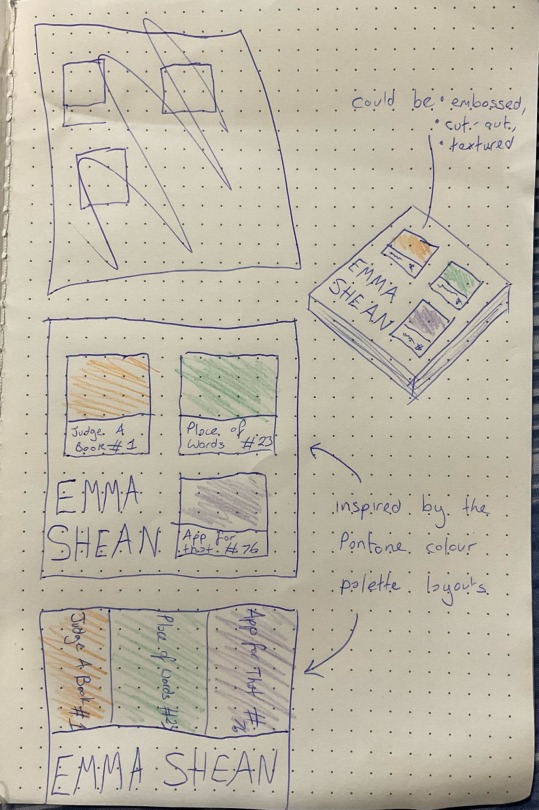
I began thinking of ideas after the talk about how to design our process books for the final term.
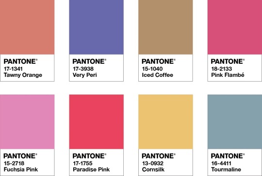
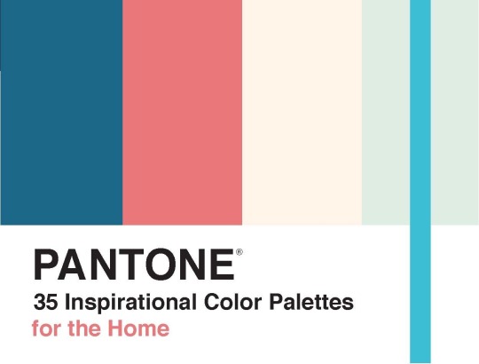
My favourite idea was having the contents on the front page, with a Pantone colour palette layout of the main colours used in each of my projects to distinguish between the chapters and units. I thought this was quite unconventional to have the contents on the front page, and gave it a unique first look. The different colours in each project, for example blue/orange for the ‘Judge a Book’ project, would continue throughout the book chapter and make it easy to see which unit of work the reader is in.
:) from Amy
2 notes
·
View notes
Text
Final Group Crit
Week 8
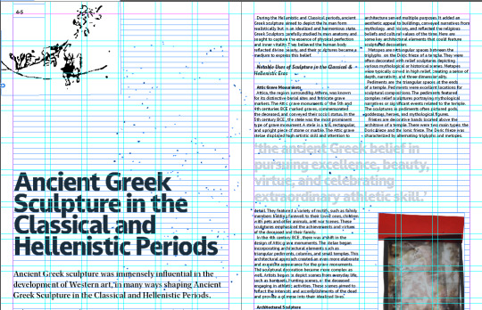
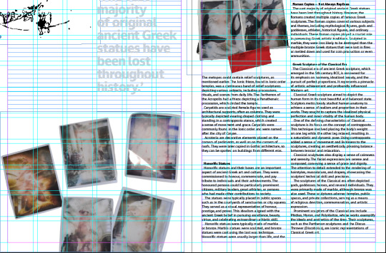
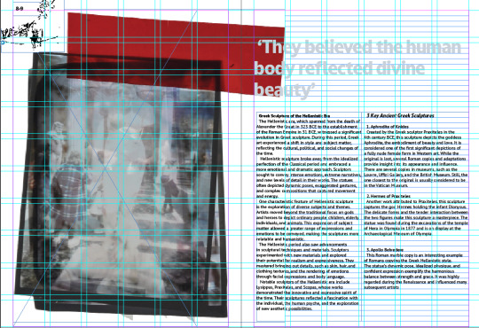
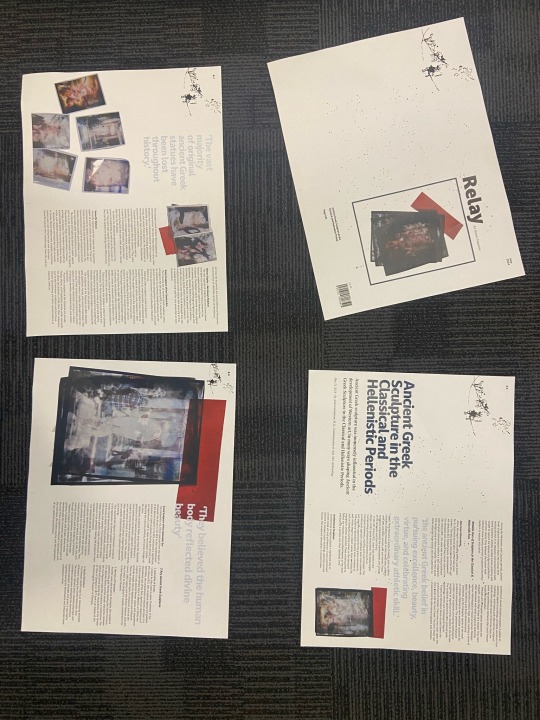
Small text adjustments
Change all pull quotes to light blue
I think it looks even better with these small changes. Printed out and cut down, makes it seem even more like a real magazine and professional. I love what I have made this term, and didn't think I would at one point, like anything I made.
0 notes
Text
Process book development
When experimenting with my process book cover, I found that the contents did not resemble a journal as the images were printed on and the text was large.
To fix this I decided to experiment with placing the images as separate inserts, similar to how a personal journal looks.
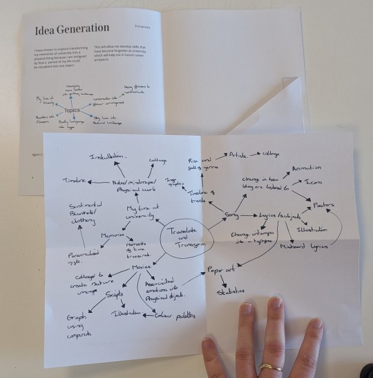
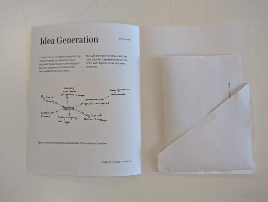
I found this layout was more linked to the traditional side of my project and made the book look like more of a journal with a modern twist, as the text is not hand written.
0 notes
Text
MP - Process Book (Chapters) LO3
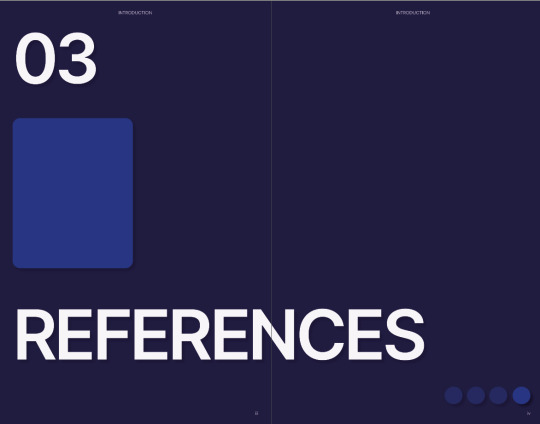

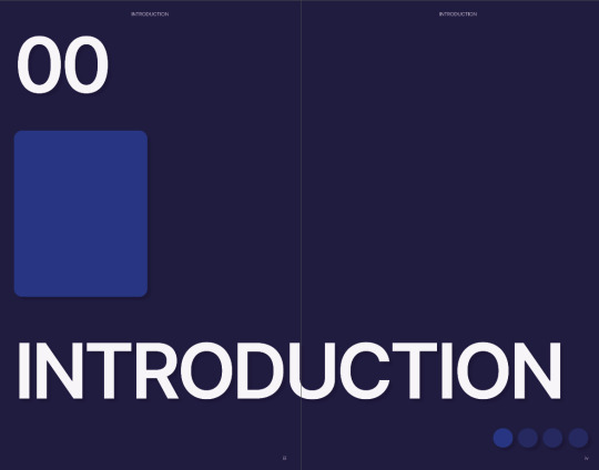
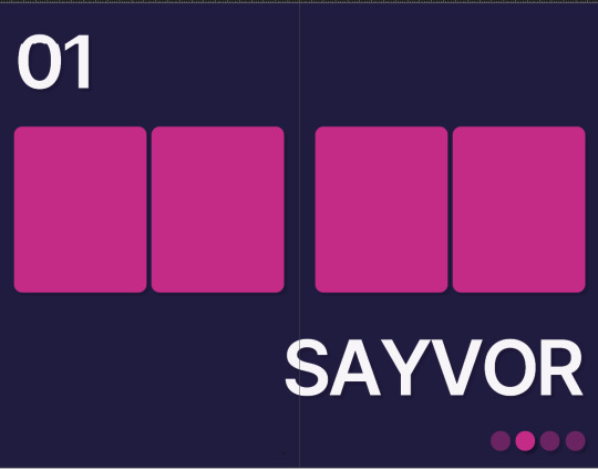

These are chapter pages, there will be brief descriptions of my work in these pages. I stopped creating the layout because I was feeling inspired from the last layout but realized I couldn't get more inspiration and that is what I dislike about editorial design.
Again the inspiration is UX. At the top is the chapter numbers, the middle has vertical rectangles where I will place images relating to the chapter and the chapter heading. Finally, the bottom shows slider buttons as a form of navigation for readers.
0 notes
Text
Process Book - Size
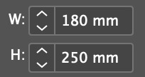
Here is the size that I am sticking to for my process book for this term. I have decided on this size making it smaller than a4.
0 notes
Photo
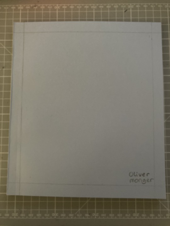

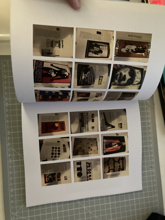
Process Book
This is my bound process book that I did using the perfect bind.
For the cover I used a baby blue and I drew a grid onto that and added my name to it. I wanted to do more but didn't have the time nor resources to do that at this time, however I do want to make sure that I do it next project as I have ideas in mind.
The binding and printing process went well enough but there's one thing that I need to change for the process book and that is the edit of the text making sure that their are no orphans in my text. It's something that I overlooked this time when creating and that has made me very disappointed as it's an important aspect. I will make sure to perfect it next project.
I feel like there is always going tot be something that goes wrong.
0 notes
Text
Process Book Timing
While I enjoyed the learning a new binding method it came at a bit of a sacrifice. As I needed Jospehs help to get this book binded, the latest I conducted wait to print was the workshop on the Monday before deadline. The problem with binding this early is im not done with my website so only about half of my process will be in the book as I'm working on now. I think this is going to be important to keep in mind in the future because its going to change the way I work. If I were to go back I would've given some of the time I used to bring my D&AD to completion to work on the website. I think this would've resulted in a more rounded book as both projects would been near completion in time to print instead of one 100% done and one 50% done.
1 note
·
View note
Text
Printing and Binding my Process Book
Week 7
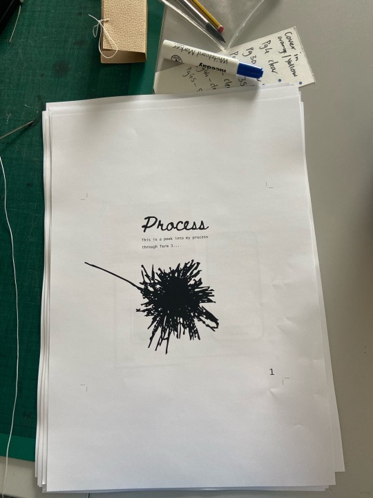
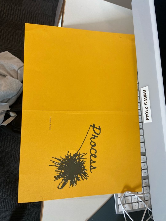
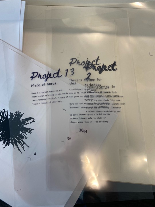
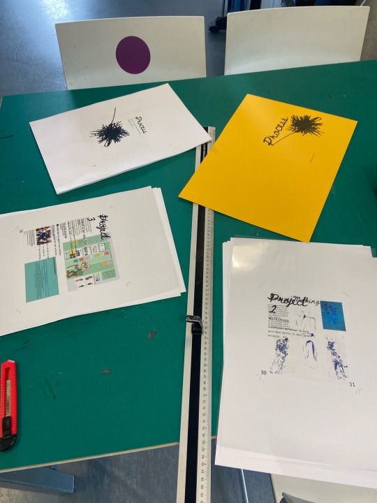
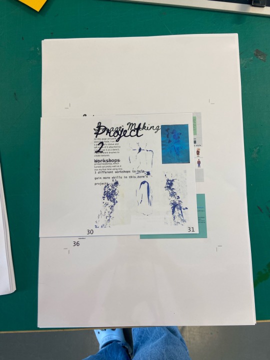
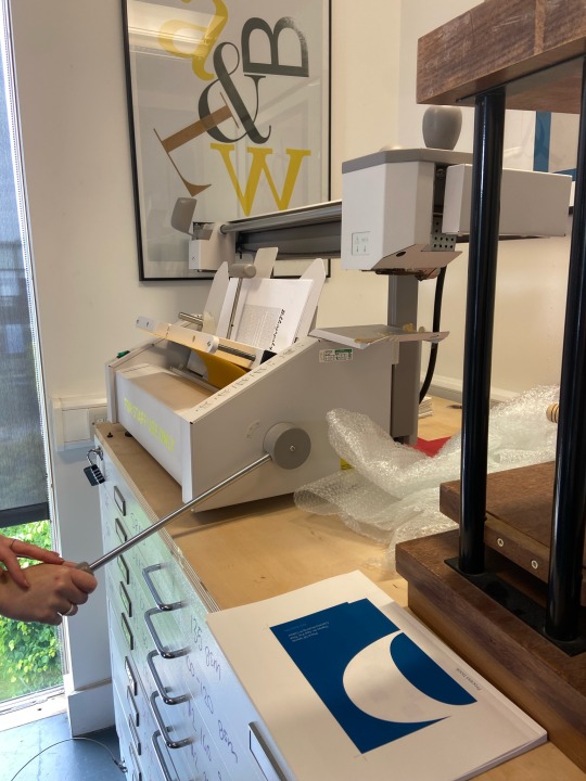
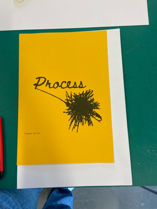
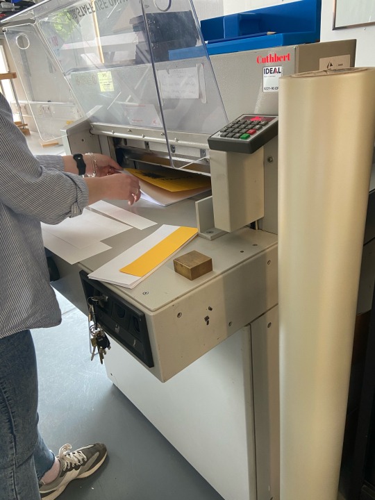
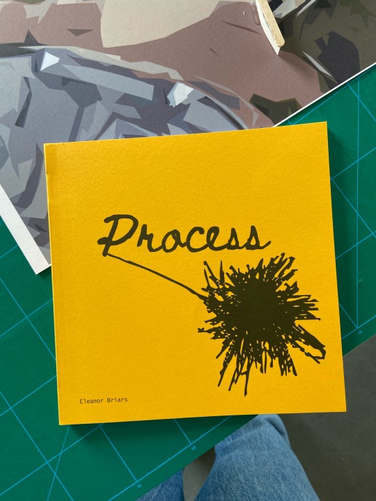
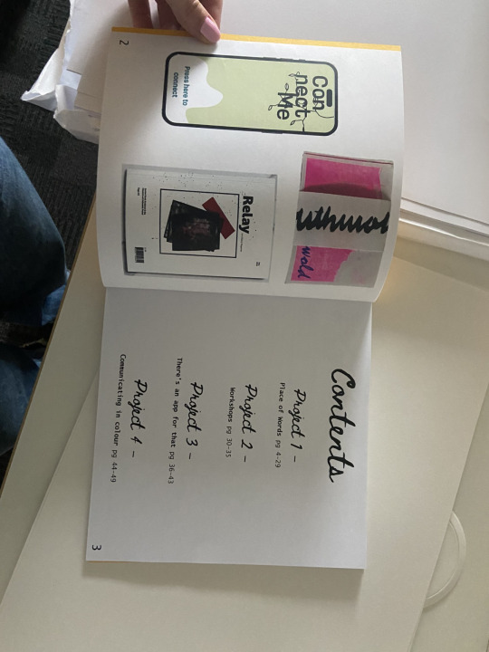
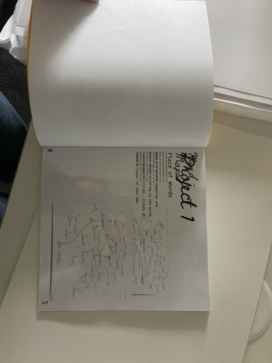
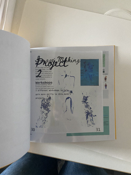
Binding the process book was actually kind of long as I had different types of paper and sizes in the book. There wasn't enough orange/yellow card for the inside pages and it would be too thick for the pages. There also wasn't any orange card like the shade I wanted. The acetate project pages worked really well, and so did the smaller pages, they just had to be cut down before binding.
Overall, I think it turned out pretty well. I love how I have different types of paper and size in the book, it makes it more interesting and interactive even. The bright yellow cover looks simple but effective, I don't think it needed much as the illustration says everything about creative processes in general.
There are a couple things that are annoying, mainly with page numbers, one page doesn't have on and the page numbers on the project pages aren't on the right side. Aside from that, I think I quite like it.
0 notes
Text
Test printing process book cover
To draw attention to the textured paper and handcrafted binding have decided to use a simple cover design. For cover I have decided to use the logo I have created for Craeft, as I like how this links to the project but holds an air of mystery, which will make people feel curious.
Default Settings on large format
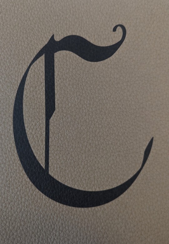
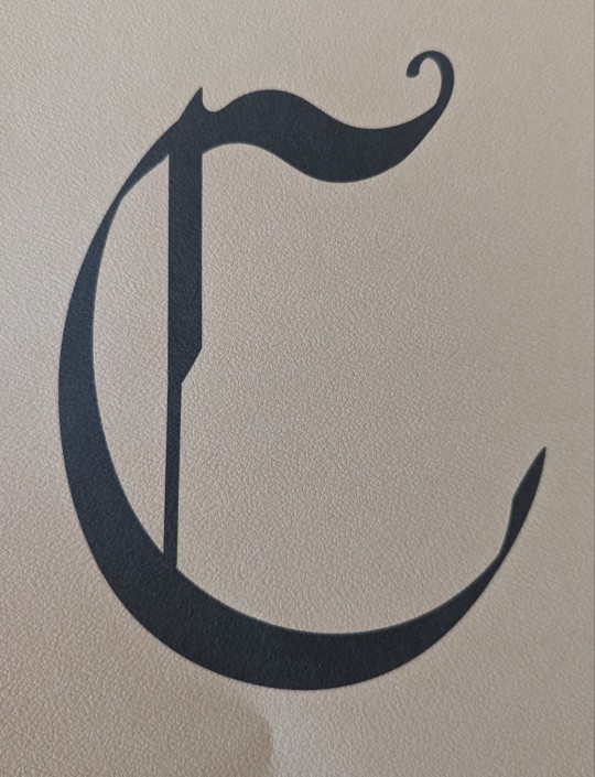
First Jordy decided try the default setting on the large printer. I liked how this created a clean print but still allowed the texture to be seen through the ink.
Glossy Paper settings on large format
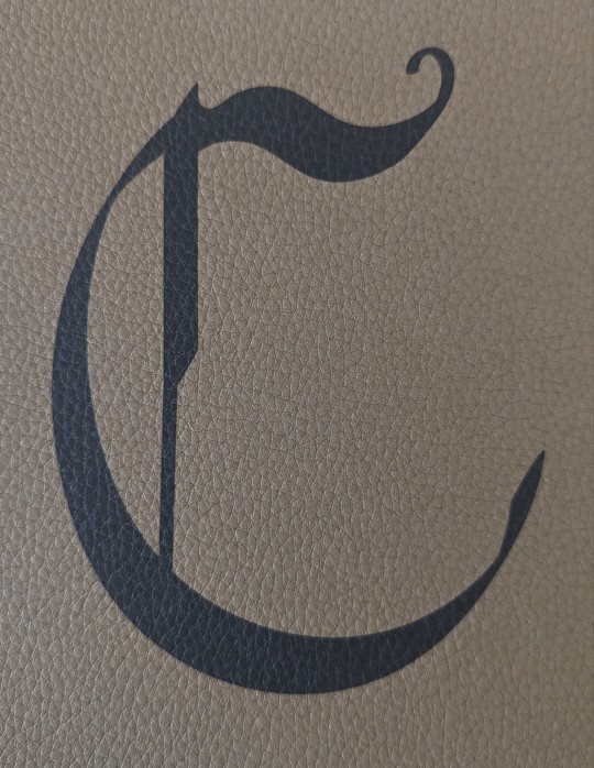
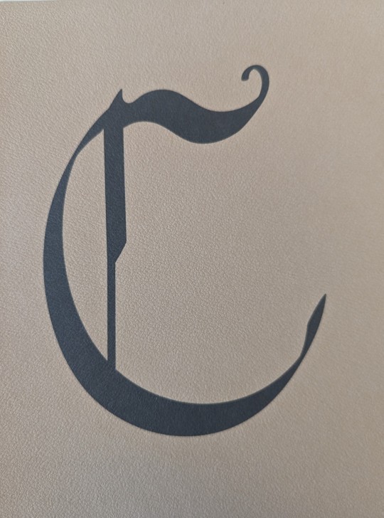
However, we decided to try a different setting to see if more of the texture could be seen. I found the Photo glossy paper did not reveal more of the texture but instead caused the print to appear grey, making the texture less see able.
Standard printer
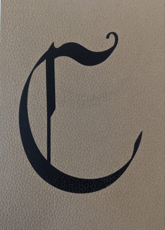
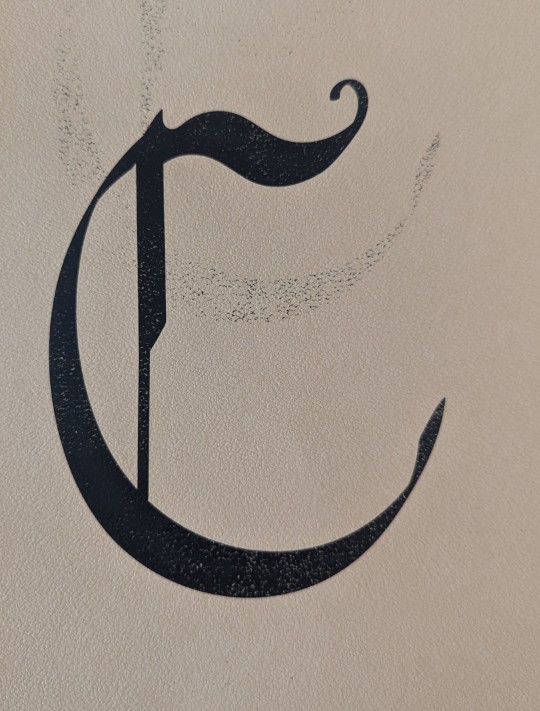
Following this one of the other technicians suggested I try the laser printer as this will make the ink sit on top of the paper instead of sinking in, which could make the texture more noticeable. However, I found the standard printer dragged the ink causing it the print to look untidy and unclear.
Following this I have decided to use the Gmund leather peanut coloured stock using the default settings on the larger format printer, as this creates a crisp print but still allows the texture to be seen more than the Morocco embossed paper.
0 notes
Text
MP - Process Book Creation
Table of Content Inspiration

For the longest time, I've struggled with creating my process book and anytime I ask the lecturers or the technicians for resources, I am advised to look at layouts I like.
However, I refuted such advice because I wanted to understand 'why?' I was designing rather than picking a layout because I deemed it good. My thought process is it shouldn't only have a good form but be able to perform the function I want and unfortunately, not all designers explain their design decisions for layouts.
Thus, I have had to look at designs I like in the end.

However, as I am an aspiring UX designer, I am trying to customize this process book to reflect it. Below are more colorful iterations with my brand colours.
My Customization


I added boxes or square elements as digital interfaces icons use rounded boxes for elements. Then, I added shadows to the boxes and numbers for my depth as many UI elements aren't flat design
After creating the table of content, I am more confident and will hopeful make more progress.
0 notes
Text
Process Book - First Thoughts
This year the process book is something that needs to be thought through in a lot more depth than the ones that we had done previously. This year a word count has been instated of 2000 words. This restricts a lot of what could be included but most of that mainly come from copy and pasting what we has on Tumblr.
Setting us with a word count allows us to carefully construct the process book to create a narrative of development through the book to the final design.
For the process book this unit I am thinking of having it formatted portrait.
For this year having strong imagery showing development will be key to create a strong process book.
0 notes
Text
Process book cover
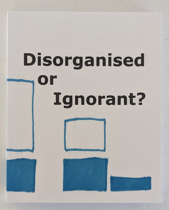
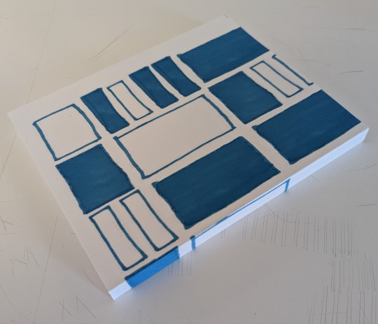
For my process book cover I have decided to use the illustrations I have drawn to represent my productivity. I decided to use the rectangles from week 7 because this is the week where I started to design and create my process book. I also like how this week shows the different sized tasks throughout.

When I added the outlined designs I had used to show the full week, I found that is made the cover look unfinished. It looked too plain compared to the designs I have created in this project.

When I placed the boxes I used to represent the completed tasks on the page, I though it looked too busy.

However, when I used a combination of the two designs I liked how it made the design look fun. I like how this links to the method I have used inside the book. This links the cover to the content of my process book.
For the name I decided to use 'Disorganised or ignorant?'. This refers to a conclusion I made during this project where I found that creative students have trouble managing their time because they have not learnt most time management methods. Therefore, the problem most students face is being ignorant about how to manage their time instead of being disorganised.
For the type I decided to user Verdana to keep the front cover connected to the contents of the book. This keeps my design consistent throughout the book.
0 notes

