#placeofwords
Explore tagged Tumblr posts
Text


26/04/23 - The Chapman Brothers
Artist Research
2 notes
·
View notes
Text
Place of Words
FINAL PRESENTATION
On Tuesday this week, we showed our final prints for the magazine and received feedback. This is what i showed:

The colours came out beautifully and I was very happy with the results. Here's the feedback I received:
The colours and illustrations were met with good reactions, especially the cover and the first spread, which I was especially proud of.
For the things I could improve: the cover and the final pink spread. For the cover, it came off as more of a poster rather than a magazine cover. To improve it, I made these changes:


Before (left) and after (right)
First, I removed the grain/noise effect I put on Relay. I first added it to match the texture of the illustration but that made it more poster-like. I made it crisp and matched its colour to the yellow circle on the background. Then, I lowered everything a bit to make space at the top for additional text. I also removed the white border since all of my text was in the image anyway.
It was cool to see how those small details made it look much more like a magazine and I'm happy with the final result!

For this spread, I was told that it looked a bit different from the rest since it's all pink. I thought about adding complementary colour accents but here's why I didn't:
Unlike the other spreads, this one only carried one idea. The first spread is supposed to cover the general idea that fashion styles can vastly change how you identify or are identified by others - a juxtaposition I helped clarify using complimentary colours.
On the next spread, it covered two ideas in the article - cultural contexts and group identities, therefore I assigned a monochromatic colour scheme to each of them. I made them complimentary as well so they would look nice next to each other. The pull quotes were the exception from the monochrome so the pages of the spread would interact better.
For the last spread, it only discusses social class and status. I picked out its mention of Valentino's hot pink collection trickling down to the public through fast fashion, like Zara. To complete the effect, I kept to the same colours for both pages.
0 notes
Text
Final Group Crit
Week 8
Small text adjustments
Change all pull quotes to light blue
I think it looks even better with these small changes. Printed out and cut down, makes it seem even more like a real magazine and professional. I love what I have made this term, and didn't think I would at one point, like anything I made.
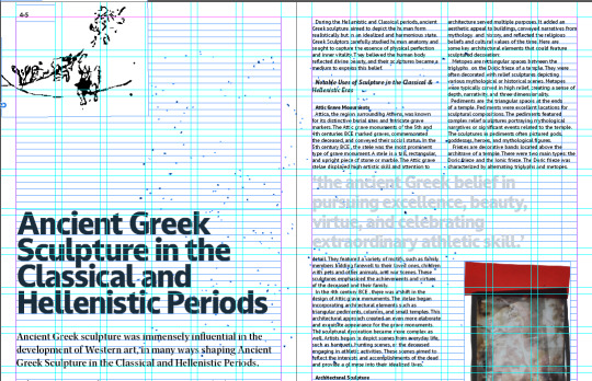
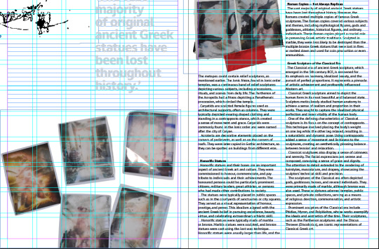
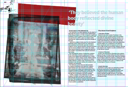
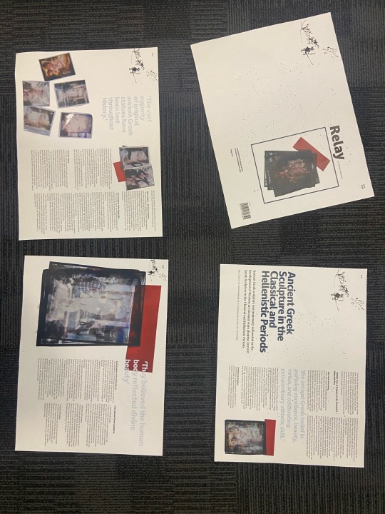
0 notes
Text


Bibliography
1 note
·
View note
Photo




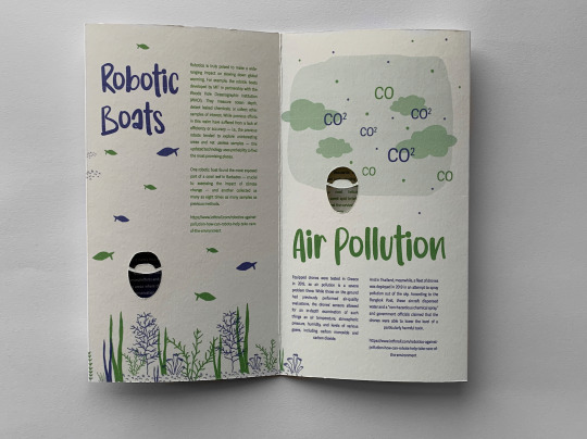

06/12/21
Final Piece
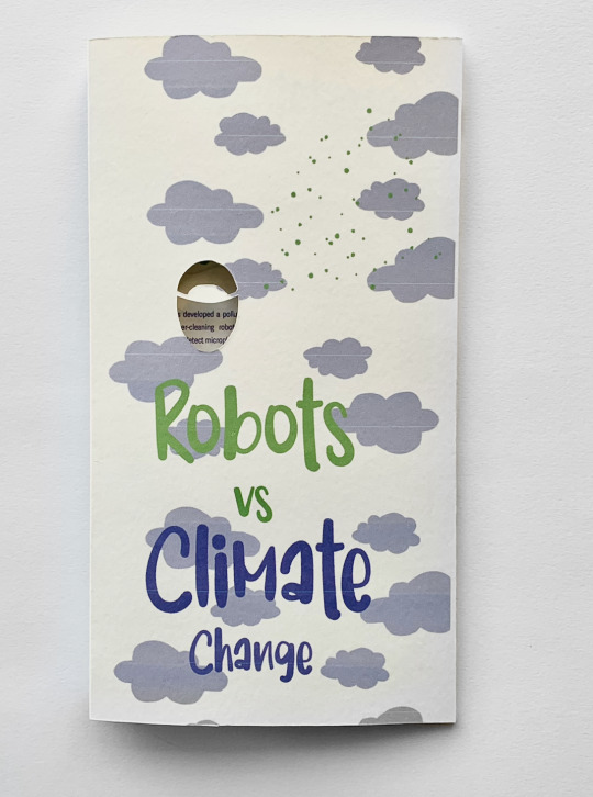
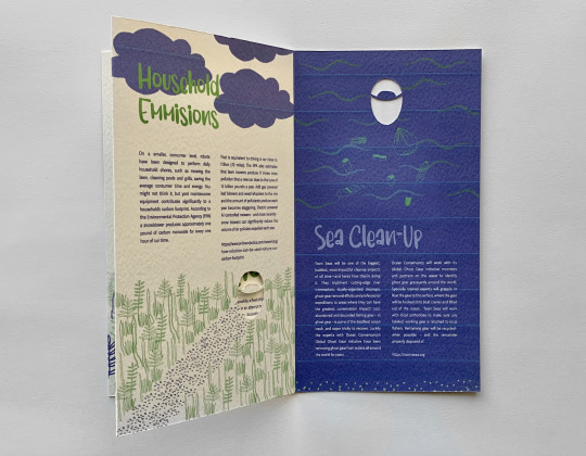
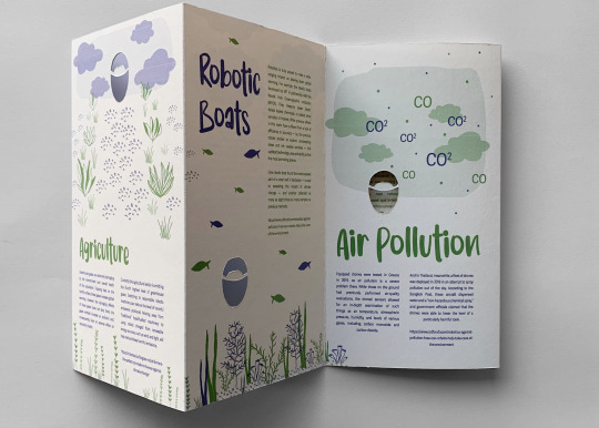
When making my final piece, I realised through text prints I needed to print larger so I needed to change my paper as I had only planned on printing a3. I therefore as a substitute printed on a textured card. It was only textures on 1 side but still had the effect I was going for.
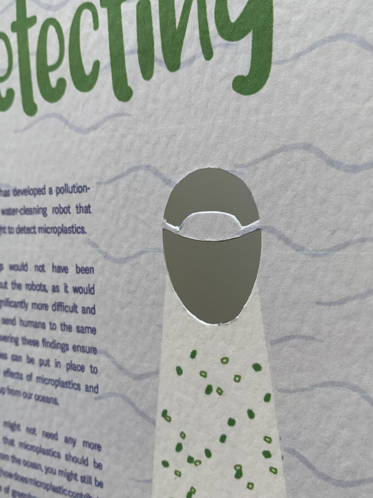
I cut out my piece with a scalpel and ruler, and with a scalpel for the robot holes. I was quite happy with how this came out and thought the robots all looked neat, and the thicker card made the more fragile paper in the cutout strong.
I am really happy with how my final piece looks, the quality of the printing and the colours.
2 notes
·
View notes
Text
Last but not the least for today.


Mixing both BBC and Netflix logos, I created this.

This is not my idea. There was a controversy of Netflix BBC and I stumbled upon it.
#introtoviscom#introductiontoviscom#adobephotoshop#adobeillustrator#adobeindesign#adobe#learning#indesign#illustrator#photoshop#bbc#netflix#typeface#typography#type#unitbriefing#brief#placeofwords
2 notes
·
View notes
Text


we found peace on details
#paradise island#island#placeofwords#famous place#blog tour#tourism#beachphotography#beachlover#summer
0 notes
Text
Don't forget where you belong
💫
0 notes
Text


23/04/23 - Josh Smith
Artist research
I really liked his miniature models of real life objects, and I would like to try replicating this for my Place of Words project.
2 notes
·
View notes
Text
Place of Words
I've finished up on the illustrations for the last two spreads after a quick inspiration search over in Stack magazines' catalogue.
There was this magazine called Bum which caught my eye:


I was able to relate this magazine to mine since it's highly illustrative; it had a watercolour/ink style that stuck with a limited colour palette. I really liked how each of the spreads were cohesive - tied together by the same colours as their illustrations - and I thought I could apply the same to my spreads. Not only did the colour matching make the whole page look like it was part of the art, but it also brought attention to the pull quotes.
So, I changed the colours of my article's text according to the illustration on the page it was on, which brought it all together.


On the third spread directly above, the passage talks about how high fashion trickles into society as fast fashion, giving the example of Valentino's Hot Pink collection and Zara following suit.
To illustrate it, I first drew one of the models from the Valentino runway show, then later cut it into the clothes and put those into the UI of Zara's online shop; which I hope effectively delivers the idea of the text.
COVER
Now to finish off the cover.

From my last attempts, I really liked the long 'RELAY' going from top to bottom, but I left it at a clipping mask and didn't like how the illustration got covered up. So I tried a lot of variations:


I liked the layering interaction this had but it didn't make much sense; but putting the text fully behind the illustration made it impossible to read.


I tried another font, but wasn't a fan of the shapes-I felt it didn't go with the illustration.

Now with this one, I fixed up the legibility of the masthead by shortening half of Relay and placing it up front. I liked where this was going but was unhappy with the colour, so I played with a few. A lot actually but I forgot to take pictures of them.


Then I felt like I wasn't getting anywhere with the duotone so I brought in a third colour:

And from there it clicked. Triadic, similar to one of the trials I did earlier on (left), I applied the same colour to my new type arrangement (right):


And I think that's my cover done! All that's left is to wait for the final presentation.
0 notes
Text
Final Magazine Printed out and ready for submission
Week 7

I printed it out for the final submission and to double check it all works. I think it has come together really well, considering the obstacles this term. Each page links to the next, in a cohesive way, suitable for a magazine. Overall I am really happy with it, and just really happy I have an outcome that works!
0 notes
Text


Final Place of Words Spreads
These are my finished spreads after my final feedback crit. I had to change a couple things, mainly involving the text where I had lots of single words hanging at the end and gaps missing in sentences. Mark also suggested that I add a little yellow in every page to keep the consistency. I did this through pulling out some more quotes which i think work really well. In the second spread, the quote fits nicely into some of the white space making it a bit less empty and in the last spread the quote broke up the huge lump of text that was there before. Overall, I am very happy with the final outcomes and feel that they work well together as a magazine.
1 note
·
View note
Photo


04/11/21
Book Binding Induction
I learnt some quick methods of book binding which I think I could incorporate in the production of my book. Following this workshop I want tho think more about the appearance of my book, and what I think would be most appropriate for the content I want to include as well as the over all style.
2 notes
·
View notes
Text
These are some of the paper I practiced with to finally get the folding right.

0 notes
Photo

This is my Mid-point presentation for my place of words brief, I completed it well in advance of needing it so that if my ideas changed drastically enough that I needed to change it, I could. The images are all prompts in reference to the research I have completed, In the first slide there is an evolution and changes in ideas, then it went onto a more refined research where I focussed on my topic, and experimentation, fonts and various mood board ideas etc, then some pins that I found inspiring and might be able to implement those design styles a little bit, or the stitching.
Edit, my ideas changed after the presentation was completed, I was advised that it was too broad perhaps and to narrow it down at bit more, additionally, I have found over time that I am not going to be able to incorporate too many ‘design-istic’ items into this project as the focus should purely be the subject matter, despite wanting to have more ‘design’ the whole design is the minimalistic way the context is presented so that it is informative.
0 notes
Text
Final Evaluation


0 notes