#practically no-one reads this
Explore tagged Tumblr posts
Text
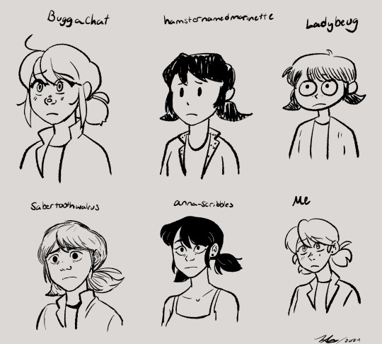
Drew a bunch of Marinettes in a bunch of different artists styles it was a lot of fun!!
Artists who's styles I mimicked: @buggachat @hamsternamedmarinette @ladybeug @sabertoothwalrus and @anna-scribbles all epic artists 🤟😎
#my art#marinette dupain cheng#miraculous ladybug#miraculous fanart#style mimic#sorry for the @s btw#yall should go follow those artists if you dont already also#this was sort of inspired by a post the three artists on the top row made#i think they all got together and drew with one another#which is really cool#but i was genuinely confused because i mimic styles a lot#and ive seen others do it too so i was just like#wow they really know each others styles really well#until i thought about it and read their posts some more#style mimicking is really freaking fun and i think its really good practice#and a good way to explore other ways of doing things#like you really have to learn new techniques and get out of your comfort zone#also anna scribbles i could not find a recent pic of marinette in her main outfit#so thats the only marinette i drew in different clothes cuz i couldnt find a more recent ref of you drawing it#anna scribble marinette has privileges thats the others dont#but ye#i also threw my own style in there as a frame of reference to what me draw like#ive drawn marinette before just not in a loooong while#sabertooth walrus was the hardest for me to mimic cuz they have a broad range in their style#so its like which sabertooth do i wanna be in this pic#Buggachat has such a distinct style thats very clean and consistent which is amazing so they were easy#being easy or hard arent bad things either it also has to do with like styles meeting up with one another#buggachats and mine arent too too different in some shapes and aspects#so yeah itd be easier plus they drew marinette like 3 sec ago so i have more recent of a ref#as opposed to sabertooth who i have a recent ref of ladybug but not marinette so we got two diff styles in one
3K notes
·
View notes
Text
My litmus test for deciding if I respect or value a person’s One Piece opinions is looking at the way they discuss Usopp tbh. You can tell a lot about someone based on how they talk about Usopp specifically.
If a person insists that Usopp is useless (whether it’s because he’s not as strong as Zoro or Luffy or Sanji or because he “doesn’t have a real job” on the crew) it tells me that they don’t pay attention to what Usopp does contribute, nor do they pay attention to what the story itself deems useful. Usopp may not be a massive, hulking powerhouse with ultra-powerful haki, but he does have utility in the crew. (And even if he didn’t, he would still belong because they wanted him.)
If a person insists that Usopp is just a crybaby or a coward and that he sucks because of this, it tells me that you don’t pay attention to what he’s doing while he’s running or crying. He might cry or shake or run, but he always comes back. He always stands up and fights in the end. He feels scared and then he does it anyway. It’s easy to forget, but Usopp is just a human in a world of monsters. For him to stand up and fight takes a lot of courage.
If a person insists that Usopp is not strong, it tells me they miss what the story itself tells us about what strength is and what it means to be strong. He has a skill that most do not. He is able to shoot with a degree of accuracy that is borderline inhuman. Whether he can kick through a boulder is irrelevant. Sanji can’t snipe from hundreds of feet away.
If you can’t look at Usopp and see where he fits in the story, I am truly uninterested in anything else you have to say about this story.
#txt#usopp#one piece#I’m not saying you have to adore him#I’m just saying you should probably practice like. a teeny tiny bit of reading comprehension#Usopp carried the crew all the way to Water 7 just to get disrespected by the fandom every ten seconds#I’m sorry but he did. he really did.#and WHO INSPIRED FRANKY????? That’s right.#thank you Usopp for not one but TWO boats!!#anyway. I’m not taking criticism so don’t try lmao#I’m right#oh but water 7– I already stopped listening. go reread it.
644 notes
·
View notes
Text

Maybe this could cheer some people up, but I finally drew a Mario x Peach proposal
#i just read back one of my mutual's posts about this and was inspired#mario being EXTREEEEMELY nervous even when practicing with luigi nine hundred times beforehand#peach being so overcome with emotion and knowing this would be hard for him to do#ughhhh it's my cup of tea#mario#super mario#super mario bros#mareach#mario x peach#princess peach#smb#mario bros
857 notes
·
View notes
Note
hope you feel better soon!

I am riddled with ailments, but I stay silly!
#ask#non mdzs#My health journey has been: Hernia -> acid reflux -> Vocal pain due to aforementioned reflux -> chest infection.#I'm terrified to know what's about to hit me next. Please let it be something kind. PLEASE.#The consequence of living with linguists is that you'll wake up with a wacked up voice -#suddenly you're sitting you down in front of a program called something like Praat having your shimmer and jitter levels calibrated.#They gave me a GRBAS of 33012. I have a fun thing called a pitch break where a whole octave just does not exist.#My vocal pain was bad enough I ended up seeing a speech pathologist and that whole experience was super neat!#I learnt a lot about voice - to be honest I might make a little comic on it after some more research. Fascinating stuff.#For example; your mental perception of our voice modulates the muscles of the vocal folds and larynx.#meaning that when you do have changes (inflammation = more mass = lower frequency)#your brain automatically attempts to correct it to what it 'should sound like'. Leading to a lot more vocal strain and damage!#And it gets really interesting for trans voice care as well - because the mental perception of one's voice isn't based on an existing sampl#So a good chunk of trans voice training is also done with the idea of finding one's voice and retraining the brain to accept it. Neat!#Parkinsonial Voice also has this perception to musculature link! The perception is that they are talking at a loud/normal volume#but the actual voice is quite breathy and weak. So vocal training works on practicing putting more effort into the voice#and retraining the brain to accept the 'loud' voice as 'normal'.#Isn't the human body fascinating?#Anyhow; Now I have vocal exercises and strategies to reduce strain and promote healing.#Which is a lot better than my previous strategy of yelling AAAH in my car until my 'voice smoothed out'.#You can imagine the horror on the speech path's face. I am an informed creature now.#I'm my own little lab rat now. I love learning and researching. Welcome to my tag lab. Class is dismissed.#I'll be back later with a few more answered asks </3 despite everything I'm still going to work and I need the extra sleep.#Thank you for the well wishes! And if you read all of that info dump; thank you for that as well!
414 notes
·
View notes
Text
i think it’s important everyone knows about the little roman girl who died at only five years and seven months old, and her grave reads "dum vixi, lusi" or "while i lived, i played"
#her epitaph actually has a much longer poem which contains this line#and it’s not like. stylistically high quality poetry either#which indicates this was not a poem someone was hired to write for the grave (as was a relatively common practice)#but instead written out of love by one of her family members#it’s twenty three lines of mostly correct dactylic hexameter#and it makes me bawl when i read it#we translated it in a latin class i took a few years ago and then wrote our own latin poems about our friends
2K notes
·
View notes
Text
i haven’t stopped thinking about the implications of daniel saying armand’s martinis were better than Real Rashid’s or the fact that he mentioned how good the martini was in season 1. why would a 500 year old vampire be so good at making a martini exactly how this old man likes???? i’m going insane
#iwtv#iwtv spoilers#devils minion#here’s how devil’s minion can still win#haters will say it’s because he can read minds#but lovers know the truth#PRACTICE. WITH PRACTICE.#need to make one of those fundamental need pyramid memes where it’s all just#‘someone fucking that old man’#feeling very charlie kelly pepe silvia meme abt this#interview with the vampire
733 notes
·
View notes
Text
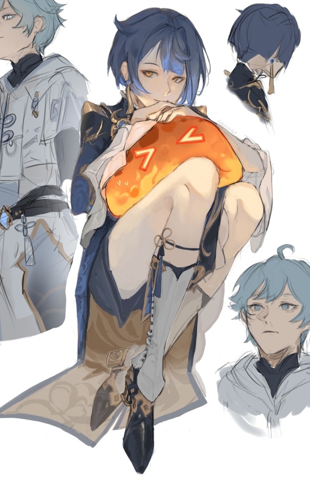
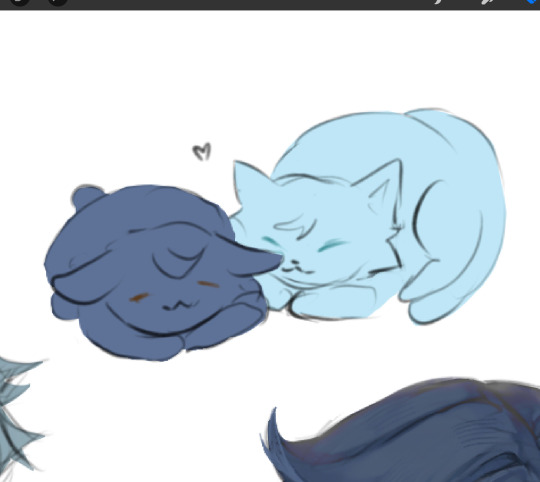
practice stuff idk
#genshin impact#xingqiu#chongyun#xingyun#chongqiu#dotcircledotart#actually idk if i even want to tag this but whatever lol#rendering practice + faces bc i felt like i was getting stuck in one angle :’)#anyways idk what else to say#oh yeah inspired by xingqiu’s in game sticker bc i find him terrorizing pyro slimes oddly endearing#like hell yeah get your reading light i guess#also please do not take this as sxual thanks
1K notes
·
View notes
Text
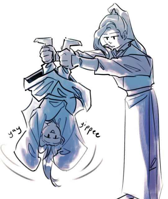
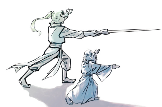
despite his initial rough impression, lqg gets a "fun" rating on the gege scale
#arts#mottau#dragging lqg into the autism to autism communication array#sy thinks he is so cool actually. but he will fiercely deny it if you say so#lmao stupid little baby crush#he has! a cool sword! and hes fought so many monsters! and hes called the Bai Zhan WAR GOD#and also is more lax than his other geges in letting him do stuff that toes the line of things he shouldnt be allowed to do yet#such as you know imitating sword forms when he's not supposed to touch cultivation or combat for another year#in lqg's mind theres no reason he cant practice the forms. and also he doesnt even have a practice sword let alone a real one#he will get yelled at later#can you tell that i read dun meshi and it irreversibly changed the way i draw silly little autistic smiles. bc i sure fucking can#anyways releasing this from containment since im almost done the next chapter. incentive (for myself)
404 notes
·
View notes
Text


days 4-8
#orangetriestoart#isat#blood tw#self harm tw#finally got around to these aAAAa AAA#cheating a little bit with color so i can do it faster >:]#having a lotta fun with these though theyre a v nice stress reliever but also wowie as soon as i have free time i need to practice more#anyways have a good one if ur reading this!!!#also if the glass one needs another tw please let me know and ill add it! im not fully sure if i tagged that properly
327 notes
·
View notes
Text
It's incredible how much everything changes when you rewatch p1, after seeing the whole thing at least twice. Especially episodes 1-2. The context of Colin's feelings, his confounding feelings, makes everything even better.
Because imagine this: he's on the tour of the continent, living the life, only no one responds to his letter or seems interested in his whereabouts. And if it were only the family? He'd probably be fine. Salty, but fine. Except it's Pen, his dearest friend who doesn't respond to his letter. Not once.
So, Colin spirals, decides to change his personality, become the man he thinks society expects him to be, starts documenting things in his journal where usually he'd write about them to Pen. Perhaps with time he stops writing letters to her completely, but he still misses her so much.
He comes back, a changed man, everyone's attention on him and his newly acquired swagger. Debutantes swoon over him and his new look. It's everything he wanted, except... Pen gives him the cold shoulder. Twice. Doesn't seem at all interested in his new persona. The flirting, which he has tried out on many unimportant women in the Ton doesn't work on the one woman who actually matters. He's confused and lost.
Once he realises what he has done to garner Penelope's anger, he instantly makes amends. Sheds the newly acquired armour to tell her just how much she means to him. Or at least as much as he's allowing himself to notice by that point. The confusion is still there, and it gets worse after the handshake because you cannot tell me he didn't feel a spark right then? He definitely did. And it was bewildering.
But, still, being the oblivious man he is, Colin pushes on with the mad and spontaneous plan to help Pen find a husband. Mostly because it gives him a chance to spend time with her. And suddenly this is all he wants to do. The only thing that provides genuine joy. Only in those brief moments with her he can be himself. He can be accepted.
And episode 2 showcases all of that perfectly. It shows Colin in a permanent state of confusion because not only are those moments with Penelope the only times he feels like his old self, but also now there's more. The constant desire to be alone with her, to trample over any left rules of propriety to steal just a moment of her attention. To help her because this is the only thing he's good at. To be useful. Then jealousy begins to brew because he has to watch Pen be her charming self with men that are not him. Slowly he begins to realise that perhaps he wants more than to be her friend. That perhaps she's never been just a friend.
By the time Pen asks for that kiss, Colin is terrified because he wants to kiss her. He wants to kiss her while knowing that it will mean something. It will mean something to him. Because Pen is home. Pen is everything he was looking for. And now that he has realised it there is no chance he can forget. The kiss only signs off that which was inevitable.
#look at me writing essays no one will read#anyways#gotta put that uni degree to practice somehow#so media analyses it is#bridgerton#colin bridgerton#bridgerton spoilers#polin
308 notes
·
View notes
Text
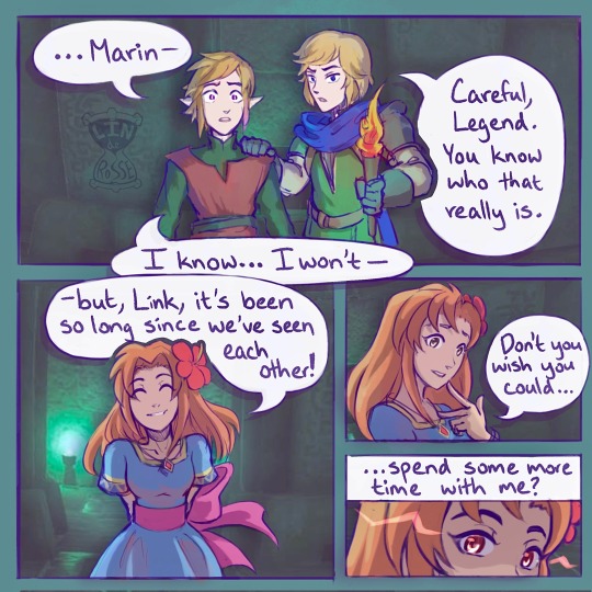
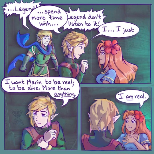
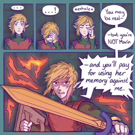
Based on a scene from Ch2 of The Secrets We Keep.
(Note: This takes place in the same universe as Wielders of Wisdom. Certain characters’ arcs are intertwined, but you should be able to read one without reading the other.)
#linked universe#lu legend#lu warriors#loz marin#fanart#lin draws#I drew this so long ago#almost a year maybe#comic practice#hope u enjoy#same universe as wielders of wisdom#but you can read one without the other#angst#lu the secrets we keep#lu wielders of wisdom#the secrets we keep#wielders of wisdom
2K notes
·
View notes
Text
Tango makes a terrible, terrible face as he walks into Grian's new creation. Bit rude, he thinks that is, but whatever. Grian waves his arms out, getting ready to show Tango more than he'd shown him when the practice room was still in-progress, when Tango says:
"What did you do to it?"
"Huh?"
Tango shudders. He folds his arms over himself and looks at Jellie the ravager. "What did you do to it. To this place. Why is it... warm?"
"I mean, it's not really warm, see it's all white so it actually doesn't retain heat very well, even with the froglamps, so I had to do some work to make sure the temperature was appropriate for heavy physical activity while not risking frostbite the way the actual dungeon does, and..."
Grian trails off.
"The point is that it's mostly just, I don't know, mild temperature? Unnoticeable temperature? The fact you commented on it is weird."
There's a strangely echoing quality to Tango's voice as he steps back again, against the door to the practice room. "It's clean."
"Yeah. I mean, that's the aesthetic, isn't it? Wiped clean of everything but the ravager, the water, and the drowned. None of the distractions. Good for practicing, you know?" Grian squints. "You should like it. You said you'd like it. Wanted people to be able to practice so they'd do better at the dungeon."
Tango shudders again. "You've wiped clean the ravagers, too. I can't... touch her."
"What?" Grian says, baffled.
"What have you done to this place," Tango says.
"Listen, I won't have you insulting my clean room," Grian says. "I cleaned it of all the dungeon bits. It's nice and easy and white and understandable. I won't have you corrupting it."
Hm. Not sure where that one came from, he realizes. Probably a bad sign. He'd certainly guess as much from Tango, who is staring at him with something akin to horror.
In a voice that echoes like a card readout, Tango says: "You won't do this in the dungeon. You'll feed us what's left from this. Or I'll have to ask you to move it."
Grian rolls his eyes. "Geez, yeah, I won't touch the actual dungeon! I already broke the sound test room, I'm not breaking any really important redstone. Now, do you want to see the drowned dodging room or not?"
"I'm horrified to find out what happened to the drowned, if this is your ravager."
Grian looks between Jellie's blank stare and Tango and throws up his hands. "Nothing! I did nothing to her! I have no idea what you're on about!"
"It's like you bleached their insides," mutters Tango. "Bleached everything. It's not natural."
"Not natural? Like you're one to talk!"
"I need to know. Show me," Tango says.
"Right then. Take off your armor first, I don't want Jellie getting thorned or something, then let's practice some dodging and get in there. Then you'll see this is a perfectly normal set of eerie white rooms and leave me alone, right?"
Tango makes a face.
"I don't know why I bother. Honestly. You'd think I'd done something weird," Grian says, and then neither of them talk much, on account of the ravager trying to chew their faces.
#hermitcraft#decked out 2#a bee fic#grian#tangotek#tango voice: what the fuck. how did you do this to the dungeon. what the FUCK#grian voice: what could i have possibly done. i just bleached the entire thing of everything that gave it life and made it hollow.#tango voice: WHAT THE FUCK#anyway i love how OPPOSITE the aesthetic of the practice room is to the actual dungeon#and how that is still somehow terrifying#also this one’s funnier if you read it as being in the universe where tango was COMPLETELY eaten because then it’s decked out itself#just going ‘what the fuck’ real quietly on repeat#but you can also read it as a universe where decked out and tango are more mutually the same thing or communicate or whatever you want
932 notes
·
View notes
Text
A bit tired of people complaining about Sanji's principle of "not hitting women" being misogynistic when it has been clearly stated multiple times that he does not choose it and it's heavily tied to his trauma and admiration for his dad and respect for women and definitely not from seeing women as somehow weaker than him
#like okay i get where you're coming from and i understand that from a simpler perspective it's weird#if meet a guy irl who refuses to fight against women no matter how evil they are for no reason other than being women i'd consider it odd#but.... we have watched sanji's backstory and we have seen him actively feeling bad for not being able to hit female enemies#like what do you not understand#you can say the practice itself is based on misogynistic views too but the reasons why sanji doesn't hit women are more complex than that#a lot of people might disagree with me but like#i'm not saying the act itself is awesome and solemn and correct but you can't go and call sanji a misogynistic character just bc of that#like saying he views women as weaker than him is just. wrong. and i've seen people say it#and yes this behavior adds to his gentleman personality and it's also for the writing to show how polite and nice he is to women#but it's not exaggerated. he genuinely has issues viewing women as equals bc he romanticizes them#and that's bad! he knows that's bad!#let the character grow?????? i swear people can't read 😭#i'm not making any sense i just woke up but yeah#one piece#black leg sanji
282 notes
·
View notes
Text
Love how Hoyo is just as much on Boothill's dick as the rest of us. The Wardance crowd really is just the fandom fjkdlsajlksl


#hsr#honkai star rail#hsr 2.5#boothill#hsr boothill#screenshots taken with Dan Heng bc of course heehee#none of them even care that he's wanted for murder and mayhem it's only the IPC so that's allowable KLJDKLSJADKFJ#'he's hot so it's ok!!' love the priorities here#one of the Wardance judges going to Jing Yuan like hey there's a wanted felon among the registered contestants. like a REALLY wanted one.#'What did he do?' 'Well-' and then it's just them reading off a massive rap sheet for like 10 minutes straight JKDSAJKDL#but they end it by specifying these are all charges held by the IPC and the IPC only so Jing Yuan is like 'oh well that's fine then'#Besides Yanqing was standing nearby at his usual post and Jing Yuan can see him practically vibrating out of the corner of his eye-#-all excited to fight a strong opponent haha#as if Jing Yuan would turn away a Galaxy Ranger anyway#you know he was restraining himself from asking Boothill to take him with him pfffffffffft
169 notes
·
View notes
Text
why Aurora's art is genius
It's break for me, and I've been meaning to sit down and read the Aurora webcomic (https://comicaurora.com/, @comicaurora on Tumblr) for quite a bit. So I did that over the last few days.
And… y'know. I can't actually say "I should've read this earlier," because otherwise I would've been up at 2:30-3am when I had responsibilities in the morning and I couldn't have properly enjoyed it, but. Holy shit guys THIS COMIC.
I intended to just do a generalized "hello this is all the things I love about this story," and I wrote a paragraph or two about art style. …and then another. And another. And I realized I needed to actually reference things so I would stop being too vague. I was reading the comic on my tablet or phone, because I wanted to stay curled up in my chair, but I type at a big monitor and so I saw more details… aaaaaand it turned into its own giant-ass post.
SO. Enjoy a few thousand words of me nerding out about this insanely cool art style and how fucking gorgeous this comic is? (There are screenshots, I promise it isn't just a wall of text.) In my defense, I just spent two semesters in graphic design classes focusing on the Adobe Suite, so… I get to be a nerd about pretty things…???
All positive feedback btw! No downers here. <3
---
I cannot emphasize enough how much I love the beautiful, simple stylistic method of drawing characters and figures. It is absolutely stunning and effortless and utterly graceful—it is so hard to capture the sheer beauty and fluidity of the human form in such a fashion. Even a simple outline of a character feels dynamic! It's gorgeous!
Though I do have a love-hate relationship with this, because my artistic side looks at that lovely simplicity, goes "I CAN DO THAT!" and then I sit down and go to the paper and realize that no, in fact, I cannot do that yet, because that simplicity is born of a hell of a lot of practice and understanding of bodies and actually is really hard to do. It's a very developed style that only looks simple because the artist knows what they're doing. The human body is hard to pull off, and this comic does so beautifully and makes it look effortless.
Also: line weight line weight line weight. It's especially important in simplified shapes and figures like this, and hoo boy is it used excellently. It's especially apparent the newer the pages get—I love watching that improvement over time—but with simpler figures and lines, you get nice light lines to emphasize both smaller details, like in the draping of clothing and the curls of hair—which, hello, yes—and thicker lines to emphasize bigger and more important details and silhouettes. It's the sort of thing that's essential to most illustrations, but I wanted to make a note of it because it's so vital to this art style.
THE USE OF LAYER BLENDING MODES OH MY GODS. (...uhhh, apologies to the people who don't know what that means, it's a digital art program thing? This article explains it for beginners.)
Bear with me, I just finished my second Photoshop course, I spent months and months working on projects with this shit so I see the genius use of Screen and/or its siblings (of which there are many—if I say "Screen" here, assume I mean the entire umbrella of Screen blending modes and possibly Overlay) and go nuts, but seriously it's so clever and also fucking gorgeous:
Firstly: the use of screened-on sound effect words over an action? A "CRACK" written over a branch and then put on Screen in glowy green so that it's subtle enough that it doesn't disrupt the visual flow, but still sticks out enough to make itself heard? Little "scritches" that are transparent where they're laid on without outlines to emphasize the sound without disrupting the underlying image? FUCK YES. I haven't seen this done literally anywhere else—granted, I haven't read a massive amount of comics, but I've read enough—and it is so clever and I adore it. Examples:


Secondly: The beautiful lighting effects. The curling leaves, all the magic, the various glowing eyes, the fog, the way it's all so vividly colored but doesn't burn your eyeballs out—a balance that's way harder to achieve than you'd think—and the soft glows around them, eeeee it's so pretty so pretty SO PRETTY. Not sure if some of these are Outer/Inner Glow/Shadow layer effects or if it's entirely hand-drawn, but major kudos either way; I can see the beautiful use of blending modes and I SALUTE YOUR GENIUS.
I keep looking at some of this stuff and go "is that a layer effect or is it done by hand?" Because you can make some similar things with the Satin layer effect in Photoshop (I don't know if other programs have this? I'm gonna have to find out since I won't have access to PS for much longer ;-;) that resembles some of the swirly inner bits on some of the lit effects, but I'm not sure if it is that or not. Or you could mask over textures? There's... many ways to do it.
If done by hand: oh my gods the patience, how. If done with layer effects: really clever work that knows how to stop said effects from looking wonky, because ugh those things get temperamental. If done with a layer of texture that's been masked over: very, very good masking work. No matter the method, pretty shimmers and swirly bits inside the bigger pretty swirls!
Next: The way color contrast is used! I will never be over the glowy green-on-black Primordial Life vibes when Alinua gets dropped into that… unconscious space?? with Life, for example, and the sharp contrast of vines and crack and branches and leaves against pitch black is just visually stunning. The way the roots sink into the ground and the three-dimensional sensation of it is particularly badass here:

Friggin. How does this imply depth like that. HOW. IT'S SO FREAKING COOL.
A huge point here is also color language and use! Everybody has their own particular shade, generally matching their eyes, magic, and personality, and I adore how this is used to make it clear who's talking or who's doing an action. That was especially apparent to me with Dainix and Falst in the caves—their colors are both fairly warm, but quite distinct, and I love how this clarifies who's doing what in panels with a lot of action from both of them. There is a particular bit that stuck out to me, so I dug up the panels (see this page and the following one https://comicaurora.com/aurora/1-20-30/):

(Gods it looks even prettier now that I put it against a plain background. Also, appreciation to Falst for managing a bridal-carry midair, damn.)
The way that their colors MERGE here! And the immense attention to detail in doing so—Dainix is higher up than Falst is in the first panel, so Dainix's orange fades into Falst's orange at the base. The next panel has gold up top and orange on bottom; we can't really tell in that panel where each of them are, but that's carried over to the next panel—
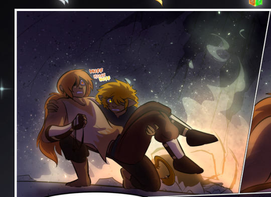
—where we now see that Falst's position is raised above Dainix's due to the way he's carrying him. (Points for continuity!) And, of course, we see the little "huffs" flowing from orange to yellow over their heads (where Dainix's head is higher than Falst's) to merge the sound of their breathing, which is absurdly clever because it emphasizes to the viewer how we hear two sets of huffing overlaying each other, not one. Absolutely brilliant.
(A few other notes of appreciation to that panel: beautiful glows around them, the sparks, the jagged silhouette of the spider legs, the lovely colors that have no right to make the area around a spider corpse that pretty, the excellent texturing on the cave walls plus perspective, the way Falst's movements imply Dainix's hefty weight, the natural posing of the characters, their on-point expressions that convey exactly how fuckin terrifying everything is right now, the slight glows to their eyes, and also they're just handsome boys <3)
Next up: Rain!!!! So well done! It's subtle enough that it never ever disrupts the impact of the focal point, but evident enough you can tell! And more importantly: THE MIST OFF THE CHARACTERS. Rain does this irl, it has that little vapor that comes off you and makes that little misty effect that plays with lighting, it's so cool-looking and here it's used to such pretty effect!
One of the panel captions says something about it blurring out all the injuries on the characters but like THAT AIN'T TOO BIG OF A PROBLEM when it gets across the environmental vibes, and also that'd be how it would look in real life too so like… outside viewer's angle is the same as the characters', mostly? my point is: that's the environment!!! that's the vibes, that's the feel! It gets it across and it does so in the most pretty way possible!
And another thing re: rain, the use of it to establish perspective, particularly in panels like this—

—where we can tell we're looking down at Tynan due to the perspective on the rain and where it's pointing. Excellent. (Also, kudos for looking down and emphasizing how Tynan's losing his advantage—lovely use of visual storytelling.)
Additionally, the misting here:
We see it most heavily in the leftmost panel, where it's quite foggy as you would expect in a rainstorm, especially in an environment with a lot of heat, but it's also lightly powdered on in the following two panels and tends to follow light sources, which makes complete sense given how light bounces off particles in the air.
A major point of strength in these too is a thorough understanding of lighting, like rim lighting, the various hues and shades, and an intricate understanding of how light bounces off surfaces even when they're in shadow (we'll see a faint glow in spots where characters are half in shadow, but that's how it would work in real life, because of how light bounces around).
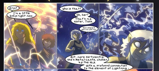
Bringing some of these points together: the fluidity of the lines in magic, and the way simple glowing lines are used to emphasize motion and the magic itself, is deeply clever. I'm basically pulling at random from panels and there's definitely even better examples, but here's one (see this page https://comicaurora.com/aurora/1-16-33/):

First panel, listed in numbers because these build on each other:
The tension of the lines in Tess's magic here. This works on a couple levels: first, the way she's holding her fists, as if she's pulling a rope taut.
The way there's one primary line, emphasizing the rope feeling, accompanied by smaller ones.
The additional lines starbursting around her hands, to indicate the energy crackling in her hands and how she's doing a good bit more than just holding it. (That combined with the fists suggests some tension to the magic, too.) Also the variations in brightness, a feature you'll find in actual lightning. :D Additional kudos for how the lightning sparks and breaks off the metal of the sword.
A handful of miscellaneous notes on the second panel:
The reflection of the flames in Erin's typically dark blue eyes (which bears a remarkable resemblance to Dainix, incidentally—almost a thematic sort of parallel given Erin's using the same magic Dainix specializes in?)
The flowing of fabric in the wind and associated variation in the lineart
The way Erin's tattoos interact with the fire he's pulling to his hand
The way the rain overlays some of the fainter areas of fire (attention! to! detail! hell yeah!)
I could go on. I won't because this is a lot of writing already.
Third panel gets paragraphs, not bullets:
Erin's giant-ass "FWOOM" of fire there, and the way the outline of the word is puffy-edged and gradated to feel almost three-dimensional, plus once again using Screen or a variation on it so that the stars show up in the background. All this against that stunning plume of fire, which ripples and sparks so gorgeously, and the ending "om" of the onomatopoeia is emphasized incredibly brightly against that, adding to the punch of it and making the plume feel even brighter.
Also, once again, rain helping establish perspective, especially in how it's very angular in the left side of the panel and then slowly becomes more like a point to the right to indicate it's falling directly down on the viewer. Add in the bright, beautiful glow effects, fainter but no less important black lines beneath them to emphasize the sky and smoke and the like, and the stunningly beautiful lighting and gradated glows surrounding Erin plus the lightning jagging up at him from below, and you get one hell of an impactful panel right there. (And there is definitely more in there I could break down, this is just a lot already.)
And in general: The colors in this? Incredible. The blues and purples and oranges and golds compliment so well, and it's all so rich.
Like, seriously, just throughout the whole comic, the use of gradients, blending modes, color balance and hues, all the things, all the things, it makes for the most beautiful effects and glows and such a rich environment. There's a very distinct style to this comic in its simplified backgrounds (which I recognize are done partly because it's way easier and also backgrounds are so time-consuming dear gods but lemme say this) and vivid, smoothly drawn characters; the simplicity lets them come to the front and gives room for those beautiful, richly saturated focal points, letting the stylized designs of the magic and characters shine. The use of distinct silhouettes is insanely good. Honestly, complex backgrounds might run the risk of making everything too visually busy in this case. It's just, augh, so GORGEOUS.
Another bit, take a look at this page (https://comicaurora.com/aurora/1-15-28/):
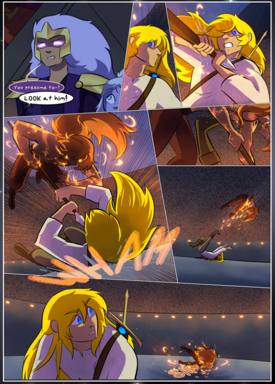
It's not quite as evident here as it is in the next page, but this one does some other fun things so I'm grabbing it. Points:
Once again, using different colors to represent different character actions. The "WHAM" of Kendal hitting the ground is caused by Dainix's force, so it's orange (and kudos for doubling the word over to add a shake effect). But we see blue layered underneath, which could be an environmental choice, but might also be because it's Kendal, whose color is blue.
And speaking off, take a look at the right-most panel on top, where Kendal grabs the spear: his motion is, again, illustrated in bright blue, versus the atmospheric screened-on orange lines that point toward him around the whole panel (I'm sure these have a name, I think they might be more of a manga thing though and the only experience I have in manga is reading a bit of Fullmetal Alchemist). Those lines emphasize the weight of the spear being shoved at him, and their color tells us Dainix is responsible for it.
One of my all-time favorite effects in this comic is the way cracks manifest across Dainix's body to represent when he starts to lose control; it is utterly gorgeous and wonderfully thematic. These are more evident in the page before and after this one, but you get a decent idea here. I love the way they glow softly, the way the fire juuuust flickers through at the start and then becomes more evident over time, and the cracks feel so realistic, like his skin is made of pottery. Additional points for how fire begins to creep into his hair.
A small detail that's generally consistent across the comic, but which I want to make note of here because you can see it pretty well: Kendal's eyes glow about the same as the jewel in his sword, mirroring his connection to said sword and calling back to how the jewel became Vash's eye temporarily and thus was once Kendal's eye. You can always see this connection (though there might be some spots where this also changes in a symbolic manner; I went through it quickly on the first time around, so I'll pay more attention when I inevitably reread this), where Kendal's always got that little shine of blue in his eyes the same as the jewel. It's a beautiful visual parallel that encourages the reader to subconsciously link them together, especially since the lines used to illustrate character movements typically mirror their eye color. It's an extension of Kendal.
Did I mention how ABSOLUTELY BEAUTIFUL the colors in this are?
Also, the mythological/legend-type scenes are illustrated in familiar style often used for that type of story, a simple and heavily symbolic two-dimensional cave-painting-like look. They are absolutely beautiful on many levels, employing simple, lovely gradients, slightly rougher and thicker lineart that is nonetheless smoothly beautiful, and working with clear silhouettes (a major strength of this art style, but also a strength in the comic overall). But in particular, I wanted to call attention to a particular thing (see this page https://comicaurora.com/aurora/1-12-4/):
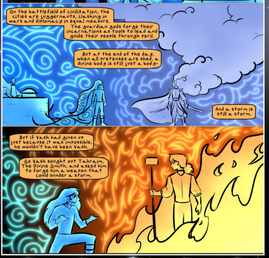
The flowing symbolic lineart surrounding each character. This is actually quite consistent across characters—see also Life's typical lines and how they curl:
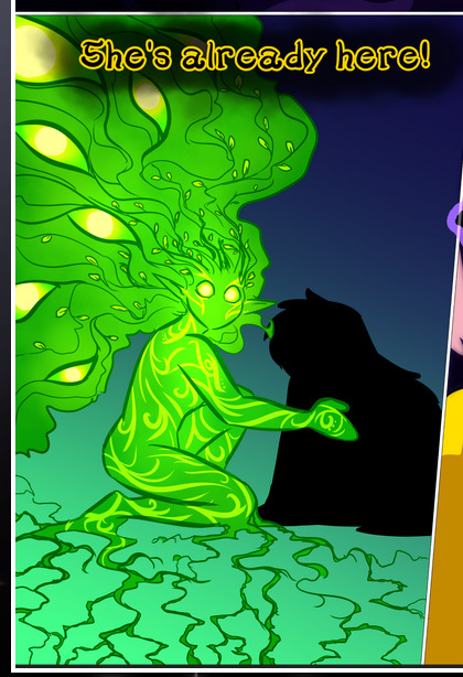
What's particularly interesting here is how these symbols are often similar, but not the same. Vash's lines are always smooth, clean curls, often playing off each other and echoing one another like ripples in a pond. You'd think they'd look too similar to Life's—but they don't. Life's curl like vines, and they remain connected; where one curve might echo another but exist entirely detached from each other in Vash's, Life's lines still remain wound together, because vines are continuous and don't float around. :P
Tahraim's are less continuous, often breaking up with significantly smaller bits and pieces floating around like—of course—sparks, and come to sharper points. These are also constants: we see the vines repeated over and over in Alinua's dreams of Life, and the echoing ripples of Vash are consistent wherever we encounter him. Kendal's dream of the ghost citizens of the city of Vash in the last few chapters is filled with these rippling, echoing patterns, to beautiful effect (https://comicaurora.com/aurora/1-20-14/):
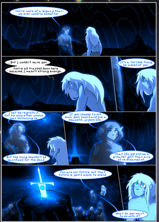
They ripple and spiral, often in long, sinuous curves, with smooth elegance. It reminds me a great deal of images of space and sine waves and the like. This establishes a definite feel to these different characters and their magic. And the thing is, that's not something that had to be done—the colors are good at emphasizing who's who. But it was done, and it adds a whole other dimension to the story. Whenever you're in a deity's domain, you know whose it is no matter the color.
Regarding that shape language, I wanted to make another note, too—Vash is sometimes described as chaotic and doing what he likes, which is interesting to me, because smooth, elegant curves and the color blue aren't generally associated with chaos. So while Vash might behave like that on the surface, I'm guessing he's got a lot more going on underneath; he's probably much more intentional in his actions than you'd think at a glance, and he is certainly quite caring with his city. The other thing is that this suits Kendal��perfectly. He's a paragon character; he is kind, virtuous, and self-sacrificing, and often we see him aiming to calm others and keep them safe. Blue is such a good color for him. There is… probably more to this, but I'm not deep enough in yet to say.
And here's the thing: I'm only scratching the surface. There is so much more here I'm not covering (color palettes! outfits! character design! environment! the deities! so much more!) and a lot more I can't cover, because I don't have the experience; this is me as a hobbyist artist who happened to take a couple design classes because I wanted to. The art style to this comic is so clever and creative and beautiful, though, I just had to go off about it. <3
...brownie points for getting all the way down here? Have a cookie.
#aurora comic#aurora webcomic#comicaurora#art analysis#...I hope those are the right tags???#new fandom new tagging practices to learn ig#much thanks for something to read while I try to rest my wrists. carpal tunnel BAD. (ignore that I wrote this I've got braces ok it's fine)#anyway! I HAVE. MANY MORE THOUGHTS. ON THE STORY ITSELF. THIS LOVELY STORY#also a collection of reactions to a chunk of the comic before I hit the point where I was too busy reading to write anything down#idk how to format those tho#...yeet them into one post...???#eh I usually don't go off this much these days but this seems like a smaller tight-knit fandom so... might as well help build it?#and I have a little more time thanks to break so#oh yes also shoutout to my insanely awesome professor for teaching me all the technical stuff from this he is LOVELY#made an incredibly complex program into something comprehensible <3#synapse talks
777 notes
·
View notes
Text


#--/ art#--/ story#ava the dark lord#⬇⬇⬇ context in the tags ⬇⬇⬇#alan becker#animator vs animation#animation vs minecraft#ava the chosen one#it is done !! ok ill give y'all the intro context synopsis now#the story goes that way way way way before Showdown cho and dark used to sneak into abandoned-looking buildings in the city at night#and one such target they stumble upon happens to be a storage room containing artifacts from Minecraft#the most interesting being the beds.#on this particular outing cho and dark were returning from other shenanigans and could use a place to rest. perfect!#dark belly-flops onto the right bed (scooting them out of alignment) and strikes a pose.#while chosen is shoving them back together again... oh. he's already asleep? ...???#!!! the beds draw you in if you get too close!#so what was supposed to be half an hour at most rest turned into the whole night. they skedaddled and forgot about the freaky beds.#until. a certain someone goes and dies :333#you get it now ! ! !#it was dark diesn't ALL ALONG-#yeah and then for extra spice i threw in that the hooded stick King meets with during his episode to buy a command block...#...happens to own that storage room.#thus and so begins more brand new shenanigans with dark interacting with this shady rando. i call em seafoam#i highly extremely doubt there's a tag for seafoam . . . wiki calls them only 'hooded stick figure'#anyhow. behind the scenes this was also a practice of drawing things in 3D... keeping on model... and composition for storytelling#and i learned some things about how Whiteboard works too :o i. didn't know about the fill tool. it is cool#yayaya!! so that's been in my head for a while.#thx for reading <3 <3 ill be posting some close-up shots of this and other things i put on the whiteboard later#Minecraft bed
312 notes
·
View notes