#potentially could be eyestrain???
Explore tagged Tumblr posts
Text
weekend so yay i can post lol


many versions i can’t decide which ones best

#:3#digital art#art#artwork#furry#ibispaint art#ibispaintdrawing#ibispaintx#made in ibis paint#furry art#furry tag#art tag#artists on tumblr#illustration#drawing#my art#illustration art#ibispaintapp#song :3#my sona#sona art#sona#fursona art#fursona#yayy#potentially could be eyestrain???#tw eyestrain#tw dogs#in case
25 notes
·
View notes
Text

[ID: a digital drawing of riz gukgak from fantasy high. in the front is a relatively small drawing of riz juggling books that are falling out of his hand and a phonecall, and he has a huge backpack on. he looks a bit overwhelmed, hair flying in all directions, and has a nervous smile on. in the background is a large shadow of riz, only one glowing eye and a shining gun visible. the background is red, giving an eerie feel. End ID]
Kill your best friend
Cheat your way to your rogue teacher
Announce your presidential campaign
Don't let them know how angry you are
LEARN TO RECOGNIZE A MONSTER
#riz gukgak#fantasy high#fantasy high junior year#fhjy#fhjy spoilers#fantasy high junior year spoilers#ik the 'uh oh i fucking miscalculated big time' applies to all the bad kids BUT riz is my little blorbo so#and he was the first to go full brutal in s1 and was likely the one ppl would've seen it coming from the least#i dont need to justify myself i love all their dichotomies. my homicidal blorbos who're on a slippery slide to becoming the villains#as they grow more powerful but still react to threat with a 'no holds barred' approach#wait wait this isn't an analysis post jskdjsdjk art! had a lot of fun with this one#have the funniest 'sketch' for this that i did that was me drawing w my laptop touch pad (? the touchy mouse thing) w notes so i dont forge#the idea back when i didnt have the juices to draw it and was also in the armchair writing fic and didnt want to move stations#im still experiment with colours and now im also figuring out gradients which is super fun! correction layers my beloved <3#also didn't use my usual canvas size and had to keep making it bigger and bigger so its unfortunately compressed#such is life#did some warmup before this for once bcs i felt like working on my no-underdrawing drawing skills#have this beautiful pen brush and a new big (for me) sketchbook so i went to town with some references open#also working on tackling the wretched face angles. why do our faces Do That#anywayyyy the list is from kipperlilly's pov in case it wasn't clear#im looking forward to eventually rewatching s3 and giving her another chance#like i COULD get sick abt her. theres potential there bcs i do love angry annoying women who stick to their shit#im leaving now i simply have to hydrate its been hours#eyestrain tw#sorry for the late tw i work with so many layers of eye protection on my laptop that it took looking at this on my phone to go uh oh
190 notes
·
View notes
Text

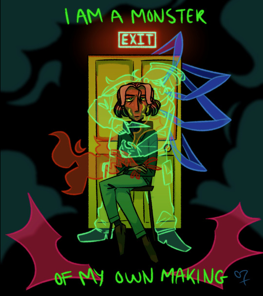
*guy who had no control over his fate voice* it's all my fault
#i am a jonathan sims apologist im sorry#i dont think hes a completely good person but i think the way he turned out was not his fault-#-and that his nature as an avatar does not contradict his morals!!!!#idk if this is the best way to convey how i feel about jon being marked by all the fears but i hope it comes across how i want it to :3#tw eyestrain#potentially#my art#tma#the magnus archives#jonathan sims#alice daisy tonner#if its not clear: daisy is the hunt + his neck scar#the fire is the corruption/jude perry + the burn scar on his hand#the bones in his hand are his ribs + the flesh#the pink explosions are the stranger/unknowing + his explosion scars#the orange cut near his collar bone is the slaughter/melanie#the worms are the corruption/jane prentiss + the pockmark scars on his face#the spider legs are the web + symbolic for the mental mark mr spider left on jon#and the door is obviously the spiral + could be interpreted as when michael's hand cut jon#and you could interpret the clouds around as lonely fog
444 notes
·
View notes
Text
Posting here as well because why not!! Shout out to (and rest in terror 😔) Alan Curupen of Providence Al Dente. Your soul may have overflowed on lore but.
actually no yeah we don't know what terror a. ball's deal is yet so. this may or may not go poorly for us. but at least we're plot-relevant /lh

( honestly I don't know what the quality's going to be like because mspaint but uhm. I miss you alan :[ )
#eyestrain#bright colors#scopophobia#body horror#just in case!! let me know if I need to add any more tags 👍#frost art#terror ball#terrorball#terror a. ball#a lot of terror. a lot of balls#alan curupen#providence al dente#i do think tab may be my favorite player now aside from patricia aldritch though#do we know their deal? no. could they be evil? potentially#but i think tab can just be really ominous while we wait to find out. as a treat#took me forever to figure out the poses and whatnot oughghgh. sorry alan for the lack of detail i. did not have it in me#and also i was going to try and do a whole warning sign-style thing but i got a bit. carried away. so
40 notes
·
View notes
Text
hiiii here's an edit abt kuron. My silly goober. My little guy
I was going to try to do more w this edit (for example- replace that beginning scene w pidge in it w some clips that fit more, maybe swap out some clips that i felt needed replaced) but hahaha capcut got fucking BANNED so I had to rescue this thing whether I was done or not!
The watermark had to be added in a separate app and as a result I think the edit is a bit cruncher than i'd like but oh well!!! I take what I can get!!
Song is Take Me Back To Eden by Sleep Token w an effect over it btw
Edit 1/23: APPARENTLY CAPCUT IS BACK!! idk if I'll end up going back into the edit and changing what I initially wanted to change but it seems like it came back literally right after I posted this and I just didn't get the chance to check until today. At least the edit still looks good
#voltron#voltron legendary defender#my edit#vld kuron#kuron vld#I'm not gonna tag this w shiro bc it's more about kuron once he's been (fully) mentally hijacked and not when he believes he's shiro#flash warning#glitch warning#uhhhh#eyestrain#? Potentially? bc of the bright bits#And also because the effects I used Can cause eyestrain#But uhhhh yeah#If anybody thinks of any other warnings i could add to these tags lmk
11 notes
·
View notes
Text

unedited/originally colored version under cut

#the right hand [your left] and heart underneath are taped to the paper due to technical error [the paper there wore down too far to use]#you could colorpick a really nice genderfluid flag out of this one#aarons art tag#jash tag#chonny jash#cj heart#assorted sketches#eyestrain#potentially
73 notes
·
View notes
Text

[Image ID: An eleven horizontal striped flag, its colors going as follows from top to bottom, white, light yellow, light orange, pumpkin orange, brown, a larger stripe of magenta, brown, dark red, pale red, pink, white. End ID]
Greatwistingial: A gender related, connected to, or otherwise effected by the ritual from The Magnus Archives, "The Great Twisting."
Tagging @radiomogai and @lovesickangelguts (as you requested this many a moon ago...)
#greatwistingial#neogender#mogai#mogai gender#mogai flag#mogai coining#liomogai#liom#liom flag#liom gender#liom coining#gender coining#my flags#my terms#possible eyestrain#potential eyestrain#i did desaturate it a little but its still a little hard on my eyes... could just be me though.
20 notes
·
View notes
Text

♡♫YOURE LIVING LIKE A DISASTER✿☆
#i could not get the image quality better BELIEVE ME. i am an android user. this has one billion filters btw.#picos school#nene#newgrounds#special interest tag#(potential)#eyestrain#art portal
43 notes
·
View notes
Text


do we think these images would be too bright/eyestrainy for a blog header
#mono’s stuff#eyestrain#potentially?#i really wanna do the first two but i dont think i could. the last one Might be an option? but idk. wanna double check
3 notes
·
View notes
Photo

[Image ID: A nine striped flag, its colors going as follows from top to bottom, teal, dark gray, grey, teal, dark teal, grey, dark grey, teal. End ID]]
Mindflayillian: A neogender related to the Mindflayer from Ultrakill.
#mindflayillian#mogaiswirls#mogai#liom#possible eyestrain#potential eyestrain#mogai gender#mogai flag#mogai coining#liom gender#liom flag#liom coining#euh i couldve sworn there was a gender specifically just about ultraakill but i cant find it :6#maybe it was just on someones to-do list or smth.. idk#i could also be thinking about uh cybergrindian i think the name was?? idk its like 2 am and i couldnt sleep so my brain is. chugging#^ it twas.#ultrakillgamic
5 notes
·
View notes
Text
ok now time to pass out
I've drawn a lot today that you should see some queued soon
#talking about the rise august thing. also potentially a mm countdown#ive drawn in 4 different styles today help#still dont have a concrete one for mm i just drew something between the future leo and donnie autism tournament#really proud of both of those#also i need to work on my tmnt au because theyve been in my head too long. i got a toyhouse earlier just so i could house them#ALSO THE MM ART CONTAINS EYESTRAIN/BRIGHT COLOURS PLEASE BLOCK THAT TAG IF IT BOTHERS YOU#viv.txt
1 note
·
View note
Text
yeahhhh-
They really did just dress him like a Normal Guy
Which considering all the other characters who have unique outfits is even funnier
I drew Void/Seer

(Unshaded, tags, and notes under cut)

I have a LOT of feelings about Seer as Void which I. Will not get into here.
I gave him the wings i draw Seer with but in red.
Kinda funny that they put their terrifying final villain in just. Normal clothes
@itsgirlcraft
@chaoticcyprus
@thebeingmerf
@itisindigos
@its-indigos
#...#Maybe i should draw Void in a dark version of Seer's outfit#That could be fun...#Eyestrain#Potential eyestrain
17 notes
·
View notes
Text
Hello! I’m Ladders :)
I'm just here stylizing some fnaf characters and mostly drawing the evil green rabbit like an animated villain.

Basically, I always loved animated shows and movies. They're why I started drawing when I was little, and I still watch and pull ideas from that kind of stuff to this day. Classic Disney's my fav, so you might see me talking about it sometimes. Anyways, since villains are my favorite and since I've starting drawing fnaf stuff, it's mainly been art of Springtrap, which you'll see a lot here.
If you're ever just looking for my art, the tag is #laddersarts. More tag stuff at the bottom of the post. Also, love asks, but please be considerate about the ask box, ty.
Do not repost my art anywhere, even with credit. I'm fine with it being used for things like a profile picture/banner as long as it is credited.
vv FAQ / TAG GUIDE vv
Q: What art program do you use? Krita. It's free and it "works," which is all I ask for.
Q: Do you do commissions? This answer will change around: currently, no. I've been meaning to, honestly, but just haven't felt collected enough to make a comm sheet and whatnot. Hopefully I'll be able to update this soon though.
Q: What are your other socials? I currently don't have any others, so if you see my art somewhere else, it's stolen :)
Q: Why do you draw [insert character] like that? I normally get this question about Springtrap, but I like to make designs that lend themselves more to 2D animation, which means simplifying a lot of things and hopefully still being able to get the point across. Too much detail and it becomes complicated very quickly. Fnaf animatronics/characters lend themselves really nicely to stylization because of how simple in concept they are overall. They're also left up to a lot of different characterization potential, not just from their simple designs, but the fact that they don't really get super hard-established personalities. Basically, all of that comes together into me enjoying taking a base concept and turning it into something you could potentially see in some older hand-drawn cartoon. As far as *specific* choices for how I draw *specific* characters, I feel like those would each need their own posts especially for Springtrap since I draw him the most. I know I'll have to make that sometime.
Q: Can I draw fanart of your designs? Of course! I'd just like to be credited and tagged so I can see it and reblog it :D
Tag Guide laddersarts and not my art - arts that I post or ones that I reblog (my art tag is all stuff since I got back earlier this year, art before that I just tagged as "my art") justtalks and talkin disney - indulgent tangents justfrens - things from peeps I know and whatnot answered ask - stuff from the inbox goofies - silly stuff midnight magma things - arts from group canvas drawing fanart for me :0 - fanarts of my designs!!!!! :0 present for springtrap :) - ask series where y'all wanted to give Springtrap something nice (there's a line formed and I just get to them whenever I'm up for it, but feel free to add to it) alt springtrap - art of goofy alternate versions of Springtrap I make sometimes: there's currently Vamptrap, Mothtrap, Jackotrap, and ERRORtrap (suggestive, eyestrain, flashing, gore, and all that stuff some people might not want to see I will hopefully remeber to tag)
153 notes
·
View notes
Text
(warnings: implied child abuse, bright colors/potential eyestrain)


HOO FUCKING BOY THIS TOOK. A LOT OF REFERENCES.
i also. attempted to do an 80s-ish filter. tried looking up tutorials, most were for photo editing and not for art. and the few i Could find for art made no sense to me. so i did my best.
meet the kids for my Fnaf au/Rewrite called "Blurred Lenses"!!
here's the ages:
Charlie: 10
Susie: 7
Fritz: 14
Gabi: 5
Jeremy: 4
David: 10
if y'all want to ask about these lil guys, go right ahead!! or the au in general. either is cool!!
tag time!!
@that-darn-clown @hello-there-world @docterzerocare
and here's the versions without the filters:


#fnaf#fnaf au#fnaf rewrite#charlie emily#fnaf mci#my art#Blurred Lenses au#bl!Charlie#bl!Susie#bl!Fritz Jr.#bl!Gabi#bl!Mimi#bl!David
29 notes
·
View notes
Text
CW: Eyestrain


Everybody ready for the thing I've been thinking about for close to a year now?
I have been wanting to draw this idea for ages! Ever since I read the list of episode plots that we never got. There's one that stood out to me significantly.
To sum it up: It was going to be a Raph centric episode, where he goes to Draxum for help because he's having trouble with his giant doppelganger form. It somehow separates from Raph and starts running amok through New York; leading them trying to catch it.
I could not stop thinking about the potential of this episode getting to really dig down deep into Raph's character. I thought, what if Raph's doppelganger actually was a projection of Raph's emotions? The turtles mystic/ninpo gains strength from their trust and love in each other, right? What if though, Raph's powers can feed off and grow volatile from his emotions he keeps bottled up and every time (within the episode specifically) Raph would try to brush off or outright deny his stress, anxiety, fear/worry, and anger to his brothers that the rampaging doppelganger just got bigger and more unstable?
This whole concept popped into my head after reading the episode summary and because of Danny Phantom.
Yes Danny Phantom. There is a specific scene from the episode What You Want (Desiree's debut episode), where Tucker gets the evil ghost split from his body and he sees the physical representation of all his negative emotions and feelings and is just so shocked by it. That scene has lived rent free torturing me everyday for almost 20 years. And it's just such a fitting concept for Raph as a whole. Because what happens when the angry one actually sees what their anger is doing to them?
#my art#fanart#rottmnt#cw: eyestrain#rottmnt fanart#rottmnt raph#i'm calling this#volatile raph#save rottmnt#unpause rottmnt#give me season 3#i need this episode!!#nickelodeon#cartoon
211 notes
·
View notes
Text
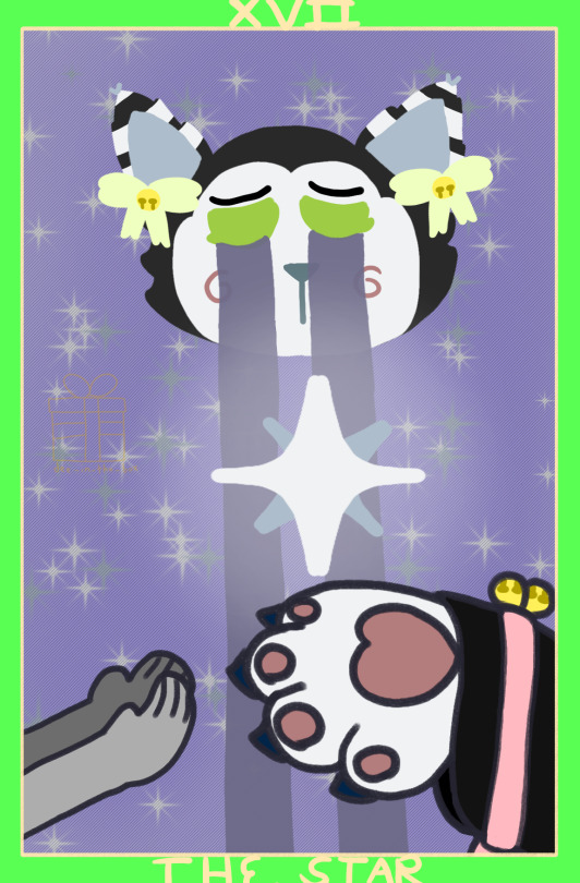
(warnings: bright colors/potential eyestrain, blood, implied child murder/death, eye contact but not a lot)


The Sun
The Star
Judgment
(Dee tarot cards! based off of her vibes)
also, while it might be obvious, in the Judgment card, Dee's judging Legacy (if you can figure out what which Dsaf 2 ending his Whole Deal is based on, you get a sticker), Dave, and Henry. the fact she's staring Henry down specifically is intentional.
the Judgement card is also based heavily on the Rider-Waite card, because it was both the main one that came up, and because it was the one i could easily find a way to translate over to Dee.
17 notes
·
View notes