#posted that gifset and blacked out
Explore tagged Tumblr posts
Text
head empty only jongup
#posted that gifset and blacked out#slowly recovering#not immune to pretty boys#especially not immune to pretty boys acting a certain way#addy.txt
1 note
·
View note
Text


Scream King - Daniel Kaluuya
#horror#horror movies#horror movie#gifs#gif#horror gif#horror gifs#my gif post#daniel kaluuya#horroredit#horror edit#my gif#my gifs#get out 2017#nope 2022#nope movie#horror tv#black mirror#kick ass 2#psychoville#the fades#ch@room#chatroom 2010#welcome to the punch#sicario#widows 2018#gifset#my gif edit#screamking#scream king
240 notes
·
View notes
Text
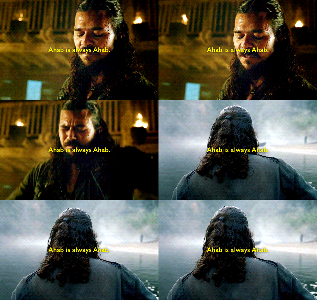
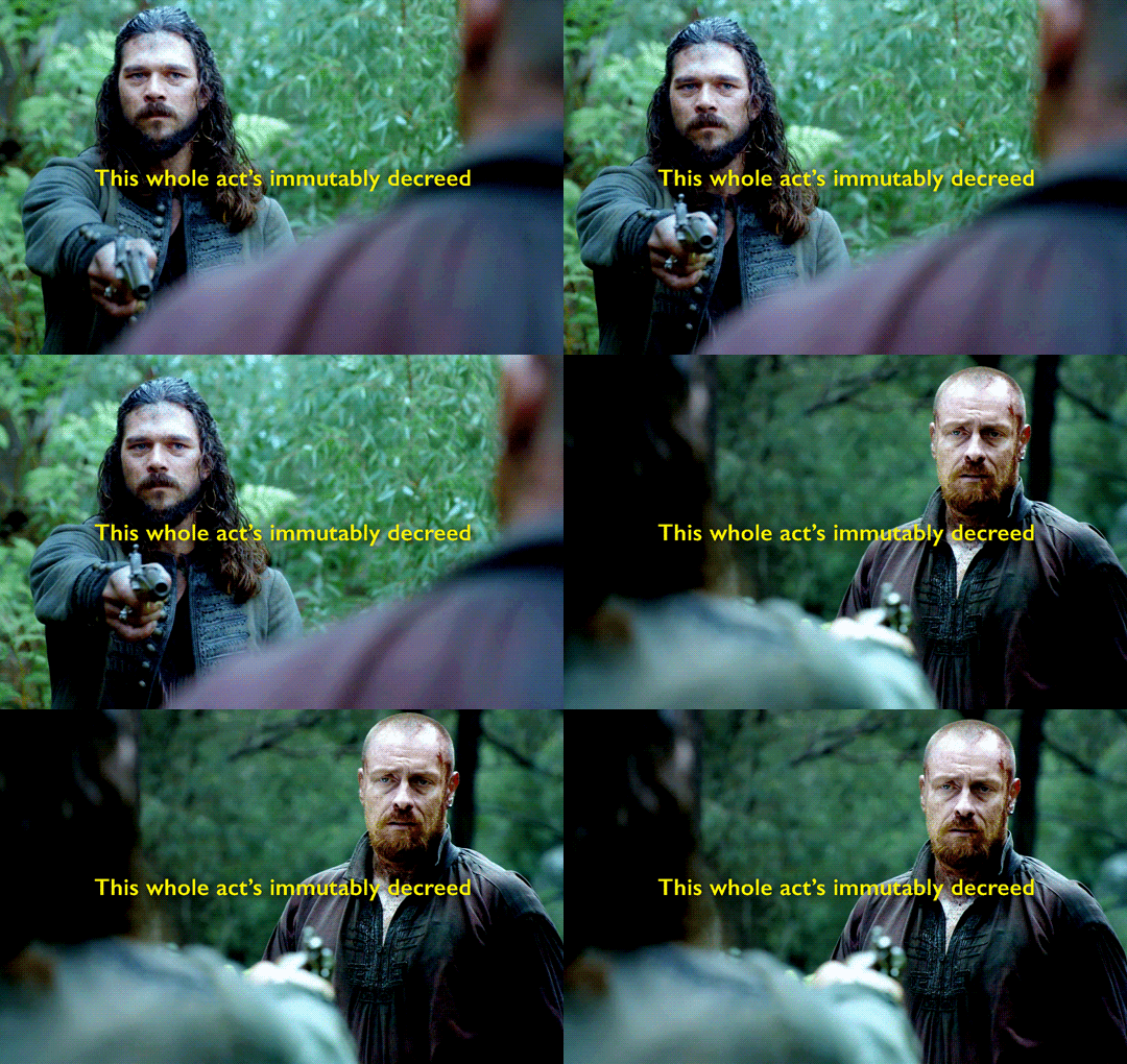
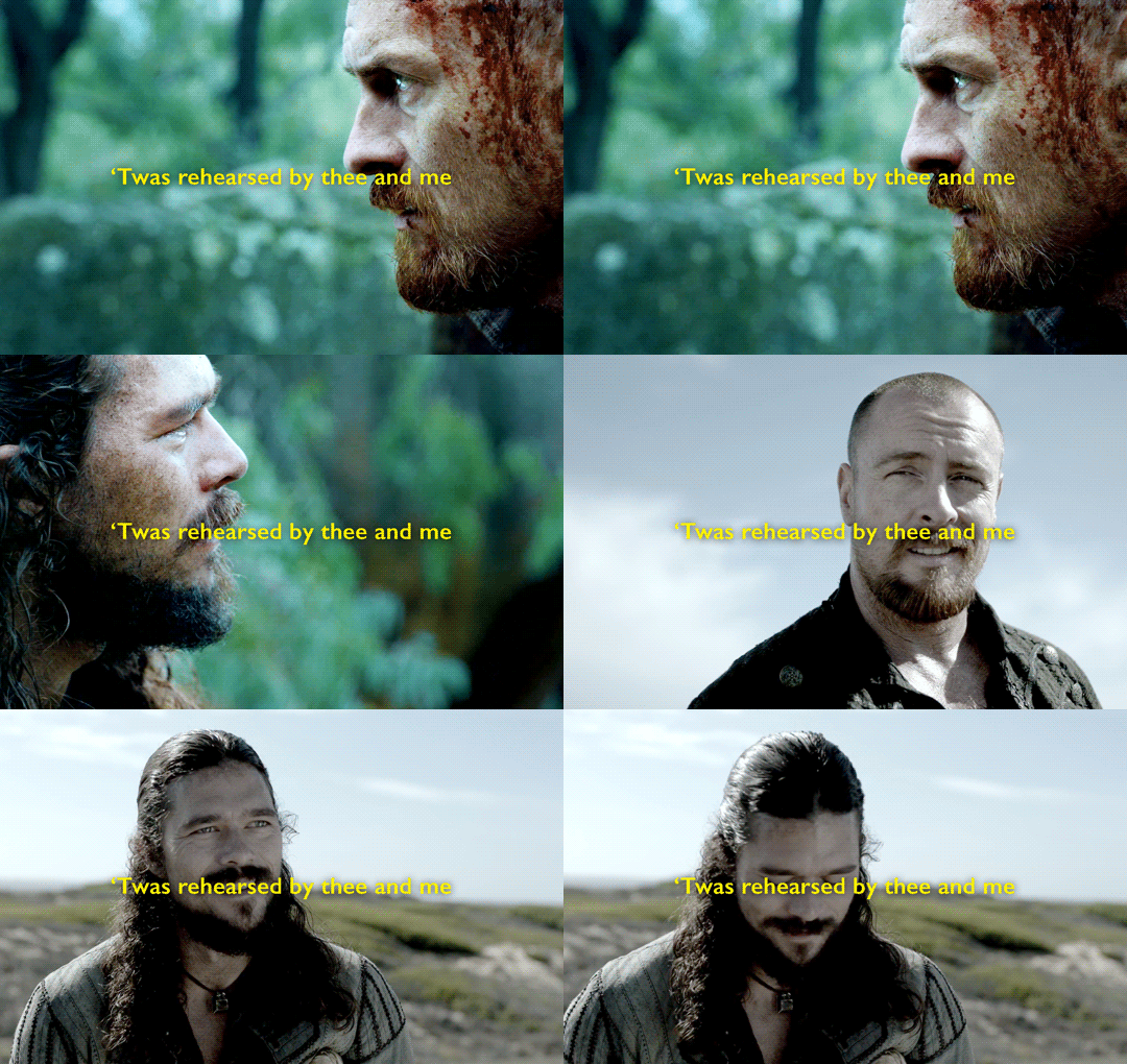
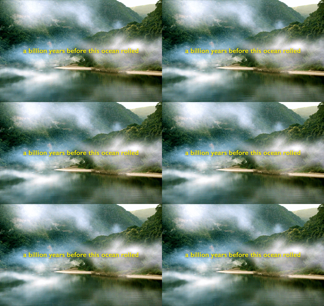
Until then, I remain, Long John Silver.
Moby Dick by Herman Melville, chapter CXXXIV The Chase - Second Day
#black sails#bsedit#blacksailsedit#moby sails#moby sails posting continues! im not super happy with this but i need it off my laptop so i can focus on my other worse gifsets <3#john silver#james flint#the point here. idk. the point is about trauma transforming you.#the point is about being trapped in a story and not trying to fight it. this is how it goes.#and other people are trying to get you out but you know better! you're this forever! a billion years before this ocean rolled!#whatever. post <3#FUCKKKK ok edit: just realized I misquoted. first line should be ahab is forever ahab#that’s what I get for doing this from memory and not doublechecking before I post but it’s too late now!!!#most people won’t notice but I have to be honest :( i fucked up :(
267 notes
·
View notes
Text
2024 Creative Round Up
Thank you to @thisbuildinghasfeelings @alrightbuckaroo @heartstringsduet @lemonlyman-dotcom & @annoyingcloudearthquake for tagging me in this!
According to my archive, I've posted over 340 edits this year.

That is way too many for me to round up concisely. I figured instead I would link some sets for every month in the year: the most popular set and then my personal favorites. I'll add a gif sampling for each month in here too for some ✨visual excitement✨and also put it behind a cut to save the timeline.
JANUARY Most Popular: HAYDEN CHRISTENSEN. Actor and Tea Connoisseur Personal Faves: 911 LONE STAR REWATCH 2024 -> MY FAVORITE SCENES | Paul rockin’ his gear in 1.04 Act of God

FEBRUARY Most Popular & Personal Fave: 911 lone star -> carlos + gripping TK’s neck
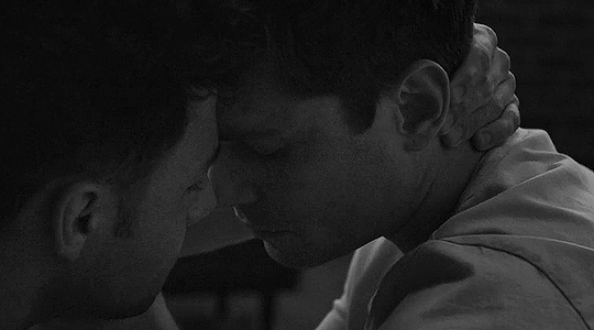
MARCH Most Popular: 911 lone star -> tk + holding carlos’ face in his hands Personal Faves: 911 lone star fashion -> every grace outfit -> 4.05 & 911 lone star fashion -> every grace outfit -> 4.09


APRIL Most Popular: 911 LONE STAR REWATCH 2024 -> 3.08 parallel Personal Fave: PAUL STRICKLAND (noticing things in the field set) & 911 LONE STAR REWATCH 2024 -> MY FAVORITE SCENES | TK antagonizing the firefighters in 2.07 Displaced

MAY Most Popular: 911: Lone Star | Nancy & Marjan Personal Fave: NICHOLAS GALITZINE is a Creed fan

JUNE Most Popular: This or That: Tarlos Edition -> Babe or Baby Personal Faves: This or That: Tarlos Edition -> Catan gang hangs or private date night

JULY Most Popular: 911: Lone Star | Tarlos Kisses (S1 -> S4) Personal Faves: 911: Lone Star | Music Monday & This or That: Tarlos Edition -> Monster Inside (1x08) or Push (3x04) & This or That: Tarlos Edition -> Dancing at the honky tonk or Dancing at the wedding & 911: Lone Star | Tarlos Head Kisses (S1 -> S4)

AUGUST Most Popular: This or That: Tarlos Edition -> Soulmate scene or proposal Personal Faves: 911: LONE STAR | PAUL STRICKLAND -> Hero on fire and ice & 911: Lone Star | MARJAN MARWANI

SEPTEMBER Most Popular: 911 Lone Star |3.13 -> 5.01 Personal Faves: 911 Lone Star | S3E9 -> S5E1 & 911: Lone Star | 5.01 -> Tarlos phone call & 911 Lone Star | S5E1 -> The Big Tortoise

OCTOBER Most Popular: 911: Lone Star | Tarlos in 5.03 Personal Faves: 911: Lone Star | Owen & Carlos -> burying their grief by overworking & 911: Lone Star | S5E4 -> Paul talking to the rats & 911 lone star -> owen ‘yee-haw!’ strand & TK/Carlos + Touch -> 5.05 Thunderstruck

NOVEMBER Most Popular: 911 lone star -> tarlos kisses rotated ↻ Personal Faves: 911: Lone Star | Tommy Vega S2E10 -> S5E7 & 911 lone star -> tk & jonah parallel & 911: Lone Star | ✨TK Strand's oral fixation✨

DECEMBER Most Popular: 911: Lone Star | Tarlos -> squished-nose kisses Personal Faves: 911: Lone Star | S4E18 -> S5E9 & 911: Lone Star -> 3 times Carlos smiled while thinking about Jonah & TK

tagging some fellow 911ls gifmakers! (with absolutely zero pressure to do anything as complicated as I did here lol): @lutavero @reasonandfaithinharmony @strandedbuckley
#911 lone star#creative roundup#tag game#my gifs#according to me and me alone I posted a lot of bangers in July okay?#that gif for the proposal set is the base gif that isn't edited with the black & white & the font and stuff#sooo it's a gifset outtake if you will.... a gif at phase 3 out of 7#i'm not double checking any of these links before posting 🤭 godspeed little links i hope you're all correct
34 notes
·
View notes
Text
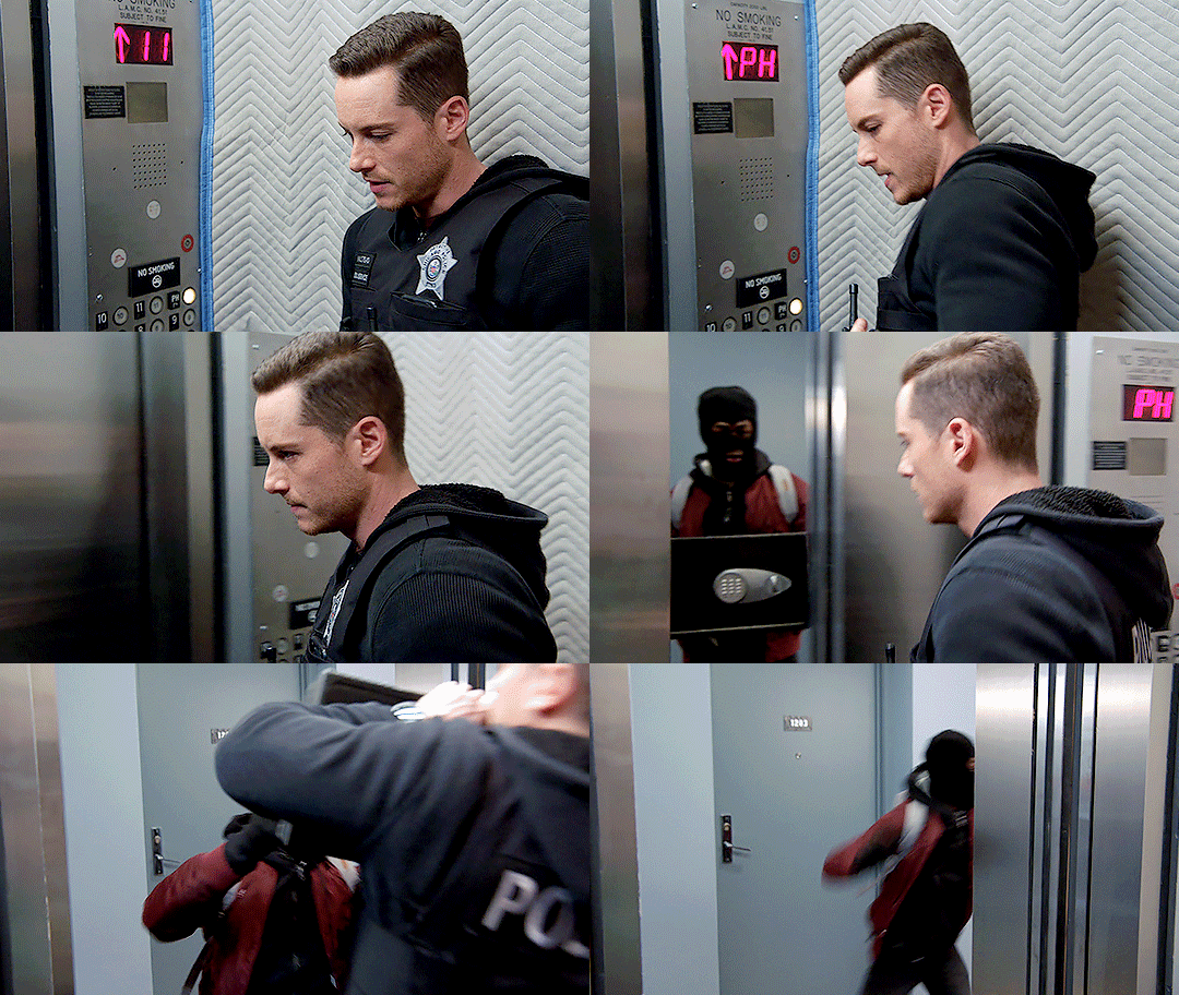


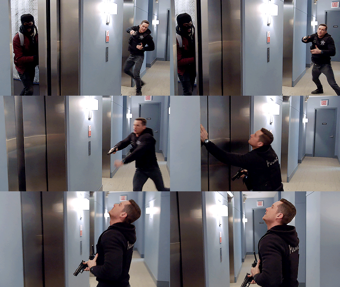
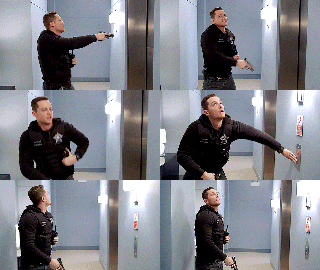

CHICAGO P.D. 6.15, "Good Men" (2019)
#chicago pd#jay halstead#jesse lee soffer#tvedit#cpd#cpd 6x15#guns#elevator hallway police radio vest black hoodie burglar thief gun good men edit 6.15#mine#hi this gifset was good in theory bc i like this little scene but it turned out meh so i didn't post it#but i keep scrolling past it in my drafts so ... ok ... why not just release it on a friday night when no one's looking#also one thing i really like about this scene is his voice. the way it's soooo calm and soothing until !!!!!#and then it's all high alert 5021 george squad advise my partner there's a second offender coming her way and i love her so so so much#<- tru fax that's exactly what happened#cpdedit#jayhalsteadedit#jesseleesofferedit#S6
206 notes
·
View notes
Text
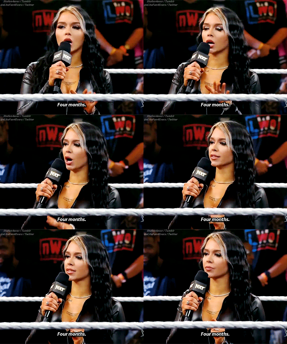

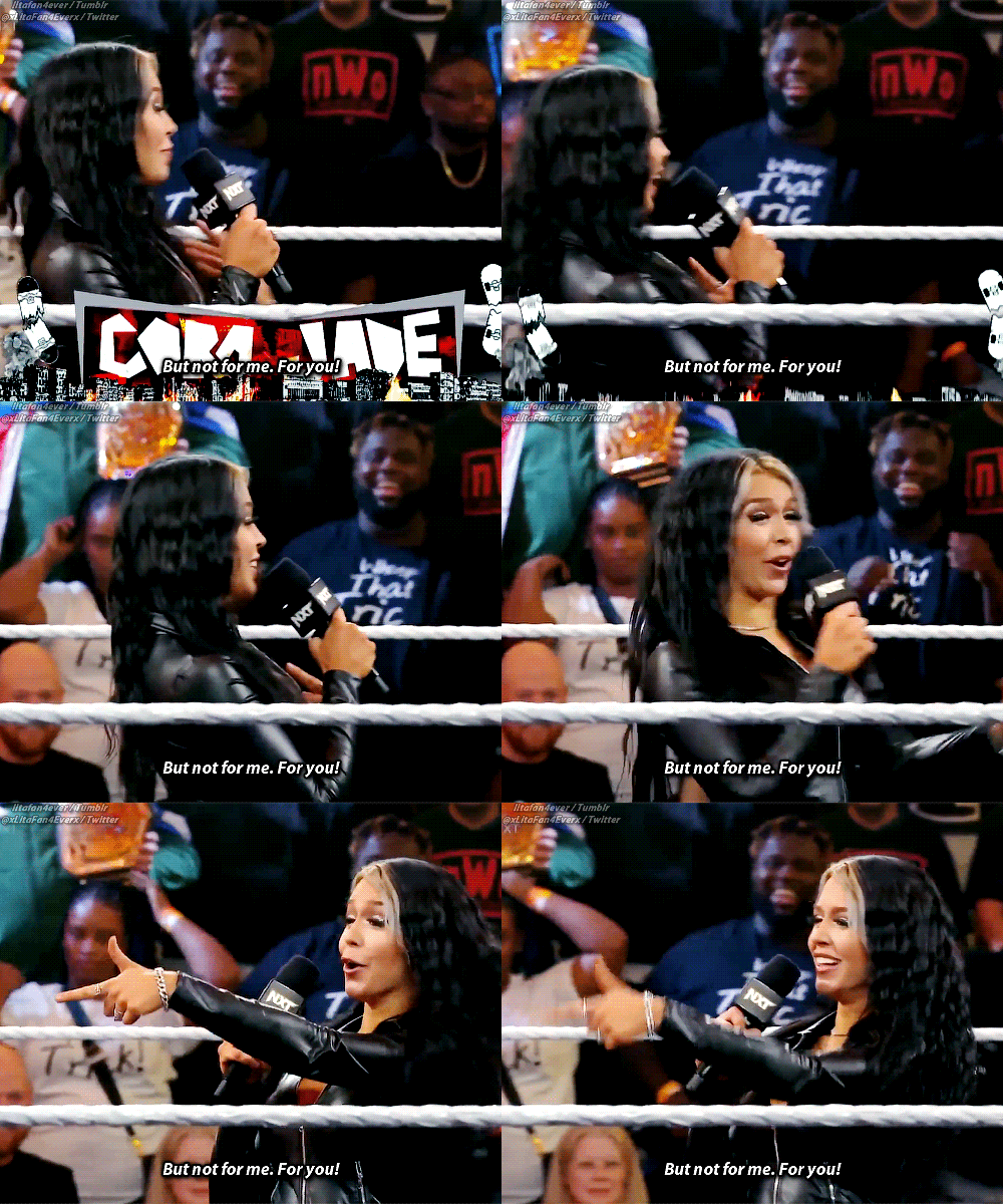

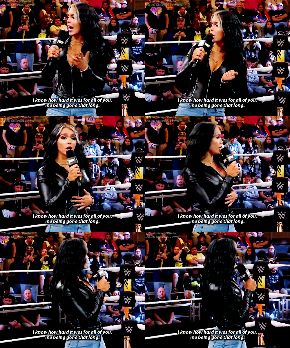
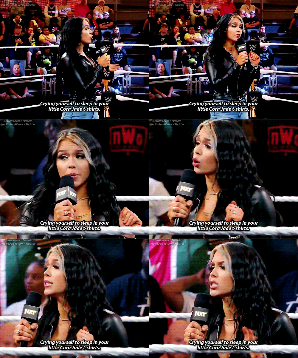

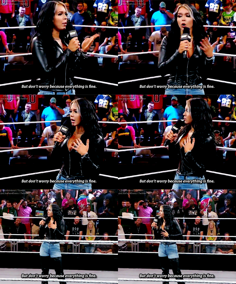


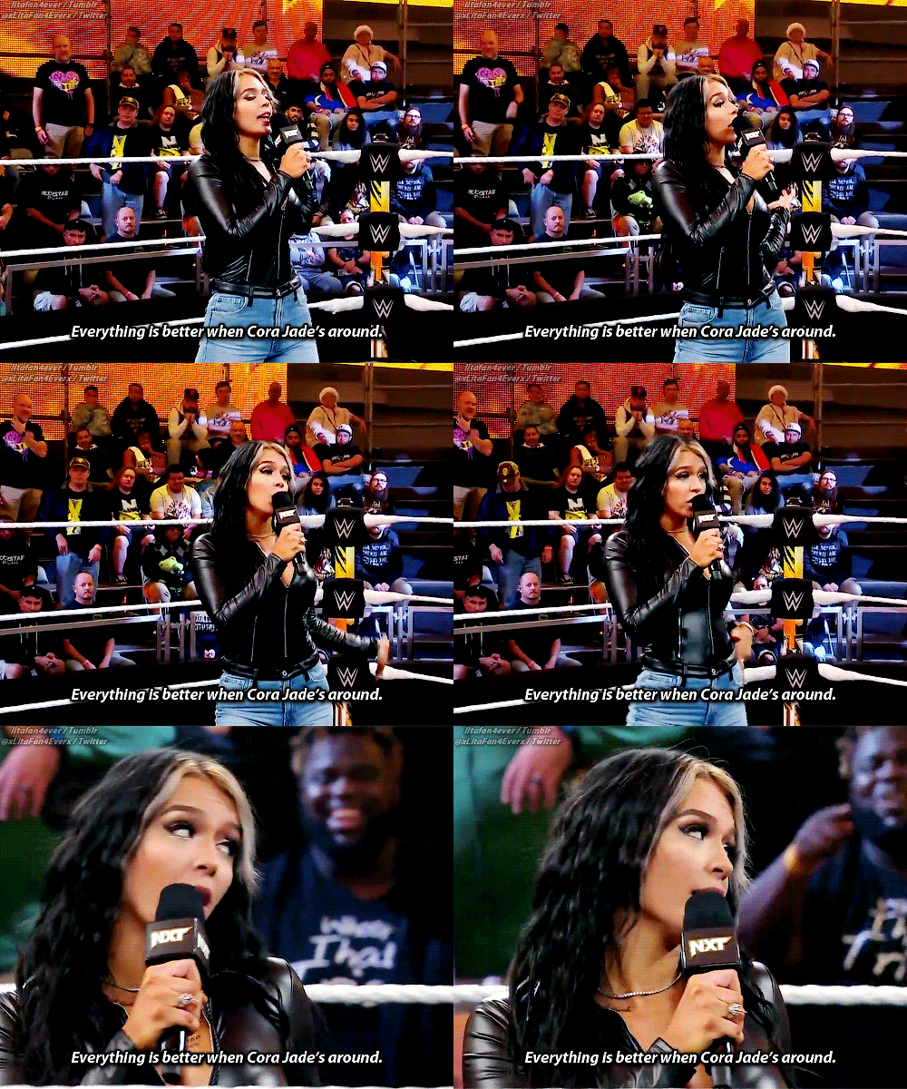
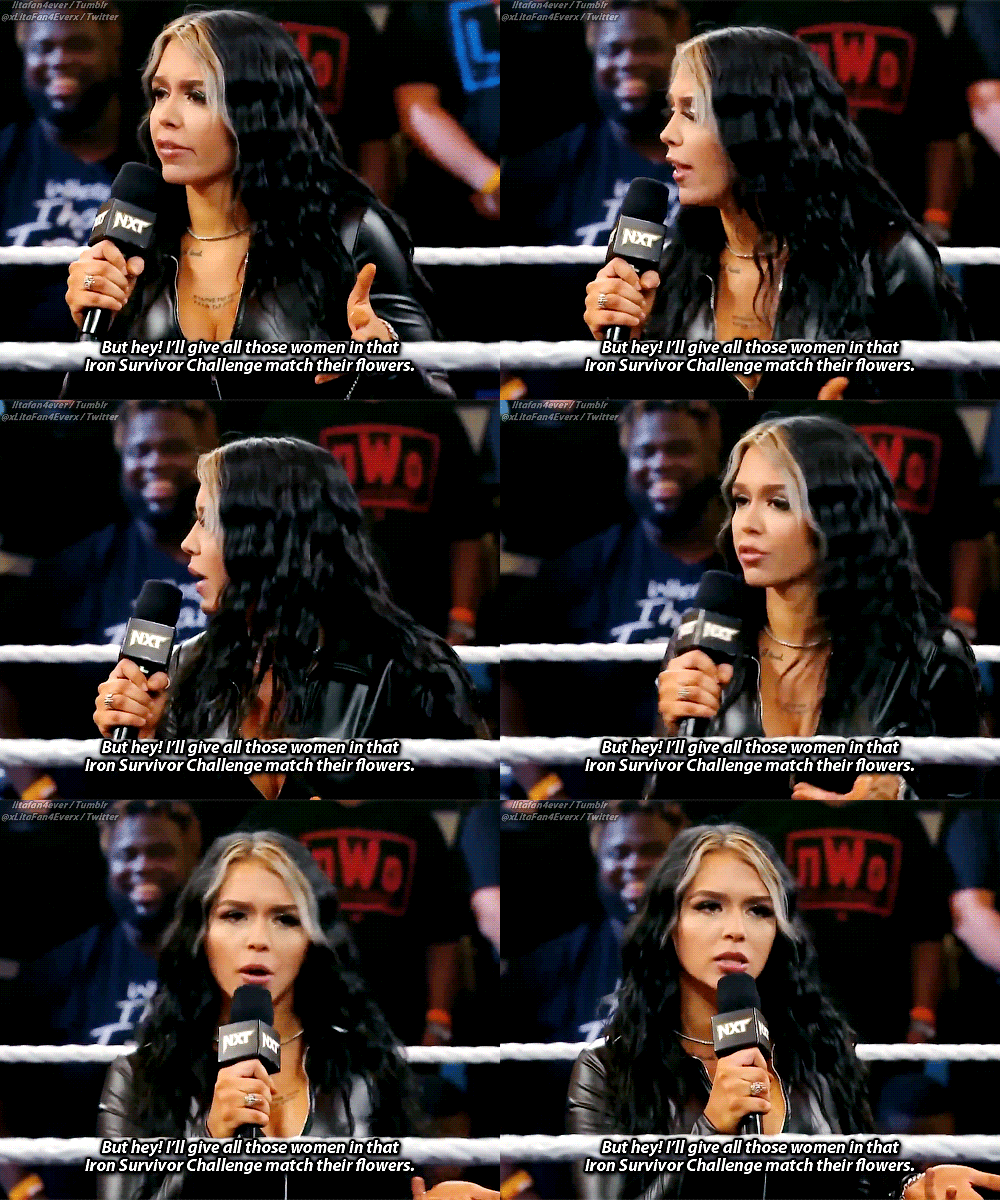


Cora Jade - WWE NXT (December 12, 2023)
#Cora's not wrong lol I missed her so much! ;~~;#God I missed her and her epic promos#I can't wait for her to become NXT Women's Champion! :')#Cora Jade#Elayna Black#Brianna Coda#wweedit#corajadeedit#WWE#WWE NXT#My Gifs#Flashing gif#Just in case#Gradient Text#Long Post#I'm sorry this is such a long gifset I know I'm a sick freak but I didn't wanna leave anything out so forgive meh! :~~;
46 notes
·
View notes
Link
Chapters: 1/1 Fandom: The Exorcist (TV) Rating: Mature Warnings: No Archive Warnings Apply Relationships: Marcus Keane/Tomas Ortega Additional Tags: Angst, Masturbation, The Fucked Up Inside of Marcus Keane's Head, Canon Typical Religious Perspectives Summary:
Marcus doesn't think of the other man in the room when he touches himself.
It’s not that he believes God will judge him. In the ranks of his sins, this can hardly factor, and he has seen far too much to credit the notion that abiding by God's rules might serve to win back his favor. God is far too vast to have time for such pettiness.
But the demons aren't.
#the exorcist#marcus keane#tomas ortega#fanfic#my writing#so my hand slipped#a while ago when i got briefly obsessed with this show#this was supposed to be the first chapter of something longer#but for now i'm posting as is and we'll see what happens#its literally 500 words and most things should be clear from context#if you want to check it out and havent seen the show#also i highly recommend you go watch it#if you follow me for black sails stuff#this is the ONLY thing that competes with silverflint#in terms of#whatever the fuck these two have going on#it is gayer than gay sex#i will reblog some gifsets in a minute so you can picture them#hm this has been a weird day NIGHT EVERYBODY
16 notes
·
View notes
Text
if anyone has a solution to this (and i blame the new post editor bc this Never happened with the perfect old editor), but on my side blog, every time i've posted a video recently, it Never shows up in the tags. and the tags aren't the problem (i've switched up the tags and it still never appears, posted a text or image post with the Exact Same Tags and they show up in the tag search fine). and the side blog is pretty video-heavy (practically every other post from '21 to '22 was a video, but posted with the old post editor). since february of this year, i've only posted 3 videos and they have never, ever shown up in the tags.
tumblr support never got back to me and the The Most Random workaround i found on tumblr (while trying to see if anyone else has this same issue) was posting an image/gif in the same post as the video (like under a "read more") and SOMEHOW?!?! that makes it show up. but clearly other people keep posting videos without an image/gif placed underneath (based on the handy-dandy timestamps), so what the Fuck is up???
#god i DESPISE the new editor bc it's Always out to get me somehow someway!!!#posting gifsets is screwy and hard to place in whatever order you want#the html viewer is just white text on black so it's Crazy difficult trying to keep track of the non-color-coordinated code#and now this! i cant even post goddamn videos?! without adding an pic signature like it's a forum in 2009???#what gives?!!?#PLEASE. FOR THE LOVE OF GOD. HELP ME!!!#not naming names but i blame cyle for this#rambles#tumblr
4 notes
·
View notes
Text
I just want everyone to know my drafts are insane rn
#a million fantakens and also I blacked out and made like 5 gifsets#no idea when I will post those but they're beautiful#one day I will be normal but not today fksjdjs#ilytalks
4 notes
·
View notes
Text
Claudia's Celebration of Life: Spark in the Dark
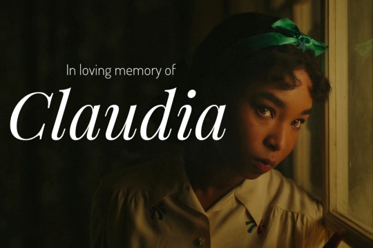
As the title suggests, this event is to celebrate the wonderful Claudia; her personality, her aspirations, her journey. The heart for the past two seasons of AMC Interview with The Vampire. This is to take the narrative back to her, proving she's not just a shingle roof for us.
The event will be held for 30 days (from Aug 11th to Sept 9th) with 15 themes. Anyone can join, and you can post whatever you like, from gifsets, meta analysis, fic recs, fanvids, web weaving, fanarts, fanvids, even poems. You can post them on Tumblr, or Tiktok, or AO3 etc. The rule is just one: make sure to tag "#Claudia's Spark in the Dark" and her character tags #Claudia and #AMC Claudia. Let's flood her tags with posts about her again! (plus, please give TW or CW when it's appropriate)
Important point: This event is AMC Claudia & Madeleine focused only. Please try to minimize inclusion of other characters or iterations except when it's on the theme.
Themes and dates are under the cut!
(The order of themes are generated randomly. Feel free to interpret each theme. For the themes with 'OR', you can choose which one you want)
1. Aug 11th & 12th: Hobbies
2. Aug 13th & 14th: Alternate Universe
3. Aug 15th & 16th: Quotes (From TVC books, other cast, Anne Rice about Claudia OR web weaving with other media)
4. Aug 17th & 18th: Family (Her relationship with Louis and/or Lestat OR with the concept of family itself)
5. Aug 19th & 20th: Claudia's Voice and Lack There Of (e.g. Claudia's diaries as her outlet and how they're used by others)
6. Aug 21th & 22nd: As A Caged Bird OR In Solitude (e.g. the limitations Claudia faces as a seemingly 14-year old Black girl OR bird motif)
7. Aug 23rd & 24th: Happiness (Anything as long as Claudia is happy. I just want to see her happy)
8. Aug 25th & 26th: Favorite lines or scenes
9. Aug 27th & 28th: Womanhood OR Childhood (e.g. Claudia's relationship with womanhood OR the still childlike or innocent part of her)
10. Aug 29th & 30th: The Actress(es) (Bailey Bass and/or Delainey Hayles with or without Roxane Duran)
11. Aug 31th & Sept 1th: Finding The X (Claudia's quest in searching for love)
12. Sept 2nd & 3rd: Enduring (e.g. Claudia relentless determination to "make the best out of it" with her vampirism or how the abuse she suffers and witnesses shapes herself and her views)
13. Sept 4th & 5th: Fashion or Costumes
14. Sept 6th & 7th: FREE THEME!
15. Sept 8th & 9th: Claudia & Madeleine
Special thanks to my mutual (you know who you are) who has helped me with the themes.
Update! I also made a submission page available during the event, if that's your preferred way to post.
Feel free to ask by replying under this post or ask me on my account or on my Twitter @itskuronekos
Let's go!
#interview with the vampire#iwtv#amc iwtv#amc interview with the vampire#claudia#claudia Éparvier#claudia de pointe du lac#claudia de lioncourt#amc claudia#claudia's spark in the dark#vampterview
235 notes
·
View notes
Text
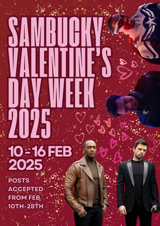
SamBucky Valentine's Day Week 2025

The @sambuckylibrary will be holding a Valentine's Day week-long event! While the event will start on February 10th and the prompts will end on the 16th, the event will continue to accept entries until February 28th. During that time, we will be reblogging and sharing the work you guys create here on our blog.
You can post fanfiction, art, fic rec lists, comments, moodboards, podfics, edits, etc. It’ll be a low-stakes event. No need to sign up. Just remember to tag @sambuckylibrary in your post for each fill, and we will be tracking #sbvalentine2025 for reblogs.
If you are posting on AO3, please add it to the SamBucky Valentine's Day Week 2025 Collection.

There are also badges for each fill. For those badges, as well as the FAQ and rules, check the information under “keep reading”.
FAQ
What is this?
It’s a SamBucky week-long event.
Is there any pressure?
No pressure at all. Fill one prompt. Fill all thirteen prompts at once. Do however many you please.
Can I fill more than one prompt with one piece of art/one fic?
Yes! You can fill one prompt with one piece of art or fic. You can try to fill all thirteen prompts during the week at once with one piece of art or fic. You can do any number in between.
Are there any prizes for making anything for this event?
Just the satisfaction that you made something cool.
Is it just SamBucky?
Yes please, just SamBucky. There can be side ships, but the main ship should be SamBucky.
How long will this event run?
It will run from February 10th and run until February 28th.
I heard there are badges I can use for each fill?
There are! The badges will also appear each day of the first week of the event, but here they are just in case:








RULES AND GUIDELINES
What are the guidelines for the bingo?
I will be borrowing some of this from the MYSU Valentine’s Day Bingo 2022 Guidelines, since they were fantastic.
For Everyone:
1. Remember to @sambuckylibrary in the post as well as #sbvalentines2025.
2. Please also tag the prompt you’re filling (for instance, if the square is “Redwing”, use “#redwing” as one of your tags when posting about it on Tumblr).
3. If you’re uploading to AO3, please:
a ) Say somewhere which prompt you’re filling.
b ) Add it to The SamBucky Valentine's Day Week 2025 Collection (SamBucky_Valentines_Day_Week_2025).
For Artists:
1. Create at least one piece of new art that can’t have been posted anywhere else before this.
2. All visual art forms are welcome:
a ) Gifsets, at least 2 gifs.
b ) Aesthetic boards or moodboards, at least 4 images each.
c ) Drawing/painting, that is not a sketch.
d) Fan video.
e) Graphics edit.
For Authors:
1. At least 500 words.
2. Posted on Tumblr or AO3.
3. Can be part of a series, but should work as a standalone.
For Podficcers:
1. The podfic should at least be 5 minutes long.
2. It should be posted on either Tumblr or AO3.
3. The podfic can be of a fic made for the event, a fic not made for the event while still adhering to the prompt, or a notfic.
For Fic Rec Lists:
1. You must have at least three fics or podfics on the rec list.
2. Make sure to give brief descriptions of the fics or podfics as well as their rating and wordcount.
For Commenters:
1. Any amount of comment counts, from a heart emoji (“❤️”) to an essay.
2. We would rather this be about what makes you happy and joyful about reading than any scathing critiques.
Things to be mindful of when creating:
For Sam
Avoid framing Sam only as a caretaker or emotional support for Bucky. Be mindful of Sam acting angry or aggressive in an out-of-character way and falling into the angry/sassy Black man trope (check out the MCU source material to help with character traits).
Avoid decentering Sam as a main character and refrain from focusing entirely on Bucky.
In art: avoid whitewashing Sam’s skin and research drawing Black characters.
General disclaimer: Race affects every aspect of his life, including interacting with police/government and the white structures of the world when it comes to performing his duties as Cap and simply being a Black man that lives in the U.S.
For Bucky
Avoid phrasing “flesh/normal/human hand” to refer to the contrast between his prosthetic arm and his right arm. The phrasing is ableist. You can simply refer to his prosthesis when relevant, otherwise use “right/left arm/hand”.
For more information, please check out this document suggested by @ninesdb on how to write Bucky as an amputee. @ninesdb is also open to questions if you have any queries not answered by the google doc.
Specific Tags:
Avoid tags in AO3 like “Sam Wilson is a Gift”, “Sam Wilson is a Saint”, and “Bucky Needs a Hug”.
Have fun and we look forward to your Valentine's Day fics!
- The Mods
#sbvalentine2025#sambucky#sam wilson#bucky barnes#sambucky events#sambucky valentine's day event#valentine's day#sambucky fan art#sambucky podfic#sambucky edits#sambucky fic recs#sambucky fanfiction#sambucky moodboard#sambucky art#mod: thatmexisaurusrex
86 notes
·
View notes
Text

TJ MIKELOGAN's HALLOWEEN 2024 EVENT
RULES:
Use the tag #USERTJ to share your creations (and so I can reblog them)
Include "TJ MIKELOGAN's HALLOWEEN 2024 EVENT" + that day's prompt in your caption
Reblog this post
THINGS TO KNOW:
This event is open to anyone who wants to participate – gifmakers, editors, etc. – and you do not have to be following me if you don’t want to! Create gifsets, graphics, moodboards, whatever you enjoy!
You can do as many or as few prompts as you want! This is supposed to be fun, so no need to put unnecessary pressure on yourself.
Interpret the prompts however you see fit; stick to them as loosely or as rigidly as you want! If you have any questions, don't hesitate to send me an ask or DM!
When I reblog your creations, I will tag them as halloween24event and I will tag mine as *halloween24
Make sure to check out the #USERTJ tag as well so you can see what everyone else is coming up with and share what they’ve created! Even if you’re not participating in the event yourself, please support creators by REBLOGGING!
PROMPTS:
DAY 1: Your go-to Halloween movie DAY 2: Colors – orange and black DAY 3: Foreign horror DAY 4: Classic horror (pre-2000s) DAY 5: Villains DAY 6: Horror parallels DAY 7: Vampires DAY 8: Costumes and makeup DAY 9: Horror movie soundtracks DAY 10: Animation DAY 11: Obscure horror DAY 12: Newer horror (2000-2010) DAY 13: Horror television DAY 14: Horror tropes DAY 15: Halloween episodes/specials DAY 16: Colors – purple and green DAY 17: POC in horror DAY 18: Spooky musicals DAY 19: Horror remakes DAY 20: Quotes DAY 21: Make it horror DAY 22: LGBT+ horror DAY 23: Modern horror (2010-2024) DAY 24: Horror sequels DAY 25: Final girls DAY 26: Colors - black & white DAY 27: Period (historical) horror DAY 28: Halloween nostalgia DAY 29: Horror film that scared you the most DAY 30: Favorite horror movie DAY 31: Wildcard – your choice
last year's event post + creations
gif frame/border can be found here by @raccoonscity
Below the cut, I’m tagging those who reblogged my original poll regarding this event and were either interested in participating or signal boosting, those who participated last year, as well as some moots who’ve expressed interest in all things Halloween and horror. Regardless of why you were tagged, please don't feel obligated!
@kizzyedgelll @scarecrowmax @vinmauro @sidprescot @showyoumyfavoriteobsession
@thepunkpanther @idlewarning @3rdboywonder @hollytanaka @rhcenyra
@mvthr @taiturner @stuckinthedeadlights @chappelroans @maybethistimemegz
@katieskrsgard @charmedslayer @marionsravenwoods @kvtnisseverdeen @usertiff
@sapphic-girls @elssbethtascioni @esmecarmona @maxinesminx @maxanor
@magicaplin @miwtual @scullys-scalpel @sculien @muldxr
@angelamcss @finnickodaiir @ianmckellen @cowboykeery @laurabenanti
@chaoticroad @muldery @kizzyedgelll @leodanbrock @anyataylorjoys
#*halloween24#horroredit#halloweenedit#gifmakerresource#completeresources#dailyresources#chaoticresources#horrortvfilmsource#junkfooddaily#userriel#userairi#userzal#tuseraicr#usermaguire#alexlook#useralien#userveronika#tusercj#usergwendaria#userhann#usermalina#userbrittany#tuserheidi#janielook#usermagic#userbuckleys#userfanni#usermimsi#userpriyas#nessa007
270 notes
·
View notes
Text
louis and claudia r literally everything the tragedy and horror lovers on this site always want with nuanced, flawed parents and justified angry and hurting kids and somehow claudias relationship with louis is always made about lestat and his mommy issues instead too. even though we have absolutely none of that yet in the show. like theres no reason for this except u dont want to engage with complicated, interesting stories spotlighting black protagonists
still havent forgiven yall for making the entire iwtv s2 plot themes of second chances, being failed and hurt again, grief and regret, lost childhoods and infantilization, long game manipulation, artistry and voyuerism, cycles of violence, and the complicated emotions in families with past trauma.... about armandanial. like that season gave EVERYTHING, delivered almost everything it possibly could for louis's arc, to set up claudia's tragedy.. but its abt a weird toxic romance yall invented in ur head. even ignoring the ACTUAL canon fascinating and complicated one ARMAND WAS ALREADY HAVING onscreen bc uhhhh old man yaoi or smth. yall can write a 2k meta post abt the way armand's eyes skated over daniel lingeringly and make every other post in the armand tag abt them but the real story of louis being vulnerable to abuse AGAIN right after leaving lestat or claudia's longing and bitterness for family while unable to trust louis just go unremarked some months later.
#my post#iwtv#its obviously not all of the fandom bc theres still rlly good posts and meta and gifsets out there and esp from black fandom members#its what black ppl in this fandom have been saying for ages just damn. this show is so wasted on most of you
16 notes
·
View notes
Text

HOW TO: Make an iPhone Layout + Downloadable Template
Hi! I've gotten a few messages asking for a tutorial on my iPhone gifsets — but instead of only doing a tutorial (that would probably be triple the length this one already is), I decided to turn my layout into a template with all the bits and bobs! In the "tutorial" under the cut, I'll share everything you'll need, a free template download, and quickly go over how to use this template. :)
Disclaimer: This template uses Video Timeline and this tutorial assumes you have a basic to intermediate understanding of Photoshop.

PHASE 1: THE ASSETS
1.1 – Download fonts. These are the fonts used for all assets I've included in my template: – SF Pro or SF Pro Display (Regular, Medium, Bold): Either version works, they look nearly identical. You can download directly from https://developer.apple.com/fonts/ or easily find it via Google – Bebas Neue: Free on Google Fonts, Adobe Fonts, and dafont – Times New Roman (Bold): Should be a default font in Photoshop

Make sure to download and install any of the fonts you don't already have before opening my template. That way, once you open the template file, all the settings (font size, weight, spacing, color, opacity, etc.) are as intended.
1.2 – Download my template. Before you use my template, all I ask is that you don't claim or redistribute it as your own and that you give me proper credit in the caption of your post. Making these iPhone gifsets takes me a longgg time and turning this layout into a template took several hours too.
DOWNLOAD TEMPLATE VIA KO-FI ← This template is completely free to download (just enter $0), but if you feel inclined to tip me, I appreciate you! 💖
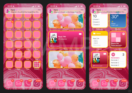

BTW this template also includes some of my frequently used icons!
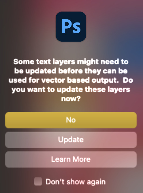
NOTE: If, for some reason, you open the template and see the pop-up shown below, click "NO" — otherwise, the fonts will be all messed up:
And if you see this triangle with an exclamation point by a text layer, don't double-click it — it'll mess up the font as well:

PHASE 2: THE GIFS
I'm just going to briefly go over gif sizes and my recommendations. Also, keep in mind when grabbing your scenes, you'll want all of these gifs to be the same amount of frames.
2.1 – Background Gif: 540 x 540 px. I recommend this size so you have a good amount of visibility for the gif behind the iPhone wallpaper. I also recommend making this black and white (or in my case, black and white with a slight blue tint — idk I just like the way it looks) so the wallpaper coloring can stand out.
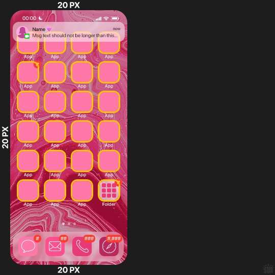
2.2 – Wallpaper Gif: 230 (w) x 500 (h) px. Keep in mind the very narrow dimensions of the wallpaper! And also keep in mind that you'll have a bunch of apps and widgets covering the image. I try to use wide shots (or layer my clips into looking like wide shots). Also, keep in mind your color scheme for your set and your character's aesthetic! I tend to focus on one or two colors for the wallpaper.
I usually position the wallpaper to the side with 20px bumpers, so there's lots of space to see the background:
2.3 – Large Photo Widget Gif: 201 (w) x 96 (h) px.
2.4 – Small Photo Widget Gif: 94 x 94 px.
PHASE 3: THE TEMPLATE – "IPHONE" FOLDER
In this section, I'll try to quickly walk you through how to use this template and some bits that may require extra instructions. I'll be going through each folder from top to bottom.
3.1 – Status Bar. Time, Service, and WiFi are pretty self-explanatory. In the Battery folder, you can use the shape tool to adjust the shape layers labeled "Fill (Adjustable Shape!)" to customize the battery level.
3.2 – Message Notification. Again, these are pretty self-explanatory. I've already masked the circle for the contact photo, so you can simply import any photo and use the transform tool to shrink it down. The circle is 24x24 px. If you don't want to use a photo, there's another folder called Default Initials.
If your message text can't fit the text box, the message should end with ellipses which is how iOS caps off long texts.
3.3 – Blurred Banner (IMPORTANT) This folder is easy to miss because there's only one placeholder layer in there. On iPhones, the area behind a banner notification and the dock get blurred (including the wallpaper and any apps).
What to do: Make a duplicate of the apps in Row 1 and/or widgets that intersect the message banner, convert them all into one smart object, apply a Gaussian Blur filter (Radius: 3.0 pixels) on the smart object, and move the smart object into this masked folder!
(There's another masked folder in the Wallpaper folder for the dock which I'll go over in that section.)
3.4 – Apps Turn off the yellow guide if you don't need it to keep things aligned and turn off layers you don't need by clicking the eye icon. Replace the "App" placeholder text with your app name, change the color or gradient of the square to compliment your color scheme, and add your custom app icon overlay!
If you can't find an app icon you need from the ones I provided, flaticon.com is a great resource. Also, if you can only find the filled version of an icon, check out this tutorial for how to make any text or shape into an outline.
Also, each app folder has 4 notification bubble options (1-4 digits). Again, you can toggle these on and off as you need!
3.5 – Big Widgets I like using these when my wallpaper has A LOT of negative space to fill. I included the Photos and Books widgets in my template, but there are lots of widgets available on iPhones. You can check some of the other ones I've done here, or if you have an iPhone, simply try adding some widgets to your phone!
There are also widgets bigger than these, but they would take up half of the phone screen which is why I don't use them for these edits.
3.6 – Small Widgets The only thing I'll say about these — because they're pretty straight forward — is there are a lot more weather themes than I included in my template. Also, if you set your character's phone to evening, the weather widget will show a dark background (sometimes with stars), so keep that in mind.
Speaking of, I've included Light Modes and Dark Modes for, I think, every applicable widget.
3.7 – Page Dots These barely perceptible dots indicate that your character has more pages of apps than shown in your gifset (so if an anon tries to come at you, you can just say "it's on the next page of apps" /j /lh)
3.8 – Dock Again, the dock has notification bubble options and I've included the default app designs, custom filled designs, and custom outlined designs for iMessage, Phone, Email, and Safari (there's also a FaceTime alternative if that's how your character rolls). These are usually the apps people keep in their Dock, but this is fully customizable too. So, if your character is, like, super obsessed with Candy Crush or something and needs it in thumb's reach — you can put it in the dock.
3.9 – Wallpaper This whole folder is masked already to a 230x500 px rounded rectangle.
Inside, you'll find another "Blurred Portion" folder for the area behind the message banner notification and the dock.
What to do: Duplicate your gif layer and place it in this folder, remove any sharpening filters, and apply a Gaussian Blur filter (Radius: 3.0 px). Be sure to add any coloring/adjustment layers ABOVE this folder and your original sharpened gif layer.
PHASE 4: EXPORT
We made it!
I hope this template makes it super easy for you to recreate this layout! If you decide to try it out, feel free to tag me with #usernik.
If you notice anything wonky about the template, kindly let me know so I can fix it! And if you have any questions about how to use this template, please don't hesitate to send me a message! I just ask that you try to be specific in your question so I'm able to answer you the best I can!
#gif tutorial#completeresources#userpickles#usersmia#userabs#usertreena#alielook#userkosmos#usershreyu#userzaynab#tuserabbie#useryoshi#usersalty#tuserlucie#usernanda#userelio#userhella#usercats#gfx*#resource*
926 notes
·
View notes
Note
hi alie! can i request on how to do this grey-white text? /post/721285784354865152/ thanks!

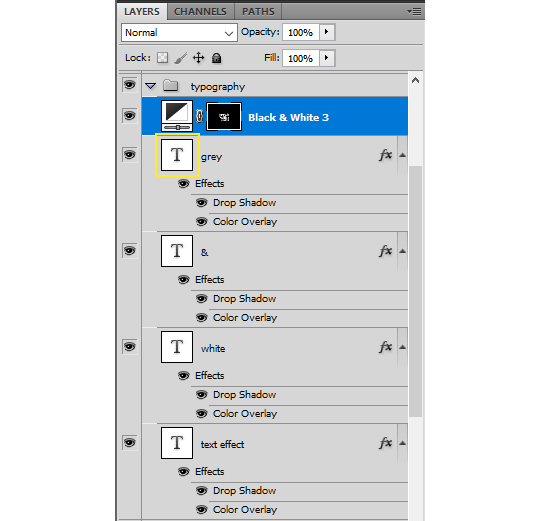
hiii, sure! it's quite simple actually, here are the steps for the text effect on this gifset (and settings/screenshots under the cut):
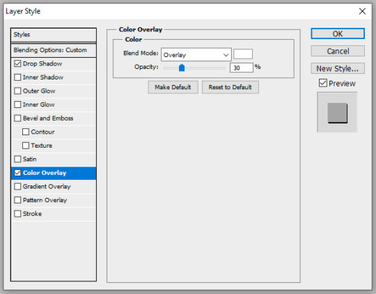
type out you text and select white for the color, then set this text layer's blending mode to Difference
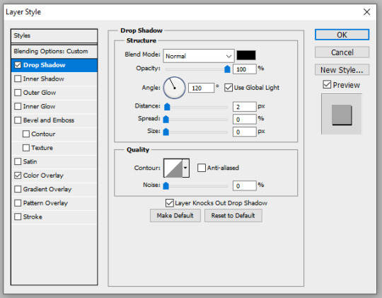
double click on the layer to get to the layer style options and add a Color Overlay. choose the color white (black also works) and set the blending mode to Overlay. play with the opacity slider as you wish, this will brighten your text and it helps for gifs that have a high contrast behind the text.
if you don't need to brighten the text, put the color overlay's blending mode to Hue, you're actually done right here, easy!
optional: if you're using the color overlay as an overlay like i have for that particular gifset, you need to create a mask of your typography. to do that hold the ctrl key and click on the text layer's icon (the "T", the yellow box on one of my screenshots). this will make a selection of your typography. if you have multiple text layers, hold CTRL + SHIFT to select multiple layers. once your selection is done, go to the top menu and Layer > New Layer > New Adjustment Layer > Black & White > Ok. make sure that layer is on top of the text layers.
add a Drop Shadow if you want, and that's it, the effect is done :)
#alie replies#Anonymous#*ps help#photoshop#resource#tutorial#resources#allresources#typography#completeresources#resourcemarket#userabs#userdahlias#usercats#usersmia
328 notes
·
View notes
Text
just saw a lovely gifset of the Birdcage and thought again about how the older I get and the more people in my ethnosocioeconomic cohort (lower middle class but higher educated white west coast millennial american) I meet the more apparent it is how weird it was for my boomer mom to go out of her way to show us gay, Black, Jewish, and queer movies outside of the typical family movie diet that was usual at the tjme. like as part of her media literacy program for her children, both of whom did in fact turn out queer.
this is an annoying post and I'm sorry, it's got that twitter backhanded "well *I* had a good childhood here's a cute story" tone to it and I apologize. the other way to tell stories like this is via laconic autobio someone calls "arrestingly vulnerable" in a NYT interview where you're sitting in your charmingly cluttered apartment looking out a window etc. sorry again. I think my point is just that I'm so glad to understand 99% of the movie references drag queens are making to each other
209 notes
·
View notes