#please‚ do not reblog!
Explore tagged Tumblr posts
Text
For Minerva, to let her hair loose is to be at her most vulnerable state, and so she seldom lets it. The most she lets it flow down her back is in a braid when she goes to sleep, but even then it is not completely free, is it ? So, normally, it's kept in a tight, low-lying bun there, at the back of her neck.
2 notes
·
View notes
Text
I’m really glad that Aaron’s self-immolation for Palestine is getting attention, but on November 8th there was also a Congolese man who did the same thing for the genocide happening in the DRC. From what I read in the article above, his fate and identity are unknown but I think his story should be getting equal amount of traction and I haven’t really seen anyone talking about it on Tumblr specifically yet.
#if any more info about this guy came out do please add it in the reblogs#none of us are free until all of us are free#aaron bushnell#free palestine#free congo#palestine#congo#democratic republic of the congo#important
27K notes
·
View notes
Text
✍️ more fic writer asks!
reblog & your followers can send asks with the questions they’d like you to answer!
the last sentence you wrote
a character whose POV you’re currently exploring
how you feel about your current WIP
a story idea you haven’t written yet
first sentence of the fifth paragraph of an unpublished WIP
the word that appears the most in your current draft (wordcounter.net can tell you)
your preferred writing fonts
if you had to write a sequel to a fic, you’d write one for…
start to finish, how long did it take you to write the last fic you posted?
what is the longest amount of time you’ve let a draft rest before you finished it?
a WIP you’d like to finish someday
a trope you’re really into right now
a fandom you’re thinking about writing for
where do you get your inspiration?
favorite weather for writing
favorite place to write
talk about your writing and editing process
if you keep them, share a deleted sentence or paragraph from a published fic
the most interesting topic you’ve researched for a fic
in what year did you publish your first fic?
when did you publish your most recent fic?
do you ever worry about public reaction to what you’re writing? how do you get past that?
pick three keywords that describe your writing
how do you recharge when you’re not feeling creative?
besides writing, what are your other hobbies?
are you able to write with other people around?
your favorite part of the writing process
your least favorite part of the writing process
how easy is it for you to come up with titles?
share a fic you’re especially proud of
#please reblog to your own followers!!#you don't need to send me any (I just like making them)#I meant to do this yesterday but was too sleepy#fic writer asks#ask game#I have 100% asked these on discord or twitter at some point#but there are only so many Thoughts in my poor head
9K notes
·
View notes
Text
To illustrate this post by @mayahawkse I would like to visualize to you the difference:
A post in 2023:

A post in 2014:

A zoom out of the same post:
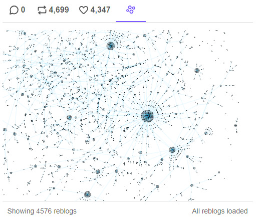
This is what a community looks like.
See how in 2023 almost all of the reblogs come from the OP, from their few hours/days in the tag search. Meanwhile in 2014 the % of reblogs from OP is insignificant, because most of the reblogs come from the reblogs within the fandom, within the micro-communities formed there. You didn't need to rely on tags, or search, or being featured. Because the community took care of you, made sure to pass the work between themselves and onto their blog and exposed their followers to it. It kept works alive for years.
It's not JUST the reblog/like ratio that causing this issue, it's the type of interaction people have. They're content with scrolling and liking the search engine, instead of actually having a reblogging relationship with other blogs in their community.
Anyways, if you want to see more content you like, the only true way to make it happen is to reblog it. Likes do not forward content in no way but making OP feel nice. Reblogs on the other hand make content eternal. They make it relevant, they make it exist outside of a fickle tumblr search that hardly works on the best of days.
If you want more of something, reblog it.
#i said i wont ever rant about this bc it's unseemly but HONESTLY.#you simply cannot complain about not having enough of A or B or C and then never reblog / interact with the content you love.#If you LOVE something you cannot just leave a like and silently wait for more to happen#I know countless of content creators that simply stopped doing art/writing fic/making edits#You need to understand that fandom content is made FOR the fandom FOR the engagement FOR the entertainment and fun it makes.#If a content creator does not have fun IN the fandom-- why would they spend the scares free time they have on making this content?#And we're not talking about things that you don't like-- no one expects you to reblog things you don't like.#However I think it's safe to say that when a post has more than 5k it's not some random shitpost with no value.#tumblr issues#tumblr#content creators#buns.txt#something something please don't starve your local clowns
35K notes
·
View notes
Text
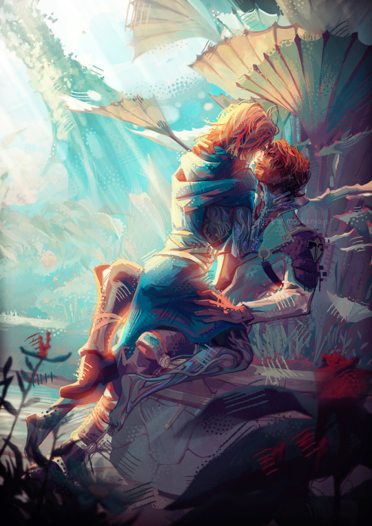
Stay your pretty eyes on course
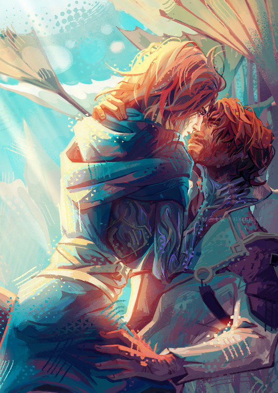
#jayvik#viktor#jayce#jayce talis#arcane#arcane fanart#jayvik fanart#i think a lot about all the universes where jayce couldnt#you know#do it#we all know if viktor had been awake when he arrived jayce would have folded#oh to let yourself being corrupted by your cult leader husband and embrace toxic yaoi#anyway please reblog this i've spent so many hours on it lol#trying to master clip studio paint for the first time#myart
1K notes
·
View notes
Text
A week or two after Ithaca saga
Odysseus: (eating lunch with his wife and son) -get it?! I responded to his rhetorical question with a literal answer-
Penelope: (nodding along, unfazed)
Telemachus: ….(nervously sips drink) (chokes and spits it out)
Odysseus: My boy, are you alright?
Telemachus: Yeah- uh, just, what kind of wine is this?
Penelope: (tastes her cup, hums) interesting. It doesn’t look like wine, either…
Odysseus: (frowns and smells it) ….what is this..?
Telemachus: (looks into ‘wine’ pitcher) ….father?
Meanwhile, up in Olympus:
Ares: (giggling) he’s finally trying it-
#next up is Hefuffuf making a statue and naming it Uncle Hort#epic memes#epic the wisdom saga#epic fandom#epic the musical#epic#epicthemusical#odysseus#odyssey#epic musical#jorge rivera herrans#epic odysseus#penelope epic the musical#penelope#epic telemachus#telemachus#ares#epic ares#misheard lyrics#god games#please reblog with the tags because I guess some people don’t have the same level of EPIC brainrot as I do#please
2K notes
·
View notes
Text
you can use this site to find out which phase you were born under, and this site to see if you were born on a blue moon!
#i know a blue isn’t Technically it’s own phase but i still think it counts <<<333#also Hi please reblog if you do this bc im curious :3c#blue moon*
12K notes
·
View notes
Text
DPxDC Prompt #13
Danny was born in Gotham and ended up for adoption shortly after. The woman who birthed him listed the father on his birth certificate as The Batman. Everyone laughed it off as a joke from a woman who didn't know or didn't want admit who the father was. They left it be, but no one really thought it was true. It couldn't be. Right?
#DPxDC Prompt#DPxDC#Thought about going into more detail with the story my head is building here#But ultimately decided to leave it more open for anyone to take and build in any direction they please#That said if anyone wants to hear more about the version I got going on in here#Feel free to ask#I can do a reblog with my thoughts#After I finish work for tonight
2K notes
·
View notes
Text
Emergency: Donations needed to survive through the winter!!
[plain text: Emergency: Donations needed to survive through the winter!! /end plain text]
I don’t know how to communicate to you all that Mahmoud Abu Hamam (@ma7moudgaza2) needs your continued attention. He has recently been a victim of fraud, which caused his bank to freeze his account. Now, he is barely getting any help at all.
Mahmoud currently has no access to the 11k he has painstakingly raised after MONTHS of campaigning. This is heartbreaking- all the compromises he had to make to get there; he gave up hopes of evacuating and then again of rebuilding, because nothing was coming in! Now, after a whole year of genocide, Mahmoud is still struggling to get donations. So please help him, now that he is campaigning only to collect survival funds. He needs the money to procure warm clothes and blankets for 20 family members, 10 of whom are children. Gazan winters are terrible and living in a tent with no blankets or warm clothes is a death sentence.
I promise you that your donations won’t go to waste even if Mahmoud has no access to his bank account. His organizer would send him funds via USDT but that cannot be done if there is nothing to send. So please, please galvanize yourselves for the Hamam family now. They have lost everything- their home, their peace, their dreams- and right now all access to lifesaving funds. Please DONATE AND BOOST. Circulate the fundraiser as an emergency amongst your family and friends. DM your mutuals, your close fandom friends but please help Mahmoud collect the necessary funds.
Currently $11,543 USD on the gofundme. Let us at least raise 1k and help Mahmoud reach $12,543.
Don’t forget, NO DONATION IS TOO SMALL. Mahmoud barely has anything left with him and it is not an exaggeration to say that your participation would essentially save his life.
@oorevitcejda @yellowwperil @sandersgrey @ofide @rukafais
@officialpenisenvy @theonpilled @fleurrice @tetrafelino @think-queer
@timothylawrence @roakkaliha @lostacelonnie @huzni @laurajameskinney
@gamb0fficial @vincentspork @teabisexual @officialscud @evilponds
@dinodamage @yurischolar @lune-tic @lipid @newporters
@witticismz @dovv @capricornpropaganda @charlott2n @determinate-negation
@parsleyrosemarybotch @tadpoledyke @userpeggycarter @thedigitalbard @melon-colli
@demilypyro @lesbocrocker @kahin @chososhairbuns
@zamanassad @wayneradiotv @jihaad @evillesbianvillain
@stuckinapril @goldenspirits @scarletlich @rongzhi @marxistcomedy
2K notes
·
View notes
Text


#gimmie a second im having a breakdown#making gifs with tears in my eyes nbd#niko sasaki#dead boy detectives#dead boy detectives agency#dbda#dbdaedit#dbdedit#dbdagifs#tvedit#im sorry i do not know the goodest tags for this show i did my best#giffed🍂#please use tumblr's gif search feature if you want to put one my gifs in a new post ty#do not repost gifs - reblogs or tumblr gif search feature only thanks!
2K notes
·
View notes
Text
Following her decision to become a Healer at St. Mungo's after finishing her studies, and as discussed with her head of house, professor McGonagall, Mary becomes madam Pomfrey's part-time assistant in the infirmary in her final school years, 1977 and 1978. The days where one can find her there, as agreed with McGonagall and Pomfrey both, do not interfere with her studies and classes, though there might be special occasions, such as Quidditch matches and training, where she might be called in order to assist the Madam and also learn something new with a more hand-on experience.
3 notes
·
View notes
Text
URGENT!!
Save a 3 month olds life!!
I am writing this post on behalf of Israa @nasseer220 who is fundraising to support her, her two children, and her father. Here is a previous post explaining her circumstances. She has two critically ill people to support, her father, who has cancer and recently had a stroke, and her 3 month old daughter Enaam, who has hepatitis, and has recently taken a turn for the worse, and needs urgent liver surgery. This surgery is scheduled for tomorrow, and they need $1700 USD to pay for it. Enaam was born during the genocide, and it is all she has known. This surgery will allow her to keep fighting for her life, so that one day she will know a life outside of the genocide. Yesterday, we raised most of the amount needed for Enaam's surgery. This is great! I cannot thank you all enough for your generosity! However, we are not quite at the goal yet. I know we can raise the money Israa needs to save her daughters life. Continue to donate and share, we cannot let Israa and Enaam down.
Make sure to get your donation matched by @musicfren
WE HAVE LESS THAN A DAY TO RAISE £300!!
Tagging people under the cut, message me if you don't want to be tagged anymore.
@neptunerings @socalgal @robotpussy
@rhubarbspring @duncebento @wotsukai
@bulliness @intersectionalpraxis @imjustheretotrytohelp
@nbblacksheep @deepspaceboytoy @strangeauthor
@lafemmemacabre @toesuckingoctober @heritageposts
@dlxxv-vetted-donations @fading-event-608 @sayruq
@omegaversereloaded @capricornpropaganda @hoodhinata
1K notes
·
View notes
Text
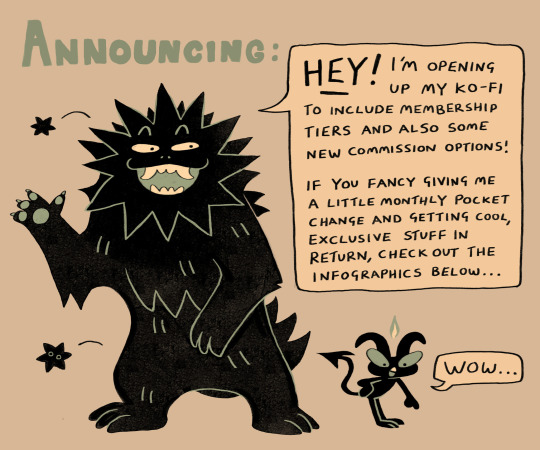
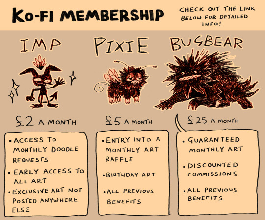

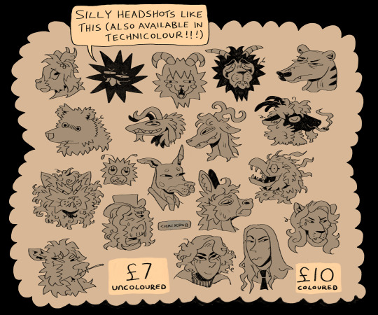
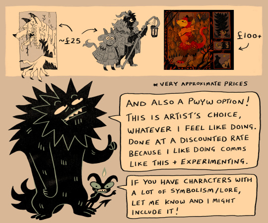
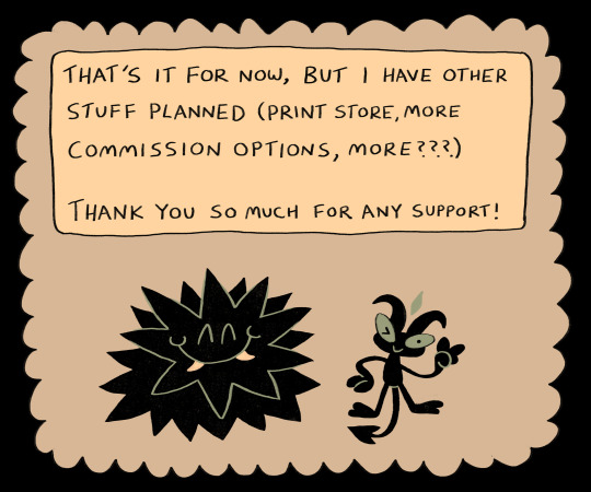
KOFI
commissions: here!
membership: here!
more in-depth explanation above lol but yes, opening up my kofi for the above stuff! i'll still be posting art to my socials as usual, but there'll be more consistent/exclusive/early-access art and wip posts for members on kofi, along with all the benefits above
thank you very much for any support as always! muah
#my art#commissions#illustration#oc#beas#wellyboot#furry#anthro#i'll probably make a separate post later with some of the painted headshots i've done because i like them and they're fun to do#also sorry i will probably reblog this a bunch lol. forgive me....it's taken absolutely ages to work on all this#graphic design is NAWT my passion but hopefully this is vaguely interesting to look at/read through#i'm hoping to slooowly transition to making art on a more regular part-time job basis so i have to....advertise myself....#mortifying for everyone involved but it will give me more time to make more art (if successful) so also a win for everyone?#also i put it in the pixie tier description but please please PLEASE don't subscribe just to get the cheap birthday art and then unsub....#you will make me cry and wither away and i will have to remove it as a perk#(obligatory: of course feel free to unsubscribe at any time no explanation needed....just don't play the system i beg you)
817 notes
·
View notes
Text
been dicussing it with a few mutuals and we're all in agreement but I've seen some wild discrepancies in the character tags so out of interest:
#gabriel agreste#miraculous ladybug#not expecting this to reach anyone#but please answer#🥺#also reblog for reach#nathalie sancoeur age next if you do#hawk moth#shadow moth#monarch
519 notes
·
View notes
Text
so, Amity Parkers fit in in gotham.
plus the city is so rich in ectoplasm it's almost like at home! in fact they probably only need their ecto-sups because it's so cursed.
the fear toxin works like caffeine for liminals. they found out accidentally while Wes was mid-rant and forgot his gas-mask like a dumbass he is.
Wes being Wes figured out the Bats identity in the first month since moving but he learned his lesson, kept his mouth shut and corkboard hidden safely in the realms having joined the Team Phantom a while ago.
Val visits some of her friends here sometimes, with the suit being part of her body now she's basically halfa-adjacent (she has suspicions she's one major near death experience away from actually becoming one) and she's getting major "Fuck-off it's my haunt" vibes from Crime Alley. maybe Red Hood's a ghost? not gonna check now.
Paulina is having emotions about Nightwing's ass and no one wants to hear them, curse liminal ability of ghost-speak.
all things considered? life is well. tho it might be a matter of time before the bats start getting annoying.
#dpxdc#liminal amity park#Amity Parkers in Gotham#somethin exploded on the next street just like home#Wes is addicted to fear toxin#he is also the Riddler's nightmare#the bats are concerned TM#why are these out of town people so chill in gotham??#why are they trained??#IS THAT PERSON DRINKING LAZARUS WATER????#Please do repost#damn i want to read that#feel free to use#feel free to reblog
1K notes
·
View notes
Text
I'm very normal. I swear.
SSTP, your fault. this post
#I'll reblog the ask post when it's done#for now I'll leave this here#tf mecha universe#How do I show Vortex panicking is the main problem here#Please insert Shinji's japanese screaming#I only stop now because I have to sleep
587 notes
·
View notes