#playing with gradients and textures
Explore tagged Tumblr posts
Text
tried making a wallpaper in sfm

unedited version below ↓
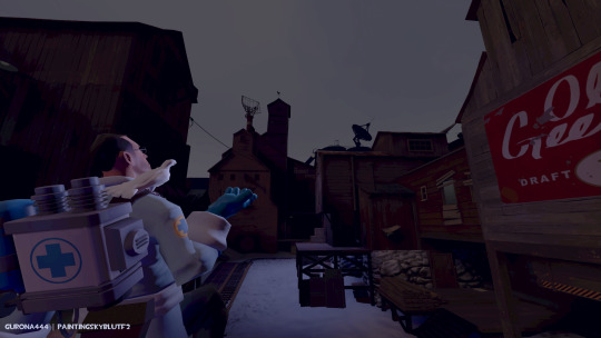
i'll make another one in vertical format for mobile too, someday. feel free to use with credit.
i am not very good at it but if anyone has sfm poster/image requests(or usual doodle requests), my ask box is open!
#tf2#team fortress 2#team fortress two#tf2 medic#medic tf2#tf2 sfm#sfm#source filmmaker#painting sky blu art#it took 2 days total. it took a while because of some bugs as well as blackouts. didnt do a paintover(?). no energy.#just added gradient maps; a few texture brush strokes; blur and played with layer modes a bit.
24 notes
·
View notes
Text
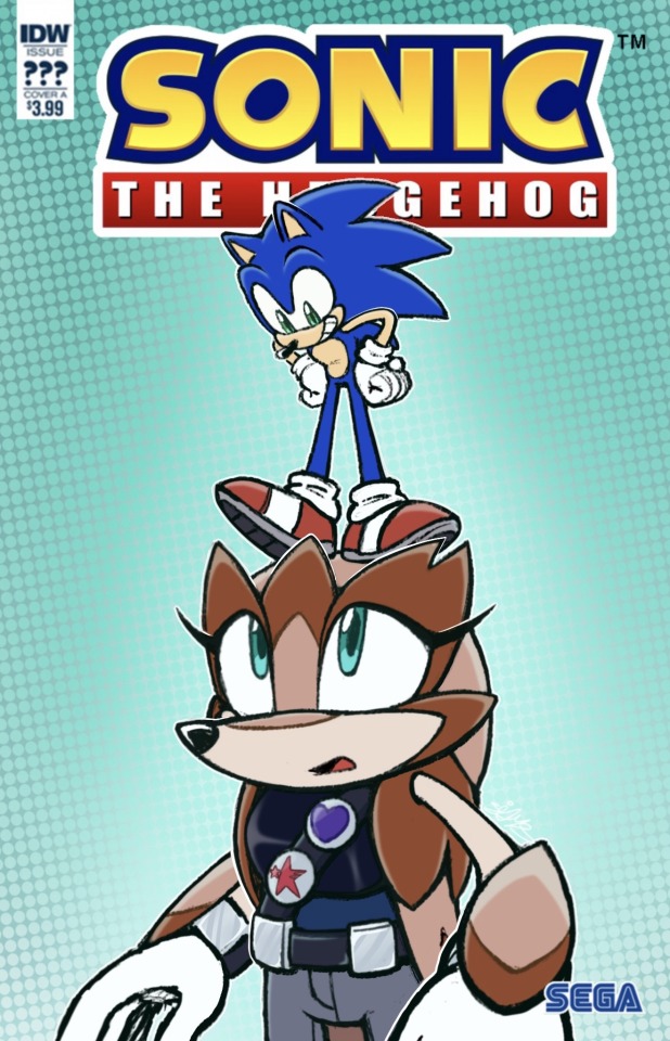
Made another fan cover feat. Rotunda
#i was playing around with gradients and texture brushes and then this just happened#idw sonic#sonic the hedgehog#rotunda the pangolin#scribbs ocs#my art#sonic fanart#sonic the hedghog fanart#sonic oc
44 notes
·
View notes
Text

i am running on 0 sleep and half-assery so this came out poorly but i spent way too long on it so have it anyway. was experimenting with brushes and trying to learn how to make certain textures
god the anatomy on the arms is so bad but something something art is about having fun and i had fun grrrrr
#slugcat#rain world#ive never done the background gradient thing before. i like how i achieved that even though it's very simple looking#and the texturing itself of the mask and skin is obviously very choppy but! i have a basic idea of how to do both now#i really liked doing the mask even though how it's turned out doesnt look very different it actually took a bit. guh#picture based on a very long play session with two friends last night where i killed like 8 vultures and had all their masks in one shelter#+ a scav corpse because he was very Pink
2 notes
·
View notes
Text


playing with values and gradients and skies, love some deep texture
4K notes
·
View notes
Text
HOW TO GLAZE YOUR WORK WITHOUT A GOOD PC(or on mobile)/TIPS TO MAKE IT LESS VISIBLE
Glaze your work online on:
Cara app. It requires you to sign up but it is actually a good place for your portfolio. Glazing takes 3 minutes per image and doesn't require anything but an internet connection compared to 20-30 minutes if your pc doesn't have a good graphic card. There IS a daily limit of 9 pictures tho. Glazed art will be sent to you after it's done, by email. It took me 30 minutes to glaze 9 images on a default setting. Cara app is also a space SPECIFICALLY for human artists and the team does everything in their power to ensure it stays that way.
WebGlaze. This one is a little bit more complicated, as you will need to get approval from the Glaze team themselves, to ensure you're not another AI tech bro(which, go fuck yourself if you are). You can do it through their twitter, through the same Cara app(the easiest way) or send them an email(takes the longest). For more details read on their website.
Unfortunately there are no ways that I know of to use Nightshade YET, as it's quite new. Cara.app definitely works on implementing it into their posting system tho!
Now for the tips to make it less visible(the examples contain only nightshade's rendering, sorry for that!):
Heavy textures. My biggest tip by far. Noise, textured brushes or just an overlay layer, everything works well. Preferably, choose the ones that are "crispy" and aren't blurred. It won't really help to hide rough edges of glaze/nightshade if you blur it. You can use more traditional textures too, like watercolor, canvas, paper etc. Play with it.

Colour variety. Some brushes and settings allow you to change the colour you use just slightly with every stroke you make(colour jitter I believe?). If you dislike the process of it while drawing, you can clip a new layer to your colour art and just add it on top. Saves from the "rainbow-y" texture that glaze/nightshade overlays.
Gradients(in combination with textures work very well). Glaze/nightshade is more visible on low contrast/very light/very dark artworks. Try implementing a simple routine of adding more contrast to your art, even to the doodles. Just adding a neutral-coloured bg with a darker textured gradient already is going to look better than just plain, sterile digital colour.
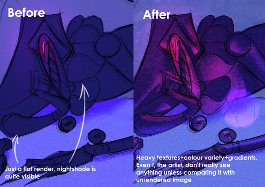
And finally, if you dislike how glaze did the job, just try to glaze/shade it again. Sometimes it's more visible, sometimes it's more subtle, it's just luck. Try again, compare, and choose the one you like the most. REMEMBER TO GLAZE/SHADE AFTER YOU MADE ALL THE CHANGES, NOT BEFORE!!
If you have any more info feel free to add to this post!!
7K notes
·
View notes
Text
My Favorite Cheap Art Trick: Gradient Maps and Blending Modes
i get questions on occasion regarding my coloring process, so i thought i would do a bit of a write up on my "secret technique." i don't think it really is that much of a secret, but i hope it can be helpful to someone. to that end:

this is one of my favorite tags ive ever gotten on my art. i think of it often. the pieces in question are all monochrome - sort of.
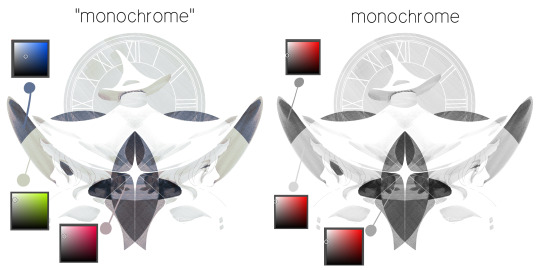
the left version is the final version, the right version is technically the original. in the final version, to me, the blues are pretty stark, while the greens and magentas are less so. there is some color theory thing going on here that i dont have a good cerebral understanding of and i wont pretend otherwise. i think i watched a youtube video on it once but it went in one ear and out the other. i just pick whatever colors look nicest based on whatever vibe im going for.

this one is more subtle, i think. can you tell the difference? there's nothing wrong with 100% greyscale art, but i like the depth that adding just a hint of color can bring.
i'll note that the examples i'll be using in this post all began as purely greyscale, but this is a process i use for just about every piece of art i make, including the full color ones. i'll use the recent mithrun art i made to demonstrate. additionally, i use clip studio paint, but the general concept should be transferable to other art programs.

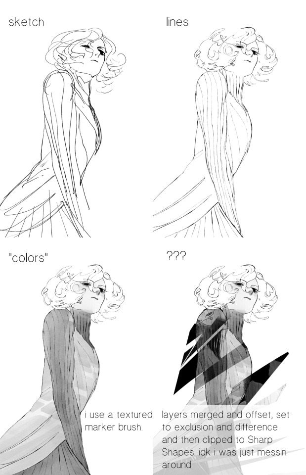
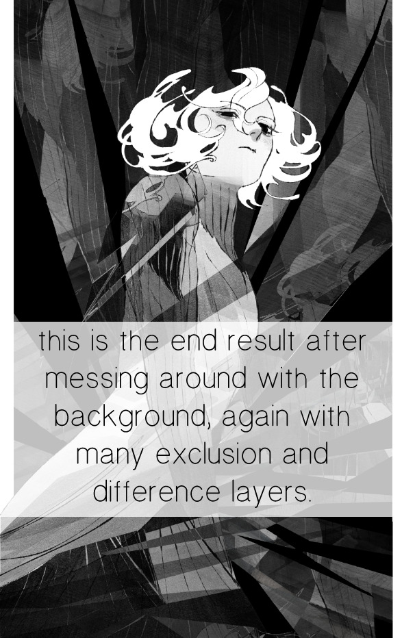
for fun let's just start with Making The Picture. i've been thinking of making this writeup for a while and had it in mind while drawing this piece. beyond that, i didn't really have much of a plan for this outside of "mithrun looks down and hair goes woosh." i also really like all of the vertical lines in the canary uniform so i wanted to include those too but like. gone a little hog wild. that is the extent of my "concept." i do not remember why i had the thought of integrating a shattered mirror type of theme. i think i wanted to distract a bit from the awkward pose and cover it up some LOL but anyway. this lack of planning or thought will come into play later.
note 1: the textured marker brush i specifically use is the "bordered light marker" from daub. it is one of my favorite brushes in the history of forever and the daub mega brush pack is one of the best purchases ive ever made. highly recommend!!!
note 2: "what do you mean by exclusion and difference?" they are layer blending modes and not important to the overall lesson of this post but for transparency i wanted to say how i got these "effects." anyway!
with the background figured out, this is the point at which i generally merge all of my layers, duplicate said merged layer, and Then i begin experimenting with gradient maps. what are gradient maps?
the basic gist is that gradient maps replace the colors of an image based on their value.

so, with this particular gradient map, black will be replaced with that orangey red tone, white will be replaced with the seafoamy green tone, etc. this particular gradient map i'm using as an example is very bright and saturated, but the colors can be literally anything.
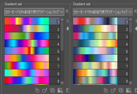
these two sets are the ones i use most. they can be downloaded for free here and here if you have csp. there are many gradient map sets out there. and you can make your own!
you can apply a gradient map directly onto a specific layer in csp by going to edit>tonal correction>gradient map. to apply one indirectly, you can use a correction layer through layer>new correction layer>gradient map. honestly, correction layers are probably the better way to go, because you can adjust your gradient map whenever you want after creating the layer, whereas if you directly apply a gradient map to a layer thats like. it. it's done. if you want to make changes to the applied gradient map, you have to undo it and then reapply it. i don't use correction layers because i am old and stuck in my ways, but it's good to know what your options are.

this is what a correction layer looks like. it sits on top and applies the gradient map to the layers underneath it, so you can also change the layers beneath however and whenever you want. you can adjust the gradient map by double clicking the layer. there are also correction layers for tone curves, brightness/contrast, etc. many such useful things in this program.
let's see how mithrun looks when we apply that first gradient map we looked at.

gadzooks. apologies for eyestrain. we have turned mithrun into a neon hellscape, which might work for some pieces, but not this one. we can fix that by changing the layer blending mode, aka this laundry list of words:

some of them are self explanatory, like darken and lighten, while some of them i genuinely don't understand how they are meant to work and couldn't explain them to you, even if i do use them. i'm sure someone out there has written out an explanation for each and every one of them, but i've learned primarily by clicking on them to see what they do.
for the topic of this post, the blending mode of interest is soft light. so let's take hotline miamithrun and change the layer blending mode to soft light.

here it is at 100% opacity. this is the point at which i'd like to explain why i like using textured brushes so much - it makes it very easy to get subtle color variation when i use this Secret Technique. look at the striation in the upper right background! so tasty. however, to me, these colors are still a bit "much." so let's lower the opacity.
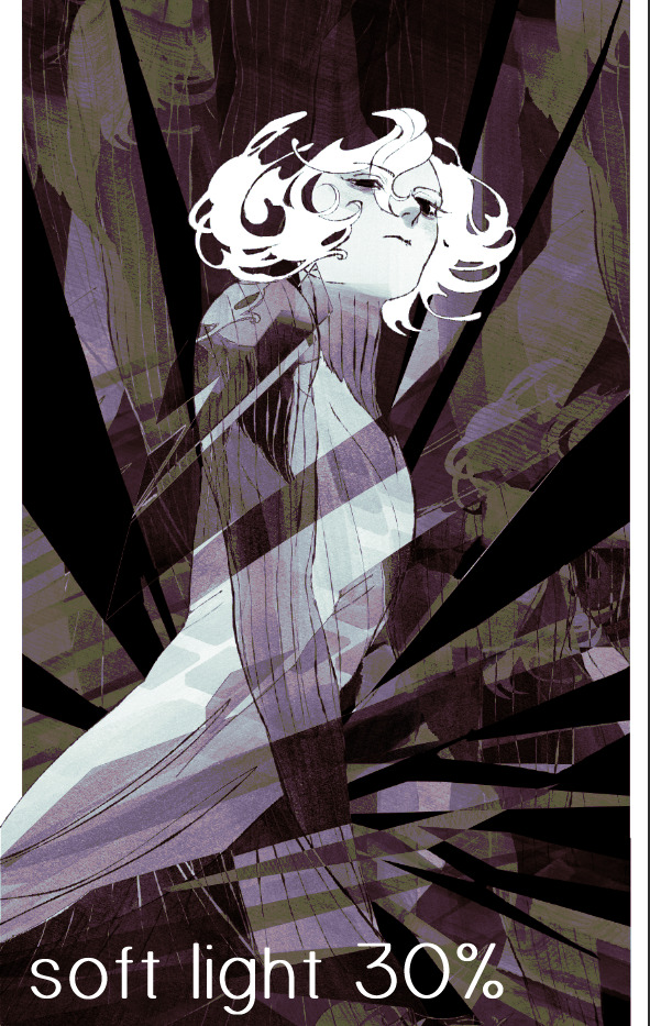
i think thats a lot nicer to look at, personally, but i dont really like these colors together. how about we try some other ones?
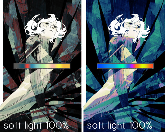
i like both of these a lot more. the palettes give the piece different vibes, at which point i have to ask myself: What Are The Vibes, Actually? well, to be honest i didn't really have a great answer because again, i didn't plan this out very much at all. however. i knew in my heart that there was too much color contrast going on and it was detracting from the two other contrasts in here: the light and dark values and the sharp and soft shapes. i wanted mithrun's head to be the main focal point. for a different illustration, colors like this might work great, but this is not that hypothetical illustration, so let's bring the opacity down again.
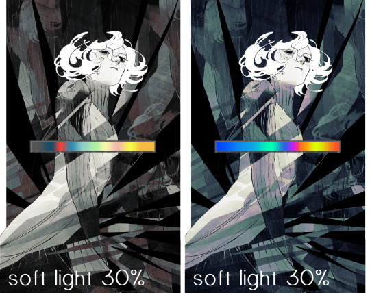
yippee!! that's getting closer to what my heart wants. for fun, let's see what this looks like if we change the blending mode to color.
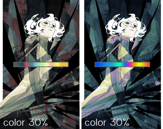
i do like how these look but in the end they do not align with my heart. oh well. fun to experiment with though! good to keep in mind for a different piece, maybe! i often change blending modes just to see what happens, and sometimes it works, sometimes it doesn't. i very much cannot stress enough that much of my artistic process is clicking buttons i only sort of understand. for fun.
i ended up choosing the gradient map on the right because i liked that it was close to the actual canary uniform colors (sorta). it's at an even lower opacity though because there was Still too much color for my dear heart.
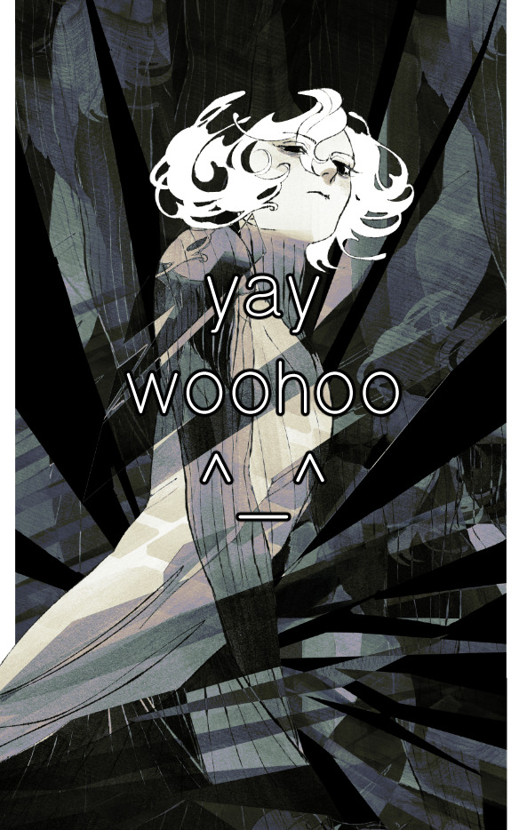
the actual process for this looks like me setting my merged layer to soft light at around 20% opacity and then clicking every single gradient map in my collection and seeing which one Works. sometimes i will do this multiple times and have multiple soft light and/or color layers combined.
typically at this point i merge everything again and do minor contrast adjustments using tone curves, which is another tool i find very fun to play around with. then for this piece in particular i did some finishing touches and decided that the white border was distracting so i cropped it. and then it's done!!! yay!!!!!
this process is a very simple and "fast" way to add more depth and visual interest to a piece without being overbearing. well, it's fast if you aren't indecisive like me, or if you are better at planning.

let's do another comparison. personally i feel that the hint of color on the left version makes mithrun look just a bit more unwell (this is a positive thing) and it makes the contrast on his arm a lot more pleasing to look at. someone who understands color theory better than i do might have more to say on the specifics, but that's honestly all i got.
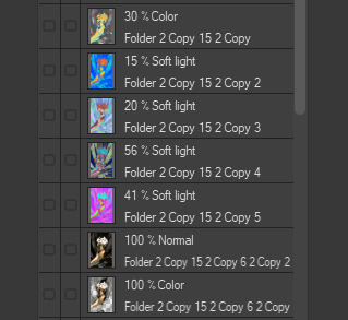
just dont look at my layers too hard. ok?
2K notes
·
View notes
Text
April 20, Beijing, China, National Museum of China/中国国家博物馆 (Part 2 - Dehua white porcelain exhibition/德化白瓷展 continued):
This was actually the very first piece I encountered at the entrance to the exhibition, a gigantic basket of flowers (probably over 1 meter tall and over 1 meter wide?), the entire thing made of porcelain.
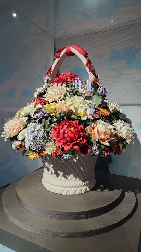
And to reiterate, every part of every piece is porcelain. Though I will say that despite the ultra-realistic shape of the flower petals and leaves, the only detail that hinted at these flowers being made out of porcelain was that the painted colors weren't as vibrant as real flowers. That's it. If you don't examine it up close you really can't tell that it's all porcelain.
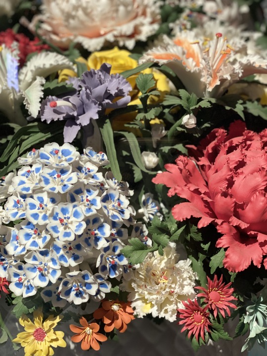
This is a good place to roughly introduce the technical side of Dehua white porcelain. The color of Dehua white porcelain mainly comes from the clay it uses, which is a special kaolin clay (gaolingtu/高岭土 in Chinese) found in Dehua. The clay mineral used naturally contains sericite and quartz, both of which are silica minerals and may have contibuted to the almost translucent look of the finished pieces; it also contains comparatively high amounts of potassium oxides, while the amount of iron oxides present is low. Due to the intricate designs of the pieces, the firing success rate may be very low. All those pieces involving super thin parts representing fabric or paper or flower petals? They may bring the success rate down to about 5%. Which means many of these pieces may be the 15th-20th try that finally survived firing. For people who are more interested in the chemistry of Dehua white porcelain, this paper goes into depth about it. There's also a great book in Chinese that goes into depth all about Dehua porcelain. (link goes to the first chapter only)
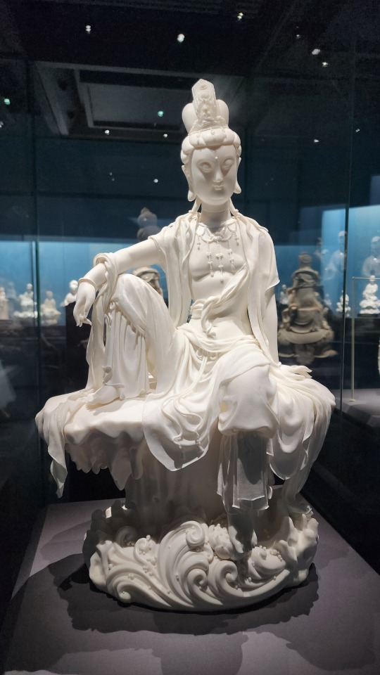
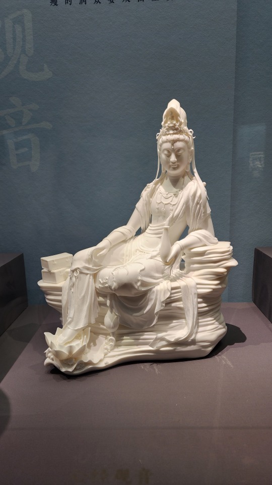
Continuing on, this is one of many Guanyin/观音 (Avalokiteśvara) statues at the exhibition, again with light clothing made out of porcelain:
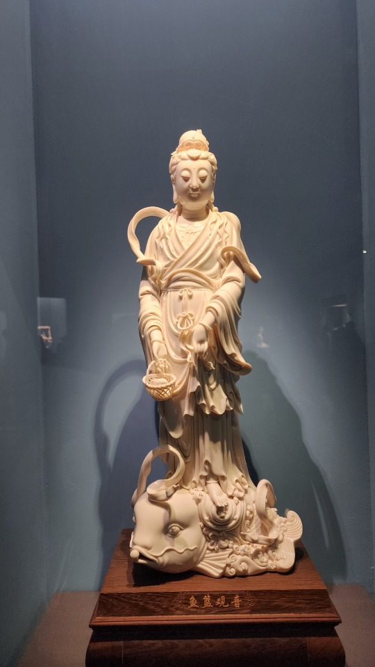
More Guanyin statues in various classic depictions/forms, of which there are 33 total. This particular form is called Yulan Guanyin/鱼篮观音 (鱼篮 means fish basket), and comes from a legend where Guanyin transformed into a beautiful female fish vendor in order to guide mortals.
I believe the text here reads 持经观音 (Guanyin holding scripture)? The Guanyin here is holding a vase instead of a scroll though.
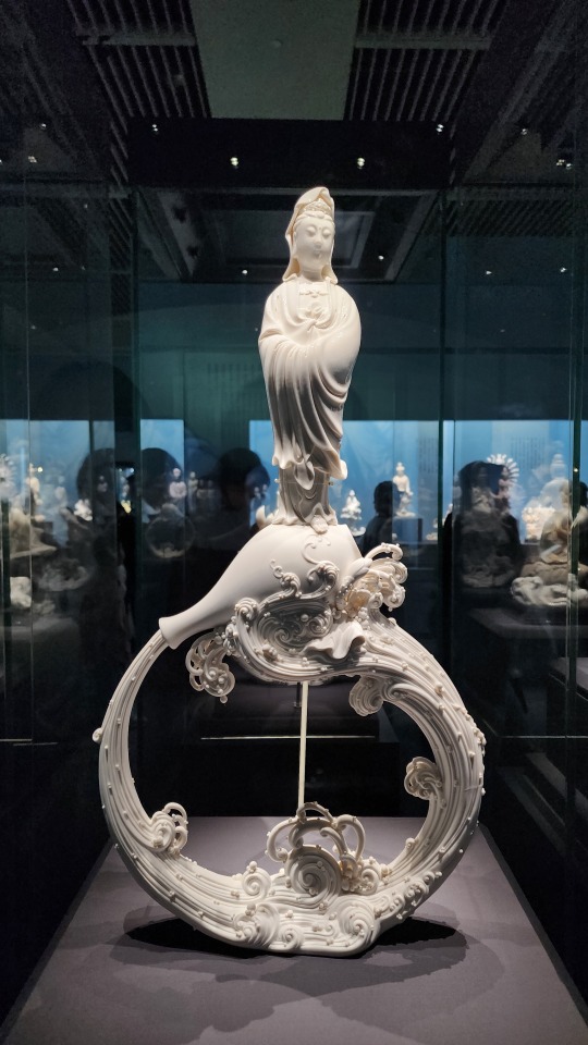
This is a classic depiction of Guanyin with a little bit of a modern-ish twist? Guanyin is often depicted with a vase of divine water, but here it forms a circle.
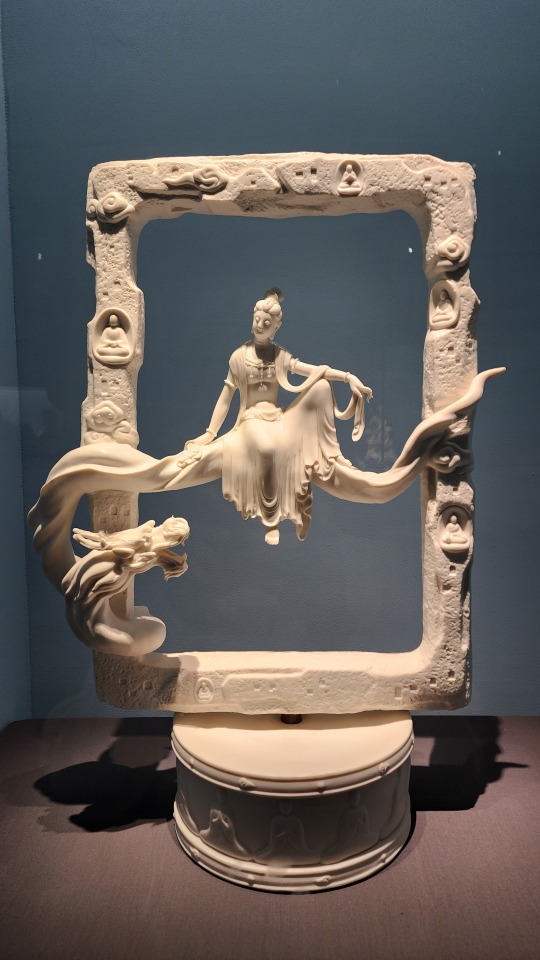
Despite some of the Guanyin statues having the amazing ceramic "clothing", this one remains my favorite, just because of the sense of space and serenity that this simple "frame" design creates:
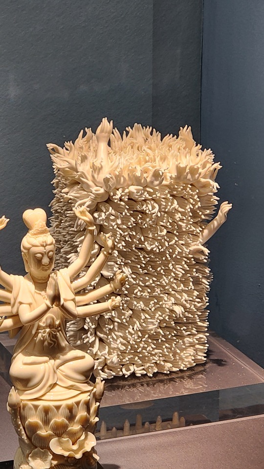
And this very literal take on "thousand arm Guanyin" (千手观音). It's giving me that "biblically accurate angels" vibe:
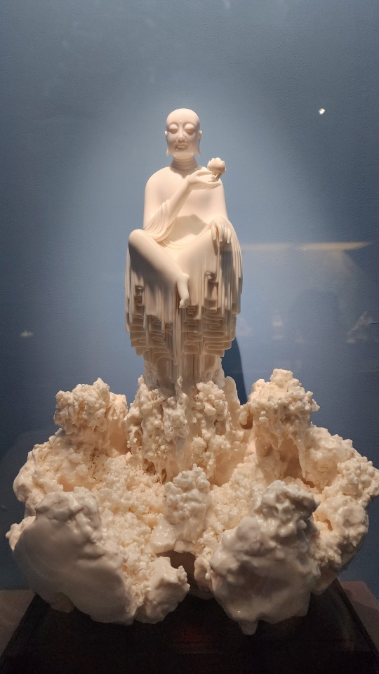
Buddha floating atop.......idk what that is but the texture is amazing:
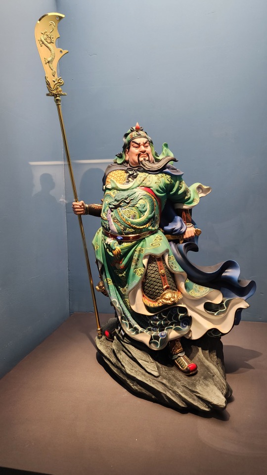
A fully painted statue of Guanyu/关羽. The gradient and detailed patterns on his robes is amazing:
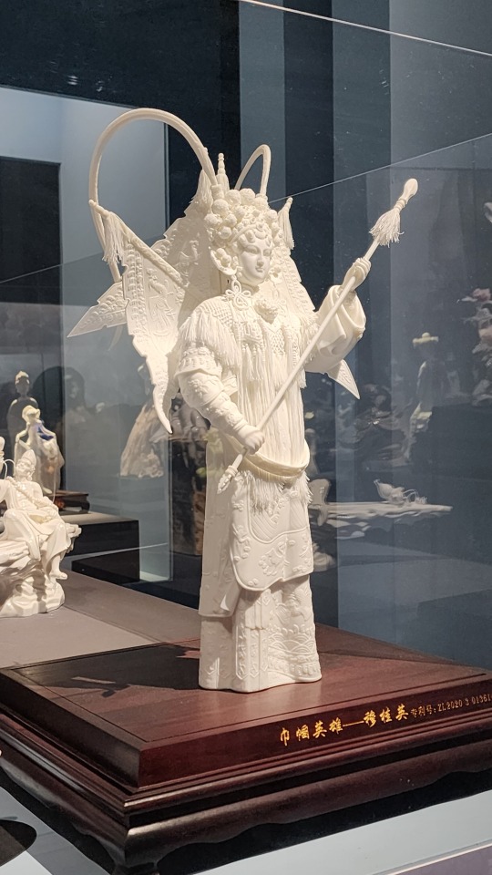
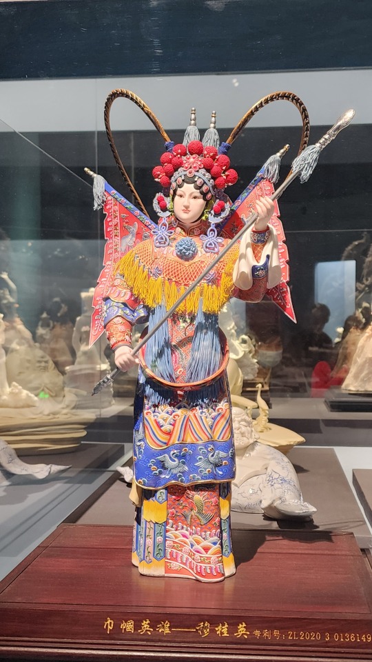
Two identical (I think?) statues of the daomadan/刀马旦 (female commander archetype) character Mu Guiying/穆桂英 as she would appear in Chinese traditional opera, one painted and one unpainted. The word 巾帼英雄 in the title means "hero in women's headscarf", which is a term used exclusively in reference to female heroes. There's also the phrase "巾帼不让须眉", which roughly means "those in women's headscarves aren't inferior to those with beards and thick brows"
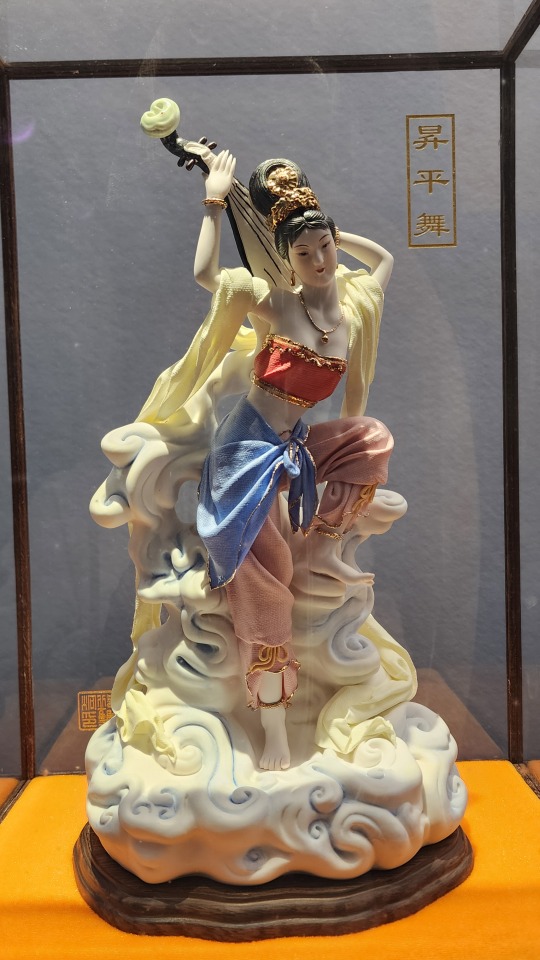
Porcelain depiction of Dunhuang's famous feitian/飞天 figures, in the classic pose of playing pipa in reverse (called 反弹琵琶). The clothing on this figure is made of porcelain, but this time also painted:
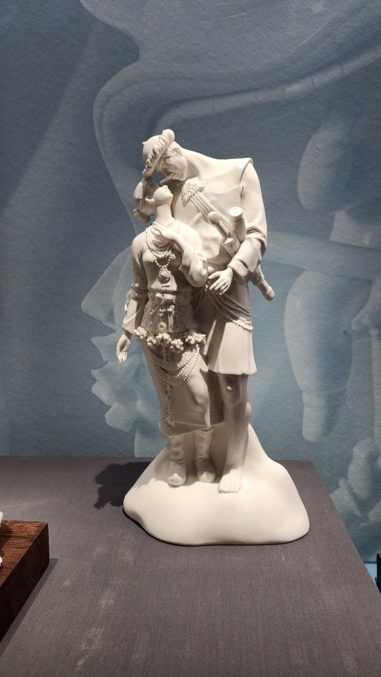
A porcelain statue of a couple in traditional Lhoba/Luoba/珞巴 clothing. The Lhoba/Luoba people are one of China's 55 少数民族 who mainly live in the south-eastern region of Tibet Autonomous Region, and as of 2019, it is the 少数民族 with the smallest population
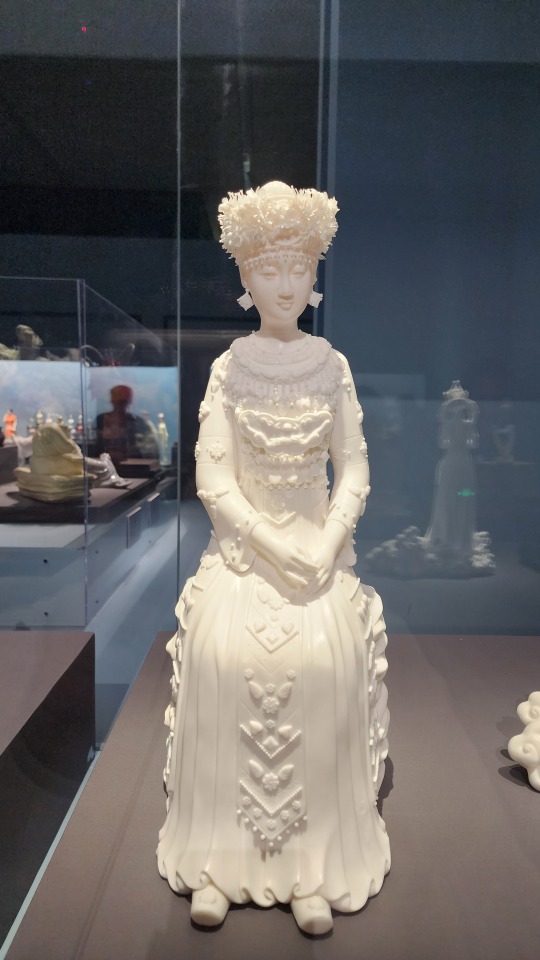
A porcelain statue of a woman in traditional Miao/苗 clothing. I love how the artist recreated the traditional Miao silver crown in porcelain.
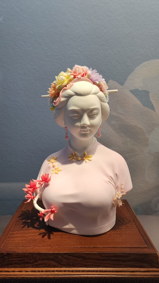
Painted porcelain bust of a woman wearing the Xunbu/蟳埔 "flower crown", named a zanhuawei/簪花围. The town of Xunbu in Fujian province is known for its tradition of zanhua/簪花, or wearing flowers in one’s hair.
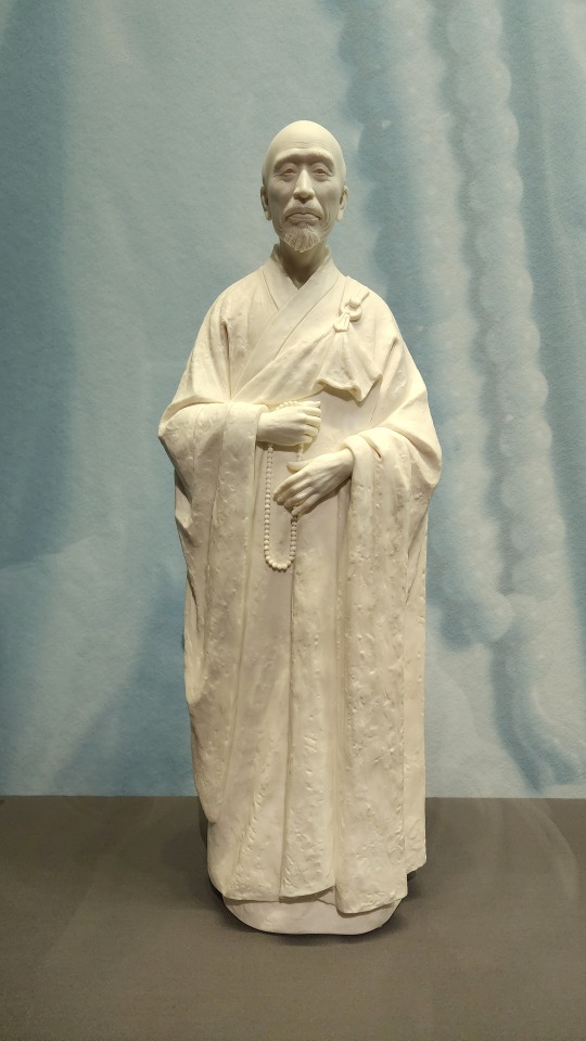
Porcelain statue of a Buddhist monk wearing a zhiduo/直裰 (the robes on the inside) and a jiasha/袈裟 (काषाय/kasaya; the garment on the outside that drapes over the left shoulder). From its looks, one can tell that zhiduo originated from hanfu, but with some minor changes (sidenote, this is not the same as the zhiduo of Ming-era hanfu). Jiasha evolved from the clothing of Indian Buddhist monks, but there appears to be a lot of influence from Central Asia and ancient Greece as well (link goes to pdf; this article is in Chinese).
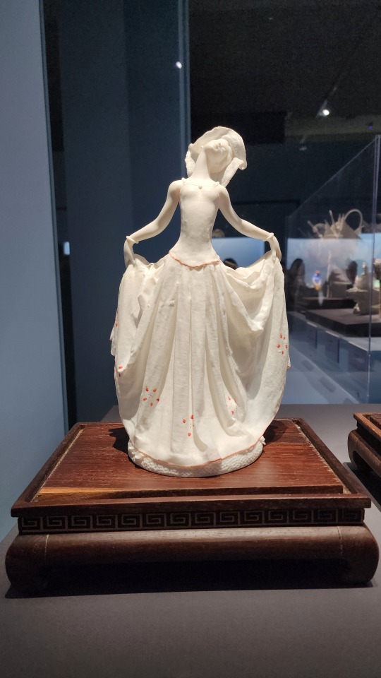
Some modern-themed pieces. Look at those dresses omg
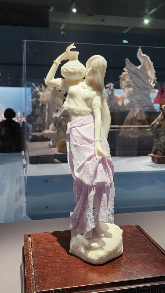
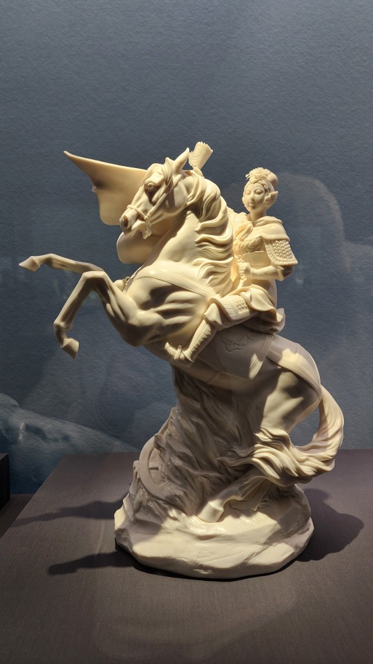
A porcelain statue of Hua Mulan/花木兰, the character from traditional Chinese literature and opera that inspired the Disney character. I will say though this pose reminds me of someone else.......
#2024 china#beijing#china#national museum of china#dehua porcelain#blanc de chine#porcelain#chinese art#chinese culture#art#culture#buddhism#guanyin
699 notes
·
View notes
Note
HI HELLO I love your art So much,,, do you have any tutorials on how you render your stuff? For example, the colors you use & how you pick them, how you get that pink tone around the Lineart (I think) (it's just rly cool). I would love to see stuff like that, cuz your art is Such visual candy (◍•ᴗ•◍)
Hey! Thank you so much, I'm glad you like my art, I worked hard to make it what it is!! Means a lot you appreciate it!!!!!!
I've had no professional art training, I seriously don't know what I'm doing and struggle making tutorials. But will try here!!
For me the colour work is really situational on the drawing! I find myself experimentally attempting to weaponize colour theory and there's a lot of instinct involved that I can't figure out how to verbalise yet. Here's an example of some thought process I have:
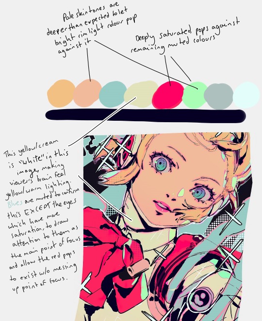
My main advice is to play with sliders a lot and really experiment (that's what I do for every drawing)!
To get the pink glow around your lineart, copy your lineart layer, fill the copy in with a pink of your choice (sometimes I do a gradient), blur the layer (experiment with how much blur you'd like), put it directly below the lineart layer, and set the layer to multiply (or any mode you think looks pretty)!
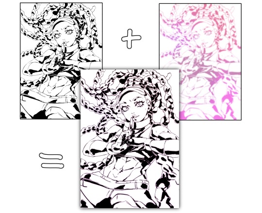
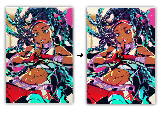
You may want to adjust your piece's brightness/colours after applying it and sharpen the image after exporting.
A lot of colour gradients are involved and on their own they can eventually compromise the gritty/punchy style, especially the ones that are between extreme and subtle. A good way to combat this is with screentones/haftones!! You can use them to diversify colours and imply shading/texture.
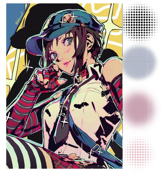
I recommend going nuts and having a lot of fun with it to find what works for you!
I often add a lot of small lens flares as they satisfyingly cut through the piece, imply flash photography (which goes well with the strong black shading), add visual noise to areas you don't want to be your main point of focus, are a great way to show speculars, and idk man sparkles are just pretty haha.
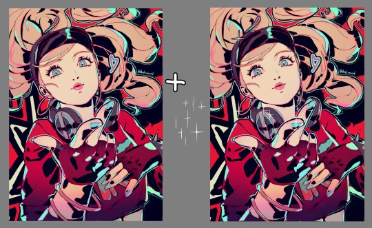
Go nuts with them and have fun!! When you get them to look good, think to yourself why that is.
I made a tutorial ~1 year ago on how I shade with black. This simple trick will really help it look good, 3D and rendered - it just requires a lot of knowledge about shadows to start with. I have a lot of experience rendering "normally" which helped me learn how to use black in an experimental way.
Minor correction that the shadows labelled "ambient occlusion" in the tutorial are actually just normal shadows, ambient occlusion is total lack of light.
I hope this is useful to you!! You have a knack for art, your work is very inspired. Please keep drawing!! I am still learning too, let's keep going baby.
-Cravat x
472 notes
·
View notes
Text
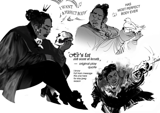
making Hamlet fanart in 2024, slapping Juicy (main hero of Fat Ham, a modern play, Hamlet version, played by black fat queer person) on char design i saw in old b&w film while listening MCR playlist was an experience
highly recommend. also pls watch/read Fat Ham upd: image description added! (in alt text, but also under the cut)
(Image Description: List of sketches with 3 drawings. The textures used here are elegant looks-like photo silk (for clothes), soft shades and gradients. Shapes are sinking in each other depth. No color, black and white
It's fanart depicting Hamlet character being combination of different versions of him from different media: fat black queer masculine person being elegant, wearing mascara and lipstick (took from modern play Fat Ham) wearing vintage royal clothes (took from old classic film). The narrative of sketches also mixed of modern play (Fat Ham) and classic one
There are 3 sketches:
First one. It's the character described above (TC in text further) sitting in side view. His eyes is closed and face has melancholic emotion. TC is holding a scull. There is a simple-shaped silhouette of crown above his head. This image represent classic play melancholic vibes of character fused with modern play appearance
Second sketch. It's TC singing, while holding white pigeon in hands. It had previous classic-modern fusion vibes + a little vibe of disney princess song (because of bird and emotion expression similar to disney musicals). By left side of this sketch is stylized speech babble with music notes symbols and deformed text, visualization of singing. The text saying: "I want a perfect body", quoting singing of TC from modern play. By the right side of sketch there is arrow pointing at character with text "has most perfect body ever".
Sketch Three. It's dynamic sketch of TC in a duel (opponent is out of the frame), waving a thin sword (idk how it in eng, in my first it's шпага, a sword but specific type of it). From the chest of TC it's going steam, like character is heated mechanism pushed to limits. The face of TC is strong and determined, with mouth wide open trying to catch breath. Near this sketch is text: (text starts here) "He is fat and scant of breath" - original play quote. i know Fat Ham message. this one [the sketch with duel] here for slay jpeg reason (text ends here).
End of Image description)
643 notes
·
View notes
Text
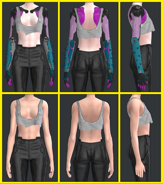
Cyberpunk 2077 - RITA SET - TS4 Conversions

Hello Chooms. Before downloading or reading anything, proceed to look at my total Night City baddies wearing it:

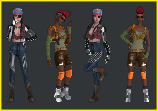
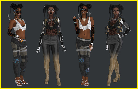
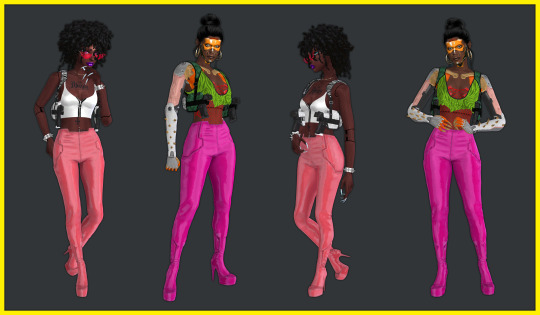


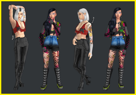

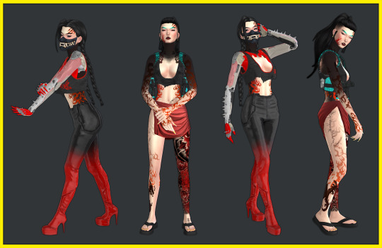
Now you have seen the Night City baddies, you may adequately and safely proceed to the download info 🤩💙💜💅
ヽ(✿゚▽゚)ノThe set includes:
💜Cyberpunk Tank Top with Kitsch Cybernetic Arms with many colour swatches for the arms (must use overlays to colour the tank top) + Cyberpunk Tank Top with no arms (must use same overlays to colour the tank top). EDIT: Just added a nude version of only the arms, use at your own risk, accessory top/bra links can be found in Recommended CC section below. (THIS REQUIRES THE TANK VERSION TO SHOW UP)


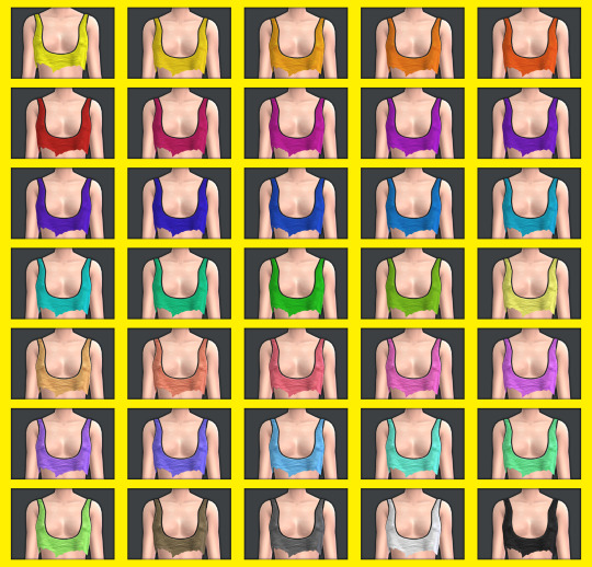
💜7 Tank Top Overlays (found in Middle finger left/right + Ring finger left/right of the rings category). I made it so you can pick and choose overlays or just take the merged file with them all. Don't unmerge any of the files. 1- Plain (35 swatches)
2- Zebra (35 swatches)

3- Kanji (35 swatches)
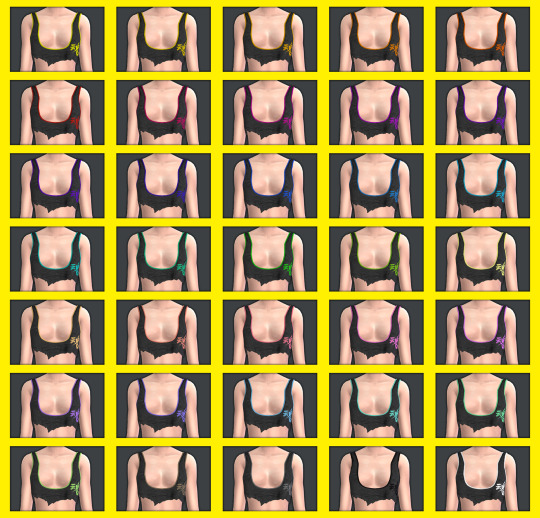
4- Faux Leather with colour edges (35 swatches) (sorry it is hard to see)

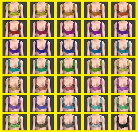
5- Dirty with tape crosses (35 swatches)
6- Plaid (15 swatches)
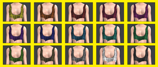
7- Camo (16 swatches)
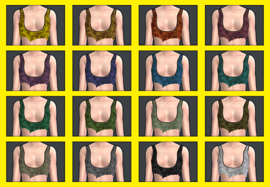
💜Bottoms 3 versions: Black with colour gradient (35 swatches) White with colour gradient (35 swatches) Plain (45 swatches). Don't unmerge the file.
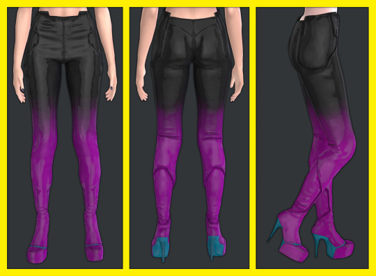
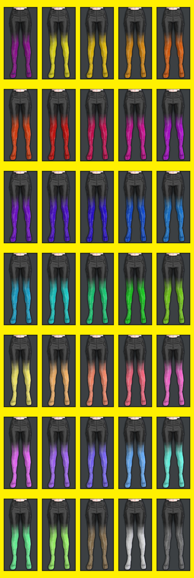
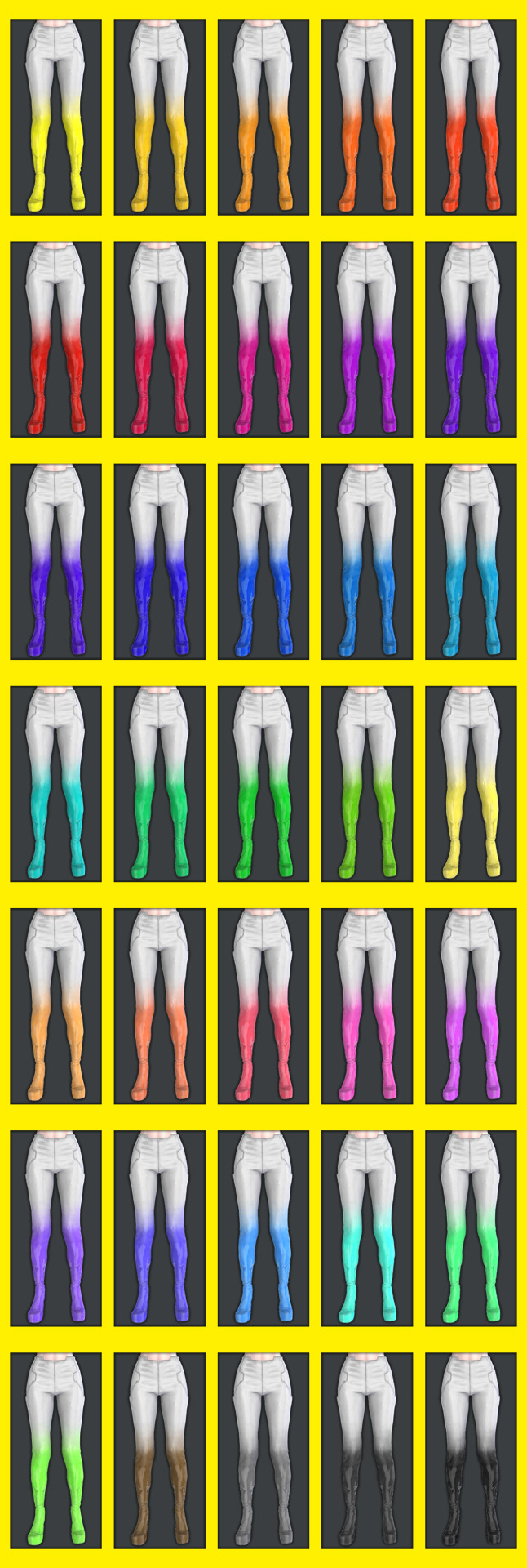

There are two versions of black and white plain, this is because I used different methods and liked both effects. You can't see much in the pic, but there are slight differences in shine and the way the textures show. The shoes are connected to the pants and other shoes don't show, but you can use high heel shoes even if they don't show if you want it to sound like heels in game. - Gun holster accessory (found in hat category, not compatible with hats or cc items using the hat UV space). Can be layered over these tops and others.


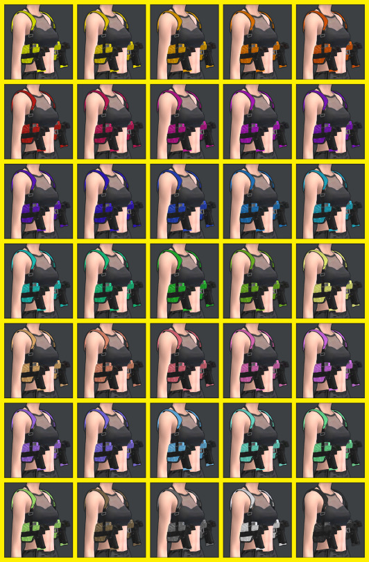

3 Versions (sorry about the texture quality of this item, it was not much UV space left and a very complicated mesh): - Random cyberpunk textures and inspired designs (15 Swatches). - All colours in plain (35 Swatches) - All colours with black zebra print on straps (35 Swatches)
💜SKIN ITEMS: Mox Chest Tattoo (Chest tattoo category, 4 swatch variations of size and placement) + Rita's Face Cyberware (upper back tattoo category) + Shiny Doll Skin Overlay (face skin detail, forehead category) you can't see much, but basically makes the skin look shiny like plastic like Rita Wheelers in Cyberpunk.

Recommended CC - Accessory tops - More Accessory tops - Accessory bras
💜Disclaimers / Important info
All items have specular and normal maps.
All items are tagged correctly (as far as I know) and have the correct colour labels.
All items are disallowed for random townies.
All items (once again as far as I know) can be worn on male frame (disable the masculine tag and they appear) From now on I'll make sure to do this for all cc's since I didn't realise it was being restricted before until I tried to take some pics of a sim with male frame for this post. Since then I've fixed it all and tested it and it fits the body fine even though I made it to fit the female frame. I may fix my older sets soon too but I'll need to test they work ok.
Let me know if something doesn't appear, or if you have any issues or notice any glitches at all.
⚠️⚠️⚠️⚠️⚠️⚠️⚠️- Very high poly items, use at your own risk if your machine struggles with the sims. I couldn't reduce the poly anymore without noticing the mesh getting worse. - Some items are slightly low texture quality. I don't play with HQ mod or do HQ textures, so sometimes the textures when baked downsized show some jagged edges or pixel effects if you look super up close. You can see it a bit on some of the gradient pants or on the gun holster which as an accessory I didn't have much UV space to work with, no matter how much I tried to simplify the mesh. - Tanks have no swatches, don't forget overlays to colour the tank. - When using the tank overlays in the different ring categories make sure you don't equip more than one or they'll clash, the different ring categories for the overlays are just so you can use it in another slot if you require another accessory from that finger section) - Make sure not to add merged files as well as other packages that form them or you'll have duplicates. - Don't unmerge any files, just choose the ones you want and use as intended. If you have to unmerge them for any PERSONAL editing, remerge them again after. - Tank is quite revealing, if you're streaming or something and use adult skins, make sure to check nothing shows or that you won't get any sort of strikes (not that there is anything wrong with it at all). Alternatively check out cc accessory tops or bras that can go underneath like the ones in the Recommended CC section. - Nude version of cyberware arms to match with accessory bras/tops now available, same warning as previous point. Thank you so so so so so so so much to the lovely people and great tutorials that helped me throughout the process providing tips and tricks and info that led me to making this properly <3 It helps me keep making these conversions. Thanks to the people who requested this prompting me to make it. These beautiful meshes I converted were originally made by CD Projekt Red
💜💜💜💜💜READ AND RESPECT MY TERMS OF USE 💜💜💜💜💜
This is literally over 100 hours of work, the meshes aren't mine but converting them takes a long time (especially since I suck at making cc) and all the textures images etc were done by me, it's free for all, don't be a jerk and steal my stuff to profit from it: - DO NOT REUPLOAD - DO NOT PUT BEHIND PAYWALL OF ANY KIND in ANY FORM - DO NOT INCLUDE CC IN ANY DOWNLOADS - DONT CLAIM YOU MADE IT - DO NOT INCLUDE MESHES IN DOWNLOADS Please tag and credit me if you recolour the meshes (don't include them, link to this post), no paywall. Conversions to TS2 and TS3 allowed, no paywall, just tag me please! If you use them in pics you can tag me too I'd love to see!
💜💜💜💜💜If you like my conversions and would like to help me be able to do more, you can support me on Patreon!
💜DOWNLOAD PATREON
💜DOWNLOAD GOOGLE DRIVE
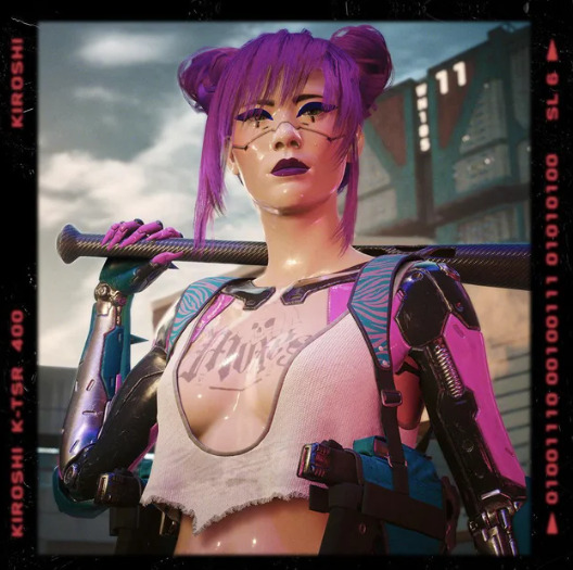
Now I'm going to take a long well deserved break.
See you chooms! 💜💜💜💜💜
#moonbiscuitsims#moonbiscuitsims4#moonbiscuitsimscyberpunk#mbsdownload#moonbiscuitsimscc#moonbiscuitsimscas#sims 4#the sims 4#ts4#sims 4 cyberpunk#the sims 4 cyberpunk#ts4 cyberpunk#cp2077#cp 2077#cyberpunk#cyberpunk 2077#rita wheeler#cyberpunk cc#sims 4 cc#ts4 cc#sims 4 cas#ts4 simblr#moonbiscuitsimsphotos#simblr
115 notes
·
View notes
Text
Absume. (Yandere!Best Friend x GN!Reader)
feat. sui's ai
♡ oneshot, approx. 1k words
♡ post-specific warnings: melancholy (?), angst (??), angst w/o happy ending (???)
♡ a/n: HAPPY BIRTHDAY TO THE LOML SUIIIIIII❤️ i did not have as much time on this as i would've liked but no matter, i wasn't gonna exist on suiday w/o a suiday celebration dar style. i present to you ai angst❗❗(it was meant to be fluff but i'm a fucking dumbass who can't write lmao) ai belongs to @suiana and is from her stellar, absolutely fantastic game, Anything Will Do. sui i want you to know you make everything worth it and i wouldn't still be here on tumblr if it weren't for you. all my love to you mwah mwah <333 unedited, not proofread.
♡♡♡
This life was strange to you.
Sometimes it went by so fast, you’d wake up with no recollection of the days passed; staring at the ceiling with open eyes. It’s the same crack in the paint that had always been there, long and thin and unnoticeable if it weren’t for the fact you sought it out unconsciously. You remembered it, even if you didn’t remember crawling into bed that night, or having dinner at the table, and what exactly it was that your mother fussed over.
There was a growing emptiness since you first noticed. No matter what you did, or how many people you were surrounded by, inside of you something was caving in. You didn’t know who you were. You didn’t know your place in this world without landmarking it by your achievements — and yet, when you looked back, there were none. How had you gone on so long? What had you been doing all this time?
Perhaps you lived in your head a little too much. Everything could be a little lighter if only you’d let it be. Sweeping every thought aside, you rolled, trapped your arm under your own weight and looked at your reflection in your mirrored bedside table. You were as you had always been. This was you, and this — whatever it was — was yours.
Lukewarm air, no temperature gradient, it should’ve made it easier for you to leave your bed, but you stayed there some long minutes before moving. Your clock was broken. Not conventionally. It only moved by the hour. Time was yours and you could waste it. There was security in the feeling that you had a choice to not start your day.
Morning, mundane as always, slathered you in its hues. Washed browns jittery under your feet, like there was no ground beneath you from wood to tile. The bathroom mirror had your fingerprints. You’d touched it many a time. Left a mark. This too, belonged to you. You could no longer believe this wasn’t real. Maybe it was that you were sensationless at your soles, treading carefully over loosely carpeted steps, trying to feel the tickle of those familiar fibres. When had you lost it all?
Your mother was in the kitchen, you don’t remember a time when she wasn't. It’s as if she can’t leave this lower floor, like she cannot rest, like her duties do not end. The door to her room never opens or closes, and you don’t think you’ve ever seen her without that plaid apron. She never notices you unless you speak to her. She never says anything different.
At the table it’s fruit, and it tastes like nothing. No texture, nothing to chew. It feels like you’re eating air. Play-pretend at a plastic table with a plastic knife and fork. You’re young again and your sister ropes you into her fake kitchen. You don’t have a sister. Not here, at least.
There’s a knock at your front door. It’s light, like the person on the other side is afraid to be heard, but wants your attention still. When you open it, there he stands — the only thing in this world that you can reach out and touch, that thrummed beneath your fingertips, as alive as you were desperate to feel.
Ai takes your hand, and the breeze picks up just like that. Ever so easy. You watch your feet and every step they take to the pavement, nothing skips; you can commit it to memory. He’s speaking to you but you can’t hear the words just yet, there is only wind and the rustle of leaves. His hair billows, bleeds out heavy cyprus that blends into the backdrop of trees. He has always given you these beautiful bits of him, and you had let yourself go blind.
Letting go was something you should’ve done long, long ago, but you guessed he was your comfort. Solace. A shelter you could run to. Leaving never felt right, not when you knew he’d stay waiting. Ai told you once, he loved you beyond all of this. Outside the street lights would flicker, and in the flashes it was his face illuminated, tucking you in after a dreary day. You could never hold onto those scenes, in your mind they were fragmented, and you forgot about them as quick as they came. If you asked him why, you knew he’d tell you that this was the price, whether either of you could pay it, whether either of you could even endure it anymore.
On a deep inhale, you finally resolved that it was no fairer to him as you found it was to you, that now was the only right time. Now would be the only time you’d have him by your side like this again. This moment alone, he was real and he would not slip through your fingers.
You had set out for school, but with your textbooks weighing what your heart could not, you had no intention of going there with him. Instead these empty streets faded, and quickly noon set over the park you ended up at. The swings did not creak, but they were old. You wondered how they could carry the two of you — you and Ai, and everything you’d both been piling up inside.
Back and forth you went, here and in your head, trying to find the words to say you don’t think you could do this anymore. If you said sorry, would it make him mad? His due returns weren’t meant to be apologies. You were meant to fill him up just as he had done for you, you were meant to make everything worth it, every sacrifice, every stilted interaction from the day you understood that you were losing him. It was meant to get better. All this was meant to pass. Your mind was blank, and you were waiting for something but your clock was still broken, so nothing would ever come. You wanted to say I love you. You wanted those to at least be your final words — you just didn’t know how.
Ai was kind to you. He had always been. So he took your head in his hands, didn’t cry a single tear though it should’ve gone with that smile, and made the cut clean.
He said: “anything will do.”
#lovelettersfromdar#i've never written anything so fast in my life and yk what that means sui?#it means you're my muse <3#i apologise bc i wanted this to be a lot better and go a lot differently but i was not informed earlier that your bday was two days away 😭#at my time of writing#kinda wanted to expand on that really beautiful sombre feeling the end of the game leaves you w/#i don't think now was a good time to do that tho💀#next bday will be a happy fic trust#but anyways enjoy your day today bby!! wishing you all the best always#take care of yourself🩷#yandere x reader#x reader#gn reader#yandere oc#reader insert#male yandere#yan x reader#yandere#yandere male#yandere boy#gender neutral reader#yandere oc x reader#yandere x darling#yandere original character#yandere x y/n#yandere x you#angst
86 notes
·
View notes
Note
hi so can u give a tutorial just for like.. anythinf?? i wannna learn how to edit but it always looks empty / wrong
hi anon !! i decided to give you a tutorial on how to make your layouts (whether it be graphics, rentries etc) more full since that seems to be your main concern !1!1
the first thing i started doing is using more pngs and masks. it might seem like you’re overdoing it, but trust me, once you get the hand of it, it starts to look a lot better ! i use textured masks (such as these) to create certain effects ! you can use these as overlays, decorations etc, you don’t have to put an image into them.

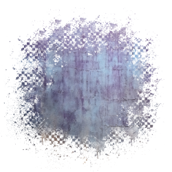

i also recommend using inspo from other creators on where to place stuff ! it can be hard to figure out what will look good, but if you decide to go in without any inspo that’s okay ! i do that too sometimes :3 just take it slow with yourself! tutorials for text designs are also extremely helpful, especially when it comes to gfx. if you’re looking for more scattered pngs but don’t know where to start, you can try using the stuff that’s already in ibis paint! i love using this stuff a lot :3

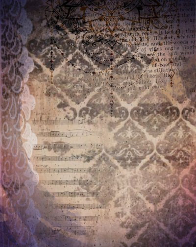
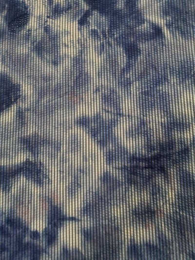
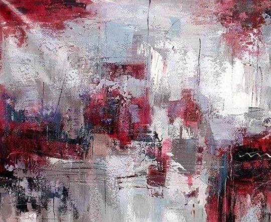
try looking for resource rentries for more textures and overlays ! speaking of, textures are really, really helpful for making your designs look better. here are some of the ones i use the most ! play around wit the settings and stuff until you decide you like where your design is at !
i also recommend playing around with the filters in ibis paint, such as using the filter chrome as an overlay! i use that way too much.. uhm, i also recommend using grayscale and playing around with the brightness and contrast section before coloring your graphics ! theres also a really helpful website if you don’t have ibispaint bro (thank you kapri!!) for gradient maps ! i’ve been using this a lot, and it really helps make my stuff look better :,)
i hope this helps, anon! and anyone else who needs it ^_^. i’m in the process of making a discord server and rentry for my resources also, and there will be some tutorials and whatnot there as well !!
86 notes
·
View notes
Text
Link's Fun Commentary - Prologue!
+ sailor design commentary. link's fun extra

Twilight Field, War of Eras...
Sailor starting in Hyrule Warriors and being dropped immediately into Shepherd's era is actually the second pitch for the beginning of the comic, the very First pitch being the first two pages of chapter 1.
More than anything we just wanted to get it done, but we didn't really know what we were doing . We cobbled together a custom font and got right to it. My Fun Facts: All the grass is the same image reused over and over except for when it isn't . Literally all of the smoke was just repeated/moved around. We didn't even really know how to use gradients effectively...

... Which can be seen in these next two panels. LOL.
The work split on this batch set a precedent for sure. @islandlobster took up lining and flat colors, and had the Hard Job of harmonizing our styles, processes, and experiments. Do you see a lot of small, long-form comics with grainy, textured line-art? Maybe no? Well we found out why.

These panels also feature the Only Two Triforces we remembered to draw !!! Oh My God!!!

As much as we struggled, things moved pretty quick from the get-go. Since the prologue is only a handful of pages we didn't really run into the issues we would with chapter 1, especially regarding our complete and utter lack of script. This went straight from thumbnailing to the final result!! (NOT A SUSTAINABLE WAY TO DO A GROUP PROJECT...!)
I wanted to mention though that when I wrote the line above, I wasn't sure if this was how you would spell it for like . a Soldier Troop or a Performance Troupe. Which I just looked up now and found out I Absolutely got them mixed up. so umm. Sorry. Sailor is not in the circus yet.

Cia was just defeated in the main campaign! I felt like such a smart cookie for this one.

She doesn't even know she wont be going home yet‼️ laughing and pointing ‼️

It was an Early idea that Sailor would conveniently miss the time portal transporting the field (with her in it!) back to its era. This was supposed to be a reoccurring bit, but we didn't commit to it too hard going forward, so who's to say if that'll be realized.

The pirate charm plays a big role in the prologue. A little funny because we were absolutely sick to death of drawing it by the end, as well as the fact that it is there in lieu of her red-gem necklace that we forgot to draw. it is Welcome and Unfortunate that it doesn't work anymore, especially because having the chance to name drop like this was very indulgent.

The era of twilight ! Including the locations and times was in the original sketches, but when we found out that our inexperience with backgrounds wasn't lending itself to establishing Where we were, it came in handy. We Agonized over placing the castle and argued* for like a week about how forested the area should be. Luckily we use noclip now, so things have improved as we've moved into chapter 2 :]
Either way, hopefully it wasn't too confusing, and as we introduce new characters the picture will be clearer. We've talked a little bit about returning to the prologue to spiff it up a bit, but we feel we aren't far enough into the comic to make it worthwhile.
and now over to Pea with the weather:
my name is pea islandlobster and you can't tell that it's me because we are writing on the same post but trust okay 🤞 I am here to talk about SAILOR!!!
Sailor has been my baby brainchild before LFRT was even a blip in our minds eye (my proof) and it has been a beautiful indulgence for me to both put her in AND have her be the first Link we meet. YAY!
I have two designs for her, for which I have helpfully made a diagram just for you..! Labeled and everything..!

A: pheww my big one that I have been sitting on forever. Sailor's necklace was constructed over the course of her adventure, initially only having her red gem (given to her by King Daphnes, from his own crown). Four pearls were later added, parting gifts from Oshus and the three spirits. Also intended to mirror the three Goddess pearls from Wind Waker..! and an extra yellow one i guess. triforce? idk
B: Sailor's chipped tooth is a funny one that I will have to make a small comic about at some point. It's not even anything from her adventure. A couple years before WW, Aryll was pretty upset about losing her first tooth, and in typical Link fashion she thought the best way of comforting her was to ALSO lose a tooth. Grandma was not happy.
C: Most Links have a triforce mark, and each one we are giving a reason towards ^.^ Sailor's mark is entirely scar tissue, specifically it is hypertrophic. She held her triforce for only a few days and got it (maybe quite literally) ripped from her by Ganondorf, so take that as you will. Tetra and her are matching yayyy..!
D: Giving her hero outfit it's own section so I can tuck it out of the way lol. A modified version of her original hero outfit, courtesy of shipmate Nudge (guy in the top left). She was a little upset over having to alter Grandma's hard work, but she preserved it where she could. Like her seashell belt! ^_^
E: SIDEBURNS! Not present in the prologue because it has been a recent development but I figured it was worth bringing up. During WoE, as she grows her hair, her sideburns resemble little lobster claws. Cute! In LFRT as grown out as it is, I thought making them swirly as a reference to pretty much every cloud/wind effect used in WW lol.
From a combination of outgrowing stuff and missing home, Sailor was christened with Lobster Shirt 2.0 as we know and love today. Who made it for her? I dunnooo..... let's sit and think about this one.
Phewww. This was a long one - and no doubt the next will be longer - but this is all for now! Feel free to send any questions you might have ^.^ Thank you for all the support! Chapter 2 part 2 soon!
61 notes
·
View notes
Note
How do you get that grainy texture on your art? It’s very nice!
thank you!! i love art that's soft and fuzzy...
i generally do it a handful of different ways, but i tend to bounce between a color noise filter layer in soft light mode, between 30% and 50% opacity,

... or i use something from my wide array of paper textures, and usually set the layer to overlay and play with opacity till i'm happy with it

......oooorr i do a combination of the two! which i did in the final version of this piece, which i Also added a gradient map to to make the colors a lil more ✨Dramatic✨
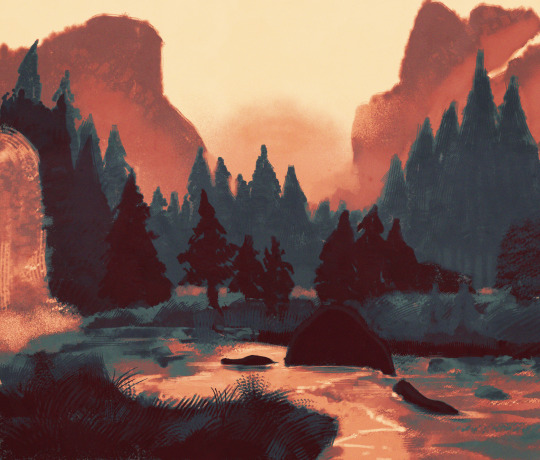
here's where i got (most of) my paper textures and here's a rainbow color noise texture (that i don't personally use but looks rlly similar!)
#i actually use a color noise filter from a VHS auto action set i used to use on my VHS icons. if yall remember those#my art#ask#tutorial#i guess??#idunno#if you have more questions feel free to dm me! i love clip and i love to teach ppl abt all its cool features#dinosaur#since i prolly wont seperate post my landscape study tht i threw a spinosaurus on
108 notes
·
View notes
Text
♡ Somewhere Only We Know ♡


♡ Pairings: artist!boyfriend!hyunjin x fem!reader
♡ Genre: fluff
♡ Summary: Things have been hard for you lately so you retreat to your boyfriend's apartment where you find all of the love and reassurance a girl could ask for.
♡ Word Count: 1.2k-ish
♡ Warnings: None really but reader's been going through a lot so she is indeed a little sad tonight.
♡ A/N: This is a request from @jehhskz who I promised to write a literary hug for so I really hope I lived up to my promise. Thanks so much for the request you beautiful human.

The night hangs quietly over Hyunjin’s loft, the fresh earthy post rain air gradually filling the space. Seated at his desk facing the open window, Hyunjin hums along to the music flowing from the record player tucked in a nearby corner. Before him on the desk sits an open sketchbook, textured canvas paper coated in a gradient of pastels that mirror the night sky.
And seated on the floor between his legs, wrapped up cozy and warm in his favorite blanket, is you. Working with his pastels typically dictates that Hyunjin use two hands but tonight he makes due with one, the other preoccupied with more important things like playing with your hair or tracing the contours of your face.
With your head resting against his inner thigh he can only reach one side of your face but that’s more than enough room for him to silently praise those beautiful features that take up more space in his mind than you know. The tips of his fingers are delicate, each brush of them across your skin so deliberate that it’s almost as if you’re one of his paintings.
Lately it seems that the whole world’s caving in on you. The pressures of life have begun to take their toll and it’s all so much…too much. What you’ve needed more than anything is a safe place to be, somewhere to get away from it all, and Hyunjin couldn’t be happier to be that for you. “Jinnie���” you say—the first thing you’ve said in at least an hour—and the scratching of a midnight blue pastel against paper comes to a halt. In an instant everything around him disappears. There’s only you.
Hyunjin reaches around, cupping your chin, and tilts your head up towards him. You lock eyes, him looking down and you looking up. His eyes are the moon, yours are the sea, and, oh, how he moves you. “Need something, sweetie?” he asks, strands of dark hair falling loose from the hair band keeping it out of his face. You shake your head, the tiny hairs on your arm standing up as he strokes the side of your neck. “No, it’s just…do you ever wanna…I don’t know, run away?”
Hyunjin gasps, pretending to be on the verge of tears, “She said I’m so boring I make her wanna run away.”
“You’re such a drama queen” you giggle, rolling your eyes, “It’s not that. I mean, I do want to run away but not from you. From…” Your chest tightens at the thought of what troubles you, stopping your words short.
Hyunjin leans down to kiss you on the forehead, grounding you in this moment with him. His way of reminding you that you are safe here. “From everything else? Just drop it all and run as fast as you can to escape it? I feel that way all the time. Way more than I’d like to honestly.”
“So how do you get over it?” you ask, relieved to finally have someone who gets it. “Hmm,” he sighs, glancing out at the endless night and back down at you, “Someone once told me that when we feel bad things that’s just our hearts telling us that something’s not right. So we shouldn’t just get over it. We should pay attention to it.”
You shudder at the concept, paying more attention to what you’re feeling is the last thing you want to do. “But every time I think about it I get so upset. I feel weak.”
Hyunjin’s expression sours the second the word “weak” leaves your lips. Sitting back in his chair, he holds his arms out to you, “Come sit.” Staying snug in your blanket burrito, you make your way onto his lap, quickly adjusting to your new spot. Hyunjin laces his arms around you, holding you close to him like something too valuable to let sit unprotected.
“Never say that again” he says, empathetic but unwilling to let you doubt yourself, “You are not weak. You’re human. Life sucks sometimes and you don’t have to force yourself to be okay with it. Not for anyone.”
Fidgeting with a loose thread in the blanket’s stitching, you fight your hardest to choke back the tears that inevitably come streaming down your cheeks. Life may be overwhelming but this—being loved by him even when you’re falling apart—is overwhelming in its own way.
Hyunjin pulls the sleeves down on his sweatshirt, using the smooth cotton to wipe away your tears as they fall. “So, where are we running to?”
“What do you mean?” you sniffle, blinking through the tears.
Hyunjin looks at you like his reasoning’s the most obvious thing in the world. “You wanna go so let’s go. Right now. We don’t even have to tell anyone. Let’s just…fuck it…let’s go.”
“You can’t just go, Jinnie. You have that thing tomorrow and—”
Hyunjin kisses you, wiping your brain clean of any thoughts of pushing him away. His lips play a game of catch and release with yours. Drowning you in their soft embrace, letting you come up for air, and dragging you back down again. “What’d I say to you when I asked you to be my girlfriend?”
“You said, ‘It’s me and you’” you recall, as if you could ever forget.
“Me and you and you and me and me and you” Hyunjin says faster each time until you’re giggling through what’s left of your tears, “We’re in this together. You’re stuck with me.”
He lingers closely enough to your face that you could steal a kiss of your own if you wanted to and you do. Your body rushes with so much heat that you let the blanket fall away, exposing you to a light breeze. Hyunjin pulls you over so that you’re stadling him, his arms locking around your waist.
“Take me wherever you want,” you whisper, “As long as I’m with you I don’t care.” It gives him butterflies to hear you say that and you notice his cheeks begin to go all rosy on you. It’s the cutest thing. Hyunjin plants his feet firmly on the ground, lifting you up without warning, and carrying you towards the bed. You cling to him for dear life, only letting go once he has you safely on the bed. Even then the two of you can’t quite untangle from each other. Not that either of you try.
“Cuddle tonight and prison break in the morning, deal?” he asks, lit up with all the possibilities of where you could escape to together.
You yawn, settling into the fluffy mattress, eyelids growing heavy, “Deal.”
Hyunjin pulls you in, your head nestled against his chest, and strokes your hair as he hums along to the music once more. You drift off to sleep in no time. Comforted, loved, protected, and safe in the knowledge that tomorrow won’t be like the others have been because you’ve finally let him in. Finally let yourself trust that it truly is you and him.
And him and you and you and him and…

#stray kids x reader#stray kids x female reader#stray kids x you#stray kids fluff#hyunjin x reader#hyunjin x you#hyunjin fluff
186 notes
·
View notes
Text
gif tutorial
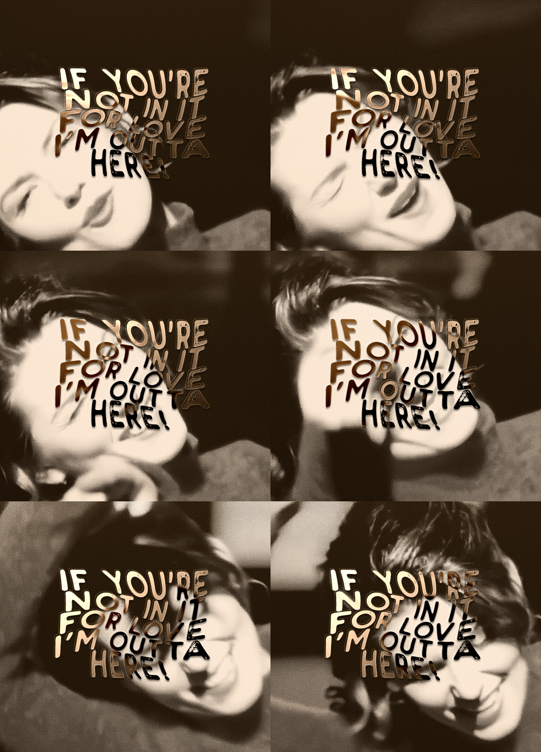
i was asked to make a tutorial for this set i made, so let's get right into it!
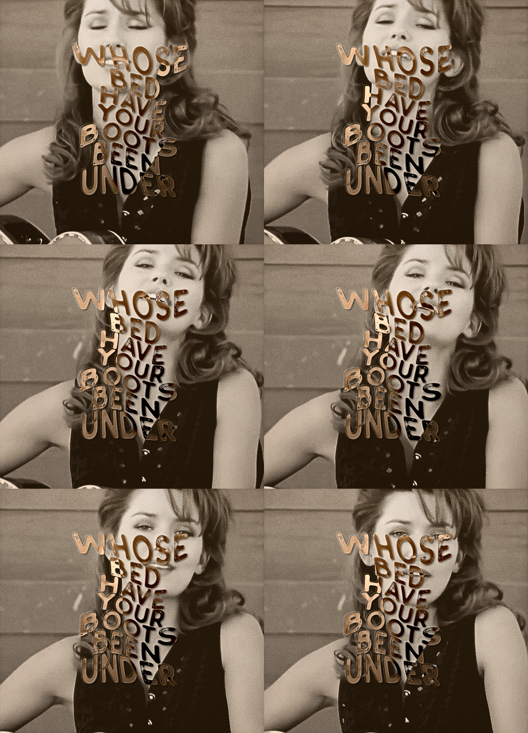
first things first, i downloaded the music videos from youtube in 1080p using 4k video downloader. unfortunately, the quality of youtube videos always seems... not great, to put it simply. plus these music videos are from the 90s, so they've been upscaled to 1080p after the fact. all of this works against us, but i've definitely worked with videos of lesser quality than these, so at least there's that!
when i gif, i import video frames to layers rather than screencapping. this comes down to personal preference. after everything has loaded, i group all my layers together and set the frame delay to 0.05. i then cropped my gif to 540x500.
the next step in my process is sharpening. i did play around with my settings a bit given the quality of the footage and the dimensions of the gif. i compared both @hellboys low-quality video gif tutorial to my regular sharpening action and my vivid sharpening action and in this case, i preferred my normal vivid sharpening action. i used this tutorial to create the action for myself, and you can find other sharpening tutorials here. this action converts my frames to video timeline and applies sharpening.
once my gif is sharpened and i'm in timeline, i begin coloring. i wanted to simplify the amount of colors used in these gifs, again because of the video quality -- i knew it wasn't going to have the crispness i would normally like for my gifs. here are my coloring adjustment layers and their settings (not pictured: my first layer is a brightness/contrast layer set to screen) (explanation in alt text):
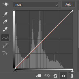

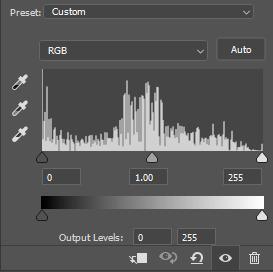
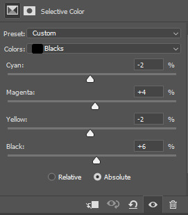
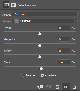
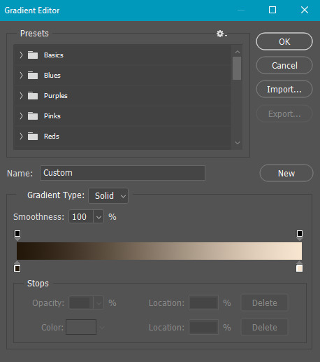
all of these layers and their settings will vary depending on your footage and its coloring (and obviously, feel free to make the gradient map whatever colors you like if you aren't going for this exact look).
pretty basic coloring, especially with just slapping a gradient map on top (my beloved), but at this point, i still didn't like the quality of the gif, so i added a couple textures/overlays.
i put the left one down first and set the blending mode to soft light and the opacity to 8%. depending on what look you're going for, you could increase or decrease the opacity or play around with different blending modes. i like using this texture with lower quality footage because even when it's sized up a bit, it adds some crispness and makes things feel more defined. for the second texture, i set it to overlay and 75% opacity. we love and respect film grain in this house.
now for the typography! sometimes i really enjoy typography and other times it's the bane of my existence for the sole reason of just how many fonts i have installed. anyway, here are the settings i used for this set:
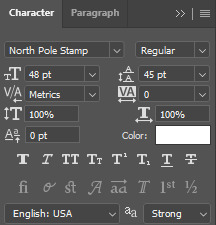
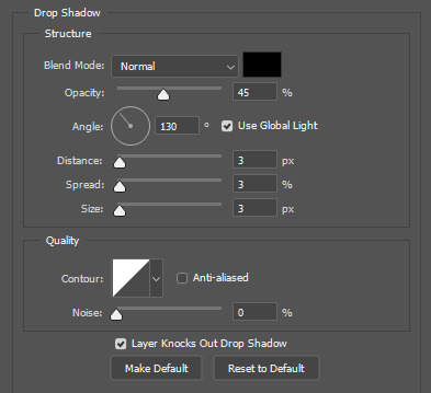
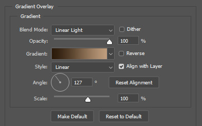
make sure the color of your font is white and then set the blending mode to either difference or exclusion. i can almost never see a difference between the two, but for this set, i used exclusion. below are the blending options (double click on your text layer to bring up this menu or right click and select blending options).
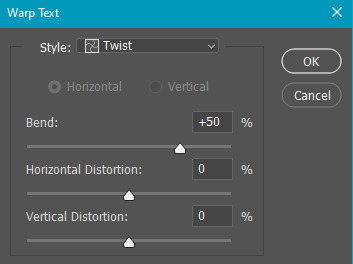
now we have to add the warp effect. with your text tool still selected, click this icon at the top of your screen:

from the dropdown menu, select twist. these were my settings, but feel free to play around with different warp options and their settings. the ones i use most often are flag, fish, and twist.
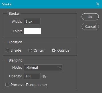
this last step is completely optional, but it's an effect i use in most of my sets with typography. duplicate your text layer (select the layer and ctrl+j), turn off the layer effects (click the eye icon next to effects), and set the blending mode to normal. right click on the layer and select rasterize type. right click on the layer icon itself and choose select pixels.

at this point, you should see the moving black and white dotted line showing that only your text is selected. then go to edit > stroke. here are the settings i almost exclusively use.
this is what your text should look like now:
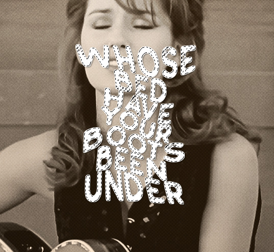
using ctrl+T, move the layer off the canvas so you can't see any of the text anymore. you should be left with only your outline. click anywhere on your canvas to de-select the text we just moved. use ctrl+T again as well as your arrow keys to nudge the outline over to the left 2px and up 2px. this is personal preference as far as the positioning, but i almost never move it any other way. you can leave it like this, which i sometimes do, or you can set the blending mode to soft light like i did for a more subtle effect.
and that's it! rinse and repeat for each gif in your set or use a different warp effect on each gif to switch it up! if you have any questions about this tutorial or would like me to make one for anything else, please feel free to ask any time!
#gif tutorial#my tutorials#gifmakerresource#completeresources#dailyresources#chaoticresources#userdavid#coloring tutorial#typography tutorial#tutorial#photoshop tutorial
267 notes
·
View notes