#i was playing around with gradients and texture brushes and then this just happened
Explore tagged Tumblr posts
Text
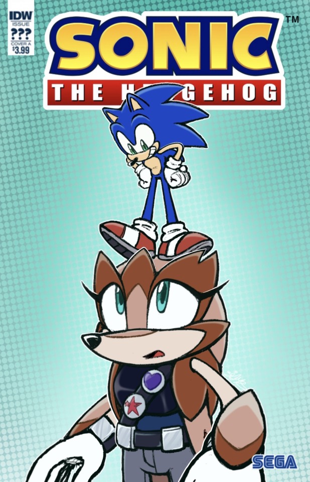
Made another fan cover feat. Rotunda
#i was playing around with gradients and texture brushes and then this just happened#idw sonic#sonic the hedgehog#rotunda the pangolin#scribbs ocs#my art#sonic fanart#sonic the hedghog fanart#sonic oc
44 notes
·
View notes
Text
(long post ahead sorryyyyyy)
Some process shots at the request of @lizteaart :)
(sorry in advance - I was not struck with any impulse for originality, so you get these two posh mfs looking dumb and pretty.)
This is not meant to be a guide by any means, just a glimpse at how I (generally) build up paint and then colour correct. I work the same way unless I’m trying to achieve a particular style for practice or effect (like this piece, in which I strictly followed lineart and hated every second of it; or the Byrgenwerth portraits, done completely in greyscale and coloured with custom gradient maps).
I work in Clip Studio because there’s something about the colour blending that feels extra buttery, but I used to work in Photoshop; all of this applies cross-software anyway.
Step 1: lineart. If I’m not working stylistically for clean lineart, I leave it pretty loose. I almost always change things around while I’m colouring. I have about 3-4 rounds of progressive lineart until I’m happy (in a loose watercolour brush).
Step 2: I will have the lineart on multiply so I can work under it for a while. I sometimes (but not always) block in some rough colour underneath just for extra texture and in case I need to clip to layer later. I also put down a tentative palette (skin in this case) just so I can have a range for the colour dropper. I add and subtract from the palette while I work - but it also prevents things from getting too muddy, which can happen if you’re exclusively selecting colours from inside the work itself.

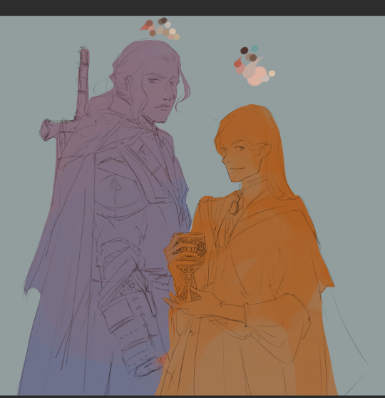
Step 3: (sorry, the screenshot is super small here) I do a VERY rough blocking in of colour just to see if things make sense (and so I don’t have to change my mind so much later). These are clipped to the colour-block layer from the previous image to save time. Sometimes I duplicate these layers and play around in modes to increase saturation, contrast, etc. Here I left them as is cause I’m going for a colouring style that’s a little more subtle.


Step 4 ad infinitum: refining. Here I’m starting with the skin and hair, since the focus of my work is always the character’s face. I try to work in a way that’s non-destructive: every time I establish a baseline of good build-up, I create a new layer and work on top of that. That way, if I over-render or muck something up, I can just delete that layer, and the previous state will still exist. In this work, I deleted at least one layer of rendering from both their faces, because at some point I felt like I’d over-rendered or lost some nice texture or good shape definition. But I still had whatever acceptable state saved beneath. I merge them as I go so they don’t get to be too many.
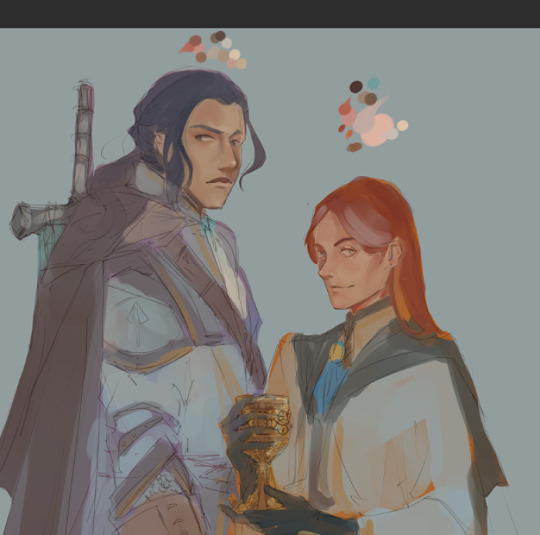

I’m trying to build a pretty smooth surface of skin here, which is a new thing for me, since I used to render with heavier, more textured brushes. Here I’m using about 3 different watercolour brushes. I work soft-hard-soft-hard: softening and blending, adding hard edges, and then going again until it looks somewhat convincing. I try to colour select as much pure colour from the palette so it doesn’t get too muddy, and I also like injecting some unexpected colour here and there, especially in shadows, like cyans, for a little more life.
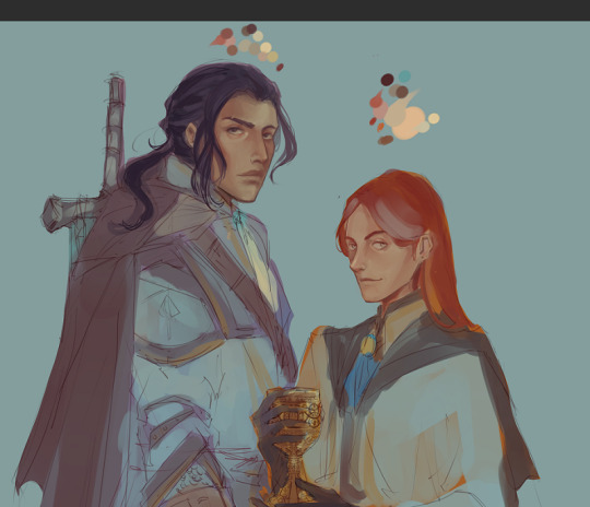

Step 5: By now, I’ve started layering above the lineart. I only do this when I feel the facial structures are solid enough that I don’t need it anymore. But the lineart layers are still there, beneath, if I ever need to go back to it as a guide.
I also add a very low opacity gradient map at this step, for little more interesting saturation, and continue to work above it. I go back and forth between skin and hair so I don’t spend too much time on one thing, and give my brain a break to come back and notice things I would otherwise glaze over. I try not to over-render and still leave lots of evidence of painterly gesture.
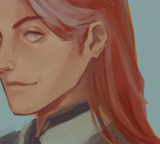
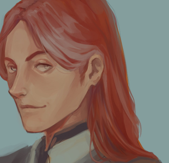
Closeup of the hair from base to almost-rendered. I add a sharpen filter to the hair often to get parts of it a little visually crispier.
Step 6: the exact same thing but with fabric/armour/whatever. I mix my watercolour brushes with bulkier, meatier brushes for textile, since I can’t be arsed to render clothes with the same care as I do skin. These are the types I use (folks can DM/anon if they want the brush names, I have a million different sets and use maybe…ten).

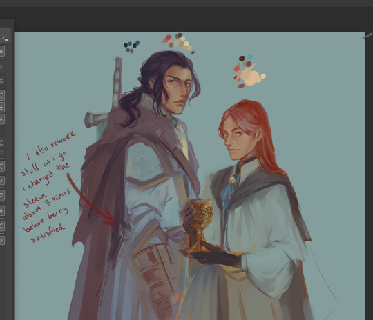
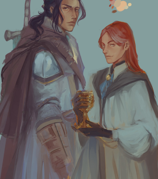
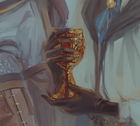
The chalice midway through render.
At this stage I will let it sit for a while longer. Whether it’s done is debatable and usually up to personal preference - you can render till kingdom come if you want something more realistic, but you might lose some lovely, sensitive evidence of gesture or interesting accidents. I also highly encourage playing with gradient maps if that’s something of stylistic interest. A good gradient map can do a bunch of things - change the whole temperature of a piece, push back certain details and pull others forward, etc (example here - this particular gradient didn’t suit what I was looking for, but it still manages to be visually interesting).
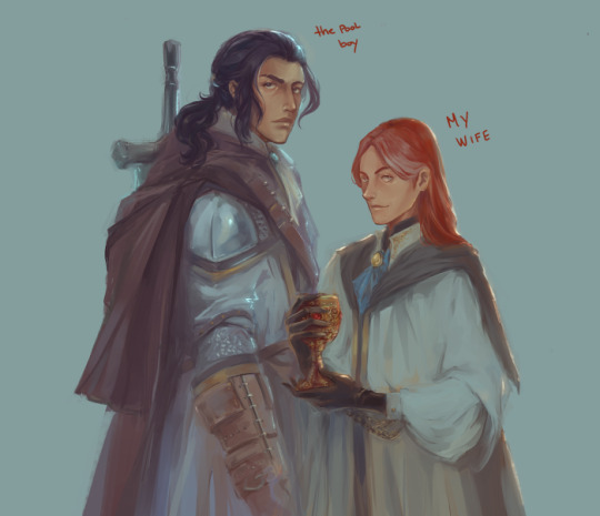
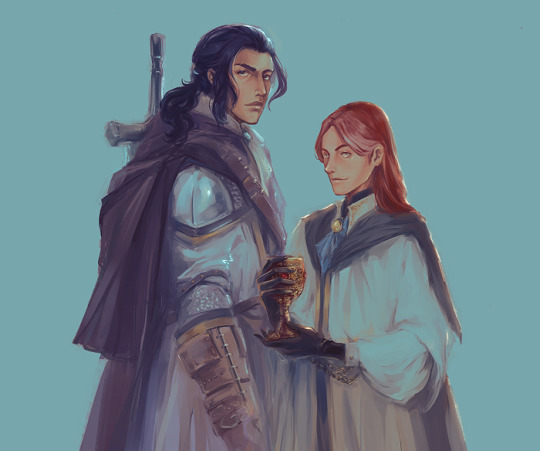
I usually come back and nitpick a few things before moving it into Photoshop where I’ll do colour management - another gradient map, fixing saturation/vibrancy, selective colour, etc - and anything structural that I may need liquify for. Then I’ll sharpen it one more time, slap a noise gradient on it if it feels like it needs some extra texture, and try not to hate it right after saving it LOL.
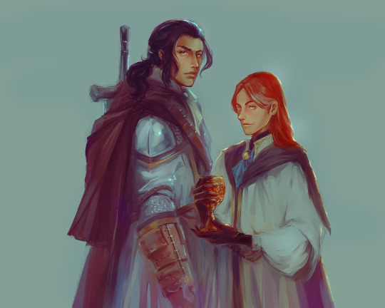
(I'll probably come back to this a few more times before posting something that feels more "finished").
Sorry for the long post - and hope this was helpful (•‿•)
#ask#wip#painting process#bloodborne#laurence the first vicar#ludwig the holy blade#digital painting#amateur hour
77 notes
·
View notes
Note
Hii! so i really love Dialuci and i wanted to request a fic about them. I like the 5 things + 1 thing trope but i saw that u already have a fic like that, so if you dont wanna use i understand, i just want a cute Dialuci fic bc they are adorable 💖
5 Times Diavolo Felt a Little Less Alone
AO3
Ship: Diavolo/Lucifer
Word Count: 2005
Warnings: None
A/N: Hi Anon! I’m always down for 5+1 requests! I hope you like this! I’m still getting used to writing for this ship, but I had fun!
1
Diavolo’s fingers danced along the castle walls as he gazed at the fallen Morning Star. He was more than the prince could ever wish for, to ever hope for, and he was standing right there. Well, sitting. He’d met Lucifer before, but he’d never seen him this worn. It was understandable, but still.
Gripping his nerves, Diavolo decided to approach him once more. Lucifer’s eyes swept up towards the movement and the Prince suddenly was all too aware of his heart pounding away in his chest.
“May I take this seat?” he asked.
Lucifer was silent for a moment, then he nodded, “I suppose you can.”
He was a bit more eager than he’d like to admit at the ‘okay’. He wanted to turn the Devildom into a home for Lucifer and his brothers, to make them all feel comfortable. He wanted them to want to stay.
Lucifer regarded him oddly, almost as if he couldn’t make out Diavolo’s intentions. Which was fair by all means. Perhaps he wasn’t setting the most appropriate of moods, but he found himself giddy at the mere thought of sitting close to the Morning Star. Even if the circumstances that brought them together once more were grim, he was still happy that he got to see him again.
“Can I get you some tea?”
He wasn’t sure if he wanted something to calm Lucifer or his own nerves. He’d have Barbatos bring every type out that he could find. He wanted to give Lucifer the widest variety of options that he could. He wanted to give Lucifer anything that he could.
“I suppose that would be nice,” Lucifer seemed hesitant. It was understandable of course, but Diavolo was already summoning Barbatos. He was going to make the Devildom home for Lucifer.
***
2
Diavolo loved parties. They filled the castle up with people and laughter and music. Things Diavolo wished there had been more of as he was growing up. Even so, sometimes the parties still felt lonely. Others wouldn’t address him the same way they addressed each other. It made sense, he was the Devildom’s prince. They had to treat him with respect.
He could act like one of them.
But he couldn’t be one of them.
His fingers tightened around his glass.
“Lord Diavolo, are you quite alright?” Lucifer was staring at him. Lucifer’s attention was on him.
He forced a laugh and put his hand on his shoulder, “Of course! Why would I be anything other than okay?
Lucifer’s brow furrowed and his lip twitched. He didn’t believe a word that had just come out of Diavolo’s mouth. Lucifer was the eldest of his brothers and the one that kept them in line, he knew when he was being lied to.
But before he could get a word out, Diavolo was already spewing more words at him. “I mean, just look at everyone out there having a grand time! There’s nothing to be disappointed about when there’s so many smiling faces,” he said, “In fact, shouldn’t you be out there enjoying yourself too?”
Getting Diavolo to try to go back to their previous discussion would be like taking Cerberus to the vet. So Lucifer played along, for now.
“I don’t believe I will, I have a perfect vantage point of my brothers from here.”
“Vantage-?”
Diavolo glanced out to where Lucifer was nodding. The rest of the six were all in perfect view with a slight turn of the head. He shouldn’t be surprised, Lucifer always had to make sure his brothers were on his best behavior. Well, Diavolo didn’t necessarily think that Lucifer had to per say, it was something he just did.
“So if it’s quite alright with you, I think I’m content on staying right here.”
For the first time that night, Diavolo felt himself relax and offer a genuine smile, “Of course.”
***
3
He knew it was late, but come on. Diavolo tapped the back of his D.D.D. restlessly as he listened to the line ring. Sure he could send a text, but he just wanted to hear someone else’s voice for a moment. Just a moment. Then he would be content.
He was about to hang up and redial again when a tired voice came up on the other end of the line.
“Diavolo? Do you have any idea what time it is?”
Part of him felt bad when he heard Lucifer yawn on the other end of the line, but his heart also leapt at the sound of his voice. Lucifer had a strange affect on him, and Diavolo was addicted to the sensation. It filled a void that rested deep within him, and he didn’t want that space to ever be vacant again.
“Ah, I apologize Lucifer. I just had something I wanted to tell you,” he stopped. Well, that phrase wasn’t completely a lie. He was sorry, but he didn’t have anything to say. “But it all seems to be slipping my mind right now.”
Silence flooded the other end of the line. A sigh entered his ear. “Diavolo- Send me a text when you remember then. You can always tell me to-”
“Wait.”
He could feel Lucifer hesitate. He could practically see the way his eyebrow raised, how his arms would fold if he wasn’t holding his D.D.D. He could feel the way he analyzed him, looking for the smallest bit of truth, the tiniest give away in his being. His words died at his lips, his normal forms of begging and pleading refused to come out.
He didn’t want to be alone.
Not right now.
Not ever.
“Please don’t go.”
His voice came out so small. It didn’t fit him. Normally his presence was powerful and captivating, but not he felt like the smallest breeze could blow him away. The ticking of his clock started to flood his mind, drawing out any other possible thought he could have had.
Time stretched out in odd ways Diavolo couldn’t comprehend, and there was only one thing that brought him back.
“Alright, alright. I’ll stay on the line, just don’t mind if you hear snoring. Now, what do you want to tell me?”
***
4
“Oh Lucifer! Look at this!”
Humans had such odd little things, but they were also incredibly dear. Who would have thought about making tiny clothes for animals? Adorable!
Diavolo held up a small yellow raincoat and pushed it into Lucifer’s face, “You should see if you can get a big one for Cerberus.
“Cerberus will be fine without,” yet his eyes lingered on the small outfit for a moment too long. A smile cracked at his lips, “I do believe I know a certain chihuahua it might fit though.”
Lucifer chuckled to himself as Diavolo continued to gaze at the little treasures that decorated the walls. “Oh they even have little rain boots! It’s a shame they don’t have anything bigger. Human dogs are just so tiny. And they don’t have nearly enough heads. They’re still just as lovable though.”
His hands moved to the bones and a frown spread across his face, “These are hardly fit for a dog.”
“On that front I agree with you. Not bloody enough.”
“Not big enough.”
“And they hardly look study.”
“It would barely function as a toothpick!”
“And no meat either.”
“It’s sad really.”
“Trully.”
The human world was different from the Devildom, very different. Diavolo could honestly say he’d never experienced something quite like it before. Everytime he thought he had it figured out something new popped out from around the corner. What made the entire thing even more wonderful was having someone to share it with.
He peered at Lucifer from the corner of his eye. Before he knew what was happening, the warmth of Lucifer's lower back was pressed against his hand. Lucifer stiffened ever so slightly. Then his muscles relieved themselves of their tension.
The Demon Prince had someone to share his experiences with.
***
5
This was an ethereal experience. It wasn’t something he could take lightly. This was a sign of trust. This was so much bigger than him, and Diavolo wasn’t about to take it lightly. Lucifer’s naked back was to him, his blackened wings stretched out before him. Diavolo felt as if he could see every breath the Morning Star took, every heartbeat drowned out the ticking of the clock.
“Are you sure?” Diavolo wanted to give him one last chance to back out. This was something sacred and intimate, something that he knew must have Lucifer on edge.
Lucifer’s head nodded ever so slightly, “Just remember what I told you.”
Diavolo swore he could feel his hands shaking, anxiety curled around his stomach like a serpent the closer he came to the majestic sight before him. Then the soft silky texture brushed against his finger tips. He couldn’t help but admire them as he ran his fingers along their gradient.
Lucifer trusted him with this.
Lucifer wanted him to do this.
He could have teared up in that moment, He promised himself that he would forever hold this specific moment close to his heart.
Of course Lucifer’s wings wouldn’t preen themselves. “Tell me if I do anything wrong.”
Perhaps he’d gotten too close to Lucifer’s ear, maybe his breath had been a little too hot, maybe he shouldn’t have gazed at Lucifer’s reddening cheeks as long as he did. But he wouldn’t change it for the world. His right hand man trusted him. A man as wonderful and beautiful and radiant and intelligent as Lucifer trusted him. Diavolo was allowed into his life.
The room was dark, quiet, and safe.
Diavolo never wanted to share anything this intimate with anyone else.
***
+1
The first thing Diavolo registered was how warm everything around him was and the fire softly crackling against the wall. Slowly his eyes peeled open and he sat up. After taking in his surroundings, he came to realize that he’d fallen asleep at his desk. Something quite unusual for him. He grabbed at the blanket around his shoulders as questions filled his brain.
“This is quite the role reversal isn’t it?”
Ah. Lucifer.
Diavolo hadn’t even noticed him.
A kiss was pressed against his cheek and a cup was set down onto the table. Spices immediately filled all of Diavolo’s senses flooding every corner of his head.
“Usually you’re the one doing things for me when I’ve been at my desk for too long, and now here we are.”
Diavolo brought the cup to his lips, enjoying the warmth against his skin, “It took so much for you to allow me to spoil you.”
“Not everyone in the world is as genuine as you Diavolo, and affection isn’t something I’ve been particularly used to.”
Lucifer’s hands soared over the desk as he started to organize various papers and documents. Honestly, at this point Lucifer was probably almost as skilled as Barbatos when it came to organizing Diavolo’s desk. Diavolo liked watching him work, it almost reminded him of a dance. Watching Lucifer was always a wonderful time, it was a treat. Perhaps domestic was the correct word.
“I believe you’ve told me before that there’s more comfortable places to relax than a desk.”
“Like plush chairs by the fireplace?”
“I do believe you mentioned those, yes,” Lucifer took his hand and helped him up, “Join me?”
Diavolo had gotten a taste of company all those years ago, and now he constantly lived in company. His old self would be envious of what he had now. As long as he had Lucifer he wouldn’t be lonely, he’d have warm nights and bright days. There would always be a reason to make a second cup of tea or to bring two plates to the study. His things would sit next to Lucifer’s, they could have long conversations or comforting silence, and the chair next to him would never be empty.
Finally Diavolo had someone to share his life with.
Finally life wouldn’t be lonely anymore.
#ruewrites#anon#request#anon request#obey me#obey me diavolo#obey me lucifer#diavolo x lucifer#dialuci#5+1 things#5+1 fic#angst#fluff#angst with a happy ending
84 notes
·
View notes
Photo

✧ TEXTURES – A TUTORIAL BY EVANSYHELP.
In this (long and image-heavy) tutorial, I’ll be showing you how I make textures, as requested by a very kind anon. I use Photoshop CC 2019 but you should be able to replicate my methods on most editing software. Please like or reblog this post if you find this helpful!
Index.
Ethically Sourcing Your Images.
Finding The Right Image.
Making Your Texture.
Other Tricks I Use.
Quick Recap.
Making Textures Without Images: Speedrun.
Outro.
Ethically Sourcing Your Images.
I will be explaining a couple quick ways to make textures without any images at the end of the tutorial, but since my personal favourite way involves images and that’s specifically what the anon requested, that’s what the majority of the tutorial will be focused on.
The first step, naturally, is finding an image to use. My personal favourite site is Unsplash, but there are plenty of options out there.
What you need to keep in mind is what kind of license the images have. Unsplash is free for personal and commercial use with no attribution required, which makes it perfect for things like this. There are more sites like this in my free for commercial use masterlist (linked at the end of the post), but unless you’re using them in products you’re selling (like graphic commissions), the commercial aspect isn’t something you need to worry about. Just check the site/photographer’s rules to make sure you’re allowed to edit the images for personal use, and whether attribution (credit) is required.
Another important thing to keep in mind is that these sites typically never allow you to redistribute the images as they are. That means you can’t just go to Unsplash’s texture category, save the images without any changes, and reupload them in a texture pack on Tumblr. That’s stealing. We don’t do that.
Finding The Right Image.
Knowing what kinds of images will make good textures is a learning curve. My first couple texture packs are rough compared to what I make now, because I basically taught myself with no guidance and learned through trial and error. But with practice, I learned what worked and what didn’t.
You want your images to be HQ, either with no ‘subject’ (ie. a person) or with a large background. Higher contrast is better but not super necessary. You should hopefully be able to envision what kind of texture you want to make before you even touch the image.
Making Your Texture.
For the majority of the tutorial, this is the image I’ll be working with. Credits can be found in the link at the end of the post.

Open your canvas. You can make specialised textures, like 100px for icons or 540px for Tumblr graphics, but I personally prefer to make them large for versatility. I’m using 800px in this tutorial. Once you’ve chosen your size, upload your full-size image into the canvas. This is where the fun begins!
Drag the image around into a nice position. Or use Edit > Transform to rotate, flip, and warp the image in different ways. Or use Edit > Free Transform (Ctrl+T) to change the size or the angle more precisely. Or probably some combination of all three! With Free Transform, make sure this aspect ratio anchor is selected so you don’t butcher the quality of the image, unless you’re warping it intentionally:

This is all very individual to each image you use. You might want to flip one, shrink another, put another at a 30 degree angle. Just experiment until you end up with something you think would look awesome as a texture. For the sake of providing a good example, I flipped this image vertically, shrunk it to 80% its original size, and rotated it until it looked like the smoke/cloud was coming from the bottom right corner. This is what we have:
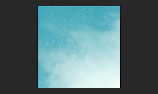
Then we move onto enhancing. Textures work best when there’s a lot of contrast because it’s easier to manipulate the blending modes. So if your image isn’t already high contrast, these adjustment layers (Brightness/Contrast, Levels, and Selective Colour) are your new best friends:

If you don’t see this on your Photoshop, go to Window > Adjustments and it should pop up. Again, just experiment, because different images will require different things. Essentially, you want to make the darks darker and the lights lighter. Something I like to do is add a Selective Colour layer and use the Black slider. Pick out the primary colour of the image, and then Whites, in the drop-down menu, and move the bottom slider (left to lighten, right to darken) until you’re satisfied. Like so:
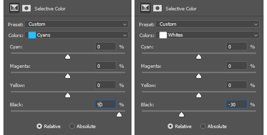
So with those Selective Colour settings and the following Levels settings, here’s the before and after of my image.


Much better contrast! If you want to end here, you can, but I personally prefer grayscale textures a lot of the time because it makes it more versatile. Instead of being forced to make a blue graphic because this image is blue, I can make any colour graphic I want with one simple black and white Gradient layer. Photoshop does have a default Black & White adjustment feature, but I prefer using Gradients.
Pro tip: if your image doesn’t have a pure black, you can keep the darkest parts of your image dark by using the left slider, shown below.


A lot of the time, I’ll also decrease the opacity of that Gradient layer, to somewhere between 80% and 95%, so just a hint of the original colour comes through. This gives it more dimension in my opinion, while still keeping it mostly neutral. Here’s 100% vs. 85%:
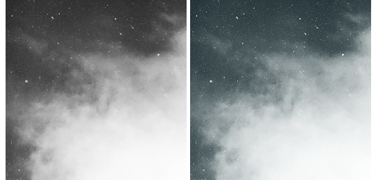
You may find that you want to add a little more contrast after. With this texture, I decided to grab another Selective Colour layer, pick ‘Black’ in the drop-down menu, and pull the Black slider up to +40. I also settled on 95% opacity for the Gradient. And here’s the final product!

Other Tricks I Use.
That covers how I make a lot of my easier textures, but here’s a quick run-through of other, slightly more complex tricks. I’ll be working with this image (again, credit at the end of the post):
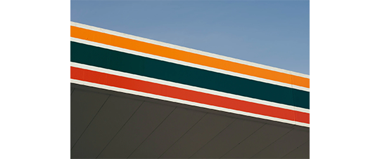
This, of course, is not as obviously texture-worthy as the previous example, but I love textures with strong lines, so here’s how the magic happens! I wanted to get rid of the detail on the bottom half, so I used the Polygonal Lasso tool to select it:

Then I used the eyedropper tool (the 4th symbol under the polygonal lasso in the image above) to select the blue of the sky and, on a new layer, painted that selection completely blue. I decreased the opacity to 90% just so it wasn’t a total block colour, but not enough that you can really see the lines. I repeated this process for the sky, so it looked more consistent with the bottom half.
Then, using the eyedropper tool again and making a new layer for every colour, I went in with a small soft paintbrush and painted out the harsh vertical lines on each segment of the stripes. I didn’t want to make them totally perfect, but I painted over the bulkiest interruptions.
I added a black and white Gradient layer, using the slider tool I showed you before to darken the darks and lighten the lights, and decreased it to 50% so that it wasn’t totally black and white but still more neutral than the original. Here’s the result:
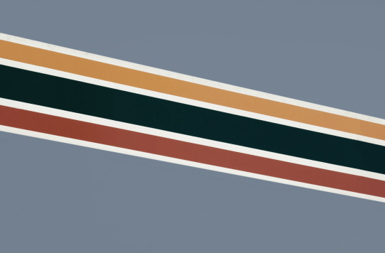
Another fun way to shake things up, which unfortunately will require Photoshop (CS6 should be fine, not sure about earlier versions), is the Filter Gallery. Go to Filter > Filter Gallery, and you’ll find a TON of effects that change your image drastically. Most of the default settings are nightmarish, but you can play around with the settings panel on the right.

Here’s just a few results that are possible with the Filter Gallery, labelled for convenience. You can view the HQ versions in the link at the end of the post.

Quick Recap.
So you don’t have to reread this obnoxiously large tutorial every time you want to reference it in the future:
Choose a HQ image.
Resize, rotate, flip, and/or warp.
Enhance the contrast.
Black and white!
Paint over problem areas!
Filter > Filter Gallery.
Making Textures Without Images: Speedrun.
We’re almost done! There are some tools built directly into Photoshop that can allow you to make textures completely from scratch, and I’ll briefly cover my favourites here.
The first is pattern fill layers. I spent too many years not appreciating the patterns feature in Photoshop, but they’re great. Go to Layer > New Fill Layer > Pattern, click ‘OK’ on the box that pops up, and another box will pop up to let you choose your pattern.
By themselves, they are UGLY. It can take a while to figure out how to use them. But if you change the scale, change the blending mode, and change the opacity, you have thousands of textures at your fingertips. And if you add two or three together? Billions of possibilities. I can do a more in-depth tutorial on patterns if y’all are interested, but here’s two examples I just whipped up in a matter of minutes, using two patterns on each:

The next feature is gradient fill layers, and the gradient tool. Go to Layer > New Fill Layer > Gradient… to select a gradient (or make your own!) and an angle, OR use the gradient tool (featured below) to drag the gradient across your canvas manually. On its own, boom, that’s a gradient texture. Paired with a pattern or put through the Filter Gallery? Even better!


The last is brushes. Brushes can be great for textures because there are so many kinds. You want to make a paint splatter texture? Paint splatter brush sets are everywhere! You want to make a smoky texture? You can get brushes that look like smoke! Smudged? Scratchy? Grunge? Halftone? Light leaks? Torn paper? Brushes have your back.

With all of these features (and things like actions, too!), your saving grace is going to be this little cog wheel shown below, and the list you’ll find under the Reset/Save/Load section. There are SO many more options built directly into Photoshop that you don’t even see right away, because you have to add them manually from this little cog wheel.

And you can download countless more patterns, gradients, and brushes from sites like Brusheezy and DeviantART. A couple tutorials on downloading and installing them can be found in the link at the end of the post, but remember, download these things ethically. If you want to sell products that use a custom brush, it’s your responsibility to find brushes that are free for commercial use. If you don’t want to credit the creator, it’s your responsibility to find resources that don’t require attribution.
Outro.
I think that’s everything, guys! If you found this tutorial helpful or otherwise enjoy my content, please consider supporting me on Ko-fi! I offer exclusive rewards, like custom graphics, to everyone who donates.
Due to Tumblr’s latest rules about links, you can find the credits list, the promised bonus tutorials, other important links, and the full-size HQ versions of the textures made in this tutorial over here.
Thanks for reading!
#rph#allresources#completeresources#itsphotoshop#chaoticresources#photoshop tutorial#photoshop resources#photoshop help#ps resources#ps tutorial#eh#eh: tutorial#tutorial#ps help#texture#*100#*250
371 notes
·
View notes
Text
A Moment of Reflection
Place: Directly After “A Gate Between” Word Count: 1,830 Rating: T Prompt For Quarantined Frans Weeks: Day 5 [Time] Cross Posted to a03 here!
@qfransprompts
“where’s frisk?” Papyrus turned to look at Sans over his shoulder, a bony brow raised inquisitively as he slowly dried a plate. Was he honestly asking that? There was no other place Frisk could be other than the house.
“...CAN YOU NOT FIND HER?” He drawled slowly.
His older brother frowned up at him. “paps, if i could would i be asking?”
“TRUE ENOUGH. WHERE HAVE YOU LOOKED?” Sans let out a sigh as he listed off all the rooms including embarrassingly enough the bathroom. Papyrus frowned at that but didn’t prod as he looked out the kitchen window in thought.
“HAVE YOU TRIED THE GARDEN?” Sans’s eyelight shrunk in surprise as he glowered at himself. Why hadn’t he thought of that? Frisk might not have been ready to go exploring or anything but that didn’t mean she didn’t want fresh air or the like.
“thanks bro.” Paps hummed as he returned to doing the dishes, not giving his sibling a second glance as he lazily took a shortcut.
Frisk...felt tired.
She was enjoying watching the magical plants in front of her. Loving it when one would light up in a pulsing glow every time an insect would touch it’s petals to let out a silent melody of music she couldn’t fully place. Or when a red flower would erupt a tiny sprout of flame from its center similar to a candle when lit.
But the majesty in front of her was also a brutal reminder of the price she had paid to witness such things.
To be alive to do so.
Slowly she reached out to a lone blue flower situated to the side of the bed and brushed against it, marveling as Papyrus’s voice came through loud and clear. “BROTHER WOULD YOU STOP TALKING TO FLOWERS, YOU’RE GIVING THEM YOUR BAD HABITS.”
She snickered and played it again just as Sans appeared behind her.
He watched her silently as her face glowed with happiness, her knees tucked up beneath her chin just as she had done when she was younger and felt his soul give a twirl in his ribs. She looked so beautiful mesmerized by the echo flower.
But it was also a reminder of the simple joys she’d been denied.
“he says bad habits but i call them lessons in comedy.” Frisk jolted in place, her heart quickly leaping into her throat as she spun around, but just as quickly calming as she smiled up at the Seelie grinning at her.
“I’m still not used to your shortcuts.” He tried not to notice how small her smile had gone.
“sorry, didn’t mean to get the jump on you.” His wink was enough to earn a chuckle, one just as small as her expression but still clear enough that it warmed his bones. Slowly he walked closer and plopped nonchalantly on the ground next to her. It was cute how red her face turned at his closeness but he chose not to address it.
“checking out the flowers?” Frisk nodded.
“Yeah, I have been curious about them for a while now.” Sans’s sockets softened as he recalled how often she’d sit with him making flower crowns and rings as they spoke with each other, how excited she’d get when he told her stories of plant Seelie and the meaning their blooms usually told when speaking.
She hadn’t exactly brought up flowers or other conversations with him since she’d gotten there.
Sans missed it.
“want me to tell you about them?”
Frisk blinked as she looked over at him and she could only see a warmth in his gaze that made her cheeks sting as she recalled their kiss from a few nights ago. She suddenly felt shy but looking back at the mysterious plants in front of her she managed to nod again.
Sans chuckled. “which one first?”
He watched as she pointed towards one, it’s tone shifting in a gradient of white and purple light as it swayed in the light breeze around them.
Ah. He liked that one.
“that’s a flavor petal.” Frisk’s face scrunched up as she gave an adorable nose wiggle.
“Flavor petal?” Sans looked at the questionable tone and simply shrugged.
“it’s used in cooking a lot similar to parsley. when you eat a petal it lets you taste whatever food or drink your body is craving at the time. paps has had to pull my snoozing butt from the garden on occasion because of it.” Frisk snorted. She could picture that easily.
“Back home that type is called a Tritonia Crocata.” Sans hummed thoughtfully but his smile dropped as he noticed her eyes dull slightly. He didn’t fail to notice how soft spoken she went when she’d mentioned home.
So much guilt stirred in him.
“you’re homesick.” She didn’t deny it, only tucked her chin into her arms as she stared at the flower they’d been speaking about.
Sans tried to be tactful but he couldn’t think of a way other than to address the whole thing head on. He knew she forgave him, understood why he’d ignored her wishes and had manipulated her the way he had. Frisk might tell him all the time his honesty wasn’t that but he knew that was her being too kind and merciful.
That also didn’t mean there still wasn’t regret she felt for caving to him whisking her away.
“i’m sorry.” She looked at him in confusion before letting her shoulders slump as she realized what he was talking about.
“Sans--”
“i’m sorry.” He looked at her gently. “you can tell me for the rest of our lives there’s nothing to forgive but there is. and i’ll be honest i don’t regret having you here with me, just why it had to happen.”
His soul tightened painfully as she looked back at the flowers, a detachment he didn’t like and always hated seeing overcoming her features. It reminded him so much of those bad days she’d have.
Sans never wanted to be the reason for her to look like that.
“It’s...going to take time.” She looked at him again and for a brief moment he saw her younger form and felt himself taking the chance to offer her the comfort she’d so often denied him back when he’d been incapable of helping her.
“it may seem like it’ll never go away, like you can’t feel anything else but the pain.” The way he saw water bead in the corner of her eyes confirmed what he’d been thinking. Hesitantly he wrapped an arm around her and gently nudged her into his side.
Frisk at first tensed but slowly she relented and leaned into him and let out a shaky sigh as he ran his phalanges through her hair. The feeling of his textured phalanges running though her locks sent a pleasant warmth down to her toes and it made it surprisingly easier to breath.
He spoke in a lowered tone, near a whisper like she might fall apart if he was any louder.
“but it’ll get better. it’s fair to mourn the loss of your mortal life, but it’s not going to last forever frisk.” The sound of her name in his baritone soothed her.
“It feels...so heavy Sans. I’m happy to be with you, really...but it hurts to wonder what I’m missing…” He pressed a kiss to her brow and she turned red as a tomato. Still he ignored it again as he rested the side of his skull against the top of her head.
Frisk then noticed she’d been fully pulled into his lap, his legs stretched out on either side of her and his arms securely holding her as he continued to pet and twist her hair. There was a faint rumble, a barely concealed hum against her side where it rested against his ribs.
Was that...his magic?
She felt so safe, so protected being held so close as she was even as the contact sent her heart into a tizzy and made butterflies soar through her stomach. It might have been uncomfortable if others were around but she found she welcomed it with just the two of them for company.
Sans might have been a different being from her but she had never felt closer and more related to him in these rare moments. The rare moments that had gradually become more frequent since they’d confessed to each other.
“i know, i know what it’s like to miss the potential for something you’ll end up never having.” And she caught just how sad Sans sounded. Like he really did know what she felt. Before she could ask though he was shifting her to face him.
His hands framed her face and he lingered as he took in the smoothness of her skin and the pale shade of her lips, but more than anything still how bright her sun colored eyes were as he looked into them thought they were filled with sadness.
“eventually you’ll make friends though, experience new things and sights no one else will ever get the opportunity to have done.” His words sounded so passionate her ears burned. His sockets narrowed reassuringly as his smile lifted in one corner empathetically.
“make no mistake, a part of you will always carry that weight that currently suffocates you, but it’ll be so much easier to bear. and i’ll be here every step of the way to make sure it doesn’t crush you.” Frisk’s breath froze in her lungs as he pressed his forehead into hers and tucked a lock of her hair behind her ear.
She wanted so much to take his words and engrave them into her heart. She never wanted to forget them for even a moment. How did he manage to see to her very core and say exactly what it was she didn’t know she needed?
“...y’know i hate making promises, because a lot of the time they can’t be kept. you never know what life is going to throw your way. but for you? i promise. in time it’ll get better, and i’m going to love watching you shine every step of the way.” She sniffled and choked.
“D-did you just make a pun?”
Sans smirked. “how could i not? the sun’s staring into my sockets.”
Frisk couldn’t help it.
She let out a sob as her heart swelled and balled herself up against the skeletal Seelie as she shook.
Sans silently held her, not minding for a second how her tears wet his clothing or how her hands clenched and tugged against him where they rested on his chest. He knew this had been the very thing she’d always needed.
Someone in her corner and to support her.
Never again if he could help it would he let her go without that. This was a promise he refused to break come what may.
They had all the time in the world for him to prove that to her.
#fransfun#faerytale-au#undertale#alternate universe#sans x frisk#adult frans#frans#hurt#comfort#qfransweek#day 5#time
117 notes
·
View notes
Photo
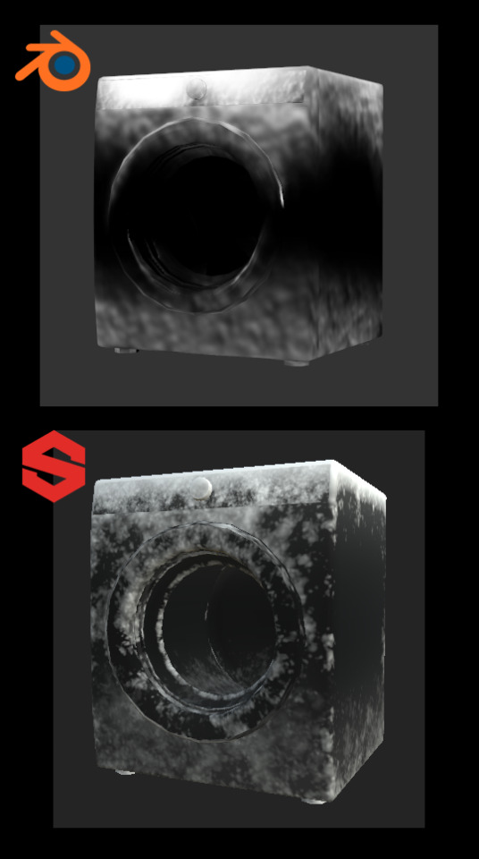
Click on Continue Reading to learn how to create Snow Masks for The Sims 4 objects.
After The Sims 4 Seasons came out, some object were provided with a Snow Mask. It’s a black and white mask with pretty high contrast, used for objects that, in real life, would have more complex snow accumulation than what the automatic accumulation can achieve. Some objects have a void snow mask, which is pretty annoying. If there is a snow mask for an object, i always use it, and these are my methods.
This tutorial teaches you some methods to make this map easily and quickly.
Hopefully, the GIFs work 🤣

Requirements: - Your mesh has to have a UV Map; - You must decide a texture size and stick to it, you can always size down but never up; - You must switch to the Cycles rendering engine.
Procedure:
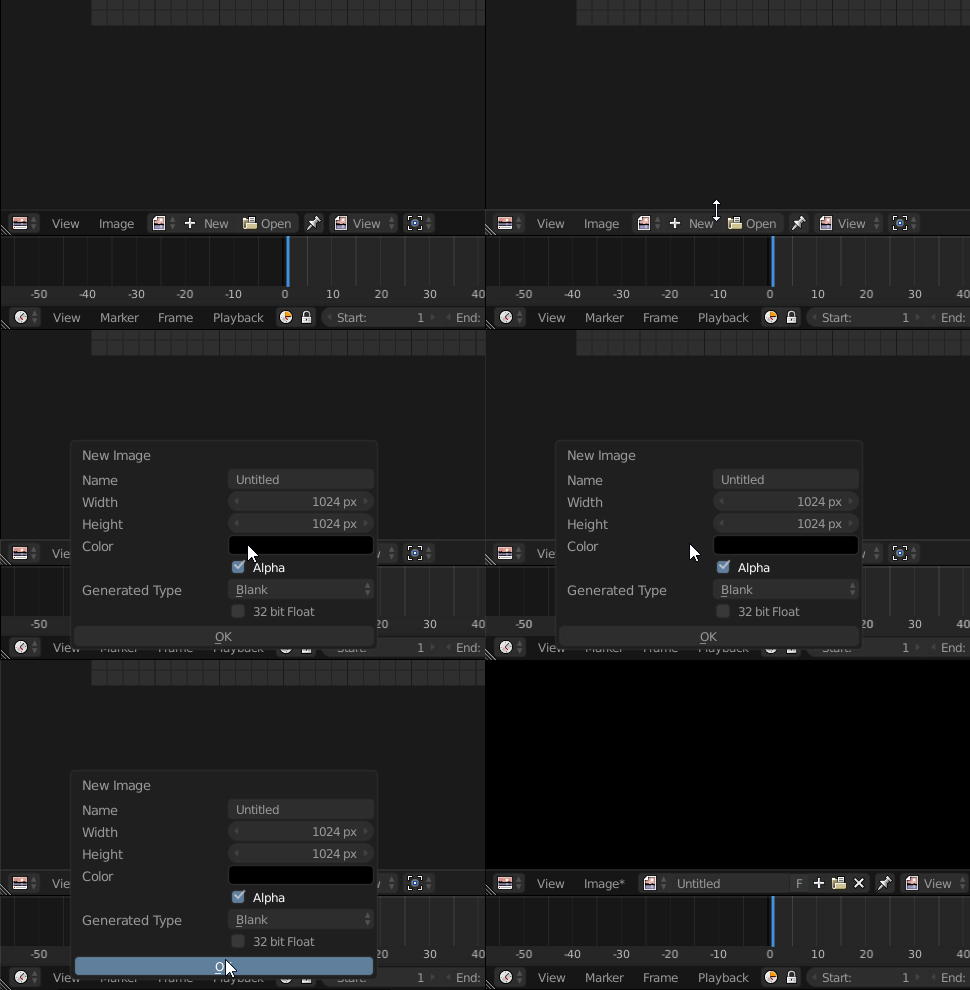
Open your Blender file with the object we’re going to design the snow mask for. Once you’ve opened the file, open yourself a UV editor tab and create a new texture with the size of your diffuse texture. The texture we’re going to create is going to be black:
Once you have your texture, we can start painting. Let’s create a new material for your mesh. Click on your mesh and reach the materials panel:
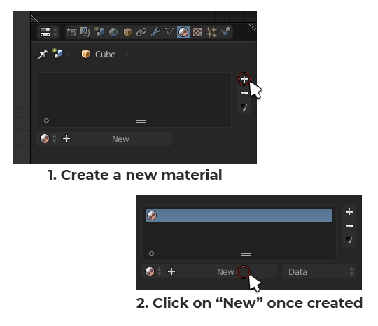
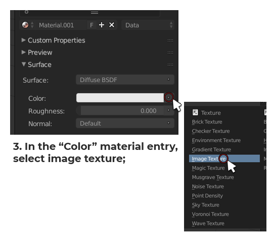
Now that the texture is inserted into the material, we can paint on it. Let’s switch to Texture Painting. Select your mesh and press [DEL] on your keyboard Numpad to center the view on it. Once you’re done doing that, this is how to enter Texturing painting mode:
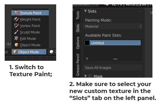
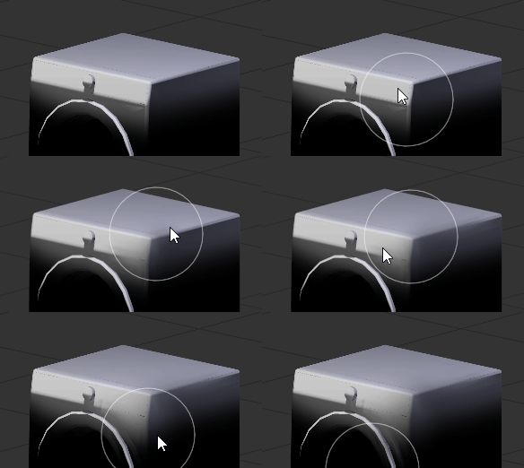
We’re ready to paint. To create a snow mask, you want to cover the base of the mesh a bit to simulate the frosting of the surface caused by the freezing snow on the ground but also the top surface to simulate the snow that has fallen onto the object from the sky. The best way to do so is, first of all, by going into Orthographic view. Having no perspective in the scene will help you minimize the bleeding of your painting. To switch to Ortho, press [5] on your keyboard Numpad.
Let’s paint the front first. Press [1] on your keyboard Numpad to switch to front view. Let’s adjust our brush before painting. Adjust your brush size and strength according to what are you’re trying to cover.
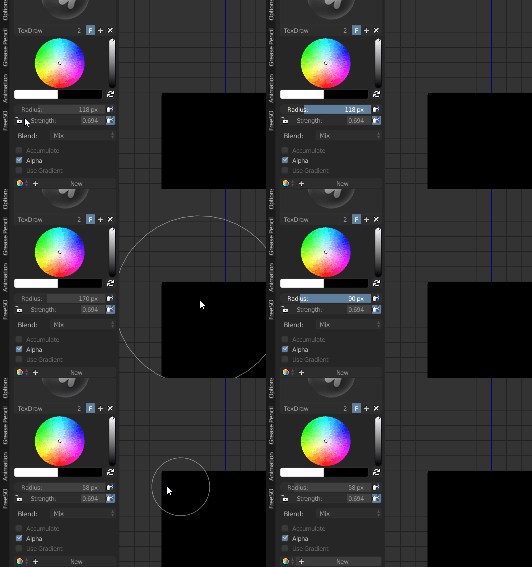
For the bottom portion of the object you want to have a big brush and a lower strenght (around 50% the original default strenght) in order to use just the feathered out end of it for a softer stroke.
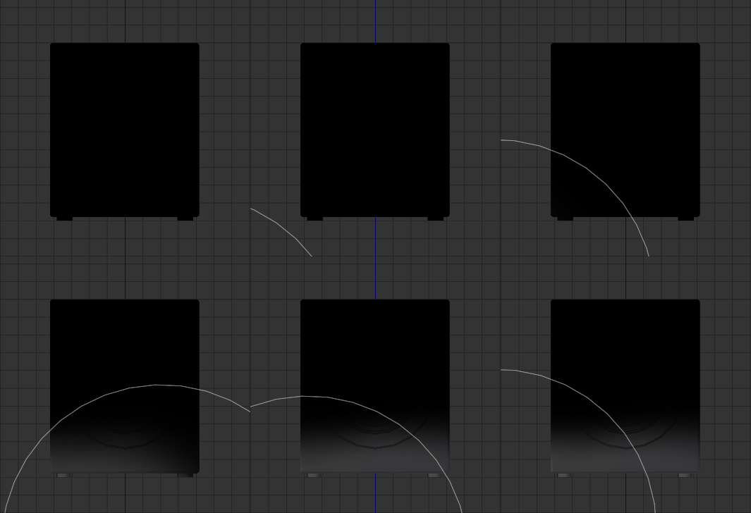
Repeat this for all sides! Don’t worry too much about being too even with the height of your strokes, we’re gonna blend them together after we’re done painting them.
Once you’re done, it should look something like this:
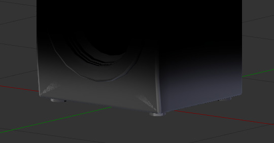
Let’s even out these harsh edges and, occasionally, painting artifacts. Grab the “Smear” brush in the brushes toolbox:
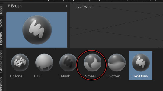
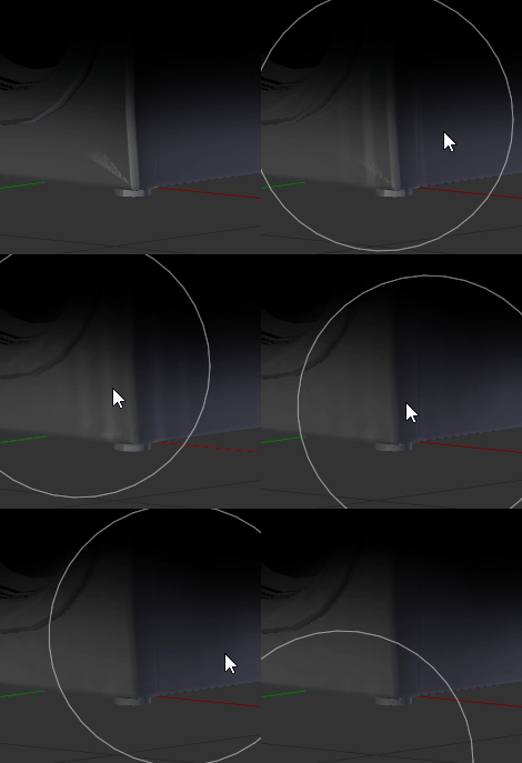
Smear the edges until completely smooth. Do this for all sides.
Once you’re done with the ground snow, paint the sky snow. To do that, grab your Texdraw brush back and follow these steps:
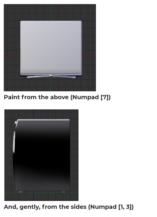
And then, smear it all!
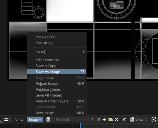
Once you’re done doing that, save the texture and open it in Photoshop. I’m assuming you know how to export a texture from Blender as a PNG and then opening it in Photoshop.
Once you have your texture open in Photoshop, i want you to google a Snow texture, fairly big (big enough to fit the size of your texture).
Insert it in your PS document as a new layer and put it over the snow texture you painted earlier. Now turn that snow texture black and white (even if it seems to be already, there’s probably some colored pixels due to compression here and there).
Now open the Levels sliders and achieve this look by sliding the middle slider on the right or left (depending on your picture):
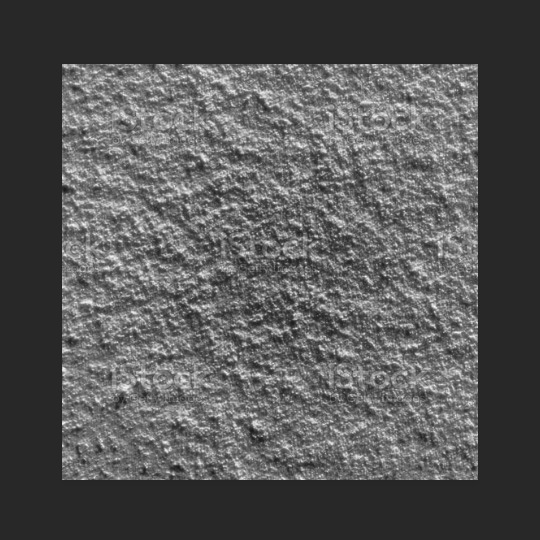
Now, use gaussian blur to feather it out a bit and make it less harsh and Alpha like, we’re going for a maxis match look. If you want an alpha look, skip this step. This is how it looks after blurring it:
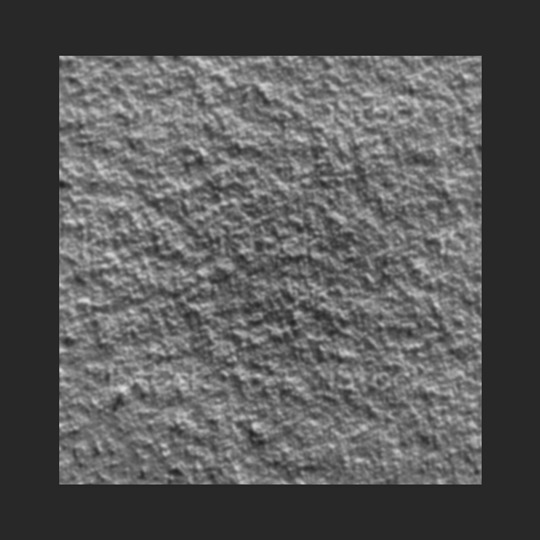
Now, go to the blend mode of this layer and set it to Overlay. I’m assuming you know what this means.
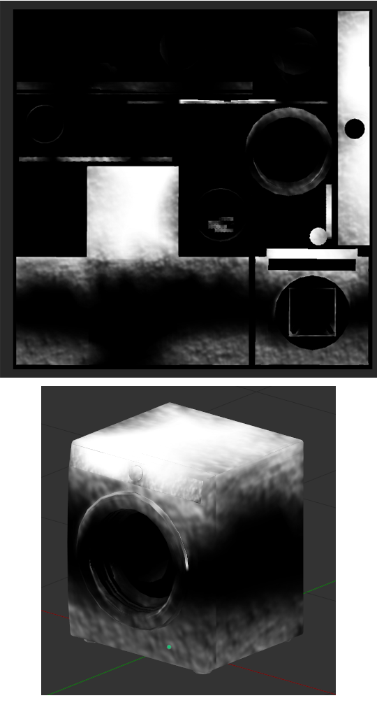
If it needs further smearing, go ahead and do that to remove visible seams. If it needs opacity adjusting, you can do that as well. Add a pitch black layer over everything in photoshop and adjust it’s opacity to make the snow more or less visible.

Substance Painter is a product under paid license by Adobe. My university provided me with a license, however, you can use the trial version to experiment with it.
Import your mesh into substance painter, without any additional texture (don’t click on ADD):
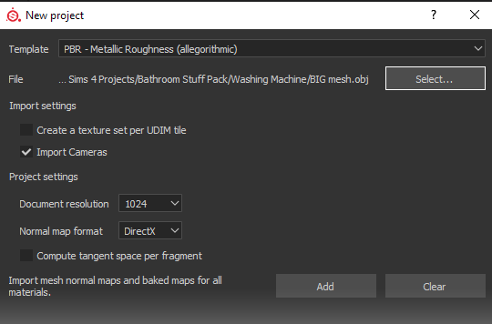
Add two fill layers and uncheck every single material property except for “Color” and “Roughness”. The top material will be white, the bottom one will be black. Turn the roughness of both material to 100%:
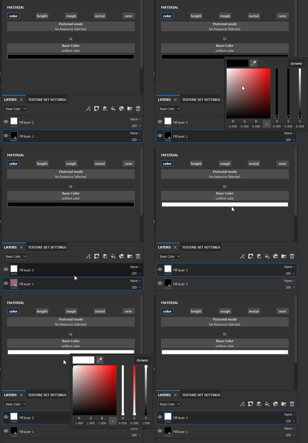
You can rename your fill layers if it makes it easier for you to keep track of what you’re doing. I suggest renaming the white one “Snow” and the black one “Background”.
Now, let’s add a few a masks to make it look like what we’re trying to achieve. Right click on the snow material and select “Add Black Mask”. Now, right click on the mask and select “Add Generator”:
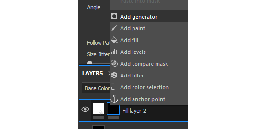
Generators are dynamic masks that can be fully controlled by the user to achieve multiple types of dirt.
For our snow, we’ll begin with the ground generator, for the frosted surface starting from the bottom. Click on the generator entry that was created and assign it a “Mask Editor”:

If you scroll all the way down inside the Mask Editor options, you will notice our mesh has absolutely NO baked texture:
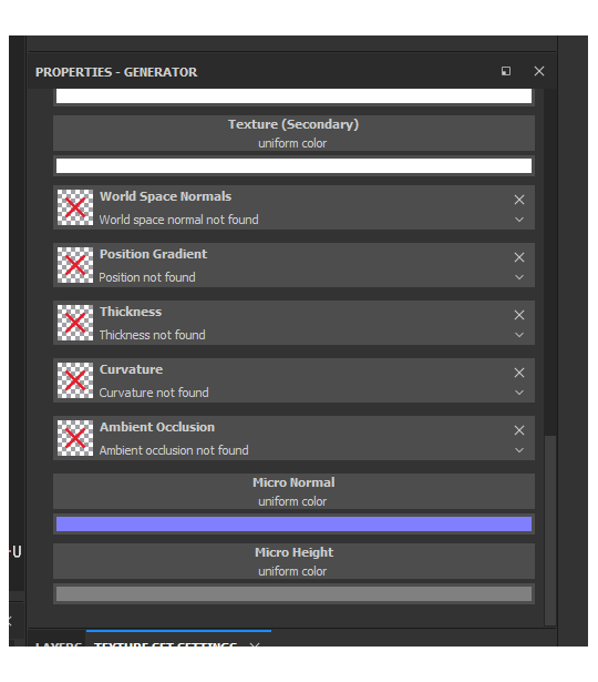
To operate, the Mask Editor needs these textures, so we’re gonna bake them. In order to do so, switch over to the “Textures” tab:
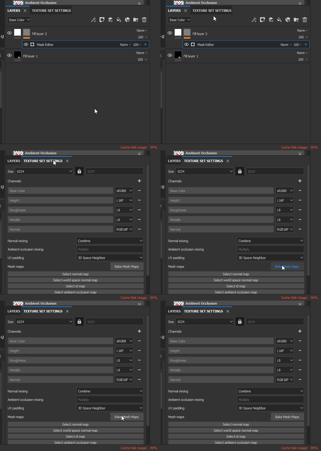
This is what your Baker window should look like:
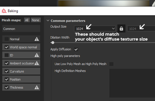
You can now click on [Bake DefaultMaterial Mesh Maps]!
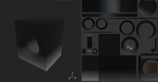
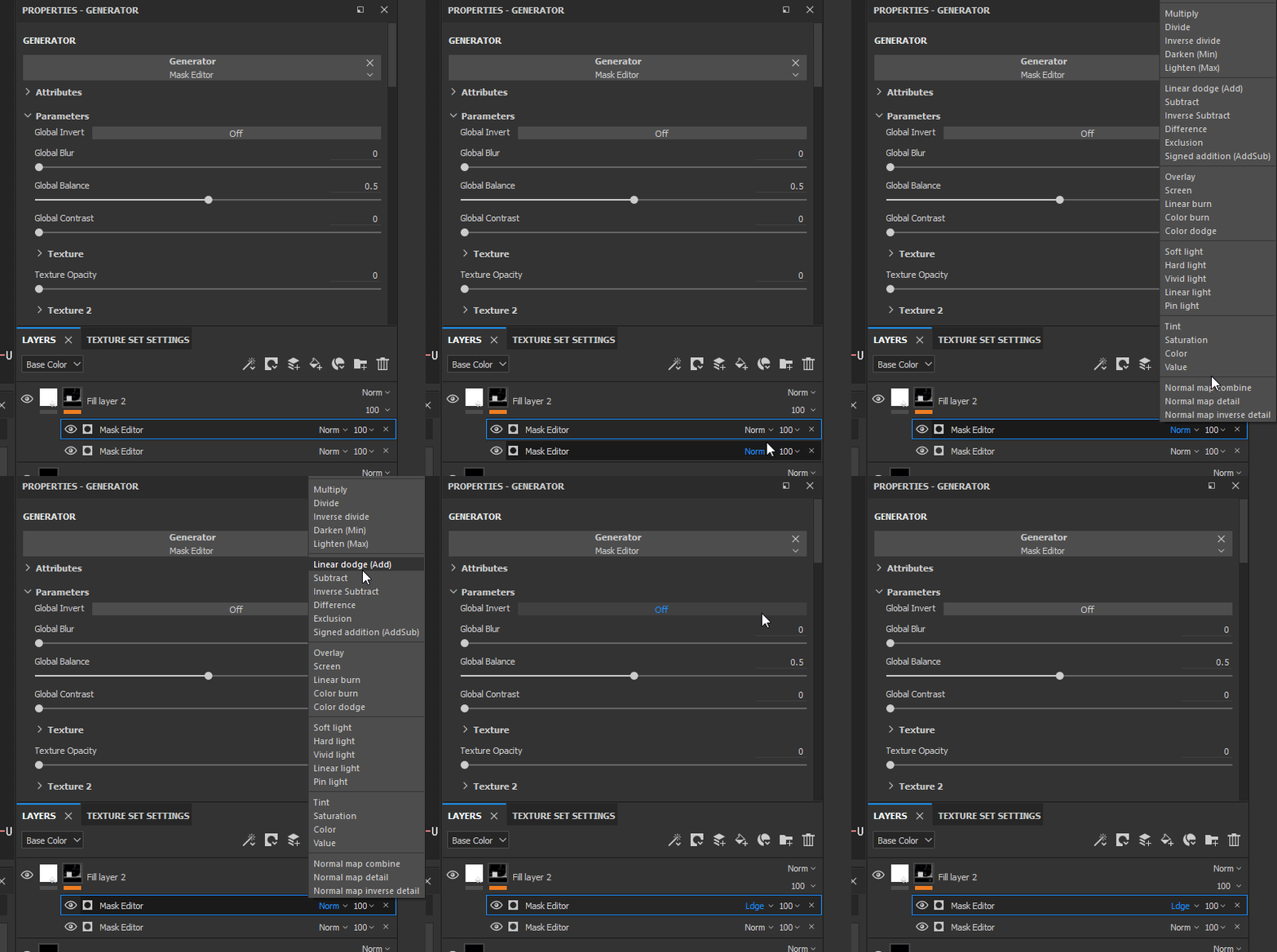
Once the bake is finished, your Snow fill layer should look a little different, cause the Mask Editor received the recently baked textures. Now we can edito the Mask Editor properties. We are starting by creating the bottom frost layer, so let’s get to it.
By default, in the Mask Editor settings, the Curvature value is turned on all the way. Slide the slider to 0. Instead, activate the Position Gradient value. By default, the position gradient goes from top to bottom. To invert this flow, the handy Invert button is there for us. Switch Invert from off to on. Since we inverted the mask property, the Brightness slider will still do its job, but the other way around. Increasing the brightness will decrease the opacity of the snow mask. Now, play around with the Balance and Contrast sliders until you achieve a similar look:
Balance: 0.09; Contrast: 0.22; Brightness: 0.57;
We now have the perfect base to work on some details, a nice linear bottom to top gradient. Now, scroll down to the texture area of your Mask Editor. You’ll notice there’s two empty slots, called just “Texture”:
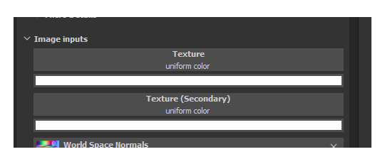
You can fill these in with “Grunge maps” (detail textures in black and white) to add variation to anything in the Mask Editor. Let’s fine one that suits our project the most.
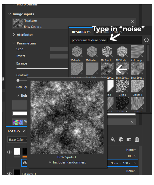
This randomizable texture called “BnW Spots 1″ seems to be a good starting point, it looks like it could be interpreted as a frosty snow, let’s click on it and add it to our “Texture” slot.
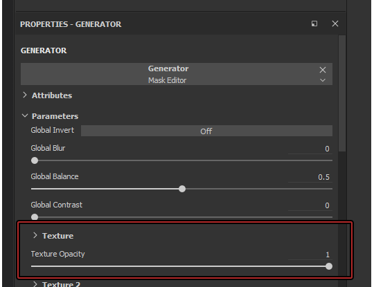
To make our “Position Gradient” influenced by the newly added texture, you’ll need to turn up the “Texture Opacity” slider in the Mask Editor global settings at the top:
The result is now undeniably better:
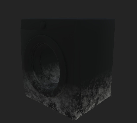
Looking good so far! Now, you can play around with the Texture’s Balance and Contrast in the Texture Slot and see changes happen live:
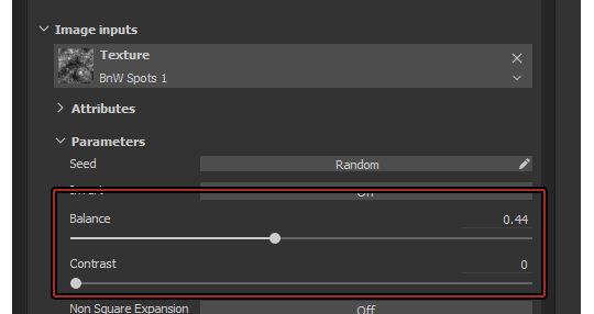
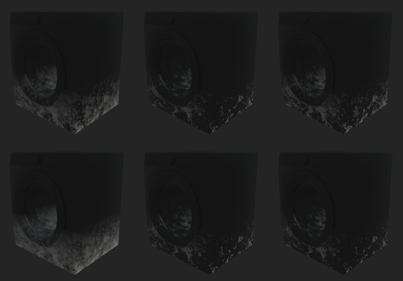
Decide what looks good to your eyes, this is 100% subjective! It’s looking really good, but you can still see a clear ending point of the gradient!
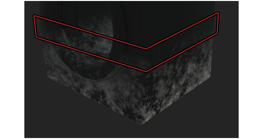
To fix this issue, you’re gonna have to play around with the Balance and Contrast of the entire Mask Editor, which are located at the top of the Mask Editor options:
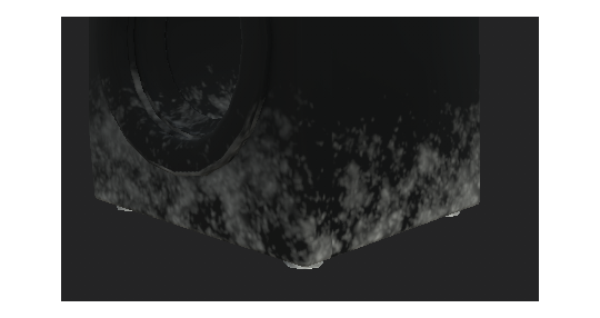
Repeat the same process for the top portion of the snow (the fallen down from the sky type), just without turning on Invert obviously. You can right-click on the mask and add another Generator. Just make sure to set your second Generator to Add onto previous layers!
You can also turn on some “Curvature” (the one we previously disabled) on the top snow Generator to make it even frostier:
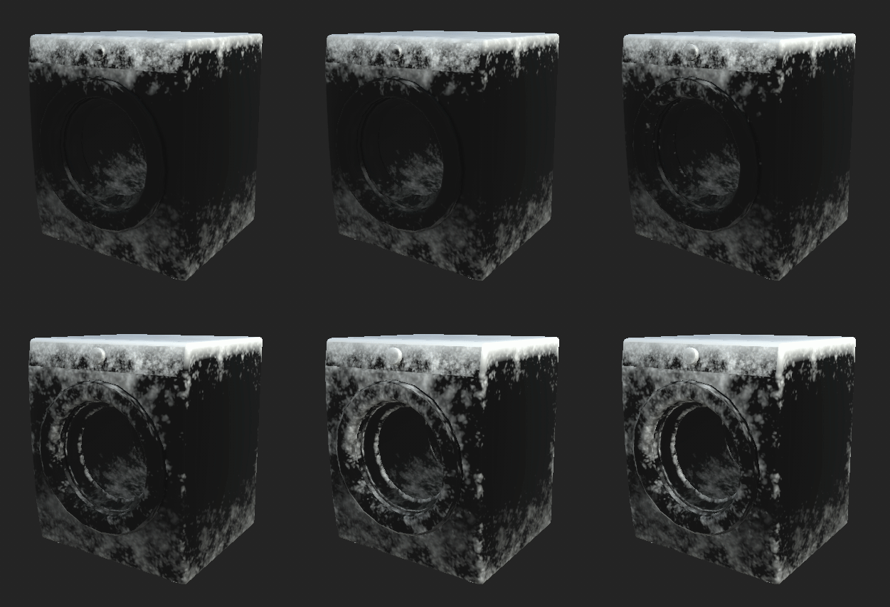
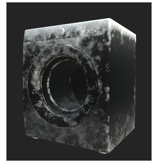
In my final product, i added another two generators, with no texture, to add some more gradienty frostiness to the whole texture.
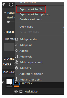
Once you’re done, export your mask and save it as a file. Put “.png” at the end of the file name!
And you’re done!
#the sims 4#sims 4#ts4#s4#the sims 4 tutorial#sims 4 tutorial#ts4 tutorial#s4 tutorial#the sims 4 snow#the sims 4 snow mask#sims 4 snow#sims 4 snow mask#ts4 snow#ts4 snow mask#s4 snow#s4 snow mask#the sims 4 seasons#sims 4 seasons#ts4 seasons#s4 seasons#tutorial
71 notes
·
View notes
Text
𝕿𝖗𝖔𝖕𝖎𝖈𝖆𝖑𝖎𝖆 | 07/11/19
This is the third out of the four weeks that this workshop is happening. Though I wasn’t there for the first weeks lesson, I have managed to catch up over half term and have fully prepared for this lesson.
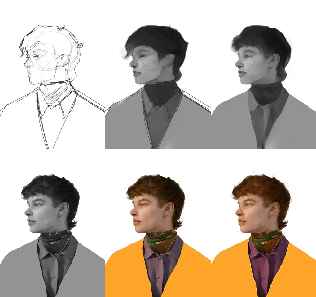
When the lesson began, we all just dove straight into working and continuing where we left off from before half term (Mood board and thumbnail ideas). During the half term I had decided what I wanted to do by evaluating which of the thumbnails I found myself drawn to the most. So with that done, I drew a portrait for me to use as the main subject for the poster. Here are some screen grabs from the process of making it, all done using Krita and my drawing tablet:
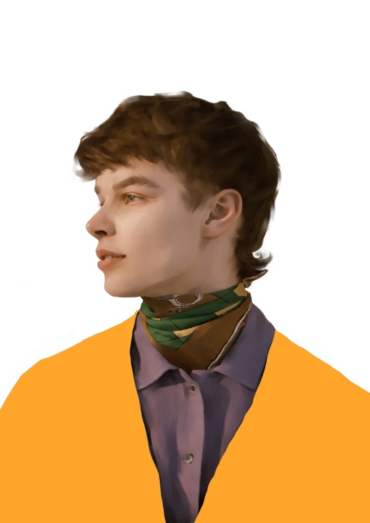
Here is the finished portrait:
After doing some work individually, we were told to take a moment to focus up on the board, where we would then go through some terminology based on Type.
𝕿𝖞𝖕𝖔𝖌𝖗𝖆𝖕𝖍𝖞/𝕿𝖞𝖕𝖊𝖋𝖆𝖈𝖊 𝖛𝖘 𝕿𝖊𝖝𝖙/𝕱𝖔𝖓𝖙
Typography is simply put just the actual writing, say for example on a poster; it’s the body of text, or it can also be referred to as “copy” (though this usually only applies with media texts ((film, blogs, posters, news papers etc.))).
Font is different types of text, for example Times New Roman, Arial, Perpetua, Verdana, Calibri, Impact etc. Font focuses on the appearance of each symbol and/or letter.
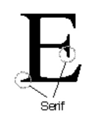
Serif (font) in typography, is the small extra stroke located at the end of the main vertical and horizontal strokes of each letter. These can also be referred to as glyphs. A popular Serif font is Times New Roman:

Sans serif (font) is a category of typefaces that do not use serifs/glyphs (the small lines at the end of each line or stroke of the letters). A popular Sans serif font is Verdana:


The key for this workshop is to play around with the different fonts that come with Adobe Illustrator to find what works for you and your poster.
Hierarchy is a term that describes the focal point of the content, essentially breaking everything within it into a list of most to least important. Doing this makes you able to let the reader know where to look first by the use of scale and positioning of images, type, logos etc.
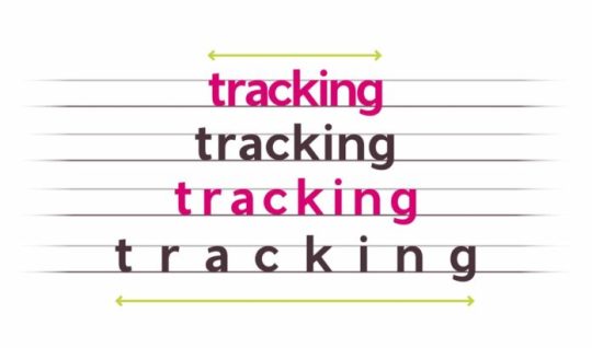
Kerning is a term used when specifically talking about typography. It refers to the spacing between letters, which can cause issues with certain words reading differently than if they were spaced accurately.

Tracking is a typographers term for letter spacing. Using this can make text seem less claustrophobic.
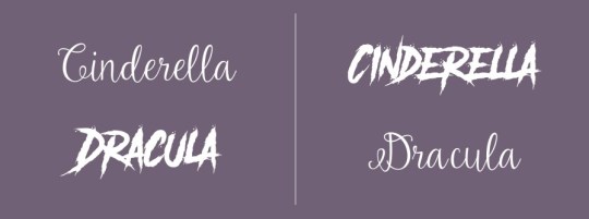
Tone of voice will guide users to the right emotion and allow them to relate to the content shown. It’s important to consider these aspects when designing the poster!

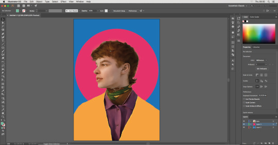
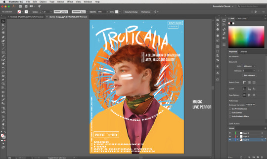
With all of this in mind for the rest of the lesson, I continued working. At this point I already had my main subjects completed, so now it was time for me to put together the poster itself using Illustrator and following what the brief specifies to include within it. The brief says that the final poster has to be of A2 size, meaning I had to create a custom sized canvas to work on. The dimensions for an A2 sized file is 420 mm x 594 mm.

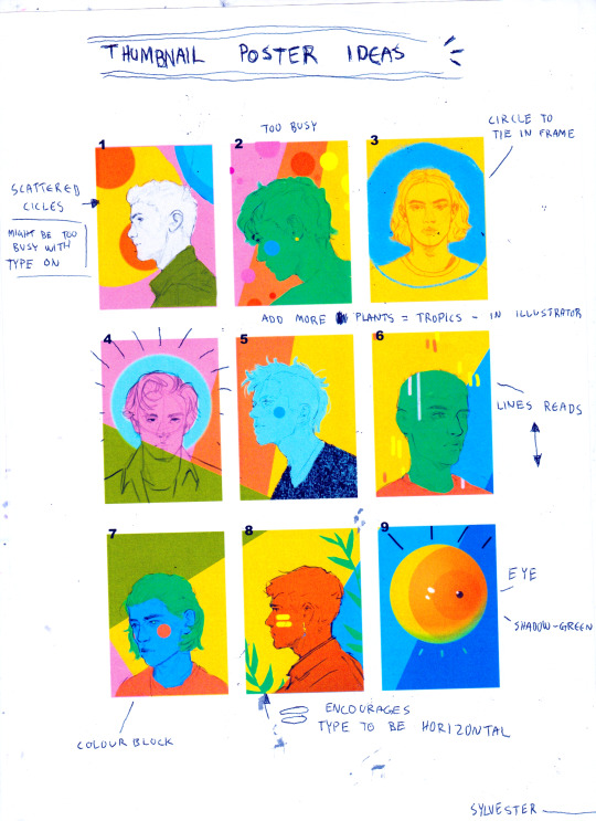
I then imported the png of the portrait, making sure it’s the top layer so I then could experiment with some different colours, patterns, tone, shape etc. I already had a general ideas in mind with a bold round shape behind the figure, mostly done for compositional purposes just to direct the eye to the focal point even more. The week before, I did a selection of different thumbnail ideas for the poster in which i ended up wanting to mix together number 3, 4, 8 and 6. 3 and 4 for the framing by using the circle, 8 for the contemporary looking plants and face paint/stripes on cheeks and 6 for the 3/4 view.
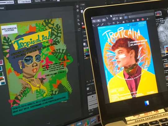
The following screen grabs are just of me experimenting with some different options.
1.
2.

3.

I played around with some line tools for the circular shape as seen in the second screenshot, and by clicking around I found that if you increased the size of this particular line brush, it created a painterly gradient. I really liked this effect since it added some additional interest to it by giving it some subtle texture, something that can be a bit difficult to archive digitally.

I wasn't really feeling the green/turquoise tone because it didn’t really make any of the other colours pop or stand out, which is definitely a must for an eye-catching poster. So with that said, I changed it to a bright blue- contrasting and almost clashing with the warm oranges. The festival is supposed to be a summer festival so I though it would be good to incorporate the bright blue as to simulate a hot summer day with no clouds in sight, a big bright sun shining down on the stages, music blasting and people cheering.

After adding some plants with the use of the brush tool (a tool I actually haven't used before, but found to be really handy for creating something more painterly, such as these plants) by using different hues of blue. - Since then, I also added in some thicker strokes of the bright blue colour and some white (simulating big palm leaves) to emphasise on the festivals tropical and Brazilian aspect.
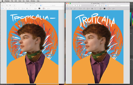
Once I was happy with the background, it was time to look into the title. Keeping in mind about the hierarchy of all the information that had to be included on the poster, I had the title be at the very top. I decided this because it tells you what the event is based upon and it also conveys the vibe and feel you can expect from this event; happy, bright; tropical.
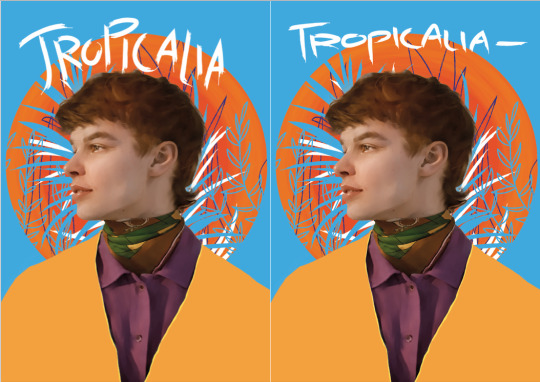
I then came up with two different styles of the title; again, using the pen tool with a brushy textured brush. To decide which worked best, I decided to put it up for a vote, so I printed each version out next to each other on a piece of paper and took a round with my peers in the studio with a sharpie, asking them which they preferred;
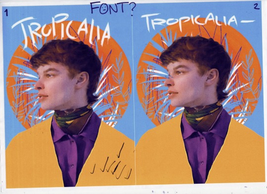
The results were obvious; number one got everyones vote.
So then I took this version into Krita, the program I primarily use for all my art, both digital and for general editing. I did some minor adjustments, using layer modes (mostly soft light and overlay) to add in some extra colour. I also added a few sparkles around the portrait and circle + some additional detail such as steaks of hair, stubble and freckles, as well as a bit of a white outline around the guys facial features, just to separate him from the background to make it read a bit better.

I also added in the Southbank London logo in the top right and did the painterly streaks of white on his cheek.


This is a higher res version of that:
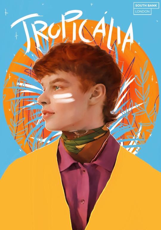
I then took this altered version back into Illustrator to start doing the text. I wanted to go with a clean style so it would be easy to ready and understand, so I chose the font Bebas, a Sans Serif font. I wanted to give it a more modern feel, just so it wouldn't look as if it was an outdated event from 2010 or something alike that, so I took the text box and simply stretched to my liking.
Below is the process of me decided the hierarchy of all the posters information listen on the brief and putting it onto my poster in an organised way;


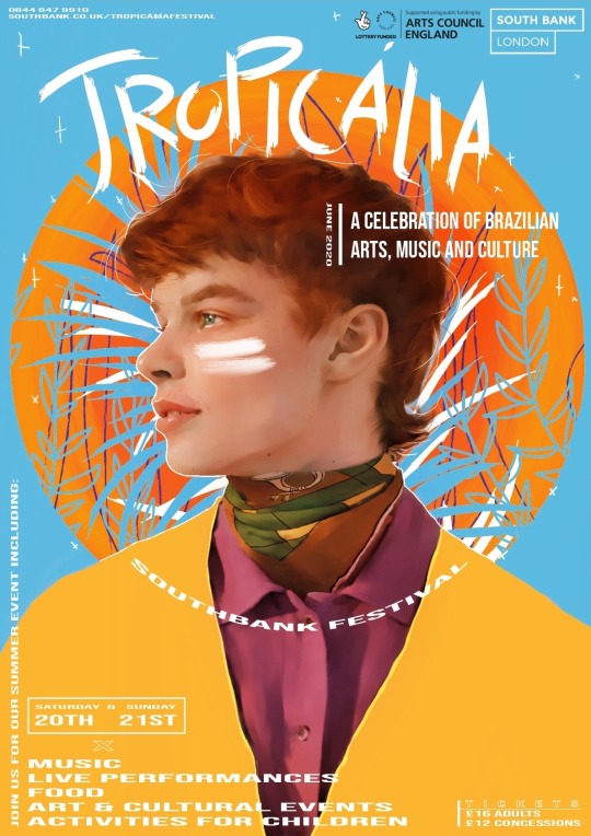
Here is the finished poster:

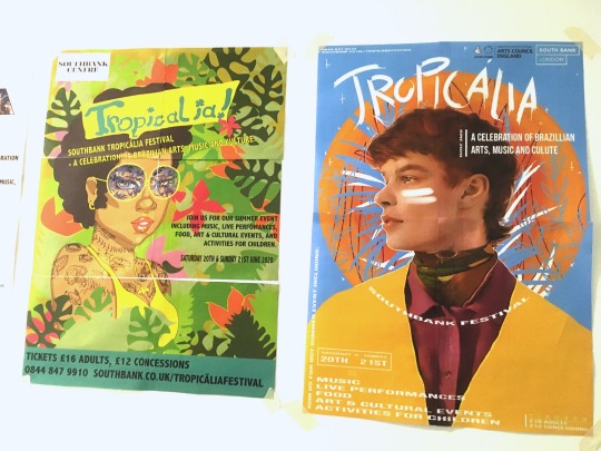
Update:
I corrected some spelling mistakes using Krita and the polygon tool:
4 notes
·
View notes
Text
Sweater Weather
Genre: fluff
Member(s): stray kids’ hwang hyunjin
Word count: 1.3k
Summary: what better way to spend a crisp, autumn morning than with your warm, soft boyfriend?
Author’s note: autumn is finally pushing it’s way through here in south korea so here’s some pure indulgence for everyone’s favourite prince, hwang hyunjin (not to mention the adorable photos that he posts of him in hoodies)
-Before you knew it, autumn had arrived and the cold was beginning to creep in
-The crisp autumn mornings brought a chill that only made you want to stay in bed, under the warm covers rather than let the chilly air lick around your ankles and send goosepimples up your arms
-Autumn was your favourite season however, no matter how cold it got the further it got on
-The leaves turning from green to orange, the smell of fresh mornings and a mug of hot chocolate to curl up with on the sofa, a blanket wrapped around your legs as
-It also meant you could break out your favourite item of clothing: sweaters
-You were proud of all the jumpers you had collected over time
-A huge variety of jumbled knitwear, hoodies and sweatshirts, all in different colours and textures
-Pulling one on in the morning never failed to brighten your day, especially when the sleeves fell over your hands and you just feel extremely snug
-It just so happened you weren’t the only one who loved wearing sweaters
-So did your boyfriend, Hyunjin
-If anything he loved them even more than you did, preferring hoodies over knitted sweaters
-This boy had a whole section of his wardrobe dedicated to hoodies, in a gradient from black to white (though he has an extortionate amount of black hoodies)
-Autumn was the perfect season for indoor dates with Hyunjin
-Movie nights became much more abundant, the night always ending in the two of you asleep curled up against each other
-Chan often walked in on the two of you asleep on the sofa, his motherly tendencies kicking in and draping a blanket over the two of you before shaking his head fondly at the sight of you two intertwined together
-Most of the time these nights ended with you staying over the night because it was late and Hyunjin didn’t want you to walk home in the dark (despite the offer from Chan to drive you home)
-Really it was an excuse for Hyunjin to spend more time curled up with you, and he really enjoyed cuddling with you for even longer
-When morning rolled around Hyunjin always woke up before you, admiring the morning sun streaked through the curtains and basking your features in weak sunlight
-Hyunjin always lets out a little giggle whenever you blink groggily, squinting against the sunlight as you wake up
-You groan back at him and throw yourself back into bed, under the warm covers
-Hyunjin, however, has other plans and throws the covers off you causing you to growl at him
-He just giggles again before walking over to his wardrobe and throwing one of his jumpers at you and pulling another one for himself
-You don’t complain, slipping your arms into the hoodie and basking in its warmth
-You stumble out of bed and straight into Hyunjin’s arms, the act of waking up still leaving you a little weak on your legs
-Hyunjin wraps his arms around you, chin resting on the top of your head as you bury it into his chest, breathing in the smell of your boyfriend
-Autumn really couldn’t get any better
-“Y/N, we gotta eat some breakfast”
-“Mmm” you mumbled into his chest, not wanting to let go of him just yet
-“Come on, I’ll cook for us” Hyunjin let go of you but instantly found your hand and enveloped it with his own, letting the sleeves cover your intertwined hands and pulling you towards the kitchen
-True to his words, Hyunjin did end up cooking for you, even if it was just a fried egg and toast all whilst doing his best not to let go of your hand
-The coldness of your hand made Hyunjin not to want to let go, except when he tried to flip an egg with one hand,,, well you had just laughed and were content to wrap your arms around his waist and rest your cheek on his shoulder blade
-After he finished cooking, the two of you ate on the sofa, the television playing some anime that Jisung left on in the background as you ate in silence, occasionally exchanging a tired smile
-For fear of being caught by the hyungs, you quickly cleared up the plates washing them up as Hyunjin wrapped his arms around your waist and nuzzling into your neck
-You just let out a soft laugh whenever he whined that you somehow managed to spray him with water
-Once you washed the last of the dishes, Hyunjin was soon to drag you back to the sofa and pull you straight into his arms
-You didn’t say anything as you snuggled closer to your warm boyfriend, playing with the cuffs of his sweater as the two of you were curled up, the two of you content enough to sit in silence in each others’ presence
-It wasn’t until Jisung came barrelling in and took in the sight of you two and just let out a massive sigh
-“Hyunjin, Y/N are you really wearing matching hoodies? Whilst watching MY anime?”
-You glanced at the hoodie you were wearing, then at Hyunjin, who was wearing a smug smile and tightened his grip around you
-“So what if we are Jisung? Are you jealous? Do you want a matching hoodie with us too?” you could practically feel the smirk on Hyunjin’s face as you glanced back at Jisung
-“You two are so gross, I’m leaving BYE” and with that, he quickly left the two of you alone
-You just blinked, the morning grogginess still not worn off completely
-“Hyunjin?”
-“Hmm??”
-“Are we really wearing matching hoodies?”
-There was a moment of silence before your boyfriend answered, fiddling with your fingers as he did so
-“Uh… I bought them ages ago and I just… didn’t know how to give it to you”
-You twisted in his arms and straddled his lap, taking a good look at the hoodie he was wearing
-True to his words, they were matching
-You were both wearing simple black hoodies but you noticed that on the design on the front of the hoodie had a variety of little fabric badges each adorning something
-As you looked longer, you saw your respective star signs and initials carefully embroidered into the tiny badges
-Smiling, you leant back to so you could compare the hoodies, your smile grew wider as you realised they really were matching and you let out a giggle before throwing your arms around Hyunjin’s neck
-“Silly, I would’ve loved it no matter when or how you gave it to me” you whispered into his ear before pulling back
-Hyunjin just let out a small smile and let his arms tighten around you, bringing you closer to him
-You rested your forehead against his as you leaned closer to him, close enough to feel his heartbeat hammering against his chest and a fleeting thought crossed your head and wondered if maybe he could hear your heart hammering too
-That thought was quickly forgotten as Hyunjin pressed his lips softly against yours and nothing else seemed to matter as you melted into him
-It only lasted a few moments before you pulled away from him and smiled
“Go brush your teeth, you still have morning breath” you laughed at him, clambering off his lap before the words could register
-“HEY!”
hello again my loves!!! i am finally back with just a pure indulgent piece for hyunjin!!! i know it’s been a while but to be honest with you all, school and a lot of personal stuff has gone on these past few weeks but i am back with just a lil something!
feel free to follow me on twitter bc u can find out all about my life here in south korea, so here’s my handle: @nahjaeminah
as always, i hope you’re happy, healthy and hydrated and for those of you where autumn is in full swing sTAY WARM !!!! I DON’T WANT U TO GET ILL
love, admin leigh <3
#stray kids#stray kids imagines#stray kids imagine#stray kids scenarios#stray kids hwang hyunjin#stray kids hyunjin#hwang hyunjin#hwang hyunjin scenarios#hwang hyunjin imagines#hwang hyunjin imagine#stray kids hyunjin scenarios#stray kids hyunjin imagines#stray kids hyunjin imagine#i do love a hwang hyunjin#hes so beautiful irl#i cant believe we've acknowledged each other#read: i high fived him and he said thank u for coming to unveil#i DIED#admin leigh rambles abt her life#ALSO IM SO HECKING PROUD OF SKZ GETTING THE ROOKIE AWARD AT THE MGAS GET THAT BREAD BOYS
186 notes
·
View notes
Text
Digital Walkthrough – Dragon Thrall
From April 2007. Nowadays I tend to completely work in Photoshop CS, but many of the techniques are the same no matter the software. This is a fairly rambly post as it's taken from notes I made while painting. This is NOT the way I work for client work!!!!! This was a personal face study that I built a painting around. I now plan things!
This painting was completely unplanned. It started out as a gothic vampire piece… ended up something completely different! These are some of the notes I posted to LiveJournal while painting, and subsequently featured in February 2008’s EMG-Zine.
Normally it’s a good idea to plan a painting. You should work out your composition details, color schemes, lighting sources and other technical details, but sometimes it’s more fun just to get in there and paint! Some of my best paintings have been the result spontaneity, experimentation and sheer desperation to fix a mistake! It started out as an exercise in skin tones, turned into a modern vampire piece and ended up having dragons! Hopefully you’ll learn a few things about why planning can be useful, as well as why it can also be fun to follow the rambling path your muse sets you on!
A few thoughts on digital art and painting software:
There is a plethora of information on digital art available online. This article isn’t a basic A+B=C tutorial. It’s more a discussion on the creative process I employ while painting digitally. For this article you will need a basic understanding of Adobe Photoshop or similar software and have access to a digital graphics tablet (or be really good with a mouse!). Access to Corel Painter would be handy too, however you can get similar effects in Photoshop with a bit of experimentation and practice.
I use Photoshop and Painter together. I’m not going to argue about which one’s better – because frankly it’s like comparing a banana with a pineapple! They’re both graphic software programs, however they’re designed for completely different purposes. Photoshop is an editing tool which you can paint with. Painter is purely designed for painting, with a few editing tools thrown in. With each new incarnation the blurring of these definitions decreases. I’m sure that if you experimented enough, you could probably get the result you want in either software.
Setting up the canvas
I started the painting as an exercise in skin tones. I hadn’t worked in Painter for a while and thought it was time to flex those painting muscles again. Unfortunately some versions of Painter can cause files to corrupt in native Painter file format (pre-version 5), so I recommend that you either create your file in Photoshop first, or save the files in Photoshop format (*.PSD extension)
Just like painting on paper or canvas, a blank canvas can be very intimidating. I always lay down a color of some type on the background layer just because it’s something to start with. When you plan a painting it’s a good idea to think about the lighting in regards to the background. If you are painting a scene which is sunny, then a warm yellow or warm blue might be a good choice. If you’re thinking about a night scene then start with a dark indigo or a cool blue. If it’s in a forest you may want to think about a green, while a snow-filled landscape may require a pale lavender-blue color.
As I said, this was a practice for skin tones so I decided on a dark maroon to pick up the dark tones in the hair (I’d planned on painting a redhead). Most of the time I apply a lighting filter, or a gradient to make it more interesting – kind of give it a focal point.
The first character I sketch on a separate layer to the background/ canvas. When painting directly onto the computer with a graphics tablet I generally start with a few lines to work out the placement of the head, eyes, mouth, nose and ears. I then work out a few ‘base’ colors that I will use for the skin. I place ‘dabs’ of the color I use regularly somewhere on the canvas:
A mid pinky-brown color – the base color
A pale yellow/ pink color for highlights
A redder tone of the base color used for cheeks and nose area
A purple version of the base color for shadowing
A darker brown-pink for the deep shadows
A light pink-purple (not shown) for blending in areas where the skin is fine and the veins show through.
In later versions of Painter you get a tool called a ‘mixer’ where you can place dabs of colour and create variants using the mixing tools. If you are having difficulties with colours try using the colour picker on real photographs and see what ‘real’ skin colours look like. You’ll probably be quite surprised!
Once I have the colours and some lines down I begin to paint. For this face I used Painter’s digital Airbrush set at about set at about 10% opacity, 100% Resat, 0% bleed and 0% jitter. I vary the brush size from about 150, right down to 2 or 3. I spent about 2 hours to get to this stage.
A few notes on skin tones:
Every person has a different skin tone and texture – we’re not all a standard ‘flesh tone’, straight from the tube
Men and women also have slight variations in colouring
Different nationalities have different skin tones. Some have ruddy complexions, others a yellow undertone, while some have dark skin. Study photographs, place them next to each other and note the differences
Skin tones reflect the colours around them. If you are wearing a purple shirt, you will get some reflection under your chin depending on the lighting. If you are standing next to a yellow wall, the side facing the wall will reflect the yellow.
The colour of the lighting impacts on skin highlights and shadows. If you use a yellow light, the shadows of the skin are generally the complementary colour (in this case purple).
One thing I remember reading (Don Seegmiller in his book Digital Character Design and Painting) was the fact that the strip across the nose section of the face is pinker than the rest, while under the eyes should be purplish-blue as the skin is so delicate here. I recommend his book for color theory, regardless of the painting medium! In fantasy art, the ability to create convincing skin tones in important, particularly if painting something like a Drow, or even an alien with blue skin
Adding the hair
Hair is basically made from 4 colours which I vary the opacity and size of the bush. The illustration below shows the four colours and the way I build up the hair.
A mid tone
A light tone
A dark tone
A very light tone for the highlights
Why having no ‘theme’ for a painting can be a problem!
Like most sketches where I don’t think about anything much except picking up the ‘paintbrush’, I get to a point where I start wondering about things like ‘does she want straight or wavy hair’, ‘does she wear modern or old fashioned clothes?’, ‘what the heck do I do with the background?’.
At this point I was listening to rock music and it was about midnight so I decided it should be a vampire/ gothic piece. Originally it was just going to be a strapless dress but it ‘felt’ wrong. I added a leather jacket and a cameo choker. I planned on having a night sky, maybe the silhouette of a building. This means that dark blue is going to have to replace the maroon canvas colour. A guy is going to be behind her, all ‘vampy’ and hopefully pretty good looking! I took a break and came back to the painting after some food. I’d been working for about two or three hours and realised that I’d changed the angle of her torso mid painting which is why it is looking odd. This is why it’s a good idea to plan your painting before you begin! You can waste a lot of time working on something, only to realise there is an inherent flaw in the drawing. So I really had a think about where the painting was going… which was feeling like the great digital dustbin in the sky!
Unfortunately I only had a clear picture of the character’s faces so I was basically very aimless when painting. I get bored with details so I moved onto the male character. I knew I’d have to revisit the female character but something was really bothering me about her and I didn’t want to think about it too deeply. I spent about 2 hours working on the guy. Notice that his skin base is slightly more yellow. Guys’ faces are also more angular than females (generally) so I painted in a more aggressive manner, not blending as smoothly as for the female. I also added in some texturing with a ‘captured bristle’ brush.
A note on photo-references:
When I work from photo references I try to avoid working directly from one reference for copyright reasons. Each painting I’ll often work from at least half a dozen images (which I normally collect AFTER I’ve made the initial sketch). I also have a huge collection of images that I’ve harvested from the net, reference books/ CDs, personal photo references.
I also like working with greyscale images and using small images so I can’t rely upon them too heavily. This way I can make the colour up on the fly. I also find that it helps to practice sketching in greyscale. You focus on rendering the form rather than colours, which teaches you a lot about volume, lighting and texture.
Back to the painting
I spent another 2 hours on this (up to about 10-12 hours now). I kind of became obsessed with finishing his face. I put him in a leather jacket and white shirt and played around with where his arm should go, ultimately deleting it. I changed the background colour to a near black colour while I was playing with things. I’m still not convinced about what’s going on in the painting. But I’m happy to let my mood decide what’s going to happen. I enjoy these kinds of paintings because I just let the paintbrush take me where it wills. However it’s getting to the stage where I will need to decide if I’m going to do something with this painting, or just file it as an experiment.
I’ve got more details to do… tidying up his eyebrows, giving his skin some texture around the jaw line, finalising his nose and lips, and one of his eyes is slightly off (shadowing and shape’s wrong… but I’ll fix that up later.)
Vampire goes Renaissance?
I’m heavily influenced by music. When I paint I listen to a variety of music, and often it can influence what I paint. I stopped listening to my Dishwalla album and put on Medieaval Baebes… at which time I thought to myself ‘this is just two people standing together, there’s no fantasy here’. So the painting went Venetian 16th century!
I’ve obsessed over historical costume for as long as I can remember and one of my favourite paintings is Rafael’s La Donna Velata. I deleted the leather jacket and replaced it with a front-laced bodice over a creamy chemise. This costume was popular with working classes as it was comfortable and didn’t get caught up while working. I think it is important to think about the clothes you put your characters in… it is part of their story. It can suggest what they do and their status in society, it can also indicate if they’re light and fluffy, or rigidly straight-laced.
A few hours work went into the dress. It’s not finished yet. This is only the basic form. I’m debating about patterns and colours. The more elaborate fabrics tended to be used a few decades after this dress style was popular, and only by the wealthy, but it’s fantasy so I guess I can do what I like!
Working out the background:
I have decided a night sky doesn’t suit the lighting of the characters, so I’ll do a dawn/ dusk sky. I flicked through some reference shots of skies and started laying down some colours in Photoshop with a large airbrush tool. Not much I can say about skies except for the light will reflect on the characters, which is why it’s not a strong sunlit scene. In this low light there won’t be much reflection or shadow.
I’m still playing around with the idea of having a column behind the male character. The sky’s getting close to being completed. I’ll start looking at the lighting in the painting later on… normally that’s something I do in the planning stages for a *proper* painting. It’s up to about 200MB… time to save a new copy and collapse a few layers I think.
On a side note, I’m not happy with the poses or placement of the characters. They’re too rigid. There’s no connection between them, I need to bring them together somehow. I’ve started to realise the girl’s body looks too small and much too straight on for her head. I’m going to have to repaint whole chunks which will be a lot of extra work. You can do this with digital, however if I’d planned the painting I wouldn’t have to be ‘fixing mistakes’ at this late stage!
I added some columns and moved the characters closer together. Each character is on a separate layer and I often take a copy of a layer to do the modifications (in case I muck it up!) I also do iterative saves… I have 7 versions of this file from various ‘major’ points from within the painting.
I like the placement better than the previous version, but I know that I’m going to have difficulties with his arm placement. I also don’t like her headpiece. I haven’t spent much time on it, but it just looks wrong – far too elaborate. I’ve got a feeling that she’s not the kind of girl to wear masses of jewellery! The pose is still disjointed. Why is she moving away from him? It doesn’t exactly look like a comfortable pose. Is he trying to put on her cloak, take it off, or strangle her? When you paint, you have to think about how the painting could be interpreted.
The home stretch
Unfortunately I sat down and painted in one marathon session (without taking saves part ways through). Inspiration struck and all at once I knew exactly how the painting had to look. All the missing elements fell into place. I had the narrative that went with the painting, I knew why they were standing together. The pose was vital to the scene. I think it is important to know ‘why’ things are the way they are. Sometimes it can be as simple as ‘because it looked right’ or ‘because I want the viewer to feel scared’, but with more narrative pieces, the ones that work best tend to make every piece of the painting into something vital to understanding the whole piece… like clues in a mystery novel.
I ended up moving her directly under his chin and slightly curved into his body and moved his arm so he’s supporting her, rather than embracing her. The sky remained unchanged however the bottom needed a focal point – it was too empty. The forest and cliffs are a scene I’ve used in numerous paintings… they are like an old friend �� something quick and easy.The lake came next, and the glow lights (which have no real meaning, but they ‘fit’ with the mood of ‘magic in the air’). It still was looking empty. In the story in my head the character’s connection is through dragons. I’d already planned on giving the female character a dragon necklace and the male character golden eyes, however I think a more ‘literal’ representation of the dragon was needed. The placement was deliberate in that I wanted the viewer to follow the motion from the dragon to the characters and back around.
Often when I’m working without reference (like I did for their poses, I try to work out their bodies in their entirety. Even though it still looks a little ‘wrong’, because of the angle of his body, his shoulder is right behind her hair. I tried extending his shoulder but it didn’t look right either.
I added an Overlay layer to do some lighting along the side of the girl’s head and the columns. There are 13 layers in the final version (after I collapsed the multiple character layers from the previous version).
I thought I was finished. I posted it online, added it to a few galleries, but something was still a little unrefined. So I stepped away from it for a week or two (see further down for the revised version).
Some notes on Composition
I like working with the Golden Mean (also called the Golden Section/ ratio/ proportion/ The Divine Proportion). It’s a way of dividing up a painting so that the image is artistically and geometrically pleasing. It’s based on mathematical principles and can be seen in nature in such shapes as nautilus shells. Below I’ve added guidelines in pale blue that divides the painting into thirds. Notice how the parts of the painting that your eyes are drawn to tend to fall along the lines, with the light in the forest being at a ‘focal point’, where the lines intersect.
The painting’s composition loosely fits into what is called the ‘L’ Composition
It could also fit in with ‘V’ or ‘triangular composition.
The trick is to try and get the viewer’s eye to follow the movement from one point of the painting to the next
Final Piece:
I went back and refined it a little… just added a few more details to the hair, fixed the column and tidied up the tree-line. There are still aspects I’m not entirely happy with, but I’ve spent enough time on this painting… I don’t want to overwork it.
So 20 or so hours later, here’s the final piece and the story that goes along with it:
Text I wrote to go with the painting
The dragon-thrall caught her, its silken threads binding her mind to the golden dragon completely. Kara and the great beast launched upwards as one, pushed from powerful back legs. Muscles flexed as the wings extended fully, capturing the wind and propelling them higher still. Freedom! She threw back her head and laughed, the rumble echoing from the surrounding cliffs. The sun and sky called to her, daring her to fly higher and faster than she could ever dream.
She wheeled to the right as she caught movement in the valley below. Ruby eyes fixed on the deer. Tucking her wings to her side, she dove towards the earth, pulling up just above the forest, the trees bending then snapping back in her wake. Kara could taste the hot, sweetness of the blood. She wanted it, lusted for it, she had to have it. It was a burning pain that drove her.
Something yanked at her. Whipping her head around in annoyance she couldn’t see a rider. Focusing on the deer again she snarled as the strong will commanded her to stop. The hunger tore at her, but still he cajoled her, coaxed her, and compelled her. Snarling and baring her teeth she snapped at the unseen force. Finally he dominated, wrestling control from her. Emotions flitted across her mind – fury, hatred, pain, desire. And then she was in her own body again.
Rhys caught Kara as the dragon-thrall released her. He’d been with her throughout the flight, his golden eyes seeing just as the dragon had.
“Now do you understand?” he murmured, his breathing still ragged from the clash of wills. She shuddered, glad to still be in his steadying embrace.
“It helped, but I don’t think I’ll ever understand them, not the way you do.”
Prints and products are available here from RedBubble , painting can be found in the Dragon Fae Oracle as the Lovers card.
1 note
·
View note
Text
Cutie Reviews: Kawaii Box Nov 19
Firstly, I wanted to show this new prize I got from Tokyo Catch. I won it back in March or April during their free daily play promotion (which will be resuming in June), and I got it earlier this week! It’s so sweet looking, I just love it~
I also have 2 more prizes coming, and I’m hoping to get more if anything strikes my fancy this upcoming month. I’d also like to do a post dedicated to Tokyo Catch in the future, just to discuss the process, my opinions, etc, for anyone curious.
Word of the month: Mahou - Magic
Event of the Month: November 3rd is Bunka no Hi (Culture Day).
“Embark on a Fantastical journey to a magical kawaii world!“
Mystery Kawaii Item - Pill Case
Our first item happens to be the random warehouse extra they like to supply us with every now and then, and for this month I’ve received a cute pill/tiny item storage container. I got a pink version of this a long time back (as well as various others), but these come in handy so I don’t exactly mind getting another one.
These cutesy pill case consists of 2 small pockets and 1 larger on the bottom, and attached to it is a silver ball chain so that you can carry it around with you in something or connected to something.
♥ ♥ ♥ ♥
I admit, it might have been nicer to get something else, but these come in handy. It’s a lot easier to bring these around than a bunch of boxes or bottles, and they look so much cuter!
I like to use these to hold things to reduce pain, like Ibuprofen or some stomach tabs, and then for the third pocket I usually put in a prescription I might be taking at the time. But you could also use it for other small items if you wanted, like erasers, hair pieces or earrings, maybe even a little lotion or product? Maybe.
Magical Bunny Pastel Gift Bag
Next up is a sweet little item you can use as a gift to someone else or keep for yourself. There is a few variations of the bag and in each box we get 1, featuring a lovely pastel color scheme with adorable bunnies.
The bag itself feels like smooth card-stock and has metallic silver woven straps.
♥ ♥ ♥ ♥ ♥
In general I tend to be against getting items like this, ones with the intention of giving to another person. I don’t know why. But I really like this, and the booklet suggests using it to store some items, which I think is a cute idea and I’ll probably end up doing it.
The bag is very sturdy, I love rubbing my finger against its surface, it feels so nice. While I was writing this, I just got a great idea as to what to put into the bag x3 I have a bunch of pretty gem-like perfumes/body sprays I’ve been wanting to display but wasn’t able to at the time, and because one of my cats has been yanking them off of the shelf lately I think I’ll store them in it~
Glittery Animals & Jewelry Puffy Stickers
To go with a magical themed box, we have some magical looking stickers! They’re ultra-sparkly and adorable, consisting of things like gem hearts, bunnies and fantasy animals, sweets, and cute phrases. Each sticker has gold lining and is very shiny. This exact sheet is called Unicorn Melty Flavor.
♥ ♥ ♥ ♥
Now, I’ll be honest. As cute as these stickers are they are fairly “flat“ with a slight hint of the 3D puffiness that stickers like these usually have. They are also hard, not squishy or “puffy feeling“ in my opinion. But I think they are very cute and I still really like them. My picture doesn’t do them any justice.
Sparkly Mermaid Hair Clip & Metallic Mermaid Tail Pen
Just in time for summer (unintentionally :P) is this adorable mermaid hair. There are 6 versions of these, each with its own unique colors and design. I really like this one~
If you don’t want to put it in your hair it would also be a really cute decoration for other items. But does anyone else think its a bit strange that its called sparkly when it really isn’t? Other than the little gem on the hair piece.
♥ ♥ ♥ ♥ ♥
The clip is very secure and “heavy duty“, I didn’t notice it have any problems holding the hair I clipped it to and it seems to be really nicely made. I didn’t notice any sort of defects or problems with it. I really like it!
- - - - -
In going with mermaids, we also have this mermaid tail pen! It features a lovely gradient of rainbow colors and has a metallic finish and a lovely textured tube reminiscent of scales. I love rubbing it~
It’s a basic black ink fine tip pen.
♥ ♥ ♥
The pen writes smoothly, no scratchiness or irritation. However, I strongly dislike the fact that we have to set the pen cap aside. I know its not a big issue but as someone with cats and a constantly running fan/chaos surrounding them, its not easy to keep an eye on them very long. Not only that, but I really like putting my caps on the pen; there’s something fulfilling about it.
As soon as I saw it, I thought about the makeup brush I got from a NMNL box some months back and I was pretty excited. This will be a really cute summer pen!
Meito Pukupukutai Yumekawa Wafer Snack
Our snack item this month is an adorably new Pukupukutai wafer in the flavor of "Berry”. If you’re unfamiliar with my blog or this brand, these wafer are in the shape of fish to resemble the popular Japanese snack Taiyaki, a fish-shaped cookie or biscuit filled with various ingredients, such as red bean paste or chocolate.
I heard about these prior to getting this box, and because I’m an avid fan of these (and trying new flavors~) I was berry excited! As you can see by the packaging, the fish is magically split so that one side is colored sky blue, the other is light purple, with the airy chocolate inside colored a pretty lavender shade~
♥ ♥ ♥ ♥ ♥
It’s very delicious, with a berry taste that wasn’t overwhelmingly sweet or tart. I can’t exactly pinpoint what berries were used for the flavoring though, it didn’t taste like strawberry or blueberry though; maybe raspberry?
I’d recommend picking one up if you ever get the chance!
Unicorn Heroine Pocket Mirror & Magical Wish Note Bottle
TreeIn Art is back and this time we’re getting a cute mirror themed around a pretty girl and her magical unicorn companion. Pocket mirrors can come in big handy, that comes without saying right?
I also found out that on Blippo.com, they have matching notebooks featuring the designs.
♥ ♥
As much as I love the gorgeous art work and would like to use this... probably won’t, because to my shock, I unwrapped it (prior to the picture for the first time) to find a large crack against the back of it.
And no, it didn’t crack from me looking at it >3< it was that way, my finger rubbed on it which led to the discovery. I don’t know if it was a result of it being tossed around, if I did it or shipping, this hasn’t happened before and I didn’t know about it until now... so I’m pretty sure its too late to do anything about it.
It’s still usable, but I’d hate to break it even more or cut myself.
- - - - - - -
Luckily our next item came perfectly unharmed; an adorable “wish bottle” that includes two little slips of pastel paper you can write your deepest fantasy, wishes, a secret, or even future goals on, then cork up and wait for them to come true~
Besides this, the bottle is filled with tiny gems (that make the most lovely little jingle when shaken) and held by a cute candy and bow themed sticker with silver detail.
♥ ♥ ♥ ♥ ♥
I’m not sure I’ll ever open this, because it’s just too precious! It’s not really an essential item or anything- but I love cute magical decor things like this, and I definitely will be putting this in a safe spot for display.
For such a small item its also very detailed, which I appreciate.
Fluffy Pastel Octopus Plushie & Magical Anime Girl Wand
Every magical girl needs a cute companion right? So Kawaii Box thought what would be cuter than a fluffy pastel octopus?! Besides its soft body and coloring, it also has a heavy duty silver duo chain piece so that you can choose your preferred method of carrying it around.
♥ ♥ ♥ ♥
It’s very soft! I love it! There’s nothing wrong with the plush, but while it might not be very visible in the picture, it has very obvious “seam/stitching lines“ covering it, which I’m not a huge fan of.
Also... is it just me, or does it kinda look like a jellyfish? I kept thinking that while I look at it and according to the tag, its actually called that. So... I think I’ll call it Bubbles, the jellypus. Or maybe Octofish?
- - - - - - Along with a partner, every magical girl needs her wand :D its a MUST. At least if you don’t have another transformation tool or weapon of choice. This is available in 3 very Sailor Moon-esque designs:
A light blue and purple crescent moon with a star and winged ornament, accenting in silver.
A pink crowned heart with gold accenting and ribbon ornament.
Red, white, and blue with gold accent, a star or sun ornament, and winged circular design with a gem
There is also a button you can press, which makes the gem light up in various colors and play a magical sound.
♥ ♥ ♥ ♥ ♥
I think any magical girl fan would love to own one of these, and even if you’re not, hasn’t it been at one time a dream to be able to magically transform~?
It’s made from plastic but its very durable and holds up very well, it doesn’t seem like it would fall apart easily.
I think all 3 of them are pretty, I especially wish I got the pink crowned heart (because I love all of these things!) but I might be tempted to purchase the other two. I’d love to make these into a display piece~
♥ Cutie Ranking ♥
Content - 4.5 out of 5. I loved it all, it’s very cute, colorful, fun, and lovely. However, I feel like there is a slight limitation on practicality. By that I mean, a few items are essentially trinkets/decorative.
Theme - 4 out of 5. As much as I loved it, I wish they played up the magical girl element more. I feel like they were more focused on things like unicorns and mermaids.
Total Rank: 8 out of 10 Cuties. I really liked it, but its rare to find a perfect box. With a few changes I would have loved it even more, but I think it would be worth it if you like magical girls/unicorns/mermaids.
♥Cutie Scale ♥
1. Wish Bottle - It has a wonderful magical feel, I love to observe it~
2. Wafer - It was delicious!
3. Magical Girl Wand - It’s so much fun to play with, the cats are a bit frightened by the sound though, it’s a little loud.
4. Mermaid Hair Clip - Very pretty and fun to wear.
5. Stickers - They’re very pretty, I kind of want to use them but then I kind of don’t to avoid ruining it.
6. Bunny Bag - It’s so sweet looking, I’m really happy to have it~
7. Mermaid Pen - I love its texture a lot, but the cap is a turn off.
8. Pill Case - I have a bunch of these already, but I like the idea of swapping them whenever the mood strikes.
9. Pocket Mirror - loved the design, hate the large crack <_<
10. Plush - I don’t know, its adorable but I don’t feel an overwhelmingly close attachment to it yet.
0 notes
Note
in your art tutorial (which was awesome and helpful btw) you had an example which i believe was the last one of a person with a long ponytail and honestly the way their hair looks in that fascinates me so i was wondering... how did you do the thing ? im rubbish at hair .
First of all thanks! I’m going to try and roll both a tutorial as to how I draw that particular hairstyle as well as an overall hair tutorial, aight?
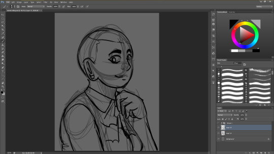
when it comes to that sorta thing I draw a rough sketch first (sometimes i don’t out of habit, but with unfamiliar or more complicated hairstyles it never hurts to have your hairline down
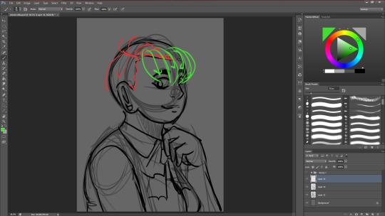
I also lay down where the parts in the hair are (rella specifically has kinda roundish bangs along her forehead)
ok so a lot of more anime-ish hairstyles can be broken down into different parts
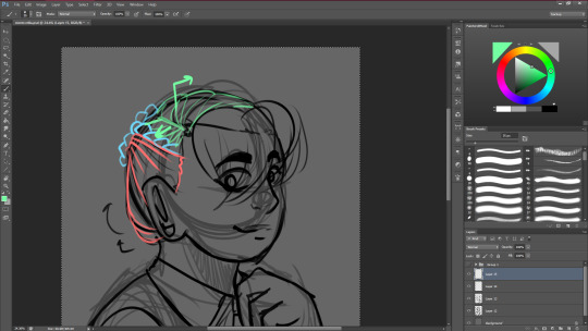
rella has:
the bottom part of her hair (red, which is a little closer to her skull and comes off of it a little bc That’s Just What Ponytail Hair Does unless it’s a really tight one or something)
a braid along each side of her hair that meets around in the back (blue, it’s relatively stylized because I don’t want to draw a lot of strands All The Time)
the Rest of It (green) which is essentially just hair going from the part into the braid or into the other side of her head
she also has a ponytail
the way i stylized it basically makes her hair really ribbonlike in shape but it’s also really thin in shape and texture so it’s easier to play with in terms of shape and volume
if i were to make it thicker hair, this is how i’d do it: a lot closer to tufts as opposed to strands, though when shading, i’d follow more or less the same ribbon shape (with respect to the bumpy shape of the tufts of course)
when i’m done with all of that, i normally merge my sketches and make them transparent and i take a brush and start lining (this one i just used is this one, it’s my only downloaded brush pack and that’s just because i’ve been using it for so long tbh)
little detail things that i do:
divide the hair into mini strands as you see fit, define it!! especially on shorter, tuft-ier hair (like in rella’s bangs). generally i define it more where more shading is, because that gives me more of a baseline as a whole.
hair is like fabric but it’s on your head. and your head is round, so rumple it! make it come up OFF of the head, make it emphasize the shape of it! it’s a wonderful way to make it realistic just by making it a little ruffly
hairlines are not always super clean cut. jag em up! show where individual follicles are being pulled if u Gotta.
for the back hair: pretty much always show it going into the background. the more you indicate that there is DEPTH to the hair, the better it works.
more detail things but more actual bodies of hair:
do whatever you can to continue to indicate that the hair is 3-dimensional. make it twist around corners, make it move and spill together. have fun this is the payoff
separate it! it’s a very art nouveau look, plus it makes it look to actual hair with strands moving and doing their own thing
have hair not only break away from the bigger body, but also have it interact with obstacles. hair does that
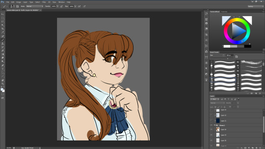
rella has auburn hair, and i just randomly picked out some colors that seemed legit, if not a little ugly
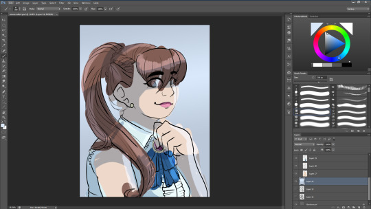
screen layer + multiply + overlay + a background to set the mood
im making a palette out of this
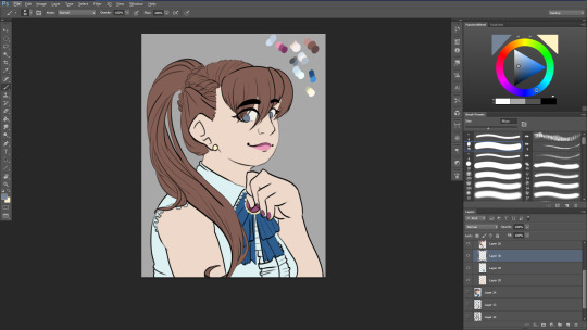
ok with the base colors all flatted in, i’m finally ready to actually…color the hair
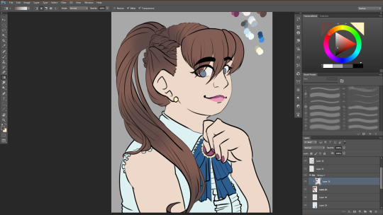
there are several ways to go about it this time around i’m blocking it large areas with (circular) gradients. it’s a trick i picked up from studying how himaruya (the artist for hetalia) does things and I think it lends itself pretty well to a silky hair texture.
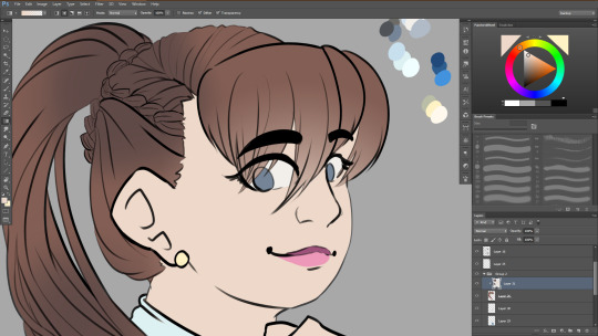
i also took her skin color and used it right next to the bangs to make them look more transparent
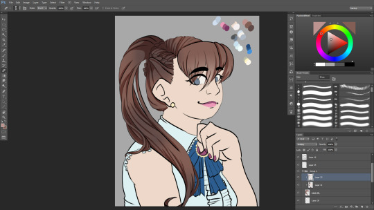
i took the highlighter color from the palette i made and blocked in some soild shadows on a multiply layer. i’m probably going to change up the colors after a bit to make it look nicer, but for now, this will do just fine!
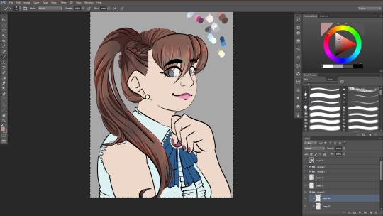
i did the same with the highlight and an overlay layer. it looks a little off right now, but i can always change it later.
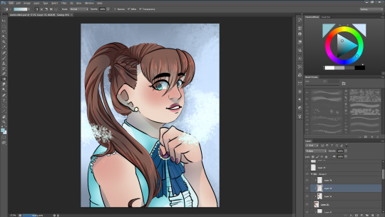
i ended up not using the palette as much as i thought (which is ok! it happens) and i locked the layer with the shading on it so i can just go in with a light blue instead, so that it looks more unified!
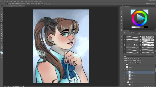
and there!
this last bit is optional because black lines look fine but a style thing to consider is coloring the lines, which i did here:
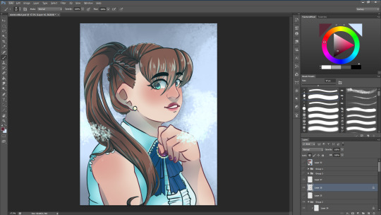
and yeah that’s how i do hair
#burned-toast#answered ask#hair#how to draw hair#anime#anime tutorial#hair tutorial#help#art help#art tip#digital art#lineart#ponytail#braids#long post#long tutorial#anime hair#gabriella acerbi
164 notes
·
View notes
Text
Icon tutorial
Someone asked me while a go to make an icon tutorial, and I finally have the time and energy to do this so here we go :d This tutorial is long and image heavy.
You’ll need:
Any form of Photoshop, I use CC
A psd or your own coloring
A screencap
Patience

Let me start by saying that I use some things that are also said in this tutorial, mainly the gradients, so full credit goes to her!!!!!!! (also the tutorial is really good, check it out)
fyi: English isn’t my first language so there will be mistakes in this tutorial. I hope I made stuff clear, if not, feel free to ask.
So I start with a screencap. Sometimes I use my own caps, or I google some (make sure to use images bigger than 500px width and try to use images as hq as possible, it makes it a lot easier), or I use screencapped.net. Tip: when looking at screencaps, make sure to check the lighting on it. If there’s too much contrast or the brightness falls onto part of the hair (making it almost white) it probably won’t work. (I sometimes only notice after I’m almost done, it sucks)
So I started with this:

What I sometimes do is add brightness, when the image is a bit too dark to work with. This one is good, so I’m going to cut out Octavia. I use the Polygonal Lasso Tool.
So you just trace around the person like this
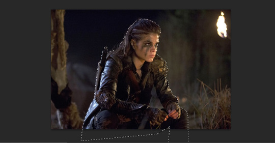
make sure that your start point is outside the picture, and that the end connects with the start point. You’ll kind of see when that happens :p (I’m sorry I suck at explaining)
Then click ‘refine edge’ in your top bar

These are my settings, though I often change the smoothness (Smooth says ‘28′, Feather ‘0,3′ and shift edge ‘+5′.) Click ‘ok’. You’ll see the background disappear. Note: this takes practice... If I see my icons from months a go, they look horrible to me :p you kind of need to ‘develop’ the feeling of knowing what you have to include and what not (like parts of hair, you don’t have to include every single strand and just go around the basic outline).
The next thing I do is crop the image to make it square. I keep it the same size because it’s easier to add adjustments when you can still zoom in.
I’m adding coloring now. It’s mainly curves, levels, brightness, black selective color and some vibrance (sometimes color balance if the image is way too yellow/blue/...) Put your adjustments in a group (select all + control+g)

Okay now, in your ‘layers’ section, you see the cutout. Right click (make sure your cursor is on the image) and click ‘select pixels’. Then add a vector mask to your coloring group.

It’ll make sure your coloring doesn’t affect the background we’ll add layer (unless you want it too ofc)
okay next is adjustments. I start with the hair. I can’t tell you the color I always use, bc it’s always different :p Make sure to ‘select pixels’ again. For this screencap, I used #43251a. Normally I’ll make the layer ‘soft light’ but now ‘color’ looked better.
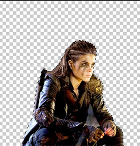
I duplicated the hair layer and put it to ‘soft light’ , opacity 42%.
I ALWAYS color over the lips too (on a new layer), to make them stand out a little bit. I used #a00303. The opacity of the layer is 76%, because I don’t really like it when the lips look like they have lipstick on them (it would also just look weird on this screencap)
i just noticed I forgot to remove the rest of the background (under her arm) so I’m doing that now :p I’ll just trace around the background with the polygonal lasso tool and click delete. Always make sure to delete everything hahaha :p I selected pixels again, inversed them (by clicking on select in the topbar and clicking reverse) then clicked on the vector mask on the coloring group and used the brush to delete coloring from that part too.
Now I do the clothes. I usually go with the color of the clothes, but in this case they’re black so I’m going with a dark blue. Again, new layer on ‘soft light’. I go over all the clothes I want to go over, they won’t turn blue, but they’ll stand out a bit more. I didn’t go over her sword but I used black for that.
This is what I have so far. I deselect the seleciton now.
Now I add gradient fills. You can find it here under ‘gradient’

These are the setting of the two gradients (both black&white)


for this one, i sometimes change the angle. Just play around with it to see what works best. Both layers are also on ‘soft light’. You can decrease their opacity if necessary
Now I resize and sharpen the icon. I always make my icons 100x100. I would give you the sharpening action, but I have no idea where I got it :/
Okay, now I add color fills UNDER the cutout image. I have a psd with all my backgroundscolors and textures in them.
You can find color fill where you found the gradients. Just choose a color you think looks best.
I add my texture (find textures here and here or on deviantart)

Sometimes I’ll add more textures. Just put the picture above the color, but under the image and set it on ‘soft light’ (you can choose the opacity).
this is what my layers look like:
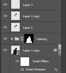
55 notes
·
View notes