#photogram archive
Explore tagged Tumblr posts
Text
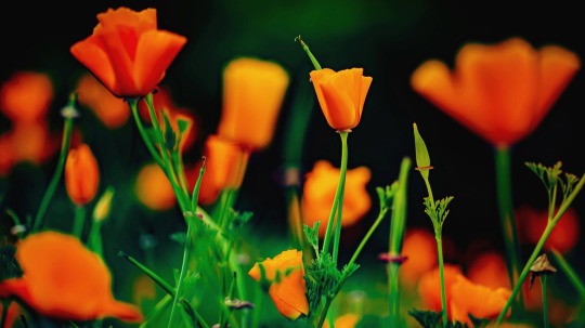


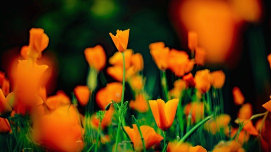
They were given the color of the sun.
#flower#japan#nature#photography#art#aestheitcs#beautiful photos#original photographers#photooftheday#photographers on tumblr#my photography#my artwork#flower aesthetic#flowercore#flowers#flower photography#beautiful#beauty#photogram archive#photographer on tumblr#photoart#digital photography#photoofday#artistic photography#写真#花#ポピー#カリフォルニアポピー#poppy#california poppy
435 notes
·
View notes
Text
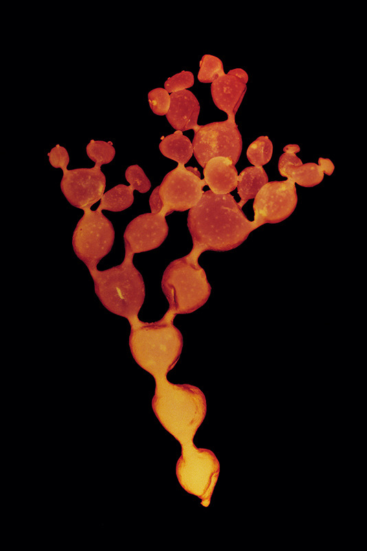
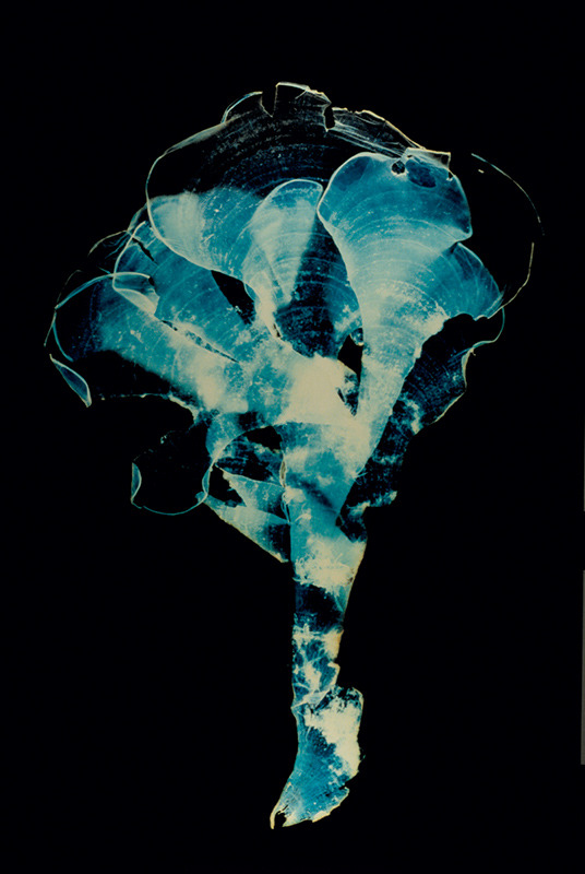

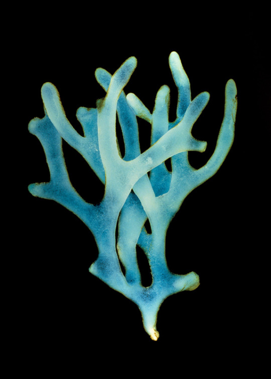
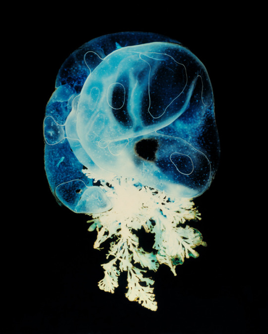
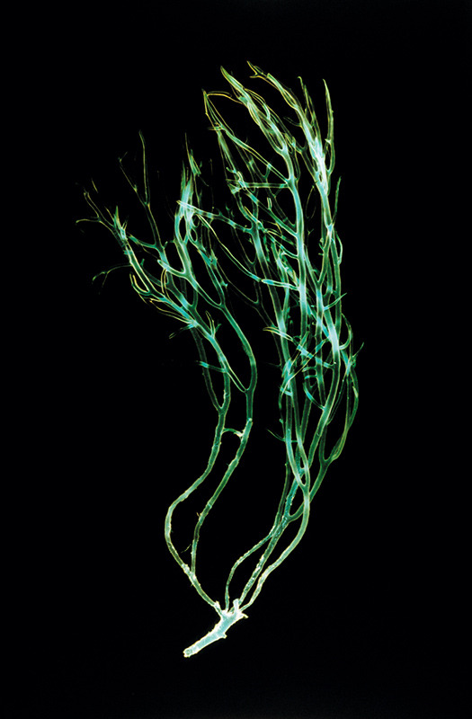
Stephanie Valentin: 'fathom' Series (2004)
3K notes
·
View notes
Text

+ sonic youth’s kim gordon & thurston moore (1991)
#sonic youth#kim gordon#thurston moore#music photography#photogram#alternative#music blog#black and white#style#grunge#alt music#pale#film photography#music archive
26 notes
·
View notes
Text
instagram
📍Star ⭐️ City
1.27.2014 | 📸 @kristinemaeb
#2014#2014Feb#archives#wheninmanila#ferriswheel#themepark#starcity#krizwanders#photogram#photography#kristinemaebphotography#kristinemaebsnapshots#throwback#funday#Instagram
0 notes
Text

László Moholy-Nagy - Photogram, 1926. From the Budapest Municipal Photography Company archive.
132 notes
·
View notes
Text
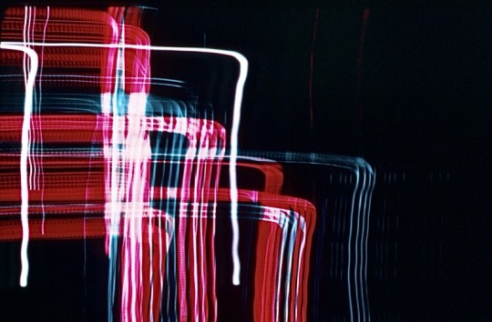
László Moholy-Nagy (Hungarian, 1895-1946)
Untitled, 1939
Fujicolor Crystal Archive print, 27.9 x 35.6cm
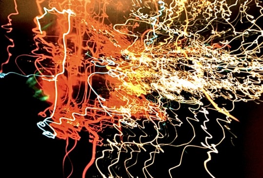
László Moholy-Nagy (Hungarian, 1895-1946)
Untitled, 1937-1946
Fujicolor Crystal Archive print, 27.9 x 35.6cm
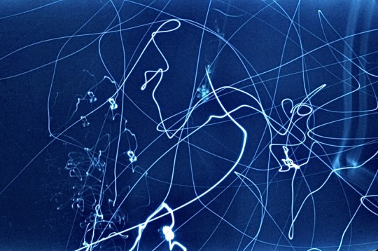
László Moholy-Nagy (Hungarian, 1895-1946)
Untitled, 1936-46
Fujicolor Crystal Archive print, 27.9 x 35.6 cm
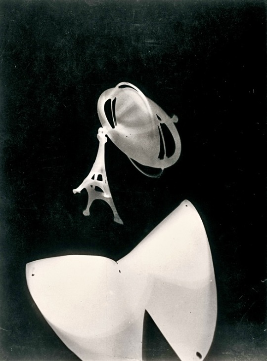
László Moholy-Nagy (Hungarian, 1895-1946)
Photogram with Eiffel Tower and Peg Top, 1928
Silver gelatin photograph, 38.7 x 29.9cm
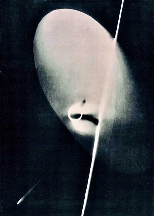
László Moholy-Nagy (Hungarian, 1895-1946)
Photogram No. II, 1929
Silver gelatin photograph, 95.5 x 68.5cm
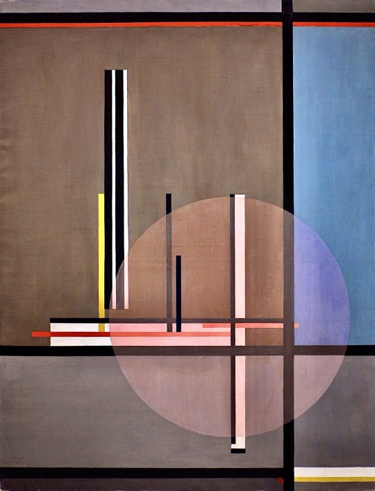
László Moholy-Nagy (Hungarian, 1895-1946)
LIS, 1922
Oil on canvas, 131 x 100cm
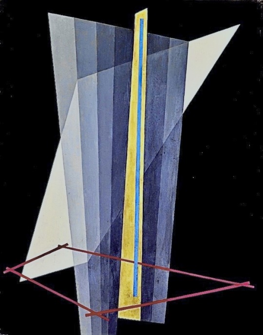
László Moholy-Nagy (Hungarian, 1895-1946)
K XVII, 1923
Oil on canvas, 95 x 75cm
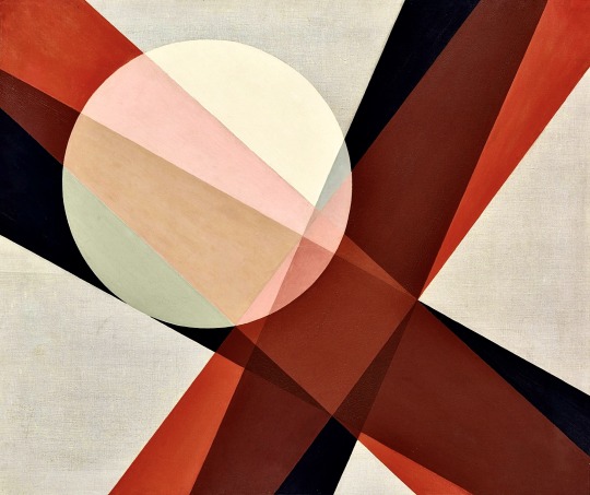
László Moholy-Nagy (Hungarian, 1895-1946)
A 19, 1927
Oil on canvas, 80 x 96cm
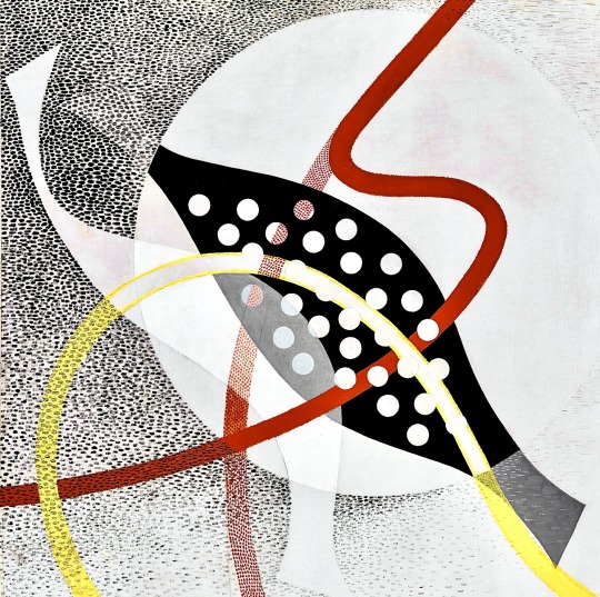
László Moholy-Nagy (Hungarian, 1895-1946)
CH BEATA I, 1939
Oil on canvas, 119 x 120cm
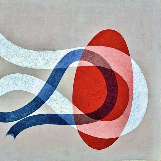
László Moholy-Nagy (Hungarian, 1895-1946)
CH SPACE 6, 1941
Oil on canvas, 119 x 119cm
László Moholy-Nagy Retrospective exhibition at Schirn Kunsthalle, Frankfurt
8th October 2009 - 7th February 2010
Artworks © Hattula Moholy-Nagy for the Estate of László Moholy-Nagy © VG Bild-Kunst, Bonn 2009 / Artists Rights Society (ARS), New York
ART BLART_ ART AND CULTURAL MEMORY ARCHIVE
Curated blog and article by Dr. Marcus Bunyan:
•
•
▪️YouTube silent video >> László Moholy-Nagy Ein Lichtspiel Schwarz Weiss Grau (Light Play: Black, White, Grey) [1930 / 6mins.+34secs.]:
youtube
Ein Lichtspiel Schwarz Weiss Grau (Light Play Black White Grey) is perhaps Lázló Moholy-Nagy's best-known film work. It features his Light-Space Modulator, also known as a lighting fixture for an electric stage.
Light-Space Modulator is a key work in the history of kinetic art and even new media art, and therefore one of the most important works of art of its time.
Initially conceived by Moholy-Nagy in the early 1920s and built between 1928 and 1930, its completion required the involvement of a number of collaborators.
It was intended to be the centrepiece of the Contemporary Room at the Provinzialmuseum in Hanover, planned (but never realised) by Moholy-Nagy and Alexander Corner, the museum's director.
Light-Space Modulator was exhibited in 1930 at an exhibition in Paris on the work of the German Werkbund. From the point of view of the object, it forms a complex and beautiful set of metal, plastic and glass elements, many of them movable by the action of an electric motor, surrounded by a series of coloured lights.
Moholy-Nagy used it to produce light shows that he then photographed or filmed, as in the case of the film shown here. Although in black and white, the film manages to capture the kinetic glow of the sculpture.
•
•
▪️YouTube video >> László Moholy-Nagy: Proto-Conceptual Artist [2019 / 5mins.+36secs.]:
youtube
Coinciding with the Bauhaus centenary, Hattula Moholy-Nagy and Daniel Hug, the daughter and grandson of László Moholy-Nagy, consider the lasting impact of the artist’s work today. Hauser & Wirth’s exhibition in London dedicated to Moholy-Nagy examines his influence as a proto-conceptualist, whose work interrogated the role of the art object and the artist in society, anticipating questions posed by subsequent generations of artists.
László Moholy-Nagy is on view at Hauser & Wirth London from 22 May – 7 September 2019.
•
•
▪️ YouTube video >> Moholy-Nagy: Future Present exhibition overview at the Guggenheim [2016 / 3mins+14secs.]:
youtube
Curator Karol P. B. Vail provides a brief introduction to Moholy-Nagy: Future Present, a comprehensive retrospective of the work of László Moholy-Nagy (1895–1946), on view at the Solomon R. Guggenheim Museum, New York, May 27–September 7, 2016. To learn more visit https://www.guggenheim.org/moholy.
•
#Art & artists#Artworks by Lázló Moholy-Nagy#Paintings#Drawings#Photography#Photograms#Sculpture#Light sculptures#Cinema#Films#Stage set design#Typographical projects#Kinetic art#Experimental art#New media art#Modernism#Abstraction#Conceptual art#Bauhaus - Germany#New Bauhaus - Chicago#Schirn Kunsthalle - Frankfurt#Guggenheim Museums#Hauser & Wirth - London#Hattula Moholy-Nagy#Estate of László Moholy-Nagy#VG Bild-Kunst Bonn#Artists Rights Society (ARS) New York#Dr. Marcus Bunyan#Art Blart#YouTube
16 notes
·
View notes
Photo
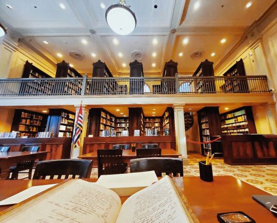
My studying space today, at the Williams Research Centre of The Historic New Orleans Collection. I spent all day with records of a 19th century German immigrant society in a gorgeous Beaux-arts reading room. . . . 🏷️ #studygram #study #neworleans #gradstudent #gradschool #gradschoollife #history #phd #phdlife #research #archive #studying #studyblr #instagood #travel #travelphotography #journey #wanderlust #louisiana #library #reading #studytime #phdstudent #19thcentury #historynerd #researcher #nola #photooftheday #photogram #amateurphotographer (at Williams Research Center) https://www.instagram.com/p/Cmh7DaFv2Cb/?igshid=NGJjMDIxMWI=
#studygram#study#neworleans#gradstudent#gradschool#gradschoollife#history#phd#phdlife#research#archive#studying#studyblr#instagood#travel#travelphotography#journey#wanderlust#louisiana#library#reading#studytime#phdstudent#19thcentury#historynerd#researcher#nola#photooftheday#photogram#amateurphotographer
19 notes
·
View notes
Text
Alice Lex-Nerlinger (1893-1975)
Alice Lex-Nerlinger (29 Oct 1893 – 21 Jul 1975) was a German mid-20th century artist in the media of painting, photography, photomontage and photograms. via Wikipedia #PalianSHOW
Alice Lex-Nerlinger; nee Pfeffer29 Oct 1893 – 21 Jul 1975was a German mid-20th century artist in the media of painting, photography, photomontage and photograms. via Wikipedia | Alice Lex-Nerlinger in her studio at Waldstrasse 50 (n.d.), photographer unknown. x Alice Lex-Nerlinger, Berlin, c. 1920. Photographer unknown. Akademie der Künste, Berlin Nerlinger Archive, x German artist Alice…
0 notes
Text
The Power of Commercial Architectural Photography: Capturing Spaces and Stories
Architectural photography for commercial purposes is not simply the craft of taking pictures of a structure and creating images; it is the business of telling a story through the structure. This is a niche area of practice that incorporates a technical, science-like approach complemented by art to present architecture in a manner that is unconventional in revealing its intricate characteristics and aesthetics as a form of practical art. For property and business listings as well as advertising, marketing, and promotional content, commercial architectural photography has been essential to understanding and valuing architecture.

The Importance of Architectural Photography in the Field of Commercial Practice
There are a number of significant uses of Commercial architectural photography. Advertising, one of the primary utilities of architecture photography, is vital to real estate developers, architects, businesses investing in properties, and many other professionals. Such pictures make the potential clients and customers see the space and endeavor to grasp the concepts of design of the particular space and the features which are both artistic and usable at the same time. It is here that, in a highly competitive environment for a particular pharmaceutical product or service and with lots of insignificantly different images, a more appealing image can indeed draw attention and create leads.
In addition, architectural photography helps capture the design and personality that the structure held at the time of the shoot. When a building is renovated or changed in some form or even destroyed, there is no way of replicating the original design and function of the building without the help of photographs. This is a great value aspect in archival and historical value for appreciation of the items.
Architectural photography is a subdiscipline of architectural drawing that has developed through the interaction between architecture and commercial photography.
Thus, key elements concern commercially architectural photography.
1. Technical Precision
In commercial architectural photography, it is critical to attain a very professional photograph. Some of the concepts which photographers need to learn include perspective correction which is important to reduce distortions where necessary, and hence have to make good use of tilt-shift lenses where such things like straight lines are to be captured in a correct proportional manner. Lighting is another important factor; non-artificial lighting can accentuate the features of the architectural design but artificial light sources may also be used for illumination by the photographers for emphasizing certain features or setting the mood.
2. Composition and Framing
Choice and arrangement of the elements are crucial in architecture photography. The choice of this type of construction makes it possible to stress the large size, shape, staggering and location of the building. Most photographers walk around looking for the best view or angle to take the picture from. Telephoto lenses are used in the documentation of an entire structure while the special lens zooms in on details such as material used in construction.
3. Lighting
An aspect that stands out famously is lighting since it is capable of creating varying moods and appearances of architectures in the photographs. When it comes to lighting, natural light is usually the best as it helps one to realize the actual colors and grains of some materials. Nevertheless, artificial lighting can be required during indoor shooting or if the object is to spotlight some elements. Another factor is the time of day, and the best is the so-called golden hours – in the early morning or late evening, a soft warm hue is obtained.
4. Post-Processing
Thus, post-processing is a significant stage in creating commercial architectural photograms. Subsequently, photographers make the final enhancements on the pictures using computer software, in aspects such as color, contrast, distortion, among others. However, while editing, it is critical to preserve the objective truth of the building and improve the visual aspect. These are some of the problems that may arise from over-editing; it distorts something’s appearance and can alter the viewer’s perspectives.
Contemporary tendencies and novelties in the sphere of commercial architectural photography
1. This website includes Virtual Tours and 360-Degree Photography.
In the commercial architectural photography, virtual tours and 360-degree photography are now in use due to the influence of technology. These formats also enable the viewers to move around the spaces progressively, making it easier to recall the layout and decor. It can also be a great asset to the real estate industry mainly in the marketing and promotion of huge projects.
2. Drones
Architects’ photography has benefited significantly from the advent of drone technology since the latter provides exceptionally good aerial shots of buildings. These perspectives offer an unconventional look at a building’s environment, through which photographers can strategically document a structure’s connection to its surroundings. Another advantage of drones is the spectacular views of the space and panoramic views that add value to architectural pictures.
3. Environmental finishing for affordably green architecture
With the increase in awareness of sustainability, commercial architectural photography is more and more devoted to green structures and sustainable design. Architects as well as photographers focus on the installation of green walls, solar panels, the incorporation of energy-efficient systems, and others. It is for this reason that this emphasis also highlights the fact that the building’s construction is innovative while at the same time being in harmony with clients who are conscious about the environment.
The Commercial Architectural Photography and its Implication In the Current Branding and Marketing Industries
Commercial architectural photography is, to a great extent, a powerful instrument for creating brands and promoting enterprises among businesses and organizations. Professional pictures of offices and corporate spaces such as commercial complexes and headquarters have a sense of tidiness and higher quality. They can also portray the company’s value system and, in essence, enable acquisition of clients, customers and talents.
These photographs are vital in portfolio creation by architects and designers as a means of displaying their work. An effectively implemented project may even bring http://www.xyz.com/ new clients and obviously show the firm’s efficiency and inventiveness. Similarly, real estate developers and agents depend on the stand out images and beauty to make the property stand out in advertisements or marketing lists.
Conclusion
Architecture photography as a business is fundamentally an art where the achievement of aesthetic end results depends on the technicalities, creativity and observation. This aspect is of significant importance in determining people’s perceptions as well as how buildings and structures are marketed for sale, for instance, the branding of commercial buildings. Over time the advances in technology are inevitable and therefore the approach and trends in architectural photography will also be evident. Whether it is with the help of classical means, including architectural photography, or using modern technologies such as drones and virtual tours, the significance of architectural photography in the commercial sphere is rather high, as it influences how the world is perceived.
0 notes
Text


hauntedbystorytelling
view on wordpress
George Herbert, 5th Earl of Carnarvon ~ The Frieze. Photograms of the Year (1917-1918) | src internet archive
related post Source: unregardoblique.com
0 notes
Text


「 kaleidoscopic world 」
#flower#art#photography#flowers#nature#photographers on tumblr#floral#beautiful#beauty#my photography#original photographers#beautiful photos#photogram archive#flower photography#photooftheday#japan#aesthetic#flower aesthetic#flowercore#写真#花
773 notes
·
View notes
Text
Handle With Care explores the fragility of human existence, looking at themes of memory, life cycles, the corporeal, and the spiritual, echoing the transient nature of our material possessions.
The remnants of these material objects underscore the malleable and shifting quality of memory. Old photos, once cherished, now depict unrecognised faces, while clothes hang as empty garments, signifying the absence of their owner. These items are presented as relics to be conserved and archived.
Among various processes, the body of work utilises photograms and contact printing to suggest absence. Imprints and impressions are created through sun bleaching and the exposure of unprocessed photopaper on which unfixable images and colours gradually fade and reappear.
A sense of transformation permeates throughout the narrative, as the work itself bears the marks of human interaction. The hand, unintentionally damaging, leaves fingerprints on turning pages, while the glove symbolizes the divide between self and surroundings, reminding us of our dual role as both protector and disruptor.
0 notes
Text
This is a random His Dark Materials fic I quickly wrote. I have written fanfiction in the past but this is my first His Dark Materials fic. It's a small moment where Lyra's and Will's futures are connected
This is on AO3 with a few edits
As they entered the theatre, Lyra made sure Pan had his seat. It was in contrast with everyone else in the theatre. They had their daemons touching them, some even curled into their sides. Lyra was more dressed up for the occasion, in a white blouse with a light tan skirt which had a small petticoat built-in with ankle boots, her favourite bag over her shoulder.
Films were invented a year before but it was the first time a cinema had opened and was open to the public. Lyra was eager to see the first film they showed to see how similar it was to that one time, years before with Will. Looking around, people were more dressed up than she was. Lyra knew that moving pictures could happen and it was common to go in Will's world. To everyone else in her world, it was a brand-new thing and they were known as 'moving photograms' but Lyra chose to always call them 'films'
The only other seemingly open seat was on Lyra's right side. She wished Will was occupying that seat and sat with snacks she would steal. Pan and Kirjava on the other side of them, watching the film like their owners, and their tails entwined.
As it started, Lyra expectantly looked to her right, hoping that Will had somehow figured out a way to get there. Instead, there was a llama daemon sitting there. If Will was in the land of the daemons, they would've been buzzing that they could watch movies in Lyra's world!
In his world, Will had sat down on a first date with a girl named Imogen. They met when the guy Will had briefly dated had introduced them on a night out. They'd agreed to it after Will had broken up with James. Will and Imogen had a horrendous Pizza Express dinner, in which they didn't seem to get along. He hoped that "Back to Black" would distract him from her.
Imogen was the polar opposite of Will in every way. She wanted to be in the middle of everything when he was more comfortable blending in. He knew that opposites could complement each other, but he and Imogen just clashed. She was a bit on the taller side with short ginger hair, wearing a black dress with a yellow overshirt and yellow high tops. He was in his go-too random t-shirt with dark jeans and fleece combo with his old faithful trainers.
He sat in his seat with Imogen on his right and an empty seat on his left. As the sound of Amy Winehouse's voice filled the theatre, he looked at the empty seat, thinking to himself, "Lyra, look at this!"
A lesbian couple was sitting on the other side of that seat. One of them had bleach-blonde hair and was sitting where he envisioned Pan and Kirjava being. He liked the idea of their tails being tangled together.
#his dark materials#lyra silvertongue#will parry#his dark materials fic#my fic#moment in the future#contains small references to things I like
1 note
·
View note
Text
NEXT/PREVIOUS
The Gerald Moore Gallery 2nd-30th September.

The Gerald Moore Gallery is pleased to present Next: Previous, a curated by Steven Scott that brings together works from eight artists with practices established in diverse fields. Artists include Andy Bannister, Frederick Bell, Andrew Bick, Peter Downsbrough, Susan Morris, Nicola Rae, Steven Scott, and Clare Strand.
The Gerald Moore Gallery is pleased to present Next:Previous, a group exhibition curated by Steven Scott that brings together works from eight artists with practices established in diverse fields to offer correlations between form and reference, concurrency and possibility. The exhibition will run from 2nd to 30th September 2023 and includes pieces by Andy Bannister, Frederick Bell, Andrew Bick, Peter Downsbrough, Susan Morris, Nicola Rae, Steven Scott, and Clare Strand.
The private view will be on Friday 1st September 5 - 8pm.
The selection of works for this exhibition began from structural concerns around dual and multiple images and interrelationships between the temporal sequence and the spatial array. It is hoped that alignments perceived as a result of bringing these different works together will allow for new relationships and perceived concurrencies to be revealed.
The exhibited works include a dual painting by Andrew Bick titled OGVGGT [double echo], and a double tapestry by Susan Morris, Binary Tapestry & Binary Tapestry (Reversal). These pieces have been described in relation to notions of ventriloquism and the channeling of one aspect of the work through its other in asymmetrical circuits. Viewed this way these works incorporate doubling modes of translation that play out in alternating shifts between concurrent states and references to spatialised time and the marking of lived events.
Clare Strand’s Spaceland/Flatland consists of darkroom generated images and sculptural objects that form spatial sequences and shape-shifting arrays. The work references Edwin Abbot’s 1884 novella Flatland with its satirical use of hierarchies of form and dimension,
Binary Tapestry & Binary Tapestry (Reversal)
by Susan Morris
alongside Eastman’s patenting of photographic film and the subsequent increase in viewing the world as 2D images. Notions of translation between dimensions also inform the dual projection piece by Nicolas Rae, Remote Sensing Sonification: Jupiter Aurorae, in which she transposes digital recordings of Jupiter’s auroral data between image and sound.
Fredrick Bell’s paintings of sequenced forms in The Conversation, Diagram Painting Number One describe both directional flows and mapped positions as overlapping events across four panels, and the print Delay/Delay by Peter Downsbrough reminds us how repetition and mirroring can slow the immediacy of language, here rendering it concrete in the collapsing of form and content.
Andy Bannister adopts pictorial and schematic forms in a dual drawing titled Container/Contained/Sellafield ’16 to allude to nuclear half-life, extended duration and an unknowable future, and the light and photogram works from the series Sequence and Stereograph by Steven Scott attempt to frame perceptions of phasing and parallax shifts as a visual experience that maintains a potential for future concurrencies.
The exhibition is open every Saturday 10am to 4pm until 30th September 2023 or by appointment for other days.
Andy Bannister lives and works in London. Since graduating from Chelsea College of Art in 1992 he has made and exhibited works which employ a range of media including sculpture, drawing, video and sound. Most recently, his work was included in the 2018 and 2022 Trinity Buoy Wharf Drawing Prize exhibitions. His current practice investigates the impact of science and technology on culture and society from the mid- twentieth century to the present. Since 2017 he has created a number of drawings which involve the meticulous transcription of archival photographs and documents that relate to the history of the atomic age; in doing this he aims to reveal the latent meanings that these images hold and to explore the connections between them.
Frederick Bell worked for several years as a medical lab technician in the NHS before going on to Art College. This had some Influence on his conceptual approach, using mainly painting and photography in a symbiotic relationship. He first exhibited in The Young Contemporaries at The Whitworth, Manchester and shortly after graduating moved to Brussels. He has exhibited widely across Europe including at Fotogalerie Vienna, Royal Museum of Fine Arts and FOMU Antwerp, J&J Donguy Paris.
Whilst exhibiting regularly at Galerie Ruimte Morguen in Antwerp his work began a dialogue with the exhibition space itself. His work became about ‘the work of art’ and its varied relationships to place, context and audience.
Andrew Bick’s works consist of combinations of oil paint, marker pen, wax, acrylic paint and Perspex. He utilises elements of flat colour, depth and surface, revealing the process of painting as a series of strategies or components that call into question false opposites, and contrast hard geometric or graphic forms with uncertain or dashed-out strokes. His work is based on the belief that disruption within a system helps us relearn the process of paying attention.
Bick has an MA in painting from the Chelsea School of Art (1988) and has since shown extensively in Europe and the U.S. He is represented by Hales Gallery, London and Von Bartha, Basel. He lives and works in London.
Peter Downsbrough was born in the USA and lives and works in Brussels. Associated with Conceptual and Minimalist art since the 1960s his practice includes sculpture, installation, photography, film and artists’ books. His various works bring together text as both a visual and semantic signifier, composing this within geometric forms,
graphic lines and structures that delineate space and the subjective encounter. He uses these elements as a basis to examine place and the urban landscape, spatial relationships, reflexivity and concrete poetry in a complex array of interrelated works.
Downsbrough publishes and exhibits internationally and is represented by Galerie Thomas Zander, Cologne; Krakow Witkin Gallery, Boston; Angels Barcelona; Michèle Didier, Brussels, Gilles Drouault, Paris and Loom, New York.
Susan Morris is an artist who also writes. Her work engages with periodicity and the involuntary mark, either through a form of diaristic writing, or by diagrammatic works generated from data recorded by devices worn on the body and, more recently, from ambient light and sound recordings.
Morris has an MA from Goldsmiths, University of London, and a PhD from CSM UAL. She lives in London and is represented by Bartha Contemporary, London.
Nicola Rae’s interdisciplinary practice engages with scientific processes and phenomena, and collectively initiating and co-curating exhibitions is an important part of her working process. She studied BA Fine Art at Canterbury, MA Art & Design in Education, Institute of Education and an MA in Contemporary Art Theory at Goldsmiths, and has exhibited internationally including during Venice Biennales 2013 and 2017, Cyberfest: Patterns of the Mind at the State Hermitage Museum, St Petersburg, 2015 and at Partial Presence: Testing Ground, Zabludowicz Collection, London 2015. She is based at the APT Studios & Gallery in SE London.
Steven Scott is a London based artist and curator working with installation, photographic processes, moving image and print. He utilises methods of mirroring, extended duration and the presentation of interference patterns formed from the interplay of repeating parts. His recent work frames alternations and phasing between points in time and positions in space, intending that this simple matrix frames a liminal threshold at which visual perception gives way to protention. He has recently completed a PhD in Fine Art at the Royal College of Art, London.
Some recent exhibitions include: Galerie Ruimte Morguen, Antwerp; APT Gallery, London; Focal Point Gallery, Southend, and the Dyson Gallery, RCA, London. He has co-curated shows at Centro Cultural CEEE, Porto Alegre, Brazil and Contemporary Art Platform, Kuwait City.
Clare Strand is a British artist working both with and against the photographic medium. For over 25 years she has produced work with found imagery, kinetic machinery, web programmes, fairground attractions and more recently, large-scale paintings and chamber music. She often rejects the default settings of photography and instead, and without apology, welcomes a subtle, slow-burn approach. Her practice is situated somewhere between control and a wilful acceptance of chance.
She exhibits internationally, including at The Museum Folkwang; The Center Pompidou; Tate Britain; Salzburg Museum of Modern Art and the Victoria and Albert Museum.
She is based in Brighton, UK, and is represented by Parrotta Contemporary, Cologne/Bonn.
The Gerald Moore Gallery is a young centre for modern and contemporary art with learning at its heart. Opened in April 2012, in Mottingham, the gallery is uniquely set within the grounds of Eltham College and is a valuable resource for the students and the local community. The gallery has gained momentum hosting some exciting exhibitions including works by Matisse, Louise Bourgeois and Cornelia Parker, whilst supporting emerging local artists. In unison with the exhibitions, the gallery's outreach programme works with local community groups, teachers and schools, creating lasting relationships with our locality. Gerald Moore Gallery was made possible with the foresight and generosity of Old Elthamian, Dr Gerald Moore, many of whose works are archived at the gallery and who has a permanent exhibition on display.
1 note
·
View note
Text
instagram
Summer of 2015
📍 Festival Supermall
4.15.2015 | 📸 @kristinemaeb
#tigasouthkaba#wheninsouth#kristinemaebsnapshots#kristinemaebphotography#structuraldesign#photogram#krizwanders#festivalmall#southies#archives#2015#2015Apr#wheninmuntinlupa#festivalsupermall#throwback#Instagram
0 notes
Text
// Traditions of remembrance
Keeping the memories of the past alive is probably the principal purpose of photography, among some others. In order to pin down pieces of life, photography is the best way to make an instant eternal. It is not only moments that are susceptible to be caught but also objects. The essence of things, without any function or background related to them, is what is at stake. This is exactly what I observed when I discovered the Katami sensitive series by Japanese photographer Naohiro Ninomiya.
Born in Nagoya, a coastal town in Japan, in 1969, Ninomiya is now living in Strasbourg, where he came to study in the Higher National school of decorative arts. After graduating from Aichi University with a degree in management, he decided to move to France in 1988 and changed his direction to art. Since his graduation in 2005, the artist has won multiple awards. For example, he was the winner of the UPC Discovery Award (Union des Photographes Créateurs) and received the Rotary Award in 2006 for his Sonomama series. He participated in several exhibitions as well and his work is displayed in a Parisian gallery. Even if he no longer lives in Japan, Ninomiya takes most of his photographs in his native region of Gifu, and prints and finishes them by himself in his studio in France.
The care given to the technical aspect of the photographic process is what is particularly remarkable in his way of working. He is always looking for the appropriate medium and technique for each project and that is the kind of detail that creates a particular sensitivity. What is more, Naohiro Ninomiya is not interested in simply printing his negatives images in his studio. He wants to emphasize the potential materiality of an image, and make his work more tangible in an increasingly flat world. His wish is to create sensations from his images : the visitor must be able to feel the roughness of the picture and be able to understand all the stages which the image went through in the atelier. As the Japanese tradition requires, the handcrafted dimension is essential to him.
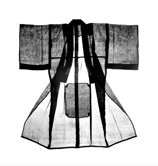
For the Katami series, the artist has chosen to anchor his project in his family history, assigning it to a powerful and personal affect. In fact, almost two years after his mother passed away, and during a trip to Japan, he found her kimonos, which she kept after she was married. According to Japanese family traditions, these keepsakes are shared by the family, but the artist decided to claim the kimonos temporarily to make photograms. For this purpose, he realised a series of photographic prints. This simple process involves placing an object on photo-sensitive paper and exposing it to light to capture its shadow. Using this technique, Ninomiya was able to capture the shape of the shadow cast by his mother’s clothing but also all the details of the fabric through transparency.
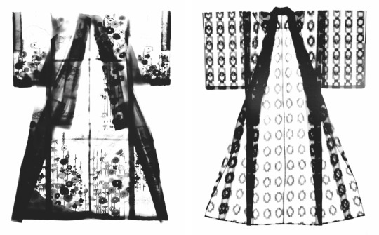
The photogram technique is a genre in its own right just like monotypes or cyanotypes but these methods generally involve only photographic prints composed with solid objects without any transparency. But Ninomiya’s work shows the interest of composing with soft material such as textile fabrics, and in this case fabrics of great rarity and fineness. The details of embroideries are revealed by the power of the contrast created by the photographic technique. And just as watermarks on a piece of paper, there are almost invisible to the naked eye. In some parts, the image looks diluted, the sharpness and the blur are interconnected and give the picture a force of serenity. The natural overexposure is not only a way to let appear the warp and weft directions of the fabric but it also brings a sacred or maybe divin aspect to these traditional pieces of clothing. This photographic technique is a poetic way to archive objects and capture emotional memories, giving to these particular kimonos that will never be worn again, an eternal character.
Lou Duvelleroy.
Publié le 8 janvier (3936 caractères).
0 notes