#paper (visual art medium)
Explore tagged Tumblr posts
Visit Tumblr Blog
Explore Tumblr blogs with no restrictions, modern design and the best experience.
Last Seen Tumblr Blogs


Fun Fact
Tumblr Inc. is funded by 13 investors.
Note
how do you plan the panel layouts for your comics? i always get stuck and it feels cramped or unsatisfying
okay so i went to college for 2 whole semesters and one of the only art classes i took (and definitely the only one i retained much from) was my sequential art & comics class. so i'm gonna try to explain my process in so many words, but there's a LOT of stuff that goes into a successful comic and i'm by no means a professional. i can however throw some tips and tricks and some recommended reading your way (another longpost ahead!)
first, know what you want to do. know where your comic starts and ends. if you find any joy in writing scripts, you can also do that, but i'm not the best at writing with no visual aide so i usually script while i thumbnail, but always make sure you've got a concept and a goal.
next, start thumbnailing. my initial thumbnails usually look like this:


(incidentally, my storyboard thumbnails look a lot like this, too)
there's no real structure, and i'm just noodling my way from the top left of the page to the bottom right. if you've got what you want from your comic in mind, this part can sometimes just pour out of you. i feel a very strong attachment to these characters and the situations i put them in, so that definitely has to do with how smoothly this part goes. draw the panels as small and as detail-free as possible. i usually don't do speech bubbles, and instead treat it like a storyboard, writing my rough script under the panels as i go.
once you're satisfied with the way your story is coming together, THEN you start laying your panels out. this part looks like this when i do it:

(these are actually from a gfalls comic i never cared to finish from like. five months ago but who's counting?)
honestly, it's best to do this as small as you can possibly get it, to really get your head out of the "but i have to fit all the panels exactly as i drew them on the page" funk. remember that, at least if you're writing the comic in english or other languages read in the same direction, that you're trying to lead the reader's eye from top to bottom and left to right. this is really hard to keep track of, and i still make mistakes and flub up the readability all the time. like here:

the panel layout should be reversed here. the panels in the top left and bottom right should be smaller than the other two, so the gutters would actually guide you to read it left to right instead of top to bottom, but laziness and initial drawing blindness struck me and i never fixed it.
once you have a layout that makes sense to you, it's as simple as blowing your thumbnails up to comic-size and going over your very rough sketches with your final clean panels & inks, or, if you're doing it traditionally, re-sketching your page on your big bristol board after doing some measuring to see where your panels should actually be.
there are other rules to keep in mind when you're in the thumbnailing phase of your comic, like the 180-degree rule (something that carries from film to animation to comics to, really, any form of sequential art), which is easiest to explain with a little diagram:


keeping this in mind really helps with readability. you can do a bunch of things with your angles, you can even omit the other character, but keeping them on the side of the frame you establish them on is very helpful. this is mainly for dialogue, but it does also help if you want to display one character walking in one specific direction, or if you want a fight scene to read as well as possible, etc.
and, if you look at your comic sketch now and think, hey, this looks great, this is so clear and easy to read, i highly recommend stepping away for a few hours to look at it again, or, if you're impatient like me, sending it to a friend. you're also totally welcome to send it to me, if you just need someone to tell you whether your comic is easily readable.
to learn more about drawing comics, i recommend two things. one, read some comics. by professionals in the industry, ideally, though there are many many competent and incredibly detailed comics by independent creators out there. people in the industry will (MOST of the time) be held to slightly higher standards of readability than the average independent artist, and the workflow for professional comics involves several people at once reading and reviewing and revising what's made so that it'll be digestible to the average audience.
two, i recommend getting your hands on a copy of "understanding comics" by scott mccloud. love this book. lots of comic artists love this book. it's fun and informative and packed full of tips, while also being a comic, which makes it even more fun to read. mccloud goes into a lot of detail on stuff i didn't mention, from the gutters between panels to lettering to working with other artists and writers and finding an art style that fits the story you want to tell. great stuff. go to the library, check it out. you won't regret it.
#ask#myart#wander over yonder#comics#rambling#comics are HARD man it's tough stuff to learn and even tougher to put onto paper#but when you learn about comics you also pick up lots of stuff for animation and writing and even film#because visual art is all connected. peace and love. but comics are one of the most involved mediums of storytelling out there#also quite possibly The best. because you get to read through it as fast as you want#but you can also hang back and look at the panels forever and really think about what makes them work as well as they do.#live laugh love sequential art
26 notes
·
View notes
Text
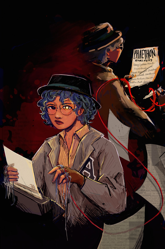
ghostwriter (their grandma would tell them she'd lose half her soul)
#or smth smth. having a lot of Thoughts. anyways here's the piece i've been working on and sometimes u have to just say Done#there's a lot of thinks but i am maybe a bit tired and so tmr i'll come in and add all the Tags that i'd personally want to get from myself#maybe i'll reblog the extras tmr too. this is an incredibly self indulgent piece + it probably deserves a tag ramble essay or smth#ig for now we see how it stands for itself + in the meantime:#adamandi#beatrix valeria campbell#hello!! i'm back with belated tags yippee!! alright so for funsies i'm going to make it sound like i'm going bonkers over this :3#the eye shine... the glowy eye... it's like phaethon shine but also smth about eyes to windows to the soul and like#there's two beatrixes here! half the soul. lost part doing things specific to the phaethon and here it's portrayed as tearing off her name#because that's really; truly; when it all starts!! also notable for the ghostly beatrix is i did it more painterly and cloaked in shadow and#fading into the bg. i think i was super duper specificish about where the glow comes from! front lighting back lighting beloved!!! like help#let's put it this way- beatrix face always glowy. important parts of paper also glowy. it's just that different elements are turned away#from the viewer by each beatrix!! also also. let's talk about the very gently implied blood and red etcetera#like the red string is canonical and i love personally the whole red strings of fate thing even though it's not Here Applicable exactly but#that definitely was an influence! and also the blood in the bg... i'm starting to think this is a recurring trend. but anyway shadowy bea#the other strings hang while the red string loops!! so like that one string feels almost alive. it's a sort of whimsical i put on the same#as metaphorical glowy eye!! also also the eye is lowkey influenced by the whole idea of Eyes and Spotlights within the show and also glow#as in power as in heyyy you ever think about writing as a visual medium huh#speaking of writing!! there is no beatrix thingy complete in my head without text sorrry but the black text overlays are always so >>> to me#and in the sense of art styles and overlays shoutout to all the black crosshatching outline thingys because For Some Reason in my mind#of all the characters beatrix feels like the bnw ink printed illustrations you get in books idk#fun fact! i spent so long rendering this and that was fine i liked it! but then trying to figure out text to go on the papers was a Thing#i tried to do. but then gave up on! sometimes i have to pick my battles and graphic design is indubitably Not my passion bc Fonts#fun facts about this is i Actually did start with a quick sketch in mind and there's been so many changed elements. in the og the front#paper for instance had 'ardess murders' written on it and the back one said phaethon interviews.. i like the nominee list better it feels#more narrative-esque and less passive than her just holding her writing.! other elements that got discontinued were that#front beatrix was supposed to blur into the other ghostly beatrix but i couldn't do it without sacrificing clarity so... no... no blurry#oh and the red string morphing at the ends to smth more abstract was always there from the start!! og had more floating papers#and also a silhouette of vincent and a scalpel bc 'one who pulls the strings' but that (pun intended)! got cut (hahahahahahaha) (sorry)#used also to be a lot of print room clutter but that got cut to bc compositionally i made beatrix larger (learned lesson from last art)
86 notes
·
View notes
Text
Curso online com certificado! Animais de Origami
Como fazer Origami criando animais de papel , passo a passo. Faça sua inscrição:
#amizade#animal#animals#ano novo#arte#bird#birds#boas festas#criança#DIY#dobraduras#easy#enfeites de natal#enfeites para casamentos#facil#feliz 2015#grou#instruções#japao#lembracinhas#making#oriental#origame#origami (hobby)#papel#paper (visual art medium)#paper craft#papiroflexia#pássaro#paz
0 notes
Text
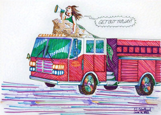
My mom requested fridge art from her daughters. And I'd already sketched one siren a bit after first seeing that one post, but that composition definitely will require the layers afforded by digital painting. So behold! A fire engine and its siren. Not too shabby for both my yellow and red markers giving up the ghost while I wasn't paying attention the last few years.
(This is the first time I've really seen how Tumblr size compression can murder a gif, but it wasn't at all helpful at the 540px width so click for quality.)
I did color in the wipers I'd forgotten and make the emblem on the door slightly more legible while editing my phone pic.
Image descriptions under the cut:
[ID: First image is a colorful drawing of a fire engine seen in three-quarters profile, driving toward camera left. On the roof of the truck's cab is a rough rock formation with a large mermaid lying on it, her tail draped down between the cab and trailer of the truck, her left arm pressing against the rocks, and her head held high while she speaks into a megaphone in her right hand. Her hair streams behind her toward a spiky word bubble with a zigzagged electronic tail that reads, "Get out th'way!" in all-caps. The headlights and amber light bar above the truck windshield are all on and the pavement and traffic lines below are represented with horizontal slashes of marker. The drawing is inked with even, thin black lines (a micron pen size 02) and colored with varied hatching with non-blending markers. On close inspection, the emblem on the fire engine's door reads "escucha las sirenas" in all-caps, Spanish for both "listen to the sirens" and "listen to the mermaids."
Second image is a gif of phone camera pictures showing six stages of the fire engine siren process and the final digital edit. First pencil sketch; second all but the lettering inked; third all but the lettering pencil marks erased; fourth inked word bubble with more emphatic italicized lettering; fifth the beginning layers of marker where the artist took a break with some yellow-orange, light red-orange, light blue, and periwinkle mostly over the truck cab; sixth the fully colored phone picture; and finally the edited shot with the white of the page and vibrancy of the colors restored as well as a coloring in the space around the door emblem with a brighter red for readable contrast. End ID]
#mermaids#sirens#comics#puns#cj gladback#yeah i'm taking full responsibility for this#though without the help of lasso tools and resizing it does feel about as well constructed as#scribblings#as always a little surprised about the speed things can get done in traditional art (at least when your medium doesn't take drying time)#thought about waiting to post this with the tornado siren cause they are funnier together but they're gonna be so visually different#think i'll just link between the posts whenever the other gets done#relatively speedy yes but this did still pretty much take a work day including the edits and gif making#and that's before I decided on a whim to download and try glazing on this#this is the low intensity high render quality and it's interesting because the medium quality apparently failed their test#but it looks like the same amount of aberration for what's visible just a different seed#mostly it's not noticeable through the colorful portions but it makes the paper white look like i painted it with a palette knife#and both high and medium quality look bad around the word bubble so if i were to publish a webcomic and want to protect it#it would be worth asking the glaze team if doing an opacity mask to fade in the original under the glaze around words would ruin everything#speculative fiction#tag you're writ#ramblings#this. post. has. *everything.*#gallery
1 note
·
View note
Text
Event Rules and Info
Please read this post before you send an ask!
WHUMPTOBER is a month-long, prompt-based creation challenge (think: Inktober, but whumpier). There are 31 official themes this year - one for each day of the month - which can be used, skipped, or combined in any way you’d like. They are meant to serve as inspiration without being taken literally (e.g. you don’t have to include the exact wording of prompts into your work). Feel free to run rampant on interpretation. For example, if the prompt is “flame", you could create something with reference to a candle/campfire, your character could have suffered a burn, or the flame could be a reference to an ‘old flame’ - an old relationship. It’s truly down to you!
In total, there are 4 prompts for each day. These are optional suggestions and can be used in conjunction with the theme, or as options/alternatives. We want to give everyone as much creative freedom as possible, as well as increase event accessibility for folks with triggers and squicks. There is also a list of 15 alternative prompts that can be subbed in for any day, again to give participants as much creative freedom as possible.
Creators can PRODUCE work in any media they choose, including but not limited to: writing, visual artwork, photo/video/audio edits, paper crafts and elaborate recommendation lists (not just a list of links). Creators can PARTICIPATE as much or as little as they want (i.e. you don’t have to do ALL the prompts if you don’t want to) and prompts can be used in any order. They are also free to use even after the event ends.
When uploading Whumptober content to your blog, be sure to tag it with:
#whumptober2024 …..(the event tag)
#no.1, #no.2, #no.3, …..(theme number)
#bruises, #stabbing, …..(the theme or specific prompt you chose)
#altprompt …..(if you use an altprompt, tag the post with the number of the prompt you replace)
#fandom or #OC, …..(ironman, original content, oc, etc.)
#medium …..(gifs, fic, podcast, art, etc.)
#teeth, #etc …..(trigger warnings & any additional tags. Keep in mind not to add “tw” in front but only use the word/trigger itself)
#nsfwhump …..(only for nsfw content)
#your own tags go here
PLEASE BE DILIGENT WITH YOUR TAGGING. Only properly tagged posts are considered for archiving on the official @whumptober-archive blog. They must be tagged in the order above. An elaborate post about our tagging system can be found [here]
Unfortunately, due to the sheer number of participants in recent years, we cannot guarantee your work will be archived. A random selection of properly tagged posts from all genres will be reblogged each day.
Whumpers who produce content for 31 total theme days are considered event completionists and will be tagged in a masterpost at the end of the month. A form will be published at the beginning of November asking you to tell us if you completed. This is based on trust and we will not check this.
Questions not addressed in one of our many event info posts can be directed to this blog. We will not answer any questions that have been answered in the FAQs or rules already.
Thanks for reading, and happy whumping!
473 notes
·
View notes
Text


Hey you! Have you made friends or found community through fandom? We want to hear about your experience!
What is this?
This is a zine, or a DIY collection of your submissions! It’ll be a booklet that is made available for free online after it’s assembled. We also hope to print a limited number of physical copies for contributors, depending on how many contributors there are and our funding. I hope that this zine will serve as a useful archive for people who want to learn more about this topic and as a way for people to connect with each other and see their experiences reflected in a collection.
What to submit:
We are looking for a blend of scholarly work, personal reflections, and generally thoughtful work. You can submit personal essays, academic papers, art, comics, interviews, oral histories, and more, as long as it can fit on the printed page! You could even submit a zine to include within a zine :) The medium/genre is not as important as the topic.
Brainstorming questions:
What makes fandom friendship special? How have your fandom communities changed over the years; have the ways people relate to each other changed? What can we learn from fandom friendships?
Who am I?
I’m Lianne, and I’m assembling this zine with the support of Fanhackers. Some of my favorite people on the planet are people I met through fandom, so I love this topic :)
How to submit:
Email [email protected] with your piece, how you’d like your name to appear in the zine, your pronouns, and a short bio (100 words maximum). If your piece is a written file, please make sure it is a .docx or .doc file. If it is an image, please send it as a PDF.
If your work is not in English, we may be able to help translate it into English for you. Please reach out to our email ([email protected]) to discuss this.
Written works are limited to 8 letter sized pages (double spaced, 12pt font, 1 inch margins on an 8.5×11 default document page). This will come out to about 2,400 words in English prose. Going over a little is okay, but please try to keep your submission under the limit.
Visual and multimedia works are limited to 8 pages. The size of the zine will be 8.5” (21.59cm) in height and 5.5” (13.97cm) width.
Everyone here is a volunteer; this is not a paid opportunity.
When to submit:
Please send your submission by November 30, 2024.
Any questions? Send us an ask on Tumblr or email [email protected]!
285 notes
·
View notes
Text
I think there is a difference between the comic as a sequence of images with text and the comic as a comic. it's a subtle difference that an untrained eye might not see but the more one as artist draws comics the clearer this difference becomes, because one who first aspires to draw comics will soon find they are merely drawing sequences of images with text.
when people say an artist is clearly inspired by anime they often use "anime" to refer to japanese pop culture in general, but if you look more closely you can often tell it really is specifically anime rather than manga that inspired them, because the paneling and camera angles in their comics will read like a series of anime screenshots rather than a manga page. similarly, when I was a teenager really popular manga that had anime adaptions would sometimes get "animanga" reprints where they replaced the panels with the equivalent anime screenshots of the scene, and they often looked like dogshit because the very premise showed blatant disregard for why the original comic worked in the first place. these two examples are both about anime because i am a weeb but it applies outside that context too. a cartoon storyboard can be read as if it were a comic, but what it really is is a sequence of images with text that has yet to be refined into its actual intended format.
there are many artists who only employ the medium of comic because what they actually want to draw is a video, or a video game cutscene, but the only tool actually at their disposal is the ability to draw a series of images and add text to them so that is what they use. there is no shame or mistake in doing this, you have to make your art with the tools that you have available, and if the sequence of images with text is enough to convey the idea then it was the right tool for the job. but these are different mediums with different visual languages, languages which have a lot of overlap and can occasionally be used in each other's stead to achieve similar results (especially when drawing a fanart comic of a video game for example), but which are still ultimately different. the comic and the video and the cutscene are all different forms that a sequence of images with text can take but they are far from completely interchangeable.
there is a key difference in approach to the comic as a series of images roughly interchangeable with other forms of series of images like the video and the cutscene, and the comic as specifically the comic. this difference in approach is not always necessary to achieve results, an artist who wants to convey a scenario they came up with needs only the sequence of images with text to achieve this. but the difference between a comic with good writing and art, and a comic that is a good comic, is in whether it was treated as a comic rather than a sequence of images with text. I say this as an artist whose nearly every comic has been simply a sequence of images, because I just don't have the patience to refine it into a comic when I merely want to convey my idea rather than draw a comic. it takes a particular skill and insight that have to be developed and practised separately from the ability to draw well and the ability to write well in order to become good at making "the comic" as synthesis of the two.
it's hard to specifically point out the essence of this difference between the sequence of images and the comic because it's kind of a vibes thing honestly, and it depends on where and how the comic was meant to be published too. comics meant to have paper print editions have different constraints and requirements and frameworks to work with than webtoons meant to be read on slim mobile screens in a continuous scrolling format. a good traditional comic will consider not just how each individual panel looks but also the way each page as a whole looks, and how the pages look next to each other in a spread, and how it feels to turn the page towards the next spread. a good webtoon will consider the movement of scrolling down and how this affects the transition from one moment to another in its composition. time is time in videos and cutscenes but space is time in comics, and the space your have available determines how you can divide time across it. when you make a webcomic on your own website you have no constraints but the ones you set for yourself, and sometimes this leads to things like homestuck, which would not work in any other format than the one it created for itself.
the best comics are good because they tell their story and present their images specifically in the form of a comic, in a way that would not be possible if it were not specifically a comic. I think this is true for basically every medium, I'm just thinking about comics specifically lately, because even though I don't really consider myself a comic artist - because I usually draw sequences of images rather than comics - the thing my clients want to pay for is often still "a comic", and they don't know or care to tell the difference. it's a difference that, as established, is often fairly moot anyway, because as long as it successfully conveys your idea it's good enough. but it's precisely because the sequence of images is often good enough that the specific skill of the comic artist is often overlooked.
541 notes
·
View notes
Text
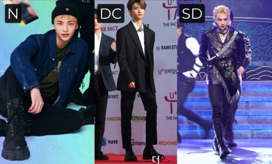
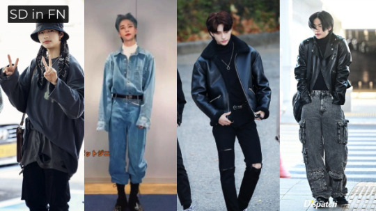
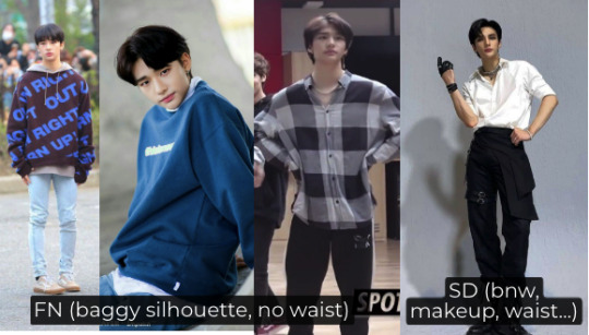
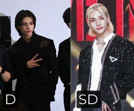
🌹 KIBBE types || Why Hyunjin is a 𝒮𝑜𝒻𝓉 Dramatic
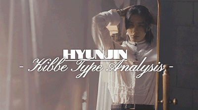
↪︎ INTRO :: Welcome to another lengthy Kibbe Body Type analysis. Today, I’ll discuss Stray Kids’ Hyunjin, who is certainly among the most beautiful men of our times 🌹
Across the web he’s been typed as a [Soft] Dramatic, Dramatic Classic, and Flamboyant Natural respectively — I make my case for SD here in bite-sized illustrated points. Enjoy!
---- 🅲🅾🅽🆃🅴🅽🆃 ----
I. ANALYSIS 🌹
why he’s in the dramatic type family
hyunjin’s SD features & fashion
comparison to FN/DC/D + other members’ types (Chan, Lino, Han, Felix)
why he fits the versace look
II. CONCLUSION 🌹
hyunjin as an archetype and GNC icon
shifting beauty standards
thoughts on kibbe type distribution in skz/k-pop generally (do successful groups feature types from all 5 kibbe categories?)
----
why he’s in the dramatic family
Needless to say, Hyunjin is likely part of the Big Three (D, SD, FN) or a Dramatic Classic due to his notable vertical line. Like all of these yang types, his model physicality is hard to overlook.
At 5′11, he’s already tall and close to the 6´0 threshold on paper, but he appears even taller mostly. People surely wouldn’t describe him as petite or barely medium in height. I heard through the grapevine that 5′11+ is Kibbe’s cutoff for male yin types who have short vertical lines:
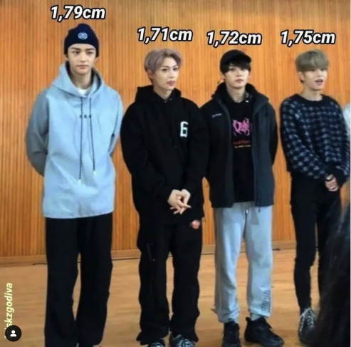
Especially as in South Korea, the male average height is estimated to lie between 5´7 and 5´8½. That would be their Classic type benchmark. Lee Know is commonly typed as Soft Classic at 5′8. I agree with the typing: He looks great in sophisticated, clean, standard black tie with waist emphasis and suave fabrics (yin). All C category looks suit him, less is more.
Hyunjin appears taller and bolder congruently, seemingly taking up twice as much space as most Soft Gamines like Felix (SG is Kibbe’s most petite type next to the Romantics, they are the Big Three’s opposite). His physical frame is easily noticed first.

His extremities are fairly narrow, though. At his height, only one Image ID category looks like that, in fact: D types, the longest legs of the Kibbe system. Slim and streamlined, Hyunjin embodies sharp yang.

And he fits their reputation: Like all Dramatics, he does visually intimidate. His appeal can be described as intense, towering, and in your face (D), not as bluntly rounded, wide, sporty (N) or subtle and detached (C). Changbin being from the Natural family, the difference is quite stark. Changbin is frame dominant, Hyunjin is vertical first.
There’s an edge, he’s square and tall, not bevelled, not all-round symmetrical, not tiny, nor softly round. Hyunjin isn’t fully mesomorph nor endomorph either, but slenderly column-like with longer bones (D), which tends to reflect in his dance/stage presence. Very angular.
SKZ’ concert outfits can be quite theatrical in a Kibbe and aesthetic sense, it suits him well. Kibbe calls the Dramatic element theatric because literal drama/theater in the arts relies on tall actors with exaggerated makeup & features that can still be seen in the last row. D types are easily spotted from a mile away.

Let’s do the reverse: Zooming in, typing by detail. Tell-tale sign of a D type: Hyunjin’s hands/fingers are long and slim. FN’s hands are broad and less dainty/slim, if not huge sometimes. Classics are “regular”. His extremeties are not, we see bone structure first.

Calves, hips, underarms, too. All very yang. Not short, not soft, not balanced, not sturdy, not contrasted, just elongated and slimmed. I can hear people say it’s FN’s dramatic undercurrent, but it’s not an addition, it’s his main thing.

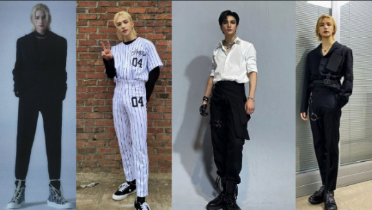
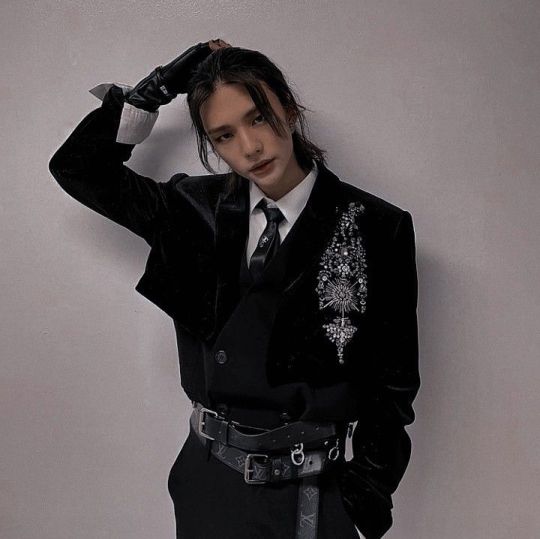
Test it with outfits: Kibbe is about matching similar things to create harmony, which creates beauty. Hyunjin’s most famous looks are all angular like he is. They mirror his frame. His artistic alter ego is as fittingly dramatic-themed as it gets. Sharp asymmetric corners everywhere:

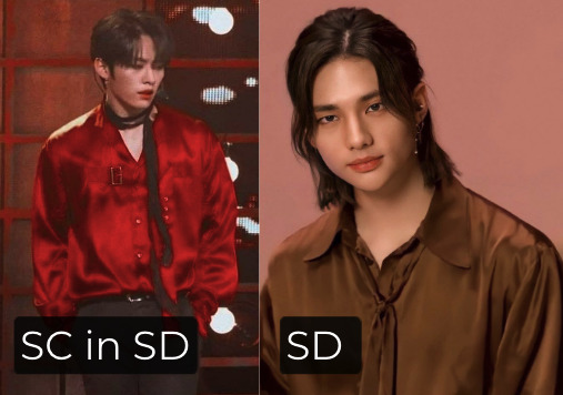
how his yin undercurrent manifests
Now that we established his Dramatic base, let’s see how his yin undercurrent shows. Outfit test again, because it’s fun: Especially opulent and dark-colored SD lines overwhelm all Classics and Naturals. But Hyunjin, never. Just another Thursday for him, he can do it all.

And either way, his lush, super-prominent facial features are the waving flag for SD. They pair so well with glisteningly adorned yin styling. The hair could be more contrasted (= yang) here, but you get the gist.
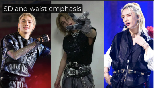
He even has a semblance of double curve, which is elongated in SDs. FN has a broad ribcage > hourglass, Pure D has a straight, streamlined body. DC has no curve. But SD looks great with the waist marked. Only then does the outfit become “Hyunjin-esque” lmao! And it puts the focus on his face.

Hyunjin is far more yin-oriented than D, DC, FN. He wears Romantic and otherwise gnc clothing so well. You could douse him in jewels. SD is the only type among the Big 3 that can pull off TR decor. Modern Hanboks are often yin-themed (SC, TR, SD...). He’s born to wear it.

SD borrows its yin from R, yes. But as I see it, the infamous “homme/femme fatale” Theatrical Romantic type is SD’s younger sister. Simply due to TR’s sharp yang Dramatic influence. Hyunjin is easily a `sexy TR with more vertical´, and tall homme fatale is exactly what he exudes. An SD face says “femme but I’ll eat you up”.
That doesn’t mean that if you made TRs like Jimin or Han more elongated, they’d look like Hyunjin. Ofc not. Besides no person ever fully resembling another, Han is yin first (rounded face, small waist), and Hyunjin is yang first (chiseled body, long limbs). SD is gigantic next to TR.
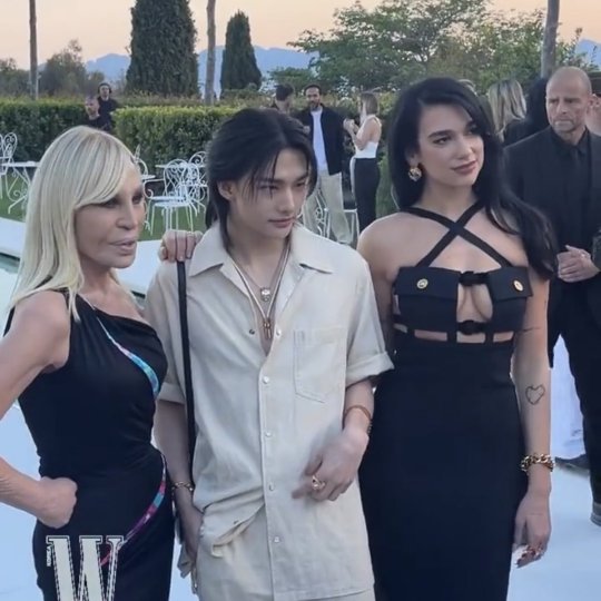
However: Added to how Korean men tend to be on the smaller side already, and SD still points toward R and is the least towering of the Big Three most of the time, Hyunjin is still less gigantic than Pure D and FN — even if he looks tall by himself or next to G types like I.N, Felix, etc. Next to FN Dua Lipa in heels below, next to D types in the second pic.

For SD, Kibbe says overdressing is virtually impossible, as long as their narrow vertical line is honored. Unlike Classics, Hyunjin is certainly the “more is more” type. Minimalism wouldn’t do him justice. All-out dark luxury and ornamentation is peak SD aesthetic.
As above, and like in Han’s or Taemin’s case (both are TR), all of his outfits are elevated by belts. A purely yang type couldn’t wear this convincingly or comfortably. But with his small waist, belts are needed to keep the outfit together. Again, he can’t overdo it.
Finally, his feet are long and yang, but the toes appear yin and rounded, softly padded. The gentle, fleshy undercurrent of SD shows here, just like in his face. I’m a Pure Dramatic, my toes are thin and elongated, and my face is taut. SD has less structured feet, even if they can be bony. That’s why Natural category boots look so heavy on him, DC shoes appear regular, but elongated boots that emphasise vertical suit his outfits. He rarely wears SD shoes, but as always, the more glam, the better.

why he fits the versace SD aesthetic
It’s no coincidence he became a Versace ambassador. Donatella — despite being a tiny Flamboyant Gamine at 5´2 — herself dresses like a Soft Dramatic often, and loves supermodels embodying the shiny Diva Chic, it’s the brand’s entire theme.
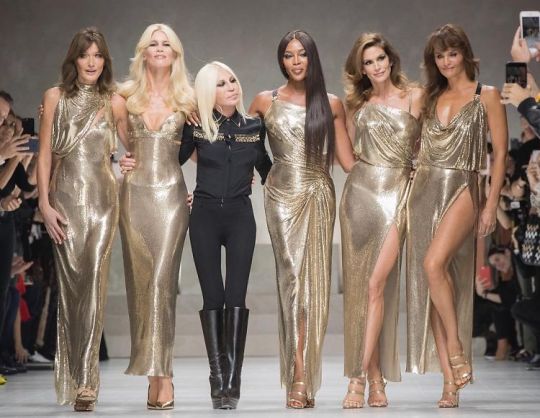
Just like D & G and Mugler celebrate TR, Chanel and Gucci revere Gamines, Armani worships yang types (D, DC), and Dior suits Soft Classic, Versace lionizes SD, Italy’s Kibbe archetype. Bold patterns, sharp shoulders, black, waist, long lines.
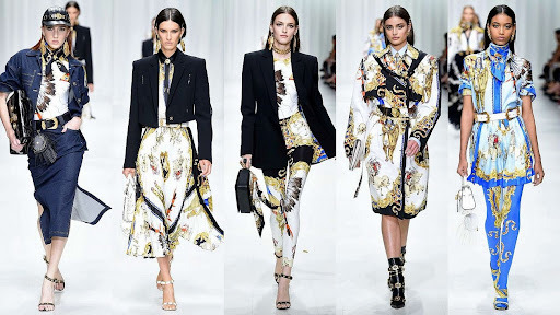

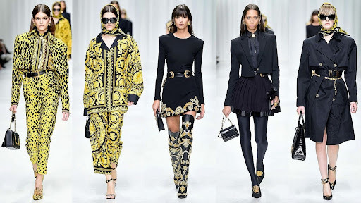
Versace and Hyunjin’s best signature style are based on the severe long, black vertical look, angular and stark. Head to toe! The velvet fabric ad glossy boots are also quite SD.
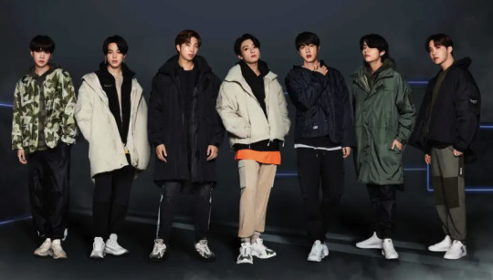
By constrast, Versace doesn’t base itself on the flowing mix´n´match, wide lines and cozy fabrics of Naturals. That would be, say, Urban Outfitters or FILA. The BTS campaigns show of how casual FN/N is. No coincidence how RM and JK are positioned center, they are SN and FN. Brands will always clock which types instinctively fit the aesthetic.
Like all designers searching for a muse, I think Donatella looks for models that symbolize what her own contrasted/angular FG type doesn’t feature: Extreme vertical, a consistent essence (as opposed to Gamine’s mix of D and R lines), and yin. Thus, Versace’s muse is SD. Hyunjin perfectly fits the role. He is tall and radiates decadent splendour.
why he’s not flamboyant natural
Some FN clothing suits him, yes, as SD and FN are neighboring types. You can always steal from your closest Image IDs and pull it off to a certain degree. It accommodates his vertical, after all. But again, he can go even more fashion forward, and isn’t known for his leisure looks like, say Namjoon (FN) or Jungkook (SN). FN clothing looks casual on all other types. FN clothing on an FN looks like a million bucks.

Some FNs have soft yin features, but on SD, they stand out. Hyunjin’s go-to makeup look is not understated like Kibbe would recommend for the N family. Full lips, strong brows, sharp chin, sharp smokey eyes, contoured nose. His face shape is slightly more elongated than wide to begin with, the eyes aren’t wide-set like it’s often the case for Ns. His signature style is long hair, wether straight or wavy: but pulled back (D), not big and wild and free (FN).

The FN (and DC) outfits he wears the best are all black, head to toe. Which is a D characteristic! The drape of the fabric is similar to SD, but the materials are still reading as casual and wide on him. FN clothes look huge on all other Kibbe categories and hide the body, but on all Naturals they look stylish and showcase their frame dominance. FN is oversized on Hyunjin, especially the upper body. SD might have a T-silhouette, but not the FN ribcage. Casual clothes are snug on actual FNs.
Vice versa, Hyunjin makes the most artificial-looking, least casual aesthetic seem entirely taken for granted on him. His silhouette asks for emphasis in the middle of the body than just the shoulders (yes, SD does need shoulder emphasis!). The FN style leaves his legs looking too slim by comparison, as the top part winds up being too baggy.
That couldn’t happen to a Natural like Chan who fills out skinny pants easily. He needs the heavy fabrics, chest, arm, and shoulder accommodation like air. Stage looks are heavily manicured; he becomes a different person — Chan looks good, but he’s most at home in cozier looks, and most known for it, too. It balances his body.
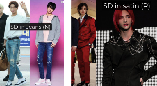
Test jeans (N) versus satin (R): Which is more well-dressed? SD is about how far you can go, N is about how relaxed you can go. I think jeans is good, but underwhelms here and there. Plain satin lacks structure on him, too, which is why R is only his undercurrent. It requires the angular tailoring of D to incorporate yin fabrics in his wardrobe. But you could still throw more jewelry on him! Gala/dinner/red carpet dressing is so easy for SD. The right-hand outfits are fantastic. The colors pack a punch, too. SD needs heavy duty [winter] hues, regardless of their personal color.
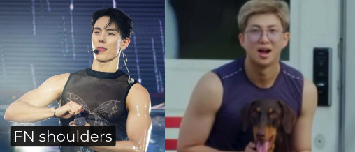
So, in stage outfits, he wears sharp shoulders well. FN has larger, protruding, rounded shoulters that do not carry pointed Dramatic corners well. No sharpness here, just massive soft yang muscles, eg. Namjoon and Shownu. Worlds apart from Hyunjin. SD is the fiercest slayer ever, FN is a complete machine.
Any impression that he has Kibbe width is caused by the T-Shape most SDs have, an illusion created by their small waist making the shoulders look prominent by comparison.
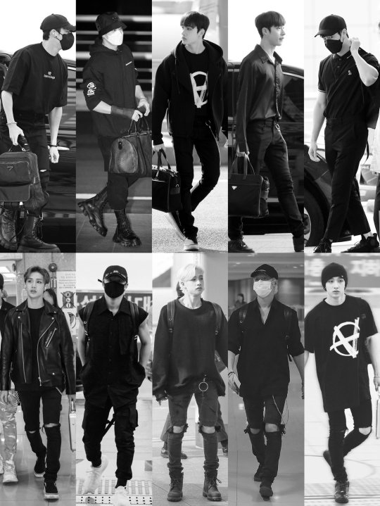
Stiff fabrics that hold their shape (=D) are key to his best outfits, not coarse/woven FN fabrics or DC tweeds. fN are the kings and queens of athleisure. SD is underdressed in FN. It needs lavish draping and bnw contrast (=D element mixed with yin). He looks great in it:

SD is a naturally androgynous type. It fuses a tall model body with a soft yin face. Think Austin Butler, Shawn Mendes, Lil Nas X, BTS’ Jin. But FN is as masc as it gets. Think Henry Cavill, Jason Momoa, Hugh Jackman, RM, Minho (SHINee), Chanyeol. FN can be humongously broad when trained! SD bulks up, but their narrow, delicate vertical still shows first. And Hyunjin is shredded to the gods, mind you.

His legs showcase thin D bone structure. Congruently, he wears pointed toe shoes better than rough and ready FN ones (sharp, black shiny boots, his signature). Even if they have a sharp yang undercurrent, FNs still have more substantial N bones by comparison. When FN works out, their frame becomes even more biased towards the upper arms, shoulders and thighs, where SD becomes leaner first, and just more defined overall. Hyunjin’s legs aren’t blunt, they are extra long (sharp yang) with softly wide flesh (yin undercurrent) on top. FN is bulkier, stronger-looking like RM. And Hyunjin is a main dancer!
In short, trained FN idols are basically closest to bodybuilding contest winners because they look so broad and vigorous, while SD idols could win a pageant because they’re so beautiful, not rugged and hypermasculine like FN. Hyunjin is muscular, but you don’t notice broadness first, but his gorgeousness and model height.
FN benefits from earth tones + softening the hair color, while all Dramatics are recommended to go darker, more uniform in shade. Contrast works miracles for Hyunjin, black hair or completely bleached white is his forte. Muted colors undersell him. FNs will pass as a natural muted blonde or light brunette, while the D black and white color scheme don’t flatter them as much. Hyunjin definitely needs the extreme.
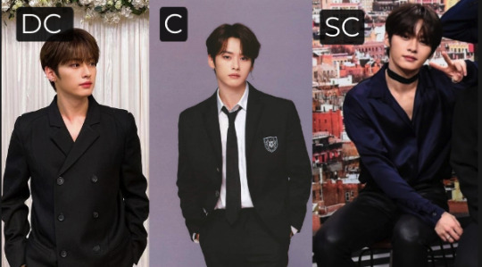
why he’s not pure dramatic
Pure Dramatic fits his proportions, it looks great on him (proof that D is his family) but the certain something is missing. It conceals his body rather than adapting to his shape. SD is never boring, always memorable (!), the longer you look the better it gets (minus the whitewashing on the right). SD is the right “challenge”.
The fact that Hyunjin can handle so much glamour whereas Pure Dramatic best sticks to the all-black column look without the glitter and diamonds makes him secondary yin. SD can lean into (Theatrical) Romantic, but on a tall scale. The jewels, the glitter, the soft fabrics, you can put all of this on him. The big florals, too!
Pure D is enjoyable in how contrasted and proportional it us, but it seems more boring than his stylists playing it up and adding more of a genderless element without making it classical drag art; it’s his specialty. His roster of SD hairstyles is endless and we all love it. The wavy ponytail below shoulder length (SD can go even longer anyway).

Pure D lines also don’t lend enough definition to his face. Wearing one’s Kibbe type HTT (head to toe) naturally makes the face pop, as its surroundings are harmonious. He will be too gaunt in too-straight hair and too-stiff fabrics, the SD volume is missing. E.g. Sehun and Wonwoo (Pure Dramatics) wear this better.


why he’s not dramatic classic
His insane proportions and remarkable face also disqualify him as any Classic. C styling looks good on everyone as it is the midpoint of the Kibbe spectrum and thus accommodates all types. He can pull the plain white dress shirt off, but only with sufficient accessorizing (SD). C drowns in SD, but C jackets are like crop tops on SD (red carpet image below).
In general, his body is not balanced — small waist, very narrow legs, prominent facial features, etc — enough to be described as average. Nothing strikes you about Classics, they are subtle and perfect. It’d be harder to draw Lee Know from memory than Hyunjin. All Dramatics stand out. Classics blend in, staying understated, visually embodying the “handsome, cold yet elegant gentleman”.
how he compares to any other types
Kibbe is about comparing Image Identity: Hyunjin could never be the sporty guy next door like SN Chan; he could never be the SG brand of “short and sweet” (think Sabrina Carpenter, SG) like Felix. Hyunjin has the tall contrasted look of sharp yang types. SD is the dark and sensual god king, SG is the lovely elven prince (yet both have yin lips).

Hyunjin’s ability to ace high-effort styles is only restricted by his lack of Gamine essence, which is K-Pop’s main mode. G types have few rules except breaking the line, SD requires rule-abiding. The floor length, the belts, the longer hair, the intense colors.
G lines turn to kitsch on SD, it is too “youthful“ for him to maximize the potential of SD. Eclectic Gamine lines are too short. G looks ‘cutesy/fun’ on all other types except on Gamines, who look stylish and cool in them, like FG J-Hope. Everything is ugly unless Hyunjin wears it as they say, but G is too hit and miss (and not “Hyunjin-esque” 😄).
Finally, Romantic is too delicate for him. It needs more oomph and “overstyling”. R is not risky enough for Hyunjin! Yes, he is secondary yin. He looks dainty in it. But it works better with yin guys like Felix, Jimin, Woozi, Wooyoung, Suho, Xiumin, you name it. R clothing looks corny on all other types, but on TR/R/SG it looks flaming hot. Pair Romantic’s velvets and pastels and crystals and transparent fabrics and sparkles and ruffles with Dramatic edges and it works for Hyunjin:

conclusion
Since Kibbe has these type-specific names that set a certain tone or theme: I think luxurious “Divo/Deus Chic” (SD) fits Hyunjin best. As in `godly´ man, since Deus was the male operatic lead, historically, and Diva the goddess. Kibbe has no men’s equivalent of “Diva Chic” so I figured `Deus´ was quite fitting, as Hyunjin does look like one would imagine a seductive deity.
I see why many type him as Pure D and FN, and he can’t go wrong with DC either if the vertical line is kept, either. He can embody those three essences through acting, styling, working out. But the above-and-beyond ornate SD image sums him up well and dresses him to his fullest.
He’s close but not quite the masculinely austere Pure D, Kibbe’s “Regal Sir” (D), who tends to be the most mature-looking, dry/stern type, far from Hyunjin’s genderbending visual that effortlessly breaks every boundary of what is considered menswear. He stands out from the common “Spitfire” Gamine idol aesthetic, too (small, lean, youthful, `doll-like´ face — think Taeyong, Jennie, or Yoongi), which makes him so recognizable.
He’s modelesque, moreso than the leisurely, Herculean yet relaxed boho “Free Spirit” (FN), or the understated yet sophisticated “First Gentleman” (DC) who stands at a more medium height and excels in spartan clothing. Most SD men are chronically underdressed, Hyunjin became famous because he barely ever is (props to the stylists!). I love this ID on him, and it has many options, just a feast for the eye.

I thought about Taemin successfully carving out a niche for himself as a sensual Theatrical Romantic, heavily breaking with mainstream masculinity. Or Lisa (her type is debated, but we can all agree she’s yang-leaning) being known for her tomboy look pre-fame and later blowing up astronomically for her concepts that have no time for the submissive Asian girl trope. They both defied the expected norm, aka FN or FG male idol, SG female idol. In a similar manner, SKZ having so many yin subtypes is probably what made them so appreciated for their lavish GNC styles — and the big stage/a music video is really where you can wear all of this to the max.
If you think about it, they have yin types in all of the 5 main Kibbe categories! TR Han, SG Felix, SC Lino, SN Chan + Changbin, SD Hyunjin, like how? Perfectly distributed, talk about range! No wonder they can do any concept. Hyunjin and Felix being the most known for genderless fashion is likely due to SD being physically impossible to miss and SG standing out as they are so petite (think Woozi from Seventeen, best example). Kibbe is onto something when he made sharp yang and soft yin the end points of the spectrum.
For the stylists, it must be hard to find a balance between dressing the Naturals VS the several Romantic-leaning members, and everyone in between. They do a tremendous job though most of the time imo, it’s refreshing to see SKZ’s fashion style having courage and forward-thinking instead of catering to a conservative worldview: Not to mention the many contemporary, low quality menswear design landscapes which are nothing short of underwhelming. SKZ create a visual spectacle, that’s one of the many reasons why they stay relevant to the public. I don’t think a group mostly consisting of say Classics could execute their theatrical stage displays convincingly. Example: Wolfgang worked because Chan is Soft Natural. Felix’ runway debut worked because the outfit was Soft Gamine. Hyunjin became a sex symbol as soon as he grew his hair long (a Dramatic characteristic, yin `feminine´ hairstyles are actually short in Kibbe’s system! Think TR Hwasa’s iconic wavy bob).
So, maybe one crucial ingredient, besides other factors, to a successful group is having members from all Kibbe 5 main IDs? To give each a recognizable/particular wardrobe, showcase height differences, be able to stay flexible with concepts, and further emphasize the concept of group roles? If we’re talking male groups in general, EXO has all Kibbegories except a strong R department, but therefore more yin subtypes. The literal exact same goes for ATEEZ and TXT. BTS has at least one Romantic (Jimin), Gamine (Yoongi), Classic (V), Natural (Jungkook), and D type (Jin) featured. That effect is even more pronounced in Seventeen (they almost have all the 13 types, it’s insane) and of course, within NCT we find it all, I mean the numerical chances of them having each Kibbe type present are high anyway lmao!
And of course, SHINee is THE most balanced group: Minho FN, Key SD, Onew SN, Jonghyun DC, Taemin TR! Yes — I am aware Key and Jonghyun are typed as Flamboyant Gamines frequently. Those aren’t bad typings at all, especially since SHINee often did and successfully does a FG concept. But as I see it, Key wears and exudes the Divo aesthetic like no other, and Jonghyun is easily associated with crisp and elegant suits. So even if they aren’t SD and DC, FGs can be type chameleons, as we saw with G-Dragon who’s portrayed every Kibbegory in the book. Long story short and pun intended, let’s crack the code: SHINee being Kibbe allrounders could also be a reason why they are timeless.
The veracity behind racist stereotyping à la „they all look the same“ unsurprisingly proves to be nonexistent, even despite the industry’s persisting Gamine bias for both girl and boy groups. Which, worryingly, shifts toward promoting the too-muscular Natural body for male idols lately. We can anticipate more N types being cast into debut groups to reinforce that ideal. It does seem to create a new „be this type or go home“ beauty standard that is often divorced from the variety fans want to see. Say, nobody campaigns to have Felix look like Terminator Arnold 2.0 😅 He’s grown so perfectly into his Soft Gamine/Light Spring Season style and looks stunning. No need for a gargantuan bicep or pecs out of proportion, or 15 layers of insoles.
So, I wouldn’t want to pump up everyone into a quasi-Flamboyant Natural (the current Hollywood steroid disaster is telling) or slim everyone down to a faux Dramatic or FG (see Ozempic) when we have nothing short of 13 human archetypes, with 12 different seasonal color types on top anyway. You cannot change your ID to begin with, ever — you’d need surgery for each cell of your body. Even today’s possible amount of cosmetic procedures couldn’t change your yin-yang balance completely. You still look best in your original lines. Plus, height and bone shape are hard and painful to alter from head to toe. I prefer Kibbe’s prennial `dressing your own, already beautiful type´ approach, which still applies if someone had lots of surgery, too. Kibbe types are permanent after one’s early 20s.
That’s why I still think the „5-category-SHINee-effect“ does contribute to longevity and artistic merit. Exactly to last through extreme trends (because what’s after N muscles? Maybe skinny like D again, or balanced like C? It cycles on). Styling a group, it’ll never be a hit or miss game if you have all 5 archetypes present. Imagine SKZ doing an edgy/smokey eye concept, the yang members (e.g. Seungmin) will make waves. Or if they do lace and pearls, the yin types will look especially great.
No matter what theme a comeback has, it’ll strike a chord for at least one person. Everyone can have their turn, there’s no forgotten member. [Male] groups consisting of kindred Kibbe types (e.g. only Romantics, which would 100% set them apart) sadly rarely break through. They’d have to stick to one signature style, which probably wouldn’t survive in the capital-driven/high-speed K-Pop trend and fashion cycle, which asks for novelty. I’d love to see groups like that though, like an all Dramatic model squad. There’s still variety within one Kibbe ID’s styling options. Maybe I’ve overlooked some groups whose members all have similar types? Take to the comments and let me know, I’m curious!
PS. Thank you for reading all the way — and have a great week - Caro 🐯
#stray kids#skz#hyunjin#hwang hyunjin#kibbe types#kibbe#kibbe body types#skz hyunjin#stray kids hyunjin#fashion#bang chan#felix#lee know#han jisung
148 notes
·
View notes
Text
There’s an interesting tension in complaints about capitalism or executive meddling for marketability purposes ruining tv and film, just because they are two of the most capital-intensive art forms ever devised. You can write a novel for the cost of pen and paper, or more realistically these days a cheap netbook. Painting or sculpture or other static visual media can be more expensive, but the initial capital outlay is like hundreds of bucks, or if you really need particular tools, thousands.
Meanwhile a film on a hilariously small shoestring budget can run tens of thousands of dollars—you gotta pay for actors and equipment rental and stuff. And more ambitious projects basically require the backing of large production companies, who—if they do not concern themselves with marketability—may rapidly cease to be large production companies.
And on top of all this, the scale of such productions means they are inherently collaborative in nature. That’s been true of performance arts for centuries, of course, but when a key element of your production is the Money Guy, it makes sense he has to worry about his ability to be the Money Guy on similar projects in the future. And given the vagaries of show business, and that there are way more consistent ways to make money, I don’t think there are many people in the business of film or TV or for that matter theater production who don’t care about the medium to some degree.
And in some ways capitalism is the ideal system to produce big film and TV productions in, at least for the would be auteur. If capital is allocated solely by private whim, you just need to get one loaded producer on your side to realize your vision—you don’t necessarily need to justify the existence of your art to a philistine public, or to bean-counting government bureaucrats, or to the people who process grant applications at arts funding councils.
Still, loaded producers are in limited supply, and it’s much easier to get their attention for your non commercial vanity project if you are already famous and well respected as a director. It’s not a system optimized for producing really top notch art! But the problem of where to get the money can only be shifted around, while actors and animators and sound technicians and so on and so forth are a finite resource.
(Notably the auteur’s incentives are in many ways directly opposed to the acting and technical staff’s incentives—a world where even big name actors get paid peanuts or are replaced entirely by computers is a world that removes a lot of financial limits on an auteur’s creative vision! Of course a lot of directors and showrunners want their employees to be paid well; they recognize there is more to making TV and film than minimizing costs. But in terms of the labor economy of show business, the auteur or showrunner is management, not labor, and auteur theory is a justification of that arrangement.)
#I assume a lot of this applies to stage productions as well#my impression is that theater is cheaper than film and tv#but still can be incredibly expensive depending on how elaborate you want to go#though one advantage theater has#is that people don’t demand high levels of verisimilitude#so there is much more appetite for high concept storytelling#with minimalist production values
56 notes
·
View notes
Text
Artist collects fallen leaves from trees and creates incredible works of art

The art of leaf carving is gaining increasing attention in the contemporary world, thanks to the creativity of artists like Jaypoy Sucal, known on Instagram as "Lito Leaf Art." This Japanese artist has mastered the transformation of ordinary leaves into intricate works of art, employing a carving technique reminiscent of traditional kirigami, the Japanese art of folding and cutting paper. His creations tell visual stories that bridge the gap between nature and human experience, bringing to life fantastical characters and enchanting scenes.

The works of Lito Leaf Art are captivating and astonishing, featuring details so minute they seem almost impossible. With each leaf, the artist creates small vignettes that tell stories of animals, mythical creatures, and elements of everyday life. This form of art invites reflection on how even a seemingly insignificant object, like a fallen leaf, can be transformed into a masterpiece through the artist’s imagination and skill.

Born in 1986, Lito Leaf doesn’t just carve leaves; his work also conveys a message of resilience. Despite living with Attention Deficit Hyperactivity Disorder (ADHD), he has found in his passion for carving a way to channel his creativity and focus. Each piece he creates is a testament to his determination and his ability to see beauty and potential in what many would consider mere waste.

His virtual gallery on Instagram is a haven for art and nature lovers. Here, visitors can marvel at a variety of creations, from rabbits and mice to whales and adorable anthropomorphic carrots. Each piece is a visual journey that transports the viewer to a fantastical world, where every leaf tells a story and every carving reveals a new detail to explore. Through his skill in leaf carving, Lito Leaf Art proves that art doesn't have to rely on traditional mediums like canvas and paint. His innovative vision transforms the ordinary into the extraordinary, inspiring many to look beyond appearances and recognize the value of small things. In an era where the superfluous is often discarded, Lito Leaf's art invites everyone to rediscover the wonder and magic hidden in every leaf.

51 notes
·
View notes
Text


Artist Maria Berrio was born in Bogota, Colombia in 1982. She received her MFA from the School of Visual Arts in 2007. Berrio’s dreamy works encapsulate a surreal environment satiated with color and intricate patterns. Her mixed-media works leave one with a haunting sense of beauty and awe.
"I experimented with painting before collage, though painting and I always had an uncomfortable relationship. I am too messy with brushes and I treat them very badly. I was never neat enough or patient enough to mix paint or to wait until it dried. With collage there is instant satisfaction: you tear a huge piece of paper and there you go, you have a sky. There is pleasure in the raw physicality of the art form -not simply applying a medium, but tearing it, forming it, cutting it, spreading glue with sticky fingers, feeling the various textures of the different papers."
https://www.studiointernational.com/maria-berrio-flowered...
89 notes
·
View notes
Text


Albarran Cabrera —– Instagram
Art | Basel sneak preview 3/4
We are proud to present for the first time an initial set of new work at Art | Basel 2024 You can see it at Elvira Gonzalez gallery BOOTH F13 | Hall 2.0 JUNE 11 - 16, 2024
As most part of our photographs, these pieces are also inspired by Nihonga, a type of Japanese painting that draws on different styles. Many of them use traditional techniques and materials such as mineral pigments, washi paper, and silk painting.
This new work in particular is an exploration of the intersection between the gestural Western abstraction and the profound symbolism found in the Japanese folding screens ( 屏風 - byōbu) through the medium of photography. Using classical photographic effects such as inversion, sabatier effect, polarization or masking, this body of work seeks to distil the essence of the fleeting beauty of nature, presenting abstract images that evoke a sense of wonder and contemplation and invite viewers on a journey of exploration and discovery.
As part of “The indestructible” series: “Using an image captured with a camera and the possibilities of the photographic medium, we can create photographs that are not a faithful display of reality but an exploration of the limits of reality. The photographic medium, for us, becomes an extension of the human visual capacity. Our goal is to create photographic objects that create in viewers their very own experience of their encounter with the boundary between the real and the unreal.”
The Indestructible #70015, 2016 74 x 50 cm | 29 x 19 5⁄8 in Pigments on gold leaf on paper
The Indestructible #70015 (detail)
The Indestructible #70015 (detail)
The Indestructible #70015 (detail)
#the indestructible#artists on tumblr#photographers on tumblr#albarran cabrera#albarrancabrera#pigments on gold leaf#artbasel 2024#屏風#nihonga#byōbu#acnews
74 notes
·
View notes
Text

Erato Muse of Poetry
Artist: Edward John Poynter (British, 1836 - 1919)
Date: 1870
Medium: Watercolor on paper
Collection: Private collection
Erato, Muse Of Poetry is a famous oil painting, originally by English artist Sir Edward John Poynter in 1870, with the style of academism. The painting now is collected by private as collection. This kind of portrait oil paintings is very common in visual art.
#painting#watercolor#erato#muse of poetry#edward john poynter#british painter#laurel crown#wings#music#dreamlike#british art#19th century painting#academism style
38 notes
·
View notes
Text
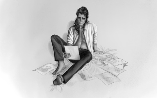
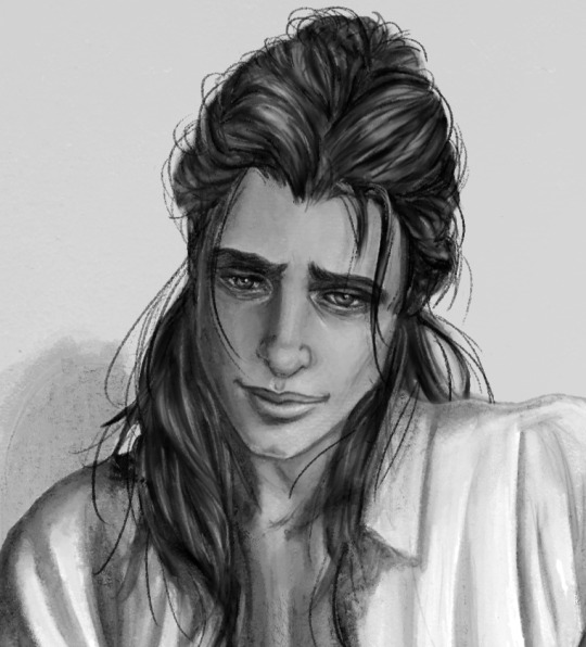
Keeping Neverland
Sometime after my fourth Neverland dream, I started to draw sketches. Whatever I could remember from my dreams. Everything I could remember. Drawing became preservation and sanctuary. Once captured onto paper, I’m able to return to Neverland whenever I want, simply by flipping through my sketches. It isn’t the same, but it’s something. Something tangible, in a way my dreams are not.
Excerpt from Lost Boys, Chapter 2, by @mooncello
(I can't believe it's taken me a month to post the art from chapter 2 of this beautiful, beautiful fic, but here it is at last! Of course, it's been viewable inside the story this whole time so if you haven't seen it yet... well. Ahem. XD)
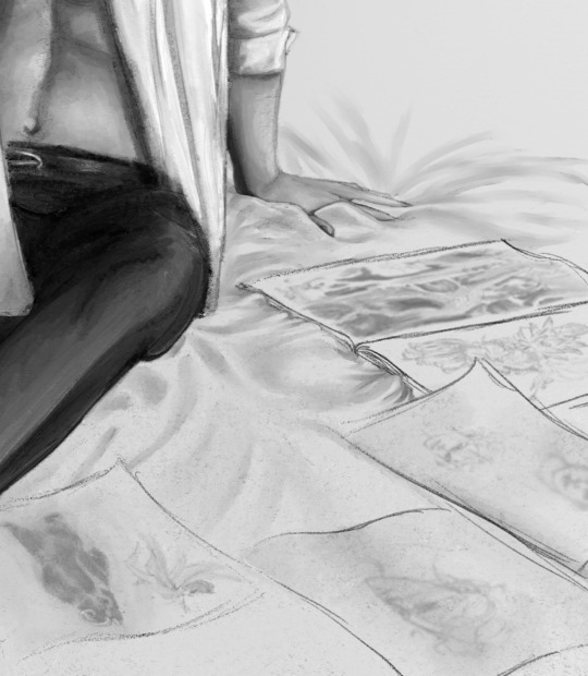
Keep reading below the cut for some extra info on what went into this particular illustration!
One of the things that got my attention from the get-go - not just as a reader, but as an illustrator - was Baz's artistic side within his story. He develops his talent for visual art almost out of necessity; he has no other way to record his adventures in Neverland, and thus preserve them in something less flimsy than his memory.
And, in particular, I was drawn to how Heath writes his artistic journey. In Chapter 2, he states, via the narrative, that he began working in graphite, but by the age of 15, charcoal was his preferred medium. (It's written far more eloquently than that, but I don't want to spoil your reading experience...)
It was (is) very important to me that I do my best to illustrate that side of Baz's artistic journey as best I can. And thus, the illustration from Chapter 1 is very much a pencil drawing, with sketchy elements, and in Chapter 2, I've used (digital) charcoal. (I did use actual charcoal for a couple of the sketches that surround him on the bed, though.)
I'll do my best to stay with Baz as he explores new artistic mediums, and we'll both push ourselves to be the artists we need to be to somehow (somehow!) help Baz find (and keep) the boy of his dreams. XD
(Seriously though, if you haven't checked out Lost Boys yet, you're missing out!)
#snowbaz fanart#carry on fanart#fanart for fanfic#illustration#artists on tumblr#baz pitch#charcoal#omg the charcoal is hard even in digital format#though I used to love working with it as an art student#different drawings from a different time though#lost boys#snowbaz fanfic#peter pan au#character art#tyrannus basilton grimm-pitch#Jodarta
75 notes
·
View notes
Text
Whumptober 2023 Event Info & Rules
Event Info & Rules
~ Please read our extensive event info posts before sending us an ask ~
WHUMPTOBER is a month-long, prompt-based creation challenge (think: Inktober, but whumpier). There are 31 official themes this year - one for each day of the month - which can be used, skipped, or combined in any way you’d like. The 'theme' of each day is the line of lyrics.
The prompts are merely to serve as inspiration without being taken literally (e.g. you don’t have to include the exact wording of prompts into your work). Feel free to run rampant on interpretation. For example, if the prompt is "flame", you could create something with reference to a candle/campfire, your character could have suffered a burn, or the flame could be related to an 'old flame' - an old relationship. It's truly down to you!
In total, there are 4 prompts for each day: there's lyrics, an object, a trope and a line of dialogue to choose from. We want to give everyone as much creative freedom as possible, as well as increase event accessibility for folks with triggers and squicks. There is also a list of 15 alternative prompts that can be subbed in for any day, again to give participations as much creative freedom as possible.
Creators can PRODUCE work in any media they choose, including but not limited to: writing, visual artwork, photo/video/audio edits, paper crafts and elaborate recommendation lists (not just a list of links). Creators can PARTICIPATE as much or as little as they want (i.e. you don’t have to do ALL the prompts if you don’t want to) and prompts can be used in any order. They are also free to use even after the event ends.
If you are uploading Whumptober content to your blog, be sure to tag them with:
#whumptober2023 …..(the event tag)
#no.1, #no.2, #no.3 …..(theme/theme number)
#lyric, #bruises, #stabbing, …..(the theme or specific prompt you chose)
#fandom or #OC, ... (ironman, originalcontent, oc ...)
#medium …..(gifs, fic, podcast, art, etc.)
#teeth, #etc …..(trigger warnings & any additional tags. Keep in mind not to add “tw” in front but only use the word/trigger itself, because tumblr sucks)
#nsfwhump …..(only for nsfw content)
#your own tags go here
PLEASE BE DILIGENT WITH YOUR TAGGING. Only properly tagged posts are considered for archiving on the official @whumptober-archive blog. They must be tagged in the order above. An elaborate post about our tagging system can be found [here]
Unfortunately, due to the sheer number of participants in recent years, we cannot guarantee your work will be archived. A random selection of properly tagged posts from all genres will be reblogged each day.
Whumpers who produce content for 31 total theme days are considered event completionists and will be tagged in a masterpost at the end of the month. A form will be published at the beginning of November asking you to tell us if you completed the event. You do not need to post anything you have created, we rely on trust and we will not check this.
Questions not addressed in one of our many event info posts can be directed to this blog. We will not answer any questions that have been answered in the FAQs or rules already.
Thanks for reading, and happy whumping!
552 notes
·
View notes
Text
Notes on Comic Art #2: To Hatch or Not to Hatch, also some coloring stuff
One of the most influential things I've ever read on the subject of comic art is a piece Jesse Hamm wrote on Alex Toth where he talks about flatpacking.
[I discovered while writing this that Jesse Hamm passed away in 2021. He was a brilliant educator, one of the best in the history of the comics medium, and will be sorely missed.]
In the piece Hamm basically discusses how over-rendering objects usually makes them function worse as comic art. Many other people have discussed how using thicker lines for objects closer to the "camera" is good practice, how colors can seperate shapes and create depth, etc.
The question is, where does cross hatching fit into all of this? Or rather, various methods of adding more detailed rendering to artwork? I'm trying to figure this stuff out as I'm doing layouts for my comic, because I want to know the answers before I start inking the final artwork.
I try/want to have an uncluttered, clean, easily readable art style. I occasionally add hatching to my drawings, because hatching is fun, but I often feel like I've slightly ruined my artwork when I'm finished.
I've decided to look at some of the art that I feel like my own work is trying the hardest to emulate, at least philosophically, to see how other artists "weigh in" on this debate. It's important to remember that inkers embellish artwork [hence the alternate title "embellisher"], and so I'm going to try and find inkers most representative of a given penciller's intentions when applicable.
As I was working on this piece, I read Hamm Tips vol 1.1, and I discovered this diagram, which seems to relate with what I'm going to discuss later:

I think it's accurate to say that my desired approach is Uninflected/Deliberate; I think most people going for a clean and cartoonish look fall into that quadrant. Some people might describe Toth's work as being "clean", and so I should clarify that I'm talking about clean in the spirit of "lines meet neatly".
Some of the artists I'll discuss have lines that fall somewhere between being Inflected and Uninflected, and I think a lot of this comes down to inker approach. I feel like, in spirit, all of these pencillers are Uninflected, but some of the inkers use brushes, which creates a sort of middle ground. Brushes add different weights to a line, whereas crow quill nibs and pens have a uniform width. [The technical term for unweighted inked lines is "dumb line"; I believe this was coined by David Mazzucchelli.]
Let's first look at Adam Warren's work in the Dirty Pair volume Fatal But Not Serious. I'm a huge fan of how this comic looks; the flat, cel animation-style colors are very clean and easy to read. It's a very pleasant look, and I'm surprised more comics don't do this.

There is some hatching here, but it's not "serious" hatching. Just a few lines on cheeks, hands, etc. 98% of the artwork is shapes delinated entirely by a clean line and color. The convention floor panel is able to have a ton of detail without really changing the visual "rules" of the comic. An artist who does things in a more highly rendered way may've, for instance, reduced the crowd to a series of heavily shadowed figures, or colored in a single expressionistic wash to paper over things, etc.
Warren's Magical Drama Queen Roxy used a very similar approach to Fatal But Not Serious:

Let's now look at Rick Mays. I'm not a huge fan of Rick Mays, I've only actual read a single issue of a comic by him, but as I was reading Gen 13 he immediately stood out as being the best artist on that series, aside from Adam Warren himself [speaking only about issues Warren wrote]. It feels very telling that Rick Mays later did the final art for a graphic novel Warren laid out called Livewires.
These are from Gen 13 vol 2 #70:
The biggest difference between this piece has nothing to do with Warren or Mays, and everything to do with the coloring approach. I don't think the coloring here is bad, but the gradient-y colors do create a vastly different visual effect than the cel look I highlighted earlier.
The inking approach feels quite similar between the two artists; while Mays's art takes one or two steps towards realism relative to the Fatal But Not Serious stuff, texture is largely used to the same degree [with the grass and tornado being understandable exceptions]. What's interesting is that this issue has three different credited inkers; Karl Story, Rick Mays, and Jason Martin. I'm assuming this happened for deadline reasons.
I feel like I'm maybe starting to sound a little repetitive, and so I feel like I should share an issue of Gen 13 that I disliked, and then we can move to things that aren't Adam Warren-adjacent. These are from #43 and #44, with pencils by Lee Bermejo and inks by John Nyberg:
I'm not a big fan of this. The borderline chiaroscuro inking makes everything look heavily referenced, labored, and weird, and the "acting" in the comic suffers because of the over-rendered faces. It's a real shame the artwork is like this, because this two-part story is actually quite solid and would be a minor classic with better artwork.
I notice that many newer comic artists [which is to say, people who began their careers during the 90s onwards] put a lot of heavy shadows on figures in a way that feels too slavishly devoted to a certain kind of realism. I say a "certain kind" because the high contrast look of black spots being put onto a figure make the shadows way darker than they'd actually look in real life, so it almost makes the figures look dirty.
Look at comic art from the olden days and figures are largely defined by outlines/color. If a figure in an old comic has a lot of shadow on them, it's for reasons that are obvious and motivated; noir-y venetian blinds stuff, a mysterious villain being obscured, someone being underlit, or having half their face obscured, etc. There's a clear reason shadows are being used in these cases, rather than it being done to add usually unnecessary detail.
Anyways, let's look at Amanda Conner's work. Image on the left is from a Vampirella story called Fantasy Feast, and the image on the right is from Power Girl #12. Texture is used, like on the walls of the bathroom, but sparingly.
Looking at Conner's work in this context makes me realize, I don't think I've ever seen Amanda Conner's stuff colored flat [at least after she fully matured as an artist]. I don't think the more three-dimensional rendering used in any of these panels is bad, but I'm not going to be doing that kind of coloring in my book, and so it's not quite as instructive to me.
That being said, I really love Conner's style. I've noticed that Marvel and DC are increasingly using artists with styles that are broadly similar to Conner's; I've included an example below. Maybe it's because the artist below is too lazy to draw a proper background, but their work feels so much more flavorless than Conner's in comparison. I think it's because the "acting" is not as impressive, and Conner brings a fun-factor that feels completely absent in the page below.
I realize "fun" isn't always the order of the day, but this page doesn't really reflect . . . anything. It's completely bland.
Here's Kirby, who couldn't be bland if he tried. The left image is from the Young Romance collection Fantagraphics put out, and the right is from OMAC. The former is from the 40s, latter is from the 70s. [By the way, the Young Romance image is photographed from my own collection; there's no warping visible because Fantagraphics knows how to design a book].

Looking at these pieces side-by-side really challenges a lot of my assumptions about Kirby's artwork, because in some ways his artwork changed less than I previously thought it did without direct comparisons. There are some things that are more abstract about the OMAC page, like the wiggly shadows. Someone unfamiliar with Kirby might assume these were drawn by two different people, but only because 30-odd years of growth seperate these two pages.
Kirby's style, in my mind, is highly geometric and defined more so by abstract shorthand squiggles than hatching or other forms of rendering, but there actually is a fair amount of hatching on the OMAC page.
However, that OMAC page I believe was inked by Mike Royer, or at least someone using a brush. I noticed that, by sheer coincidence, almost all of the Kirby art from my first post in this series was inked by D. Bruce Barry, who didn't use a brush and also followed Kirby's pencils perhaps more literally than any other inker he ever had. In those images, it's clear that most of the hatching in Kirby's work was added by his inkers.
When Kirby did ink himself [using a brush], his style was oddly clean. He did add in hatching, but it was never particularly dense.
Anyways, I want to close this by including some Jesse Hamm quotes from his instructional PDFs:
-Simplicity is great, but often you need extra texture to seel weirdness.
-Another sign of experience is texture. The pro-level artist has learned to give different textures to grass, hair, tree bark, bushes, etc. Meanwhile, the amateur uses the same one or two shading techniques on EVERYTHING, giving it all a samey feel.
-Open spaces of black or white may be "activated" with a bit of texture. A few pebbles/ripples/etc will spur the mind to fill what's missing.
-We talk often about spotting blacks, but spotting greys (i.e., details/texture) is also crucial to clear compositions.
The lesson in the bit of Hamm writing I most often revisited, the flatpacking post, was that too much texture and rendering can make a comic exhausting to read. But reading more of his work, it turns out he had a more nuanced, texture-inclusive view of things.
What's the lesson here? Discretion.
52 notes
·
View notes