#palette roller reference sheet
Explore tagged Tumblr posts
Visit Tumblr Blog
Explore Tumblr blogs with no restrictions, modern design and the best experience.
Last Seen Tumblr Blogs


Fun Fact
China blocked Tumblr because of pornography and censorship problems in 2013.
Text
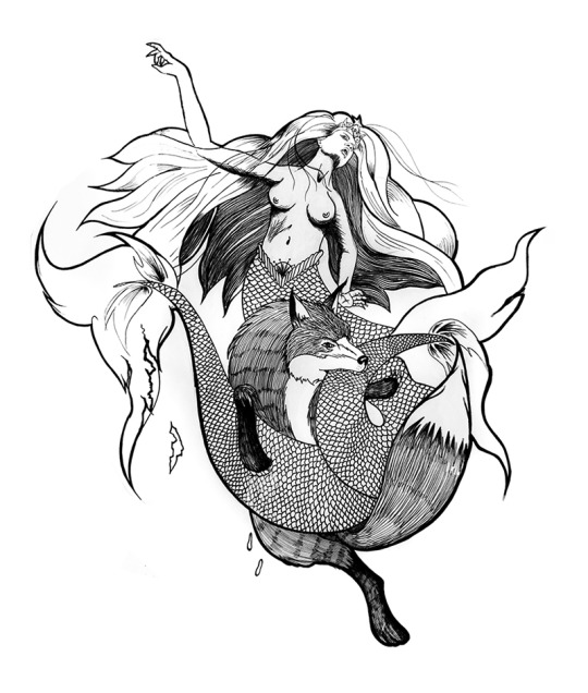
Palette's Reference Sheet!! It's finally here!
I know it's been a long time but I was finally able to do it the way I wanted and in the way I know how to do it. Because I tried to make the sheet many times but I never finished them and that was because I wasn't doing it my way. BUT FINALLY- I have finished my mission (•̀∇•)ᕤ
Let's go! (✯◡✯) ---------------------------------------------------------------------------

Very good, things have changed: I changed the color of his jacket because the color palette he had was looking very dark, which doesn't suit him so much; so now he has a brighter and more striking jacket. 🌟 -Basic information. -The things he always carries with him.
More powers:

-The other powers that I had not portrayed before. -The illusory scenarios disappear after a while, they are made of watercolor after all.
Soul:

-The energy cape makes him immune to Repear and their relatives.
--------------------------------------------------------------------------
Flying Boat and house.
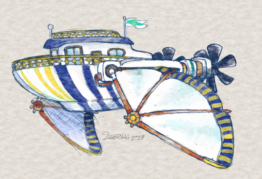


-''Why would he need a boat to travel if he can already open portals?'' You're wondering, right? Well, it's because the boat doesn't consume hi's magic, which he would need to use to fight if something happened. While Palette's magic is quite large and takes time to tire, that doesn't mean he can't get tired using it. (And because he likes it 😆)
-The house is located on a medium-sized island of the many that make up the islands of the AU of Just. -The lighthouse and the house were abandoned but Palette was able to restore it with time.
-----------------------------------------------------------------------------
Good! That's all for now, I think I covered what I needed and was missing ( ̄▽ ̄*)ゞ
Bye bye! ~ヾ(・ω・)
#myfactin#palette roller#palette roller factin#palette roller reference sheet#utmv#undertale multiverse#undertale au
485 notes
·
View notes
Text
More Art-Related Vocabulary

Abstract Expressionist: An artistic movement of the mid-20th century emphasizing an artist’s freedom to express attitudes and emotions, usually through nonrealistic means.
Age of Exploration (also, Age of Discovery): From the early 15th century to the early 17th century, European ships traveled around the world in search of new trading routes, lands, and partners to supply an ever-growing European market.
Albumen silver print: A photograph made using a process that was prevalent until the 1890s. The paper is coated with albumen (egg whites), and the image is created using a solution of silver salts.
Brayer: A hand roller used for applying ink to relief printing blocks or occasionally for the direct application of paint or ink to a surface.
Caricature: A representation in either literature or visual art that includes a ridiculous distortion or exaggeration of body parts or physical characteristics to create a comic or gross imitation.
Ceramics: Vessels of clay made by using a variety of shaping techniques and then hardening or firing the clay with heat at a high temperature.
Chasing: A term encompassing two processes in metalworking: (a) modeling decorative patterns on a hand-shaped sheet-metal surface using punches applied to the front, and (b) finishing and refining a cast sculpture.
Classical: Describes a prime example of quality or “ideal” beauty. It often refers to the culture, art, literature, or ideals of the ancient Greek or Roman world, especially that of Greece in the 4th and 5th centuries B.C.
Collage: An art form and technique in which pre-existing materials or objects are arranged and attached as part of a two-dimensional surface.
Color palette: (a) A set of colors that makes up an image or animation, and (b) the group of colors available to be used to create an image.
Composition: The process of arranging artistic elements into specific relationships to create an art object.
Daguerreotype: An early method of photography produced on a silver plate or a silver-covered copper plate made sensitive to light.
Exoticism: Fascination with and exploration and representation of unfamiliar cultures and customs through the lens of a European way of thinking, especially in the 19th century.
Expressionism: A style of art inspired by an artist’s subjective feelings rather than objective or realistic depictions based on observation. Expressionism as a movement is mainly associated with early 20th century German artists interested in exploring the spiritual and emotional aspects of human existence.
Gelatin silver print: A photograph made through a chemical process in which a negative is printed on a surface coated with an emulsion of gelatin (an animal protein) containing light-sensitive silver salts.
Illuminated manuscript: Comes from the Latin words illuminare (to throw light upon, lighten, or brighten), manus (hand), and scriptus from the verb scribere (to write). A handwritten book, usually made from specially prepared animal skins, in which richly colored and sometimes gilded decorations, such as borders and illustrations, accompany the text.
Illuminator: A craftsman or artist who specializes in the art of painting and adorning manuscripts with decorations.
Impressionist: Referring to the style or theories of Impressionism, a theory or practice in painting in which objects are depicted by applying dabs or strokes of primary unmixed colors in order to evoke reflected light. Impressionism was developed by French painters in the late 19th century.
Inking plate: A flat surface used for rolling ink out in preparation for applying ink to a plate or block.
Inscription: A historical, religious, or other kind of record that is cut, impressed, painted, or written on stone, brick, metal, or other hard surface.
Source Art Vocabulary pt. 1
More: Word Lists
#art related#word list#photography#dark academia#writing reference#spilled ink#writeblr#literature#writers on tumblr#writing prompt#poetry#poets on tumblr#history#studyblr#creative writing#writing inspiration#writing inspo#writing ideas#art#konstantin somov#rainbow#nature#art vocab#writing resources
109 notes
·
View notes
Text
Hello! Welcome to the Daycare!
I hope you’re having a good day today!
First of all, thank you for making a visit here <3 we really appreciate it!
I’m the new owner of the AU “Pj’s Daycare”! Nice to meet you!
I always loved the idea of the universe (parents turning into kids, kids turning into adults and taking care of them 😭💖) and the designs too!
The original comic was discontinued so I plan on making right from the start! I’ll be rebooting some stuff like the age, personality, surnames etc.
I hope I’ll be able to turn this AU into a better one! (If I do anything wrong, please inform me personally since I can be quite distracted in excitement sometimes 😓 I’m sorry)
Side note: Any ships in this AU aren’t canon :’3 yes even the ones I ship TvT so please don’t start a ship fight😭 anything can happen :’D yes there are boundaries like come on-
——————
Caretakers reference sheets:-
(Still working of the reference sheets)
Paper Jam (PJ)
Palette Roller
Goth Afterdeath
Gradient
Blue Screen (Blue)
Fika Melonsweet
(Other additional characters will be added later!)
——————
Children’s reference sheets:-
(Still working on the reference sheet)
Sans
Frisk
Chara
Undyne
Papyrus (Papy)
Alphys
Toreal
Argore
Betty
Amber
Core!Frisk (Core)
Swap
Fell
Error
Ink
Dream
Nightmare
Gaster sans (Gin)
Science (Sci)
FlowerFell (Red)
Sugar
Melon
Dust
Horror
Killer
Reaper
Geno
Fresh
Lust (Lulu)
Outer
Cross
Fellswap (raspberry)
Alter
Bill
Epic
Dance
Gas
Outer
(Other additional characters will be added!)
——————
Other characters reference sheets:-
Cray Spray
Elys Francis
Raven
Arno Francis
Mafia
Furry
Sprinkle
Lux
Bullet Port
Blueprint
Økse
Deneb
Neon
Morgue
Crescent
Starcross
Lucid
Kuro
Mord
Haris
Molpe
(Other additional characters will be added!)
——————
If you want to know about more information, please feel free to ask on the askbox :3
That’s all, thank you for your visit and support!♡
————
Credits:-
PaperJam and Bluescreen belongs to @7goodangel
Gradient belongs to @askcomboclub
Goth belongs to @nekophy
Palette belongs to @lasseutblogo / @lasserbatsu
Cray belongs to @weezy-pup
Fika belongs to @missladytale
Frisk, Chara, Sans, Papyrus, Toreal, Asgore, Undyne, Alphys belongs to Toby Fox
Betty and Amber belongs to Camila Cuevas (I do no support her actions)
Swap(Underswap sans) belongs to @popcornpr1nce
Fell (Underfell sans) belongs to Undertale community
Error, Geno and Freah belongs to @loverofpiggies
Ink belongs to @comyet
Dream and Nightmare belongs to @jokublog
Gaster sans (Echotale) belongs to Yoralim
Science (Sciencetale) belongs to HolyTraitor
Flower Belongs to ???
Outertale belongs to ???
Reaper (Reapertale) belongs to @renrink
Dance (Dancetale) belongs to ???
Mafia (undermafia) belongs to @undermafiaz
Horrortale belongs to Sour Apple Studios
Killer!sans belongs to @rahafwabas
Dust (Dusttale) belongs to @ask-dusttale
10 notes
·
View notes
Text
Welcome to The Aureum

Hi! I'm a newer software dev, but with a long history with programming (thanks to this accursed site in 2014 and my desire to join robotics) I also happen to love writing and art, and have a lot of OCs. I always struggled with keeping them organized and finding a software that works for me.
Enter, The Aureum!
What is The Aureum?
The Aureum is a work in progress web based app made with electron that I am working on so that I can organize my characters in a bit of a different way. A lot of elements and planned features take inspiration from the fandom community wiki, mixed with some of my other favorite world building websites that just ended up not being a good fit for me.
I made this blog so I can easily keep track of my development progress on this, and maybe make some cool new friends in the process.
What does it do?
Currently? Very little, other than make characters with information.
However, I'm currently working on a number of features, one of my most ideal features being project organization. This would allow me (and other users ofc) to sort their OCs and locations BY the project. Maybe you're a writer working on a few different series/stories at the same time, and you need some way to seperate them. Maybe your a game dev, visual novel creator, etc and you just want to have some way to store all of your story and character information in one place.
I also have some more fun and 'unique' features that are being worked on, like an automatic reference sheet generator, which prints out some of your characters information like name, age, height, weight, body type, and some of your preselected colors.
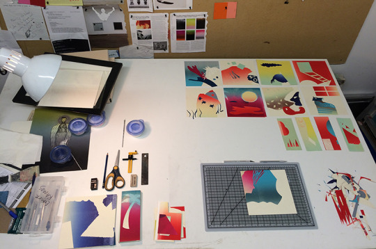
Another favorite feature I'm working on are the personality sliders! In the characters page there are sliders that you can edit to have a little more of a 'fun' view of how your characters act. Here are some screenshots of the layout from within Figma!


Currently, I'm setting up the data storage structure so that we can input all of this character information and still be able to create a project after to put the character in. But while I'm still working out the kinks, here's a list of the main planned features that will be implemented before i send it out to friends to alpha test!
Features
Multiple Projects/ Worlds
Entirely locally hosted, no internet connection required
Personality sliders
Character sheet generator
Timeline feature per project/world
Ability to link to sources and citations
Relationship linking between characters (Similar to fandom wiki setups)
The Aurei - The golden ones, your favorite OC's flagged so that you can access them faster, especially if you have favorites from multiple projects.
Random generation features, for things like art prompts and writing prompts.
Ideas for future releases
D20, d6, etc dice roller
Fake social media screenshot generator similar to twinote or photonote
Additional timeline just on a character by character basis
Ability to sort OCs by tag - by gender, species, location, etc.
Dark mode (maybe custom color palettes for later that users can upload/customize via css)
and more!
Okay but when will it be done?
Truthfully, who knows? I'm solo deving this software for fun, while working a full time job on top of my normal small game projects I make. It might be functional in a few months, or it might take a few years. Ultimately, I have no timeline for this project, and I want to be up front right out of the gate. Once i get a stablle build with the main character and project features implemented and organized, I'll send it off to friends to alpha test, and if all goes well for a few weeks, then I'll post the alpha build for others to use.
Why are you doing this?
the short answer is just because i want to. The longer answer is because, while I love using things like notion, obsidian, metos, worldanvil, etc. I find that there's always one or two things missing from each of them that I'd personally like to have. A lot of these softwares/websites are created with specific things in mind, like note taking, etc. But for me, I make games, i do art, i write stories, and I'm a DND Dungeon Master, so not all of those softwares will work for my every project.
I wanted to make something that would work for everyone, for all of their creative needs.
Also a mini note, to anyone who comes back and sees this or is curious, this project *will* be free on release to the public and likely hosted on itch.io. There are currently NO plans for an online sync or any only features, as that is not within my devstack or technical abilities at this time.
#Welcome to the aureum#aureumdev#theaureuem#softwaredev#developer#electronjs#webdev#character development#oc#worldbuilding
5 notes
·
View notes
Text
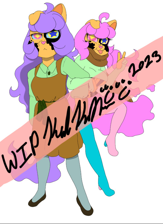
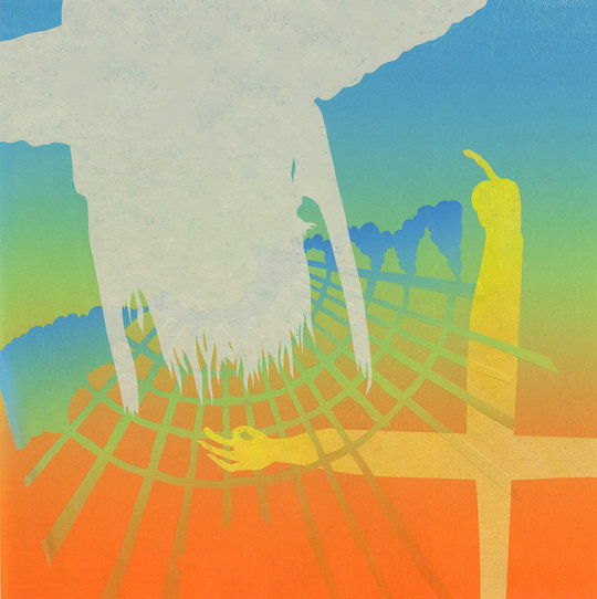
A WIP of my Undertale Fanchild, Pastel. A child made between PaperJam(7goodangel) and an OC of mine. A fanchild of a fanchild! She is good friends with Palette Roller(Lasserbatsu) and Goth(Nekophy) even though she won’t admit she wants to be more than that. Yes, BOTH of them.
ALT: (Left)Pastel in her neutral/casual form and (Right)Pastel in her battle/active form. This is a Work In Progress picture for a reference sheet.
#ask julia the succubus#julia the succubus#oc#Monster#cat monster#skeleton monster#Hybrid#fanchild#fankid#paperjam#paperjam sans#7goodangel#palette roller#palette roller sans#lasserbatsu#angexci#goth#goth sans#nekophy#art wip#wip#my wips#current wip#ref sheet#reference sheet#my art#my artwork#Pastel#undertale#undertale fanchild
1 note
·
View note
Photo

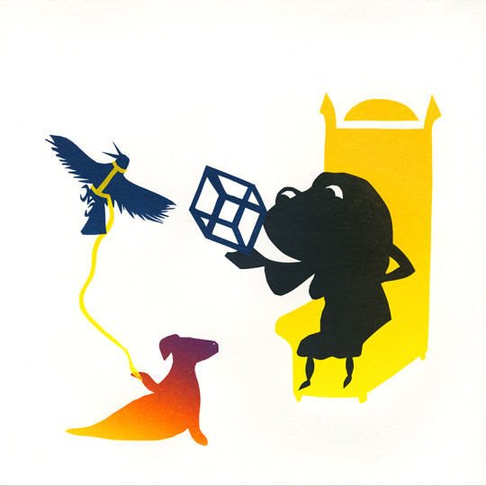
My new baby!!!!!!! Her name is Bee
#concept art#character desing#character concept#character sheet#design sheet#design#reference#oc#original character#bee#bee(oc)#cute#color palette#cute drawing#cute art#crown#roller#skate
111 notes
·
View notes
Text
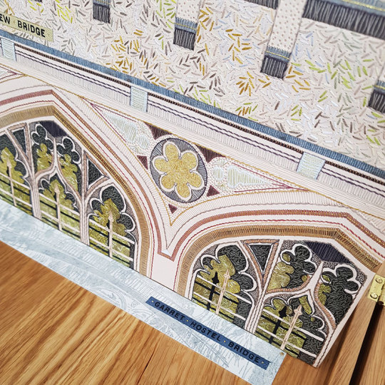
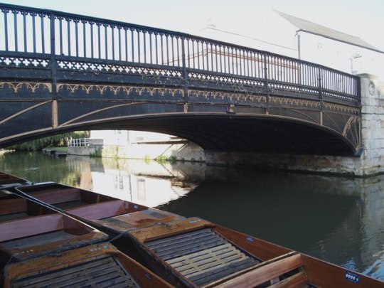
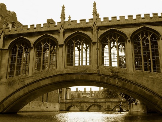
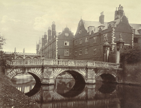
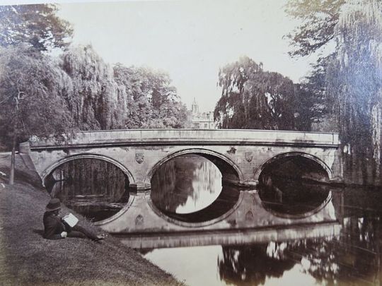
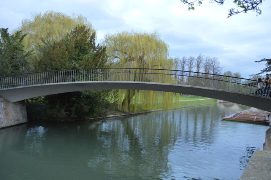
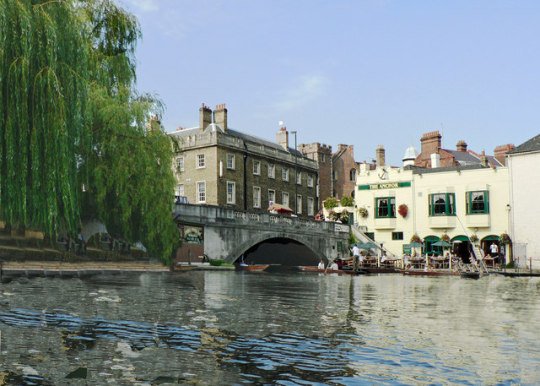
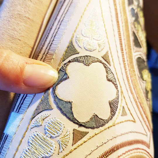
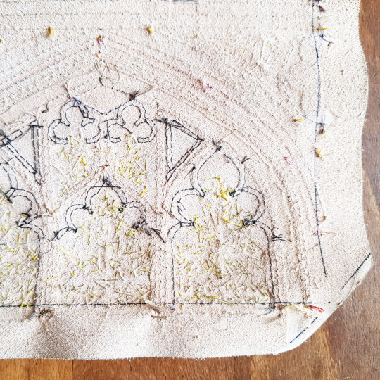
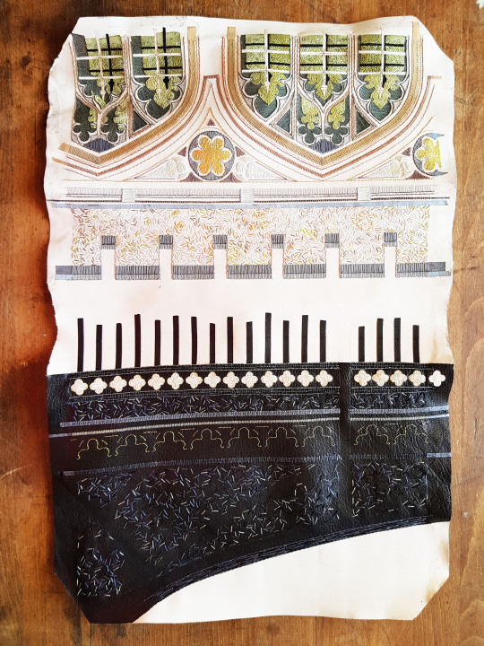
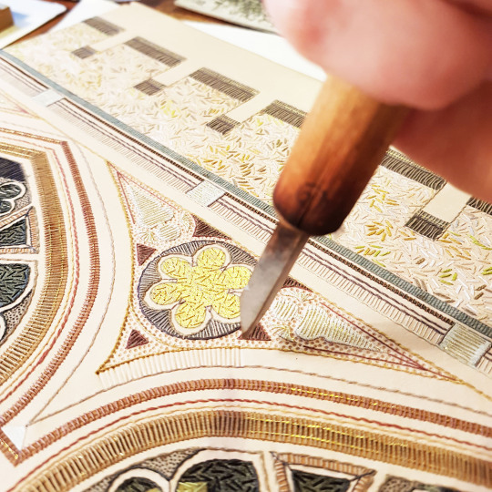
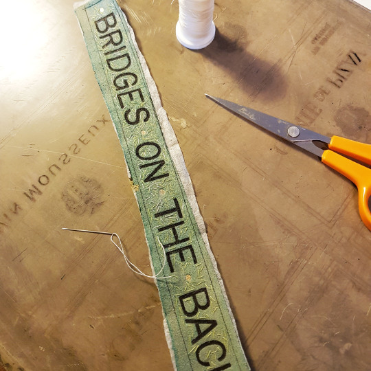
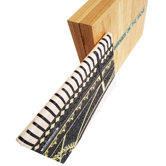
Bridges on The Backs
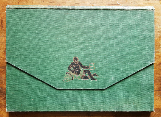
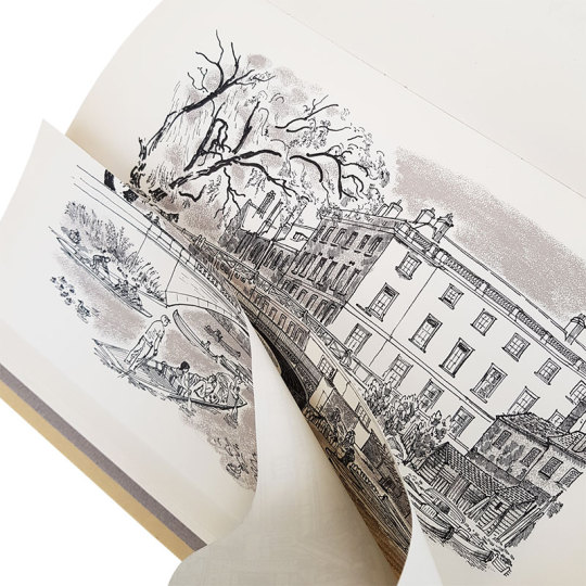
Not only do you have to be a bookbinder when you are a bookbinder, but also a graphic designer, craftsperson, leatherworker, printmaker, carpenter, jeweller, photographer and of course a miracle-maker!! My latest commission is finished and one more book has left the studio and is now happily with its new owner. Fortunately I didn't have to trust the postal service for this one and was able to hand deliver it.
“Bridges on the Backs” was completed at the end of March. The book was printed in 1961 and formed part of a series of more than 34 books that were published by Brooke Crutchley at The University of Cambridge in between 1930 and 1958 as part of “A Printer's Christmas Books” - the printing of these was the University Printer’s continued custom of giving a book to friends of the press at Christmas. The series was started by Walter Lewis and Stanley Morison in 1930. Brooke Crutchley was the University printer at Cambridge and oversaw the production of the Christmas Book series from its inception 1930 until its discontinuation in 1973. He gave a talk at St. Bride Printing Library in December 1975 at the opening of an exhibition of the Christmas books which ran from 10 December 1975 to 30 January 1976.
The book is a first edition, one of 500 copies printed in Monotype Times Wide on Spicer's cartridge paper. Illustrated with 9 drawings, touched with colour, by David Gentleman, with another on the front endpaper and title-page. The original binding was a green canvas portfolio binding, lettered in gilt.
In the words of Brooke Crutchley, `”Bridges on the Backs is unique - it opens like a lady's handbag; unique in other ways too and, I think, my favourite of the larger books, perhaps of them all. David Gentleman's drawings are delightfully reminiscent of youthful Cambridge in summertime. Peter Eden in his text and captions carries his erudition with consummate grace, and the overlapping illustrations, a la Humphrey Repton, never fail to surprise.”
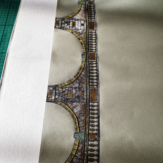
The nine illustrated drawings depict all the nine Bridges on The Backs, a picturesque area to the east of Queen's Road in the city of Cambridge, England where several colleges of the University of Cambridge back onto the River Cam. The name "The Backs" refers to the backs of the colleges. Historically, much of the land was used by the colleges for grazing livestock or growing fruit. Cattle can still be found grazing behind King's College. The river was also an important commercial thoroughfare to the mill at Silver Street.
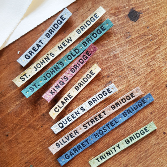
I wanted all of the bridges to appear in the binding and box in some way. I began by looking at images of each of the bridges online (unfortunately time didn’t permit me to visit Cambridge in person as I would have liked to do). The bridges are as follows:
Great Bridge (now known as “Magdalene Bridge”)
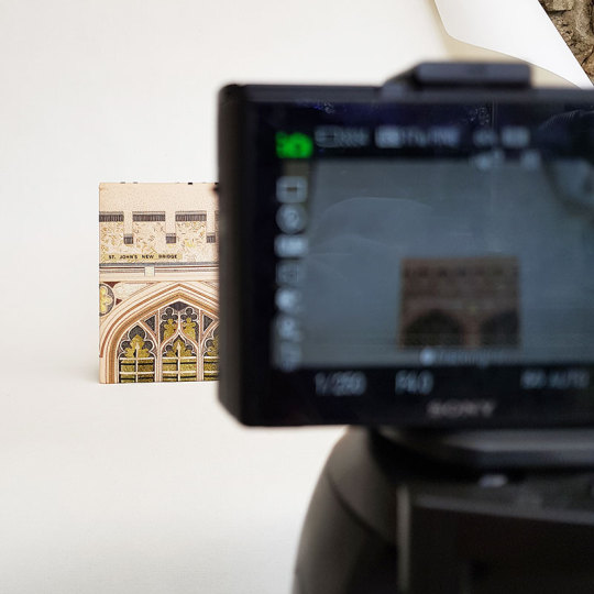
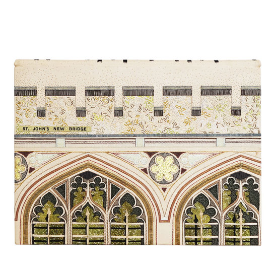
St Johns New Bridge (otherwise known as The Bridge of Sighs)
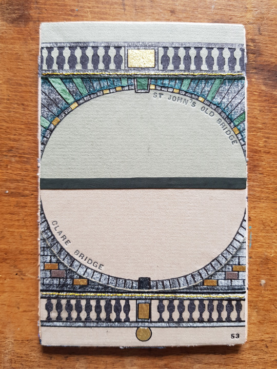
St Johns Old Bridge
Trinity College Bridge
The beautiful bridge which crosses the River Cam at Trinity College dates from 1764 and was built by James Essex, a builder and architect who worked at many of the Cambridge colleges. It replaced a stone bridge built in 1651.
Garret Hostel Bridge
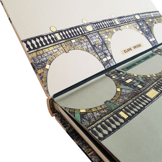
Clare Bridge

Kings College Bridge

Queens Bridge (otherwise known at the “Mathematical Bridge)

Silver Street Bridge
The Silver Street bridge, designed by Sir Edwin Lutyens in 1932 built in 1958-9, it is an arch bridge that carries both vehicular and pedestrian traffic across the River Cam in Cambridge. It is a site of bridges dating back to the 14th century.
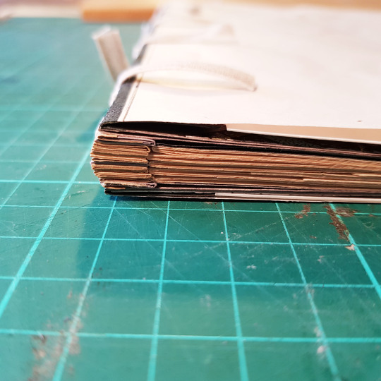
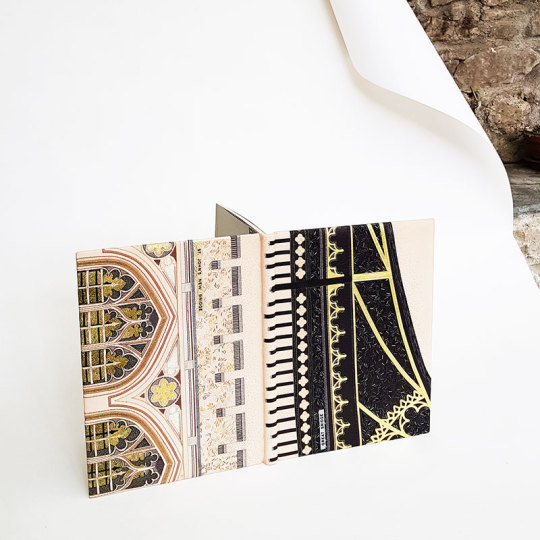
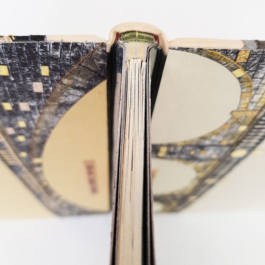
I had never bound a book in this format before, with the spine edge at the top of the text block - this led to some interesting design challenges. Because the book was an unusual structure, and the illustrated pages had additional flaps revealing how the bridges looked in previous incarnations behind each one, I wanted to make sure that the pages would open well to facilitate the opening of these flaps. I therefore chose to bind this as a stub binding.
I chose papers to match the colours and tones of the illustrated drawings: grey and mustard yellow. As there was more bulk at the front edge of the book due to the tipped in flaps I had to compensate for this at the spine. I folded up stubs for each of the sections but also had extras in between these to make up for the difference in thickness. Initially the stubs were sewn to their relevant sections using linen thread.
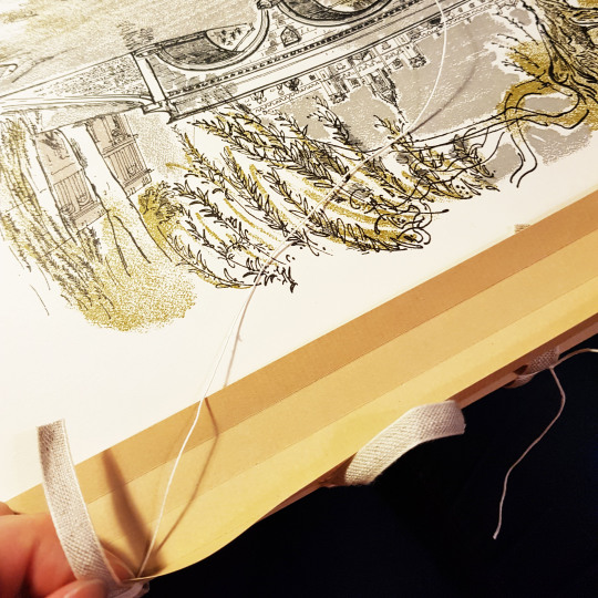
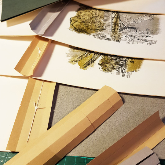
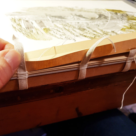
These stubs were then sewn together onto four tapes to create the text block.
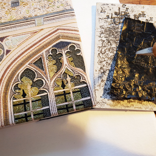
Once the text block was sewn up I started to work on my ideas for the cover design, endpapers and doublures. For each of my bindings I make a small sample board to test out ideas ahead of making the actual binding.
I looked at images of all the bridges, for the endpapers and doublures I wanted to “mirror” two bridges on each, so I paired up the bridges that best matched each other - for example Clare Bridge and St John’s Old Bridge each had three arches, and Silver Street Bridge and Kings College Bridge had one each so they were natural choices to go with one another.
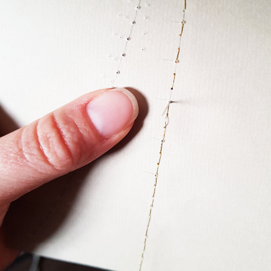
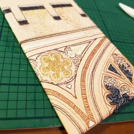
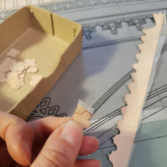
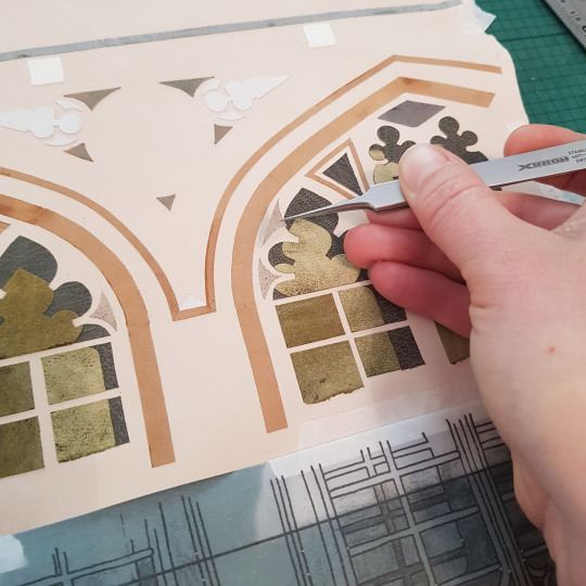
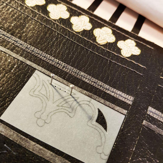
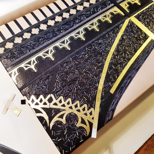
I drew line drawings of these bridges and then cut the silhouette of each out of paper that I had textured using a roller with black ink on top of a textured surface.
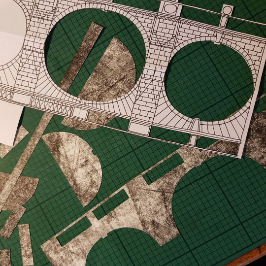
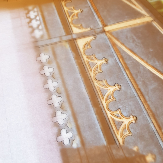
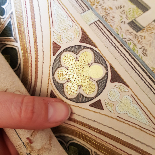
Further detail was added to these papers through the application of suede onlays, black paper cut-outs (for the pillars) and gold leaf that had been adhered to Japanese paper. In the below picture you see part of the doublure for the sample board being made.
Lines were also embroidered through the paper. These holes were pre-pricked with a needle pricker through the front and then carefully embroidered using a running stitch. Care must always be taken when embroidering paper as it is prone to tearing. The thread was then whipped around with an additional thread on the front face of the doublure.
Once I had worked out which bridges to put on the endpapers and doublures I was able to choose which to have on the front and back covers of the binding. This was a binding of two halves, more so than any other I have ever done. The different format of this text block meant that the front and the back cover played different parts in the design, therefore I chose the two most contrasting bridges for on the front and back covers: St John's New Bridge (The Bridge of Sighs) and The Great Bridge.
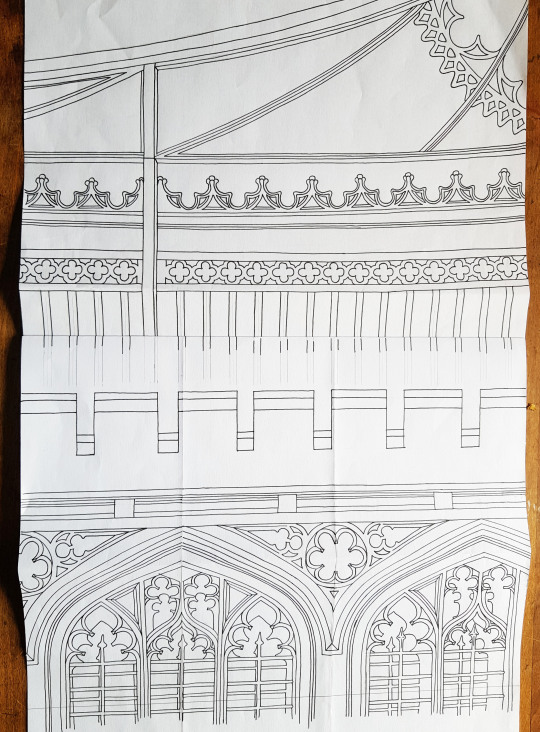
I thought that the Great Brdge would work well with the gold on black against the more ornate look The Bridge of Sighs. I started by using my light box to help draw the outline of the bridges.
I then pieced these together into a full cover design. At the time of drawing this design I wasn’t sure if I might want to join up the front and back covers across the spine in some way. With this in mind I scaled up the front and back images so that the lines of each, if carried across the spine, would meet with each other.
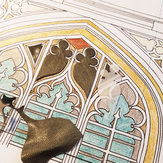
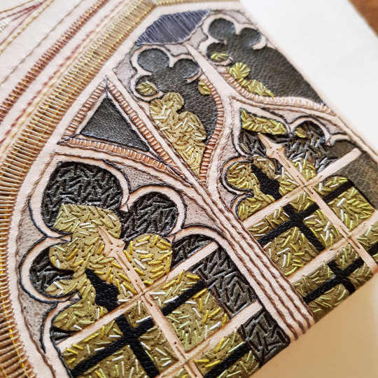
For the sample board I chose to trial the Bridge of Sighs part of the design. This particular bridge was built in 1831 and it named after the Bridge of Sighs in Venice. The design was built up using a variety of leather onlays, machine embroidery, hand embroidery and also onlays made by sticking gold leaf to Japanese paper.
This sample board is number 52 in my series.
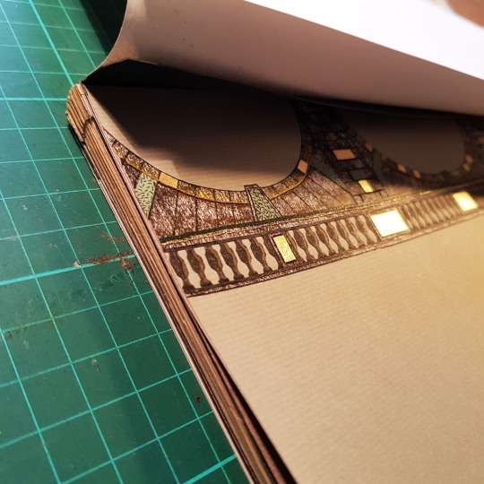
Back to the text block, the endpapers were made up by laminating the illustrated bridge paper sheet to a plain bi-folded sheet, capturing a long, thinly pared, piece of leather (0.4mm) between the sheets at the edge - this would later get stuck down and become the leather joint.
A waste sheet and compensation guard were also added this endpaper unit to protect the endpapers during the rest of the forwarding and covering process. This endpaper could then be sewn to the text block.
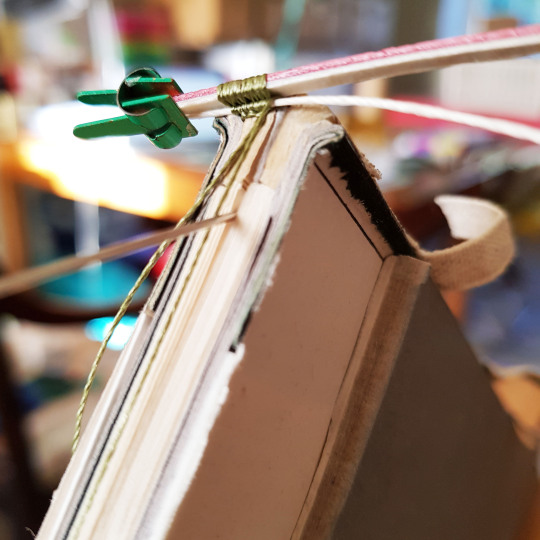
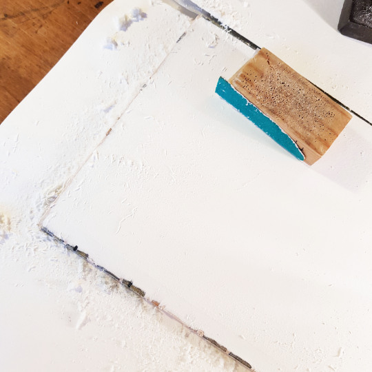
The book block was then rounded with a backing hammer. I drew the thickness of the boards onto the outer waste sheet, plus a little extra (as seen below indicated by the thin black pen line). I then placed the book block into my backing boards to this line in order to make sure the shoulders were made at the correct place to allow the boards to sit perfectly within them.
The top and bottom text block edges were then sanded flat, and the foredge sanded into a round by wrapping some sandpaper around a piece of dowel of the correct diameter. Double-core end bands were sewn, the boards attached and bevelled at the edges. I was then ready to proceed with the leather work!
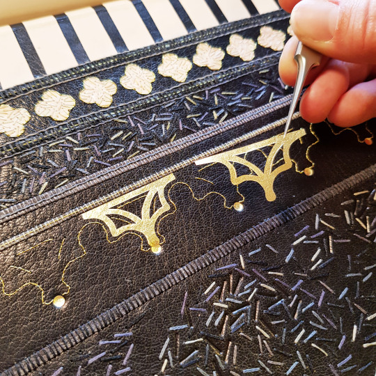
Given my choice of using two contrasting bridges on the cover design, this meant that I needed to scarf-joint two contrasting leathers together: black goat skin for The Great Bridge and fair calf for The Bridge of Sighs.
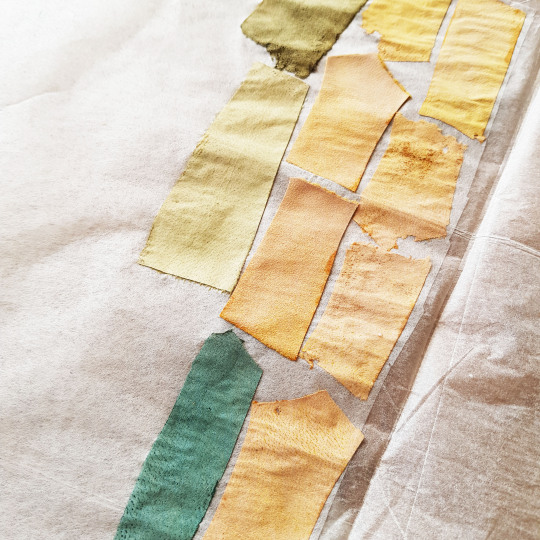
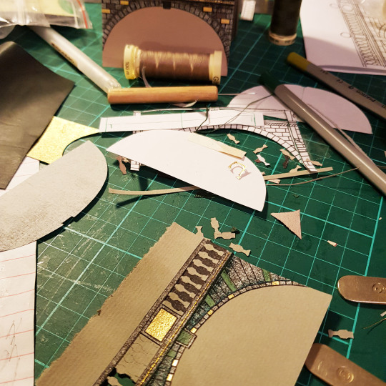
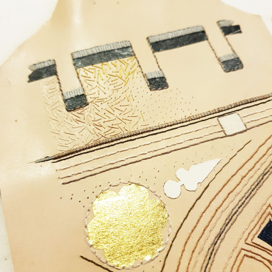
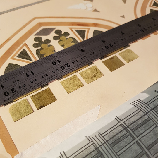
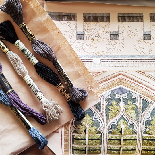
Onlays, and plenty of them! I don't like to throw anything away so even the edge parings that come off the back of the leather after running it through my Brockman paring machine get kept. I back them into lens tissue and use them as onlays - it gives a whole new colour palette in addition to conventional onlays.
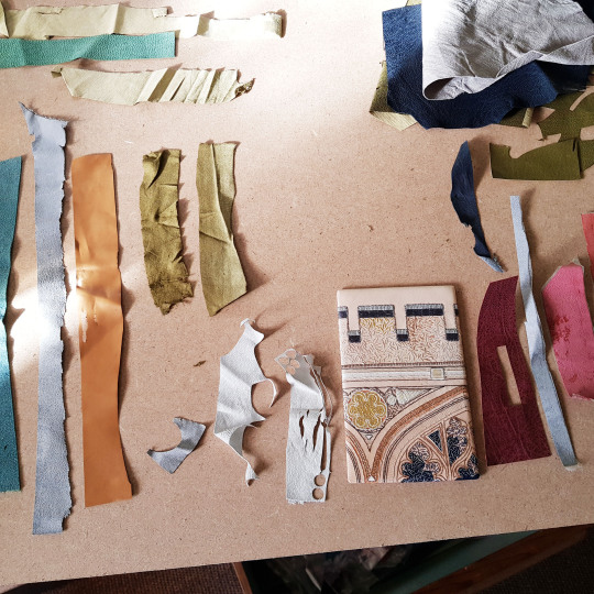
This book mainly used greens and greys, I adapted the colours I had used on the sample board (one reason i do the sample boards - to test colours out in advance!). I cut all of the shapes out using a scalpel and fine scissors.
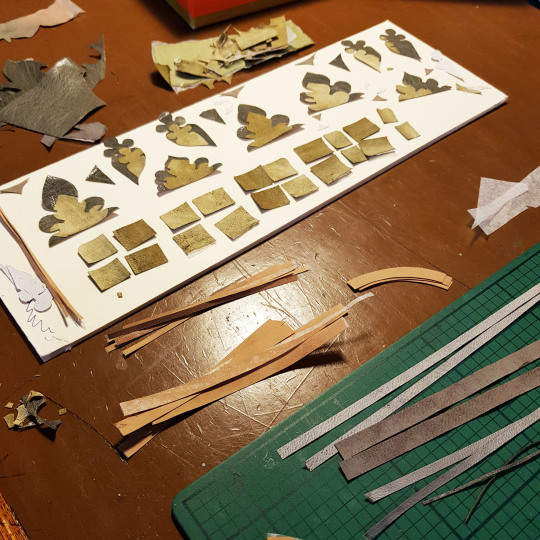
The onlays were glued down in place using PVA through a tracing paper template, using a ruler for extra accuracy.
I find my fine-pointed tweezers one of the most useful pieces of kit I own, perfect for picking up small pieces and getting then stuck down exactly where you need them to go!
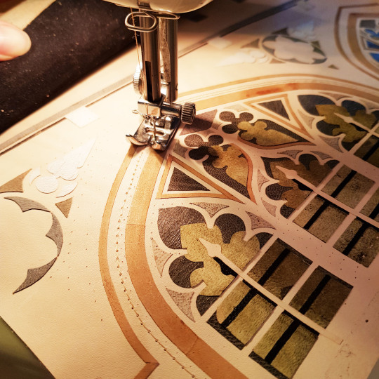
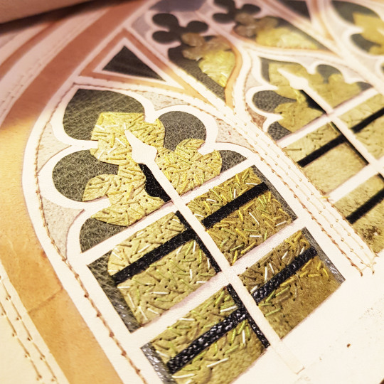
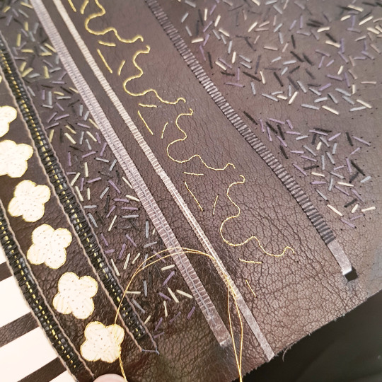
After the onlays and backparing came the embroidery, the bit I enjoy the most! For this binding I machine-stitched the multiple linear border lines to speed up the process and then whipped over the top of them with cotton threads.
Tiny flecks of different green threads were hand-sewn to break up the colour of the green onlays beneath.
When embroidering a large piece of leather, it is not possible to use an embroidery hoop as the leather is too thick so I coil up the leather and hold it in place with bulldog clips at the top and bottom. This makes it much easier to handle.
As well as using cotton threads I also used slightly thicker skeins for the larger patches of detail.
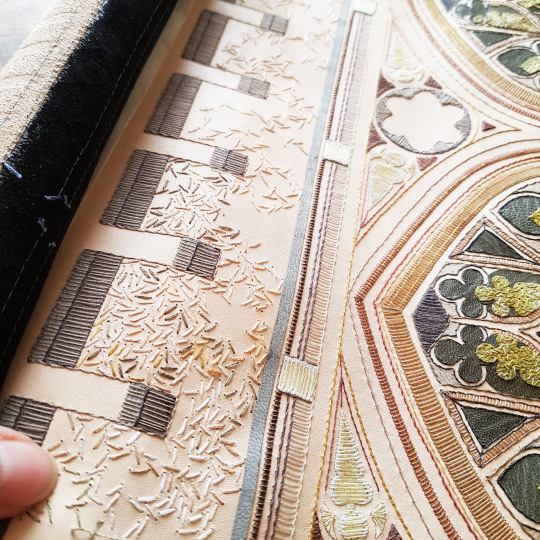
Plus you can't beat a bit of metallic thread! This was embroidered over the onlays that were made from gold leaf stuck to Japanese paper.
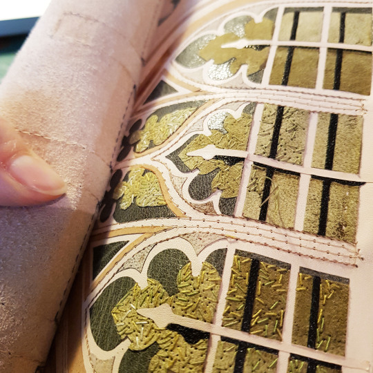
I always love to capture what the back of the leather looks like post-embroidery, after all this won’t be seen ever again!
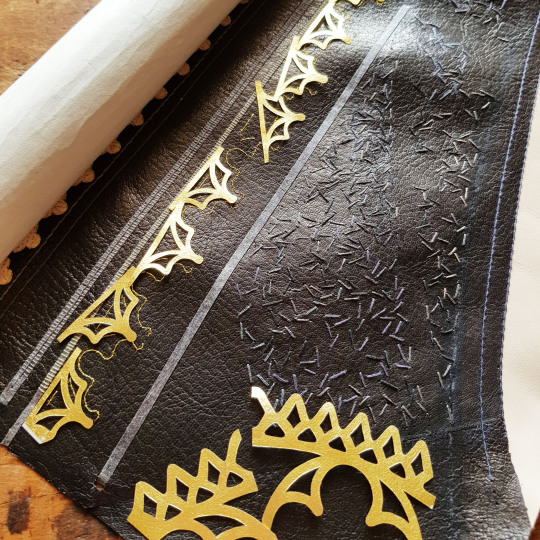
The same process applied to the Great Bridge side of the cover. The onlays were stuck down, back-pared and embroidered. I used a tracing paper template to prick where I needed to sew the metallic thread lines that would lie alongside the gold onlays - I was going to wait to glue these down once the book was covered (I will cover the reason for this later).
The actual Great Bridge has gold elements on a painted black behind so I naturally chose to depict these gold elements using gold leaf. The gold leaf was stuck to Japanese paper squares using PVA glue. I then cut out the required onlays and put them to one side until the book had been covered.

Because it is necessary to dampen the leather when covering the book, I decided to stick on the gold onlays after the book had been covered, to avoid damaging the gold.
So, with all of the embroidery complete it was time for covering!
The text block had been bevelled and back-cornered in preparation. The text block was capped up with paper and cling film to avoid moisture getting to the text block during the covering process.
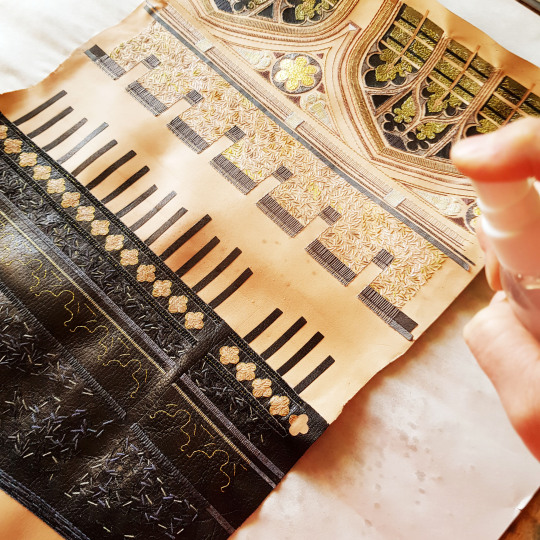
The leather was dampened with a water atomiser ahead of pasting the back out with home made paste. The dampening was done to prevent any marks on the front of the leather due to the paste being drawn through unevenly.
The book was left to dry between blotters overnight, changing the blotters regularly to draw out the moisture. The following day I was able to open the book up and lay down the leather joints. Once these were down the back of the boards was infilled with watercolour paper, then a layer of Zerkall paper. This was then sanded flush. The surface was then ready to have the decorated paper doublures stuck down onto it.
I then added some blind tooling detail in between the sewn lines using a hand-made finishing tools.
Plus I also added more detail using carbon tooling within the window spaces of The Bridge of Sighs.
Once the binding was dry it was also time to add the gold detail onto the Great Bridge section of the book. I first gold-tooled some circles directly onto the leather. The decorative gold onlays were then stuck down within the metallic thread lines I had sewn previously before the book was covered.
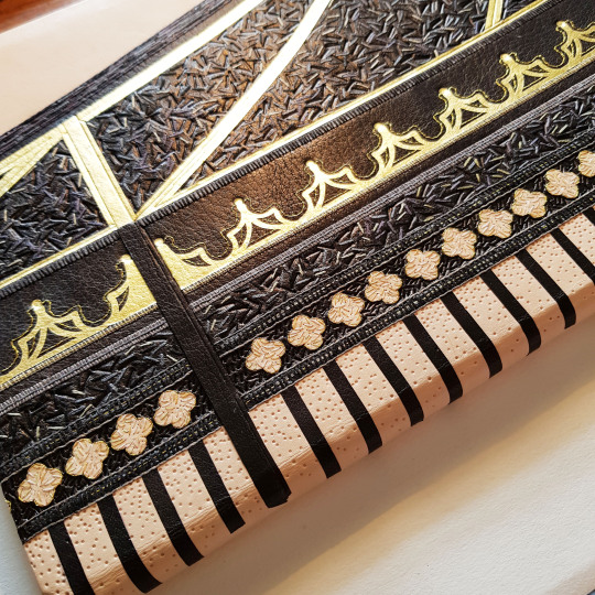
Here shows the sample board on top of the covered book - the differences in the colour of the leather onlays and sewing threads are apparent.
The final part of the tooling process was to tool each of the bridges names on a coloured leather to correspond with the appropriate part of the book or box.
A title was also carbon tooled to go onto the lid of the oak box the book was to be housed in. This was then embroidered with small flecks of different green threads, like on the book cover.
It was then time for photography! I take all of my own photos now in the conservatory of our house as the light is by far the best there than anywhere else in the house.
With a “standard” binding I would take a photo of the book with both covers open, however it doesn’t really work for this book as the orientation is wrong!
FRONT OF BOOK: St John’s New Bridge
BACK OF BOOK ALONGSIDE OAK BOX: The railings of the Great Bridge were carried over onto the spine of the book, with the ends feathered out using little carbon-tooled lines. the box was made from oak with the title strip stuck to the front.
THE HEADBANDS:
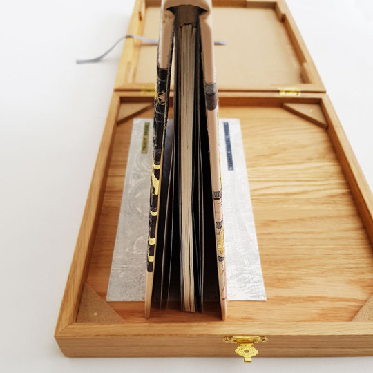
THE BOX: The box was made so that the book could sit open for display within grooves in the box lid. There are six of the nine bridges illustrated on the binding. Images of the three bridges I couldn't fit in sit in the box creating the grooves for the book to stand upright in!
DETAIL OF THE FRONT ENDPAPERS AND DOUBURES: With rather unexpected luck, this commission was being gifted as a wedding present. The couple met at Cambridge University and so happened to be at Clare College and St John’s College respectively - the two bridges I had mirrored inside the front cover!!
To see these photos and more please visit my website here.
#bookbinding#bookbindingcommisison#cambridge#cambridgebridges#reliure#reliuredart#leatherbinding#bridges#bridgeofsighs#mathematicalbridge#leatheronlays#embroideredbinding#goldtooling#blindtooling#carbontooling
17 notes
·
View notes
Text
Heaven’s Gate (1980)
***Disclosure: I watched the 154-minute theatrical cut, on a laptop, which feels like a disservice, but it was on Hulu and my curiosity got the better of me.
If, like me, you read a lot of film criticism, eventually, you’ll run into a discussion or a mention of Heaven’s Gate. What you glean from this context is something along these lines: this film ruined Michael Cimino’s career, bankrupted United Artists, marked the end of New Hollywood, and it’s way too long. (I’ve ranked these items in order of their relative objectivity.) For some, all of this would be a turn-off. For me, though, it only made me more curious, especially once I saw one or two mentions of it being a ‘flawed masterpiece’. I’m always intrigued by a big, wild artistic swing, even or perhaps especially if it’s close to a disaster. Lynch’s Dune, Apocalypse Now, High Plains Drifter-- I could go on. So when I decided to watch Heaven’s Gate, my main intent was to try and meet it on its own terms, using the same central questions I bring to any movie: What do I think the director is trying to do, do I think they succeed, and why or why not?
From the opening notes of the overture, I was immediately intrigued. The film’s score, composed by David Mansfield, is not the kind of triumphant, vaguely Teutonic classical theme we might associate with a John Ford Western. Nor is it a twangy fiddle-and-banjo affair. Instead, it has a distinctly Eastern European flavor, with plucked strings and minor tonalities. As it turns out, this is kind of the key to the whole film-- it’s not really a Western at all. It’s more like an epic Russian novel that just happens to take place on the American frontier. Through this lens, the massive scope of the project suddenly makes a lot more sense.
The score has a less abstract significance, as well-- Heaven’s Gate is set in 1890, when immigration to the U.S. from Eastern Europe was reaching its peak. Most of the film’s ‘population’, as it were, are Czech, Bulgarian, and Polish immigrants, who are targets of the nastiest kinds of nativist suspicion-- routinely named as ‘anarchists’ and accused of (among other things) having too many children. A private stockman’s association in Wyoming, headed by the oily Mr. Frank Canton (Sam Waterston, putting his talent for WASP-y, patrician disdain to excellent use), has effectively declared war on a particularly fractious county, alleging that its inhabitants routinely traffic in stolen cattle.
Before we get there, though, we’re treated to a dream. The film opens on an imposing stone edifice, shrouded in summer-morning mist, and pans down to reveal a young man in a fine suit, running pell-mell across the dewy courtyard. He soon meets up with a crowd of his fellows, a roistering band of black-clad youths (following behind an actual band playing the chorus of “Battle Hymn of the Republic”). It’s commencement, Harvard, 1870. Pretty girls wave from windows and giggle behind their lace gloves. The class speaker, named as W.C. Irvine (John Hurt) makes a show of astonishment on his way to the podium. Later, in the soft evening light, the graduates and their sweethearts twirl on the lawn to “The Blue Danube Waltz”. The camera twirls, too, bowing in and out from the circle of voluminous skirts. Our latecomer from the morning, who has been addressed as James (Kris Kristofferson), takes the arm of a lovely blonde, and they laugh in mutual delight. Quite suddenly, the dancing turns into a spirited brawl, with a few gallant punches thrown. Our young heroes are shown finally gathered together, noses bloody but eyes bright, facing toward a future in which they will help to civilize their vast nation. Or some such thing.
The film then flashes forward to a muddy yard outside a log cabin, where a cow has been butchered, its innards being excavated by the butcher and his family. Then the shadow of a hat creeps up along the bottom of the white sheet serving as an improvised wall. The butcher calls out, and takes a bullet to the head in response. Framed through the rip in the sheet is an elegant young man in dandyish grey (Christopher Walken). Later, we find out his name-- Nicholas Champion. He is an enforcer for the Association, referred to as a traitor by one of the men he apprehends. Meanwhile James, now Sheriff Averill, disembarks the train at the local station, and right away, we sense something is amiss. As he walks into the general store, a roughnecked man studiously avoids his eyes. Another man is examining a knife for sale, and the camera lingers on the bright flash of the blade.
This is the essence of Heaven’s Gate-- its focus is, overwhelmingly, on the visual details. The cinematographer is Vilmos Zsigmond (McCabe and Mrs. Miller, The Deer Hunter, Close Encounters of the Third Kind), and the color palette reminded me of the autochrome process used in some early photography-- lots of deep brown, grey, green, and purple. Smoke and mist and haze frequently drift over the scenery. Most of the film was shot on location in Glacier National Park in northern Montana, which made it deeply moving for me-- the bright turquoise hue of the lakes, the abundant wildflowers, the craggy mountain peaks. There’s another dance, introduced by a debonair young fiddler on roller skates (the film’s composer, David Mansfield)-- and then when the assembled citizens join in, we see that everyone’s on roller skates! It is kind of absurd, but in a thrilling way, at least for the majority of the runtime.
Unfortunately, however, this focus on setting the scene does lead to some neglect of the characters. It’s no fault of the actors. Kristofferson’s ramblin’-man grace is perfectly suited to the role of James Averill, Southern scion trying genuinely to be a figure of decency in the world. Walken’s striking, nervy energy animates the ambitious Nicholas Champion, who is increasingly unsure which side he wants to be on. John Hurt makes an entire three-course meal out of too little screentime-- going from W.C. Irvine, Harvard class clown, to being addressed contemptuously by Waterston as “Billy”, a sozzled, tragic cynic. Isabelle Huppert brings a fascinating steeliness to Ella Watson, the local madame who knows her business and knows it well. But (at least in this cut) those one-sentence summaries are about all the character development we get, and it’s a shame, because there are a lot of intriguing threads here.
Still, I came away from Heaven’s Gate feeling like I’d seen something important. It’s passionately made and often magnificent-- the first half is just one brilliant sequence after another. Sure, it staggers under its own weight a little bit, but it’s attempting the type of load one rarely sees. Someday I’ll have to hunt down a Director’s Cut (I know there are a few versions out there) and see it on a big screen. I know it’ll be worth it.
#film#movie review#Heaven's Gate#(also):#Walken's character in this#really made me think of Frank Shabata#in the book O! Pioneers#and how on Earth have we not had a good movie adaptation of that yet#hmm
3 notes
·
View notes
Text
10 KEYS TO PAINTING THE HOUSE LIKE A PROFESSIONAL
Painting the walls is the fastest and most effective way to transform the decoration of your house. Do you want to paint like a pro? Follow these tips and you will be able to give all rooms a perfect finish

Painting the house is undoubtedly a reform ten. Not only do you "clean" your face on the walls –which, with use, accumulate scratches, scratches, and even some scribbles if there are kids at home–, but also, just by changing the color, your house will look like another. Give it a lighter tone and you will have the feeling that the meters have been stretched; a more intense one, and space will look more welcoming and collected; a glossy finish, and it will look like you've opened a new window in the living room. The transformative power of painting is enormous. If you dare to paint your house, with these 10 professional tips and tricks, you can do it yourself. And for very little money!
1. PLAN WHERE TO START
If you want to paint the whole house, which room will be the first? The ideal is to clear the rooms as much as possible. If you paint the emptiest one first, it will help you release the rest and facilitate movement.
Prepare the material. Check if you have everything (painter's tape, plastic, and protective paper, putty, sandpaper, spatula, large and small roller, bucket for rollers, palette, paint, and enamel). If you have old sheets, you can save on plastic.
2. TRY DIFFERENT COLORS TO GET IT RIGHT
If you doubt the color, brush on walls where the light falls differently and look at them at different times of the day. Keep in mind that paint darkens when it dries.
A special color? The different paint firms offer a very extensive palette of color references to choose from, a very practical option, especially if you want to later repaint a room or do revisions. If you want to make the mixture yourself, you should start with white paint and be careful, as some are blue.
3. PREPARE THE WALLS WELL AND MAKE ARRANGEMENTS
If they are in poor condition, they must be sanded well, cleaned of the dust created, primed, and putty before painting. Paint by itself does not remove blemishes.
Mini-flaws? You only need some putty for small cracks and holes. Wait for it to dry, as sometimes you have to put it back. Then sand and clean.
4. PAPER AND STUCCO: WHAT DO I DO WITH THEM?
It is a cumbersome and delicate job, so it is best to have a professional. If there is stucco, the ideal is to remove it, especially if the grain is coarse. If it is very fine and has a good grip, the wall can be paved with putty.
Paper out! You have to tear it off, sand, fix or sealer, up to three layers of putty, and at least two of paint.
5. PROTECTS FURNITURE AND SURFACES
Put painter's tape on non-wood baseboards, corners of ceilings, doors, and frames - if they are wood, they will also need to be painted - and cover the tape on the blinds. The switches, if you can remove them; if not, tape them too. On the ground, better paper than cardboard, because the paper is flexible and repels more than cardboard.
6. CHOOSE THE MOST SUITABLE PAINT
If the walls are in good condition, you can use plastic paint for all rooms, including the kitchen and bathroom. In addition, they are increasingly natural, so they hardly give off the smell of paint. But you have other options:
Thixotropic. With a great covering power, it is ideal for walls with grease, smoke, humidity, and even mold and rust stains.
Anti-allergies. They prevent the proliferation of mites and fungi and minimize the emission of volatile compounds (best for allergy sufferers).
100% Eco. They are breathable and you will recognize them because they have the European ecological label (Ecolabel).
With odor and anti-odor. There are paints that can even perfume your home because they have natural essences that slowly release the aroma. Of course, the effect will last only a few days. And you can also do the opposite, neutralize odors with paints that absorb them. They are photocatalytic.
And the enamels? Choose them acrylic and not synthetic: you will reduce solvents. Although you should know that, according to professionals, better results are obtained with plastic paint.
7. CEILINGS, CORNERS, AND WALLS
Start with the ceiling to be able to cover the drops that fall on the walls. But if there are defects to caulk, start there and take the opportunity to paint corners.
Smooth corners. To avoid the difference between the corner brush trace and the rest of the wall, paint them first, with a brush, and smudge the line with a roller.
8. IT'S CARPENTRY TIME
Paint the doors and joinery with a flat trowel and small, very short-nap, or foam rollers. The ideal is to work with two: a wet one with which you load the paint surface and another dry, with which you comb it.
Paint freehand! And do not put painter's tape on the wall to avoid staining it, since when you remove it you can lift the paint and the remedy will be worse.
9. SIX HOURS LATER, ANOTHER LAYER
Open the windows wide so that the paint dries well and quickly. In the case of plastic paint, wait at least six hours between coats. If it is enamel, pay close attention to the instructions on the container.
Monolayer paint. If you use this type of paint, you will not have to give it a second coat, although the application may cost you a bit more. Rate it well before deciding.
10. REMOVE THE TAPE AND DO TOUCH-UPS
Once it has dried, don't wait to remove the tape from the whole house. If you leave it and it dries, chances are high that it will break, leave a trace of glue on the wall, or take the paint with it.
Final touches. Once everything is clean, take a look and with a small brush or a small roller, fix any damage.
And now that? You see yourself painting without a problem, right? Well for it. You have a few days to choose colors. Prepare everything and you will start the month of April with a new home.
Hiring us will yield incredible results for all aspects of paint and drywall. Call us now for your complementary consultation! More Info Residential Paint Contractors
0 notes
Text
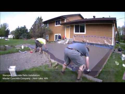
5 Laws That'll Help The Decorative Concrete Patio Sealer Industry
Coloring patio surfaces with stains quickly boosts its glimpse and addresses up any stains or discoloration. Acid stains only are available earth tones but water-based types give you a broad palette of colours you can combine and match.
Examination the concrete for humidity written content. In advance of painting your patio, Make certain that paint will adhere to begin with.
An uncovered combination complete is realized by placing concrete then eliminating the outer ‘pores and skin’ of cement to reveal the decorative coarse aggregate.
Plenty of Area for a few lounge chairs and yet another 3’ around the chairs, furthermore enough room for a little cocktail desk.
"I convey to men and women to request addresses of twenty reference Positions to go see — if they can't think of that quickly, then some thing is Erroneous," Salzano states.
Another option is to implement plastic sheeting (inset higher than) or possibly a commercial curing compound. Water evaporating within the slab will probably be trapped, getting rid of the need for wetting.
Since the concrete is cleanse, be sure your footwear are, much too, prior to deciding to wander on the patio once more. The bordering ground is going to be moist from concrete cleansing. We adjusted into a pair of clean, dry shoes to operate around the patio. Ahead of cracking open up the stain, protect the decreased percentage of your home and any close by landscaping materials to safeguard versus drifting spray.
If you employ muriatic or phosphoric acid, this method is referred to as etching, and will ensure the concrete has a sandpaper-like texture that paint will stick to raised. Etching really should be performed before painting new or bare concrete.
Wait around 16 to 24 several hours. Following that time, thoroughly take out the square of foil or plastic and Look at the concrete as well as the underside from the sq. for condensation or moisture.
Visual appearance: This method allows for both layering and colours to be used, delivering an aged-earth craftsman’s appear.
Apply the mandatory coats. Follow the identical actions as ahead of. Utilize a scaled-down brush close to fragile or awkward edges and a larger brush or roller to finish the coat.
Read more about how decorative concrete was used On this patios project. See more photos from this contractor >>
youtube
4 of 17 Stenciled Sisal Runner Who knew you could possibly up grade a rug with regular interior paint? The bloggers at Young Residence Appreciate confess that foot website traffic will fade the color, but say they prefer the ensuing patina on their own Ikea runner ($49.
A stamped concrete patio gives homeowners the chance to obtain Innovative with outside Areas. They allow different designs and colours to make a signature glance. (Photograph courtesy of Salzano Concrete)
0 notes
Text
Interview with Elmer Ramos
Although every one of us is unique and has a specific visual voice, Elmer’s work is truly unlike anything we’ve seen in Square Carousel previously. His exploration into the middle-ground between representational and nonrepresentational art carries a lot of power, via very strong uses of color and shape. We can’t wait to see how he incorporates this experiment into his visual-problem-solving for Square Carousel. Keep reading for more of Elmer’s thought-provoking answers.
”The Fuck”
Q: I love that your work is often open to interpretation, ambiguous, yet somewhat narrative, Elmer. How did you evolve into this style of art, when those concepts are often conflicting? A: As an illustrator I love telling stories, the more eccentric they are, the more unpredictable they become. During my transition from working strictly with ink and graphite to color monotypes and collage, my process on developing a narrative became more ambiguous. I discovered that by giving a shape some resemblance to a known-object while still keeping them a mystery, allowed for the viewer to wonder what it is or what the story is about. Think of it as a Rorschach test, testing your personality and emotional connections to what you see or what you think you see.
“An Honest Capture”
Q: Tell us about how your work bridges the gap between representational and nonrepresentational. A: I am interested in the idea of one thing seeming or becoming another. I like to get my ideas from looking at coffee stains, clouds and abstract paintings. As I mentioned previously, like a Rorschach test. I get to examine my personality and emotional relationship to a particular idea or subject. When creating narrative work, I like to give the viewer a hint of what might be happening by using a representational shape but I also leave parts open for interpretation which are the non-representational parts. I look at Kara Walker's silhouette work often, because she can take a large white wall and create an entirely new story by just using the same silhouettes and shapes. You should definitely look at her work. The idea of working representational and nonrepresentational is just another way for me to be able to walk the line between fine art and illustration. In illustration you want to communicate the visual message immediately and in fine art you want to hold the viewer a bit longer, to have them wander into the painting.

“Collage Narrative Representationals and Nonrepresentational”
Q: Explain your process, from start to finish. Step 1: Color Mixing I start off my pieces by selecting a group of colors that work well together. I often consider the magic 3’s, the dominant colors, subdominant colors and the subordinate, or as others refer to as the shadows, midtones and highlights. I use Johannes Itten’s Contrast of Extension when I am developing the palate. This is also considered when I am creating my compositions in order to maintain a balanced and harmonious composition.
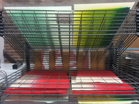
Elmer’s drying monotypes, in progress Step 2: Monotype Printing Once the colors are mixed, I use a large printmaking roller to create the color gradients that are going to be printed on eastern paper. These are the monotypes. Once I am done printing them they are placed to dry for 2 days.
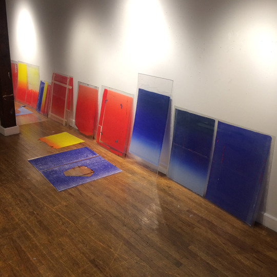
Elmer’s rice-pasted monotypes, in progress Step 3: Rice Paste After the oil based ink has dried for about two days they get two coats of rice paste in the back and are laid out flat on a large sheet of plexi and left to dry for an hour. I usually have multiple sheets going at once to make the best of the time creating an inventory of colors.
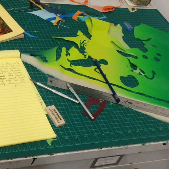
The shape-cutting stage, in progress
Step 4: Compositions During the composition stage this is when I slow down a bit and start thinking about what I am creating and what is the message I am going for, or who I am creating for. The nice part about creating collaged compositions is that nothing is set-in until I know the compositions are done. I usually work on multiple works at the same time in order to be more efficient with my time.
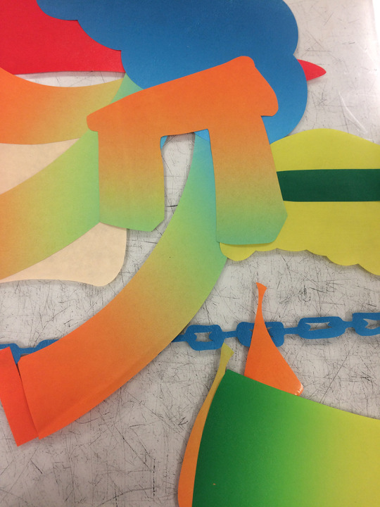
Shapes, waiting to be placed
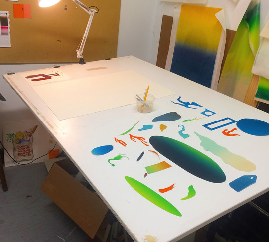
Mounting, in progress
Step 5: Mounting Once the compositions are ready and all the shapes have been carefully cut out, I soak the substrate that the cut-outs are gonna go on, usually western printmaking paper. Paper soaks for no less than 5 minutes the paper is pulled from the soaking tub, blotted, laid on the press, lay-out all of my cut out collage pieces creating my composition, and run it through an etching press. The etching press joins the monotype cut-out with the western sheet. The water from the western paper activated the glue on the eastern paper, making them adhered to one another. They then sit to dry for another day using a stack of davey boards to remove moisture from the soaked paper.
Q: What would be your ideal application of this work, within a career?
A: I believe that the collaged pieces lend themselves pretty nicely to advertising and editorial work and that's where I want to continue heading.
I am a big fan of the New Yorker’s spot illustrations and that's another thing that I would love to do is somehow create just spot illustrations using my collage pieces. But I also have a passion for creating logos and vector work which is funny because vector and collage work, as you know, have sharp edges. I like the clean sharp look, that's the reason why I don't print directly onto the printmaking paper. I like to mount because printing will still give you a fuzzy edge, it's very minimal but I am very uncompromising about what I do and so that's why I think collaging gives me that nice sharp edge that I wouldn't be able to get with anything else. Q: What is your favorite project to have ever completed, and why?
A: I have no idea to be honest… I remember two projects way back before the my transition to collage work. They were both for local businesses. One was for Foxy Loxy Print Gallery and Cafe and the other was for Perc Coffee Roasters in Savannah. I don’t become emotionally attached to my work. It’s a business. My biggest reward is having people react to the work in some way. Sometimes, I see people wearing a shirt I designed downtown and that is when I become emotional. Hahaha.
“Foxy Loxy”
Q: You also have a fantastic sense of color and gradients within your portfolio. Do you derive that palette from any specific inspiration?
A: I do have a good idea of what color schemes work well together, I like to follow Johannes Itten’s color theory on color contrast. After learning about Itten’s theory I discovered that the colors I tend to choose, refer to the Contrast by Extension color palate. In this color palate you are trying to maintain a good balance of colors to achieve harmony. You should check his theories out as well. I also studied much of Hans Hoffman’s color theory on the push and pull using color. I also spend a lot of time mixing colors back when I worked in a commercial printing studio. Clients always want that seafoam green that no one ever makes. It always has to be mixed. Arrrgg.. I am also inspired by color blends that are found in nature such as sunrises, sunsets, and stormy afternoons, or just color blends from a field at a distance, i believe we relate to them easier. Another approach is, what I call, the nursery color scheme. Which pretty much means that, I like to mix colors that you would find in a newborn's nursery. That’s another thing, I love kids and it is amazing how their imagination has no limitations. I usually say a kids imagination has no gravity, anything is possible. If you are ever having a creative block, sit with a 5 year old and come up with a story with them.

“Garibaldi’s Cemetery”
Q: Who are your greatest influences?
A: I would say that my greatest influence comes from Julien Pacaud, a French illustrator who does digital collage work and uses really beautiful gradients in his work. I just can't get enough of his work! He is the artist I have been following for such a long time and still continue to be intrigued by his work. He creates atmospheric perspectives and somehow has a way of playing with scale to the point where it makes sense somehow. I would say this is the direction, I want my work to go. I also look at Kara Walker's work for the erratic narrative pieces arranged in a certain way that provides multiple representations or non- representational narratives. I am a fan of vector art and logo designs, so I look at Aaron Draplin, from Draplin Design Co, when I am doing more design type of work.
Q: If you had to choose between always saying what's on your mind, and never being able to speak again, which would you pick, and why? A: I would say that I would choose to never being able to speak again, because I often think about how I’d much rather spend my time expressing my thoughts through my work instead of talking about it. Sometimes when I try to talk and explain my work to someone, the right words won’t come out, so I end up leaving them with a misconception of what my work is about. I also get in trouble when I open my mouth. hahaha. I am bilingual, my first language is Spanish, and sometimes words are just jumbled up in both languages that I have to find another way to explain what I am trying to say. That’s probably why I am an Illustrator.
Elmer’s workspace Q: What's your favorite food?
A: My favorite food is anything I don’t have to cook. I just love to eat. I would say my guilty pleasure is eating out, burgers, asian fusion, and pizza. Luckily I have a partner that is an amazing cook and loves to cook. So I tend to eat pretty healthy most of the time. But every now and then I treat myself. Q: Tell us your biggest quirk, while working.
A: My biggest quirk, is having a clean and big table to work on. If I don't have enough space to lay out my paper to create the compositions, I cannot make work. Sometimes I end up spending more time cleaning than creating. I also prefer working in large spaces, and if I don't have a large table, I just lay out rolls of newsprint on the floor and lay my prints out that way and create my compositions that way. I have this crazy idea in my head that if the space I work in is bigger, bigger ideas will come.

Elmer, enjoying springtime
Q: Anything else you would like the readers to know? A: The road to being an artist is never-ending, and when you think you’ve figured everything out, more things pop-up. The fun part of it all is the journey of creating and discovering new things. I always think that I'm going to be set on a specific “style” or medium but I just love everything and I am influenced by everything so much. At any point anything can change and switch, so it's okay to like everything and not try to hold yourself down to just one style although for marketing purposes it's really good to just have one style. Always take advice with a grain of salt because no one knows what is going in inside your head other than you. Can’t get enough? Check out Elmer’s portfolio website here.
#interview#interviews#elmer ramos#illustration#printmaking#monotype#monoprint#collage#color#gradient#representational art#nonrepresentational art
2 notes
·
View notes