#painterly takes so long but i do love it lol
Explore tagged Tumblr posts
Text

let them kiss !!
#i think this is the first time i've drawn halo#oops#anyways hanix canon idc#my art#natasha phoenix trace#callie halo bassett#halix#hanix#hannix#phoenix x halo#top gun#top gun maverick#wlw#art#artists on tumblr#sapphic art#lesbian#lesbian art#i can't decide if i want a stylised style or a painterly style lol#painterly takes so long but i do love it lol#i think i'm just gonna try different styles until something sticks#thoughts over
75 notes
·
View notes
Text

(Click the image for better quality)
Yipeeee that Keiki and Mayumi fanart I posted the WIP of is finally done woooo- This piece was a very experimental one that I'm kind of OK on. Maybe because I've just gone insane looking at it for so long and I'm my own worst critic lol.
Artist's Notes;
So I've once again been playing around with my rendering style, mainly because I have been wanting to improve my lighting for a while now and as I was just scrolling through Tumblr, I saw some of the official art for that one webcomic-turned-animated-TV-Show Lackadaisy and was immediately inspired. I also have seen a technique a few times in the past where the lineart and shading are merged together, so I've been meaning to try that for a little while.

I did some experimentation on this one sketch of Keiki I posted in my sketch dump and I really liked the results of it, so I carried those over to this piece.
I ended up scaling up Keiki and Mayumi from the original WIP because I felt like they were both getting lost in the composition, and I'm glad for that because I think it works a lot better. I'm not a fan of how Mayumi's sword turned out at all, but it's not really meant to be the focus of the piece so eh. Overall, I think I could do better with my colours, probably because with Keiki and Mayumi's colours, I did them flat in greyscale and then used a brush on the overlay blend mode to colour all of them over, after which I changed the base layer for their colours from white to yellow and then lowered the opacity so it all went together better. I also decided to use gradient maps for a lot of the background elements, mainly to experiment with getting in my values first to make them pop out more. I ended up finding a really nice sky gradient on Clip Studio Paint that I really liked, and that kinda helped to establish the colour scheme of the background a lot. I think the whole "start in greyscale then colour" thing really works better with painterly styles rather than more illustrative ones, and while it is good at making sure your values are more readable, I honestly don't think I have the skill level to pull that off yet. Honestly, I think I've been looking at this drawing too long or maybe I added too much to it, but I wish I could've made the colours less monochromatic, but I'll just save that for the next piece I do.
I do love how the flame (...well it's more of a weird space rift than anything in this piece) and the lighting turned out, those were fun to do. I was initially struggling with the flame and how Mayumi is positioned in front of it before realizing "Oh wait! This is a weird abstraction of a weird creature! I don't have to follow the laws of anatomy!" and just dislocated it's flamey bottom jaw from the main body. I also changed the colours of it since I was really not liking how incredibly bright it was when it had lighter colours. Again, the gradient maps served the more painterly style of the flames well.
I also love how Mayumi turned out. I could do her sleeves better but that's more of just me needing to study how those types of sleeves fold in that position more. I'm also very happy with the posing, the technique I used for that was taking photos of myself in the positions I wanted, blocking in the silhouette and then modifying that by adjusting it to my lines of action that I drew on top of the original photos, and then sketching over the silhouettes and drawing in the shapes of the hands overtop of the photo if I needed to get the fine details right. As for what I do to take the pictures myself, I use a tall chair I have, prop up my phone with a phone stand, put on a ten second timer and scramble to get in position. Yes, I did have to use a bunch of thin markers I had to try and get the hand positioning on Keiki's pose right, yes I do have a fake sword that I used to get the positioning of Mayumi's arms and hand right, the sword was for an old Halloween costume from several years ago. I really like how both Keiki and Mayumi turned out in this drawing, I'll have to play around with these designs for them more in future drawings.
Also, if you wanna know why I draw buildings like that, when I watched Fantasia 2000 as a kid (One of the Disney movies where they make really beautiful animations to classical music) the way they drew the buildings in the first few sections Rhapsody in Blue segment (the jazz one with the cities) changed my brain chemistry and now whenever I need to draw buildings really quickly, I refer back to that. Since the buildings aren't really the main subject, I didn't put much thought into them.
As you can tell I am very tired of this piece, mainly because I made things harder for myself by overcomplicating the process compared to what I usually do, mainly with the whole "starting in grayscale then adding colour." I'd honestly just prefer having a black layer set to colour that I can just toggle on and off when I need to see the values, but it was good to experiment. And that was mainly the point of this whole drawing, to experiment. I'm definitely going to have to play around with this new style I'm going for, mainly because I liked how it turned out a lot in the augmented Keiki sketch, and also because I want to find ways of making it suit my style more. I also really want to keep experimenting with my lighting like this, it's very fun. Last but not least I am never starting in greyscale again because dear god I do not like the workflow it forced me into. I don't have a problem with the method itself it's mainly just a skill issue lol.
If you wanna read my headcanons for these two, I put them in my WIP post, so you can read them there if you want to. The more I look at this the more I prefer the simplicity of my WIP. I might go back to this and just take away the fancy colours and effects to see what it looks like without all of that stuff and reblog this post with that drawing, but for now, I don't think I can look at this drawing again for a while.
#touhou project#art#fanart#touhou fanart#touhou 17#wily beast and weakest creature#keiki haniyasushin#mayumi joutougu#haniyasushin keiki
116 notes
·
View notes
Note
Love your lineless art! Do you do a rough draft in the sketcg and then color/shade in shapes, or go for a more painterly style?
I make sketches! They’re usually very messy lol, but so long as I get the gist of what I’m trying to draw (& can read my chicken scratch XD), it’s all good!
Then I just take a pic, import it to Procreate, put it as a bottom layer at lower opacity, & draw over it. ^_^

Example of one of my very messy sketches lol XD
#ask#drawing#sketch#sketchbook#I have a little sky blue one that fits in my pocket 🩵#Also got a normal one with a cloudy cover
33 notes
·
View notes
Note
What do you think of Ko Takeuchi as an illustrator anyway? Do you blame him for WarioWare getting normalpilled?
LOL well either way I can't be too mad at him considering that he is the one responsible for the original lightning-in-a-bottle designs in the first place (IIRC he's been the sole credited character designer since Mega Microgrames). Truly we'll never know if the Normalbobification of warioware was a personal stylistic choice on Takeuchi's part or a push from more marketing-minded suits behind the scenes, and we will likely never know because of people like me who are fucking insane about it. I will beat a dead horse and say that his same-face syndrome for women specifically is really bad. But, to his credit, and despite the depressing new art direction of the series, his more painterly character art from Get It Together is nothing short of gorgeous:


(Yes i chose the only long orbulon in the batch DON'T look at me.)
So, overall, I don't think he's a BAD artist. The fact that I like a lot of his work actually makes the overhaul even more painful; he COULD make everyone look weird and greasy again, it would be so easy for him to make everyone look weird and greasy again. This one isn't solely an art style thing, so I'm kind of derailing here, but how did we go from this:

To this:

It just ain't right!!
But, on the other side of the coin, as much as I have qualms with the new art style and some of the changes in characterization of a lot of our guys (not just Orbulon, I think Crygor and Jimmy got hit too), I do really really love that more focus has been put on their characterization at all. Hell, Warioware Move It is basically a cartoon episode disguised as a game. That's fun as hell! From the fully-voiced Gold to the saga of Get It Together, it feels like they are really making the most of the awesome cast of weirdos at their disposal - and they always have, but now instead of all the fun stuff being relegated to websites and manuals, it's taking center stage. Something I love about warioware is just how much love the crew seems to have for these characters, and it's nice that that's still evident no matter what they look like.
53 notes
·
View notes
Note
Hii im the same anon who asked for the jewellery rendering tutorial. Sorry i keep asking for tuts but how do you render clothes,, it's currently my biggest struggle along with actually drawing the folds 😭😭
Hey there anon!! Don’t apologize!!! I actually really do enjoy answering questions, whether it’s drawing tips or my opinions and such on mammon!! It’s fun to talk to y’all when I can!
Anyways yeah I think I can explain my thought process when it comes to clothing and such!!
(Putting it under the cut cause it may be a bit long lolol)
So when I draw clothes, my main focus is to understand and be able to get across the texture/material of the clothes I’m making!! I find that when you can get across what material it is, other people will be able to fill in the blanks of what the clothes are supposed to be!!
For example, here’s my pool table mammon where he’s wearing a gold metallic puffy jacket:
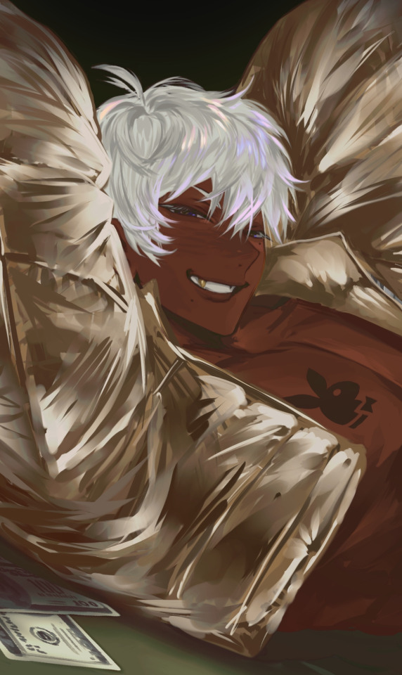
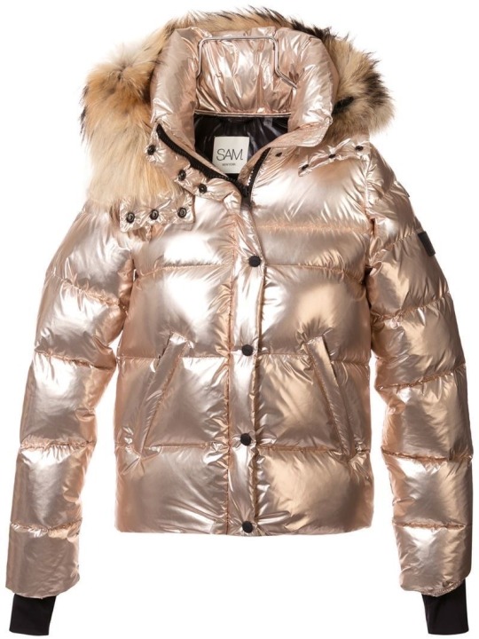
For reference, I looked for a picture that had similar material and overall shape to what I was drawing.
But rather than trying to copy the shading and folds line for line (which wouldn’t have worked either way since the angle, pose, lighting is different and would change a lot of things!), I look at which places the material looks the brightest and darkest, as well as where the clothing puffs and where it sticks to skin to be able to accurately get across the kinda clothes I wanna put my subject (usually mammon for me 🫶🥰) in!!
A few other examples would be these two mammons:
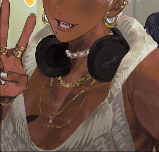
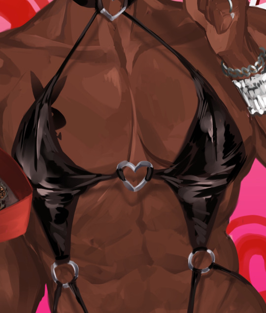
In these two pictures, mammon wears clothing that have a very distinctive texture to them, leather and knit! Even though I don’t draw every line or fold perfectly, I try to get across that it’s a knit sweater or that it’s a tight leather material by either drawing the wool stitching/pattern or having the shininess of the leather come through the dark material!
Even though it’s messy, you get what I’m trying to convey when you understand that it’s wool or leather or whatever material I’m trying to convey at the time!
Once you understand material, I think it becomes easier to understand folds!
Take this mammon for instance:
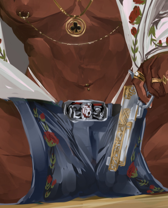
Because I understand denim fabric and because I looked at the jeans I wanna reference prior, I know that those folds/lines tend to be where the legs connect/around the crotch area, so I know to put those there! If it were a longer pair of jeans, I would put those folds around the knee areas, since there’s where denim tends to bunch up!
I think it’s very helpful to spend some time looking at fashion images online and when you’ve picked your clothing, to really look and see where clothes *tend* to fold into itself when it’s made of a certain thing! That way, when you draw something puffy, you know what spots is puffs at and where it sticks to, or if you’re drawing something that clings, you can see what spots cling to the skin and was spots have a looser fit!
I tend to spend a lot of time going on Pinterest lookin at fashion pictures and clothing and saving the ones I wanna draw mammon in, so I’ve built up my understanding of how material works! I still have plenty to learn, but I’ve built up my observation skills to a point where I can trust myself to get down a certain material once I’ve found a good reference!
Hopefully y’all found this helpful!! The way I draw is very much messy and only really drawing what I think is important and letting myself and others “fill in the blanks” when it comes to finer, finer details! My thought process is to draw enough to get the point across, even if it ends up looking more painterly and less clean than it should LOL but I’ve come to enjoy the way I draw :P!!
Anyways thank you so much for the question, I actually really love talking about my drawing process! I don’t tend to do it often, so when I do explain things, I think I also end up learning things myself when I look at my own art and explain it to all of you guys!!
#asks#mammon obey me#I used mammon for all my examples LOL#my little model helping me out 🫶🫶#isn’t he so cute and helpful 😍😍#it’s cause I love drawing different fashion types on mammon#I love playing Barbie dress up with my man 🥰
38 notes
·
View notes
Text
Chapter Eight

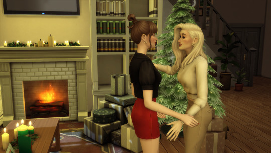
“Will you have a Bailey’s dear?”
“Oh yeah, thank you, that’d be lovely.”
Claire’s mother Cassandra, who could genuinely be her older sister, strokes her hand down my cheek to my chin and makes an affectionate clucking sound in the same way that her daughter does. They’re alike in so many ways that it’s almost frightening, clones of one another, the understated beauty, the way they’re always touching you, the plump, pouty mouth. Cassandra is the most glamorous woman in Tullamore and everybody knows it. She’s soft cashmere and velvet, the colour champagne and the smell of vanilla, and tonight she’s dressed in beige and white, patient stiletto heels clicking across the tile in her enormous kitchen to get a carved crystal glass for my liqueur.

“She won’t be long, love.” She calls out to me as I perch on a settee by their roaring fire in the next room, its mantle adorned with eucalyptus leaves and a dozen white pillar candles.
“Oh it’s fine.” I say. “I’m alright with waiting, your house is so cosy.”


“Oh, thank you.” She replies, delighted, and hands me the glass, half a strawberry floating amongst the ice cubes. “We’re doing a white and gold theme this year for Christmas, since we had our walls painted in Elephant’s Breath last summer I thought we could keep it neutral.”
“It’s beautiful, you’ve done an amazing job.”
“Oh darling, you’re so nice.” She moves around the room looking for something, all long legs like a gazelle, and then peeps under the coffee table to grab a magazine. “I’m going to go into Barry in the other room, he’s watching a film if you’d like to join us.”
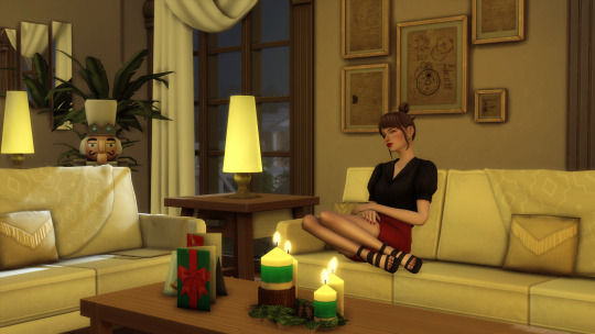
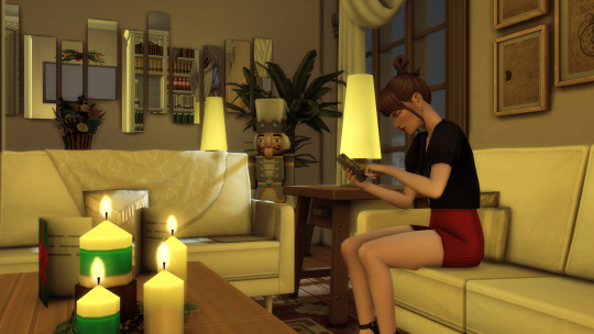
“Oh, no I’m fine here.” I say, and she leaves me by the fire where I curl my legs up underneath me and watch the flames dancing in the dim lamp light, sipping from my glass while the logs crackle and I feel like a kid on Christmas in some 90’s movie like Miracle on 34th Street or Home Alone. It’s the day after Christmas so all of the presents have been opened, but Cassandra leaves fake ones under the tree. I think they’re just empty cardboard boxes but they’re wrapped in gold foil paper and tied up beautifully with silk ribbons with the kind of patience and care that I know I will never have for something so arbitrary as a Christmas present, never mind a fake one. I fantasise, the way I often do when I’m by myself in Claire’s house, that I grew up here and had this wonderful, perfect childhood where I got everything I ever wished for and life was always beautiful.
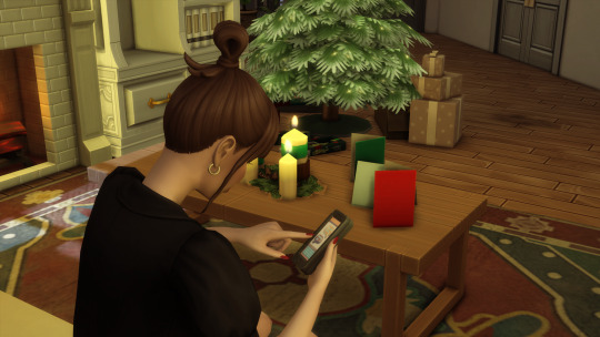
My phone goes off and I’m distracted from my daydreams as I take it out of my pocket to see a notification on my Instagram. I tap to open the app and read it, and it’s just Marnie commenting on one of my recent drawings.
Ugh, so talented.
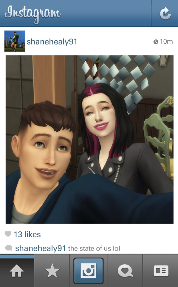
I hit the home button and the app instantly takes me to a picture Shane uploaded earlier in the day that I haven’t seen yet. I do a double take when I see it. It’s him and Jen. I stare at it for ages, taking it all in, the way that they have their heads smushed together in the frame, both of them grinning. The caption is: The state of us lol.
It is disquieting to see it for some reason, and as I look down at my phone in my hand I remember my encounter with Jen in that cocktail bar back in November and how she’d mentioned some get together with all the old gang. Here is photographic evidence that it happened, and Shane went, even though he never told me that he did. I stare at the photo some more, Jen has commented underneath it, something about how bad they both look, and then I notice something else in the background of the photo.
It’s a hand on a table, the rest of the person off screen but I know instinctively who it belongs to by its long painterly fingers, my insides start feeling like something is bouncing around in my guts and before I can stop myself I have already tapped on Jen’s profile. It’s like my body is invaded by something, and it just takes over from my brain and starts performing automated movements, scrolling, tapping, scrolling, tapping. I go to her followers list and start trawling through hundreds of names, nothing familiar, nobody I know, until…

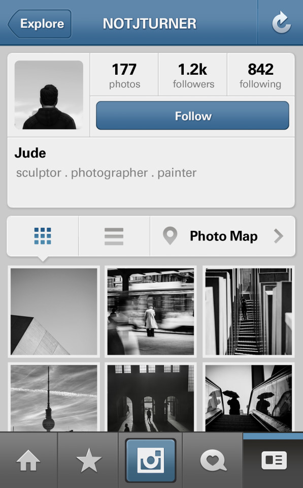
I stop. There it is. NotJTurner. The little icon next to it is the back of his head, a black puffer coat on him, looking out over a winter sky streaked with clouds, and I want to snort with derision. He really is so pretentious, it pisses me off. I tap on the icon anyway.
There are no photographs of him on the profile. The whole thing is this immaculately curated mood board, every picture taken with what must be some expensive DSLR camera, edited perfectly to fit the theme and capture city life. A man walks his dog while drinking from a takeaway coffee cup in the snow. Two girls climb out of a taxi on a wet night, the lights of the city smeared and reflected on the slick tarmacadam. A symmetrical shot of a skyline, a building with a hundred windows and then a vast expanse of clear cyan sky in the negative space it creates. The more I look the angrier I get and I don’t know why. All of these carefully selected pictures of this perfect Berlin life, everything so aesthetically pleasing, all of it so goddamned good. I hate that he’s good. He’s supposed to be terrible, he’s supposed to be as awful as the feelings he ran away and left me with.
But I can’t look away. Dotted here and there among the street photography are pictures from exhibitions, some sculpture work he’s presumably doing at college and then like me, he’s photographed his sketchbooks, and they’re breathtaking. Deep, dark and moody, faces emerging from blackness on the page. The way he’s captured expression and movement would put stars in Ida’s eyes, and I linger on one page that just hands, some draped over the edge of a bathtub with wrists exposed, dirt beneath the nails, skin taut over the veins, knuckles rough and scabbed and yet they look like they’re ready to start moving off the page. He never showed me his work that summer, I never knew, he never told me it was like this, and I feel more humiliated than ever that I let him see my stupid, childish work that night after the graveyard. And I think of the way he looked at me and said these are really good. I huff out of my nostrils. What a liar.
I start scrolling faster through the images, blood rushing through me and throb in my face and I know that if anyone asked me I’d have no way of explaining this reaction and this flood of strange feelings that have crashed over me, how the meagre act of looking at someone’s instagram profile could make me feel with such intensity.
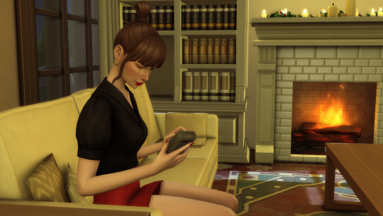
I stop dead with confusion when I see something else among the other posts. Is that… me? Am I looking at my own face?
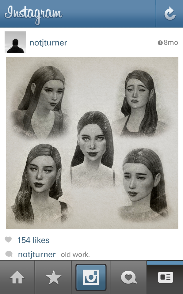
I become still and look, and keep looking. Is it really? I stare at the screen and wonder if I’m just making things up out of self-obsession, but it’s undeniable that the face in front of me is my own. Or rather, the faces. Somewhere in the depths of his profile, way down near the bottom is a photograph of a collection of drawings. There are five heads all arranged on a page, each one with a different expression, confusion, scepticism, surprise, contentment, and another that I become transfixed on because I don’t recognise it right away. The girl on the page has bare shoulders, long, unkempt hair that’s coming across her forehead in loose strands over her low straight brows. Her eyes are bright and engaged, and sparkling, as you might even say if you were feeling generous. Her head is tilted forward and the corner of her mouth quirked upwards to create this cheeky, mischievous expression that I never knew I had. When have I ever made that face?
He’s made me look so free and so easy and so beautiful that I’m sure he’s taken creative liberties. I don’t ever really look like that. These versions of me are from somebody’s imagination, like they’re a character who’s wearing a mask of my face and has enhanced all of the best parts and ignored the way that my shoulders are always hunched and there’s a line etched between my eyebrows. When did he draw these? Why did he draw these? I read the caption.
Old work.
That’s all. Of course he doesn’t say anything about who the girl in the drawings is, or what compelled him to draw her, but why would he? There’s a big piece of me that wishes that he’d shown me these before, emailed them to me, anything. How old are they? Are they from that summer on the beach, or sometime afterwards? My mind drifts back to my bedroom in Tullamore where there is a sketchbook hidden away in a big plastic box beneath my bed that contains my own clumsy attempts at drawing him. I remember doing them in the middle of some emotional episode and feeling like I was in some way creating a bridge between our distance, relishing each little zing of pleasure I felt as I remembered another little detail about his beautiful face that I could put to paper. But you couldn’t waterboard those drawings out of me now, never mind convince me to put them up on the internet.
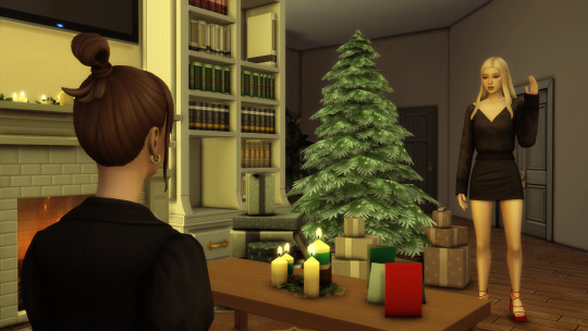
When I hear Claire coming down the stairs I hastily put my phone back into my pocket. “Hello gorgeous.” She says as she sweeps into the room. “Are you ready to hit the road?”
“Yes!” I say, and I grab my half full glass of Baileys from the coffee table so I can gulp it down in one go. It doesn’t even make me wince. “Let’s get moving.”
Prev // Next
#sims#sims 4#ts4#simlit#sims 4 story#sims story#writing#fiction#romance#sims 4 storytelling#sims storytelling#sims4 storytelling#lucky girl part 2
27 notes
·
View notes
Note
hiii!! your artstyle is SO COOL to me- as in sometimes i'll just stare at some of your pieces because theyre all so great. i was wondering if you were comfortable sharing your process when it comes to art?? i'd love to see how you do things!
Hi!! I'm sorry this took so long to answer, I hope you still find it useful. It means a ton to me that you enjoy my art so much! <3 It's easy to feel discouraged by the Invisible Hand of Internet Engagement, so I really appreciate your ask.
General thoughts (NOT rules, just things I consider or do a lot):
Things that appear one solid color irl can be broken down into multiple colors through artistic interpretation. I see a lot of beginner artists paint trees as solid green, when there's a lot of yellows, blues, and browns in there! A FANTASTIC example of this is jadenvargen, whose color use is masterful and I can only aspire to emulate one day.
Base colors are not saturated; saturation is reserved for pops of color and details
Shadows are purples, blues, and greens
Reference is your best friend!!!
So the nitty gritty for those who want to see: with digital art there's two main avenues I take. The first one is lineart, and the second is painterly. All IDs are in alt text.
My process for lineart pieces:
I always start off with a sketch; for this example I'm using one of my pieces from @/mylittlefusions (that isn't actually posted yet but will be later today) - a Grogar and Trixie MLP G4 fusion. I like to fiddle with brush selections until I get the effect I want, and then go slow on the lineart to make sure it's how I want it, so this can be time consuming!
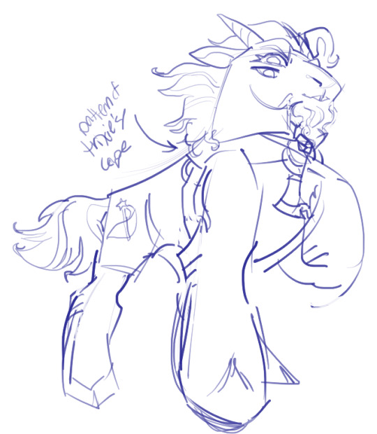
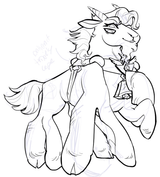
I've been trying for distinct shapes; I hate when my art gets muddled, I feel like the end piece is less impactful when I don't put in the right amount of contrast and distinctive silhouettes. Just something I've been thinking about and trying to improve.
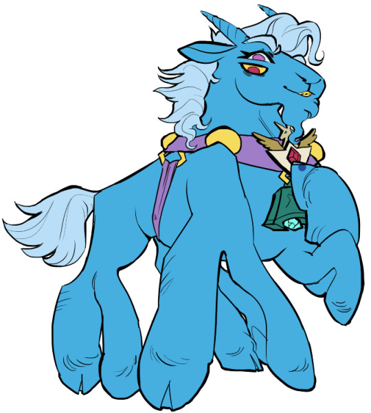
Then I add base colors, going for slightly desaturated colors. I like to use saturated/bright tones to contrast or draw attention to something. I put the base-base colors down in one layer and then add details as a mask layer:
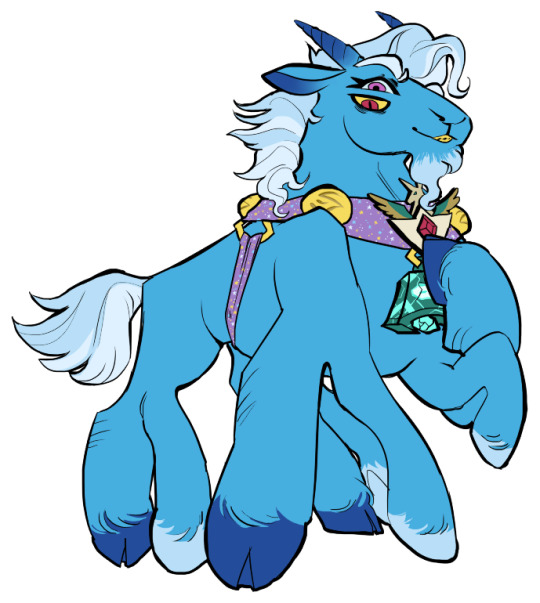
Then comes shading!! I'm a big fan of a multiply layer set to cool tones like blue, so I usually start there. If I think it needs to be different I can change it later. In this instance, I filled the whole canvas in the shading color as a mask over the base colors, and then erased where needed. Now that the shading is done, I often go back and color the lineart :)
Last but not least is my favorite part, painting on top! The extent to which I do this depends on what I think is needed, but I usually at least paint on top of the multiply shading to add some nuance, i.e. the greener bits on the background limbs. Here I added bright magic outlines to pop from the more desaturated character.
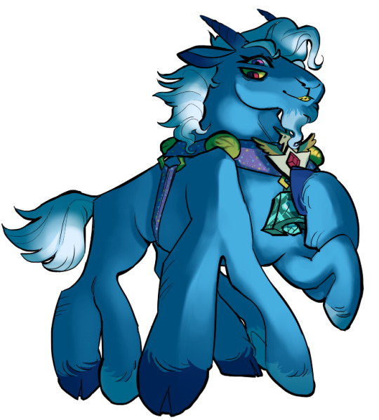
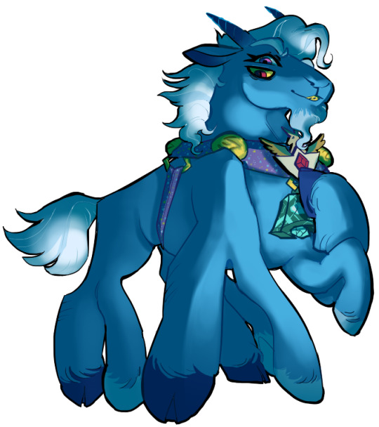
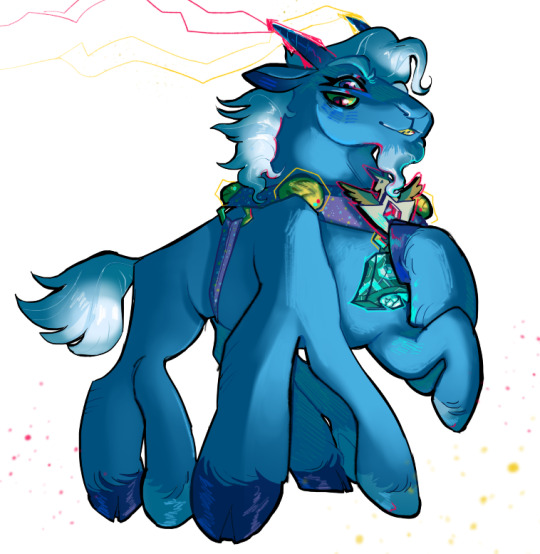
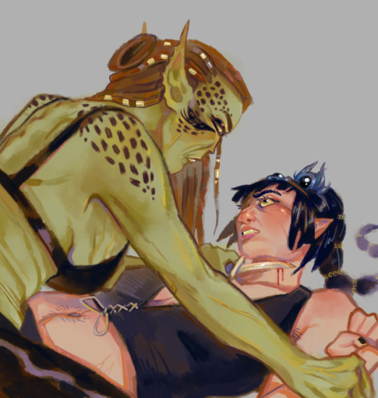
My more painterly style is a different story though! I use the same thoughts about color and shading, but I usually forgo multiply layers entirely and just do colors by eye. I still do a sketch, usually. Here is an example using my Lae'zel / Shadowheart piece.
The sketch is a disaster zone lol - but I painted below it using base tones, again desaturated. Once I feel I don't need the sketch anymore, I keep painting, making a new layer when I feel like being cautious about a change I'm making.

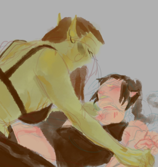
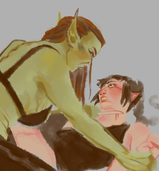
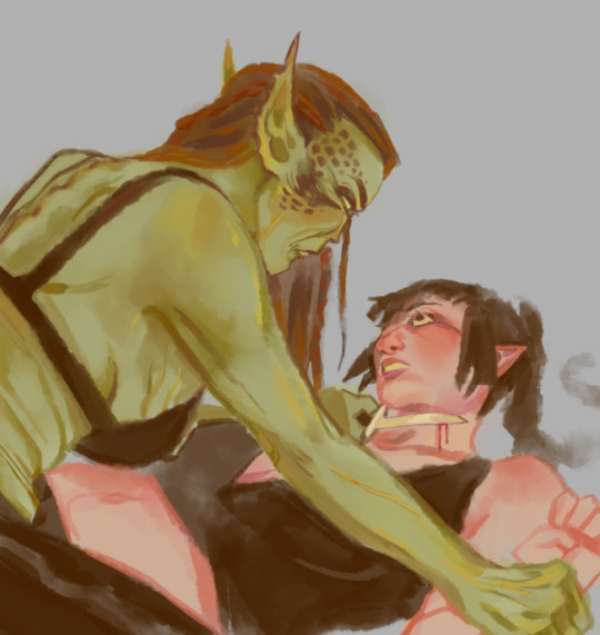
After I feel that I've got base colors down, it's time to get more contrast in using darker and/or more saturated colors! Then, like with my lineart process, I paint more details on top of everything else - reflections, jewelry, body hair, etc. I try to communicate shadow and distance with purples and blues, but I'm still working on it.

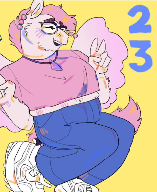
Another example real quick, where i did my typical lineart process base work and then painted on top of the shadow layer and the entire piece as a whole:
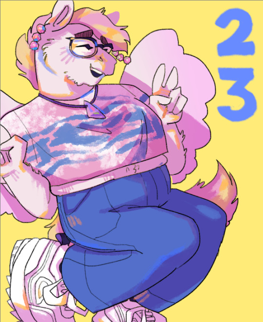
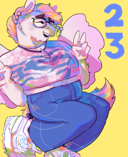
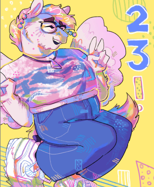
Thanks for reading if you stuck around, and thank you for the ask, friend! ^^
6 notes
·
View notes
Text
Nearing the end of Mettamay! Recap and thoughts :D (This is just for fun lol)
I think this is the part where I drop off of drawing for Mettamay AAAA But hey, I did really good though! (imo ofc!) The number of days I did and how much I drew MTT himself was insane 👀👀👀
In total I accomplished days: 1, 2, 3, 4, 5, 6, 7, 10, 12, 14, 15, 16, 18, 20, 21, 22, 23, 24, 25, 26, 27! So in total, 21 days! Holy shit LMFAO VERY proud at my commitment yo, I kinda wanna do this again next year if it's on! >:D (just remind me bc I WILL forget probably)
I've mostly dropped off by now, just bc I can't think of what to draw, and my motivation has moved to updating oc's for Art Fight BAHA But the fact I made it so far--- bonkers, bro, absolutely bonkers. This was INCREDIBLY fun and got me through pretty bad burnout, so yah! It was honestly very relaxing to just draw Mettaton for 21 days JHSDGHSD
Also, shout out to Mettamay for getting me to experiment with art aswell! Notably, I've become more comfortable not fully rendering with a painterly style, rather, just using a single pen brush in my software and doing pretty decent cell shading(?), which is epic as bc painting takes... SOOOO long JHDF
And honestly, imo to end off Mettamay for MYSELF Imma rank my favourite pieces I've done for this month, just to look back on and just for funsies KEKEKE
VV - UNDER THE CUT! BC THIS POST IS LONG AS HELL - VV
TO RECAP FOR MYSELF, My favourite pieces were these:
FIRST:
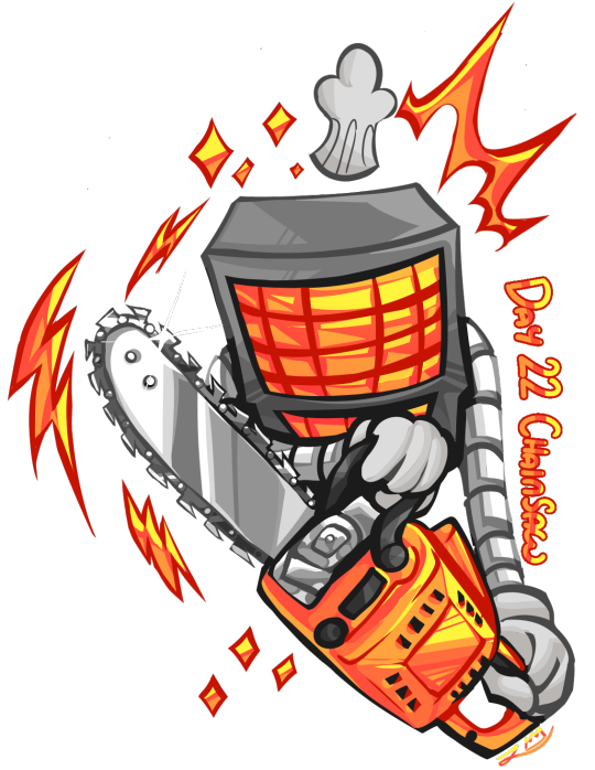
Mostly bc I am so SO happy with the rendering and colours JKSDHGFSD
SECOND:
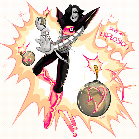
First siting of me doing decent rendering in the whole of this challenge 🫵 This one was specifically a blast. The pose- not too great, but for me who is pretty shit at poses, I'm VERYYYYY happy with it >:D Very epic to see I also accomplished kinda comic-like background graphics, dunno how I did it JKHJGHSFGSDJ
THIRD:
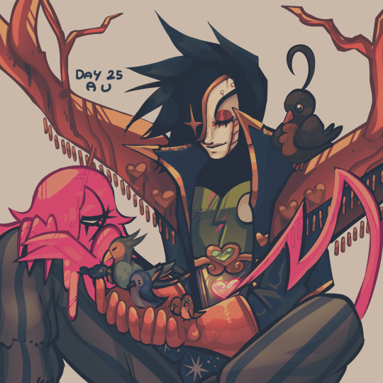
i'm kinda insane about my AU MTT. Salty I forgot the weird cape banner wing things but I love this piece nonetheless ;;w;;! I'm so happy with the design, and getting the chance to draw it for Mettamay was a blast.
LASTLY/SPECIAL MENTION The amount of ghost MTT's I drew have to get their own spotlight. I had so so much fun drawing his ghost form, and honestly? NEW COMFORT CHARACTER UNLOCKED KJSHJHFDG
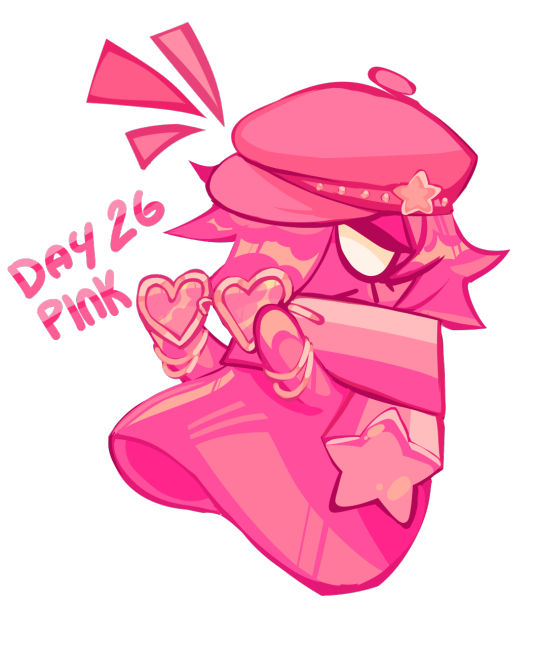
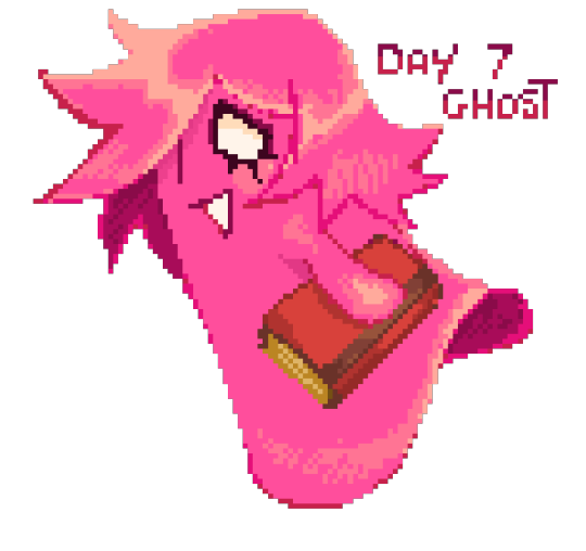
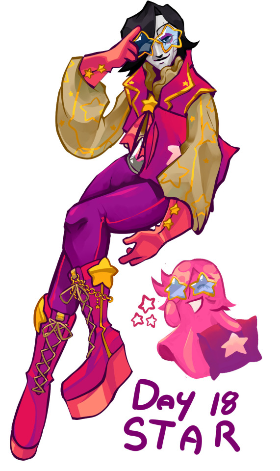
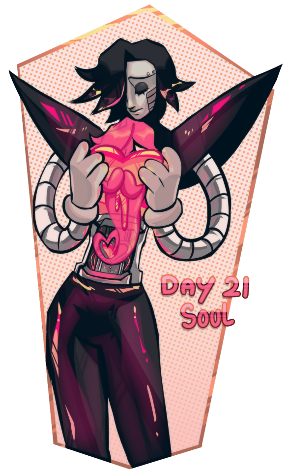
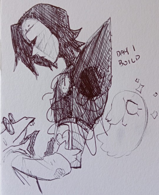
Who knew a hot pink ghost of my design would become a comfort PFFT Very happy at his design development since the first one LMAO Bro got edgier hair JHGGFJS thanks to my AU ghost MTT also having edgy af hair KJHJHSDJKDDHSDSJ
BUT YEAH Overall, Metta May was a BLAST And now that I experimented with drawing Mettaton, I think I'm comfortable drawing more of him now >:3 Just--- when motivation hits me LOL
#mettamay recap!#WOPPIEEEEEE#this was fully for funsies#this month was a blast KEKEKE#And it really showed me now determined I was to draw Mettaton LOL#bro is still rotting my brain#my art#long post
2 notes
·
View notes
Note
hiii (*´ω`*) 10, 11 and 20 for the ask thingie?
HIIII!!!! TYTYYY
10. Favorite piece of clothing to draw
ELEGANT BLOUSES OR DRESSES!!!!! WITH FRILLS AND RUFFLES AND LACE i love it all it takes me so much restraint not to put every character i draw in them ... where's the meme that's like the kid from up receiving a badge and it's like "the highest honour i can bestow upon my favourite character" that but it's the pretty blouse
11. Do you listen to anything while drawing? If so, what?
really long streams ... 5-10+ hours long i dont like having to think about what i'm gonna watch and music distracts me too much while drawing so i just pick a big ol stream to chip away at over the next few days sfdfhrgh
20. Something everyone else finds hard to draw but you enjoy
it's hard to pick something specific... but i think having a messy painterly type style def makes certain things more loose and fun because you don't have to go through the process of "sketch > lineart > base colours > details" it's kind of just "block out the shape then detail" and it's done LOL
2 notes
·
View notes
Note
Do you have any tips / know of any tutorials of how to draw in your kinda style? I love the painterly look!

Yeah I'll share with you what I know, idk how to teach exactly how I paint but I'll share with you my process, I think it's similar to how most people draw.
youtube
youtube
youtube
youtube
youtube
So I spent like a long time drawing in grayscale and copying online images, you can check out my Deviantart to see that lol My DeviantArt
I practiced for a long time just drawing in grayscale and when I decided I was comfortable enough copying with grayscale I moved on to learning about forms in 3d space like at the beginning of this year, and I really only watched Istebrak on YouTube and all her form videos on how light bounces on form to figure out how to draw blocks and things from imagination. When I paint I'm still drawing in grayscale but instead of using gray I will use a color and increase its intensity depending on a few factors.
youtube
Watch the entire Marco Bucci series.
So when I'm painting color im still piggy backing off what I know from drawing in grayscale. I'm not sure if this helps but I'll add a few more videos I usually rewatch over and over. If you don't get it the first time it's okay it took me months to figure out what these peeps were talking about it's good to rewatch rewatch and take notes and pause and Google when you get confused.
Here's some extra vids regarding color.
youtube
youtube
There's a ton of other vids on YouTube which are great but I can't share them all heres there's a ton if you need any more info or have any questions let me know I can fwd you any other resources that can help!
12 notes
·
View notes
Note
I enjoy your breakdown of what's going on with SM but we differ in opinion where the music is concerned... well the stuff I've heard. I have not listened to the girl groups at SM much but I love the music everyone else has put out, even 2 baddies. I like like when groups experiment, some songs are going to not vibe with some people and some songs are but one of my favorite things about NCT and the sub units are you never what to expect. 2 Baddies is just one of those mindless fun songs to me, but for me NCT 127 are so versatile that they can make anything work. You got SuperHuman, Highway To Heaven, Favorite, 2 Baddies... they can mold into any concept imo Also I love Ay Yo and WayV's last album, the winter palace songs, etc etc... I think a change wouldn't be an awful thing but idk this seems really shitty. I know business can be cutthroat but these people are working there because of what this man Lee Sooman did to start that company and truthfully start of kpop and I just think he deserves more respect than this. This feels dirty and harsh. Another worry is SuperM. Capital seem to work closely with Lee Sooman considering how tied Mr Lee was to that project... do you think Capital will want to cut ties with a company that staged a coup? This is stressing me out lol Oh no and what if this makes some artists want to leave in solidarity with Lee Sooman??? Is that being really paranoid? Do you think Taemin would stay because I know he's close to Lee Sooman.
Also what do you think about the hoopla about Baekhyun's health and people blaming SM? They think because he was sick for 3 weeks and now eating once a day and working out a lot, that SM is to blame for not stepping in.
Always good to have a difference of opinion 😊. I think the SMCU Winter songs were outstanding tbh. I even liked the surreal painterly concept of the photos. But again, I really don't know who is behind what. Like what of Kwangya? Is that LSM or Chris Lee?
And I agree that on the surface of things, it feels like a really brutal fuck you to a man responsible for a lot of great music and careers. SM made a hell of a lot of mistakes, but they've become so artist-centric, it does seem a shame to throw the baby out with the bath water, so to speak.
Regarding SuperM and their future - Capitol Records wouldn't cut ties unless their contract was up and they no longer were interested. I don't know what the profit sharing model is with Capitol or what Capitol has agreed to do marketing/resource wise (anything?), but honestly there's not anything to worry about here. SuperM's comeback has already been announced and is likely being planned as we write on this infernal website, lol. Artists and groups are not likely to up and walk over this. I would find it very surprising. Getting out of their contracts would be too costly, and we don't even know how they feel about SM 3.0 etc. So, no need to be paranoid!
Re Baekhyun's health... I just am sooo sick of the victimization. If Baek wants to do that, he's gonna do it. Fasting is not bad for your health. As long as his meal is not actual junk food he'll be fine. And I assume he's drinking water and taking supplements. Like, fasting is actually good for your health. Why don't we let Baekhyun, an adult, decide what's best for him?
To me, all that victimisation stuff comes down to infantilizing grown men and also this pervasive, misguided savior complex. I'm sorry but men in Korea do not need to be saved from the evil mistreatment of... choosing their own diet and exercise plan? He's not 14. He's a seasoned idol. Marge from Utah isn't gonna change Korean beauty standards and deeply ingrained cultural values by crying on Twitter that SM are evil. What she will do is cause more racist journalism in the West decrying that kpop's evil dark side must be tamed. Sigh.

2 notes
·
View notes
Text
Ask Answers (February 22nd, 2021)
Hello! Here’s another collection of anon ask answers all put together in one big post.
This might be strange considering how upbeat yall are about the fandoms for your games in general, but is there any particular trope or ship you WOULDN'T want us writing/drawing/etc. in relation to your stuff? (IE, any canon you don't want us 'overwriting' or something like that?)
Of course we would want the fan content people make to not be racist, sexist, homophobic, bigoted, harmful, etc. But in terms of generally doing non-canon pairings or adding in headcanons or stuff, we really don’t mind that. People are welcome to have fun and explore their own ideas.
for the 1.2 Android update was it meant to download as a separate app? I really want to keep my previous save files but they don't show up (also thank u for the updates I'm really excited to get back into the game!!)
We had to change the name of the file and unfortunately for some phones that meant it’s treated as a brand new game. I’m sorry your saves didn’t transfer over to the new version. You can try to look up your specific phone and see if there’s a way to access save files for games on your device and then transfer those saves over to the new build manually. It may or may not be possible.
I'm having some trouble figuring out how to get the update from Itichio without losing my save files? Is it the same game or a folder I can put in the properties? Sorry if this question is not worded well or if this isn't the avenue you'd want to take technical questions on
Are you using Android? If so, the above answer may apply to you. If you’re on PC or Mac, the save files will automatically still be included.
Hey. I really loved playing our life. It was a fun experience and I never thought I would like it this much. I do have a question, I am currently replaying the game and I am choosing choices I never chose at first. In step 2 during the road trip arc, I decided to ask Cove about what he liked to see on people. One of his response was anklets and black eyes. My MC have just happens to have black eyes. Do Cove say black eyes cuz my mc have it or it was just a coincidently programmed into the game?
He uses your eye color intentionally! If you changed your eye color he’d change what he said.
Will step 4 have 10 moments like steps 1-3?
Step 4 is only an epilogue. It plays like the openings/endings of the earlier Steps where it’s a bunch of scenes all in a row, there aren’t any individual Moments.
hi! who was/were the artist(s) for our life?
&
who is the artist for Our Life: Beginning and Always?
Main Sprite and CG Artist: Addrossi
Main Background Artist: Vui Huynh
Main Interface Artist: Winter Slice
Other artists who helped out can be seen in the credits of the game.
In the new ol, there are two main love interests... Would it be possible to pair them together or is that weird?
You can’t stay single and pair them together. If we are going to add all the extra content to have a route where the two LIs get together, it’d be a full poly route where them and the MC were all dating. And that’s not a for sure option yet because it’d add a lot of extra complications. But either way, in OL the relationships all gotta be about the MC, haha.
In OL2, there will be extra LIs in form of DLCs? Like Dexter and Baxter.
Maybe! We’ll see how it goes.
Since Cove will have 2 diff body types in s4, will the storyline and dialogs reflect this? Or all of it will be the same? Btw love the game and sorry for bad english. Hope this doesn't sound rude 😅
Some descriptions and pieces of dialog will change, but it won’t impact the story really. And you don’t need to apologize! It’s all good.
Will you ever release the transparent sprites of the Our Life characters?
Probably not, I’m afraid. They’ve got a lot of pieces and it’d just be kind of hard to deal with, aha.
Something I was curious about, what was your inspiration for making a game with so much customization?
Initially, the idea was just about having a romance where you actually grew up with the LI. But it was pretty stressful to try deciding how fast the relationship would progress with it taking place over such a long period of time and with no real storyline carrying it. People might not wanna play a game where the characters don’t get along as kids, but other people might not bother with a game where kids immediately liked each other. So the obvious answer came, just let the player pick themselves how it goes. From there we simply continued to add more flexibly with the MC due to the same thought process of wanting to make sure people were onboard with how their life was going.
What made you decide to change the artstyle for ol 2 so much? I of course respect all your decisions and will buy the shit out of everything related to ol 2, but i love the original style and i m honestly not a fan of the styles shown on patreon, despite me liking the painterly style in general. (I don t mind the style being changed, just that the examples shown so far all feel like there s something wrong with them.)
We’ve always used different art styles for each of our projects. They all have distinct looks from each other. It’s just nice to do something new. I’m glad you really like how the first game looks, though. And those samples were only general concepts, rather than the exact options being decided between. We wanted to see reactions to different options. The art style we’re going with won’t be exactly like those, though I personally like all of them. I think players are gonna enjoy the style Our Life: Now & Forever when it’s revealed.
Hey! Is it ok to ask what gender ourlife2 protagonist will be and if we'll be given the same opportunity to customize an MC? Totally understand if you're keeping this under wraps for now if u don't wanna say!
OL2 will have the same type of MC customization as OL1, but even more refined! So their gender will be up to you.
Hi! I happened upon Our Life on Steam by pure chance. It is such a great game, I am super excited about the DLC, and I just want you all to know that you are awesome! :D I have a question, and I'm sorry if it's been asked before. Do you have plans of making more games similar to Our Life, with customizable player character? The customizable player character was probably the one thing I personally have been desperate for in romance VNs. So glad there finally is one and would love to see more.
Thank you! And yep, we do have plans for more games like Our Life, most notably is another game in the franchise- Our Life: Now & Forever. We’ll also likely have other, non-OL, games with customizable MCs, though we may still have some games with set MCs in the future as well.
On the patreon dlc just curious but is it possible to play it without actually sleeping together/getting the nsfw content? I just want to spend more time with Cove
Yeah, you can still choose not to go that far. Though the event is shorter if you pass on the 18+ stuff.
At the beginning of Step 2, did Cove end up accidentally falling asleep in your bed? Or did he fall asleep on the floor?
He fell asleep sitting on the floor with his body/head leaning against the side of the bed.
This may seem like a weird question, but what exactly is the difference between "direct" and "relaxed" on the comfort scale?
Direct is blunter and more teasing, relaxed is lighthearted and goes with the flow.
can the MC have tattoos in step 3?
Not in Step 3, but you can in Step 4.
how would Cove react if he visited somewhere like North Carolina in winter where it can get in the 20s(F) at night sometimes?
He would be shocked and unprepared for what serious coldness is really like, haha. The poor beach baby would wanna go home.
Hello! I just joined the PATREON!! It’s amazing! I love your games! I have a question, approximately how much after will the nsfw be out? After or before the dlc 3 and step four? Sorry my English isn’t the best!❤️❤️❤️
Thanks so much! The NSFW DLC will be out after the Step 3 DLC but before Step 4. And you don’t need to apologize for that ^^.
This might be obvious but, will step 4 have dlcs? Also, where will the nsfw dlc happen? Won't bother me at all if it s in in our or his house but i do think it d be moderately funny
Step 4 will have the Cove Wedding DLC and the Derek and Baxter romance DLCs each add a lot of new content to Step 4, though they’re also partially set in Step 2 and Step 3 respectively. The NSFW DLC happens in Cove’s room.
I keep wondering what would've happened if Mr. Holden met Lizzie first instead of the MC. I can't see that turning out well somehow lol.
It wouldn’t have made a difference. He met the MC’s parents first and they told him about their two kids. He wanted the MC specifically to be Cove’s friend because the two were the same age.
Even though we have a way to go I'm really excited for OL 2! I was curious though, is the next main character going to be adopted again? I thought it was really clever to make the first main character adopted so when players are customizing, they can make them look how ever they like without worrying about pesky genetics. Just wondering!
The OL2 MC is not adopted. We wanted to go for a new dynamic. Instead their parents are their biological single mother who is partially customizable and an off-screen sperm donor father. So the mom will look generally like the MC and any other traits not from her can be assumed to come from whoever the father was.
—– —– —–
Thank you so much for all the asks ^^
FAQ If you prefer to just see the main posts without all the asks/reblogs, feel free to follow our side account instead: GB Patch Updates Blog
#our life#Our Life Beginnings & Always#ourlifeba#ask#gb patch#gb patch games#Our Life: Now & Forever
172 notes
·
View notes
Note
I absolutely love your art and how you color, I was wondering if you could give some pointers of your coloring process? It looks so clean and sharp and I have such a hard time with making it look too muddy on digital paintings
wahh anon thats so sweet of you to say thank you so much!! 🥰
going to focus on how i colour skin for this ask! also please note im specifically talking about colouring light skin here, the process for colouring dark skin would differ slightly (i.e. more highlights as darker skin reflects more light). colouring clothing is a bit more intuitive for me, i tend to just scribble about a bit on multiply/screen layers and see what works! (also as a note the drawing programme i use is the original paint tool sai)
ive slightly branched out into a more painterly style this year but the process is still more or less the same! i shade on multiply layers - there ends up being at least 3. highlights are done on sceen layers and again there tends to be 2-3. lets use this drawing i did lately as an example:

for me it just tends to be a case of figuring out where your lighting is coming from then build up some shadow layers! i tend to use a light purple or orange for shading. the last multiply layer i tend to use something like a dark purple / red and sparingly put it in areas where the light isnt hitting (i.e. eye sockets, nose shadows, inner ears, under chin). my multiply layers are all at different %s, the darker i want the shadows the highter the %. lets take a look at highlights:
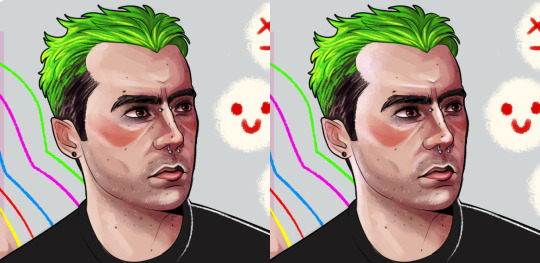
im someone who loves looking at references! if you get stuck on where the highlights should go, looking at photos should definitely help. the main places i tend to put highlights are nose, chin, and cheekbones as they stick out and tend to get light bouncing off them, and forehead bc its a big ol' vast space of nothing where light tends to hit. again like with the shadows i build up the highlights and they tend to look lightest in the areas i just mentioned.
finally ill go in with the finishing touches which arent the same for every piece so i wont go too detailed here - i went in for a rim light around the outside of the face for this one as i think it tends to make the features pop especially against the darker shadows, and i also threw in a blue overlay layer at 25% over the top of this one for that melancholy lighting feel:

BASICALLY what this all boils down to is - i love to put every single tiny little thing on a new layer. i love using layers! i think using layers in your art might help making things looks less muddy, as the shading is all separate and you can mess around using different colour shades before you get something that feels right! if im drawing a fullbody with a background i tend to hit sais maximum layer count and have to start merging things!
also want to reiterate this is just how i do things and isnt the be all and end all. if you decide to do something completely different thats great - im always feeling at awe of people who do everything on one or two layers! ive built this drawing style up over many years and it comes very naturally to me now. i treat hair and clothes in a kinda similar way - i.e. building up multiple shadow and highlight layers.
sorry for how long this got, ive never been asked this before and got very excited LOL! thanks for the ask 🥰
#sorry i got carried away lol#anon#ask#i 4got to turn the eyeliner tears layer back on at the end but u get the idea shfjkhfdshfk#personal
4 notes
·
View notes
Text
@velvet-impala tagged me to answer this long set of questions, and bc I love this sort of thing I’m DOING IT! I’ll tag folks here just in case you don’t want to read thru this whole dang thing. But I wanna say: if you want to do this, PLEASE DO IT and tag me so I can see-- I *love* reading responses to stuff like this. But @la-paritalienne @disgruntledkittenface @and-id-marry-larry @calmrry @crinkle-eyed-boo @lightwoodsmagic -- y’all are tagged :)
1. Do you prefer writing with a black pen or blue pen? black, but what matters most is how smoothly it writes.
2. Would you prefer to live in the country or city? walkable neighborhood in a city. 3. If you could learn a new skill what would it be? would love to learn how to hack into billionaire bank accounts without getting caught so i could redistribute their wealth to a variety of mutual aid funds. :) 4. Do you drink your tea/coffee with sugar? no, just milk! unless it’s really shitty/bitter coffee, and then i will take it with a couple sugars or sweetened creamer.
5. What was your favourite book as a child? probably the Anne of Green Gables books 6. Do you prefer baths or showers? showers! i wanna love a bath, but i get bored too fast and i never feel comfortable (where do i put my head? my feet? what do i do when my belly isn’t covered by the water and it gets cold?) so they’re meh.
7. If you could be a mythical creature, which one would it be? dryad! i wanna be a tree spirit!
8. Paper or electronic books? paper, i guess. but i do love reading fic electronically, so..
9. What is your favourite item of clothing? used to be my work hoodie. but now i would say this blue striped button down i have OR this one black dress i have with 3/4 sleeves that’s really soft and comfy.
10. Do you like your name or would you like to change it? i always meant to start going by Dottie when I got older, but it hasn’t happened yet so it probably won’t by now? but i would never change my name generally speaking.
more after the cut!
11. Who is a mentor to you? i had a co-worker who was really a mentor for me since i got into being a cheesemonger in 2008. he’s been in the industry for a long time and basically recruited me to the job i have/had here. but when i got sick he basically dropped me/hasn’t spoken to me in a long time. let me tell you: it fucking sucks. bc a mentor is a cross between a friend and a colleague and a relative; we jokingly called him my lesbian uncle. and so losing him from my life so completely over something like this is deeply shitty.
12. Would you like to be famous and if so, what for? not now, but before i was sick i would’ve said yes. BUT only bc i think i would be a great Saturday Night Live host (not a cast member! just a one time host with a monologue/skits). So whatever level of fame i needed to get that..
13. Are you a restless sleeper? I have really bad insomnia that means i take at least an hour to fall asleep most nights. Once I’m out, I usually sleep ok, but i do have intense dreams/nightmares that wake me up sometimes.
14. Do you consider yourself a romantic person? yeah :/
15. Which element best represents you? earth: the wet dirt and leaves in a forest after rain in particular
16. Who do you want to be closer to? emotionally i’m pretty good i think. physically i wish i could be closer to friends and family in NYC, Seattle area, TN/Atlanta, and Germany
17. Do you miss someone at the moment? the people referenced above. also missing my Grandmomma a lot lately and my mom.
18. Tell us about an early childhood memory. art lessons with my grandmomma. her set of pastels that were all worn down and the heavy paper (black) that she pulled out to work on. she drew a quick portrait of a man, showing me how to create depth in skin tones with blue and green against the softer flesh tones. she didn’t blend it out, the marks all painterly and strong-- her style. i was 10, maybe? 12? so not *early* but it feels like forever ago.
19. What is the strangest thing you have eaten? i have no idea? i’ve eaten a lot of weirdish cheeses. i’ve had geoduck?
20. What are you most thankful for? the amazing friends i’ve gathered into my life along the way, my dad, and my baby dog.
21. Do you like spicy food? yes, within reason (i don’t get stuff that’s spicy just for the heck of it, like ghost pepper chips or whatever? but when spice is integrated in with other flavors i love it)
22. Have you ever met someone famous? i used to make up stories about meeting famous people that were based on partial truths. i’ve hung out with or met a lot of gay famous people. but the biggest person who comes to mind is Sandra Bernhard. I sold her cheese. 23. Do you do you keep a diary or journal? i have over the years. now i sometimes write things down in a paper journal, but mostly go to a really old blogging site where i basically put all my big feelings down in a public but sorta private spot.
24. Do you prefer to use a pen or a pencil? depends on my mood.
25. What is your star sign? taurus sun and moon, gemini rising
26. Do you like your cereal soggy or crunchy? in between...not HARD crunchy, but not soft soggy.
27. What would you want your legacy to be? would like people to remember that i loved them well and made them feel good/happy when i was around them. and hopefully that it made them feel like being good to others too.
28. Do you like reading, what was the last book you read? i do, but i’m mostly reading fic these days. i think the thing i read last was Pink Like the Paradise Found, which was FANTASTIC!
29. How do you show someone you love them? i tell them, shower them with physical affection, and do little things for them. also try to remember small details about what they enjoy and then do stuff to make them feel good when they’re down
30. Do you like ice in your drinks? yes, but not too much
31. What are you afraid of? sometimes being along but only when it’s very dark out and i’m in the sads. honestly-- this is some deep internalized ableism but here it is --i’m very afraid of never getting better and not being able to take care of myself or anyone else.
32. What is your favourite scent? jasmine flowers, pu-er tea, the specific scents of people i love
33. Do you address older people by their name or surname? however they’re introduced i guess. maybe because i’m an older person lol
34. If money was not a factor, how would you live your life? i would live in the apartment i had alone (with a guest room). i would hire someone from my community to come help me out sometimes. i would get a weekly grocery delivery from the good quality place. i would have a dog walker. and i would fly home to see my family more than once a year and fly my family out for a visit sometimes. so like. probably the way a lot of ppl live? idk.
35. Do you prefer swimming in pools or the ocean? ocean
36. What would you do if you found £50 on the ground? get dinner at the thai restaurant down the street a couple times.
37. Have you ever seen a shooting star? yes, lots!
38. What is the one thing you would want to teach your children? i’m not having kids BUT for the kids in my life, i try to teach them/model the importance of consent and respect for their own bodies as well as other people’s. and i know it said one thing, but alongside that is that i respect and love them for who they are, and that’s something they get to decide.
39. If you had to have a tattoo, what would it be and where would you get it? i want a lot of tattoos, but if i could get one tomorrow it would be a cheese themed tattoo with a variety of cheese knives (parm tools, dutch style knife) and a small cheese assortment. or a portrait of my dog
40. What can you hear now? this kinda dumb netflix show that i decided to binge today even tho it’s only kinda meh and my dog snoring just a little.
41. Where do you feel the safest? when i’m surrounded by friends.
42. What is the one thing you want to overcome/conquer? my stupid money issues prolly
43. Of you could travel back to any era, what would it be? wanna go back to 1977 and live in the girl direction AU i wrote last year, lol.
44. What is your most used emoji? laugh crying emoji or sobbing maybe
45. Describe yourself using one word. colorful
46. What do you regret the most? not sure if this is a thing but i regret not realizing when i got bitten by a tick/got lyme disease the first time, bc maybe i could’ve just taken antibiotics and killed it, and then maybe i wouldn’t be sick?
47. Last movie you saw? watched the new charlie’s angels the other night
48. Last tv show you watched? this dumb show is called sweet magnolias, and it’s. honestly not terrible! it’s just not my style of show. OH WAIT i take it back, they left it on a really shitty cliffhanger without warning, and that is the one way to make me drop your show/fic HARD unless i like. genuinely love you. so byeeee dumb show, hope you get cancelled
49. Invent a word and it’s meaning. saungry: sadness brought on by being hungry, like hangry except oops you’re crying now! example: “fuck i knew i should’ve eaten before calling my best friend, now i miss them and i’m too saungry to figure out what to eat! Guess I’ll have tears for dinner” (almost called it sungry, but the internet thinks that might just mean ‘so hungry’)
did you make it to the end? WOW! devotion. thank you.
17 notes
·
View notes
Text
July 25th-July 31st, 2020 Creator Babble Archive
The archive for the Creator Babble chat that occurred from July 25th, 2020 to July 31st, 2020. The chat focused on the following question:
Where can your comic be read, what is it about, and why should people read it?
carcarchu
last one
mariah (rainy day dreams)
You can read Rainy Day Dreams on it's homesite: http://rainydaydreams.mariahcurrey.com/ Book 1 of RDD is also currently in pre-orders for both physical and digital books. This volume collects the newly redrawn and remastered first five charters. Currently not all of those pages are online so book buyers will get to see them first https://gumroad.com/mariahcurrey Rainy Day Dreams is a manga influenced, character driven supernatural story with dreamlike pacing. It follows the lives Tristin, an excitable and friendly human who becomes trapped in the Nameless World after a treasure hunt gone wrong, Mara, a reclusive retired knight belonging to an ancient lineage of psychics, and Michael, a sad vampire torn between his vampire instincts and being the soft boy he is deep down. Come for the compelling characters, interpersonal drama, and found family, stay for the underlying slow build of the cosmic machinations of the Nameless World's gods and a villain from the past bent on undoing the very fabric of reality. Reasons you should read it beyond the above pitch: - I've been told by frequently people find it's relaxing to read. We all need a little relaxation - Has a female driven narrative - I take every chance I get to put my characters in ball gowns or party dresses - Monsters! Cute monsters, scary monsters! Monsters that want to eat you, monsters that want to smooch you! - I make this comic traditionally with ink wash so enjoy all the beautiful ink blooms! - Chapter 18 starts this week
CoppertheCarutor
Oh wow, I missed out on A LOT! Dang! Well, here it goes I guess. To start off, please read with discretion, this project is rated R/17+ and for now contains: Abuse, discussion of suicide, blood, violence, queerphobia, trauma, mental illness, self-harm, mild body horror, substance abuse, profanity and full-frontal nudity. You can read my comic, The Guide to a Healthy Relationship, on it's main site: http://tgtahr.spiderforest.com/ I also have it posted on Tapas, Webtoons (nudity censored), Comicfury, FlowFo and Itch.io. The Guide to a Healthy Relationship is a slowburn character driven psychological drama about an emotionally immature alcoholic trying to make amends, and fix his friendship with his ex-childhood friend upon discovering they're not dead. Unfortunately the situation is much more complicated and serious than he can comprehend. Why you should check it out: - Possibly interesting if you enjoy non-fantastical character studies and/or Psychology. - May be cathartic if you like consuming heavy content in a controlled environment. - Has some light horror elements. - Contains an extremely flawed LGBT+ cast. - No romance. - This comic is drawn traditionally with pens and color pencils. - The story is a little over halfway finished. - Contains/will contain beaches if you like the beach. - Lots of sky shots.(edited)
Krispy §[Ghost Junk Sickness]§
(Ahhh this was hard to write out, i'll really miss this server) Ghost Junk Sickness is a free to read LGBTQ+ sci-fi that tackles themes of found family, accountability, and acceptance. It rated T for it's course language and violence, and can be read on it's official website, < https://www.ghostjunksickness.com/ > . Books 1-3 are available on the store (link on site) and we're currently on our way to wrap up and print vol 4! Ghost Junk Sickness is about two bounty hunters with an unstable dynamic who are pushed to pursue the elusive and deadly bounty dubbed The Ghost. It updates mondays and fridays, features an extensive cast with queer rep, topics about dealing with trauma, responsibility, and taking control. GJS has: -Space ships! -Lived in worlds/ extensive world building through illustrative backgrounds and characters - Slow burn character growth, expanding relationships, and new love -Drawn traditionally and worked on by a team of two! -Long run story that reached the halfway point, GJS has a huge buffer of over 800 pages now, so it's a time sinker! - hot lizard lady (best part)
Eightfish (Puppeteer)
holy shit 800 page buffr
OH wait by buffer you mean archive omg
Krispy §[Ghost Junk Sickness]§
(oh YE we only have 70 page buffer now woohopps lol)
Eightfish (Puppeteer)
holy shit 70 page buffer
that's like 10 months
eliushi [Keyspace]
KEYSPACE: A Winged Tale is a story about kids with wings for hair, and can be found at https://www.webtoons.com/en/challenge/keyspace-a-winged-tale/list?title_no=322364 https://tapas.io/series/KEYSPACE-A-Winged-Tale/ TW: Body Horror (comes with having wings sprouting from the head and more) Keyspace is my passion project about a world between portals that is dying. A Winged Tale is the first story of this series and touches upon the deeper magic that unites the work. It’s about a wingless girl trying to find her missing scientist mother in a laboratory beneath a forest, winged children discovering their origins and Machines that once ravaged the world, now lost. It’s a story for those who grew up with Studio Ghibli stories but want a little more complications and lore but still retain hope for the future. TL;DR: Come for winged hair, sad robots, possibly dragons, lots of science. The comic returns August 1
CoppertheCarutor
AH! Thank you for reminding about a couple content warnings I forgot to add.
LadyLazuli (Phantomarine)
Phantomarine is a story about a haunted ocean, a ghostly princess, and her journey to save her soul from a death god known as the Red Tide King. http://www.phantomarine.com/ TW: death, body horror, limb loss Princess Phaedra's untimely and mysterious death casts her out into the dark waters of the Candlelight Sea, forcing her to wander the world as an ethereal seaghost. Her journey toward resurrection quickly evolves into a grand maritime adventure on her ship, the Mantaluna, along with a crew of similarly-cursed friends and familiars. But Phaedra's mission has a dark undercurrent to it - a divine mystery that, when solved, will force her to question everything about her life, her death, and her world's long-dead past. If you like:
-THE COLOR BLUE (or just the ocean) -general spookiness that never gets too dark or gory -flamboyant villains of various kinds -swashbuckling pirate-y stories -fancy boats and pretty islands -big elemental animal gods fighting -friends and family fighting for each other -lots of hero-vs-villain salt and sass -DOGS
then heck yeah, this is your comic (edited)
Miranda (Into the Swell)
Into the Swell is about a Pirate with nothing left to lose but his life and a Wizard who wants more than a life of entertaining royals with party tricks being thrown together on the treasure hunt of their lives. The official blurb is: Ocean swells are remnants of storms hundreds of miles away. So do past actions cause swells of destiny on the shores of the present. Fate will always find a way. Given the choice between a one way trip to the gallows or a return to high sea adventure, imprisoned pirate Fletcher makes the obvious choice. With Court appointed wizard Kelwyn watching his every move, the two set off to reclaim a stolen treasure for King and Country. The ocean journey leads the duo through uncharted waters that hide dangers and secrets that could unravel the very fabric of their lives. Could this treasure hunt prove more adventure than they bargained for? TW: deaths? You can find it on https://tapas.io/series/into-the-swell or Webtoons It’s just starting out so there’s not much yet but you gotta start somewhere!
Cronaj ~{Whispers of the Past}~
Heyo! For all you who don't yet know me, I work on Whispers of the Past, a fantasy comic about a farm girl and an amnesiac elf man going on a journey to learn who they really are. https://www.webtoons.com/en/challenge/whispers-of-the-past/list?title_no=191366 Age Rating: PG-13 or T+ TW: death and corpses, blood and violence, bladed weapons, profanity, depictions of racial discrimination, alcohol, miscarriage, suicide, suggestive content Magical powers can only come from the other side... When Aniya discovers a foreigner with amnesia, she sets out to help him find the answers to his nightmares. Along with their growing feelings for one another, they will uncover an identity riddled with magic, bloodlines, and betrayal. What WotP has to offer: - a unique painterly art style - in-depth world-building (including a conlang) - hurt/comfort themes - hella family drama - MAGIC - ace, bi, and POC representation - cute romance - If you like high fantasy like ATLA, this might be right up your alley
Nutty (Court of Roses)
I wanna say first of all that thank you for this server. Even if I couldn't participate often, it was a lovely place, love you all!! Court of Roses is in several places, but its main site on Spiderforest is a page ahead! Best place to read it is here: http://courtofroses.spiderforest.com/ As summer comes to an end in the kingdom of Prismal, the Bardic Festival is in full swing, bringing together musicians and minstrels from all over. But amidst the celebration, a sinister plot of murder unfolds... Follow a ragtag group of bards as they band together and travel the realm of Prismal; Merlow the Rose, half-elf, charismatic leader, bagpiper, and perpetual drunk; Diana the Fleetfoot Fletcher, human tidinit player with a heart of gold; Nocturne, brooding but classy Infernal and violinist; Sven Rockscreamer, goliath drummer and seeker of justice; and Feliks Halfdance, curious gnome who plays accordion and magically conjures their entire backup. And who knows! Mayhaps they'll solve a murder mystery together! The comic is greatly LGBTQ-friendly, and takes inspiration from both classic fantasy themes (Dungeons and Dragons, Lord of the Rings, The Elder Scrolls, etc.) as well as music across all genres. Specific pages and scenes might even include their own suggested theme songs in the author notes. Contains Fantasy Violence and Alcohol Use(edited)
AntiBunny
You can as always read my comic at http://AntiBunny.net/ and is a film noir inspired story about anthropomorphic rabbits and the difficulty with coexisting with humanity. Crime and conspiracies move the plot along, but in film noir there's rarely a clear black and white. Why should you read it? Do you like stories about crime and conspiracies? Do you like bunnies? Do you want to see a contrast of cute and grim, and see relatable characters who deal with mental health issues, and fight a struggle for acceptance? Do you ask yourself the question what is identity? Well then this is for you.
You can find my other comic at http://nailbat.AntiBunny.net/. Nailbat is part of the AntiBunny universe, and deals with many of the same issues, but using a more straightforward and action packed superhero story. If you love superheroes and action you'll enjoy it, and maybe along the way get into the deeper lore of the AntiBunny world.
Holmeaa - working on WAYFINDERS
Thanks everyone who I have chattet with in here, it has been a delight <3 Wayfinders: Off Course Can be read on Tapas or Webtoons (I prefer tapas ) https://linktr.ee/snackbagstudios Whats it about? You may ask. In a world where magic is as natural as breathing, and the gods are known to actually answer some prayers, a ship is sent to keep the fragile peace between 2 countries that has been at war for 60 years. But guess what? The ship crashes almost immediately. Now the 3 only survivors, a runaway monk, with unexplained powers, the noble son and peace advocate, and a chaos child with an affinity for magic washes ashore on an unknown island and is forced together by a magical compass. With navigation, and magic being broken, it is not an easy task to cross the ocean. If only they knew of the chaos which is unravelling outside their comfortable lives. If they thought this adventure was going to be uneventful, they are in for a surprise. Why should you read it? It is a mix between the Road to Eldorado, and Avatar the Last Airbender, and if that short pitch is not enough, I don't know how else to sell it. It has fun colors, anime reference, and a lot of ocean and sinister magics Thanks to all the admins for putting in so much work in this server
Feather J. Fern
Okay, I have like three comics, and the fourth one coming soon so.....Lets get the easy ones out of the way. On Webtoons, you can read Teasday or Don't you hate it when...(DYHIW) https://www.webtoons.com/en/challenge/dont-you-hate-it-when/list?title_no=486501 https://www.webtoons.com/en/challenge/teasday/list?title_no=169870&page=1 DYHIW is a gag comic, so if you want a little laugh to brighten your week, feel free to check it out. Teasday is a tea informative comic, but it's on a bit of a hiatus and ending soon. My current project is Gravitational Pull, a story about a depressed magical girl trying to save the world while also trying to get the energy to leave her bed that day. Read it if you like magical girls, space and representation of anxiety, depression, inferiority complex and learning to take each day slowly. http://gravitationalpull.featheryterrarium.com/ And when it comes out, Go Figure is my comedy action webtoon about someone who wants to use a powerful wish to cure their asthma and allergies over anything else.
sssfrs (JOE IS DEAD)
JOE IS DEAD A band of pirates are visiting an island and they discover the dead body of their astronomer JOSEPH CINNABAR. He leaves behind a will with mysterious instructions that none of the pirates really feel like following. The crew decide to send the least-liked and least responsible pirate of them all on a solo mission to carry out Joe's final wishes. If you like: - Alternate historical timelines where the United States doesn't exist - Gay, lesbian, and transgender pirates - Morbid humor, death, dying - Biblical allusion - Warm colors - Alliteration - My handwriting - Birds or anything else, you will love to read JOE IS DEAD, a webcomic worked on entirely by me that will be at 150 pages within a week or so. My background is in marine biology and satirical writing, so I promise you this comic is funny and scientifically accurate. Rated PG 13, mild violence and swearing Where can I read it Read it on http://joeisdead.com/ (the main hosting website with some functional html) or on Tapas: https://tapas.io/series/JoeIsDead It's also on Webtoons but it's a couple chapters behind on there You can follow me on Twitter for information about updates https://twitter.com/sssfrs_
boogeymadam
Sink Your Hookteeth An LGBT+ Cosmic Horror/Love story about eldritch merfolk that fall for a pair of humans who are studying mermaids to cure a supernatural illness. CW: bodyhorror, gore, upperbody nudity, sickness, drowning, tryophobia, eye trauma, If you like:
-sea monsters
-big teeth
-painted comics
-nonbinary and binary transgender, lesbian, bisexual, and pansexual protagonists
-neurodivergent protagonists
-goofy friendship dynamics
-nasty and imperfect wlw couples
-enemies to lovers trope
-childhood friends to lovers trope
then this is a comic you might enjoy :D! It finished chapter 1 a few months ago with 195 pages, takes maybe an hour or two to read, and is currently on hiatus while I am building chapter 2's buffer. You can read it on Its own site https://hookteethcomic.com/ Webtoons https://www.webtoons.com/en/challenge/hookteeth/list?title_no=300709 Tapas https://tapas.io/series/Hookteeth/info
also i need to read more of these but joe is dead, wayfinders, keyspace: a winged tale, phantomarine, ghost junk sickness, the guide to a healthy relationship, and court of roses are all absolutely amazing and -chefs kiss- please give them all read if you aren't yet!
varethane
Comics!! Chirault A young half-demon named Teeko has been forced from her home, and to make matters worse, is now the size of a squirrel thanks to a wayward magic spell. Her only protection is the demon-hunter Kiran, who is a demon himself and lacks patience for children. Together, they must seek the help of a mage to reverse the spell on Teeko, but the journey is far from straightforward.. My first webcomic-- it's complete, it's a high fantasy adventure comic about finding family, fighting monsters, and also making friends with monsters (both outside and... inside). Check it out if you enjoy any of those things! http://chirault.sevensmith.net/ Wychwood Tiara is a delinquent who has been using a mysterious power to goof around for years without realizing the kind of attention it could attract. When a powerful organization finally tracks her down and attempts to recruit her, she has to decide what she really stands for. This is my new/current webcomic! It's a sci-fantasy genre-blender, with bits of post-apocalypse and urban fantasy thrown in as a treat just for fun. If you enjoy stories involving evil organizations, fire-flinging delinquents, and angsty supersoldiers, give it a look :U (Chapter 4 has just gotten started!) http://wychwood.sevensmith.net/
TaliePlume
Feather Cleanse (French: Nettoyage des plumes, Haitian Creole: Plim Geri) is a supernatural, sci-fi and military Shonen manga. Set in the year 2034 in the Haitian kingdom, Vérité Kindgom, the story follows 14 year old Soleil Andirans, her two older brothers and their cousin who joins their kingdom's military program to help Soleil find a wanted criminal and stopping a mad scientist from taking over the kingdom. This is a personal project that is very dear to me and I can't wait to share with you all hopefully around June of 2023. Why should you read it: -A positive Haitian representation -Strong female protagonist -Learning about a new culture - Family Bonds -Mad Scientists and experimentations - Criminal MasterMinds - Servant and Master relationships -Kings and Queens/Royalties -Dynamic and Impactful Fights Then, this is the comic for you.
shadowhood {SunnyxRain}
Alrighty cracks knuckles SunnyxRain, a webcomic about monsters surviving college.....BY THE POWER OF FANFICTION. Follow Sunny Dupont, a gluttony demon as she navigates college life and fanfic writing with the help of her housemates Liam (a qilin she roped in as her beta/editor) and Aron (an ocean naga as a fan). A story of trauma recovery and learning lessons about life and love. If you like: -housemate shenanigans -fanfic/fandom culture exploration -kickass but seriously flawed protagonists recovering from trauma - VOID CAT -LGBTQ+ cast because I can -coffee gremlin cryptid dudes -sweet slow burn romance -lesser known mythological creature representation Then this webcomic is for you to read, and y'all can come read it here! https://tapas.io/series/SunnyxRain/info and HERE https://www.webtoons.com/en/challenge/sunnyxrain/list?title_no=409335(edited)
Deo101 [Millennium]
Well, Here we go ^^ I have 2 comics right now, so: Millennium: A sci fi adventure featuring two best friends as they seek to help anyone and everyone they can, where we put together a bit of a misfit crew who are all intent on bettering themselves and the world around them. It's a lighthearted, LGBT+ Slowburn The sci fi is soft and so are the characters It's got found family, hurt/comfort, and gentle handling of heavier themes. It's easy to read and shouldn't make you think too much, it's just an hour or two of simple adventure between friends! It can be read a lot of places! My personal site: https://millennium.spiderforest.com/ Webtoons: https://www.webtoons.com/en/challenge/millennium/list?title_no=110866&page=1 Tapas: https://tapas.io/series/Millennium Comic Fury: http://millennium.thecomicseries.com/ and Tumblr!: https://millennium-comic.tumblr.com/ Time and Time Again: A noir mystery about time traveling vampires! We follow Adam, a vampire, and his subject of study, Steve, the first werewolf/vampire. The two of them are trapped in the 20's, looking to solve the mystery of a missing relic. It's a limited palette, scroll style comic if you're looking for a bit more action and higher stakes, and a more serious tone, then this one might be a better fit for you than Millennium ^^ I'm planning on finishing it up relatively soon, so get in on it now! (It's currently on a short hiatus while school is doing me in) It can only be read on tapas! https://tapas.io/series/Time-and-Time-again
kayotics
Ingress Adventuring Company You can read Ingress Adventuring Company at https://www.ingress-comic.com/ TW: some gore, blood, violence Saving the world is a pretty big deal, but what do you do once you’re done with that and no one needs you anymore? Do you become a magic professor? Do you study a convoluted thesis that no one understands? Maybe you relive the glory days by starting up a one-man adventuring party to gather mystical artifacts for people who may or may not pay you. Or, if you’re Toivo Kissa, you do all of those things. Reasons to check it out! - You like D&D or other stories inspired by it - It’s got bittersweet comedy - Very fun villains - Expressive art - Elves. Just a lot of elves. - Sad Dads and old men - LGBTQ+ cast
maxwestart
Poison Ivy Gulch is hosted on its own WordPress site: http://www.poisonivygulch.com/ Poison Ivy Gulch is a funny Western set in a frontier town in the 1870s. The protagonists are Lotta Doler, a gambler, and her kid sidekick Ace. Other characters include a marshal, an undertaker, a prospector and many extras. Poison Ivy Gulch is a spiritual successor to Tumbleweeds. If you like Blazing Saddles, you'll love this!
sagaholmgaard
Ahh dang, thanks for the heads up!! Here it is: https://tapas.io/series/_Reclaim_ My comic, Reclaim, is about a prince that has to deal with the aftermath of a successful coup. His father is imprisoned and sentenced to death, and he's in hiding with his dear bodyguard. Now he has to save his dad and reclaim the throne from the power-hungry witch warrior Irene, but how can the two of them hope to stand a chance against the entire force of the empire? And what was the real reason for the coup in the first place? This is for people who want a heartfelt fantasy story, with inspiration from Steven Universe and themes around being a better person than you were yesterday, and sticking together through hardships!
PiraPiranha
DEPARTURE is a story about dead brothers, hot guys and competent women! Lights! Camera! Action! The flaws of our predecessors are the burdens that we carry today! As galactic governance has been passed down from generation to generation of divine beings, the wars and insecurities of the previous pantheons are weighing down on our world. Whether it’s vanquishing your greatest enemies, or buying tomorrow’s cereal, keeping this flaming shipwreck of a universe together is going to require a little elbow grease, and a lot of flashy super powers! Follow Kovit, a space fighter turned part-time cook and his friends Casey (Cool, has a nice jacket) and Vermillion (Dumb, has stupid hair) as he tries to help the most powerful beings in the universe keep it together (Ostensibly by beating them up). Check it out here! http://departurecomic.cfw.me/(edited)
seetherabbit
Vulperra is an anthology comic featuring superheros, cowboys and regular common folk in the fantasy world of Vulperra. Most of the stories are about the hero Flash Gauntlet, who travels from place to place to solve problems with his magical gauntlets which were bestowed to him by the goddess of the land. https://vulperra.com/
NAAN
Legendary Beings Ara & Celi is about a young girl, Miyara, who is chosen to be the successor to a specific line of Angels – headed by none other than Ara–and with it, duties that extend beyond the physical world. Only one problem: Miyara has no desire to do the job! What will happen then, especially with Celi, Ara’s counterpart, is intent on causing chaos in her life?! You can read Ara & Celi at its main site: http://ac.jadinerhinestudios.com/ Here is the Webtoons mirror: https://www.webtoons.com/en/challenge/legendary-beings-ara-celi/list?title_no=59422 Doesn't have any trigger warnings (maybe that (1) page in chapter 2 is too creepy-crawly for anyone?), and it's currently on hiatus because I'm working on chapter 4, will update again when I have completed it! So enjoy the 3 chapters so far! If you like: • MAGICAL GOILS • an old school b&w shoujo manga style (according to some people, and I don't even do it on purpose ) • on that note, since the 3rd chapter, the comic is drawn traditionally! (all covers are in color and traditional) • expressive comedy • language jokes and notes • angels and demons, yes, it's one of those but is anybody really the bad guy here • a lion and a jinn walk into a bar-- • slow worldbuilding and character development • heck if I know what else, you should just check it out and tell me what you think later like in the good ol' days
L Hornsby
Heyo, I haven't been very active. I'm not used to Discord. If anybody would like some silly comics about puppies that live in the clouds and enjoy parties (and also happen to be princesses) my comic Princess Pups has you covered. It's all ages friendly so if you have younger kids you want to get into comics, it's a swell read according to my 3 years old :) https://tapas.io/series/Princess-Pups/info
carcarchu
@L Hornsby oh i didn't know you were in this server! i actually read your comic because our comics have really similar names ahaha
L Hornsby
Oh wow hey there! :)
I usually lurk on Instagram and Twitter these days and have been crocheting more than comics lately
mathtans
What the heck, been on hiatus more than a year but there's an archive and it's not like there's any dangling plot points. I personify mathematics! Because equations are people too. The hairstyles are the graphs, and there are puns.
Main site: http://mathtans.ca/
Tapas mirror: https://tapas.io/series/Any-Q
It's called "Any ~Qs" because notQ is the symbol for irrational numbers. So anything irrational, in a sense. Very G rated - maybe PG, some discussion of biological sex and tangential politics. Enjoy, possibly.(edited)
Spring-heeled Jack
Hey all! My comic is a horror comic that features some LGBTQA+ characters in the main cast. Today is also my monthly update on public sites. I do four pages at the end of the month on Tapas, Webtoons, and my website. (Patreon gets weekly updates.) It is a story of a picturesque town with a dark secret and what will be done to keep that secret. I follow a few characters through the the twisting plot and show how the darker side of this town affects them. I think this would be PG13 mostly because there will be some blood, but there are no sexual situations. Currently Tapas has the most recent free pages as I will have to do Webtoon and the website manually later today. Happy reading and please do let me know what you think! <3 Website: https://www.iamfilledwithstatic.com/crocus Tapas: https://tapas.io/series/crocusheights Webtoon: https://www.webtoons.com/en/challenge/the-secret-of-crocus-heights/list?title_no=405820 Patreon: https://www.patreon.com/iamfilledwithstatic
DanielHookerArt
I have a series of self published graphic novels. When all copies of the first volume sold out I posted it on Webtoon. It's sort of a Isekai Mystery Adventure, inspired by the 1980's movie Labyrinth.
https://www.webtoons.com/en/challenge/line-of-ruin/list?title_no=232705
StickFreeks
Hi I'm Christy! I make the webcomic / graphic novel series EXTRA! It's about Extras in the backgrounds of a movie world escaping their fates of getting killed off... by going to go ask the Producer to stop killing them off. (Sort of like The Truman Show, but everyone is in on it.) You can read it at https://extra-comic.com/ I'm always looking to make new comic buddies! (edited)
Annausagi2
Hello! I joined right at the announcement of the channel shutting down, so bad timing. :,O I've been working on my webcomic Helix since 2012: Read from the start here: http://helixcomic.com/ Description/warnings: A street rat is given a second chance when he is dragged from the gutter and into a new life. Will he accept his position at the side of royalty, or fight every step of the way? -Rated M for sex (M/M, consensual), violence, nudity, language, and dark themes.- Warnings: -References to child abuse and sexual abuse.- If you can handle these subjects, I hope you'll enjoy the comic. :) Thanks for reading! UPDATES EVERY WEDNESDAY! ~ Support me on Patreon: https://www.patreon.com/Annausagi2 ~ Join us on Twitter: https://twitter.com/Annausagi2
Kalli
I joined right when things were shutting down too :( Just my luck Anyway! I'm Kalli and I have a fully traditionally drawn webcomic, called World of Ruan! https://www.worldofruan.com/ It's a post apocalyptic, sci fi adventure type story, following Cait, a mutant mouse/human hybrid and Roxy, her robot companion! I update every Saturday~ And I'm always down for meeting new comic friends!
Cap’n Lee (Flowerlark Studios)
I make Children of Shadow: Ashes and Dark Wings: Eryl. Ashes is an urban fantasy / horror about teens with supernatural powers who have to team up with woodland critters to save the world from twisted monsters. It’s rated PG-13 and has mild language, graphic violence, and intense scenes. Eryl is a dark high fantasy about a fallen angel, a woman on a journey to find a dragon, and a wyvern who has been kidnapped. It’s rated 16+ and contains strong language, nonsexual nudity, and graphic violence. https://twitter.com/kickyourwrasse/status/1277315129793826816?s=21
Tuyetnhi (Only In Your Dreams!)
Only In Your Dreams! is a rom-com Drama comic featuring shoujo and future LGBT+ elements. Also a mainly BIPOC cast! Rated: PG16+ There are some suggestive language & content, and partial nudity. “Cara Luong is tired of her failed dating attempts and settles for Richie, her imaginary lover every night in her sleep. When given a chance to meet him in person for the first time, she suddenly forgets their long-term romance! Now it’s up to Cara to decide if Richie can live as a real boyfriend. That is, if she wants him to exist in the first place!” What it contains: - Dumbassery moments between a dreamer and a dream boi - Expressions that you can feel it in your soul - Main romantic interest participating in healthy masculinity and embracing femmine traits - horror elements in a romance comic? huh-- - Himbo appreciation - A mixed-Black Vietnamese protag for this romantic rollercoaster lol If you're looking something self indulgent, read it why don't you? I release pages early on patreon! https://www.patreon.com/tuyetnhip Otherwise you can check out the site! It updates once bi-weekly on Wednesdays usually! http://oiydcomic.com/ Tapas: https://tapas.io/series/Only-In-Your-Dreams Webtoon: https://www.webtoons.com/en/challenge/only-in-your-dreams/list?title_no=115046 Other links: https://linktr.ee/oiydcomic
alizarin
I joined near the end of the server but I can't wait to participate in the reboot! So many interesting comics in here * _ * I make a comic called Patent the Sun, it basically reads like a big puzzle. It's about two characters who wake up without any memory, but slowly we learn about their whole universe and what happened to them. Oh and there's also magic, aliens, murder, and crossdressing https://www.webtoons.com/en/challenge/patent-the-sun/list?title_no=123560 https://tapas.io/series/Patent-the-Sun(edited)
Las Pinter
It is a pity that I was not so active here. I create the Tales From Somewhere comics, currently there are two of them: The Legend and The Secret. Both of them are high fantasy stories taking place in a fantasy world. The Legend is about three adventurers trying to survive in their realm. They are aware of being DnD like characters in a cruel world, where the DM wants to kill them as fast as he can... without luck so far. It has some comedy, action, horror and weird elements. This comic is ongoing since a long time, so expect to have big changes in the style and writing. The Secret is about an elf, who begins his journey from the world's end after an apocalyptic event. Accidentally meets a human thief girl, and now they are travelling together and figuring out what is happening to their world. This comic is currently being revamped and the story is continued parallelly. I would rate them R/17+ since they have some blood, violence, profanity and nudity. Website: https://www.talesfromsomewhere.com/ Tapas: - The Legend: https://tapas.io/series/Tales-From-Somewhere-The-Legend - The Secret: https://tapas.io/series/Tales-From-Somewhere-The-Secret Webtoons: - The Legend: https://www.webtoons.com/en/challenge/tales-from-somewhere-the-legend/list?title_no=77159 - The Secret: https://www.webtoons.com/en/challenge/tales-from-somewhere-the-secret/list?title_no=78355 And I'm on Twitter: https://twitter.com/thelaspinter
quietsnooze
Radio Silence is an award winning queer coming of age webcomic about a British rock band’s rise to fame. Hitting the road on a journey of self discovery and acceptance, this coming-of-age tale gives a backstage look at friendships and the plights of fame as experienced by a modern British rock band. On the fast track toward fame, the five members of the fictional British rock band, Radio Silence, enter into an exciting new life on the road with their best friends. As they tour across the United Kingdom, they excitedly embrace this new lifestyle and all the resulting challenges, including living in close quarters with each other with little privacy, and the overwhelming reaction of the public to their new-found success. Main site: http://radiosilencecomic.com/ Webtoons: https://www.webtoons.com/en/challenge/radio-silence/list?title_no=35242 Twitter: http://twitter.com/quietsnooze
Tired Programmer
This is mine. There will be update tomorrow (in 10 hours). https://tapas.io/series/The-story-of-how-humanity-has-thrown-itself-into-the-scrapyard Civilization, technologically advanced in the past, is now in decline. Killer and hacker are trying to survive and find the answers to their questions among the ruins. What will they meet in this crazy and cruel world of misused technologies? WARNING: strong language, violence and nudity. Only for adults.
JUNK
If any creators or readers are looking for another webcomic server to hang out in, you can check out this one: https://discord.gg/qjWJt7
I'll post it in the general channel too. :3
sierrabravo (Hans Vogel is Dead)
I wish we could have had a bit more time, but thanks everyone for creating such a great space for webcomic creators!! I make HANS VOGEL IS DEAD: an antifascist fairy tale with elements of historical fantasy. A German fighter pilot is shot down and killed during the Battle of Britain. When he wakes up in a fairytale afterlife, he learns what the evil he served has destroyed, and must undo the damage of fascism to become a better person. The end of Volume 1 is coming in the next two weeks, and September will be the fifth anniversary! You can read it on Webtoons: https://www.webtoons.com/en/challenge/hans-vogel-is-dead/list?title_no=62633 and find me on twitter! https://twitter.com/chjorniy_voron
Haruh2 (Colony Life)
This was such a great discord, hopefully we can keep in touch and still chat about comics and such my twitter is : https://twitter.com/Haruh2 Here is my comic Colony Life, ive been working on this for abit and will always love making this comic no matter what https://www.webtoons.com/en/challenge/colony-life/list?title_no=193784
boniae
I regret that I wasn't more active in here besides occasional lurking, but I always think back fondly to the CTP chat that my comic was discussed in, it was the first time I ever got to see so much in depth feedback and analysis on my comic and I will forever appreciate this server Four Corners is set in 1995, Yokohama, as the story follows Kazuhiro Tsuchiya who now leads his deceased brother's legendary gang, the Four Corners. Kazuhiro is approached by Hideki Yuhara, a schoolmate who claims to have vital information that Kazuhiro should be wary of. The two unlikely delinquents pair up to figure out the reason as to why gangs in the city are being brutally eliminated...though the unraveling of the mystery is darker than it appears. How far will Kazuhiro and Hideki go to rest their case? If you're looking for a slow burn lgbt romance, 90s manga nostalgia, drama, mystery, and a story with a general theme of: misfits who come together against dangerous odds to protect others, especially the ones they love—come check it out! https://tapas.io/series/four-corners/ http://fourcornerscomic.com/ https://twitter.com/boniaeart
snuffysam (Super Galaxy Knights)
I'll really miss having a new comic to read every week! My comic is called Super Galaxy Knights Deluxe R. It's a story of a small woman from a small town who goes on adventures across a strange kingdom. Action, comedy, and very, very slow burn romance... http://sgkdr.thecomicseries.com/ https://tapas.io/series/sgkdr https://www.webtoons.com/en/challenge/super-galaxy-knights-deluxe-r/list?title_no=41795
LeahVillart
I haven't done much work or anything in general these past months because they've been utter shit for me. This year had stuff breaking in my home, my grandma died from covid, family issues, found out my 9yo dog has lymphoma (blood cancer) and I got to a break point and I'm trying to recover from all the shit. Now it's late and I'm tired so I'm gonna make a super sleepy pitching~ I make Teach Me To Kill a horror-comedy webcomic about a school of villains and killers where a new seemingly innocent teacher arrives to help the worst class become the horror legends they are "destined" to become. [IN ENGLISH AND SPANISH] If you like contradicting/opposite genres or themes you'll find it here, violence, blood, kills, but all done with a cute colorful style where nothing is as it seems. With a cast made of crazy humans, detectives, monstergirls and guys like -our sexy looking hybrid vampire Daki who didn't ask for any of the cards she's been dealt and only wants to find true love and not something attracted by her vampiric aura. - Our lil raven kid Nayla who is a sugar bomb ready to explode, but can break a mountain in two. - Kyllian, a boy who's managed to make a personality out of each of his expressions, which sometimes is helpful and others a horrible mistake. - Q.Bee, an innocent looking girl who radiates sensuality in some weird way luring her victims into her trap. You never know what she's thinking or could do at any moment. the cast and world is really huge and don't want to spoil more, but it's filled with slice of life, mystery, action, dark humor, romance, fantasy, paranormal stuff. A total mix. If you give it a read, thanks for doing so and hope you like it! <3 http://teachmetokill.com/(edited)
Comic Tea Party
This concludes our final #creator_babble chat. Thank you so much to all the wonderful creators who have participated in this chat over its existence. It has been great to see your enthusiasm for the craft of webcomics, as well as learn your unique stories of how you pursue it. We are positive these conversations have helped many other creators out, so we appreciate you having them. For this conversation, and all past #creator_babble chats, you’ll be able to find them archived here: https://comicteaparty.com/creatorbabble
#ctparchive#comics#webcomics#indie comics#comic chat#comic discussion#comic tea party#ctp#creator interview#comic creator interview#creator babble
2 notes
·
View notes
Note
Hi 👋 I remember a long time ago you said you do makeup on the side. I have a wedding coming up that I’m in and was wondering if you had any tips or recommendations, anything would great. Love your blog 💖
Aww thanks for remembering! I love doing makeup on the side, which hasn’t really happened with the whole Covid thing. Here are a few tips and products that I love.
Try to avoid getting a facial the week of the wedding. I know a lot of bride’s think that it will be a fun thing for all their bridesmaids to do, but unless you do them regularly, it could cause breakouts and that’s the last thing that you want. Same goes for masks. Stick to products that you already know work best for skin.
I always stick to a basic natural look, unless there is some sort of theme to the wedding. So any neutral palette will work. I know some people aren’t big Kardashian fans, but KKW Beauty’s Mrs. West palette is literally amazing and goes so well with anyone’s skin. I’ve used this on tons of bridesmaids and a few brides. I can totally help you out on application if you’d like as well. One tip for longer lasting eye shadow is to prime the lid first, I use MAC Pro Paint Pot in Painterly, in fact I use this almost everyday. If you don’t want to spend the money on that you can always prep your lids with foundation or concealer. Stick to eyeshadows that are highly pigmented. Some great brands are MAC, Lorac, Huda Beauty, and Jouer. Also, you can add a little shimmer to your lids, but stay away from glitter shadows.
Foundation is a bit trickier. I always use an airbrush foundation system when I do bridal. It stays on long and doesn’t cake, but I realize most people don’t have that option. My go to everyday foundation is MAC Studio Fix Fluid. Every time (no lie) I wear this foundation, someone compliments my complexion. I also love Tarte’s Face Tape. This is a great all-day full coverage foundation.
If you have and blemishes, roscia or dark spots you’re looking to cover, use a color corrector. Sephora has some great easily blendable ones. Green for red spots and peach to cover the dark. I recommend only doing these if you’re not using an airbrush foundation. Apply them before your foundation and just blend them out lightly, they help neutralize the skin.
For bridal I tend to finish off with a translucent powder. MAC has a great one, but you don’t have to go expensive as ELF cosmetics is just as good. Translucent powder doesn’t cake like regular ones will.
My favorite all time blush is NARS Orgasm. It goes with every skin tone and I feel like everyone should have this in their makeup drawer. Remember to apply just a hair bit more for pictures.
Contouring can be tricky if you’re not used to doing, but I always do the hollow of the cheeks for great pictures. Remember to blend blend blend, so you don’t have this unnatural cut in look. I usually use MAC Studio Fix Sculpt and Shape Contour Palette. Dab a little of the lightest color along the jawline for highlight.
Eyeliner is key, and I don’t recommend doing a wing unless there’s a theme to the wedding. I like to use Marc Jacob Highliner Gel Eye Crayon. It smudges easy but also stays put until the day is over. I usually wear it on the top smudged and at least halfway on the bottom (smudged as well) depending upon your eye shape. If you want to make small eyes look bigger only go part way, otherwise you can line the entire bottom. If you’re not big on eyeliner, you can always smudge a little eyeshadow on the top and bottom for a subtler look.
Mascara, I recommend waterproof if you’re a crier like me...lol. I’m a fan of Tarte’s Lights, Camera, Splashes. I usually prep with Lancome’s CIL Booster XL Enhancing Lash Primer, it helps keep my lashes separated, but if you don’t want to spend the money on that, take a little of that translucent powder I talked about earlier, coat an old mascara wand, or a disposable one with the powder and brush it onto your lashes before adding mascara. I’ve done this little trick numerous time and it works like a charm. You can also wear fake lashes, if you don’t have a pair that you like, Adrell has great ones that look natural and so does Eylure. I always use Duo lash glue when I wear them as well.
Ugh I feel like this is so long, but don’t forget lipstick. Nothing bright or crazy, unless, again it’s a theme. I always use a quick lip scrub to get any debris and dead skin off your lips. Then line your lips with some lip liner. I’m literally a MAC Lipstick whore, so I love Whirl, Soar and Devrish. I then pair it with a lip stick, MAC again, the shade will depend on what looks good on you and the time of year. I top it off with some Buxom Plumping Lip gloss in a complimentary shade.
I finish the look off with a setting spray. MAC Prep and Prime Fix + is a staple. You can spray it on before you start your look and then spray it again once you’re finished. But there are a ton of great ones out there Morphe, Tarte and Make Up Forever. You can always add a little highlighter to your cheekbones if you like, just don’t go overboard.
Things I carry in my makeup case that always come in handy, Q-tips, Wisps (because inevitably someone always forgets to brush their teeth or you are snacking while getting ready) a small sewing kit, perfume, bobby pins, and mints. These are just things I’ve found helpful, so as a bridesmaid you might want to have them on hand. Hope this is helpful. Hit me up with any other questions! Most of all have fun sweetie and remember to drink water along with all the alcohol…haha!
#Myhockey asks#Myhockey Makeup#Not hockey related#This is as long as a story#sorry about that#Makeup recs
1 note
·
View note