#page templates
Explore tagged Tumblr posts
Text
Resources page
May 20th, 2023

Updated my resources page to show screenshots of the template pages.
Added a "review page" template, .
20 notes
·
View notes
Note
How do you make your stamps? :0
Disclaimer: this is an obscenely long explanation, with pictures. Efficiency is stupid
So, for the static ones, I make a 99x56 px file on ibis paint x. Other programs are probably available online but I don't use them.
After that, I either upload an image I want to make into a stamp, or I draw one.
Then, I find a frame I want to use. Ill upload them here but let it be known I stole all of these right from deviantart


Most of them are from Lil-Devil-Melii on deviantart. The rest i have no idea. They're not all 99x56px but you can crop the canvas it's fine
Make sure to erase the edges of the picture , so they're transparent. It's not as cute otherwise
Upload those frames over your image in whatever art program you're using and viola, stamp.
For moving ones, it's a lot harder. Mostly because I refuse to download Photoshop.
There are a couple ways to do this. Some are simple animations, like with flashing text and whatnot. For these, you download the individual animation frames from your art program. Make sure it's transparent.
Then, upload each frame to ezgif.com under the option "GIF maker." You can play around with how fast each frame goes and whatnot but in the end, it'll be a stamp with some rad text that moves. This is easy, and doesn't make me want to shit my pants and cry. If you're new, do this. This is fun. This is good. This does not kill me inside
I made that↓ stamp with this method :)

this next one is how we turn gifs into stamps. This one makes me sad. It involves math and sucks. But we gotta do it. For the vibe
First, grab your gif. I'm using this cow gif because it's awesome

Then, I resize it using ezgif. Literally everything for this will be using ezgif. I am a simple man
At this point you should decide what frame to use. I'm using this one because its the first one I clicked

Figured out what size the inside of the frame is. That's what I resize the gif to, so the edges can be transparent. The inside of this one is 93x50 px, so those are the dimensions I'm making the gif.
Figure it out by putting the frame into ibis paint and realizing the canvas to fit just the inside of the frame, then seeing what the dimensions are. But there could be easier ways

Woah it's so small now
Then, still on ezgif, I go to the "crop" option.
Make sureeee to upload the smaller gif
press the button that says "extend canvas size", and then put the "width" and "height" as the dimensions for your FRAME. This'll put a bit of a transparent border around the gif. For this frame, I did 99px and 56px.
The "left" and "top" boxes show how many pixels the cropping happens from the edges of the canvas. The formula for finding that is
(width of gif / 2) - (difference between gif width and frame width / 2) = left box
For me it's (93 / 2) - (6 / 2) = 43.5
Then you do the same.for the height, which for me ends up being 22 from the top
This is reallyyy touchy and annoying though
Here's my result , with no visible difference

Okay so THEN you go to the "overlay" option, under "effects." And upload your frame. If the cropping was done right, you shouldn't have to move the frame at all and can just download it
Here's my result:

if you don't care about transparency, you can resize your gif to be the same size as the frame, and then put the frame over it. But I'm a slut for transparency
Anyways. I'm sorry if anything was unclear, it's two am. And I hope this was helpful :) these really are fun to make once you get it down
also if anyone has an easier way to make stamps from gifs, please god tell me
#web graphics#old web#neocities#custom#custom blinkies#stamps#page decor#web resources#da stamps#deviantart stamps#blinking gif#How to#tutorial#How to make stamps#Spacehey#deviantart#rentry graphics#old internet#early internet#stamp collecting#ezgif#stamp making#stamp template#Stamp frames#blinkies
5K notes
·
View notes
Text
𓏴 stamp templates !!


drawn by me, but there are only so many ways you can draw a 'basic' stamp outline ദ്ദി(• ˕ •マ
credit is appreciated but not required ! jus don't claim (the base) as yours. (when crediting, feel free to tag me. i love seeing whats being made ! /nf)
More stamp templates: zzoom , inky , catwebp , caterpillar
━━╋ while you are here, please be sure to see fleaseditstuff post about some popular stamp templates.
#rentry resources#rentry#rentry decor#editblr#carrd resources#pixels#carrd#stamp#stamps#rentry stamps#stamp template#rentry graphics#rentry pixels#web decor#web stamps#web graphics#pngs#rentry material#rentry stuff#carrd stuff#web resources#old web#page decor#neocities
2K notes
·
View notes
Text


stamp template based on old paint programs. i know it's a bit of a tight fit compared to some other templates, but it's usable regardless. examples ⬇️


#my creations#rentry#rentry resources#carrd#carrd resources#stamps#deviantart stamps#neocities#neocities stamps#web decor#page decor#stamp template
928 notes
·
View notes
Text
૮꒰ ˶• ༝ •˶꒱ა ♡ #𝐇𝐄𝐀𝐑𝐓 𝐃𝐈𝐕𝐈𝐃𝐄𝐑𝐒 ��𝐓. 𝟏
please like && reblog && give credit !


#my template#rph#dividers#aesthetic dividers#tumblr dividers#post dividers#carrd dividers#divider packs#divider#page dividers#text dividers#separators#cute dividers#tumblr layouts#heart divider#love divider#pastel dividers#peach dividers#orange dividers#yellow dividers#green dividers#blue dividers#purple dividers#pink dividers#black dividers#white dividers
2K notes
·
View notes
Text


ㅤ────ㅤㅤfree 2 use black rentry frames


⠀⠀⠀⠀

#⠀⨾ 𝓡 𝑒ntɾy fɾam𝑒s 𓂂 𓏵#rentry#rentry graphics#sntry inspo#sntry graphics#rentry resources#sntry decor#black#black and white#rentry template#carrd resources#carrd graphics#carrd frames#rentry frames#sntry frames#page decor
752 notes
·
View notes
Text


i made some stamp templates today too, theyr kinda janky but with some work theyr usable sooooo
#zzoomies creationzz#stamps#deviantart stamps#neocities#neocities stamps#web decor#page decor#stamp template
345 notes
·
View notes
Text
"sped up" "slowed down", IT'S NIGHTCORE AND DAYCORE.
#i'll cry#nightcore#daycore#music#music meme#music memes#best meme#tumblr meme#memes#tumblr memes#funny memes#dank memes#new memes#meme thing#meme tag#meme quotes#meme energy#meme response#meme reference#meme reply#meme reaction#meme trend#meme template#meme time#meme of the day#meme post#meme potential#meme page#meme account#meme shitpost
605 notes
·
View notes
Text

sorry for posting the same thing again but now it's colored and reblogable (? is this a word?)
#dragon age#the inquisitor#cullen rutherford#ellana lavellan#cullavellan#this is actually their bg3 versions. i um. have thoughts.#there was this one OC wiki page template going around and i decided to fill it out for my tav#(i'll post it. someday)#but my tav is my inquisitor's child. so now i have to put his parents into dnd setting too.#i have like 40 tabs open with links to the dnd wiki lmao. research!#the brainrot got me 😔
157 notes
·
View notes
Text


BLINKIE SET #61 . . . LGBT TEMPLATES!
I thought it'd be fun to compile a few templates to post, and then I ended up recoloring a few different ones for this set! feel free to use these however you'd like, more will be made eventually. :-)
in order: lesbian pride, rainbow flag, bisexual pride, transgender pride, xenogender pride, aroace pride, nonbinary pride, genderfluid pride, leather pride, & the original 1978 flag.
#lgbt#flashing lights#eye strain#page decoration#page decor#old web#old internet#blinkie#blinkies#blinkie templates
444 notes
·
View notes
Text


⿻ Simply Plural Blinkie + Badge ⿻
♯ F2U with credits and tag! Reblogs and likes appreciated
↳ Self Indulgent ⨾ no recolors / reposts ×
I was searching through my gallery and found this two things my brother (/in sys) did months ago so, why not share them? Even if I changed my font style for blinkies and I don't do badges (idk how he had the patience to do it????)

#⸝⸝⸝ paws in the stars⨾ 𓃦⟡ ݁₊ .#rentry graphics#f2u graphics#carrd graphics#edit resources#blinkies#rentry#rentry template#rentry inspo#rentry resources#rentry stuff#carrd decor#carrd resources#carrd stuff#rentry decor#blog decor#web decor#web graphics#web resources#imvu badges#imvu buttons#shiny buttons#page decor#simply plural
113 notes
·
View notes
Text
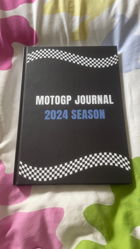
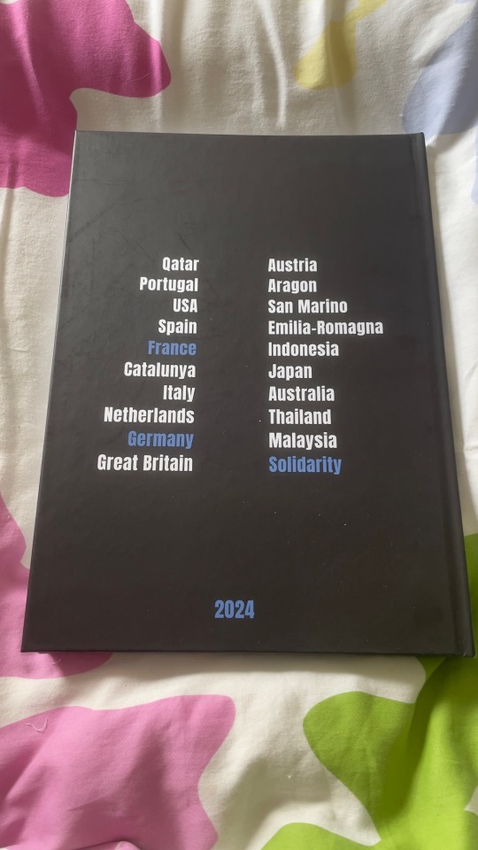
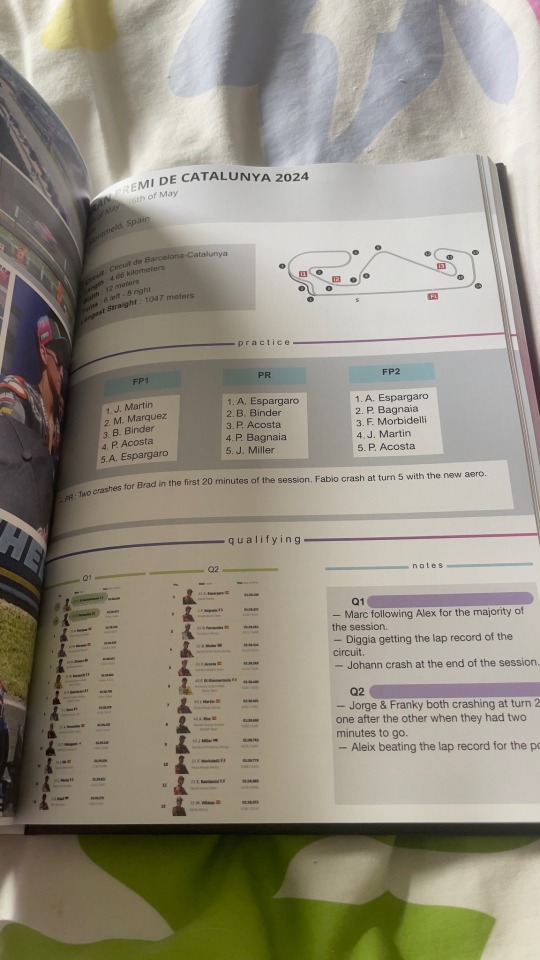
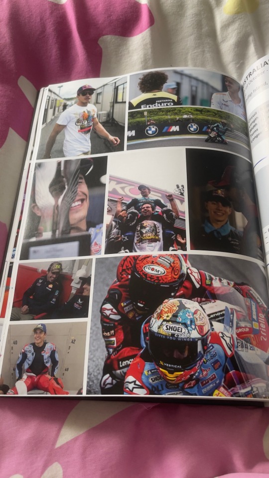
Printed my 2024 MotoGP journal and it came in the mail today (photos featuring my home bedspread).
#motogp#journals lb#this is now the most expensive book I own 🙃#worth it tho#in its 202 pages glory#except I noticed an issue with my photos template and the photo on the middle right is always a little too high / not aligned with the rest#but oh well#also my camera washes the colors out but they look really bright irl#*
120 notes
·
View notes
Text
New meme template
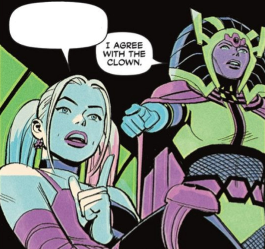
#dc#dc comics#comic books#comics#birds of prey 2023#birds of prey#comic pages#comic panels#memes#meme template#funny#harley quinn#big barda#humor#ideas#funny memes#comic characters#dr harleen quinzel#harleen frances quinzel#harleen quinzel#my memes
434 notes
·
View notes
Text
oh man this crowdstrike fiasco lol. for non-software people following this, the issue isn't that machines were updating automatically (because for enterprise security software, that's pretty normal), the issue is that they rolled this out to every single destination machine at the same time (rather than a "staged" rollout where you hit a small group of users at first to see how things go), apparently without doing the bare minimum of testing or quality control, on a FRIDAY
#cracking up because their official blog post about the outage has a free trial CTA at the bottom#which I'm sure is part of their blog template for all pages but still. read the room fellas
181 notes
·
View notes
Text


✂ kitchen notion template.
Links: install (free) | more notion templates by xue
Kitchen is a free Notion template for home chefs (anyone really!) to keep track of their favourite recipes, shopping lists, and plan meals. It’s a simple layout optimised for both mobile and desktop viewing.
Features: cookbook database, recipe templates, views for now cooking & new recipes, pantry database, shopping list views, two meal plan styles (page/calendar)
#polished up a more personal page for public release B)#got a few requests to make more notion stuff so here's a trial of something more basic & for everyday use#i'm polishing another big gaming-related template rn tho#notion templates by xue#notion#notion templates#xkitchen#cooking notion#free notion templates
165 notes
·
View notes
Text
૮꒰ ˶• ༝ •˶꒱ა ♡ #𝐒𝐓𝐀𝐑 𝐃𝐈𝐕𝐈𝐃𝐄𝐑𝐒 𝐏𝐓. 𝟑
please like && reblog && give credit!


#my template#rph#dividers#aesthetic dividers#tumblr dividers#post dividers#carrd dividers#divider packs#divider#page dividers#text dividers#separators#cute dividers#tumblr layouts#star divider#space divider#pastel dividers#peach dividers#orange dividers#yellow dividers#green dividers#blue dividers#purple dividers#pink dividers#black dividers#white dividers
1K notes
·
View notes