#or add a whole psd like this one and see what happens!
Explore tagged Tumblr posts
Text
I was tagged by @episims and @mrs-mquve-cc , thank you for thinking of me! 😊 This is long, so I’ve hidden most of it behind a cut.
1. What’s your favourite sims death?
Okay, I've watched a video showing all the ways sims can die in TS2, and I think my favourite is the one that can happen while using the wishing well.
2. Alpha CC or Maxis Match?
For my own game, maxis match. To each their own though, I like seeing everyone's games regardless of aesthetic.
3. Do you cheat when your sims gain weight?
What??? No. Is that a thing? Wait - I have cheated a test sim's weight when I made clothes to make sure that the fit and fat states work? It was more effort than just creating test models in a permanent testhood with different body states so I only did it once or twice.
4. Do you use move objects?
Yes, it's a must.
5. Favorite mod?
Community time, probably. Honorable mentions to Romantic Standards and Shiftable Everything.
6. First expansion/game/stuff pack you got?
...I don't remember. My family got TS1 & TS2 pretty much as they came out.
7. Do you pronounce “live mode” like aLIVE or LIVing?
aLIVE. Because "...and we're live!" I never really thought about the alternative.
8. Who’s your favorite sim that you’ve made?
Can I just say the whole of Deep Lorewood? I have such fondness for the whole hood, even though it's unfinished and unplayed. *heavy sigh* This blog doesn't even have Deep Lorewood pictures on it.
9. Have you made a simself?
Yep. Many years ago. Looked nothing like me.
10. What sim traits do you give yourself?
Creative, Cat Lover, Squeamish from TS4. Neurotic, Coward, Hopeless Romantic, Friendly, Easily Impressed from TS3. Shy/Nice/Serious/Neat/Active in TS2.
11. Which is your favorite EA hair color?
I kind of like them all?
12. Favorite EA hair?
Updoo and GelledRock.
13. Favorite life stage?
Teenager or adult, probably, since it opens up a lot of possibilities.
14. Are you a builder or are you in it for the gameplay?
It's like 70% gameplay, 30% build. I can get really into building sometimes, but it's not a regular thing.
15. Are you a CC creator?
I have created CC before. I have not created CC in quite a while though, and have no plans to in the near future.
16. Do you have any simblr friends/a sim squad?
There are simblrs that I consider myself friendly with, but no "friends" as such.
17. What’s your favorite game? (1, 2, 3, or 4)
Of those options, it's 2, clearly, but the handheld games were also a ton of fun.
18. Do you have any sims merch?
Nope.
19. Do you have a YouTube for sims?
Nope.
20. How has your “sim style” changed throughout your years of playing?
When I first started using CC, I used semi-realistic stuff and played in a custom hood. Now, I have veered quite hard into maxis match and play a LEPacy rooted in Strangetown.
21. What’s your Origin ID?
I don't think I have one.
22. Who’s your favorite CC creator?
I like so many though! Which is ironic since I now play with very little cc.
23. How long have you had a simblr?
Many years. I don't know how many, because I accidentally deleted my original tumblr and my memory isn't the best.
24. How do you edit your pictures?
I used to use different actions and PSDs but now I just let reshade do the hard work. Then it's crop, resize, add a border.
25. What expansion/game/stuff pack do you want next?
I can't really think of anything I'd want officially adding to the game. For basically everything else, there's mods.
26. What expansion/game/stuff pack is your favorite so far?
I like freetime a lot. I like trying to support my sims' favourite hobbies.
I will tag @curiousb, @sometownie, @frottana-sims, annnnnd @rena-sims and anyone who would like tagging, consider it done. Obviously, feel free to ignore!
11 notes
·
View notes
Note
hi, i love your gifs! i’m wondering, (assuming you use photoshop for your gifs) do you use a downloaded color pack to help with the coloring of your gifs? or do you just have a magical recipe of mask layers you use to get such great coloring?
thank you!!!! you're so kind :) and yes, i do use photoshop! there's no magical recipe i'm afraid, every scene is different and what works on one gif can look absolutely awful on others. but i did learn how to color by downloading psds other people made at first!! it's a great way of learning new things, and i would definitely recommend you try it. i found them on deviantart mostly - just search for 'psd', and download a couple that look good. then try them out!
i'll add a little tutorial as an example, for which i downloaded this psd (add it to your favorites if you use it too, to support the creator)!
okay so step one: open the psd in photoshop and make sure that you have 'properties' visible, so that when you click on a layer, you can actually see what they did (go to window and make sure properties is selected), and tweak it if you want to. like this:

then of course we need to make a gif, i'm gonna assume you already know how to do that but if you don't, feel free to shoot me a message if you need any help! and i'm a bit tired so please also send me a message if any of this is unclear or i forgot to explain something! i'll use a gif from my last gifset, which without any edits looks like this:

and when you put the psd on top of it, it'll look like this:

that's pretty good, right? now, what i usually do is turn the individual layers off and on one by one to see if the gif looks better with or without them (for example, maybe the gif is more vibrant than you'd like, and turning off one of the vibrance layers makes it look better). in this case, i didn't delete any layers, just adjusted the opacity of some of them: i lowered the opacity of 'Channel Mixer 11' to 60% and the opacity of 'Exposure 2' to 20%. now it looks like this:

and that could be all you need to do! we got lucky this time and it looked good right away - it's a well-lit scene, and the psd is nice! but maybe you want it to be purple! (add a hue/saturation layer, go to cyan, and set the hue slider to +43)

or maybe you do like cyan but you want it to look softer and less vibrant! in that case, make sure you change the vibrance and saturation layers at the bottom first, because removing saturation after adding it makes your gif look grainy (unless you want it to be grainy of course!!). i turned off all the vibrance layers and added a new folder with three layers: (1) hue/saturation, where i lowered the cyan saturation to -28, (2) selective color where i made the red a little more cyan (+6) and (3) gradient map, black and white, with the checkbox 'reversed' checked, with the opacity set to 10%. this is the gif now:

etc!
but you probably want to learn how to do all of it yourself! i'm not gonna lie, you're gonna have to spend Some Time to figure out how the different adjustment layers work and what you can do with them. but seeing how other people use photoshop really helps! and googling stuff helps too. or asking me!
p.s. there's a 'gradient fill' layer in this psd - it was likely made for images, not gifs, and this is one of those layers that doesn't automatically adjust to the length of your gif. so make sure it doesn't look like this:

but like this:

to make sure this doesn't happen:

#answered#anonymous#mytutorials#a rule of thumb: if you're making a gif and it looks Bad? change something Big. like remove all saturation of a specific color#or change the hue#or add a whole psd like this one and see what happens!#and if your gif looks just a liiiittle off? try to find out what's bothering you#like; is the whole thing too yellow? are the cyans too green-ish? are the dark parts too dark? and try to find solutions#if you're making multiple gifs for a gifset - put them together as soon as you can and see if they match#and if they don't: try to figure out why that is#like are they the same brightness? or is it the colors?#or does one of them move too much or too fast compared to the others? maybe you can slow it down so it's less distracting#etc etc#ok now i'm off to bed!#this was probably more than you were expecting but if there's one thing i cannot do when people ask me about gifmaking it's: shutting up#so! hope this was helpful#and good luck!!
31 notes
·
View notes
Note
Omg can you give detail on how you make it into a gif
ahhh i can try! this is one of those things i've been doing for so long that it's second nature and by now i don't even think about it but!!
this is for making gifs only if you have already rendered your frames! this isn't a method for converting videos into gifs.
if you open photoshop and go file>scripts>"load files into stack" and you'll be greeted by a pop up window instructing you to add your frames. select browse to find and add them, and click okay-- now it's going to take a few minutes to load all those files into a stack!
photoshop has a lot of windows that are hidden for very good reason, so make sure you go to window>timeline to make sure your timeline is visible at the bottom. this is important because gif making happens in the time line!
i'm gonna put the rest under a read-more because i'm writing this off the cuff and very tired
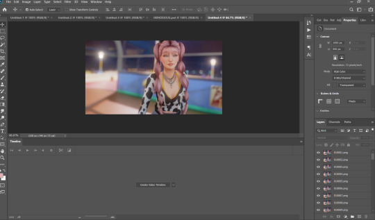
anyway, by now you should see something like this! when you click "create video timeline" you'll be met by the timeline used for video editing, but look in the corner and select "convert to frame animation" and you should get something a little less scary!
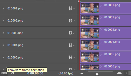
this is a lot less intimidating, right?

on the timeline, on the far right hand, there's the button with the little lines, and when you click that it opens up a world of possibilities.
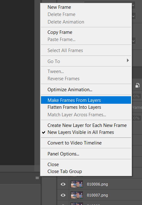
first thing's first, you're going to want to make frames from layers, and there are two things you're gonna wanna take note of. 1. your frames are backwards, and 2. they are timed badly! again, using that drop down menu, "select all frames," then reverse frames, and they should be in the right order.
now, for timing the gif!
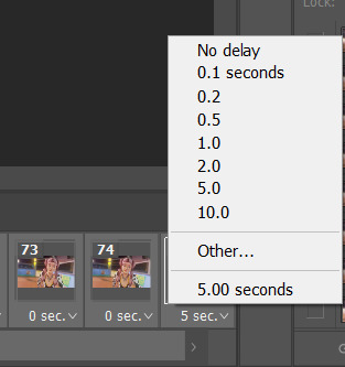
you always want to make sure you have ALL the frames selected when you do something like this, unless you wanna get a little timey-wimey with it. depending on what you're into or the effect you're going for, the sweet spot is between .04 and .08 seconds!
also, good general rule of thumb when you're making gifs? always make sure the first frame is selected. it's a good habit to get into! anything you do to the first frame will happen to all the frames-- if you're adding a PSD or filter, that's incredibly useful. select the first frame of your gif, and you can just drop the PSD onto it and go!
all that's left is to resize it, which i do using image>image size, and make sure the number of frames fit in under tumblrs very strange file size limits, and save it using file>export>save for web/legacy, at which point you will be greeted with this!
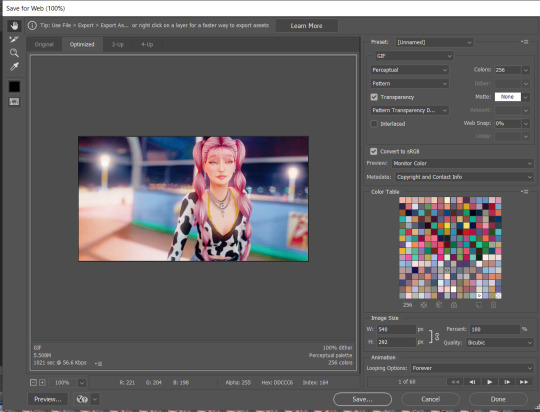
a few quick things:
1. your dither settings will always look best as a pattern. trust me. when the dither is a pattern it's less noticeable to people, the uniformity makes it easier to ignore any dithering.
2. you really don't need to worry about your color settings anymore, so you can ignore them all together. in olden times, we would lower the number of colors to get a smaller file size, because tumblrs limitations were soooo restrictive.
which brings me to...
3. file size. if you go onto tumblrs FAQ it will tell you the limit is 10MB, and i'm here to tell you that is a lie!
in theory, you could get a 10MB gif to work on tumblr, but that gif would have to be incredibly small, with shitty colors, and even then the quality would get eaten up. someone once fit the entire bee movie into a 100x100px gif and it fit under the limit-- but just because you can doesn't mean you should!
personally, i think 5MB is the sweet spot for what tumblr can handle, reliably. higher quality gifs might get mangled screen to screen, but 5MB is a pretty safe bet that everyone will be seeing the same gif. that's not to say shoot for 5MB-- it means try not to exceed 5MB. but, i cannot stress enough how much size matters.
tumblr is designed for 540px wide gifs, and i've managed to cram about 30 frames into a 540x1000px gif, but there wasn't a whole lot of movement happening. meanwhile, at 540x300-ish, i can cram anywhere from 50-75 frames in there. however, if you were to do half-sized gifs (268px wide), you could probably manage to make a hundred frames fit under the limit-- but if you do that i think they call the police on you because that's insane!!! i've done it and i'll do it again tho
tldr on gif limits and sizing; bigger canvas=less frames, smaller canvas=more frames. more motion=less frames, less motion=more frames. tumblr propaganda machine says 10MB, dude with 10 years experience making gifs on tumblr says 5MB is the goldilocks zone.
#IS THIS EVEN HELPFUL??? i'm sorry#i'm exhausted and got carried away at the end#if you want horror stories about how we used to make gifs on tumblr.... lmk#the limit was 1MB#asks#photoshop help
27 notes
·
View notes
Text
Tutorial - Transitional Blending + Adding Text
Another request from Mary @princess-seaweed :) This time I’m making a tutorial to show how I created the transition in this gif and how added the text with its effects:
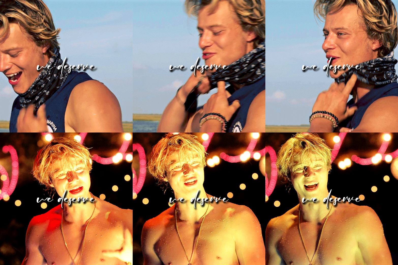
Once again, this is an advanced tutorial that supposed you’re already familiar with basic gif making using photoshop.
I will try to go into as much detail as I can, but if anything is off/unclear/vague, don’t hesitate to reach out!
So, we’re gonna start by blending the two gifs with the transition, and then we’ll add the text and its effects.
I’m using photoshop 2020.
First things first, as I mentioned before, this is an advanced tutorial that supposes that you already know how to create gifs, so the first thing you wanna do is make the 2 gifs (or 3, or 4, or however many you want) you wanna blend separately, (resize, sharpen, add adjustment layers and whatever else you want to add), and then save the psd files (you don’t have to actually save if you have them open, but this is a precaution in case anything happens). Since we’re gonna be layering the gifs one after the other, the number of frames for each one can be different.
Once you’re satisfied with the gifs, open your animation timeline bar to the frames animation mode.
For this particular gif, I’m using the below gifs, sized 540x540px each. I’ve already resized, sharpened and colored my gifs and this is what they currently look like:
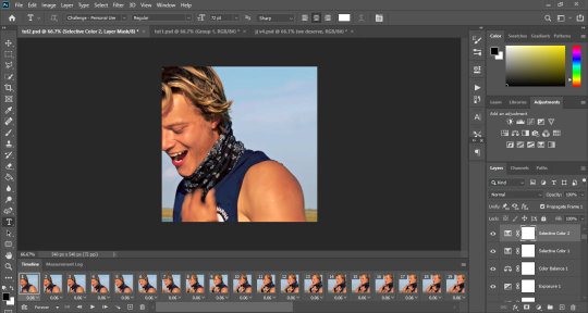
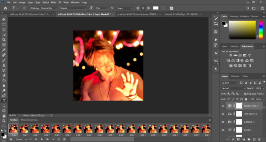
Not that it matters, but my first gif has 41 frames, and the second has 40 frames.
Okay, so what we’re going to do is we’re going to copy the second gif after the first one, but to get the transition, we’re going to layer some frames of both gifs on top of eachother. I know this sounds complicated, but it’s really not :)
First things first, you’re gonna decide the order of the gifs. I want the gift to start with happy JJ (1st gif) and transition to sad JJ (2nd gif).
So, you’re going to go to your 2nd gif, and select all the frames in the animation bar:
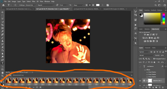
Now you’re going to click on the small menu on the right side of the animation bar, and select copy frames:
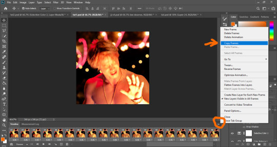
Now, we’re going to copy this gif after after the first one, but we want to layer some of the frames on top of eachother to achieve the transition part. In this case, we’re gonna layer 9 frames.
To do that, you’re going to go back to the first gif, scroll all the way to the end of the animation bar and select only the last 9 frames:
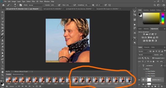
Then you’re gonna open the small menu in the right corner of the animation bar and choose paste frames:
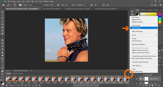
A window will pop up, asking what the paste method is. Make sure paste over selection is checked and click ok:
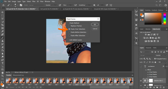
So, what’s happened now is that the second gif has been added after the first one, with 9 frames overlapping between the two.
This is what my psd currently looks like:
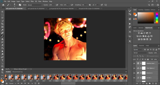
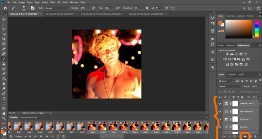
Now you’re going to group the second gif. To do that, look at the layers tray. The layers of the second gif should all still be selected. You’re gonna keep them as they are and just click on the small folder icon at the bottom bar:
Now we’re going to start creating the transition. This isn’t very complicated, it’s just the crucial part to get the transition right. Basically, we’re going to be playing with the opacity of the 9 overlapping frames, so that the top layer gradually becomes more visible from one frame to the next. I promise, it’s not complicated.
You’re going to select the first frame containing the second gif in the animation bar. And you’re going to make sure the whole group is selected in the layers tray.
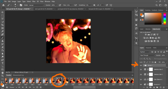
now you’re going to change the group’s opacity to 10%. To do that, find the opacity tab on the right side corner of the layers tray.
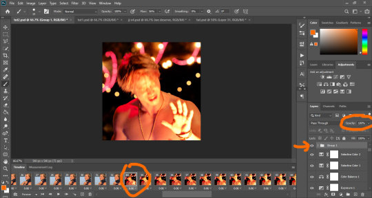
Now change the value from 100% to 10%. You’ll immediately see the top layer almost disappear, and the bottom layer will be mainly visible.
Don’t worry, this will only change the opacity value for this frame, and all the other frames will remain the same:
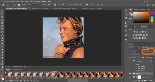
Now you’re going to move to the next frame. You’ll notice the opacity value will be back to 100%. This time, you’re gonna set it to 20%.
Again, this will only affect this frame, and top layer will fade, but be slightly more visible than the previous frame.
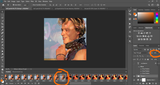
Now you’re going to move to the next frame. This time, you’re gonna set the opacity value to 30%.
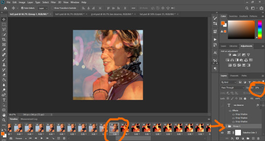
And you’re gonna keep repeating the process, frame after frame, each time adding 10% to the opacity, until you reach the 9th frame and set that to 90%.
You’ll notice that with each frame, the bottom layer fades a little more and the top layer is more visible. Your 9th frame should look something like this:
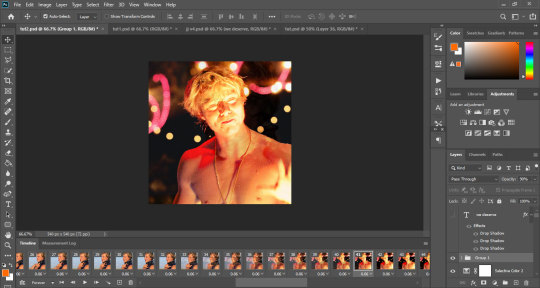
And that’s it, the transition is complete. If you save your gif now, it should look like this:
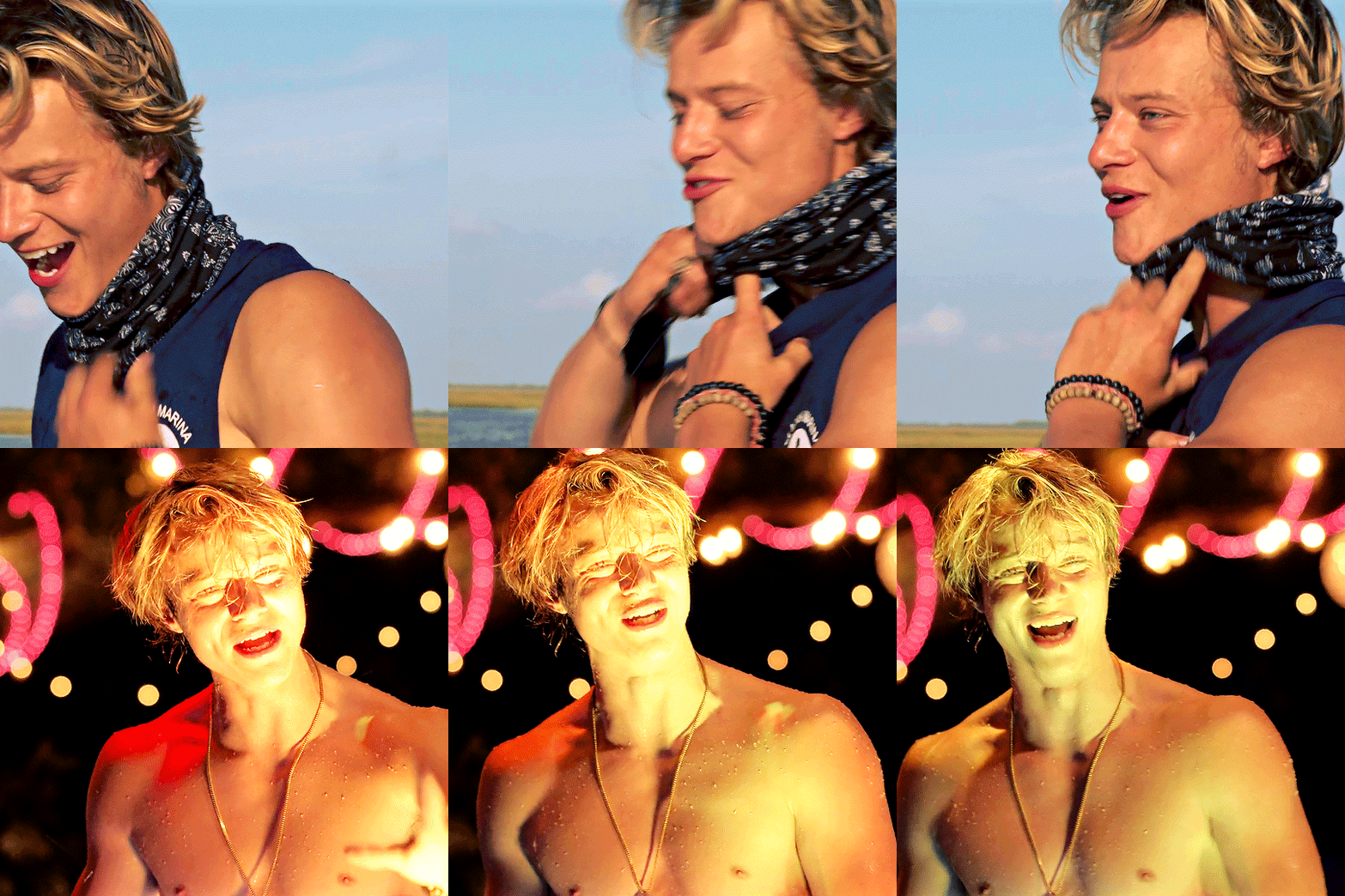
You can make the transition as long or as short as you want. The trick it just to make sure that whatever number of frames you want, it’s a dividend of 100 so that your transition is even - that means that, for example, you can choose 5 frames and make the opacity jump by 20 from one frame to the other.
And that’s it for the transition part!
Now onto adding the text.
The first thing you’re going to do is make sure that the first frame in your animation bar is selected, because if you make any additions on any other frame, they won’t apply to the whole gif - this is why we were able to play with the opacity on the frames above, because they only change individually. If we wanted the opacity to apply to all the frames at the same time, we would’ve chose the first frame in the animation bar. So, select the the first frame, and choose the type tool.

The font I’m using is called Challenge, set to size 72, text color is white. click anywhere on the gif, and the standard lorem ipsum text will appear.
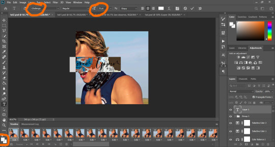
Now, write whatever text you want. I want it to be in the middle of my gif, so once I’ve written my text, I’m gonna click on the selection tool at the top.

To align the text, I create a new layer right under the text layer, fill it with any solid color, and select both layers:

Don’t worry, this is just to align the text, we’ll hide it in a bit. Now make sure the selection tool is chosen and that both your text layer and color layer are selected.
In the top bar, you’re gonna click on the two icons shown in the image below:
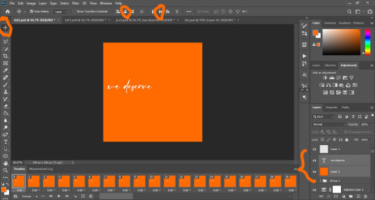
Your text should now be aligned in the center of your gif:
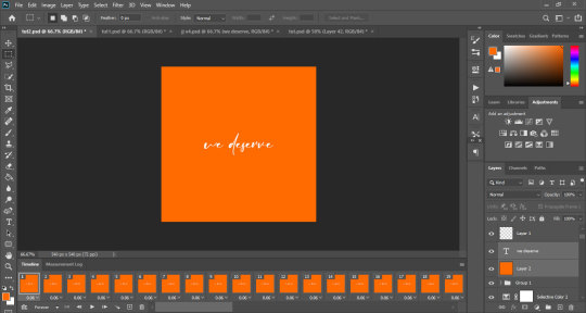
Hide the colored layer by clicking on the small eye icon next to it in the layer tray:
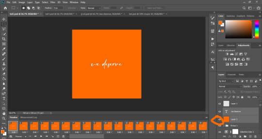
This is what your psd looks like now:
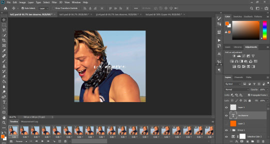
Next, we’re gonna add some effects to our text (mainly some shadow). You’re going to right click on the text layer, and from the menu you’re gonna choose blending options:
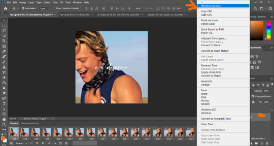
Now, a pop up box will open. You’re going to make sure the drop shadow box is ticked, and change the settings to your liking. My settings are as below:

I still want my shadow to be even darker, so I’m gonna click on the small + at the right of the drop shadow twice, to create 2 more shadow effects, and then click ok:
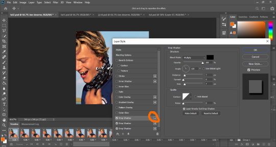
You can add other effects. I use glow, stroke and gradient alot, but for this one I only wanted to add a shadow.
And that’s it!
Now you just gotta save. My save settings are:
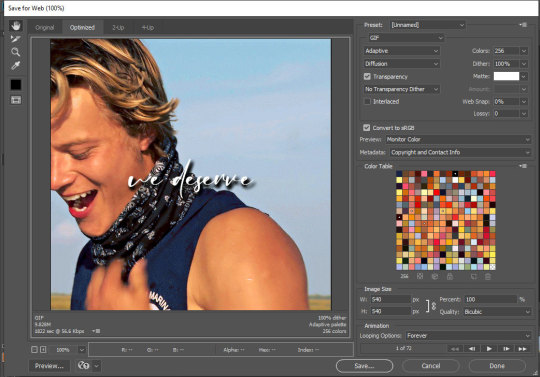
and my gif now looks like this:

And that’s it!
If you have any more questions or need anymore help, just hit me up, and let me know if you find this helpful at all!
#tutorials#resources#photoshop 2020#photoshop tutorials#gif tutorials#my edits#kinda#tuts*#princess-seaweed
36 notes
·
View notes
Note
I need some kind of a photoshop lesson for this aesthetic of yours
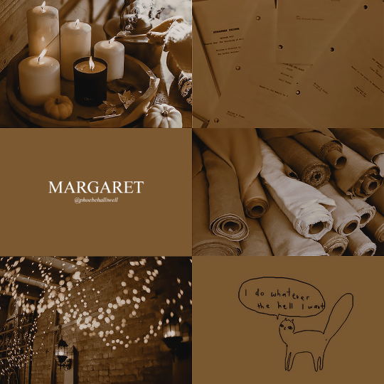
okay i’m gonna do a tutorial real time for a picspam type aesthetic that will look like this ⇣ a photo i will put here once i make it.
step one. open ps : )

welcome : )
okay so dimensions r a thing tumblr compresses photos like hella so i do all my still img aesthetics 900x900 is you’re trying to do this for say insta i would actually recommend jumping up to 1080x1080. pixels, obviously. idk if i have to clarify that.
so click ctrl+n or create new i’ll be doing 900x900
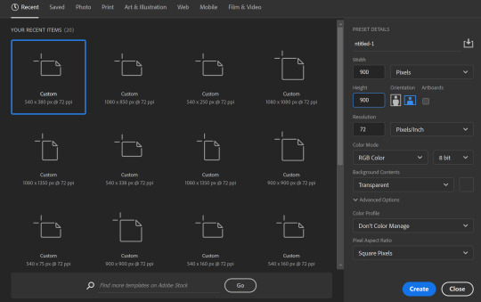
these r the rest of my settings i personally do not think they matter my resolution stays at 72 the only thing i’ve detected this affecting is font size. (side note notice how this pic looks all fuzzy? that’s bc it’s a ss with a boatload of pixels. and if there’s one thing tumblr hates. it’s pixels. and then it’s users. but who’s counting? tumblr is. i recommend keeping ur still images 900x900♥)
step two is collecting ur images i personally use pinterest for these bc quite frankly it’s really nice & easy to find these types of photos esp if you’re looking for a canon character bc if you type in [character name] aesthetic you’ll get stuff if you don’t quite frankly even just type in aesthetic you can scroll until you find an image you like click on that and go through like images underneath it and keep burning thru. like u probably know how to work pinterest. but i am being thorough and covering my bases. searching [color] aesthetic is also nice or even searching a character that isn’t the character you’re doing this for but who’s kind of similar that also works. i recommend esp for charmed bc their pinterest gets bogged down with screencaps and then like. charms like jewelry searching “charmed aesthetic” or “phoebe halliwell aesthetic” really just doesn’t cut it so what i’d recommend is instead of going through pins, go through boards.
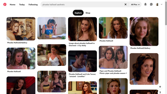

bc like. big difference. other pro tips if you see a board you like, go to the person’s profile and check out their other boards bc odds are you’ll find more you like. another protip if you’re specifically doing ocs typing in oc aesthetic will get you a lot even going to the boards on that as well. yields.
so. you’ve gathered ur images. u need five. open em. i’m making an aesthetic 4 myself which you’ve probably already guessed from the fact i’m putting the finished piece at the top, but it’s not ready yet so it’s still a surprise for me.
cropping. if ur doing a 900x900, use these setting exactly. 1080x1080 use 1080/2 x 1080/3. i’m not doing the math 4 u ♥

most important part? Delete Cropped Pixels. otherwise ur not really doing anything. crop all five images.

but them in ur document. document? psd? ur thing ♥ place them places. u do not have to commit now. leave one middle one blank. it does not matter which one. i personally like to alternate my text pieces if i’m doing a long post like what i did on my ncwotng set. some people keep them all on the same side. this lowkey bugs me i feel like it throws off the Balance but i imagine some people like The Consistency. i don’t. but w/e. it’s up to u as this is gonna be ur set. also like. as you’ve cropped these to x/2,x/3 settings they should fit nice like puzzle pieces : )

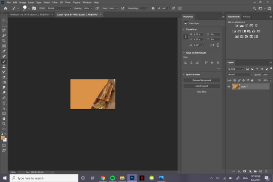
the next step i personally like doing is creating by text box with The Color™ do this bc simply duplicating one of ur images, shoving it in the empty slot, and converting into a sharp object. edit contents.


now. obvi i selected these images w a color scheme in mid. i recommend u do the same. even if it’s just vague. they don’t all have 2 fit. this is my example of my sheridan piece b4 or after. tweaking is possible. layers w masks r ur friend. i can talk about them more if need be.
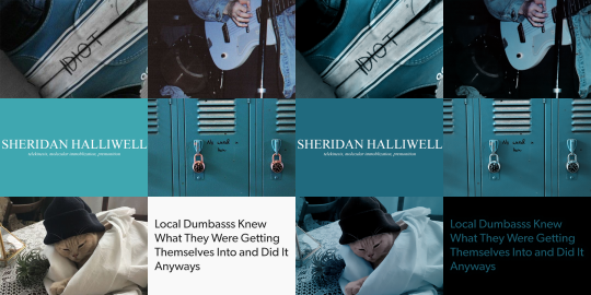
But. back 2 the smart object. brush tool. paint it.
♥
the text i used was times new roman all caps 40pt font 0 spacing for the title and times new roman 14pt font 0 spacing italics for the subheading. here’s my dency b4 and after for comparison

next step is after you have your text in alright, shove everything into groups. mode on “normal”
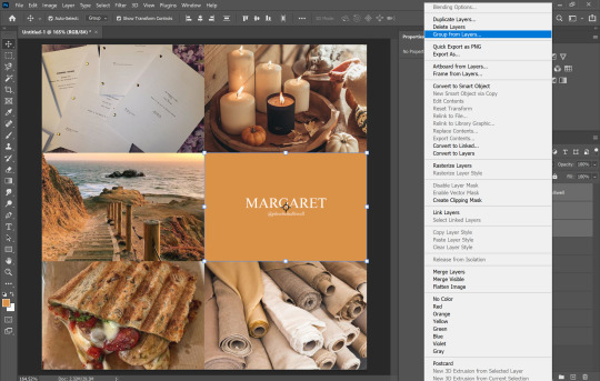


then you can start editing. the groups let you edit things like lighting and color without touching any of the layers below it 👍
i’m not gonna do a Major coloring tutorial, for lighting i’ll usually tinker with exposure, levels, sometimes brightness/contrast. for colors, color balance + hue/saturation. i rarely touch anything else.
i’ll bring u along 4 the coloring of this one bc i’m gonna add a layer mask.
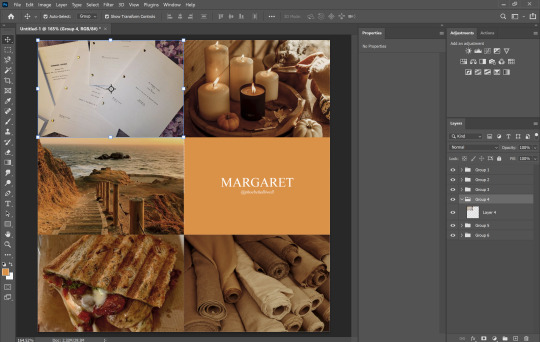
so the first thing i’m going to do bc the paper itself is already close to the vibe is i’m going to color it normal and just ignore the background

something like that. then i’m going to add a layer mask (square button w the plus sign)

and then i’m going to eye dropper a color off from somewhere else
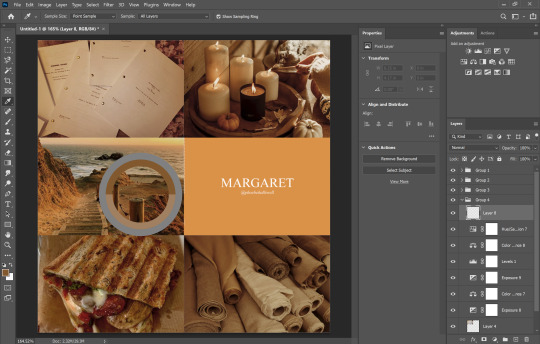
now i was talking about the “normal” blend mode stops ur color settings from bleeding over onto other images? does not apply to painting on layers but you’re already masking this bad boy, so it doesn’t matter. just don’t say i didn’t warn u
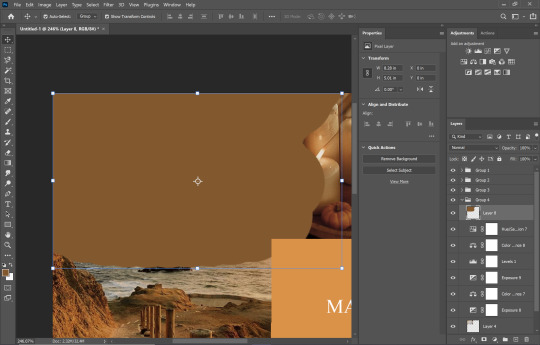
i’d recommend using a really ridiculous blend mode to clean up ur thing at first, i’m using darken which isn’t that wild but like whatevs.
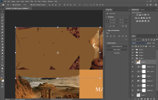
add a layer mask using this button.

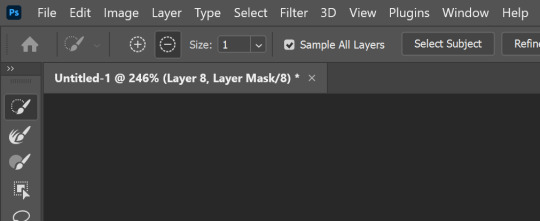
select and mask
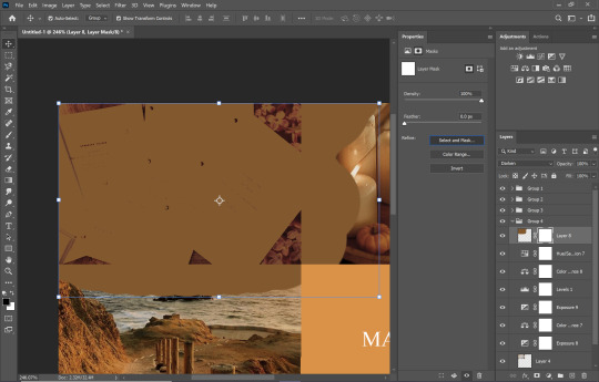
use this thing to clean up ur mask
okay so i did a lot since we last spoke

but if i impart any lesson to u. it’s: fuck around. find out. that’s literally how i’ve basically done everything. nothing’s ever really gone horribly wrong. click things. see what happens.
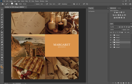
okay so now that you’ve kinda gotten everything figured out. change ur text box color again. i’m introducing u to ye ol trick that is not the paint brush. but. hue/saturation on colorize more yeah babyyyyy
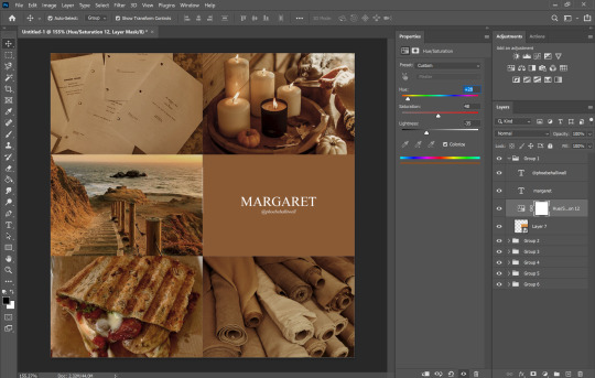
ahaha yes. love this bad boy.
Now. Trick To Make Everything Super Cohesive™. put things above All of your groups.

yeah boy.
reorganize ur thing bc u don’t like how it looks.
fuck around w a lot of stuff.
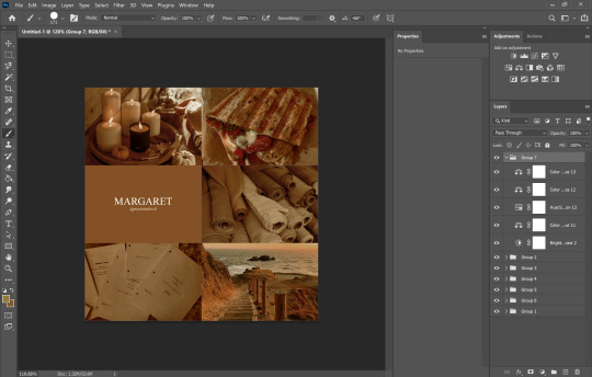
it’s still cluttered.
fuck it. grab a new image.
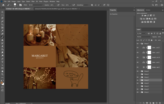
something like that. never let the fear of striking out keep u from playing the game : )
fuck around a bit more.

vibes♥
save ur image bc u literally Have Not Done That Yet

& then remember the other thing u forgot to do
eyedropper what ur text box looks like move the whole thing to the tippity top and recolor

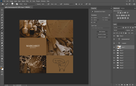
this is just bc u’ve fuck around a lot w a lot f different settings. this ensures that the text stays the same color u set it as.
okay final step.
turn The Whole Thing into a smart object, smart sharpen
leave out the text box tho. the sharpened text can look weird. it’s ur choice, but with these settings,, cronch.
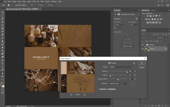
and wallah. ctrl+shift+s save as png and bada bing bada boom baby. aesthetic

#like i cannot stress how much of this simply is. fuck around. find out.#like just have fun click on things#go ape#like there's no right or wrong way to do this#anyways i used to make these for harry potter on canva ♥ remember ur roots#tutorials#ps tutorial#aesthetic tutorial#ogwork
39 notes
·
View notes
Text
how I make my gifs: a tutorial
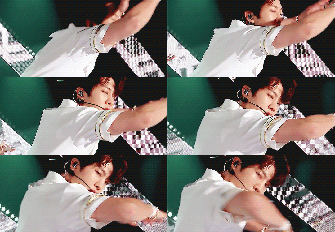
Hi everyone! Just in case someone asks in the future + for those curious, I'm here with a tutorial on how I make gifs! If you have any questions whatsoever, please do send me an ask! I’ll be glad to help! The gif I made with this tutorial is the one right here!
So... let’s start this tutorial with the programs I use.
Adobe Photoshop 2020 - To make the gifs, majority of the work is done in this program.
TopazLabs (Topaz DeNoise 6 and Topaz Clean 3) - To "denoise" and "clean" the gifs, as the names would suggest. Links for download: Topaz DeNoise 6 & Topaz Clean 3
KMPlayer (an alternative would be PotPlayer, or any other video playing program that allows you to capture the frames) - To capture the frames. - I use an older version of KMPlayer, though I don't know which exact version that is.
Now let’s continue onto how I use these programs to create gifs!
Step 1: After you’ve downloaded the necessary programs, download your video. The way to get the best gifs? Quality videos. That’s the first step. For K-pop performances, I recommend this website (the hq files are in .ts form, KMPlayer should be able to open these). Bookmark it! It’s really handy :) Get the video you want to make a gif from and open it in KMPlayer (or PotPlayer or any other program, but for this tutorial I’ll use KMPlayer). Open your video in said program and look for the part you want to make a gif of. Then press CTRL+G (I apologize because I cannot for the life of me remember if this was a standard shortcut or not)
Step 2: After pressing CTRL+G, you’ll be met with this screen:

I’ll briefly explain the numbered parts, but before that, these are my standard settings and just make sure you have them all the same and it should be good!
1: This is where your captured frames will be extracted to. I have them extracted to the standard folder, but you can change this if you want to. You’ll need this folder later when opening the frames!
2: Like it says, this is the image format. I use PNG in the highest quality, as the name would suggest, for the quality.
3: These are the amount of frames the program captures. Say you put in every 2 or 4 frames, you’ll get more choppy gifs. To get the smoothest gifs, put “every frame” (this in turn will increase the gif size as the amount of frames will obviously be bigger).
Once you’ve put in the correct settings and you’ve put the slider where you want the capturing process to start, press “start” (now, before you do this I recommend putting the video on mute as the audio will start to get kinda demon-y the longer you record lol save your ears pls). Then, when you’ve captured all the frames you need, pause the video, press CTRL+G again and click “stop” and close the pop-up/program.
Step 3: It’s time to open up Photoshop! Then go to File > Scripts > Load Files into Stack... (for older versions/another version I used in the past this one didn’t work and I had to use the “Load Multiple DICOM Files...” instead. It should work similarly though, if I remember correctly).
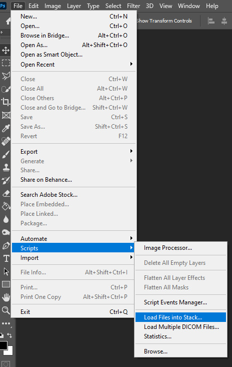
You then get a little pop-up that looks like this:
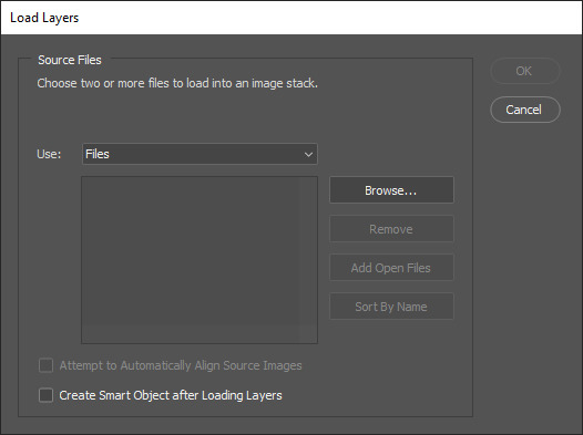
All you have to do here is click “browse” and navigate to the folder where your captured frames have been saved in. Select all the frames you need, wait for them to load in and then click “OK”!
Step 4: Depending on the amount of frames you’ve selected to load in, as well as the beefiness of your PC/laptop, the frames loading part might take a little while. Photoshop is importing every frame as a separate layer into one file, so just... grab a drink or something and wait a bit! When you’re done waiting, if you haven’t already, go to Window > Timeline. This will show you the animation timeline. For older Photoshop versions this is slightly different (I believe it’s called animation). Then click “Create Video Timeline” and click the 3 squares on the left bottom side (in older versions it’s on the right bottom side, not sure).
Step 5: After you’ve done all that, you’ll want to select all your layers. You can do this by pressing ALT+CTRL+A or going to Select > All Layers. With all the layers selected, you have to go to Layer > Arrange > Reverse. You only have to do this if you used the “Load Files into Stack” option!
Step 6: After reversing all your layers, you’ll want to go to the three lines you see in the following screenshot, and click “Make Frames From Layers”.
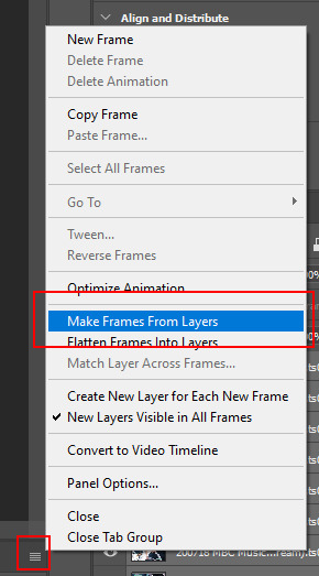
As the name suggests, this turns all the layers into frames. I don’t know why but the first frame will always be 5 seconds long, so to make it easy on yourself when you want to check your gif while editing, just put that on 0 for now. You can do that by clicking the seconds under the frame and clicking “No delay”. After this, check to see if you have the right frames and if you need to delete some (you can do this at any point in the process but I didn’t know where to put it in the tutorial oops).
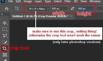
Step 7: Time to crop the gif to the correct size! For this gif I’m using as an example, I’m making it specifically for Twitter, so the sizes aren’t that obvious (for Twitter I usually use a width of 850 px to keep it sharp, for long size gifs (more height than width for example), I add a background so that it eventually still becomes 850x850 pixels). There’s many posts on Tumblr about the correct sizes for gif/photosets, but a brief rundown of my most used sizes: one gif spanning the entire width of the post has to be 540 px in width. Two gifs next to one another need to have a width of 268 px. I use these dimensions the most! For others, you can Google!
Step 8: After you’ve cropped the gif, you can do either of two things: either you first add the coloring of your choice and then sharpen the gif OR you do it the other way around. I usually switch these two around depending on how sharp the gif already looks before sharpening because I can’t stand looking at 2 pixels while coloring (lmao). For this one I’ll do the sharpening first.
The whole sharpening process is actually quite simple but you need to make sure that you do the following little steps in the right order or else it won’t work! Select all the layers (CTRL+ALT+A or Select > All Layers) and then click this little thingy:
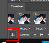
Then you’re going to Filter > Convert for Smart Filters
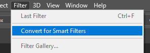
If you don’t do it in this order, your gif will end up... well, not being a gif and not moving. If that happens, track back in your history to see if you did it in the correct order! :)
Step 9: The actual sharpening process! After clicking the “Convert for Smart Filters”, you’ll want to go to Filter again and find the Topaz Labs tabs. Personally, I usually do it in the order of DeNoise first and then Clean, but this is a personal thing, really.
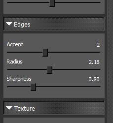
I recommend playing around with the settings to see what fits the gif but here are my go-to DeNoise settings (tip: save these as a preset so you only have to click that for faster giffing!):
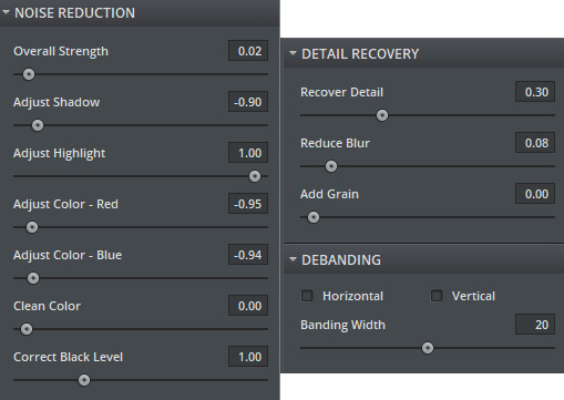
And my Clean settings:
Press OK when you’re done with these and then go to Filter > Sharpen > Smart Sharpen. These are my SS settings (just copy these, and again, save as a preset!):
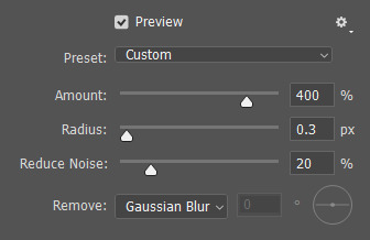
Depending on how sharp you want the gif to be, you can input the same settings or go to this in the layers and change the percentage.

Now that we’re done with these... it’s time to flatten it! Just follow these little steps:
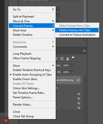
And then you wait. Again. I know.
Step 10: After playing the waiting game, you’ll click the three little squares again and do the same thing you did earlier: “Make Frames Into Layers”. Delete the first frame. Add a coloring of your choice (can be a PSD, can be your own coloring, etc. this is honestly just... playing around with things and see what it can do). After you’ve done coloring, select all your frames (same lines as previous screenshot except now you’ll see a “Select All Frames” option, click it!) and change the time to whatever you like (I usually go for 0.05, 0.06, or 0.07. Again, just play around with this!! Try different things!)
Step 11: Final step! Saving :) I use shortcuts a lot to make things faster so either press ALT+SHIFT+CTRL+S or go to File > Export > Save For Web. Not much to do here, just copy the following settings and save the file!
!!! NOTE: After making a new gif today I realized there’s a weird dotted border on the top of my gifs, it’s a bit difficult to explain but I had no idea what it was. Turns out that the reason why this showed up was because, as shown in the screenshot below, I had “Transparency” selected. If you’re experiencing this too, UNSELECT the transparency and it should be all good!
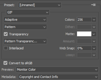
Also make sure that the “Looping Options” is set to Forever, or else your gif will play only once and then stop!
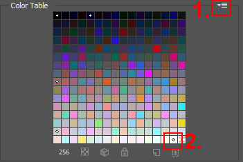
Tip: While making gifs for Twitter I at one point noticed that if I added in a white background, no matter what I’d do, it’d show up as yellow-y in the preview box. After googling I found that going to the options (1 in the screenshot) and then clicking “Sort by Luminance”, then double-clicking the lightest color (not the transparent one, 2 in the screenshot) and selecting white (or FFF) will get rid of this! This likely won’t be that useful for Tumblr gifs but just in case you ever want to have a white background...!
Then just... save, and upload to Tumblr! :)
Final note: Tumblr has a mix gif size of 3MB. If you have a gifset of 4 gifs you want to upload, all 4 gifs can be max 3MB each. Keep this in mind! If you’re over 3MB, delete a few frames and try again, or resize/crop your gif!
As it turns out, Tumblr has increased their gif size to 8MB, however, the quality tends to get compressed with larger gifs like that so per recommendation: keep them below 5MB! (thank you @yeoli for letting me know!)
I hope this helped! If you have any questions, feel free to send me a message and I’ll try my best to answer them.
75 notes
·
View notes
Note
a vent (feel free to ignore if it's too much!): so recently i've noticed psd makers getting anon asks on whether they're ok with people who write certain topics (mostly rpf, incest, rape, underage, the usual "problematic" topics) using their recourses. now, i don't roleplay any of these subjects on tumblr, so even if a content creator said not to use their stuff, it's not even something i need to worry about - but, and maybe this is me overthinking it, what if i, someday, write a noncon fanfic on ao3? i'm still not using their resources on the subject or writing it on tumblr, but i'd probably feel weird about it, like i'm crossing some boundary. what if a psd maker whose content i've already purchased suddenly goes "actually don't use my psds if you rp abusive relationships", which is probably the closest to what people consider "taboo themes" of the things that i roleplay. it just feels like a fine line between personal boundaries and a shitty situation for a customer - not wanting to cross boundaries but already having PAID for something previously, when no such rules existed. it's making me want to 1. block everyone i see saying this, because even though i don't personally roleplay the topics above, i don't feel SAFE around people who tell others what kind of fiction they are allowed to enjoy and 2. just quit using people's resources and spend years learning to make my own psds so i won't have to worry about this shit. it's just stressing me out, as someone who has been harrassed and bullied online for speaking against censorship. i've had literal sock accounts made just to spew targetted harrassment at me on twitter. i've been accused of being a pedo and supporting incest and this is??? literally for saying "i don't think real people should be harrassed for fictional shit", i've not even shipped underage or incest ships. both make me uncomfortable. but fuck, antis make me 1000000x more uncomfortable than people who ship these kinda ships. i digress, this got rambley, i just. do you have any advice on what to do with the potential psd situation, or am i really just overthinking it? (always worried i accidentally send stuff like this off anon. help)
I need you to know that I actually had to rush-scroll back up and just double check that you did submit on anon lol! I always get worried I'll miss the one person who accidentally didn't use anon, if it makes you feel any better! When someone does submit with their URL attached, I message them first to be sure they are okay with them having it posted that way/it wasn't an accident ;) That's what I would want someone to do!
Alright, so, anyhow...
I've also noticed that becoming a more common thing and it's been on my (maybe huge) list of things to look into for a bit because I really do try to make sure I'm not just noticing things in my areas of the RPC/failing to notice things that do not impact me. Since I do all my edits and graphics, it falls into the first category for me. So, thank you for moving that up the list and informing me that it really is more prevalent and not my imagination!
My take on seeing it was a combination of business logic and anxiety, not going to lie.
On the first: charging to do a psd that is just that, just a psd file being used as a template/to act as an easier version of a photoshop "action" in a way, that's 100% legal and fine. Absolutely no muddy waters there. However, charging to do things like icons, edits, etc. that include images of celebrities and stills from movies (or gifs) is quite muddy. Legally, it's not legal. It's a thing we're allowed to do and use (on most platforms) because we're not making money off of it, we're not claiming to hold rights to the images, and so on - it's ignored but illegal. Charging money for it, however, even when phrased as "for my time" (which, absolutely valid feeling), is a more serious form of illegal and potentially attention-getting. This all gets more iffy though when we add donation instead of direct commission/purchase when working with these copyrighted materials. You can ask people to donate and suggest a donation based on your time spent, and that is always what I advise people to do.
Okay, so, that preface is necessary because the thing about stipulating use-rights is that they're iffy, too, there are variables present.
Often, these same people are charging for things like icon packs as well, meaning that even if they're only charging you for a template-style psd file sans imagery they don't own, they've kind of shot themselves in the foot. Not to mention, it's exceedingly damn hypocritical to pitch a fit about someone violating your rights when you're literally using other people's copyrighted materials lmao And that does tend to occur to me, yeah, it's a consequence of attorney friends and running businesses.
The other issues with this are that usage rights have to be stated at the time of purchase and morality clause-style shit, as pertains to products, is not legally binding.
When you purchase something like a psd file, that purchase acts as a sort of contract.
Think of like...buying a photoshop brush set - the person selling it puts very simple rules as to its use, such as: non-commercial use only, brush pack cannot be resold or distributed for free, separate brushes from the pack cannot be resold or distributed for free individually. Meaning that you own the brushes you bought, but you are not legally allowed to make real-life money from anything you use them in, and you cannot send the whole pack or files individually to friends for free or charge other people for them. By buying these, you have agreed to these stipulations of use and ownership.
If the person sells psd's and you agree to what they've stated about the use (you can't use them to do commissions you make IRL money from, you can't give them away to friends, etc.), that's binding even somewhere as casual as RP Land. The exchange of real currency makes it that serious.
However, there are limits to stipulations of use! One of those things is when you agreed - this person cannot, even one literal second, later change their terms of use and retroactively hold you to them. If they were okay with you not crediting them anywhere or using them in works you will gift others or charge others something like game currency for at the time you purchased, then that's it. Tough shit for them, not you, when they decide a month later that they want credit given where the work appears, that they do not want finished products gifted, or don't want you to make even in-game currency from them.
And that absolutely would apply to the morality wank, yes.
Except that this very morality wank comes with its own issues. Reality is not tumblr. In reality, at least in most instances and countries, you can't throw in a fucking morality clause regarding the buyer, use of item, or finished product.
Think of this in this way: Chik-Fil-A starts denying chicken and waffle fries to anyone suspected of being queer. They're legally allowed to run their business (as a private business, everything does have variables) with some things that are morally objectionable that they feel morally aligns with their religious beliefs. They're not allowed to deny queer workers a job or queer customers service, however, in accordance with overarching laws.
While "being gross" online in fiction is not like, making anyone a protected status person lol this is just an extreme example to drive home the point. Legally, when it comes to items/products be they digital or physical, your rights and responsibilities as the seller don't include your moral policing.
What your right is, is to make people uncomfortable to a degree, yeah. You absolutely can do that. You can state some nasty shit about prospective buyers you don't want. For example, they should (I mean, they should just grow up and get some real concerns, but) be stating that they would not like to see their psd's used by people on this following DNI list of idiocy, and they will block those users if possible to prevent interaction and purchase. That's really it, that's what they can do and the least immature way to proceed.
On the second: none of this logic would make me feel comfortable about interacting with them and their psd's in the future once they had outed themselves as morally objectionable and dangerous to me with this nonsense. And I would still feel anxious about using things I had previously bought because once harassed...it doesn't really go away, does it? It would just give me some ease about the latter with things I'd already made. Like, I could keep using the icons I'd made with those psd's with a little bit more comfort knowing that they honestly have not a leg to stand on outside of their harassment.
I might have the tendency to respond to harassment without much upset, but that doesn't mean I want to be harassed. Especially when I am not doing anything that draws that kind of attention. Not that harassment is warranted over anything, but when I make a PSA or answer an ask that I know is likely to get their attention and piss them off? That's an acceptable risk I am knowingly taking. When I'm just going about my life as a RPer, it isn't.
So, I don't feel like you're overthinking it or being too concerned! In no way did you sign up for getting unwanted attention, and because it has happened before, of course, you're trying to insulate yourself from having it happen again. That's totally reasonable!
Now, what you could do about it...
It's another of those situations in which we're only truly capable of controlling ourselves. Everyone else is kind of a NPC.
You don't have to do anything I'm suggesting, but these are things I would do!
I would block the shit out of anyone saying these things/trying to make them stipulations, yes.
By that, I mean that I would also visit blogs they appear to interact with and they'd be blocked as well. We can all reblog something like resources or a shit post from a user we do not agree with without realizing it, but when it's frequent reblogs, direct support, and friendly vibes going on, it's safer to assume that they are aware their friend sucks. More importantly, that they do not think their friend sucks and support their views.
Even if that is not the case, do you want someone else's repeated inattention to expose you to bad actors? Nope! So, don't run the risk of paying and otherwise interacting with the one resource blog in the group that doesn't express these views/"requirements," but does involve themselves with those who do.
Try to find people selling these resources, that are not connected to the problem ones, who do not have those views. Once a trend starts, it is very hard to stop until it has run its course naturally, so, this might be difficult and take some extreme effort. You might want to consider asking like-minded friends who use psd's where they got them so you can check those users out for yourself.
If they're all the same, problem, people...
Look for users well outside of your corner of the RPC(s) who are not asking to be paid. I know it sounds wild, but there really are RPers out there who just enjoy making things for others! I can think of at least one right off on my dash. They might not be advertising for doing psd's or psd packs, but either they might be willing to do so (especially if they do not appear policing-positive) if you explain what is going on, or they could at least fill some requests for you for fully made icons and such. Hell, people who love doing this work usually know others who do as well, and anti-policing people quite reasonably stick together. They could have suggestions for someone not vile selling psd's.
Depending on what it is you want your psd's to do, I promise you that it wouldn't take you very long to learn it. I know...I know lol that's both really easy for me say when I've been doing it for over twenty years and am about to piss some people off. The latter because the most common settings on popular psd's are extremely simple shit, a lot of that is the kind of thing you're expressly told not to do in design work. Like ramping up extreme contrast, pixelating the fuck out of an image, and turning up the primary colors only. Once you get to playing with photoshop or an equivalent, you will totally see what I mean. You can accidentally make an icon look identical to something that is on trend in the RPC. If that was what you were going for? You've hit the mark, and it's just repetition and tweaking it here and there!
Once you start playing with it, too, it's actually pretty intuitive when it comes to the basic things like resizing, adjusting colors and contrast, and doing easy effects like blurs and sharpening. Frankly, playing with it is better than half the tutorials you'll find because they get unnecessarily complicated when all you want to do is crop your muse's face, overlay some color, and add a damn dotted border. Listen, like I said, I have a lot of experience...and I find many tutorials frustrating and overwhelming!
It is not just you, you're not dumb or anything. People get very comfortable with something and when they try to explain it to others, they use terms and methods that are more advanced or specific to them than they realize. That's all!
If you have friends who make their own things, ask them some very basic questions about what you want to do. They know you, so, they'll know better how to explain to you, specifically. Just keep it simple until you've had some time to experiment! Ask things like, "I want to take this image, resize it to be an icon, and add an orange tint to the image while sharpening only my muse's features...how would I do that? Easy mode?"
And! You don't even have to pay for photoshop or pirate it anymore! Photopea is as an exact copy as possible entirely located in your browser for free. It's all overwhelming at first, a real case of too many options and ways to do the same thing, but the only way it gets less overwhelming is just diving into it. Dive in, get a little frustrated, have some successes, make some awesome discoveries, it gets a bit addicting in short order. Then, the tutorials and tips are so much easier to figure out and expand on, too.
If you'd like, you can always send me a pm here and ask me. I'm happy to try to explain how to do things, zero judgment or impatience. Just an additional option if you both decide to try learning and would feel comfortable doing that. Zero judgment as well on not wanting to do either of those things!
Okay, this one is much harder than learning PS basics because it's honestly a bit terrifying...the way these people are, they're going to take issue with you no matter what you do, and in the end, if they notice you and feel like bothering you, they will. There's literally nothing you can do about it. All you can do is try to buffer yourself, stay away from them, and be aware that you are not the problem.
Like with the AO3 thing or writing what could be viewed as toxic relationships. You can never write or be interested in a single, solitary thing that they're on about (and accusing you of doing in real life when the burning Eye of Moron turns your direction), but to them, you supporting the right of other people to do so is just as bad as doing it yourself. To them, the toxic relationships not only would be problematic, they'd be problematic enough. Being uncomfortable with their policing and feeling unsafe because of it is, to them, a red flag of how problematic you are. Writing anything they've deemed objectionable (or reading or viewing it, for that matter) anywhere, doesn't have to be on this platform or RP-adjacent, doesn't have to actually utilize any of their materials, is enough.
They're absolutely including you in who shouldn't use their shit. That's part of the "logic" and methodology of policing. Everyone is problematic, so, everyone can be labeled a pedo and harassed without too many people getting up in arms about it. No one is safe, so, everyone better behave. You don't actually have to be engaging with or enjoying things like underage, non/dubcon, rape, abusive relationships, etc.
It's gross, it's bullying, it's actually a problem...and there isn't much you can do.
All that is truly up to you is making an effort to avoid them, though, this is very often unfair and likely to get more unfair as resource blogs of all sorts deal in it more. At least, in this case, you do have some small bit of actionable power - by not ever buying from them. They wouldn't be charging if they did not either need or want the money, not giving it to them is a bigger hit than things like simply unfollowing/blocking, reblogging PSA's, and so on is!
Nope, it isn't like you're denying them some extreme amount of money by yourself, but every three, five, ten dollars is felt pretty hard when you desperately need money and/or are saving for something.
I know, I mean, I personally do know, that it's impossible to "get over" bullying, Anon. I'm in no way telling you to just get over it and move on, find some great well of not caring somewhere! What I'm saying is that there is power in not giving them power. The power to make you anxious, uncomfortable, unsafe, when you have every right to be here doing your thing and are not hurting anyone. And it might seem to be a deeply contrary sort of logic, but realizing and accepting that there are people out there who irrationally dislike you for literally no reason, that you cannot infallibly escape or avoid, despite doing nothing wrong is a bit empowering. Because it puts into perspective the things you can control, and when we know what is in our control, it's easier to just enjoy our time here without constantly waiting for the other shoe to drop. If it drops, we can go put it back in the closet where it belongs.
It starts to put a positive spin on the whole, damned if I do, damned if I don't feeling, if that makes sense? I'm probably way too tired to try to be explaining this lol I'm sorry!
Anyway, again, I'm not implying you can or should do any, let alone all, of those suggestions! I just really hope that something will help you feel even a little bit more at ease. It's an unfair situation, it isn't right, and you have every reason to be uncomfortable and stressed. If I could make it happen, you better believe that every policing asshole out there would be writing heartfelt apology letters and sending donations to everyone they've upset lol but...since I can't make that happen, all I can do is say what I, personally, do, would do, or have done.
0 notes
Note
Can I ask how do you make your gifs? They are always just so sharp and beautiful!
Thank you so much! 💜
I actually made a gif tutorial a little while ago, which might be helpful! There’s part 1, which is just the gifmaking process itself, and then part 2, which is the brightening/coloring section where the magic happens. There is also a link in there to a sharpening action that helps make my gifs look very crisp.
Of course, this is just a springboard to start people off with. The steps of the coloring and brightening don’t really change much between scenes, but the colors you use and how you use curves/gradient maps changes a lot. So while the tutorial might be good to give you a basic understanding of how to create a gif, there’s nothing like experimenting with the different options and seeing what happens when you click a button. (You can always CTRL+ALT+Z the whole thing if you hate it. Promise.)
I’m personally really fond of gifs that have a lot of bright colors and happy skintones, haha, so I have no idea why I landed myself in a fandom that.. does not do the colors or the happy in its source material. 😂 Anyone who’s talked with me will have heard me yellin’ about the fucking neutral tones in BoB/TP and how much of an enemy the indoor Haguenau scenes are for me, lol, and so I personally recommend coming into my IMs/inbox to scream about it with me once you’re giffing this stuff. Seriously. Drop me a line. I’ll shout with you and then tell you how I fix the hassle.
Some other helpful things below the cut:
The quality of your video helps. I have both BoB and TP in 1080p, which is pretty much the standard if you want your gifs to look high quality. You could shoot for 720p in a pinch, but there’s a little difference already in the way that’ll look in comparison!
Screencap a bit more than necessary. You can always remove the frames you don’t need, but if you count the amount of screencaps beforehand you might land with a scene that ends in the middle of someone’s mouth being wide open or someone being mid-movement. Play the scene out a few times in Photoshop so you get a sense of where to cut the frames.
Dark scenes are really finicky to get right. I prefer to work with a curves layer to brighten it up, but sometimes that is too intense for the scene and I resort to a gradient map instead. I always set the first half of the gradient to something light purple/pink and the other half to light yellow, then adjust the layer opacity (set to soft light) as needed.
Neutral-toned scenes usually have me adding a selective color layer (bringing out a smidge of cyan/blue or red/yellow in the neutrals section) before I add the curves layer. Rule of thumb: if the scene itself is yellow-toned, you use blue tones to bring it down; if the scene is blue-toned, you use red/yellow tones to bring it down. It’ll help even out the skin tone problem. Learn which colors cancel each other out and giffing gets easier. Color theory is your new best friend, welcome to art school! 😂
Occasionally, I will use color balance to add more blues to shadows and more red/yellow to highlights in a scene when I struggle to get the skin tone to sit right. Another helpful thing depending on scene coloring (too cyan? too green? too something-something you hate?) is photo filter set to a warm color or lilac/lavender color.
I will sometimes add a vibrance layer. I’ll set the vibrance high and the saturation a little higher than median on the gifs that really don’t mind that sort of thing. Scenery gifs and gifs that have just one pop of color really, really love that layer. Gifs with a more tricky color palette (yellow tones helppp) really don’t like it when I push those buttons. Again, experiment!
On rare, rare occasions: the reduce noise filter. It’s really fab for giffing scenes that take place wayyyy in the background of an actual scene. If you crop something that takes place in the background, you often get it looking a skosh too grainy. Reduce noise heals a lot of that jazz.
Tutorials are your best friend. I followed a lot of different giffing and coloring tutorials to figure out what I liked and what worked best for me. Everyone gifs a little differently, believe it or not! So my method works for me, but it might be a hassle for someone else. Trying things out and just.. not being scared of the buttons helps. 😂 You can always undo it!! Just press the button, go “oops that looks like a unicorn puked on it” and undo it. Press the button, squint at your screen, go “Speirs isn’t supposed to be that green” and undo it. Eventually, you’ll hit a button that lands you with the good things. If not, save the whole thing as a .PSD-file and try again tomorrow.
5 notes
·
View notes
Text
gif coloring tutorial
for @sappho-mia
a photoshop tutorial on how to make gifs that look like the ones in this gifset. I will only explain how to do the coloring, so if there’s any other part of gifmaking that you’d like for me to explain, let me know and I’ll make another tutorial or send you some tips!
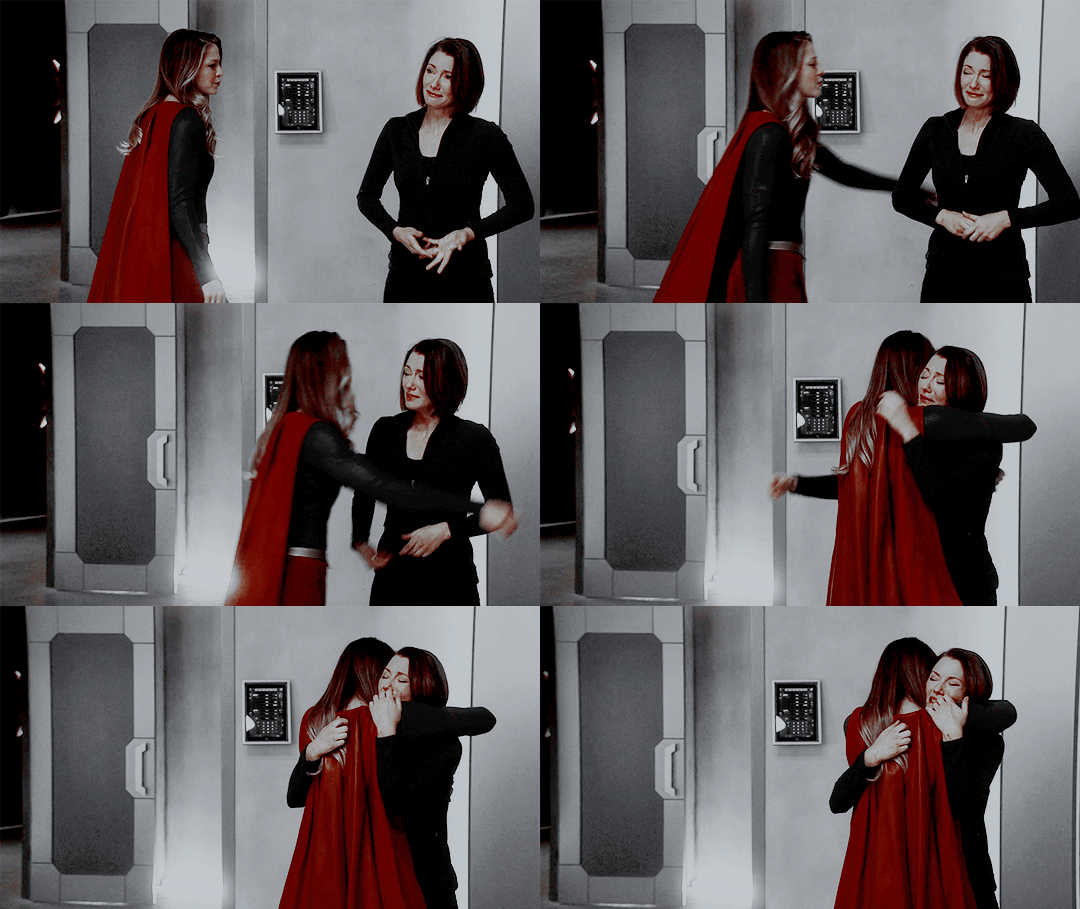
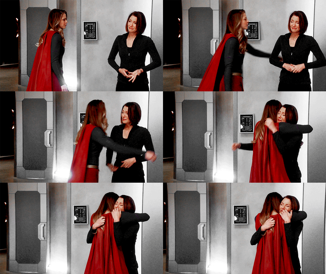
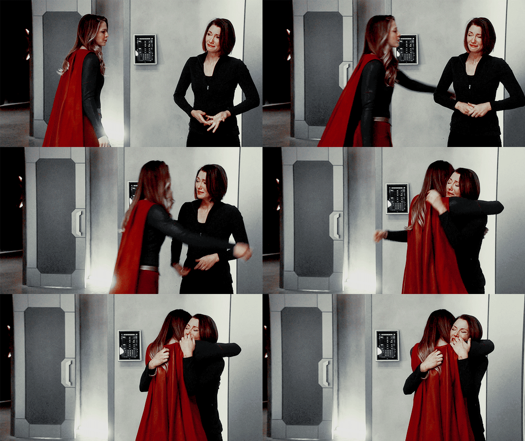
I’ll show you how to go from this:
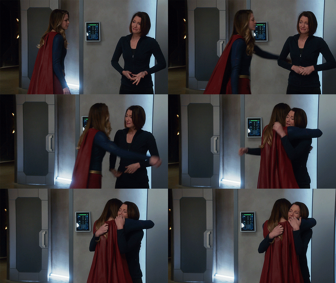
to this:
1. exposure
shows have the lovely habit of underexposing every scene, but you don’t want people looking at your gifs like this
so: time to brighten that shit up!
I have a psd (an edited version of the one in this tutorial by @redkrypto) that I use and adjust for basically all my gifs, but for the sake of this tutorial I’ll do this step by step.
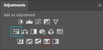
photoshop has a few good options for changing the exposure. first, go to window > adjustments to get this:

which is your biggest friend. the ones on exposure are these 4:
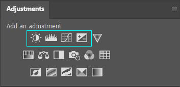
I’ll be honest, I have no idea what the difference between levels (the second one) and curves (the third one) is. they both adjust the tone of your gif - with the option to make the dark tones, the light tones and the midtones either brighter or less bright, separately. this’ll make your gif look less flat!
let’s take a look at levels:
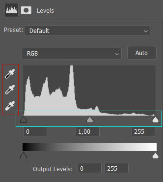
this might look daunting but I promise I don’t really know how to read the histogram either, I just use the little sliders (cyan) and see how it looks. you can also use one of the eyedroppers (red) and click on a part of your gif that you want to be black, white or grey, and the rest of the image will adjust to this. it might be a little too intense - in that case you can lower the opacity of the layer (see image below).
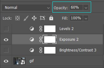
then there’s brightness/contrast and exposure. the difference between these two is that brightness will mostly affect the parts of your image that are already bright, while exposure will affect the whole image. the exposure window has another option I use often too, gamma correction. with gamma correction you can change the gamma levels of your gif, and I have no idea what that means but it sure does look good lmao
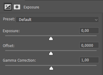
there not one ‘right’ way to do this, so just play around a little and see which ways you like the most :)
after brightening, our gif looks like this. yay!

for comparison:

2. coloring
I remember feeling very overwhelmed with all of photoshop’s options at first. I will discuss all of the ones I used to create this gif, but you definitely don’t have to use or understand all of them in order to make beautiful gifs!
two adjustments I use in pretty much every gif are hue/saturation (cyan) and selective color (red).
first, selective color. selective color basically gives you the option to single out a color in your gif and change it. the most important thing to understand here is which colors are opposites: red and cyan, green and magenta, blue and yellow. so if you’d want your yellows to be green, you use the magenta slider.
for the gif we’re making, we want kara’s cape to stand out, because red is going to be the only color left. these are the settings I used:

now it’s gonna look a little oversaturated, but we’ll fix that later on. I also made the yellows more red and less yellow and increased the blackness a little.
another way to make a color stand out is by removing the other colors -- the background is mostly yellow, green, cyan and blue. so we’re gonna go to hue/saturation and completely remove their saturation, which will make the wall behind them look gray.
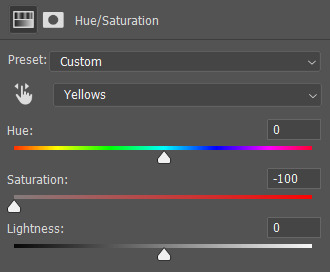
in the saturation window, you also get the option to reduce the lightness (and the hue, but we’ll get to that later). reducing the lightness does not do the same thing as increasing the blackness in selective color: reducing the lightness will give it more shadow, while increasing the blackness in selective color will make for example a lilac go to a purple, or a red to a deep red.
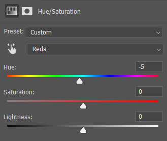
for our gif, I reduced the lightness (-13) and the saturation (-3) of the reds. now it looks like this:
the next step will make the gif look weird at first but after we add the other layers, it’ll look better. go to adjustments > photo filter and select ‘sepia’ (it’ll be a warming filter first - click on that and you’ll see all the other options). then increase the density:

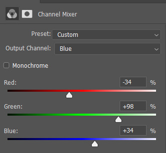
next, we’ll move to channel mixer. channel mixer is one of my favorite adjustment layers because it’s the easiest way to make your colors look really different. there are three channels (red, green and blue) and the best way to use it is to just try things out and see how it looks. my settings for this gif were:

then I added another saturation layer and reduced the saturation for the yellows, greens, cyans and blues, and removed the saturation completely for the magentas. for the blues, I also decreased the lightness, and for the reds, I changed the hue a bit so it looks less yellow:
another selective color layer (with opacity and fill both at 65%):

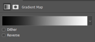
then add a gradient map (bottom right in the adjustments window). make sure it goes from black to white, and isn’t reversed. this will make the gif look a little softer! opacity: 20% fill: 50% (or your whole gif will be black and white)
increase the red saturation a bit and increase the blackness with selective color, so it’ll look like this:
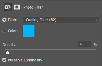
see if your exposure needs some tweaking, remove all the colors you don’t want (the background is mostly yellow now) and add another photo filter, a cooling filter this time, and set it at 4%.
finally, one last selective color layer:
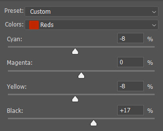
and that’s it, we’re done!!

3. some final tips
it matters which layer is on top. if you use selective color to turn all the green into cyan and put a saturation layer on top of that, not a lot will happen if you increase or decrease the green saturation. but if you increase the cyan saturation, every part that photoshop recognizes as cyan now will become more saturated.
some scenes are a lot harder to color than others, and you’re allowed to just ignore the existence of those scenes. :-)
use folders or “groups” to put layers together. my psds are very chaotic but this helps me find things!
when making a set, your gifs should look good together, not just on their own - sometimes seeing my gifs together makes me realize I need to change the coloring / brightness in some of them. to make sure this realization doesn’t happen when I’ve finished all of them already, I always put them in a tumblr post in my drafts while I’m still working on them.
use creator tags when posting your gifs. so don’t just tag it as “supergirl” but also “supergirledit” and not just “kara danvers” but also “karadanversedit” - this is the easiest way for other people and other creators in your fandom to find you! if your set doesn’t show up in the tags (when you search supergirledit and click on “recent”), send me a message and I’ll help you figure out what went wrong.
try to make your coloring match the ‘mood’ of your gifset - is it dramatic? soft? angsty? romantic? should there be intense contrasts? lots of reds, or calmer blues? same goes for the font you choose, but that’s a whole other tutorial (that I am probably not qualified to give haha, but I can point you in the direction of some people that are really good at it!).
you’re going to make a lot of gifs you don’t like, and that’s okay. it doesn’t mean you’re not good at it, it means you’re learning and improving! and it can also mean that you forgot to turn off the night shift on your laptop and your ‘red’ gif turns out to be... definitely not red. lol

if you have any questions, don’t hesitate to ask!! good luck & have fun :)
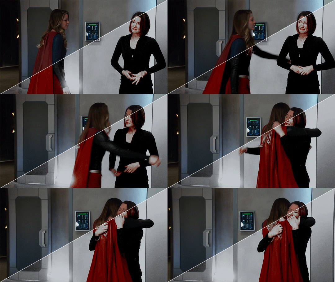
#completeresources#allresources#gif tutorial#coloring tutorial#photoshop#photoshop tutorial#ps tutorial#dailyresources#mytutorials#I didn't use color balance for this one but that's a very useful one too!#and vibrance too#though that one makes ALL of your colors more vibrant and that's not always ideal
148 notes
·
View notes
Note
hi!! i love your moodboard a lot :) do you think you could do a tutorial on how you color them?
Hey there! First of all, thank you so much for your kind words! I’m glad you’re enjoying them. ♥
Now, if it’s only the coloring part you’re interested in, the short answer is Photoshop, but there’s not much of a process set in stone. Each moodboard is different and unique, so there’s a lot of experimentation and fiddling and tinkering until things start looking good. But! I will try my best to give you a few tips and pointers on how I go about it.
Under the cut, because it got long:
Part 1
First, I start by gathering my pictures. I only end up uploading nine of them but I often start with 20+ because I like having many options to choose from. I crop and resize them so they’re all 300x300px using Photoscape. I find it easier to do this in Photoscape than Photoshop, the batch edit feature is especially handy for resizing all pictures at once.
It helps a lot when you have a general theme in mind and details like colors you want to use, whether it should be more faded or vibrant, bright or dark, colorful or monochromatic, etc. because you can gather visually similar pictures from the start and make your job of editing them so much easier.
For example, I’m working on a moodboard for Willy from Stardew Valley right now. I associate him with blues, greys, sandy colors, all desaturated and light. So this is what my folder of pictures looks like:

I know this isn’t exactly part of the coloring process, but it’s probably the best tip I can offer. If your pictures already match one another, you’ll have a much easier time making the final product look homogeneous and pleasing to the eye once you put them together.
Part 2
The next step is loading them all in Photoshop: File > Scrips > Load Multiple DICOM Files and then select the whole folder. Make sure your Workspace is set to Motion (from the Window tab) and then press Create Frame Animation. At this point it should look like this:

Next, you click on that little icon I highlighted in red and Make Frames From Layers. To make things easier, click on the same icon again, and then Reverse Frames, just so that the first frame on the timeline at the bottom corresponds to the layer at the top of our stack on the right and the layers don’t get mixed up.

Now we have all our pictures loaded and can edit all of them at the same time. I find this infinitely easier than editing each one individually, especially because you get to see what they look like next to each other without having to switch back and forth between 20 different windows.
Important note: for this to work, your pictures must be the exact same size. Otherwise, they won’t load properly and it’ll be a mess, so make sure you resize them beforehand.
Part 3
Now to the actual coloring! This is where it gets tricky because as I’ve said, it’s different for each moodboard. Sometimes I use .psds I’ve made myself, sometimes made by other people (a quick search of ‘free psds’ here on Tumblr will help you find tons of resources), sometimes I make something new (and then forget to save it, lol), other times I put together all of the aforementioned.
For the sake of this tutorial though, I’ll create something new just for this moodboard and try to explain a bit of what I’m doing.
Things to keep in mind: if you want a layer to affect all pictures, you put it at the very top. If you want it to edit only one picture, you use the Create Clipping Mask feature and put it directly above the picture you’re editing.
Here are the first three layers I started with: two adjustments to Saturation and Brightness and one Fill layer with a medium grey color set to Lighten.

Already my pictures look like this, which I think is very promising!

But some pictures have more green and yellow in them than others and I want to ‘equalize’ that, so next I’m going to play with Selective Color layers.

I add a Color Lockup layer set to Drop Blues as well because I think it adds a ‘misty’ feel to the pictures, which is in line with Willy’s fishing / sea aesthetic.
My pictures look like this now and I think that’s it!

As I mentioned in the beginning, having visually similar pictures helps a lot, so I didn’t have to edit too much this time. But there is no wrong or right here, just play around with adjustment layers a lot, add Fill layers and set them to different colors and different Blending Modes to see what happens and what looks good.
Part 4
To save your edited pictures, all you have to do is go to the File tab > Export > Render Video.. and make sure your settings look like this:

Then simply click Render and all your pictures will be saved in your chosen folder. All I have left to do now is play around with arranging my pictures until I find nine that look good together. Maybe like this:

Another tip I can give you here is to pay attention to the composition of each picture! Which ones are more ‘light’ and which ones feel more ‘heavy’ so you can balance them together. In my example, the right corner and the left bottom feel ‘heavier’ to me so I placed them like that to balance the whole thing. The popping red that draws the eye first is in the middle, and around it, there are four pattern-like pictures. The top left and bottom right also have about the same amount of the same hues, so they’re placed at opposite corners.
I don’t know if this is the best example, so here’s another from the Sandy moodboard I posted recently. Bright, intense purples in the corners and the middle, balanced by cream, orange, and green in between:

I would that this is my biggest ‘secret’ when it comes to making moodboards: it’s all about finding a balance! :D
I hope this whole thing makes sense and it’s helpful somehow. If you have any more questions or need me to clarify anything, please don’t hesitate to ask! I know I’m not the best at explaining things so it might be a bit confusing haha
#asks#cockbiteproductions#random stuff#tutorials#long post#thank you for the question and i hope this helps at least a little bit! :)
30 notes
·
View notes
Text
graphics guide
a guide filled with basic info, tips, and answers to common questions that i hope helps people who want to start making graphics
*this was made based on my experiences of making graphics and is what i thought was important to cover but everyone has different ways and approaches so dont feel the need to follow everything on here
what is a graphic?
a graphic (also known as ‘gfx’) is a image edit that incorporates various elements (textures, filters, text, etc) in order to visualize a idea or to create a aesthetic composition
unlike making gifs, there is no right or proper way to make a graphic so dont get too caught up in the idea that a graphic should look a certain way - just stick with your style and what you think looks good
anatomy
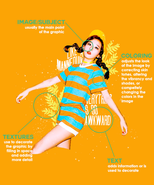
image/subject
usually the main focus of the whole graphic
you should always try to use a sharp hd picture - getting it from the original source is always the best option
make sure the source of the picture allows editing - pictures from public sources like a company or the news can be edited while fansite pics and scans need to have permission asked (and if they give you permission make sure you link them when you post your graphic!)
coloring
often referred as ‘psd’ because that is the format they are in (i.e. pink psd pack)
comprise of multiple layers that can alter the images look
a lot of people make their own colorings since the outcome of the look also depends on the image’s original coloring
textures
smaller cut out images that are often used to decorate the graphic
can also refer to a image that can be use as a background of a graphic
can be found in the form of a png (copy + paste into graphic) or a brush (”painted” on to the graphic)
avoid using any textures that does not state the original poster made them - you could unintentionally be using someone’s work that was not made to be used [read more about it here + resources that you can actually use]
text
text can be used to tell information or just for decoration
try to choose fonts and colors that are legible
faq
what software can i use to make graphics
most people use some version of photoshop (i currently use photoshop cc 2018) and a lot people have it cracked but if you cant afford photoshop, find a cracked version or a patcher (i used adobe zii 3.0.4 for mac), or are uncomfortable with getting a cracked version then there are other softwares that are just as good!
i can only vouch for gimp since i used it when i first started making gfxs. it is very similar to photoshop and shares most of the same tools and has a similar look to photoshop. it is also probably the most popular photoshop alternative and would totally recommend it if you cant get photoshop!
[visit + download gimp here]
where do you get your pictures from
official sources such as teasers companies release, photos released by press, photos from idol’s instagram - basically photos that are made for the public to see are whats best to use for a gfx. you should download the photos straight from the source so you get it at its highest quality
some phrases you can use to search for pictures on google: - [group name] photoshoot - [idol name] press - [group name] showcase - [idol name] teaser
remember the more specific you are in your search the better! also when you search through google make sure you check your source!
avoid getting photos from reposting websites like we heart it and pinterest avoid using fansite pictures and scans unless you are granted permission
i don’t know where to start/i’m overwhelmed and i don’t know what to do/ where should i begin
figure out what you want to make or a theme you want to follow - do you want to make a simple graphic or a infographic? do you want it to center around a certain theme like a comeback or a photoshoot? once you determine what you want to do it becomes easier getting ideas and finding stuff you will need for the gfx
example thought process: “i want to make a loona graphic” → do you want it to be the whole group or a certain member or unit? will it just be a simple gfx or a AU gfx or based on a event that the group is doing? “i’ve decided on doing a kim lip one” → do you want it to have a certain theme like kim lip smiling or kim lip with blonde hair? is there a certain frame of time in which you want the graphic to represent like during eclipse era or hi high era? “i want it to be from max and match era with her teasers” → from here you can start finding pictures to use and thinking of colors and textures that would fit your theme
where do you get ideas/inspiration from
i mean it’s different for everyone but for me i literally just think of stuff and i’m like wow i want to make that happen asdfsdfj but mostly when i see pictures or watch something thats where i suddenly get a idea
but tumblr is full of graphic makers!!! ive seen so many amazing graphics from various fandoms like kpop, anime, marvel, etc.
some amazing graphic editors i know myself include: primirene, ireone, nctjaemin, celo-mar, 1hyungseo, jeongahn, haechxnie, sonxiumin, syua, lulumelody, dinomite, lovelyeo, joohys, whatchatalkabout, yveu, maerinah, mihyon, lorbits, cherryjennie, thatporcelain, monoka, ifbin, 7ww
some other places you can look at are behance (dont go on behance if you have a cracked ver of ps - it might trigger a ingenue software alert that is a huge pain to deal with), pinterest, deviantart, dribble, and probably any social media platform if you just look up #graphicdesign
remember if you take inspiration from someone’s work then you should cite them in your caption - if you are afraid that you might’ve accidentally copied someone when you were trying to take inspiration from them its best to either try to remake the gfx again or just to ask the creator permission if its fine if certain details are similar/same
my stuff sucks how do i get better
literally just keep on making stuff aka practice. you can’t improve if you don’t bother putting effort.
ways i’ve forced myself into practicing making gfxs is by: 1) starting a gfxs series - its self paced and is based on what you want to make (i.e. introducing my biases gfx series, my favorite outfits gfx series, etc) 2) taking in requests - people who would request from you probably like your stuff so its a win win situation (i.e. send me a idol + era, send me your bias + palette, send me a group and i’ll make a gfx of my fav member, etc)
tips
only sharpen your pictures after you are done resizing them, if you sharpen and then resize it might result in a more blurry or grainy picture
always save your graphic every 5-10 mins in case photoshop crashes
have two copies of your image cutout: one will be the original and the other one will be the one you edit with - in case you mess up like over erasing or over sharpening your image you have a back up you can use
stick with a color palette so you don’t get overwhelmed when having to color everything and it makes all the graphic panels you have look more cohesive
on photoshop you can favorite fonts!!! take advantage of it!!! your computer has a lot of fonts saved on it and it takes forever to look through a whole list of fonts so by favoring fonts you can see all of the fonts that you like to use for graphics
combine a png pack to one psd → when you open a png pack you will probably get a lot of png files and it gets annoying having a lot of tabs open in photoshop when most of them are just textures so by putting all of those pngs into one psd you can cut down the files you open and can easily see all of your options
make folders dedicated to colorings and textures that way you can easily access them instead of looking through your computer for a certain file
name your layers... i dont do it because its easy for me to tell what layer is what but when you are working with a lot of layers its best just to name them it’ll make life easier
lock your main image/subject so that when you play with texts’ and textures’ location you don’t accidentally move your main image
use curves to help get a photo back to its original coloring! like if you have a photo that has a weird filter on it just use curves and it’ll help the picture look more natural! [tutorial]
try warping your text to make it stand out more! you can access it by pressing the icon on the top text bar that has a T with a curved line under it. i use flag and wave the most
alter a particular color by using a selective color layer
rather than changing the actual color of an image/texture you can: create new layer → select the image/texture and color it on the new layer instead of on top of the image/texture → change the opacity or the mode of the layer so that the color is put on the image/texture while keeping its detailing and not affecting the actual image/texture
resources
colorings: can be found on deviantart or tumblr just look up ‘psd coloring’ or ‘[color] psd’
textures: can be found on deviantart (check to see if its og content or stolen) simply just search what you are trying to find or ‘png pack’ or ‘texture pack’ common textures you can try to find: vintage flowers, memphis shapes, organic shapes, doodles other wesbites: pngtree, creative market, lost and taken, spoongraphics
fonts: if you are looking for a certain font then you can just do a google search but if you are browsing then dafont and font squirrel are really good websites too some of my favorite fonts: abril fatface, agfatumc, antonellie calligraphy, arcadeclassic, bebas neue, century gothic, couture, daily news 1915, dark larch, hondurhas, kotori rose, krinkles, risingstar, sant joan despi, studly, zing rust
color palettes: i made one myself which you can find here, color hunt, and honestly a quick google search will give you tons of options
if you have any questions, other stuff you want me to cover, or want to add more resources and tips then please dm or send an ask! i hope this helps!
#i really hope this helps someone and that it makes sense#i literally woudlve been so happy if i saw this when i first started it took me so long to figure things out and im still learning#also i basically told where i got everything so like please dont take advantage of this and end up copying my gfxs... its happened to me a#lot#idk what to properly tag this alfkjasd#ps help
129 notes
·
View notes
Text
Yuumi’s art process (with pics!)
This is how I go about doing the art palettes, and generally how I do art (specially on lose, not so long pieces such as these). I’ll breakdown the process under the cut so I don’t spam people’s timelines (´・ω・`)
I was going to put these final advises at the very end but someone else might make use of these instead of going through the whole thing so here:
Important things to keep in mind in case you’re learning and actually think I’m worth being listened:
References are GOOD. No one is perfect and no one knows how to draw stuff from their memory so go google weird things, Google-sensei won’t judge. Hopefully. (else set your navigation on private).
Brushes and whatnot don’t make the artist, but it sure as hell help you feel like you’re doing what you like or not. I can’t stress enough how many times I’ve just not finished works because my brushes felt “off”.
Posemaniacs is very good for both anatomy and speed practise (I’m aware I’m really fast compared to my fellow artist friends but by no means it’s a standard, I just got used to work fast uwu)
Be careful with your wrist!!! use your whole arm when drawing!! and also T a k e · b r e a k s.
Art block is a bitch and strikes anyone. I’m usually artblocked but if you find something you’re passionate about go draw that, whatever it is. (I hadn’t consistently drawn in p much 5 years after college and thanks to MLB season 3 here I am LOL)
And now for the actual breakdown:

Step 1: Sketch
My first step is the sketch, which some of you might think “but it’s SO CLEAN!!”, yes, sometimes I leave my sketches as lines and polish them a bit. Anyways, these is what my sketch looks like and next an important thing:
...which is the 2/3 rule! Photoshop blabbery ahead, tl:dr how i made the grid
I’ve been doing this small trick by filling a layer of any color, lowering the opacity to 50% and transforming it to 33,33% it’s height duplicate and place on each side of the canvas and then merge, and then another layer doing the same but doing 33,33% width instead of height. Then I merge both layers, set the opacity to 30% and the result is that perfect 2/3 rule.
If you don’t really know what the rule is, I kindly suggest this instead of my explanation bc words are not my forte.
Step 2: Lineart!
Nothing to say here other than cleaning the lines from earlier with a different (or the same in this case) brush as the sketch one. Opacity varies from day to day.
I have several styles of lineart and they all come with the mood I feel on that day, so don’t be afraid of experimenting and finding what you like most! I personally like thin lines a lot but also thick lines too! i’m constantly looking for the perfect line™ and to give an idea this is what my brushes look like:
in summary, practise with as many tools you can find around and see which ones you like most uwu

Step 3: Base Color
This is probably the part where I give up the most bc it boooooores me LOL. I try to spend as little time as possible in order to overcome this step. These are usually colors I use in 99% of my pics, since... idk years. If you look in my old arts in twitter you’ll see them haha.
Something important I’d like to mention here is ✨LAYERS✨:
This is how my layers look like in the base color part. I tend to do 1 for skin color, 2 for hair / eyes, 3+ for clothes and stuff. I tend to separate them in colors so they don’t merge! I go with numbers because... I think it’s faster to type and I’ve been using this way of naming for years so it works for me, what matters is that you group your layers and keep them organized uwu (specially if someone else has to look at your psd files >>)

Step 4: Shading!
Normally, I shade every single layer with a proper shade but on the case of the palette challenge I’m doing just the skin because I want to stress the light mood. Liiiike if I want to go with a softer light I’d use lighter shades or a stronger light = stronger shades. To pick colors, I usually go with that brown from Chat Noir and Marinette’s jacket as my universal black (I don’t like working with black, I’m weird), and most of the colors I just eye pick from the Color Picker on Photoshop. In the right you can see my swatches:
To choose the shade tone (in this example we’ll use Chat Noir’s hair), I picked a Yellow -Adrien’s hair is specially hard to color ugh- And then with that same tone I’d choose its shade going diagonally looking for a darker tone. This way you can find interesting colors! On this pic I did that for Adrien’s hair and... the rest I did the following:

I did my lazy shading™ : which consists in a layer set to Multiply with 50% opacity (this varies depending on the light, again), and I shade everything with the same tone (my to go is purple, but sometimes I use other colors too). This gives a sense of uniformity and the resulting shades are way nicer in my opinion.

Step 5: But Yuumi... where are the palettes???
I take that people straight handpick the palettes and use them to shade all the way and I respect them for that. I instead decided to do whatever floats my boat so I color regularly but add the palettes over the whole thing to change the overall mood and colors of the illustration. I randomly use the Gradient Tool and use the palettes’ colors around and then set that layer to Screen, Multiply, Focal Light, Overlay... etc etc, whatever I feel like doing in that moment, and so the magic happens! :’D
I don’t usually do this on my works but this is a new way to experiment for me and I’m having fun with it!
Step 6: Finishing Touches
Here is where I use the palettes the most, adding random highlights in whatever way I feel like. Yep, I pretty much Ladybug my whole coloring process: Wing it and go with the flow™. I’m still learning about lighting and whatnots but I really don’t care at this point LOL
To which you’ll say: But Yuumi?? In art school they told me that---
To which I say: shhhhhhhhhhhhh assigntments are over for me. go watch some Bob Ross (I am serious). Do whatever you feel like. Be happy. No one is going to judge you, and if they wanna judge they better be paying for your work first. so. whatever you do: BE HAPPY. or don’t do it. unless it’s a school assignment, in that case go do it or i’ll kick your ass.
✦ Finishing Notes ✦
So yea, that’s my art process in how I’ve been doing these Miraculous Color Palettes and generally how I go about my illustrations most of the time. For more complex illustrations, I need to remember how I did those (oops). And actually, do them. These illustrations usually take up 2 or 3 hours to make, on other pieces i’ve been working on them for up to 8 hours, it really varies from piece to piece, but I hope this was helpful!
Please let me know if you have any questions, commenting in this very post will help me -and others?- keep track of things and learn together! My asks are also open and I’ll reply as fast as I can uwu (my requests are still waiting there, don’t worry).
aaaaand that’s all, folks. Stay Peachy!
54 notes
·
View notes
Text
After Effects Text Effect Tutorial
A while back, an anon had sent me a request on how to do the fancy little text effects for a previous gifset I made, so that’s what I’m here to show you all today. Here, we’re going to be going from this:
to something like this:

What you will need:
Photoshop (I have CS5)
After Effects (I have CS6, though this tutorial should work with other versions; I will provide links on where to get AE somewhere down below)
Basic knowledge on how to make gifs in Photoshop
A folder or two for your gifs (I’ll explain why as you read on)
Your scene/shot already giffed in Photoshop
The font(s) you will be using for your gifs
Some time and patience (because this is most likely your first time doing this, and it may take a minute to get the hang of it)
As this tutorial is very lengthy, detailed, and image-heavy, I want to divide it into separate little parts:
Part 1 - Opening Your PSD in After Effects
Part 2 - Adjusting Your Timeline Panel in Preparation for Your Text
Part 3 - Typing and Animating Your Text
Part 4 - Rendering Your Composition for Photoshop
Part 5 - Saving Your Final Product
PART 1 - OPENING YOUR PSD IN AFTER EFFECTS
The first thing you’re going to want to do is make your gif however you want it. Since this is solely a tutorial that teaches you all the fancy text effects, I won’t be delving into a basic gif tutorial, though if you would like me to do one of those, or if you want me to direct you to some tutorials that helped me with my giffing, then I can definitely do that for you as well.
Here is what my gif looks like with my coloring and without any text on it:

However, we’re not going to do the whole “save for web and devices” thing just yet. Before we go into the tricky part, you wanna make sure you’re fine with the coloring that you want to use, and after that, we’re going to open After Effects. When you open up the application for the first time, it may end up looking something like this:
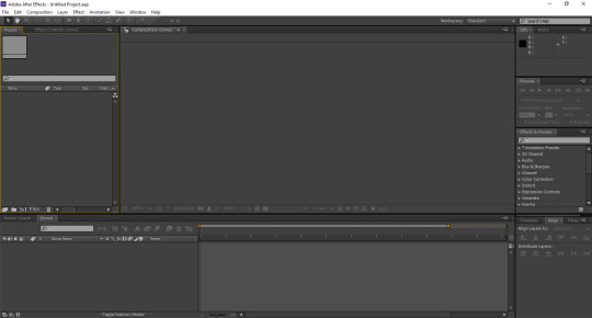
What you’re gonna want to do next is create a new composition. Go to Composition > New Composition to create a new canvas for your gif. A little menu will come up, asking you what size you would like the composition to be. You want your composition to be the same size as the gif itself. So make sure the box where it says Lock Aspect Ratio is unchecked, and type in the dimensions for your gif (the gif I’m using for this example is 268 x 200). For the frame rate, I keep it at 29.97 frames per second for the best results. Once you’re done with that, click OK.

Once you have your composition ready, you’re going to want to open the PSD in which your gif is made into After Effects. To do that, you will go to File > Import > File..., and it will ask you to select your PSD. You should see something like this once you’ve made your selection:

You want all your layers to be there when you make your edits in After Effects, so just click OK. Your PSD will then be located on the left side of the screen. Underneath that, you will see this big, blank space labeled Comp 1.

Your next step is to drag the PSD down to this blank area, and that is when you will see your PSD cover your composition that you previously made.
PART 2 - ADJUSTING YOUR TIMELINE PANEL IN PREPARATION FOR YOUR TEXT
One important thing before we actually get to the text part itself. When you load the PSD into After Effects, you’re going to see this little timeline panel towards the bottom of your screen. It’s similar to what you would see when you would do the whole “frames to layers” thing when you make a new gif in Photoshop. Here, you’re going to notice two things: 1) the gray time ruler (that long, gray bar with the yellow end points) is used to determine what is visible when you’re working on your gif, and 2) the short, light blue bar shows you your gif itself. However, usually when you load a new PSD into After Effects, you’re going to end up with a lot of unnecessary time that you won’t be needing.

Towards the very bottom is this little slider that allows you to get a better glimpse of the duration of the PSD you chose. Drag it far enough so you can see where your gif starts and ends. Once you’ve done that, you’re going to drag the gray ruler exactly where your gif ends.
Note: You don’t have to drag the smaller ruler on top of the bigger one; it’s gonna move on its own when you drag the bigger ruler to your end point.

Now you know exactly when the text for your gif is going to stop moving. Your primary goal is to showcase the entirety of the effect you would like to choose, and I will show you why that is in a minute.
PART 3 - TYPING AND ANIMATING YOUR TEXT
Here’s the fun part that you all have been waiting to see. Go to the panel towards the top and select your Horizonal Type Tool. You can choose any particular font you would like for your gif. For the purposes of this tutorial, I am going to use the font Questa Grande. Once you’ve selected your font, type your text over your PSD. You want your PSD to be centered over your PSD, so go to Window > Align, and you should see a little alignment box towards the right side of the screen. I placed mine in the same area with the Character and Paragraph tabs.
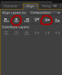
When your align tab is ready, click on these two center alignment options, and your text should be exactly in the center of your gif.
Note: You have to turn your Caps Lock off in order for this to work, as it will not only not center your text, but it will also cover your composition in one solid color.
As you will see in the timeline panel, the red bar represents your text layer. However, it is stretched out way past the point where your gif actually ends.

Align this red bar with the light blue bar as shown above. This will definitely come in handy when you are working on applying the effect itself and making it fit in your gif, which we will go into next.
The next step — and the for-real fun part — is where you choose the text effect you would like to apply to your gif. Over to the left side of the screen, you will see a tab that says Effects & Presets, and here contains a bunch of folders and whatnot filled with effects that come with After Effects itself. You’re going to want to click on the one that says *Animation Presets, and from there, you will click on the one that says Text.
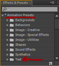
At this point, you can experiment with different text effects and see which ones you like. I’m going to show you a couple of examples of how certain effects look, because depending on the one you would like to choose and how long your text might be, you may need to make a couple of adjustments. For instance, when I go under Animate In > Fade Up Characters, this is what my gif now looks like:

Notice how the animation was able to complete itself before it reaches the end of the gif. That’s what you want for your particular gif. If you’re able to get all of your text to fit like this, then you can skip to the rendering section, if you like. Now, in some cases, you may run into animations that may not be complete when you play the whole thing through. Let’s say I decide to go to Animate In > Twirl On Each Character instead. This is what it would look like when you leave the animation as is:

What’s happening here is that some of your text gets cut off towards the end, which more than likely means that you would have to change the time stretch for the effect you’re using. What do I mean by this? Well, try right-clicking either over the text on your gif or over the text layer in your composition panel (that big space where we dragged the PSD earlier) and go to Time > Time Stretch..., and you will get this little window that comes up.
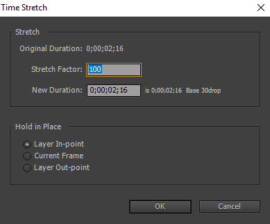
You will have to change the percentage showing in the box where it says Stretch Factor in order to squeeze all of your text in at once. You can experiment as much as you want with this until you get your desired look. I’m gonna type in a stretch factor of 70 just to test it.

However, when you change the stretch factor of your text, then that red bar in the timeline panel is no longer aligned with the light blue bar that represents your PSD. If you leave it like this, then there is a chance that your text might cut off and disappear, leaving the remainder of your gif blank. So you’re going to drag that red bar back across and line it up with the light blue one so they’re together again. Now I’m ready to test the text out once again.

This time, the whole animation is able to play itself out so you can see all of your text appear in the gif. For some people, this particular stretch factor may be cutting it a little close, so if you want to lower it to, like, 60-65 or something like that, you can definitely feel free to do that, if you want.
Here’s that same gif, but instead, I use the Raining Characters In animation and set the stretch factor to 90:

Like I said, feel free to experiment with different effects, because there are a lot of text effects already in the application that you could use. If you somehow don’t find something that you want that’s already in After Effects, feel free to look around for more text effects online, apply them to your application, and then try and follow the steps I provided for you previously.
This is another optional step, but if you’re editing your text over a very bright background, you can change the text color from white to something else. In this gifset I made not too long ago, for example, I had changed the text in one of the gifs to a particular shade of blue. To do that, you would go to the Character tab (located in the same area where I put my Align tab) and change the Fill Color (that little white square next to the available fonts).
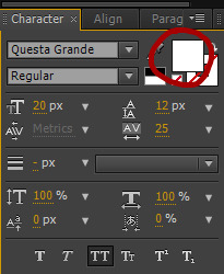
PART 4 - RENDERING YOUR COMPOSITION FOR PHOTOSHOP
Now you have your text, the animation you would like for your gif, and all that other good stuff, so now we’re going to save it so we can open it back up in Photoshop. Go to Composition > Add to Render Queue, and you will see this appear towards the bottom of the screen.

My screenshot shows multiple different compositions here for the purposes of this tutorial, though yours will only have just one since you’re starting out. There are two main areas we want to focus on changing here: the one that says Output Module, and the other one that says Output To. When you first add a composition to the render queue, the output module will be set to Lossless. Click on where it says Lossless, and this little window will come up.

The format is automatically set to AVI when you open it, but you want to change it to PNG Sequence. And for the channels section, just change that to RGB + Alpha, and then click OK.
Earlier in this tutorial, I said you would need a folder or two for your screencaps. I said this because when we changed the format to PNG Sequence, that means the gif we added the text effect to in After Effects will be saved as multiple PNG frames after it’s being rendered. In order to keep these frames organized, I personally like to make a folder for the PNG sequence to be saved in.
After making a new folder to save your frames, you’ll want to go to the Output To section and click where it says Comp 1_[#####].png. It will ask you to find the folder that you want to save the sequence in. Once you select that folder, click OK. Once everything looks okay, all you have to do is click Render, and your gif will be saved to that folder.
PART 5 - SAVING YOUR FINAL PRODUCT
You will now need to open up your PNG sequence in Photoshop in order to make it into a gif. To do this, go to File > Open, and find the folder where you placed all of your screencaps from After Effects.

Click on the first screencap within that folder, and then check the box where it says Image Sequence. That will ensure that all of the screencaps within that folder load in your Photoshop document. Once you do that, click Open.
Another dialogue box is going to come up, asking you what frame rate you would like to use. It should be set to 29.97 frames per second. If it is, click OK. If not, change it to 29.97 fps and then click OK. Now all of your frames are all together. Next, go to File > Save for Web and Devices..., make sure your file is under the file limit (3 MB) before changing the Looping Options (towards the bottom right of your dialogue box) to Forever, and click Save. I prefer to save this gif in a separate location from where you placed all of your PNG screencaps previously.
Then open the gif you just saved. You should see that all of the screencaps are set to a screen delay of 0.03 seconds in the frame animation panel. This delay makes the gif move too fast. For the best quality gifs, you want your screen delay to be set at a normal speed but also not too slow (e.g. 0.07). I set my screen delay at 0.05 seconds for all my gifs.
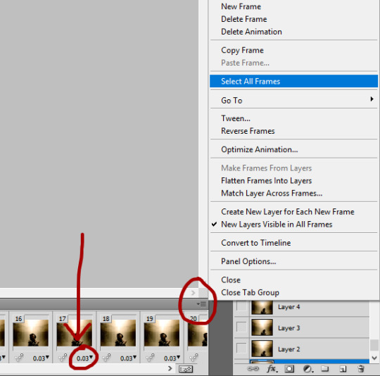
To do that, click this gray button on the top right of the frame animation panel and go to Select All, which will select all of your caps in the panel at once. Then click on the 0.03 on any of the caps you see, and then go to Other..., which will pull up another dialogue box asking you what set delay you want to choose. Then type 0.05 in the box and click OK. Lastly, go to File > Save for Web and Devices... once again, and click Save. To distinguish your final product from the faster gif you saved previously, just change the name (or, if you want, you can keep the same name, and then a dialogue box will come up asking you if you want to replace the gif or not; at this point, just click Replace, because you won’t be needing the faster gif anymore).
And that’s basically it for this tutorial. I know a lot of people aren’t too familiar with After Effects or much less even know how to use it, but since we’ve reached this point in the tutorial, I want to leave you with a couple of extra tips:
You may want to practice using text effects with smaller gifs. I say this because the file limit for gifs (3 MB) may be restricting for big gifs, especially those that are 540 px.
Going off the previous point, make sure that your gif doesn’t have too many frames in it to the point where it goes over the file limit.
The process for this tutorial is basically the same with edits or graphics, except you don’t have to really worry about the file size as much as you do with gifs, because the majority of your image will be still. However, it’s always important to check anyway in case something happens. If you end up with more frames in your edit/graphic than necessary with the text effect(s) applied to it, feel free to delete whatever you’re not going to be using once you get ready to save the final product.
I encourage you to experiment with different text effects and see what works. Not every text effect you look at will work out, depending on your personal preferences. I’m still kinda new to After Effects as well, so we’re all learning here lmfao.
When testing new effects, make sure you press the First Frame button in the Preview tab (it’s gonna be that one arrow pointing to the left towards a vertical line) so you’ll know that the animation will start at the very beginning of your gif. This is very important, because if you don’t do this, then the animation will start wherever your current time indicator (that yellow thing that goes back and forth in your composition panel) had stopped previously, and then you won’t be able to see the whole animation.
If you make a mistake at any point in testing out new effects, just go to Edit > Undo so you’ll know where you’re at.
Just practice using After Effects in general. You may end up finding something that I haven’t even come across yet. That’s totally fine. Not everyone is gonna understand it right away, so study it as much as you can.
For those wondering where specifically I got AE, I don’t remember the exact link (when I got it, I was looking for it on my old laptop, which malfunctioned before spring break this year, unfortunately), though it did take a lot of Google searching for the link to AE CS6, so if you do that and find a good link, feel free to share it so more people are aware. But for the sake of this post, here are a couple of links to posts where you can access a download link:
maxiresources downloads by @maxiresources
How to Get After Effects by @alternatetutorials
Adobe CC 2019 Suite by @yeahps
Activating CC 2018 Programs on MAC (Photoshop, Illustrator, After Effects, etc.) by @kaeveeoh (this should work for PC as well)
Make sure all of the links work when you're looking for one to download After Effects. If the ones I provided don't help, I'm sure you can ask at least one person from @yeahps or any other popular Photoshop blog for some advice.
If you have any questions on any part of this tutorial, feel free to message me anytime you want. Other than that, if this tutorial has been helpful for you, please give it a like/reblog. It would be greatly appreciated.
#completeresources#yeahps#chaoticresources#itsphotoshop#usernums#arianagrandre#gif tutorial#*#resource*#not really sure who else to tag but yeah here it is#@ anon sorry it took me so long to make this btw#between summer school and cleaning my room and dieting i've been up to a lot lately#but i didn't want to leave you hanging either so here you go!!!
282 notes
·
View notes
Photo
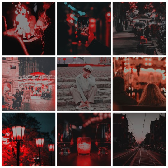
» Pairing: Kim Taehyung x Reader (female OC) [Strictly Platonic]
» Genre(s): Post Breakup!AU, Best Friends!AU, Non-Idol!AU, Friendship, & Angst
» Rating & Warnings: PG-13 / mentions of break up / slight-mentions of insecurities / mentions of alcohol / mentions of drunk sex
» Word Count: 389
» A/N: Do you guys like that throwback to Namjoon’s mood board/drabble? I’m glad that Jim the plant is doing good!

“I don’t what’s wrong with me, Y/N.”
You smile sadly. Your heart aches seeing your closest and dearest friend so heartbroken. You want to offer him words of encouragement, but somehow you can’t form the correct string of words.
While it’s not directly your fault, you can’t help but feel guilty. Your gut has told you that Sowon was the one for him. Even more so, when she has stated, numerous of times, that she didn’t mind your close friendship with Taehyung.
So, what changed?
“There’s nothing wrong with you, Taehyung,” You tell him, placing a warm hand on his shoulders. “I’m just as confused as you are, to be quite honest.” You add, looking off into the distance, noticing the happy couples all around you.
Maybe hanging out at the town’s local hot spot for dates is a stupid idea.
Taehyung sighs deeply, finding it difficult to control the tears that are desperate for release.
“Should I talk to her?” He asks as he pulls out his phone from the pockets of his jacket.
You give him a look that basically tells him that texting his ex-girlfriend is a dumb idea.
Taehyung’s lips thin, “Yeah. You’re probably right...” He trails on, tucking his phone away, “So, what should we do now? I told my roommates that I wouldn’t be home until 11 tonight.” He asks, looking around his surrounding as he tries to find something salvageable for them to do as friends.
A faint hum emits from your lips as you search for something - anything - for the two of you guys to do.
Then, your eyes home in on the beer stand as a lightbulb sets off in your mind.
“Want to drink your sorrows away?”
“Depends, are we allowed to have amazing drunk sex afterward?”
You click your tongue, “I don’t think my boyfriend would appreciate that, Taehyung.”
Taehyung nods slowly, “Oh, yeah. How are things going with Namjoon anyway? How is Jim?”
You laugh softly, “Jim is fine. He’s thriving but is quite sad that there hasn’t been a whole lot of sunlight lately. As for Namjoon, he’s doing good. He sends his sympathies over what happened and has told me to tell you that you’ll find someone better.”
“Aw, I knew I was his favorite.”
“Well, The Kim Trio has to stick together.”
“Damn straight!”

❝Late at night, your drunk voice Tells me that something sad happened You said you had a big fight with him And asked me to comfort you❞
— “Best Friend” by IKON
↳ Photo Credits: 1 | 2 | 3 | 4 | 5 | 6 | 7 | 8
↳ PSD © itsvenue
» Mood board Series: BTS as Seasons - 7/7
#bangtanarmynet#bangtanhq#kwritersworldnet#armyofwriters#btsbookclub#btswritersguild#/myaesthetic#bts#bts taehyung#bts v#bts drabble#bts aesthetic#bts moodboard#bangtan#bangtan taehyung#bangtan v#bangtan drabble#bangtan aesthetic#bangtan moodboard#taehyung#taehyung drabble#taehyung aesthetic#taehyung moodboard#v#v drabble#v aesthetic#v moodboard
14 notes
·
View notes
Text
ashlee’s gif making tutorial
@amysperalta has requested a gif making tutorial from me and i’m happy to oblige! everyone has a different way to gif and some ways don’t work for some people, so this is just how i personally make them. i’ve also never made a tutorial before, so let’s hope this doesn’t end badly.
this is the gif i’ll be making for the purposes of this tutorial:
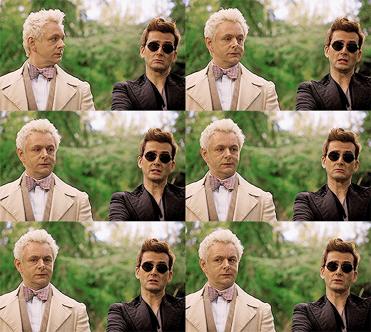
things you’ll need:
a version of photoshop
some way to get frames from a video file (i’ll give some options)
patience
step 1: getting your frames
there are many, many ways to do this. there are multiple different programs to do this with (kmplayer, uplayer, gom player) but i personally use mpv (via @kylos lovely tutorial here; which i also highly recommend as a gif tutorial since it gives a different way to create a gif file) because my mac doesn’t accept any other type of program.
note: BE SURE THAT WITH ANY PROGRAM YOU USE, IT IS SET TO SAVE EVERY FRAME. some people may lie to you and say a program grabbing every other or every third frame is fine, but it’s 2019 and we don’t do that any more. the tumblr gif limit is 3mb, which means we can have smooth, non-choppy gifs by gathering every frame from a scene.
okay, so i gather my frames, and typically keep them in a folder, separating scenes cut-by-cut so it’s easier to handle. for example:
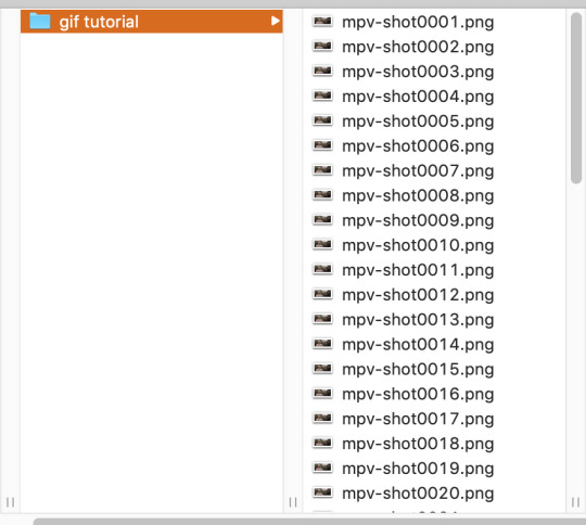
from there, i import them into photoshop using: File --> Scripts --> Load Files into Stack; this screen pops up, in which you browse for your frames hit OK. this will automatically upload all the frames into the same file for you. be patient! depending on how many frames you choose, it can take a few minutes to upload all of the frames.
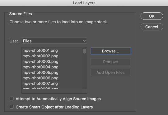
i always save my work after every step. so once frames are uploaded i save the file. be sure to have “timeline” (or “animation” on some versions of photoshop) opened in your view. my photoshop looks like this when i open the file:

now, i’m going to click “Create Frame Animation” at the bottom. This will give me a timeline to work with at the bottom. Next step, go to the three little lines on the right side of the thingy that says “Timeline” and go through these steps:

and then

now, you have a working gif! you can hit the little play button at the bottom left of the screen and it should play for you.
step two: cropping and sharpening
there is plenty you can do for sizes on tumblr. the general widths are 540px (big), 268px (normal) and 177/178px (small). it’s all a matter of the type of set you’re making. also be aware that the gif limit is 3mb. the bigger the gif, the fewer frames you can have. most of my 540px gifs have between 20-35 frames, while some of my 268px frames can have 75-90 depending on the coloring of the scene.
but for the purpose of this tutorial, i’m making one 268x160. i go to the crop key at the left side, and set my ration up top to 268 and 160.

then i crop the gif! (note: sometimes, files will have a black line on one side of a video file; typically the bottom or on one side. the black line will be no more than 2px big and sometimes hard to see until you’ve cropped it. be sure to drag the cropped area away from the edge of the files that have this dark line, as it when appears on the final gif and looks bad. one of my more recent sanditon gifsets fell to this and i didn’t realize until i had posted it. 😖)
now we have to size it. you do do this by going to Image --> Image Size or using the keyboard shortcut. it should automatically keep the aspect ratio, thus when you change width to 268, the height should change to 160 automatically.

hit OK and now you have your base gif!
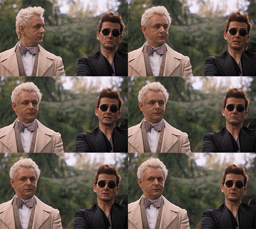
next, we’ll be sharpening and setting the frame rate, two very important things. to sharpen a gif, there is no way you want to go do it frame by frame, so you can use an action! these are really helpful. i have one i use for most gifs, and one i use for lesser quality. the one i use for this gif is this one here. to use this, you’ll have your photoshop open, you can go to your actions in your barthingy on the right by color swatches which should look like this:
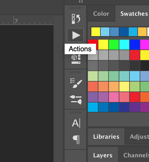
click that and find the three grey lines at the top right. click them and this will pop up. you’ll go to “load actions” and then browse for the action you downloaded.

once loaded, it will show up like this and have a nifty play button!
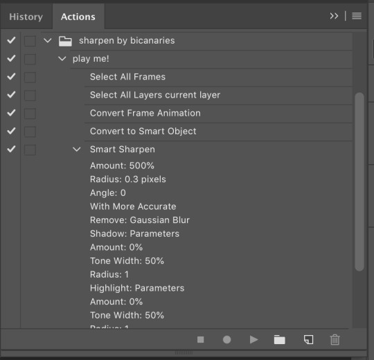
make sure you click on/highlight the “play me!” line and then hit the play button on the bottom of the box. it will go through the motions for you and sharpen your gif. once that’s done, you can hit the big action button to close this box to get it out of the way. now, to set a frame rate, you’ll go down to the timeline and highlight all of the frames and then click while holding shift and this will pop up.
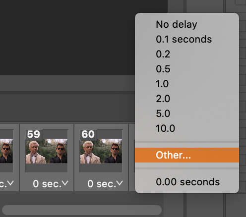
you’ll select “other” and type in “.05″. this is the most commonly used frame rate. most movies and tv shows will look fine using this for scenes, especially ones with subtitles, etc. for more artistic scenes, sometimes i’ll use “.06″ to slow it down just a hair. also make sure that your gifs are set the loop “forever”.
and there you go! a gif fully sharpened and moving at the proper speed:
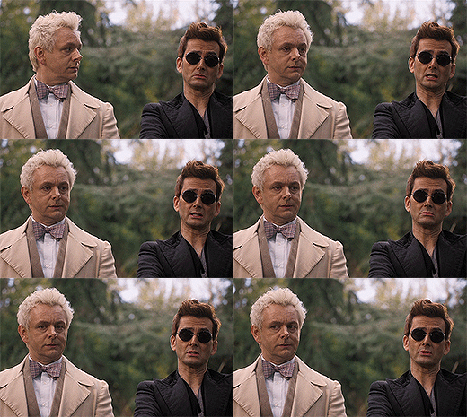
this is also the time you can choose your frames. meaning if you uploaded like 200 frames and only wanted to use 50 of them, you can go through and delete them in the timeline. there’s a little trashcan button there.
note: once you’ve sharpened and set your frame ratio, be sure to go into your levels box and click the top frame. it is also useful to have the first frame in the timeline always highlighted as you’re editing the rest of the gif.
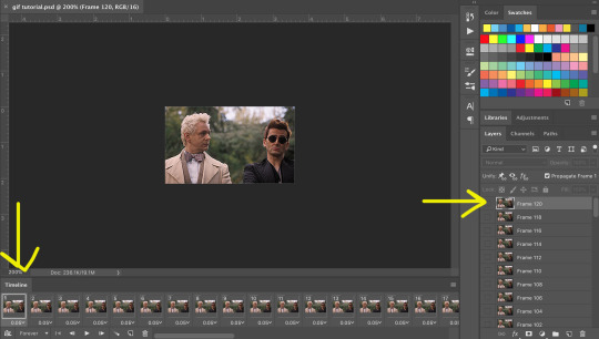
step three: coloring
there are endless ways to color. there’s loads of people offering psd colorings. (psd means an editable photoshop file btw) you can also make your own. i have a whole slew of psds i’ve made for certain scenes that i’ve kept and reuse, tweaking each time. this isn’t a coloring tutorial, but i’ll show you a quick way to make a simple coloring. (i purposely chose a well lit scene for this gif tutorial for this reason. making dark scenes look good, or scenes with bad color balance is a whole other tutorial lol)
first off, make a folder above your frames. you can name it whatever you want; it will automatically call itself “group 1″. this is where you’ll be putting all of your coloring layers so they stay together and you can also save it to use again.
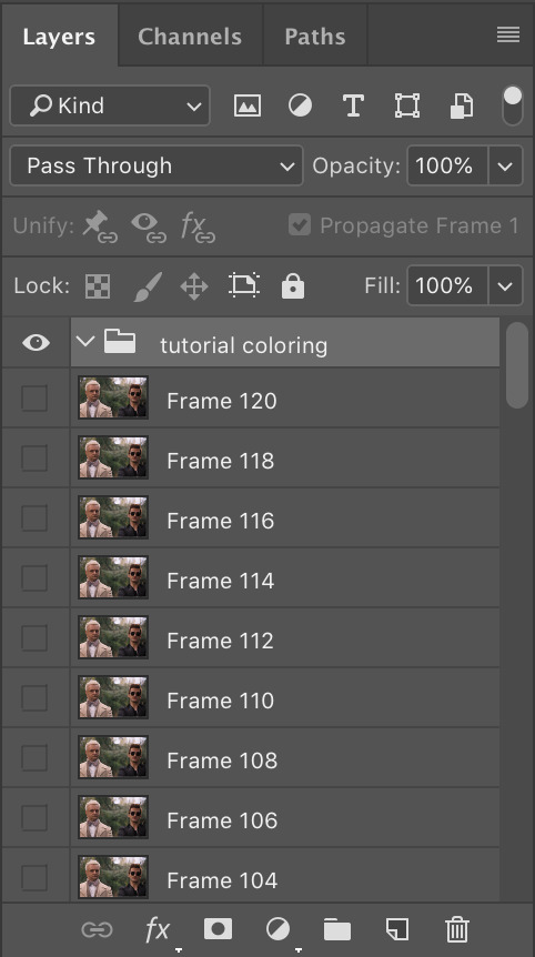
from here on out, we’ll be adding layers, using the half black/half white circle down at the bottom; just click on it and it’ll pull up a list of things you can use. note that when you add coloring layers, you start at the bottom and add other layers on top of it.
always start with “levels”. i lighten up almost every scene i gif, since it gives me the chance to play with contrast on my own terms.
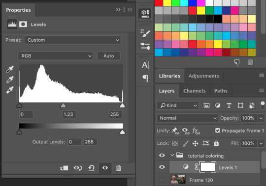
then we’ll do a “selective color”; this one is just to set some blacks while giving contrast. be sure to select “blacks” at the top and change just what’s below:
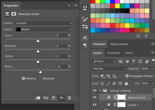
most gifs also need some “color correction” at this point. (this is a layer you’ll keep coming back to to tweak as you add more above it fyi.) for this one, i’ll make it a bit more green and red.
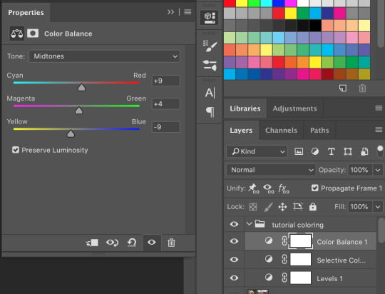
the gif right now looks like this....which isn’t perfect, but i can see where it will get to from here:

now we’ll add a layer of 100% “vibrance”

not every gif needs 100% vibrance, but i tend to like how colors look when i use it and we can fix any weird colored skin in later steps. and now some curves for contrast:
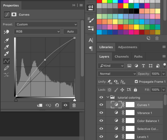
the gif now looks like this:
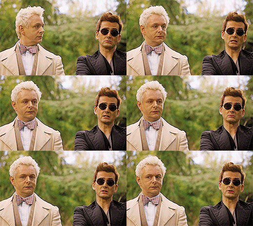
which is much too yellow certainly, but gifs always look worse before they look better when it comes to coloring! next, we’ll make another layer of “selective colors”. this is when you’ll play with each color within the same selective color layer. i’m guessing i’ll utilize more blues and less yellows under “yellow” and “red” but let’s see what happens:


now it looks like this!

which is a lot better. i’ll probably up the blacks +10 (using the same selective color layer) just a bit so crowley can be his angsty self entirely. i also want to up the greens because i love bright gifs.
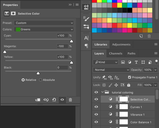
the great thing about selective colors is that they’re easy to manipulate. and you can even have multiple of them over one another to really zero in on one color. and if you find that you can’t get the gif to look right at all, you can also return to your color balance layer and tweak it until it looks better and is easier to manage.
so now, my finished gif looks like this:

(this is not the most exciting gif ever, but it works to show how to play with colors in a well lit scene).
there is a number of other things i do/can be done in making gifs, but these are the basics.
be sure to go to File --> Export --> Save for Web and follow my settings to save your gif. (there are many ways to save a gif, and each gif tutorial will give you different settings. i recommend trying them out and see which works best for you.) pay attention to the “bicubic” quality at the bottom. and when your gif is small enough (under 3mb), be sure to click on the “original” tab at the top and save it while on that screen.


and, because i’m feeling nice, let’s have a quick subtitles moment:
bonus step 4: subtitles
i know there are easier ways to make subtitles but this is how i do mine. using the ruler around your photoshop space, drag one vertical line over your gif. the program should automatically “snap” them to the middle of the gif to create your perfect center.

then take the text tool and write something in it, no matter where or what size, just so you have something to manipulate. you’ll find that it too will snap to the center to match the ruler line, giving you a centered text box! you can have it whatever distance you want from the bottom (don’t go too close or tumblr will cut it off) and then you can edit the text color/font/etc. these are my settings.

and i also have an added stroke and drop shadow to it which you can get to from Layer --> Layer Style:

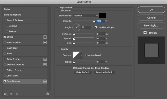
and so it looks like this:
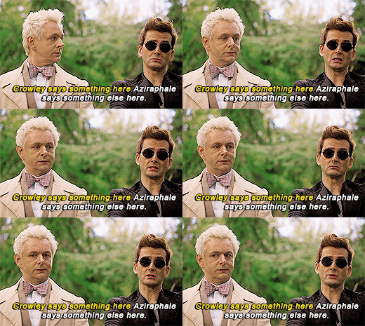
it is important to add your text layer ABOVE your coloring folder, otherwise the coloring will affect the text. and it’s good to have different colors for different people talking.
i hope that all made sense! feel free to send me any questions (i’m sure i must have made you confused or missed a step or something), or if you have any other tutorials you’d like to request.
#gif tutorial#photoshop tutorial#photoshop#itsphotoshop#tutorial#my tutorial#thanks for requesting this!#it's very long but i hope it helps
68 notes
·
View notes
Text
THE 100 GIF/COLORING TIPS
Okay, so I know nobody asked for this lmao but I’ve seen a lot of people complaining about the lighting on The 100 (which is completely understandable since it’s very bad.) And even though I’m not at all a pro, I’ve been giffing this show for awhile and I’ve found out some stuff that might be useful for other The 100 gifmakers out there.
Please reblog/like this if you save anything from this tutorial or if it helps you at all :)
WHAT YOU NEED
Photoshop (I use CS5).
General knowledge on giffing.
Patience because The 100 is a hard show to color.
COLORING PREVIEW

WARNING: This is very long. Everything starts under the cut!
GENERAL GIFFING TIPS
Get 1080p/720p downloads. Since The 100 is already a very dark and grainy show, anything lower will ruin the gifs’ quality.
Make sure you have cropped the gifs to the proper Tumblr size. Click here for reference. And get rid of the network logo when you’re cropping it! It always looks better without it.
Sharpen your gifs! I don’t see any reason why you shouldn’t. Sharpening your gifs will make it look more HD and show off your coloring better. My sharpening is a smart sharpen with these settings. You can go here if you want to experiment with other actions/settings, though.
Do not have any skipping frames. Please. Your gif will look sloppy and won’t be as smooth, therefore ruining the quality of it.
Make sure you have the gif timing right. I usually go for 0.05 seconds because personally I think it looks best, but I’ve seen some who went with 0.04s or 0.07s and that also works well. Go for 0.05s! I realized now other time settings doesnt work as well as 0.05s especially with The 100.
Save settings. My usual go-to settings are these. Though sometimes I went for selective instead of adaptive and it looks okay, too! :)
+ extras: subtitle!
The font you use for subtitles on your gif will also affect the way your gif looks. Fonts that are too big or too small will make it look less HQ, but having the right font with the right size (and the right position!) will make it look good. Here are some text settings you can use that I’ve found: [ one / two / three ]
COLORING TIPS
Now that you’ve kind of gotten the general giffing tips, I’ve listed out some coloring tips that I found out specifically for The 100. All PSDs will be linked at the end of this post.
Adjust your brightness before anything else.
The 100 is generally very dark, but even with scenes that are already not too-dark, you’re still gonna want to adjust the brightness so you can work on the colors better. I’ll go detailed with this one. We’ll be working on 3 scenes, bright, neutral, and dark scenes.
1. BRIGHT/YELLOW
For this one, I used a scene of Clarke from Season 5.
The scene is already very bright, so what we’re gonna do here is to adjust it so it’ll look prettier without being too bright that it hurts our eyes. First let’s do curves. I added two curves layer, the first one is to add just the tiniest bit more brightness to her face, and the second one is to darken the background. and then I’m gonna add brightness and levels for contrast:
Alright, now that I’m already happy with the brightness, I’m gonna go and adjust the color. This is too yellow for me, so I’m gonna add a color balance layer to and pull up the blues/cyans/magentas

That’s good, but it’s too desaturated. I’m gonna go and add selective layer to make the colors pop up. I adjusted the red, yellow, and neutral and I got this:

Now this looks great already! Unfortunately, I’m annoying so I have to add more adjustments lmao. This is the final result after being added with an extra brightness layer and a gradient map on luminousity.
2. NEUTRAL
For this one, I’m gonna use a scene of Lexa (reshop heda you’ll always be missed) from Season 2. It’s not very bright but it’s also not too dark.
Now the tips with scenes with enough clarity (doesn’t have to be super bright, but if you can still see things clearly) like this one, clicking the ‘auto’ button on curves saves a whole lot of time. I did so and this is what I have in result:

The auto curves will usually brighten the gif and balance the color on it. Often times you still have to adjust it again. But still this will save a lot of time. I added some more brightness and levels before adding color balance and selective colors layer, and here’s the final gif:
Keep in mind that this will only work with some scenes. This will work alright with the Clarke gif above, but it definitely won’t with this next gif we’ll be coloring.
3. DARK/BLUE
Okay now this one requires some work. I chose Octavia’s scene from the Season 6 trailer.
The original sharpened gif (notice that I got rid of the logo! It’s really annoying for me so I always find a way to get rid of it.)
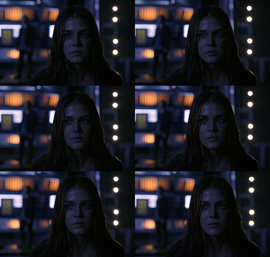
It’s reaally dark. So let’s start with brightening it up a little. I added curves, brightness, levels and more brightness because it was still dark as hell:

Now, you may think it’s already bright enough, but for me personally I can still make it brighter, so I added exposure. With dark scenes exposure works really well. But you have to take it easy with this layer since it affects the gif drastically with very minimal effort. I also added a black and white Gradient Map layer that I always set to luminousity:
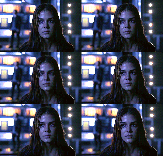
Now it’s time to go and adjust the hell out of the color balance to make it less blue! I also added an extra selective colors layer to make the reds pop out and get rid of the pixelated/grainy blacks on her hair. After that I added another brightness layer. Here’s my final result:

The quality on this gif is not as good as the others since it was from the youtube trailer (1080p youtube video are still low compared to web-dl’s) but that’s basically the gist on how I work on The 100′s darker scenes! :)
Color balance and selective colors.
The 100 lighting often makes your gifs not only too dark or too bright, but also too yellow or too blue. Balancing it out using a color balance almost always helps. Selective colors layer will also help when you want to pop up certain parts of your gifs. Here’s some tips on selective colors that I got from msmarvel’s coloring tutorial.
Selective colors and color balance layer usually go in the middle or on top of brightening adjustments for me. But I found out that color balance could also be done after you’ve done your coloring, but you have to put it under the other adjustment layers to have the most effect.
I’m gonna show you how I edit this gif here of Raven and Murphy with what I’ve said above.
Without any coloring:
Yeah, I know. I can’t see anything either.
I brighten up this gif using my method above for dark blue scenes. Curves, brightness, levels, and add more depending on what you need. Here’s what I have now:
We can see both of them properly now, but it’s waay to blue. Also I’m losing some color from Raven’s skin so I’m gonna add color balance under every adjustment and pull up the reds and yellows.
Now it’s better! You can totally leave it here and post your gif like this. but I added an extra selective colors layer to bring out the red, yellows and blacks, and here’s the final result:

I should mention that when it comes to scenes with POCs, you have to be very careful. With this scene with Raven color balance and selective colors helped bring back her color, but on other scene adjusting too much of the red/neutral/yellow might ruin her skin. You are allowed to adjust the colors on a gif extremely when necessary, but be careful about it :)
Some dark scenes are supposed to stay dark.
I realized that with the 100 (or any other shows tbh) brightening up a gif with a dark scene too much will make it lose so much quality and ruin it. So, what I’ve learned to do is to let it be dark. I’ve seen some people brighten their gifs too much and even though I understand your frustration, it’s gonna be better if you just let it be as it is. But, still, make sure it’s bright enough so you can still see the things happening on the gif.
Here’s a gif of Bellamy from Season 5. You can see how dark it is without any coloring:
First, let’s brighten this baby up so we can see Bellamy’s face. I added curves and brightness, levels and more brightness:
Now I know it’s still very dark, but instead of brightening it up too much I’m gonna go to color balance and add the tiniest bit of red and yellow, and then I’ll add a photo filter. These two adjustments are done so we can have more color on his face instead of the ugly dark red we had. With those adjustments, what we have now is this:
Next, we’ll move on to selective color. This is what I mean when I say you have to be careful with this adjustment. I want to brighten up Bellamy’s face by putting down the blacks on the red selective color. But by doing so I might erase all the reds from his face and whitewash him. To prevent that, while I put down the blacks, I bring up the reds (lowering the cyan) and yellows. I also pull up a bit of neutral and black selective color so I can get rid of the grain (adjusting the black on both selective colors.)
With a little more last-minute brightness, here’s the final result:

That’s pretty much it! You can add more brightness than what I did here (I was in a rush when I made this but I would definitely add a little more curves or brightness) as long as it doesn’t ruin the colors and won’t make the grain too visible.
Now as promised, here are the PSDs I made for this tutorial! Please don’t claim them as your own and feel free to tag me (#useraaya) if you make anything with them so I can check it out :)
[ clarke ] [ lexa ] [ octavia ] [ murphy & raven ] [ bellamy ]
I hope this helps! Don’t hesitate to message me on my main blog if you have any questions. <3
#itsphotoshop#yeahps#chaoticresources#the100edit#the 100#**#gif tutorial#coloring tutorial#*tutorials#*resources#aaya
423 notes
·
View notes