#ok edit: me putting the crop out in. so THE EYE - im pretty sure I dont need to explain further why I like that but the combo of the eye AN
Explore tagged Tumblr posts
Text
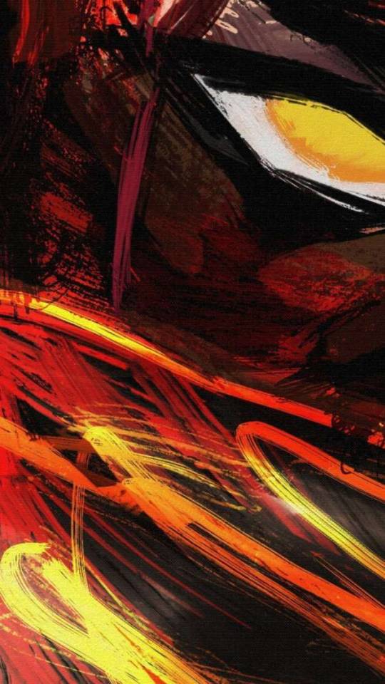
This! -my favorite part! the piercing eye and the glowing streaks of red and yellow (thanks for giving me the permission to crop it and put it in everybody's face XD)
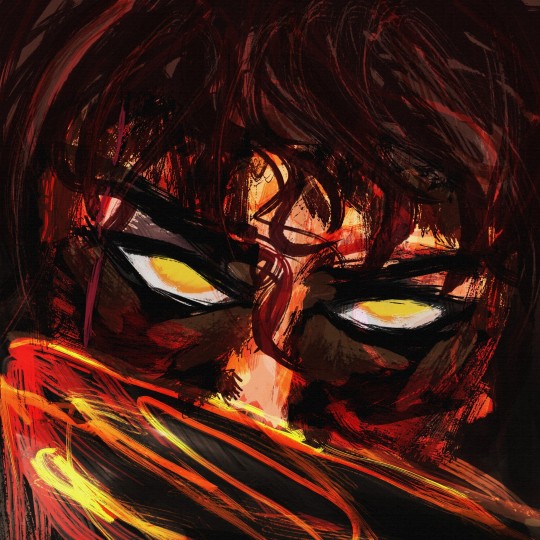
I wasn't going to post it, as it's merely a test of messy and really blunt brushes that lack texture or finesse (part of my neverending journey to attempt and switch to drawing on an android tablet and suffering profoundly for the lack of ps brushes) However, for 4 days now, I kept jumping with surprise at the intensity of his gaze each time I opened my drafts (saved there to relocate from tablet to pc) and so in the end I decided that I might as well just leave it here as a, WIP, I suppose.

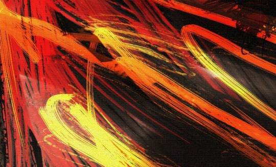
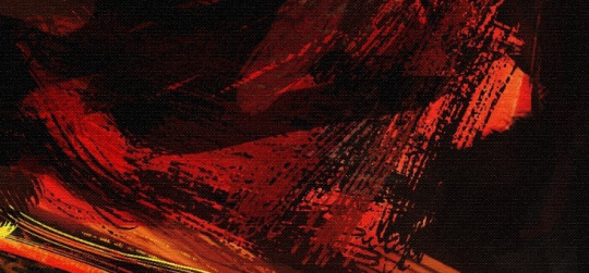
I do enjoy those details, though. Lately I've been in my black-gold-red era.
#ooooooh? the colorssssss#the vibrant warm colors are so pleasing. intense. mnnnnnn so tastyyyy *chomp#haha but I think that my inclination to paint on giant canvas is rubbing off on you and as per usual Tumblr doesn't like that#it's doing you dirty (me whining while zoomed in. studying the brushwork. seeing the canvas texture...)#(I don't want to be disrespectful but I was very tempted to reblog it with my favourite crop out to make everyone else see it too lol)#gasp- was this done in the Infinite painter??#magnusbae#(this is getting ridiculous you're basically half of my blog how come I have only one tag for you?)#(... you're half of this kingdom. you choose XD#ok edit: me putting the crop out in. so THE EYE - im pretty sure I dont need to explain further why I like that but the combo of the eye AN#the yellow streaks is just AWFSGJHBAJ *chewing on that part#I can see the slight white to make it glow even further. im looking especially at the yellow brush stroke bellow the and I enjoy the transi#tion from red to yellow and the white flare in the yellow#yes me fixating only on the tiny part of a kriffin large painting. yes I know that doesn't sound very sane but Im not apologising.#it is what it is *shrugs and laughfs nervously#hah I hope the crop is gonna look ok once tumblr chews it (it's impossible to post something and make it look good on all devices)struggles
37 notes
·
View notes
Photo

not sure how to make an introduction for this tutorial. i might have gone too extra because it’s so long...but this is highly requested and i said i would do this as detailed as possible, so here we go!

adobe photoshop 2018 (ahoy, matey!)
topaz lens effects (just for grain)
srwe (sometimes, but not for this tutorial)
reshade (i dont use a specific preset)
drawing tablet (wacom intuos art)
macbook pro mid-2015 (but bootcamp)

//part one
grab a screenshot from your own lovely screenshot folder! mine is straight from my reshade screenie folder. then crop it how you like it! my original screenshot size is 2560 x 1600, and i almost always cut the background out. this is how i do it:
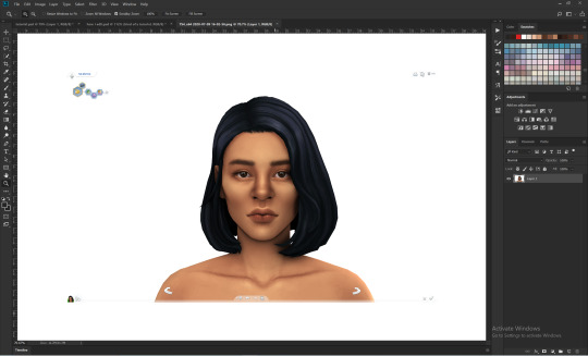
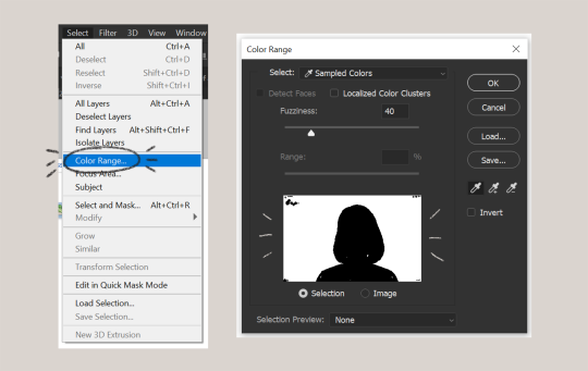
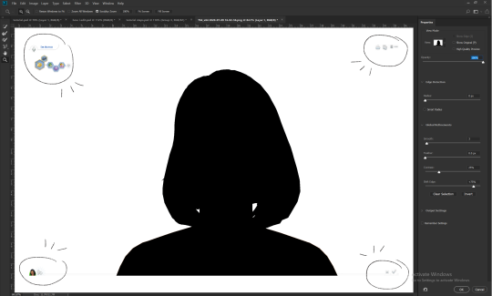
click color range, then click on the background of your sim. the little screen above will look like that. the background should be white. it’s easier when it’s a fully solid color. those are my settings above. click ok! the selected area will have those teeny tiny marching ants.
click quick selection tool, then select and mask...
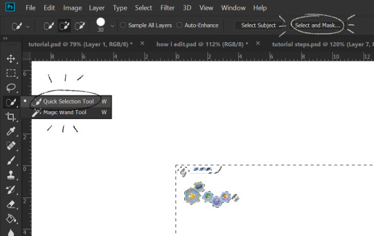
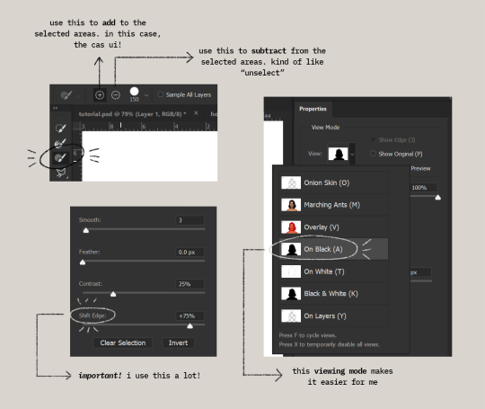
i drew over these circled areas using the “add brush” i showed above. use “on black” viewing mode, then make sure that the sim is completely filled black (it’s the unselected area). use shift edge so there wouldn’t be any of the original bg left over. my settings are shown above. then click ok if you’re all done. press delete and then ctrl + D to unselect. the marching ants should be gone. go ahead and crop it!
after cropping, i resize the width of the photo to 1280px! always!
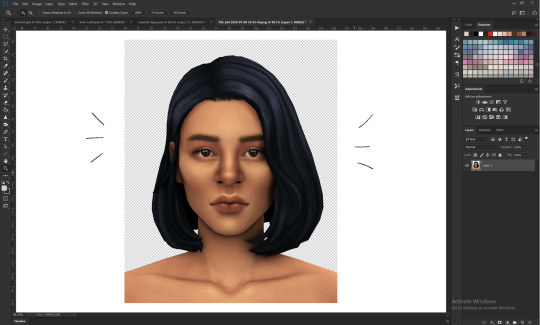
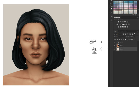
i create a new layer for my background, then add in the psd that i use for my edits. (i hide my psd layer while drawing)
sometimes i also use liquify to edit things like this:

//part two
i use a soft round brush to do everything! it’s literally from adobe, but i changed a few things like the flow jitter in transfer.
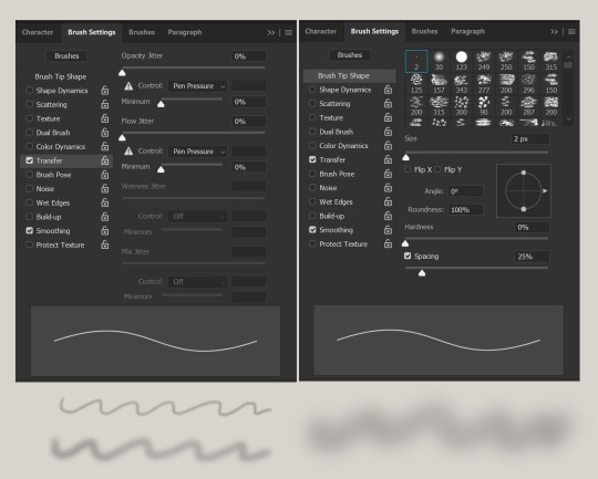
red areas are usually where i put the shadows, purple areas are usually where i put the highlights
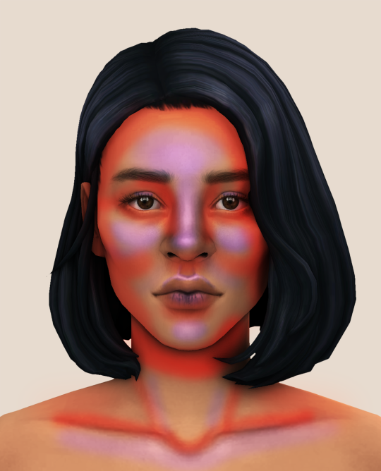
i usually do the shadows before anything else! it’s pretty simple. using the brush i showed above, i create a new layer.
use the eyedropper tool on her skin, then pick a slightly darker shade. change the blending mode of the layer to multiply, then draw the shadows.
right click on the layer, then select “create clipping mask” to make your life a little bit easier. an arrow will appear beside your layer.
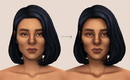
//part three
this is where i draw over the features. let’s look at her face. these are basically what i think it needs:
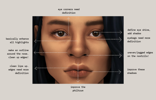
pay close attention to the imperfections and clean it up! that’s what makes it “sharper” in my opinion. small brushes will do the job! something like this:
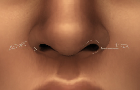
define the edges!!! define!! zoom in and take a look!! even though these are tiny little details, it makes a whole lot of difference! the eyedropper tool is your best friend!
i start with a big brush and then i use smaller and smaller ones as i go, which creates the sharpness. go a little darker as well! im not very skillful with my graphic tablet, so i add stuff bit by bit since it tends to become too harsh when i just go for it! im not as talented as some of u here ;-; i just wing it and pray it doesnt look too bad. half of the time im just experimenting since i literally do not know where some shading goes
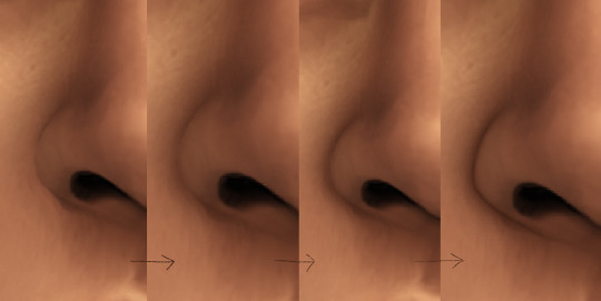
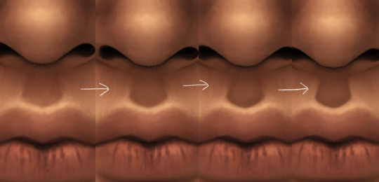
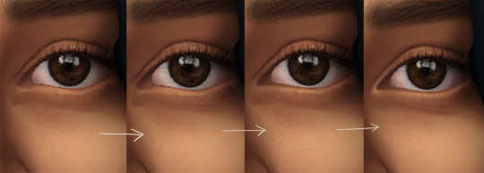
i wont be showing every single thing, but basically that’s the idea! i’ll add in the stuff i pointed out above and more shadows. sometimes i might turn down the opacity of some layers if they look a bit too much. here’s what we got so far:
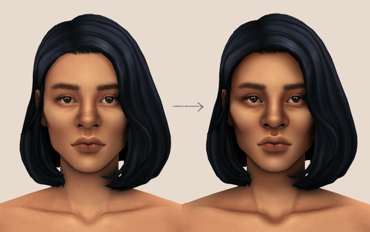
i also like adding some face pores using this amazing “skin texture 1″ brush from this brush pack!
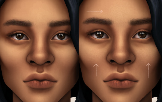
//part four
for the highlight layer, i change the blending mode to either overlay or soft light. use a slightly bigger brush for the bigger areas. use the eyedropper tool on her skin, and instead, pick a lighter shade.
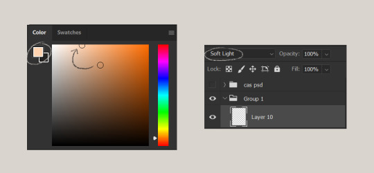
let’s start adding highlight to the purple areas i marked above!
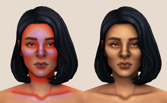
try to enhance the highlight on tiny details too such as the eye corners! if you want something more dramatic, create a new layer and do an overlay layer this time! don’t be afraid to add some on the hair, eyes, lips etc.
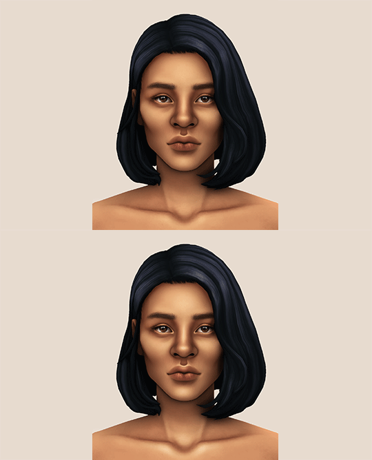
//part five
ok lets add some not decent looking hair strands. i almost always avoid this part because i literally have 0 idea on how to draw hair. i use the “hair base” brush from the same brush pack i linked to above and also have smoothing on to about 35%! the eyedropper tool is still your best friend! just follow the flow of the hair and i guess you’ll be fine ???
i’ll also fill in the annoying gaps beside her neck
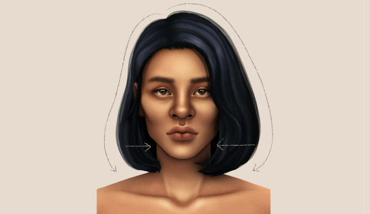
unhide your psd layer and wooowweee
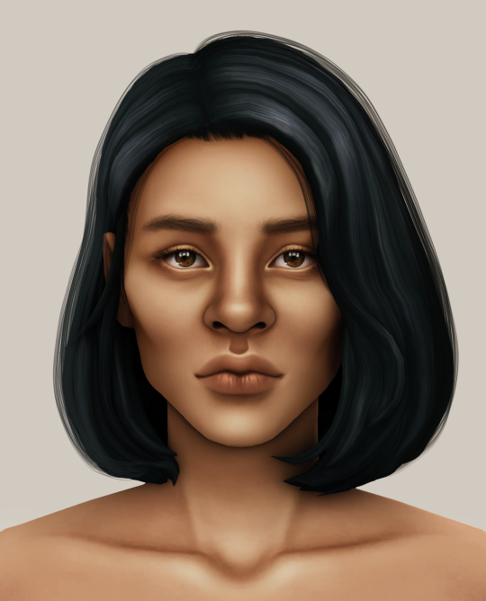
//part six
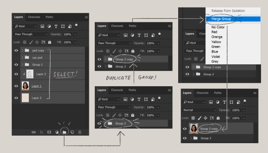
select all the layers, then click create a new group!
select the new group, then hit ctrl + J or right-click the new group, then click duplicate group
right-click the duplicated group, then click merge group!
i do this so i have a backup of the collapsed layers and can make changes anytime.
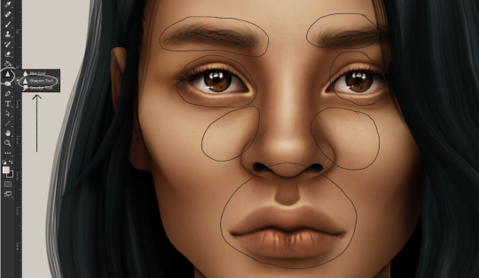
i use the sharpen brush on small details i circled below. i used to do stylize > oil paint or topaz clean before, but since the personal action that i use blur things a lot, i try to keep small details visible and sharp.
next is smart sharpen, my settings are below. sometimes i go for a smaller radius, but it looks like this most of the time.
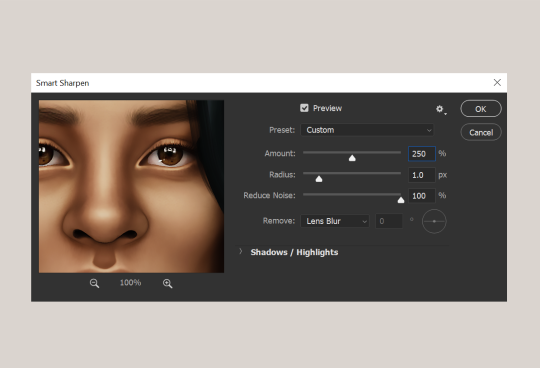
my personal action set consists of this:
duplicate the layer that you just used smart sharpen on, then click lens blur!
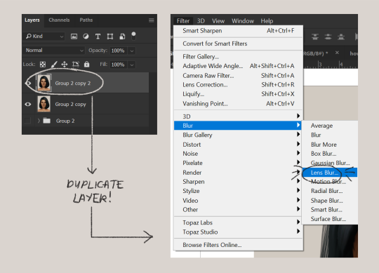
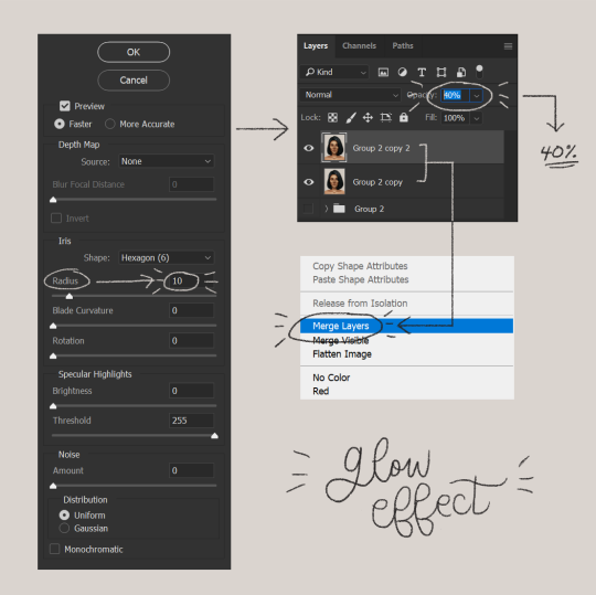
below are my lens blur settings
turn the opacity of the layer (that you just put the lens blur on) to 40%
select both layers, right-click then merge layers!
duplicate the layer again (yes, again) then right-click, choose blending options.
uncheck the R located on the “channels” under “advance blending” then click ok.
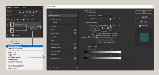
an icon will appear on that layer!
make sure you have that layer selected, then click the Move tool
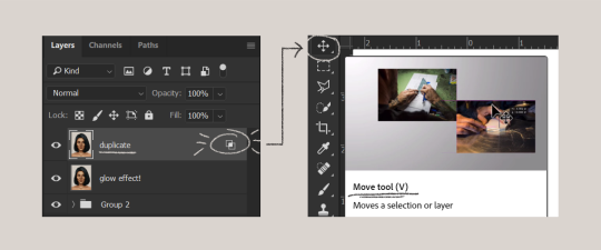
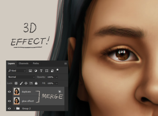
then hit your arrow left/right key once or twice! i do it once because i only want a subtle 3d effect! go ahead and merge those layers!
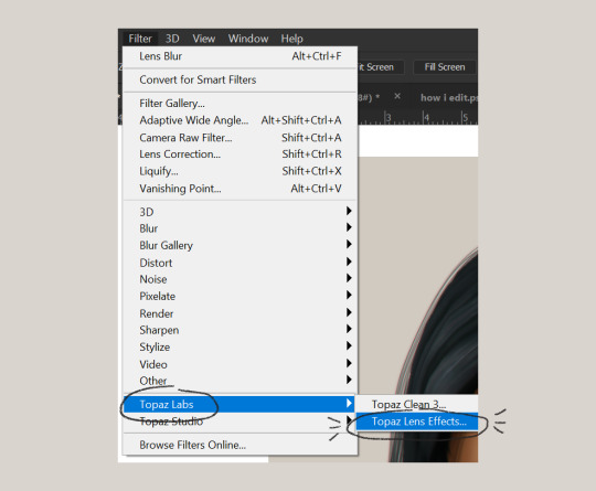
last step is the grain effect. i use topaz labs > topaz lens effects. if you don’t have this, you can also use filter > noise > add noise that photoshop has.
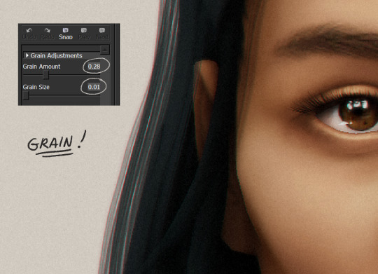
these are my settings:
//final look!
here’s a before and after gif! (here’s the finished edit) i hope everything’s clear! i’m really bad at explaining things (っ˘̩╭╮˘̩)っ
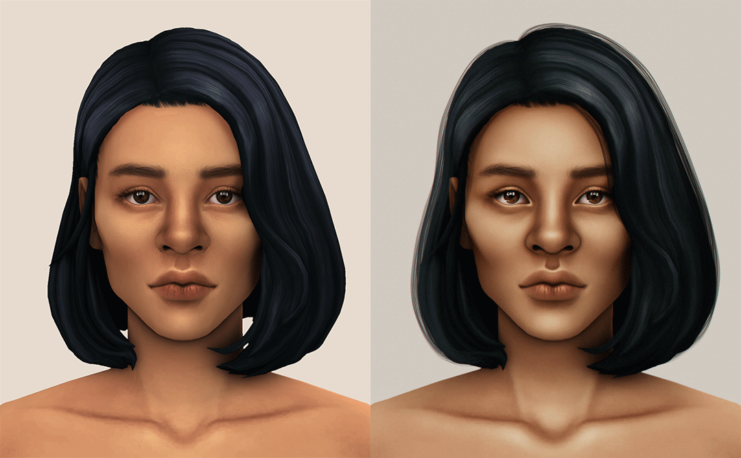
feel free to tag me when you use this tutorial for an edit!! i would like to see it! i hope this helps! ♡\( ̄▽ ̄)/♡
2K notes
·
View notes
Note
Ooh you're lookin for requests? Ok imma hit u up. How bout reacting to reader having a wardrobe malfunction and immediately grabbing them to cover up? (Foe example, if their shirt comes off, they hug them tightly to avoid anyone else seeing but now theres a half naked reader clinging to them 😂) You can write for whoever you want! I'd love to see some CaeJose, Pol, and Mista especially 🥰
Are Caesar and Joseph together for this? Yes? No? Im doing both anyways because I want to. I originally was going to add other characters but I had an allergic reaction when I went to the gas station today and I had to take benedryl so I'm tired.
Another PSA, theres no limit to amount of characters or how many requests you send in. I’ll write it all.
Also, I’m currently reading Jojolion so as soon as I finish that, I’ll let you guys know so you can send in requests but i s2g dont ever make me write for Joshu i fuggin hate him.
Im also assuming it’s an AFAB reader because of the situation, I’m going to use they them pronouns though but BLEASE if I am wrong PLEASE tell me and I will edit the whole thing no problem.
CAESAR:
Okay so Caesar was my favorite Jobro for the longest time until Bucciarati came in and then Bucciarati was my favorite until Gyro and literally Gyro is the greatest character ever in anything but anyways
-Your shirt snags on the back of your chair, or a pole when you’re walking. And rips off. (Or someone else rips it off)
-You immediately grab him and press into him, trying to cover up. He notices, looks down to see your shirt in tatters, and B L U S H. His face gets so red.
-He immediately takes his jacket off and covers you with it, making sure you’re decent.
-”Oh, what happened, Cara?” His voice S h a k e s it’s actually cute.
-Your face is also flushed in embarrassment, so it doesn’t matter what you were in the middle of. He gets you home soooo fast, blushing the whole while, so that you can get a change of clothes.
-At this point it doesn’t matter anymore, so you invite him back to your room and just change in front of him, telling him “Well I guess now’s a good of a time as ever to let you see, huh?”
-Oh?
-Really?
-You don’t even get a chance to pull the new shirt over your head as he’s pressing you against the wall, kissing you with a heat you’ve never seen from him before.
-You had plans? Not anymore. 👀
JOSEPH:
-Oh surprise hug?
-Oh
-He will tease you but only because you’re embarrassed and because you are h a l f n a k e y and pressed up against him. His heart is pounding.
-”Well if you wanted this kind of attention you should have asked!”
-Will cover you up though pretty much immediately, securing his jacket around you, getting you home in no time at all.
-Joseph is not respectful. He will watch you change clothes because it’s hot.
-You tease him a little too, just to get back at him.
-”Well if this is the show you wanted to see we should have just stayed home in the first place, Jojo.”
-When he gets up, you shake your head at him, your eyebrows shooting up.
-”No sir, no touching. You just sit there and watch.”
-”Baaaabeeeeeeeeeeeeeee.” His voice is whiny at first, but keep teasing and he’ll change his tune.
-”You’re so needy, aren’t you, Jojo? This is probably a dream come true for you.” You go to slip the new shirt over your head, and he’s on top of you in a moment, leaning close, pressing You into the wall.
-”Keep running your mouth and I’ll show you exactly what I want from you.”
-Rip
CAEJOSE
-The moment it happens you grab whoever’s closest and shield yourself with their body, flushing with embarrassment.
-The other one will probably threaten or beat up the perpetrator, depending on who it is that you’re not holding on to.
-They’ll cover you up and get you home so that you can change, but god help you because they’ll tease the hell out of you. This situation caught all of you off guard.
-”You didn’t tell us how attractive you are, Cara.” Caesar eyes you, a smile playing on his lips. Joseph will run his hands up your sides while Caesar talks, kissing the back of your neck.
-”Well if you wanted to see you should have just asked, tesoros” you make it a p o i n t to use Caesars mother tongue, making a big show about picking out a new shirt, discarding the ripped, tattered one.
-Rip to you honestly because you're teasing 2 men who are probably twice your size. You won't win this round.
-Caesar's eyebrow quirks up when you use the italian phrase, and Joseph will grab you and set you on the former's lap. Unfortunately for you, Caesar's arms will wrap around your waist and lock you into place while joseph leans in close, his face centimeters from yours.
-You're in for one hell of a night with them if you're down. (If you aren't, they'll let you get dressed and sit with you at home playing cards or something)
POLNAREFF
-Will be a blushing BLUSHING mess the moment you hug him out of nowhere.
-His sould will proceed to leave his body when he sees that your shirt has, uh,
-"Oh, jesus christ, mon ange, Let's get you home?"
-He'll help you cover up as soon as you can, glaring Daggers at anyone who just so happens to even glance in your direction.
-Will make it more obvious in an attempt to make it less obvious.
-Literally shouting "Oi, oi, oi, don't look at them! Look away!" While covering your chest. Cut him some slack. He means well.
-Once you're home, getting re-dressed, you tease him to no end.
-"Jean-Pierre, you seemed to really enjoy yourself today." You flash a grin at him, relishing in the heat that rises on his cheeks.
-He can't help but stare as you pull the shirt over your head and down your body, clearly finding the words he wants to say. You grin at him, fully dressed, and plop yourself in his lap. His arms find their way around you, securing you in place, and he presses a kiss to your nose, a lopsided grin on his face.
-"If you're up to it later, maybe I'll let you see me some more." You're obviously embarrassed at what happened, and you want to crawl into a hole and hide from the public eye for at least 10 years, but he's being so cute that you can't help but joke around.
-His arms tighten around you, and he presses a kiss to your cheek, grinning.
-"Maybe let me see more now?"
MISTA:
-He knows the feeling of skin, so when you press against him, he immediately recognizes the skin on skin contact. (He wears a crop top ffs)
-Speaking of the crop top, it's off in a heartbeat when he sees your situation. He'll walk around shirtless, he doesn't mind. At the very least, you can wear that until you two can get home so that you can change.
-"Oh, no, Zabaione!" (Rips shirt off of his body and yanks it down over yours, keeping you covered the whole time.) "Here, wear this."
-He does not stink despite what Trish says. You know how some people have a distinct smell? He smells like gunpowder.
-What's more embarrassing? Having your chest accidentally exposed, or wearing your boyfriend's shirt while he walks around half naked with a gun sticking out of his pants right above his crotch.
-Your face is pretty red, but he's honestly living for this.
-"Oh my god, Bombolone, you look so cute in my shirt. You should wear it more often."
-"Yeah? And what are you gonna wear?"
-"What, you think I don't have other clothes?" He snakes an arm around your waist, leaning in close, murmuring in your ear. "Do you mind seeing me exposed like this?"
-He'll laugh good naturedly, getting you home and putting a shirt on himself, preventing you from changing yours because he continues to insist how absolutely adorable you look in his shirt.
-Indulge him BLEASE he's so cute when he's flirty.
#jojos#jjba headcanons#jojo headcanons#jojo x reader#jjba#jjba x reader#jojos bizarre adventure#jojo no kimyou na bouken
162 notes
·
View notes
Text

so! this is my first tut and im not the most articulate person so bear with me. this is a tutorial on how i do my snow edits (examples here and here). You don’t need any actions or a drawing tablet i did it with a mouse. warning, this tut is pretty long and detailed with LOTS of pictures rbtghjkd
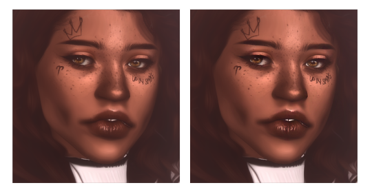
so first u start with a cas screenshot, with a white background. i use reshade in cas because it 1. helps a whole bunch with just like colours and stuff and 2. also smooths out the edges since i have edge smoothing turned off. i used beyond the veil by @fuchsiateasims (this is also what i use for my gameplay posts it very pretty)
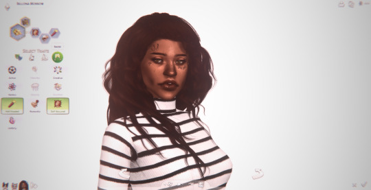
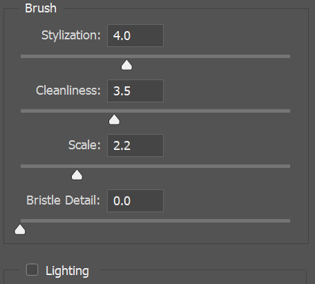
next u crop the screenshot to a nice size, i usually do 5:7 or 4:5 which are photoshop presets. duplicate ur image. click on ur copied layer. then, use oil paint on these settings
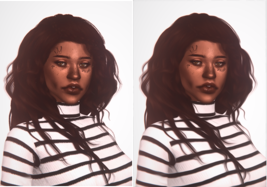
click ok. erase some of the weird blurry bits of ur sim or where u want to preserve detail. it smooths out skin and alpha hair. see the diff?
using the sharpen brush go lightly over some of the features u want to bring out. i usually do the eyes, lips, and some of the hair strands if im feeling fancy.
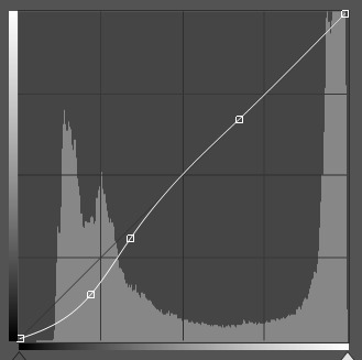
ok! bc the picture is feeling a lil bit bland i use a curve layer to deepen the shadows and brighten the colours. u gotta mess around with it a bit before it looks nice and it really depends on the image. my curve layer looked like this lmfao
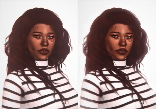
then using photoshop’s default blurry-around-the-edges brush on white and the layer itself on soft light, go around the sim. if it’s a bit strong get the eraser on about 50% opacity and rub those bits out. that gives it a bit of a 3D look like the sim is fading into the background or some shit. p subtle
um ok so next! u get ur soft white brush from literally just then and paint on a new layer over cheekbones, middle of forehead, tip of nose, chin, cupid’s bow. that layer goes on overlay mode! this is ur highlight!! i put my layer opacity at 61% bc thats what looked good to me
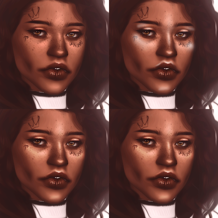
uh ack i hate my gifs but thats what it looks like
next, on a different layer, use the same brush in black and with the layer in overlay again, go where... the shadows go? i went with along the jaw and nose and crap. u can see the difference when i did the glow and shadows below
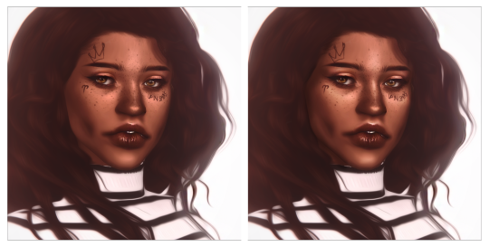
i’m going to skip the eyes and lips bit because thats another tutorial all on it’s own
NEXT! we add the snow! so i use this dirt brush which i... couldn’t find where i got it but it was one of these im prettty sure. u just make it white and click, and then ur image is covered in white specks.
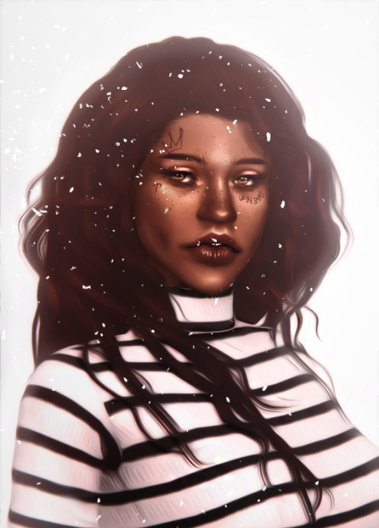
in filters, gaussian blur that bitch, but only lightly so it still retains it’s shape.
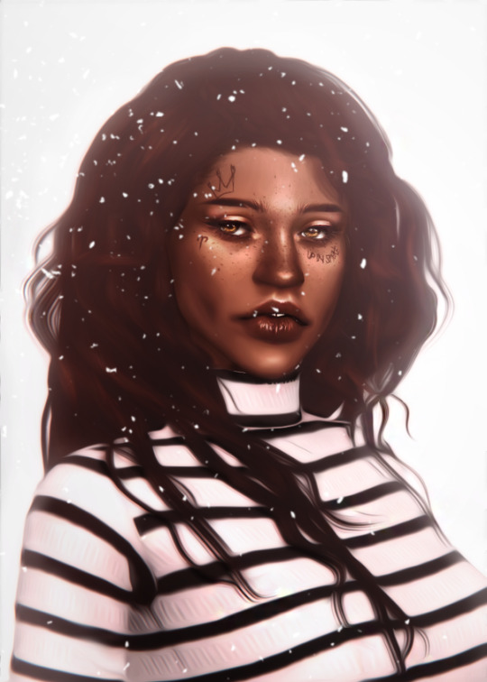
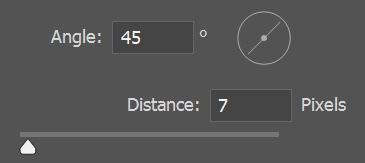
then using motion blur, angle where you think the snow would be falling from using these settings
then erase some of the stuff that’s around the face so u can actually see your sim.

make a new layer, and using the gradient tool from white to black drag it in the direction where the snow is falling so it’s lighter upwards. make this layer soft light and make the opacity to your liking. rub out the bit with ur sims face if ur worried about white washing which i was.
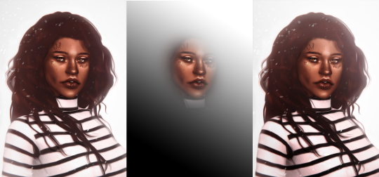
and that’s pretty much it. tag if u use it lmaoo
72 notes
·
View notes
Text
how to make an icon border for rpers!
for my friend, saint, here is a general guidance on how to make a border for your roleplaying icons. should you have any question once the tutorial is over, feel free to reach out to me via IM or askbox. well, first of all, here is some of the borders i’ll be guiding you guys on to make:
(1) basic borders - dark outline, with white lines.

(2) dotted or dashed borders

(3) or how to add borders on a rounded icon

note: the brown-background is merely to show how the border would look like in case the white background doesn’t allow you to see it, but rest assured we will be having our icons in .png to support transparency. on another note , i’m very aware that the icons aren’t pretty — i don’t put any psd or any adjustment on the icon itself (taken from here) — but feel free to adjust the borders or your icon later on once you’ve fully understood the tutorials because im really teaching you the basics of how i usually do it and it’s really adjustable :))
what you will need:
photoshop, definitely.
1. BASIC BORDERS ICON
for starters let’s start with the first one so, have your icon — set it in whatever size you want ( the new trend is the smaller the better , i set mine usually at 65x65 although for this tutorial it would be 100x100, but you do what you like my friends ) — and leave it be .

now my next step is only an advisable step — like you don’t have follow it if you don’t want (you can still do your border in any case) but what i would do is create some transparency space behind a.k.a.
(1) make sure you duplicate your picture so it could be another layer (or you could turn the background into a layer itself) (2) and just use the crop tool to expand the size a little bit

if a pop up showed up to ensure if you really wanna do that and name it, just press okay (in my case, i don’t bother naming them unless it gets crowded later), and then you would be left with this

NOW SEE HOW I MAKE SURE THE BACKGROUND LAYER WON’T BE AVAILABLE ??? yes, do that please. just click the eye of the background layer (NOT THE BACKGROUND COPY) and we can move on to out next step, which is secure a few spaces behind the icon in transparency.

of course it doesn’t have to be as a lot as i’ve done it above^ , but that’s just to make sure that people can understand what i meant. now to do the next border is very easy. there’s a lot of ways of course, to do it, but what i did is —
(1) locate your quick selection tool (2) just select the heck outta your icon until it covers all area (3) create a new, EMPTY layer (4) go to edit > stroke > changes the setting to 3px and a white colour and click ‘OK’ (5) locate your quick selection tool again, do step (2) till step (4) except this time it’s on your WHITE BORDER layer and change the setting to 1px and a darker colour than white and click ‘OK’
and the picture demonstration would be:

figures above showed the located quick selection tool as per Step (1)

figure above showed the area of the icon are being wholly selected as per Step (2)

figure above showed ONE OF THE MOST IMPORTANT STEP i.e. add a new layer pls as per Step (3)


two figures above showed the process of Step 4

figure above shows the result of Step (4) aka you made your white already border yay !!!! but we’re not done yet. because the outline of that white border still needed to be implemented to “complete” the look. but since you know the previous step, just re-follow it. however, here are the picture demonstration in case you need it :)


three figure above shows the repeated steps done to create the darker outline to the WHITE BORDER as step 5
the end result:

a.k.a

note: feel free to get rid of the extra transparency space if you wanna !
2. DOTTED OR DASHED BORDER
usually, the dashed or dotted border comes with the basic icon border. meaning people tended to do the basic icon border and then added another outline outside that border to make it extra fancy and nice ! The steps i’ll be taking to do that would be
(1) All of the steps above to make the Basic Icon Border (2) Locate your Custom Shape Tool (3) Click your Rectangle Tool (4) Adjust it on your border (5) Once the shape is determined, go to fill and reduces it from 100% to 0% (6) Make necessary adjustment if you’d like, and you’re done !
the picture demonstration would be

figure above shows an icon with complete basic border icon ready as per Step (1)

figure above shows the located custom shape tool as per Step (2)


two figures above shows the next step once the custom shape tool is selected

figure above shows the result the custom shape tool once the area is selected as per Step (5). however, worry not! because the next step will guide you on how to adjust it
FIRST, if your custom shape tool ends up giving you this

instead of dashed or dotted outline, just do the next steps, which are

once you’ve chosen your preferred outline, go to your Layers, and change your Fill

figure above shows the steps to reduce the Fill from 100% to 0% as per Step (5)
it should give you this:

figure above shows the end result

figure above shows any available spots to adjust your dotted border further as per Step (6)
THE END RESULT

a.k.a.

3. ADD BORDERS ON ROUNDED ICONS
Alright, since this is a tutorial to make borders, I won’t go into how to make ‘Rounded Rectangle Icon’. If it’s requested, sure, but for now — I’m making the tutorial with the intention the rounded icon have already been created. So the steps are as followed:
(1) Have your icon ready at whatever size you need with the Rounded Rectangle already in place. (2) Locate the Custom Shape Tool > Rounded Rectangle Tool (3) Create the shape following your icon, and adjust until you’re satisfied. (4) Changes the shape into Smart Filter so you can select the whole area using Quick Selection Tool. Once changed, select it fully. Then closes the Rounded Rectangle Shape. (5) Add a new layer. Go to Edit > Stroke > Adjust your width and color > Press ‘Okay’. In assumption that this will be your WHITE BORDER layer, your width should be at 3px and the color should be white #fff. (6) Now select the areas of the WHITE BORDER layer. Create a new layer. Go to Edit > Stroke > Adjust your width and color > press ‘Okay’. In assumption that this will be your OUTLINE DARKER BORDER, your width should be at 1px and the colour should be of darker color than white. (7) You should be done.
pictures demonstration are as followed:

figure above showed the rounded icon are in place as per Step (1)

fIgure above shows the step in accordance to Step (2)

figure above shows any adjustment done to fit ur icon as per Step (3)


three figure above shows the steps in converting the Rounded Rectangle Shape into Smart Filters, selecting it using Quick Selection Tool and closing the layer as per Step (4)


four figure above shows the addition of a new layer (WHITE BORDER LAYER), the steps to choose stroke and give a white layer to the icon as per Step (5)


three figure above shows the selection into making darker outline as per Step (6)
THE END RESULT

a.k.a.

AND YOU’RE DONE.
note: my advice is, you should put all of the layers of the making of your borders under one file and put it ON TOP of the layers of your coloring PSD and save it. that way, you don’t have to repeat the process every time cause it’s already saved along with your psd file.
of course, any confusion at all, just hit me up.
and below, are some of my icon creation feat. different borders !

#icon tutorial#icon border tutorial#rp tutorial#border icon tutorial#icon rp tutorial#mine#:))#hope it helps !
450 notes
·
View notes
Text
Bad Blood - Part 1
Characters: Reader x Roy, Sam, Dean
Summary: You stop at a small cafe in Louisiana on your way home from hunting with the Winchesters. There is something about the man behind the counter that makes you hungry for more than just the pie.
Warnings: Violence, Language, Pre-Smuttiness
Word Count: 2262
A/N: This is the first part of a series I am working on. Part 2 is already done and I am starting part 3 next. Future parts will be NSFW and I will be sure to put that in the warnings. The gif is not mine - thanks Google.
Your feedback is so appreciated! :)
Thanks to my Soul Sister @wheresthekillswitch for beta’ing this for me and for always encouraging me. Also thanks to @emilywritesaboutdean who kinda pre-beta’d this like a long time ago when Lee was working on her 400 celebration and I needed help moving forward. You are both incredible writers and I am privileged to call you my friends. The support and love you guys and @arryn-nyxx give me on a regular basis is beyond words. I love my squishes.
Tags are below - please send me an ask if you would like to be added or removed from my tag list! :)

Bad Blood
Part 1
Guidry’s Cajun Cafe - Carencro LA
You have seen your fair share of shady places, but this one - with its battered walls and rickety tables and mismatched chairs may well top your list. You eye the empty barstools lining the counter to determine the one least likely to put your ass on the floor. You decide on the one closest to the cash register, perching gingerly upon it.
The run-down cafe is nearly empty, unsurprisingly so at 12 am. The smell of coffee makes your stomach growl and you immediately turn over the chipped stoneware mug in anticipation. The sudden squeak of a swinging door is soon followed by soft melodic whistle, both sounds cause your head to jerk up from the menu in your hand. A man wearing a green apron appears behind the counter. He approaches you holding a pot of coffee in one of his large hands.
“Evenin’ ma’am,” he drawls, his voice is warm and intoxicating. One side of his mouth quirks in a grin as he fills your cup.
“Thank you.” You return the smile as you meet his gaze. His brilliant blue eyes are mesmerizing.
“Can I get you anything ‘sides the coffee t’night?”
“Uh...yeah...actually. Do you have any, uh...pie?” You groan internally as you stumble your way through your reply. Get your shit together. What is the matter with you?
“I believe we got one slice left.” The grin on his face widens, causing the corners of his eyes to crinkle slightly. “How d’you feel about cherry?”
“Sounds great. I’ll have that.”
“Comin’ right up.”
He turns on his heel to get your pie, offering you a glimpse of his back. This man is huge, though definitely not freakishly tall like your friend Sam. The thought of Sam and his brother Dean makes your eyes roll.
Those crazy sons-a-bitches nearly got you killed. Three days ago, they’d called, asking for your help to take out a nest of vamps in Baton Rouge. What could go wrong?
Well, as it turns out, everything.
According to their research, the nest had contained no more than half a dozen bloodsuckers. They’d been keeping a low profile in the area, but the signs were all there; seven missing in the last eighteen months and four bodies, all drifters, with their throats ripped out and not a drop of blood to their name.
The Winchesters tracked them to a run-down shack out on Highway 61. The dense foliage obscured the building from the road, providing a prime spot for the vamps’ homebase. The sliver of moonlight in the inky sky gave off little light making it impossible to discern distinct shapes.
Dean found a secluded spot to stow his Impala and the three of you exited the vehicle quickly. The elder brother popped the trunk and you stifled a giggle as he propped it open with a sawed off shotgun.
You’d only been hunting with these boys a few other times and each time you’d found something new to be intrigued by. Sam and Dean had battled and taken out every kind of evil thing you’d ever heard of and a handful that you hadn’t. Their reputation was known far and wide in the close-knit community. In your few encounters with the handsome brothers, you’d grown to appreciate their trademark cunning and intellect and they’d quickly earned your heartfelt respect. Dean’s cocky attitude and confident swagger, however, had the innate ability to frustrate the shit out of you and this was no exception.
In the hours leading up to your arrival, you’d tried and failed multiple times to get the green eyed man to share his strategy to take out the nest, each time receiving the same self-assured grin.
“It’s simple, princess. We go in, chop their heads off and celebrate with a beer for a job well done.” His use of the nickname “princess” annoyed you, but you chose to let it go for the moment.
Dean turned, passing a machete each to you and Sam, his own gripped tightly in his large hand, before slamming the trunk closed.
“Ok, we good?” His tone was determined and focused.
“What’s our play here?” you asked again, hoping for a proper answer this time.
“I told you, get in, get out, beers. Any questions?”
“That’s it?” you barked, frustration sharpening your tone.
Sam glanced at you empathetically. He seemed to understand your need for detail, but you assumed that his years on the road with Dean had helped him learn to cope.
“Oh I’m sorry, princess, do I need to draw you a diagram?” Dean retorted as he stepped closer in an attempt to intimidate you with his large frame. He gestured vaguely toward the highway. “Look, there’s the road if you want out, but I suggest you start walking now if you want to make it back to town by morning.”
Your blood boiled as you squared your shoulders and your eyes narrowed. You stretched your neck to meet his gaze.
“Listen here, Winchester, call me ‘princess’ again and it WILL be the last time. You called me, remember?” You jabbed your finger into his chest to emphasize each word. “You need me, so you can back off with your badass male-dominance, ‘I’ve got a big dick’ bullshit. All I want is a plan. You wanna waltz through that door and get your ass ripped to shreds, be my guest, but I’ll be damned if I’m going to let your over-confidence put me in the ground.”
A muffled sound made your head whip around. Sam’s eyes glittered with suppressed laughter and his scruff covered dimples threatened to emerge. The sight was infuriating.
“What’s so funny over there, Sasquatch?” you growled through clenched teeth.
“Nothing.” he said. His attempt to wipe the smile off his face failed. “Nothing at all. I just love watching you refuse to take Dean’s crap. It is just so...refreshing.”
Dean grunted and you looked back at him through slits. “Well, what’s it going to be, Dean. You gonna keep up this asshole schtick or are we going to do our job?”
“Fine. Y/N.” He spit out your name like a curse as he leaned back against the car and sighed. “Sam and I will take the front door, you go round back to catch any trying to make a get-away. Chop chop and we are out of here. Capisce?”
The half dozen vampires turned out to be 15 and the “shack” - an expansive abandoned motel. When everything was said and done, you were all three bleeding profusely, each needing an indeterminate number of stitches, but the nest was eliminated. You limped back to the Impala in silence, chucking your blood-coated blade in the trunk before falling into the back seat and slamming the door.
Dean slid carefully behind the wheel, letting out a deep breath as Sam took his seat.
“Y/N…” Dean’s tone was soft and tinged with remorse but you cut him off.
“Just...don’t. OK? They are dead, we are breathing. Let’s just be done. I need a shower and you promised me a beer.”
Dean nodded, throwing the car in reverse before tearing off down the road.
The soft rattle of a plate against the counter draws you out of your thoughts. You smile appreciatively at the man. “Thank you. This looks delicious.”
“Bon appetite. The name’s Roy,” he offers a large calloused hand and you reach to shake it instinctively, your brain entranced by the sparkle of his eyes and his perfect white teeth.
“Y/N,” you manage, swallowing hard, the feel of his hand wrapped around yours sending a current down your spine.
“Nice to meet ya, y/n. What brings you to this part of Louisiana this time ‘a night?” He releases your hand and leans on his elbows, crossing his arms on the counter in front of you.
“Passing through on my way out of Baton Rouge.” You tug at the collar of your jacket nervously, wincing at the sting of fresh stitches near your collarbone. His eyes follow your movements, pupils widening briefly as the edge of a bandage peeks out from under the collar of your t-shirt. You drop your hand to the steaming mug. “I just needed to stretch my legs a little before I settle in for the long haul back to Texas.”
The sound of someone clearing their throat grabs Roy’s attention. “‘Scuse me, darlin.” He straightens and winks at you, scooping up the pot of coffee and heading toward the booth in the far corner.
You shake yourself, a voice in your head scolding you for being so awkward. The last few days with the Winchesters have done a number on you. It’s not that you’re attracted to them, but damn are they attractive. You don’t usually go for the pretty-boy, straight from the cover of the plaid-appreciation edition of GQ type. But between the adrenaline of the past few days and the close proximity of the brothers, you are more than a little worked up, and the way Roy is looking at you isn’t helping matters.
Roy makes his way back up to the counter, placing the pot of coffee back on the warmer and grabbing a towel while whistling softly. You study him carefully out of the corner of your eye. His hair is cropped short and his carefully trimmed beard is peppered with grey. His neck is thick and his fitted white shirt hugs his broad chest. The sleeves are rolled up exposing his massive forearms, muscles flexing as he wipes down the counter. You have the sudden image of being pushed against a wall, that muscular chest pressing into yours as one of his thick hands winds into the back of your hair, his lips crashing into yours in a heated kiss.
“How’s it taste, cher?” Roy’s sultry voice breaks your thoughts, making you yelp in surprise. You look up wide-eyed, finding him much closer than you’re expecting and you suck in a quick breath.
Roy raises his hand in front of him, quirking an eyebrow. “My apologies. I wasn’t tryin’ ta frighten you.” You notice his a tinge of sadness in his eyes and a part of you wonders what put it there.
“Sorry.” You smile, shaking your head. “Sorry...it’s just been a long couple of days.” You scoop a forkful of pie and place it in your mouth, closing your eyes in delight as the sweet taste hits your tongue. “This is amazing,” you practically moan.
Roy’s face brightens and a wide smile graces his lips. He seems to enjoy watching you savor each bite as much as you’re enjoying eating it.
The sound of footsteps from behind you is soon followed by the squeak of a hinge and a dull thud as the customers from the far booth head outside. Roy makes his way to the door, flipping the switch on the open sign.
“Oh shit, you’re probably needing to close down…” You try to stand too quickly, but lose your balance as the stool begins tipping over, your foot still entwined in the bottom rung. Roy’s strong arms are on you suddenly as he deftly steadies you and the barstool in one motion. Leaning into his firm chest for support, you untangle your foot from the offending furniture. Your breath hitches as his scent fills your nostrils and your gaze shifts slowly upward to meet his. Roy swipes gently at your parted lips with his rough thumb.
“You had a lil’ som’thin’ on your lips there, cher.” His voice is strained.
He wets his lips and the sight of his tongue sends a heat coursing through your body. Slowly, his hand slides to the back of your head and then his lips are on yours, a feather-light touch. Winding one hand around the back of his neck, you press into him. Your eagerness granting him permission, his tongue dips into your mouth and you moan into his kiss.
A growl vibrates through his chest as his hands slide down the length of your body. One hand lands on your ass, squeezing firmly and you arch your back. Roy kisses a trail from your mouth to your throat and his tongue stops to trace the vein in your neck, the sensation sending waves of heat straight to your core. You swivel your hips and press your thighs together, searching for some kind of friction.
You quickly untie the strings of Roy’s green apron from around his waist, pulling back just enough to pull it over his head and throw it aside. He releases the grip on your body, reaching a hand behind his head to grab a handful of his shirt and yank it off as you shed your jacket. His fingertips fall to trace the hem of your shirt before hooking his fingers under it and removing it from your body. The look on his face as he drinks you in is almost predatory.
His eyes lock onto the patch of white just over your collarbone and he goes completely still, the color draining from his face. You study him, glancing down self consciously to note the blood that has begun to seep from your wound, a bright red spot beginning to spread through the fibers of the bandage.
There is nothing human about the sound that escapes Roy’s throat, and your eyes shoot up to meet his. Pupils dilated, chest heaving, mouth agape as he turns around on his heel. It takes your lust-drunk brain half a second to put the pieces together.
Read Part 2 Here
Forever Tags (I love you guys!):
@wheresthekillswitch @arryn-nyxx @emilywritesaboutdean @fandommaniacx @cookie-dough-lova @spnfanficpond @impandagrl @maddieburcham1 @trexrambling @27bmm @beachballsizeladyballs @hannahindie
SPN Fanfic Pond Tags:
@aprofoundbondwithdean @manawhaat @bkwrm523 @roxy-davenport @impala-dreamer @jelly-beans-and-gstrings @deansleather @whywhydoyouwantmetosaymyname @mrswhozeewhatsis @ilovedean-spn2 @babypieandwhiskey @wi-deangirl77 @sinceriouslyamellpadalecki @oldfashioncdvillain @mysaintsasinner @deals-with-demons @faith-in-dean @bohowitch
#spn fanfiction#spn fanfic#benny lafitte#benny x reader#roy!benny#roy x reader#spn reader insert#bad blood series#dean winchester#Sam Winchester#panda writes
111 notes
·
View notes