#official concept art recolor
Explore tagged Tumblr posts
Text
when you're coloring official concept art & you realize it's a dank cat meme...


21 notes
·
View notes
Text
Crown-a-Crown!
TL;DR: Vote for your favorite form of the Master Crown! The poll is below this kind note directly from our sponsor.
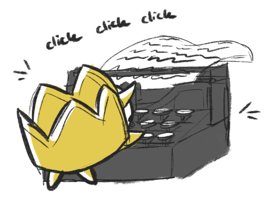
"mortals, It's the Crown Without a Ruler (WITHER IN FEAR). I am speaking to you today via server-hosted textual display data. make no mistake; in better days, the God of Another Dimension never relied on computers or clockwork, but due to My very TEMPORARY circumstances, it is the best Your Diademic Deity can do.
today I generously offer you the chance to sing your praises in a quantitative manner. I have asked the (LOWLY) owner of this account to compile every single form of the Master Crown (ME) thus far revealed to mortal eyes (YOU). My memory is infallible, but theirs is not, so if they manage to forget something, please rectify the situation by sending them HATE MAIL.
My appearances are invariably arresting, so I understand that your decision will be difficult. I allow you to determine your answer by considering power, mere aesthetics, story significance, or a combination of those and more.
you can explain yourself in the "tags" or "replies" if you wish, but if any one of you cringing, crawling things MENTIONS—nay, so much as CONSIDERS—any manner of BLUE-CLAD WIZARD, then by Eden's Altar, there will be RETRIBUTION.
I give you a week's time to cast your vote.
inimitably,
THE MASTER CROWN"
(A) Landia/Parallel Landia/"Base" form:
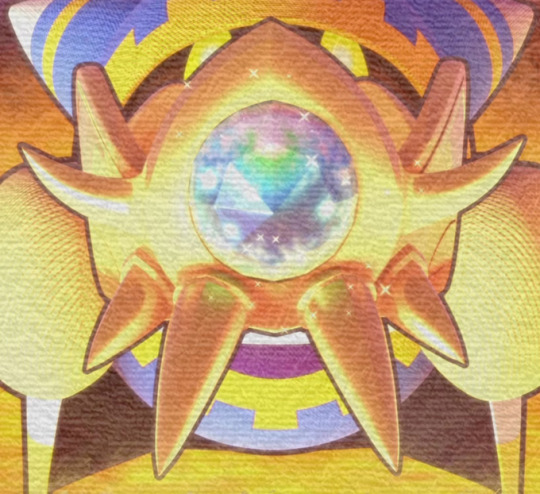
(B) Landia EX:

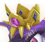
(C) Traitor Magolor/EX:
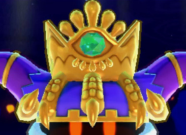

(D) Magolor Phase 2:
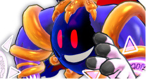

(E) Magolor Soul:
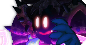

(F) Crown Shards:


(G) Crowned Doomer:
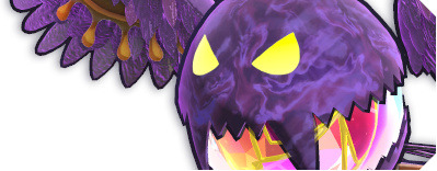

(H) Final Boss/"Mistilteinn":
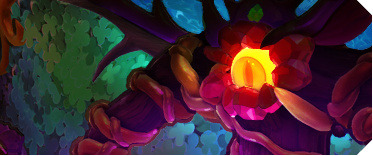
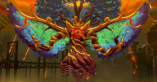
(I) Star Allies:
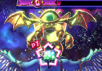

I'm sure glad it isn't up to me! Too many good choices...
All exemplary images courtesy of Wikirby. Check the tags for some finer details on my decisions while making the poll.
#as you may be able to tell i tried to group simple recolors or otherwise very similar designs together#didnt include anything that isnt explicitly/canonically shown to be a form of the crown. so no concept art... etc.#personally i consider the entirety of the Magolor Phase 2/Soul forms to be part of the crown. not just the thing on its head...#...especially since the Soul flavor text says it's “a manifestation of the crown itself.” but im not sure everyone would agree with that#making this poll reminded me that “Mistilteinn” isnt technically the tree forms official name (yet?)#kirby series#master crown monday#master crown#poll#PS: some of the options i dont realistically expect to get any votes. and thats okay. i was just trying to be thorough lol#PPS: i dont think the master crown knows how to add bold face or capitalization. it changes text emphasis with its soul. its true
32 notes
·
View notes
Text
OK. So.
I really like Mushi. Yk. Mc king kong mushi from parappa the rapper. And when I like a character, I like to collect their official art. So, guess what did ? I went to parappa the rapper's wiki fandom, and I downloaded every official art of him.
THE PROBLEM IS THAT ALL the colors were WRONG. on EVERY SINGLE OFFICIAL ART OF HIM. so now guess what I did. I FIXED IT.
KABOOM 👹💥💥💥💥 :

And here's the OG version I found on the wiki to compare, with also the references I used to recolor it. AND NO THE RED GLOVE OR WHATEVER ISN'T A MISTAKE !!!!!!! idk why he wears one, but look at the screenshots from parappa the rapper 1. He has a red glove. Why.
Also if you saw my other post about him balding, well I kept his hair because he appeared more times why his front hair than without, so yeah I kept it BUT I COULD HAVE REMOVED IT 😊😈


I don't even know where they come from but they really messed up the colors........ or maybe it's concept art and they didn't make any official art for him. Idk. But the first one is from a phone sticker so I doubt it.... :/
(The phone sticker : )

OK BYEEEEEEEE EVERYBODY AnD REMMEBER YOU GOTTA BELIEVE

(This is official btw 😂😂😂)
#parappa the rapper#mushi#mc king kong mushi#king kong mushi#vrm les bro y savent pas suivre une référence#après c'était probablement un problème de lisibilité du dessin mais quand même....#AAAAAAAAAAAAAAAAAAAAAAAAAAAAAAAAAAAAAAAAAAAAA#aléd
14 notes
·
View notes
Text
My Issues With Starboy and Fandom Nostalgia Blindness
DISCLAIMER: This isn't an attack on fan artists who like Starboy. This is a critique of the misconception and I don't condone bullying of any sorts towards people who make and consume content they like.
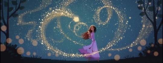
As I have written in my previous posts about Wish, I am just generally not a huge fan of the Starboy. Well, specifically the fandom centered around him and what they represent.
Context for those who don't know, Star was originally going to be a shapeshifter with a humanoid base form, basically a mix of Peter Pan and the Genie in terms of personality. The misconception that he and Asha were originally going to be a couple was the result of people misreading a line from the art book about how Star and Asha are "soullmates".
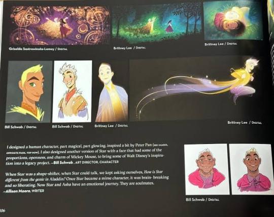
As you can read above, the book says "Once Star became a mime character" meaning they meant the current plushie Star, and that they and Asha are connected.
But what about the love song? Well, someone already made a post dissecting the topic. At All Costs was always intended to be written about the wishes but the song writer wanted to make a love song but there wasn't needed for the movie so it sounded like one out of context. Which isn't a bad thing as Disney has been subverting the True Love trope that love does not come from a romantic partner but also from friends and family as seen in films like Frozen and Maleficent, hence why the song sounds like both a lullaby and a romantic duet.
However, even after this was disproven, some fans still insisted they were "robbed" of this non existent romance. Even with the fact that in this early draft of the film, Star was considered to be a younger version of Sabino who passed. Yet, fans still wanted their romance and decided to make fan content based on the unused draft. Well, more accurately the draft they imagined in their heads.
Honestly, I have never read a single one of these rewrites of the film and I am in no position to judge content I have never seen. I do encourage people to make their own version of Wish based on this concept wether it's romantic or not. However, I don't condone the behavior that some of these Starboy fans have.
Even though the art book says the early draft Star was a combination of Genie AND Peter Pan, fans opted to picked just Peter Pan. And that's also factor in the Star was a shapeshifter like Genie and Maui yet most of the general fan art I seen is just Star as a human very little if not rare have him drawn as an animal or as the abstract more alien designs the creators considered for Star after they scrapped the human shapeshifter draft.
Speaking of designs, a common criticism I and others have is that most fan designs for Starboy is just a blonde Jack Frost. Heck, fan edits of the film straight up use Jack as a stand in for Starboy but with his colored yellow.
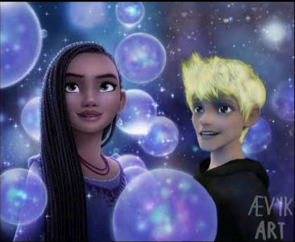
There were attempts to alter the Jack Frost inspired design to be close to the concept art but the effort is just the equivalent of a Deviantart base being recolored in MSpaint.
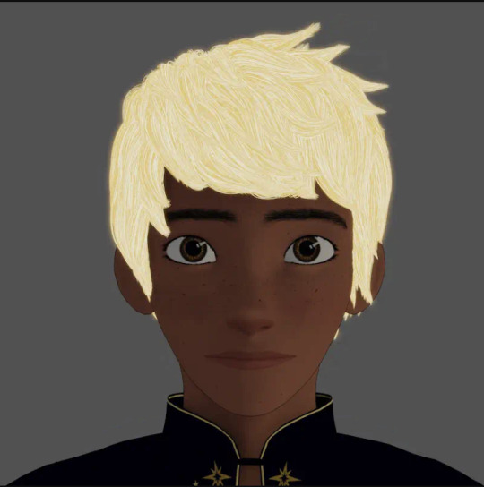
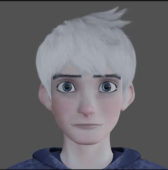
The funny thing is that there's already a canonical design for human Star in the artbook.
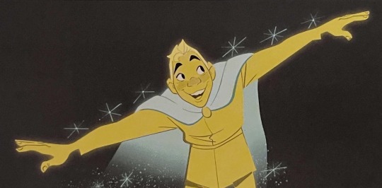
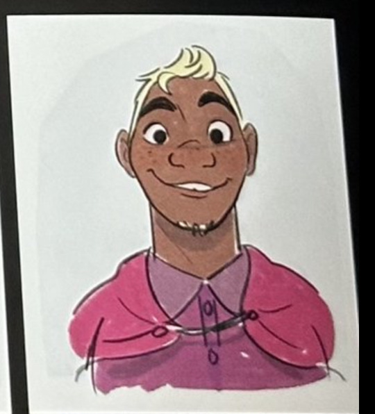
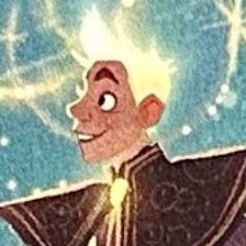
Even though there's several considered designs for him, the fact that there's plenty of official concept art with this facial structure suggests this is the closest to a canon human Star we got.
And if you notice, this human Star doesn't look as attractive to the Jack Frost inspired ones. It's pretty telling they favored the fan made pretty boy one over the closest canonical one with thicker eyebrows, freckles, large nose, darker shade of skin, facial hair and slight tooth gap.
Not only that, in an animatic of a scene in the early draft, Star was a more comedic character.
youtube
And that just make notice how very rare it is for a romance to have one of the partners be conventionally looking and also be the comedic character.
Despite that this fandom makes content about Asha and Star's romance, it doesn't feel like about the both of them. This is less of Starsha and just Starboy.
Not helped is that Asha is already mischaracterized as selfish my media illiterates who didn't payed attention to the movie. So, seeing Asha, a character who is treated like the villain in her own story being shipped by a version of a character who mostly designed as light skin by a fandom who clearly hasn't leg go of their old fictional crush where she's suddenly cared for by audiences comes of as a little iffy, since Asha's is a bi-racial black girl, and that the people who treated her as a villain are in support of the film's actual villain, who is light skinned.
Asha is pretty much like Tiana in a way, being somewhat a discarded character but is only liked by her status of not being single, with Tiana's in film and Asha's in fanon.
Coming back to the plagiarizing Star design , this may come of weird and out of no where, but I partly think Jack Frost is responsible for this mess. Now, Jack Frost is a hot piece of snow, I agree. He was pretty much Tumblr's biggest dream boy of the period of his film's release to the point he is being shipped with characters outside of his film.
Remember the time where people make crossovers of him with Rapunzel, Hiccup and Merida? That was the hit fandom back in the day and like with all fandoms, shipping fights were present and take a guests who gets the most paired with.
This crossover shipping extends over to the Frozen fandom where Jelsa was created. I mean, it was obvious, lonely ice girl and lonely ice boy. The fact remains is that people still have the hots for Jack that they use him as a stand in for a character in a romance that doesn't exist.
And that's what the vibes I'm getting. People just want a romance for the sake of it but don't consider how it would affect the movie and its themes.
I mean, it would be nice if Asha gets a romantic partner but she has bigger priorities. Disney romances have been infamously bad, especially with the older films where the princes are more like plot devices than actual characters. They got better over time with Naveen and Eugene, but that's mainly due to the fact that they're obligated to because they're in a Disney fairytale movie made in the 2010's, of course they should fall in love. With their own princesses, not with each other. You're welcome for that visual.
If Wish had a romance, it would clutter an already cluttered film. Despite that most of Wish's ACTUAL criticism dwells on how half baked it is, a romance isn't going to fix it. It's like adding an extra ingredient to an otherwise fine but half baked cake, that's not gonna make it fully bake.
And this brings us to the fandom's nonexistent issue that they were "robbed". I don't like the usages of "rob" this way because they weren't robbed of anything. Robbed is when someone takes something away from you. Human Star is not theirs but Starboy and his romances with Asha is because they created it after misreading a line about soulmates in the art book and assumed they were romantic partners.
Not helped is that Wish is accused of being made with A.I. and then we have this person crying over a slideshow of A.I. generated images of her stolen romance.
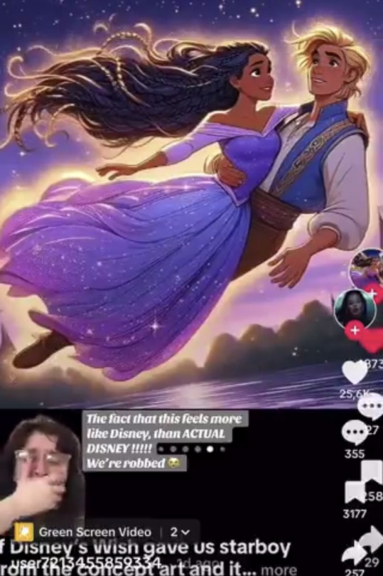
I wrote in my previous posts about Tastes and Preferences and briefly brought up Wish as an example and I intend to expand it right here. The people who want Asha and Star as a couple to be canon is not because of they think it would have improved the film, but more so for their own tastes.
I literally saw a posts from someone saying the potentials if Asha and Starboy being canon would mean them appearing in the Disney parks. Now, that just shows where their priorities lie. This eerily reminds me of the time Tumblr users fangirled over a Peter Pan face performer at the parks where it got so heated that he was allegedly fired.
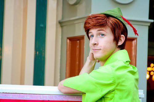
And remember how human Star was inspired after Genie and Peter yet fans mostly prioritize on the Peter inspiration? This pretty much confirms what I get off of them, they're still crushing on Jack Frost and Peter Pan got mad when a character they perceived to be just like them was scrapped. If human Star was kept, imagine the poor actor being looked after by fangirls. If Reylo fans got angry when Daisy Ridley didn't sat next to Adam Driver during that one time, imagine when some derange fans find out that the performers for Star and Asha weren't actually dating.
Heck, this general unhealthy behavior from shippers is even more oddly similar to Zutara fans.
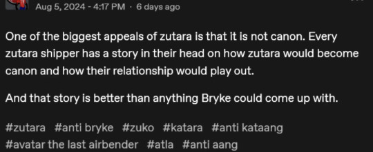
I get the appeal that fanon ships are more immersive than the canon ones, but this behavior saying that it's better than the canon already established ship is just wrong. You're just coping you didn't get what you wanted.
This isn't to say that most Starboy fans are bad. There are those who genuinely love the idea so much they want to make their own take on it. Some even make their own non Jack Frost inspired designs but they are just as rare as the people who like Wish as it is, flaws and all. They just don't want to be lumped in with the obsessive ones.
I'm not against the human Star idea, or giving Asha a romantic partner at all. I even consider Dahlia to be a potential love interest given that she and Asha are close and since I am not a fan that most romance stories are about characters getting together and becoming official AT the end instead of BEING together from start to finish, why not have Asha and Dahlia be established girlfriends.

I'm rather fond of the cat monster Star design because I'm a furry and would love to see fan content of him but I don't necessarily need it that bad I would be pointlessly unreasonable salty.
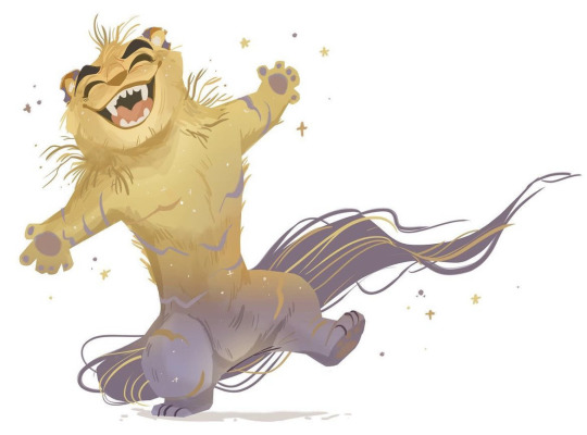
I'm disinterested at the Starboy craze at best and annoyed at worst. I still hold my opinion that most designs are just so samey you could practically make NFTs out of them but I am aware there are fan designs that take a different approach and make no mistake that's genuinely alright.
As much as I don't like, as in neutral towards most Stargirl fangirls, I do appreciate the work and effort they put into their art and I highly encourage them to take risks with their creativity and think outside of the box.
However, I highly discourage the behavior some of them have about being robbed when they are literally making and consuming content that was taken away from them for themselves and acting that a work with the things they like in it is better than those without them.
Thank you for reading and I am sorry for wasting your time.
⭐️
16 notes
·
View notes
Text
Harvester Concept Art?


Concept Art for a dragon I'm designing. Not sure if this will be the official design, so that's why I say it's concept art.
So anyways, this goofus is named Havester, & they're based on a Harvester butterfly. They exist in the universe known as "Reign of Ruin" which sorta... Makes the pantalian Dragons more buggy. (No I'm serious they're more buggy. Don't ask me ask my frend u goofus. This is their universe, not mine.)
Now you may not like their design, but sometimes AUs & whatever do some different things & honestly. I think it's cute imo. (Minus the soulless eyes, but what can u really expect from a bug? They're cute but also stare into yur soul with them big ol eyes)
Credits
Design was created by me but owned by the same frend who owns "Reign of Ruin"
Art is mine
Program: IbisPaint
Bubs' TOS: Plz don't repost/steal, trace, or recolor my art WITHOUT MY PERMISSION! If you do, I'll take yur femur and pelvis.. SO, DON'T THINK ABOUT IT! (The PNS on my blog's pinned post clearly means "Please No Steal" plz follow that rule.) If you do post my art on anything like yur blog or somewhere else (With my permission) PLEASE CREDIT ME!
#neptuniadoesstuff#art#oc#WoF#wof au#wings of fire#wings of fire au#WoF: Reign of Ruin#Silkwing (RoR)#Harvester (OC)#Silkwing#Dt#Design Trade#Concept Art?
10 notes
·
View notes
Text
Since I’m officially a year older now, I figured I’d share my growth as an artist with y’all. True GlitterPenSupremacy followers will know that I had to redesign my redesign (hehe) of Viperion, but he isn’t the first MTS character I didn’t nail on the first try. Here’s a few others that I had to reredesign (and a bit about why)
Art below the cut! ⬇️

This one is a special instance, since I technically haven’t redesigned her yet, but it’s an idea I had for a civilian Zoe design. Basically I don’t really like the colors anymore (and her proportions are off) so I’ll be reworking it. The final design will probably still go with the orange stars, but it’ll look different.

Of all the characters I’ve reredesigned, I think she was probably the most decent to begin with. Other than her features being a bit blurry, her biggest issue is that her costume is basically just a recolor of her Miracubug one (and while I do like that version of her design, it just doesn’t fit in with the MTS cast of character designs).

The OG Carapace design was me trying to make an intimidating character, but accidentally leaving him too bland looking. The fullbody suit and lack of hair just wasn’t doing it (plus he needed more variety in his color palette beyond shades of green).

I thought Ladybug was pretty good at the time, but when viewing her design (both on its own and in contrast to her partner), it definitely needed more. Adding another shade of red (and the cute little neon clovers) was absolutely necessary.

Yeah his color scheme and details are kinda lame in comparison to modern MTS designs, and his hair also feels a bit basic, but let’s be real, the biggest offender, (BY FAR) was his proportions. Like who is that??? Certainly not Ivan! I had to fix his shape so it actually looked like the character.

Polymouse had a lot of the same issues as Minotaurox. Mid detailing, generic color scheme (especially with Pigment around: Mylene needed more than just pink, grey, and white), an uninspired hairstyle, and most importantly WHY DOES SHE LOOK LIKE THAT?!?!?! She needed her proportions fixed to match her actual body type.

Other than her eyes needing to be pink like Daizzi’s, the general vibe I was going for with Pigment changed, and I needed to give her a new costume to reflect that. (This design is decent, but not MTS-worthy and doesn’t really show what kind of hero Pigment is.)

This is a pretty old design (made in ‘22!) so there were a lot of things I needed to rework. I’d say the main thing was Greyhound’s personality changing from his initial design. When I first conceptualized Greyhound MTS, I kinda figured he’d have the same personality as Felix, just being a superhero (and maybe a tad less formal). Nowadays he’s a lot more of the sweet but shy puppy type (a lot of Felix’s softer and “not professional” emotions get repressed as a civilian, and kinda leak out as Greyhound). I needed his new design to represent that. Now he fits his power (he had the concept of Devotion and healing powers) and age (14) much better than his OG design.

My first ML design! You can see a lot about my skills and confidence from this drawing. I was heavily trying to mimic the Miracubug style (with Night Light’s design basically being ML Vesperia as a Firefly and also me altering all the pet peeves I had with VP’s design) despite that not really fitting my skills as an artist. Plus I just wasn’t as good at detailing back then. This is why the modern Night Light design is essentially just a glow-up of the old one (with the fluffier hair, baggier clothes, and black retinas being the main objectives of the design). I also got better at communicating personality through my designs (well, that, and I wasn’t too sure what NL’s personality would be at first). Like Greyhound, I think the newer design looks far more her age!
And that’s (probably) all of them! Hopefully this was interesting to y’all (and if it wasn’t, well, I’m gonna justify my self indulgence with the Birthday Card). I’ve actually got a new hero design or two in the works, so if you’re interested, keep your eyes peeled 👀
#miraculous ladybug#miraculous: the series#miraculous reboot#miraculous fanart#miraculous redesign#ml rewrite#ladybug redesign#carapace redesign#zoe Lee redesign#Polymouse redesign#Minotaurox redesign#Purple tigress redesign#pigella redesign#My tumblr app may be being a toad >:(#But that won’t stop me!!!#oh and I shoulda said this sooner but#if you’re newish to the blog and want to see the final designs for theee characters#I have them all (except civilian Zoe) posted to my blog
9 notes
·
View notes
Text
Usagi with red roses
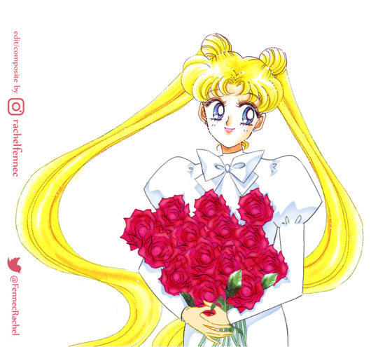

In case it's not obvious: this piece is a COMPOSITE of official SailorMoon art and my own lines. I spliced elements of five different pictures from NaokoTakeuchi's art books, added the dress and arms and recolored the borrowed roses to recreate the little doodle/concept of Usagi and ChibiUsa I edited earlier. Further iterations are still in the works.
#SailorMoon#セーラームーン#セラムン#美少女戰士#美少女戦士セーラームーン#prettyguardian#sailormoonclassic#UsagiTsukino#月野うさぎ#SerenaTsukino#sailormooneternal#NaokoTakeuchi#武内直子#magicalgirl#bishoujosenshisailormoon
25 notes
·
View notes
Text
i swear to god im going insane, if anyone ever happens to care about specifically the sugar rush speedway adaptations i'm making this post for them and also so i don't forget this stuff. also i just have the energy to write about the stuff today lol
Info may be incomplete because I wrote this at 2 am and set it to queue
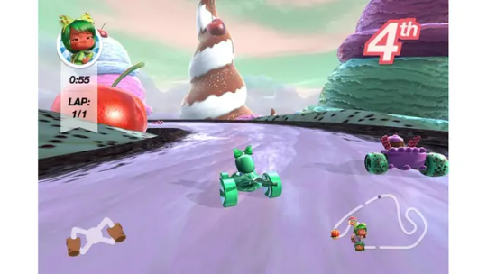
Sugar Rush is one of the fictional games from the Disney movie Wreck-it Ralph. it's a kart racer game similar to Mario Kart, but with a sweets and candies theme. alongside other games like Fix-it Felix jr, Hero's Duty and Turbotime, this game had multiple game adaptations and related minigames. here im gonna talk about 3 adaptations: Sugar Rush Speedway, LEAP Motion Sugar Rush Speedway App and the "Baking" and "Racing" games from the Wreck-It Ralph Storybook Deluxe. i'll be ignoring the Sweet Climber minigame from the wreck it ralph app because its a simple endless jumping game.
ill try to go from my percieved idea of which one is more popular, in descending order.
Sugar Rush Speedway
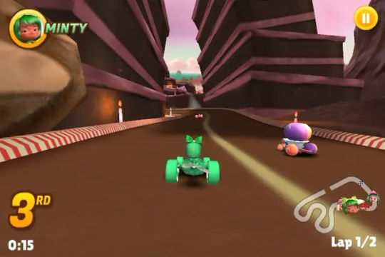
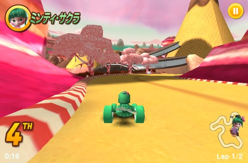
if you remember having played a sugar rush game, it was probably this one. available as a browser game until it stopped being playable beyond the first map because of a game error and it was later removed somewhere in 2018.
can you still play this version of sugar rush? yeah...but not officially, it is available and fully playable on Bluemaxima's Flashpoint (god save flashpoint)
its got 4 cups, each cup being 1 track normally, in reverse and flipped. you go trough 3 laps in most of these.
it has all 10 sugar rush racers, plus you can unlock king candy trough the code KINGCANDY (wow, original) but it does not include vanellope or the recolors. there is also a lost japanese version whose only diference was that it replaced Minty Saki with Minty Sakura and the code to unlock King Candy was 7ELEVEN (lol). items work just like any common denominator kart racer, random items from an item box.
since this game was released very closely to the movie's release, some of the stuff is based on concept art and deviates from the game we see in the movie, also the graphics are a bit unpolished as it is expected for a browser game from that time, more info and images on the wiki.
Wreck-It Ralph Storybook Deluxe Games

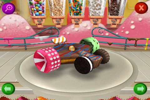
the wreck it ralph storybook deluxe app was a paid app that, as it says, has the story of wreck it ralph in storybook form, alongside a game you can play. the app costed money and its been retired from both the play store and the app store.
is this version of sugar rush still playable? no. unless you have the app still installed on an old phone, i have the apk but it doesnt work on modern phones.
there are two "games" from the wreck it ralph storybook app, the Bake one, which corresponds to a simplified and less gimicky version of the bake-a-kart minigame, where you get to customize your kart. and the "Racing" game, which is, of course, a few sugar rush courses. 3 in this case, and 3 diferent difficulties as well.
unlike the other game, this one only has 4 of the sugar rush racers, but it also has vanellope, which automatically makes this the superiorest version of them all. in this version instead of random items you get character specific abilities.
LEAP Motion Sugar Rush Speedway
im kicking and biting and maiming and
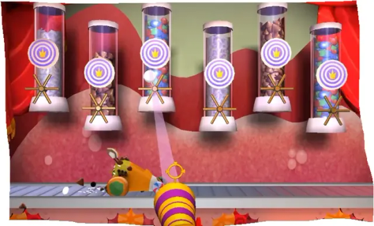
the sugar rush speedway app for leap motion it's a purchasble app from the leap motion store, while its meant to be used with a leap motion device that tracks your hand movement it can be played without, its the same game as the browser sugar rush speedway with a few key changes: the races are only one lap, the graphics have been enhanced, and it had a bake-a-kart mode more similar to that in the movie.
is this version of sugar rush still playable? hell no, unless you had it installed previous to the shut down of the leap store.
some other changes are that king candy is no longer playable and one of the items is missing, i've only found 6 videos on youtube and a few screenshots of the game, more images and info on the wiki.
while some of the game content is out there and someone probably still has a copy, at least in my opinion, the playable game could be considered partially lost media,
10 notes
·
View notes
Text
Official Heroes of the Storm Skins: Tracer
These are not fanskins, they are official crossover skins found in Heroes of the Storm; however these concepts are interesting and I find it worth archiving them here. Find more Official HOTS skins here.
*= skin found in Overwatch already

Base Tracer with reskins by Marc Brunet, Phill Gonzales and Ted Park based on work from the Overwatch Art Team

Agent (original)*, Neon Green*, Royal Blue*, and Throwback
Divine Herald Tracer by Florencia Kristiani (concept), Oleksandr Zapisochnyi (sculpting), Ekaterina Bolshakova and Stas Lisowski (texture and recolor), and other Dragonfly Studio members
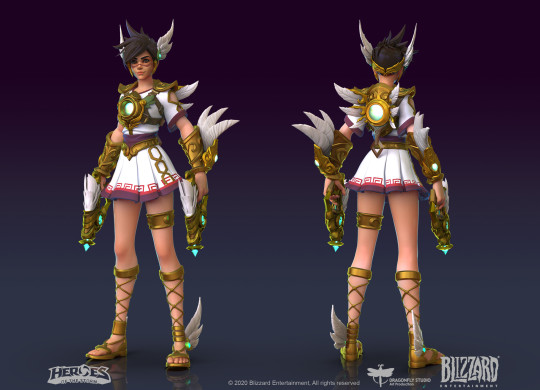


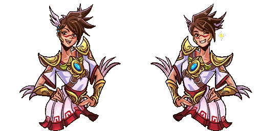
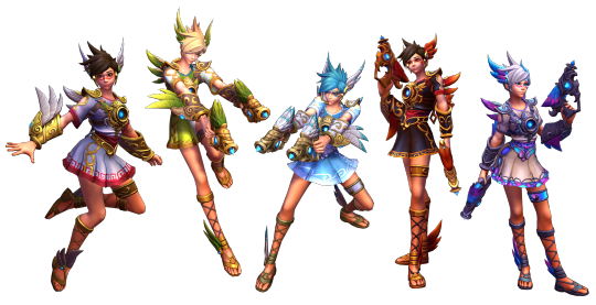

Divine Herald (red/white), Nature (green), Serene (blue), Infernal (red/black), Cursed (purple)
Ghost Tracer by Luke Mancini (concept), Leslie Van den Broeck (3D art), Ben Gerowe (techart), and Mr Jack
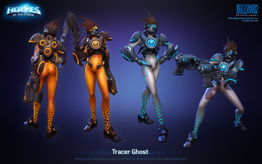
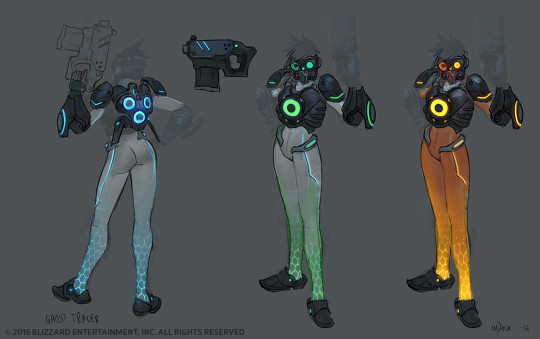
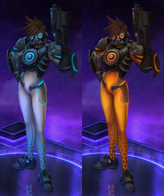
Ghost (blue) and Amber (orange)
Spectre Tracer by Marc Brunet, Theodore Park, Leslie Van den Broeck, and Samwise Didier and Luke Mancini (concept)
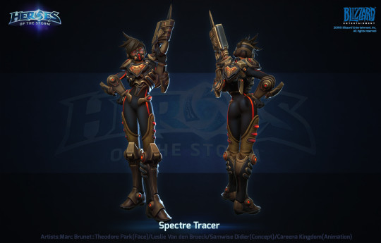
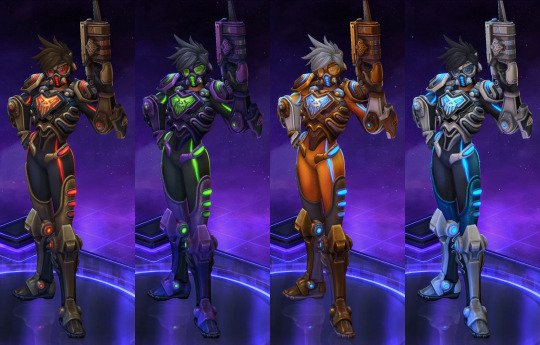
Spectre (red/black), Neon (green), Amber (orange), Cyro (blue)
Turbo Tracer by Edward Crane, Renaud Galand, Ted Park, Phill Gonzalez, and Marc Brunet
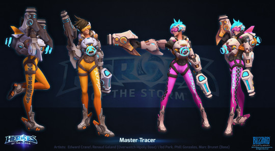

Turbo* (orange), Slipstream* (blue), Hyper (pink), Hot Rod (red)
Slip 'N Stream Tracer by Oscar Vega/raspbearyart (illustration), Edward Crane and others
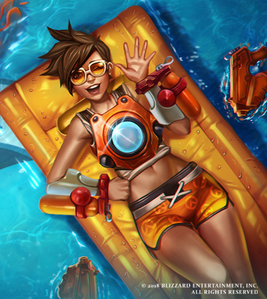

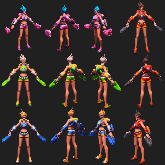

Slip 'N Stream (orange), Hyper (pink), Verdant (green), Azure (blue), Heatwave (red)
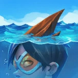
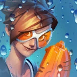
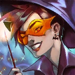
Bonus: Heroes of the Storm Portraits (Ghost Portrait by Mr Jack, and Nutcracker Tracer by Zach Fischer)


#tracer#summer holiday#heroes of the storm#official hots#myth/legend#cyberpunk#greco roman culture#Oscar Vega#raspbearyart#Mr Jack#Zach Fischer#Leslie Van den Broeck#Luke Mancini#Edward Crane#Marc Brunet#Phill Gonzales#Ted Park#Florencia Kristiani#Oleksandr Zapisochnyi#Ekaterina Bolshakova#Stas Lisowski#Ben Gerowe#Samwise Didier#Renaud Galand
21 notes
·
View notes
Text
i ranked the wizards
on combat ability, mental stability, and currently available content. why? cuz i was bored and those categories seemed fun/doable. top of list is most, bottom of list is least. i’m not trying to set some kind of fanon rules here, nor am i claiming to be an expert on what content exists out there. this is just my personal take. rank the wizards yourself if you want, however you want.
=Combat Ability=
Wizardmon x
+ went back to school for a phd in ass-kicking (fire magic)
+ Has evolved beyond the need for wands/staves
+ ‘Quantum’ magic
+ Can freely traverse dimensions at will
+ X evolution means inherently stronger than base version
Flame wizardmon
+ Double the wands, double the power
+ Armor evolution means inherently stronger than base version
+ Courage based armor evolution means intense aggression, less cautious
- hasn’t been shown to have any healing/defensive abilities
+ Out of the 3 animations he’s been in, only died in the one where he was just a background character (tho he was defeated in the other two, he lived)
Wizardmon (classic)
- Basic wizardmon, nothing fancy
+ Has two masters degrees (fire being best at attack, and earth being best at defense)
+ Has been shown to have greater power than the average champion/adult digimon
+ Has been shown with ultimate/perfect level wards/shields and cure/healing spells
- Died after 1-3 episodes of the anime but cheated death in two mangas
Sorcerymon
- Just a wizardmon recolor
- Died in his debut episode without doing much
- Focuses on water and healing spells, no notable offensive or defensive abilities
- Really just a support guy/healer, not a fighter
=Mental Stability=
Wizardmon (classic)
+ Shown to be very pragmatic, even in dire circumstances, and highly resistant towards torture and emotional goading/baiting
+ Has been through some pretty crazy shit (traveling through multiple dimensions, being reformatted, and dying) but maintains a cheerful, calm demeanor without being unrealistically optimistic
+ Loyal, determined, but also flexible and adaptable
Sorcerymon
+ Similar personality to basic wizardmon due to just being a recolor
+ Water element lends itself to calmness and gentleness
- Alas the above is at odds with digimon’s natural tendency towards violence, and he kinda cracked under the pressure when the person he devoted himself to died
- If you’ve ever been healer/support in a multiplayer game, you know this guy’s a little crazy
Wizardmon x
+ Technically very similar to basic wizardmon, just with an x antibody, but
- In all TWO of his official images, he is grinning maniacally, very unlike his base form
- What kind of sane wizard would go hand-to-hand instead of using a safety stopgap like a wand or staff (yes i’m looking at you, witchmon, we all know you crazy)
Flame wizardmon
- Genuinely just enjoys violence and screaming
- Is just casually on fire pretty much all the time
- Dual-wielding wands is pretty crazy imo
- In one of his anime debuts he was stealing people’s hutzpah, in the other he worked for a literal clown
=Content available=
Wizardmon (classic)
+ Plays a major role in two episodes in the original season, and has a cameo appearance in the second and fourth seasons, as well as the tri movies
+ Plays a major role in both the xros wars and dreamers manga series’
+ Had an official plushie
+ Had an official figurine and is about to have another one
+ Is somewhat regularly featured in promotional art and has some bonus concept doodles aside from his reference book image
+ Is in most if not all of the games in some form
+ Has quite a few digimon cards, both the original japanese AND the new english ones + Is tagged over 500 times on pixiv
Flame wizardmon
- Has no official art aside from his reference images
+ Appears only in two basic virtual pets and has a single japanese card
+ Appears as a main character in one episode of both xros wars and ghost game, as well as a background character in the frontiers movie
- tagged almost 30 times on pixiv
Sorcerymon
+ Plays a major role in two episodes of frontiers, the fourth season of the anime
- Has one official image that isn’t just a recolor of wizardmon’s own images
+ Appears in a fair number of videogames but has no playable cards
- Tagged almost 30 times on pixiv
Wizardmon x
- Has no official art aside from his reference image and its sketch
- Has a single english card and appears in one virtual pet device
+ Supposedly appears briefly in a story meant to promote the above virtual pet?
- Tagged only five times on pixiv
#wizardmon#sorcerymon#flamewizardmon#wizardmon x#flame wizardmon#wizarmon#sorcerimon#sorcermon#flawizarmon#fla wizarmon#wizarmon x#sorcerermon#x antibody wizardmon#ranked
16 notes
·
View notes
Text
Okay so I was looking through the hero gallery reaffirming my favorite skin for each hero (and double checking I don't really like any Winston skins, which holds up), but I found something. Peculiar.
I was checking Symmetra's skins and noticed a peculiar name for one of her Rare skins (the blue-tier ones that are very minor recolors, where only four are made for each hero on their release and never any more). Normally, these names are very formulaic, very often just the color of the skin in the hero's native language, or some vague pleasant-sounding way to describe the color choice.
But then there's this Symmetra skin: Technomancer.

Her other three Rare skins are named Cardamom, Hyacinth, and Saffron, all different plants, so "Technomancer" sticks out.
But I think I know why...
Putting it simply, this was her beta design color scheme
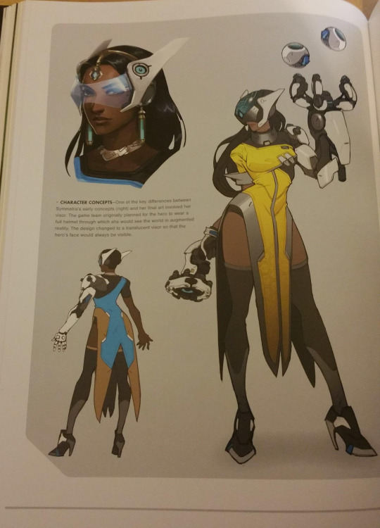
Seems like yellow was meant to be Symmetra's main color before it was settled that her outfit should be primarily blue.
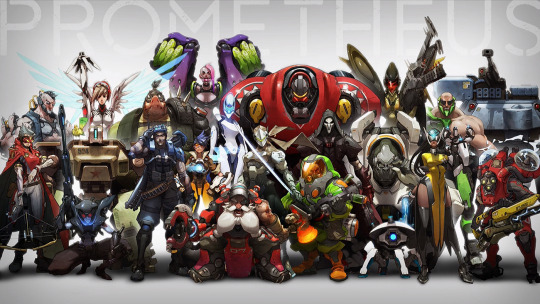
It even shows up in this concept art that I've shown before and will show again, along with several other heroes in their finalized and not-so finalized designs, along with some characters that never made the cut in general.
It's also worth noting that Symmetra is one of the oldest Overwatch character concepts, back in the MMO phase of the idea where each character was instead a class, with the class that became Symmetra being... okay it'd be cool if I could say it was also called "Technomancer", but no, apparently just "Architect".
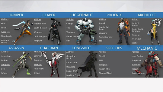
(fun fact while we're here, "Architect" is listed as being able to deploy 3 sentries to distinguish them from "Mechanic"'s one large sentry, but Symmetra could deploy a whole 6 sentries until her second major rework, where it was reduced to the three that's both how we know it today and the original concept to distinguish her from what became Torbjorn. She also couldn't deploy a shield generator until her first major rework where it became her alternate ultimate, Symmetra 1.0 only gave allies a small portion of shield health directly, while now she has no equivalent shield-generating abilities. No, her ult doesn't count, that's a barrier, "shield" in overwatch terms refers to blue health. Unless it's Rein and Brig, those are also shields.)
...*ahem* anyways.
Was not expecting to uncover a beta design reference in the final game tonight. Haven't heard anyone acknowledge this before, though admittedly people don't tend to pay attention to Rare skins much at all.
Skins that are references to earlier design iterations are super neat but not something common at all as of now, with the only other exception (at least coming to mind now) is, ironically, Lucio, with his Equalizer skin, a reference to his earlier design as well.


This one's from Archives 2018 and is super neat. The contrast in personality despite the outfit being the same is particularly delightful, it's not too far off but it's juuust different enough to be noticeable when the Lucio we know and love is wearing his beta outfit, and it doesn't quite have the same vibe as the concept art.
If I haven't made it clear yet, I adore seeing development art stuff and seeing the ideation process, so seeing characters or other concepts that were scrapped come back later in official capacity is always one of my favorite things. Morpho Knight from Kirby is a prime example, and there's great examples from Sonic like Honey the Cat and the very recent inclusion of the rabbit design that was a scrapped concept for Sonic himself. These are just a couple skins and not whole characters, but it's still super neat. Wish they did more of these to be honest, especially with Archives. Considering the whole theme of the event is (was?) seeing heroes how they were in the past in-universe, it was cool to see Lucio in how he looked in the past in a more meta sense. As I comb through the old concept arts, I'll try to keep an eye for which ones I could think work as skins for the finalized hero.
...This post ended up being longer than I expected. oops.
9 notes
·
View notes
Text
The Best Mods and Enhancements for Chrono Trigger: Revamping a Classic Experience
Chrono Trigger is often hailed as one of the greatest RPGs of all time, blending time-traveling gameplay with an unforgettable narrative and iconic characters. Originally released in 1995 for the Super Nintendo Entertainment System (SNES), the game set the bar high for storytelling, gameplay innovation, and soundtrack quality. Despite its age, Chrono Trigger continues to attract new and returning players, thanks in part to the vibrant modding community that works tirelessly to modernize and enhance the game. Here, we’ll dive into the best mods and enhancements for Chrono Trigger that keep this classic experience fresh and engaging.
1. Graphical Enhancements and Remastered Visuals
While Chrono Trigger boasts charming pixel art that has aged surprisingly well, many players seek a more modern visual presentation. Enter the graphical enhancement mods that offer new interpretations of the game’s art.
a. HD Texture Mods: Mods like “Chrono Trigger HD” upscale the original pixel art to high-definition quality, making the game look stunning on modern displays. These mods often use AI upscaling and manual touch-ups to retain the original feel while giving the visuals a crisp, modern look. The enhanced sprites and backgrounds provide a refreshed aesthetic that stays true to the game’s roots but feels less dated.
b. Recoloring Mods: Some mods focus on subtle recoloring to make environments more vibrant or characters stand out more. These adjustments help maintain the original game’s artistic integrity while making it visually more appealing, especially for those playing on high-resolution monitors.
2. Quality of Life (QoL) Improvements
For many gamers, the charm of retro games also comes with frustration over outdated mechanics. Quality-of-life (QoL) mods aim to streamline gameplay without altering the core experience.
a. Faster Movement: In the original game, navigating large maps and dungeons can feel sluggish. Mods that introduce faster walking speeds or even sprinting help cut down on travel time and maintain momentum in the gameplay.
b. Save Anytime: While the original game requires players to use save points, QoL mods often introduce the ability to save anywhere. This is particularly helpful for casual players who may need to pause their adventure more frequently, making the game more accessible and convenient for modern play sessions.
c. Enhanced Menu Navigation: Mods that revamp the user interface and menu screens can make them more intuitive. For example, mods that reorganize inventory, optimize sorting options, or improve character management make it easier to equip items, cast spells, and review stats.
3. Fan-Made Expansions and New Content
One of the most impressive aspects of Chrono Trigger’s modding scene is the passion of its fanbase, which has led to the creation of entirely new content and expansions.
a. Chrono Trigger: Crimson Echoes: This fan-made project is legendary among the Chrono Trigger community. Although it was never officially completed due to legal issues, various partial versions are available that provide a new narrative set between Chrono Trigger and its sequel, Chrono Cross. These expansions feature new dungeons, bosses, and storylines that add depth to the world of Chrono Trigger while preserving its original charm.
b. Chrono Trigger Schala Edition: This mod focuses on expanding the character development of Schala, a pivotal yet underexplored figure in the original story. The Schala Edition enriches the plot and interactions involving Schala, making her more integral to the game’s lore and providing players with a more immersive experience.
c. Time’s Illusion: Another fan project that continues to captivate the community is Time’s Illusion, a mod that introduces new timelines and expands the concept of time travel. Players can explore alternate versions of existing areas and encounter new characters whose stories intertwine with the main cast’s journey.
4. Soundtrack Remixes and Audio Enhancements
The music of Chrono Trigger, composed by the renowned Yasunori Mitsuda, is celebrated as one of the greatest game soundtracks of all time. However, audio enhancements can elevate the experience even further for audiophiles and casual players alike.
a. Orchestrated Soundtracks: Mods that replace the MIDI sound files with fully orchestrated versions are highly sought after. These remixes keep the original compositions intact while enhancing them with richer instrumentations. Playing through iconic moments like the battle against Lavos with a full orchestra behind it adds an epic scale to the gameplay.
b. High-Fidelity Audio Enhancements: Simple audio mods that increase the bitrate and quality of sound effects and background music help make the game feel more immersive, especially when played on modern sound systems or with high-quality headphones.
5. Gameplay Tweaks and Balancing
Many players appreciate subtle gameplay changes that modernize Chrono Trigger’s mechanics without significantly altering the original difficulty curve.
a. Rebalanced Boss Fights: Some mods fine-tune the game’s difficulty by making boss fights more challenging and strategic, ensuring that veterans of the game face more engaging battles. These tweaks often include improved enemy AI and new attack patterns that require more thoughtful use of the game’s combo-based combat system.
b. New Game Plus Enhancements: While the original Chrono Trigger includes a New Game Plus mode, mods can expand on this feature by adding more powerful equipment, additional endings, and new side quests to keep players engaged.
6. Localization and Language Support
Chrono Trigger has a global fanbase, and modders have worked hard to make the game more accessible to non-English speaking players.
a. Fan Translations: While Chrono Trigger was localized into several languages over the years, some translations may have lacked the nuance of the original Japanese text. Fan translation mods aim to provide a more faithful representation of the original script, capturing the subtle humor and emotional depth.
b. Modern Language Packs: Mods that add support for modern languages or update old translations are invaluable for expanding the game’s reach. These language packs ensure that more players worldwide can enjoy the game in their native tongue, deepening their connection to its story and characters.
7. Technical Enhancements and Cross-Platform Compatibility
For players looking to experience Chrono Trigger on non-native platforms, mods can make the transition smoother and more enjoyable.
a. PC Port Fixes: The PC port of Chrono Trigger was initially met with criticism due to issues like clunky controls, poor UI adaptation, and subpar visuals. Modding communities quickly addressed these problems, offering mods that fix the UI, enhance controls, and improve graphics. The PC Port Enhancer is a popular choice that optimizes the game’s performance and updates its interface for PC gaming standards.
b. Mobile and Emulator Optimizations: For those who prefer playing on mobile devices or emulators, mods that adjust touch controls, improve responsiveness, and enhance screen resolution are indispensable. These enhancements allow the game to feel native on newer platforms, maintaining the same level of playability as on classic consoles.
8. How to Safely Download and Install Mods
Before diving into the world of mods, understanding how to download and install them safely is crucial. Websites like modversionapk.com offer various versions of the game, but users should always ensure they are downloading from trusted sources.
a. Use Trusted Modding Communities: Websites like ROMhacking.net and dedicated forums for retro games often provide vetted mods with user reviews. These sites can be a reliable source for downloading mods without risking malware or compatibility issues.
b. Install and Backup: Always create a backup of your original game files before installing any mods. This precaution helps revert to the original version if a mod doesn’t function as expected.
c. Check Compatibility: Some mods may conflict with others, so reading the installation instructions and checking for known issues in mod descriptions is essential.
Conclusion
Chrono Trigger’s enduring legacy is a testament to its groundbreaking design and storytelling. However, the dedicated modding community has ensured that this classic remains relevant by offering a host of enhancements that appeal to both nostalgic fans and new players. From graphical and audio improvements to expanded content and gameplay tweaks, the range of available mods provides endless ways to experience this masterpiece anew. Whether you’re reliving your childhood memories or exploring it for the first time, mods can help tailor Chrono Trigger to your tastes, ensuring the game remains as compelling as ever.
0 notes
Note
Hello! Sorry to bother but I saw your post here:
tumblr . com/ frankie-bell/729032266410491904/psycho-pass-original-character-designs-by-akira
And I just wanted to ask if you wouldn’t mind sharing where you got these from. I love PP and Amano’s art so seeing this is golden and I’d love to download them in HQ if there is that option. Thank you!!! ☺️❤️
It’s no bother at all! I found the images here and on the official Psycho-Pass wiki, although they’re not exactly HQ (I don’t know if there are true HQ versions of Amano’s concept sketches anywhere online). After that, it was a lot of Photoshop — blowing up the size, cleaning, recoloring, adding a paper texture and grain effect, etc. — to get them where they are. But you’re more than welcome to save the versions I posted. All I ask is that you don’t repost them anywhere, as they’re my personal edits and took a lot of time and effort.
1 note
·
View note
Text
@kaezerdoodles I kid you not I was JUST thinking about that the other day. Been wondering what Dani would look like with Vlad's original hair color and came up with this by recoloring some official concept art. I'm seriously considering drawing something based on this at some point.

Also, @lilianade-comics has some fantastic comic strips where Vlad becomes attached to Dani unintentionally. She's still a Danny clone mind you, but in this case it's funny since Vlad gets into dad-mode with him too from time to time now that he's actually a got a kid of his own.
Here's one of the comics! (https://www.tumblr.com/lilianade-comics/706072289613053952/my-scanners-indicate-that-is-not-anaphylactic?source=share)
AU where Vlad uses his own DNA to make Dani and is actually a “good” dad
This has prob been voiced before but just in case
#danny phantom#danny phantom au#reblog#dani phantom#ellie phantom#danielle phantom#character concept#concept art#thesoulspulse#thesoul'spulse#the souls pulse#the soul's pulse#vlad masters
770 notes
·
View notes
Text
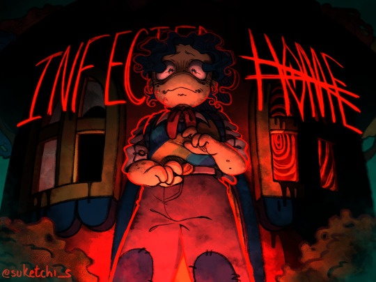
🏚️Infected Home — a WH AU!🍎
ㅤ Wally's house suddenly came alive because of an unknown parasite, and it's slowly spreading to the rest of the neighborhood. ㅤ How will they stop it..?
ㅤㅤㅤA psychological horror story following Wally, as a parasite of unknown origins takes over its house, and later on a friend.

WARNING: ㅤ Infected Home is a psychological horror story, and thus will contain topics such as... scopophobia, trypophobia, poor mental health, body/ mind control, loss of self, isolation, self harm, body/ puppet horror, and character death.

!﹘ Index
About the AU
Gallery
Boundaries
Tagging Guide
Important Links

1. ﹕ About the AU
ㅤㅤㅤafter waking up one seemingly normal morning, Wally soon discovers that the bad feeling he'd been having for the past few days was very much true when he steps out of his house, realizing it had been overtaken by a parasite of unknown origin, which is slowly spreading to its surroundings — the neighborhood.

ㅤㅤㅤclearly now without a home it moves in with Barnaby, all his belongings now lost to the parasite. suffering of constant nightmares of the future that awaits them, pup becomes a shell of what he once was, his hair now a messy ponytail rather than his usual well cared for pompadour.
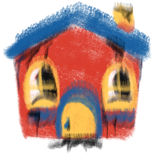
ㅤㅤㅤthey can't ignore the problem forever, the parasite only growing stronger and bigger with each passing day. the house below it now barely visible anymore, aside from its front door; almost completely untouched, almost tempting to go through. the eyes all over it seemed to multiply overnight, now covering most of its surfaces just so they can watch their every move. ㅤㅤㅤthey had to get rid of it, and someone had a plan... but maybe it won't go as smoothly as they planned; the parasite won't go down without taking another with it.
ㅤㅤㅤheart broken by the loss of a friend, they all grieve and mourn together, trying to support each other as best as they can. Wally was just a kid, after all, so the loss struck him hardest of all, now further isolating and blaming itself for all that happened.
ㅤㅤㅤbut that's not the end, is it...?

2. ﹕ Gallery
note ! Wally's first ref is right after Home's infection, the second one is after the story being told happens! :)
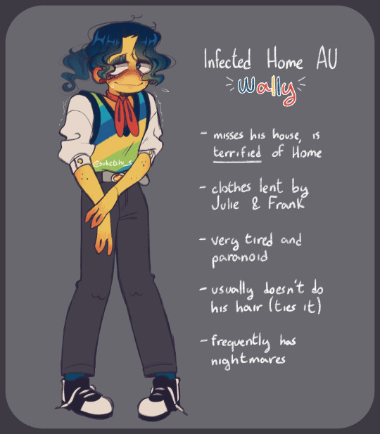
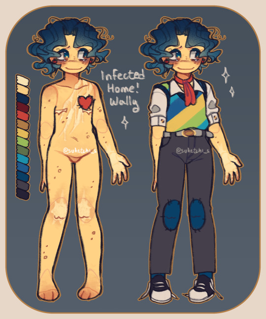


Note that these images are concepts and may be subjected to future changes.

3. ﹕ Boundaries
What is ok?
Fan art, edits, cosplays, fanfics, anything creative!
Character interactions of any kind! In any medium! I’d love to see them!
Memes or things alike!
Hurt/comfort, body horror!
Fanon AUs of the AU
Edits! (do be careful of what music you use, though.) All of this, as long as you tag/ credit me of course!
What is not ok?
Selling mass produced merchandise.
Sexual interactions, both explicit and not explicit.
Romantic OC x Canon. (Wally's an aroace child!)
Redesigns, recolors, tracing, etc. without my permission.
No comfort angst.
Edits with sexual lyrics.
Any type of com-proshipping content; this includes Wallycest.
Any kind of AI content. Please respect these boundaries, if not you will be blocked and blacklisted.

4. ﹕ Tagging Guide
#infected home au — general tag for the AU! #lore — general lore/ important posts #neighborhood lore — lore happening while at the neighborhood! #post-neighborhood lore — lore after Wally leaves the neighborhood. #post-neighborhood — general posts/ drawings happening after Wally leaves the neighborhood!

5. ﹕ Important Links
"Lost Home" lore document
Spotify playlist
fanart folder!
→ ALL official & concept art I made for the AU! ←

Byebye, neighbor! Thank you for reading! @:)


#welcome home#welcome home puppet show#welcome home art#welcome home fanart#welcome home au#welcome home wally#infected home au#tw scopophobia#tw eyes#tw trypophobia#tw body horror
1K notes
·
View notes
Text
Concept Designs for the 2nd Stange Starters | Pokemon: Industria part 2

Yeh uh... Might not be official but I kinda wanna do g0r3 again so this may or may NOT be the last thing I do before the g0r3 happens again so... Just beware... (Yes I am still ill doing g0r3tober it's just that I was taking a small break from it)
Oh yeah these guys but my themsleves:


Im wayy too lazy to imput the meaning of these fellas so u can just guess their name combos in the comments & see if u can get it right. (But if not then I'll explain to u. Unless u don't want that then that's fine)
(Btw uh... The L in Felactant's name was supposed to be a r so uh... ignore that l & instead see it as a r plz) (OK ANOTHER EDIT THE FRIKIN AUTOCORRECT FOR SOME GOD FORSAKSN REASON TURNED THE R INTO THE WRD RACIST- I DIDNT EVEN SEE THAT TIL NOW PLZ FORGIVE ME!)
Designs are all mine but are inspired by/based on MO: Astray.
Art is mine.
Program: IbisPaint
Bubs' TOS: Plz don't repost/steal, trace, or recolor my art WITHOUT MY PERMISSION! If you do, I'll take yur femur and pelvis.. SO, DON'T THINK ABOUT IT! (The PNS on my blog's pinned post clearly means "Please No Steal" plz follow that rule.) If you do post my art on anything like yur blog or somewhere else (With my permission) PLEASE CREDIT ME!
#neptuniadoesstuff#art#Pokemon#Fakemon#mo: astray#Crossover#Pokemon: Industria#Concept Art#fakemon starters#Memropod (Bub's Fakemon)#Feractant (Bub's Fakemon)#Serpscape (Bub's Fakemon)
7 notes
·
View notes