#not a huge change though
Explore tagged Tumblr posts
Visit Tumblr Blog
Explore Tumblr blogs with no restrictions, modern design and the best experience.
Last Seen Tumblr Blogs


Fun Fact
Women make up for the other 50% of Tumblr’s audience.
Text


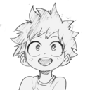
Percy and Harold’s helpful guide on how to talk to short people!
#wysty draws#thomas the tank engine#ttte humanized#railroad roundabout au#ttte percy#ttte harold#percy x harold#ttte thomas#ehehe had this idea in my head for a while now#also I changed Harold’s eyes to blue cause that looked better than brown#not a huge change though
97 notes
·
View notes
Text
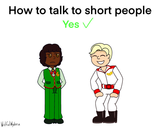
Michael Afton knows the FNAF Mimic’s secret..
#myart#chloesimagination#comic#fnaf#five nights at freddy's#fnaf fanart#mimic#the mimic#michael afton#fnaf puppet#security breach#secret of the mimic#fnaf sister location#fallfest#I can’t believe I still haven’t drawn everything that was announced during the anniversary#IM GETTING around it it folks 😭 so much to draw!#it’s a good problem to have BAHAH#SO steelwool dropped a trailer for their new game!#the secrects of the mimic LETS GOO#like huge day for book truthers first off#second of all I’m glad we’re gonna get more info on the mimic in game#plus fallfest moment it was so real#WITH ALL of this I can’t wait to play it#ITS FUNNY though if the game is set in 1979 like the trailer hints#that means Michael could of totally met the mimic#NOT saying they will but just they could#and that would be so funny Michael upon meeting the mimic already knows em#Lil Michael caught the mimic while it was changing into costume oops!#also a smaller Michael design compared the one I usually draw before he got all moody#maybe that’s the mimics fault BAHAH
5K notes
·
View notes
Text
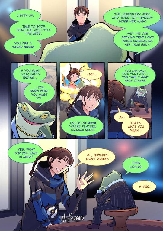
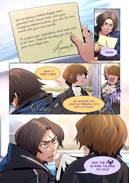
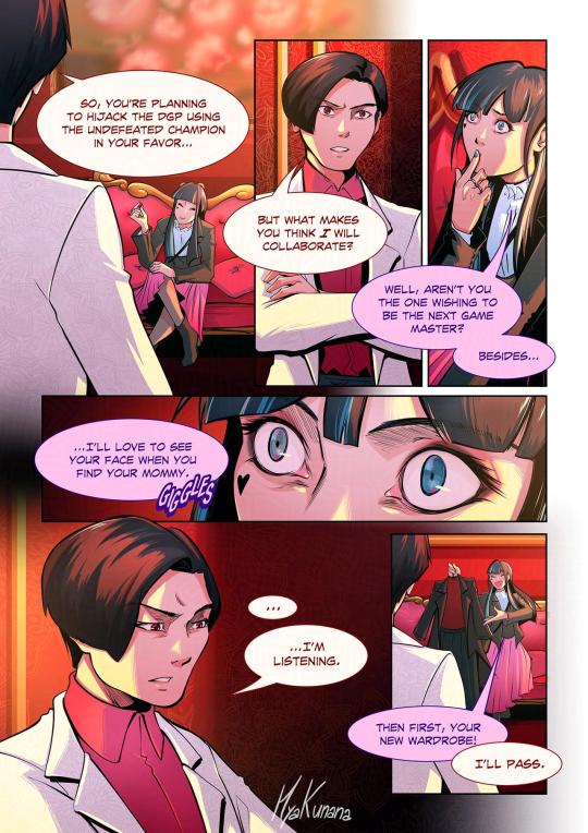
Sponsor Switch!
#kamen rider#kamen rider geats#kr geats#keiwa sakurai#kurama neon#michinaga azuma#ace ukiyo#ziin#kekera#kyuun#beroba#sponsor switch#tokusatsu#fanart#comics#comic#artists on tumblr#no beta we die like tohru lol#im pretty sure i'm not the first to make this though#THE POSSIBILITIES ARE mathematically not so endless but you get me#the major reason i've been postponing this idea was bc i didn't have a punchline for ace/beroba duo#but then on my rewatch i was reminded beroba was the one who changed michi's wardrobe so thx diva for saving my comic#but for real ace/beroba has huge potential to be explored but it was the hardest to make fun of lkjhgfdf#neon/kekera was a close second bc the princess and frog reference came quite late when i was already sketching it#meanwhile keiwa and michinaga are saved from the toxic sponsors but they're still uncomfortable lol#i mean wdym ziin can research ace's family tree and thats fine? boy has some creep potential#he's lucky that his canon rider is the star over stars over stars with 2k years of experience - he knows how to deal w fanboys#does kyuun's magic letter work outside of the lounge? does it matter tho?#is kyuun's letter me projecting my own fangirl side writing a letter to her fictional fav rider? does it matter tho?#holidays are over so time to catch up on my job! pls bear w my slow updates and happy new year <3
245 notes
·
View notes
Text
Art for the portraits in Sinsmas by jigokuhana89

#helluva boss#helluva boss stolas#helluva boss octavia#helluva boss stella#it really puts into perspective how octavia was a seemingly very happy child up into her mid-teens#like to me it speaks of how well stolas kept up the charade of the happy working marriage all that time#i imagine all that came crashing down right after blitz popped back in into his life#like imagine it from Octavia's pov: you have a normal life. your parents get along fine (at least in front of you)#your dad clearly likes spending time with you more than your mom does but that's okay. maybe she's too busy. your dad makes up for it though#then suddenly one day out of nowhere they start fighting like it's the end of the world#next thing you know they're getting divorced#like the song goes‚ her world is burning down around her#suddenly everything she thought she knew turned out to be a lie#and the catalyst for this neck-breaking change seems to be that imp her dad clearly likes way too much#it's no wonder she immediately believes her entire life has been a huge lie; as far as she knows everything was just a show#including Stolas' love for her
263 notes
·
View notes
Text

some sketches of my guy
#original character#angel oc#monster boy oc#wings#winged oc#for those curious he is the main character of this serial comic i have planned after my short film and one shots are#finished called “Mayflies”#Basically its a slice of life/fantasy comic about a world where “angels” are these huge insectoid-like entities that exist in a symbiotic#relationship with humans#They spend the majority of their life cycles in a juvenile state similar to mayflies#where they inhabit the bodies of dead humans#so every once and awhile when someone dies they will come back as an angel spontaneously. Denny was walking to work one day in the#dark and rain and got hit by a car. lucky for him#an adult angel appeared at that moment and triggered the angeldeath and he Came Back#hes like the same guy though angels dont have a separate conciousness from their host. its like#he is the angel. like a lichen. from his POV he can't tell that anything's changed inside his brain only now. he feathers#so yeah. i love him#side note#he has a GNC boyfriend named Ruth#mayflies
183 notes
·
View notes
Text
MDZS Disco Elysium AU part 2 - Psyche Skills
Part 1 - Part 3
#poorly drawn mdzs#mdzs#disco elysium#MDZS disco elysium au#jiang cheng#jiang yanli#yu ziyuan#While it's more in vogue to draw a character's skill roster tailored to them -#One of the more subtle details I love in DE is how some of the skill portraits parallel character portraits of people hbd associates with.#Theres somethine rather poetic to be said about how other people shape out thoughts and sometimes act as a 'voice' in our head.#How we are in part a collection of impressions other people left behind on us.#I am a huge Skillhead (Those are my friends! My party members! They love me! They have their own agendas and alliances!)#so of course a healthy portion of this AU is dedicated to them <3#the Int skills go basically unchanged from DE. Psy as well (with changes to a few quirks in voice).#Fys skills though...well...wwx is in a different body! Those voices belong to Someone Else.#Esp electrochem (MXY in this AU also partied to near death. WWX is withdrawing and craving substances he's never even heard of before)#While I personally don't fully subscribe to Volition Jean I *do* see Volition Jiang Cheng. The voice of your Not Brother keeping you afloat#All three of these parallels make me unbelievably sad. They are also both purple. Art is like that sometimes.#Empathy Jiang Yanli...oh man do I have a lot of thoughts about her. Disco fans Who Know....you can probably see what I'm cooking.#Authority is a really interesting skill in DE because *yes* its about power and intimidation - but it's also about finesse and respect#Titus Hardie and YZY both abuse *and* finesse how they establish their authority - in a way that leaves quite an impression.#2 more mdzs disco posts that I *need* to create and then I'm off to working on raffles <3
716 notes
·
View notes
Text
Jazz and Jason have been dating for two and a half weeks now. And in this timeframe Danny still hasn't warmed up to the former Crime Lord. Not even when Jason makes the decision to share his vigilante i.d. with Danny.
As a last ditch effort Jazz leaves Danny in her boyfriend's care while she completes her college semester. She's eager to get back to their shared apartment once finals are over, more so when Jason tells her on the phone both he and Danny have a surprise waiting for her.
To say that she was woefully unprepared for what this surprise that awaited her at home turned out to be would be quite the understatement. As never in her wildest dreams did she expect to be met with her little brother having gone through yet another just as drastic though much less extreme change.
*while halfway through the door*
Jazz: So, what's this about you two having a surprise for me?
*smirking slyly*
Jason: Danny! Jazz is home!
*apartment practically shakes from the heavy thud of footsteps, followed by the appearance of a behemoth of a seventeen year old*
Danny: Jazzy, you're finally back!
*after sweeping her into a bear hug*
Danny: Ok, I admit it. I was wrong about him. From here on out I'm completely on board! When you guys get married, can I be the best.... Uh, Jazz? You okay there?
*quivering with horror while struggling to face Jason, still trapped in Danny's arms*
Jazz: WHAT DID YOU DO TO MY LITTLE BROTHER?!
#dpxdc#danny phantom#batman#danny fenton/phantom#jazz fenton#jason todd/red hood#anger management#jazz+jason#tall jazz#though some short beanpole of an older teen or adult danny fics or prompts do a decent job of holding my interest#i will forever be team jack-sized young adult/all grown up danny#poor jason is so flabbergasted and also a little hurt by jazz's reaction#all he did was finally earn her little brother's trust by feeding him properly and enforcing a bedtime#while danny steadily becomes more and more self-conscious about his now huge stature the longer jazz rants#especially when she likens him to a teenage version of bane#jazz's just so used to as well as prefers being the big sister in size as well as age it's only natural she wasn't ready for that to change
175 notes
·
View notes
Text

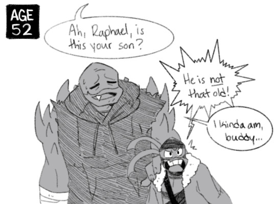
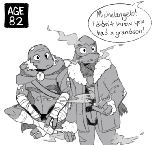


AU starts here!
Previous | Next
Coming face to face with an inevitability you’ve been avoiding for so long is a harrowing thing.
#prison!leo au#rottmnt#rottmnt leo#rise of the teenage mutant ninja turtles#rise leo#rottmnt au#rottmnt donnie#rottmnt mikey#rottmnt raph#rise raph#rise mikey#rise donnie#his brothers start complaining about old age and leo is just like ‘shut up <3’#if you’re wondering about the haze#basically Leo takes control of his abilities enough to not be constantly in pain and injured at this point#took him Forever though lol#note that this is set in#path b#edit: changed the ages a lil to push them further#ALSO YEAH RAPH GREW UP HUGE#he’s even bending down a bit here#leo is a pipsqueak next to him#and yes the dark bandages in pic 2 were made by Donnie
3K notes
·
View notes
Text

this blog is 11 years old now 🎉
I drew the siblings ever to celebrate as usual
#loz#wind waker#legend of zelda#toon link#aryll#I wasn't gonna draw anything but then I sketched link real quick and I was like okay wait i can do this#and then my brother dragged me outside ☠ but i still got it done today!#the anniversary is today. tumblr sent me a notification like ravio is 11 years old now! ravio the character is actually 11 years old.#albw released in2013. i received two reminders this morning. ravio drawing soon maybe. coming this year definitely. maybe#arylls like big brother use a damn fork#<- that was the tag when I first started drawing them in 2018#also i noticed when I draw aryll i always draw her in her blue dress so i decided to change it up. i only play 2nd playthroughs of wind wak#r because fun fact: i hate link's green tunic and hat. i finished a first playthrough years ago with a finished nintendo gallery#and then when i want to start a new playthrough i fight ganondorf again go through the credits cry and then BAM new game no-plus#i miss link's green tunic now though. its been so long. im so sick of champions garb...............idk the green is iconic idk#im not a huge fan of it but i think his base form should be green again. with the hat. let him look doofy as a default again#he was green in echoes of wisdom but i need them to follow through after again.#i didnt finish echoes of wisdom yet (SOON IM TRYING IM STUCK I NTHE SONIC ADVENTURE 1 WEB HELP) but what I saw of Link there?#he was kinda terrifying lmao its always funny to see that link is so extremely competent because i am not. that boy efficient#im stuck in the sa1 web because everyone is always talking about how good it is. so i played the pc port and. its apparently awful idk it i#thats just what sa1 outside of emerald coast plays to me tbh. but the dreamcast is supposed to be better. and i own a dreamcast. free me#i played on gamecube too. 12 years ago. it made me sick. maybe one day i'll install some mods that make it play better#why does it feel like the month is over when its only january 6#i played sa1 as a kid btw. just emerald coast tho. ALSO I DIDNT BUY A DREAMCAST FOR THIS I ALREADY OWNED ONE
62 notes
·
View notes
Text

I remember sketching this out and just giving up on it X.X
but I was in the mood to draw some some June Egbert (very rare feeling) and decided to finish this :P
Er uh also I don't give this permission out a lot but if you want to edit this image to your headcanons/what you think June n Dave look like, I don't mind for this one just as long as you give credit back to me sjhbgfhjdbdf
also I can't decide on an official design for any of the homestucks, their characters are so customizable I have many many different designs for them in mind
#I usually don't like it when people change my designs#but I don't own the homestuck characters so I don't have that same feeling BJHFJSHBDF#If I ever make more HS art I might have the same permission applied to being able to edit the art#tho for my other arts don't edit pls unless it's like those aesthetic pfps in stuff#I hope this makes sense X.X#erm anyways this was fun to draw :3#I *might* be open for drawing requests but my account isn't that huge enough for that BSDFBHSHBJDFG#but nonetheless I am open for them#though they might not come immediately sense I'm working on some personal projects and school's starting up again soon :(#art#digital art#medibangpaint#JuneDave#Dave Strider#June Egbert#PepsiCola#Homestuck#Hs#Fanart#homestuck fanart#DaveJune
63 notes
·
View notes
Text
my end of year reflection was mainly a sense of gratitude for what i have and what i've been able to do, it was a difficult year for many reasons but i ended it feeling so connected to myself + at peace with things that i wasn't with in the first half of the year. i don't have many resolutions per se for the year ahead but i hope all the love i put out and joy that i find keeps me going and that i can continue to cultivate my sense of self and learn new things and have lots of wonderful experiences <3
#like i didn't feel a huge sense of relief or cause for celebration but it was a nice way to end the year - feeling content about the#trajectory of my life even though there are many things that i am struggling with or are a cause of anxiety or that i want to change#i will figure it all out and everything will fall into place#diary#tiyas thoughts
30 notes
·
View notes
Text


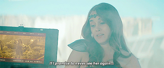


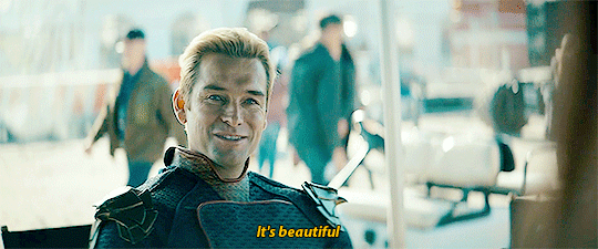
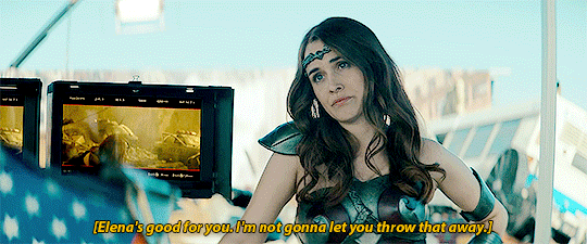
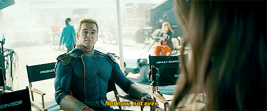
You enjoying this?
#queen maeve#homelander#the boys#there are many reasons i love this scene i wanted it on this blog#the main one being that it confirms homelander took maeve's silence the previous scene as confirmation#i know it was kinda obvious but i love that he's spelling it out since she won't lol#also the change of dynamic they had from one ep to the other was huge#i love the contrast#i love him here he's being so petty#he's a coward though for fucking with with her this way instead of going after elena#i mean it worked but#i wanted a little threatening#as a treat#my gifs
108 notes
·
View notes
Text
I find it interesting that, in The Cutie Re-Mark part 2 episode, the guards tense when hearing Celestia's name.
Nightmare: Nopony in my kingdom but me should posses magic powerful enough to change time.
Spike: Your kingdom?
Nightmare: Who else?
Spike: Um- Celestia, of course!
The fucking guards:

So mostly likely conversations such as these have happened in the past, and the guards have all thoroughly learned the lesson to not bring up the scary night lady's banished sister.
#mlp fim#princess celestia#nightmare moon#princess luna#It may seem strange that I'm posting about MLP even though I hardly ever post about it#but honestly I need the change in pace and I've been going on a huge nostalgia trip this spring/summer
61 notes
·
View notes
Note
Hiii, do you have any tips for drafting out embroidery patterns? I've got one in mind, but drafting it out and color picking is so nerve-wracking!!
[Hi!!!! this got kinda really long so I'm gonna crop it under a read more. And I honestly don't have any real training/instruction in fiber arts so this is just how I do things, and probably others do them very differently!]
Haha so my fandom embroideries are VERY different from my non-fandom personal pieces in this respect. For non-fandom things i just kind of throw myself in like WAHOO FREEFORM LETS GO and go for a kind of messy colorful approach that ends up as things like this:
Versus my fandom stuff is way more structured and designed to fill space, be very precise, etc. So for those I do go in with a digital mock up of the design I make in photoshop, that I then color in, and then as my last step translate to thread colors.
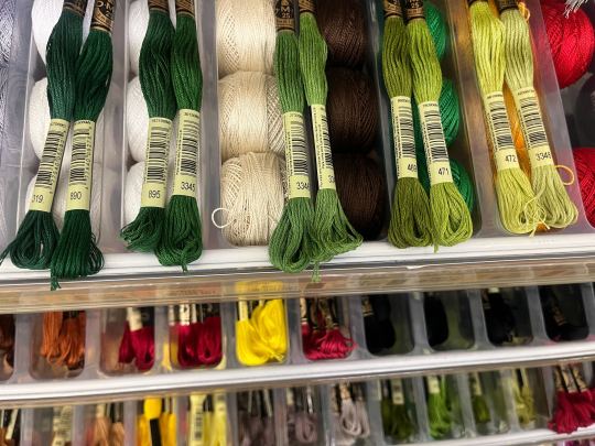
For my Dragon Age series. this has been because I'm specifically trying to mimic the stained-glass style of art you see in parts of the game like the dialogue wheels, some icons, windows, etc. The icons in particular were really easy to copy into embroidery because they already come in handy circles:

This is mostly because I have desperately wanted to pick up stained glass work as a hobby for like 6 years now. As in once every 3-6 months I put everything I'd need to start doing it into an online shopping cart and look at the price total and then sadly close the window because I just don't actually have any space I could do it in (I live in a 2bed apartment so i have no garage or yard or anywhere it wouldn't make everything else a mess or be a hazard). The day after one of those events I impulse bought and completed a floral embroidery kit from the craft store and kinda was like... ok, well, I did this once how hard can it be to use this medium to mimic the hobby I wish I could be doing? Plus, it's only like 60 cents per color! I can afford that! So I took the first design I wanted to do, the romance icon, and basically redrew it sloppily in photoshop, then freehand-copied the design onto fabric and stitched it the next day:

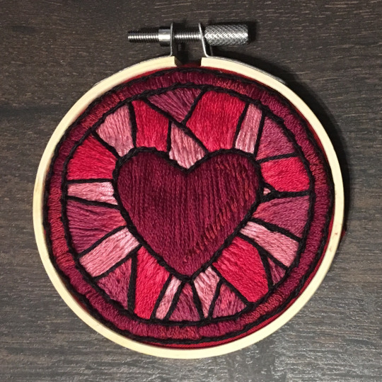
I learned a lot from this piece and changed my approach a little. Here you can see I tried shading in the parallel direction to my thread, which looked messy and added texture, so now I shade horizontally to my thread direction instead.
But it gave me a basic approach for turning the Tarot cards or DA Keep tiles (or any other art!) into embroidery patterns, which I couldn't copy as directly into this really smooth stained-glass style. There's a basic process I follow when doing these conversions that generally follows the same order, which I'll go through below.
STEP 1: SHAPES
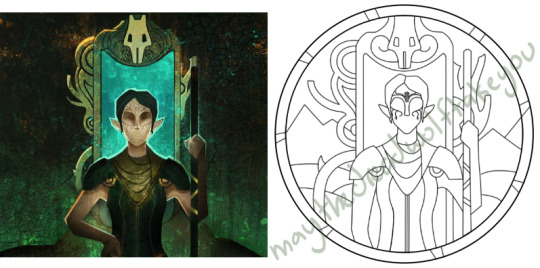
The first thing I do is pick the shape of my display frame which is usually a circle, but could be an oval or rectangle too, since I hang the finished pieces on my wall to have nice way to show them off. I like to fill the whole space so knowing the size and shape of what I want the finished project to look like is a good goal for me. Since I am doing fandom pieces I want to be recognizable, I do stick pretty close to the "original" character design/art, but you can absolutely change as much as you want and freehand draw your own interpretation instead. If you're doing original art just substitute the below composition notes with "sketch out roughly what you want it to look like". I personally do my pattern drafting digitally as I find it easier, but you can do this part by hand too.
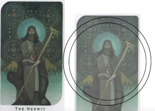
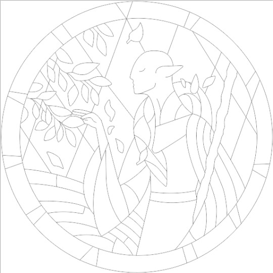
First, I keep the reference image I'm working off of open next to me while I work, and draw in the shape of my frame (here, a circle). If I'm adding in the little border to be fancy, I add a second inner circle. I keep these as their own top layer so I always know I'm working within the final "frame" and don't spend time designing any section that will fall outside it. Then I will take copies of the reference image and knock the layers down to 25-50% opacity, and start moving them around underneath the 'frame' layer until I like the way their positioning looks as a composition. Sometimes elements of a card I want to include don't all fit in, so I'll chop the section out and add an additional layer to throw in (like the background circle things in the Hermit design below). Or I'll just freehand things like adding much bigger diamonds behind Solas in my Hierophant design because I did NOT want to do 1000 tiny ones. Then once I'm satisfied with the general composition, I'll use the plain ol circular brush tool to trace out the major shapes of each element. I try to keep in mind that I can't go too small, and curvy lines are more difficult to fill in than straight ones. I usually do a rough messy version first, make it mostly transparent, and then a cleaner and more precise one over that.


(you can see parts of the rough one on the left and the fully 'cleaned up' on the right for the Hierophant design)
Now: depending on what you are doing next with the pattern, this might be where you stop and start coloring. If you are planning to freehand your design or just trace it onto fabric (or even print it onto fabric here), there's no need to do more than this kind of lineart! However, if you are working digitally and want to create a scalable vector so you can print it at different sizes, you can use the pen tool in photoshop to trace your design and make a "work path" of the lineart. However, another note: THIS PART IS VERY FRUSTRATING AND TEDIOUS BECAUSE THE PEN TOOL WAS CREATED BY THE DEVIL TO TORMENT US. It is so so so easy to accidentally delete a line or even the whole path and not notice later on. Ask me how I know 😭 Anyway I'm not going to include a pen tool tutorial because I don't even know how to use it well and have to google or watch videos every other time I try to use it. But if you can muddle through it gets you some really clean lines that eventually look like this:

With the work path selected, you can select the brush tool/size/color and use the "stroke path" option to create lineart of the vector. Then you can save this as a transparent png file for use at different sizes and for printing and it looks so nice and clean! one of the big benefits to this is that you get really fine lines that are easier to be precise with stitching on. This is extra perfect if you are printing the design directly onto your fabric (which you can do with an at-home inkjet printer for designs under 8inches wide, as long as you stick a piece of stabilizer on the back of your fabric and cut it down to printer sheet size--this is what I do and can make another post about that process if people want haha), or if you are printing onto transfer paper like you can buy at craft stores.
This is where I end the lineart for my designs. After I have this, I move on to the next phase, which is...
STEP 2: COLOR
For interpreting my designs into thread, I start by thinking of it as flat colors first. You can't "shade" as easily with threads as you can with things like paint or brushes in digital art (though you can A Little, which I will get into), so to start color planning I pick the "main" color each section will be in the piece.

For the existing icons this was simple--I kept the same sections as the original designs, so for each I just color picked or eyeballed the color in photoshop and colored it in (but you could do this on paper with pencils, markers, whatever as well--they don't need to match your threads exactly and usually won't, it's just to give you an easy reference to follow as you go). For the tarot cards which were more complicated in coloration, I just did my best and went with what looked good next to each other, even if it was a little off the original art. It will be off more later anyway when you have to pick threads so don't stress it too much honestly. I will often make layers with different color options and turn them on/off for direct comparison to try to determine what I think looks best as well, like below where I was debating between more blue/desaturated for the background or brighter colors.

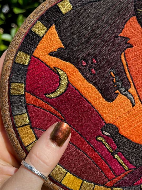
I do wanna note I have regrets about the color selection, shapes, or shading in EVERY SINGLE ONE of my finished pieces. But no one else ever comments or probably even notices! One aspect of this hobby is just learning to be satisfied with what you've made and using what you learned to get closer to your preferences next time. I'm only going back and redoing some of my designs' colors because I want to make it easier for others to choose on the patterns I sell, more than I care for just for myself. Also since I'm doing this lineart/stained glass looking approach where I go over the distinct shapes with black thread at the end, it means I get these clear delineations between sections you might not necessarily have in your own pieces, and that's ok.
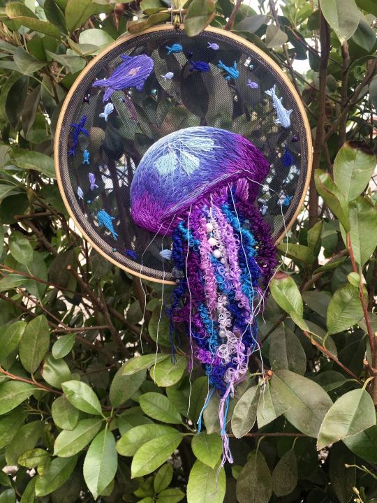
Ok right. Now while shading/coloring in detail is hard with thread, you CAN make whats essentially dithered gradients. "Dithering" in the concept of art means using 2 (or more) colors to give the impression of a third color, or to gently scale between the existing binary rather than a hard line. Think of it like blocky pixel art or gameboy game images. If you're doing needlepainting, you use really small stitches close together to get this effect, which translates to "smaller pixes"--if you look at the jellyfish in my first photos that's a very messy casual version of that. If you want a better example, I recommend looking at @ammocharis 's pieces like these in her pinned post, which are truly amazing! I simply do not have the patience myself 😂 For my stained glass style, I work only in very long straight stitches, so I can only shade in one direction and have to be a little more precise with it.
So for shading, I think about in each section which direction my threads might go. Then perpendicular to that direction I pick which side will be the light one and which the darker one. Sometimes I color this in on my pattern mockup, but sometimes I don't! Or I'll only do it for certain sections to make sure I don't forget. Like for my Tower design I only colored it as flats, and waited until I selected threads to decide how the shading would go. I am currently working on a smaller, simplified version of my Hierophant design and I did add shading digitally for that one just for fun. But it's not as important as having the flat color version you can use to quick-reference how you want your design to go while you're stitching. You might also notice I don't actually color my gold--I just throw in a stock image of gold foil for that layer so I can't confuse it with any of my yellow thread sections.

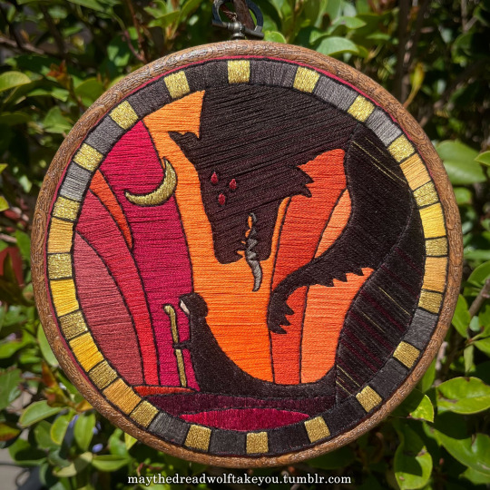

Here's a close up where you can kind of see what I mean by the "dithered" effect between colors--some are more obvious (like the red on the far left or middle orange) and others pretty subtle (dark grey to dark red on the wolf face):
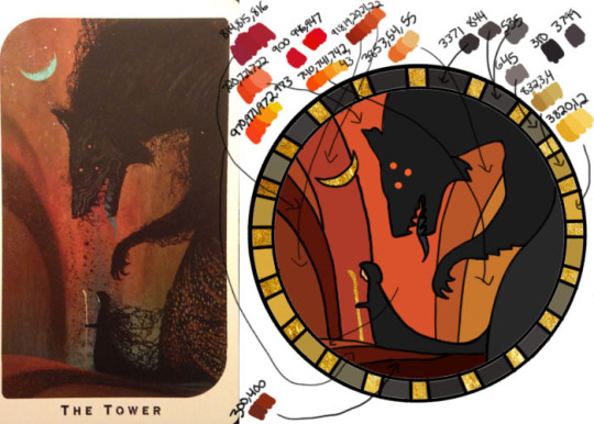
Now, while I use single layers of satin stitches for this, and just alternate thread colors increasing/decreasing as I go, you can accomplish the same thing with short overlapping stitches like with needlepainting, or with clusters of french knots, or whatever else. But in GENERAL you are going to be able to trick people into seeing gradients out of dithering best when you are using the same type of stitch for that whole area. So if I was using multiple stitch types like having french knots, daisy chains, ladder stitching or whatever else for some sections, I would keep those to contrasting areas/colors. A fantastic example of using different layered types of stitching to create more intricate color/texture in an embroidery would be these incredible tarot card depictions by @hattedhedgehog, which I like even better than my own embroideries. Here's his take on the Tower card as well for comparison to mine (I'm so in love with it!!!).
But anyway, at this phase, your design is actually still digital--the above is just to explain how it translates later in the process. The next step is...
STEP 3: THREAD SELECTION
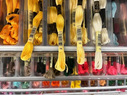
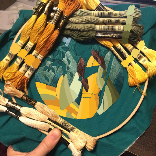
I will admit here I am not great at this part. I am constantly second guessing my thread colors, and can spend over an entire hour in the thread aisle at the craft store agonizing over choices. Really, I think this is just one of those things that takes practice and you get better at it over time. What I have had the best luck with is actually printing out a reference photo of my design/the original artwork and taking it with me. If you already have threads you can do this part at home too, but DMC alone has over 500 colors and I definitely don't even own half that so I like to torture myself by looking at them all together on the thread racks. Plus Anchor and Artiste and whatever other brands there are out there. One approach is to just sit there and pick out what you want for each section and line it all up together on top of your printout. Or in the case of my Tower I laid a bunch of options out on top of my template in the hoop to guess how they'd look in the frame.
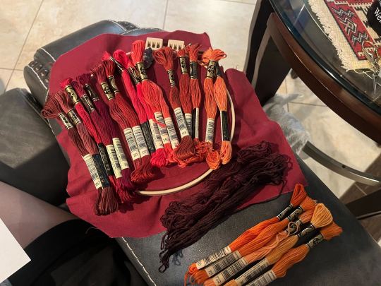
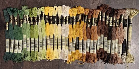
For me since I am also doing this dither shading thing, I also need 2-3 colors per sections depending on its size. Sometimes it's easy and the threads have a color just a little darker or lighter right next to them in the numerical lineup! Other times, there is no good match, or it looks too far away to shade nicely, or I want one to be a warmer or cooler tone than the other... which means a lot of standing and fretting to myself over it. I actually take a lot of photos at this stage because it can be easier to see how they will look in the end from a photo than in person to me? Idk why. Plus then after they get scrambled in my bag I remember wtf order I meant for them to go in later. But as long as you're not preventing other customers from shopping themselves, you can spend as long as you want staring at thread in the embroidery aisle and they won't kick you out unless it's closing time, so take your time.
Now, IN THEORY, you can sort of combine steps 2 and 3 by color-selecting from your threads and using that to color in the design. However I have tried this and it led to mixed success because the photoshop eyedropper brush simply isn't actually that exact (in my experience, it desaturates compared to what we actually see). And because then you have to have the threads on hand while you're coloring... which means you might buy ones you don't end up using if you don't like them. So I prefer to just use this as a refinement step where I pick threads based on the design colors, then will re-color the design a second time to match those threads more closely to be sure I like the effect.
I've even used this as a tool when I needed to adjust my color choices mid-project, by digitally coloring over over my WIP:
Or here's a design (but I haven't posted the finished piece yet bc it's a gift so shhh) I made with certain color tones initially, but after buying thread I re-did the color mockup to be more vibrant, because I liked those threads better in the store:


Once you have your thread, you can make yourself a little reference chart with the colors you intend noted on the sections you want them, like below:
(note: i didn't end up sticking to these colors because I ended up dying my own thread for several sections. And then forgot I made this entirely and picked new ones because I put the project down for a year between design and stitching. Sigh).
Or for my Solas pattern I did this in a really detailed way, which i am sorry but i have redacted because... i have it for sale now and don't wanna just give that away haha. But if you buy the pattern from my shop this is one of the files you'd get with it, for ease of reference. I do also include a text-only list of them as well.

Now I don't go to this much trouble for all my designs, just the ones I put up for sale (or plan to). You can also just make a text list of your color plans if you want. Though for fun I also have been using my scrap thread to make these little "color palette" keyrings for my finished pieces, so if I ever remake them or update their patterns I will know what the original colors were, plus I can compare what i used to other threads if I wanna change part of the design up. This step is absolutely not necessary and I'm just doing it because I'm selling the patterns now, but they are kinda fun to look at.
And don't forget.. if you start a section in a certain color and decide you don't like it, you can just cut the threads and pull them out! I did that with my original hierophant piece actually. I had an entirely different color for one row of diamonds i thought just clashed way too much with the others, so I used photoshop to paint over it with some alternate options until I found one I liked better. Then I cut away all the old threads and put in the new color. It can be a little harder to fill a piece the second time since the fabric will have stretched out a little, but as long as you're using a good stabilizer it usually doesn't move too much.
You can also just make test swatches on spare fabric to test before you add them to your real piece. I wish I'd done this for some color transitions that didn't end up looking the way I wanted, but I am simply too lazy most of the time. My exception is usually for metallic, satin, or sparkly threads, because I want to know how they feel while embroidering. But if you're really worried about a certain color or shade it's a good thing to remember you can just do.
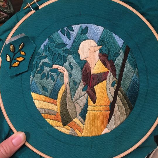
SO yep, that's my general process for drafting patterns. I start with the shapes/design, then do my flat color version, then I pick my threads. Makes it sound easy and short when phrased like that :) But I can honestly spend 8-10 hours just on making the lineart and coloring it in. If I was better at art, probably this would be less, but I'm working with what I've got (not much) 😂 I think all aspects of this are also something that gets easier over time, but it will probably never look as bad as you worry when you start out. I think all my pieces look awkward and rough right up until I do the finishing steps and move them to the display frame sometimes.
I hope this was helpful and answered your questions!! Feel free to post/share your WIPs to ask for feedback or advice ever too :) I've only ever had people in the embroidery community on tumblr be encouraging and helpful to me, and I'm happy to answer any questions myself when I can or if parts of this were confusing
#ramblings#my stuff#my embroidery#embroidery#dragon age embroidery#calicostorms#oh god tumblr changed the alignment of all my images so theyre all huge now great#WELL I keep tryign to rearrage them to be on the same line and it is NOT working so. thats how they will look i geuss#this is gonna annoy me all night... thats what i get for expectign a Functional Website though#embroidery chatter
29 notes
·
View notes
Note
Do you have any specific Apollo and Midnighter comics recs to start with?
steve orlando’s 2015 midnighter solo & 2017 midnighter / apollo series!! you don’t really need to have much background knowledge for them either
#talking#asks#even though i’m not huge on the changes n52 made to their origins#their wildstorm stuff has so much baggage with it and has aged (in my opinion!) not very well#to the point i just wouldn’t feel great about recommending it to anyone#i hope that makes sense.. not sure if worded it right#i was young & new to reading comics when i read the authority LOL i did not have an idea of what i liked yet
25 notes
·
View notes
Text
wip?

them go on a road trip in 1999
#i kinda wanna color this because them driving under the evening sun would be absolutely gorgeous#maybe this time i would actually go and search how people do coloring because i know im gonna fuck up AND spend a ton of time doing that#maybe im just afraid of failure and wasting time and ironically that make me very slow at learning stuff#even though i just said that things probably wouldn't change though#there's a huge gap between knowing / acknowledging a thing and understanding a thing#warframe#warframe rhino#warframe sevagoth#warframe sevagoth prime#my art
18 notes
·
View notes