#not a full illustration because i was too lazy to draw a background
Explore tagged Tumblr posts
Text

little dazai doodle i drew during a boring lecture
#a 3 hour long lecture with the entertainment vaule of a podcast you play in a background of gaming#so i started drawing#the outfit was a totally random choice#i didnt use any reference for dazai#i just really wanted to draw this specific pose#surprised it actually looks like him#i draw him too much haha#osamu dazai#dazai fanart#bsd dazai#bsd#bsd fanart#bungou stray dogs dazai#bungou stray dogs#digital art#my art#not a full illustration because i was too lazy to draw a background
40 notes
·
View notes
Note
Well I really love your art, may I ask how do u color? I struggle with coloring turtles and I wasn't to know how do u do that?
Hi anon! That's a very broad question, so you've given me a great excuse to ramble anything I want about my coloring, eehehehee~! This will be in two parts and I'll start with talking about my simpler coloring style.
As in, when I color characters on a white background, with a limited or light palette.
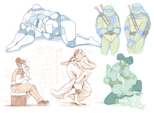
The driving force behind this style is me being lazy. My time, energy, and attention span are pretty limited, so if I want to finish anything, I gotta do it fast. And with fanart, I'm usually just doing it for fun and relaxation, so there's no need to push myself to polish it too much.
Despite that, I rarely post just black and white sketches or line arts. I always try to add at least a little bit of toning or shading, because that makes the image easier to read. The characters and their shapes pop out and catch the eye of the viewer better.
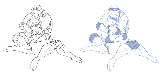
However, in this particular example, just the couple toning colors don't quite do the job. The way Don and Leo are entangled makes the center area of this illustration very busy and hard to read.
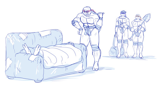
As a comparison; this pic has only one tone + mask colors, and it works. This is because all the characters are standing separately and their poses are very stationary and simple.
So for the Don + Leo pic, adding some shadows helps in bringing out shapes and depths. Also in general, if you don't feel like drawing BGs, it's good to at least add a shadow below the characters. It grounds them and makes them feel like they exist within a space.
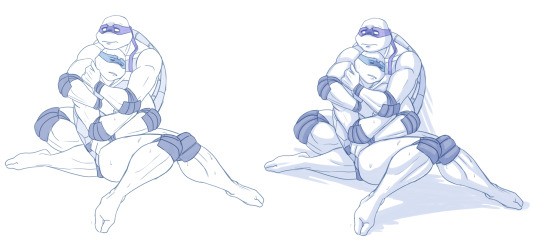
Sometimes if the posing looks too complex and busy, it might just be best to color in the characters fully.
However, even if I do full flat colors, I tend to use a lighter palette. Putting characters in their neutral/default color on a white BG can look a bit jarring as if they're floating in a void. It feels less immersive and like the picture is unfinished.
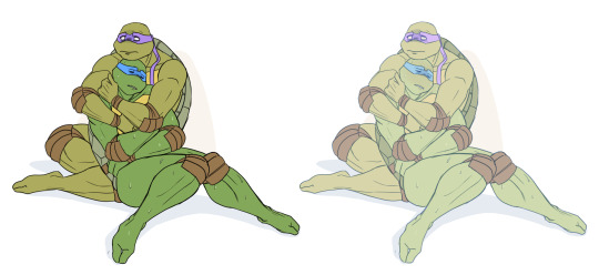
Using lighter colors makes the image more cohesive, and fits the characters into the white environment a bit more naturally.
If I'm too lazy to draw a BG, I prefer using stylized and limited colors. It feels deliberate and that the whiteness is just part of the palette, whereas the character-accurate colors on white don't match as well, even if they're more pastel.

That being said, there's nothing wrong with just slapping the flat-colored characters on a white background. As you know, I do it too. I'm just exposing my 'fancy coloring style' for what it is; me being lazy, hah!
Limited and monochromatic palettes are a nice shortcut even when you do actual backgrounds. It's faster and you don't have to worry about clashing colors. And you can still convey atmosphere and mood.
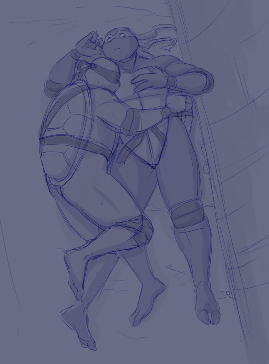
Also, on the topic of conserving your time and efforts; I think it's very common among younger/less experienced artists to think that the amount of time you spend on your art piece = how good and well received that piece will be.
Which has some merit to it of course, but it can lead to putting too much effort into areas where it's not necessary. E.g. filling the piece with tons of details and clutter that don't serve an actual purpose, but rather make the image hard to read. Or doing really complicated shading for a meme/comic, where simplicity would deliver the joke better.
So whenever I'm drawing something I intend to publish, whether it's a quick doodle or a more polished piece, I try to follow these two principles: Make it easily readable and do the bare minimum that needs to be done to convey what I want to convey.
Putting time into practice is important, but if you draw for work, it's also crucial that you know how to prioritize and use your time efficiently!
Anyway, thanks for reading! In the next part I'll go into how I do my fully colored pieces, so stay tuned for that!
183 notes
·
View notes
Text
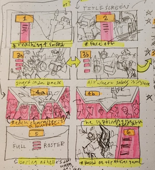
hi guys! deciding on a new main menu right now.
a short description on each:
1) Optimus is reaching for the Star Saber as it is lodged into a rock (the bg will have a cool parallax effect)
2) "Face off", where OP and Megs share the game's title screen (no cool parallax effect, sorry).
3a + 3b) 3a and 3b will be picked at random when you enter the main menu. Sometimes, you will get 3a, which illustrates some characters in the Decepticon & co. roster; Other times you will be greeted with 3b, the Autobot & co. roster. (hopefully parallax, but I'm kinda iffy on this one because I'm not too sure on how to code it quite yet)
4a) The star saber laid across in the background while the start/preferences/load buttons are portraits of some of the main characters
4b) a lazy alternate version of 4a where the sword is stuck into something instead
5) Not doing 5 but it's meant to showcase the full roster lol. just an idea I threw out there that I would NOT be able to draw lmao
6) A cool-ass parallax image of Optimus pointing the star saber at you. It pays homage to that one tfp wii game kinda
22 notes
·
View notes
Text
HELLO??? I FINISHED IT????

i blurred clare in case anyone becomes triggered by nudity or physical injuries!
in case you want to see the full version without blurring, im gonna put it at the end of the post. don't hope on it much, though, because i'm not a pro in drawing neither nudity nor scars.
so now we're gonna talk so 1) ppl with triggers don't have to see the full version and 2) you can hear me cry
so. this illustration took me three hours and twenty-five layers in total (both numbers are way less comparing to my harry potter sketch characteristics lol).
this idea came to me today morning, when i was going to school. i just thought that i wanna draw feysand / illustrate acotar so bad, so... here it is?
about details. don't blame me if amarantha's ring with jurian's eye is on the wrong finger, or if i drew lucien's eye as a natural one when it had to be the other one on that place, etc etc. i may have forgotten some details and im too lazy to check on them :)
about details 2.0. I CAN'T BELIEVE I ALMOST FORGOT ABOUT LUCIEN'S MASK AND FEYRE'S TATTOO ??? literally the way i remembered about the mask was by looking at tamlin who was already drawn wearing one, and the tattoo was the last thing i drew.
about details 3.0. IDC ABOUT AMARANTHA'S HAIR, THANK YOU.
about details 4.0 (added just before publishing the post). i just realized i could add lucien's brothers as a background fuck fuck fuck
ok so i said all i was thinking about this illustration (i guess so), so here's a look on the full version.

can i also add a p.s. if you're not annoyed by me yet? i love rhysand's face he's just like all the possible emojis in one face expression LMAOO
#a court of thorns and roses#a court of mist and fury#a court of wings and ruin#a court of frost and starlight#a court of silver flames#feyre#feyre archeron#rhysand#feysand#tamlin#okay let's do it properly: t*mlin#lucien vanserra#amarantha#acotar#acomaf#acowar#acofas#acosf#sarah j. maas#acotar fanart#artists on tumblr#art#artwork#illustration#digital art#digital illustration
25 notes
·
View notes
Note
1. Do you prefer traditional drawing, or digital?
2. How long have you been drawing?
7. How often do you use references?
25. Do you like to draw in silence, or with music?
27. For digital artists: how many layers does a typical piece require?
For the ask thing!!
1. Depends! In general I prefer digital bc it’s more portable, I have unlimited color options, and I reallllly like using layers but for comics I like to use traditional ink on paper because it’s much faster. with digital art I tend to get sort of…nitpicky since I’m able to zoom in and flip the canvas and undo redo copy and paste resize etc so my perfectionist streak goes into overdrive and I spend hours and hours trying to get it Just Right which is…not so great when you’re trying to make a comic, especially since most people are gonna spend maybe three seconds staring at each panel so it’s not worth it to perfect each and every illustration in a full comic page.
2. technically I’ve been drawing for as long as I can remember and have been taking lessons since elementary school but I didn’t start taking it seriously and drawing consistently until I was like…13 or 14 or think? around then is when I started chewing through sketchbooks
7. all the time! sometimes I don’t bc I’m too lazy to find or take them but I’m trying to be better about using them more. my visual memory is garbage and references are Good. I used spend hours trying to make a pose happen from nowhere and getting increasingly frustrated but as I’ve gotten better about using refs that’s mostly stopped happening! the downside is there are now a Lot of stupid pictures of me in various poses on my phone lol
25. I like to listen to music or podcasts but half the time I forget to turn anything on and then I listen to nothing until I remember enough to go find my headphones
27. A Lot Of Them. usually between like 3 and 5 sketch layers plus a lines layer for each figure plus several layers of background lines and then every single color has its own layer until procreate forces me to stop
3 notes
·
View notes
Photo


Some doodles/unfinished ideas that are connected to my Blade Grab illustration (x)
Also some more info/ fun facts about the details behind the Blade Grab piece and doodles:
-At first just wanted to draw a crane machine full of techno plushies but after starting the background i started to draw more and more details and thought more about the story behind it xD (may have went overboard oops lol)
-I thought it would be interesting/funny if c!Dream was the owner/manger of this little amusement park/carnival
-bee duo is in the bg cuz i thought it would be cute to include them somehow
-at first i had Mexican Dream as the park worker for the basketball hoops game but scrapped that idea cuz i got lazy at adding more characters to the illustration lol
-its a bit hard to tell in final piece but the people in the bg on the left is Karl and Sapnap (i wanted to add Quackity too but didnt want to get burned out by all the details--> he might return as a duck on sapnap’s head in a later post)
-because Dream is technically suppose to be in prison he is wearing a ‘disguise’ (which is just him but with a moustache), i thought it would highkey be funny if all DSMP characters couldn’t see through this really bad disguise
- I even tried to even make it more painfully obvious that it was Dream in the bg by making some of the moustaches on the bg signs not centered (rn its a bit hard to tell in the Blade Grab piece, but once i post the bg on its own, it would be clearer to see)
- i do want to make another full illustration connected to the Blade Grab piece but with 4/4 sleepy boiz or focused on Techno with the others in the bg (definitely not right now tho cuz that Blade Grab piece high key took a lot of energy out of me XD)
-for the doodles in this post, yes that is Dream in ‘disguise” again but running the cotton candy/candy floss booth (its sort of like the way Dream monitors/keeps an eye on the other DSMP characters)
-the last pic is a short comic idea that i didn’t finish/scrapped--> i just wanted to draw that moment in Tommy’s vlog when Wilbur gives Tommy cotton candy, but make it more serious/emotional and connected to the lore lol
#mcyt#sbi#sleepy bois inc#my art#myart#philza#tommyinnit#wilbur soot#sbi fanart#sleepy bois fanart#dream smp#man these doodles are so messy asjkldfa#hope yall like this doodle dump post xD#i didnt put these doodles under my blade grab piece cuz its a bit long#thought it would be better to give it its own post#ahh i normally dont post my doodles cuz the difference between it and my polished stuff is so big-
14 notes
·
View notes
Text
石田お寿司 12/9/21 stream translation Part 12
This is not the full translation of the stream. I only translated the parts I could understand & interpret or parts I found interesting/important. I’m still a beginner in Japanese, so the translations may not be accurate. If you want to repost, please repost at your own risk.
-----------------------------------------------------------------------------------------
(t/n: ** means translation may not be accurate.)
C: From your perspective, are editors someone who nurture (mangakas)? Are they gonna continue to be a presence who shape a part of you?
I: Nurturing? I don’t even aware of it at all. I think that applies to each other. I think both shape a part of each other as the relationship deepens. The editor gives feedback and the writer fixes the story based on the feedback. That’s how a work is created. I think both are shaping a part of one another. The writer and the editor becomes that kind of existence to each other and that’s how they both grow and change on their own accord. I don’t think they help writers grow though. To me, helping a human to grow is presumptuous/stupid.
(t/n: The word ‘okagamashii’ means both presumptuous and stupid. I’m not sure which one of them was he referring to in this context. You can interpret it as you like.)
I: Is the next Choujin X gonna be release soon?
I: Yeah. I forgot how to draw it in the middle of drawing the draft, so it took me some time.
*Ishida mentioned that he’s finding time to do both choujin x and animal rap, as well as drawing JJ’s illustrations.
C: I’m happy there’s a lot of streaming videos lately.
I: There’s not a lot lately, since I went away for a while. Maybe the duration was actually shorter than I thought it was.
C: Let’s stream until noon.
I: Well…it depends on the situation. I do think of that. I can’t help but do my work during streaming. Just like what I’m doing currently. If I play games, I’ll just play and then when it’s over, I can just end the stream. But when I’m doing my work, I don’t know when I should end it. I’ve no choice but to finish my work. In other words, I’ll be streaming until I’m done with my manuscript. For me, doing that is good because my work can progress. It’s like I’m being monitored. For a period of time, OPM’s artist, Murata sensei did that before but he quit for few reasons. I think it’s good to feel like you’re being monitored. Hamada Yoshikasu sensei did that as well. He pretty much streamed him working everyday. I’m not sure whether he’s still doing it.
C: Do stream every night.
I: That’s a bit…This is also difficult for me to do. I like making plans on what I should do. For example, “what I should do for this and that day?” or “what if I do this with this pace?”, but to actually follow the plan is hard. You’d feel lazy on the very day you had a plan. People who thoroughly follow their plans are admirable, aren’t they? It’s not like I have the need to follow it. But then, I wish to be able to do that.
C: If you get bored drawing the background, I want you to stream while you’re working on it even if it’s on irregular basis.
I: For the background, I must finish doing them all at once, if not it’ll take a few days. There’s a limit to what kind of work I can stream. I don’t want really wanna show me working on the latest chapter. It’s the latest chapter, after all. I’ll show the chapter after I’ve drawn it properly. This one is basically me fixing the chapter 2, so it’s fine.
C: It’ll be nice if there’s a notice before the stream on the day itself.
I: I see. It’ll be easier to watch if there’s a notice. You can arrange your time. But then, it depends on my mood. I‘d feel sorry if I suddenly don’t wanna stream, but you guys are already excitedly waiting for it. So, I’ll just do it randomly.
C: I can prepare some sweets if there’s a notice beforehand.
I: Well…Maybe I’ll at least give notice on that very day. If I really wanna stream, then I might let you guys know beforehand.
I: The 30,000 commemoration. I might not do anything for it. But I’ll keep that as a memory. Even someone like me can have that amount of subscribers with this kind of content. I’m thankful for that.
C: I turn on my notification, so it doesn’t matter if you tell us beforehand or not.
I: Oh, really? Then, I’ll do it as I like. It’s better If there’s a notice. Well, I’ll do it if I feel like it.
C: This is random, but I only turned on your tweet notification.
I: Sometimes, I forgot to update on my twitter though. I update it when I’m streaming.
C: 30,000 subscribers is amazing! It’s more than the number of people in my home town.
I: That’s true. If you think about it that way, then 30,000 is amazing.
*Someone wanted Ishida to stream the drawing of the Choujin X’s volume’s cover, but he said it’ll be hard to do that.
C: For me, I like for the cover to be a surprise.
I: Hm…I probably think so too.
I: For me, regarding choujin x, I want everything about it, such as the drafts, to be a secret. If I got to do another manga, then I might…ah, but that probably wouldn’t be possible due to my personality. I do kinda want to be monitored when I’m drawing difficult stuffs. It seems to be efficient for me that way. It could make me feel motivated if you guys watching me draw them.
*The adult comment came back.
I: Can I do something about it? It’s probably just random comments. Report or timeout? What’s timeout for? Should I try time it out this time? Did it time out?
*The comment finally gone. It’s troublesome though. I have to do something about the comment every single time. I should leave it to the dark moderator.
I: It did!
*Ishida mentioned that he’d timeout this one fan if they commented something unpleasant.
C: That could be a reward itself.
I: What? Me banning that person? That’s already a stalker attitude. You mean it’s because I noticed them, right? There must be such people. But what a pitiful person if that’s the only way for them to be noticed by others. Doing what the other party dislikes, then seeing their unpleasant reaction. Being happy just by the fact that the other party reacted to them is already a lost cause. Don’t wanna be that kind of person, right?
C: It’s amazing how you can have a phone call with someone everyday.
I: It depends on the occasion. Like when you really feel the need to talk or when you’re having a tough time. I too had times when I randomly just called someone because I couldn’t concentrate working. When I thought it’d be good for me to work while conversing, then I’d call someone. But the other person also has their own life, if this happens continuously, even if they say okay, they must be actually enduring it. I mostly speak to my work-related friend.
C: Being a mangaka is a lonely job, isn’t it?
I: Yeah, you’re right. This is also another difficult issue. It might get harder to confront my work if I spend more time with others. So, especially, recently, I tried to get myself more motivated. I’ve isolated myself around until the end of summer, but as I thought, working with people is easier for me, mentally speaking. I have somebody to listen to me and I feel less pressured, that is, they give me some kind of advice and I can apply them.
C: Do you consult with the editor in charge when you’re at loss?
I: I think I do. I did consult with Mr. Matsuo at the beginning. But then, I think it’s important to resolve your problems on your own. I do think I have a lot of people I can consult with, and that’s totally fine, but I don’t want to do that. I want to find the answers that I’m completely satisfied with by myself. So, I hold myself back from seeking others’ advice. I did ask Ms. Towada about stuffs on JJ when I had some questions since she gave good answers.
I: Well, I wanna work on this manga randomly. And by ‘random’, I don’t mean sloppily. I wanna work on this manga in a way that’s appropriate for both the work and I. So, I thought it’d be better for me to seek less advice or opinions from others. I’ll do differently if this way isn’t working.
C: You’re a wise person.
I: Obviously. Hahaha. Of course. It’s because I keep thinking about things like this. I hope you find my words useful.
*He then mentioned that he preferred the way of doing things randomly, but it might not be suitable for certain people. However, it’s okay to seek advice.
*Ishida recalling the conversation he had with Ms. Towada regarding Hoshi Sandek.
I: “Hoshi and Arima look similar, right?”.
T: “Have you seen how Arima Kishou looks like?”.
I: “Yes, I have… They look similar, right?”
T: “You mean their characters’ overlapped?”
I: “Not that.”
T: “Hmm….”
I: Hahaha. What do you guys think? Do Sandek and Arima look similar?
C: Are you a TG bandwagon fan?
I: Hahaha. I might’ve never read it properly. But I legit did read TG recently. I’m not kidding. I took a look at it again. I’m thinking of accepting TG. It’s not that I don’t. I wanna accept it more. All said and done, I’m really glad I wrote TG. It’s good that I have something to leave behind. It’s definitely a good thing.
C: Have you ever played Red Dead Redemption 2? (comment in eng.)
I: Like I said, short time. Short time? Little time. (Speaking in eng) I wanna play it though. I wanna play more, but I’ve no time. Too busy.
C: I think Hoshi is actually what Sui looks like. (comment in eng.)
I: She’s saying Hoshi looks similar to me. Are you kidding me?
*Ishida looking for another page to draw.
I: Please take a look at this version of the chapter in the magazine. This will be in the comic as well, probably. They’re both the same.
C: Sensei, are you gonna sleep after this?
I: Nope. I’ll probably check whether Hitman’s already downloaded after I end the stream. After that, I’ll eat and then finish up my upcoming work. I need to add colour for the pages. And I kinda wanna draw an illustration. Have you guys seen Itaewon Class on Netflix? It’s from a Korean webtoon. It’s been made into a drama and I was super addicted to it.
C: Park Saeroyi? (The name of the drama’s mc)
I: Yes. That one. He’s really cool. That hairstyle. I wanna draw Park Saeroyi, if can. There’s this sassy kinda girl in the story, right? That girl is a total beauty. Yi Seo. (t/n: Yi Seo is the FL’s name.)
I: I wanna draw real humans. I’ve been drawing them lately, not that it’s a problem, since I’ve been drawing manga only.
C: She is pretty!!
I: I know right. She’s gorgeous.
I: I read a little bit of the original work, and it pretty much the same as the drama, so I thought the original work was amazing. But then, the Japanese version changed it into Roppongi Class. It’s a different vibe… Does it really matter if it’s in Itaewon? They changed it to suit Japanese readers. Was it the Line Manga or was it not? I don’t remember, but they did that. Just let it be in Itaewon or Korea. I was like “Don’t f*** with me!”.
C: Marunouchi Class.
I: Haha. I’m drawing that. Marunouchi Class. (t/n: Marunouchi is a commercial district in Tokyo.)
I: Itaewon is better. There’s no such place in Roppongi. I’m not familiar with Roppongi though. It may have places like this, but it’s better to showcase the vibes of Korea. Itaewon is a place packed with foreigner. It’s a miscellaneous street. It’s close to Roppongi now that I’ve put it that way. But still…Those who subscribe to Netflix, I recommend you to watch Itaewon Class. They only shot scenes that were important, so it’s really easy to follow the story. Such a beautiful drama. There were quite a lot of cliché moments, but there were also some unexpected twists in those moments, so it pulled you in. Korean entertainment is far ahead.
*The assistant guy finally went to sleep.
I: Oh, you’re gonna sleep now? You definitely can’t oversleep. Don’t mention my name as well. Haha. Do your best as an assistant. Okay, after he left, everyone takes a screenshot. I’m gonna send it to his boss.
C: Sensei, do you read the manga “This is Good”?
I: I don’t. Is it an ecchi manga? Is it the one in Tonari Young Jump? Is it the one with beautiful drawing probably? I wanna try reading it. I need to cultivate (?) and boost the popularity of Tonari Young Jump. I’d like to take on that mission.
I: Has Mr. assistant slept already?
C: I won’t sleep then.
I: It’s okay 2x. Please sleep. Don’t worry 2x. Nothing’s gonna happen. If you’re worried, you can watch it later.
I: I just thought of the number 1 prank he shouldn’t do. I wanted to ask him to draw shit on the manuscript. I wanted him to leave my mark on the background. But that’s definitely a no-no. It’ll be a problem. However, that kind of assistants do exist. Not a lot, but there are assistants that play around.
Part 13
5 notes
·
View notes
Text
Rating Every Single Name of the Wind Cover
Why? Because I can. I am not a graphic designer, just a person with opinions.
Criteria for consideration: Must be a cover in a published edition of The Name of the Wind by Patrick Rothfuss. Hardcover, paperback, and ebook are all fair game, as are foreign language editions. Some editions reuse the same cover art, in which case I only rate one cover. Some editions modify cover art from another edition. If the differences are substantial, I’ll rate both.

Kindle March 2007 Edition
Ah, the famous shirtless redhead cover. This cover is a bit infamous in the fandom for being both bad and cringey. This is not good art. It’s cheesy. The shirtless aspect is silly, and the windswept hair is so windswept, you’d think Kvothe was in a tornado. Nice balance with the title and author text, although it looks like the title and author text are slightly off center.
3/10

Hardcover April 2007 Edition This is just a zoomed in crop of the above cover, which is a little lazy. It does make for a better cover image, except the creepy goat man bust has nothing to do with the plot of Name of the Wind. So I suppose they cancel out.
3/10

Mass Market Paperback April 2009 Edition
I despise this cover. It’s a lazy design, and the photo manipulation is terrible. Points I guess for good title text placement. But the photo manipulation is so! So! Bad! This is also the start of the trend of a hooded, cloaked figure with his back to the viewer staring out into the void. It is a bad trend.
2/10
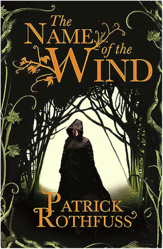
Paperback UK June 2008 Edition
We’re still with the hooded, cloaked figure, but at least he’s facing front this time. I like the embellishment on the ‘W’ in the title text, although it gets a little pumpkin viney. Overall, it’s an ok cover. It doesn’t make me cringe, but it doesn’t grab the viewer’s interest, either.
4/10
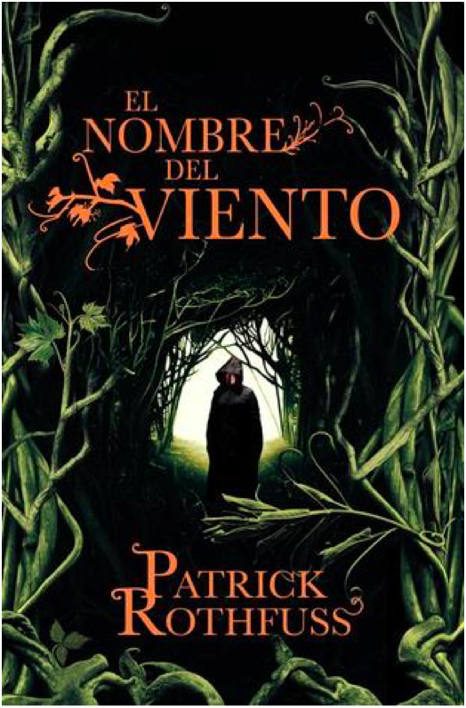
Paperback Spanish May 2009 Edition
Same image as the previous cover, but this one is uncropped and has a different plant border. I’m not sure how successful the changes are. On the one hand, shrinking the image of the figure makes the figure look more mysterious, which is good. But on the other hand, this is a bad plant border. I thought there was some corn on the right side for a minute.
4/10

Hardcover 10th Anniversary October 2017 Edition
10th Anniversary edition got fancy, and it shows. I love the ruin influence in the title text, which is a great callback to the use of ruins in the novel and also a more creative and unexpected choice than making the title text leafy. That being said, the “of the” in the title text is very oddly formatted and doesn’t fit the style. The cover illustration is pretty great, with lots of symbolism for old fans while still maintaining visual interest for new readers who are browsing and happen to pick the book up. The Cinder statue is delightfully creepy and much more relevant to the novel than the dumb pan statue from the earlier cover.
9/10

Paperback Turkish March 2007 Edition
Another trend starting here: Cloaked figure staring out at a city in the distance. I like the painting, at least what I can see of it. I find the choice to crop out most of the painting really bizarre. Is this supposed to be a telescope we’re looking through? And the leaves look like lily pads. The title and author text leaf embellishments are quite nice here, but I don’t know why there’s a metallic color shift. Overall, a poor use of space.
4/10
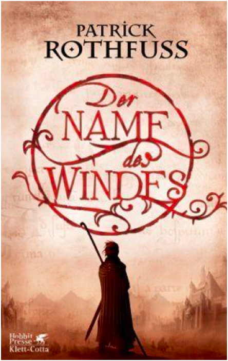
Hardcover German March 2007 Edition
Oh look! A cloaked figure staring at a city. What a surprise. I rather like the title text design, which is pretty creative and a good way to make the title visually appealing. I wish the city in the painting weren’t so damn faded and distant – I think it’s a mistake to keep the visual focus on the figure exclusively and only hint at the city beyond.
6/10
Paperback Portuguese September 2009 Edition
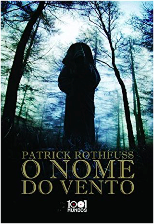
This cover is terrible. I would say the worst, but there’s more still to come. Anyways, this is incredibly bad. We’re once again with the hooded, cloaked figure with his back to the viewer, which is a lazy and uninteresting pose. The image is badly photoshopped and looks like an alternate movie poster for The Blair Witch Project. There’s nothing interesting about the image, nothing that interests the viewer. The title font isn’t boring, I guess. That’s the only good thing I have to say about this. 1/10

Paperback Portuguese July 2009 Edition
Still another cloaked figure staring off at a distant city, but this is one my favorite versions of this trope. The city is far enough in the middle distance that the figure is the main focus, but we can still see enough of the city to see that it’s cool looking. I’m glad to see the bridge from the books, which is a nice detail. The title text does a good job of filling in the empty space of the painting without crowding the other elements.
9/10

Paperback French November 2009 Edition
This is the same cover image as before, but it’s been cropped so that the figure is centered. I don’t like the change – the balance is better when the figure is off center. Also, the title text is way too big and dominates, which is unfortunate because the Spanish cover had such a lovely balance throughout. 7/10
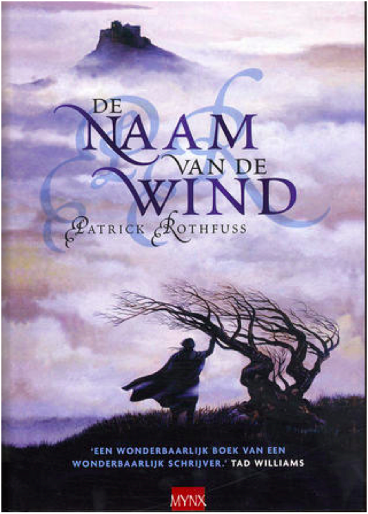
Hardcover Dutch July 2007 Edition
Yet. Another. Hooded figure. Staring. At a city. Wow. This one has a tree, at least. The image is… fine? I might be kinder to it if I hadn’t seen several better iterations of this right before. Because so much of the image is shrouded in fog, there’s very little to go on in terms of visual interest. And while I don’t mind the shadowed, muted color scheme, it also means that there’s very little to distinguish the cloaked figure and make him intriguing. The shadow initials behind the title text is horrific and obscures the title somewhat, so docking a couple of points for that. 5/10

Hardcover UK January 2017 Edition
Ahahahaha. This looks like the My Neighbor Totoro edition of Name of the Wind. It’s very silly and lighthearted, but wholly inappropriate for a book whose reading level is above first grade. If this was a kid’s book, I’d give it full marks. But Name of the Wind is very much for adults, and this cover is way too young and childish.
1/10
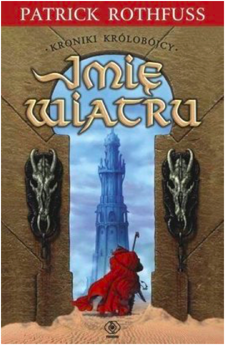
Paperback Polish August 2008
YIKES. I cannot figure out which scene or location from the book this image is trying to evoke, which makes me think the cover artist did not have the book or a text excerpt to work from. What the hell are those weird horse skulls? Why is this taking place in a desert? Why is the texture so bad? So many questions. And the effect on the title text is bad.
0/10 YES WE CAN GO LOWER THAN 1
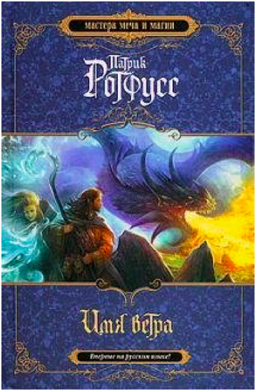
Hardcover Russian 2010 Edition
This looks like the cover to a Dungeons and Dragons manual. I suppose that’s supposed to be from the Dracchus scene with Denna, but the image doesn’t look quite right for Name of the Wind. It’s just so generic fantasy. I also don’t like how the image is cropped top and bottom to make way for a very generic marble background. Still, the image is colorful and exciting, even if it could be the cover for any fantasy novel ever.
5/10

Paperback UK 2011 Edition
What the FUCK happened here? Who let this shit happen?
-10/10
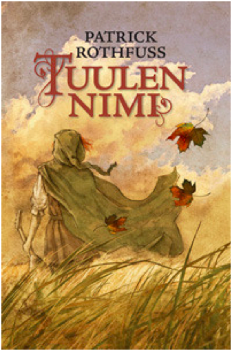
Hardcover Finnish August 2010 Edition
Ooooh, more Miyazaki fanart! This is actually quite lovely, and it fits the tone of the books much better than the kids book cover from before. I love how soft and gentle the painting is. Notice the color balance. I don’t know if this cover really ‘grabs’ you or draws interest, but it’s one of my favorites of the bunch.
10/10
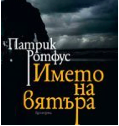
Paperback Bulgarian October 2010 Edition
I reserve the right to change my opinion later, but this may be the worst contender in the cloaked and hooded figure from behind category. I actually had to double check that this wasn’t a reused image from the mass market paperback edition, but nope! This is a brand new cover image, and it’s absolute shit. The lighting is so dark it’s impossible to make out details, the balance is way off, and the cover and title text are placed over the figure (aka the only object of interest) instead of the boring, generic storm clouds.
0/10
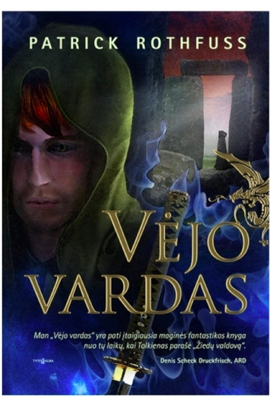
Hardcover Lithuanian 2011 Edition
YIKES times two. This cover art is truly awful in ways I didn’t know could still happen. Kvothe’s face looks ‘off’ because the facial proportions are all wrong. The blue mystical katana is bizarre because there’s no magical sword, much less a katana, in the story. And is that a photo of Stonehenge in the background? With yet another hooded figure?! I do like the gold foil of the title and the golden dragon embellishment, but the rest of this is such shit.
0/10
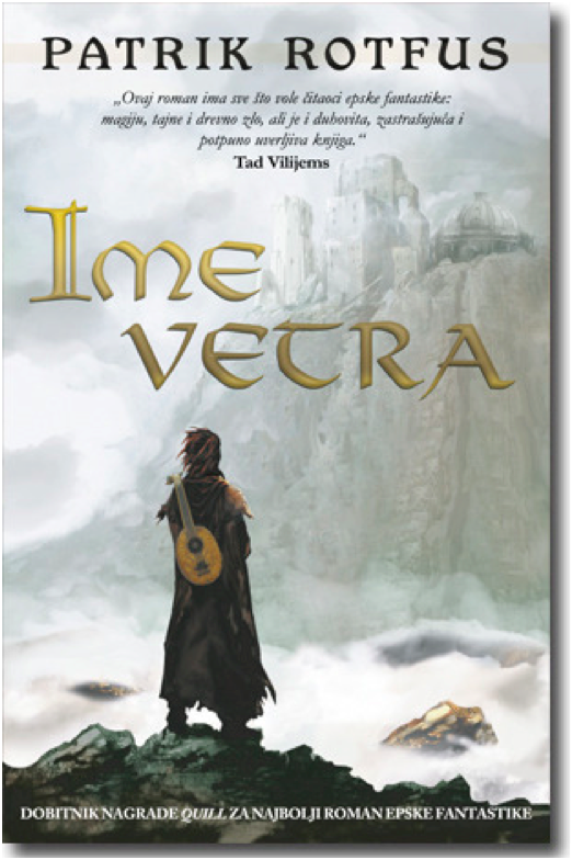
Paperback Serbian February 2011
And we’re back in the safe territory of a cloaked figure staring off at a distant city! All these covers are starting to run together, but this is a new cover art. It just looks like all the others. Once again, it’s fine. The city is a little too distant and greyed out to hold interest, and the figure is kind of generic.
5/10
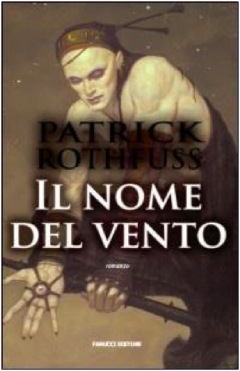
Paperback Italian 2008 Edition
I do not know what happened here. Who is this figure supposed to be? I cannot for the life of me figure out which character this is. It’s a shame, because it’s well-done art with a cool character and costume design. The title and author text obscure the image, though, and the shadow on the text is so extreme it’s hilarious.
0/10
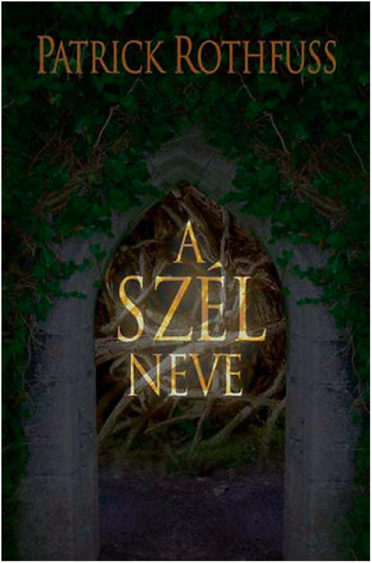
Hardcover Hungarian 2009 Edition
This is just boring. There’s no information conveyed here, nothing interesting or arresting to attract the viewer’s attention. The translucent overlay on the title is an odd choice.
2/10
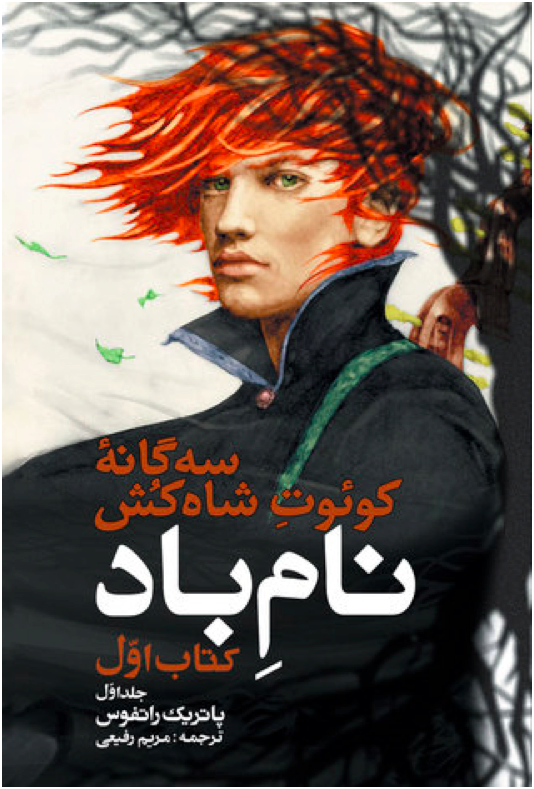
Paperback Persian 2016 Edition
I believe this was originally a fanart of Kvothe (correct me if I’m wrong please), but it’s a good one. The tree shadow in the back is distracting and obscures the handle of the lute on his back, though. I wish there was more here – it feels very spare in an unintentional way.
6/10

Hardcover Georgian 2016 Edition
Cloaked and hooded figure staring off into the distance, check. I’m not crazy about this one – the art is very soft in a blurred kind of way, and it reads as a little humdrum. The tower in the distance is quite dull – it looks like a modern office building.
4/10

Hardcover Italian October 2016 Edition
The title text is a little too high – I don’t like how it covers the figure’s chin. It’s not a bad idea to make Kvothe’s green eyes a focal point, and it’s certainly more of an original idea than most of these covers have shown. But the muted color pallete drags the whole mood down. It’s not evocative, just kind of damp.
5/10

Hardcover 10th Anniversary French November 2019
I LOVE this cover. It’s gorgeous. I love the gold foil, love the text, love the clouds. It’s stunning and timeless. Amazing.
10/10
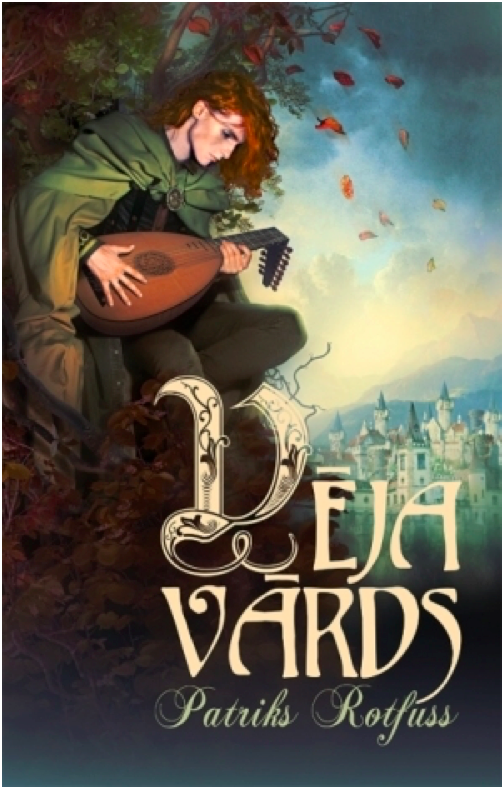
Hardcover Latvian October 2013 Edition
It’s a cloaked figure with a city in the distance, but he’s NOT looking at the city! What!! I’m rather surprised at how few covers feature Kvothe actually playing the lute – this may be the only one, actually. I don’t like the bottom fade, and I think the design is a little generic fantasy. But it’s a nice balance, and the title text is fancy and eye-catching.
7/10

Paperback Polish 2017 Edition
This cover artist also clearly wasn’t working off an excerpt from the book. The character design is so off and unlike Kvothe, except for the cloak. Wall texture looks like a photo manipulation, which is cheap. This whole thing is bad.
0/10

Hardcover Russian 2015 Edition
What is with the Stonehenge imagery? And why is that guy floating off of Stonehenge in a modern hoodie? Why is that one leaf in the top right so huge? Why is the title text red and difficult to read? At least there’s a broken lute, I guess.
1/10
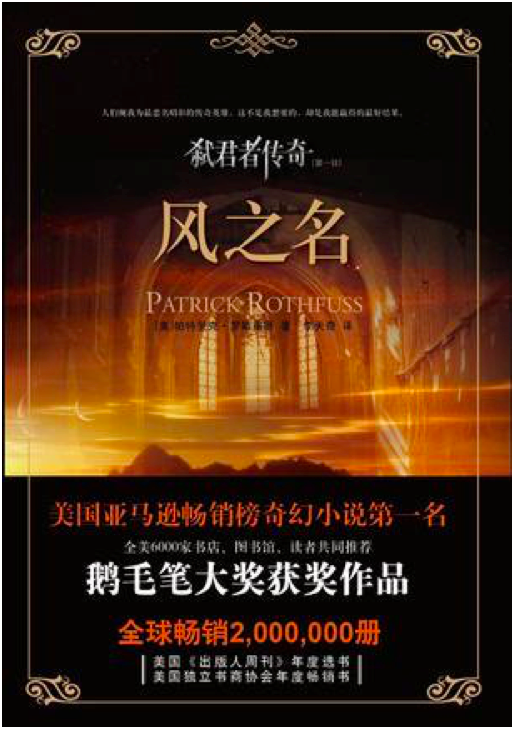
Paperback Chinese May 2012 Edition
This is incredibly lazy and the photoshop job is terrible and generic. Zero effort was put into this cover.
0/10
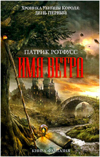
Hardcover Russian 2011 Edition
I’ve been pretty harsh on Russia, mostly because the Russian covers have been terrible. This is ok-ish. It’s very generic fantasy, and the castle looks like Hogwarts. But it has visual interest, even if the title text color is garish.
2/10

Japanese 2017 Edition
I quite love that they turned Kvothe into an anime character. And he’s doing stuff, too, and not just staring out into the middle distance. There’s so much imagery of the broken lute in these covers, so it’s refreshing to see the other part of this scene – when Kvothe loses his shit and finally calls the name of the wind. Fun cover, good artwork. The red title text works here because it matches Kvothe’s hair.
9/10
WORST:
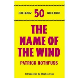
BEST:
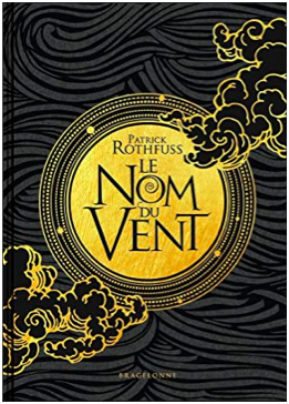
#The name of the wind#kingkiller chronicle#patrick rothfuss#book cover art#books#apologies for poor image quality i was working with what god and goodreads gave me#which was variable image quality i guess#I've been told I'm very judgemental so I decided to put those judgey skills to good use
49 notes
·
View notes
Photo
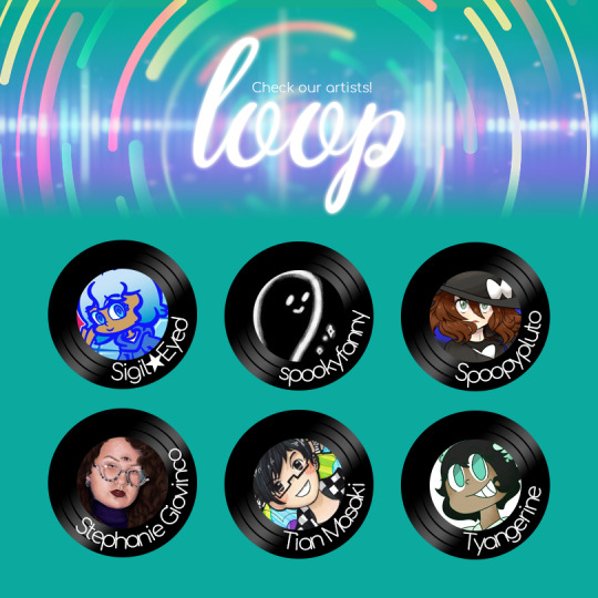
Artist Spotlights!
🎤 Sigil★Eyed 🥁 spookyfanny 🎷 Spoopypluto
🎺 Stephanie Giovinco 🎸 Tian Masaki 🎻 Tyangerine
Interview below the cut!
Introduce yourself
🎤 Hello~ I'm Erin! A lazy but friendly artist who loves bright colors~ https://sigileyed.tumblr.com/ 🥁 i’m a nonbinary comic artist/illustrator and a stay at home parent to a toddler. i am working on my first webcomic, foxgloves, a lesbian horror mystery, which will begin next year. you can find my portfolio, commission information, and social links at http://spookyfanny.carrd.co 🎷 Hello I'm Spoopypluto! I am your average digital/traditional anime artist and I like to play video games and drawing from time to time. I love magical girls and pokemon! If you want to find me you can check Instagram and Tumblr @Spoopypluto ♡ 🎺 I am a narrative illustrator from New York, NY. I work in both traditional and digital media specializing in a very old technique called egg tempera where I make my own paints and gesso to use on panel. I have a deep love for storytelling and that is the basis for all of my work, whether it be traditional or digital. You can find me on Instagram @StephanieGiovinco and on Twitter @StephGiovinco 🎸 Hello! My name is Tian and I’m a freelance illustrator / graphic designer. I am quite shy when it comes to meeting new people, so be patient with me…! Q u Q I love video games, art, photography, basically anything that involves the arts. I do mostly traditional art and occasionally digital art. You can find my work at www.artstation.com/tianmasaki. Most of my work involves colorful and detailed abstract background as I strive to bring a smile to your face upon seeing my work. I want to express a certain feeling from me to you. Overall, nice to meet you and I hope you enjoy my work! 🎻 Hello! My name is Ty! I'm an artist and an animator. This is my first time getting into a zine, and i'm very excited. I'm a big fan of Pokemon and Touhou, and i even have a few original stories. My work can be found here Insta: https://www.instagram.com/tyangerine/ Twitter: https://twitter.com/mintdeagon?s=03 Youtube: https://www.youtube.com/user/poptropica893 DA: https://www.deviantart.com/tyangerine Tumblr: https://www.tumblr.com/blog/mintdeagon
Do you do commissions post? Where can we find the info?
🎷 https://drive.google.com/folderview?id=167xlfPH1QszkjbYlG0craV5CQly_htgC
🎻 https://twitter.com/mintdeagon/status/1131347796399992833
Do you listen to music (or tv shows/films/anything else) when drawing?
🎤 yup! usually music~ mostly pop 🥁 usually, i am either listening to music or rewatching my favorite tv shows while i work. 🎷 I listen to music or watch videos while I draw, usually for background noises but when it comes to music I like it to listen to certain genres and themes to keep my mind at a creative mode. 🎺 I'm big into music, I believe that it can influence how and what I come up with. A lot of the times I will have a specific playlist for a piece just so I can keep a consistent mood through out a piece. If I want to have a neutral setting while I work, I usually just throw on a murder mystery documentary and get to it. 🎸 All the time! It helps me focus and relax at the same time. Sometimes a song can inspire me to draw through art block as well. My genre of music can go from pop to hardcore rock, then back to instrumental and indie, in many different languages as well. 🎻 I do! It's helpful background noise.
What’s your favorite music artist/band? If you could ask your favorite band/music artist one question, what would it be?
🎤 A Crow is White has been a favorite for a while now~ i really love their whispery vocal style~ 🥁 i would simply ask stevie nicks for her best witch tips. 🎺 This may be unbelievable, but I don't have one particular absolute favorite artist/band. I love so many different types of music it is so hard to pick one favorite. I guess if I really had to pick *one* I would pick Ella Fitzgerald. I would love to ask her what it was like to be a woman of color making a living as a jazz artist in the era that she lived. 🎸 I have too many to list, but if I could ask one question to my favorite musician, then I would want to know what inspired them to make a song. 🎻 Yoko Shimomura! I wonder how she always seems to make dynamic music
Do you play an instrument? If not would you like to play one? Which one?
🎤 nope but i've been interested in picking up bass~ 🥁 i have been teaching myself the ukulele the last couple years! my favorite songs to play are “f*ck was i” by jenny owens young and “us” by regina spektor. 🎷 I don't play any sadly haha 🎺 Sadly, I am not able to play any instrument. I just completely skipped that in school. I think I would really love to play the guitar or banjo. The guitar because it is an instrument thats sound really excites me in music. And the banjo because it is notoriously hard to play, so it would be cool to say I could. Maybe even a hurry-gurdy. Who knows. 🎸 I used to play the electric piano back when I was young, but not anymore. If I wanted to learn an instrument again, I would like to play an electric guitar because of guitar hero. [LOL] 🎻 I actually played multiple instruments in middle school. They were all percussion instruments!
Which song(s) are you going to draw?
🎤 i'll be illustrating Hi-speed Muteppou by A Crow is White 🥁 “i wish i was the moon” by neko case 🎷 I will be doing Dream Dream Dream by Madeon 🎺 I am going to be illustrating Past Lives by BORNS 🎸 Lollipop - Mika Battle Symphony - Linkin Park and probably more if time permit. 🎻 Katte Ni Kaizou Shite Mo Ii Ze - Kenji Ohtsuki
What do you expect from this zine?
🎤 i'm really curious to see the variety of music~ Maybe i'll find a new favorite band! 🥁 i expect to hear a lot of cool music that i have never heard before! and also push myself to work outside of my comfort zone. 🎷 The wonderful pieces everyone will be making with the songs they have chosen and even listening to some of the songs they had picked! 🎺 Just to have a whole lot of fun and discover some new music. Maybe even make some new friends in the art world. 🎸 I am excited to see how everyone interprets their favorite songs through their own means. I also thank you for letting me be a part of it as well. I can’t wait to see the zine in full blossom! <3 🎻 I expect to have a fun time with it! I can't wait to see the finished product
Anything else you want to add?
🥁 so excited to be a part of this zine and seeing people’s interpretations of their favorite songs 🖤 🎷 Thank you for making this zine, this is my first time working in a zine and I hope I do well for this project! ♡ 🎻 Thank you, Dot Zines for accepting me!
#Sigil★Eyed#spookyfanny#Spoopypluto#Stephanie Giovinco#Tian Masaki#Tyangerine#artist spotlight#loop#loop artists
9 notes
·
View notes
Note
Hello @phlavours i wanted to ask this, where do you get background ideas on your illustration? I was so foccused and used on creating a character but it dosen't always have a charm and mood since my background is always a flat/plain color... i wanted to create something a little better, what are your opinions?(Btw i love your drawings especially fire emblem arts keep making them pls :) )
Hi anon! I’m so sorry this ask is so late lol I wanted to take the time to answer this properly and never got a chance because of uni! and thank you so much!
I know exactly how you feel and tbh, my work feels the same too but i do have some ways of getting round it, this is what i do, it’s definitely not a definitive guide.
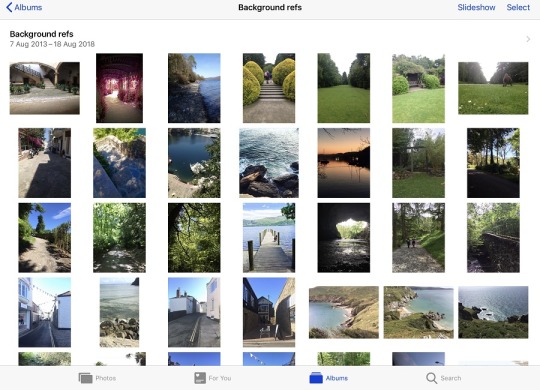
1) i cannot stress this enough bUT USE REFERENCES!!! i’m sad i went so long thinking referencing was ‘bad’ but if you’re learning and you’ve taken a photo there’s nothing wrong with it. hell i even trace some of my own photos if i can’t figure it out!
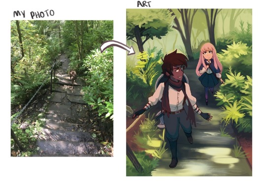
I have a whole folder on my ipad full of photos i’ve taken to ref
2) In terms of colour and making stuff look less ‘flat’ i use certain colours to tie characters and the background together.
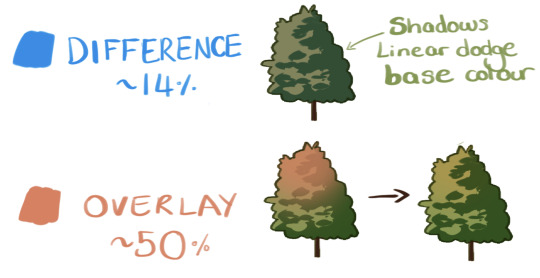
I experiment with blending modes a lot and find what works because i’m super lazy with colour. Probably check out some proper colour tutorials on the net if you want to get better at that.
I hope this helps! Good luck and have confidence in yourself and it’ll come naturally! 💪💪
54 notes
·
View notes
Photo
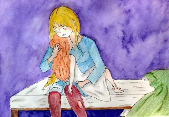
“Innocent soul” from Chapter 4 of Wicked Game called “The Pact”
“The second victim of the plague was a child called Brenna. Her mother, who was six months pregnant, brought her very distressed and concerned that her other children could have got sick too.
Fortunately, Brenna was the only one who fell ill.
At the beginning, the kid had mild symptomatology and Astrid was convinced that she would recover soon. However,
she got worse overnight. She couldn’t handle any food and she was vominting blood. The child, too young to understand what was happening, was constanly crying and Astrid was forced to make her sleep so she wouldn’t suffer.
The death of Brenna affected Astrid more than she would have liked to admit. She was able to revive her once, but she failed at the second time. Brenna passed in her arms. Astrid didn’t cry, but she was in shock when she felt how the soul of that small creature abandoned that little and burning body which was full of sweat.”
This drawing was a bit challenging and I’m not very happy with the result, mostly because of the coloring. Brenna, actually, is younger than she looks here. She was supposed to be around a year and half and two, but I don’t know why, I thought she was three while I was drawing it. So yeah, this child is actually younger than she looks here.
So, what happens in this chapter? Well, winter has come. Astrid has begun dragon training after Hiccup’s insistence and Ruffnut’s advice. She’s not very happy, but she knows that if she wants to continue living discreetly in Berk she needs to do these kind of things. Hiccup finds out that Astrid is just 20 years old and he’s surprised to be older than her (he’s 22 on February 29th). They talked about dragons and flying and Hiccup askes her if she misses flying on her own.
Of course she does.
During winter, a plague strikes Berk. Big part of Berk’s population gets sick, Stoick and Gothi among then. Hiccup and Astrid are forced to take charge to affront the plague and they enforce quarantine regimes. Astrid gets really mad with the vikings, mostly because their lack of hygiene that spreads the epidemic faster than it should. Ruffnut helps Astrid to deal with the situation with the patients while Hiccup manages with the rest of Berk. Seeing Hiccup as a leader surprises Astrid, mostly because of his leadership skills. She starts thinking that Hiccup is not the idiot she was thinking he was.
Nevertheless, things get really complicated when one of the patients, Haran Gormdsen, finds out that she’s a witch. This man has been in vegetative state for many years, but he actually was under a spell made from Le Fey, the queen of the coven which Astrid belonged to. Astrid accidentaly broke the spell (aparentely, the spell would be broken if he listens a witch lullaby and Astrid did it while she was taking care a kid how was beside him). She finds out that this man was a witch hunter many years ago, after witches stole his daugther. Astrid knows this witch (Rosethorn is her name) because she belongs to her former coven. Astrid kills this man with her magic, not before telling him that his daughter is a witch too.
Not long after the murder of this man, Brenna dies in Astrid’s arms. Astrid is really affected by her death, frustrated for her inability to do more for this child. Hiccup consolates her (he doesn’t know that Astrid killed the old man, he believes, as everyone else, that Haran Gormdsen died because of the plague) and he’s grateful for the effort she has made for Berk. The plague would have killed the whole population if it wasn’t for her guidance. For that same reason, Hiccup offers her to stay in Berk after breaking the bond, to replace Gothi when she passes. Astrid is grateful by his offer, but she has no plans to stay in Berk after breaking the bond, as she has her own projects. What’s more, she’s a warrior, not a healer. She doesn’t want to be stuck as that.
Hiccup makes her go to get some rest and Astrid realizes that she has a strange feeling in her stomach everytime Hiccup smiles at her.
For this drawing I used watercolor pencils for the background and Prismacolors for Astrid and Brenna. As I said, the coloring is not my best, but also I think I’ve improved a lot with the movement and expressions of the characters. I’ve not done a background because I was feeling lazy, so I’ve learned the lesson that I shouldn’t be that lazy next time. The drawing for chapter 5 will be published soon and I think it will be the last one I will publish before my holidays. Mostly because I need to finish chapter 24 before leaving to the US. Hope this drawings and summaries are helpful for you all to understand better this AU and to know a bit more about my story.
If you have any questions about the story I’ll be more than happy to answer them :) You can find more fanarts of Wicked Game under the hastag #wickedgame or #itsasumbrella in my tumblr’s Archive. Also, never forget that one of my favourite people of the galaxy, @poppysfanworld , has done few wonderful illustrations of Wicked Game. Follow her and give her some love!
#httyd fanart#httyd#httyd fanfiction#httyd fanfic#astrid hofferson#but she's not a hofferson here#just Astrid#hiccup haddock#witch!Astrid#witch au#wicked game#hiccstrid#romantic flight#itsasumbrella#mylife#ceatd#ceatd fanfic#spanish fanfiction#prismacolour pencils#watercolor pencils
38 notes
·
View notes
Text
Low Poly Tutorial - Beige Mode
Want to know how to make things like these?


Well, fortunately for you, I am procrastinating writing the last two chapters of Footnotes! Per request of @pg-13reylo, here’s a quickie tutorial for how to do a low poly image in Illustrator!
I’m working under the assumption that you, the reader, have some grasp of the basics of Illustrator, as far as if I say “pen tool” or “fill color,” you generally know what I’m talking about.
I apologize in advance for my somewhat manic narrative style on this tutorial - I’ve been teaching this to 100+ kids every year for the last 8 years, so I’ve gotten a little... odd. Also, this same basic method works in InDesign, but you can’t use Live Paint, which does speed up the process significantly.
A few tips on image selection - the more colorful the image, and the more dynamic and varied on the colors, the better. So, naturally, I chose a shitty-ass, beige as hell picture of an Ewok to demo with.

Set up your layers like so. The image needs to be on its own locked layer not only so you can check your line work occasionally, but so that when you put this in Live Paint later, the image isn’t stuck under all your pen work. Live Paint doesn’t like anything other than vectors.
Also note that I have my pen tool selected, with my fill color on none and my stroke color on red - set your stroke color to something that will stand out against your image. Usually I use neon green (like you see on Kylo above), but obviously green wasn’t a great option for this image.

Here’s what you’re going to spend 90% of your time doing - making straight lines with the pen tool. All you have to do is click with the pen tool to make straight lines, and click from corner to corner to make a shape.
So making a triangle is CLICK! first point. Then CLICK! - you’ve made a line, then next point, CLICK!: an angle, then finally CLICK! back where you started, and you made a complete triangle. The pen tool should have a little circle next to it when you’ve completed a full shape.

Now go make another triangle. Make sure that the triangles actually intersect at the corners - Illustrator CS5 and later will have little words that pop up with words like “anchor” and “intersect” to let you know when you’re doing it correctly. An annoying thing you’ll find out quickly is that you have to make each new triangle somewhere different, or else it’ll start deleting what you already made. I mean, sure, you could pop on to the selection tool, click away from where you just finished a triangle, then make a new one - but why bother?

Your main goal is to make triangles around your different color shapes. I don’t know how to explain it better than that. I use low poly art even with my traditional art students as a way to force them to see different colors within shades and tones. Note how I have just made a triangle around this darker patch of fur, but I have smaller ones in more detailed areas, like under his eyes. That’s a good rule of thumb for these - make bigger shapes in less detailed areas, and tiny shapes where you know you’ll need the detail to get enough detail to tell what you’re looking at, like eyes.

All right, we’ve made some progress! Let’s turn off that bottom layer and see what we’ve got-

Oh god, it’s a triangle-y mess. But don’t worry, this is a start, and worth checking out what we’ve got so far.

Turn your background layer back on, then select everything on your top layer - ctrl/command A, if you’re lazy. Go to Object - Live Paint - Make. If “Make” is not available, it’s because you didn’t lock off your image layer, or you made something else Live Paint doesn’t like, such as text. Obey your Live Paint god. Give it what it wants.

Click away from your picture to start painting - if you get too excited and start painting straight away, it will make the whole thing one color.
Here’s your pattern - i, click, k, click.
“i” on your keyboard is your eyedropper, which selects a color - click inside a triangle to get a color. Now, the first color you grab might not be the best, so take note of what color your fill color becomes to know what, exactly, you’re picking up. Once you have a color you think represents the triangle you’re in, hit “k” on your keyboard for your paint bucket. Click inside that same triangle, and it will apply that color across the whole shape.
i, click, k, click - do this inside each triangle.

So I’ve painted this chunk and turned off my background image - yep, still looks like a triangle-y mess. But the key here is to turn off your stroke color to see what you actually have so far:

Ok, that’s a start! There’s some forms being made from the shapes, and we’re getting the illusion of value. Now undo turning your stroke color off, turn your background layer back on, and MAKE MORE TRIANGLES.

TRIANGLES

Select everything again, go to Object - Live Paint - Make again, click off everything, and i - click - k - click until you’ve painted eeeeeevery last tiny triangle. If you’re doing a larger image and want to stay sane, do small chunks at a time, alternating drawing triangles and painting. Turn off your stroke color.

GASP! We have the beginning of Wicket! And, we have the end of this tutorial, since I have grown bored of this image. Hope this was helpful!
63 notes
·
View notes
Text
With or Without Background?
Cover for "Spidey".Marvel Comics 2016. Could this cover have improved with a background or did it really have everything it needs to portray the idea?
I have to admit that I was never a fan of drawing backgrounds. I've work hard to learn the rules of perspective and everything involved in the process of creating a believable environment for my characters, but I was always more interested in the figure drawing. It's not out of laziness, I swear. I love drawing and painting and I've never shied away from hard work (At least when it comes to art; If you need help moving furniture, I may show up late) but It's hard for me to get eager about drawing a background. If I feel like the image needs it, that the background tells an important aspect of the story I’m illustrating and helps the narrative, I do it without a blink but, luckily for me, comic book covers, and specially Superheroes comic book covers, are very character driven and, most of the times, a background won't add much to the cover. On top of that, there needs to be room for a code bar, title, credits, and sometimes a tagline so, most of the times, it's better to leave the image as light as you can so it can read well once the trade dress is added. But what about those times when you do need a background? Well, as anything you do on the page, you better find a way to make it amusing for you. It doesn't mean skipping work, it means working differently. You'll still have to put up time and effort to think about a way to portray the story you want, the way you want.
Cover for "Hawkeye" #12. Marvel Comics 2017.
One of my ways of making it fun is to, whenever I can, working the background as an element of design. This Spider-Men cover is a good example:
Cover for "Spider-Men". Marvel Comics 2017.
Heavily inspired, you may have noticed, in Coles Phillips' work:
Take a look at how much information he's giving us, with so very little drawing. He might not have spent time drawing details, but he sure spent a lot of time designing. The lack of a full background was very common in the covers of the old paperbacks. I assume this was because of, as previously mentioned, the need for space for the trade dress, but I I'm pretty sure that it was also a clever way to meet the deadlines.
Robert McGinnis
This (above) is a beautiful example. It didn't need more than a silhouette and some circles to convey the idea of a behind the scenes of a TV studio or a movie set. Mitchell Hooks was a master at this.
Take a look at the cover of "My Man Godfrey" (Above). While the only background is a stair (A banister, actually; he didn't even draw any steps) and a chandelier, he made sure to made it in a way where you can immediately tell it's a mansion. You don’t need more than that. Which reminds me of a saying from the old master Alex Toth that could apply here. You probably heard this one before: "Strip it all down to essentials and draw the hell out of what's left.".
Robert McGinnis
Robert McGinnis
If you enjoy drawing backgrounds, and have the time to do it, then draw the hell out of it and knock it out of the park. But if you don't enjoy it much, or the deadline is too tight, you can always come up with clever and interesting ways of providing your characters of an environment and give the reader the info they need. As I’ve said before: It’s not about skipping work, it’s about working differently. I might not be big on drawing backgrounds, but that doesn't mean that I don't enjoy seeing other people do it (I'm not a monster!), so let's end this post with a few samples of wonderful, crowded, beautifully rendered backgrounds. PS. I'm not lazy!
Bernie Fuchs
Bernie Fuchs
Paolo Rivera
Brian Sanders
from Muddy Colors http://ift.tt/2Eoq5l0
1 note
·
View note
Link
KineMaster Pro + Mod APK for Android Phone.
Take Your Video Editing to the Next Level, Download KineMaster Pro Fully Unlocked Mod APK for FREE on your Android Phone.
Premium Package unlocked.
Watermark Removed.
Video Layer Added.
Support Chroma Key.
KineMaster Asset Store Free.
KineMaster is the #1 Choice for Every Android Users as A Best Video Editing Application for their Smartphone. Download KineMaster Premium Version for Free from our Website and use All Features for Free.
Are You Looking for The Best Android Video Editing App? Then You are at the Right Place. Today Here we present you one of the best Video editing apps of all time for your Android phones. As we all know that videography is the fastest budding and growing platform, which is taken into consideration a lot these days. Now everyone around us doesn’t own a computer or laptop but, holds an android phone. So we are presenting you KINEMASTER PRO, a free video editing app for your android smartphone.
What is KineMaster?
KineMaster is a professional Best android video editor that supports multi-layer video, image and text editing with the art of cutting and trimming. You can have multi-track audio, volume envelope control, 3D transitions, Chroma key, etc. without any watermark. For Android users, the KineMaster Pro app is a leading professional video editor. Multiple layers of video clips can be cut, trimmed and edited accurately and quickly edit text, photos, and audio files. There are 3-D transition options for the Kinemaster app apk, volume control tools, LUT filters and much more. With its multitude of tools and options, the app is accessible to new editors as well as professionals. On their phones, users have plenty of control over the editing process. For specific tasks such as drawing on videos and creating a storyboard, you can even use the KineMaster app. The KineMaster is a perfect solution for content creators.
Kinemaster Pro
Kinemaster Pro is an Android-free Video Editing App. Download Android’s KineMaster Mod V5 Apk with all Pro features and No Watermark. Kinemaster is a powerful tool for Android video editing. Like other Android apps, the free version of the KineMaster Pro App also has a drawback. The free KineMaster’s project has the watermark. But we are providing you with the full version with all options, that too absolutely free. KineMaster Mod APK offers some pro-level control over the mobile editing process for professionals and amateurs also. One with no knowledge of editing can also learn to edit with much ease. On your Android smartphones, you can do dazzling edits, motion tracking and animated illustrations that were earlier only capable of being done on your PC. Here you get all the Premium options without Watermark to enhance the media without spending money.
KineMaster Mod
If you Want to Use KineMaster Pro APK for Free on your Android Phone then here is a great and only one option that is Download KineMaster Mod APK and use it. KineMaster Mod is a Modified Version of it self where Many Android App Developers Modify this APK file and unlock All the Premium Features for Free. The Mod Version is 100% Safe and in Working Condition mode. Not Only Premium Package Unlocking but Also you can do lots of things with the Video editor like Changing Color of your Editing Home Screen, Icon and many more.
MULTIPLE VIDEO LAYER
The KineMaster Pro Version Allows you to ad Multiple Video layer Editing. You can Edit Green Screen Videos with this Feature.
NO WATERMARK
Export Videos Without Watermark with the help of KineMaster Premium Version. Render UpTo 4k HD Video without KineMaster Logo.
PREMIUM UNLOCKED
Fully Unlocked All Features, Because we include the Premium Package which Completely Free for You.
Features
Chroma Key: This is one of the best features of all time as having a function as a chroma key gives you a lot of videos intended features. Chroma key is used to change the background of your videos as a Green screen in the background, which can replace anything in the environment. It is an excellent feature as by using this you can make your videos look damn impressive. Having a feature like a chroma key was earlier a part of significant pc software but Kinemaster Pro has made it look like a cakewalk. Big Hollywood movies also use Green Screen effects to replace the background. You can use chroma key effect in Kinemaster Pro to make your videos look professional. It is straightforward and user-friendly to use.
Transitions Effects: Have you ever wondered how these Bollywood and Hollywood films use special effects between their video slides, which makes it looks fantastic. These are called transition effects, which can be readily used in Kinemaster Pro. A film transition is a technique used in film editing and video editing post-production process that combines scenes or shots. Most films will also include selective use of other transitions, usually transmitting a tone or mood, suggesting the passage of time, or separate parts of the story. It offers a variety of effects such as wipe in, wipe out, fade, dissolve and much more. All these just under one click on your Android device.
Animations: It is yet another most significant advantage while editing your video. Kinemaster Pro helps you get a hefty amount of animations during your work on your edit platform. You can add various scenes available or can even download special effects from external sources.
Multi-Track Audio: KineMaster puts you in the mixing booth of the studio. It allowed you to add and play 8 or more audio tracks at the same time. It is used while you are editing a rap song or a combined music video.
Addition of Multiple Layers: KineMaster supports unlimited layers of text, image, handwriting, and overlay, as well as up to ten layers of video (on devices supported). You can easily adjust the layer position and timing and animate layers using preset animation effects or keyframe animation.
Voice Recording: KineMaster allows you to preview your project to record audio, making it easy to add voiceover tracks to any video. If you are making a commentary video or a motivational video the this is an outstanding feature. Your video will keep playing the way you want, and at the same time, your voice over also gets sorted
Download KineMaster Pro Mod APK Latest Version of 2020
Now You can use All Premium Features of KineMaster Pro Application by Downloading The KineMaster Mod APK which is a modded version of it. This Mod Apk provides you with all unlocked features for free. No need to pay any money and enjoy the premium Video Editor on your Android Device.
App Name KineMaster Video Editor Version 4.12.3.15162.GP Size 76M Requires Android 5.0 and up Last Updated 13 April 2020
Download APK Now
Reviews
Floofy Wabbit: Thank you for updating the app. you can do some pretty good basic editing with this app WITHOUT the premium feature, but if you want to do something more expert level, premium is the way to go. Since I’m lazy(or maybe just broke) I do not own premium, but still, just hear me out. This app is probably the best free editing app i have used so far. And its free! So try it!! UwU. Go do it, you wont regret it! Stop reading this and go install KineMaster now!! For FREE!!!-w-
Shadow Editz: This is a very nice app, you can make videos with it, you can also do greenscreen with it and also more, but the only thing I don’t like here its because when you put too much photo’s it starts to glitch and take the app very slow but I tried to uninstall the app and install it again to make it process fast but then, I started realising that my downloads and songs are gone..I hope you fix my problem, and please stay safe everyone! Don’t let the corona virus get to you, wash your hand properly!
Soya Akther: Probably the best video editing app on Chromebook! I highly enjoy it, and it’s pretty simple to use when you know the basics. I have some issues, like it glitching when it exports and not being very clean. But when that happens, it’s really not that bad. Just a little glitch, that’s all. I highly recommend it, and you don’t really need a premium to make a good edit.
FAQs
How Can I Remove The “KineMaster” Watermark?
To Remove watermark from kinemaster App, You have to download Kinemaster PRO APK from KineMaster.pro website.
How Can I download KineMaster Pro apk for Free?
To use Kinemaster Pro Video editor for Free You have to Download KineMaster Modded version from here Visit https://ift.tt/2VRmGpl
Will Kinemaster Support 4K Video Editing?
Yes, But make sure your device also supports 4K videos.
Will Kinemaster Mod Apk work on Xioami or Mi Devices?
Yes, Kinemaster Mod APK will work almost 99.00% of every Android device.
Will Kinemaster Mod Apk work on Realme Devices?
Yes!
Is Kinemaster Mod APK available for the IOS device?
No. Currently, we don’t have any Kinemaster MOD Apk for the IOS device.
How to Download Kinemaster Lite APK?
To download Kinemaster Lite apk visit here.
Is KineMaster Support on Chromebook?
Yes!
0 notes
Text
Chapter 43: "NEEEEEERD!"
#Paula reads SBR#Chapter 43#HOORAY VIOLENCE#Sandman sighting#EXPLAIN YOURSELF SANDMAN#Steel Ball Run spoilers#Part 7 spoilers
0 notes
Text
In the Margins
I want to write in the margins. Alright, I suppose I mean the margin. ‘Cause there’s one, to the left, just beckoning to me. I find myself thinking not about the photo that covers most of the two pages, but about that blank space. The picture could have been anything. A river, the pebbles along some close or distant shore, puddles beneath a tree in an orchard, stomped and trampled almost into mud. The picture, for me now, is irrelevant. I’m caught. I’m transfixed, thinking about all of the notes that could live in the margin. Notes pertaining to the picture, how the wave in focus appears silver. About the rippling, up to and in the curve of the wave. Or about life, family, musings on how friends are doing, reminders of tasks or events to attend. Maybe drawings, sketched trees that don’t look so much like trees, a dog that would perhaps be frightening in its offishness if brought to life. I sit, at the table, and think about the margin. What else could fit in there? Sometimes I think that people are drawn into margins, sketched like so many notes to be forgotten with the turning of a page. People we walk past on the street, never meeting their eye. Or, perhaps worse, meeting their eye but not wondering about them. Thinking them nothing better or worse than background. I sit, staring at the margin, and try to remember the last person that I delegated to nothing in my motion forward. Male or female? Not that gender defines anything. Tall or short? If gender is irrelevant, does height matter? How do you even begin to remember someone you never felt? The margin is staring at me, still. I am in a margin, too. I know it. I must be. Someone saw me, I registered as an entity in their mind, but now I am nothing to them. Maybe someone, somewhere, is trying to recall the last person they saw who meant nothing, trying to build my face, or the feeling of me, from nothing but a moment. I think they must fail, but I am also failing them. Suddenly I have him. The last person in my margin. I pick up a pen. Quickly he develops a hat, tilted sideways. His chin is up, and he’s looking a little over my shoulder. Or is he? I realize that he has a lazy eye, adrift from the other. With the eye not looking over my shoulder he is watching me. I sketch his hair, pen it falling from under his hat. He gains shape but I’ve misdrawn his arm, made his right side quite larger than his left. I scratch it away, just enough to show that it’s not the true line I meant. I finish his top half, then I pause. He is holding a sign. Protesting? Begging? Trying to draw attention to some cause? I can’t imagine the sign. Because I know, now, that even though I’m calling this remembrance, it’s not that. I’m piecing him together as I want him to be, or think he might have been. I draw under the sign, get his legs and his shoes. He is standing in the margin next to the photo. He is in the margin of my life, and now I’ve put him in the margin of this book. I stop. I look up and see the clock, near the printers. I need to leave. I look once more at my drawing, then close the book. I turn it away from me, leave it on the table where I found it. I pocket my pen. As I leave the library, I look to my right. There is a man, holding a sign. His hat is tilted sideways, his hands are gloved. At his feet is a dog, sitting. I know why I couldn’t remember what his sign read, when I was drawing in the book. Instead of words, the board is full of pictures. Illustrations that far outstripe my version of the man himself. Hands raised, in supplication. Some military insignia that I do not recognize, clearly showing that he is decorated. A dog bone, not leaving out his companion. A peace sign, that I feel in my arms. A physical weight. The man is watching me, as I watch him. He turns the sign over, but doesn’t say anything. The back of the sign is blank. I reach in my pocket and draw out a five dollar bill that is meant for the bus. I can find another way home.
#shortstory#under 800 words#reflection#how we see others#creative writing#short#story#people#writing#connection#EJFay
0 notes