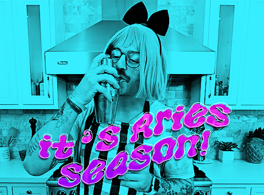
#no??? like i know you know how to use canva and make thumbnails by editing photos. you know how to do that.
Explore tagged Tumblr posts
Visit Tumblr Blog
Explore Tumblr blogs with no restrictions, modern design and the best experience.
Last Seen Tumblr Blogs


Fun Fact
Premium Tumblr themes are available from anywhere between $9 to $49.
Text
istg everytime i bring up how much generative ai sucks to my mom shes like "what else am i supposed to do!!! sometimes you just have to!! i dont know where to find an artist!!" like girl no one is forcing you to use ai for your video thumbnails and your tarot cards and your merch and your website.
#last night i was like 'im glad the art of photoshopping clickbait thumbnails is still alive considering all the ai ones“#and my mom responded “hey man sometimes you just have to”#no??? like i know you know how to use canva and make thumbnails by editing photos. you know how to do that.
5 notes
·
View notes
Note
your failteacher comic is so cool…. i can’t stop thinking about how masterfully textured your characterizations are, and while i had no context for the games (aside from, well, the Adult Women In Persona Curse lmao) being an ffxiv player made those gags really fun to read too ^_^
the best part of everything is that i genuinely want to try making comics about my own yuri rarepairs now… i was wondering if you’d ever be open to talking about your process when tackling these comics wrt the writing process and layout? you have such a strong understanding of panel composition that ive found myself admiring even small technical things things like your text and panel spacing. thank you so much for sharing your work!!
AUUYFDH THAJNK YOU .... this is so sweet 😭 i'm really glad you're enjoying it so much!!
if you're insane like me (been in pain like me) i totally recommend trying to make your own comics . its a very fun medium to work in!! comics have their own toolkit and language that i think is really strong and fun to play with. if you have specific questions for me about it i don't mind, but i will say that i'm kind of like ... yknow
FTyuri is drawn really loosely. i make a lot of "mistakes" (or at the very least, sub-optimal choices) in my paneling/layouts because i don't really have a plan for each page (LOL). i'm "self-taught" in the sense of "guy who reads a lot of comics and has internalized a lot of things as a result", so sometimes i do things based on intuition and vibe more than anything (and sometimes that does not work out super well!)
i guess what i'm saying is i'm a hobbyist who just kinda does whatever feels good, so my advice won't be particularly Scholarly AHJBHF but i love comics (reading AND making) a lot, so i don't mind if you're wondering about specific things i've done or how i approach them
i think... most importantly, you know, a comic is kind of a huge undertaking. it's A Lot of drawing. but it's also very fun. so pace yourself and choose a project with a length you think is manageable, but do try it! 😤😤
the second thing is... a comic is not just a collection of pictures, right? it's important to guide the reader through each page in the correct order, while also controlling the pace and flow of the story. you place speech bubbles or eyecatching elements where you want the reader's eye to go, and use things like the size and placement of panels and the gutters between them to slow down or speed up time. i have done some FUCKED UP text box placements in FTyuri that are totally wrong and it makes me crazy whenever i see them in hindsight but THATS OKAYYYY
'cause the third thing is you're always learning new things. even if you make a not-so-great layout or even if you never actually finish the comic, you're still learning stuff that will go into your next comic. and so on...
now, here's the "maybe don't actually do what i do" part AJHREDHB
i actually don't really plan anything at all. sometimes i have a specific idea for a page layout and have it in my mind beforehand, but most of the time i just pull up a canvas and start adding panels to it willy-nilly. i also don't write anything down in advance. at most i have a loose "i want to someday draw a scene where X happens" in my mind, but all the layout and dialogue happens when i get there
YOU SHOULD PROBABLY WRITE DOWN AT LEAST A ROUGH SCRIPT/OUTLINE. AND DO SOME THUMBNAILS FOR YUOUR PAGES. ESPECIALLY IF YOURE JUST STARTING OUT
edit: check the replies for a cool link about planning out a comic!!!
planning out the scope of your project is important! i'm just not that kind of girl 😭 and that does result in a lot of mistakes! but the alternative is that i never get around to actually making anythign at all, which is worse to me
for me, that stuff slows me down and drains all my energy before i even start. but this approach uh. does not work for everyone and its probably best to start with a more planned-out approach 😂 though, if you do try to pre-plan and find it makes your brain explode like mine does, you can try just drawing it and seeing what happens. bc like. hey. it works for me . i dunno
but yeah like i said if you have a specific topic/question i don't mind answering that more specifically!!! comics is a very broad subject so it's hard to know what to say about it just like Generally hahaha. thank you so much <3
32 notes
·
View notes
Note
Hey Nia! Question-(from someone who only uses procreate on his iPad and doesn't own his own computer)- How do you make your animatics? I'm extremely curious because I'm at a point where I'd like to start making them myself but I don't really know where to start! What programs do *you* use? Any tips? If not that's cool 🐯 -Thank you!
OMG HI CATAA
I actually also use procreate. As a matter of fact, I also use it for my animatics!
I’m not really good at explaining stuff as I’m not a professional so I hope this alright for you lol
so what i do, first i start to visualize how i want the animatic to look like. Listen to your chosen audio a couple times (for me its almost a hundred lol) if you have one and just start to imagine how your animatic will look like, how it’ll move and all that.
Then, I just open up Procreate and start drawing. If you’re doing something more complex, I suggest doing some thumbnails to get a general idea. But if it’s something silly and short, i just draw and go from there. BUT THATS JUST MY OPINION!!
here’s what my canvas looked like when i was making my animatic 👇

obviously, the backgrounds and the drawings are in separate layers. Usually, my drawings don’t have color, but I decided to colour them for this animatic. I merged both the line art and the colour together for a couple of frames. Some of them I also merged with the background, mostly just to reduce the amount of layers and prevent a bit of clutter. I know it sounds a bit tedious doing this on one canvas, but I think I manage.

Then, I take those drawings and put them into my editing app, which is Capcut! I mostly just go back and forth when completing a drawing then putting it in capcut, checking it for a while before going right back to drawing, and the cycle continues until the animatic is finished!
A tip i learned from an old tutorial video from theodd1sout- if you want to give your animatics a sort of bouncy look, duplicate your chosen drawing and distort one slightly. Then, go to your editing app and add your distorted drawing- make it last for one or two seconds- then add your original drawing. It will then look something like this!
so yeah! That’s basically how my whole process goes! If you’re just starting out, I think Procreate and Capcut are your best shots! Of course, I’m not a professional or anything, so I suggest looking up animatic tutorials online because they’d explain it better haha
I hope this is a good explanation and good luck with whatever you choose to do, Cata!^^
20 notes
·
View notes
Note
Do you have any tips/useful information for people who want to start making audio rps?
(Also love ur content sm!!! Mitch is the most lovable little guy)
Aw thank you so much! Love him too!
This is a great question, had to think about it for a bit;
If you want to dabble with making audios, feel free to start off with public scripts! I think there's subreddits like ASMR script haven (IIRC?) that has public scripts that can be filled by anyone. Just be sure to read the author's conditions carefully i.e. credit, terms of use, what can be changed etc. Right at the start I recorded a public script to try and get started, it's a great way to just jump right into making something to learn the ropes of it without also first having to write an entire script for it too. Filling public scripts is a fantastic way to start off, however I reckon writing your own stories is a major part of the fun!
You don't need an expensive mic, but audio quality is a very important factor. Do some test recordings and listen back to them (with headphones!) and see how it sounds. This is especially important for whispered scenes (DO NOT get too close to the mic or breathe on it!) or loud scenes (DO NOT peak the mic!). If your mic has a gain / input dial, play with that before recording! Just start with mono to begin with, play with stereo if your mic supports it after you become familiar with it. Aim for your recording to be no louder than -6db at the highest, if you can keep your voice roughly between like -20 and -6 that tends to sound reasonably natural.
Do your best to eliminate external sounds! If you have AC or anything like that on, turn it off. I have to shut down my main PC and record with only my editing Mac on because the PC fans are much louder and my mic is very sensitive! There'll pretty much always be background fuzz, some mics will just have some, but try to make your room as quiet as you can. Your software may have some background noise removal tools, I use filters for that (expensive so I can't recommend them), but DO NOT use the noise removal tool in Audacity! It's terrible!
Speaking of, Audacity is decent to get started with. It's good basic recording software, plus multiplatform. For a while I preferred recording on Windows with Audiodope, also very simple, plus I liked that it asks me whether I wanted to record in mono or stereo first in case I forget to switch, I currently record on Mac with ocenaudio which does the same, while Audacity won't ask, you have to go into settings. Anyway Audacity is okay to start with for editing, it's free, but from what I understand it's a "destructive" editing software in that after you make a change like adding a filter, you can't then go back in and change it other than just undoing, which I really don't like, plus changing the timing of things looks fiddly. I don't know what to recommend to move up from, I've heard good stuff about Reaper but it looks very complicated. Avoid Adobe unless you have a free subscription from somewhere else. I edit entirely in Final Cut Pro so I can't recommend that unless you're on Mac, plus it's my old work software and expensive! If you need sound effects, I use freesound.org, there are other great free resources as well, but make sure you check each individual sound effect's license before use.
Once you've edited the audio and want to turn it into a video, I've heard good stuff about Da Vinci Resolve and Kden Live, both are free! Make a video canvas of 1920 x 1080, FPS doesn't especially matter if you only have a still thumbnail, 25 or 30 is fine, and render it out as a h264 mp4 if you're not sure what to select! Good compression for internet video, good for streaming. Try to record and export your audio as wav if you have enough space, wav is uncompressed audio so it maintains full quality but they can get large.
I also make my thumbnails in-edit but you may want to use external software like Gimp to make them. Avoid getting random stuff of google especially anime boys / girls, and definitely don't ever use an artist's stuff without asking for permission + giving proper credit. Using pre-built generators like Picrew is totally fine, just be sure to credit where you got it from, but 100% avoid AI generators, obviously. Be careful with Adobe stock images, apparently there's AI slop in there too. You don't need art for audios though, they're a nice to have bonus, but many of my most viewed videos have no art at all. If you need background images, I like unsplash.com because it has a free license! Read over it yourself but basically you're able to use pretty much any image they have in your videos!
Just jump in and try making something small, never start with your magnum opus! I started with the introverted incubus character because I'm a very shy person myself, it was an easier role to get started with! If you want to start writing your own scripts too there's a lot we could talk about there as well, just try to picture the scene from the perspective of the listener, what they may be thinking or feeling at any given moment, not just the perspective of the character you're going to be playing!
This was a lot and I don't think I covered much, I hope some of it helps though!!
48 notes
·
View notes
Text
@shinimint
Here's how I make my tapes in Canva:
So I usually use the Youtube Thumbnail template and start out with the blank cassette template. You're going to want to select the image and go into image settings. There's an effect that you can select that's called Duotone. You're going to want custom Duotone for this next part.

2. Only edit the highlight colors here with the color you want to use for the tape. I'm going to go with a bit of a purple color, but having a hexcode for the specific color you want will probably be more efficient than scrubbing through the color selector until you find one that you like. (I usually scrub through the color selector. I only just realized that inputting a hex code was possible and I've used Canva a lot).

3. Once you've got that set, you're going to pull in the cassette template from your uploads again (the unedited version) and crop out the elements that you want to keep black and white - this will usually be the viewing port for the tape and the tape cover itself.

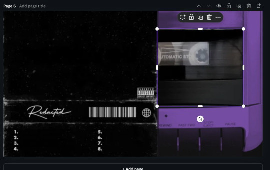
4. Next thing you're going to do is find what image or color you're going to want for the background of your tape cover. I usually use stock images from Pexels and edit them up a bit. For this one, I've applied the Belvedere filter and blurred it at twenty four strength.

5. Next you'll add your text and speaker icon to the cover. I've been using League Spartan for the font of most of my cassette covers, but recently found out that Anton is the font that Erik uses for his stuff. I usually apply the lift effect to these guys so that you can see the actual text on the cover.

6. And so what you're going to do now is get one of the other cover templates and crop it down to where you have only the 'Parental Advisory Explicit Content' bit showing and then bring it up to the position that you want it to be on your tape cover. (I have added extra effects to the cover because that is what I wanted to do, you do not have to do that).


7. And then you're going to add the lines that you want to highlight in whatever story that you're telling with this tape. Font size for me is usually at around 16, but it can go smaller if you need to fit more on the line. I alternate colors for this because I find it visually pleasing, but I know that others use single colors for it.

8. You'll add your character title and edition on either side of the Parental Advisory warning, and voila! You have yourself a lovely tape! I'd suggest exporting it as a jpg if you plan on sharing it anywhere, but for personal use, png's a pretty good way to go.

I hope that this was helpful, and if you have any further questions, please feel free to let me know. I'll get back to you as quickly as I can!
18 notes
·
View notes
Note
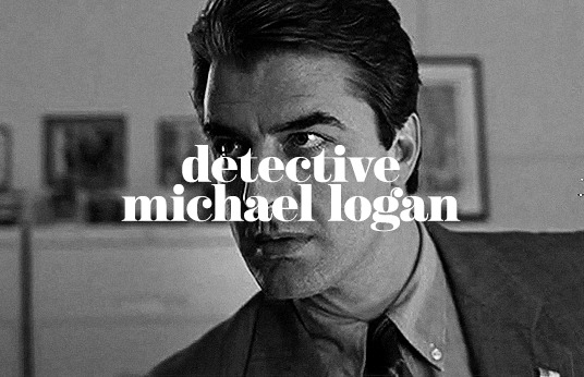
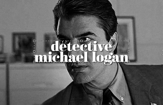
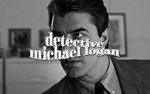
hi your edits are so so pretty!! I was wondering if you could please do a tutorial or give some tips on how you made this Typography? /post/716216798240980992/detective-michael-logan-leader-of-the-nypds
i'd be happy to! it's super easy and fun! ignoring the awful quality and slow framerate, i still love this set tbh
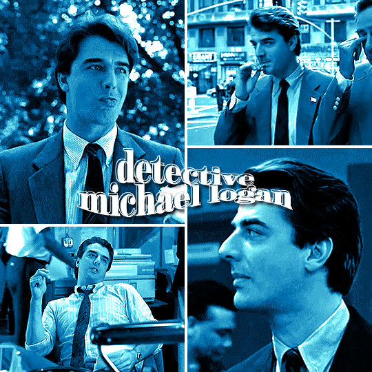
i still have the psd for this, but for some reason, i rasterized all the text layers, so i had to do everything from scratch anyway. i'm pretty sure this is the same font i used, so here are my settings for a 540px gif

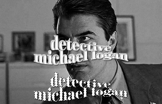
so here's our starting point:
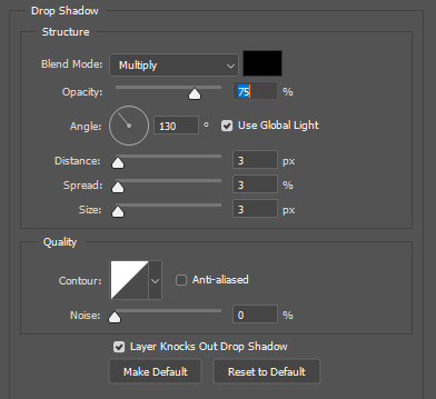
and add a drop shadow, though this will vary by font and gif
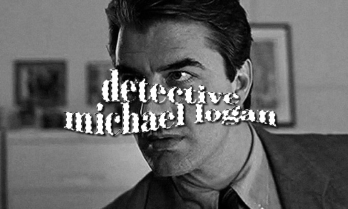
now for the fun part: the text warp tool! make sure you're still in the text menu for this to show up.

the dropdown menu gives you a bunch of different options to choose from. for this particular effect, i chose fish. some of my other favorites are flag, wave, and twist. here were the settings i used. i will say i rarely adjust anything but the bend just out of personal preference. i honestly recommend to just play around with the sliders and see what you like best!

as a side note, when warping text, you'll want to make sure your text box is as small as possible. i'm sure everyone does it differently, but when i make a text box, i start on the left edge of the gif and drag it all the way across to the right edge so it's centered vertically, so when i use text warp, i need to drag those ends back in once i have the size and font settings i want.
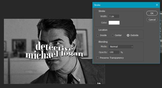
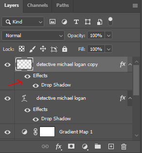
you could leave your text as is, but if you want that extra outline bit, it's also quick and easy! first, duplicate your text layer and then rasterize it (right click on the layer and select rasterize type). then, click on the little thumbnail the arrow is pointing to and click "select pixels"

this is what you'll see. you're selecting only the text on the layer rather than selecting the entire rectangle of your gif. then go to edit > stroke
i do this effect a LOT, and i almost always use 1px. i also usually use white, but that will totally depend on what you're going for. this color is going to determine the color of your outline, though you could always change it later with a color overlay layer style.
your text is still selected, but now you can see the outline we just created. this is the important part! use transform (ctrl+t) and move the selection somewhere else on the canvas where it's not touching your centered text and outline.
it's still selected (and this ended up being the part i always forgot when i first started doing this effect), so click anywhere on your gif to deselect it. the dotted lines will go away. then erase that text bc we don't need it.
it really doesn't matter when you do this, but switch off the effects on this new rasterized layer bc we don't want the outline to have a drop shadow, just the original text layer underneath.
it totally doesn't matter in what direction you move your outline, but i almost always use ctrl+t and move the outline using my arrow keys up two and to the left two.
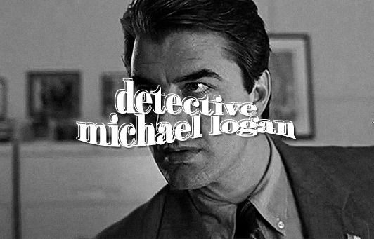
and we're left with the effect in my set you referenced! this effect looks even cooler when you change the original text layer's blend mode like in these gifs:
please let me know if you have any questions on this or anything else!
27 notes
·
View notes
Text
Okay ramble that will probably not get anywhere but I will put it here anyway because I saw yet another post about people struggling to get any writing done. And someone in the comments made a good point. You write/draw so much more as a kid because you're less practiced and ergo less worried about the imperfections that may arise from just gunning it.
And this is true! And this is why I want to tell you if you are struggling to write much, learn to write like a kid again.
You know how with a lot of art you see processes and it always starts with really shitty thumbnails that have silly faces or just blobs of color? Then you have an actual sketch (during which the artist likely moves a lot of shit around on a digital canvas) and then possibly the inking phase or just painting which is more blobs that slowly get sharper and sharper the more the images is rendered.
Yeah uh, do that with writing. Going under the cut because long
Writing as a process is something that is unique to an individual, just like there's 800 ways to slap paint on a canvas. If you look at guide books for writing and none of it is sticking it's not cause you're a failure that technique is just not gelling for you.
And as such I can only speak from MY experience with it but like, here's how I generally stay on top of projects
A) Sketch phase! It's outline time baby! "Ughh but outlines suck" listen I know school made the outline phase of an essay the worst fucking thing ever but hear me out on this. Sure some people CAN write by the seat of their pants but in terms of long projects this does not work out for me. I'm inevitably gonna hit a point where idk where to go from there and it's so hard to map all that out in long form
Listen, outlines are not there to be formal. They're not even there to be fancy. This is time to get down the bare bones and if you have to make it only a paragraph long and then extend that paragraph into multiple then DO it.
Like hell, NONE of my outlines are formatted the same! Some are a paragraph per chapter. Others are just endless bullet points that I split up later. I'm sure in one book due to all the plotlines I'm just going to have a storyline for each character laid out in columns so I can draw lines between them. Whatever works.
And again, do not have to be formal, like here is a legit line in one of my outlines
As for the ruined building… Hypno will cover the damages……….. Right? : )
Go crazy.
B) Now that you have your baselines start working on the actual story. Do you like writing shit out of order? Do it, because with an outline you still have your baselines to reference for any important details you don't wanna forget "Remember [character] is supposed to get a scar in chapter five!" Or write shit in order, and every time you hit a lull consult those baselines to say "oh yeah that's where this chapter was going"
And hey, keep writing it like a kid if that's what it takes to get this crap down. Hit a fight scene you don't wanna write? Slap down some brackets. [Insert a fight scene here where [character] gets his head smashed in so he ends up with this concussion later like a dumbass]. Boom, done, worry about it later.
Worried the dialogue isn't flowing well? Slap open another document or grab some paper and write it out in a play format to keep it moving. Add in all the beats, expressions, and details after.
Not sure if this detail you're putting in is historically accurate? Leave an easy to search symbol in the doc so you can go back to it to research later.
Write the sappy shit. Write with poor grammar (but still like, comprehensible you know what I mean). Slip in adverbs to swap out with strong verbs later. Use a run on sentence.
"But it's gonna sound bad" Who cares who tf cares that's what editing is for ! You go back and refine that shit and clean up sentences and add in all the extra research and pull out the repetitive words.
You gotta quit treating writing like you're supposed to just swing your brush on the canvas and suddenly you have some beautiful scenery. There's layers. There's blobs that turn into refined shapes. There's blending and shading. There's fine lines and thick lines. And sometimes there's mistakes that you have to wait until it dries to go back over it again.
It is a process! Let yourself have FUN with the process.
Okay rant over.
#scribs speaks#I will never tell people how they should write#but so many times when I talk to fellow writers who say they haven't touched their WIP in ages#9/10 I ask if they have an outline and they say no#sir you are trying to write a fic that could be like 20 chapters#give yourself some sketch layers
57 notes
·
View notes
Text
Stop Scrolling and Start Dominating: How Tech is Your Ticket to Winning Attention

You’re sitting on a goldmine. Right now. That phone in your hand? It’s not just for memes and DMs. It’s a studio, a editing suite, and a global distribution channel—all wrapped in a device thinner than your wallet. The game has changed. The gatekeepers are gone. And if you’re not using innovations in technology to crush it in the attention economy, you’re leaving money, influence, and legacy on the table. Let’s fix that.
Your Excuses Are Dead (And You Killed Them)
“I don’t have the gear.” “I can’t afford a team.” “I don’t know how to edit.” Stop. Just stop. A kid in Khayelitsha is shooting TikTok videos with a cracked phone and hitting a million views. A grandma in Pretoria is live-streaming her knitting tutorials and outselling boutique stores. The tools? They’re free. The platforms? They’re begging for your content.
Innovations in technology have turned every excuse into a lie. You don’t need permission. You need grit. AI edits your videos. Apps colour-grade your footage. Drones film like Spielberg on a budget. The barrier to entry isn’t cash—it’s courage. So ask yourself: Are you lazy, or are you ready to hustle?
AI Isn’t Coming for Your Job—It’s Handing You a Megaphone
Let’s talk about AI. Not the “robots will steal your job” nonsense. The real AI—the one that’s your 24/7 intern. Tools like ChatGPT write scripts in seconds. Canva’s Magic Design storyboards your ideas. Synthesia turns your blog posts into videos with avatars speaking 50 languages. This isn’t cheating. It’s leverage.
But here’s the truth: AI can’t do the work that matters. It can’t replicate your voice, your vibe, your why. Use it to automate the boring stuff—then double down on what only you can bring: authenticity. Post that unscripted rant. Share the behind-the-scenes chaos. Technology handles the polish. You handle the soul.
Viral Isn’t Luck—It’s Math (And You’re Failing It)
You think viral videos are accidents? Wrong. They’re engineered. Every trending reel on Instagram, every exploding YouTube short—they’re built on data. Algorithms reward consistency, hooks in the first 0.8 seconds, and retention rates. But you’re still posting and praying.
Stop guessing. Start grinding. Use TubeBuddy to dissect keywords. Plug your scripts into VidIQ. Test thumbnails with A/B tools. Technology gives you the cheat codes. The catch? You have to show up daily. Not when you “feel inspired.” Daily.
Interactivity Isn’t the Future—It’s the Now You’re Ignoring
Your audience isn’t watching—they’re participating. They want to click, choose, and control. And if you’re still making linear videos, you’re boring them. Period.
Shoppable videos? Viewers tap to buy your product mid-clip. Polls in YouTube Shorts? Let them vote on your next topic. 360-degree tours? They explore your hotel, your store, your event—while sitting on their couch. Tools like Vimeo Interactive and Wirewax make this stupid simple. Innovations in technology aren’t just changing content—they’re turning viewers into co-creators. And co-creators? They become customers.
Drones, AR, and VR Aren’t “Cool”—They’re Cash
You think drones are for travel influencers? Think again. Real estate agents in Joburg are using drones to film properties, slashing photo-shoot costs by 70%. Restaurants in Cape Town drop AR menus where burgers sizzle on your table via smartphone. VR isn’t just gaming—it’s virtual store walkthroughs, training simulations, and immersive branded experiences.
But here’s the kicker: You don’t need R50k gear. A DJI Mini 4K costs less than your monthly car payment. CapCut edits 360 videos for free. Technology has democratised WOW. The question is: Are you using them to create value, or just to flex?
The Cloud Isn’t Storage—It’s Your Secret Weapon
Your workflow is broken. You’re emailing files, drowning in version 12 of “Final_Final_Edit.mp4,” and wasting hours on feedback loops. Meanwhile, your competitors are moving at light speed.
Tools like Frame.io and Dropbox Replay let your team edit, comment, and approve in real time—whether they’re in Durban, Dubai, or Dublin. Cloud rendering means you stream 4K edits from a laptop older than your sneakers. Innovations in technology aren’t just about creation—they’re about velocity. Speed wins. Period.
Stop Chasing Views—Start Owning Niches
You’re trying to be everywhere. YouTube, TikTok, LinkedIn, Netflix. Bad move. Technology lets you dominate micro-audiences instead of begging for scraps from the masses.
Podcasters are repurposing episodes into YouTube Shorts with AI-generated captions. Chefs are slicing long recipes into Pinterest-ready reels. Fitness coaches are using ChatGPT to write personalised meal plans at scale. The money isn’t in “viral”—it’s in depth. Serve a tiny audience so well they’d riot if you disappeared.
The Only Metric That Matters (Hint: It’s Not Followers)
Let’s end the delusion. Followers don’t pay bills. Engagement doesn’t pay bills. Trust pays bills. And innovations in technology are your trust-building sidekick.
Use AI to analyse comments and DMs—find out what your audience actually wants. Automate personalised video replies with tools like Bonjoro. Embed quizzes to learn their pain points. Then double down on what works. Tech isn’t the goal—it’s the bridge between you and the humans you serve.
Legacy Isn’t Built—It’s Clicked
You want to be remembered? To build something that outlives you? Start today. Not tomorrow. Not after the “perfect” setup. Today.
The tools are here. The cost is near zero. The only thing missing? You. Your voice. Your hustle. Innovations in technology didn’t level the playing field—they handed you a bulldozer. Now dig. Create. Outwork. And when the algorithm shifts (because it will), shift faster.
The world isn’t waiting. But it’s watching. What’s your next move? 🚀
0 notes
Text
Video time again! Yay!
I love listening to my playlists, but even more than that, I love listening to my friend's playlists. MGMT when you die is quite frequently featured in there, & more in particular my beautiful friend used it in her wonderful series about her character so it's always been pretty fresh on my mind (I highly recommend checking it out https://www.tumblr.com/mumpsetc/722528720375742464/is-there-some-kind-of-electric-remains?source=share)
A song with a central theme about self destruction by villainizing yourself and lashing out towards those whod want to reach out towards you? WOW! SOUND FAMILIAR? I wonder if some other characters conflict aligns with that theme. Maybe I'd even make a pmv out of it. So I did
Wrote out a outline of the story beats like last time but skipped thumbnailing bcz its a pmv

Here's where I'd say I wasted the most of my time. First I wanted to get outside of the comfort zone of the brush I always used because I felt I had been relying on it too hard (and the horror if I was nothing without it), so I was like "for this video I HAVE to use a different brush it'll give it a different vibe etc it'll be great" but actually I hated it.

(I genuinely cannot stand this version so I can only deign to share the frame of them being stuffed into the calzones. It may look relatively okay but the signs of wrongness are there.)
Then I was like "no you know what I'll do it in mspaint. everyone loves mspaint Hollyleaf The Wolf Pmv was done in mspaint and thats so good" So I did that and 1. I don't like that mspaint has layers now but maybe I'm just a pussy 2. I sucked


(The way I drew her here bothers me so much. Absolutely lacking in distinctness and personality. Utterly Souless. I got scared looking at this and thinking how it reflects back on to me as a person. Also just too busy from the lack of a tight color palette and time consuming if i decided to actually color every single little thing. Incoherent all together.)
so I've wasted a week not being able to decide wtf or where I wanted to even start this project
But its ok because next I hop onto krita. this time I make the canvas not too wide but not as small, play with a pen and stick with it, and call me goldilocks the way it was juuust right.
The only reason I could complete this is because my friends are the fucking goats. I couldnt have finished this without their encouragement but also it would not nearly be half as nice to look at without all their feedback


Now finally: Some roughs that I paticularly liked and Some frames that didnt make it in because it's little awkward and too janky


I think in the final version for img 1 doesnt have as much despair or awareness? it fits the description of not feeling the effects of too much ice cream yet comparetively to the draft where she seems incredibly pained, both versions work i guess. img2 I think the doodler being inside her was probably a incredibly physically and emotionally painful process and also i dont believe some schewpid collar could contain eldritch chaos. img3 originally i was suggested to have picture terry blink but it looked really creepy to me. img4 this angle feels weird and the timing would be too fast.
I tried multiple. multiple times but the editing and timing still seems wrong so please forgive the roughness of it all
If you liked this thank you so so much it means everything to me 🫶
if you didn't that makes two of us 🤝
if you read this far lets do an art trade! or request me something and ill doodle it <3
Scary Dndads Pmv - MGMT When You Die
118 notes
·
View notes
Photo
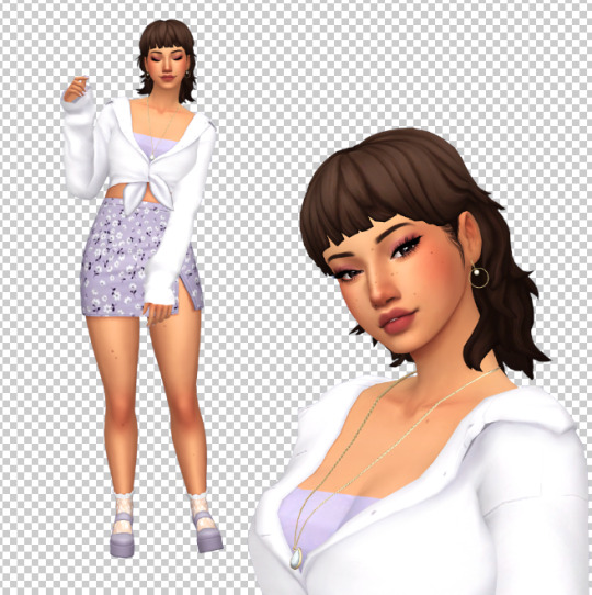
CDD ~ Fresh Start Styled Look
If you’re like me, the first thing you do in CAS is clear everything off the sim for a nice fresh canvas. This custom styled look (when coupled with Mizore’s hider mod) is intended to make that take as few steps as possible every time.
Download and info below the cut for future updates
Item Details:
Base Game Compatible
Toddler Infant - Elder; Masc & Fem frames (Added infant support on June 16, 2023; please redownload)
1 Variant (per frame)
Custom thumbnails
Needs @mizoreyukii’s Styled Looks Hider to truly be worth it. If you’re overly attached to EA’s styled looks, this cc probably isn’t for you.
Removes all accessories, clothing, shoes, makeup, skin details (excluding acne and scars), tattoos, facial hair and hair (changes color to dark brown for adultFem + children, blonde for AdultMasc, red for toddlers for all of them now I believe (I can’t remember tbh 😅 - if anyone knows how to remove the hair without changing the color, please hmu)
Does not change teeth, eyebrows, eye color, acne and scars (I couldn’t get it to remove these last 2 categories)
Tagged for all outfit categories
Added overrides (June 16, 2023) for shoes/bare feet and masc frame nude tops to resolve the look not applying to those categories after one of the recent patches. If you want to use an alternate override from someone else and it isn’t compatible automatically, (only do this if it’s not working otherwise) open your desired alternative in Sims4Studio, navigate to the warehouse tab, tick the setting box for “ShowInUI”, and save the file. (Edit June 6/20) I’ve been informed by @asixteenthrose that even with changing your desired override to have the showinui checked, you still need my overrides for the styled looks for some reason, and the desired override can’t be in a subfolder/must be in main mods folder.
Added “Stripped Start” (June 16, 2023) which affects the accessories, makeup, facial hair, clothing, and shoes, but does not affect hair, body hair, skin details, or tattoos. You can have both Fresh Start and Stripped Start in your folder at the same time or not; they should not conflict with nor do they depend on each other.
Downloads:
> SFS < (Current Version is a zip)
> Google Drive < (Current Version is a zip)
Needs: > Hider Mod for EA Looks < (by MizoreYukii)
Notes:
There is no way I would have been able to figure out this project without MizoreYukii’s How to Make Custom Styled Looks tutorial, so huge thank you to her.
This look is mainly for simmers who want nothing on their sim when they start in CAS. If there is enough demand for a version that keeps existing tattoos, skin details, and maybe hair; I might make that as a v2 down the road. After receiving nonny asks, I went ahead and added a version like this while updating the original.
I timed myself clearing every outfit category for a new sim using just this look as fast as I could, and it only took 15 seconds total.
I have added patch numbers to the files in case someone needs the outdated version.
Kijiko eyebrow texture defaults cause the fem frame teen-elder not to show Fresh Start.
1K notes
·
View notes
Text
How to Recolor Objects in TS4

Alright, you’re ready to add some custom stuff in your game. Maybe you want to recolor an outfit or add a picture of your family to your game. Whatever it is, you’re going to learn how to do it today!
Tools
Let’s start with tools you’ll need. The 1) Tool you will need is Sims 4 Studio. This is a free tool that allows you to edit content in your game. You will also need your favorite photo editor which can be Photoshop, Gimp, Canva (my fav!), etc. Whatever works!
Exporting Textures
So, there is a way to edit EA items in S4S, but we’re just going to focus on mods for today. When you open up S4S, you will see a few options to select. You’re going to choose “My Projects” (for EA items, you’d click on build, object, cas, or animation) Once you do this, a pop-up will appear and you will want to go to your mods folder and select the item you wish to recolor. Once you do that, your screen should look like this:
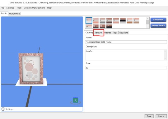
Here you see the object on the left and on the right you see the swatches and some taps with different options. You’re going to use the texture option for our purposes. The texture is basically what makes the object look the way it does. You’re going to click texture and will see this:
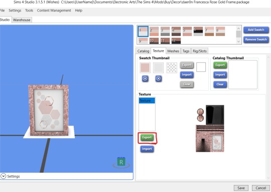
Here you see the swatch and catalog thumbnails and below that is a photo of the object. You may see other options depending on the object here, but you want the one that says texture and shows the image of the object. Once you’ve got that pick the swatch you want to edit and hit export. A pop-up will appear and you will save the image to your computer. Now here’s the fun part, editing the picture!
Editing the Texture
Now, you’re going to open up your handy dandy photo editor of choice. For this tutorial, I’ll be using Canva cause that’s my jam but it’s up to you. If you use Canva, you will need to create a design with the dimensions of the image. Tutorial on that here.
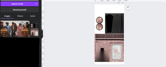
Once your design is ready for editing, you’re going to edit the part of the texture that you want to edit. For a frame, that will be the part where the photo is showing. Here is the before and after (I blacked out some story screenshots in uploaded in there previously lol)
Import Edited Textures
Alright, now we’re cooking. Now, you’re going to download your design. Note: If you’re using Canva, some objects will need you to download them with a transparent background (Pro Feature). You just select that under downloads. You can tell if you put it in S4S and it’s all white or something weird.
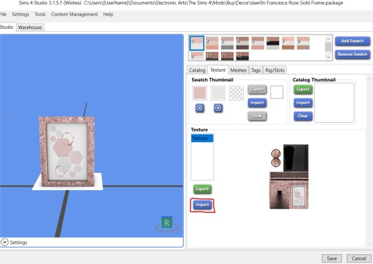
Now go back to S4S, textures, and instead of export, you’re going to hit import. You’ll get a pop-up which is where you’ll find the image you just saved and you will import it into S4S. And....

Bam! You just recolored an object. You may need to play around with it in your photo editor to get it to your liking. But, the most important thing to do is hit save at the bottom right.
You can remove old swatches by clicking the swatch and hit remove swatch or add swatches which will duplicate whichever swatch you’ve selected. I’d also recommend going to the catalog tab to change the name and/or price so it’s easier to find. You can also go to the tags tab to change where it shows up in the same. Don’t ask me about the other tabs because I have no idea lol. Yo girl only know so much!
Anyway! Hope this helps! Happy Simming!
#tutorial#blog stuff#bridgeportbritt#trying to answer common questions from the server#let me know if this makes sense#or what other tutorials you need#more on the way!#the most important info or steps are bolded
88 notes
·
View notes
Note
I love your owl house comics so much!! Do you mind sharing your art process soemtime?
Thank you! I'm glad you like them!
I've been collaborating on them with @beastalchemistva. He comes up with the idea and writes the script then I draw them out.
I start by breaking the script down into beats and sketching out some shot ideas. I like to start on paper so I can't zoom in or try to cram too much detail too early. I'll also collect reference images, like screenshots of characters and backgrounds during this step and design anything that wasn't the show (like for this one, the star guy).
Then I'll do thumbnails in Photoshop. I'll think about the composition, character expressions and poses, and how I can keep the speech bubbles flowing from left to right so it's easy to read.
The canvas is 3840x2160 (It makes it look clearer when I export it at half the size at YouTube: 1920x1080). I'll set up the perspective, sketch the background with a bigger, lighter brush and do the line art for the characters. I use a pencil looking brush that stays almost the same size no matter how hard you press. (I like drawing with felt tip pens and this is the closest I've found to that digitally.)
Then I'll clean up the background with a thinner line than I used for the character lines. Then I color the characters. I'm still figuring out color, so I'll collect the base character colors from my reference screenshots using the ones with the most natural lighting. Then I can compare the normal colors to how it changes in the weird purple light of the Collectors world.
Then I color the background and put a mask layer over the character colors and tweak it until it better matches the background colors. For this one, I just laid down dark blue, set it to multiply, 30% opacity.
To add speech bubble, I'll draw out the white part and add this layer style to give it a black outline. The font is just some basic comic font I downloaded for free.

Since @beastalchemistva commissions me to make these for him to dub on YouTube, I make them 16x9 to fit the screen. When they're done, I edit them into a comic format. Cropping, moving things around, taking out extra frames, changing speech bubble shapes so they work as a comic.
And that's about it! This is my first time trying to explain my process so if I left anything out let me know and I'll try to answer it
(Also go check out the finished video version heeeeere)
#asks#comic#tutorial#i guess?#would you guys be interested in more stuff like this?#I could do a walkthrough on how i shade stuff#that could be cool#or character design maybe?
8 notes
·
View notes
Note
hi! i was wondering how do you make your lookbooks? im horrible at photoshop/gimp so if you could, could you describe it in detail of what to do?
hi there! i'm so sorry for the late reply! i made a mini tutorial here going into detail on how i take pictures of my sims in cas and how i edit them! i use paint tool sai for the majority of my edits and add filters in photoshop. here’s a more detailed process on how i edit my lookbooks after this step (under the cut)
this part of my editing process mostly uses clipping layers and selection tool, so it’s a good idea to get familiar with those. i’ve never used gimp before, but i know that photoshop has both of these tools and i know there are other art/photo editing programs that do too (procreate, clip studio paint, sai, etc).
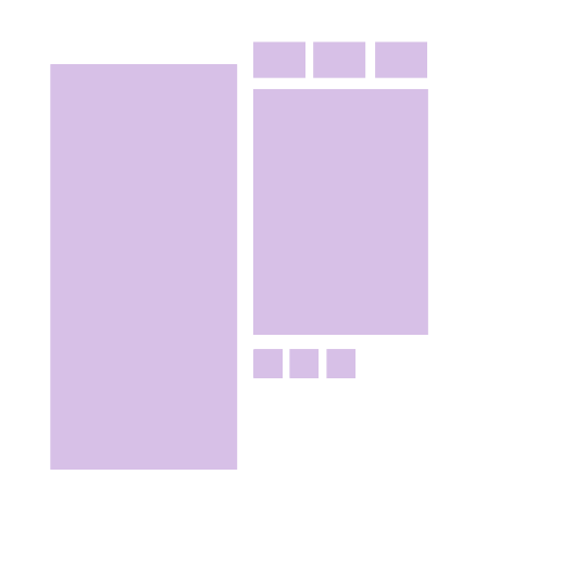
once i’m finished cutting out the background from cas and editing my sims, i arrange them on my canvas in a way i like:
the checkered background shows that it is transparent, so i am able to add a background underneath the sim
i add a layer below my sim to act as my “photo template”. i use a template so i know where to put my images below my sim. i included the png below so you can feel free to use it for your own lookbooks. you can also make your own if you’d like and mess around with the layout for your background.
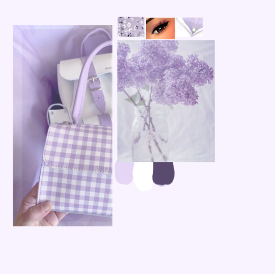
once i have my template ready, i gather some photos from pinterest that i feel match my lookbook. i usually try to go by the colour scheme or general aesthetic of the look. i then loosely arrange the photos over the template. they don’t have to perfectly overlap since we’ll be clipping them in the next part
this next part can be a bit tricky to describe so just bear with me haha,, basically, i use clipping layers to add my photos and cut them to the template without having to erase any of the excess. when you “clip” a layer to another layer in photoshop, it will essentially take the shape of that layer?? i’m not the best at explaining it but its a really easy way to add my photos without having to specifically crop them to perfectly fit the template.
to clip layers in photoshop, first put your photo layer above your template layer
then go up to your “layer” option in the menu bar and select “create clipping mask”.
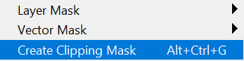
you can also hold the alt key and position your mouse so it’s between the two layers, then click, as a shortcut. i prefer doing this since it’s faster and especially more helpful when i have to clip multiple layers
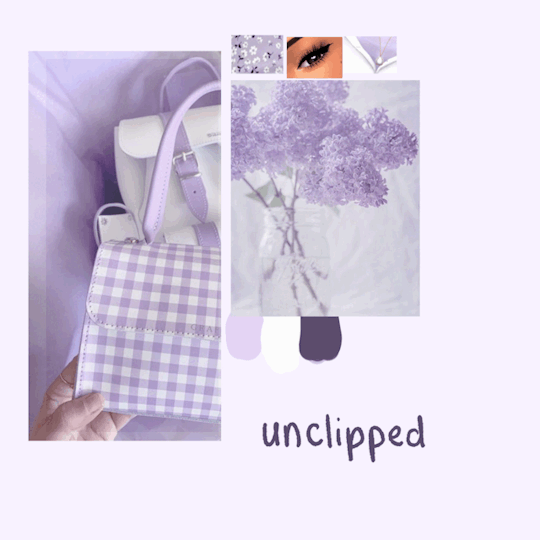
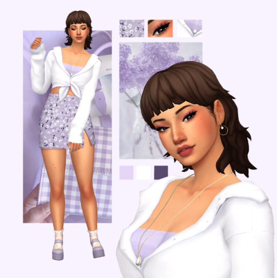
here’s a look at what the photos look like clipped vs unclipped:
if you’re still confused on clipping layers, you can find a more in depth explanation here :)
once i have my background ready, i’ll add my sim and make adjustments if necessary
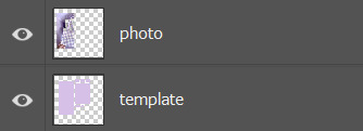
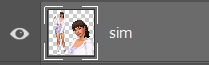
you can leave it here if you’d like, but i like to take it one step further by adding a subtle shadow underneath to add some dimension and separate the background from the sim! i start by making a selection of my sim. this can be done easily by holding + clicking the ctrl key over the thumbnail of your sim layer. its important to make sure that your sim is on a transparent layer so you get a clean selection of the sims silhouette
your selection should look something like this
with the selection made, make a new layer below your sim layer for your shadow. then, select a dark colour and use the paint bucket tool to fill in your selection. i try to avoid using a pure black for the shadow since it tends to look pretty harsh, and try and pick something similar to the colours of the layout. for this one, i went with a dark purple.
your layer should look something like this
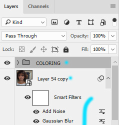
i then add a blur by going into filter > blur > gaussian blur, then adjust according to preference. you should have something like this
i then add my sim back and adjust the opacity of my shadow layer if needed
and here’s what the finished lookbook looks like! i hope this made sense and was helpful in some sort of way,, feel free to experiment with this method and create some cool stuff :)
31 notes
·
View notes
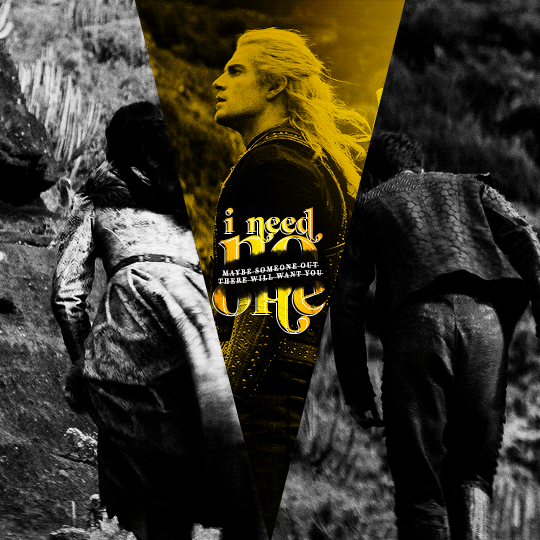
Photo
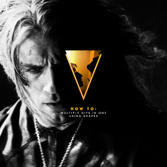
I've recently been asked by several lovely and curious souls to break down this Witcher set, so I thought I’d go ahead and put together a proper tutorial for everyone. All you need is Photoshop and basic giffing knowledge, preferably using the timeline. This isn't necessarily simple, but I would say it's one of the simpler things I've done—somewhere between easy and medium difficulty, maybe.
I. MAKE YOUR BASE GIF
To start, we’re going to be making our base/background gif, which is 540x540. You can color it any way you’d like, but I picked black and white for that particular set because I didn’t want the final product to be too ‘busy’. I wanted to keep the attention on a pop of color at the center instead, which ended up being the second gif and the text.
As a quick sidenote:
Since the gif is so big, I would recommend using at least 1080p footage. I’d recommend always using 1080p footage regardless, but I wouldn’t call it 100% necessary unless you’re making larger (540px, as opposed to 268px or 177px) gifs.
Keeping in mind that the second gif and text will be going in the center of the gif, you’ll want to align the subject/s accordingly. For example, I kept Geralt and Jaskier and Yennefer mostly to the left or right.

Here is the base gif I'll be using:

And here is a tutorial on how I make my black and white gifs if you’d like to get the same grain effect.
II. MAKE YOUR [SHAPE] GIF
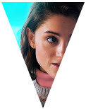
Next is the gif for the shape. Sizing is up to you and ultimately depends on the shape you choose. For me, I know I want an isosceles triangle, so the height of my gif is going to be slightly bigger than the width. My dimensions in the original set were 118x150, so I’ll be making my gif 122x154. You want to oversize here since we’ll be trimming the edges off later on.
After sharpening and coloring, this is what my gif looks like:

III. GROUP YOUR LAYERS
Sounds simple, right? And it is, but it’s as pivotal as it is easy. Maybe it’s dramatic of me to say that I live and breathe by this step, but I kind of do live and breathe by this step. It’s the same technique from this tutorial, and it’s a pivotal step in my blending process also.
Having said that, let’s put all your layers in a group. Do this for both gifs!
CTRL + A or Select > All
Layer > Layer Mask > Reveal Selection

IV. CUT OUT YOUR SHAPE
You can go about this a couple of different ways, but regardless, it’s as simple as editing your layer mask. No, really. It’s why I love grouping layers and slapping a layer mask on. It makes life so much easier in the long run.
➥ PHOTOSHOP’S CUSTOM SHAPE TOOL
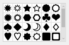
The Custom Shape tool on Photoshop has all the basic shapes you need. Triangles, circles (even though you could just use the round selection tool), stars, and even all the playing suits.
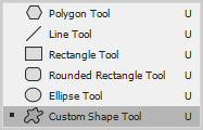
Go ahead and pick a shape to add to your canvas if you haven’t already. Don’t worry too much about the dimensions; you can manually input a specific width and height at the top. Rotate it if you need to (I’ll be rotating my triangle 180° so that it’s upside down) or leave it as is, but when you have it sized the way you’d like, center it and then merge it with a new layer. This way, we can right click on the layer thumbnail and select ‘Select Pixels’.

Next, click on the group layer mask. Invert your selection [SHIFT + CTRL + I or Select > Inverse] and then invert that part of the mask [CTRL + I or Image > Adjustments > Inverse]. Your gif should now be shaped accordingly.
➥ B&W TEXTURES AND VECTORS/PNGs
Alternatively, if you don’t want to limit yourself to basic shapes, you can use a texture or png of anything at all. An instrument, a specific symbol, something abstract, maybe even a flower—it can be literally anything, so long as it’s pure black and pure white. (If you aren’t familiar with how layer masks work, white is what shows and black is what’s hidden. Anything in between and what you get is partially or not all the way transparent, which will look wonky when the smaller gif goes on top of the base gif.)
For example, here’s an icon template by @argetnallison:

Select your image (CTRL + A or Select > All) and copy it.
Go back to your gif. Press ALT and click on the group layer mask at the same time. This will pull up your layer mask.
Paste your image onto the layer mask.
Et voila, as the French and magicians and... other various individuals including myself say.
➥ PAINT BRUSHES
If you’re like me and have a bunch of custom brush sets downloaded, brushes are another way to get fun shapes. If you don’t have any downloaded but are interested in trying it out for yourself, DeviantArt and Brusheezy are the best (or at least my favorite) places to look for them.
It’s the same steps as above, but painting instead of pasting.
V. FINISHING TOUCHES
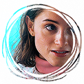
Now that you’re probably sick of me going on and on about shapes this and shapes that—we get it, Ava, there are shapes, get on with it—it’s time to drag the gif shape onto the base.
To center, because I am admittedly border-obsessive when it comes to things being perfectly 100% centered, I set guides [View > New Guide] in the middle. It’s your width and height divided by two, so I have a vertical guide at 270 and a horizontal guide at 270.
For a “3D” (I don’t know what else to call it, other than “well, I just thought it looked neat”) effect, I added a gradient with the same exact layer mask as my gif shape and positioned it underneath and slightly below the gif.
All that’s left is to add text (I wrote a mini tutorial on gradient text here if you’re interested) and we’re finally done!
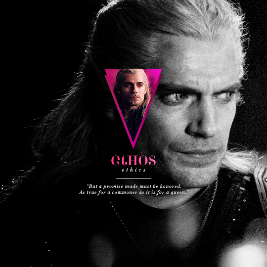
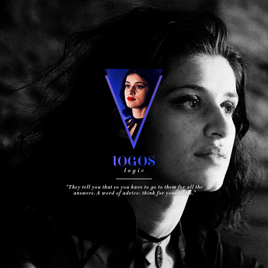
You can also do this with more than one shape, like here:
Or make the shape full-scale, like here:
Happy editing!
#completeresources#allresources#yeahps#itsphotoshop#resources#tutorials#ps asks#mine*#as always feel free to reach out if any of this is confusing#i'm sleep deprived so i feel like the chances of that are pretty likely
1K notes
·
View notes
Note
I really love your moodboards so much!!!! What advice do you have for making them?? Because I've ALWAYS wanted to make them but never known where to start!!
Hi. Thank you. 😊
Advice, hmm. I'd say figuring out what software/app you like using best is important. There's lots out there that can help making moodboards and it will also depend on if you're creating on desktop or on mobile. I settled on Canva which I mainly use on desktop, though their mobile app has improved lots in the last few years so I sometimes use that to make drafts/minor edits. Pic Collage is another popular one. Probably best to try several and see which you get on with.
For photos...Learning how to use Google image search options is very helpful, so you can find images that better fit what you're looking for, especially to set it to high quality. I mainly use that to find actor images, from interviews or promos or photoshoots. When I find an image I like I just right-click and save image as, but it's important to check it hasn't saved a smaller thumbnail version of the picture because that occasionally happens! Sometimes images save as a webp image rather than usual jpeg/png and not all software supports that - I think you can convert them to jpeg or png somehow, but I tend to just use Windows Snipping Tool to capture the image instead as it lets you drag a rectangle on screen to copy what you see in that area to a jpeg or png.
I have a lot of free stock photo websites bookmarked so that if I can't find something I like on one there's plenty more options - Pixabay, Pexels & unsplash are a few that come to mind. Some of them also have mobile apps available. I also pay for Canva Pro as that has a lot more stock images built in to Canva then, but Canva also has some free ones, as well as the ability to upload to your account any images you download from the web in your searches. You do have to get quite creative on search terms sometimes because stock photos aren't very well captioned. It also helps if you have the source material to take your own screenshots (I use the 'take a snapshot' feature in VLC media player with tv/films) but if you don't have access to the source material then finding a HQ screencaps website to use is good. Also, either Windows Snipping Tool or software like ShareX can be used to get screencaps from streaming sites if you're on desktop.
More general advice would be, have a look at lots of moodboards/aesthetics and figure out what you like about them, what catches your eye visually, what formats you like (3x3 grid, 2x4 grid etc). But bear in mind everyone has their own style and you might not know what yours is like for a while. I really admire minimalist aesthetics - where it's 1 item centred per picture on a plain background - and I tried my hand at those when I started out but I never had much success doing those because it turns out my style is very much about colour most of the time. These days, I try to have a few key colours to tie the different pictures together and usually no more than 2 types of font. I also try to balance the pictures in terms of light/dark and spread of colours, to have some kind of symmetry but that's sort of hard to explain well without examples.
I possibly rambled on too long but I hope some of this was helpful. <3
3 notes
·
View notes
Text
Free Tools For Your YouTube Channel Growth
60 hours of video are uploaded every minute, or one hour of video is uploaded to YouTube every second. Wow! This makes the competition very high! But what if you could succeed in this amazing platform despite this high competition? In this article, we will present 6 free YouTube tools that can boost your channel growth and provide you with new subscribers every day.
Of course, we are not here talking about buying subscribers to grow your channel. If you are already doing this, please stop it. This is totally wrong.
Instead, let's start looking to really grow your channel.
Don't know where to start? Here are the 6 Free YouTube Tools that will help you grow your YouTube channel Today.
6 Free YouTube Tools to Grow Your Channel
Morningfa.me
You can get access to this tool through their website Morningfa.me.
Morningfa.me helps you understand and analyze each of your videos and helps you create videos to grow and rank on YouTube. We have mainly two services in this application.
The first one is the analytics, you can see in-depth analytics, and it will show your videos and your channel in a different way than traditional analytics.
With Morningfa.me you can understand what kind of videos to create next, how to rank, how to promote and how to grow your channel in a different way.

Another free YouTube tool Morningfa.me uses to grow your channel
Morningfa.me also has a keyword tool that helps you plan for your next videos by searching for topics or selecting a video of yours to emulate (or create similar videos of) to grow.
You can select a video from YouTube, and it will give you the best tags and titles to rank.
This free tool will aid you in growing your YouTube channel.
H-Supertools
This is one of the best applications I use to help me rank my YouTube videos better and earn me more money.
H-Supertools' SEO tools and YouTube keyword tool help you with mainly two things:
In content research, you get and search for content ideas for your videos.
Helps you rank on top of YouTube by getting the best keywords.
For example, if you search for email marketing, it will show you around 247 topics or keyword ideas about it.
You can search for whatever you want and what’s nice is that it will give you monthly volume and difficulty for each keyword.
So you can select a keyword with high search volume and low difficulty to rank on YouTube. You can also use the SEO keyword research tool to get the CPC (Cost per Click).
So H-Supertools helps you earn more money with Google Adsense. Here's a screenshot from my analytics.

You can see in revenue that my CPM is $54, so advertisers pay up to that much for every 1000 views in some cases.
It is very important to select the correct keywords with high CPC so you can increase your Adsense revenue.
So be sure to visit H-Supertools to help grow your channel.
Social Bluebook
Go now and sign up because what’s nice about this tool is that it will give you the value of your YouTube channel!
For example, if you want to sponsor a service or someone on your channel, you'll know what to charge with the help of Social Bluebook.

You can see that the price is around $263 per upload for my channel and it can range up to $434 per upload in my case. You can add your own channel and see your suggested value of uploading a video and advertising someone on your channel.
It is very important in case you want to sponsor someone and earn more money on YouTube.
Canva.com free youtube tool
One of the best tools to create YouTube thumbnails, YouTube channel arts, and any banners.
Canva has a big library of templates that you can choose from and edit how you want.
Canva has a lot of features, tools, effects, photos, libraries templates to help you create an awesome YouTube thumbnail and you can start for free.
If you want to get more templates, more elements, more images, some more effects, you can go with the paid version which is like $11 per month.
It's a must-have tool that makes creating images for your YouTube thumbnails and channel arts super easy. In fact, many of the images here are created with the help of Canva!

TubeBuddy
Next up in the list of 6 free tools to grow on YouTube is TubeBuddy, it’s one of the best tools to grow your channel, analyze it, and much more.
TubeBuddy has a feature to track your keywords, so if you provide your keywords, it will give a weekly report of the keyword rankings on YouTube.
Tubebuddy helps grow your video SEO.
Their A/B split test allows comparing different thumbnails and seeing which one is working better for future videos.

It is an awesome tool and I highly recommend it to grow your channel.
Fontjoy.com
Fontjoy simply helps you choose fonts if you want to create an awesome thumbnail. Clicking on “generate” will give you a combination of different fonts.

Check out a few fonts and if you like some of them, you can use them in your own thumbnails.
It will redirect you to Google Fonts where you can download the font family to use it in whatever software you create thumbnails with.
Conclusion
So these are 6 tools to grow your YouTube channel, I use them every day to grow my channel and make it look like the way it is now. My channel grew 80% more than when I started using all these tools together, so please check them out.
If you found this helpful make sure to let us know in the comments below. Feel free to ask me anything!
#youtube#youtube ideas#youtube tools#morningfame#canva#Fontjoy.com#socialbluebooks#socila bluebook#tubebuddy#fontjoy
15 notes
·
View notes