#no matter the format or size of the video
Explore tagged Tumblr posts
Text
youtube
hey guys , i had a lot of hollow mind feelings these past 2 weeks. have a hollow mind animation
#sorry about the yt link again it absolutely refuses to embed any video i put in#no matter the format or size of the video#the owl house#toh#fan animatic#video#animation#hollow mind#hunter noceda#luz noceda#phillip wittebane#emporer belos#i rewatched hollow mind again and got inspo to finish off a project i thumbnailed back in october#sorry i was feeling silly ):#thanks for 24k btw!! that is an insane number.#Youtube
968 notes
·
View notes
Text
aes' video game gif making tutorial 2024 Part 1
Using your own footage. While everything regarding photoshop can be applied to nearly all media, apart from long form videos(5+mins) and videos not in mp4 format; I am still focusing on walking you through making your own footage look as nice as possible.
Needed:
A game and potentially mods for said game
Camera tools for various games (optional)
OBS
Photoshop
My gif making actions so you too can be fast
This tutorial simply opens your recorded footage in photoshop, no other screen cap software is required. Lets fucking go!
[Part 2]
INTRO: From Skyrim to Destiny, recording your own footage of various games is the best method of making your own gifs.
The reason for this is myriad;
+ less artifacting vs YT vids, as seen below

+ you’ll have more control over the content + you can have personal characters + you can alter the settings of the game to be better for gif making purposes
While this tutorial does walk you through most of the steps it is light on exactly/why I use various adjustment layers for coloring, mostly because tumblr began to block my images/links. Other folks have tutorials but I can make one if its something people want.
But the real purpose of this tutorial is to cut the time it take to make gifs down by just opening your file vs. screencaping and so on.
1. Select your game and edit game settings for gif making.
Because we are using OBS, and recording the screen and not the game itself(more on this later), what game you are playing matters little.
Other paid programs like FRAPS still work, as do some free programs like Afterburner/RivaTuner, but when it comes to multiplayer, some may be caught by various anti-cheats and shut down. (ESO will not launch if afterburn is already open, for example). OBS has simply been my go to for around seven years.
Settings.
Please feel free to play around with your game settings to find what works, you may even play a game on different settings from what you record footage under. I do not play with DOF settings on in games but do record with them on.
Dropping your screen-size from and being able to turn on ultra vs medium settings may make your gifs look much better as another example.
+ At least 30FPS, try to avoid stuttering, lower the settings if needed. + Avoid crushing of blacks or blown out whites, especially when giffing POC! Adjust brightness and gamma as needed, HDR isn't your friend here. + While dark nights maybe more realistic and challenging for you, it often produces a dark gif in which nothing can be seen. + Turn off motion blur and film grain, these both add needless file size and look off when scaled down in photoshop. If you want grain add some after. + 720p is about as low for footage as you want to go unless making gifs for very old games. Work with what you have with old games. + Using mods and things like reshade can make your game shine.
Example time; ENB only on top, heavily modded on bottom, no adjustments were made in photoshop.
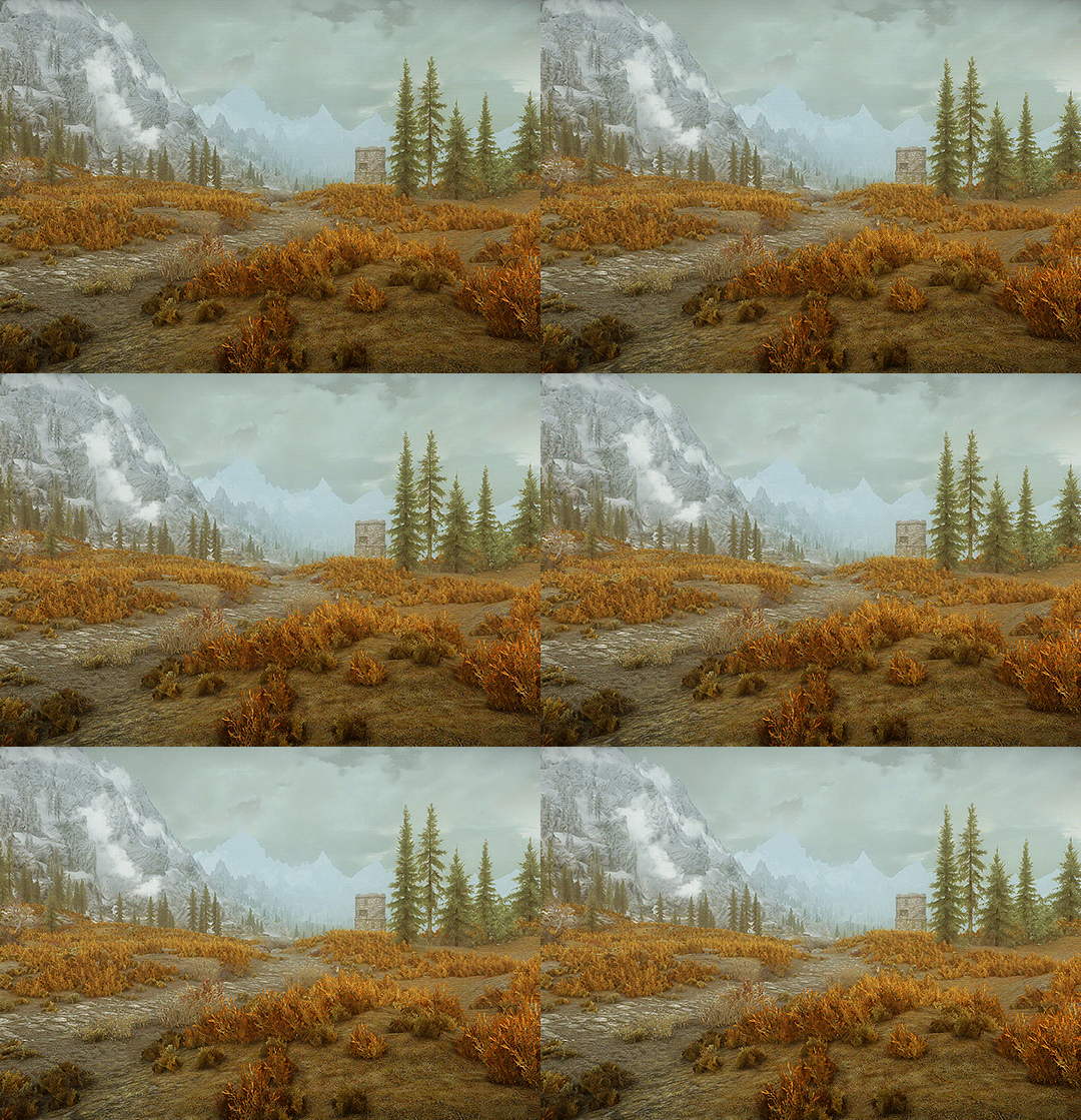
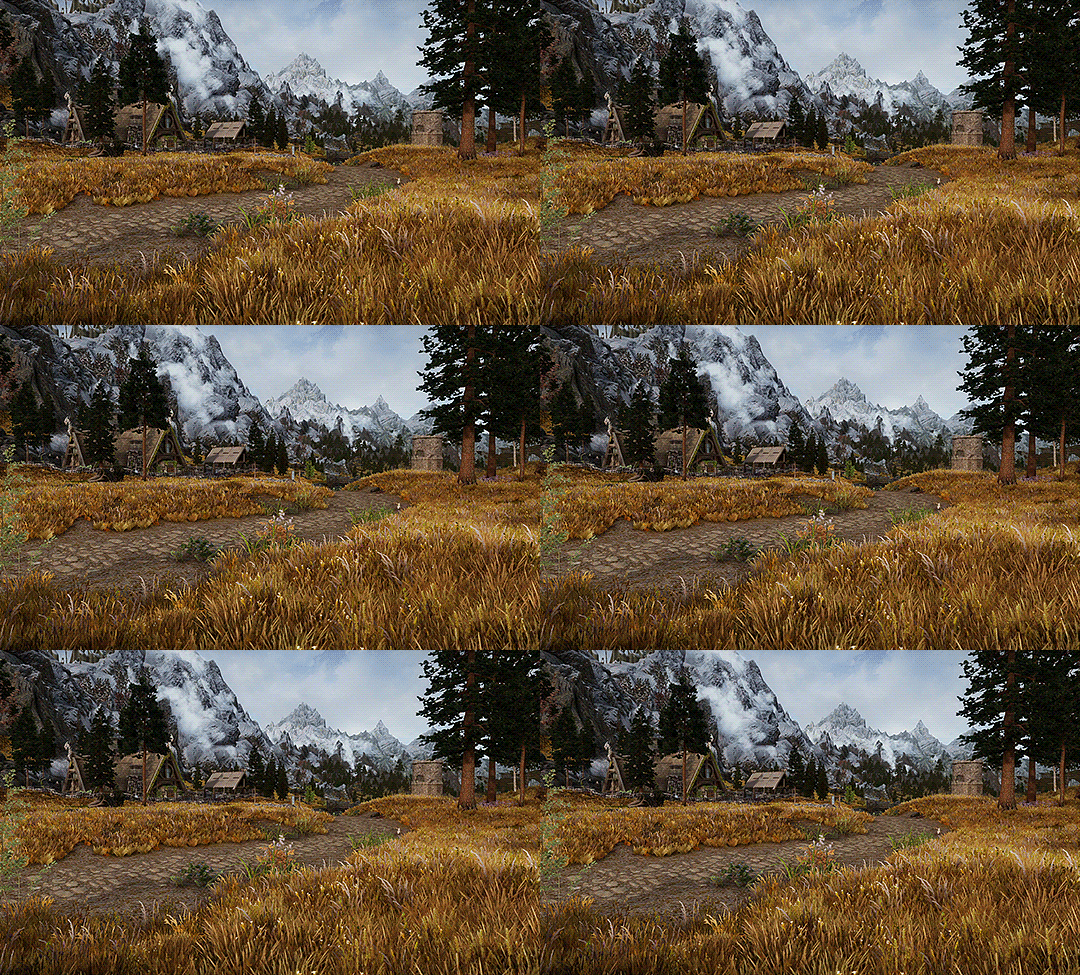
Modding can really alter a game.
Skyrim is very famous for it, but everything from Mass Effect to Pathfinder: Wrath of the Righteous have visual mods! They can make your footage stand out immensely, they can make your FPS drop, or even make it better.
Please be respectful of mod authors. As someone who made them in the past, we are not content farms, we are just folks with a fun hobby like gif making!
I highly suggest any mod that removes screen blur, vignette and film grain!
2. Camera Tools (optional)
So you have your game, now it's time to learn what camera tools exist, if any, for your game. Many games like Rogue Trader and Dragon Age, have free camera mods. Some games like Bethesda games and some Mass Effects, have built in, or partially built in fly cams.
I used to back in the day before DA:O had camera tools back myself into a corner and swing the over-the-shoulder camera around to get gifs, so you have to work with what you have.
If you want to go the paid route there are plenty of camera mods available from assassin’s creed games to BG3. These are generally of better quality and work smoothly, but check around for reviews before you dish out your hard earned money!
Each of these tools will have different commands that you will have to learn.
3. Obtain OBS & set it up
Why OBS?
It's free, it uses very little of your computer's resources. OBS also allows you to switch between screen recording, what I always use, and recording a specific program. Many other recording programs will not record some very old games, some can't record specific games.
Add to that, some hardware recording software will not record shadows or can get light values wrong and you are fighting a battle game after game. So I just go for what's free and works consistently.
I've only known one person for whom OBS failed to work, and that I think was a version issue.
Install OBS, and then make a specific scene all the way on the left;

You can rename this or duplicate it if you also intend to stream(right clicking scene will bring up the menu to do so), I don't use OBS when streaming so I leave this as is.
Right click on the source and ensure it is set as Display Capture. Because some, especially older games, won't work with Game Capture you are going to record the screen. Double click Display Capture if you have multiple screens(I have 2) and select which you want to record!
Next we need to go into settings, over there on the right under Controls. Once in settings, go down to Video and keep the base and output values whatever your actual display size is. I have a 1440 display so it's set to 1440, if you are running 720 make sure it's 720 and so forth.
Ensure 30fps is chosen. Anything more is overkill, for both photoshop and your rig!

Next go to Hotkeys. This will be different if you are using OBS to stream as well, but because I am not, I cleared everything but the recording hotkeys and I assigned them to scroll lock. This is because I've yet to encounter any game or mod that uses the key for anything. Use what makes sense for you, however.

Finally make your way to Output, this is important. Ignore streaming, look at Recording.

+ Pick a folder you want to save in + pick indistinguishable quality, large file size. + Pick MP4+ which encoder you use is up to your system! This is the one that made sense for me and my system. There are tons of videos on YT that go over each encoder. Also here https://obsproject.com/kb/audio-video-formats-guide is the official guide. We need to be able to open the file in photoshop so I tend to lean toward H.264.
3. Test OBS and your game footage together!
Go into your game, record a menu!
If you see something weird here, like your game footage not actually recording, troubleshoot!
With your recording you shouldn't see any stretching.
Now go into game and for 3-5 seconds record you playing, if something isn't recording well, again, troubleshoot. OBS takes a small amount of resources but for older rigs you may need to adjust settings in either game or OBS to get better recordings.
Once you are comfortable, it's time to go wild!
4. Record your gif footage.
+ 5 second clips are best for scenery gifs, + anything from 2-10 seconds can be used for a character talking + anything more than 10 seconds? You'll hit tumblr's limits instantly and will need to make multiple gifs. Which isn't a big deal, but do make note of it as it is much harder for older rigs to open a 5 min 1440p recording than 10 seconds. Depending on the rig it may not even open, so try and make several recordings rather than one long one.
5. Photoshop set up if you pirated an older version
If your gifs look weirdly stretched, check pixel ratio! If your photoshop is legit, or you know that it isn't stretching your gifs wildly you can skip this step.
I don't care how you obtain photoshop, but photoshop has had the ability to open MP4 videos for nearly 15 years. You do not need to, and I do not encourage you to use any screencapping software. That's great for long-form videos, but my computer 12 years ago could open a 5min music video fine and it was a potato.
Often photoshop 'portable' aka pirated photoshop comes with some wild settings, namely, pixel ratio changes. Please check this first;

And look at what default is actually set at, if your gifs always look stretched oddly when uploaded to tumblr.
It should be 1:1.
Then look at,

Again set it to square! Newer photoshop, and non-pirated versions often will let you look at other aspect ratios but won't save weirdly. so 2:1 will still save to 1:1, this hasn’t always been the case with cracked photoshop, especially the version from around 2014.
6. Open

Either drag in all your videos, or just... file → open.
This is why you saved as 5 seconds and MP4, so you didn't need any extra steps!
++Please be aware that older/weaker rigs and laptops can struggle, and if you are seeing crazy hot temps and such its an issue. Seeing Photoshop pause to open/play an action is normal but not chugging. I tell you this so you remember to dust your case and give your hardware some love, fiddle with settings and if this straight up doesn't work with your version of photoshop it might not be for you.
7. Crop your videos
Once you have your video/s open, select the crop tool. (it should be right here in the default setup. or Simply press C on newer Photoshops)

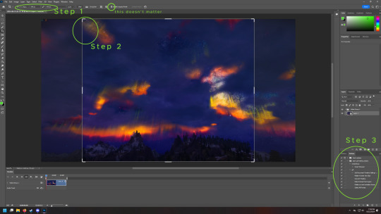
Step 1- in the far left box you want to select Width by Height and then type what size you want to crop to. Height Matters little but Width does matter.
Here are tumblr’s current 2024 sizes again!

10mb is the max, anything more will have a new compression algorithm applied to make it under 10mb.
Please look at the sizes closely. I'll give you an example! Lets say you make your widest gif 1000 pixels, a common wrong size.

I could only fit 20 frames in this bad boy, and its squished, despite the saving compression used, tumblr eats the quality to make it pixelated/artifact-filled.
Compare that to this, 66frames

Slightly different cropping but you get the point.
Same thing with using 540px in the 268px spot.


Compare it to the gifs below which is a 4.83mb 133 frame image in the 268 spot. see how it's less pixelated?
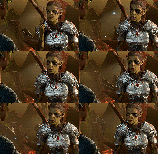

Now back to that Image. Lets talk about... Step 2. Select a range from within the image, try to avoid going to the edges, otherwise you get a 1 pixel wide transparent line. It's hard to see on some blogs, and so obvious on others. Mobile users won't likely see it, but it does take a slight amount more file size as well.
This is what I mean.
Step 3. Time is money, friend. And by this I mean I am going to provide you with the means to skip a TON of steps in the gif making process and just use my action, I'm even going to help you figure out how to fix it when it fails. For the low price of free. If you want the how to, I can break down what all the action is doing, but I haven't even thought about these steps in about 8 years or so.
PART 2 THIS WAY
(because tumblr hates more than 30 images)
46 notes
·
View notes
Note
a gifmaking tutorial would actually be super appreciated :)
Okay, this is gonna get long and it might not be great but I will do my best to make it understandable.
Put under a read more cause we're not forcing anyone to look at all this.
We're gonna make this gif:

First of all you'll need 3 software programs downloaded.
4k downloader (to download videos)
Gomplayer (to get the frames from the videos)
Photoshop (I pay for it but there are other ways)
Some things to keep in mind
better quality video = better quality gifs
if you want videos in 4k you have to download them in MKV format as MP4s can't be 4k.
gifs can only contain 256 colours so gifs with a lot of different colours might get grainy.
if you use low quality videos or upscaled videos they sometimes have duplicate frames which will make the animations look weird, but you can easily remove those extra frames.
tumblr only accepts gifs under 10mb in size so all gifs have to be less than that (photos less than 20mb)
you can put up to 30 gifs/images in one post
ok here we go
Step 1: Download video
Step 2: Get the frames from the video
You will play the video using Gomplayer
Find the part you want to GIF
Press CTRL + G to bring up this menu

I haven't experimented much with these settings but you'll want to choose the place you want your frames to end up so you can find them later
4. Have the Capture all frames box checked (unless it's 60fps then do 0.03). You can capture up to 999 frames in one go.
5. Press "burst capture" and it will start getting the frames (video has to be playing) it will look like this.

6. Great you have your frames.
Step 3. Making a GIF
Open Photoshop
Load Files Into Stack

This will open the folders on your computer so navigate to where you put your frames and select the frames you want by clicking on the first and holding shift while clicking on the last.
3. Wait for PS to load the frames
4. Once it's all loaded the first thing you'll do is crop it. Press 'C' on your keyboard. There are a couple presets you can use or you can 'clear' that and crop however you wish.

I always crop out at least a little of the top and bottom cause there can be dark lines there.

5. Resize: for optimal quality on tumblr there are three sizes to keep in mind.

For sets like this with 3 gifs next to each other the width should be 177p, height does not matter.

For sets like this with 2 gifs next to each other the width should be 268p

And for a set like we're doing today with just 1 gif it's 540p
You'll want to memorise these numbers for future use.
177p, 268p or 540p will be the width of your gifs.
To open the resize menu you press CTRL + ALT + i

Change the width to in this case 540p (p as in pixels)

It will auto match the height to keep the same proportions.
Click OK and wait until it's done.
6. Make sure you have the 'timeline' window up at the bottom of your photoshop

7. Click 'create frame animation' (button might say video timeline but change that by pressing that little arrow next to it)

8. Press the button with three lines in the top right of the 'timeline' window and press 'make frames from layers'

9. The frames will have loaded in in reverse order so open the same menu and click 'reverse frames'
Step 4. Blurring the logo/text (optional)
Since we have a logo in there I will want to blur it but you might not have one or you don't care if there's a logo or text in your gifs.
First we have to make the gif into a smart object.
Select all layers by pressing CTRL + ALT + A
Convert into a 'video timeline' by pressing the button in the bottom left of the timeline window

3. Right click on your layers and click on 'convert to smart object'

4. Press Z to switch to the zoom and zoom in on your logo/text.
5. Press L to switch to the lasso tool and select your logo/text

there should now be a line where you selected.
6. Open 'Gaussian Blur'

7. Click OK
Now we have to get our GIF back to the frame timeline.
8. Click 'flatten frame into clips' using the timeline menu

9. Press 'delete' once to remove the smart object

10. Convert back to frame animation

11. Make frames from layers

No need to reverse this time. But now your logo/text is blurred, as long as it doesn't move but that's a topic for another day.
Step 5: Sharpening
If you didn't have something to blur let's go over smart objects again.
Select all layers by pressing CTRL + ALT + A
Convert into a 'video timeline' by pressing the button in the bottom left of the timeline window

3. Right click on your layers and click on 'convert to smart object'

5. Camera Raw Filter (Optional)
I use this for base editing of colours and the overall clearness of GIFs, it's not made for that tho it sometimes gets buggy. Works best on photos.
Press CTRL + SHIFT + A to open this.

It's best to do as little as possible in here as it can bug out.
I mostly mess with the effects, light and detail settings in here, don't touch the sharpening though cause we will use smart sharpen for that.
6. Smart Shapening
Most people have a sharpening action they use, including me. But you can also do it manually. You can find my actions in here.
To do it manually and make your own settings. This is how you open smart sharpen.

If you use my sharpening action remember it can be a bit much sometimes, in that case hide the second layer

Use an action or mess around to find a sharpening setting that looks good on your gif, usually don't need much.
Now we have to get our GIF back to the frame timeline.
7. Click 'flatten frame into clips' using the timeline menu (I'm low on images to use check the blur section for images)
It might take a minute since it has to process the new settings.
8. Press 'delete' once to remove the smart object
9. Convert back to frame animation
10. Make frames from layers
11. Select all your frames to set the framerate

You can click on any frame for this. Click 'other' and set it to 0,06.
12. Press CTRL + SHIFT + ALT + S to open 'Save for Web'

these are my save settings.
Click save and name and place it wherever you want it saved.

Congrats you've made a gif.
Step 6: Colouring
Now we have a problem cause there's already 30 images in this post.
For colouring I have a psd I use and adjust to the individual set. It's in my google drive you can find it here along with my actions.
If you're making several gifs from one video you'll want to adjust to the first and then copy that over to keep things matching.
We can go more in depth on this but that would have to be a different post since I can't put more images in this one.
Step 7: Watermark (optional)
A lot of GIF makers have watermarks these days as there's a lot of people who repost GIFs without credit. Make your own so people know the GIFs are yours even when posted elsewhere.
Step 8: Post
Post your hard work on your tumblr, use a bunch of tags so people have a higher chance of seeing it.
I hope this post was understandable and clear, let me know if you have any questions and if you want a proper colouring post.
31 notes
·
View notes
Note
How do you come up with your poses? They all seem so cool and I struggle with coming up with anything/finding references.
Posing huh? This is quite an interesting topic so let's have a real talk about it. Though it won't obviously cover every single details there could be and explanations may be sloppy, I am no real art teacher after all. By the way I apologize in advance if there is any messy spelling or grammar mistake as english is not my first language.
To begin with, let's say the key words here are force lines, simplicity and body langage. Anatomy is a whole another topic so I won't talk too much about muscles and bones, as we are mainly here for posing.
Firstly, what are force lines? To put it simply, a force line is the core line guiding the figure's movement but also the whole composition, thus also guiding the eye itself toward (or away) the most important parts. With shipping, Soukoku in particular (since they have different temperaments), I like to have two lines that complement each other, via either inner or outer curves.
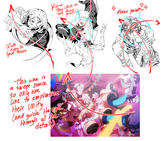
But those are whole compositions and we're not in a composition class either. However, when it comes to a single pose, the same principle can be applied. This force line can guide your whole body and even become your literal spine. As the spine is the most essential part of the human body (and non-human living body), it will act as the central part which the rest will follow naturally. Don't be shy and use a stickman for your overall structure! If you have a hard time simplifying the overall movement of your figure, try drawing it in a smaller size first. It doesn't matter if it looks ugly, you'll clean it up later.

If you're still struggling with your understanding of structures, try to decompose a reference picture (go check Pinterest, it's a true gold mine) with simple lines to determine where and how are positioned the spine, ribcages and main bones then transpose it to your own drawing as a guide.
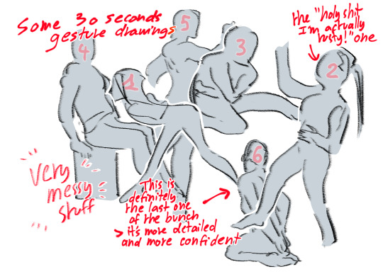
"But how do I get those dynamic lines and cool curves??", you may ask. Well, have you tried figure drawing and more specifically gesture drawing? You can of course take a class with a nude model (they don't bite don't worry and you will focus more on the art part than the nude one), but you can also do so with tons of videos, pictures and even websites such as Line of Action, which allows you to have a custom built-in timer when drawing. To have only a mere 30 seconds to draw may sound terrifying but trust me, it's not that difficult. The point of drawing a whole figure in 30 seconds (or more) is to force yourself to simplify and avoid to focus on unimportant parts that aren't essential to the overall understanding of the pose. This will put you in a focused state of mind as well as training your hand muscles (this is a great warmup exercise). Feeling a bit uncomfortable on your wrist or feeling like you can only do tiny strokes one at a time instead of big elegant lines? Well firstly... stretch your wrist regularly, drink water and stop drawing every once in a while, this is very important, may you be a beginner or a professionnal artist. Secondly, try drawing on a bigger format! It will train you to use your elbow and shoulders to draw big lines more easily, like getting a bigger compass to draw a circle. I for example draw mostly with my elbow and shoulders, even unconsciously, as this is way more comfortable for me.
That's great we are talking about a lot of technical stuff. But what about the actual drawing you want to do? Well first, you need to decide which feeling you want to convey. Is it a scary scene? A gentle one? What do you want to depict? Is there something in particular you want to focus on? Something is needed to act as the solid base and this applies to everything, not only posing. Let's take a look at some examples with what we have seen with force lines and see more of the thought process behind my own poses.
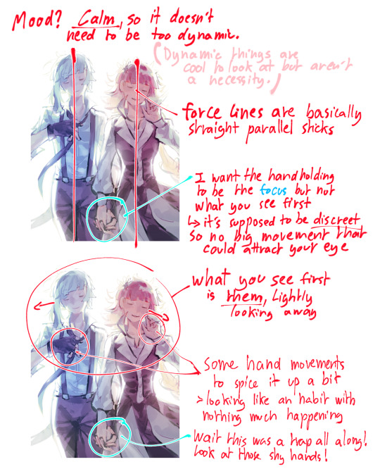
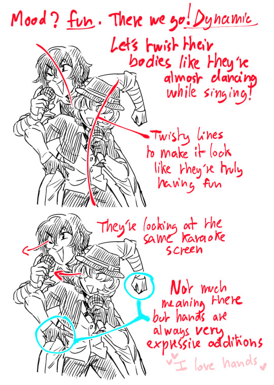
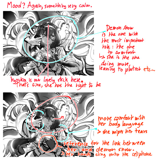
And that's about it of what I'll tackle in this single ask ahah. This is basically a lot of brainstorming and thinking as well as taking inspiration from how real life people move, especially when it comes to body language. I took it a bit too seriously but I do hope it was of some help!
164 notes
·
View notes
Note
Sorry to bother you a second time with an ask(none of my friends know kid Icarus so I got no one to talk to about)
But when hades pokes fun at pits inability to fly palutena states “his wings just don’t work right”
I googled “wing deformities” and the first thing that came up was angel wing, a deformity where rapid wing development causes the wing to outgrow proper bone support, causing the wing to bend out at an unnatural angle and a permanent inability to fly
And what’s it caused by?
An unhealthy diet of rich protein and carbohydrates.
And we know pit loves food. Specifically things like sweets and fast food, based on his distaste for veggies as stated in Palutenas Revolting Dinner
I rest my case
Well apologies, but I am going to challenge your case! A year late! (I am always happy to receive ask dw)
And if anyone notices mistakes below please comment! espically with formatting.
Angel Wing Syndrome
Angel Wing Syndrome is a deformity that effects aquatic birds, such as ducks and geese. Angels, like Pit, are typically inspired by the Dove and other birds that are typically non-aquatic birds. But let's say Pit is a swan or something, this still doesn't fit.
Angel Wing Syndrome also limits or completely restricts a bird from flying, which isn't the case for Pit, he can flap/glide on his own and with assistance from the Gods, can fly. If he had Angel Wing Syndrome he would mostly likely not be able to fly at all.
Not to matter that was make Angel Wing Syndrome so recognisable it the physical deformity is has on the bird. Having vitals feathers pulled to the rear. Pit clearly does not have this.

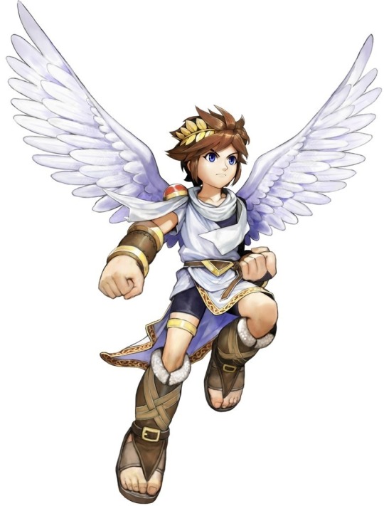
Though I will agree Pit doesn't have the best diet.
There are 10 possible food to have for health, this includes:
Fruits: apples, melons, grapes,
Meaty Foods: meat, hamburgers, sushi
Junk food: cakes, ice cream, doughnuts, bars of chocolate.
There is no vegetables! Unless you count anything in the burger haha.

But this ask did make me wonder, why can't Pit fly? And if there is any evidence in game to why.
I seem to find in an answer in by comparing when Pit can fly vs when he cannot.
Pit's Wings
In the original game he looks like this (oh gods the quality I apologise)
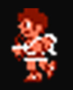

His wings go along his upper back, though pretty small right? Only reaching the neck when stretched out.

But now look at him with the Wings of Pegasus, they reach his head. Now while this could just be a visual to show the Pegasus' Wings Superiority, but perhaps Pit's wings aren't big enough to carry his weight.
But before I came to a conclusion, I looked at Uprising
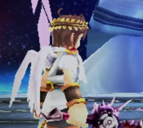


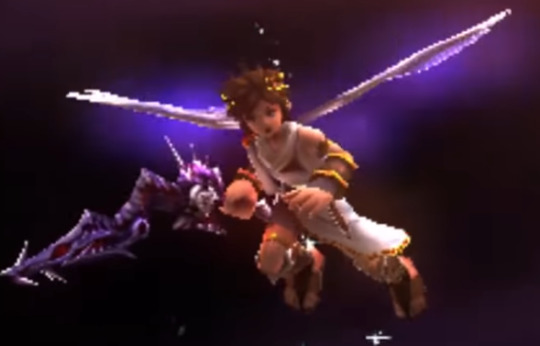
First two (top layer) are Pit's wings normally where as the last two (bottem) layer is when the Miracle of Flight is activated. It may be hard to see but his wings are bigger when the Miracle of Flight is activated. You can see this when Pit jumps out at the start of a chapter, but can also see this in the cutscene in Ring of Chaos , when Viridi activated Flight.
You can see his wings grow. As seen in the images below and at the beginning of the clip.
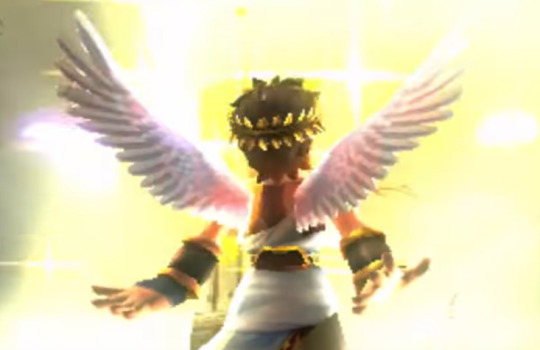

I also looked at the pegasus wings for Uprising, but they are turned off because of potential unreliability, according to Palutenas(see image one below), hence they aren't any bigger than normal miracle of flight(image two below).
Note: when Pit is extracted from battle his wings do not change. (image three below)


So when Miracle of Flight is activated, Pit's wings grow? It that just a special detail or does Pit need bigger wings?
Dark Pit's Wings
To figure this out we can also use Dark pit for when he gets Pandora Power.
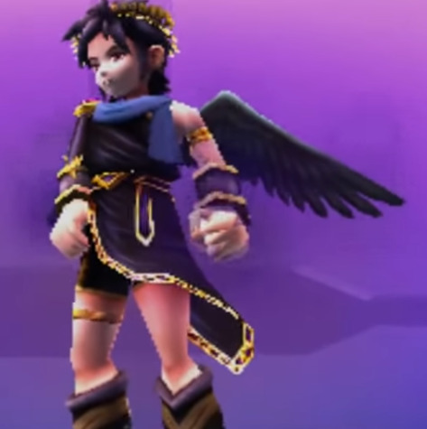

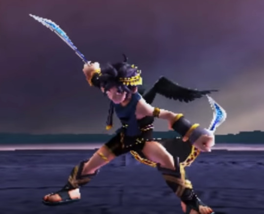
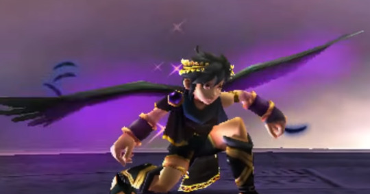
Pre-Pandora, his wings are similar to Pit's(see first image), but when he gets Pandora they almost double in size (see second image), you can really feel the difference.
But what is fascinating, is that when you fight him again, his wings are back to the average size (see third image). At first I thought this was an inconsistency, but no, as after the battle he seems to activate his wings, become big again (see fourth image).
Dark pit doesn't gain/have better wings, he gains power to activate his own infinite Miracle of Flight, which also make his wings bigger. He seems to prefer smaller wings for flighting (as they probably make them both lighter on their feet).

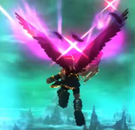
This makes me think that the Pits don't have big enough (or at the very least strong enough) wings to carry them. So the Miracle of Flight acts as an aid that give them these things while in flight (as Dark pit chooses to deactivated on the ground).
This is probably the answer.
(more speculation below)
But if that is the case, the biggest question is
Why does Pit's Wings Burn/Why is there a limit to the Miracle of Flight?
This part now is just speculation. (Also I am ignoring the last scene of 15min flying for this post, as I just think it's just a credit thing.)
Is seems that if the Miracle of Flight is used for too long Pit gets burnout both metaphorically and physically, his wings catch aflame due to the limit. So why is there a limit, and why does Dark Pit not have it?
The only difference between Pit and Dark Pit is how they gain their miracle of flight.
Dark Pit absorbed Pandora's power, making it his own. Therefore the power he uses to fly is (temporary) his own that he can control and regulate. Whereas Pit has someone else acting upon him, gods for that matter. Who cannot regulate their power being exerted upon him as well as Dark Pit can on himself.
I think it's the different between external vs internal regulation that is the difference between Pit and Dark Pit here. Dark Pit can know exactly how much power/usage he needs for flight whereas the gods made be just shoving a bunch of power in Pit's wings, not knowing how to regulate it correctly to Pit's needs. For the Miracle of Flight to be safe and unlimited, Pit has to be the one giving power to his wings.
But in order to get that power he has to steal it, which has been shown to be unsustainable as Pandora lived on in Dark Pit's wings. Not only that but it had to be all of Pandora's power, who was a goddess. So I don't think Palutena can simply give this power to Pit, as is has to be the power of an entire deity, but if you absorb that power, the deity lives on. While the circumstances of Pandora's revival were rare, there no certain way to know that there isn't other ways an absorbed deity can get their power back.
This makes in unlikely that Pit could one day fly on his own indefinitely. Though can offer explanation on why Dark Pit can fly. But alas, this part is more speculative than the other (hence under the cut). But it is interesting to think about.
Thanks for the ask!
#also I purposely ignored myth and monsters since#i view the game unreliable for KIU lore#pit kid icarus#dark pit#kid icarus#kid icarus uprising#myth analyses things#myth asks#myth conversations
44 notes
·
View notes
Text
The start of college was a breath of fresh air for Momo.
It meant the beginning of a new chapter. The start of a long, thrilling story. The tale of her adventures in a new country.
It meant freedom.
And with that freedom, came a chance to explore every possible facet of her life. Including her sexuality.
She’d made it a mission. A promise. Once the first semester was under her belt, it was time to go on the hunt.
She made note of things she’d seen in videos, thing she could only dream of doing before she even stepped foot on new soil. The possibilities were endless, if she found likeminded people. But there was no doubt in her mind that she could do it. She came to Korea determined, ready to live out her dreams with nothing but the belongings she could fit into two suitcases and a backpack.
And oh yeah. Sana had come with her too.
But that aside, she was ready for whatever opportunities life threw her way, in any form. Because of course she had come to a new place for much more than sexual encounters. Obviously. She wasn’t some weirdo like that. It was a choice she’d made, between Korea or the States. And in the end, she decided she couldn’t bring herself to go too far from home, even if freedom was what she was after.
So now she was here, ready and raring to go with her checklist of life. If she wanted to ace all her classes, she could do it! If she wanted to have a successful career, she could do it! And if she wanted to fuck any person who so much as piqued her sexual interests, she could do it!
…At least, that’s what she had planned for.
To have to trudge back up the stairs with a barely-passing essay in her hand was torture. Pure, pure torture.
Even worse now that she was in the second semester. But it was just so hard to get a good grasp on a language she hadn’t started learning until highschool.
She could handle math decently, but writing? No way, no way. If only she could just pull the thoughts right out of her head as she had them, no matter what language, and just print them across the paper.
Maybe then she’d be better at formatting a more realistic checklist for herself too.
As her hope faded away, that checklist started to become much more realistic over time. Much more simple, and faster to obtain.
Right now she was at:
- Go on a date (Sana didn’t count. That was a bestie thing.)
- Get at least a 70% on her midterms
- Make out with someone at a party (Sana still didn’t count. That was just harmless fun.)
- Try out her mom’s curry recipe with the ingredients available to her
- (Possible?) mutual masturbation with a (preferably new) friend (‘New’ eliminated Sana. Not that it would count anyway. That was a moment of weakness for both of them.)
- Remember to try out for dance club this semester
- Buy a new toy (the one Sana gifted didn’t count…)
…Ok, it was safe to say Sana had been checking off way too many things for her. But she wasn’t like that with every friend! No way! That would be crazy. Some friends were best left as that, with no sort of sexual benefits.
But Sana…
Sana was her best friend, her platonic soulmate… who she just happened to be very physically close to. She was just as enthusiastic as Momo was about using sex as stress relief or as filler for the gaps of boredom. Or, when she was annoyed that some guy she’d hook up with got insecure about the… size difference… between them and ghosted her. Momo would be there to bring her kind words and some physical comfort.
Was there anything so off about that?
Normally, after shipping off to a new country together, this would be the part where they’d slowly realize their feelings for each other. Then they’d run off together, and — after months of angst — would get together officially, knowing they were destined to love each other.
…Yeah right.
The thought of that made Momo laugh, glad no one else was in the elevator to see her little outburst. They really were just horny and high off of fresh independence.
Speaking of which, Momo thought as she got out on her floor, maybe she could ask Sana for another favor today. It was Wednesday, so she should either be at their dorm already or close to coming back. And if she wasn’t? Well, sharing a room with Sana meant it was easy to establish rules about “alone time” and all that. It was pretty much free reign, and Momo didn’t particularly mind getting walked in on, which meant there was no need to rush.
Yet, when she walked past the tiny sliver of a living area they shared with the room across the hall, rethinking on today’s failed academic mission in the cool silence, she realized something.
‘Something,’ being that she really wasn’t feeling a solo mission today.
Call it a bad habit, but she wanted to get lost in the heat of someone else. And her quickest option was always Sana. So she’d wait. Wait for as long as she could, at least. And if Sana wasn’t feeling fully up to it, they could work around it. She could just ask her to suck on her tits or something while her own hand took care of the rest.
Again, that was if Sana came home soon.
With a sigh, Momo shuffled into their shared room, practically chucking her crumpled essay papers on her desk.
“Just great…”
Even greater that there was no hope for revisions, even if she did have the courage to ask.
Just great, just great.
She slung her bag over her desk chair and missed, causing all of her papers and pens from class to scatter all over the floor.
Even greater!
She didn’t even feel like cleaning it up, deciding to just flop back onto her bed instead. She should really change into her more comfortable clothes but… ah well.
Laying there and thinking over her daily struggles was the plan. And thinking about fun once Sana got back….
It had been a few days since the last time. Over a week actually. It wasn’t her fault she was needy. All this thinking about essays and sex and class and sex and failure and sex and sex and sex…
It was making it worse.
Tossing and turning was making it worse too. She could feel how stiff her clit was whenever she shifted her legs even the slightest bit. She was starting to get wet too. God this was torture. Maybe she was ovulating or something because there was no reason she should be feeling this primal-
“Hello?”
From past her bedroom door she could hear a muffled voice. It was way to faint for her to make out who it was or where they were. For all she knew they could just be wandering out by the hall. Or maybe they were outside and the sound bounced itself off the walls. So she waited a few more seconds. Which was all she needed to confirm, because a knock followed soon after.
She wondered if Sana had possibly forgotten her keycard and sprung into action. Pulse pounding, chest heaving and mind racing, she ran out to the common area and opened the door and then-
And then…
Then it wasn’t Sana at the door. Not at all. It was-
“Hi, I’m Nayeon. Are you Sana?”
It was someone named Nayeon. Looking for Sana.
That made two of them.
“Uh, no. Um… she’s… not here,” Momo wasn’t quite sure what to say. This wasn’t even a dialogue option prepared in her brain for something like this. Pretty girl. Shoulder length hair. Who isn’t Sana. Full lips. At the door. Expensive looking clothes. Looking for Sana. Good fashion. Waiting for Momo to speak… What was she supposed to say??
“Sorry,” Nayeon easily filled the space that Momo’s voice couldn’t, “this might be weird since I never met her. Or you. I just got the room number because a friend of mine asked me to drop this off but… I guess Sana’s not here!” She laughed stiffly, holding up a folder full of papers and Sana’s worn down backpack. If she hadn’t come back yet, she must be searching all over for it by now.
Classic Sana.
Momo grabbed for the folder extended to her and missed. Then grabbed again, brushing Nayeon’s hand and jolting so hard that a few papers spilled out onto the room’s floor. Awesome. Really awesome.
It really wasn’t her fault, though. It was just a little hard to act normal when:
1) Momo hadn’t been expecting to meet any new people today (she had to prepare for that mentally),
2) The girl at the door was super pretty and seemed a lot more used to talking than she was,
And 3) She had to act normal, as if she wasn’t just about to plead for sex from (who she assumed was) Sana.
Her mind was jumbled. Unsure what to ask. What should she ask when she could barely process anything?
“Come inside?” She tried.
Nayeon’s eyebrows shot up to her hairline. “Huh?”
“Did you want to? Come? In? In here?”
“Um…. Why?”
“Because I… you.. um. You want to wait for Sana?” Momo weakly offered up. Anything to explain her awful attempts at everything.
“Oh! Well… no that’s ok. Like I said, my friend knows Sana. Not me. She said I should just drop it off here. So sorry to trouble you ummm…”
Nayeon stared at her. Hard. And it was kind of hot, but Momo wasn’t sure why she was doing it-
“Your name? What’s your name?”
“Oh. Momo.”
“Oh Momo?”
“No. Hirai Momo.”
“Hirai? You and Sana are both Japanese?”
“Yeah. We’re… good friends.”
Wasn’t she just the smoothest girl around?
“I see. It’s good you have each other,” Nayeon nodded, more to herself than to Momo. “Well, thanks for answering the door Momo. I have to go, but maybe I’ll see you around campus?”
“Yeah. I hope so.” She closed the door quickly wondering why the hell she’d said that. In fact, it would be better if they didn’t see each other anymore so Momo wouldn’t have to self destruct.
She pressed her back against the door, sliding down until she hit the ground. Head in her hands, she sighed loudly, trying her hardest to compose herself. But then-
“Um… Momo?” Nayeon’s muffled voice called out, “you forgot to take the bag from me. I’ll just leave it out here, ok? …Take care.”
…
Nayeon left. Sana still hadn’t come back. And the day continued as it was.
But Momo sat there, replaying the same 5 minutes of conversation in her head over and over. Unmoving. Until the only thing she could think to say about it all was:
“Yeah… I really could use sex right about now.”
33 notes
·
View notes
Text
Advertising backgrounds Buy on ShutterStock
https://www.shutterstock.com/ru/g/a-stock
Revolutionize Your Advertising with Shutterstock Backgrounds
Denis Marketer (Copyright)
#Denis_Marketer
Advertising is all about making an impact. Whether you’re designing for digital platforms, print, or video campaigns, the right visuals are crucial to standing out in today’s competitive market. One of the simplest yet most effective ways to elevate your ads is by using high-quality backgrounds. Shutterstock offers an incredible collection of advertising backgrounds that can take your campaigns to new heights.
1. Why Backgrounds Matter
A background is more than just a backdrop. It sets the tone for your ad, frames your message, and captures your audience’s attention. A strong visual foundation can make all the difference between being overlooked and leaving a lasting impression.
2. Shutterstock: Your Ultimate Resource
Shutterstock provides a vast library of professional backgrounds designed to meet every advertising need. With thousands of options to choose from, you’ll always find something that fits your vision perfectly.
3. Premium Quality Guaranteed
All Shutterstock backgrounds are available in high resolution, ensuring your ads look flawless no matter where they’re displayed. Whether it’s a billboard or a smartphone screen, your visuals will always shine.
4. A Background for Every Campaign
From bold and colorful gradients to subtle, minimalist textures, Shutterstock has backgrounds for every style and industry. This variety allows you to adapt to the unique demands of each project.
5. Save Time with Ready-to-Use Designs
Why waste time creating a background from scratch? Shutterstock’s ready-made options save you hours of effort, giving you more time to focus on your core message.
6. Perfect for Any Platform
Whether your ad is destined for social media, a website banner, or print media, Shutterstock backgrounds are versatile and easy to integrate into any format.
7. Customization Made Simple
Shutterstock’s backgrounds are not only stunning but also customizable. Add your branding, text, or images effortlessly to create a cohesive and professional look.
8. Elevate Your Brand Identity
Using high-quality backgrounds demonstrates your brand’s attention to detail and professionalism. This enhances your reputation and builds trust with your audience.
9. Ideal for All Industries
No matter your niche—be it fashion, technology, or food—Shutterstock has backgrounds tailored to suit every industry’s unique needs.
10. Boost Engagement with Visual Appeal
Attractive visuals are proven to increase engagement. Shutterstock’s striking backgrounds help draw viewers in, encouraging clicks, shares, and interactions.
11. Stay Ahead of Trends
Shutterstock frequently updates its library with the latest design trends. This ensures your ads always feel fresh, modern, and relevant.
12. Affordable Solutions for Every Budget
With flexible licensing options, Shutterstock makes premium backgrounds accessible to businesses of all sizes. High-quality visuals don’t have to break the bank.
13. Trusted by Professionals Worldwide
Top advertisers, designers, and marketers rely on Shutterstock to power their campaigns. Join the countless professionals who trust this resource for their creative needs.
14. Easy-to-Use Platform
Finding the perfect background is simple with Shutterstock’s user-friendly search tools. Filters for color, style, and category make the process quick and efficient.
15. Gain Inspiration
Browsing Shutterstock’s extensive library is a great way to spark new creative ideas for your advertising projects.
16. Enhance Your Storytelling
A compelling background helps set the stage for your message, enhancing its emotional impact and making your story resonate with your audience.
17. A Professional Look Instantly
Even small businesses can create ads with a big-budget feel using Shutterstock’s premium-quality backgrounds.
18. Tailored for Ad Campaigns
Many Shutterstock backgrounds are specifically designed for advertising purposes, making them ideal for creating compelling, eye-catching campaigns.
19. Scalable for Any Project
From small-scale ads to large-scale campaigns, Shutterstock backgrounds deliver consistent quality across every size and medium.
20. Improve Conversion Rates
Effective advertising leads to better results. By using stunning visuals, you can increase audience interest and boost conversion rates.
21. Easy Licensing Process
Shutterstock’s licensing agreements are straightforward and designed with advertisers in mind. Use your backgrounds worry-free.
22. The Perfect Complement to Your Message
Shutterstock backgrounds enhance—not overshadow—your ad’s content. They’re designed to highlight your message, not compete with it.
23. Showcase Your Creativity
With endless options at your fingertips, you can experiment with different styles and approaches to find the perfect match for your campaign.
24. Get Started in Minutes
Shutterstock’s intuitive platform makes it easy to find, download, and start using your chosen backgrounds immediately.
25. Don’t Miss Out!
Ready to elevate your advertising? Shutterstock backgrounds are the ultimate tool for creating professional, eye-catching campaigns that leave a lasting impression.
👉 Visit Shutterstock today and explore their stunning collection of advertising backgrounds. Transform your campaigns and captivate your audience like never before!
#backgrounds for advertising#texture for editor#picture for marketing#image for internet marketing#template for editor#wallpaper for desktop#ads#backgrounds#background for advertising#background for internet marketing#wallpaper#screensaver#art#design#illustration#concept#creative#collage#texture#sticker#abstract#gradient#vintage#poster#banner#flyer#billboard#color#shop#sale
3 notes
·
View notes
Text
The Core Elements of Digital Marketing in 2025
1. AI and Data-Driven Campaigns
Data remains the backbone of digital marketing. With AI-driven tools, businesses can analyze customer preferences and behavior to deliver laser-focused campaigns. This approach maximizes efficiency and ROI by targeting the right audience at the right time.
At Clickon IT Solution, we harness the power of AI to craft data-driven strategies tailored to your business.
2. Personalized Marketing
Generic, one-size-fits-all marketing is a thing of the past. In 2025, customers expect brands to know their needs and deliver personalized content, ads, and recommendations. This level of customization builds loyalty and boosts conversions.
Our team at Clickon IT Solution specializes in creating hyper-personalized campaigns that resonate with your audience.
3. Seamless Omnichannel Presence
Consumers now interact with brands across multiple platforms—social media, websites, apps, and even immersive AR/VR environments. A unified, seamless presence across these channels enhances customer experience and drives engagement.
We excel at developing omnichannel strategies that ensure your brand stands out everywhere your audience is active.
4. Optimization for Voice and Visual Search
The rise of voice assistants and visual search tools has transformed how users discover content. Businesses must optimize their SEO strategies to cater to conversational voice queries and visually rich search formats.
As the best digital marketing agency in Kerala, Clickon IT Solution ensures your business stays visible across these advanced search methods.
5. Engaging and Interactive Content
Interactive and immersive content is a game-changer. In 2025, tools like augmented reality (AR), virtual reality (VR), and interactive videos offer brands new ways to captivate their audience.
We bring creativity and technology together to produce content that keeps your audience engaged and excited about your brand.
6. Purpose-Driven Marketing
Today’s consumers align with brands that share their values. Businesses prioritizing sustainability, ethical practices, and social responsibility gain trust and loyalty from their audience.
At Clickon IT Solution, we help you highlight your brand’s commitment to these values in a way that connects authentically with your customers.
Why Clickon IT Solution is Your Digital Marketing Partner for 2025
When it comes to digital marketing, experience and innovation matter. Clickon IT Solution is recognized as the best digital marketing agency in Kerala for a reason. Here’s why we’re the ideal partner for your business:
Expertise in Emerging Trends: We stay ahead of the curve to implement the latest strategies for maximum impact.
Customized Solutions: Every business is unique, and we tailor our strategies to meet your specific goals.
Comprehensive Services: From SEO to social media, content creation, and paid advertising, we handle every aspect of your digital marketing needs.
Proven Results: Our success stories and satisfied clients speak for themselves.
Take Your Brand to the Next Level
Digital marketing in 2025 is an exciting blend of creativity and technology. Partnering with Clickon IT Solution ensures your brand remains competitive and relevant in this ever-changing landscape.
Ready to boost your business with the best digital marketing agency in Kerala? Contact us today and let’s create a strategy that works for you!
#digitalmarketing#socialmediamarketing#seo services#smm services#graphic design#emailmarketing#logo design#marketing#web design#web development
2 notes
·
View notes
Text
Submission guidelines
Art Guidelines and Submissions Guidelines for submissions:
1. Be sure to have filled the sign-up form before you submit. 2. Subject matter is your choice, so long as it stays within the theme of the Paper Mario series, i.e. games with Paper Mario in the title. It can be a single character, a group, a location, an event, an abstraction, anything! Please keep it PG-13 or lower. Works that are outright pornographic, extremely violent, or otherwise offensive or controversial will not be allowed. AI-generated art will result in being banned from the project. 3. Size ratio can be your choice, so long as the art is vectorized in a .pdf or .psd format and can be upscaled/downscaled without losing quality. Maximum size is 10000x10000 pixels. The resolution should be 300 dpi or higher. 4. Writings should be submitted as pdf and be able to be copied and formatted. Word limit is 7k. 5. Animation/Videos must be H.264 compliant, such as .mp4 and .mov. The runtime limit is 5 minutes. 6. Audio must be submitted in .mp3 or .wav format. The runtime limit is 5 minutes. 7. 3D projects must be submitted in U3D 3rd Edition or PRC format, or created in a pdf first then sent to the director for accurate lighting. If the pdf doesn’t accept your project, screenshots are a valid option, with a maximum of 10 pictures in .pdf or .psd format. 8. Please submit files directly to [email protected], along with your chosen name/handle and up to 3 links to your blog/portfolio/webcomic/etc (up to 140 characters). These links will be displayed to the public, be sure you want to share them. Include a square icon that can be used to represent you. Maximum size of 1000x1000 pixels. Please do not use stolen art; if you cannot provide an icon, you may ask for assistance through the zine’s director or the zine’s Discord. 9. For multiple submissions, please include all in the same email if possible.
Please submit your works by May 11
All art belongs to you first and foremost and this zine claims no ownership of it. If you wish to post it, please wait until the zine is released and the director has given the go-ahead. Linking back to the zine would be much appreciated as well!
Thank you so much for all your hard work! :)
11 notes
·
View notes
Text
What Are the Best Practices for A+ Content in Amazon Store Setup in Amazon App Marketing?

In the competitive world of Amazon App Marketing, utilizing A+ Content effectively can be a game-changer for your brand. A+ Content allows sellers to enhance their product listings with rich, multimedia elements, making their products more appealing and informative to potential buyers. This blog explores the best practices for creating A+ Content in Amazon Store Setup to ensure your brand stands out and drives sales.
Understanding A+ Content
A+ Content is a feature available to Amazon sellers, particularly those enrolled in Amazon’s Brand Registry. It allows you to enhance your product descriptions with additional images, text placements, comparison charts, and other multimedia elements. This enhanced content can help differentiate your products from competitors, provide more detailed information, and create a more engaging shopping experience for customers.
1. Focus on High-Quality Visuals
One of the primary advantages of A+ Content is the ability to incorporate high-quality visuals into your product listings. Images are often the first thing customers notice, and they play a crucial role in shaping perceptions about your product's quality.
Invest in high-quality photographs to present your goods from many perspectives. Include lifestyle images that demonstrate how your product is used in real-life scenarios. These images help customers visualize the product in their own lives, increasing the likelihood of a purchase.
In addition to images, consider incorporating videos into your A+ Content. Videos can effectively convey product features, demonstrate usage, and highlight the benefits of your products. Ensure that all visuals are high-resolution and optimized for fast loading to maintain a seamless user experience.
2. Craft Compelling and Informative Text
While visuals are crucial, the text you use in your A+ Content should not be overlooked. Your text should be compelling, informative, and aligned with your brand's voice. Use this space to highlight key features, benefits, and unique selling propositions of your product.
Start with a strong headline that captures attention and clearly communicates the value of your product. Follow this with concise bullet points that outline the most important features and benefits. Avoid using overly technical jargon; instead, focus on how your product solves a problem or enhances the customer's life.
Additionally, ensure that your text is well-organized and easy to read. Break up large blocks of text with subheadings, bullet points, and short paragraphs. This improves readability and helps customers quickly find the information they need.
3. Leverage Comparison Charts
Comparison charts are a powerful tool in A+ Content that allows you to compare your product with other similar products in your lineup. This feature is especially useful if you offer multiple variations of a product or if you want to highlight how your product outperforms competitors.
When creating a comparison chart, focus on the features that matter most to your customers. This might include price, size, materials, or specific functionalities. The goal is to make it easy for customers to see the advantages of choosing your product over others.
Ensure that your comparison chart is visually appealing and easy to understand. Use consistent formatting and clear labels to guide the customer’s eye through the information. This can significantly influence purchasing decisions by reinforcing the value of your product.
4. Maintain Brand Consistency
Consistency in branding is critical across all your marketing channels, and your Amazon Store is no exception. A+ Content provides an excellent opportunity to reinforce your brand identity through consistent use of colors, fonts, and tone of voice.
Ensure that the design elements in your A+ Content align with your overall brand aesthetics. This includes using the same color schemes, typography, and logos that customers associate with your brand. Consistent branding not only helps build recognition but also fosters trust and loyalty among customers.
Your brand's voice should also be consistent throughout the A+ Content. Whether your brand is playful, authoritative, or minimalist, make sure that the tone aligns with the rest of your marketing materials. This creates a cohesive brand experience that resonates with your target audience.
5. Optimize for SEO
Optimizing your A+ Content for search engines is essential for improving the visibility of your products on Amazon. While A+ Content itself doesn’t directly contribute to Amazon’s search rankings, the overall product listing, including the A+ Content, impacts how well your product ranks in search results.
Incorporate relevant keywords naturally into your product titles, descriptions, and alt text for images. Conduct thorough keyword research to understand what terms your target customers are using to find products like yours. By optimizing your content, you can increase the chances of your product being discovered by potential customers.
Additionally, make sure that your A+ Content is mobile-friendly. With more customers shopping on mobile devices, it’s crucial that your content is easy to navigate and visually appealing on smaller screens.
Conclusion
A+ Content is a powerful tool in Amazon Store Setup that can significantly enhance your product listings and drive sales. By focusing on high-quality visuals, compelling text, comparison charts, brand consistency, SEO optimization, and regular updates, you can create A+ Content that not only stands out but also delivers results.
If you're looking to maximize the impact of your A+ Content, consider partnering with a professional Amazon advertising services provider. Additionally, working with a Digital Marketing company can help you ensure that your branding and messaging are consistent across all online platforms, further boosting your brand’s visibility and success in the competitive Amazon marketplace.
#Amazon advertising services#Digital Marketing company#digital marketing#Digital Marketing services company#Amazon Marketing#Amazon advertising#amazon store
2 notes
·
View notes
Note
I can see that the problem with a lot of early Dragon Ball Super episodes is the pacing. Even ignoring the fact that these episodes are based off of movies, if you can cut a lot of filler out, you can probably reduce both the Battle of Gods and Resurrection of F sagas by at least half, maybe even by three-quarters. That is a problem that GT shares, I just noticed.
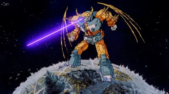
The thing I keep thinking back to are the Transformers and GI Joe movies of the 1980s. Transformers: The Movie actually had a theatrical release, but then they cut it up into episode-sized chunks and ran it as part of Season 5 of the Transformers G1 TV series. I never saw it in that format, since the cartoon got cancelled where I grew up, but there were these bumper segments where Optimus Prime is telling the story of the movie to some live action kid.
GI Joe: The Movie didn't make it to theaters, probably due to logistical issues and the box office failure of Transformers. So I think it was direct-to-home-video, and they also ran it on TV. I'm pretty sure I first saw it as a movie on TV, but later I found out it was also broken up into chunks and aired as episodes of the TV series. Those had live action host segments featuring the real-life Sgt. Slaughter.
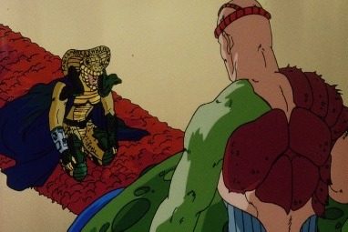
The point I'm making here is that both films could be presented this way in just five TV episodes apiece. I think Battle of Gods and Res F had longer runtimes, but all they had to do was edit the existing movies into TV-length episodes and air them that way. What would be the harm? Were they afraid of losing money by giving away the movies for free? They were already doing that by reanimating them for TV anyway! At least my idea is cheaper and easier to do.
And if they'd done it this way, there would have been less frustration with the early episodes of Super. The pacing and animation quality would have been better, and the filler episodes would be less obnoxious because you'd know for sure which ones were new material and which weren't.
And you're right, it is similar to the problem with GT. In the end, Toei was never concerned about making either show good so much as they wanted to run for as many consecutive weeks as possible, in order to hold onto their timeslot. So when they don't have a manga to work from their instinct is to just drag things out acording tot their production schedule. That's why the battle with Zamasu in the future took three separate trips through time. That's why the battle with Omega Shenron lasted as long as it did. They had a certain number of episodes blocked out for it, and very little in the way of story notes to go on. As long as the characters fight the bad guy, it doesn't matter what they do or whether it makes sense.
In GT, Goku would seem to do okay against Shenron, sometimes even seeming to defeat him, and then he would recover and be back to full-strength, and that would be the cliffhanger for the next episode, where they'd start all over again. They repeated this formula for like seven episodes until Goku finally got to defeat him for realsies, and the only reason that worked was because they knew Episode 64 was the last one.
The Zamasu fight followed the same pattern, except that the good guys would simply retreat in the time machine instead of making any real headway. Then Zamasu wrecked the time machine. Then it turned into the Omega Shenron formula where a good guy would do a big move and Zamasu would dash their hopes to set up the next episode.
This is why the Tournament of Power was so good, because even though the Goku/Jiren fight followed the same repetitive formula, you had 78 other competitors on the same stage. So even if Goku and Jiren's latest clash didn't resolve anything, there would be something else happening in the same battle that could keep things fresh. That, and someone at Toei finally convinced the studio that they had to make the anime look, you know, good, or it would hurt the brand.
To be fair, pacing issues are a little harder to notice than other quality problems with a show. Fans are just happy to see their blorbos on the screen, and even if the story is dragging, they still get to have that, so they feel mostly satisfied. But eventually, it becomes harder to ignore, so when you do a string of episodes where not much happens, fans will begin to get restless and bored, and wonder what else is on. You can get away with bad pacing, but only for so long.
The way I noticed it is when I started writing reviews/recaps/what-have-you for stories, and I would sit down and ask myself "What happened in this chapter/episode?" And sometimes I would realize that the answer was "not much". And I would think "Hey, at least this'll make it a quick write-up... wait, that kind of sucks."
8 notes
·
View notes
Text
How To Create Great Web Stories Stunning In 10 Easy Steps
What is Web Stories
Create Web Stories are a visually enticing, cell-first layout that combines brief, dynamic, and tappable content material elements which include textual content, snap shots, video, and animations. Similar to Instagram or Snapchat Stories, Web Stories allow users to eat content in chunk-sized slides, making them ideal for storytelling, tutorials, product showcases, or news updates. However, not like social media memories that live inside apps, Web Stories are hosted at the open net, because of this they may be discovered via search engines like google, shared throughout structures, and embedded in websites.

web stories are immersive, visually rich, and cellular - first review that combine brief videos, pix, animations and textual content to inform a tale or convey records in chunk-sized, without difficulty consumable chunks. They are designed to have interaction audiences thru tappable, vertical content material that customers can swipe thru at their personal tempo, similar to social media stories on system like Instagram, Facebook, or Snapchat.
Traits Of Net Memories
Visual Focus
It is prioritize awesome visuals, using photographs, movies, and animations to create an attractive narrative.
Short and Consumable
Each web tale is divided into multiple quick slides, frequently lasting a few seconds every. They are designed to be brief to view, making them appropriate for cell browsing.
Interactive and Tap friendly
Users can tap to move between slides or interact with elements embedded inside the story, making the enjoy extra dynamic.
Mobile First
We are constructed with cellular users in mind, providing a vertical format that fit the display of a smartphone flawlessly.
Hosted at the Web
Unlike platform specific testimonies on social media, Web Stories stay on the open internet and may be determined thru search engines like google, shared thru url and embedded websites.
Content Versatility
They can cover quite a few subjects which include news, travel, recipes, product reviews, tutorials and more, permitting creators to interact their target market in creative and information method.
Why Web Stories Matter
Enhanced Engagement
The quick, visually captivating format keeps users engaged, that could lead to better retention and interaction.
SEO and Discovery
We are indexable by means of serps, making them a fantastic tool for riding natural visitors.
Control Over Content
Unlike social media stories, offer more control over the content, design, and target audience reach considering they are hosted on a website.

Monetization
Best Web Stories are publishers and brands can contain ads or associate hyperlinks into Web Stories, providing opportunities for sales technology.
2 notes
·
View notes
Text
How do digital vs paper mediums impact reading?
The digital world is here to stay. PDFs and e-readers allow access to books without the space and weight constraints of traditional texts. Given this and that students are constantly surrounded by the virtual world, it is unsurprising that many students prefer digital books (Singer & Alexander, 2017a; Singer-Trakhman et al, 2019). Teachers, however, must question when digital texts are most effective and if there are drawbacks to them that we have not considered.
While this post is primarily aimed at teachers (blame my MEd), it can be useful for parents and students too! A summary is given in the section below, allong with a more detailed analysis after the second picture.

Image credit: geralt (n.d.). [A book and a mobile device with a bookshelf background]. Retrieved Feb 11, 2023, from https://pixabay.com/photos/books-smartphone-hand-keep-mobile-3348990/
The TL;DR
The brain process information presented on paper differently than that presented digitally, although we are still determining why this happens. All else equal, students have consistently better reading comprehension when working on paper.
High school and post-secondary students tend to rank themselves higher on comprehension when reading digitally, even though it does not reflect reality.
The genre of the text matters. There is no statistically significant difference in reading comprehension for narrative texts between paper and digital mediums. Meanwhile, there is a very significant difference for informative texts.
The longer a digital reading is, the exponentially greater the resources required to keep the brain on task. Comprehension on short digital readings is at least close to paper readings; comprehension on longer passages is not.
Digital enhancement is not a replacement for a knowledgeable mentor. Students reading on paper with a teacher to guide them consistently outperformed reading on any digital medium.
On the other hand, texts designed to take avantage of digital enhancements - such as with activities, videos, and a built-in digital dictionary - do acheive better comprehension than reading the same text on paper without a teacher’s support.
Digital mediums do not influence test-taking positively or negatively. Outcomes correlate to whether the student studied on paper or digitally, regardless of the test’s format.
Want to know more? Read on!

Image credit: zapCulture (n.d.). [Girl working on laptop with School Supplies]. Retrieved Feburary 12, 2023, from https://pixabay.com/photos/girl-laptop-school-supplies-student-5662435/
Comprehension
The overwhelming consensus amongst the studies surveyed is that reading comprehension is better when texts are on paper (Clinton, 2019; Delgado et al, 2018; Furenes et al, 2021; Gudinavičius, 2016; Mangen et al, 2013; Singer & Alexander, 2017a; Singer-Trakhman et al, 2019). Most worryingly, the effect size of reading digitally is –0.21, about equivalent to two-thirds of a year’s reading comprehension progress (Delgado et al, 2018)! There are, however, nuances within these results — reading digitally does not appear to impact comprehension for narrative texts the same way it does for informative texts (Clinton, 2019; Delgado et al, 2018). The inclusion of a digital dictionary can disrupt the flow of reading and decrease comprehension, but it does improve vocabulary building. Likewise, reading with an adult mentor yields higher comprehension than any form of digital reading, but digital enhancements aimed at improving comprehension produce better results than reading unguided on paper (Furenes, 2021).
Attention
Screen reading also appears to impact the attentiveness of the reader to the text. Gudinavičius’ (2016) research indicates there are significant differences in the level of attention required when reading in different formats with the most pronounced being between reading in print vs on an iPhone. This corresponds with meta-analysis indicating that information is more shallowly processed in the digital medium, making it more difficult to engage with sustained challenging tasks (Delgado et al, 2018). This implies that deeper and more critical thought is demanding in the digital format because more cognitive resources are required to keep the brain on task. It also follows that the longer a passage is, the exponentially more difficult it will become to process in digital format, a key consideration for teachers to bear in mind.
Test Taking
One question teachers may have given the rise of digital tests is if reading on a screen influences test results. Current research suggests that the medium a student takes a test in does not influence the end result. Likewise, it does not matter if students take tests in the same medium they studied in initially (Ben-Yehudah & Eshet-Alkalai, 2020). What does matter is whether they read digitally or on paper while studying, with hardcopies producing better results regardless of test format (Ben-Yehudah & Eshet-Alkalai, 2020; Mangen et al, 2013).

Image credit: sik-life(n.d.). [ebook plugged into paper books]. Retrieved March 1, 2023, from https://pixabay.com/photos/girl-laptop-school-supplies-student-5662435/
A Note of Caution
All of the conclusions we can draw about reading on screens vs paper have studies presenting contradictory evidence (Chen & Catrambone, 2015; Schwabe et al, 2021). Several meta-analyses (Singer & Alexander, 2017b; Furenes et al, 2021) provide a possible explanation: studies have failed to define what they count as reading in the first place and are inconsistent about the texts and formats they use in their studies. It is essential for teachers to be aware above all else that the question of how reading on screens impacts comprehension is a complex issue that we are just beginning to unpack. There are many caveats to be aware of when assessing the media format a text should be presented in. Our answers in this field are tentative, not definitive, so remaining abreast of current research will be essential.
Implications for Teaching
Research seems to clearly indicate that when studying academic material, working from paper is best, especially if details are required. Furthermore, the advantage that physical texts have over digital is also more pronounced when time constraints are a factor (Delgado et al, 2018). This is especially worrying when paired with the tendency for students to be overconfident in their knowledge when working digitally (Clinton, 2019; Singer & Alexander, 2017a; Singer-Trakhman et al, 2019). This is a clear warning sign for teachers — we must encourage the use of physical books for academic topics, especially when working digitally would be more convenient. The instinct for students to cram at the last minute by rereading their class’ slides is strong and may leave students feeling positive, but it does not translate to better performance.
Teachers must also consider what type of texts their students use digitally. A digital format is much more appropriate for narrative stories in Language Arts than it is for learning about activation energies in Chemistry. Teachers should be especially aware that while providing students with a PDF of their textbook is appropriate — emergencies happen and PDFs are useful for a variety accommodations, including speech-to-text — unless there is a specific reason to use PDFs, they should be a last resort, not the student’s goto for deskwork. A textbook that has been enhanced to take advantage of digital interactivity, on the other hand, may be much more appropriate for students to use a home when they do not have access to their teacher.
References
Ben‐Yehudah, G., & Eshet‐Alkalai, Y. (2020). Print versus digital reading comprehension tests: Does the congruency of study and test medium matter? British Journal of Educational Technology, 52(1), 426–440. https://doi.org/10.1111/bjet.13014
Chen, D.-W., & Catrambone, R. (2015). Paper vs. Screen: effects on Reading Comprehension, Metacognition, and Reader Behavior. Proceedings of the Human Factors and Ergonomics Society Annual Meeting, 59(1), 332–336. https://doi.org/10.1177/1541931215591069
Clinton, V. (2019). Reading from paper compared to screens: A systematic review and meta‐analysis. Journal of Research in Reading, 42(2), 288–325. https://doi.org/10.1111/1467-9817.12269
Delgado, P., Vargas, C., Ackerman, R., & Salmerón, L. (2018). Don't throw away your printed books: A meta-analysis on the effects of reading media on reading comprehension. Educational Research Review, 25, 23–38. https://doi.org/10.1016/j.edurev.2018.09.003
Furenes, M. I., Kucirkova, N., & Bus, A. G. (2021). A comparison of children’s reading on paper versus Screen: A meta-analysis. Review of Educational Research, 003465432199807. https://doi.org/10.3102/0034654321998074
Gudinavičius, A. (2016). Towards understanding the differences between reading on paper and screen. Libellarium: Časopis Za Istraživanja u Području Informacijskih i Srodnih Znanosti, 9(1), 175–184. https://doi.org/10.15291/libellarium.v9i1.240
Mangen, A., Walgermo, B. R., & Brønnick, K. (2013). Reading linear texts on paper versus computer screen: Effects on reading comprehension. International Journal of Educational Research, 58, 61–68. https://doi.org/10.1016/j.ijer.2012.12.002
Schwabe, A., Brandl, L., Boomgaarden, H. G., & Stocker, G. (2021). Experiencing literature on the e‐reader: The effects of reading narrative texts on screen. Journal of Research in Reading, 44(2), 319–338. https://doi.org/10.1111/1467-9817.12337
Singer Trakhman, L. M., Alexander, P. A., & Berkowitz, L. E. (2019). Effects of processing time on comprehension and calibration in print and digital mediums. The Journal of Experimental Education, 87(1), 101–115. https://doi.org/10.1080/00220973.2017.1411877
Singer, L. M., & Alexander, P. A. (2017). Reading across mediums: Effects of reading Digital and print texts on comprehension and calibration. The Journal of Experimental Education, 85(1), 155–172. https://doi.org/10.1080/00220973.2016.1143794Singer, L. M., & Alexander, P. A. (2017). Reading on paper and digitally: What the past decades of empirical research reveal. Review of Educational Research, 87(6), 1007–1041. https://doi.org/10.3102/0034654317722961
38 notes
·
View notes
Text
Can you read my mind? I've been watching you (Part II of III)

Find it here on AO3 (I much prefer the formatting there)
Part I
Pairing: Matty/George
Summary: Matty's bored. He decides to make it everyone's problem.
(AKA a fic about that unhinged video of Matty gagging on his own fingers).
Words: ~3k
Rating: E
Seen by bedforddanes75
As the minutes ticked by, the rush of excitement and adrenaline that drove Matty to act out had quickly given way to embarrassment. A light sweat broke out at the nape of neck as he resisted the urge to physically cringe; he couldn’t bear to look down the aisle, no matter how desperately he wanted to. He squirmed in his seat, his mind racing.
What if it was too much? What if he’d pushed it too far, annoyed George, completely mugged him off? Fuck, what was he even thinking, putting himself through this on a ten hour—
Matty stilled. Goosebumps rose on the back of his arms. At the edge of his awareness, he felt it; George’s presence was undeniable.
His first thought as he glanced up was that George looked furious. To anyone else, his blank expression might have come across as indifferent, bored even, but Matty knew better. His stomach clenched with a heady mixture of fear and arousal as he took in the thin line of George’s lips, the intensity of his stare, the way he loomed from above— tall, broad, and imposing. There was something about George’s stature and the hidden power it conveyed that triggered a primal response in Matty’s subconscious, the innate knowledge of he’s bigger, stronger, could hurt me if he wanted to sending all of the blood in his body rushing south.
Before he had the chance to say anything a tight grip encircled his wrist, hauling him up into the center aisle. George guided him toward the rear of the plane without so much as a glance back, stepping gingerly to avoid waking the others. Matty stumbled and struggled to right himself as he trailed behind, whipping his head around to ensure that no one noticed them.
When they arrived at the bathroom George slid the door open and all but thrust Matty inside. Matty wavered— “Jesus, George”— and steadied himself against the wall, muttering low under his breath. He turned around just in time to watch George flick the lock closed with a deadly sort of calm.
He’d wanted a reaction, but he never expected to finally get one— and if the icy look in George’s eye was anything to go on, he was well and truly in for it. Matty allowed a smirk to play at the corner of his mouth, an arrogant gesture of self-satisfaction that he was certain George would clock immediately. It was an attempt to mask just how high-strung he really was. His pulse pounded in his ears as he silently grappled with that strange, overwhelming fight-or-flight response that George—sweet, perpetually stoned George— seemed to evoke in him.
The tiny room was far too small to contain the mounting tension as they sized each other up. For a moment, the only sound was the steady thrum of the plane’s engine, giving the air an odd, muffled quality. Paired with the harsh light of the florescents, the whole scene seemed altogether surreal— dreamlike, even — until George broke the spell with a question.
“What’s your damage?” he asked darkly.
Matty shrugged, nonchalant: “Dunno what you’re on about.” He jerked his chin at George’s hard stare. “What’s yours? Dragging me back here like a brute.”
George snorted and stepped forward, crowding Matty against the wall, filling his field of vision. Matty couldn’t help but admire George’s features up close; his strong brow, narrow eyes, plush lips… the stubble across the sharp angle of his jaw… George was so fucking beautiful, so classically handsome in a striking, intense way, it was unbelievable that it had taken him so long to see…
After days of taunting, the proximity had Matty’s head spinning. The tiny sliver of air separating their bodies was alive, charged with heat, shimmering like the first few drops of rain on asphalt in the summer sun. It took everything in him not to reach out and touch, so he relished the way George broke first, leaning in to grip his hips just a little too tight. He slid his hands up and under the hem of Matty’s shirt, the pads of his fingers brushing against bare skin. The sensation made Matty's abdomen twitch.
“What do you think you’re doing, Matthew?” George implored softly as their foreheads met. He sounded wrecked. The low rumble of his voice reverberated deliciously inside Matty’s skull.
Licking his lips, Matty looked up at George from beneath his lashes. “What do you mean?” he murmured.
George sighed in frustration. He dragged his left hand up Matty’s torso to rest along the long column of his neck, fingers splayed to cradle his jaw. He drew their bodies together, solid, warm and hard. Matty’s breath hitched; there was no mistaking the swell in George’s jeans, throbbing insistently into the angle of his hip bone.
“That needy little display you put on the internet for everyone to see,” George grumbled, grazing his lips against Matty’s ear.
He sounded so annoyed that Matty actually laughed. “Don’t slut-shame me,” he protested. “Ah!—”
George bit brazenly at the corner of his jaw in response, pulling a shocked, heated moan from deep within Matty’s throat. He shuddered and gasped as George mouthed at the sensitive skin to soothe it, trailing hot, open kisses down the edge of his jawline before sucking a bruise into the exposed dip of his collarbone. When George spoke, his voice went straight to Matty’s cock:
“Don’t act like such a fucking slut, then.”
Matty’s eyes fluttered closed with a groan as the electricity coursing through his veins doubled-back and intensified. One of the most unexpected things he’d learned about George when they started sleeping together? He had a filthy mouth on him— and what a discovery that had been.
In a useless act of half-hearted defiance he gave George’s shoulder a weak shove. George easily captured his wrist, pinning it to the wall with a tsk of disapproval. His other hand still lingered on Matty’s neck; he didn’t place any pressure there, but he didn’t have to. Matty was already fighting to focus through the haze of lust consuming him, already finding himself slipping as his chest heaved. Why was he even resisting? What was the point, again? When it would feel so good to just give in?
George drew back to take in the sight before him. Matty knew what he must look like by now; pupils blown wide, cheeks aglow, mouth all soft and pink and wet. He melted under George’s gaze, tilting his head against the wall as his hips rose of their own accord, seeking some kind of friction. George traced Matty’s mouth with his thumb, pulling gently on his lower lip just to watch it pop back into place. Matty’s tongue darted out to stroke the border of the tattoo inked into the skin there. Transfixed, George’s eyes grew hazy. He slowly shook his head, incredulous.
“Look at you. You just can’t help yourself, can you?” he whispered.
The tension in the room, stretched taut like a rubber band, finally snapped.
Lips collided, both men groaning with relief at the contact. Matty surged forward to fist at the collar of George’s shirt, pulling him in, needing him as close as possible. The hand that had been resting on Matty’s neck moved to his hair, threading through the messy curls as George changed the angle of the kiss. Matty quickly became lost in the increasingly familiar feeling of George’s warm, soft lips moving against his own; it was like he was floating above himself, and yet somehow, he’d never been more grounded in his body.
George’s mouth covered his as the kiss deepened, growing hot and languid. He parted his lips to allow George’s tongue to sweep against his own, to taste, sending pleasant little shivers down his spine. Time slowed, dripping over them like honey. God, Matty had needed this; needed George to take up his space, surround him, burn through him until there was nothing left. He never could understand how it always felt this good to be caught up in George’s orbit. Matty was fickle when it came to sex; it was easy to catch his attention, but he was quick to lose interest. It was different with George. Things had always been different with George.
Matty gasped when George released his wrist from the wall to settle over the bulge in his trousers. He’d been painfully hard since he looked up to find George looming over his seat, and it was nothing short of divine to finally have George’s hand on him. Matty retreated from the kiss, breathing hard as he leaned into George’s shoulder. George was stroking him properly now, running his hand up and down his length with the perfect amount of pressure. A needy moan fell from Matty’s open mouth.
“You wanted my attention so badly?” George murmured, squeezing Matty through the thin layer of fabric. Matty, for once, was rendered speechless. His mind was fuzzy, wholly captivated by the feeling of George’s strong body pressed to his… the smooth timbre of his voice… the drag of his fingers…“You have it.”
George shifted his hands to Matty’s shoulders and pushed down, hard. The sudden change of pace startled him, cutting through the fog clouding his mind. He wobbled as he went to his knees, protesting at the twinge of pain as they met the floor.
“Fuck’s sake, I need those you know,” Matty snapped.
Above him, George’s eyes flared. He grasped Matty’s jaw in a vice-like grip between his thumb and index finger, digging into the soft skin of his cheeks. Matty glared even as his heart jumped in his throat. George leaned in close, his voice deceptively soft: “Don’t pretend that this isn’t exactly what you wanted when you posted that shit,” he warned venomously.
Matty wanted to argue. He wanted to shove George away, run his mouth, object to being manhandled like this. Yet even as the thoughts crossed his mind, he could feel the desire to commit to any of them slipping away. The act of being brought to his knees already had the outside world fading out of focus.
George fumbled with the buckle on his belt with trembling hands, the metal gently clinking as it came loose. He pushed his jeans down his thighs, revealing the hard length of his cock trapped beneath the thin grey material of his boxer briefs.
“I need to be able to sing tomorrow,” Matty cautioned, eyes trained on the way George gripped himself through the fabric.
George shook his head, an amused smile at the corner of his lips: “Should’ve thought of that earlier.”
He released Matty’s aching jaw to run his fingers through his hair before gently drawing Matty’s face to his groin. Matty went without complaint, mouthing along the outline of George’s cock, teasing, soaking the soft fabric. George groaned appreciatively above him. Matty could feel himself going under again, losing himself to the simplicity of giving George pleasure. He was good at this— he knew he was— and it felt good to give for once instead of take. It seemed like he was always taking.
George tightened his grip to a fist and pulled Matty off, wrenching his head back in the process. Matty thrilled at the sting, at the tiny pinpricks of pain tingling along his scalp. He could already feel the strain on his neck and shoulders, and the ache only made him sink deeper into that blissfully blank headspace.
George slipped his briefs down his legs to pool at his feet with his jeans, his frankly intimidating cock bobbing up to curve toward his stomach. With one hand still in Matty’s hair he squeezed himself, eyes drifting closed with a sharp exhale. Matty’s mouth fell open as he drank in the utterly intoxicating sight of George touching himself. It made him feel even more desperate, if that was even possible— he fucking loved sucking George off. He tried to take George in his mouth, but the fist in his hair held fast— he couldn’t budge. He flicked his eyes up to find George gazing down at him thoughtfully.
“Wider.”
Matty shuddered, and did as he was told.
George tapped the head of his dick on Matty’s outstretched tongue a few times in quick succession, the wet, rhythmic sound filling the room. He guided it over the outline of his swollen lips, rubbed it against one cheek and then the next, repeating the pattern until saliva glistened on Matty’s face. Matty tried to close his mouth around it, eager to swallow him down, but George merely tighten the grip in his hair to pull him back, controlling exactly how far Matty could reach. The easy display of power made Matty whimper. The most he could do was push his tongue forward, just barely able to lap at the tip, his mouth filling with saliva as he struggled.
“You’re obscene,” George murmured reverently. He released his rough hold on Matty’s hair to stroke his cheek. Matty melted into the tenderness of the touch, floating on the endorphins flooding his system. George drew his eyes up with one finger beneath his chin, in so much contrast to the way he’d yanked his head back by his hair mere moments ago. It made something warm glow in Matty’s chest. “What do you need, love?”
“Need you. Need this,” Matty pleaded, mouthing at the shaft of George’s cock. “Need… I need you to tell me what to do,” he confessed in a rush.
“You like when I tell you what to do.”
It wasn’t a question, but Matty answered anyway: “I fucking love it.”
George let out a shaky, uneven breath.
“Then suck.”
Finally released, Matty promptly wrapped his lips around the head of George’s cock, swirling his tongue, savoring the salty taste of the pre-come gathered there. He took more and more of his length into his mouth, thrilling at the stretch, at the way his jaw was already protesting at the position. Above him, George was moaning into his fist, trying desperately to keep quiet as the silky heat of Matty’s mouth engulfed him. Matty took him to the base, pulled off with a lewd sound, and dove back in to bob his head in earnest. George’s panting was laced with bitter curses and strangled groans of pleasure.
“Fuck, your fucking mouth, Matty—”
George’s words only spurred Matty on, stoking the fire blazing through his body. A dizzying sense of relief washed over him. Distantly, he realized that this was the most at peace he’d felt for days.
George’s hands came to rest at Matty’s temples, his fingers gently burying into the dark curls. He gave a small thrust into Matty’s mouth, searching his face for some sort of sign. Matty took the hint, slowing his own movements and gazing up at George in silent permission. George held his head with both hands as he slowly began to rock in and out of Matty’s pink, wet mouth, fragmented praise spilling from his lips.
“Fuck, baby, just like that… so good, so good for me always…”
Despite his best efforts not to, Matty gagged and sputtered as George set a punishing pace. His eyes watered as he tried and failed to control the broken sounds forming deep in the back of his throat.
“You wanted it so badly?” George demanded, breathless, “so badly that you couldn’t wait, like I asked?”
Matty whined, unable to nod. George stilled and guided Matty’s head back so their eyes met, Matty’s lips still around him. “Let’s see you take it, then. Take all of me… that’s it, just relax…” He steadily fed his cock further and further into Matty’s mouth until his nose was pressed into wiry hair at the base. Matty trembled all over, concentrating on his breath as he felt his throat flutter around George’s length, his own spit dripping down his chin. He flushed with satisfaction at the feeling of George’s whole body shuddering, at the ragged pants falling from George’s lips, the deep growl in his voice.
“You’re such a fucking brat, d’you know that?”
Matty choked harshly as George thrust once, twice, before pulling him back down to the base: “Takin’ me so well, Christ.”
Matty was just barely on the edge of true discomfort when George pulled out with a grunt, somehow always knowing just when to ease off. Strings of saliva still connected them as Matty panted, fighting to catch his breath, luxuriating in the warm, deep calm that had settled into his bones. He didn’t realize his eyes were wet until George crouched down in front of him to wipe the errant tears away, gazing at him with adoration and something like pride.
George kissed him softly, cupping his cheeks. Matty made a small, happy sound at the contact. “You were so good Matthew, so good for me. Are you okay, love?”
Matty nodded, not trusting himself to speak. He was better than okay; he was euphoric.
“C’mere,” George murmured, helping Matty to stand up on shaky legs.
“I'm not through with you.”
I'm not through with you either, Matty thought slyly, a mischievous smile pulling at his lips.
#the 1975#matty healy#george daniel#matty x george#ross macdonald#adam hann#the 1975 fic#george daniel fic#matty healy fic#cyrmm#please please please let me know what you think#im quite nervous to post it#but also pretty happy with how it's turned out so far#part III to come!#no pun intended#gatty
18 notes
·
View notes
Text
Study Group: How to Efficiently Divide the Workload
The power of a well-organized study group is undeniable. It fosters collaboration, boosts understanding, and keeps everyone motivated. But one of the biggest challenges study groups face is efficiently dividing the workload. When done poorly, it can lead to resentment, uneven preparation, and ultimately, a less productive learning experience.

This article will guide you through effective strategies for dividing the workload in your study group, ensuring everyone contributes meaningfully and reaps the full benefits of group study with Explain Learning. Whether you're a college student tackling complex concepts or a parent coordinating a group study for children, these tips will help your group thrive.
Why Dividing the Workload Matters
Fair and effective workload division is crucial for a successful study group. Here's why:
Equity and Participation: Everyone should feel like they're contributing equally and have the opportunity to learn from different perspectives. An unevenly divided workload can lead to some members feeling overwhelmed while others are left disengaged.
Focus and Efficiency: Clearly defined tasks help each member focus on specific areas, enhancing study session efficiency and maximizing learning outcomes.
Preparation and Accountability: Knowing what you're responsible for promotes individual preparation, holding everyone accountable for their share of the work.
Reduced Stress: Knowing the workload is balanced reduces stress and anxiety, creating a more positive and productive learning environment.
Key Factors to Consider When Dividing the Workload
Before diving into task division, consider these factors to tailor the approach to your specific study group:
Group Size: Smaller groups (3-5 members) allow for a more personalized division of tasks, while larger groups (6-8 members) might benefit from a more structured approach.
Learning Styles: Consider the diverse learning styles within the group. Some may excel at summarizing key points, while others might prefer creating practice questions.
Course Material: The nature of the subject matter will influence how you divide tasks. If it's a heavily text-based subject, outlining chapters might be a good option. For science or math-heavy courses, focusing on explaining concepts or solving problems might be more effective.
Time Constraints: Factor in the time available for your study session and the complexity of the material.
Strategies for Efficient Workload Division
Here are some practical strategies to ensure a fair and efficient division of workload:
Brainstorm Together: Start by brainstorming tasks that need to be accomplished for the study session. This collaborative approach ensures everyone is aware of the overall workload and has a voice in the division process.
Play to Strengths: Consider each member's strengths and weaknesses. Someone with excellent communication skills might be responsible for summarizing key points, while another with strong analytical skills tackles creating practice problems.
Rotate Responsibilities: Avoid assigning the same tasks to specific members every session. Rotate responsibilities to ensure everyone has the opportunity to develop different learning skills and keeps the group dynamic.
Set Clear Expectations: Once tasks are assigned, clearly define expectations for each. What format should the outline or summary take? How many practice problems should be created? Clarifying expectations ensures everyone is on the same page.
Utilize Explain Learning: Explain Learning is a valuable resource for study groups. Utilize our platform to find relevant learning materials like chapter summaries, practice questions, and video explanations. This can significantly reduce the workload for individual members, allowing you to focus on more in-depth discussions and collaborative activities.
Additional Tips for a Productive Study Group
Set Ground Rules: Establish ground rules for your study group. This can include arriving prepared, respecting everyone's time, and focusing on the designated tasks during the session.
Maintain Focus: While some social interaction is expected, prioritize focused discussions and productive study sessions.
Actively Participate: Be an active participant in the group. Ask questions, share insights, and contribute to discussions based on your assigned task.
Respectful Communication: Practice respectful communication and active listening. Ensure everyone feels comfortable asking questions and contributing their ideas.
Conclusion
Efficiently dividing the workload is a cornerstone of a successful study group. By following the strategies outlined above and leveraging the resources available on Explain Learning, you can create a collaborative learning environment that fosters understanding, boosts academic performance, and makes the learning process more engaging for everyone involved.
Remember, the key is to be flexible, considerate, and adaptable. By working together, you can turn your study group into a powerful tool for academic success.
Know more https://explainlearning.com/blog/study-group-efficiently-divide-workload/
4 notes
·
View notes
Photo

2023/03/20 Blog post by Wakana そのさきへのGO!サイン!〜3rdアルバム 5月31日リリース〜
❗This is Fan Club EXCLUSIVE content❗ ❗PERSONAL USE ONLY❗ Do ❗NOT SHARE❗ on other sites ❗Join her FAN CLUB! Check out my detailed TUTORIAL ❗
Sono Saki he on “GO!サイン” Day!〜3rd Album Release on May 31st〜
Everyone! As announced last week, the release date for my 3rd album "Sono Saki he" has finally been decided! \(^o^)/ May 31st! It's May 31st! Let's try to remember the date as "GO!SA-IN" day! ! 5-3-1! GO! SA! IN!
I briefly talked about my feelings regarding this album in short comment section which was included in all the social media announcements. First and foremost I wanted this album to feel like we are “heading toward the future together”. As long as we are alive, we are always moving forward. No matter how sad or painful things are, time won’t stop or wait for us, we can’t stand still. If there are people who feel loneliness in such a time, I want them to remember that they are not alone. I want to make the kind of music that always stays by your side. Right now, I'm wokring on this album with the help of many people, including Satoshi Takebe. In order for you to see a new Wakana, we will continue to carefully work on the final details of the album, so please be patient a little while longer!😊✨I want to share my music and feelings with everyone as soon as possible! I can't wait for that day😍
Please let me introduce the 3 versions of the album!
[First Press Limited Edition A] First of all, we have the first press limited edition A which will include a bonus DVD with 86 minutes worth of footage from the concert "Wakana Classics 2022~Christmas Special~"!・:*+.\(( °ω° ))/.:+ Honestly, I am so eager for you to watch it! You really need to see it!😂😂 It’s just amazing! *laughs* The footage perfectly captures the feeling of trust among us, the joy of sharing music with the audience, the beauty and acoustics of the venue. Truly the best! Please be sure to watch it! !
[First Press Limited Edition B] This version comes with an LP sized cover (it's huge!). As bonus content you get a CD with the songs from the concert♪ There’s also a big photo booklet and a poster😊
[Reguar Edition] The lyric booklet contains different photos for each and every version, Including this regular one, so please look forward to that as well😍💕
Furthermore, the track "Flag", which is scheduled to be included in the album, has been released digitally! On the Wakana YouTubve Channel you can watch snippets of this song being performing during the Christmas Live last year, so please check out the videoヽ(´▽`)/♪ The whole thing will be available on the first press limited edition A! \\\٩( 'ω' )و //// It’s a shame that I can’t share the full album with you yet but at least I have finally been able to tell you the details about the release date and the different formats, as well as the release of "Flag"\(^o^)/
There are still more announcements to be made so please look forward to that~ ٩( 'ω' )و♩
Last but no least, this Saturday I will hold my "Spring Shark Festival Vol.2" with Yuuka Nanri! We’ll have a talk and a mini-live session so I'm looking forward to spending time with everyone! (((o(*゚▽゚*)o)))♡
Finally, please enjoy seome off-shots from the shoot! (The cameraman's feet are so slim!!)
Until next time☆(*'▽'*)/
***Wakana***
#kalafina#wakana#wakana blog#botanical land#fan club exclusive content#wonder what other announcements are coming up??!!
29 notes
·
View notes