#no designated image descriptions because i do them in the body text of the post
Explore tagged Tumblr posts
Text
Bestiaryposting Results: Haesorog
Welcome to this week's bestiaryposting results! This is an unusual one in that the entry is short, but we have plenty of physical details. We're also following up two obvious ones with a description I genuinely think nobody can identify unless they're familiar with the bestiary tradition itself, or the sources thereof.
If any of that was confusing to you, please consult past posts on this matter at https://maniculum.tumblr.com/bestiaryposting. You can also keep up with the current beast of the week -- and participate -- by checking out the tag "maniculum bestiaryposting". The entry that our artists are working from this week can be found here:
Anyway, art below the cut in roughly chronological order:
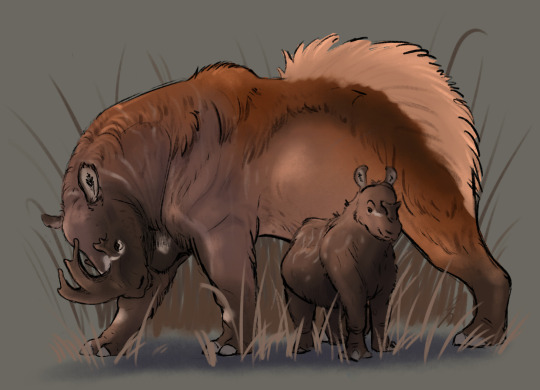
@silverhart-makes-art (link to post here) took this in a rhinoceros kind of direction, drawing something that reminds me of paleoart depicting prehistoric rhino relatives that I have seen & enjoyed. I was going to say something like "I'm not sure if that was the vibe they were going for", but the linked post cites Brontotherium as an inspiration for the horn, so that's probably what I'm picking up on. The depiction of it defending its young makes this a really interesting image, I think; I like it a lot. Also, the design decisions explained in the linked post are genuinely pretty interesting, so I encourage you to check that out.
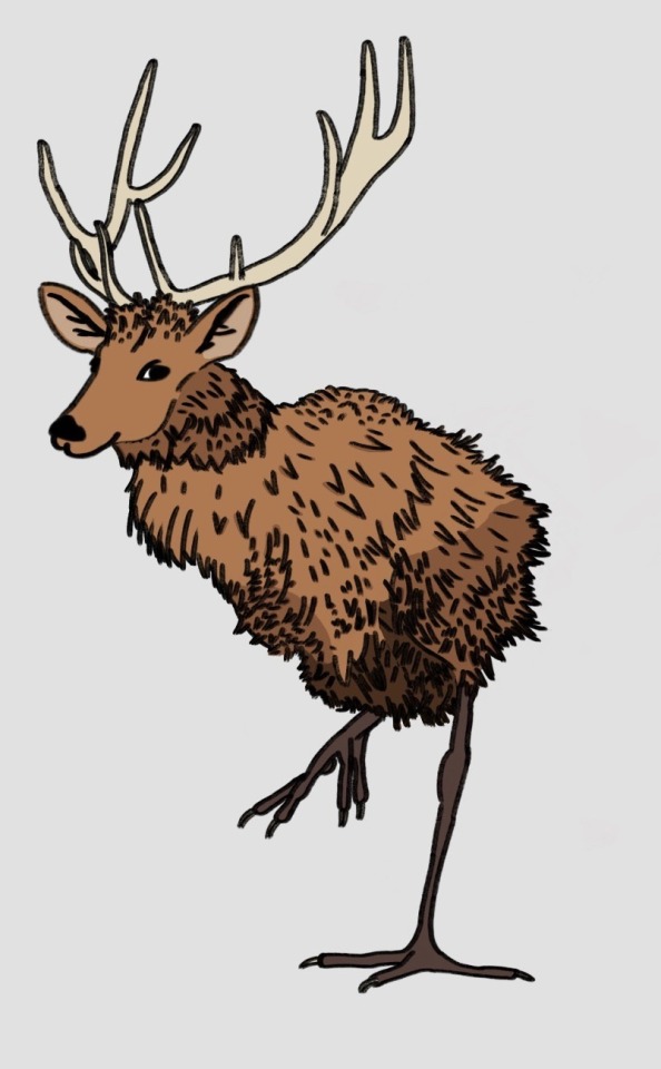
@moonygryffin (link to post here) ran with the "ibis feet, deer head" thing to produce something kind of like a flightless peryton, which I think is pretty cool. What's really clever here, I think, is how the body effectively blends elements of both animals so that it looks like a natural transition between the two. It's kind of bird-shaped, but you can see some deer-shaped elements at the top, and it's got this furry kiwi kind of vibe that's plausibly both "deer" and "bird".
Moonygryffin also suggests that the thing with the feet is the result of our favorite game, Manuscript Telephone, and it was originally the footprint of an ibex, which I think is probably correct. From some quick searching, it looks like Pliny just described this beast as having "cloven hooves". I think it's plausible that a later author changed it for purposes of parallelism -- "size of an ox, fur of a bear, head of a deer, feet of an ibex" -- and then someone else misread it and gave it bird feet. (Do ibexes/ibices* have cloven hooves? I'm going to assume they do, they're goats, right?)
*I checked the OED; both plural forms are attested, though the first is the more common. Which is probably why Tumblr is giving the second one the red underline.
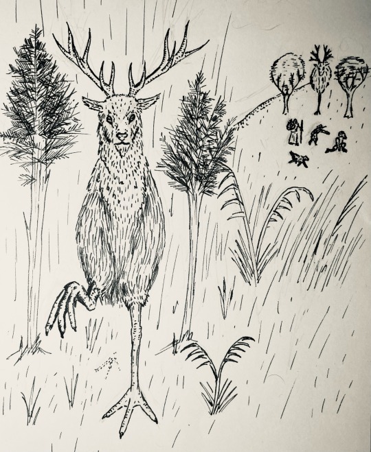
@cheapsweets (link to post here) went for a similar concept as the above, but in a different medium and interpretation. Genuinely impressed by the realistic detail on the legs and head here -- CheapSweets has mentioned seeking out some reference material and art books recently, so I'm inclined to assume those are really paying off. Look at that thing. There's a lot of interesting material in the linked post, speaking to influences, research, and design decisions, which I think is definitely worth checking out. One thing I want to point out specifically because I missed it the first time I saw this drawing: take a look at the people & dog in the background at the top left. Now look at the trees next to them. One of them is a Haesorog cleverly disguising itself. Excellent.
(Also thank you for providing alt text.)
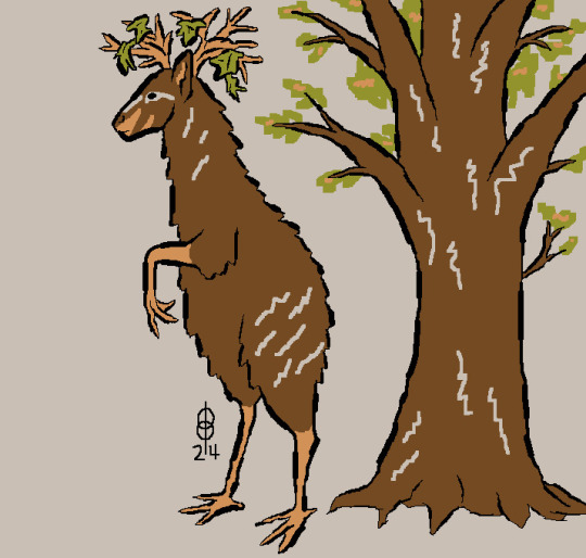
@pomrania (link to post here) has collaborated with @theforceisstronginthegirl on this one, which is a delight! Pleased to see you back, Theforceisstronginthegirl. Anyway, they've also clocked the error with the ibis thing: while they don't suggest it's an error for ibex, they do suggest that it refers to cloven hooves, which as previously mentioned is indeed what Pliny says about it. And then they also decided to give it bird feet anyway because that's more fun, which is very much in the spirit of the thing, excellent call. Anyway, the focus of this design is on the camouflage aspect. They've interpreted it as simply having stellar natural camouflage, which is why it's shown next to a tree here -- we can see that the pattern of its fur lets it blend in with the coloration of the trees around it, and that leaves tangled in its antlers along with its ability to stand on two legs enhances the effect.
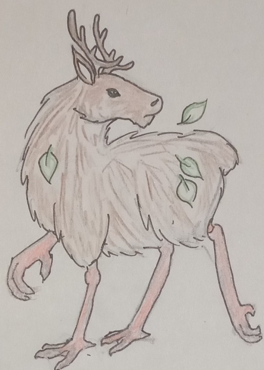
@sweetlyfez (link to post here) went with a similar quadrupedal design, shaggy deer-like thing with bird legs, but went the opposite direction with the camouflage. Her post indicates it's shown here "shedding some leaves from the last time it turned into a bush," which means this version of the Haesorog is suggested to have actively supernatural camouflage that allows it to shapeshift. (Which is definitely suggested by the text.) There's something very evocative about the eyes here, which I like. (Also, thank you for including alt text.)

@coolest-capybara (link to post here) continues to deliver beautifully stylized art. I'm really delighted by the the pose the second Haesorog is taking in order to blend in with the very pretty Stylized Plants around it -- I think this is maybe not the environment where color-shifting is hugely useful, as I have no doubt the first Haesorog is fully aware of its presence. Something that makes this particular design interesting is that between the default coloration displayed on the left and the shape of the feet, you get a kind of "this thing is a step too human for a quadruped" feeling that makes it a little more unique-looking than it might be otherwise. (Also, thanks for including alt text.)
Over all of these entries, I'm noting that one effect of the clear physical description is that it does provide a more restricted space in which artists can play -- it's much more obvious than in other weeks that all of these are the same animal. Whether that's an upside or a downside is, I think, wholly subjective. Now let's look at the Aberdeen Bestiary.
...
Okay, we can't do that actually. The page with the illustration is missing from the Aberdeen Bestiary. So we're looking over to its sister manuscript, the Bodley Bestiary. (MS. Bodl. 764, also digitized online.)
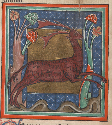
So this beast is of course the Parander.
Yep, bet everyone feels foolish for not recognizing such a common and well-known animal as the parander.
Also, of course, known as the Tarand or Tarander, of course. Or parandrus / tarandrus in Latin.
Right, so the reason that I was so confident nobody without a thorough background in the bestiary tradition (or Pliny the Elder) would recognize this one is because it's not a real animal. And it's not even one of the mythical ones that managed to get a foothold in the modern consciousness.
I might be overstating the "not a real animal" line, actually; odds are good it's based on one. Let's talk about that.
There have been some guesses as to the parander's identity in scholarship. The Bostock translation of Pliny has a footnote that cites two competing theories: "reindeer" and "elk [aka 'moose']". The reindeer one gets an explanation -- differently-colored summer and winter coats -- but the elk one is just kind of tossed out there as a proposed alternative. My guess (based on it already being past 10:30pm here and not wanting to put in the time to track down a source that's cited only by a last name with no other identifying information) is that that one's about the parander's size being emphasized.
You may say, "excuse me Maniculum, neither of those animals lives anywhere near Ethiopia. What are you playing at? Are you going to try and convince me that the pre-modern definition of 'Ethiopia' was so broad it encompassed the Arctic Circle?" The solution is that the parander wasn't originally described as being from Ethiopia -- Pliny says it's from Scythia. Which... also seems a bit too far south. But it's entirely reasonable that the Scythians were reporting on something seen on a trip north or something they heard about from northern neighbors, which would put "reindeer" and "elk/moose" both back in as options. Scythia is close enough to the range of both of those animals that it's plausible they would be familiar with them.
Someone you may have heard of took a stance on this issue, interestingly. An 18th-century biologist named...

... Linnaeus. Yep, it's codified right into the scientific name for "reindeer" now, and has been for as long as binomial nomenclature has been a thing. Anyone who wants to make the "elk/moose" argument is going to have a bit of an uphill battle.
All that out of the way, now take a moment and scroll back up to that medieval illustration. Mentally compare it to the description and the art shared in this post. There's something different, right?
You may notice that the artist has given it cloven hooves rather than bird's feet, having not been confused at all by the "footprints of an ibis" thing. Now, often this is the result of the art not actually being directly based on the text, but copied from art in a previous manuscript, so a scribe can write down the wrong word and it won't affect the art at all because the artist may or may not even be reading the text as they work.
Often, but not always. In this case, I would like to float an alternate explanation.

On the left is the translation of the Bodley Bestiary I have on my shelf, to which I referred when filling in material from missing pages in the Aberdeen Bestiary. On the right is the Bodley Bestiary digitized manuscript.
Now. I am not trained in Latin paleography, so it's possible that I'm misinterpreting an abbreviation. But that word on the right... the penultimate letter certainly looks like a C, doesn't it? Not, e.g., an S? (It would be a long s here, but that doesn't actually help.)
Which means that the manuscript says ibex. The ibex -> ibis confusion is a case of Manuscript Telephone, but it was telephoned in the 1990s.
Again, like I said, I'm not an expert. I've never translated a single page of a Latin manuscript, much less had a book-length translation published in a handsome slipcover edition. So it's very possible I'm missing something. But right now I'm pretty sure that everyone's been drawing bird feet not because of an error made by a medieval scribe, but by the modern translator.
Anyway, that was exciting, right? I hope that makes up for me posting this a few hours later than usual.
56 notes
·
View notes
Text
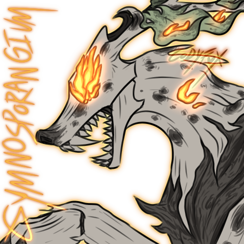
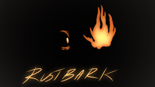
Full version of PFP + Header, information about the AU under the cut :D
This is just a lil thing for fun, it is serious but it's mostly just screwing around to see what sticks. I've been meaning to mess with an infection AU for a bit now, and MLP in general I used to love this show growing up and as someone who adores horror and silly zombie plots this is exactly up my alley thank you
This blog is mostly based around Rustbark Disease, which is the in-universe nickname for it, or Gymnosporangium juniperi-virginianae/Cedar Apple Rust. I love timber wolves, they're neat, and I haven't seen many people use them for one of these AUs just yet so I looked for some tree diseases and bonk, angry puppy. Also gave me an excuse to draw one with a birch body and weird elk-looking antlers, I love making a bunch of variants for things that do not need them. I'll probably make a post about timber wolf variants later on but for now: horror stuff!!
TWs for typical scaries below the cut, body horror, violence, it's based on a fungus disease so pretty much if The Last of Us freaks you out maybe don't, I suck at TWs I am sorry
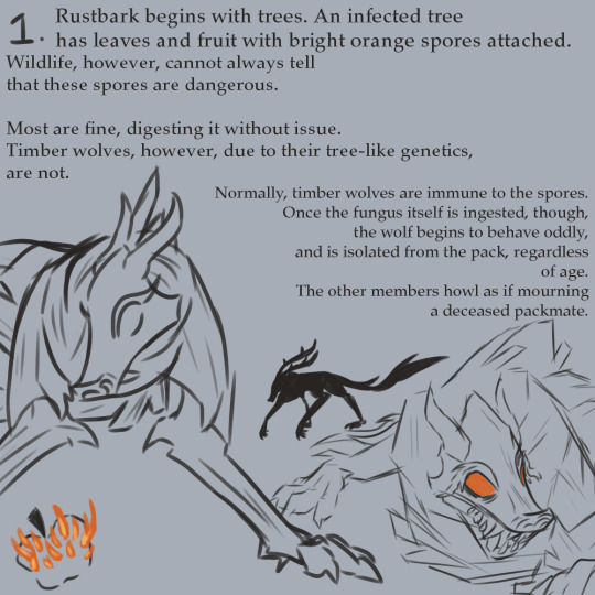
(Text is in the image description for all of these! I'm not the best at descriptions so if you have a better one in mind I'd be more than happy to change it, but for now I've only included what I felt was the most necessary.)
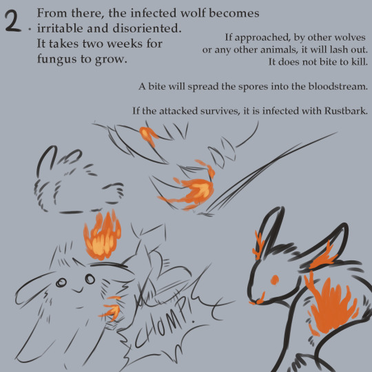
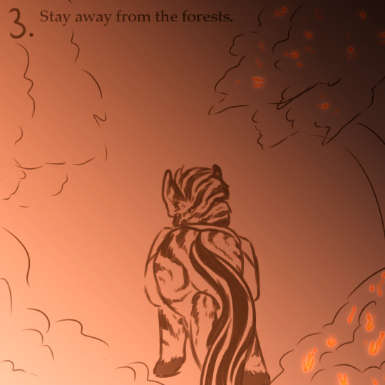
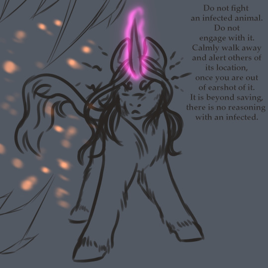
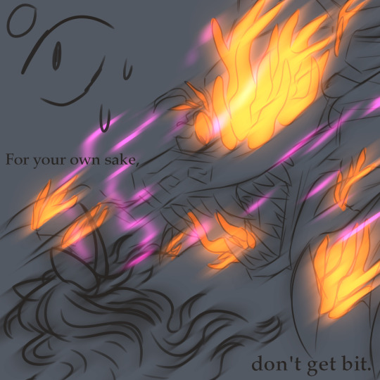
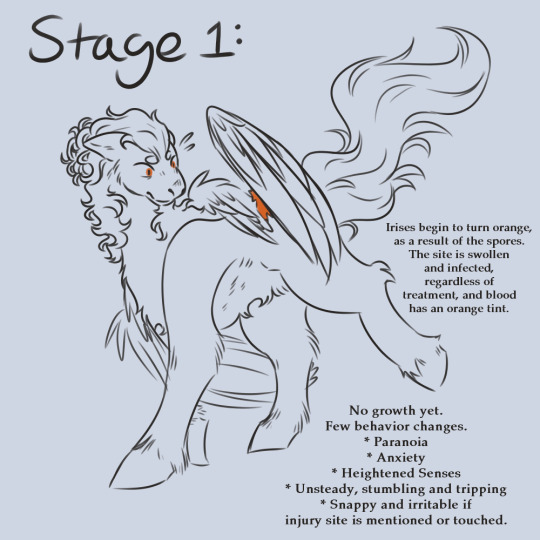
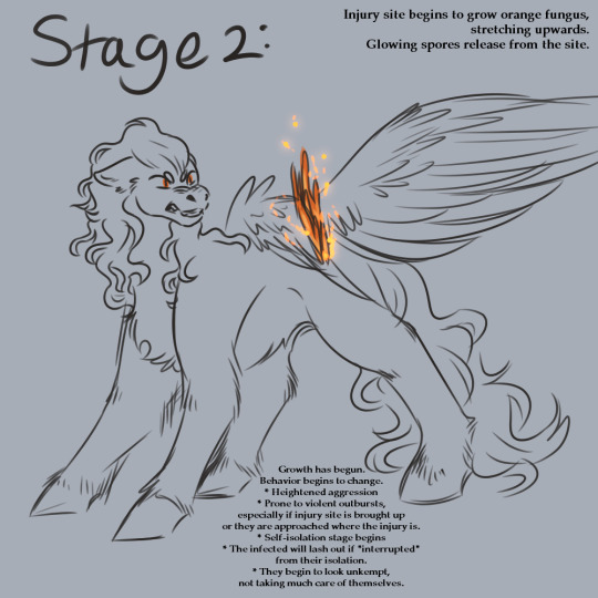
And while I do want to include more stages, there are more 100%, I feel as though now is a good time to stop it. Leave some room for speculation... also I don't want to burn out before I even get started lol. I do have St3 mostly drawn but aaagh I don't wanna draw this many of what feels like the same thing to my brain so.... haha.. I'll probably scrap it
It moves a bit slower and is a bit less dramatic than some I've seen, but in my defense I am a nerd who loves doing research and most diseases tend to move kinda slow in most cases. I personally feel like that's scarier, anyways. The slow, drawn-out takeover is great for horror.
The infection is based off of a few different things, color-coded for your convenience. Primarily, the real-life Gymnosporangium juniperi-virginianae, or cedar-apple rust is a big inspiration. The fungus is non-lethal to the plant and mostly affects the appearance, so, with it mainly being transmitted by Timber Wolves, I also felt it made sense to base it off of diseases like Rabies and, since I design Timber Wolves with ungulate-like antlers, Chronic Wasting Disease/CWD. In the final stage, the infected collapses and the body begins to rot, but the fungus and spores continue to prosper.
It is inspired by games like The Last of Us and perhaps some Dying Light, but is not by any means a direct copy of anything. I tried to avoid taking inspiration from other AUs because I simply wanted to go wild with my imagination, so from here on out any unintentional similarities are purely coincidence.
All ponies (except for Zecora) shown in this post are nameless ocs for the point of showing off the disease.
All parts of this will be tagged with #Gymnosporangium, #Rustbark, and #Cedar Apple Rust, for the sake of simplicity. Non-canon entries have #Branch as a tag, as a silly little pun about trees and how it branches off from the main series, and designs I've made for the series are, of course, tagged #Design, as well as the character's name. Art that isn't mine is tagged #Not My Art, of course, such as edits or.. I dunno, picrews or something. Each post will have involved characters' names tagged as well. I never fully finished the original series and am in fact not too far in rewatching sadly, but I will strive for diversity as well as I can.
Lowkey a lil nervous but horror is one of my favorite things, infection AUs are sick (hehe) and I want the practice, so, uh, here
#mlp horror#mlp infection au#mlp fim#mlp#mlp fanart#horror au#infection au#Gymnosporangium#Rustbark#Cedar Apple Rust#Timber Wolves#Zecora#my little pony#art#my art#au#digital art
9 notes
·
View notes
Text
if at least 3 people @ me to show they've added the ID I made for their Flatland art on @accessible-flatland-art to the original post in plain text, I will show you all my awesome new design for the Sphere even before I actually finish writing the newest Flatland short story for @neopronouns-in-action :)
3/3 for the Sphere early post.
___
if at least 6 people @ me to show they added the ID to the original post, I'll make a poll and let you all vote on who gets a new design next.
4/6 for the new design for another character to be chosen by poll.
___
Here's an example of what the ID should look like when you add it to your post:
The title of your post, if you have one, goes first.
then the image, then the image description,
then the caption for the image.
Like this:
__
Title: Behold! An image!

[ID: The words, "Behold! an image!" in black text on a white background, with a black border around the edges of the picture. End ID.]
Caption: I made this in MS Paint
___
The image description should go in the body of the post itself for accessability, because tumblr's ALT text glitches and gets changed often, and not everyone who needs an image description can use the ALT text.
Avoid using all caps, bold text, or colored text, or if you must, then include plain text as well, which means a version of the colorful / big text that's in plain black and white and normal size.
Using a lot of colored text, especially rapidly alternating many colors, can cause eyestrain and migraines, and make it difficult if not impossible for people to read.
also, I will not be able to add image descriptions to art / videos that have flashing lights or neon colors (or audio that dips up and down in volume and speed), so if you make art like that, you'll have to find someone else to make the ID for you, or do it yourself.
if you want me to be able to add IDs to your art, please make sure not to use fully saturated neon colors. If I look at them too long I get a migraine and or nausea. it's not fun.
7 notes
·
View notes
Text
Old Lou & June stuff
I was told to put this in another post since it's long & the original post is meant to just be a ref
Link to original post
Once again want to mention everyone(except like 3 pics) are drawn with everyone as humans instead of puppet people & I forgot why.

So here’s the old refs for them, for some reason I drew Muppet characters in human/gijinka form most of the time. Dunno why I think part of it was not being sure how well I could do Muppet style all the time.
I don’t remember what Juniper’s coloring was but old Lou was a copy of Lips but eyes covered, freckles & no facial hair. Now they look more like mixes of their parents, June is green cause she’s a mix of her parents’ colors(the lip color is lipstick) June has a very slightly thinner version of Lips’s nose & ignoring the eyes Lou got Zoot’s face/chin, he’s a little more yellow than June but still different than in the past.
It’s kind of interesting how they changed from Juniper & Lou to June & that estranged murderous brother she doesn’t want to be near & for some reason blames past relatives deaths on despite him being too young(or not even being born) to be the cause.

“So this is Juniper, Zoot & Lip’s adult daughter. She works in IT & her brother & dad will embarrass her later by mistaking her fiance saying "I do” for a rejection" -From the description of the Juniper ref
So here's the only time I drew Juniper/old June in Muppet form. I've forgotten at this point what led to her design.(Vincent told he what to draw & what to do for this but it's a blur & possibly on Skype which I don't use anymore) This version's hair later went into the design of Vincent's version of Zoot's mom, Sarah.(Link1)(Link2)
The writing in the bottom left corner came from thinking I messed up her hair a little. As you can probably see & if you read some of the text Juniper & June are pretty different. Juniper was a stylish IT worker that was annoyed by her family’s craziness & the fact they wasted her college fund. June is an introvert editor/assistant for a fashion magazine that doesn’t really put effort into her looks due to being busy with work & cares about her family despite how they are. She still would likely pull a Juniper if her family possibly embarrassed her in front of her partner if she had one.
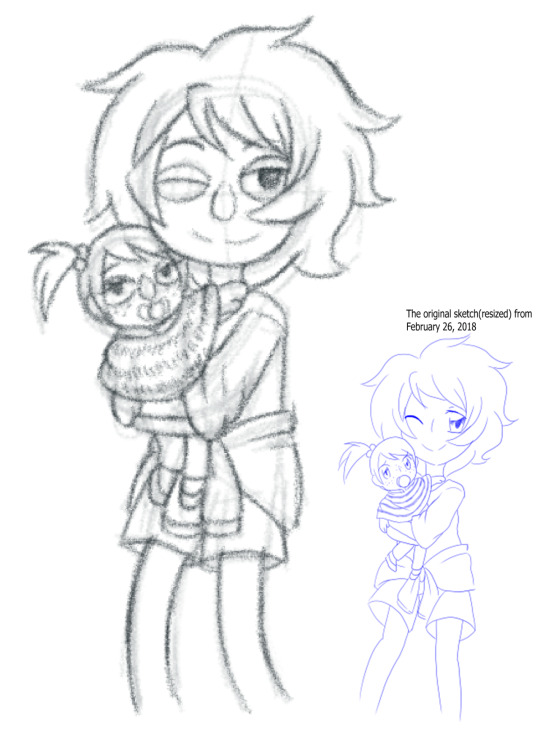
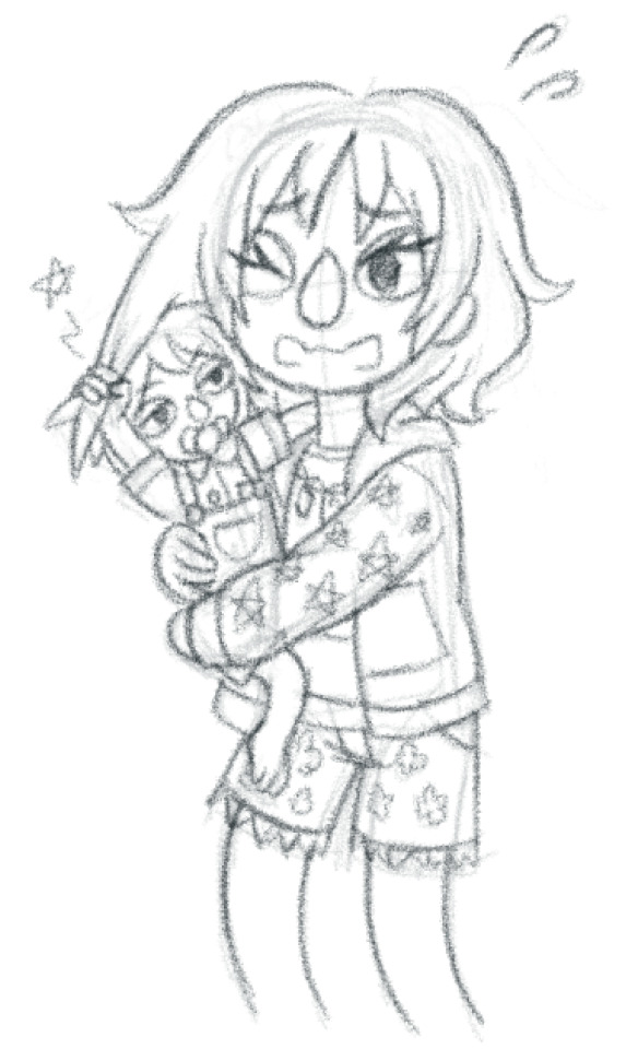
Here's a redraw of an old image I made involving an old image of younger Juniper & Lou along side a redraw were this time it's current June & Lou.
Some interesting things to know is that for some reason I drew all Muppet characters in gijinka form because I wasn't sure about drawing their muppet forms. As you can see with recent pics I can do muppet style now.
Another thing is that besides mentioning Lou use to be nicer in the past he was also the older sibling in the old stuff. Juniper/June is the older one now.
Link to a colored version I reblogged(for just in case) from Vincent that was colored by another friend of our's


Here's some old pictures of old ver Lou, first one is just him in an ironic shirt & the only time I semi could get his body type right.(I had trouble working on different body types when I was younger, Lou is meant to be chubby but this is likely not good enough) The second picture is just Lou in a dress just cause. It's kind of funny that his shirt says humble, original Lou use to be a relaxed & friendly airheaded guy that loves his family even if they're all crazy(him included) however Lou is a scam artist. Lou's main source of money is selling rocks, minerals, crystals & fake gems while making people(mostly hippies & spiritual people) think these are good crystals & spiritual items or some shit. Janice was his first victim, not because he sold shit to her but he took her crystals. I don't remember what happened I think he was throwing them as skipping rocks or something & learned he could sell these to people when someone asked to buy them from him.
Current/present ver Lou is a guy that has hurt his family, killed animals & now is with a guy(Who as a joke looks like Jim Henson) just as bad if not worse than him with multiple kids. Lou is married to a serial killer cult leader whose first victims were his grandpa(original creator of the cult) & his dad(grandpa's right-hand man) but to be fair they had it coming cause they led to how Sage is now.
One of his kids is Chrysanthemum or Chrys(is the oldest daughter) in past pics who eventually ran away from the cult & go a job helping people that use to be in cults de-learn their cult shit & have normal lives

I don't remember what the context for this was I think I was watching videos of weird moments on Family Feud or something & drew this.
For some reason it's Zoot & Lips(I have no idea why I drew him like this) with their adult kids on a game show with the original version of Clover as the host. Juniper is mad her family is a bunch of idiots(she's suppose to be the family member with common sense) because the winning question was "say the word what" but some how they don't know the answer. Clover wishes to use an airhorn on them to end this show since they've been like this for a little.
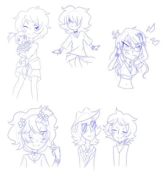
Last set of pics I have, this is a compilation of old digital sketches that were part of other sketch dumps. The one in the top left corner was shown already due to being used as context.
Yes these are full sized, I don't know why I drew shit so small in the past.
Top:
Old ver Lou as a kid holding baby Juniper(he grew his hair out a little when he was older which is why they're not covered)
Lou again
Juniper pissed, I think it has to do with her family again
Bottom:
Old ver Lou with eyes uncovered
Zoot & Lips, still don't know why I drew them like this
7 notes
·
View notes
Note
If you don't mind me asking (or if you have already answered this), why do you write descriptions on your images? Are there specific people that follow you that use them because they are visually impaired, or is there a different reason?/gen
Honestly it's not that I have specific followers that I know of that are visually impaired, so much as I just want to make my art more accessible.
Image descriptions are necessary for people who rely on screen readers to use the internet, but they aren't the only people who are helped by image descriptions. If someone is having trouble understanding what emotion is supposed to be conveyed by a given facial expression or what some symbolism is supposed to mean, I put that in the ID. I can also use it to explain or point out small details that might otherwise get missed. If someone's internet is slow and images aren't loading, then they can read the ID and not miss out on knowing what a post is about. The fact is that there are plenty of people online who struggle with understanding visual images or can't access them at all.
Also, even if I don't have followers who are visually impaired, I guarantee you that there are visually impaired people in the fandom who might come across my posts. Might as well make my posts something they can actually enjoy. (I do try to find IDs in the notes of the posts I reblog as well, but if I can't find one I tag it as undescribed so people can at least filter it.)
And as for why I normally do image descriptions in the text rather than using the alt text feature for it, that's because tumblr's alt text feature is kinda weirdly designed and when you open it to enter text, it blocks the image you're trying to describe. It's way simpler for me to just write the ID in the body of the post lol. (Not to mention that if I put the ID where people can see it, I can get corrections if I describe something wrong. The other day I wrote one late at night and described a character's shirt as completely the wrong color, but someone caught it and let me know.)
TLDR: I want my art to be accessible. That's the main reason.
#asks#bambi's rambling#i will say though getting in the habit of describing posts has made me realize how many of them aren't described lol
10 notes
·
View notes
Text
Support @hibiscusly and my friend @se3raj.0 and the families around him to have a chance to get a free Custom Vinyl pro test Banner! Go to bit.ly/serajfund to support!

By supporting Seraj’s GFM, you get a chance to get a custom wearable vinyl protest banner made for you that you can attach to yourself or your mobility device, use at pro tests, hang up in your window, hang up in your workplace, there are so many options! You can co-design the banner with me- I can make something pretty exact from a drawing, or just tell me what elements you would like / things you would like it to say and I can design it! Your banner can talk about multiple types of liberation struggles since our liberation is interconnected! Banner can be up to 4 feet wide!
I do sliding scale entries, check out the great sliding scale guidelines graphic from @Chiara.Acu :
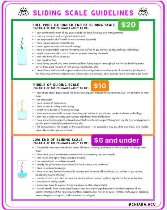
$20 an en-tree for those who can
$10 an en-tree for those in the middle
$5 or less an en-tree for those who are low income
So for example if you are employed and have access to healthcare but stress about some basic needs but are still able to meet them, send $10 for every en-tree.
For those of you who cannot contribute financially, I would also accept these other options:
-contribute art, goods or services to Seraj’s Support Soiree at bit.ly/fundraiserforseraj
-your commitment to post 4 days in a row about Seraj on your social media as 1 entry, or if someone financially supports on your behalf! Send me screenshots as proof!
Unlimited entries!
You can send proof of support through the @RebirthGarments IG or our Tumblr ( rebirthgarments.tumblr.com ) , and you will be contacted through whichever platform you contact us on! This rahffle is open till April 2!
[Image descriptions:
Photo 1:
Sky holding up a silver holographic banner with the queercrips for pal-is-time graphic in red, black, green and white. Sky is wearing a turquoise and purples scalemaille headpiece, purple holographic disco jumpsuit, pink laser cut queercrip symbol earrings, a @FloMaskUSA mask with Rebirth Garments custom fabric covering the filter and a black and white scarf with olive leaves and net pattern. They are standing in front of a white cubes tile wall.
Graphic 2: a text graphic by @Chiara.Acu titled:
“Sliding Scale Guidelines
Full Price Or Higher End Of Sliding Scale ($25)
(Multiple Of The Following Apply To Me)
• I can comfortably meet all my basic needs like food, housing, and transportation
• lown my home or rent a high-end apartment
• I am employed or don't need to work to meet my needs
• I have regular access to healthcare
• I have regular access to financial savings
• I have an expendable income for eating out, coffee to go, movies, books, and new technology
• I might have some debt, but it does not prevent meeting my needs
• I can take time off for vacation
• I can travel for fun
• I have family wealth and have benefitted from family support throughout my life (my family/parents pay or have paid for part of rent, phone, healthcare, etc)
• I benefit from institutional support and social privilege because of aspects of my identity (multiple of the following identities describe me: white, male, cis, straight, able-bodied, neuro-normative, US-born)
Middle Of Sliding Scale ($10)
(Multiple Of The Following Apply To Me)
• I may stress about basic needs like food, housing, and transportation at times, but I am still able to meet them
• I am employed
• I have access to healthcare
• I have access to adequate housing
• I might have access to financial savings
• I have some expendable income for eating out, coffee to go, movies, books, and new technology
• I can take a vacation every year without significant financial burden
• I have some family support or have benefitted from family support throughout my life (my family/parents pay for part of rent/phone/healthcare etc)
• I fall somewhere in the middle of the social matrix - For example, I may be white and trans, or a middle-class able-bodied person of color”
“Low End Of Sliding Scale ($5 Or Under)
(Multiple Of The Following Apply To Me)
• I frequently stress about my basic needs like food, housing, and transportation and don't always meet them
• I have debt, and it sometimes prevents me from meeting my basic needs
• I rent lower-end apt or have unstable housing
• I am unemployed or underemployed
• I qualify for government assistance like food stamps and medicaid
• I have no access to savings
• I have no or very limited expendable income, and I cannot afford eating out, coffee to go, movies, books, and new technology
• I cannot afford a vacation or have the ability to take time off without significant financial burden
• I do not have family wealth
• I sometimes have to support family members or other dependents
• I do not benefit from institutional support and social privilege because of multiple aspects of my identity (multiple of the following identities describe me: Person of color, female, trans, queer, disabled, neurodivergent, immigrant, undocumented or refugee)”
End image description ]
#news on gaza#gaza genocide#free gaza#gaza#gaza strip#save gaza#gazaunderattack#gazaunderfire#artists on tumblr#photography#gay#queer#protest
3 notes
·
View notes
Text
reading sekien no inganock and losing it
a little description of the game, diary, and review post!! this is an 18+ game. i am not showing or talking about anything explicit but heads up.
this post contains text and cgs from the game and talk about general themes in it but not really about any concrete plot points. there are very vague spoilers for the end of the game so whether you read this is up to you!
Inganock
sekien no inganock - what a beautiful people- is a visual novel first released in 2007. its part of a whole "what a beautiful" saga by the same author, hikaru sakurai. it has a linear plot, with in a steampunk setting that features Mysterious Critters. there are furries. everyone is super duper disabled. sometimes there are breasts on screen.

and is it not beautiful?
inganock is often called "fantastical". not in the positive sense. in the "how is this thing real and running" sense. it is a large city made up of layers - something like a structure composed of large plates stacked on top of each other. like hell in dantes inferno, which speaks volumes of its living standards.
about 10 years ago, a big science experiment cut the city off from the outside. it is surrounded by a non-traversable thick fog and water.
but do not worry!!!! inganock has been designed to be self-sufficient <3 at least as far as the production of food and daily commodities goes. so thats.... good?

i say this is a steampunk novel. and it is. but that might make you expect something else. regardless of that, inganock is what i would consider an ideal appealing form of steampunk: an industrial polluted hellscape.
it has been running on its own for 10 years in a self-made cage of smog.

and this is important to establish, i think. inganock is sort of a post-apocalyptic setting. (it gets worse, too! <3) no one calls it that because everyone is accustomed to their workdays and everyday life. this system is running. though, visibly, it cant run like this indefinitely. though most of the city lives in poverty, resources are not necessarily an issue. they are just unobtainable. the structure of the city itself combined with the high population density makes management of the lower tiers very difficult.
most importantly, not only the city was affected, but the people themselves. for the past 10 years, rapid mutations have twisted bodies in inhuman and/or bizarre ways. this mostly means it is a society of people with animal-like attributes but the process, speed, severity, and results depend on the individual. most people are becoming or have been left severly disabled and/or disfigured.
again, the story does not directly Tell you youre looking at a healthcare crisis, but you are. there are very few doctors around who are actually equipped to handle more than your standard general practitioner and their services are expensive. there is no insurance. it is commonplace for people to require entirely new body parts, and such technological wonders exist, but barely anyone can afford them.
this health emergency has gotten so bad that, apparently, it is perfectly legal to kill anyone who has mutated "too far". a clear explanation is never given, but in the case someone comes to resemble, say, an insect more than a person, they will be considered "too far gone". and at some point their absence will be seen as a blessing.

unrelated image of haro from gundam
no one remembers how any of this happened btw. yeah, everyone has trauma-induced amnesia in relation to where things went wrong.
denial and grief are core points of the narrative. the whole story might be about society avoiding its problems. (and who can blame them, the common inganockians life is hard enough as is)
its a sovereign principality that has been left to rot, both enviromentally and by the absence of its prince... which..... effectively means its more or less a very chaotic sort of aristocracy. any little sense of "law" is generally enforced by leftover indestructable robocops (which enforce uncontrolled violence based on past coding), privately hired muscle, bribery, or simply the physical means of private people. so thats an issue. apparently the few people in the two top layers reign over the city and control the economy and the prices of food entirely. idek.
tl;dr dude it SUCKS.... inganock has a really intriguing setting. i adore it deeply. but well....
Disclaimer
i have read maybe a handful visual novels in my whole life. my extremely limited japanese knowledge is not worth mentioning and i am working off a fan translation. so all that influences how i talk about the story. and there are probably countless details that escape me or stuff i just did not get due to a language barrier.
OFTEN there are parts of inganock that reference another game in the -what a beautiful- series. if you dont know what happens in there and how things connect.... well some stuff will never make sense. i have just accepted this to be honest. maybe ill understand in the future.
there are short stories set after the games story! i have no read them yet. apparently they explain a lot about the games very wild and confusing ending and i hope to get to them some time. hopefully, i can make another post about it.
disability is a huge focus for me. it might not be as important to you. but claiming it isnt a defining feature of the games setting is ignorance.
inganock is, in my opinion, fundamentally a story about the enviroment and about disabled peoples struggles. so i talk about that. on a more emotional level, as mentioned before, it is about avoiding ones trauma and thereby being unable to move on/getting stuck in ones own mind prison forever. its also about how you should eat breakfast with your daughter for mental health.
Frontloading My Biggest Criticism / Content Warnings
sekien no inganock has a huge problem with sexualizing one of its main characters, kia, a teenage girl. how old she is exactly does not matter because she looks like this

this is my biggest issue with the game. it felt incredibly gross and invasive to play at a handful of points. there are two cg's that show her chest. characters keep implying she is somehow in a romantic physical relationship with the adult man protagonist. even if it happens on the side and relatively rarely, its really damn disgusting.
the game clearly delivers lolibait but keeps up a front of plausible deniability. she is not a "love interest". she is not in any written out and detailed "hentai scene", like they exist in the game (though there is arguably a scene like that with her. just to warn you.). she is not exactly "underaged" because there simply is no canon age.
this is really serious and i needed to get that out of the way instantly.
and, just like i had to write in previous posts about other games, there is a needlessly detailed rape scene here too. and while there is a narrative purpose and a great critical evaluation of it in inganock, it still functionally serves as a sexualized porn scene.
as always, im not against difficult or brutal topics like these coming up in media, i am against exploiting and fetishizing trauma. this really is by far my biggest gripe and greatly influenced my experience as a reader. i will discuss neither further in this post but its necessary to mention, should anyone want to have a look at this game.
how i approach the storytelling
the enviromental descriptions in this game can be both overwhelming and confusingly vage at the same time. and there is one mini game that serves as an infodump in every chapter.
if you are curious and want to give it a try, here is what I recommend: it could be really useful to take some notes. it is a fairly long game with a lot of repetition, both through chapters that are built up in similar ways, and repeating bouts of text. don't bother taking detailed notes on the lore or specific terms, you are fighting a losing battle. the story loves to namedrop concepts on you, only to explain them to you much later on. thrice. it will make sure you dont stay confused, you just have to trust it to explain itself.
what you SHOULD keep an eye on are the timeline and connections between characters. pay attention to everyones health and overall feelings. a lot of the games strongest writing points are centered around depicting everyone's struggle with the world they live in and the bad health this results in. this goes for the enviroment (which truly is its own sort of organism) too!
a lot of text repeats itself but each time a tiny difference in the wording will manifest. imo, there is an appealing sense of horror to the monotony of it and how it mirrors the protagonists life, as it gets disturbed step by step.
inganock has a weird habit of spoiling parts of the near future and characters that are just about to appear. this is kind of a neutral quality, its just a bit strange and funny. it never spoiled my fun but it didnt necessarily help me comprehend the story better or made me more curious. HOWEVER it gave off the idea that, as a reader, i am not really following the protagonist gii, i am instead following a story in which he plays a role.
the game has a linear story and while every chapter provides the reader with a choice at its plots climax, there is only one "correct" answer that will continue the story, the rest results in a very short but interesting game over. these game overs are similar across the board but worth checking out every time.
what i personally love is, there is never a choice that feels good or correct. the game only provides the ability to give up or to carry on and face the consequences. this results in a very sad but satisfying direction!!! "game over" isnt tied to "doing the wrong thing" or dying necessarily, its tied to giving up on ones ideals and drive.
The Actual Story
in the hellhole that inganock is, gii is a practicing doctor. like everyone else, he mutated too, but only his brain changed. outwardly he is human and sticks out like a sore thumb. he has been able to do healing math magic, at the cost of his own sustenance. (and oh boy is he willing to sustain.)
while his profession leaves him with stable income and the ability to survive, his life is unremarkable and he mostly just works and sleeps. his only social contacts are patients, a bunch of orphans he tends to out of altruism, and a catgirl called ati. ati and him are sort of a thing. (convoluted simplification)

ati, ngl, your not-boyfriend situation sucks and your bird coworker cant help with that
one day he walks into a large mutated giant carrying off a little girl, so he steps in and......... now he got a roommate.
kia is adorable, she is a joy, she is childish in the best most positive way, and maybe the last person around who chooses to be kind to absolutely everyone. a total contrast to giis depressed and apathetic nature. inganock hasnt seen the sun in years but kia is the next best thing.
she is also weirdly competent for the age she looks to be. and has no visible mutations. and very clean high quality clothing. ... odd.

kia packed a suitcase with onigiri AUGH she is so cute
every chapter they encounter a patient or get involved in A Situation (tm) otherwise. the game can get a bit stale here but imo every single side character has a unique appeal and captivating fate. and theres monsters. and manifestations of peoples dreams and hopes, which look and work exactly like jjba stands. gii fights the monsters with his stand. just take this at face value okay, it looks really epic every time.

also every chapter we catch a glimpse how the games main antagonist (again, convoluted simplification) progresses in the background. eventually, they will meet and interact, and with every chapter they get one step closer to it.
the antagonists actual motives go unexplored for a large portion of the story. the city they live in itself is so difficult to deal with that it provides enough conflict and adventures.
the main plot centers around what becomes of doomed inganock. but it just as much centers around everyone collectively overcoming the paralysis trauma put them in.
What I Love About The Story+World
inganock loves to linger on individual fates and tragedies. most chapters are tied to one character and most of these are women with incredibly sad lives and lovingly crafted problems
^ within this concept, there is a fair amount of explorations in regards to identity, ones own body and the horrors it brings, family relationships, and gender
monsters (or "critters" as they are called in the game) are manifestations of societal fears (child mortality, an aging population, uncontrollable health epidemics, natural disaster and the destructions of the enviroment, ..... and... THE INTERNET???? and internet additiction? this is a topic?)
because of the repetition on the storytelling, fighting those monsters always goes the same but it is soooo badass and sooooooo cool every time
imo, it is incredibly fun to keep track of repeating scenes because they slightly change every time. it can be hard to fully realize something has changed even. with the core themes inganock provides, this seems to purposefully mirror stale routines in life
there is a character with some sort of transgender and sex worker story in it and the first time i read her part i really wasnt sure if it is weirdly transphobic or the most empathetically written description of someone experiencing the horror of their own body. i still dont know. kinda really loved it though
the end is bizarre as fuckkkkkk but i guess i... liked it? it is very much a "the world and nature around you is a larger organism and will always be stronger than you, a human" kind of deal
it really seems to me sometimes that the city itself is the protagonist and a character who acts on its own
in general, inganock is often likened to a baby that never got to develope.... a common fate within its smog dome as well as the cruel wasted potential of the "perfect city"
about the protagonist
i ADORE gii. right from the start, he vaguely drops hints that he lives with immeasurable regret. while he is one of the incredibly rare cases of people whose mutation arguably leaves him in a better spot than he was in before, he is deeply chronically sick. it is a mix of grief and depression that leaves him almost entirely apathetic and unable to care about himself.
however he is deeply driven on and on by his nurturing nature, guilt, and the feeling like he owes his services as a doctor to every single person in inganock. like many other people, he cannot remember what happened 10 years ago and what exactly made him feel guilty to begin with. this is a powerful metaphor, of course. his mental issues have become an independent force, they are entirely seperated of what made him feel inadequate in the first place. feeling this way is all he knows and so he cannot get better.
he is deeply stuck, deeply unchanging, but fundamentally a very good person whose altruistic aspirations almost kill him physically. he is very "pure", carries the world on his shoulders, but remains helpless by himself. he can only exist for and by the grace of others.

oh, you.... (kicks legs)
what eventually inspires change in him is kia repeatedly forcing him to eat, to sleep, she provides him with company, and gives him very very few chances to help her and thereby define his worth through services.
though kia is a very responsible skilled person, the only care she needs is emotional companionship. they form a very clumsy father/child sort of bond!

(it takes him like 2/3s of the visual novel to realize this)
though the games disgusting lolibait STUPIDLY destroys what it carefully built up later in the game, for the most part, those two are an unending source of comfort as well as a good example of a troubled father who genuinely tries and a daughter who has to grow up too quickly. its sweet and real and a bit ugly and i adore them.

multiple times during the game gii drops this line. and youre forced to wonder WHAT DOES HE MEANNNN.
i genuinely dont want to actually tell you the end of the story and what becomes of inganock. because its really kind of a "what the fuck" moment. its so weird that i was wondering whether the last chapter of inganock has a pro-life sentiment (it doesnt. but if you really wanted to, you could read it that way. not important, i just thought its oddly funny.)
BUT!!!! gii is and remains what he seems to be at first glance - a burdened and sick but ultimately helpful person. he has to make tough decision as a doctor. many times he finds himself at the lever of his own personal trolley problems and has to kill one guy to save five. this isnt his fault. he really is just a guy. and i love him deeply for this.
like with many people that struggle with feelings of guilt - the guilt was never even rightfully his to hang on to.
the fucking clown

you know, problems clown
there is a clown in inganock. the clown is omnipresent. you never actually see it and it doesnt do any clown things, to be honest.
in a wayyyy the clown is sort of a commentator on giis mental health? but not reallyyyy.... the game has its own weird version of a greek chorus in the form of clock crack chrome. so that is not what the clown does.
just imagine the entire story happens while there is a clown standing juuuust within eyesight. and every time gii eats shit, the clown taunts him for it. its kind of its own mental illness. i think it is a metaphor for ones own thoughts working against oneself. but there are many things the clown could be and thats beautiful.
no point in talking about this, i just think the clown REALLY adds something.

i dont want to actually spoil you for important cgs but this is 100% what the clown looks like
closing thoughts
SHOULD you read inganock? probably not. honestly. the horrible kia parts are too bad to really recommend this to anyone.
DID I ENJOY inganock? yeah, a lot! personally! i love the focus on disability and the enviroment and i LOVE clowns. i love clowns so much. so it was very whimsical and touching to me.
i dont share much of the criticism other people have for the game, about it being repetitive or losing focus. personally, to me, inganock is very much trying to be artsy, a fairytale, and a book at the same time. its less of a coherent logical sequence of events and more of a mental health diary, really. "whose mental health diary?" the... citys? in the grand scheme of things, the weirdness of its storytelling and vagueness quite possibly adds to its charm.
i dont love inganock for its story, i love it for its clear external observation of avoidant traumatized life. and the fact it provides the reader with the chance to reflect on their own actions because of it.
(very vague hesitant thumbs up)

thats all that is!
1 note
·
View note
Text
Male Shadowheart. Edit: gonna update this post Tomorrow with mods used. Hang tight!
Mods update:
Ok, so folks wanted to know the mods used for my male Shadowheart. So here goes. Let’s start with the basics:
Download these first:
BG3 mod manager (read all the instructions!)
https://bg3modmanager.net/
BG3 mod fixer
https://www.nexusmods.com/baldursgate3/mods/141
Improve UI
https://www.nexusmods.com/baldursgate3/mods/366
These are required for a few different mods that change Shadowheart. But to be honest, these are just good to have as a default, regardless, because it seems most mods will eventually require them.
--------------------------------------
As for Shadowheart specifically:
First download the mod that changes she into a he:
Boy'zel and or Chadheart
https://www.nexusmods.com/baldursgate3/mods/2599?tab=posts
I downloaded two files: “Fixed Chadheart” and “Chadheart voice”. The voice you hear in my video is that file’s voice changer. I believe there are other voice changers out there if you don’t like this one. I’ve seen at least one other one.
This mod reskins Shadowheart to look like a guy but he doesn’t really look like the one I have. I’m mainly just using the voice changer. So technically the “Fixed Chadheart” is superfluous, but I do have that mod running on him. (But in the long run I really didn’t need it. I will leave it up to you. You can edit the reskin so it’s not a big deal.)
Here’s what I really used in the long run because I want to change his hair, eyes, and give him tattoos:
Appearance Edit Enhanced
https://www.nexusmods.com/baldursgate3/mods/899
I have ��appearance edit enhanced” AND “appearance edit origins” files running in the mod manager.
So download both of those files.
Also, let me explain how to use this mod because I was so confused at first. These appearance editing mods basically give every character a magical spell. It should be down in their spell slots. It looks like three of the “disguise self” masks stacked on top of each other. (You’ll know what I mean when you see it.)
Step 1. Recruit Shadowheart
Step 2. Select Shadowheart in party list.
Step 3. Have Shadowheart cast “appearance editing” spell. The spell with the three masks as the image.
Step 4. (From this point on is where it gets tricky. Read carefully.) Cast “Resculpt”. Don’t bother with Mirror. It doesn’t work. At least it does not for me. You can edit stuff in the mirror spell but it won’t save. I mean if you wanna try, go ahead. It doesn’t “confirm” for me. Cast “Resculpt”
Step 5.
Click “custom” at the top. Do not try to edit anything other than custom.
Click “race” – half elf
Click “body type 2” – male body
Click “edit appearance”
I explain below what I did to edit Shadowheart’s appearance. If you wanna deviate from what I did, by all means. He’s YOUR Shadowheart!
You don’t seem to need to worry about selecting a class or designing the guardian or even naming Shadowheart. None of that stuff changes. Just the appearance.
---------------------------------------------------
Another little optional extra, if you want it. This mod changes “she/her” in text to “he/him”. The narrator still says she, as do the other characters, but if you wanna immerse yourself to see masculine pronouns in text, then here’s this. It’s optional. Up to you, really. I used the “BIG” version for the male Shadowheart dialogue. You’ll see there is a big and small version. I just used “big”.
Male Dialogs for Lae'zel Karlach Minthara Shadowheart Jaheira
https://www.nexusmods.com/baldursgate3/mods/5531/?tab=files
---------------------------------------------------
Ok let’s start from the top down…
The hair:
Vessnelle’s Hair Collection
https://www.nexusmods.com/baldursgate3/mods/1420?tab=description
I downloaded all 4 packs. I ended up using number 25. You’ll see it in the hair selection screen. It should have an M25 mark on it. It’s the second to last style.
The hair color:
Astralities Hair Color Supplement
https://www.nexusmods.com/baldursgate3/mods/2002?tab=description
So I just used ASTRL_Raven_Black for all three layers of hair color. Intensity maxed.
The face:
(Not a mod.) You’re going to use male half elf head 5, which is actually what the reskin uses anyway.
The skin:
(Not a mod.) Cool tone 1.
The eye makeup:
(Not a mod.)
Makeup 7
Black
Intensity and metallic tint maxed.
The eyes:
(Not a mod.) Flame blue 1.
The tattoo:
(Not a mod?) I don’t think this one is a mod. I used Broken sword. Black color.
The jewelry:
(Not a mod.) Chultan serpents
The clothing/armor:
PK Clothes and Armours
https://www.nexusmods.com/baldursgate3/mods/9859
I dressed Shadowheart in “Midnight”
You will find the clothing/armor available aboard the nautiloid. It is located inside what everyone calls the “tutorial chest” which I think is a really vague/poor explanation of the chest or where it is located. This chest is called a Cartilaginous Chest. It is located inside of that room aboard the nautiloid where the woman is trapped in a pod. (Remember? You can access a terminal and turn her into a mindflayer.) The “Cartilaginous Chest” is to the right of the terminal, up the little stairway. Open it up, PK’s clothes and armor are inside of that. If you miss it, no big deal. Arron and Dammon (at the grove) also sell it in their inventory.
---------------------------------------------------
Ok, whew. I think that's everything. Typing it all out makes it seem like a bigger feat than it really is!
1 note
·
View note
Text
(don’t read if you don’t want andor season 2 spoilers)
the quality is terrible on the leaked andor season 2 teaser but asdfljkfasdflkjkl look

someone with long, dark, wavy/curly hair and baggy black sleeves enters the hall holding a blaster with both hands

later in the trailer, someone with the same baggy black sleeves holding the blaster in the same way is pointing it at a shocked dr. gorst. this has to be the same person we saw coming down the hall.
i think based on the hair this is either cinta or bix. the hair looks a bit more like bix to me, I love cinta but with bix it would be a very personal revenge, please tell me bix gets to kill him please please please
bix is also possibly meeting luthen?

i can’t tell if that’s her or cinta from behind, i think it’s one of them based on the hair again. i think the jacket looks a little more bix than cinta; it looks leathery like bix’s signature jacket from season 1, whereas cinta had a puffy down jacket. or this could be a completely new character, idk
also towards the very end they had this:

which is definitely bix, unconscious/dead and loosely holding a blaster. at first i thought oh damn, we knew she had to die before the events of rogue one but did they really put her death in the trailer??? but on closer look i think she’s maybe just sleeping, she appears to be on a bed or mattress. either way, I think this shows she’s fully joined the rebellion— either sleeping with blaster in hand ready for an attack at any minute, or going out fighting to the end.
i was so hoping bix’s recovery arc would wind up with her deciding the empire has taken enough from her and it’s time to fully commit to fighting back, and i really hope this teaser is confirming what i think it is. i hope we see bix do some damage in season 2 including killing dr. gorst kill him kill him
#no designated image descriptions because i do them in the body text of the post#bix caleen#andor#andor season 2#star wars#original post tag
26 notes
·
View notes
Text
Starting out with image descriptions: formatting
Plain text: "Starting out with image descriptions: formatting" in title text. end PT
Continuing my series about accessibility, I have decided to explain how an ID should be put in a post. I see a lot of people in here who already do image descriptions but aren't sure how to properly format them, or who format them in a way that isn't accessible. I decided to make a post to explain the basics on how to make IDs.
This won't explain what to write when you're making IDs; just how to properly put your ID in the post in a way that is accessible. For more resources on IDs, you can go to my "accessibility" and "reference" tags.
1. Text ID vs Alt Text
Plain text: Small title text saying, "1. Text ID vs Alt Text". end PT
A text ID is an ID you write on the body of the post, visible to everyone. Alt text, on the other hand, is an ID you code in along with the image, so it isn't visible for people with screenreaders, but people with it can click on the image and get that ID read out loud.
Tumblr offers the possibility to add alt text to your images, if you click on the three dots that appear on the corner of the image on mobile. Except... Oops, it doesn't always work
As with many Tumblr features, Tumblr alt text is known to glitch, and the entire alt text might disappear or not be available to users without the O.P necessarily knowing. The reasons for this range from "the post was edited later" to "reblogs ate the alt text" to "damned if I know". So, it is unreliable, and that alone is a reason why it should not be used
There are, however, other important reasons! Namely, that alt text isn't actually accessible to a lot of visually impaired people. This is because alt text can only be accessible via a screenreader, since the ID will only be available in the post's code. And not every visually impaired person uses a screenreader, including blind people
There are other accessibility features that legally blind and visually impaired people use, such as: bigger text, bigger display, high contrast text, the enhance button, color correction, and more. These people still need IDs (including of screenshots of text! They need these accessibility features to see text, so if you post a screenshot of regular text, they can't read it), but cannot see them if you only put it on alt text
Not to mention that some blind people cannot use a screenreader even if they preferred that to other accessibility features, because they are Deafblind, have auditory processing disorder, or simply cannot listen to something at the moment for whatever reason
Tumblr is working on a feature that allows alt text to show up in the body of the post so people can read it normally, but while it isn't available to everyone, alt text is not accessible. It is not accessible to Deafblind people, people with APD, and people who prefer not to use screenreaders, which is a choice they have the right to make. Therefore, using it is not a good accessibility practice and using plain text IDs is preferable
There is also an important argument, which is that alt text is designed to be invisible to sighted folks, and that in itself is problematic because it discourages people to think about accessibility, recognize when something is or isn't accessible, and start incorporating accessibility practices into their lives. I am a strong supporter of this argument, which is another reason why I don't think I'll ever advocate for alt text. This part, however, isn't a consensus. The other parts are
2. Placement of the ID
Plain text: Small title font that reads, "2. Placement of the ID". End PT
Imagine that Tumblr's newest glitch is that any images added to a post end up at the bottom. So you see a text post that makes use of several images, but every time there is an image in the middle, you just get text that says "image" and you have to scroll down, find the image in question, then scroll back up
This is the experience you are giving blind and visually impaired people when you leave your IDs at the bottom of the post
Folks, when you add an image (or more) to a text post, you don't put it in a random place, do you? You put it in the ideal place for someone to comprehend your text. There is a logical, comprehensible sequence between text and image, and the image is right where it's supposed to be
Therefore, it is also where the ID should be
Please understand me clearly: an ID is their user's image. It substitutes the image for them. When you are writing one, it is helpful to ask yourself, "what would this look like if there was no image, only the ID?". Because that's what it's effectively like for people who need IDs
If the ID is anywhere that is not directly over or under the image, it's in the wrong place. If a place is where the image should be, then it's also where the ID should be
And yes, this includes when you post an image post with just a one-line caption underneath. Most of the time, the caption doesn't make sense without knowledge of the image. If you didn't post the caption before the image, there's no reason to put the caption before the ID
3. About "ID" and "End ID"
Plain text: Small title font reading "3. About 'ID' and 'End ID'." End PT
I occasionally see people posting IDs without the "ID" and "End ID" at the beginning and end, so I thought it'd be helpful to explain why they are needed.
Without the "ID" at the beginning, someone who can't see your image will not be able to tell that the image is described, and will assume that what you are posting is a caption. Then they will probably skip it, or at least believe they are missing the image's information
There is really no other way to make it obvious that what you are about to post is an image description. And a lot of the time, even reading the ID won't make it obvious that it's an ID if you can't already see the image. This is particularly true when the image in question is a screenshot of text and the ID is just a transcription without information that it's a transcription. Someone who sees that and can't see the image will assume that it's your own caption to the image, which could be literally anything
Similarly, the "End ID" is important for the person to know where the ID ends and the poster's caption or commentary begins. Again, there is no way for them to know otherwise. Not even the paragraph break, because some IDs are longer than a paragraph, especially if it's an image with lots of information, such as an infographic or spreadsheet
Using brackets [] instead of the "ID" and "End ID" is NOT ["not" in caps and bold] an appropriate substitution, because brackets are a form of punctuation, and therefore, screenreaders will just read them as a pause. A pause which they would already have because of the paragraph breaks. So, for screenreader users, they offer absolutely no differentiation
Note: "ID" stands for "Image Description", not "Identification". So you don't need to say "Image ID", as that would be "Image Image Description". That's not a cardinal sin that deeply affects your accessibility or anything, but it's good to know. I was saying "Image ID" for like a year before I realized that and I felt really stupid afterwards, so I thought you'd like to know
4. Formatted text
Plain text: Small title font that says, "Formatted text". End PT
I see a lot of people posting their IDs in formatted text (usually tiny text or italics, but occasionally bold, colored text, and others). You should not have your ID in any kind of formatted text
Why? Because most forms of formatted text are unreadable to at least some people with visual impairments, if not all of them. This will generally not be a problem for screenreader users unless you use all caps, stylized fonts, or embedded links. But they will be a problem to users who don't have screenreaders, which, as we've seen before, make up a significant amount of ID users
Legally blind or visually impaired users who don't use screenreaders generally rely on bigger text/display as an accessibility feature. This means that they set their phone to make text bigger for them. If you put your ID in tiny text, you are making the text small all over again. So they won't be able to read it, and your ID will be useless
I have my phone's text and display set to biggest, and Tumblr tiny text looks roughly the same size in that mode as Tumblr regular size in regular mode. That is not big enough for lots of visually impaired people to read; if it was, they wouldn't have their phones set to make text bigger
Similarly, italics make the text look thinner, which is harder for a lot of visually impaired people to read. Bold makes the letters get easily smushed together, which is also hard for some to read. Colored text has a lower contrast, which will also be harder for them to read. Not to mention visually impaired people might have other conditions that affect reading such as color blindness or dyslexia
This is specially harmful if it's long chunks of text. I've seen some people who will put everything that was directly transcribed from the image in bold or italics, and I've even done it myself for a brief period. Please don't do this! It is very hard for a lot of people to read
Every time you mess with formatting on your text, you are basically annulling someone else's accessibility features display. And since Tumblr does not allow users to turn those settings on or off, this is an accessibility issue
Note: not everyone will be negatively impacted by the use of these. Some people even find them helpful, especially if it's to signify key words. But again, since it's impossible to turn it on or off, the best way to do an ID is without formatting, a.k.a in plain text. The exception to this is BlockQuote (a.k.a idented text) and bullet points
To find out more about plain text, you can check out the other post I made about it on the link below
Link
"Do I need to put the ID between brackets?"
Plain text: Small title font reading, "Do I need to put the ID between brackets?". End PT
You might have noticed that most people post IDs between brackets, like this: [ID: A pig wearing a baseball hat. End ID]. This might be the most common way of formatting it
It is not, however, necessary. As far as I know, people do this so people who don't need the IDs can easily know where it begins and ends, and skip them. They do not serve any accessibility purpose
Personally I don't use them, and if I want to have a visual cue to show where the ID begins and ends, I put it in BlockQuote. This is not necessary either, although it might help some people with dyslexia and ADHD better organize the contents of the post. It is fine to do, though, as long as it doesn't substitute the "ID" and "End ID"
And that's all, folks! Thanks once again for reading this long post, and I hope it was helpful
TLDR
Plain text: small title font reading "TLDR". End PT
You should make your IDs in text, directly under or over the image, with the "ID" and "End ID" at the beginning and end, and without italics, bold, or tiny text. Using brackets isn't necessary but it's okay
#accessibility#image descriptions#reference#resources#how to make ids#has plain text#has tldr#long post
795 notes
·
View notes
Text
SPIDER-SONA TIME!!

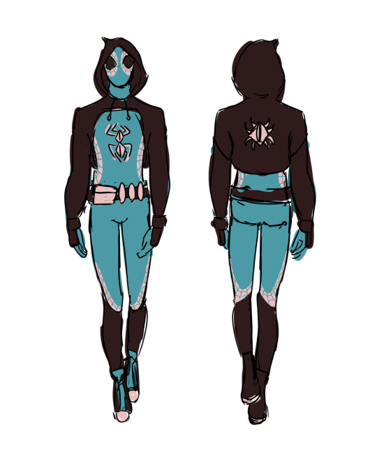
[Image Description: two digital drawings of void-crawler (my spider-sona). the character is drawn five different times throughout the whole canvas. on the top left corner, void-crawler is unmasked, smiling and doing a peace sign. there are two white text boxes representing void’s internal thoughts that read “gotta love hammerspace. how else would my hair fit otherwise?*”. underneath there’s a turquoise text box that reads “*editor’s note: it would not.” in the middle left side of the canvas, void-crawler is shown with a surprised expression and the spidey sense lines. there’s a white bubble text that reads “omg i have squiggly lines!!”. near that drawing, there’s a smaller one with a chibi head of void doing a salute with a turquoise bubble text with a white center reading “of course, officer!”. an arrow points to text saying “talking with hero voice (a.k.a. deeper)”. on the bottom left corner, there’s an unfinished but colored drawing of void-crawler drinking a milkshake with half their mask off and with little hearts on the side. there’s an arrow pointing at the drawing accompanied by text that reads “pretend this is okay [heart emoticon] and finished…” on the right side of the canvas, there’s a full-body drawing of void-crawler. void has a hand near the face in a thinking manner and the other near the hip. to the right, there’s a written text that says “void-crawler!” in all caps. the background is a yellow note-taking paper texture. the second image shows the front and back design with some mannequin models as template. background is white. /end ID]
more info below:
alright guys, let’s do this one last time. my name is mars walker. i was bitten by a radioactive spider. and for the last 2 years, i’ve been the one and only void-crawler. i’m pretty sure y’all know the rest. i saved a bunch of people. got spider-man to be my mentor. did a couple of team-ups with him and deadpool. i saved the city but i… couldn’t save peter. i stopped fighting for a while. changed my suit and hero name. and now i’m back, stronger than ever, wahoo! because no matter how hard life gets, i always find a way to come back and save the city. cuz who else will if not me?
amazing intro proving i’m a hero… check!
whole backstory explained… on hold
hi! finally posted this, i made it like a week ago. anyway, i think i would have some extra powers, as a treat.
first of all, enhanced spidey sense. i don’t only perceive near danger but FUTURE danger as well. basically i get visions, premonitions, prophecies, whatever you wanna call them. they are always about danger and there IS a way to change them. i dont know how that would work with time and space continuum and all those complicated things, but who wants logic, boring!! (i’ll solve the plot hole soon, dw 😭🛐) (if any of y’all have any idea how to solve it, pls tell me)
i would be able to break the 4th wall cuz i constantly do irl anyway,, sometimes life follows a specific storytelling pattern and has very notorious plot armor and that makes me think “huh… weird”
i would also have sensitive senses, and that includes night vision! (i already have sensitive hearing irl and it’s a nightmare! good luck void-crawler). i could also “change” my appearance? i would not physically change it, but i would release some kind of chemicals or stuff that would make people see other thing. this is inspired by the ant mimicry spiders do. spiders DO change physically, but i think mine would be just psychologically. idk, i thought that would be cool :P
the design of my spidey suit is inspired by, spidey of course, but also by deadpool’s suit. cuz i’m obsessed with both of them atm, so had to add that to my story 👍 AND IT WILL MAKE SENSE STORY WISE MUAHAHAHA! cant wait to tell y’all the backstory.
yk that thing miles and gwen do when talking to their dad while in the spidey suit (deeper voice)? well i would do that all the time i’m talking with people that are not aware void-crawler is mars walker. and my bubble text would show that by being mostly turquoise with a bit of white in the center :3
#HEHEHEH!!!! finally posting this wahoo!#spidersona#spidersona oc#spider man oc#spiderman#spiderverse oc#spiderverse#across the spiderverse#atsv#itsv#into the spider verse#peter parker#deadpool#wade wilson#art#digital art#digital artist#marvel#marvel art#sony animation#sony pls hire me i have many ideas (i’m only 17 tho F)#has id#my art
36 notes
·
View notes
Text
Making Writblr More Accessible
Hello, all! I'm Nico, your local disabled writer. Specifically, I am (loudly) autistic, as well as coming to terms with the chronic pain that's been following me for a few months. I am also an advocate for accessibility in writblr, because it is unfortunately lacking.
I am not the leader of knowing what accessibility looks like, of course--for instance, while I do wear glasses, my vision is not nearly as affected as anyone considered legally blind and I do not know everything there is to know about being accessible for that. I don't know what it's like to be disabled in ways I'm not, but I do know a lot about accessibility due to spending time in disabled communities, and I want to share that knowledge.
I'll split this into images & GIFs, fonts, blogs, community, and "in conclusion". I'll mostly just talk about blatant inaccessibility, but the community section will discuss community attitudes and behaviours as well.
(The rest of the post will be under a keep reading, for length reasons.)
Images & GIFs.
An undescribed image or GIF is an inaccessible image or GIF. There are blind and visually impaired tumblr users who rely on screen readers, but screen readers cannot read images.

[ID: a photo of Grumpy Cat lying down and looking at the camera. She is white and brown. /end ID.]
There are two ways to do IDs; adding them in the alt text, and adding them in the body of the post. I did both with this image.
An image description should be as short and useful as possible, so the person who needs it gets a good idea of what is in the image but is not overloaded with pointless information. (E.g., I did not describe Grumpy Cat's exact ear shape.) You also should not use tumblr's small text for your ID; more on that in "fonts".
Some images are more complicated than others, and will require a longer ID. You still want to follow the same general rules, though. Keep it simple, but make sure you put in all the important info.
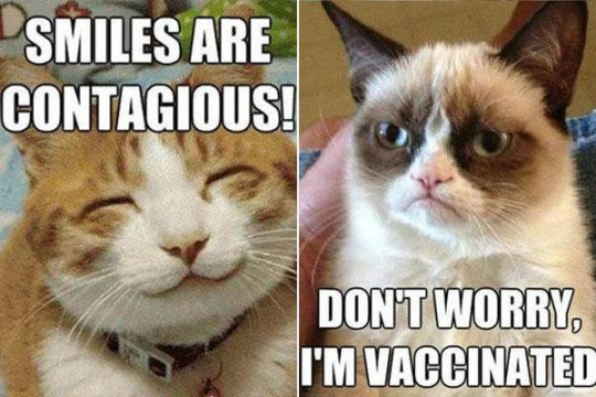
[ID: a two-panel Grumpy Cat meme. In the first panel, an orange tabby cat is smiling and the text reads "smiles are contagious!".
In the second panel, Grumpy Cat is looking over at the first panel, and the text reads "don't worry, I'm vaccinated." /end ID.]
This is an example of a slightly more complicated image.
You want to describe memes, screenshotted tags, picrews, WIP intro powerpoints, GIFs... basically anything that is not normal text. Additionally, you should tag for GIFs ("#gif tw" and "#gif warning") as the sudden flashing and/or movement can risk triggering epileptic seizures.
Fonts.
This overlaps with both the "images & GIFs" section and "blogs" section, so I figured I might as well make it it's own thing.
Some fonts are more accessible than others, both in regards to size and design. This link right here leads to an article about what makes a font more readable, as well as a list of accessible fonts.
Generally, you want a larger font for your blog's desktop layout, as they're easier to read. You also want to use tumblr's regular font when posting; this small text is very difficult to read for many people with vision issues. [Translation: "this small text is very difficult to read for many people with vision issues." /end translation.] Personally, as someone with glasses partly for headaches, attempting to read small text always sets one off. (That's why you shouldn't use it for IDs, either.)
Some dyslexia-friendly and readable fonts include: Arial, Comic Sans, Dyslexie, Helvetica, and Century Gothic, though there are many others. When in doubt of a font's accessibility, look it up!
Blogs
I've had personal inaccessibility difficulties with both previous elements, but this one is really the one that frequently bites me. When designing their desktop blog appearances, people often just consider what looks cool to them, as opposed to what's accessible.
Blog accessibility is important in writblr in particular because when you put any writing or intros under a keep reading, it will redirect to your blog directly. This means your blog layout should be accessible for people with sensory issues, dyslexia, and low vision.

[ID: a screenshot of my blog's desktop layout. It is eggdesign's "iconic" theme, customized. The background is a plain light blue, the posts are white with dark blue font, each post has a yellow border, and the font is arial. /end ID.]
I customized blog's layout to accommodate my own autism-born sensory hypersensitivity and mild visual impairment (needing glasses). The colours are contrasting, which is important for readability, but not overly saturated, which is important for sensory issues. The font is at the normal size with no embellishments.
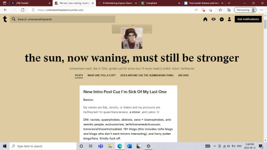
[ID: @.wherearetheplants' desktop blog layout. Is is the default tumblr theme. The background is plain beige, the posts are white with black font, and the title and bio are brown. /end ID.]
@wherearetheplants is a good example of a well-contrasting but not cluttered or oversaturated blog theme!! (& check him out, he's cool.)

[ID: @.inaccessible-blog-example's first layout. The background is bright green with bright pink accents, and the only post contains one paragraph in small text and one in curvy text. /end ID.]
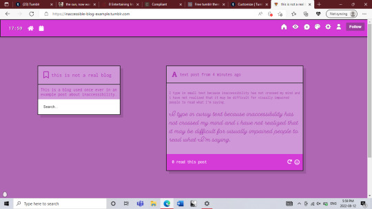
[ID: @.inaccessible-blog-example's second layout. All the colours are very similar shades of purple, and the only post contains one paragraph in small text and one paragraph in curvy text. /end ID.]
These are two examples of what an inaccessible blog theme may look like; I know I personally would not be able to read anything on either of them for longer than maybe two minutes.
Community
If you want disabled people to feel welcome here, not only should you strive for basic accessibility, but you should also actually think about your internal biases and assumptions and whether you're actually considering disabled people in your day-to-day interaction with the writblr community.
Are you giving disabled & mentally ill traits (psychosis, low empathy, canes, scars, DID, etc) to exclusively villain characters? Are you using words like "narcissist", "psychopath", and "psychotic" as an insult? Are you equating being disabled with being pitiable, inspiring, tragic, or dangerous in how you talk about and portray us? Are you uplifting disabled voices? Are you calling out ableism when you see it, and backing up disabled people who do so? Are you thinking about and deconstructing your personal biases against disabled people?
Asking yourself those questions is important. Examining your behaviour is important. For writblr to be truly accessible, the abled people involved must be willing to take the time to actually alter ableist and saneist behaviours.
In Conclusion
Two final notes:
One. I love writblr. This long-as-hell post is a labor of love, because even though this community has issues, I genuinely love it. I would not be making this post if I thought it was pointless. I think a lot of people aren't being malicious, they just genuinely don't know about these things.
Two. I'm not perfect, and I don't expect anyone to be. We all fuck up, including disabled people ourselves. That doesn't make you a bad person or a bad ally--what matters is that you try, and that when you do make a mistake, you own up to it and try to fix it the best you can.
I hope this was helpful, and if anyone has other comments, feel free to add on.
111 notes
·
View notes
Text
Anatomy of a Regular Square, as Seen From The 3rd Dimension.
Web archive link where you can download these, and the other Flatland art files.
Please consider donating to the Web Archive if you’ve got any spare change!
Buy this design from Threadless! I'm too disabled to work, anything helps!
Buy the equal sided triangle design. Here's the tumblr post.
Buy the straight line design. Here's the tumblr post.
(I'll be making a master post when I'm done all the shapes I want to do)
Free to use for whatever you want! It’s public domain because I made it and I said so!
You are 100% encouraged to download, share/repost these images, including the pencil drawings you can find at the link, as long as you link back to the web archive link so people can download the originals, include an image description for accessibility, and don’t claim you made them!


[ID: Two images. The first is an anatomy diagram for a square currently turned on a diagonal to form a diamond. The top of the diagram is titled, "Color coded your convenience, An Adult Flatland As Seen From the 3rd Dimension [Warning: Do not poke internal organs!] This is followed by a flat color drawing of a sqare Flatlander as seen from above, with the internal organs all marked with different colors, and labeled with text in the same color. Going clockwise around the Flatlander, the labels are: “Eyes: [Cannot see you unless you intersect Flatland in front of them]”. The eyes are very small and inside a short opening at the tip of the line. “Brain” - A small pink blob along the top right inside of the Flatlander. “Stomach” - a large green sack taking up most of the space in the middle right side of the body. “Skin” - the dark grey outer layer that separates the Flatlander’s insides from the outside world. It is intersperced with short black lines. “Womb” a large orange sack in the right corner of the body. “Birth canal” - A very small interlocking section in the outer wall of the Flatlander’s skin by the womb, currently closed. Under the birth canal label is a tiny version of the larger line that is labeled “Newborns tend to be one-twelfth the size of their parent at birth”. “Gonads: Sperm / Ova” - Two connected small sacs marked dark pink and gold in the lower point of the body. “Unrealistic heart” - a small red heart-shape in lower left side. “Butt” - a short black line on the outer skin, connecting to the kidney. “Kidney” - a dark red shape like a bean in the left corner of the body. “Nervous system” - Dark blue squiggly tubes branching across and around all the other organs in a random pattern. “Blood” - The purple-red color filling in the background behind all the organs rather than being in veins. "Lung” - a dark blue sack near the top left of the body. “Proboscis / esophagus” - A tiny light blue tube reaching from the eye and down to the stomach. Below the Flatlander is black text that reads: “[Warning: Do not reveal a Flatlander’s pregnancy status without permission!] Under The Current Regime, it is illegal for any Flatlander other than a Straight Line to carry a pregnancy, and illegal for a line to impregnate anyone. Attempting to congratulate a Flatlander on their pregnancy could get them killed! Discretion is the better part of valor! Keep their secrets to yourself!” This is followed by another image of the same Flatlander, now with all the labels removed, with the internal organs now in various shades of pink and purple. This drawing is labeled, "Anatomy of a Regular Square (true to color)". End ID.]
#long post#described images#pregnancy#anatomy#anatomy diagram#fake anatomy#ask to tag#Flatlander anatomy#Flatland#Rjalker reads Flatland a Romance of Many Dimensions#Flatland biology#Flatlander biology#IDK#Threadless merch#Flatland merch#Flatlanders#Rjalker does art#Anatomy of a Square#Anatomy of a Regular Square#Flatlandanatomyposters2023#Flatlandanatomyposters
20 notes
·
View notes
Text
fan language: the victorian imaginary and cnovel fandom
there’s this pinterest image i’ve seen circulating a lot in the past year i’ve been on fandom social media. it’s a drawn infographic of a, i guess, asian-looking woman holding a fan in different places relative to her face to show what the graphic helpfully calls “the language of the fan.”
people like sharing it. they like thinking about what nefarious ancient chinese hanky code shenanigans their favorite fan-toting character might get up to—accidentally or on purpose. and what’s the problem with that?
the problem is that fan language isn’t chinese. it’s victorian. and even then, it’s not really quite victorian at all.
--------------------
fans served a primarily utilitarian purpose throughout chinese history. of course, most of the surviving fans we see—and the types of fans we tend to care about—are closer to art pieces. but realistically speaking, the majority of fans were made of cheaper material for more mundane purposes. in china, just like all around the world, people fanned themselves. it got hot!
so here’s a big tipoff. it would be very difficult to use a fan if you had an elaborate language centered around fanning yourself.
you might argue that fine, everyday working people didn’t have a fan language. but wealthy people might have had one. the problem we encounter here is that fans weren’t really gendered. (caveat here that certain types of fans were more popular with women. however, those tended to be the round silk fans, ones that bear no resemblance to the folding fans in the graphic). no disrespect to the gnc old man fuckers in the crowd, but this language isn’t quite masc enough for a tool that someone’s dad might regularly use.
folding fans, we know, reached europe in the 17th century and gained immense popularity in the 18th. it was there that fans began to take on a gendered quality. ariel beaujot describes in their 2012 victorian fashion accessories how middle class women, in the midst of a top shortage, found themselves clutching fans in hopes of securing a husband.
she quotes an article from the illustrated london news, suggesting “women ‘not only’ used fans to ‘move the air and cool themselves but also to express their sentiments.’” general wisdom was that the movement of the fan was sufficiently expressive that it augmented a woman’s displays of emotion. and of course, the more english audiences became aware that it might do so, the more they might use their fans purposefully in that way.
notice, however, that this is no more codified than body language in general is. it turns out that “the language of the fan” was actually created by fan manufacturers at the turn of the 20th century—hundreds of years after their arrival in europe—to sell more fans. i’m not even kidding right now. the story goes that it was louis duvelleroy of the maison duvelleroy who decided to include pamphlets on the language with each fan sold.
interestingly enough, beaujot suggests that it didn’t really matter what each particular fan sign meant. gentlemen could tell when they were being flirted with. as it happens, meaningful eye contact and a light flutter near the face may be a lingua franca.
so it seems then, the language of the fan is merely part of this victorian imaginary we collectively have today, which in turn itself was itself captivated by china.
--------------------
victorian references come up perhaps unexpectedly often in cnovel fandom, most often with regards to modesty.
it’s a bit of an awkward reference considering that chinese traditional fashion—and the ambiguous time periods in which these novels are set—far predate victorian england. it is even more awkward considering that victoria and her covered ankles did um. imperialize china.
but nonetheless, it is common. and to make a point about how ubiquitous it is, here is a link to the twitter search for “sqq victorian.” sqq is the fandom abbreviation for shen qingqiu, the main character of the scum villain’s self-saving system, by the way.
this is an awful lot of results for a search involving a chinese man who spends the entire novel in either real modern-day china or fantasy ancient china. that’s all i’m going to say on the matter, without referencing any specific tweet.
i think people are aware of the anachronism. and i think they don’t mind. even the most cursory research reveals that fan language is european and a revisionist fantasy. wikipedia can tell us this—i checked!
but it doesn’t matter to me whether people are trying to make an internally consistent canon compliant claim, or whether they’re just free associating between fan facts they know. it is, instead, more interesting to me that people consistently refer to this particular bit of history. and that’s what i want to talk about today—the relationship of fandom today to this two hundred odd year span of time in england (roughly stuart to victorian times) and england in that time period to its contemporaneous china.
things will slip a little here. victorian has expanded in timeframe, if only because random guys posting online do not care overly much for respect for the intricacies of british history. china has expanded in geographic location, if only because the english of the time themselves conflated china with all of asia.
in addition, note that i am critiquing a certain perspective on the topic. this is why i write about fan as white here—not because all fans are white—but because the tendencies i’m examining have a clear historical antecedent in whiteness that shapes how white fans encounter these novels.
i’m sure some fans of color participate in these practices. however i don’t really care about that. they are not its main perpetrators nor its main beneficiaries. so personally i am minding my own business on that front.
it’s instead important to me to illuminate the linkage between white as subject and chinese as object in history and in the present that i do argue that fannish products today are built upon.
--------------------
it’s not radical, or even new at all, for white audiences to consume—or create their own versions of—chinese art en masse. in many ways the white creators who appear to owe their whole style and aesthetic to their asian peers in turn are just the new chinoiserie.
this is not to say that white people can’t create asian-inspired art. but rather, i am asking you to sit with the discomfort that you may not like the artistic company you keep in the broader view of history, and to consider together what is to be done about that.
now, when i say the new chinoiserie, i first want to establish what the original one is. chinoiserie was a european artistic movement that appeared coincident with the rise in popularity of folding fans that i described above. this is not by coincidence; the european demand for asian imports and the eventual production of lookalikes is the movement itself. so: when we talk about fans, when we talk about china (porcelain), when we talk about tea in england—we are talking about the legacy of chinoiserie.
there are a couple things i want to note here. while english people as a whole had a very tenuous knowledge of what china might be, their appetites for chinoiserie were roughly coincident with national relations with china. as the relationship between england and china moved from trade to out-and-out wars, chinoiserie declined in popularity until china had been safely subjugated once more by the end of the 19th century.
the second thing i want to note on the subject that contrary to what one might think at first, the appeal of chinoiserie was not that it was foreign. eugenia zuroski’s 2013 taste for china examines 18th century english literature and its descriptions of the according material culture with the lens that chinese imports might be formative to english identity, rather than antithetical to it.
beyond that bare thesis, i think it’s also worthwhile to extend her insight that material objects become animated by the literary viewpoints on them. this is true, both in a limited general sense as well as in the sense that english thinkers of the time self-consciously articulated this viewpoint. consider the quote from the illustrated london news above—your fan, that object, says something about you. and not only that, but the objects you surround yourself with ought to.
it’s a bit circular, the idea that written material says that you should allow written material to shape your understanding of physical objects. but it’s both 1) what happened, and 2) integral, i think, to integrating a fannish perspective into the topic.
--------------------
japanning is the name for the popular imitative lacquering that english craftspeople developed in domestic response to the demand for lacquerware imports. in the eighteenth century, japanning became an artform especially suited for young women. manuals were published on the subject, urging young women to learn how to paint furniture and other surfaces, encouraging them to rework the designs provided in the text.
it was considered a beneficial activity for them; zuroski describes how it was “associated with commerce and connoisseurship, practical skill and aesthetic judgment.” a skillful japanner, rather than simply obscuring what lay underneath the lacquer, displayed their superior judgment in how they chose to arrange these new canonical figures and effects in a tasteful way to bring out the best qualities of them.
zuroski quotes the first english-language manual on the subject, written in 1688, which explains how japanning allows one to:
alter and correct, take out a piece from one, add a fragment to the next, and make an entire garment compleat in all its parts, though tis wrought out of never so many disagreeing patterns.
this language evokes a very different, very modern practice. it is this english reworking of an asian artform that i think the parallels are most obvious.
white people, through their artistic investment in chinese material objects and aesthetics, integrated them into their own subjectivity. these practices came to say something about the people who participated in them, in a way that had little to do with the country itself. their relationship changed from being a “consumer” of chinese objects to becoming the proprietor of these new aesthetic signifiers.
--------------------
i want to talk about this through a few pairs of tensions on the subject that i think characterize common attitudes then and now.
first, consider the relationship between the self and the other: the chinese object as something that is very familiar to you, speaking to something about your own self vs. the chinese object as something that is fundamentally different from you and unknowable to you.
consider: [insert character name] is just like me. he would no doubt like the same things i like, consume the same cultural products. we are the same in some meaningful way vs. the fast standard fic disclaimer that “i tried my best when writing this fic, but i’m a english-speaking westerner, and i’m just writing this for fun so...... [excuses and alterations the person has chosen to make in this light],” going hand-in-hand with a preoccupation with authenticity or even overreliance on the unpaid labor of chinese friends and acquaintances.
consider: hugh honour when he quotes a man from the 1640s claiming “chinoiserie of this even more hybrid kind had become so far removed from genuine Chinese tradition that it was exported from India to China as a novelty to the Chinese themselves”
these tensions coexist, and look how they have been resolved.
second, consider what we vest in objects themselves: beaujot explains how the fan became a sexualized, coquettish object in the hands of a british woman, but was used to great effect in gilbert and sullivan’s 1885 mikado to demonstrate the docility of asian women.
consider: these characters became expressions of your sexual desires and fetishes, even as their 5’10 actors themselves are emasculated.
what is liberating for one necessitates the subjugation and fetishization of the other.
third, consider reactions to the practice: enjoyment of chinese objects as a sign of your cosmopolitan palate vs “so what’s the hype about those ancient chinese gays” pop culture explainers that addressed the unconvinced mainstream.
consider: zuroski describes how both english consumers purchased china in droves, and contemporary publications reported on them. how:
It was in the pages of these papers that the growing popularity of Chinese things in the early eighteenth century acquired the reputation of a “craze”; they portrayed china fanatics as flawed, fragile, and unreliable characters, and frequently cast chinoiserie itself in the same light.
referenda on fannish behavior serve as referenda on the objects of their devotion, and vice versa. as the difference between identity and fetish collapses, they come to be treated as one and the same by not just participants but their observers.
at what point does mxtx fic cease to be chinese?
--------------------
finally, it seems readily apparent that attitudes towards chinese objects may in fact have something to do with attitudes about china as a country. i do not want to suggest that these literary concerns are primarily motivated and begot by forces entirely divorced from the real mechanics of power.
here, i want to bring in edward said, and his 1993 culture and imperialism. there, he explains how power and legitimacy go hand in hand. one is direct, and one is purely cultural. he originally wrote this in response to the outsize impact that british novelists have had in the maintenance of empire and throughout decolonization. literature, he argues, gives rise to powerful narratives that constrain our ability to think outside of them.
there’s a little bit of an inversion at play here. these are chinese novels, actually. but they’re being transformed by white narratives and artists. and just as i think the form of the novel is important to said’s critique, i think there’s something to be said about the form that fic takes and how it legitimates itself.
bound up in fandom is the idea that you have a right to create and transform as you please. it is a nice idea, but it is one that is directed towards a certain kind of asymmetry. that is, one where the author has all the power. this is the narrative we hear a lot in the history of fandom—litigious authors and plucky fans, fanspaces always under attack from corporate sanitization.
meanwhile, said builds upon raymond schwab’s narrative of cultural exchange between european writers and cultural products outside the imperial core. said explains that fundamental to these two great borrowings (from greek classics and, in the so-called “oriental renaissance” of the late 18th, early 19th centuries from “india, china, japan, persia, and islam”) is asymmetry.
he had argued prior, in orientalism, that any “cultural exchange” between “partners conscious of inequality” always results in the suffering of the people. and here, he describes how “texts by dead people were read, appreciated, and appropriated” without the presence of any actual living people in that tradition.
i will not understate that there is a certain economic dynamic complicating this particular fannish asymmetry. mxtx has profited materially from the success of her works, most fans will not. also secondly, mxtx is um. not dead. LMAO.
but first, the international dynamic of extraction that said described is still present. i do not want to get overly into white attitudes towards china in this post, because i am already thoroughly derailed, but i do believe that they structure how white cnovel fandom encounters this texts.
at any rate, any profit she receives is overwhelmingly due to her domestic popularity, not her international popularity. (i say this because many of her international fans have never given her a cent. in fact, most of them have no real way to.) and moreover, as we talk about the structure of english-language fandom, what does it mean to create chinese cultural products without chinese people?
as white people take ownership over their versions of stories, do we lose something? what narratives about engagement with cnovels might exist outside of the form of classic fandom?
i think a lot of people get the relationship between ideas (the superstructure) and production (the base) confused. oftentimes they will lob in response to criticism, that look! this fic, this fandom, these people are so niche, and so underrepresented in mainstream culture, that their effects are marginal. i am not arguing that anyone’s cql fic causes imperialism. (unless you’re really annoying. then it’s anyone’s game)
i’m instead arguing something a little bit different. i think, given similar inputs, you tend to get similar outputs. i think we live in the world that imperialism built, and we have clear historical predecessors in terms of white appetites for creating, consuming, and transforming chinese objects.
we have already seen, in the case of the fan language meme that began this post, that sometimes we even prefer this white chinoiserie. after all, isn’t it beautiful, too?
i want to bring discomfort to this topic. i want to reject the paradigm of white subject and chinese object; in fact, here in this essay, i have tried to reverse it.
if you are taken aback by the comparisons i make here, how can you make meaningful changes to your fannish practice to address it?
--------------------
some concluding thoughts on the matter, because i don’t like being misunderstood!
i am not claiming white fans cannot create fanworks of cnovels or be inspired by asian art or artists. this essay is meant to elaborate on the historical connection between victorian england and cnovel characters and fandom that others have already popularized.
i don’t think people who make victorian jokes are inherently bad or racist. i am encouraging people to think about why we might make them and/or share them
the connections here are meant to be more provocative than strictly literal. (e.g. i don’t literally think writing fanfic is a 1-1 descendant of japanning). these connections are instead meant to 1) make visible the baggage that fans of color often approach fandom with and 2) recontextualize and defamiliarize fannish practice for the purposes of honest critique
please don’t turn this post into being about other different kinds of discourse, or into something that only one “kind” of fan does. please take my words at face value and consider them in good faith. i would really appreciate that.
please feel free to ask me to clarify any statements or supply more in-depth sources :)
1K notes
·
View notes
Text
Alternative Text Versus Image Descriptions
What is the difference?
Alternative text, or alt text, is invisible text coded into an image to briefly describe said image. While the character limit for a single image’s alt text on Tumblr is around 4000, a single image should only have around 150 characters in its alt text. This is an average of course; sometimes you’ll need a bit more to adequately describe the image. But as a rule of thumb, if you can’t fit all the alt text for a single image in one tweet, it’s too long.
Image descriptions, or IDs, are written descriptions of any length that are visible to everyone. On Tumblr, this usually involves writing out an image description in the caption of the post.
How do I know which one to use?
There are pluses and minuses to both, but it doesn’t actually have to be an either-or type of situation. Sometimes you might want to briefly describe an image in the alt text, and then refer to an image description you write in the same post that goes into more detail about that same image.
If you do want to use one or the other though, you should be aware of the advantages and disadvantages of both.
Some advantages of alt text are that it:
Doesn’t increase the length of the post at all
Doesn’t require those using screen readers to navigate past the images in your post, hearing “image” for each graphic, before getting the description (they get it right away as soon as they navigate to the image)
Some disadvantages of alt text are that it:
Doesn’t provide information to people who use image descriptions but don’t use screen readers (some blind/low vision people, people with certain cognitive disabilities, people with poor internet connection, etc.).
Doesn’t provide a way for people to know if the image is already described (or still needs to be) unless they are using a screen reader. Note: you can circumvent this particular disadvantage by adding a note in the original post’s caption along the lines of “ID in the alt text.”
Isn’t really designed for long descriptions, which are sometimes needed for more complex images.
Some advantages of image descriptions are that they:
Provide information to everyone who can benefit from an image description, including blind and low vision people who don’t use screen readers, people with cognitive impairments that make comprehending an image difficult, and people who have a poor internet connection.
Allow you to include as much detail as you want, because there is no practical or technical character limit to contend with.
Allow everyone who sees the post to know it is already described
Some disadvantages of image descriptions are that they:
Increase the length of the post, especially if the description not under a read more (which generally you want to avoid unless it’s extremely long, because that can make it harder for some users to get the information)
Require screen reader users to navigate through all images in the post before they get to the information (each of which just read “image” unless you put alt text on them). Note: if you’re putting images in the body of a text post, it’s best to put an image description after each one instead of waiting until the end to describe everything. This can mitigate this disadvantage quite a bit.
89 notes
·
View notes
Photo

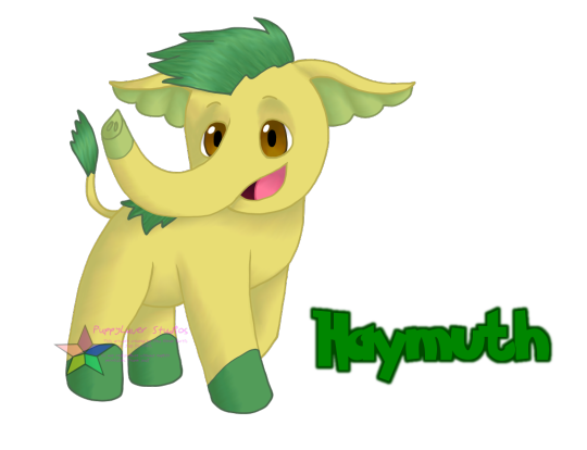

[Image Description: Three fan-made Pokemon made to resemble plant-themed mammoths or mastodons.
The first Pokemon is a yellow baby mammoth with brown eyes, green feet, light green inner ears and trunk tip, and green hair on its head, back, and tip of its tail. It has its front feet in a position that appears like it’s going to start walking forward, with its head turned toward the viewer and a smile on its face. Green text outlined in darker green to its right reads “Haymuth”.
The second Pokemon is a lime green young mammoth with brown eyes, dull green inner ears, grass-covered feet and trunk, small beige tusks, and green hair that resembles soy plant leaves on its head. The tip of its tail resembles a soy bean pod. It is walking towards the left of the image and holding its trunk out. Green text outlined in darker green to its right reads "Soystodon".
The third Pokemon is a grassy green mammoth with dark green grass-like hair on its head, back, and feet, purple eyes, lavender inner ears, and long pale lavender tusks. It has small purple flowers growing from its grassy bits, and a large purple flower sprouts from the tip of its tail. It is walking toward the right of the image with its trunk held up and its head turned to look at the viewer. Green text outlined in pink to its right reads "Hedeomadon".
End ID.]
-----
Haymuth - Baby Mammoth Pokemon | grass Often frolicking in tall grass, the hay-like hair on their body makes for the perfect camouflage to ensure their safety even in the moments when their mothers don’t have their eye on them. / Haymuth are incredibly playful, running around with abandon in tall grass and picking up objects with their trunks to use as toys. Great care should be taken to keep inappropriate objects out of their reach.
Soystodon - Young Pachyderm Pokemon | grass Soystodon trunks are quite nimble and can often get into things that one may not expect. This often leads those living with humans to overeat when food is improperly stored. / While they are more independent than Haymuth, it is not uncommon to see them holding onto their mothers’ tails with their trunks. They do like to distance themselves from adults a bit more, but they are still young and still feel a need for parental guidance.
Hedeomadon - Royal Mastodon Pokemon | grass/fairy The females travel in matriarchal groups with their young, while males either roam individually or in male-only groups. The groups reunite on occasion in order to breed at their discretion, usually when the pennyroyal plants are flowering. / Hedeomadon mothers are very protective of their young during early development, and separating Haymuth from their mothers for even a few minutes can be very distressing for all parties involved if done hastily. They are fine with letting trusted humans watch their young for them, however.
After a long amount of waiting to give that survey some time to garner responses before I got started working on the player illustrations, I'm finally back to posting Cantessy region content! So here's our grass starter Haymuth, now with their evolved forms Soystodon and Hedeomadon! I hope the one other person who picked Haymuth in that survey is still happy with their choice, there were two people who picked them and I only picked them because if this were gen 9 I'd be using a grass starter regardless XD
I wanted to go with the perceived theme of grass starters being based on extinct megafauna, so obviously I'm going to look at extinct animals that were around the Appalachian area in the past. and of course, the first prehistoric beast most think about when dinosaurs are taken out of the equation are mammoths. Fun fact, did you know that the first mastodon skeleton excavated and studied scientifically was found in Kentucky? It's true, and if you've heard of a place called Big Bone Lick, you know at least something about the place now because that's where they were specifically found. (it's called Big Bone Lick because there was a salt lick there that animals would get sodium from, as well as the obvious big bones found there). So with that in mind, I decided to combine mammoths and mastodons with agricultural stuff from around here. Was tempted to go with tobacco for one of them but ehhhh I don't think that'd be all that appropriate for a Pokemon, so I kinda just turned that into a name for a human character instead. (and yet the poison-type gym leader and her occupation exists...you'll find out later, hehe) Haymuth is, of course, utilizing hay in their design, while Soystodon obviously has soy. Hedeomadon is a bit more obscure. Their name comes from Hedeoma pulegioides, also known as the American pennyroyal, or "pennyrile" by local dialect. I literally didn't know it was a Thing that Existed until I started research for this project, let alone that it's a pretty big crop here. And the flowers kinda gave me a fairy vibe, so that's why Hedeomadon gains the fairy type.
In terms of gameplay if this were an actual game, the Haymuth family is gonna be more special-focused ant a bit bulky, with both special stats and HP being highest on baseline. They'll obviously learn a good amount of grass and fairy moves that take advantage of this along with some status moves, and when Hedeomadon has evolved they'll learn the move Royal Bloom, which acts similarly to Flying Press in that it works as both a grass and fairy type move in terms of super-effectiveness (and by that I mean it does double damage to the things that are weak to fairy as well as those that are weak to grass, but does normal grass damage on things that are neutral to or resist fairy). Is that broken? It might be broken, but at least the other starters get something like it so maybe that balances it out? I'unno, I'm a character designer, not a game balancer hehe. I mainly just get the visual for how it'd look, and I can imagine it being like a beam that gets fired out of Hedeomadon's tail blossom thing. That'd be cool o:
Also if anyone wants to suggest other moves for these guys to learn and some physical stats (ie. height and weight, I only have a height for the base form starters atm and no weights XD ), feel free to throw 'em at me :3 Links to their info pages will be provided in the replies!
💖🐶 Check out my pinned post for ways to support my artwork, among other things! 🐶💖
~If you like, please reblog to show your friends! Likes are appreciated, but reblogs let more people see my content! If you have something to say, feel free to give feedback in tags/comments/replies as well!~
Pokemon and related concepts © Nintendo/GameFreak Haymuth, Soystodon, Hedeomadon, the Cantessy region, and artwork © PuppyLuver Studios
#pokemon#fakemon#cantessy region#haymuth#soystodon#hedeomadon#jess drew the thing#sfw#image description#long post
18 notes
·
View notes