#new ceiling designing
Explore tagged Tumblr posts
Link
Searching for Modern new ceiling design ideas? Explore the latest collection of false ceiling designs at Livspace. Find 500+ latest,modern & simple POP Ceiling designs for home interiors.
0 notes
Text
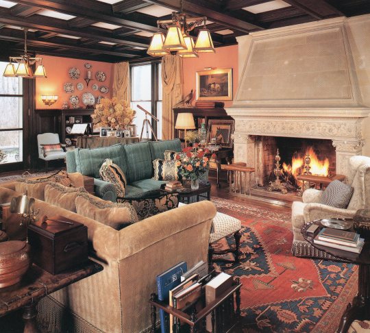
Patricia A. Lazor, Patricia Lazor, Inc.
100 Designers' Favorite Rooms, 1994
#vintage#vintage interior#1990s#90s#interior design#living room#fireplace#coffered ceiling#antique#porcelain#traditional#chandelier#stone#carved#wood#terra cotta#New Jersey#Patricia Lazor#style#home#architecture
466 notes
·
View notes
Text

is this your card? ♦️♣️♥️♠️ it isnt but you dont wanna hurt his feelings
#this was supposed to be a warmup but i got carried away.... i havent drawn in so long that its been hard to focus orz#im testing a new brush for fun. again.. i think i can use this for clean lineart..?? im surprised i went as long as i did with the#narinder brush honestly... but i wanna try something new so here we are again#if i could get my shit together id love to draw a model of his van because i have smth really cool in mind..i was looking at pictures#of old wooden caravans like the horse drawn ones and i wonder if i could combine that with the shape of an RV#i like the ones with a door at the rear bc it kinda lookslike a train caboose.. maybe he'd get someone to weld him a custom ride!!#idk how intricate and detailed i can design it without making it a pain in the ass to draw every time BUT i have a general idea#it would probably have a door on the side but idk if itd flip down to make a stage or upwards to make a roof?? and then theres a#curtain behind it where he would come out and do his show methinks.. ive been looking at pictures of camping vans on pinterest for ideas#i dont think he LIVES in the van since i mentioned his home is an old run down theatre when he isnt on the road. i wanna draw that too#but the RV should have enough for long travels like a bed and cabinets..? maybe a net hanging on the ceiling where all his props go#id like to think of ideas for a hometown.. toronto has a huge entertainment district so it would make sense for him to live there#although id also love to base parts of it from vancouver since id love to go back and visit </3#..would there be furth names for those places?? nyancouver... clawronto... whinnypeg (like a horse whinny)...#pawson creek.... purrlington... otterwa.. i love coming up with names lol#my art#myart#my oc#oc#sleight#laikas comet oc#fan character#fur#furry art
363 notes
·
View notes
Text

SKIDMORE, OWINGS & MERRIL UNION CARBIDE, 1960 New York, USA Image © Ezra Stoller
#architecture#design#architect#art#archdaily#designer#artwork#photography#juliaknz#form#ezra stoller#ceiling#light#mies van der rohe#dezeen#interior#interior space#new york#nyc#luminous ceiling
285 notes
·
View notes
Text

#lofted ceiling#loft living#new york loft#comfy aesthetic#comfy design#big windows#bright spaces#bright interiors#brick walls#hardwood floors#home interior#interior decor#interior design
940 notes
·
View notes
Text

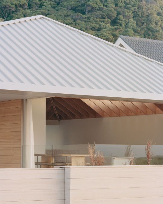


rk residence ~ seear-budd ross | photos © rory gardiner
#architecture#interiors#interior design#houses#living#ceiling#wood#simple#minimal#pyramid#skylights#standing seam#new zealand
281 notes
·
View notes
Text
Me: *has an idea for bedroom makeover*
Me: *reads how to remove wallpaper from the wall*
Me: *has doubts*
#thankfully I have wallpaper only on one wall#and I don't have to do anything in that room technically#but I got tired of it tbh#I have light cream walls and ceiling and one wall with wallpaper which is white with light gray floral pattern#it's been the same for the last 12+ years and it wasn't my 'design'#I also have an old wardrobe and a bed that's actually too big for this room#the bed was my idea - I wanted double bed!#it's a white metal frame with cusioned headboard#and lots of boxes with various shit underneath#it's 160x200 cm though and I finally realised I can barely move around it and by the window#so I want 140x200 cm (*gasp* - I know - so small for a single person???) with space to store the aforementioned shit in it#but set differently#and a new wardrobe which can actually be bigger with the new set-up#and dark emerald paint on the wall that has the wallpaper now (by the bed)#the rest would be white#anyway#I have 'till October to think#give a like if you actually read those tags#cheers!#about me
9 notes
·
View notes
Photo
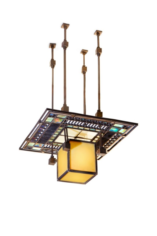

Frank Lloyd Wright Ceiling Light from the Francis W. Little House, Peoria, Illinois
Executed circa 1902-1903. Executed by the Linden Glass Company, Chicago, Illinois. Iridized and opalescent glass, 'colonial' brass-plated came, patinated bronze. 29½ in. (74.9 cm.) drop. Lantern: 8½ x 16⅛ x 16⅛ in. (21.6 x 40.9 x 40.9 cm.).
#Frank Lloyd Wright#Frank Lloyd Wright Ceiling Light from the Francis W. Little House 1902-1903#Linden Glass Company#american designer#art#artist#art work#art world#art news#art deco#pretty#beauty#beautiful
70 notes
·
View notes
Text
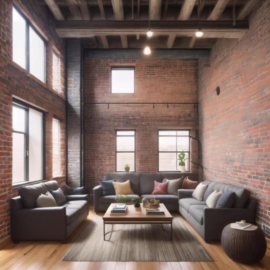
#unique building#lofted ceiling#loft living#new york loft#comfy aesthetic#comfy design#big windows#bright spaces#bright interiors#brick walls#hardwood floors#home interior#interior decor#interior design
3 notes
·
View notes
Text

saw this in a dream and felt the need to make it a reality
#for real though tears of the kingdom plays with verticality SO WELL#probably some slight spoilers past here youve been warned (mosly map design and stuff)#seriously this game is so good about verticality. ESPECIALLY the new stuff that isnt just copied over from botw#even that though theyve adapted incredibly well with wells and caves and stuff#and the sky islands and the depths are AMAZING examples#the map just feels so incredibly HUGE especially some places in the depths where theres just HUGE cliffs#not evne the floor-to-ceiling ones but like a big chunk of the gerudo region in the depths is WAYYYY below everywhere else#and theres these huge cliffs and looking up at them its like HOLY SHIT.#this game is so good#ill probably make a post complaiming about it at some point because there are parts i dont like#it works better as a standalone game than as a sequel tbh. too many of the mechanics are copied (shrines as one example)#but they also tried way too hard to differentiate them#like just include the sheikah! its ok!!#totk#totk spoilers#tears of the kingdom
16 notes
·
View notes
Text
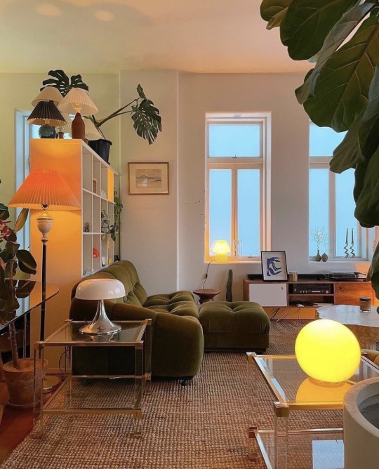

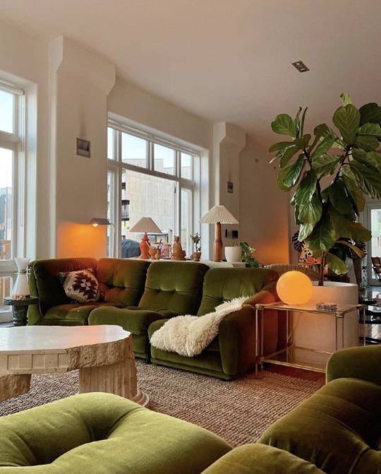


Ron Goh, Auckland NZ
#Ron Goh#interiors#lighting#soft#warm interiors#mood lighting#interior design#auckland#new zealand#curated#living space#apartment#high ceilings#soft light#spacious interiors#style#house plants#monstera#white interior#neutral colors#orange
22 notes
·
View notes
Text
Not going home this weekend so I’m making soup and doing coursework lfg!!!!
#we have to make our own sewing pattern for an entire tailored jacket#I’m making a short coat thing#all week I’ve been trying to figure out the collar bc we can only make it a certain width so I found a loophole to getting a sailor esque#collar#we had to pick a design theme and I chose asoue#so it’s a little eclectic with military themes sailor themes and also. a little punky!#also amazing news. I found this lovely fabric sample in thsi expensive shop but it was too expensive lol so I was sent out to find other#wools similar to it and. I found the exact material in another shop for half the price#YAYYYY#now onto the soup. it’s meant to help during the winter when there’s a lack of sunlight#which is needed#we only have these small windows on the ceilings in our workrooms#I Forget theres a whole world outside..
2 notes
·
View notes
Photo

New York Master Inspiration for a huge timeless master beige floor and dark wood floor bedroom remodel with beige walls, a stone fireplace and a standard fireplace
#sitting area#ceiling design#luxury home architects#high end residential architecture#master bedroom fireplace#new york architects
2 notes
·
View notes
Text
5 Key Features of Modern Pop Plus-Minus Design
Modern Pop Plus-Minus Design is a fresh and innovative approach to creating attractive new modern pop plus-minus design. This design style combines simplicity with functionality, making it a popular choice for many homeowners and designers. In this article, we will explore five key features of this exciting design trend that make it stand out.
1. Simplicity and Clean Lines
One of the most appealing aspects of attractive new modern pop plus-minus design is its simplicity. This design philosophy emphasizes clean lines and minimal clutter. The goal is to create a space that feels open and inviting. When you walk into a room designed in this style, you immediately notice the absence of unnecessary items. Instead of heavy furniture and decorations, you will find sleek shapes and elegant forms.
This simplicity helps to create a calm and peaceful environment. By reducing visual noise, the space becomes more relaxing and enjoyable. Whether it's in your living room, bedroom, or office, a clean and simple design allows you to focus on what really matters.
2. Flexible Spaces
Modern Pop Plus-Minus Design is all about flexibility. This design style encourages the use of versatile furniture and layouts that can adapt to different needs. For example, you might find modular sofas that can be rearranged easily or tables that can extend for gatherings.
This flexibility makes it ideal for modern living, where spaces need to serve multiple purposes. A home office can quickly transform into a guest room with the right furniture choices. This feature allows homeowners to maximize their space while maintaining a stylish and functional look.
3. Bold Color Choices
While the overall look of Modern Pop Plus-Minus Design is often simple, it can also incorporate bold color choices. Designers use bright colors strategically to create focal points in a room. This means you might see a vibrant accent wall or colorful accessories that stand out against a neutral backdrop.
These bold colors can evoke emotions and energy within the space. They can make a room feel more lively and inviting, attracting attention and enhancing the overall aesthetic. Using color wisely can create a dynamic balance that adds character to modern designs.
4. Natural Materials
Another important feature of Modern Pop Plus-Minus Design is the emphasis on natural materials. Designers often incorporate elements like wood, stone, and metal to create warmth and texture. These materials not only add beauty but also bring a sense of nature indoors.
Natural materials work well with the clean lines and simple forms of this design style. For instance, a wooden dining table can serve as a stunning centerpiece in a minimalistic dining area. By using materials that are sustainable and environmentally friendly, this design approach contributes to a more responsible way of living.
5. Smart Technology Integration
In today's digital world, modern design must include smart technology. Modern Pop Plus-Minus Design integrates technology seamlessly into the home. This means you can find smart lighting systems, automated window treatments, and energy-efficient appliances that enhance comfort and convenience.
By incorporating these technologies, homeowners can control their environment more easily. For instance, you can adjust lighting and temperature with a simple voice command or smartphone app. This integration of technology aligns perfectly with the overall simplicity of the design, making everyday life easier while maintaining an attractive aesthetic.
Conclusion
In summary, Modern Pop Plus-Minus Design offers a refreshing approach to home design. Its key features, such as simplicity, flexibility, bold colors, natural materials, and smart technology integration, make it an attractive new modern pop plus-minus design choice for many people. By focusing on clean lines and functional spaces, this design style creates an inviting atmosphere that is both stylish and practical.
If you are looking to transform your space, consider embracing the principles of Modern Pop Plus-Minus Design. With its unique blend of aesthetics and functionality, you can create a home that is not only beautiful but also a true reflection of your lifestyle.
0 notes
Text

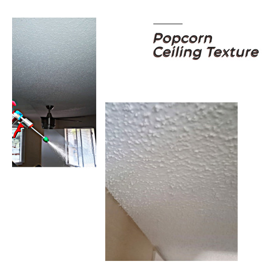
Popcorn Ceiling Emergency Repairs? We've Got You Covered!
🛠️ Whether it’s patching up those tricky spots or giving your ceiling a fresh coat of paint, we specialize in popcorn ceiling repairs that last! Don’t let unsightly cracks or damage take away from your space.
✅ Popcorn Texture Matching ✅ Fast Emergency Patchwork ✅ Smooth, Professional Finishes
Reach out today to get your ceiling looking new again!
#PopcornCeilingRepair #DrywallPatching #CeilingPainting #DallasHomeRepairs #PopcornTexture #HomeImprovement
#Reach out today to get your ceiling looking new again!#PopcornCeilingRepair#DrywallPatching#CeilingPainting#DallasHomeRepairs#PopcornTexture#HomeImprovement#customer service#home design#structure#architecture#contemporary romance
0 notes
Text
Innovative Ceiling Designs for 2024: Elevate Your Space with Cutting-Edge Trends
As we step into 2024, ceiling design has evolved from a mere afterthought to a central element of interior architecture. Modern ceilings are no longer just about hiding structural elements or providing overhead coverage—they are now integral to the aesthetic and functional character of a room. This year, ceiling designs are embracing bold textures, dynamic shapes, and advanced materials, offering endless possibilities to elevate your space.
One of the standout trends for 2024 is the use of geometric patterns and 3D textures. These designs add depth and visual interest to the ceiling, transforming it into a focal point. Geometric tiles or panels, often arranged in intricate patterns, create a sense of movement and rhythm. These can range from simple hexagons to complex interlocking shapes, providing a contemporary touch that complements modern interiors. Meanwhile, 3D textures such as sculptural elements or embossed designs introduce a tactile dimension, making the ceiling a standout feature of the room.
Another notable trend is the incorporation of integrated lighting. Ceiling designs are increasingly incorporating LED strips, recessed lighting, and backlighting to enhance the ambiance and functionality of the space. Cove lighting, where LEDs are hidden within a recessed channel, creates a soft, indirect glow that highlights the ceiling’s texture and adds warmth to the room. This approach not only illuminates the space effectively but also adds a dramatic effect that can be adjusted according to mood or activity.
For those seeking a touch of luxury, metallic finishes and reflective surfaces are making a significant impact. Ceilings with polished metals or mirrored panels reflect light and create an illusion of greater space. These materials are particularly effective in small rooms or areas with limited natural light, as they enhance brightness and create a sense of openness. Additionally, metallic finishes can add a sophisticated flair, making them ideal for contemporary or glam-inspired interiors.
Biophilic design, which emphasizes a connection to nature, is also influencing ceiling trends in 2024. Living ceilings, adorned with greenery or natural elements, bring a fresh, organic touch to indoor environments. These can range from lush vertical gardens to small potted plants integrated into ceiling panels. The incorporation of natural materials not only improves air quality but also creates a calming and invigorating atmosphere, bridging the gap between indoor and outdoor living.
Sustainability remains a key consideration in 2024 ceiling designs. Eco-friendly materials such as recycled metal tiles, bamboo, and sustainable composites are gaining popularity. These materials not only contribute to a more environmentally conscious design but also offer unique textures and finishes. Additionally, advancements in acoustical design are leading to the use of sound-absorbing materials, which enhance the comfort and functionality of a space by reducing noise levels.
Finally, customizability and personalization are becoming more prevalent. Homeowners and designers are increasingly opting for bespoke ceiling solutions that reflect individual tastes and needs. This trend includes custom-painted murals, artistic installations, and bespoke shapes that cater to specific room dimensions and design themes.
In summary, ceiling designs in 2024 are characterized by a blend of creativity, functionality, and innovation. From geometric patterns and integrated lighting to luxurious metallic finishes and biophilic elements, the latest trends offer diverse options to transform any space. Embracing these cutting-edge designs can elevate your interior, making the ceiling not just a structural component, but a statement piece that defines the character and ambiance of your home.
0 notes