#need to learn how to do layouts and cool typography effects
Explore tagged Tumblr posts
Text


#bucktommy#bucktommyedit#evanbuckleyedit#tommykinardedit#911edit#gifset#*911#*mine#*gifset#tv: 911#911 show#evantommy#tevan#kinkley#evan buckley#tommy kinard#ch: evan#ch: tommy kinard#otp trying to keep up#twitter being my muse#since i never know what gifs to make lol#need to learn how to do layouts and cool typography effects#userkayla#jddryder#userabs
262 notes
·
View notes
Text
EVALUATION
Given our project was based on a book, mine was “The Figure In The Carpet” the project was more digital based with the way we created most of our final outcomes.
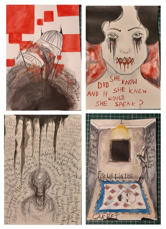
We researched a multitude of artists some stood out more to me than others. Starting with Frank Moth, though his work style did not translate into my final outcomes, I loved how his work stood out gave a new perspective and a futuristic feel to it, his work almost feels nostalgic like someone looking back on the life they had. His work greatly inspired a lot of my drawing sessions making connections to the future hidden meanings and messages. The simplicity of his work only combining a few images as well was a great inspiration to one of my final pieces. David Carson, his method of work and use of typography greatly influenced a lot of my outcomes including a few of my final ones as well. He uses a lot of overlapping techniques in this image which reality distorts the text, making it difficult to read, this technique I wanted to include into my own work especially in parts I wanted to make stand out. His work and style had a massive effect on my work especially the typography aspect and whether I should include serifs or non-serifs, there were so many different font options I could use to make my work stand out. Such as overlapping fonts and lettering sizing just like he did. Finally, Annegret Soltau, her work impacted my traditional work more so with her use of stitch transforming collages and work. Taking her approach with stitch and thread work I added it into one of my final outcomes stitching her mouth shut and stitching all the lettering I thought it would be much more impactful.
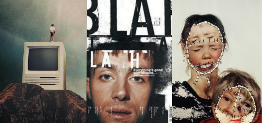
MY INITAL IDEAS & CONCEPTS
While it took me quite a long time to grasp this topics concept and ideas. Once I did I came up with varying ideas on how to approach it. We made mind maps about typography, hidden meanings analysing our books. In short, the book I was given was about a book with a hidden meaning no one could figure out. So, I took that basic meaning and applied it to my work giving all my pieces quite a twisted outcome. Taking quotes from our books we were told to create post cards or art based off theses quotes phrases etc. the words that grabbed my attention were usually quite dark imagery ones. Quotes I could do a lot with visually. My colour scheme initially was to be reds blacks and vibrant colours keeping a sinister approach to it.
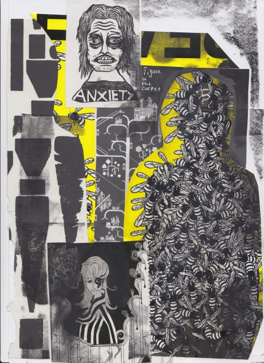
Why I came up with this approach.
After reading the book and analysing it, the book was all about secrecy and hidden meanings so taking that I translated that into my own work creating ideas and concepts based on that. I loved the twists and turns as well as the madness the characters ended up having desperate to find out this books hidden message.
Main things I learnt
The main thing I took away from this course is my photoshop skills, starting from scratch to being able to edit and develop pieces and create art and animations just from photoshop!
It is a skill I will be trying to develop further as It is something that has proven to be useful. While photoshop and all the skills I learnt from that have been extremely useful, I also experimented with many new drawing techniques.
Such as, tracing paper layers making it look like the background was furthest away, giving depth to the drawing. Another process I really enjoyed was the stencil screen printing technique it was something completely different it proved quite challenging to get right especially with all the fiddly parts and all the details. However, the outcomes turned out awesome I loved it!
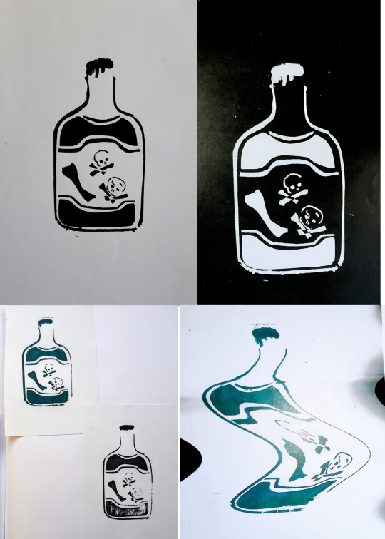
Thursdays sessions
Thursday’s drawings lessons have always been one of my favourite parts of the week. This term we focused on lots of different techniques such as asemic writing, which was the typography aspect part while at first, I did not enjoy it as much once I got round to completing the outcomes from that lesson, I ended up loving them. One of my favourite techniques we learnt as I mentioned was the tracing paper one, we focused on depth and layers within a drawing making it look almost apocalyptic.
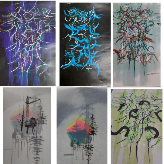
A few pieces of the work I created over this project I feel has been impactful to my learning are any of the photo shop work & the printmaking work as these things I had no idea how to without the class and being taught how to do it. So, I am thankful I had the opportunity to learn as I love the outcomes of all of them. From the colours I chose to the layout of each piece. So, from not knowing how to producing good quality work it is something I am quite proud of.
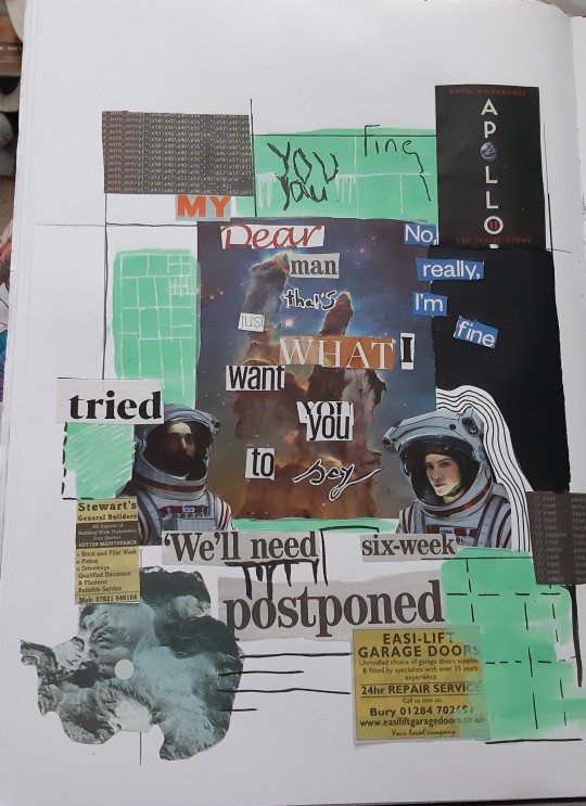

my journey creating my final pieces
From initial ideas and the final outcomes, I have learnt a lot from the history of typography to how to use font properly and including all this knowledge within my work. I also learnt about colour theory and what colours mean what and If I wanted a darker presenting collage of work, I should use blacks’ reds and greys etc. Though I already knew this is was interesting to learn about why.
I ended up creating 8 outcomes 4 digital 4 drawn, they all share similar colours and themes.
I was inspired for the 4 drawn ones by music I listened too as well as quotes from the book. The images it gave me in my head which were all creepy and dark. My main idea given from the book was hidden meanings and secrets, so I applied this to my work by giving all the pieces hidden meanings which only I know. Though the 4 drawn ones if you line them up right will make one giant image which I thought was cool.
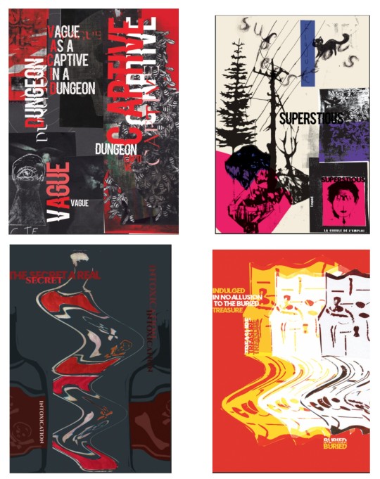
The 4 digital ones were based of collages and dark imagery from quotes within the book these ones were interesting and slightly challenging to make taking inspiration from many artists in the process learning about all the different techniques I could use to create the works. Overall, I am really pleased with my outcomes they all worked well, and all have the intended reaction to them it makes you think and question the work etc.
If I had to list 10 words describing the overall outcomes it would be
· Creepy
· Dark
· Sinister
· Repetitive
· Secrecy
· Intriguing
· Busy
· Sombre
· Overwhelming
· Thought out
sound track
If I needed a soundtrack for this project, it would be a soundtrack from a horror film as the pieces I did are creepy and dark it would fit well and would make the pieces even creepier to look at. it would give the pieces a whole new meaning and would make you look at them differently maybe even creep the audience out more.
hours spent on it
I spent a long time on this project, it would vary how long I spent on it each week. However, on average I would spend maybe 10 hours to 5 hours each week depending how much I had planned for myself to do and what I had planned if it were an extensive amount of research and analysis then it would take me 10 hours+ a week to do. If it were drawing or finishing off work, I could do that relatively quick and get it done within 5 hours + a week. So, it really depends on the week I had planned for myself.
I work at my desk either at my mums or dads, it has all the supplies and tools i would need though digital tools and software are limited all non digital tools i basically have access too.
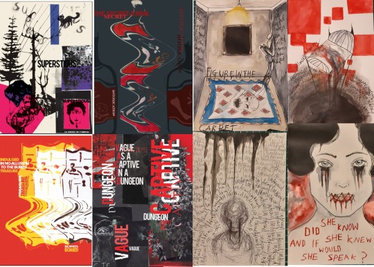
My final outcomes in my opinion turned out successful with lots of interesting aspects to them. Artists that helped me with my work are, Annegret Soltau. Her work inspired me to use stitch within my work and it turned out well in the end its one of my favourite pieces that I have done for this project.
Artists that helped my digital work are David Carson & Peter Bankov as their use of typography and collage really inspired my final digital outcomes, they really helped my ideas flourish and make my work what it Is now.
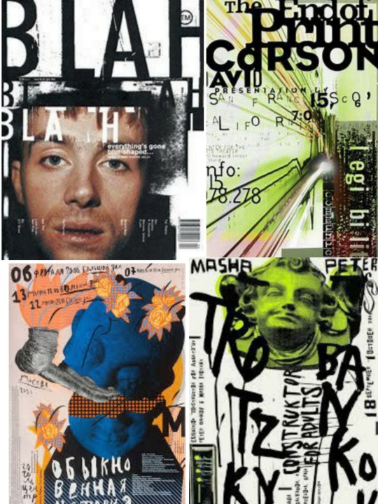
My original idea of secrecy and hidden meanings never changed I made sure to include that in any piece of work that I could but over learning about all the artists and techniques it just evolved and became really cool to draw and create work for.
1 note
·
View note
Text
9 Essential WEB SITE DESIGN Methods for DIY Beginners
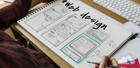
Let’s get right down to it, shall we? Below are a few of the very most useful styles and guidelines to learn when building your first website:
1. SET ASIDE the Mouse, GRAB a Pencil
Your site may already exist as a lovely, complete entity in your mind which is the reason why you immediately leap into Photoshop (or worse, an internet browser and HTML) to plan it out. Whoa, whoa-cool your jets for another! Don’t place the cart before the equine. First, get out a pencil and pad of paper and start putting your ideas into something easily tangible. That is an important stage to map out the framework of your site using only rectangles, doodles and influenced ideas (categorized as wireframing). Things can be very tough at this time; no one’s heading to view it nevertheless, you.
It is more easily at this time to alter designs you originally thought works however now discover are cluttered and confusing in writing. This can save you many hours of disappointment instead of making the same finding after the site is coded and in a web browser. Plus, it can help significantly to create a web page when you have research at hand to seek advice from rather than moving in blind.
2. Follow a Hierarchy
It’s an undeniable fact that a lot of web surfers tend to only check out webpages rather than take time to read everything. You should be ready because of this by placing the most crucial content first. This means that a consumer can break down the most essential information on a full page all in a single screen on preliminary load, and never have to focus or scroll. That is, of course, easier said than done. Here are some tips to help you better understand the significance of the design theory:
Keep Content “Above the Collapse”
We call that preliminary display of loaded content “the fold”-and everything below it that must be scrolled to be observed is considered supplementary. Generally, your most significant information rests “above the collapse”. The crucial thing to perform within this area is to entice a consumer to do this or generate the motivation to scroll down further.
Utilizing a “Hero” Image
A common trend in web site design nowadays is to fill this “above the fold” area using what is named a “hero” image or banner. They are full-screen history images with very succinct and to-the-point overlaid text messages, usually combined with a call-to-action button. Feasibly the whole purpose of the net web page could be included within this banner area, although it also acts as a great primer for this content to follow.
“The Collapse” May Change With regards to the Device
Here’s where things become complicated-and why you shouldn’t overburden yourself attempting to match everything above this marvelous line. Concerning the user’s device, the display screen sizes could differ greatly. A jaw-dropping 5K screen has a vertical quality of 2880 pixels, whereas an iPhone 5 has not even half of this. This means that mobile users just aren’t heading to have the ability to fit as much content to their display real property. (More upon this later.)
3. Typography Is Your Design
Unless you’re owning a photography business, the text is the solitary most important component of any website, so it’s important to get this done part right. Your web page’s hierarchy is greatly reliant on the typography you select: how your headings, subheadings, and body text message follow an all-natural circulation and stay aesthetically distinctive in one another
Make sure the written text is legible (avoid flowery fonts!) and large enough (usually around 16px for your body).
Stick to only two fonts-and make sure they set well together!
Give your paragraphs some room to inhale between one another, and arranged enough top cushioning or margin on your headings to symbolize clear breaks in content.
Avoid long lines of text. It’s easier on the eye for paragraph lines to be approximately only 15 words long-and a little significantly less than that for mobile displays.
Serif fonts are usually best only in print-unless they may be found in large headlines on the net
4. Colors & Comparison Are Crucial
We’ve discussed color mindset at length, however, the idea bears duplicating. The colors you select for your website play a massive role in how users understand your brand, as well as how motivated they could feel in taking action (i.e.: buying things) through your website. Why? Well, every color evokes certain feelings, and either for their natural character or by social fitness, these colors have grown to be associated with certain types of businesses. If a children’s toy company or a financial consultant painted their whole website in the stark dark, it could send the incorrect indicators with their meant viewers. Around the flipside, a shiny orange or an enjoyable blue, respectively, would catch the perfect firmness and consciousness for his or her customers.
If you’ve already established the colors of your brand, use those on your website then. It’s best, however, to keep it at only three colors for your site; like fonts, you don’t want to overdo it here or your site could finish up with multiple personality disorder. Also, be skeptical of way too many splashes of color across your website; our eye is attracted to them like honey traps, plus they could interrupt the natural movement of your articles. Use color only once it is most needed, such as links or control keys.
In contrast, your text message must stick out from the backdrop. Using light greys, yellows or greens for your fonts will likely render them unseen on the web page. Black on the white background is the foremost combination of comparison and is normally what you ought to stick to.
Additionally, you want your text message to pop against background images. Using very occupied photos can distract from the written text, to avoid this issue either use less comprehensive photos or use an overlay of, say, rgba(51,51,51,0.5)to help soften the image within the text.
Contrast also is important in how users are attracted to certain important elements of your site. Your most significant call-to-action control keys must get attention through the use of contrasting colors. A blue “Buy Now!” button manages to lose its urgency and well worth it when it's swallowed by a niche site that uses blue everywhere-but a red button on that same web page grabs a user’s attention by shouting “Hey! Click me!”
5. Using Pictures
Deciding on the best images to use on your website partly boils down to your artistic aptitude, but there are also intellectual considerations to consider that should assist with your selection process. First of all, avoid embellishing your site with extraneous photos because they could look nice. Instead, think of how each image you utilize serves its purpose, and how it functions as content. A well-chosen picture can convey your brand, service, product, or audience a lot more effectively than words. Use photos to help your users understand something, to evoke feelings, or even to inspire trust and self-confidence; with them solely for visual reasons should be supplementary.
Understanding Document Types & Compression
There can be an extra step that must be taken for using images on the net. Those elegant photos you have from sites like Shutterstock and iStock could be very substantial (5,000+ horizontal pixels and 10+ megabytes in proportions) which is okay for printing, but they’re unfit for websites. Not everyone has superfast Dietary fiber Internet, and that means you must decrease the size of your images to support for launching times (not forgetting 40% of site visitors will leave if the website takes much longer than 3 mere seconds to weight!). Typically, you want to keep each of your images at no more than 500 kilobytes in proportions, though your average quality should of times be around 100 kilobytes.
JPEG is the typical format for photos. It is a lossy format, this means its image quality is reduced when compressed. If you’re utilizing a JPEG for a full-width history image I quickly recommend keeping its horizontal quality at a minimum of 1200px. For general purposes, stay away from any image with significantly less than 600px horizontal quality, as it'll likely show up blurry on modern displays.
PNG is the most well-liked choice for images or for images that want transparency. It is a lossless format, which is ideal for keeping image quality but may also greatly increase document sizes. Generally, you’ll use PNG images for illustrations, symbols, or smaller images that may be stacked together with other elements for their transparency. You’ll hardly ever need a PNG to be bigger than 1000px.
SVG (Scalable Vector Image) is a more recent format that is changing GIF and even PNG in some instances. SVG wonders that it could be as large or as small onscreen as you will need it to be, all while keeping perfect clearness and crispness (but still be a little quality). You should think about using SVG for just about any logo design, icon, or vector visual on your website; as high DPI shows are becoming commonplace, the sharpness of SVG provides the best image quality.
6. Mobile-First Design
We’ve now reached a period where most people consume online quite happy with their cell phones rather than on the desktop computer. As a total result, there is much larger precedence in web site design to tailor specifically to the mobile experience, which has resulted in the “mobile-first” design viewpoint.
This means that essentially, throughout your initial sketching and planning phase in some recoverable format, it is best to focus on the site’s mobile layout first. Only the most crucial content necessary for the functioning of your site will be displayed on smaller screens. This causes you to simplify your design and slice out any distracting elements immediately. Think back again to your “above the flip” content: if you first ensure that the important info can fit on the original screen of the phone, then you’ll know for several it'll fit on bigger displays. Once you’ve nailed the fundamental mobile layout, you'll be able to start adding in embellishments or bigger images for desktop displays.
Your mobile layout assumes a far more vertical design that inspires scrolling, as opposed to the wide landscape of the desktop. If, say, your product web page displays entries in a grid of 3 across on desktops, then usually your mobile layout will display them as only a single column.
Yes, which means that you essentially need to produce several layouts for every web page of your website. Fortunately, a worthwhile website contractor should provide reactive templates that change these designs automatically so you’ll then just need to fine-tune them.
7. Keep Things Aligned
When elements appear sporadically laid across your site it is often due to an alignment issue. Imagine your website on the sheet of graph paper. Individual it into even columns by sketching, for example, six right lines. You now want to ensure that the remaining sides of your elements are distributed and aligned to only these six vertical lines.
8. Keep It Simple
It is said that the best web site design moves unnoticed; it is a poor design that phone calls focus on itself. As stated earlier, the main facet of any website is merely its text message. If you can offer outstanding typography that is a joy to learn, you won’t do much more. Wanting to overdesign your site will just mess and complicate things.
Are the package shadows necessary? The crazy, ornate patterns? A large number of colors? Not probably.
9. Big Open up Spaces
Your articles need room to breathe. White space is the prevailing design choice for modern websites: wide, open up areas of nothingness to pad areas between content. It’s a far more pleasant way to process information, looked after stimulates you to eliminate superfluous text messages and images to keep carefully the site clean.
Get more advice Thought Media is a leading Chicago web design providing professional website development services, and one of the top SEO companies. The agency has worked with hundreds of clients all over the world! Creating high converting website designs, providing reliable website hosting, and successful Search Engine Optimization Marketing campaigns!
Conclusion
Web site design can be considered a sprawling field of technology to learn, ideas to practice, dialects to review, and artistry to understand. Only with experience will all of these components start to make sense, however, you already are well on the way simply by grasping the basics of why is a good website work. I am hoping that guide acts as your launching-off point, which offers you the self-confidence to consider your website into the own hands and build it just how that only a business proprietor knows best.
1 note
·
View note
Text
Photoshop CC for Beginners : Adobe Photoshop Course

This Adobe Photoshop CC course will teach you the basics of Photoshop for web design, graphic design, photography & more. Photoshop CC for Beginners : Adobe Photoshop Course What you’ll learn: You will have expert level knowledge of Adobe Photoshop CC in this course, whether you are a beginner, intermediate or have no previous knowledge of Photoshop. You will create a real world project to give you a general understanding of Photoshop and the different functions that you can do with it.You will be given a major overview of all of Photoshop's tools, filters, features, and workspace so that you can quickly begin working on your next project.You will achieve the experience and knowledge to take your Photoshop skills into your career, job, or freelance lifestyle at your own pace.Graphic designers, web designers, photographers, marketers, and whatever other industry you are in will be able to find useful information in this course.You will learn Photoshop's workspace and how you can edit it to your own workflow.You will learn how to work with images in Photoshop and edit them appropriately to your project.You will learn all of Photoshop's selection tools and how they can assist you as you edit.You will learn about layers and how they have revolutionized the way you can work in Photoshop.You will learn every type of tool available in Photoshop and how to use the most common tools.You will learn about type, fonts, and typography inside of Photoshop and how they function.You will learn the importance of color and even be given a brief lesson on color design theory.You will learn how to use alignment, guides, and grids inside of Photoshop.You will learn about all of Photoshop's many filters and features available to you.When you are finished, you will have a solid understanding of the Adobe Photoshop CC software. Requirements: This course is for beginners or anyone who does not have experience with Adobe Photoshop CC and wants to learn how to use the program. This course is not intended for advanced users of Photoshop, though the course can be used as a reference guide to find the exact information on any feature that you'd like.You will need to have an active Adobe CC subscription and the newest version of Photoshop installed on your computer. This course does not go over the installation of Adobe Photoshop CC. (Photoshop CC 2018 is used in the teaching of this course.)You will need to have a Mac or PC with at least the minimum requirements for Adobe Photoshop CC. Information can be found on the Adobe website.You will need to have a working keyboard, mouse, and/or tablet to use Photoshop. Touch screens and other pressure sensitive devices will work, but are not covered in this course.Project files are available for download for each lecture. Make sure you download the appropriate files if you would like to follow alongside the course. Photoshop CC for Beginners : Adobe Photoshop Course Description: Learn Adobe Photoshop CC in this New Course! Many people try to learn Photoshop but struggle because the program is so vast. Most quit before they even get started. :( That's because they've never been taught the program in a step-by-step, easy to learn manner. But that isn't you now, is it? You have found the perfect course for learning Photoshop. It doesn't matter if you have no experience at all, this course was designed to teach you Photoshop in the most effective means necessary. With over 15 hours of video and over 100 project files, this Photoshop course is JAM PACKED with information to help you learn this awesome program! The videos build on one another so that as you work through this course, you will understand more and more! Pretty sweet, huh? :) Not only that, but this course is also designed so that if you already know some Photoshop and just need help with a specific tool or feature, you can skip directly to that topic! So who can benefit from using Photoshop? Adobe Photoshop CC is useful for a lot of careers, industries, and hobbies. It doesn't matter if it's photography, graphic design, web design, social media, user interface design, advertising, painting, printing, or video/animation. This course will cover tools that can be used in any niche! Each section goes into specific detail of the feature or tool being shown so that you will feel comfortable using them on your own. This course will cover: The Basics Photoshop's Workspace Images Editing Selecting Layers Masks Tools Type Color Alignment Filters and much, much more! Don't forget all of those juicey project files! This course has over 100 project files for each individual lecture for you to use and follow along with. From the basic to the advanced, these files will at least help get you started so that as you watch each video, you can work alongside the instructor. What are OTHERS saying about this instructor's courses? "This course is amazing. Learning photoshop with this guy is easy ;-) Thank you so much. " 5/5 Stars - Robert Fersti "Great course that outlines several fundamentals of Graphic Design. Coming from a web designing background, I found a lot of the basics applied here as well. But, the course builds on that and gives you so many pointers on how to capture, guide and hold your audience's attention. I think, in addition to promotional graphics, the ideas explained can be readily applied to designing hero image layouts for landing pages of your websites as well." 5/5 Stars - Ravi KT (on Canva : Graphic Design Theory course) "This course is really informative, up to date, and engaging. Phil and Jeremy keep up to take with the posting of their students and provide reliable feedback. They have inspired me to keep pushing myself forward with my art, and graphic design. I would tell anyone (from beginner to advance) who uses photoshop / or would like to know more about it, to take this course. Its worth it!" 5/5 Stars - Betheny Powell (on Photoshop for Entrepreneurs course) People from around the world are learning valuable skills and applying them to their everyday lives. Don't be the one left out. You can absolutely learn this program and by taking this course the instructor will be with you every step of the way. Other great stuff you might want to know.. Not only will you get over 15 hours of video content and lessons, 100 project files, and a new life skill, you will also have direct communication with the instructor to help you along. This includes direct messages, discussions, and specialized projects in the course that will allow you to interact with the instructor and others. Feeling lost? Don't worry, we are here for you! As they say, "Come for the course, stay for the community." Well, that's not the exact phrase, but you get what I mean. :) What else is there to know? What else? What else?! Well there is that little 30 day money back guarantee thing. That basically means that if you don't enjoy this course for any reason at all, you can get a full refund up to thirty days since the time you purchase it. It's a win-win situation! and I applaud winners. So what are you waiting for?! The time is now to stop procrastinating and begin learning Photoshop so that you can take full advantage of everything that it has to offer! Enroll now in this course and get started! Who this course is for: This course is specifically designed for beginners or anyone else who doesn't know how to use Adobe Photoshop CC but would like to learn. This course can be viewed one video after another, or you can skip around to the sections that you need. Advanced features, special projects, and design theory WILL NOT be taught in this course. Graphic Designers Web Designers Game Designers Photographers Marketers Social Media Experts UI / UX Designers Product Designers Architects 3D Artists Beauty Artists Paint Artists Entrepreneurs and anyone else who wants to learn Photoshop. THAT'S YOU! :) Who is the target audience? This course is specifically designed for beginners or anyone else who doesn't know how to use Adobe Photoshop CC but would like to learn. This course can be viewed one video after another, or you can skip around to the sections that you need. Advanced features, special projects, and design theory WILL NOT be taught in this course.Graphic DesignersWeb DesignersGame DesignersPhotographersMarketersSocial Media ExpertsUI / UX DesignersProduct DesignersArchitects3D ArtistsBeauty ArtistsPaint ArtistsEntrepreneursand anyone else who wants to learn Photoshop. THAT'S YOU! :) Course content of Photoshop CC for Beginners : Adobe Photoshop Course: Total Lecture:140 Introduction How to Create a Polaroid Effect in Adobe Photoshop CC 2018 Upload Your Polaroid Photograph! Welcome to This Section on the Basics of Adobe Photoshop CC 2018 Getting Started with Photoshop Overview of the Photoshop Interface Changing the Photoshop Workspace Navigating the Document Window Using the Tools Panel in Photoshop Undo, Redo and the History Panel Understanding How Layers Work in Photoshop Saving Your Files in Photoshop Resizing an Image in Photoshop Making Selections with Photoshop Using Brushes inside Photoshop Creating Shapes and the Pen Tool Transforming Selections, Shapes and Images Text and Typography in Photoshop Working with Color inside Photoshop Other Cool Features of Adobe Photoshop Resources for You to Use in Your Projects Welcome to This Section on Understanding the Photoshop Workspace Resetting Photoshop to the Factory Default Setting Preferences with Photoshop Creating a Custom Workspace Starting with a New Document Using a Photoshop Template Opening Files in Photoshop Closing and Saving Files Common File Types Exporting Files from Photoshop Welcome to This Section on Working with Images in Photoshop Image Modes and Channels Changing the Image Size Adjusting the Canvas Size Cropping an Image in Photoshop How to Trim an Image with Photoshop Rotating an Image in Photoshop Straighten an Image with the Ruler Adjusting Brightness and Contrast Using Levels with Your Images How Curves Work in Photoshop Changing the Image Exposure Adding and Removing Vibrance Hue and Saturation Adjustments Having Proper Color Balance Black and White Imagery Applying Photo Filters in Photoshop Invert, Desaturate and Equalize Adjusting the Threshold of Your Image Overlaying Gradient Maps Selecting Specific Colors Working with Shadows and Highlights Replacing Colors in Photoshop Welcome to This Section on Making Edits in Photoshop Projects and Documents Fixing Mistakes in Photoshop Cut, Copy, Paste and Clear Fill and Stroke Selections Transform and Free Transform Content-Aware Scale Puppet Warp Perspective Warp Welcome to This Section on Selection Options in Adobe Photoshop CC Select All, Deselect, and Reselect Selecting the Inverse of an Image Using a Color Range for Selection Selecting by a Focus Area Subject Selecting Quick Mask Mode and Mask Selecting Modifying a Selection Saving and Loading Selections Welcome to This Section on Photoshop Layers Understanding How Layers Work in Photoshop Creating and Deleting Layers How to Select Layers in Photoshop Layer Groups and Why They Are Important Merging and Flattening Layers Adding Layer Styles in Photoshop Using Masks with Layers Clipping Masks Working with Layer Adjustments Blending Modes with Photoshop Additional Layer Options Exporting Layers in Photoshops Converting Layers to Smart Objects Artboards and Layers Welcome to This Section on the Many Adobe Photoshop Tools Working with Tools in Photoshop The Move Tool The Artboard Tool The Marquee Tools The Lasso Tools Quick Selection and the Magic Wand The Crop Tools The Slice Tools Eyedropper and Color Sampler Tools Ruler, Note, and Count Tools The Healing Brush Tools The Patch Tool The Content Aware Move Tool The Red Eye Tool The Brush Tool The Pencil Tool Color Replacement and Mixer Brush Tools The Stamp Tools The History Brush Tools The Eraser Tools The Gradient Tool The Paint Bucket Tool Blur, Sharpen, and Smudge Tools Dodge, Burn, and Sponge Tools The Pen Tool and Selection Tools The Type Tools The Shape Tools The Hand, Rotate, and Zoom Tools Welcome to This Section on Creating Typography and Using Fonts in Photoshop Using Type and Fonts in Photoshop Adding Type inside of Photoshop Working with Text Layers Characters and Fonts in Photoshop Creating Paragraphs and Content Character and Paragraph Styles Glyphs and How You Can Use Them Extruding Type to 3D Text and Work Paths Convert Text to a Shape Warping Text in Photoshop Match Fonts from Photographs Other Type Options in Photoshop Welcome to This Section on Understanding the Importance of Color Working with Color in Photoshop Color and Swatches Using Gradients inside Photoshop Adobe Color Themes A Little Bit About Color Theory 3 more sections Photoshop CC for Beginners : Adobe Photoshop Course course Read the full article
2 notes
·
View notes
Text
Top 12 Best UI/UX Design Trends In 2021
We know that competition in the market is fierce and user attention has reached the highest level ever. Each factor is important when designing to attract more organic traffic. All businesses need more web or application visitors to attract their website.
research shows that design is the first impression of web and mobile users. Visual appeal and user efficiency play a prominent role in the interaction between visitors and digital products. It is expected that the work of a web designer will have an excellent online image and help achieve user goals. Sometimes people want to know what UI UX design is.
What is UI UX design?
UX design introduces the terms user experience design and UI stands for user interface design. These factors are critical to the product, and they all work at the same time. Although he has an expert relationship, he plays different roles and is involved in various forms of the product design process. UI UX designers know how to use them in their design projects and attract more customers.
Let’s Check The Latest Trends In UI Design
Illustrations and Animation
There is a trend for custom 2D or 3D illustrations or figures or design factors, drawn by hand. It appears in free form, misaligned factors, projects, and huge asymmetric forms, and also creates a familiar and attractive environment to give users a better experience. All businesses expect the website to be able to perfectly display their image online, which is why these illustrations come with a variety of proposal designs.
Helps to attract the attention of the user and reveal the content provided by the company on the first site. A lovely illustration is customized for the website or mobile app to make it more interesting.
moving factors and amazing animations make users curious, scroll further to see what information is available. The UI UX design uses these attractive solutions and analyzes the industry represented by the website.
Scroll-Activated Animation
The ability to tell stories about digital activities will continue to be the best trend. Typography creates a dynamic visual hierarchy and becomes a core element of user interface design. It plays an important role in shaping a great user experience.
copywriting becomes one of the most important factors for the best user experience. His style attracts the attention of users and is related to a brand.
When you need to switch, you need to consider the conversion rate. UI designers use a simple style with 3D illustrations, and the service website looks professional and keeps up with the times.
Artificial Intelligence
AI is built into all products, making work easier and easier. You can quickly create manual connections, even digital photos, on-demand, without worrying about copyright, distribution rights, infringement claims, or royalties. The product understands users based on user behavior and creates a personalized user experience. When designing many guide screens, will eventually lead to a higher conversion rate and provide a smoother experience.
Augmented Reality
Web design trends require thinking according to the latest trends. There is a need to show interactions that take place in the real-world environment.
We know technical giants like Google & Apple already introduced their AR development platforms. AR UI design comes with various approaches that help UI designers to create innovative designs.
Most UI UX designers develop their knowledge with the upcoming AR UI kits. The capability to produce augmented reality interfaces and 3D factors will become a useful technique in the upcoming years.
Virtual Reality & Meetings
Virtual reality becomes popular in 2020 and provides users with more Internet experiences. It also brings more excitement to the game audience. It presents an important opportunity to improve communication between various departments during power outages.
UX designers create virtual spaces for their clients and help create designs with virtual factors. Today, due to the pandemic, there is also a trend towards virtual meetings.
virtual intelligent tools made a breakthrough, further analysis from the design point of view. There are many possibilities in this area, and a cleaner and lighter version has been designed for those who have experienced slow Internet access.
People work from home all the time, so they need to make simple online video calls. Now, UI designers use the latest virtual meeting features to create sites or applications.
Usability
Usability has become the "UI" trend of various UI UX layouts. Google includes three new user experience metrics to cover website loading speed, interactivity, and visual stability. We call it Core Web Vitals. User experience auditing is the best practice to identify product usability flaws and improve its online performance.
We can perform usability tests on real users to learn more about their needs. Shift the focus of the user interface to a more common and user-friendly layout. User experience design can easily attract the attention of visitors to your website or app.
You need to understand the website there. Sometimes the UI design structure of the client communicated advertising portfolio website is abnormal and the animation is heavy, which does not mean it is used for commercial websites.
Glassmorphism
UI designers have brought a new kind of excitement called the glass shape. It comes from the blur effect or blurred background, which brings a new impression to the user. It seems they saw it from the glass.
Glassmorphic elements are becoming more and more popular because people do not like to use new morphological elements due to their poor accessibility.
These glassy transparent components provide clearly defined permissions on the interface. We can do this by simulating the depth that encourages users to distinguish given factors.
3D Designs
We live in a generation of rapid development of technological endeavors and performance, such as software optimization. People tend to use animated details, such as logos, illustrations, and text. It grows on the web and provides users with different parts that they can interact with.
design tools (such as Adobe XD) have determined the next 3D details in the design. An additional feature called 3D conversion has been introduced to add an extra look to upcoming designs.
The user interface design can be considered beyond the traditional X and Y axes to generate concepts. Now UI UX design can help designers to get AR or VR experience
Similar Icons
Advanced trends are accompanied by flat geometric designs or vibrant gradients, and we use these logos as icons. We use these icons for various purposes and get a cool and similar look so it's easy to tell them apart.
It is a powerful tool for visual communication with customers. We analyze simple icons to turn them into powerful user experience trends.
Ink Trap Fonts
The latest trends in the use of ink trap fonts related to typography indicate that various font characteristics are arranged for small size printing. We raised the corners or details of the glyphs, and if there were no ink traps, the extreme ink would come out and destroy the edges.
When we create an ink trap to print small dots on newsprint. Large, bold versions of these fonts appear on the website, adding more personality and charm to the typeface.
Retro Aesthetic
There are a variety of colors, and large and bold fonts are used in the design. UI designers accept the qualities of the modernist art movement by understanding the purpose of the website.
The designer realized the need to determine the appropriate font for the website, product, or application. Users will always associate selective fonts related to a great brand. The Internet giant created the Roboto front and showed it to the world.
UX designers using fonts to search have become one of the major trends in user interface design. Web designers use various sources to display relevant information and communicate it to clients. We create most websites based entirely on typography, and they look fresh and interesting.
No-code Platforms
The coding software is not growing, and these platforms include low code (low code) or (no code) programming skills.
Many online visual publishers allow users to build their websites and start. An experienced designer uses WebFlow to develop new products. Using the same template on a variety of websites, it helps create a unique page.
The designs of the user interface must handle creativity and innovation. According to the project, it is necessary to promote the latest trends and adaptation technology.
We can use the latest trends of our design project, so it may be more user experience. The design of UI UX has many other new trends. The IU designers can be easily used in several projects using all advanced trends in their projects. It helps you design sites and applications in an attractive way.
Our Model
UIUX Studio working design team uses the latest technology and utilizes the latest trends in design projects. Our team has experts who know how to use the latest trends in projects.
We have been in the design field since 2009, handling many projects around the world. Our design team has the experience to use the latest features according to your projects.
Therefore, the trend in 2021 is mixed, with designers using simplified UX, soft colors, 3D animation, or visual effects, or typographic fonts.
Our team of UX designers has created a fresh and attractive user interface that connects various trends.
Final Thoughts
We firmly believe that the primary goal of UI / UX design is to help users manage their goals. Our design team tracks the latest UI and UX trends that help create attractive websites or apps.
Take your business to new heights with our team of UI UX designers. Call us for details or chat with us on Skype.
0 notes
Text
20 of the Greatest Infographic Examples to Encourage Your Subsequent Design
New Post has been published on http://tiptopreview.com/20-of-the-best-infographic-examples-to-inspire-your-next-design/
20 of the Greatest Infographic Examples to Encourage Your Subsequent Design

There’s rather a lot to love about well-designed infographics — whether or not it’s the attractive typography, concise messaging, intelligent layouts, or daring graphics.
To not point out that folks retain 65% of information passed along with an image in comparison with solely 10% after they hearken to the identical piece of data.
Because the fourth most-used sort of content material marketing, infographics pop up in all places — from social media posts to whitepapers. However do not be fooled. They require simply as a lot strategic considering as a weblog submit or video.

But, as this record of one of the best infographic examples exhibits, the hassle is worth it. Including them to your marketing technique can increase web traffic by 12% and assist you keep aggressive within the B2B crowd, the place 65% of marketers use infographics.
Fortunately, there are quite a few sources to create lovely infographics of your personal.
To assist encourage your subsequent visible creation, listed below are a handful of beautiful branded infographics to kickstart your creativity.
Greatest Infographic Examples to Get Impressed
Easy Infographic Examples
1. 10 Records You Can Break Working From Home, by ChairOffice
Though it’s important to finish your duties and stay productive whereas working from dwelling, many staff usually discover themselves working too exhausting with none breaks.
This good, but easy infographic from ChairOffice accommodates 10 world information you possibly can try as you’re taking mandatory breaks from work.
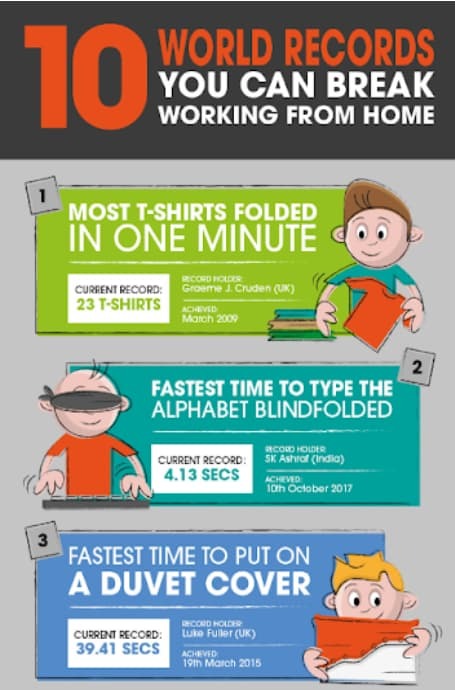
With vibrant colours, animated characters, and textual content, this infographic shares a easy message: take breaks. Who is aware of? You may be breaking a world file.
2. A Simple Guide to Shooting Video By Yourself, by Spielcreative
Though 86% of businesses use movies as a part of their marketing technique, only some get it proper.
Whether or not it’s background noises, poor lighting, or another distraction, the movies don’t normally come out the suitable means.
This infographic from Spielcreative gives ideas you’d have to create unbelievable movies all by your self.
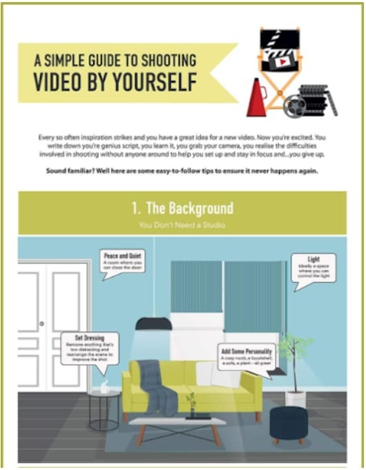
Using easy graphics and arrow pointers makes the visualization straightforward to comply with and perceive. You additionally don’t must pressure your eyes to learn the textual content, because it’s large enough to learn from afar.
three. A Purposeful Life, by Studio Patten
This free infographic from Studio Patten collects completely different survey outcomes regarding residing a purposeful life and presents the information with visually interesting charts.
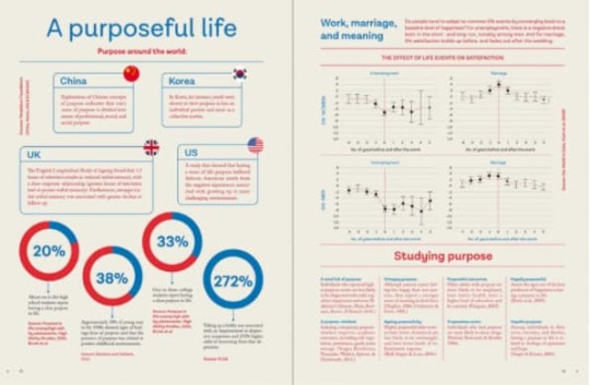
Though the subject of a purposeful life may be a deep one, this infographic does an ideal job of presenting the knowledge merely.
There’s additionally a pleasant steadiness between using textual content and information visualization components.
four. The Most and Least Bike-Friendly Cities In America, by Tower Electrical Bikes
Realizing whether or not a metropolis is bike-friendly or not is an element cyclists contemplate when shifting.
Naturally, questions in regards to the metropolis’s bike lanes, bicycle owner fatality charges, and the variety of individuals utilizing bikes would come up in a bicycle owner’s thoughts. Tower Electrical Bikes solutions these questions utilizing this easy infographic.
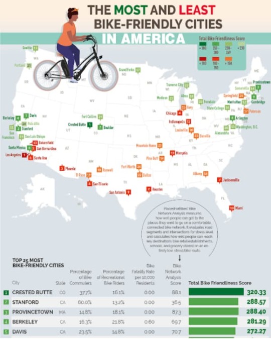
To make sense of the infographic, Tower Electrical Bikes used colour gradation (going from inexperienced to purple) to assist its viewers of cyclists perceive how pleasant the completely different cities in america are.
Cyclists can have a look and inform they’d have to keep away from the Los Angeles areas in the event that they need to take pleasure in sunny days out on their bikes.
5. How to Enjoy Studying, by IvyPanda
Learning doesn’t all the time must be a chore. IvyPanda created this glorious infographic design to assist college students take pleasure in finding out as a substitute of feeling burned out or turning to social media due to boredom.
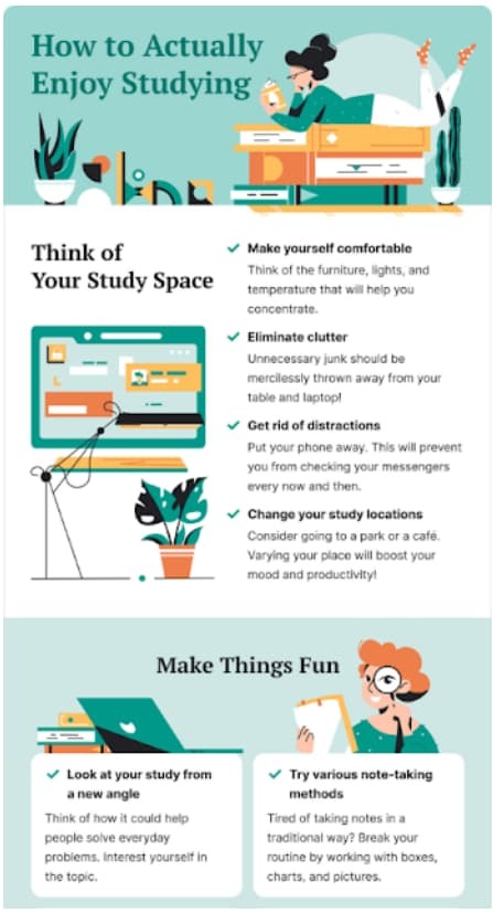
Using brilliant colours and minimalist animated design is good from IvyPanda.
Enterprise Infographic Examples
6. How SMB Sales Teams Are Keeping Up in 2020, by Zendesk
Everyone knows 2020 led to huge adjustments in the best way we work, purchase, and luxuriate in leisure time. However this infographic by Zendesk hones in on a particular group (SMB gross sales groups) to indicate how they sustain with the occasions.
Via research-backed information, clear visuals, and concise copy, the principle level comes throughout crystal clear: Know prospects’ expectations to satisfy them the place they’re.
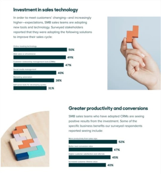
This infographic does a superb job following one theme, from begin to end. Readers can reply “What is the level?” throughout the first few sentences — a greatest apply, in response to CoSchedule.
This helps focus your infographic and avoids cramming an excessive amount of info into one piece, which is why Zendesk flowed from the analysis and stats to how SMB gross sales groups undertake new expertise to maintain up.
It even contains the advantages of CRM technology, like a 52% improve in productiveness from gross sales reps. In fact, the advantages align with the customer support software program Zendesk gives, making the infographic a very good gross sales device for its staff.
7. Content Marketing in Times of Uncertainty, by LinkedIn
Greater than eight out of 10 individuals need manufacturers to behave as a information supply in unsure occasions, foster a way of neighborhood, and supply instructional sources. Whew.
As a content material marketer, these are important expectations to reside as much as. LinkedIn realized the altering world panorama would alter buyer expectations and, consequently, content material marketing methods. So the staff put collectively this useful infographic to assist entrepreneurs give attention to what issues most.
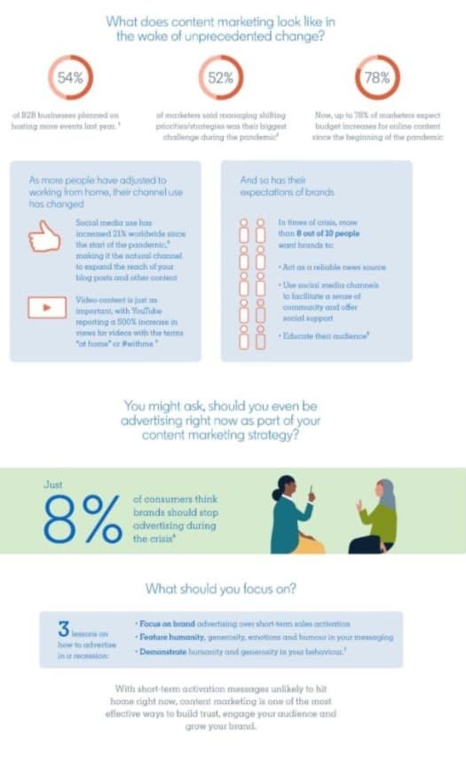
This infographic instance options a number of design components from LinkedIn’s present model. The graphics adhere to its major and complementary colour scheme, embody numerous illustrations, and relate to the work-from-home occasions.
It additionally makes use of colour block banners so as to add visible curiosity and break up chunks of textual content. However my favourite half? The ruler graphic on tips on how to measure ROI and present why your efforts are worthwhile.
eight. How to Be Productive While Working From Home, by Bannersnack
Working from dwelling is not the pajama occasion many individuals (used to) think about. As workplaces closed and thousands and thousands turned eating tables into dwelling workplace areas, Bannersnack created this infographic to assist its staff transition to a unique means of working. As a freelancer working remotely for the previous 5 years, I discovered it stuffed with sensible ideas and invaluable instruments.
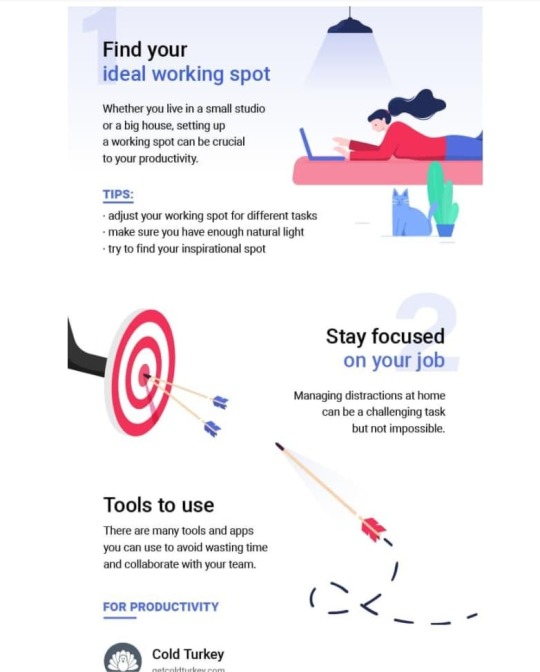
Past important components like model colours, Bannersnack contains info individuals can instantly put to make use of. Whereas it is simple to remain planted in your sofa all day, Bannersnack recommends discovering a number of workspaces for various duties — an inspirational spot for inventive considering and one other for deep work and crunched deadlines.
Ideas like this will appear small as soon as you have been working remotely for some time, however for newcomers, it is one much less factor you must be taught whereas adjusting to a unique routine.
9. 45 Slack Tricks That Will Impress Your Boss, by Internet Credit score
A device as highly effective as Slack has many options most individuals won’t ever use, but this infographic makes it straightforward to seem like the cool “Slack-er” on the firm even in the event you’ve solely mastered the /giphy shortcut till now.
Internet Credit score begins with a handful of stats to tell readers and provides an concept of Slack’s scope. Who knew individuals spend 50 million hours on the platform in one week? I am intrigued and need to hold studying.
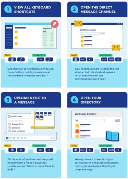
As you scroll down the graphic, you see a mix of direct headlines “Read Channel Highlight” adopted by textual content directions and visible cues. As a visible learner, I recognize how these cues mirror the precise interface.
Every part is organized that can assist you discover what you are on the lookout for, whether or not it is “#channel” or “message” ideas. Finance could also be Internet Credit score’s bread and butter, however this infographic exhibits how its staff is adaptable and useful — precisely what you need in a monetary companion.
10. How Bad Data Affects Businesses, TD Insights
A foul egg spoils the entire bunch, however what impact does unhealthy information have on companies? TD Insights solutions that query with this glorious infographic design.
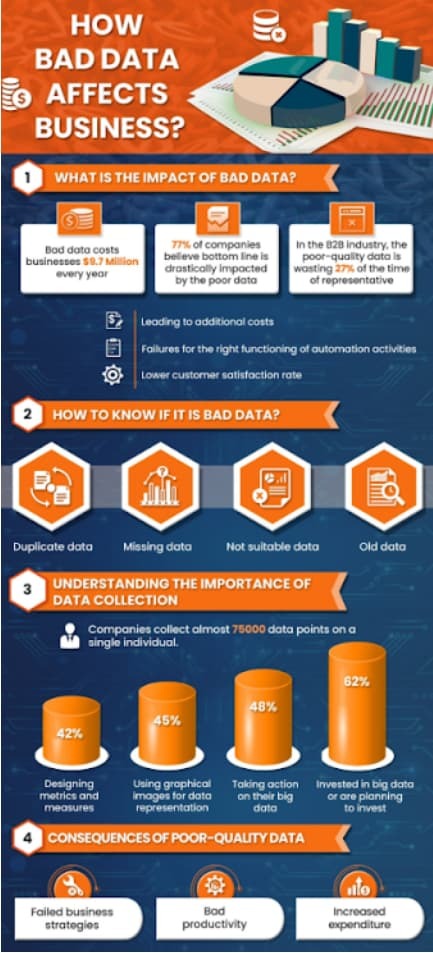
Using distinction makes this infographic visually interesting. Any reader can shortly determine the principle themes and factors of the design due to the inventive use of various fonts.
Timeline Infographic Examples
11. Tech’s Bizarre Beginnings & Lucrative Pivots, by Visible Capitalist
The great thing about infographics? They can be utilized by dozens of industries for lots of of various functions. However one of the best ones are sometimes surprising.
Take this graphic designed by Visible Capitalist. It reveals the wild origin tales of a few of the largest tech corporations in the present day. I had no concept YouTube started as a video courting web site with the tagline “Tune In. Hook Up.”
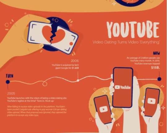
As a rising online publication that focuses on information and expertise information, Visible Capitalist’s viewers is probably going interested by tales round firm pivots that led to success.
That info, coupled with a easy timeline construction, enjoyable graphics, and hard-hitting metrics, makes it powerful to look away from this infographic. Plus, all of us want reminders that it isn’t the place you begin however the place you are going.
12. Power Shifts, Studio Patten
America is a robust nation, however that wasn’t the case centuries in the past.
On this infographic, Studio Patten takes us on a journey by means of the years that present probably the most highly effective nations at completely different occasions in historical past.
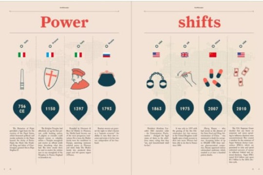
This infographic is straightforward, but it surely additionally makes use of inventive photos and textual content to offer a historical past lesson.
13. The Evolution of US Vaccines, by Janet Haniak
People have been preventing ailments and pandemics lengthy earlier than COVID-19. Right here is among the many infographics that make it straightforward to study previous vaccines created to fight these ailments.
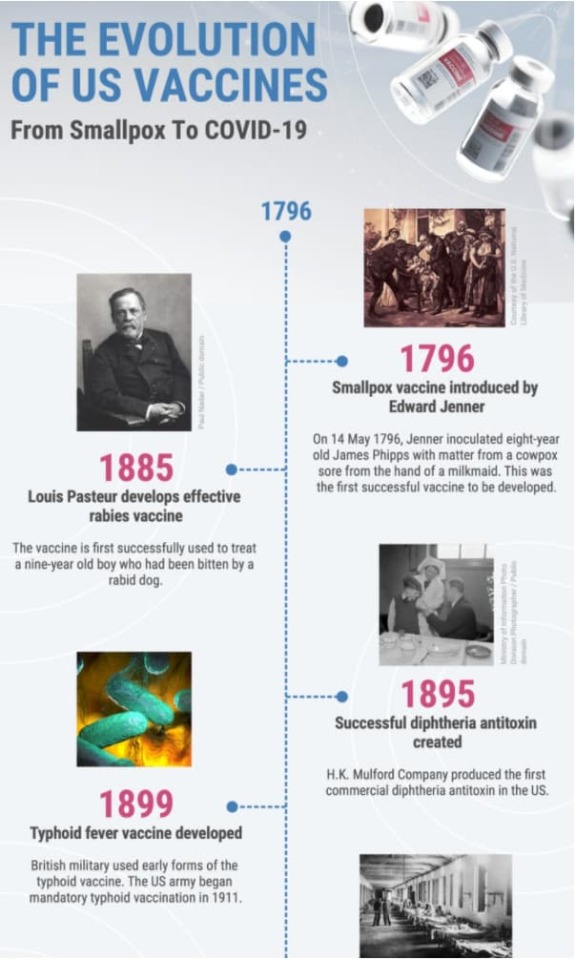
Using real-life photos as a substitute of cartoon characters makes this infographic extra plausible. As an alternative of complicating the infographic, the designer made the timeline seem on a single line, with the notable occasion branching out of that line.
14. The Journey of Oprah Winfrey, by Blue Mail Media
Oprah Winfrey is among the strongest ladies alive in the present day. However do you know she grew up in a poverty-stricken household and had a tricky childhood?
This infographic from Blue Mail Media permits us to look into Oprah’s formative years and the way she grew to grow to be who she is in the present day.

Though this infographic has a distinguished blue background, the opposite brilliant colours make partaking with it straightforward. The quote breaks additionally add character to the infographic.
15. Apple History Timeline, by Viziononline
Apple is the topic of this inventive infographic created by Viziononline, and why not? Apple is among the largest companies on the earth. Actually, you’re probably studying this text in your iPhone, iPad, or Mac.
However was Apple all the time this huge?
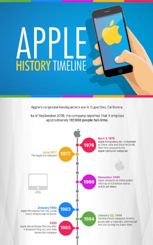
With one look, a reader can inform that this visualization is about Apple due to the completely different merchandise that seem all through the infographic.
Interactive Infographic Examples
16. Response to COVID-19, by the usFood and Drug Administration
It would not be a 2021 round-up with out mentioning the worldwide pandemic that stored many people at dwelling for months. The intense spot? There are infographics galore educating individuals on tips on how to wash their palms and social distance correctly.
The U.S. Meals and Drug Administration (FDA) additionally relied on this visible medium to share how their regulatory division addressed COVID-19.
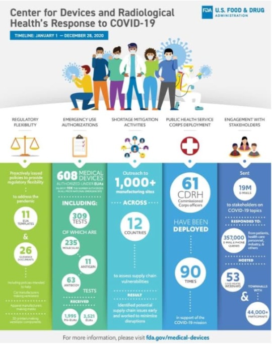
This infographic instance made our record for a number of causes. First, to indicate how infographics can spotlight the affect, as a substitute of sharing step-by-step directions or research-oriented content material.
The affect of every motion is organized into separate columns and given a definite colour to assist your eyes monitor from high to backside. Whereas this stream breaks the everyday left-to-right studying sample, it isn’t distracting or tough to comply with.
The healthcare employee design on the high of the web page nods to these on the frontlines, the colours align with the model, precise numbers are straightforward to learn, and the web page is not crowded with textual content.
So the subsequent time you should clarify the fruits of your labors to your boss, assist win them over with an impact-driven infographic.
17. Pianeta Plastica, by Manuel Bortoletti for GEDI Gruppo
“Che bello” is the primary thought that involves thoughts for this design. The beautiful information visualizations, oceanic colour scheme, and easy-to-understand structure let the visuals do the speaking. Visme explains how an infographic follows this essential best practice if it is smart with the entire textual content eliminated.
Which will appear unattainable, however designer Manuel Bortoletti pulls it off with informative maps accompanied by clear keys and a bar graph that makes use of oil tankers to tell readers about how oil circulates the globe.
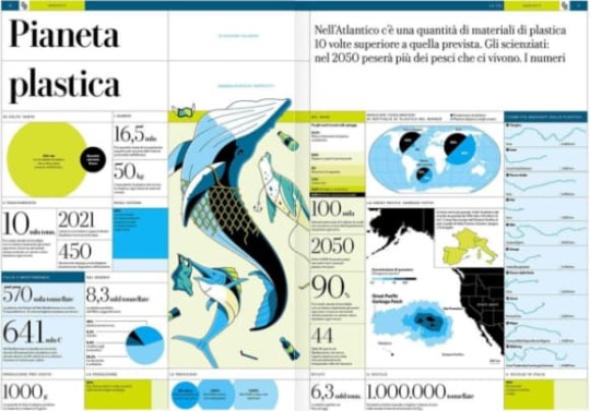
Even with my extremely restricted Italian, I perceive that the principle level of the piece is to tell readers in regards to the affect of the Nice Pacific Rubbish Patch. And since this infographic was designed for the Italian media outlet GEDI Gruppo, it stays on-brand with a extra formal editorial tone.
18. How to Properly Wear a Mask, by John Hopkins Medication
Training is the crux of an infographic. And when you’ve mere seconds to seize people’s increasingly narrow attention span, the knowledge higher be straightforward to be taught.
That is why among the finest infographic examples comes from John Hopkins Medication. They designed an infographic to share tips about a vital COVID-19 process: carrying a masks.
Is protecting your nostril essential? You guess. What about carrying a bandana as a masks? No means. Hopkins makes use of a mix of easy graphics and replica to make the do’s and don’ts very clear.
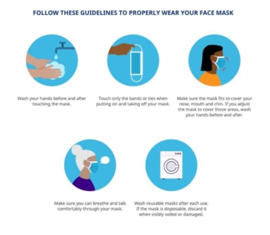
As a famend medical establishment, Hopkins has the expertise and authority to teach individuals on this matter, so it matches its model and is useful for everybody’s well being — a real win-win.
19. The Sustainable Development Goals Report, by the United Nations
Infographics are an effective way so as to add visible taste to in any other case dry content material, like annual experiences and whitepapers.
What stands out on this infographic instance is how it may be used as one visible or divided into 17 sections — one for every Sustainable Improvement Aim. This enables the content material staff to decide on which sort of content material most closely fits the audience.
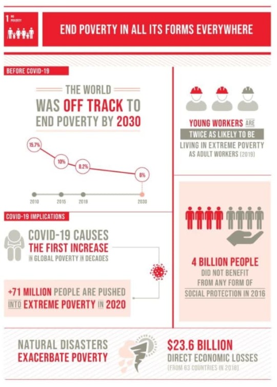
If the UN is chatting with organizations that empower ladies and women, they’ll share the “Gender Equality” graphic. However a non-profit that promotes the entire UN targets will probably be interested by the complete design.
Whereas quite a lot of info is packed into every graphic, it is by no means overwhelming. Every objective is separate from the opposite with daring headers and distinct colours, that are additionally used to distinguish the UN’s marketing efforts.
20. Ocean Pollution, by Stephanie Phung
Designer Stephanie Phung created this partaking visualization to make extra individuals conscious of the ocean’s present state of air pollution.
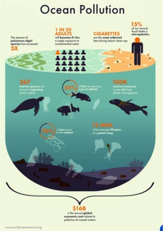
This free infographic makes use of artwork to inform a narrative in regards to the monetary and environmental implications of ocean air pollution. The designer additionally makes use of colours and design components — the blue colour for the ocean — that individuals are already acquainted with.
Prepared to start out designing beautiful infographics?
Now that your creativity is sparked, it is the right time to start out creating your infographics.
Whereas the infographics you create may be completely different from these on this record, guarantee they’re colourful and fascinating. And most significantly, that the infographics go throughout info in a fashion that’s straightforward to know.

Source link
0 notes
Text
Get UX Design Services From Highly Experienced Team
The design of the user experience is related to any communication provided by the user. UX design services analyse all elements that improve the experience in websites and applications. Feel that the user feels, administers his disconnected tasks, and all points to improve UX design.
UX Designer simplifies the payment process by buying something online. The purpose of the UX design is to build an attractive, soft, efficient, important, and anterior experience.
The design of the user experience is broad and integrated and interesting. The UX design has become an important factor in today's business world where process companies create products and services.
UX Design’s Advantages
Recent Advantages Today, people use advanced technology in everyday life. Most people want to use the latest technologies to obtain new experiences about websites and mobile applications. Users are focused. They want the fast charge of the page and use a website that is easily opened.
The UX Design Team always creates a user experience design on websites and application projects.
Acquisition of the client
UX Design Company is always important to point to new customers. The UX design process is aimed at new customers with highly reliable or persuasive clients for corporate products and services.
Companies use customer acquisition values as a related standard to calculate the business. The acquisitions of customers include several plans and strategies. We often use new customers to obtain a user experience. A great user experience will work with customers and provide a business with a healthy competitive advantage to keep customers.
Strengthens the design of the brand site for good functionality to create trust, and strengthens the possibility of brand attractions. Its users can change them to customers. Interesting UI / UX design with a powerful strategy to achieve new customers than prices.
Development, time, and cost
People always want to use attractive applications and sites to get services and products. You must design a site with planning and appropriate considerations. Because UX design companies create websites and applications in the best way, customers can easily move to websites and fascinate.
The UX Design Team offers services that offer optimized UI / UX services. Companies that use UI / UX designs on projects also improve and efficiently discuss problems with experience and experience after development.
The designer expects the needs of the user immediately before issuing a solution to the target audience. It will ensure that the design is scalable and adaptable so that it can extend it together with the users in the future.
Improvement of productivity
In current time Companies require sufficient interfaces to support the target market. It also helps its products and services to obtain good profits for investment.
The UX Design Services provide an experience and design of appropriate users that help employees promote passions to work fully. Employees are sounds to execute the reward system. Use a powerful and effective UI / UX design to generate designs and menus that promote commitment.
Ask the workforce to complete his work. The best UI / UX systems reduce errors and increase easy workflows for employees. You can use bright colors and you can see relevant information. The UX design services help focus on the information that helps attract more organic traffic.
The user's commitment
The most important factor is to be responsible for the most organic traffic for those websites and applications. Prioritizing all UI / UX designers to configure the user's commitment to understanding the design and style selection. Satisfy them when the potential client finishes on the brand's website.
The best way to get visitors related to the Site of the brand is to manage it towards a specific action using the Waithood of design. We intend all the pages of the site.
It is necessary to improve the user's commitment through the UI / UX design by lighting. It is beneficial for the site easy and priority interesting or interesting attractive designs.
Keep your website simple and prioritize attractive designs that look cool or interesting.
UX design trends
technology changes every day and uses the latest and most advanced technology. It also happens in user experience design because there are many advanced technologies. There are many latest trends in user experience design that help design websites or applications in novel ways.
Animation
It is only a matter of time before many interfaces are taken over by anthropomorphic animation. It is necessary to adopt more gorgeous animation trends and change the shape of dynamic graphics that understand digital design.
It is related to animations that resemble human actions, such as blinking or nodding. The anthropomorphic animation plan still maintains its elegance.
Before we notice the next character in the image, they still need it to read the product description. This effect is more immersive, because the design itself is only a bit aware of its movements like a real person.
MicroInteractions
We know that the purpose of all UX design is to communicate. Digital design creates an interaction with the moment the user performs an action (such as clicking a button). The help page responds to micro-interactions and real satisfaction.
The UX designer team empowers them through advanced animation and page conversion. It ranges from zooming to a complete redesign of the page layout.
Personalized Learning
The UX design company achieves this goal through personal learning, where educational applications use matching techniques, psychological testing, remote feedback, and programming tools to change each user's learning experience. It's typically a powerful dashboard for tracking progress, setting goals, and learning from mistakes.
Escape from reality
Drawing a user's journey is an essential step in any design. When the user experience starts from a virtual vacation and the user experience designer creates charming places, it looks more beautiful. It becomes the core of your design and brings a sense of foresight to the audience.
The UX design service is expressed through luxurious, organic color schemes, full galleries, or oversized images. Minimalism in user interface elements is the best technique for highlighting images.
Overhead
Helps users find menus or buttons from the outside to understand what the UX should convey. A user experience is emerging focused on determining brand ethics, providing users with a way to create products or provide services. Includes maintenance of used materials or social media pop-ups or overlays with transparent strategies on how to manage content. Brands realize that their website visitors need to be responsible users, and they know that the brand has the same values as theirs.
There are many other trends in user experience design, such as real-time collaboration, augmented reality, and there are more alternatives available in design. We can use more tools to design sites or applications.
Our User Experience Design Service
User Research
Creative Rats provides its customers with a variety of user experience design services. Our main UX design services are:
UX design services start from focusing on the end user. User flow analysis or user journey map is a key product in the research phase to familiarize yourself with the initial wireframe.
Flow Chart
The UX design team uses design factors such as colors, flow charts, permissions, charts, textures, shapes, images, typography, and layout to support the management of user experience. It also involves converting low-fidelity designs into high-fidelity designs.
Wireframe
Wireframes, mockups, and functional prototypes allow UX designers to generate websites or mobile applications in the hands of users. Quick assessment helps feedback on future design and development decisions.
Content Strategy
Content Strategy focuses on planning, authoring, delivering, and managing content. You need to make sure that there is useful and usable content. It also has a good structure and also improves the user experience of the website.
Information Architecture
Information Architecture is the basic design of websites, intranets, online communities, and software that supports usability and searchability. Our design team focuses on bringing design principles, architecture and data science into the digital realm.
Branding and Design System
UX designers understand the brand’s business goals, structure, and precise communication needs, and incorporate a set of tools, templates, and guidelines to support them. It helps us strengthen our brand and design system.
Know us from the inside
Our UX design company has provided UI UX design services to various customers all over the world for many years. The main features of our company are:
Agile UX Design Services
is used to develop customized models and designs for websites or applications.
Innovative Design and Outcome Solutions
Customer Participation Information Method Model
Affordable Price for Top UX Design Talents
Our UX Design Team is your UX design partner from idea to implementation
Accurate testing and verification in the design and development process Idea
Success and successful project execution record Help complete the project within the specified time.
Why choose us?
Do you want to know why our UX design service is better than others? Our workflow is better in many ways. We work on this model, for example:
Definition
needs to define all the system specifications, represent the main technological options and understand the roles and roles of the users. It helps us understand any project.
Design
First, our UX design team analyzes the main appearance of the product. We plan for user experience and user journey characteristics to present the best design.
Delivery
We continue to conduct specific evaluations of function, time and cost, and begin plans to deliver the project on time.
Development
During the product expansion phase, we monitor quality control and use project management tools to provide implementation updates. It helps us to provide the best design for each type of project.
You can contact us at any time to obtain our services. We make the best design for each type of website or application.
If you want to hire a UI UX designer, hire a website developer and then work with us to achieve the best results in your business. Or call us or chat with us for more details.
0 notes
Text
WEEK 7 EVALUATION
Monday - Today is assessment week and I was being assessed this day in the week. In the morning I spent my time learning how to use Lino. We did a Lino printing workshop and I referenced an image from Pinterest to create a cut and print. I found doing Lino printing really fun for me. it was much easier to do than woodblock printing was. I realised that I had to be careful to ensure that I wasn't cutting too fast as I would accidentally cut the wrong areas. Overall I found the experience really fun and I also really liked the outcome of my Lino print. I decided to create a flipped grid pattern with the outcome as the print was squares which I felt was quite cool. I ended up cutting that in Half and scanning the good side of it, which I then developed later on in the day on photoshop to create a flipside utopia/dystopia postcard. I was able to use the photocopier in a way where I could make a copy, put the copy back into the paper tray and print again. This made a really cool and organic effect which I manipulated in photoshop. I also worked on my blog in my free time, making sure things were up to date like my weekly reflections, different blog posts which needed attention and the overall theme of the blog was consistent.
Tuesday - Today in the mac suite we learnt how to use the basics of the program Adobe illustrator for the first time. We used it as a typography workshop to learn to create different ways manipulating text and use in different fonts that I had installed online fonts as ways to communicate the ideas of the flip side utopia and dystopia. I installed a custom font called seagram. This is a font I have used widely on my project because it is in the old English style, but slightly simplistic and more modernised. I really like the font because I feel like it fits the borders of utopia and dystopia at the same time. The font feels natural in both areas and it helps to link the ideas together. It also has helped to unify my body of work over the past few weeks as I have continued to use that font repeatedly on projects and workshops. I also experimented with using fonts like Helvetica Bold. I really like this font and have for a long time. It’s an easy to read, modern bold font which has the sharp lines but easy curves and it just makes a great standard font. And although it is common and basic, I still reference this font quite a lot. I use it for the font of my logo, it’s on my blog as the set font for text and it’s commonly used along side my Seagrams font. In the afternoon of this day I worked on doing some independent directed study work. I decided to continue with some of the typography workshop for a bit, printing them out and scanning, manipulating and editing more on Adobe illustrator. I then decided to work on some of the targets I had been given from assessment. I spent the rest of the afternoon looking into how I could present/display my work and I came up with the idea of a cabinet which I really enjoy. Overall today was a great day for getting work done. I enjoyed the typography workshop and experimented with series of fonts in different layouts, disconcerting all the letters from one another and manipulating the length and angles, adding stoke lines and colour, repetition of text. These all help to effectively communicate the utopia and dystopia themes in the flip side really well. And then the development and idea generation in the afternoon helped to gather ideas and different ways to think about how my project can move into the next stage naturally.
Thursday-in Thursday‘s lesson we looked at Japanese stamp illustrations as our workshop for the day. The Japanese stamps were all very different so everyone was able to get a Japanese stamp which related closely to the theme. Fortunately, I found a stamp which was a large historic looking building. This worked really well for me as I was able to trace the lines of the architecture and create it into something that worked for my theme really well. I mostly traced the lines of the architecture I also worked on tracing lines of the stamp itself. This helps to add a border to my art illustration and also helps to link it closely to the Japanese stamp. The Japanese stamp had lots of small little dots and this took me a very long time to fill in however I feel like it was worth it due to the effect and the shading which added depth to the piece with the strong defined border. This generally took me all day to complete as I wanted to take my time on getting it right. I was really happy with the final result, the stamp looked great and it was one of my best illustrations. I was really happy with the result so I took it and got it photocopied into different negative images and colours. I now have a series of different outcomes. I also got some acetate and tracing paper and printed the outcomes onto there, this is so I can experiment with the dark room and also screen printing onto shirts or other fabrics to go along with my collection of outcomes.
0 notes
Text
EVALUATION !
This project is called MULTIVERSE, and my task was to create a zine using a collection of words linking to this topic that was given to use on google classroom. With these words, I were asked to pick out a minimum of 12 words and did so, but I only dedicate my zine to four words out the 12, and those four words were PARALLEL, REALITY, TIME AND ELEMENT, all the work I create during this project was created using the programs of adobe photoshop, illustrator, Lightroom, InDesign and procreate.
A zine is a small looking magazine that norThis project is called MULTIVERSE, and my task was to create a zine using a collection of words linking to this topic that was given to use on google classroom. With these words, I were asked to pick out a minimum of 12 words and did so, but I only dedicate my zine to four words out the 12, and those four words were PARALLEL, REALITY, TIME AND ELEMENT, all the work I create during this project was created using the programs of adobe photoshop, illustrator, Lightroom, InDesign and procreate.
A zine is a small looking magazine that normally is used for advertisement or to spread the word about something, In my case, it was to show artwork that portrays word that I have chosen.
A big part of this project was researching because I need to first research about zines as I didn't really know what they were I also need to research how to make one and how they work so I was able to create mockups and outcome that are the right size after doing this it helped me a lot to understand zine, and I was able to get on with creating, but then I knew it was time to create the outcome to go in my zine so I had to research and look up a lot of artist and designers for inspiration the pain website I used for inspiration was Pinterest due to me being able to create a board that I could go back to and inspire me.
The artist that I research that helped me a lot would probably be Ranganath krishnamani because he enables me to find a style that I like and help me open my mind to think or outcomes that I create this artist help me with the topic of reality as he a series of outcomes called a shift in the playing field and before I found him I knew I wanted to use social media and technology in my outcome, but didn't know how to do it so when I found his work it inspired me and I was able to think of loads of different ideas.
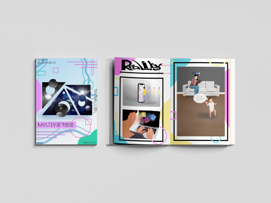
Each page in my zine is dedicated to a topic of my choice and the target was to show that word through artwork, for example, the word PARALLEL I used images such a building and shapes line and by doing this I put art together that represented parallel another page in my zine was about time so I used a lot of clocks to show that topic, the big part of this project is the MARS side or it MATHS ART RELIGION AND SCIENCES so another thing I had to have it mind was making sure I was showing this throughout the project and in my outcomes.
With me creating my zine I thought they would be a load of different problems doing it but in fact, there wasn't that many the main problem that I came across was one finding artist that had focused on the word time as I was really struggling with inspiration I need someone to inspire me but after a lot of searching on Pinterest and Google I finally came across outcomes that inspired me but was still unable to find an artist that focused on the topic time another struggle and I think the last struggle I had was trying to keep a team throughout my project and in my case, it was a colour pallet I wanted to use my colour pallet through but sometimes it would fit with the aesthetic so I have to think and think until I come you with and outcome using the colour pallet that I choose but overall the journey of my project had many ups as i was creating consatly but had some down fulls exspesaly went I have a brain block on ideas but came over quickly due to looking at pintrest the that got the ball rolling so a smooth journey i would say with this project.
As this project had a task that was very different from the other projects that I have done there was a lot of learning involved and learning new skills and techniques including different programs to learn such as in design and new techniques on photoshop the main skill that I learn that I’m really pleased with was the dissolve effect/liquefy effect on photoshop that is used in my time poster in my zine another new technique that I approached was a log print/rubbing this was another technique that I used on my time pages for my zine and it was interesting to learn a new skill and in the future, I may want to learn about wood printing similar to linocuts and screenprinting but using wood. Are used a lot of old skills that I have collected over my time at college including collage thing halftoning and just my way of laying out my artwork and also a big part of graphics and getting my topic out there was using typography and I learnt a lot about how important typography is and I learn every day when creating new outcomes.
My favourite skill overall that I have learnt would be the liquefying effect on photoshop and also photography. I knew a lot about photography as I have grown up in a photographers household but I learn a lot more about capturing the topic of something through a photograph and I also learn a lot about Lightroom as that is where I edited the photos. With photoshop I watched many videos on how to do the liquefying effect and now I have that skill which I’m really happy about. I mentioned in my blog that I wanted to learn the program in design and I’m learning as I go along and I’m still figuring out the program watching videos but hopefully, I will be able to use that throughout my time at college and after and hopefully mastering it similar to illustrator and photoshop.
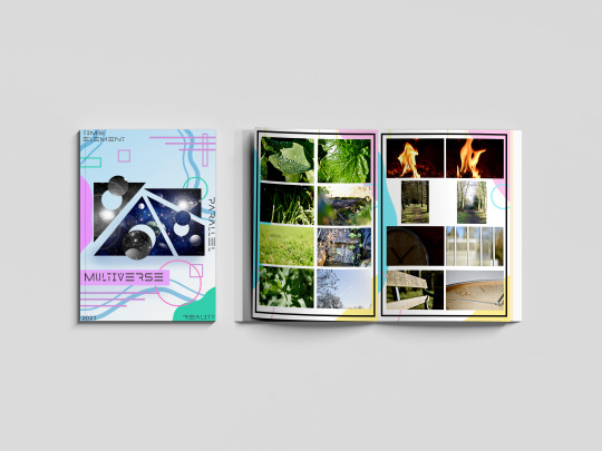
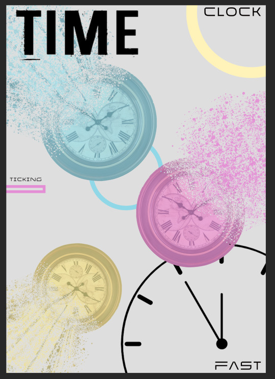
Due to us being a national lockdown the college isn’t open so we have been having to work from home and to present our work we have been using the website Tumblr I created account name is multi-verse and was adding all my outcomes and journey throughout this project onto my blog I really do prefer doing it a digital way rather than writing in a journal and sticking stuff in a sketchbook as one it gives you better quality pictures and it also allows you to choose statics and have a theme of your whole website page. Are used different ways to show my work and the journey of here the most common way was doing screenshots of how I got to an outcome and explaining step-by-step how I did it I also uploaded videos on my blog for me drawing on my iPad which is a cool way of seeing the development of an outcome. By doing all this work in this type of way I feel that I have displayed multi-verse and the project brief well on my blog and I feel that if someone was to look at it they would get an understanding of what it’s about and know what it’s about. Because especially at the beginning of my blog by explains a lot about space the multi-verse and theories delving into the more science and maths side of it and then as you go along through my blog you see research in me developing outcomes and by doing this I was able to develop outcomes to the best of my ability and be pleased with the outcome is at the end and then look well done.
With my blog I started off with a brain block I didn’t know what to do so the first thing I did to plan for this project was create spider diagrams that I could put all different connotations of my chosen word onto and search pictures on Pinterest and add them to the board by doing this I was able to refer back to them when I had another brain block further into the project. I also created a layout of how I wanted my zine to look and this helped me have a strict approach onto the scene as I knew that I wanted it to look like that so I stuck with that and as it was on my blog I knew that that’s what I showed that I wanted to be like so I wanted my outcome to show that I had followed my planning. And there are many different ways once I finish my outcomes that I evaluated them but normally I would just put my outcome on my blog and explain what my intentions were and what context I wanted to show and talk a little about the piece of artwork. One thing that I find it’s really important with any project is you try and see your work from someone else if you and try and give yourself critical feedback so you can push yourself and work harder I always do this on every topic are normally I get my family members to look at my artwork and say things about them and things that I need to change and things that are good so I work on it until I’m happy and pleased with everything on the page.
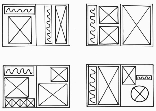

With this project a big part to me was the context as I wanted to show the words well through using artwork I feel the best piece of our that does show context is my reality pieces because you can see many different feelings and emotions through that piece of artwork and people can link personally to it where is with the other ones they do show context but not as deeply as the reality pages. But overall this project has worked really well and I’m really happy with how my final mock ups came out each page portrays a word in a good way and you know what the theme of the pages I’ve used many different skills and techniques including digital drawings typography log prints etc, but there are weaknesses to my outcomes and I would like to work on them in the future if I had the time and that would be maybe changing the theme of the background within the project as that was one thing that I was wary about and was concerned but the reason I chose are quite bold and colourful background with me looking at the word multi-verse and focusing on the word multi and thinking of loads of different colours so I had different approaches to the topic and they link back to everything which I think is a good thing to have but I play to my strengths which is always a good thing as you know that there will be a good outcome at the end by also worked on my weaknesses and learn new skills which I will use in further projects.
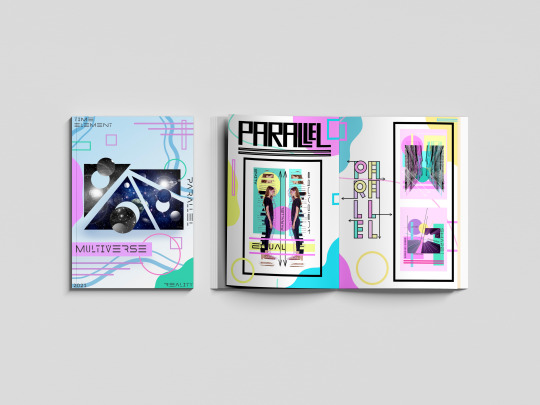
#MULTIVERSE#END#OF#PROJECT#EVALUATION#HAPPY#ZINE#PARALLEL#TIME#REALITY#ELEMENT#SKILLS#LEARNT#PHOTGRAPHS
0 notes
Link
Change my mind: CSS is hard. In fact, I preach day in and day out that scalable CSS is one of the more difficult concepts to grasp effectively. Here are 7 tips to help you scale and manage CSS and its alternatives.
1: Keep Architecture Front Of Mind
To be able to scale styling effectively, you need to first think of the grander picture.
No amount of styling finesse will help you if your application cannot scale.
An example to provide here is the popular concept of Atomic design. While it is not the only paradigm out there, it is a great example into how you can think about how the parts of your application come together.
Atomic design is inspired by chemistry and attempts to take things from first principles. From this, Brad has broken down designs into five parts:
Atoms
Molecules
Organisms
Templates
Pages
While this post is not a deep dive into that thinking framework (nor others), identifying and isolating smaller components from larger ones such as the pages will go a long way into how you begin to organize your style files and avoid repetitiveness.
2: Where Appropriate, Use Processors
Pre and post processors such as Sass, Less and Post-CSS power up your workflow with style sheets and enable powerful modularity.
Simple concepts like nesting in Sass and Less can make a world of difference to ensure your styles don't "bleed" into other style rules unintentionally.
For example, take the following trivial example:
<div class="home-page"> <div class="component-one"> <div class="container"> <p>Hello</p> </div> </div> <div class="component-two"> <div class="container"> <p>World!</p> </div> </div> </div>
What happens if we add the follow stylesheet?
.container { background-color: #000; }
What naturally follows are two .container divs with a black background. Trivial? Yes. A troublesome reality? Also yes.
What happens if this is unintentional? While the example itself is trivial, what happens in a large scale app if your class name matches that in another part of the website? Unintentional side-effects, that's what.
Even the basics of nesting can help you prevent this:
.component-one { .container { background-color: #000; } } .component-two { .container { background-color: #fff; } }
As for tools like Post-CSS, it enables you to harness popular plugins such as the autoprefixer which enables you to forget about vendor prefixes altogether. You can see from their base example on the site how powerful this utility can be:
Before autoprefixer:
::placeholder { color: gray; } .image { background-image: url([email protected]); } @media (min-resolution: 2dppx) { .image { background-image: url([email protected]); } }
After processing with the autoprefixer:
::-moz-placeholder { color: gray; } :-ms-input-placeholder { color: gray; } ::-ms-input-placeholder { color: gray; } ::placeholder { color: gray; } .image { background-image: url([email protected]); } @media (-webkit-min-device-pixel-ratio: 2), (min-resolution: 2dppx) { .image { background-image: url([email protected]); } }
As you can see, we no longer have to write rules for variant of browser - a most troublesome foe indeed.
Cool - so we've managed to save ourselves some code and are preventing some side-effects with the basic capabilities of pre-processors, but we are still in a bit of a pickle. We can still abuse these powers and end up in a mess. So what can we do next?
3: Find Structures That Work For Your Team
There are a number of paradigms, naming conventions and ordering tips that can help make traversing stylesheets easier. Here is a list of a few:
BEM - Block Element Modifier
SMACSS - Scalable and Modular Architecture for CSS
RSCSS - Reasonable System for CSS Stylesheet Structure
Outside in ordering
Object-orientated CSS
BEM
BEM is a popular style of class naming convention that is approachable and helps you understand the purpose of a class from first-glance. This is an introduction from their home page of this application in action:
<button class="button"> Normal button </button> <button class="button button--state-success"> Success button </button> <button class="button button--state-danger"> Danger button </button>
.button { display: inline-block; border-radius: 3px; padding: 7px 12px; border: 1px solid #d5d5d5; background-image: linear-gradient(#eee, #ddd); font: 700 13px/18px Helvetica, arial; } .button--state-success { color: #fff; background: #569e3d linear-gradient(#79d858, #569e3d) repeat-x; border-color: #4a993e; } .button--state-danger { color: #900; }
The idea is that from seeing the button is the block, the state is the modifier and the variant (success/danger) is the value which leads the convention to block--modifier-value. There are a number of different preferences for implementing BEM based on preference ie block--modifier__value is another popular approach.
Outside-In Ordering
For me, this is an incredibly underrated helper. Outside-in is simply a way to describe ordering your CSS within the block scopes.
From the article, it aims to order CSS properties in the following order:
Layout Properties (position, float, clear, display)
Box Model Properties (width, height, margin, padding)
Visual Properties (color, background, border, box-shadow)
Typography Properties (font-size, font-family, text-align, text-transform)
Misc Properties (cursor, overflow, z-index)
Take the following example without this in mind:
.button { font-size: 3em; background: #196e76; display: inline-block; margin: 1em 0; font-family: Avenir, Helvetica, Arial, sans-serif; padding: 1em 4em; text-align: center; text-transform: uppercase; text-decoration: none; color: #fff; border: 0.25em solid #196e76; box-shadow: inset 0.25em 0.25em 0.5em rgba(0, 0, 0, 0.3), 0.5em 0.5em 0 #444; }
Now compare it to a block that takes this convention onboard:
.button { display: inline-block; margin: 1em 0; padding: 1em 4em; color: #fff; background: #196e76; border: 0.25em solid #196e76; box-shadow: inset 0.25em 0.25em 0.5em rgba(0, 0, 0, 0.3), 0.5em 0.5em 0 #444; font-size: 3em; font-family: Avenir, Helvetica, Arial, sans-serif; text-align: center; text-transform: uppercase; text-decoration: none; }
For such a simple concept, the latter block becomes far more approachable and is a small win for developer experience when those properties are grouped into relatable properties.
OOCSS, SMACSS and RSCSS
All three of these libraries serve as great guides and approaches to styles.
Websites such as RSCSS also provide great examples of common pitfalls that developers come across.
With OOCSS, it brings in the common programming paradigm to think object-first to help with re-useability and composition of styles.
SMACSS itself self-proclaims to be more of a style guide than a framework, so placing it in this section may be incorrect, but it certainly leads us to the next important point.
4: Use Style Guides, Linters and Code Formatters
The beauty about web development is that web developers are the first to create amazing resources for their peers to use! You do not need to ~re-invert the wheel~ make the same mistakes as our predecessors.
Style guides operate as a great resource for helping decide upon the rules and conventions that you as a team wish to use.
Linters can help enforce coding conventions decided upon by the team. This helps enforce rules into the codebase and is a great help for new team members onboarding into the codebase.
Code formatters can bridge the above two and help re-format your stylesheets automatically.
Here is a non-exhaustive list to kick start your research into this:
AirBnb CSS Style Guide
Dropbox CSS Style Guide
Stylelint.io
Prettier.io
5: Consider Frameworks That Support Compartmentalization
While this starts to verge outside of the style specific territory, frameworks such as ReactJS in tandem with bundlers such as Webpack allow us to compartmentalize our styles so that they do not affect others.
For a very trivial example, let's take two components ComponentA and ComponentB:
// ComponentA.css .component { background-color: #000; } // ComponentB.css .component { background-color: #fff; }
// ComponentA.jsx import "ComponentA.css" const ComponentA = () => <div className="component"></div> // ComponentB.jsx import "ComponentB.css" const ComponentB = () => <div className="component"></div>
Thanks to the separation and power of transpilers, the styling applied to both classes can be independent of each other and do not clash. This solves our previous issue around "style bleeding".
6: Consider CSS-in-JS
CSS-in-JS has been a relatively recent technology brought into the web development world.
I say recent, but even two months can feel like an era.
Modern libraries such as styled-components and Emotion JS bring the power of styling into JavaScript. This empowers us to use modern superpowers with ease such as application themes (think dark mode toggles), lets us use JavaScript concepts and data structures to help modify and maintain our styles and enables us to use powerful tooling such as static typing.
For those who want to harness these powers but still prefer the final CSS output, checkout alternatives such as Treat which enable you to do this.
7: Use Comments
This should be self-explanatory, but I have two requests:
Please use them.
Please don't write // HACK: my reason unless you are playing a prank on some poor developer inheriting your database two years later or you have a very, very good reason to do so.
Comments are powerful for humanizing the code and explaining what is happening in understandable terms. They are not an alibi.
Conclusion
These have been seven tips that I have learned along the way to help with my mortal enemy: CSS.
Here is to hoping that these resources help you in your own battle against maintaining styles!
Do you have any other tips that you have learned along the way? Share them below!
0 notes
Text
The Origin of The Stars Evaluation
What informed and motivated my design decisions?
I chose The Origin of the Stars as It was a clear story to work with for me, I could see ideas for imagery already and enjoy that whole area of ‘the cosmos’ in general. To begin with I analysed the text, identifying main the themes such as the sun should be scorching, the wind blowing harsh and the moon as the main focus, appearing cool and delicate. Started with two storyboards with two very different ideas, visually inspired by the Mozart sequence and through visual research online looking at different ways of representing the moon, initially with the idea of cut-outs.
However, I was hugely inspired by the animation ‘Charlottes Daydream’ by Marlies van der Wel that I came across through my research, it immediately held my interest and I thought it was quite beautiful to watch. It also ran parallel with my ideas and the subject of my own work, with the same sci-fi, surreal slightly magical theme. My initial moon drawings were a step outside what I’m used to drawing, both the technique of drawing digitally and the style. However, after watching this animation it edged me on to attempt more in that same style and see where I could take it, with no real idea what my work would end up as.
The colour pallet was so similar to mine and the style of illustration is something I have been in awe of for a long time but never dared try myself in fear of not hitting the mark. It just seemed like the perfect mirror of what I was trying to achieve in my animation that I had to use it to develop my work forward. This was the biggest turning point in my development as my animation took off from here.
Throughout the drawing process, I was constantly assessing each drawing; whether it fit right with the others as a consistent set and if I could put them together as a smooth animation. Through my own trials with animating sperate images and some together, it was apparent what worked best and so I moved on to only focusing on the moon as not only did it stand out in the original storyline as the main subject, my drawings for it also provided the most affective visuals.
I looked at Moon Panda That Girl- drawn animation as I wanted to gather more of a range of drawn animation styles to learn from. This animation has a lot of finer details and more overall movement then Marlies van der Wel’s work and I see where I could focus on animating smaller details in my work, like the stars and heat waves in the sun scenes.
I struggled to think of ways to transition my work when drawing. Different scenes from my earlier storyboards as each illustration had a set layout and I needed to link them together to make the animation run smoothly. In my research jump cuts came up often and seemed the best way that wouldn’t disturb the detail of the drawings. I got the idea of using the moon as the subject of all the movement from Charlottes Daydream other parts of my research where an object leads into another scene. This also helped establish that moving forward my animation would only include the moon.
Analysing Jessica Smith’s illustration helped with perspective and affirm the colour pallet in my work, as well as her similar style to ‘Charlottes Daydream’, I drew inspiration here specifically for my final scenes where I felt more out of my comfort zone drawing more landscape scenes.
What changes and developments has my project gone through?
My project went through the biggest change initially at the beginning of the project was where my ideas where cut-outs and a more abstract design with line drawings. Once I trialled digitally illustrating my ideas, my entire concept changed and my work developed into a new style. After this I was going to include illustrations for the sun, wind and moon from my storyboards, however whilst drawing them, it became apparent that the moon scenes ultimately worked the best and so I scrapped the other scenes and focused entirely on the moon. Adding in the music was another big development as it orchestrated the entire animating that I made to match it. The lights coming on in time to the beat and the telescope moving all fit in time with the music when before there was nothing pulling it all together. The last development to top off my animation was the addition of text, I only played around with a few fonts as the look I was going for in my head was quite particular, a sort of storybook vibe that wasn’t too over the top. From this I had all the bits I needed to put together my final animation.
Did I manage my time well throughout the unit?
For this project I was constantly drawing and analysing my work, more than I would normally, throughout the drawing process. This meant I was aiming to get a lot done on my blog as I knew it would take me a long time to illustrate. I finished my animation in plenty of time as I became more and more confident with After Effects and quicker at using it.
How did I respond to my feedback?
As normal a lot of the issues brought up about my illustrations or animating in the discussion and feedback where by me as I knew when something just wasn’t working very well. I took onboard everything said and my project could only move forward because of this. When it came to the typography and whether or not to just focus on the moon, that’s where feedback was greatly appreciated as they were problems I was struggling to solve. My animation is far cleaner and neater now from that.
Are there any areas of my design process that need more practise?
When it comes to animating, I think I can be a bit braver and try out more difficult ways of transitioning and animating more details. I also need to make sure I’m documenting all the little changes I make without really realising. I tend to have jumps in my work where I haven’t shown my development as I just work through a problem without showing the process.
What have I learnt from this unit of study?
When it comes to animation, I’m fairly confident with using After Effects and I know I can teach bits to myself or pick it up fairly quickly, however I often worry about trying something new in case it’s not as successful as I wanted it to be. With this project I definitely stepped out of my comfort zone. Recently I’ve opted for safer options when it comes to design as I don’t really have any idea what I’m doing, but with this project, by trying to push myself to see what I could create on my tiny tablet screen with my knock off stylus, I’m quite pleased with what I managed to achieve. I’ve definitely become more confident in trying to push myself to become a better illustrator, something I never really described myself as, still don’t really. Through this project I really want to get better, happy as I am with my final project, I now just want to gain more skills and develop my own style as I’m still not sure what that is. I’ve uncovered more I the world of animation and am surprised by how much I enjoyed this project as I was very unconvinced I would be able to make anything good to begin with, setting my standards low at first before I pushed myself to illustrate.
On reflection are there any improvements that I would make to my final outcome?
I would like to include more detail, experiment with maybe the movement of the person on the hill and include more difficult ways of animating. Make the experience feels like there is far more movement but still smooth, like a professional animation essentially. I would also make the clouds in the first scene move more but I couldn’t get that to work in After Effects as the scene moves down from the top, it’s not static like the others. On the whole I am fairly happy with it, if anything I would like it to be longer just because it feels like it flies by however that wasn’t the brief.
0 notes
Text
Photoshop CC for Beginners : Adobe Photoshop Course
This Adobe Photoshop CC course will teach you the basics of Photoshop for web design, graphic design, photography & more. Photoshop CC for Beginners : Adobe Photoshop Course What you’ll learn: You will have expert level knowledge of Adobe Photoshop CC in this course, whether you are a beginner, intermediate or have no previous knowledge of Photoshop. You will create a real world project to give you a general understanding of Photoshop and the different functions that you can do with it.You will be given a major overview of all of Photoshop's tools, filters, features, and workspace so that you can quickly begin working on your next project.You will achieve the experience and knowledge to take your Photoshop skills into your career, job, or freelance lifestyle at your own pace.Graphic designers, web designers, photographers, marketers, and whatever other industry you are in will be able to find useful information in this course.You will learn Photoshop's workspace and how you can edit it to your own workflow.You will learn how to work with images in Photoshop and edit them appropriately to your project.You will learn all of Photoshop's selection tools and how they can assist you as you edit.You will learn about layers and how they have revolutionized the way you can work in Photoshop.You will learn every type of tool available in Photoshop and how to use the most common tools.You will learn about type, fonts, and typography inside of Photoshop and how they function.You will learn the importance of color and even be given a brief lesson on color design theory.You will learn how to use alignment, guides, and grids inside of Photoshop.You will learn about all of Photoshop's many filters and features available to you.When you are finished, you will have a solid understanding of the Adobe Photoshop CC software. Requirements: This course is for beginners or anyone who does not have experience with Adobe Photoshop CC and wants to learn how to use the program. This course is not intended for advanced users of Photoshop, though the course can be used as a reference guide to find the exact information on any feature that you'd like.You will need to have an active Adobe CC subscription and the newest version of Photoshop installed on your computer. This course does not go over the installation of Adobe Photoshop CC. (Photoshop CC 2018 is used in the teaching of this course.)You will need to have a Mac or PC with at least the minimum requirements for Adobe Photoshop CC. Information can be found on the Adobe website.You will need to have a working keyboard, mouse, and/or tablet to use Photoshop. Touch screens and other pressure sensitive devices will work, but are not covered in this course.Project files are available for download for each lecture. Make sure you download the appropriate files if you would like to follow alongside the course. Photoshop CC for Beginners : Adobe Photoshop Course Description: Learn Adobe Photoshop CC in this New Course! Many people try to learn Photoshop but struggle because the program is so vast. Most quit before they even get started. :( That's because they've never been taught the program in a step-by-step, easy to learn manner. But that isn't you now, is it? You have found the perfect course for learning Photoshop. It doesn't matter if you have no experience at all, this course was designed to teach you Photoshop in the most effective means necessary. With over 15 hours of video and over 100 project files, this Photoshop course is JAM PACKED with information to help you learn this awesome program! The videos build on one another so that as you work through this course, you will understand more and more! Pretty sweet, huh? :) Not only that, but this course is also designed so that if you already know some Photoshop and just need help with a specific tool or feature, you can skip directly to that topic! So who can benefit from using Photoshop? Adobe Photoshop CC is useful for a lot of careers, industries, and hobbies. It doesn't matter if it's photography, graphic design, web design, social media, user interface design, advertising, painting, printing, or video/animation. This course will cover tools that can be used in any niche! Each section goes into specific detail of the feature or tool being shown so that you will feel comfortable using them on your own. This course will cover: The Basics Photoshop's Workspace Images Editing Selecting Layers Masks Tools Type Color Alignment Filters and much, much more! Don't forget all of those juicey project files! This course has over 100 project files for each individual lecture for you to use and follow along with. From the basic to the advanced, these files will at least help get you started so that as you watch each video, you can work alongside the instructor. What are OTHERS saying about this instructor's courses? "This course is amazing. Learning photoshop with this guy is easy ;-) Thank you so much. " 5/5 Stars - Robert Fersti "Great course that outlines several fundamentals of Graphic Design. Coming from a web designing background, I found a lot of the basics applied here as well. But, the course builds on that and gives you so many pointers on how to capture, guide and hold your audience's attention. I think, in addition to promotional graphics, the ideas explained can be readily applied to designing hero image layouts for landing pages of your websites as well." 5/5 Stars - Ravi KT (on Canva : Graphic Design Theory course) "This course is really informative, up to date, and engaging. Phil and Jeremy keep up to take with the posting of their students and provide reliable feedback. They have inspired me to keep pushing myself forward with my art, and graphic design. I would tell anyone (from beginner to advance) who uses photoshop / or would like to know more about it, to take this course. Its worth it!" 5/5 Stars - Betheny Powell (on Photoshop for Entrepreneurs course) People from around the world are learning valuable skills and applying them to their everyday lives. Don't be the one left out. You can absolutely learn this program and by taking this course the instructor will be with you every step of the way. Other great stuff you might want to know.. Not only will you get over 15 hours of video content and lessons, 100 project files, and a new life skill, you will also have direct communication with the instructor to help you along. This includes direct messages, discussions, and specialized projects in the course that will allow you to interact with the instructor and others. Feeling lost? Don't worry, we are here for you! As they say, "Come for the course, stay for the community." Well, that's not the exact phrase, but you get what I mean. :) What else is there to know? What else? What else?! Well there is that little 30 day money back guarantee thing. That basically means that if you don't enjoy this course for any reason at all, you can get a full refund up to thirty days since the time you purchase it. It's a win-win situation! and I applaud winners. So what are you waiting for?! The time is now to stop procrastinating and begin learning Photoshop so that you can take full advantage of everything that it has to offer! Enroll now in this course and get started! Who this course is for: This course is specifically designed for beginners or anyone else who doesn't know how to use Adobe Photoshop CC but would like to learn. This course can be viewed one video after another, or you can skip around to the sections that you need. Advanced features, special projects, and design theory WILL NOT be taught in this course. Graphic Designers Web Designers Game Designers Photographers Marketers Social Media Experts UI / UX Designers Product Designers Architects 3D Artists Beauty Artists Paint Artists Entrepreneurs and anyone else who wants to learn Photoshop. THAT'S YOU! :) Who is the target audience? This course is specifically designed for beginners or anyone else who doesn't know how to use Adobe Photoshop CC but would like to learn. This course can be viewed one video after another, or you can skip around to the sections that you need. Advanced features, special projects, and design theory WILL NOT be taught in this course.Graphic DesignersWeb DesignersGame DesignersPhotographersMarketersSocial Media ExpertsUI / UX DesignersProduct DesignersArchitects3D ArtistsBeauty ArtistsPaint ArtistsEntrepreneursand anyone else who wants to learn Photoshop. THAT'S YOU! :) Course content of Photoshop CC for Beginners : Adobe Photoshop Course: Total Lecture:140 Introduction How to Create a Polaroid Effect in Adobe Photoshop CC 2018 Upload Your Polaroid Photograph! Welcome to This Section on the Basics of Adobe Photoshop CC 2018 Getting Started with Photoshop Overview of the Photoshop Interface Changing the Photoshop Workspace Navigating the Document Window Using the Tools Panel in Photoshop Undo, Redo and the History Panel Understanding How Layers Work in Photoshop Saving Your Files in Photoshop Resizing an Image in Photoshop Making Selections with Photoshop Using Brushes inside Photoshop Creating Shapes and the Pen Tool Transforming Selections, Shapes and Images Text and Typography in Photoshop Working with Color inside Photoshop Other Cool Features of Adobe Photoshop Resources for You to Use in Your Projects Welcome to This Section on Understanding the Photoshop Workspace Resetting Photoshop to the Factory Default Setting Preferences with Photoshop Creating a Custom Workspace Starting with a New Document Using a Photoshop Template Opening Files in Photoshop Closing and Saving Files Common File Types Exporting Files from Photoshop Welcome to This Section on Working with Images in Photoshop Image Modes and Channels Changing the Image Size Adjusting the Canvas Size Cropping an Image in Photoshop How to Trim an Image with Photoshop Rotating an Image in Photoshop Straighten an Image with the Ruler Adjusting Brightness and Contrast Using Levels with Your Images How Curves Work in Photoshop Changing the Image Exposure Adding and Removing Vibrance Hue and Saturation Adjustments Having Proper Color Balance Black and White Imagery Applying Photo Filters in Photoshop Invert, Desaturate and Equalize Adjusting the Threshold of Your Image Overlaying Gradient Maps Selecting Specific Colors Working with Shadows and Highlights Replacing Colors in Photoshop Welcome to This Section on Making Edits in Photoshop Projects and Documents Fixing Mistakes in Photoshop Cut, Copy, Paste and Clear Fill and Stroke Selections Transform and Free Transform Content-Aware Scale Puppet Warp Perspective Warp Welcome to This Section on Selection Options in Adobe Photoshop CC Select All, Deselect, and Reselect Selecting the Inverse of an Image Using a Color Range for Selection Selecting by a Focus Area Subject Selecting Quick Mask Mode and Mask Selecting Modifying a Selection Saving and Loading Selections Welcome to This Section on Photoshop Layers Understanding How Layers Work in Photoshop Creating and Deleting Layers How to Select Layers in Photoshop Layer Groups and Why They Are Important Merging and Flattening Layers Adding Layer Styles in Photoshop Using Masks with Layers Clipping Masks Working with Layer Adjustments Blending Modes with Photoshop Additional Layer Options Exporting Layers in Photoshops Converting Layers to Smart Objects Artboards and Layers Welcome to This Section on the Many Adobe Photoshop Tools Working with Tools in Photoshop The Move Tool The Artboard Tool The Marquee Tools The Lasso Tools Quick Selection and the Magic Wand The Crop Tools The Slice Tools Eyedropper and Color Sampler Tools Ruler, Note, and Count Tools The Healing Brush Tools The Patch Tool The Content Aware Move Tool The Red Eye Tool The Brush Tool The Pencil Tool Color Replacement and Mixer Brush Tools The Stamp Tools The History Brush Tools The Eraser Tools The Gradient Tool The Paint Bucket Tool Blur, Sharpen, and Smudge Tools Dodge, Burn, and Sponge Tools The Pen Tool and Selection Tools The Type Tools The Shape Tools The Hand, Rotate, and Zoom Tools Welcome to This Section on Creating Typography and Using Fonts in Photoshop Using Type and Fonts in Photoshop Adding Type inside of Photoshop Working with Text Layers Characters and Fonts in Photoshop Creating Paragraphs and Content Character and Paragraph Styles Glyphs and How You Can Use Them Extruding Type to 3D Text and Work Paths Convert Text to a Shape Warping Text in Photoshop Match Fonts from Photographs Other Type Options in Photoshop Welcome to This Section on Understanding the Importance of Color Working with Color in Photoshop Color and Swatches Using Gradients inside Photoshop Adobe Color Themes A Little Bit About Color Theory 3 more sections Photoshop CC for Beginners : Adobe Photoshop Course course Read the full article
1 note
·
View note
Text
Final Evaluation Visual Thinking
1. What informed and motivated my design decisions?
After having done multiple idea generations for all products set, it got my mind thinking for every area of the products. I had more inspiration in some which gave me a clearer idea of which ones I did not want to do. However, I did not just leave it their so I decided to look at the themes to maybe give me more inspiration but in the end I actually decided to pick “plasters, bonbons and plasters”. It was then down to 3 products so I created more ideas for each using my previous research. I then realised plasters did not appeal to me swell as lightbulbs. I liked the ideas for all 3 product sets but I found bonbons more fun to look into and to develop on.
2. What changes and developments has my project gone through?
Throughout my project their have been a lot of illustration changes to give the packaging a lot more of an “identity”, it went from monsters to living fruits. The illustrations also became more consistent in the way that they looked as I decided to give them the same eyes and mouth. Having done that I also had to look at my actual packaging shape and I got inspired by a match box (the idea of a sleeve and a box inside that can be pushed in and out). I had to do multiple nets and mockups to get the right sizes and to make sure the box is shut and not open. Having found the right size for my packaging I then put my illustrations onto the packaging. Half the head with the eyes would be on the sleeve and the rest of the illustration would be on the actual box which would lengthen the illustration when pushed down creating a cool and interactive action. However, I had to change many colours, sizes and text positioning within my packaging, all to keep the consistency. When making the poster, I had to change the text and its layout a lot to make it easier for the reader. Having done that I found the right idea having asked multiple people their opinions on which ideas they thought were easier to read.
3. Did I manage my time well throughout the unit?
I managed to finish on time so yes I did, but I relaxed a lot before hand because I prefer working under pressure so it is definitely something I still have to work on in the future.
4. How did I respond to feedback?
I took any feedback possible as I love to hear other peoples opinions! The tutors provided me with great advice on how to make my illustration in relation to my theme and packaging idea. People on the course are also a very nice contribution to help me see things I wouldn’t have thought of. So feedback in general is very well taken into account.
5. Are there areas of my design process that need more practice?
I am still getting used to using a drawing pad, so this definitely helped me improve on that and I will practice more along with the use of Adobe After Effects which I was totally new to when starting this project, I will just have to keep learning!
6. What have I learnt from this unit of study?
From this unit of study, I have learnt a lot on how to make nets and how to make actual packaging. I also felt that previous skills learnt from the previous project helped me a lot through this, e.g. Adobe InDesign, laying things out and typography. This actual project therefore really helped me strengthen my skills with softwares such as Photoshop and After Effects. I now know how to make packagings and animations!
7. On reflection, are there any improvement that I would make to my final outcome?
I would actually not change anything to the design of my actual illustration. However, I would maybe change the net to make it cleaner when putting it together but it is a prototype and not made in a factory, so it isn’t going to be perfect. I also wish I could have found a way to dispense the bonbons better because perforating the packaging made it look very bad as it looked ripped that is why I did not do it on my final packaging but if it were made in a factory the mouth would definitely be perforated.
0 notes
Text
13 Quick Ideas to Improve Your WEB SITE DESIGN Skills

Designing your business website can be considered a challenging proposition. You’ve surely got to juggle the anticipations of several stakeholders, and you may often strike hurdles that prevent new ideas from growing.
I was the look manager for a big company website for almost six years, and during that right time, I came across myself losing perspective of what our focus on audiences needed. Call it “tunnel eyesight.” When you focus on the same website, it often really helps to have a step back again and consider new methods. That’s the goal of this website post.
Here are some tips, methods, shortcuts and general advice for creating great web page design. Is it possible to try these to consider your web site design to another level?
1) Design in tones of gray, add color then
If your website design company creates wireframes before visual designs, then you understand the worthiness of you start with shades of gray. Change your wireframe into a grayscale visible design, add your picture taking, then carefully add color to create elements individually.
This will prevent an “overdesigned” website and help place prominence on just the things that require it.
2) Use Keynote (Mac) to produce rapid web page prototypes
You don’t need Photoshop to generate rapid prototypes of webpages, landing pages, call to actions or other web interface elements. There’s a whole underground motion around using Keynote (that’s Apple’s version of PowerPoint) to make mockups.
There’s even an internet repository containing interface design themes for wireframing, prototyping and testing mobile and web applications in Keynote.
3) Add web fonts to your corporate and business style guide
It’s 2015, and if your commercial style guide doesn’t include web fonts, then you will need to consider adding those which means that your website gets the same governance that corporate and business documents and security does.
If you haven’t investigated this yet, Google Fonts is a superb spot to start. Find a suitable web font and define utilization in your corporate style guide so you utilize it regularly online
4) Bury those sociable media icons
You did everything work to get visitors to your website, yet you’re inviting these to leave? That’s what you’re doing when you place interpersonal media symbols in a prominent location of your website, like in the header. Bury the symbols in the footer.
If people are on your website, you want them to remain, learn as well as perhaps inquire about your services, not check away company picnic photos and bowling outings on Facebook. Social networking should send visitors to your website, not vice versa.
5) Ditch the slideshow/carousel
When the homepage slideshow/image carousel arrived in fashion, it was ways to get plenty of information on the first page of your website. The problem is that a lot of people don’t stick to the web page long enough to see all the tiles/messages.
What’s more, it would be that the communications and images usually aren’t highly relevant to your potential customer’s first visit. What’s the thing a visitor should eliminate using their website visit? Promote that a very important factor -- usually what your organization well in layman’s conditions -- and ditch the others.
6) Simplify navigation
Cutting your visitors’ options might appear counter-intuitive, but it can, in fact, help guide visitors to your most productive content. Instead of mind-boggling your guests with links to every web page, simplify your navigation.
Eliminate dropdown menus and especially multi-tier dropdown navigation that only the most skilled mouse user can navigate, and go a step further by reducing the number of links in the header or sidebar of your website.
7) Remove sidebars
The sidebar has been a particularly popular web site design trend going back ten years, on blogs especially. Many companies have found that whenever they remove sidebars off their blogs, it stimulates the audience to focus on this article and the decision to action by the end.
Eliminating the sidebar on our company blog has increased the number of clicks on proactive approach graphics over 35%.
8) Get color motivation from nature
Desperate for the perfect color mixture for your website or a proactive approach graphic? Get inspiration from character. You can either use your camera to picture natural miracles around you or find scenery photos on the net, the utilization of a color picker to choose a color. Nature’s color scheme never fails.
9) Step from the computer
I think that good design begins with great planning. Getting the ideas down in writing or on the whiteboard will help you iterate through a design, refining it and adding fine detail as you complement. Sketching on a whiteboard can also make the look process collaborative and invite other associates to give insight.
It’s also easy to erase pencil from paper or marker from a whiteboard and make quick changes, and after you have something cement to utilize, snap a picture with your cellular phone and move on to work on display.
10) Use Pinterest to produce mood boards
When you’re piecing together inspiration and ideas for a fresh website, or you’re redesigning part of your website, you need a way to gather your inspiration in one place for future reference.
Did you know you may use Pinterest to make a feeling board of your preferred images, colors, layouts, patterns, test websites, and idea materials? Another great benefit of using Pinterest is that other designers create and talk about feeling boards too, and they’ve already curated a huge amount of resources that you can use.
11) Boost your font size
Typography is incredibly important in web site design. The text message is hard enough to learn on a screen, and that means you have to help make the essential things stand out.
One way to get this done is to boost your font sizes, specifically for headings and important blocks of the text message. Consider increasing how big is your normal font, too.
12) Use white space
It may be hard to think that using whitespace is a hack, but I evaluate websites every day that might use more whitespace. Not every empty section of the display screen must be filled.
Even though whitespace and simplicity are however you like right now, way too many companies make an effort to cram everything into a little space, or even worse, “above the fold.” Give your design room to breathe, as well as your website site visitors can find things easier.
13) Utilize the squint test
Want an instant way to learn what’s most prominent on your website? Cool off from your computer display and squint. Most everything can be blurry, and only the bigger, vibrant, more prominent features will be noticed.
It’s said that technique helps a developer know very well what a first-time visitor may notice when he scans your website. Will visitors notice what’s most significant?
While this is a large post about little design hacks, I’m sure you involve some hacks of your which I haven’t considered here. What’s your preferred design hack? You will want to talk about it in the feedback below? Let’s observe how many you can include!
Also Check
Toronto graphic design : Thought Media is the best web design company in Toronto, Canada, and New York. Working with hundreds of clients all over the world from Canada, the United States, Australia, China, Norway, Dubai, and more! Effective Website Designs, reliable website hosting, successful Search Engine Optimization Marketing campaigns!
0 notes
Text
Best Instagram Apps for Marketers
By itself, the Instagram app is awesome and powerful.
But do you know all the best apps to take your Instagram marketing to even greater heights?
There are certainly a lot to choose from. There’s no shortage of great Instagram apps for marketers.
To help you find the best of the best, we’ve tried out dozens and researched scores more. All the apps we’ll recommend below are ones you can download to your iOS or Android device for Instagrammign on-the-go. (The Buffer mobile app is a favorite of ours, too, for obvious reasons.) Keep reading to see our list of the very best Instagram apps for marketers, apps that can make your social media shine even brighter.
The Trend of Standalone Instagram Marketing Apps
The trend of single-job, standalone apps is not a new one.
Whenever anything reaches the mass and scale of social networks, there’s certain to be enterprising folks building tools to make the experience that much better.
In fact, this is exactly how Buffer got its start eight years ago, doing the single job of scheduling for Twitter.
These “single-job” tools do wonderful at delivering on the promise of a single superpower to help marketers and creators. And people are way into them. Huji Cam, which make your images look as if they were taken with an old-school throwaway camera, has been downloaded more than 16 million times.
What we love about all these tools is that they do a single job well, and they make a significant impact for marketers at brands and businesses, whether it’s helping to make content even better or helping to save time in an already-overcommitted workflow.
The Best Instagram Apps for Marketers
Photo-editing apps

VSCO
Price: Free
Available on: iOS and Android
The first one we want to highlight is VSCO. Now, VSCO really stretches the definition of a standalone app — it is a fully-functioning company on a huge growth trajectory! According to Crunchbase, VSCO makes $50 million per year from app sales and in-app purchases. Wow! The app itself is hugely powerful with features and makes a completely lovely experience. You can do pretty much any sort of photo editing you’d like: filters, mosaics, you name it. VSCO has become the gold standard for photo editing.

Huji Cam
Price: Free
Available on: iOS and Android
Huji Cam has been downloaded more than 16 million times, which is amazing because the tool does just one thing: a low-fi, old school photo filter to make your pictures look like they’re vintage.
Over
Price: Free
Available on: iOS and Android
Over has been one of our go-to photo apps for years. With Over, you can place text on top of any image you want. Picture like a Canva lite — there are a ton of different typography, style, and color options to choose from.

Layout
Price: Free
Available on: iOS and Android
When it comes to making collages and multi-photo layouts for Instagram, there’s lots of great options. One of our top picks is Instagram’s own standalone app called Layout. You can combine up to 9 images at once to create some really eye-catching layouts.
Snapseed
Price: Free
Available on: iOS and Android
Snapseed, which is made by the team at Google, has a host of powerful editing options and one in particular adds a slightly different take on the editing process. Rather than editing the whole image, you can use a brush to apply any effects to just the part you want.
Other favorites
Carbon is a beautiful black-and-white photo editor to make eye-catching black-and-white photos and effects
Facetune is one of the very best selfie editors. The retouching features in Facetune work like magic! We’ve never looked better.
Glitch Art Studio has a huge number of different glitch effects you can apply to your photos.
Darkroom and Afterlight are a couple other big and powerful photo editors, similar to VSCO and Snapseed.
And if you’re looking for a simple Instagram resizer, there are a lot of apps that let you resize your image without cropping. Search for “square and crop” … but just watch the reviews because some apps make you jump through hoops to use the service.
Instagram content and hashtag apps

Re-grammer
Price: Free
Available on: iOS
One of the most popular categories for Instagram content apps is apps for reposting Instagram content. If you search your app store for “repost,” you’ll see a number of different apps that do the same job. Re-grammer is one our favorites. One of the best use cases for these reposting apps is with user-generated content. You can use reposting apps like Re-grammer to curate images from your community, reshare them to your Instagram profile, and give the original poster all the credit. These apps make that whole process easy — all you have to do is discover the content you want to reshare, and the apps add attribution for you in the caption text as well as on the photo, with a subtle tag in the corner.
See Repost for an Android alternative.
Hashtag Expert
Price: Free
Available on: iOS
Another hashtag favorite is Hashtag Expert for Instagram. This app is really quite robust with different suggestion algorithms to choose from, a trending hashtag section, and more. When you enter your desired hashtag and see the list of suggestions from Hashtag Expert, you can pick and choose which ones to keep and then copy your new list to take straight into Instagram.
Tagomatic
Price: Free
Available on: iOS and Android
Tagomatic is a super lightweight app — just 11 megabytes — that does its one job well: suggesting hashtags to use. All you need to do is enter a word, and Tagomatic will give you a number of hashtag options to choose from. One thing that Tagomatic does really well is surface trending hashtags that are popular right now.
Instagram Video Apps

Boomerang
Price: Free
Available on: iOS and Android
If Boomerang sounds familiar same with Hyperlapse app, which we mention below), theres good reason. You might have seen these apps mentioned within the core Instagram experience, too. You can use them in the Instagram app, or you can download the individual apps to build and create these special videos on their own. Boomerang allows you to create super short, looped videos that move forward, then backward, then forward again. The effect is a bit like a GIF with a rewind button. Boomerangs make for great bite-sized content and are a lot of fun for creators and for followers.
Hyperlapse
Price: Free
Available on: iOS
Hyperlapse lets you take time-lapse videos and has some neat stabilization options so that you can move and rearrange things without risking the quality of the video. Time-lapse videos can make great storytelling content for events, meetups, you name it.

Clips
Price: Free
Available on: iOS
In addition to the apps that Instagram has made, there’s a great standalone app from Apple as well, called Clips. With the Clips video app, you can add filters, emojis, stickers, and more to your video — they even have 360-degree backgrounds. There’s a lot of cool and fun customization you can add to your video with ease.

Giphy Cam
Price: Free
Available on: iOS and Android
Giphy Cam by, you guessed it, the folks at Giphy lets you record gifs — which function as a type of video on Instagram. You can add effects and stickers to make some really humorous and engaging content.
Quik
Price: Free
Available on: iOS and Android
If you use much GoPro footage on your Instagram account, then Quik by GoPro is going to save you a ton of time with editing. It’s great for editing high-def GoPro videos, and we’ve even found it to be quite easy and useful for non-GoPro vids as well.

Crop Video Square
Price: Free
Available on: iOS and Android
Crop Video Square Editor is a useful app for turning non-square video into just the right size for your Instagram feed.
See Inshot Video Maker for an Android alternative.
Instagram analytics apps
Command
Price: Free
Available on: iOS
Command is a great app full of keen insightson how your Instagram content is performing. One of its best features is the chart that shows you the best times to post content to Instagram. We also love the daily stats roundup of all the most essential metrics for your account.

Follow Meter
Price: Free
Available on: iOS and Android
And for something a bit more lightweight, you can check out Follow Meter, which gives you stats about your Instagram followers. You get all the great demographic information you could want, but you can also see who is following you back, who your top followers are, and more. We’re quite fond of Instagram Analytics, and we’re building it into a new tool ourselves. It’s not a standalone mobile app – yet — but if you’re keen to give it a go, you can learn more over at buffer.com/analyze.
Instagram Stories Apps

Hype Type
Price: Free
Available on: iOS
As the name suggests, Hype Type lets you create animated text that you can place on top of videos and photos. This can be particularly eye-catching in your Stories content, both organic and paid. Moving pictures get people to stop and watch, and moving text catches the eye even more so! See Hype Text for an Android alternative.

Unfold
Price: Free
Available on: iOS and Android
Unfold is one of our top Instagram Stories design picks. The app has over 150 Story templates to choose from, plus unique stickers and its own Unfold camera. You can create some really stunning visuals in Unfold without needing a full set of design skills!
StoryArt
Price: Free
Available on: iOS and Android
StoryArt, another Instagram Stories design app, comes with a huge number of templates plus a selection of covers and themes to choose from. Both Unfold and StoryArt come very highly rated in the App Stores. We think you’ll get a lot of value from them!
How to say hello to us
We would all love to say hello to you on social media – especially Twitter!
Heather-Mae on Twitter
Dave on Twitter
Thanks for listening! Feel free to connect with our team at Buffer on Twitter, Buffer on Facebook, our Podcast homepage, or with the hashtag #bufferpodcast.
Enjoy the show? It’d mean the world to us if you’d be up for giving us a rating and review on iTunes!
About The Science of Social Media podcast
The Science of Social Media is your weekly sandbox for social media stories, insights, experimentation, and inspiration. Every Monday (and sometimes more) we share the most cutting-edge social media marketing tactics from brands and influencers in every industry. If you’re a social media team of one, business owner, marketer, or someone simply interested in social media marketing, you’re sure to find something useful in each and every episode. It’s our hope that you’ll join our 27,000+ weekly iTunes listeners and rock your social media channels as a result!
The Science of Social Media is proudly made by the Buffer team. Feel free to get in touch with us for any thoughts, ideas, or feedback.
Thank Best Instagram Apps for Marketers for first publishing this post.
0 notes
Text
Program Mastery
Mastery: Personal Development and Leadership
In this class we found jobs that's in our fields. This helped us see what jobs are available and to start looking a qualification.
Defining Clients Needs
In this class we had to create a mind map that represented the culture, traditions, and geography of three different countries. Once the mind map was created, we had to turn the words not sketches. This contributed to my professional life because at any job being able to come up with different ways to represent a company becomes important when they want options. The class helped with my thesis because I was able to pick between the three countries and the research that was done really helped me come up with ideas.
Brand Development
In this class we began working with InDesign which is important in my professional life and was important during the program. We used InDesign in this class to create Vector Art for the countries used in the previous class and we also created toolboxes. The toolboxes were used as a way to present the design ideas in one picture. Each toolbox consisted of typography, color scheme, logos, and keywords that represented each country. In my professional field being able to use different software such as InDesign gives me an upper hand and also knowing how to create a toolbox to present to clients to give them an idea of what we came up with. This technique helped me with my thesis because with the project I decided to do I was able to use InDesign and practice my skills.
Effective Copy Writing
In effective copy writing we practice finding different ways to persuade different audiences. We each picked a different organization and created testimonials to persuade a specific audience to participate. This helps my professional life because now I know how to appeal to different groups. This technique helped my thesis because I was able to choose a demographic and create a project that they could relate to.
Design Research
Being able to create a mood board to get all your idea out about a web page layout. This helps my professional life because if I wanted to make a website, I know the exact steps to take to start. Creating the mood board to represent pictures, color schemes, and keywords; once the mood board is crated, I can move on to the wireframes and actually creating a replica. This technique helped my thesis because for my project I created a mood board and a webpage lay to promote tourism in the country of Morocco.
Organizational Structures
Putting motion to still objects was something I found to be really cool and I was very excited to learn how to do. In some way this technique had an impact on my thesis project but not a lot. When I first began working on my project, I had space on the home page to place a motion graphic, but it did not work out too well.
Design Strategies and Motivation
Narrowing down to my best three logos to later pick the best. In my professional life being able to choose the best design based on what the designer wants is important. I leaned that the choice has to be based on the clients need and not what I like. This helped my thesis project because based on the feedback from the people that took the survey, I was able add more to the site that they felt was beneficial.
Design Integration
Continuing to correct all mistakes and considering all feedback is beneficial. This is important in the real world because people are giving feedback to help not to hurt and once the feedback starts flowing your design will get better.
Multi-Platform Delivery
In this class we just finalized the full project. Through the whole process I learned that getting and receiving feedback helps a lot. It gives the designer an outside opinion on what a potential buyer would want to see.
Measuring Design Effectiveness
Creating a questionnaire to get the opinion of people who fit the demographic was interesting. Creating the questions gave me a chance to see how the audience really felt about the web layout I presented. This lets me know what works for them and I can later go in and change to better fit them as the travelers
Presentation of Design Solutions
This class I found the most beneficial because I was taught how to create a website and show off my work. For the longest I have been trying to learn about creating a website to post my work and in this class, I learned the basics.
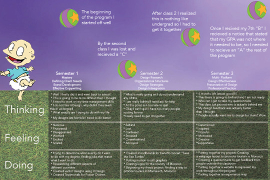
In our final class Professional Practices we were told to create an experience map that represents us and our experience in the program. For my map I chose to use my favorite cartoon rugrats to represent my inner child. The ball represents my progress in the year and how I started off well and dramatically dropped once the work began to flow.
0 notes