Don't wanna be here? Send us removal request.
Text
PLANNING FOR FINAL WEEK [12]
BLOGWORK
GOOGLE SITES SUBMIT
PROJECT PROPOSAL SUBMIT
EVALUATION COMPLETE AND SUBMIT
0 notes
Text
WEEK 11 EVALUATION
Monday
Today I worked on finishing up with my utopian clay model, I spent a few hours in the morning painting it and refining it, trying to fill and hide any cracks and imperfections, it took me a few coats to get it looking to a high standard but it was well worth it once completed. Looking back I was glad to have finished this model as it caused me a-lot of setbacks and problems. Once the model was complete I took them and placed them onto the cabinet, for the rest of that day I did a bit of blog work and photography at different times of the day to showcase the model and designs. I also took videos which I was intending to manipulate and work with to create my final outcome images and a promotion video.
Tuesday/Thursday/Offsite
on these days i continued to work on refining and producing my google sites. I worked on adding pictures and showcasing all of the work which i wanted to see, i had to use photoshop and i created my own mockups for my final outcomes which really helped to transform my work to a high standard. Once I had the pictures edited I was able to add them to my google sites and instagram to begin to promote my FMP outcome. After I had produced these I worked further on the google sites and then creating the final video for my outcome. I edited this on iMovie and published it on YouTube.
0 notes
Text
FINAL OUTCOME PROMOTION VIDEO
This is the final outcome video which I have created to showcase how I would present my outcome if it was visualised in a video/advertisement to showcase my cabinet with the theme of architecture in utopia and dystopia, Finishing with my sticker designs and clothing to represent my brand and attract a fun, youthful audience, inspired by the clothing brand collusion.

Showcased here is my editing. The software I used was iMovie. The layout of this program is fairly straight forward and was perfect for what I wanted to achieve for my short advert. The start focuses on showcasing the architecture in a dark environment, I focused on using lighting effects and camera panning movements from different angles to achieve a dark and mysterious theme. The lighting effects and use of the colours red and blue reinforce the theme and tell the viewer when the video is focusing on the utopian or dystopian aspects of my outcome.

In the video I used a small portion of the song "bad guy" by billie eilish. I used the part of the sound where only the instrumental was featured as I felt it fitted perfectly for my video, I tried to find a royalty free/copyright free sound however after searching for over a few hours I was unable to find a suitable sound, fortunately for me I was able to use the small portion of this sound, as long as I was not monetised and paid for the video. In my case the video was uploaded as unlisted and will only be attached to my google sites.
0 notes
Text
OUTCOME SERIES
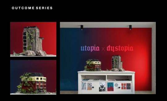

This is the final outcomes as shown on my google sites laid out, showcasing the cabinet/pop up shop which showcases all of my artwork and designs/tees/stickers. The top images shows the main outcome which is viewed upon first look, the red and blue helps to distinguish the flispide theme and the two sids of the cabinets reinforce this message. To the left I have included two close up images of the two models situated alone to showcase the designs of them and then below I have a series of 4 images which shows closeup images of the shirts and sticker designs in a neat and considered format. The blue/utopian designs are showed on the left to present that theme and the red/dystopian designs are laid on the right.
Overall I am pleased with the outcome I have created. I feel it shows everything off in a professional and high quality manner and the closeup details help to provide more information on what my art is like, what its about and the colours help to achieve the message.
0 notes
Text
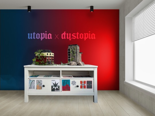
This is my final outcome which I edited using photoshop and a free mockup image of a room which I had found online, the original room was bare and had a black wall, I used layering and a gradient with blending options on to blend the gradient into the wall, making it relevant to my theme and create a neat and realistic background, I also coloured in the small downlight red and blue which helped to further replicate the realism. I also added the text using the Seagrams font and used blending options to blend it into the wall, I really like the outcome of the text. I feel it looks polished and refined. When importing the photograph of the cabinet and the models I had to use perspective and warp transform tools to make it fit in with the rooms perspective, helping to make it look realistic. I also played around with blending fx tools including the lighting. The lighting had to appear realistic for this to work, I feel that I have achieved that quite well.
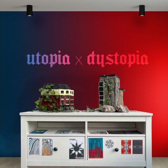
This is the cropped image outcome which I decided to use for my google sites and instagram promotion. The composition of the image is more considered and centralised, The distractions are out the way and the background is seamless and well presented to the theme. The message is clear and the styling of the graphics represents my theme and message.
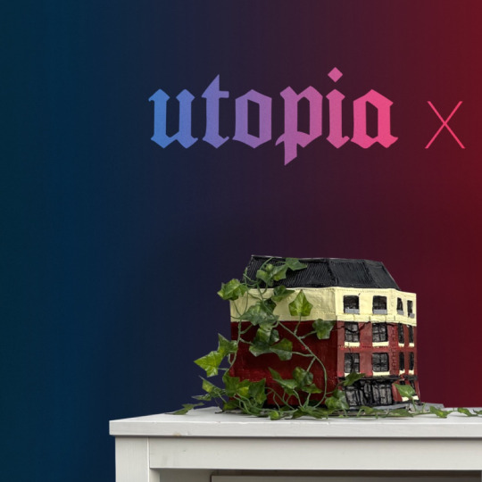
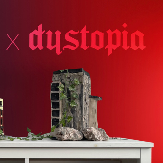
What I really like about these images is that they are high quality, this meant I was able to zoom in and get smaller snapshots like these two, showing the two models alone and this meant I was able to get closeups of my designs in a professional environment that matched the main outcome. The detail isn't lost and the images are clear and consistent with the theme.
0 notes
Text
CLAY OUTCOMES PHOTOGRAPHY

This was the set up for my models. I had it set behind the white curtains as they helped to give a clean finish but also a textured background, which I like about this. it also gives the ability to cut this out and edit this in photoshop as it is fairly plain and not complicated. I also used blankets to cover the doors and windows and a parasol to take away some of the lighting to help showcase the LED lighting at the back. I put this light here to introduce the lighting element to the models. I think this helps to relate to the theme and I used the colours blue and red to achieve this continuity.

I am pleased with this image because it showcases both of the models effectively. They both look tall and it is clear to visualise the utopian and dystopian. The stickers on the drawers help to further develop this and showcase my artwork series. I like the use of the fake vegetation and the rocks, The rocks work really well for the dystopian and the greenery helps to add sense of space and colour to the designs, for the utopian model it also helps to conceal any cracks or imperfections.

I like this closeup image of the utopian model with the greenery onto the model. You are able to visualise all the finer details of the model and the the green lighting helps to accentuate the theme of utopia.

I love this image of the dystopian model. the picture is clear and the leaves showcase the element of the vegetation growing over the models, the red lighting helps accentuate the theme of dystopia and the rough rock helps to link to the rough texture and colour of the walls of the model.
0 notes
Text
PAINTING UTOPIA CLAY MODEL
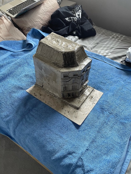
This was the outcome of my clay model after spending extra time trying to refine it and remove as many cracks as possible. After all the struggles I faced I felt like this wasn't too bad for the cracks, I know that painting over would cover alot of the cracks and I was satisfied with the result. Looking back If I had more time and experience I would want to ensure I had so cracks, ensure that it was smoother and had more details to a higher standard. But I'm happy of how it looks and I feel once I present my two models together it will look good on the cabinet.
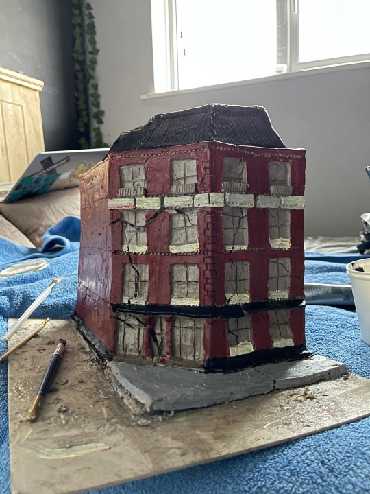
I started out by using a dark red colour for the walls, I wanted it to resemble bricks. I coated all the exterior walls with this and then used black paint for the bottom part, the small canopy and then the roof at the top. I was liking how it was coming along and I liked that it looked quite historic.

after mixing more colours I applied multiple layers, I started to introduce a light yellow colour which was to add a contrast to the structure and break up the lines a bit, add more interest and make it feel less intrusive.
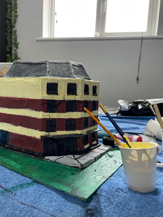
At this point I was starting to refine the details. making sure that everywhere had been coated with multiple layers of paint, I was happy that the cracks started to fade away and the colours were popping. it started to look more visually utopian.
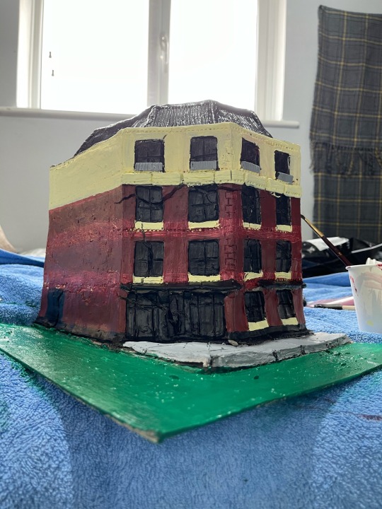
At this point I decided to remove some of the yellow lines, I felt that it would look better if the whole top floor was the yellow and the window sills of the building, so I was covering the walls with more coats as I built up the layers and smoothed the tones and started working on the finer details and ensuring things lined up.

This was the finished product. I am really happy with how this turned out, I have had alot of issues with creating this clay model and alot of times where I wanted to give up. it felt like I had been getting nowhere with all the set backs and it was hard to visualise how it could turn out as I faced alot of unexpected issues along the way. Overall I'm pleased with the outcome, the lines are all in the right places and the cracks seem to fade away, the imperfections are less visible and it shows the time and effort I have put in. For somebody who has never used clay to model before I think its good for my standard of work. Im also aware that I can use photoshop and other programs to modify the shape and remove cracks, For my final outcome photography I will play around with photoshop tools to achieve the best image and potential for this product.
0 notes
Text
PLANNING FOR WEEK 11
Evaluation
Googles sites
Tumblr blog
OFFSITE : Clay model finishing/touch ups, Problem solving + Photography.
0 notes
Text
WEEK 10 EVALUATION
Monday: Today was a catchup day for me regarding my blog work, I focused on finishing up on outstanding posts, polishing and refining my online work and ensuring that everything was up to date so far, including the project proposal, Tumblr, instagram and starting on my google sites. Overall I had a busy and productive day regarding these, I felt I achieved alot and felt my self up to date ensuring I was ahead and wouldn't have to worry as much for the rest of week, as I knew I would need to begin on my clay work and didn't want other things being a distraction.
Tuesday: Today I started my clay model. Starting with the card frame using a hot glue gun, overall this turned out well, I built it up as I went along and didn't think too much into measurements, I used the guillotine to achieve sharp and accurate edges, I used these to adhere the corners making sure it was straight, it also helped to strengthen it. For the rest of the day I carefully applied my clay, smoothing it out to a strong finish and covering all the edges, painting the back sides black and then leaving it to settle. Finishing off this day I created a screen print on a white top and some paper using the adobe illustrator utopia/dystopia typography print I created. Overall today was productive and successful, I had been busy creating the clay and focused on getting it to a smooth finish and a high standard.
Thursday: Today I came into college and faced my clay model being cracked throughout. This was a setback for me but I took it to my advantage with problem solving, I spent most of the day solving the issue and using PVA glue to keep it sealed from cracks, Eventually I ran out of clay and was unable to get more so I had to stop for the day, I let it dry for the rest of the day keeping an eye on it for cracks forming and decided to make a start of my evaluation. I also did some blog work to stay productive and work around the issues. Overall today was a huge setback for me but I tried my best to ensure I made the most out of the situation I was in and keeping productive so that I wouldn't fall behind.
Friday: Today I came into college with more clay ready to work on my model again. Fortunately for me the clay hadn't cracked this time, the glue had helped it to stay sealed, For the rest of the day I worked on the model, adding clay/glue to the sides and top and getting back nice and smooth. I then started working on the finer details to get it to a more finished standard, I kept covering the clay in more layers of PVA and watching out for cracks. Overall today was a productive day for me, I got the model looking like a structure, due to the PVA and the glossy finish it looked rough but I had to be resilient and know that painting it will help to bring its full potential out.
0 notes
Text

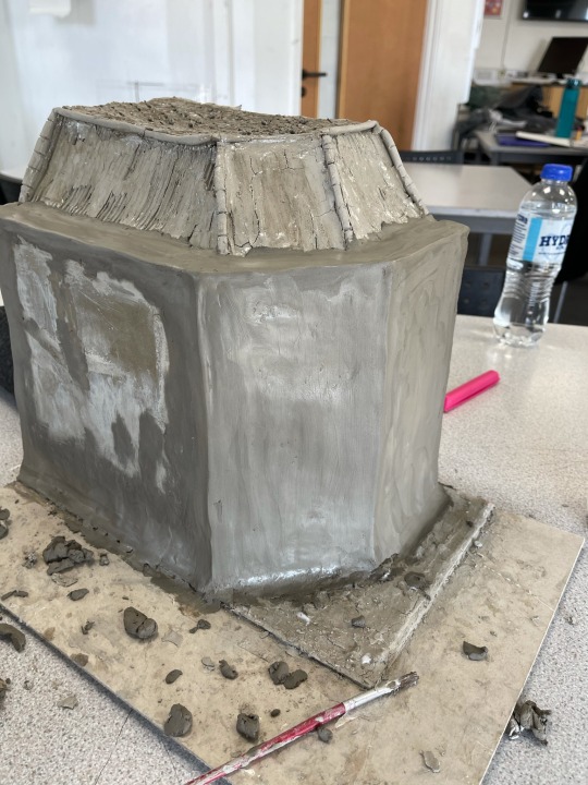
Today I started working on creating the final finish layer of my clay model, coming back to it this morning I was able to see the small section where I had tested the new method of applying the clay, it seemed to have worked quite effectively, there is a few cracks but they are minor and can be easily fixed/edited on photoshop to be removed. I slowly went around with PVA glue and then clay and worked around it, smoothing the edges and crating sharp corners


Finally it started to appear more like an outcome again, I worked into it using my various range of clay modelling tools, I used them to create detailing like the roof and then I used to it pierce holes along sections of the sides, starting to map out the different floor levels and where the windows would go.


I started carving into the shape of the windows roughly, but saved the actual carving for later on in the day because I didn't want to accidentally knock parts of the wet clay off. I also at this point used a sponge with pva to try and seal in the clay, helping to prevent further cracking and other issues. This gives the clay a dirty/glossy effect. Once I start painting my model I feel it will turn out much nicer, at the moment it looks rough, as long as it doesn't crack to badly I feel I will be going in a good direction.
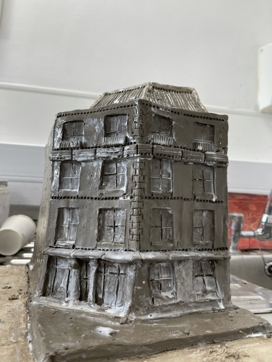

I added further detailing including the lines in the windows to form the window shape and showcase the architecture. I also added in other details like a small over hang just above the ground floor to add depth and then slightly further up to add more depth and smaller details. At this point I think I have tried my best to recover my model with the problems I have faced, Now I just need to let it dry and see what happens, if It cracks bad I will likely not use this for my final outcome, but instead as a major problem solving experiment for my FMP, I feel fortunate enough to have already created my pop up shop outcome with my shirts, stickers, designs and cabinet. The clay models were just another add on to the theme of architecture.
0 notes
Text
at this stage I had all of the glue and under layer of the clay. it looked really rough at this point in the texture, but I knew I had to stick with it to ensure that I wouldn't have further cracking issues


At this stage I had let the glue dry out, the cracks were much less visible and I felt like I was going in the right direction with it. So I started going back over with a top layer which was the final coat, this was to be the smooth finish which I had intention for already, Unfortunately I ran out of clay and couldn't find anymore at college so for the rest of the day I will focus on digital work and computer work/blogging. But I can keep an eye on the clay to see if it starts to form cracks. If It keeps cracking I feel like I will change my final outcome, I had an idea that I could use the wet clay images I took as the utopian and then showcase how the dying of the clay relates to nature taking its course on thing and showing how it decays and cracks into a dystopia.
1 note
·
View note
Text
PROBLEM SOLVING CRACKED CLAY
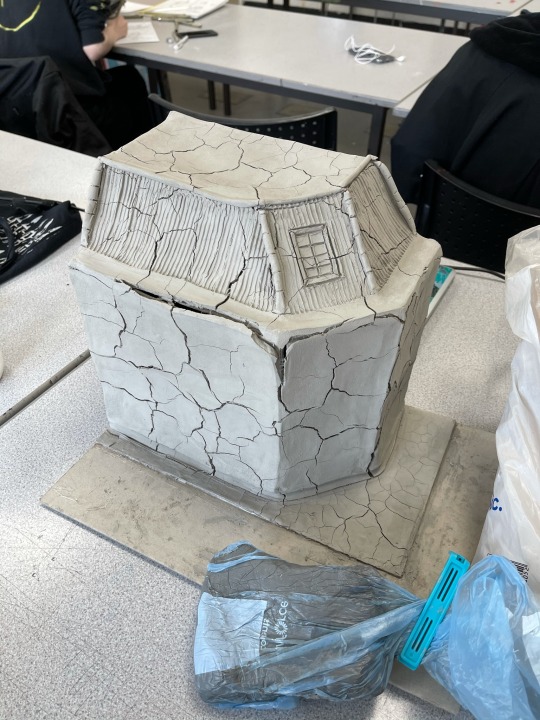
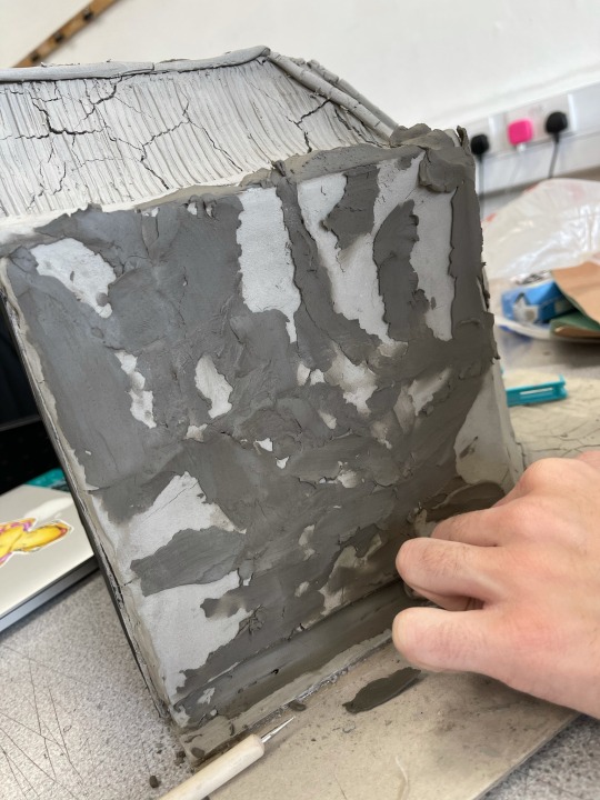
This morning I came back to college after leaving my clay to air dry for over a day, unfortunately I had come to find that the model had completely cracked all over. This was something which I didn't want to occur and has pushed back in the process of creating this model. I decided to photograph the problem to begin figuring out how I can hopefully overcome this issue.
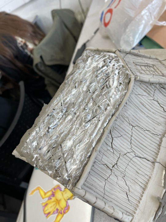
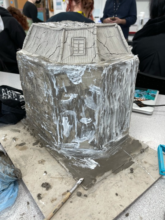
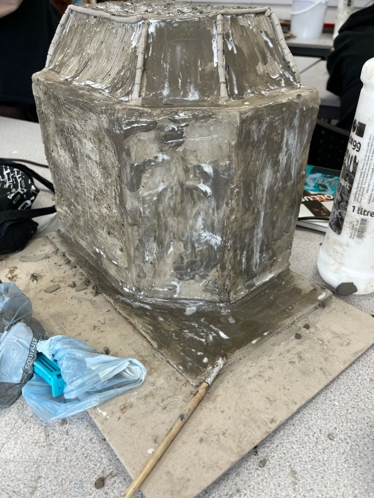
To try and seal up the cracks I decided to use a mixture of PVA glue and layers of clay to cover over all of the cracks and imperfections. This layer was not going to be seen as was only in place to be an undercoat/key to the top coat which will hopefully turn out smooth without cracking. I was quite excessive with the amount of glue that I've used as I really wanted to ensure that I won't have to revisit this issue again.
0 notes
Text
UTOPIA STRUCTURE - CREATING OUTCOME

At this stage the model was ready to start applying the clay. For the previous dystopian design the model cracked quite alot, I felt this could have been because as the clay dried it came away from the card and didn't adhere properly. To rectify this issue as I want my clay to be smooth and “utopian” I started with using pva glue on the card first, I was hoping this would help to stop the cracking and peeling.
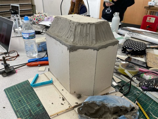
I started with the roof as I felt it would be the easiest place to start. as I went across first with the pva, I kept it I small stages as I didn't want to apply it in large areas, for it then to all dry out and not be effective.
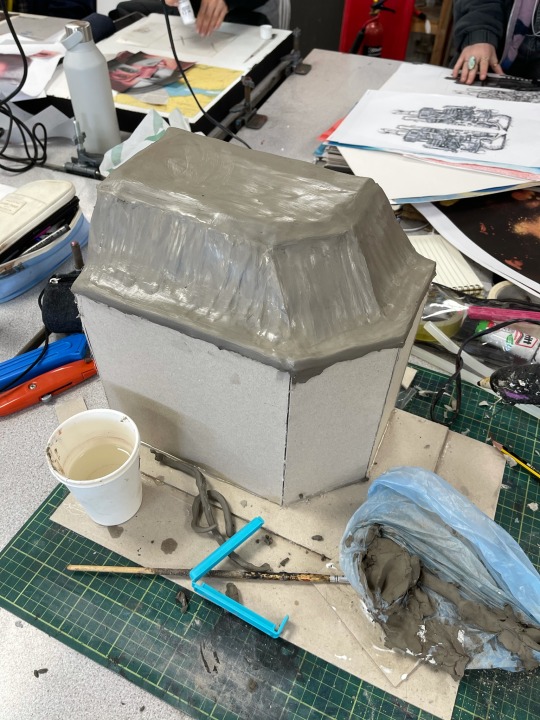
I used water and my fingers to quickly smooth out the areas and ensure that the clay sealed the exterior.

At this stage I had worked on creating the finer lines of the design, it was still a little bumpy but all the holes were filled and the main lines that I needed were in place. the visual shape was starting to come along in the progression of my clay. I now needed to wait for the clay to slightly harden so I can work back into it.
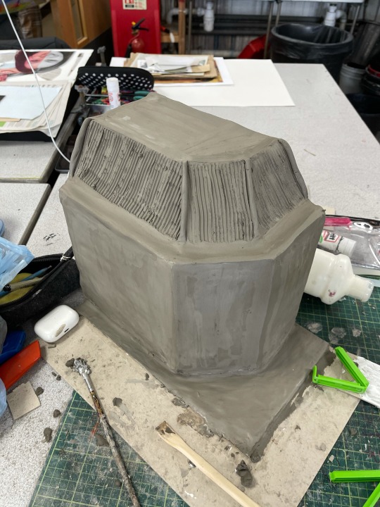
After Lunch I came back and my clay had started to harden up, I decided to make a start on the roof of my architecture, I used this clay tool which has small ridges in it to create long lines, this added a roof like texture and appeared as different lines, I really liked how this started to look initially. I then rolled out small lengths of clay and placed them on all the corners, these are to be worked into later on.
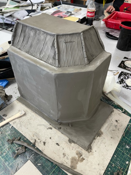
At this point I had worked further into the clay, I had straightened up the lines on the roof ensuring they were in line and mostly straight and that the detail was strong and fairly even. I then worked into the little corners of the roof, using a small fine tool to imitate the gaps to make the tiles look broken up. I then used a sponge and water on the top of the roof to even out the lines where my fingers had been. I then used a wet squeegee on the sides to hide all the finger marks and help to even out the edges, also helping to create straight lines and a smooth finish. I found this method worked quite well and I kept doing it over time as it was hardening which helped it get refined.
At this stage I am really pleased with how the model is turning out. It is smooth and the details are starting to be made. Once it dries (hopefully it doesn't crack) I will be able to carve back into the clay and create the finer details of my outcome.
0 notes
Text
UTOPIA STRUCTURE MAKING
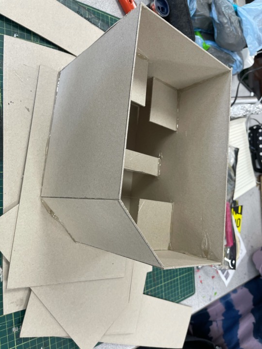
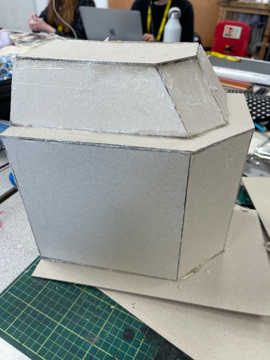
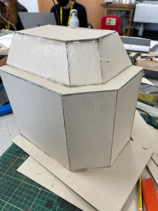
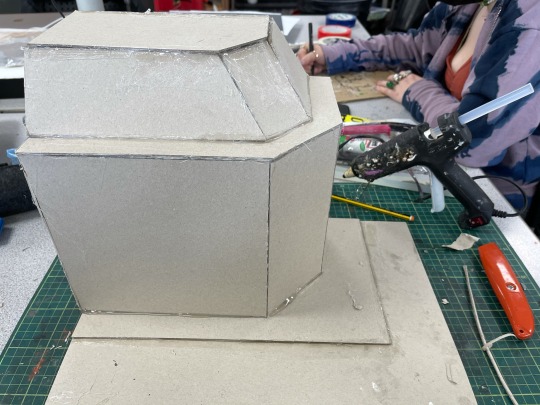
Today was the start of my utopian inspired architectural model which sits with the flipside dystopian clay model I already created. To create this model I used the same method as before, card and the hot glue gun. I also used small offcuts to reinforce the corners and also to help acheive a stronger structure to hold the clay and also to ensure that the corners were at a 90 degree angle. To build this up for the most part I just went with it, I didn't do too much planning, I used the dystopian architecture and my concept planning as a reference towards the design, but for the most part the measuring and formation of the design was not a huge consideration for me, this is because the clay would be covering the shape anyway, this meant that it didn't need to be perfect and that it would be a waste of time for me to try and perfect this, its going to be concealed. I started with making the right angled edges first and then worked onto creating the angled part last, fortunately because I have been using the hot glue gun, the corners were malleable and this meant I was able to make mistakes, it was also easy to pull off If I put it in the wrong place, and it dried quickly so I didn't need to wait around, once I had the right corners and edges I went over all of the corners and gaps with the hot glue to reinforce them and also to ensure there were no areas where the card would expand/move to prevent cracking.
0 notes
Text
PLANNING FOR WEEK 10
Blog work - catch up on any outstanding tasks and refine.
Clay model- start clay model.
Google Sites
0 notes
Text
WEEK 9 EVALUATION
Monday- Today I started to create and design my image transfer collections. In the morning I completed some blog work. catching up on any outstanding work. I then went to the shop and brought a pack of five dark image inkjet transfer paper. coming back I prepared all of my designs, printed them on high quality paper and prepared them for the heat press. I organised them all out and considered the colours and images for each shirt design. I pressed all my series of shirts and by the afternoon I was ready to present all of my work. I used mannequins to photograph and staged them in the corridor. The images I took were great and overall today I felt like I had quite a busy and productive day. I was really please with the outcome of the shirts as a series.
Thursday-Today I made a start on my clay model. I started with card and tinfoil. I formed a basic shape and stuck it all together using a hot glue gun. ensured it was structurally sound for taking clay on top of it, as I didn't want it to collapse. I then added the tinfoil on the side to created a curved tower, I then spent the rest of the day adding clay. By the end of the day I had the most part of my model created by the end of the day, ready to dry and be refined tomorrow. Overall today was a productive day for me. I managed to get most of it done in the one day which means now I only have one more clay model to do. My next problem solving is to figure out how I'm going to transport it home once both models are completed for my pop up shop and cabinet.
Friday- Today I came into college to get some extra work done, I did some blog work and also focused on completing my dystopian clay model. After I had done my blog work for the day I gathered a series of watered down paints, I then painted all of my structure with different colours, being confident with my method. I wanted to make it look rough and define the textures more using light and dark shades of greys and stone/concrete colours, This worked effectively and it gives a dirty and dystopian look to the structure, I considered the different textures for colours, the smoother surfaces of the structure are less busy with different shades of greys, the window frames are the same where I have used black to define them, I also painted the roof and bottom of the structure black to define these areas and add a more dramatic presence, breaking up the colours, overall I'm really happy with the outcome and ready to work on my next model for the next week and start finishing up with my FMP
0 notes


