#need to add the pics to the google site
Explore tagged Tumblr posts
Text
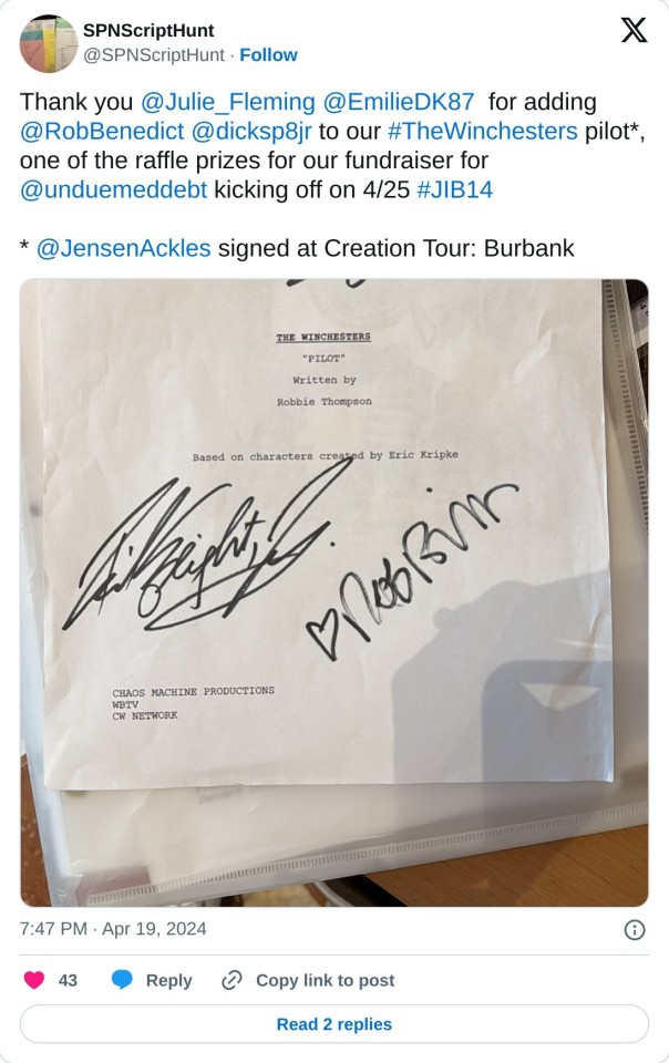

Preview all the raffle prizes here, fundraiser opens on April 25.
#jib 14#rob benedict#richard speight jr#the winchesters#dick jr and the volunteers#jibcon#admin: lets-steal-an-archive#need to add the pics to the google site#more to come#reviewed the undue medical debt fundraiser page today#it's ready!#*soon*#jensen ackles#spnbur
18 notes
·
View notes
Note
hi I really like your mb and I'm new here. Do u have any suggestions or tips to make mb? like where did u get the pics and the captions.
𝓜oodboards: a guide for beginner blogs!
I decided to bring here a small tutorial that can help other blogs that are starting out and still have questions that need clarification, with tips and links that you may need. I wrote this from my point of view of creating moodboards and I tried to be as brief as possible in my explanation, there may be errors in English as I'm not fluent in that language and everything here was translated using Google Translate, any questions you can contact me via asks or by message.

how do I find pics for moodboards?
Pinterest is where you will find most images for moodboards, so create a Pinterest board just for these images, separating them into subboards for each color or aesthetic to make it easier.
Some blogs leave the link to their Pinterest accounts in pinneds or in the carrd, you can follow them and save the pics they published on the app in your boards, this will influence the Pinterest algorithm so that they recommend more of the type of images you want.
You can also search on Pinterest for the aesthetic and color you want (coquette pink aesthetic, cottagecore aesthetic, y2k, etc.).
how to make moodboards + tips:
Well, it's not such a complicated thing for me. I generally make moodboards with 6 or 9 images, taking inspiration from the moodboards of other blogs that I admire, so I can get an idea of how to make the captions and how to position the photos in a way that matches them.
To make it easier, first I create the moodboard and then I look for an icon of a kpop idol that can match the aesthetics and color of the moodboard. The reverse can also be done: first choose an icon and make a moodboard for that image, paying attention to the color palette and tonality (and for some reason, for me it's better to create moodboards in Tumblr's light mode instead of dark mode)
When I finish the moodboard, I add the caption, the hashtags (which will be very important for your post to reach other people) and maybe a divider. You can find these dividers on other blogs or by searching for "dividers" on Tumblr.
If you want to split a photo into two or more images, use this site.
how to create captions:
To make the captions, I use parts of songs that I like or that I found searching on Pinterest for "Spotify song lyrics", but they can also be album or song names, movie names, a phrase you thought, etc. The symbols you will put in the caption can be found on this website or just by searching for "symbols", "kpop symbols", "kaomojis" on tumblr.
If you want to use a different font for the letters, there are these two websites (01 and 02). And to change the color, there are also these two tutorials (01 and 02).
what to do to make your blog "popular":
Add popular hashtags that relate to the content you are posting. If you use almost the same tags as other big blogs, your posts will have more reach. Posting frequently and your account looking nice and organized helps too.
Ask several other popular blogs to promote your account. This was very important for my profile to grow in the number of followers and engagement.
Join the events that some blogs do, as they offer good prizes like reblogs if you win. And remember to have patience, as it often takes a while to get good engagement on Tumblr.
219 notes
·
View notes
Text
Get Cold Turkey
For my peeps who struggle with managing internet use, Cold Turkey has a feature that really helps.
Cold Turkey allows you to block individual websites, or the entire internet, for as long as you choose.
The internet turns the inside of my head into a ping pong machine, and way too often I will just click, click, click useless crap and wander off when I need to focus.
Most of my social media management apps are way too easy to bypass.
Cold Turkey is not easy to bypass at all.
You can set it up so you are COMPLETELY locked from making any changes. You'd better mean it when you click that button, because there is no out.
OR you can set it up so in an emergency, you can buy a code that lets you get into a website you need to get into, but you have to give $5 to charity for every 10 minute bypass you buy.
Anyway, the best solution for me has been to use this BLOCK ENTIRE INTERNET feature (in the pop up menu at bottom right in first pic)

and then add website exceptions, which I've added in the second image.
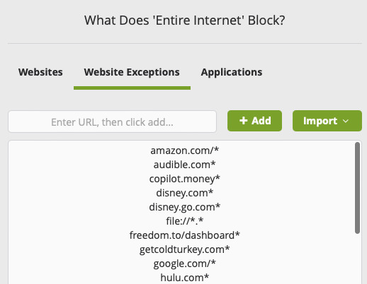
I need to use sites like Dropbox, Wetransfer, and google on the job. I often play music or videos when I work. So add the preferred site name with an asterisk to give yourself access to all pages on the site. If you don't, you will only have access to the home page.
Nowadays, I block the internet in its entirely with these website exceptions almost 24 hours a day. The first week I did this, I wrote over 40,000 words in one week after being completely blocked for months.
I only allow emergency access on one computer in the house.
Try Cold Turkey. https://getcoldturkey.com/
209 notes
·
View notes
Text
𝐒𝐔𝐌𝐌𝐎𝐍𝐈𝐍𝐆 + YUKI'S SITE ! a single muse doc tailored for in-depth character exploration
━━━━━━━━━━━━━━━━━━━━━━━━━━━━━━ i promised i would give a longer doc & i have delivered ! this doc is truly one of my favorites because its a very obvious yuki theme. i absolutely adore her in jjk & i felt the need to be more original and make a doc based off her rather than the more popular jjk counterparts. ✦ 𝖡𝖱𝖤𝖠𝖪𝗗𝗢𝗪𝗡 ・ this doc utilizes a custom sizing plugin, this will be linked down below for everyone to make use of. ( the measurements are 9 x 14 ) ・ no comments; however, a lot of these are drawings, but i trust that you guys know how to work them considering the large amount of drawings i use on my other docs ! ・ as always, the colors for the images have been edited in pics art, but everything can be made to look the way you want it to. ✦ 𝗣𝗟𝗨𝗚𝗜𝗡
・ the plugin is linked above and i highly recommend that you guys add it to your browser if you wish to change the color of this doc & others on pc instead of mobile. the plugin is compatible with safari, but I believe you have to install it on google chrome first as it works just fine for me on safari. ✦ 𝖠𝖱𝖳 𝗖𝗥𝗘𝗗𝗜𝗧𝗦 ・ the first page is inspired by @katzenx on D.A & all main images of yuki n co. are credited to gege akutami. i do not own the character nor the art, the first image under catalog is by 泊云拌面永久歇业 on weibo. & the circular image of her on the updates page is by @chi88art on twitter. please give all of these artists a follow & check out their work ! ━━━━━━━━━━━━━━━━━━━━━━━━━━━━━━
#google docs#docs#google doc template#roleplay#rp template#template#discord roleplay#literate rp#roleplay template#rp#hot docs 2023#character template#character sheet#jujutsu kaisen#yuki tsukumo#jjk#muse template#rp doc template#google docs template#discord rp#literate roleplay#rp docs template
178 notes
·
View notes
Note
HOW ARE YOU WATCHING THE DIVISION FANMEETINGS I’m a hypster member so that’s not a problem I just get an error when I click on the link and I lowkey need to watch mtcs or I may pass away
lol i’ll apologise upfront about this ask, this one is a monster topic
ight so the fan meetings are actually not at all streamed on hypster!!!! all lives, stage plays, and most hypmic extra content are streamed on abema. the fan meetings cost like, ¥4400 a ticket and i think???? they take international credit cards???? idk about that one actually, i usually just buy tickets on my phone 😭😭😭
thing is tho, abema has probably one of, if not thee strictest region blocking system on the planet i feel lmao, like you can’t watch a lot of content on that site if you’re located anywhere outside of japan. which means you’re going to need a ✨vpn✨
i use two different methods of watching abema content and they both lead back to vpn gate!!!!
the landing page is important if you’re on mobile, but i’ll get to that later. what you need for pc is to go to the download link at the top of the site, and hit the first option
on the download page, download the first option
and install!!!!! or i think it’s run application after you extract the files lol
i highly recommend you follow the instructions on the site to get connected lol, but once you run the app, let it do its installation thing and once it’s done, let the program open up and it should look sumn like this

double click the option that’s boxed in the pic and it’ll bring up a BUNCH of vpns to use!!!! double click on any one that says japan, hit yes until it starts connecting and once it does, you’re in, you’ve done it, you’ve learned basic vpn connecting lmao
except i meant it when i said abema has the strictest region blocking on the planet 😌
a lot of the vpns on the app are pretty old, and the first couple dozen or so (they have the ip 219) are actually blocked by abema. the older the vpn, the more likely it will not work on abema. try to aim for any that’s been up for a few hours, two days at max and it should circumvent the block. the host tho may close the connection at any time so sometimes you may get disconnected mid stream (or that you’ve been relying on that one connection for a very long while only to discover you can’t connect anymore either bc of the host or abema themselves blocking the ip but i don’t think you’ll have to worry about this specific problem lol). if you get disconnected, just find a new one as quickly as you can so you don’t miss anything lol
if you’re on mobile, i can only help with iphone stuff!!! but you’ll need to have these things:
the openvpn app
the abema app
a jp itunes account LOL and jp itunes gift cards bc apple won’t let you add an international card iirc
the abema app is only available in jp itunes so if you don’t want to google how to make one real quick, feel free to stick to pc lol. but if you already have one download the two apps 😌
to run a vpn on your phone, i again recommend you follow the instructions on the site lmao (tho it was made using ios ‘old as dirt’ so the interface looks a liiiittle outdated lol. should be the same tho) but go back to the previously linked landing page and click on the link in the boxed section of your chosen vpn

on that page, there’s typically four links; you’ll want to choose either of the bottom two, but i’ve found tcp links works more frequently. click the link and it’ll download the file. once it’s downloaded, pull it up and it should offer to open via openvpn. the app will redirect you to a tab that looks like this in the app
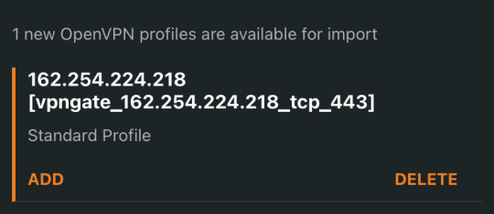
hit add, then hit connect, and it’ll go back to the connections tab in app and start connecting. if it connects, it’ll be all green and you’re good to go!!!!

more times than not tho, it’ll fail LOL just repeat the steps until you find one that works 😭😭😭
my hot vee tip is that sometimes when you’re connected, videos might pause mid connection. idk what’s causing it, but my gut says it’s likely bc of the ping you see in the line quality section (or the ping section on pc). go for a high mbps and very low ping if possible for less interruptions on both pc and mobile!!!!

that’s all i got for ya lol good luck i’m sorry we have to fight everyday to enjoy and support this fcking franchise ✌️
#vee got an ask#this ask might self destruct in a day or two idk#it’s not like abema doesn’t know about it since they block ips all the time#but still i hate exposing access to stuff lol like what if they know how to block all of them but just don’t know the site lol????#i’m always fearful of that 😭😭😭😭😭😭#but it is a struggle to stay in the know in this franchise lol#like i think a sizeable reason i’m so attached to hypmic is actually the stolkholm syndrome from trying to keep up with it 😃😃😃
15 notes
·
View notes
Text
Mushrooms in Cream Sauce...
...or Pilze in Sahnesoße.
This is for @killerblackberrypie, who went looking for the version on our "European Cusines" site and found the site gone.
@dduane had taken it down for maintenance, a new theme and to take some new photos, but while the site was down it web-provider went belly-up. These things happen.
"European Cuisines" Will Return - just not quite yet.
Our recipe was, ironically, one of the recipes slated for new pics, so while this text is from the site's offline backup (with a couple of tweaks from me, because why not?) photos are sourced from the web.
There are many, many other recipes online; they're mostly in German, but Google Translate handles Rezeptedeutch well enough. I've linked to a couple, which is only fair since I'm using their pix.
You'll also see the French word "champignons" in German recipes as often as German "Pilze"; I don't know whether this indicates a French origin for the recipe, or refers to a specific mushroom, or makes the dish sound more classy.
Here's one: Champignons in Sahnesauce mit Spätzle.
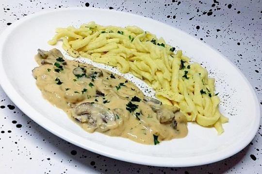
And here's ours...
*****
Pilze in Sahnesoße from European Cuisines.
Contrary to popular belief, Germany is not a vegetable-free zone.
In fact, unless you find yourself buried in some tiny backwater in the Black Forest or someplace similar, Germany is much kinder to both vegetable-lover and vegetarian than a lot of other places. It will be rare to find a menu that doesn't have at least a few vegetarian or at least mostly-vegetable options on it, often far more creative than you might expect.
But leaving aside for the moment the issue of vegetarianism per se, Germans really do like more vegetables than potatoes and cabbage, especially seasonal ones in their prime. Asparagus season, for instance, has its own name: Spargelzeit - "asparagus time".
And mushrooms (all right, not as true veggies, but at least as fungi) turn up as stars in many entreés, especially in dishes meant to be served in the autumn, "Pilzsaison", mushroom season, when the good little creatures are coming up all over in the woods and the supermarkets.
This recipe calls for the mushrooms to be sautéed with onions in bacon fat (the bacon is added later). The pan is then deglazed with white wine, and various spices are added, one of them being paprika, which instantly suggests that this recipe probably sneaked over the border from Austro-Hungary, possibly via the Czech Republic.
Finally the cream and bacon go in.
The result is substantial, surprisingly elegant, and yummy.
This is definitely a recipe for a high-end Hobbit menu: an entrée for anyone who doesn't want their mushrooms upstaged by overly large amounts of meat.
The bacon-fat and bacon CAN be left out completely, making the dish meat-free. Use more butter along with more mushrooms and a red pepper diced small, and add 1/4 teaspoon smoked paprika.
*****
INGREDIENTS
NB, we work in metric so that's "correct"; Imperial is converted and "approximate", though it won't make much difference. Just don't combine them or your mushrooms might crash into Mars...
1 kg / 2 lb fresh mushrooms, domesticated or a mixture of wild types to taste
125g / 1/4 pound bacon, diced
60gr 1/4 cup butter or margarine
2 large onions, diced
1/2 teaspoon salt
1/4 teaspoon pepper
1/2 teaspoon paprika
60ml / 1/4 cup (or more if needed to deglaze) white wine, preferably a medium or medium-dry one
A pinch of nutmeg
A pinch of mace
250ml / 1 cup heavy cream
The juice of half a medium-sized lemon, strained
2 sprigs of fresh parsley
METHOD
Clean the mushrooms with a soft brush or dry cloth. (Never wash mushrooms.) If they're big, cut them in half.
Fry the bacon in a wok or large pan until lightly browned. Remove the bacon from the pan and set it aside.
Add the butter to the pan drippings. Add the onions; sauté until lightly browned.
Add the mushrooms; cook them until they're tender, stirring often.
When they're tender, raise the heat slightly and stir in the wine, salt, pepper, paprika, nutmeg, and mace. Cover the pan and cook over low heat for 15 minutes.
Remove from the heat. Add the cooked bacon, cream and lemon juice. Reheat until just warm. Do NOT let this mixture boil!!!
Garnish with parsley and serve with noodles, dumplings, mashed potatoes, whole potatoes... And some crusty bread to chase the last of the sauce.
*****
Our original photo used Spätzle, as in the first pic. Ribbon tagliatelle works just fine as well, while here is Saure Pilz-Sahnesoße served alongside Bohemian Dumplings, a long bread dumpling boiled in water or stock then cut into thick slices.
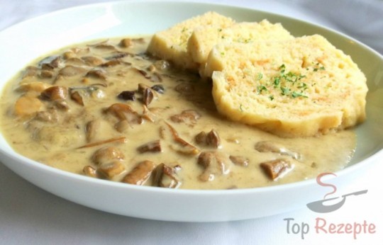
From the same site, here's a simple potato treatment, Pilz-Sahnesoße mit Kartoffeln:
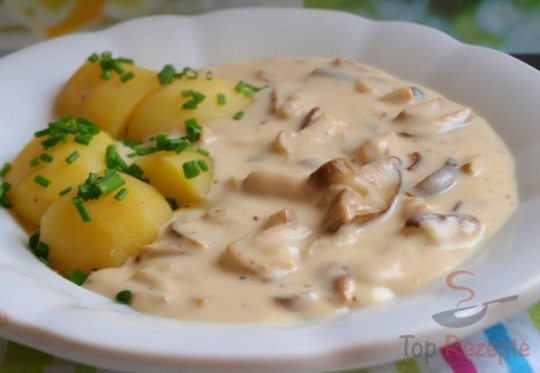
As far as we've been able to make out, the main difference between mushrooms in cream sauce as a main dish, and creamy mushroom sauce for use with something else, is the proportion of mushrooms to everything else, and often the size of pieces into which they're cut. Really small bits are one more ingredient, large generous chunks are much more front and centre.
Ours is definitely a main course, and though we haven't made it for a while, the memory of that last time still makes my Mind Palate go...

Soon. Soon...
95 notes
·
View notes
Text
New Here
I'm new here -- trying to figure things out.
I have a website, HERE, with a plog (poetry blog). I started it back in 2013, and both the site and the plog have YEARS of accumulated information. However, little did I know way back when that Weebly would become part of Square (from Google: "[Weebly] having been acquired by the company in 2018, meaning that when you use Weebly, you are essentially using a service under the Square umbrella; the platform is often referred to as 'Square Online' which is essentially Weebly rebranded under Square ownership").
Aaaannnnd -- to top things off -- the site template I chose all those many years ago is no longer supported by the company.
What does that mean?
It means that the site will continue to run as normal -- until it doesn't.
I've seen little bugs pop up. For example, I used to be able to post slide shows of pics on blog posts, but that feature no longer seems to work. Plus, when I go to publish posts, the "publish" feature doesn't always seem to work the way it should.
So here I am.
My site and my plog (poetry blog, again) are still there, and one can still view them (take a look when you get a chance -- especially if you're a fan of Emily Dickinson); however, for now, I thought I'd start making posts here -- and I'll see what happens.
First things first:
* This is my first post.
* Next, I need to figure out how to make the site look beyond clinical, how to add pics, how to edit posts if/when needed, etc.
I think for now I'll publish my (almost) daily posts both here and there.
If you happen to stumble upon my blog here at Tumblr, welcome.
2 notes
·
View notes
Text
WIP WEDNESDAY WHENEVER
got tagged by @kdval thank you!
tagging: @gloryride, @elvenbeard, @pinkyjulien, @kittenchrissy, @dreamskug, @wraithsoutlaws, @imaginarycyberpunk2023, @alphanight-vp, @morganlefaye79, @peaches-n-screem, @wanderingaldecaldo, @genocidalfetus, @jaymber, @humberg, @therealnightcity, @streetkid-named-desire, @sammysilverdyne, @aggravateddurian, and @breezypunk as always, no pressure – also feel free to ignore.
—
GENERAL:
My gaming laptop is still on vacation sleeping since mid November '23 so I have still nothing new except the last remaining vp I want to post but hesitate for own reasons to click the 'post' button. It's a never ending fight I have to do with myself here …
Each weekend I tell myself I will update, but I do not 'feel' it – it's complicated. Guess something needs to happen that requires me to update first. Nontheless, I did not sit around doing nothing. Used the time for writing, thinking, graphic design and selecting songs.
I managed to post Ryder's two favorite radio stations last weekend:
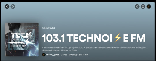

I'll link the post here again in case you missed it and have interest to listen to it. A like/follow is appreciated, a.k.a. Ryder dankt! 🖤
I know not many like this genre he (and I) listens to but maybe at least the Technoise FM finds a way into someone's music heart. Music is very deeply connected to especially my boy Ryder but all of the boys as well (each their own style) and will show up even in the big story to support the written scenery/moments.
Speaking of the big story:
—
FANFICTION:
The story has a name now and will simply go by:
Cyberpunk 2078 – Pandemonium
I'm close to finish chapter 01: The Golden Demon of Kabuki of our (@nervouswizardcycle's and me) story. It needs a few vp pics to be redone and me to make a few adjustments and prepare the first post. Hopefully I get it done by the end of January.
QUESTION:
I don't know how many people might be interested in reading it but if you are, please leave me a comment in this post or send me a DM or contact me on Discord so I take note of it and will tag you once I start releasing chapters. It won't be weekly, neither monthly. I'm slow in writing and editing plus I do not do it alone as this story is still at first a role play between @nervouswizardcycle and me, I convert into better reading flow afterwards which takes a lot of time. So you won't receive notifications that often. But in this way you hopefully won't miss out on it when I post them.
HOW DOES IT LOOK?/WHERE CAN I READ IT?
I will not make a long text post here, neither put it on ao3 or any other fanfic site. Gonna make a picture post instead that adds maybe a little teaser text and then link it to an uploaded pdf that will be stored on my personal google drive. You can read it online or download and read whenever you like/find time! :3
WHAT IS IT ABOUT?
For those who do not know: It is set after the events of Cyberpunk 2077 and starts in January 2078. Arki, the main character, recovered from the game events (so he's V). All that happened in 2077 only set the ball for his story rolling so he's on his way to find out about his missing past. My boys who work together as a merc team (Vijay, Ryder, Hizumi in the beginning; Jay and Thyjs join later), happen to help Arki on his journey, he becomes a part of the team as well and together they find out things they never could have imagined and everything is connected. It might have the one or other flashback with Johnny in it as well as Arki used to be deeply connected with him and my boys two might get some. None of my boys is a V - even though Vijay goes with the name 'V' – and none of them knows the official npcs Arki has met except for: Jackie, Misty and Vic. They've heard (and maybe seen) of some famous names tho (e.g. Rogue, Kerry). It can happen we integrate a few other ocs that belong to friends/mutuals of us – either by just mentioning them, or they even might get their own appearance if managable to integrate – this is stil a tbd, tho and I will reach out and ask first ofc! I can definitely say @gloryride's Vanessa and Enzo will be mentioned/appear. Vanessa is part of V's and Ry's friend circle and their local fixer. She's also Ryder's neighbor in the Glen. Enzo is Jay's bf, so their names will definitely fall for sure. But as said I'll reach out and ask first if allowed and nothing is set in stone yet either as we are still at the start but have rough ideas that could be integrated.
BUT I ALREADY KNOW CHAPTER ONE AND TWO?!
There might be a few of you who remember the first versions of them, as about 1 1/2 years or so ago I posted them here as simple text posts but it was way shorter, less detailed. We've gone over some parts and it's definitely worth a new read now!
—
FURTHER PLANS/IDEAS?
too many to count, my list is neverending. I have not forgotten of my vp ideas but they are put on hold for a bit bc the story needs to be rolled out first or it will never happen.
I definitely want to redo the past looks of Ryder and Vijay (they will stay like they are, just a few details changed on them and their outfits) and add the ones of Jay and Thyjs as well.
And I want to focus on Jay's tattoos as they will change into the Japanese themed one done by Kala but I need to edit them a bit (thankfully it is allowed) with Glory's help so it fits to Jay. And hopefully we can solve the layer problem so his glowing tattoo still glows bc it is essential for the story xD
Alright, I'm done :)
17 notes
·
View notes
Text
Tabula Rasa - References *Updated* - now includes Part 3, chapter 15
Like with my previous fic, I thought I would start a post detailing some of the references used in Tabula Rasa. I think this will especially come in handy for readers during the fight scenes in the latest chapters when the layout of Matt’s apartment comes into play.
I’ll add to it as the chapters are posted.
Matt’s Apartment


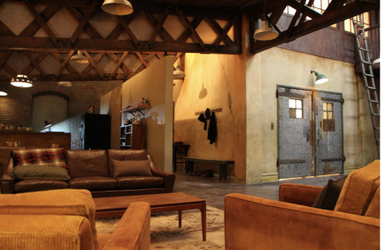
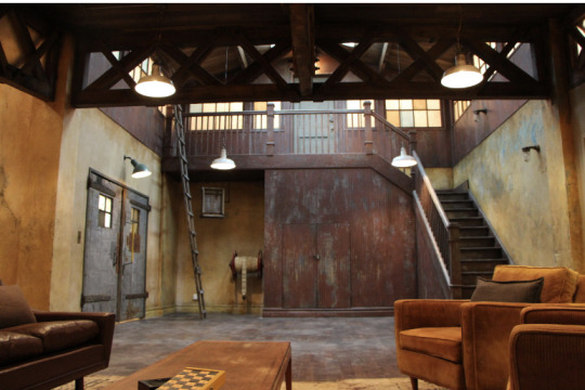
Spoiler-y stuff behind the cut - make sure you’re up to date!!
Chapter 15
Calina’s clubbing outfit. Its basically this look:

But with this style of dress:

Chapter 16
The tablet display would look a little something like this (from the Black Widow movie)

Chapter 17
Calina’s move when she escaped the cuffs was inspired by this scene from Mission Impossible: Fallout

Part 2, Chapter 6
The flower was a dahlia

The poster...

I looked at loads of gifs and pics of Matt boxing while writing this chapter - purely for academic purposes of course.

And finally, the only reason I know anything about Wing Chun dummies is from my previous fandom - Arrow. I couldn’t resist the reference!

Part 2, Chapter 7
Calina’s moves during the sparring session:
The aikido move: https://www.youtube.com/watch?v=5PLcFEnhi64 fast forward to 00:55
And her leg over the shoulder trick is another Ilsa move from Mission Impossible:

And finally some shirtless, scarred Matt - absolutely essential research...

Part 2, Chapter 15
The Braille for ‘Yes’ in case you’re wondering how in depth my googling for this fic has become!

The building I blew up - its a real one in Hell’s Kitchen (or at least it was, when Google Maps took these images).

Spot the water tower!
Here’s the back lot with the taxis, and the adjacent building that Calina and Matt exited through.

Some birds eye images (yes, my googling was this thorough - and no, it probably didn’t need to be. Procrastination is a helluva drug!)


Part 3, chapter 15 - the big date!!
Calina's dress:


The Rainbow Room:


Part 3 Chapter 17
The ethiopian fable came from this site: https://ethiopianfood.wordpress.com/2015/01/01/gursha-hands-across-the-table/
The Coney Island Rollercoaster:

The High Line (it was open back in 2018, but not fully - i checked!):

Part 4
Nika (Husky-German Shephard mix)

#Daredevil#daredevil fic#daredevil fanfic#daredevil fanfiction#marvel's daredevil#Matt Murdock#matt murdock fanfic#matt murdock x oc#tabula rasa
35 notes
·
View notes
Note
Hey I hope you don't mind me asking but can you give tips to create mood boards and sites you source your images from
Thanks
Hi! Yes I don’t mind at all!
I mostly use Pinterest, SOMETIMES Google if I’m really struggling though it’s harder to find good pics to use that well. Now as a disclaimer, I’m not sure this is the most ethical way to make these moodboards? I’m very much a believer in supporting and crediting artists, including photographers, but it can be pretty impossible to find sources on Pinterest. Since this is for personal use and I just share them because I’m proud of them, I’m not sure if it’s fine or not, but I’d love to hear opinions on this! 😅
For actually finding images… basically, I add “aesthetic” to the end of almost any search lol. I have a Pinterest board where I essentially save almost ANY image I see that could be useful for current or future chapters. I try to find images with similar color themes or lighting so that I’d only need to do minor editing for them to look cohesive.
For example, if I had a chapter that took place at a coffee shop, with a conflict between characters, that ended with watching a sunset, I might search things like “coffee shop aesthetic” “coffee aesthetic” “drinking coffee aesthetic” “girl and coffee aesthetic” for the first one. I’d look for warm tones, I’d look for images that could invoke conflict (a couple back to back, a cool knife, idk!) and a pretty sunset pic which is probably the easiest one to find.
If you’re using images with people, as a personal preference as someone who doesn’t really care for “face claims”, I would be careful and thoughtful. Also in part because I think I’d be weirded out if I found out someone was using my photos for a fictional character they wrote or played as (though that might depend on the person, character, and use.) When I use photos of people, it’s 1. Not usually meant to be a 1:1 representation of “this IS that character and what they look like,” it’s more for the vibes, and 2. I will focus on photos where the faces might be fully or partially obscured, blurry, or a close up of a single part of their face.
Along with the above; please be INCREDIBLY careful with how you represent BIPOC people in moodboards. If you’re trying to create one for an indigenous character, don’t just throw any dark haired tan model you find into your collage. Be mindful and meticulous in researching the images you’re using in this case, because it’s definitely not great to treat different minority cultures as interchangeable, or use a tan white person to represent a character who is from a marginalized culture.
I use an app called “PhotoCollage” for putting the images together, and sometimes “Picsart” to edit the colors to be closer if needed.
I think that’s a pretty good general overview? Sometimes you need to get creative to find something usable or relevant, I occasionally will get sucked in and spend over an hour searching for images before finding the write combination of search terms that result in what I need. If you have specific questions, feel free to let me know!
#morgan murmurs#anon#ask#moodboards#advice#guide#I mean KINDA guide?#idk I just want this to be easy to find again if I need it later lol
5 notes
·
View notes
Text
SEO Strategies to Invest in a Website Blog
A blog can be the best part of your website. When you make it informational and enticing, it draws readers, builds trust, and brings in new leads. Yet, a blog with no structure and strategy is like a boat with no sail. As per the expert Melbourne SEO agency, your blog needs strong SEO tactics for the clicks and views you’re aiming for. This guide will help you use SEO tricks that get results step by step.
Why Does Your Blog Need SEO?
SEO (Search Engine Optimisation) helps your blog rank high on Google and other search tools. Higher ranks bring in more users. The right SEO plan helps more people find you, read your blog, and trust your site. It also makes sure your posts match what readers look for. A blog with good SEO is a smart, long-term asset.
Ways to Enhance the SEO of Your Website Blog
Pick Smart Words to Target
Great SEO starts with the right words. These include words that your readers use when they search online are key. You need to find and use these terms in your posts.
Tips for finding the right words:
Use Online Tools: Sites like Google Keyword Planner help find words people type in.
Choose Long Words: Long words, like “buy blue shoes online,” have less competition and better results.
Check Rivals: Look at what words your top rivals use. It can show you what works.
Think Like Users: What do your users want? Write for their needs and aims.
Write Great Content
Content is king. According to expert Melbourne SEO agency, the best posts solve a problem, teach something new, or give tips. This makes readers want to read, share, and come back.
Tips for great content:
Solve Real Issues: Write posts that help readers fix issues or learn things.
Use Short Lines: Break text into short parts. Add bullet points and subheads.
Keep It Fresh: Update old posts with new info. This keeps them useful.
Add Photos: Pictures, charts, and clips make your posts more fun to read.
Fix On-Page Issues
On-page SEO helps search tools read and rank your blog. This means fixing titles, tags, and pics on each post.
Tips for on-page SEO:
Write Smart Titles: Use your main word in the title. Make it clear and to the point.
Add Meta Info: Write short meta notes with your key word. This draws clicks.
Use Headers: Add headers (H1, H2) to make your post easy to scan.
Size Your Pics: Make pics small to help your blog load fast.
Make Sure Users Are Happy
Good user experience is key to high ranks. If users like your blog, Google will too. A bad site that’s slow or hard to use will make users leave. You can also reach out to expert Melbourne SEO agency to understand the latest trends and improve the blog.
Tips for user feel:
Mobile First: Make sure your blog works on all screens.
Speed It Up: A fast site is a happy site. Cut big files and use fast hosts.
Use Clear Links: Show users where to go next with clear links or buttons.
Link Your Posts Inside the Site
Link your posts to each other. This makes your site easy to use and helps readers find more content.
Why use links:
Spread Trust: Links help pass power from one post to the next.
Help Users Move: Users can jump from one topic to the next with ease.
Keep Users Here: Links keep readers on your site longer.
Link to Trusted Sites
Expert Melbourne SEO agency find their blogs high ranking due to their effective collaboration strategy. Therefore, you can also provide links to other trusted blogs or sites so people rely on the information. This shows search tools that your post is based on good facts.
Tips for good links:
Link to Top Sites: Pick well-known sites that users trust.
Use New Tabs: Make links open in new tabs so users stay on your site.
Keep Links Low: Don’t use too many links. Only add them if they help the reader.
Share on Social Sites
Social media sites such as Facebook and Instagram have catapulted marketing. You can also leverage these to expand your reach by informing readers about your latest blogs. Share them, ask for reviews and request viewers to comment. All of these help more people see your blog and drive more traffic.
Tips for social sharing:
Post Often: Share your blog posts on all your social sites.
Add Good Pics: Use bright pics to get more clicks.
Ask to Share: Ask users to share your posts. It helps you reach more people.
Chat With Users: Reply to comments and build ties with readers.
Check How Your Blog Works
Keep an eye on how your blog does. Use free tools to track views, clicks, and more. This helps you learn what works and what needs a fix. Alternatively, ask expert Melbourne SEO agency for tools so you can gain insights about the blog’s performance.
Key stats to track:
Site Users: The count of users who find your blog.
Bounce Rate: The share of users who leave your blog after one page.
Time on Page: How long users stay on your blog.
Lead Rate: The share of users who take an action, like sign-ups.
Summing Up
A blog with a good SEO plan pays off big. It helps users find you, read your posts, and learn from your tips. With time, your blog will grow in rank, trust, and clicks. Start using these tips today, and watch your blog go to new heights.
We at Make My Website are here to guide you. We can craft a plan to boost your blog and bring you more views. Let us help you get the results you want. Reach out to us for a plan fit just for you.
0 notes
Text
searching anything on google images is absolutely impossible as of late. I'll add the standard -shop -buy -sell when I need clothing refs and yet somehow I'm still shown pics of products instead of what I need. adding "art" or concept design" or jus "design" does nothing bc all it brings up are sites used for custom screen printing clothing like!!!!!! that's not what I want aaaaaaaaa stop trying to sell me a product
0 notes
Text

Although writing fanfiction is a primarily text-based endeavour promoting it, showcasing it and engaging with your audience sometimes requires a little eye candy, and that is where this cavalcade of beauties comes in. Here is a list of the various types of graphics you might find yourself in need of at some point on your fanfiction adventures.
1. Mood Board. Dimensions: Custom I don't know if this is the broadly accepted explanation but for me, a "mood board" is a collection of images, often made at the start of the writing process that gives a visual representation of the tone of the story. How the story world would look to the audience if it was made into a movie is a nifty way to look at it. It does not necessarily feature elements from the actual plot or even characters you plan to use. They generally do not feature text. It's mental set-dressing. They are useful in a couple of ways, to have up somewhere in your writing space to help you visualise your world, or sent to your alpha or beta readers to help them get a feeling for the tone you are trying to set with the story. They can be any size or shape that suits you and include as many or as few images as you like.
2. Author’s Graphic. Dimensions: 1200 x 1200 pixels We have briefly talked about Authors’ Graphics and why they are handy before, but plenty of folks have joined since then so it won’t hurt to say it again. While these graphics can be any size they are most commonly 1200 x 1200 to fit a standard Facebook post. They come in handy when posting an introduction on new Facebook pages, or generally any place you want to showcase that you write. Like adding a little pizzazz to a Discord Authors’ profile entry on a new server. Sometimes they are handy as Profile pics or avatars and can offer a quick snapshot or taster to your vibe as an author.
3. (Author’s fandom acct) Facebook Cover Pic. Dimensions: 1640 x 856 pixels If you make the decision to completely separate your presence in fandom from your real life or are already a popular author and need an additional point of engagement with your readers you might find yourself creating a Facebook Account in your Pen Name. You are here, so I feel I can safely assume you are reasonably confident with using Facebook so creating a fandom account for your writing so fans can reach out to you for updates etc might be something you can do to grow your audience engagement that is already inside your comfort zone. Just like an author graphic it offers a taste of your vibe. It's a visual cue to let fans and casual readers get more of an idea of what you are about as an author.
4. Fanfiction(dot)net Cover Art. Dimensions: 1410 x 1876 pixels Those of you who post to FFN are probably aware you can add cover art to your stories. While most of the time it appears as a thumbnail in the top left above a fic if it is clicked on it will open into a (slightly) larger viewing window. Cover art is a chance to attract the eye of potential readers. Each account is allowed 10 images (plus one for each published story). So you can have a unique image for each of your stories and still be able to also upload another image of the same size to use as your profile pic/avatar so if people click through from your story they can get a glimpse of your style. I searched high and low on the site and found nowhere that specified the maximum and minimum sizes for cover art on FFN but after some trial and error (and with an error margin of a few pixels either way) I found dimensions of 1410 x 1876 to work the best.
5. Wattpad Cover Art. Dimensions: 512 x 800 pixels I don’t use Wattpad for a couple of reasons but I do know it is a popular platform amongst several key demographics. Moreover, Wattpad covers are discoverable by Google search so having one adds an additional search result which might lead new people to your work.
6. Standard Cover Art. Dimensions: 1410 x 2250 pixels On many other forums, publishing sites or if you are considering creating a personal website to host your work (like one from Wix for example) this is a really good size and format to use for cover art. If you are choosing not to publish on one of the major platforms (or as well as) and are contemplating creating a personal author’s fanfic site so you have complete control over your work, how it is displayed and how end-users engage with it this is a cover art format I would probably suggest to you.
7. AO3 Banner. Dimensions: 1024 x (266) pixels (suggested) Unlike FFN, AO3 allows you to insert images directly into your work. While I do not “illustrate” my works (and you could if you chose to) what I do, do, is use a banner at the top of my stories/chapters. You could use a single graphic for the whole story or customise one to match each chapter. It adds a visual clue to the tone and content of the tale. Think of how the opening “WB” logo at the start of each Harry Potter film grew darker and more spooky with each film and is now rightly acknowledged as a cue to viewers about the tone of the coming film. These banners are a more personalized version and will not only help your fic stand out in the minds of your readers (which is great for word of mouth referrals) but also serves to create a more immersive and psychologically satisfying experience for your reader by adding a visual reference for their imagination to feed on.
8. Facebook Story & Update Graphic. Dimensions: 1200 x 1200 pixels If you aren’t already using these you will have seen these used in a variety of Facebook groups. They are “eye-catchers” intended to get those people scrolling past to pause long enough to read your summary, and hopefully, click through to your story. They are used to announce new stories and chapter updates (customised or repeating). Over time you might find you develop a distinct style to your graphics that will be instantly recognisable to your fans and tie your body of work together. As you as an author or a story itself becomes popular it is important to make sure that these Facebook posts are shareable whenever possible so that your readers/fans can share new stories and updates in their own networks. Facebook posts that have interesting and eye-catching images attached will always garner more attention than plain text posts.
9. Email Header. Dimensions: 600 x 200 pixels Now I feel some of you scratching your head so let me explain. In order to sign up for an account on most social media sites, you need an email address. So, if you make that leap into creating a separate Facebook account or Tumblr or whathaveyou in your pen name you may as well have an email account that is also connected to your pen name - it further maintains that separation between real life and fandom presence (if that is your goal) but has the added utility of being a point of contact and engagement for your readers/fans. You can include it in your bios or profiles and use the email address to run a mailing list for updates, new story announcements etc and also to interact with your audience on your own terms with boundaries you set. It’s a more lo-fi approach to engagement for people not so au fait with the more recent social media platforms. The email header can reflect your personal style, be used to promote your current story or an upcoming event (like a Q&A or webinar).
10. Instagram Post Graphic. Dimensions: 1080 x 1080 pixels Many makers and creators have been using Instagram to promote their works and share their processes for a while now. It's a popular, relatively intuitive platform and the more I think about it, the more it makes sense. You can make posts about new stories and updates, share fan art that inspires you, share pictures of your writing space - or of your dream writing space. You could make posts about your writing process or struggles with writers' block or excitement when it all comes together. Instagram is a platform that makes it easy for people to “make small shows of support” (see this week’s Engorgio Audience post.) By inviting people into your process (be it real and messy or carefully curated and slick) you are drawing people further into an engagement funnel (Engorgio Audience post) that will make them feel more invested and connected to you and your stories.
11. Tumblr Header. Dimensions: 3000 x 1055 pixels Tumblr has long been a staple for fandom. Whether posting fan art or discussing canon or fan theories there are spaces and a ready audience actively seeking content relevant to them. Also being one platform suitable for more lengthy text-based posts it can be a great space to occupy as a creator of fanfiction. A header is the main banner of a Tumblr blog. Depending on your configuration, headers can be images, text or both. The header serves to welcome visitors to your blog independent of its posts. As with many of the previously mentioned types of graphics it serves as an opportunity to provide a visual clue to your style as a writer. Dark and decadent? Light and fluffy? Scarlet and sexy? If you are someone actively cultivating a following across multiple platforms things like headers and banners will act as signposts letting people know they have found the right account when coordinated with a distinct look, colour scheme or motif. Or as in the example, they could be changed to reflect upcoming events you are participating in or hosting.
12. Twitter Header. Dimensions: 1500 x 500 pixels A couple of weeks ago I posted about how Twitter is the biggest referring site to AO3 and since then after talking about it with various users of Twitter I understand a bit more of the way people use it to engage in a more direct way with their audience. It's less about promotion and more about contact and audience interaction. So for those people comfortable with the app why not use it to grow your audience and brand? As per other types of graphics mentioned in this list it could just be used to show a little of your personal flair as an author, or be regularly updated to promote a current story or upcoming event, fest or challenge. It is worth noting that your profile pic/avatar does overlap in the bottom left corner of the pic so be aware when you create your design not to put any crucial information where it will be obscured. I have also included an example of what the header looks like once it has the profile pic included.
13. YouTube Channel Art. Dimensions: 2560 x 1440 pixels This one will obviously not be useful to everyone, but I imagine there are some folks who hope to have a YouTube channel they can use for their fandom content. While the likes of Amchoupiegirl 2.0 post SSHG fan videos there is also space for writers of fiction wanting to create audiobook versions for fans who prefer to listen rather than read. Requests for “audiobooks of fic” have definitely increased over the last 12 months and I imagine more authors will either do it themselves or green light keen fans of their work to do so on their behalf. If that is you, you might find yourself creating channel art. Channel art is one of the more permanent, static types of graphic you are likely to produce and it should reflect the overall style and/or content you plan on creating or having created for your channel.
14. YouTube content thumbnail. Dimensions:1280 x 720 pixels These are the more customised, eye-catching, scroll-slowing, graphics that should be designed to entice that click. Always deliver on your thumbnail or you will alienate your potential viewers, so make sure the image is relevant to the content.
I hope this has been informative and proves useful for people and I sincerely hope more of you are inspired to use graphics and images to maximise your appeal to your audience and flourish as a result.
If anyone wants to give creating any of these styles a go I would just love to see them, equally, if you have questions or need advice on giving it a go please ask!
Link to examples: https://imgur.com/a/RMLvc2S
0 notes
Note
hey! I'm really admiring your buffy emoji set and I've been wondering how you did it and I'd love to know where you got those shapes from and how you made them look like that if you don't mind explaining🥰
Oh yes no problem! And for everyone not in the know we are making this:

So first off the the shapes in the middle. What you need to do is turn the shape into a silhouette so you can easily see the smaller gif. For generic things like fire or a tree or a heart there are already pre-made silhouettes on different stock photo sites. More specific things (such as for this example) that probably don't have a silhouette you'll have to do yourself in photoshop which is actually incredibly easy! Google images will usually have a good image of most iconic props you want (Buffy's stake, specific lightsabers, the Lothlorian leaf broach, etc) which most of the time will not have a premade silhouette. Once you find a good image of the prop you want I just plop it straight onto my first gif.

Now first things first, using the select tool of your choice you will cut out your shape, I usually use polygonal lasso tool or magic wand select depending on the background and shape. Don't worry about things showing in front or perfection because the end result is a single colored silhouette anyway. Then I use free transform to move and resize the shape where I want it.

Now we make our silhouette. Just right click on the layer of your shape and select "Blending Options". The option you want is "Color Overlay" which will turn your shape into a solid block color. For sets like these I usually pick the color I will do for the whole gif, in this case blue. In order for the object to look cleaner I also go to "Stroke" which adds a clean border around the shape. I usually make it white and make the size 5 but you can also make the border any color and size you'd like.

In order for the under gif to show up you'll need to lower the opacity of the layer. For these sets I usually make it 25% for maximum view of the under gif as well as still getting the color of the the overlay. Don't forget to turn on the Unify options for the layer so the changes can be applied to every frame.
(To put the under gif in you'll also need to combine two gifs onto one canvas. For simplicity of this tutorial and because I don't want to make it too long I'll link tutorials of that here x x x x)

Now once you have the second gif in the canvas we obviously don't want all that extra outside of the shape. In order to get rid of the excess image I use the Magic Wand select on the layer with the shape and click anywhere outside the shape. This will select all the negative space and then you can BOOM delete all the excess pic on each layer that makes up the smaller gif. (If you have an easier way please do that but I like to do things manually because I love making life harder for myself and also I'm a control freak).

Now you've done the hard part and you can do all your resizing, sharpening, and coloring you like to do to make it yours. For anyone curious, on this particular gif I used curves, levels, selective color, and vibrance layers.

If you'd like other examples I've made with this technique you can see them x x x x x x x x x
#tutorials#charlottexrichards#i hope this is followable#i ramble and also an anxiety ball so i hope i make sense
58 notes
·
View notes
Text
How to BULK download from Ao3
With this method I queued thousands of fics for download in just minutes. (also works for FF.net) [Note: fics will be saved in HTML format. kind of ugly but all text, formatting, and pictures are saved to your hard drive!]
YOU WILL BE ABLE TO QUICKLY QUEUE FOR DOWNLOAD:
All your bookmarks
All the fics by an author
All the fics from a search
Basically you can download all the fics linked in a page
Note: Due to AO3 servers, there’s about a 5-10 minute wait between loading about 30 pages/tabs of a search, but with 30 tabs open you can add 600 fics to your download queue at a time.
YOU WILL NEED:
Google Chrome
Simple Mass Downloader (Free chrome extension)
Detailed instructions with pictures below the cut!
Okay, first, have Chrome and the Downloader extension installed, and follow the instruction from the Downloader (make sure "Ask where to save each file before downloading" option in Chrome Download Settings is NOT checked.) then follow these steps:
STEP 1 - Open your tabs - (do NOT open the fics)
Get all the fics you want in one place, so either use a filtered search, your bookmarks/marked for later page, your favorite author’s works page, etc. This downloader finds the links on a page and downloads those links, so you want links to all the fics you want in one place. I’m going to use my Bookmarks page.
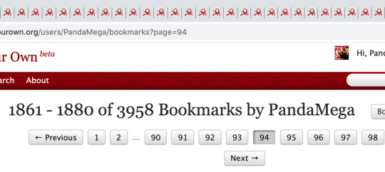
If there are multiple pages (I have almost 200 pages of bookmarks) open as many tabs as you can (usually around 30 tabs) until you get the “retry later” message. (This is an Ao3 security measure and also flood control so you don’t overload the site) Make sure all the tabs are loaded!! If the page isn’t actually loaded you won’t download anything from that page!

NOTE: Not necessary but it’s better if the window only has tabs with your fic selection because the downloader will pull links from every open tab in the window
STEP 2 - Using the Downloader
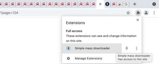
Open the downloader by clicking on the puzzle piece to the right of the address bar and selecting “simple mass downloader”
Make sure you’re on the “Resource List” tab and click the squares to the “Load Page Links” button (circled in red) to drop down the “collect links from open tabs” box. This allows you to download links from all the open tabs (or to the right/left/etc). At this point, don’t add any filters (this feature is kinda new so it’s a little glitchy) just leave everything else blank and click “Start” to load all the links from all the tabs.
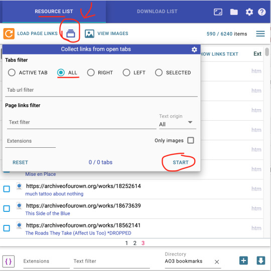
This will load something like 75 pages of links and close to 15000 "items” which we will begin to filter.
Step 3 - Filtering
First we’re going to filter OUT links we don't need. At the bottom of the window there is a space that says “Text filter.” We’re going to start by typing “comments” to filter out the links to the works’ comments. Click the menu button (three lines at the upper right corner) and select “remove filtered items.” This just removed 585 of 14805 links!
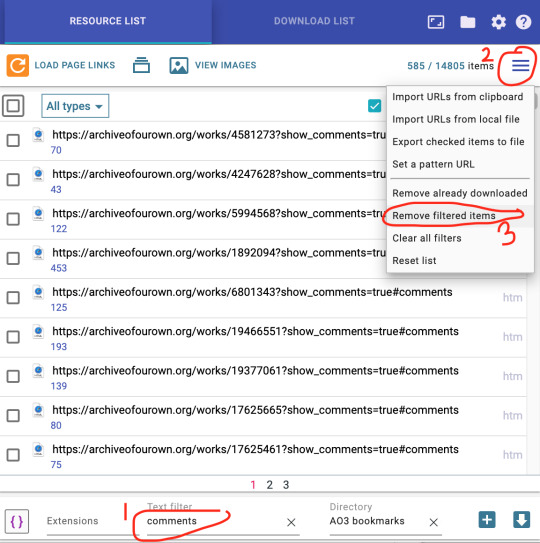
Now do the same thing for these filters to remove links we don’t need:
Comments
Kudos
Bookmarks
Collections
Chapters
Now we’re ready for our last filter: “org/works/” this will select only the links to fics! Don’t filter this out! Hit the square that selects all items (”2″ in the picture below) and deselect the first 4 items because those are not fics. If we did this right, as you scroll down you will see only links to fics!
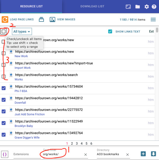
Finally we’re ready to save!
Step 4 - Save Them
Okay, to save our fics we want to specify what kind of filename they have and where they will be saved. First, click the “{ }” button on the bottom left and select “Link text.” This will make the file name into the title of the fic. Next, name your directory (3 in the pic below). This will create a sub-folder in your “downloads” folder with that name and all the fics will be downloaded into that folder. I named it “Ao3 Bookmarks” but you can call it whatever you want.
Finally, hit the “+” button on the bottom right to add all these fics to the download queue!
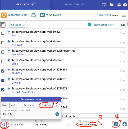
Step 5 - Download!
Last step! Now remember how we could only load about 30 tabs on Ao3 at once? Well, it also means we can only download about 50 fics at a time. Yes, this sucks but this is going to be the case no matter what method you use to download from Ao3, that’s just the way Ao3 servers operate. So this part gets a little tedious. luckily, html downloads super fast, and the list is saved in your queue.
Switch to the “Download List” tab. All the links we just added have been sent here, and if you did it right you should see several pages of fiction titles ready to be downloaded!
(optional) Now just to be safe, in case chrome crashes or if you have to leave to do something else, hit “select all,” go to the menu and click “export selected items to file” and save the file so that you can import the list and continue downloading if you get interrupted, and don’t have to start over from the beginning.
Now hit “select all” again to de-select them and select about 50 titles (click one, scroll down and shift + click). Now hit “Start Selected.” You can also hit the play arrow button and they will download until the Ao3 limit, at which point you can click pause.
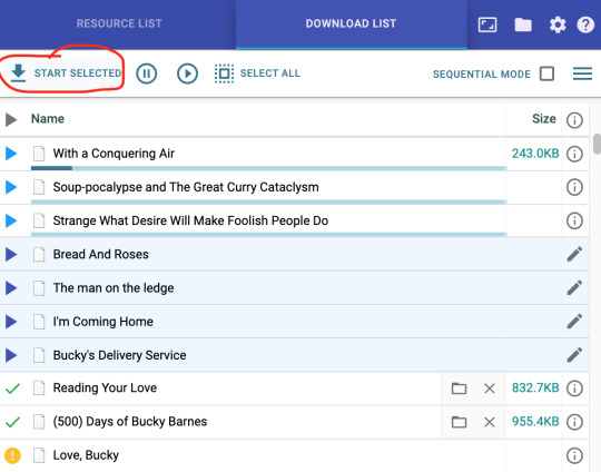
The first three titles are being downloaded, you can see the progress bar. they’re small files and should go quite fast. The dark blue arrows are up next to be downloaded. Green checkmark means the file was successfully downloaded (in theory, see note below) and the yellow “!” means that the download failed. You’ll get the download failed indicator when you’ve reached the limit for the number of downloads for Ao3 and will have to wait.
Note! If the file has no extension (no “.html”) in the folder and/or the icon is just a blank page (instead of a page with your default browser icon on it) you will have to add the file extension manually. Idk why this happens. Go to the folder and just add “.html” to the end of the title. You can also select multiple files and add the file extension at once.
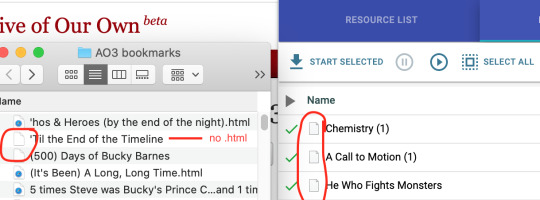
I’ll be honest. This downloading part can get kinda glitchy
TIP! Once a fic is successfully downloaded, remove it from the download list! Otherwise it will sometimes get confused and download the fic again and you’ll end up with duplicates.
As long as you only try to download about 50 fics at a time and wait for Ao3 to let you back in you shouldn’t have too much trouble!
I know it’s not the most perfect solution, but due to Ao3′s server limitations there really isn’t a better solution. This is the only bulk download method for Ao3 that I’ve found that allows you do download hundreds to thousands of fics relatively easily.
Good luck! And play around with the downloader, there are lots of other functions and uses!
120 notes
·
View notes
Text
my introduction ✧˖°
hi!
I am Lena and I am a shifter. I am trying to shift since about winter 2021, I want to share my storys and experience with you!

First off, I'd like to start with the reason I decided to start shifting.
I have no Idea what you guys are into and what your main DR is, but for me, a Kpop group called StrayKids really gave me the last push!
>I got to know the whole concept of shifting earlier tho and I really ate that whole early shifttok missinformation up T-T<
Well, but there I was, sitting in my bed at 2AM and reading anything known about shifting, watching videos, googling etc. I was veryy dediacted to shifting as soon as possible. But.. there was a small problem.. how tf do I script?
Maybe you are also strugling to find somewhere to put your scripts, but don't worry, I've tried almost all of the possible things.
Right off the bat: It does not matter at all where you put your script, it can be your imagination, on an app on your phone, laptop, notebook.. there is no limit at all. Besides, you don't even have to script, it's not neccessary.
But if you are like me, who has the need to write everything down to feel safe, I'd recommend making one. Also, in my opinion they are very fun to do!
So here are a few apps/sites whatever that I recommend:
Notion
Notion is such a lifesaver!
Even though it may seem weird to use at first, you will get used to it, and once you do, you're able to make such beautiful and practical scripts! :)
This app really just gives you everything and anything to help you develop and make a good script
10/10 as soon as you get used to it
Google Slides
I mean, it's not bad?
If you're like really good at making Google Slides look pretty and stuff, go for it!
I am not good at that type of stuff
Also it was a bit annoying that I always had to get my laptop to log in and stuff
7/10 quite inpractical, put if you're creative go for it!
Notebook
As a person who likes to visualise a lot, this was a BIG no for me
Like, I am a person, I change my scripts soo often and it's just annoying to always change stuff abt it
I always had to search a long time for the right things
Also, it was a LOT of work ;(
4/10, tf was that. I'd only recommend it, if you have a simple script and don't intend to add lot's of pics etc.
Notes App on Phone
I had an Android phone back then, a Samsung to be exact
and oh boy.. it was a mess
pictures ended up somewhere else, texts just got vanished...
I hated it
I don't know about other phones. I never tried it but I think that it is easier on Apple devices? At least I've seen more people use it
2/10 ...
if you have any other questions, ask them! I'd be more than happy to be able to help :))
Have a good day,
your Lena ૮₍ ˶ᵔ ᵕ ᵔ˶ ₎ა
6 notes
·
View notes