#myedit: resources
Explore tagged Tumblr posts
Text

Hello All! Here is a template I made based on Pinterest's Search Results! More info under the cut.
This template is comprised of two halves in separate PSDs & comes with the font (Arial) used in the first one
Any layer marked with an "{E}" is fully editable!
Each PSD is 540x586 & the gifs used in the example are 540x350.
It can be used with gifs (using the video timeline & smart objects) and/or still pictures as seen below:

Make sure all your gifs have the same amount of frames!
Here's what the bottom half looks like, i tried to make it as seamless as possible (also no GIFs cuz I'm lazy):

DOWNLOAD
If You Use Please give me proper credit in your caption! & Tag me too! (#/usersmoon) i'd love to see your edits <3
Reblogs & likes are appreciated💕
#resources#usergif#template#photoshop resources#myedit*#mygifs#mypost#usersmoon#clubgif#gif tutorial#yelena belova#yelena black widow#myedit: resources#marveledit#photoshop#psd#ps resources
58 notes
·
View notes
Text


#ෆ — snapshot#ʃ — resources#๑ — on queue#icons#free to use#icon packs#feixiao#hsr#honkai star rail#hsr icons#hsr feixiao#feixiao hsr#feixiao honkai star rail#icon pack#tumblr icons#free icons#icons pack#edit icons#my icons#girls icons#hoyoverse#hoyo games#icon#twitter icons#icon set#*myedits#*my edits#feixiao icons#feixiao icon#free resources
56 notes
·
View notes
Text
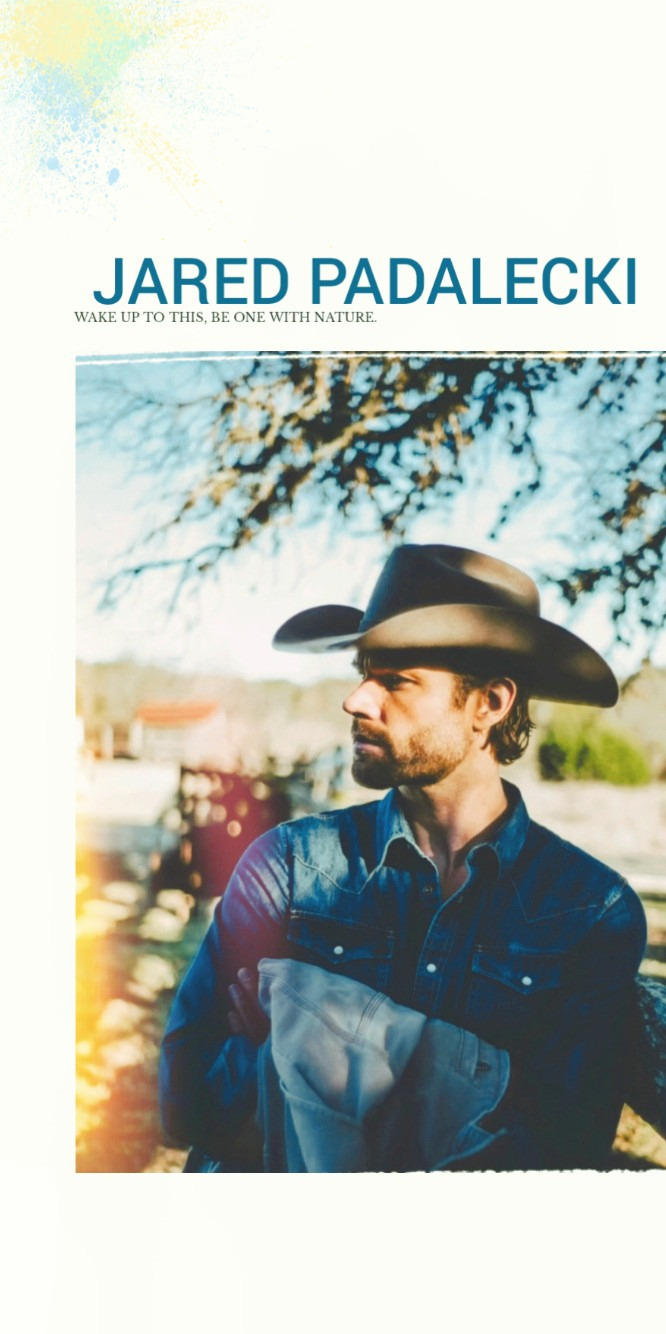
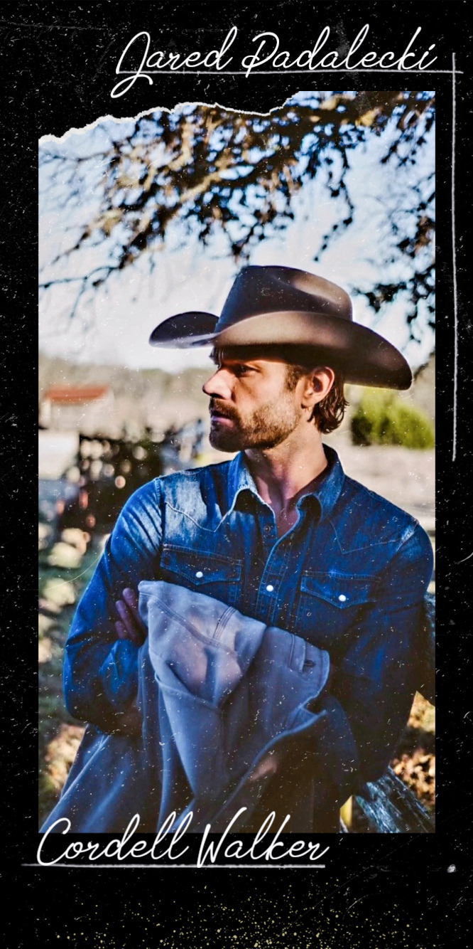
Jared Padalecki lockscreens | 📸 by Keegan Allen. [pls like or reblog if you take]
#jared padalecki#jarededit#Jared Padalecki lockscreens#lockscreens#Walkeredit#Cordell Walker#Myedits#My graphics#Resources#Happy Walker Day
74 notes
·
View notes
Text
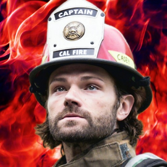
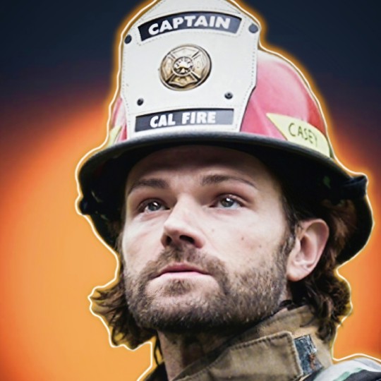
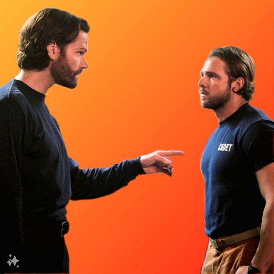
Jared Padalecki | icons | Fire Country
#jared padalecki#Camdenedit#fire country#camden casey#max thieriot#myedits#Jarededit#Jared Padalecki icons#Fire country icons#Icons#Resources#Fire country edit
16 notes
·
View notes
Photo
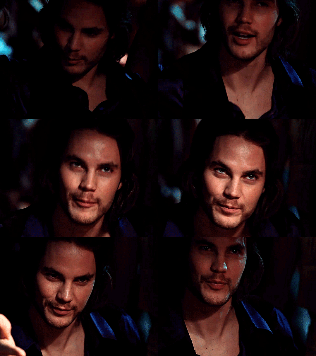
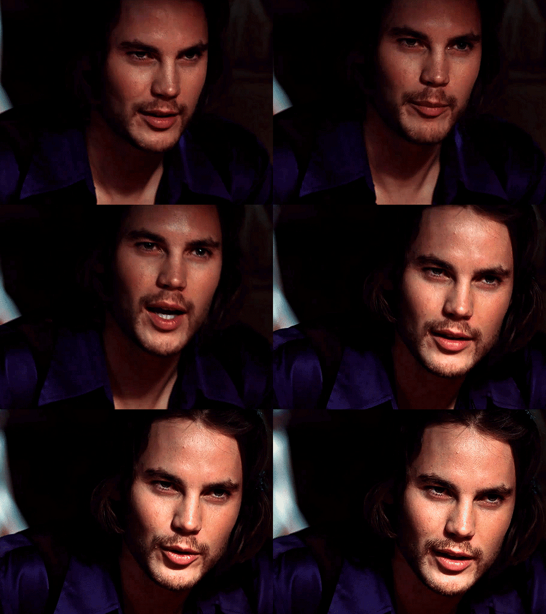


Taylor Kitsch as Gambit X-Men Origins: Wolverine (2009)
#taylor kitsch#taylor kitsch gif#x-men origins: wolverine#x-men#marvel#gambit#2009#film#filmtvdaily#dailyfilmtvgifs#dailymenedit#movie#movieedit#filmedit#moviegifs#2009 movies#old marvel#dailymencelebs#roleplay resources#myedit#mygifs#mine#tiedyedragons
140 notes
·
View notes
Text
Preview:


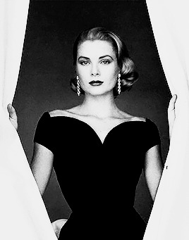
PSD #3.
A PSD made for black and white photoshoot/promotional images. Adjust opacity/fill to acheive desirable affect. Please LIKE/reblog if downloading. Thank you.
#allresources#completeresources#dailyresources#photoshop resources#psd#psd download#free psd#psd coloring#black and white#b&w#monochrome#image psd#edits#oldhollywoodedit#old hollywood#muriel angelus#boris karloff#gary cooper#grace kelly#1930s#30s#1950s#50s#*#edit#*edits#myedit#my edits#*mine
7 notes
·
View notes
Text


#bella hadid#avatars 400x640#avatars#avatar#myedit#my edit#roleplay#rp resources#forum rpg#rpg ressources#200x320#400x640#200*320#avatars 200x320#400*640#rpg#vocivus#rp#avatar 200*320
54 notes
·
View notes
Text
Youtuber voice: make a gifset with me :)
alright folks, welcome to another episode of Jo talking to the void. Gonna try and do a "follow my process" thing.
It's very- VERY long and image heavy. Under the cut and feel free to send me an ask if you have any questions/want me to elaborate on anything.
Part 1: Grab at any idea that sparks joy. Anything. Today mine is the word "horror", so we'll try and do a horror set.
Part 2: Scene analysis and reference hunting. I'll open a new folder on my pc named "Horror gifset" and dump there all the FTWS scenes I already have and that I think could be fun. Open pinterest and behance and type "horror", see if anything sparks an idea.
This takes me roughly 20 mins, here's what I have:
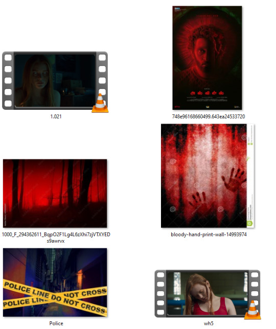
I try to take a step back and see what is it about these designs that attracted me. Clearly the red & black contrast, Bloom and I actually just like the "police line" because of the amount of storytelling it brings by doing basically nothing. (Don't be fooled, I saved many many pics before narrowing it down)
Part 3: To me this is the hardest one. I want to have a small storyline in my gifset, so time to think of it. I open a notes document and just start typing whatever comes to mind, trying to keep the mood of the previous images.

Here's what I landed on. It's not much, but I can now start the fun part of structuring the gifset.
Part 4: I've really been into layout lately, so now's the time to do math.
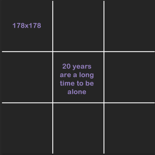
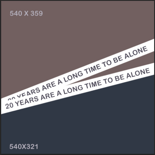
The first panel I knew I wanted to have the text centered in the middle and surrounded by the mini-gifs. Here are the two layouts I thought of. I decided to go with the second one because it's more interesting, but I already knew I'd tweak a lot, to resemble an actual police line, etc.
I separated all of the scenes from 2x06. Both when Bloom is arrested and when she's released, considering I could use them in reverse.
When making layouts the only things to keep in mind is that the dashboard optimal width is 540 px and that the space in between every piece of "frame" you put within a gif is 2px. So let's say I was going with the square layout 1. It's 540 px width, BUT I can't just divide 540/3 and make that the size of my layout, because I need to account for the space in between the squares too. So the math is actually 540 - 4 (because I have three columns - two gaps)/3 = 178 px. All the squares in that image are 178 x 178.
On Scene grabbing: I do everything I can to use footage that's high quality. This is the easiest way for your gifs to come out pretty, avoid anything lower than 1080. Especially if you're grabbing a scene that'll need loads of adjustments like a night scene or a period piece with too much yellow, grab even higher quality than 1080.
When I work with Redeeming Love's footage, I work with 4k quality, because I know I'm about to destroy the quality by adjusting it.
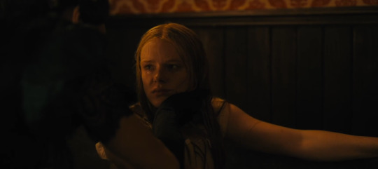
I mean look at the amount of yellow.
I t*rrent all my scenes in MKV, then use Avidmux to chop the entire movie/show into smaller sized scenes and convert it into mp4.
Part 5: Back to the set. Once I have the basic layout, I pull in my scenes and check if they make sense. One big tip is to stop thinking of scenes as what you watched, but as what you're seeing.
Scenes meaning are very easily altered by whatever context they're put in. Look for scenes in unexpected places (the romantic scene can absolutely be horror footage) and reverse the order or add in effects to alter their meaning.
Each one of these gifs had it's own peculiarities. So to break it down:
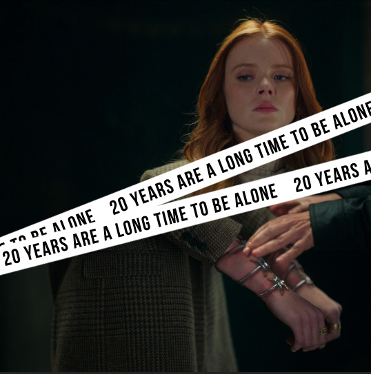
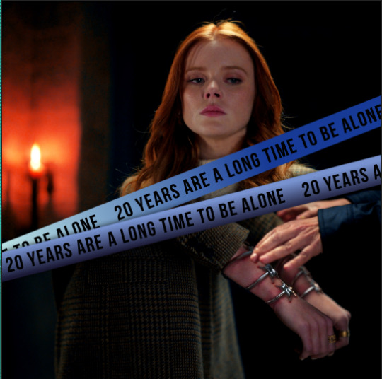
Gif 1: I colored it to bring out the black and added the blue because I knew I wanted to use overwhelming red later and this would pop-out. Shaded the white streaks so they'd appear more like police lines and colored them using a gradient just so it'd be more interesting. I didn't like how Bloom's upper part lined up with the cuffs, so I inverted it and brought out the red


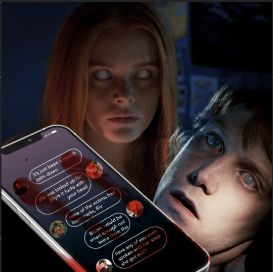
Gif 2: First off, I scavenged my memory to try and find a scene where a character appears with white eyes like Bloom's. This poor fella is from The Covenant (2005). I color matched both Bloom's and his scenes so the green was neutralized and we had more blue and red. Then finally I added the phone where the actual storyline I wrote back up starts to unfold.
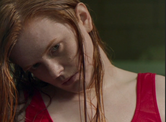
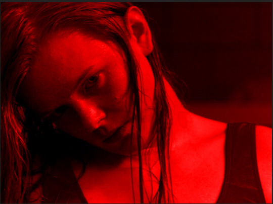

Gif 3.1: First off, this gif is 540 width, but not 540 px tall. It's actually 400 px tall, which is a good tip: You don't have to stick to one format when giffing. Sometimes a layout or scene simply won't work in a tall format and that's fine.
For this first part all I did was color Bloom, slap the all red color map and the text. Then I realized I didn't like her swimsuit under blending, so I went back and specifically desaturated the red in the starting layer and made it dark, so it'd show up black. The "20 years" are subtle, but in my head it'd be what the characters are hearing in their nightmare, so it's just a faint whisper in the corner.
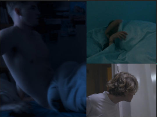
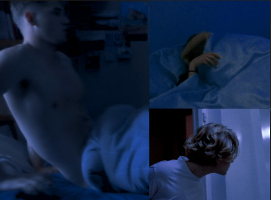
Gif 3.2: I colored all scenes to match each other. Sky's was the darkest one, so I knew I'd try and match to his because then I wouldn't have to destroy the quality of his footage to match the others. Musa's scenes was tricky because in the actual scene she's waking up slowly and happy. I chose to speed it up and start the gif already in her movement, so you don't realize she's actually very relaxed in the scene.
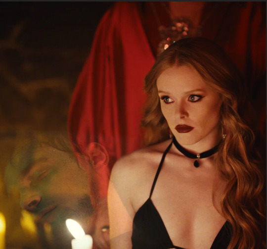
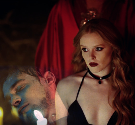

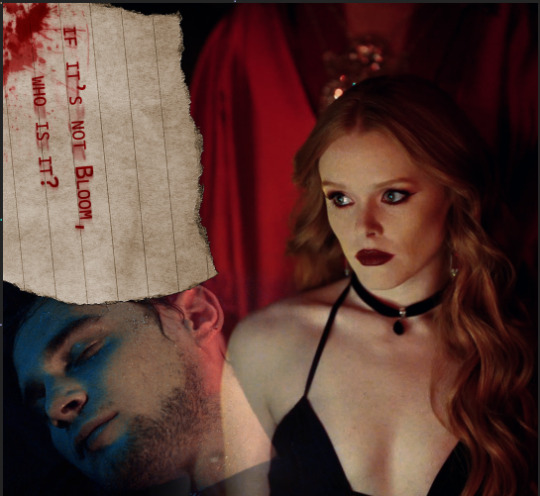
Gif 4: I started by coloring Bloom and Riven's footage, reducing the yellow and bringing out the blue and red in both. As you can see there's still a candle behind Riven, that makes it hard to see his face, so what I did was add a black shape under (or you could paint a layer in PS) with black and just blur the edges, so his footage would actually show. Finally there was that big empty spot in the upper left, so I added a note and used it to wrap up the story of the set.
There are two layers of text, both set to multiply: one is the actual text, the second one is in a brighter red and blurred in one direction, so it looks like the text got smeared in a rush. Added the blood and ta-da! We're done.
Exporting:

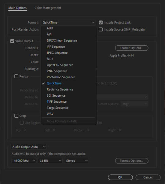
If you're exporting from After Effects, I've found exporting in MOV works better than trying to export in mp4, since it doesn't compress the file. You'll notice I'm using the format "apple ProRes 444", that's simply because this format keeps the alpha channel (transparent). While I didn't need it in this set, it's an habit.
Once I export from after effects, we're importing in Photoshop.
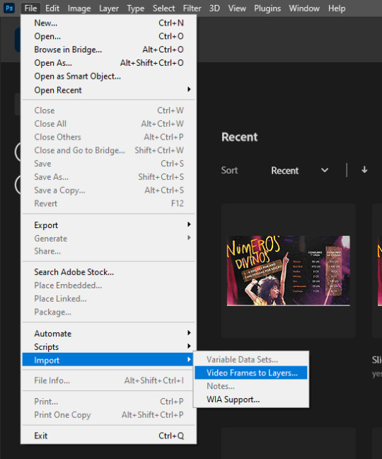
I import by going File > Import > Video Frame to Layers. Then you select your file and you should have this:

Hit OK.
If you don't have the timeline here, simply go in "Window > Timeline"
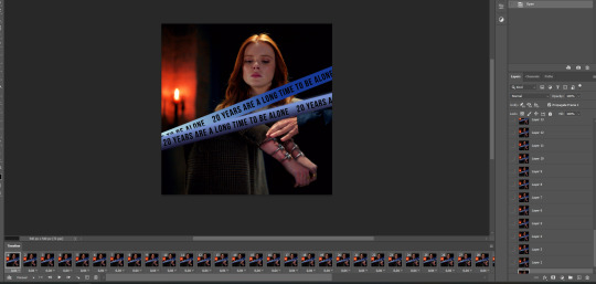
You'll end up with something like this. Now here's the most boring part of giffing, but don't give up now!

Go on the 3 lines on the bottom right of the timeline (=) and click on "select all frames". Once they're all selected, click the little down arrow under the little thumbnails to change the timing. I change mine from 0.04 to 0.05
Then I select all my LAYERS (not frames), put them inside a group. And click:
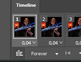
On this little piled up icon to transform into the video timeline. This is so we can sharpen our gifs.
Right Click on top of the group on the layers panel and select "convert to smart object". Then in the upper bar, click Filter > Sharpen> Smart Sharpen and use these settings:

This is what makes gifs look clear and crispy.
FINALLY we're saving. You can do it manually, like a peasant, by going on file > export > save for web (legacy). Or you can play keyboard piano and hit alt+shift+ctrl+s.
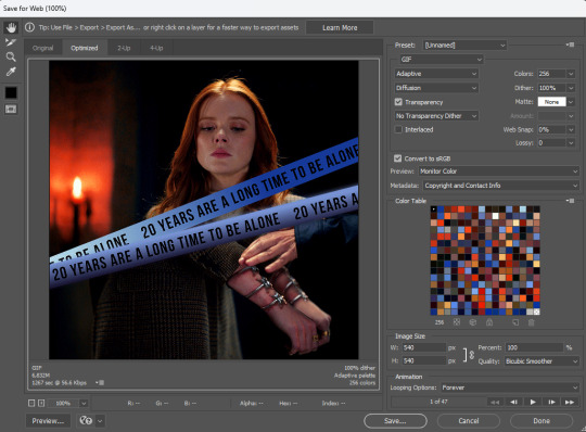
These are my export settings.
Things to keep in mind:
"Diffusion" is just one of the types of exporting you can do. TWEAK THIS for every gif. Sometimes very detailed gifs will look better with Pattern. Very colorful ones with Diffusion. It varies a lot.
"Adaptive" is just another way the pixels are laid out. I don't actually see much difference here, but I always tweak on all settings, just to make sure I'm getting the best quality by the smaller size.
On the bottom left you'll see your size. Mine is currently 6.82M. All you have to know is that Tumblr won't allow any gif bigger than 9.8M.
Looping Options: make sure it's in forever, otherwise your gifs won't play.
And then... finally, hit save.
....
Now rinse repeat and do this for 200 other gifsets, because it's a totally fun hobby to have!
26 notes
·
View notes
Photo


HOW TO: MAKE HIGH-QUALITY GIFS
Hi! A few people have asked me about my gif-making process and an anon asked about my coloring on a specific Bridgerton set. So, I decided to make a tutorial combining both! This is a very in-depth tutorial but there’s also nothing groundbreaking here. If you enjoy seeing how other people work like I do, this is for you <3 very long tutorial under the cut!
tech: ★ laptop: macbook pro (13-inch, M1, 2020) ★ external hard drive: seagate one touch ssd 1TB* tools: ★ adobe photoshop 2022 ★ mpv 0.29.1** ★ windscribe (vpn) ★ qBitt⚆rrent (for tv & film) ★ 4k video downloader (for music videos, trailers, interviews, etc.) ★ rizz’s action pack by @anyataylorjoy (highly recommend!) resources: ★ resource directory by @usergif (a source blog I created for gif effects!) * I have 2 externals, one dedicated just to storing all my 4k Star Wars files and another for Bridgerton and everything else ** I use this version of MPV bc the other ones weren’t compatible with my laptop for some reason. This one works well for me and doesn’t create duplicate screencaps which I’ve heard is a problem with other versions
PHASE 1: Prepare Your Base Gif
1.1 – Download video files. I personally like not having to do this regularly for 2 reasons: (1) I t*rrent (I use r@rbg — make sure to use a VPN if you t*rrent!) and (2) I mainly work with 4k files which can take forever to download, especially old media, and I’m not trying to waste my life away. That’s why I keep my files on an external hard drive, so I only need to download when new content drops.
TIP A: Footage Type & File Size
As you saw in the header gifs, I work with HDR footage. You may have heard some gif-makers talk about HDR or 4K screencaps looking like the colors are faded or washed out. They are:

(I don’t have examples of the Mandalorian because I only have that in 4K which is always HDR — so I’m going to stick to using this Bridgerton clip for examples. Also, I made the Mando header gif a long time ago and I’m not letting it go to waste now lol.) Some people don’t like working with HDR as a base, which is understandable! There are ways you can make your screencap software fix the coloring automatically. But my mentality is: I’m lazy, I’m used to it, I’m already coloring it anyway, and the muted coloring gives me a sense of control over the entire palette — instead of fighting with the existing colors from the original color grading. (I also talked to a videographer at work about this and he mentioned he prefers to color grade with this faded/washed-out look as a base too!) For the sake of the demo, I tried to color these two scenes as equally as possible in black and white so you can decide if there’s a difference:

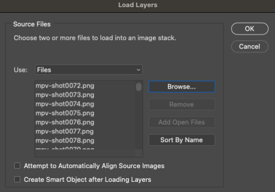
Ultimately, the file type you use is up to you! Hopefully this demo helps you make that choice easier. This tutorial is going to focus on HDR footage though. The size of your file matters too! 4k (2160p) isn’t always better than 1080p (but it typically is for me which is why I prefer to use 4k footage when it’s available). But the main thing is to look at the GB size of your file. 1.2 – Make screencaps. I use MPV which works great with 4k .mkv files (PS can’t read .mkv files if you try to Import Video Frames to Layers). Check out this tutorial for the basics on getting MPV set up and how to make screencaps. 1.3 – Import screencaps. Load your caps into PS by going to File > Scripts > Load Files Into Stack. Some people upload using Image Sequence because it loads faster, but idk. I don’t really care because I’m never uploading that many caps at a time that I need it to go any faster. This is what the Load Layers window looks like:
1.4 – Make Frames from Layers. Recently, I’ve been using the Script Action in Rizz’s Action Pack (linked at the top of this tutorial — if you use it, be sure to like and reblog Rizz’s post!) with some actions of my own added to make it perfect for my process. Actions are huge timesavers because all you do is press play!
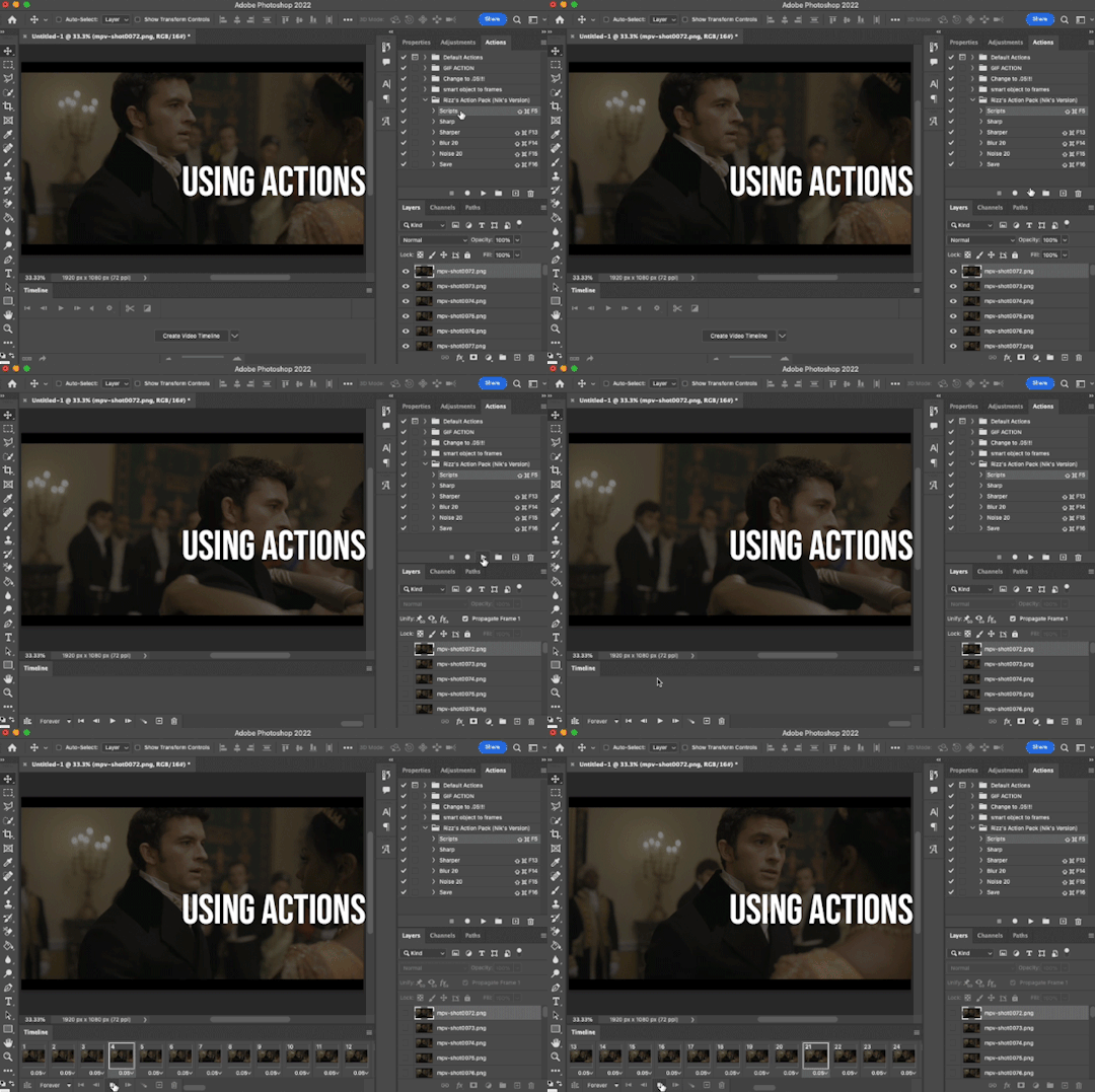
But to do this manually, you can simply select all the layers, click Create Frame Animation, click the menu in the Timeline tab (upper right), and click Make Frames from Layers. Click Reverse Frames in the same menu so your caps are in the correct sequential order and set your frame delay to 0.05 seconds.
1.5 – Crop and Resize. For this gif, I want my dimensions to be 540px wide x 350px tall. Do this to your liking but remember, Tumblr’s max width is 540px (here’s a guide for other dimensions). Any width smaller will be stretched and look bad. Any width larger will be compressed, make your gif file huge, and look bad. P.S. RESAMPLE SETTINGS MATTER! Check out this resample experiment to figure out which one you prefer. I tend to stick to “Bilinear”
TIP B: Preserving Cropped Pixels
Have you ever cropped something, done all your coloring, then wished you could nudge your image just 5 pixels over only to realize you can’t because you’ll have 5 pixels of transparent space on the side? Uncheck “Delete Cropped Pixels” so you can change your image positioning later if needed!

TIP C: 2-Pixel “Buffer”
Something I do (and some gif-makers I know do) is resize with a 2-pixel “buffer.” Gifs sometimes have a slightly transparent border or “halo” effect. You can see it a lot when viewing Tumblr in dark mode. To get rid of it, I resize a tad bigger and then crop out the extra pixels. So, for example, since I’m making a 540x350 (w x h) gif, I’ll resize it to 542px width first. After I’ve converted to a smart object (Step 1.6), I’ll crop out those extra pixels so it’s a perfect 540x350.
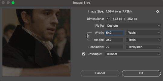
(Btw, you can also do this in the export window by setting “Matte” to none. I guess I’m old school for doing this? Idk I haven’t properly tested and compared both methods.)
1.6 – Convert from Frame Animation to Video Timeline. The sharpening action in Rizz’s Action Pack does everything in one go: converts from Frame Animation to Video Timeline, converts frames into a smart object, and sharpens your gif. If you’d rather do this step manually, just select all your frames and click “Convert to Video Timeline” in the Timeline menu panel OR click this button:
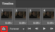
Then, select all your layers in the right panel, right-click, click “Convert to Smart Object,” and add your sharpening filters. Again, I’m a huge fan of actions, so I’d rather just hit play on Rizz’s action. It includes two sharpening presets and is super easy to tinker with if you want to add more sharpening or put other filters like Gaussian Blur, Reduce Noise, or Noise on top. I’ve been using Rizz’s “Sharper” Action and occasionally throw a Gaussian Blur filter set to a radius of 1.0 pixels at 20-40% opacity (or sometimes a Reduce Noise filter), depending on the gif. Here are my usual Reduce Noise settings which I typically set to around 40% opacity:

In this gif, I used Reduce Noise at 40% and Gaussian Blur at 20% lol. If you prefer using your own sharpening settings but want to use this action for the converting steps, just right-click the Smart Filters under the smart object and click Clear Smart Filters. Then, apply your own sharpening settings. If you followed TIP C, my 2-pixel “buffer” trick, from Step 1.5, go ahead and delete those extra pixels now! I go to Image > Canvas Size and type in the gif dimensions I want there, 540x350 in this case:

If you had “Delete Cropped Pixels” unchecked, you can move your gif around until you like how your gif is positioned. Your gif should be looking sharp and perfectly sized now, with no weird borders hanging around the edges. Let’s move on to the fun part!

PHASE 2: Coloring
Disclaimer: this is MY process for coloring, not the be-all and end-all. Everyone has their personal favorite adjustment layers and unique styles, and it’s all preference! The only wrong way to color is by whitewashing, redwashing, etc. These steps are also just my typical steps, but I always color from scratch and my adjustments always depend on the scene. A dark, yellow-tinted scene from Narcos will be a completely different process from a bright, outdoor scene in Star Wars. Because an anon asked for it, I’ll be demonstrating my coloring on the gif above from this Bridgerton set. It’ll be a little hard to explain because it’s like a method-to-my-madness, lives-in-my-mind-untranslated thing — but I’ll try my best and mostly use screenshots to demo!
MY LAYERS PANEL OVERVIEW:
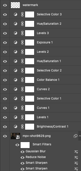
2.1 – Brighten + Color Correct My go-to adjustment layers: Curves, Levels, and Brightness/Contrast (set to screen). So, like I said, I use 4K/HDR footage which gives me a pretty washed out starting point coloring wise, but I actually love this as a base for coloring! I’m repeating myself but a videographer I work with said he films low-contrast because it provides the best base for natural-looking color grading. And I trust him and myself because I’ve been coloring like this for a long time lol.
ADJUSTMENT 1: Brightness/Contrast 1
When it comes to brightening, I’ve found myself starting to do this neat trick someone from usergif taught me! Literally just slap a Brightness/Contrast layer down, don’t move the sliders, set the blending mode to “Screen,” and lower the opacity to your liking so you don’t start out with a blindingly bright and pixelated gif.

Then, I pretty much always go in with a Curves and Levels adjustment. And I actually do a hint of color-correcting with them too!
ADJUSTMENT 2: Levels 1
In the RGB channel, I don’t add too much darkness just yet but I definitely bump up the highlights (right slider) a lot. I lift the reds in the Red channel a bit, especially when I’m working on a gif with people. It helps bring back some life to the otherwise washed-out coloring of HDR footage. In this one, I also lifted the greens and blues a bit too! When I say “lift,” I just mean I’m bringing those colors forward or emphasizing them.
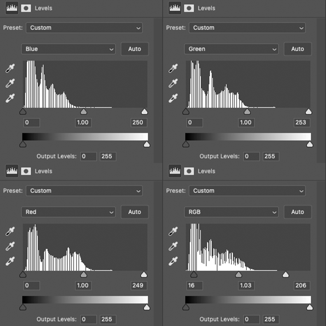
ADJUSTMENT 3: Curves 1
I only tinkered with the RGB and Red channels this time — and no fancy S-curves here. But sometimes, I’ll also go into the Green and Blue channels if I didn’t do enough in my first Levels layer. You can see here that I barely even nudged that Red curve up lol. Why do I make such minor adjustments? My brain can’t explain. I just move things, decide if I like it, and stick with it. 🤷🏻♀️

2.2 – Basic Colors + Extra Brightness My go-to adjustment layers: Selective Color, Curves, and Color Balance.
ADJUSTMENT 4: Selective Color 1
Since my gif didn’t have any true green, cyan, blue, or magenta colors, I didn’t play with those channels at all. But there’s a lot of yellow in the background and a variety of reds and yellows in the people’s skin tones which is why I adjusted those two color channels. You might notice that I increase the blacks in my Red and Yellow channels. I actually do this almost all the time. I kind of think of coloring like makeup?? Idk if that sounds weird. But the blacks kind of add some dimension the way contour would, and my HDR footage naturally lacks this. Something else I almost always do is bump up the whites in the White channel. I love really bright whites and, with an ideally lit scene, it acts as the highlight makeup lol. It gives me some good dimension on nose bridges, cheekbones, and high planes of the face I do some overall adjustments in the Neutrals and Blacks channels, but very minor since I have more coloring to do!

ADJUSTMENT 5: Curves 2
Just a teeny tiny curves layer with an itty bitty S-curve (for contrast and so I can see what I’m doing lol)

ADJUSTMENT 6: Color Balance 1
I never really know what I’m doing with color balance. There’s no formula I follow or pattern of adjustments I always do. This step is literally the epitome of push the buttons and hope it does something good.
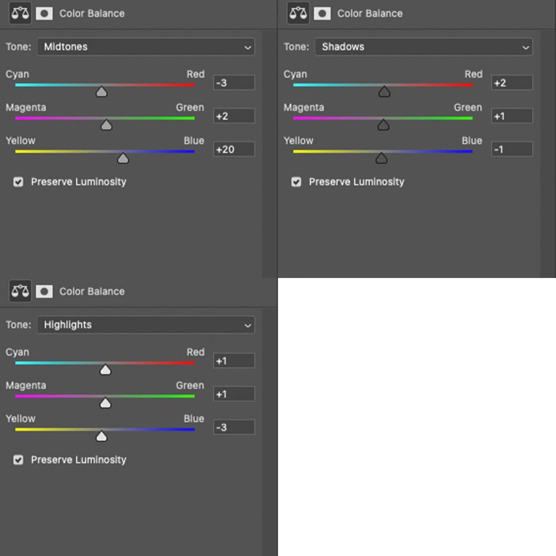
2.3 – Adjust Skin Tones and Other Colors My go-to adjustment layers: Selective Color and Hue/Saturation.
ADJUSTMENT 7: Selective Color 2
Again, I’m only focusing on the Red and Yellow color channels, adding more blacks to each again. Then, bumping up Whites and doing super minor adjustments in Blacks.
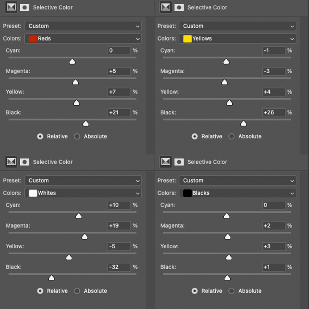
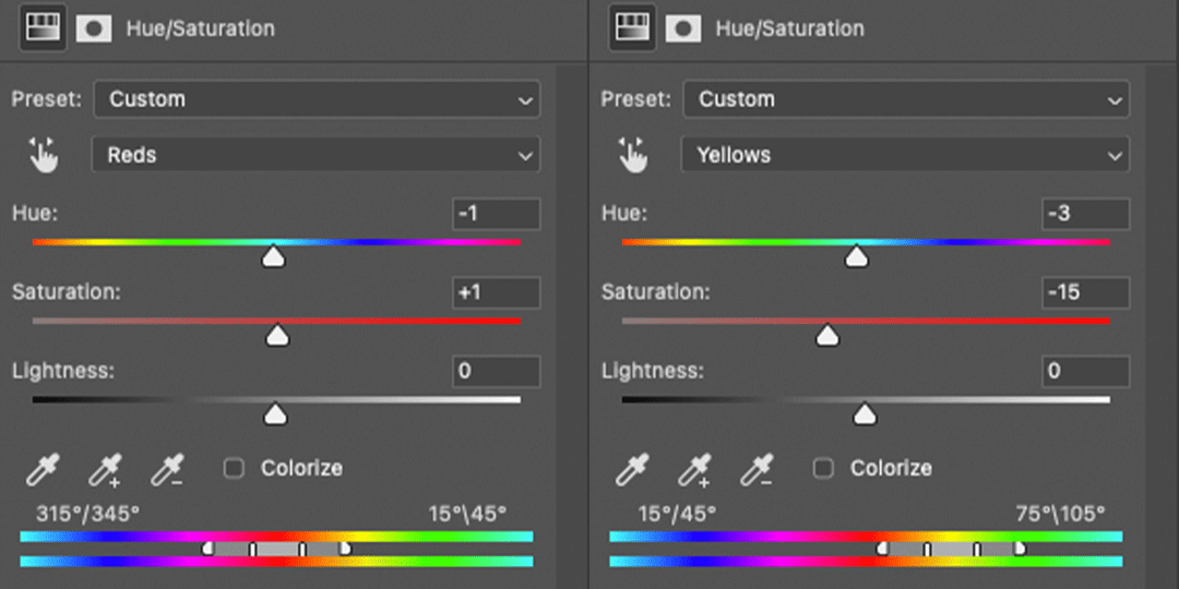
ADJUSTMENT 8: Hue/Saturation 1
Here’s where I do a lot of my skin tone correction. I try to be hyperaware of representing skin tones accurately and naturally, while still having that HQ-looking dimension. By no means am I saying I’m perfect at coloring skin tones, but I do my best using this adjustment. Again, there aren’t other colors in this scene besides Reds and Yellows, so that’s what I’m tweaking. I do sort of follow a pattern here which is: Reds Channel: slide down the hue slider a *tad* and I’ll sometimes lower the lightness (I didn’t do that here but I do in the next Hue/Saturation layer) Yellows Channel: slide down the hue slider so any overly yellow hues move closer to a neutral-magenta hue AND lower the saturation so the skin doesn’t look sallow.
2.4 – Shadows & Light My go-to adjustment layers: Levels and Exposure.
ADJUSTMENT 9: Levels 2
This is super simple. I’m just adding back some contrast. That’s kind of my trick for HQ-looking gifs. I bumped up the highlights (right slider) a lot again and darkened the shadows (left slider).

ADJUSTMENT 10: Exposure 1
I only do this sometimes when I want the light parts of my gif to be extra bright, and even then, I barely push the exposure up (I’ve only increased it by 0.08 here lol). Exposure can totally mess up your gif, so be sparing with this if you decide to use it.
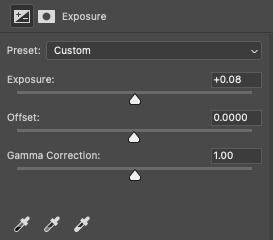
2.5 – Repeat as Needed These are my go-to adjustment layers for basic coloring (i.e. no fancy color palettes or major color manipulation — if you want a tutorial on color manipulation, I made one on usergif right here!). And I tend to add several (but not too many) layers until I get it where I want. Usually, the only additional step I’d do for a color-focused set is add a few Gradient Map layers! Here are my remaining layers and their settings:

ADJUSTMENT 11: Levels 3
Some final contrast gets added here and some last-minute color correction. For example, if I find I’ve made my subjects’ skin tones too red or yellow, I’ll pull down the left slider in the Red channel to bring back some cyan or bump up the Blues.

ADJUSTMENT 12: Hue/Saturation 2
Only in Reds and Yellows again, I pretty much follow the same principles of my first Hue/Saturation layer. This time, I did lower the lightness in Reds. Their skin was looking a bit too saturated with Red, so this helped me bring it back to a slightly more natural-looking but still high-contrast state and I reduced saturation.

ADJUSTMENT 13: Selective Color 3
Idk why I did this originally... I didn’t bump up the whites and I didn’t touch any other color channels. But I guess my highlights were looking a bit too green-blue, so I bumped up the yellows and magentas a lot and pulled down the cyans.
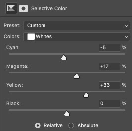
And here are all the adjustments in action, step by step:

You can see how the middle adjustments were making them look quite red, but the final coloring is more neutral imo. Now, time to save your gif!
PHASE 3: Exporting the Final Gif
3.1 – Convert Back to Frame Animation + Fix Frame Rate If you can avoid it, DO NOT export your gif then reopen it to adjust the frame rate. Reopening your gif adds an extra, unnecessary compression step when you already have to go through the unavoidable steps of PS optimizing your gif for web and Tumblr compressing gifs over 3MB. I love Rizz’s Action Pack mainly for the “Save” action which takes all the guesswork out of this step! Just hit play and your gif will be ready to export in seconds. If you prefer to convert back to frames manually, I’ve written all the steps out here! Remember to set your looping option to “Forever” and then fix your frame delay aka frame rate (the speed at which your frames play). The generally preferred frame delay among gif-makers is 0.05 seconds (in fact, I’ve heard some blogs won’t reblog your gifs if they don’t appear to be set to this speed!).

But the speed also depends on the FPS of your original file! For example, when I gif video games (like Jedi: Fallen Order) which I believe are at 60 FPS, I tend to make my speed 0.04 (or sometimes faster).
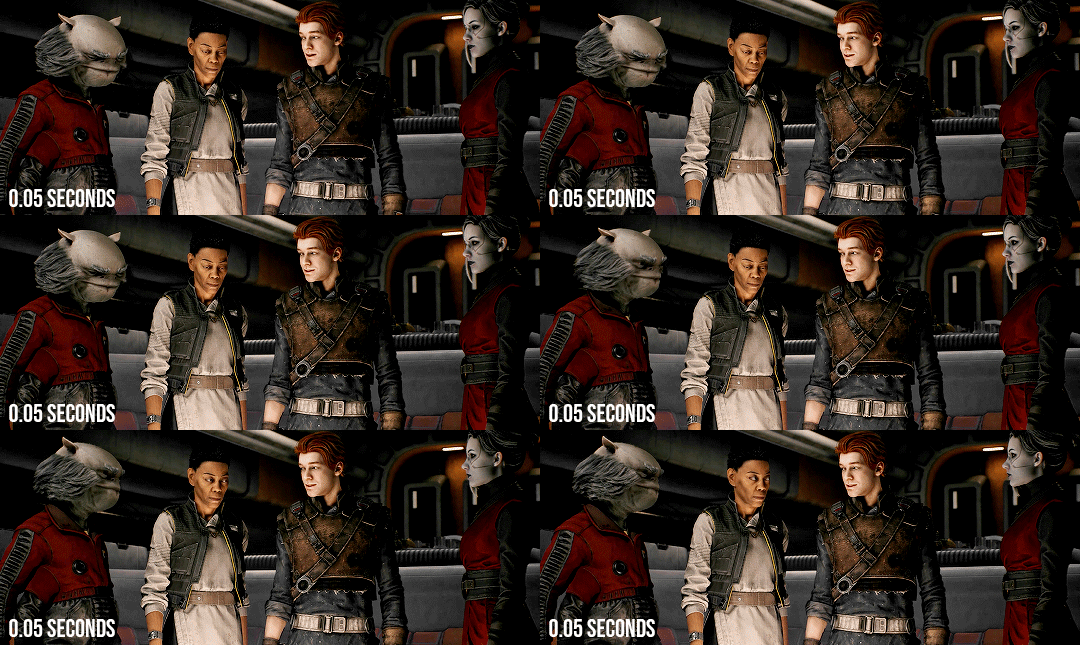

I know that seems like such a minor difference, but as you make more gifs, you’ll be able to tell which speed looks the most natural! Before exporting, just always be sure to play your gif back, check that you like the speed, and delete any accidental duplicate frames! (Duplicate frames can happen if you animate using keyframes.) They may seem minor, but it’s something I personally can notice even if it’s just one duplicate frame... and it can throw off the entire smooth flow of your gif.
TIP D: MARKETING FOR DISCORD USERS (lol) 🤡
If you share your gifs in a creator server, here’s a fun tip that totally exposes me as a marketer. While you’re in Frame Animation, move your frames around before saving it so that your best-looking frame is Number 1. THIS is the frame people see in your embedded preview link when you share your gifs on Discord. (If your selected frame is in the middle of your gif, just be sure to move all the frames after it too so your gif still loops properly. Like, if you have 10 frames but want frame 5 to be featured in the Discord preview, move frames 5-10 before frames 1-4. Now, your frame sequence is 5, 6, 7, 8, 9, 10, 1, 2, 3, 4 — #5 being the featured frame.) Your gifs loop anyway, so your first frame doesn’t have to be the first part of your scene :) By being purposeful with your “first” frame, you have control over the still image people see in the server. And if you choose a really good frame, who knows? Maybe more people who aren’t in that fandom will be curious enough to click it because it looks so good and enticing lol See this preview? That’s actually the end of my gif, but it’s the best part:
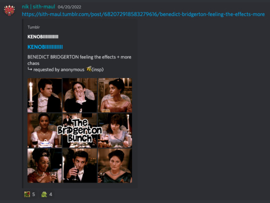
(also, not me just realizing I posted this set on 4/20 lmao that was so unplanned a;lsdjk)
3.2 – Save For Web Go to File > Export > Save for Web (Legacy) to get your gif ready to export!
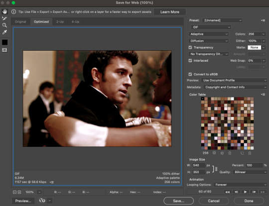
There are still some extra settings to play with here, mainly the Color Reduction Algorithm:
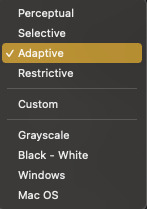
And the Dither Algorithm:

Typically, gif-makers only use Selective or Adaptive and Diffusion or Pattern. Again, these settings are going to be up to your personal preference. My usual is Adaptive-Diffusion. On occasion, I’ll go for Selective-Diffusion. And I don’t usually prefer the Pattern dither because I hate seeing the grid lines it produces. But there have been some gifs (like the first one in this set) where I have a solid background color and Pattern yields the best-looking gif. So, I’ll always toggle through the options to see which one I think looks best! Check out this guide that shows all the setting side by side!
TIP E: How to Keep Your Gif Under 10MB (Tumblr’s current max gif size)
Try to to keep your number of frames as low as possible. I think my average is 60 frames or so. Sometimes I can get away with more depending on the scene.
Make your gif smaller. Obviously, if you’re making a full-width gif, you can’t make it smaller than 540px wide. But you can shorten the height of your gif if your composition allows it!
Add more blacks to your coloring. Idk why this works but it usually does for me. More contrast or something
Try not to use too many adjustment layers (I say this but I don’t usually do this a;slkdjf)
This isn’t my personal preference and I’ll avoid it when possible, but you can add Lossy which is a compression setting that’s available when you do Selective color reduction. It helps reduce the file size, but I’d never go over 10 on Lossy:

3.3 – Upload to Tumblr Use the Photo Post option not Text Post. Gifs uploaded in a Text Post may look okay on the dash, but they can get very wonky on different themes, create size inconsistencies, and make the gutter wider than the 4-pixel default. (Plus, if you share your gifs in a Discord server — your embedded preview will be all tiny!)

Contrary to some beliefs, uploading to drafts does not mess with the quality of your gif anymore than publishing it instantly. So, go ahead and put your gifs in the drafts so you can see how it’ll all look before posting! I tend to leave my gifsets in drafts for at least a day so I can criticize myself more 🤡 kidding... a little... but I’ve also heard that keeping your sets in drafts helps them appear in the search/tags faster. I’ve never had problems with my stuff showing up in tags, so maybe that’s true! And that’s it!
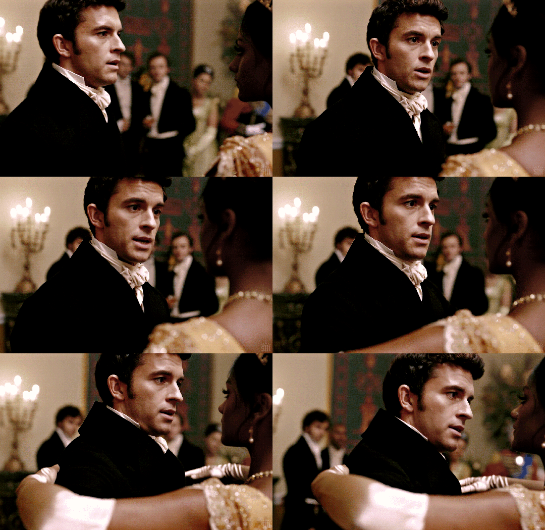
Thanks for reading my dissertation on Tumblr gifs lmao. I hope it was clearer than it was long and ramble-y... and I hope it’s helpful for some beginner gif-makers out there! If not, here are some of the best basic giffing/coloring tutorials I know:
giffing and coloring tutorial by sashafierce
giffing 101 by msmarvel
gif tutorial by kylos
gifmaking for beginners by hayaosmiyazaki
coloring tutorial by magnusedom
and check out usergif’s resource directory here for more help!
[You can also find my other tutorials/resources here]
Before I go, let me just say a few TUMBLR/GIF ETIQUETTE things:
Clearly gif-making is a process. And it is art, whether you use fancy effects or not. So DON’T STEAL GIFS, don’t even use them as a base for your own adjustments. Use this tutorial if you need help making your own gifs from scratch! Another thing: give credit when credit is due! Trends come and go in gif-making, but you absolutely should link “insp” in the caption of your post (not in the source link and not in the tags). The caption is the most visible and intentional spot, which means it’s the most deliberate acknowledgement of your source of inspiration. If you didn’t come up with a concept yourself (be honest with yourself), just link it! It doesn’t make your post ugly or cluttered. It helps spread awareness to other talented creators that some of your followers otherwise may not encounter in their fandom. And doesn’t it feel good when more people see what you’ve made and celebrate it with you? Give that same feeling to the source of your inspo! Lastly, remember: don’t let anyone tell you that the gif styles you like aren’t right or aren’t beautiful. Gif-making is about having fun and creating art! As long as you like what you’ve made and it doesn’t harm any person/community or perpetuate problematic behaviors (i.e. whitewashing), then do what you want! It’s your blog!! Have fun! <3
#photoshop tutorial#gif tutorial#completeresources#dailyresources#userkosmos#usershreyu#uservalentina#useralison#usernums#tuserkay#usercim#userk8#tuserrex#userannalise#useryoshi#userelio#tuserabbie#uservivaldi#resource*#myedit*
2K notes
·
View notes
Photo
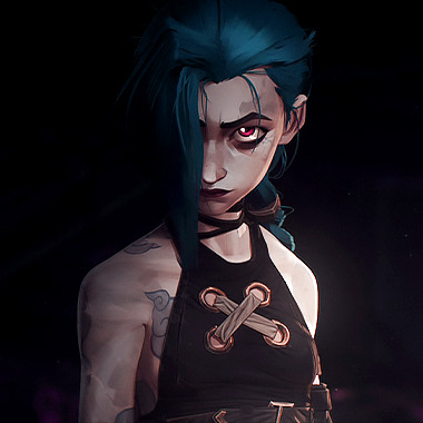
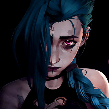
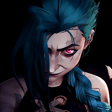
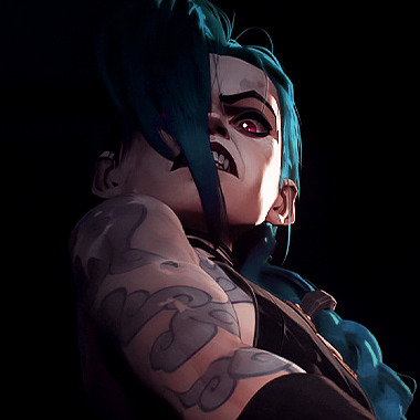
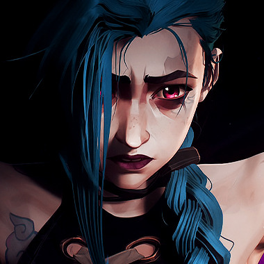
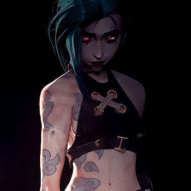
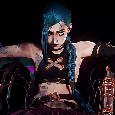
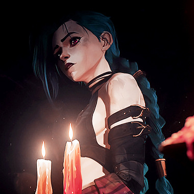
Arcane | Jinx icons
like or rb if you use/save
555 notes
·
View notes
Text
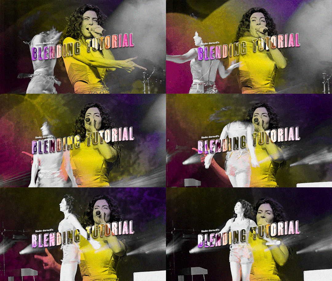
hi y'all!! anon asked me how I made my mobile header and sidebar gifs on my desktop theme so I figured I would make a little tutorial. (this is my first one which is super exciting, but also please bear with as i try to do this lol. if you have any questions please do not hesitate to ask!) you will need a basic knowledge of gifmaking. I use photoshop 2022 on mac :)
step 1: making your gifs
you're going to make two gifs in two separate documents. both are going to be black and white, cropped however you want, but if you want it for your mobile header, the dimensions are 640 x 360 — that's what I'm using.
do your normal coloring settings (i'm keeping mine pretty basic since they'll be b&w)
make sure they're the same length. if you're using frames, make sure they're each the same frame length. i'm using video files so if you do too, just make sure they're both the same length when they're together on the video timeline.
to make the gifs look better together, use contrasting shots (for this gif, I have a far away shot of marina dancing and a close-up of her singing)
step 2: making the gradient
choose which gif you want the gradient to be on. i chose the close-up shot
go to layer > new fill layer > gradient. click ok and then this will pop up:

click gradient, then choose three colors you want for your gradient. these are what I chose:

click ok, then go to the angle adjuster (idk what it's called) and make your gradient diagonal (doesn't have to be exact)
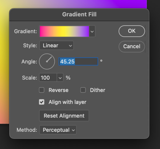
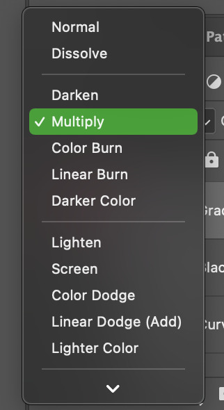
click ok, then go to your blending mode drop down in your layer panel and change the blending mode to multiply
now your gif should look like this:

step 3: converting gifs to smart objects & putting them on the same timeline
now here's where the magic happens. on the gif we just worked on, select all the layers and merge them into one smart object. do the same thing to your black and white gif.
i don't know how to explain this in writing, so just follow the gif for what to do next:

now, align the black and white gif onto the gradient gif, then change the blend mode to lighten. now your gif should look like this:
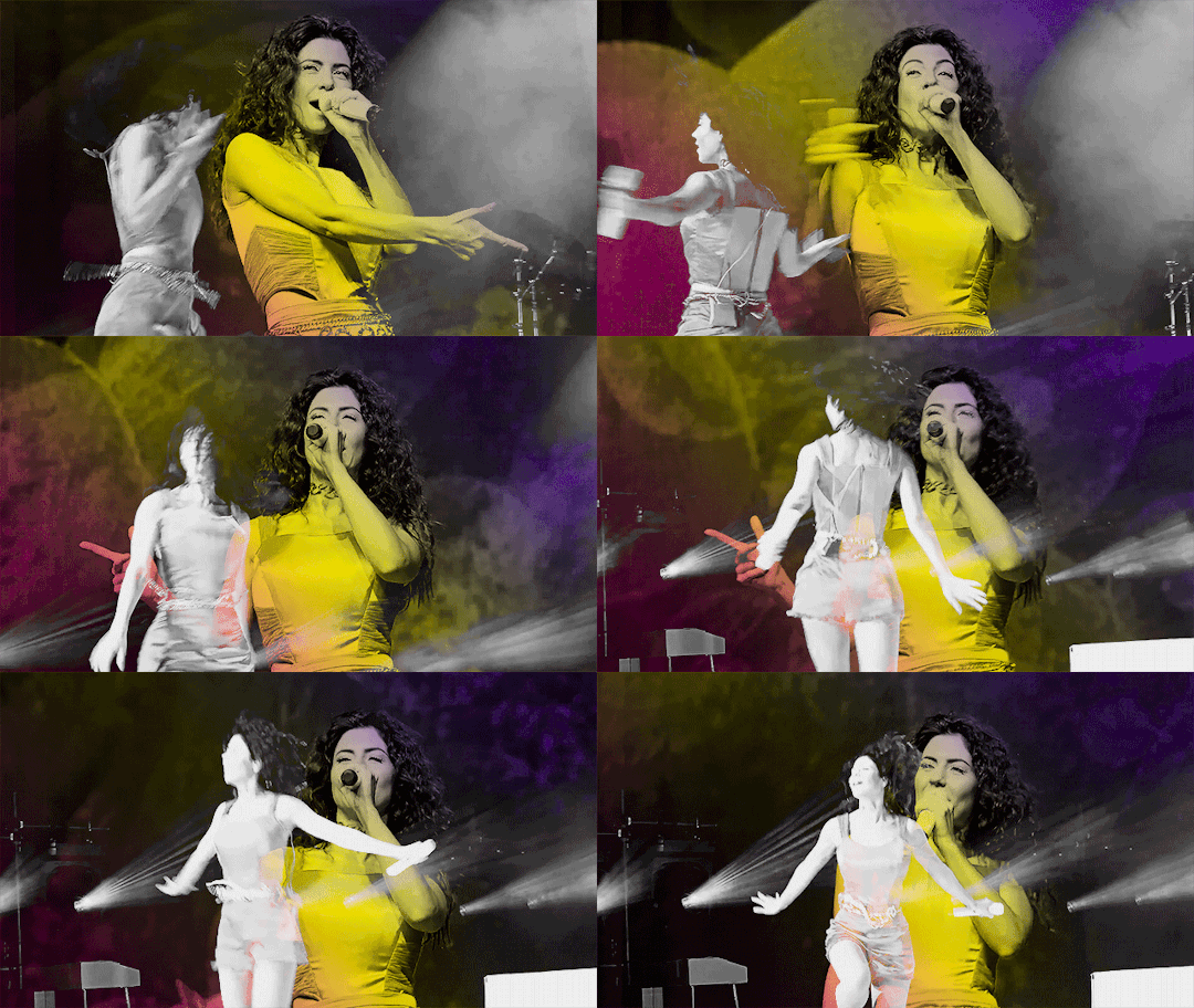
step 4: finishing your gif!
woo, we made it! now to finish, make both layers into one smart object, and add noise (these are my settings)
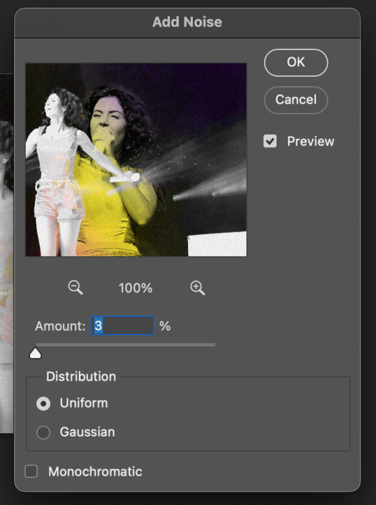
then i go to my timeline panel, click the four lines on the top right, then go to convert frames > flatten frames into clips. wait for it to process, then go back to convert frames then click "convert to frame animation".
once you're in the animation timeline, click the four lines again, then click "make frames into layers". delete the first frame on the timeline (that's your smart object), then change the speed of your frames to .05.
all there's left to do is to make sure your gif is under 10mb and you're done! here is the final gif:

hope this helps! again, if you have any questions, hit up my ask box!
#usergif#completeresources#yeahps#resources#tutorial#uservier#userkarolina#usereste#usermorgan#userives#tuserheidi#usersavana#userpavlova#photoshop#itsphotoshop#myedits#gifs*#i feel honored to be able to make a tutorial!
651 notes
·
View notes
Text

Hello Gif-Makers! Here is a template I made based on the IOS iPod Widget! More info is under the cut.
This template uses two Gifs & Is fully editable (text and color)
This template uses the Video Timeline.
There's a 540x540 Version & a larger version
Any layer marked with an “{E}” is editable!
Here's what it looks like in a 540x540 composition (The smaller gif is 166x166!):

DOWNLOAD (The fonts used are included!)
If you use this, please give me proper credit in your caption! & Tag me too! (#/usersmoon) i’d love to see this in your edits <3
#resources#usergif#template#photoshop resources#myedit*#mygifs#mypost#clubgif#psd#sabrinacarpenter#sabrinacarpenteredit#musicedit#photoshop#ps resources#myedit: resources#usersmoon
36 notes
·
View notes
Text
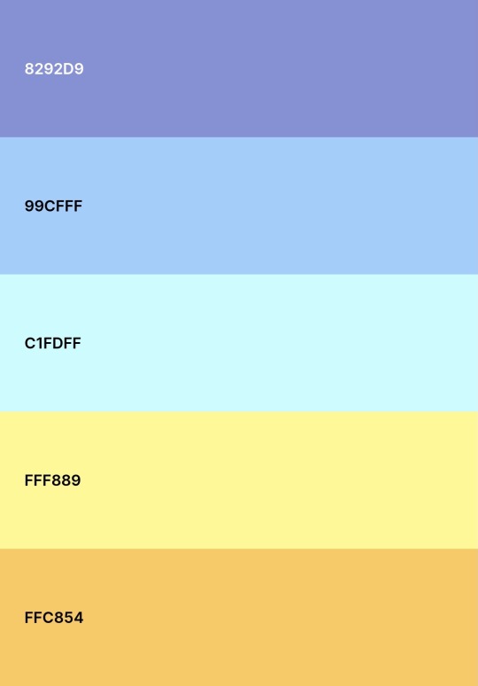
WINTER SUNSET
4 notes
·
View notes
Text
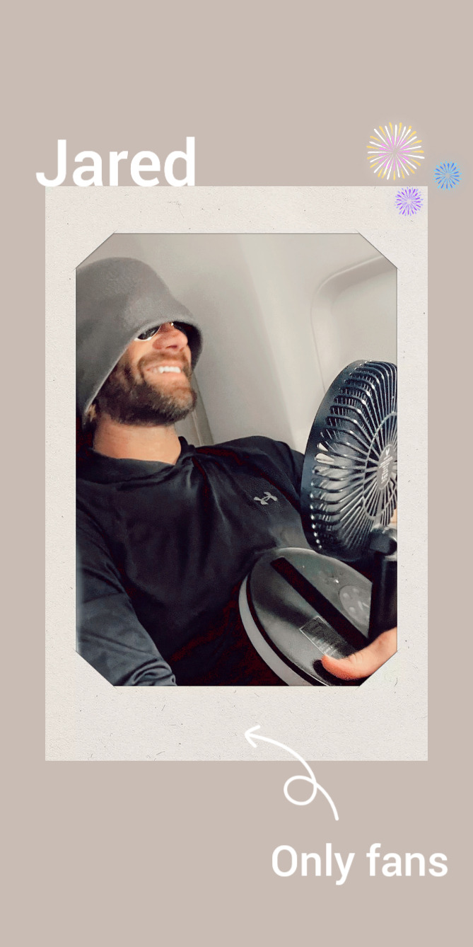
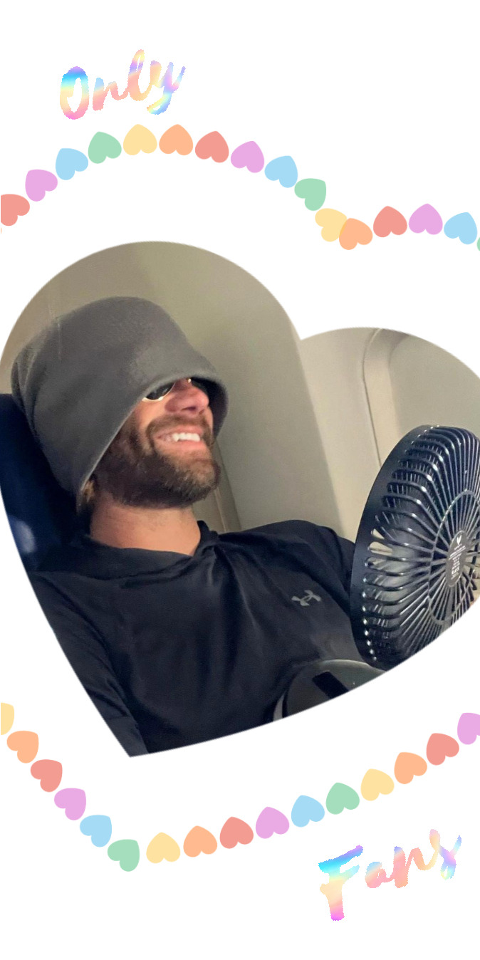
Jared | only fans lockscreens 💋
pls like or reblog if you take
#jared padalecki#jarededit#Jared Padalecki lockscreens#lockscreens#resources#Myedits#my graphics#💋💋💋
93 notes
·
View notes
Text

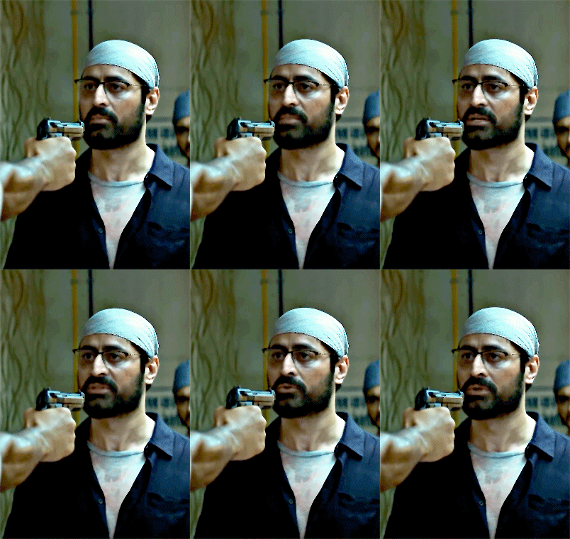
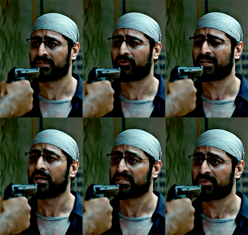

Mohit Raina as Dr.Kaushik Oberoi in Mumbai Diaries 26/11
Hum human body ko dekhte hain, human character ko dekhna hamara kaam nahi.
#mumbai diaries 26/11#mohit raina#dr kaushik oberoi#uff this scene#its my first day of quarantine that's why I am spending my time making mediocre gifts and hoping the next one will be better#I cant believe I have to spend the two last days of ramadan and eid alone#disclaimer : mumbai series is not about the why and how and the political issues regarding the terror attacks#its about the city Mumbai and their people facing a tragedy#and in the middle of it the hospital where the problem of the system are exploited brutally in this horrible night#like in this dr Oberoi says that the death of the police officer did happen bc of the gun fights but he could not be saved#bc lack of resources and money#regarding the pandemic you get a hint of all the work that the medical staff is doing#soo a lot of issues are in these series but also too many#sometimes it felt like the makers are just ticking of the list and it did not felt organic in some scenes#but all the scenes with the three new interns are incredible and I love all of them#if this would be my first day as a intern I would need 5years of vacation#can please somebody watch it so I have someone to talk about it ?#and there was too much Hindi in it#mumbai main itni hindi kaun bolta hai ?#myedit
13 notes
·
View notes
Photo


Taylor Kitsch as Kevin Carter The Bang Bang Club (2010)
#taylor kitsch#taylor kitsch gif#The Bang Bang Club#2010#film#filmtvdaily#dailyfilmtvgifs#filmgifs#movie#moviegifs#dailymenedit#dailymencelebs#movieedit#filmedit#roleplay resources#roleplay gifs#2010s movie#mygifs#myedit#mine#tiedyedragons
23 notes
·
View notes