#my very unhelpful art tips
Explore tagged Tumblr posts
Note
I have a really random question, so sorry for bothering you in advance! But some of your recent art had this effect (the lines are... I dunno kinda burnt in?) that I really like, but for the life of me can't figure out how it's done. It's especially visible in Dew transition angst and with the kit bath time.
So, my problem is I’m very illiterate with using colors effectively. I use Clip Studio Paint for my drawing, and there are a series of actions I take to create certain effects; unfortunately, that means I don’t really know what all effects I’m using. I really have no idea what I’m doing. I know I adjust my HSL levels, I adjust line weight, I add some blurring, I use a lot of color dodge and color burn…….. I really don’t know what I’m doing. I just do a bunch of stuff until it looks less shitty. A difficult feat, cause it’s always shitty. I just tend to forget what all I do.

Sorry if this wasn’t helpful, Anon��
#the band ghost#ghost#ghost fanart#the band ghost fanart#nameless ghouls#air ghoul#earth ghoul#domestic earth air and kit#era ii ghouls#era 2 ghouls#my very unhelpful art tips#i am the worst option for art advice
84 notes
·
View notes
Note
I absolutely love your Rimworld saga, I've always wanted to do something like it for one of my colonies but I'm a better writer than I am an artist. Any tips for someone not used to drawing people?
Thank you for the great stories and adorable artwork 💕
Ah, thank you so much!! I'm glad you like the Rimworld stuff, I really love making it, and I'm happy it seems to have found an audience that enjoys it.
As for art tips, here are three things I always try to remember when I'm drawing:
1. It's okay to use references!
I see a lot of people worried about art theft, tracing, and stealing, which are important issues to keep in mind. No artist wants their work stolen, and nobody wants to be accused of tracing or things like that. Certainly valid concerns for all parties.
However, I've noticed that a lot of people avoid using references because of those concerns. It's alright to use references for your artwork! You can and should look for references to practice with. It's not easy to make up every single pose from nothing, but I've seen a lot of artists give up because they can't figure poses out without looking up references, and they feel like that means they're not real artists.
I'm partial to stock photos personally. There are stock photos for every conceivable situation. Behold, one I used just yesterday:
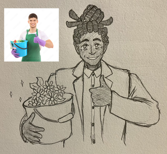
References are good and definitely okay to use. Use them a lot! They're a wonderful way to practice, and it's much easier to make up your own poses and draw people once you're used to drawing the human form from your references.
2. Don't be afraid to be silly!
Not every piece of art needs to be a serious and carefully thought-out commentary on the nature of humanity or society or things like that. Not every piece of art needs to be beautiful, or perfect, or even comprehendible. When I first started drawing art for a Rimworld colony, I was sitting beside my little brother and watching him play. I was doodling pictures of his colonists, and do you know what I ended up with? Nothing deep and meaningful, that's for sure.
I ended up with memes. Memes that are still blu-tacked up where everybody who comes into my house can see them.
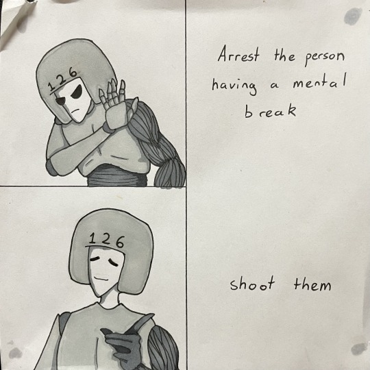
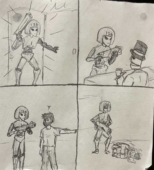
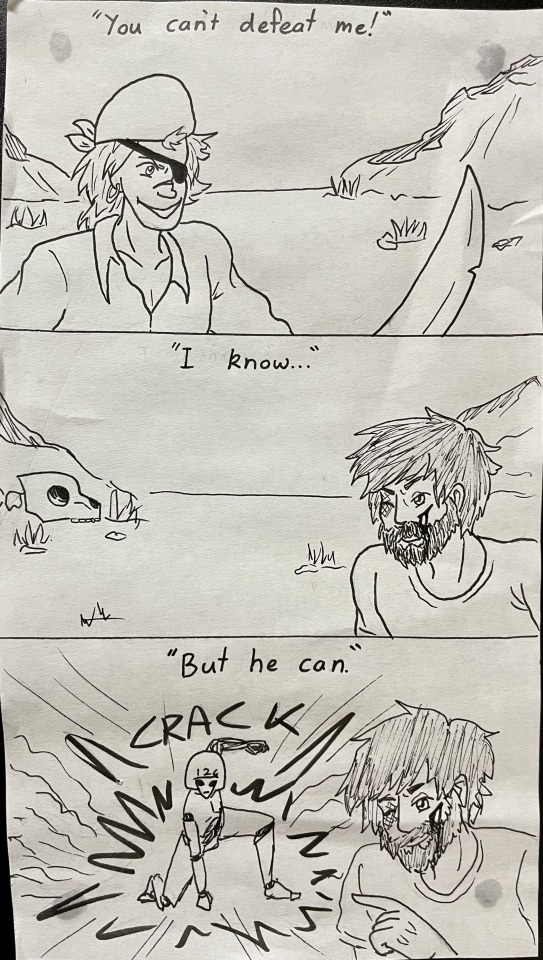
I love them. I had so much fun drawing them. That's the important bit! They're ridiculous, silly, stupid memes, and I love them so much because I loved drawing them. Have fun with your art. Don't make it a chore. Be silly. Let yourself enjoy the act of creating, even if you end up with something dumb. That's the best kind of art.
3. Do so much art! So much of it!
The old saying says practice makes perfect, and it's not entirely wrong. I don't think I have ever met someone who has ever created something and decided it was perfect, no matter how much they practised.
However, the more you practice, the better you will be. I would post pictures of my older art to demonstrate the improvement, but I still haven't quite managed to choke back the gag reflex that comes with seeing the old drawings I have tucked away.
Maybe one day, when I'm braver, I'll show you the wonky caricatures of people I used to draw, and you can see for yourself that the more you make, the better you'll get. For now, though, I shall leave you with a tiny sampling of my sketchbook collection and one (1) spooky boi:
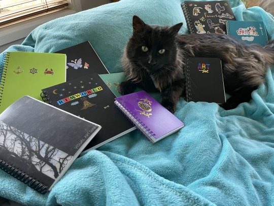
I don't know if any of that was helpful. I'm not much of a teacher, I'm afraid, but I do wish you the best with your artistic endeavours! For what it's worth, I'd read a written story about a Rimworld game just as eagerly as I would absorb pictures of it.
Thank you for your lovely compliments, and I wish you the loveliest of days! 💕
#asks#rimworld#gracie plays#art#my art#traditional art#rimworld art#unpolished art#cat#probably unhelpful art advice#I feel like a proper artist now#People asking me for art tips#Must mean I've done something right XD#I love you so much and I hope you can get something out of this nonsense I've written#If not then I hope you like the cat#He's a good boy and is very soft#have the most beautiful day!! xoxo
12 notes
·
View notes
Text
Hi y'all, I just wanted to talk a little about the behind the scenes of what I've been up to, to give y'all a little transparency and to open myself up for any tips or input! 🙏 Thank you for your continued support and for taking the time to look at my art 🫶
First and foremost I wanted to give some transparency about my art capacity.
As og followers may remember, I started this blog when I was doing art full time. Eventually my living expenses grew and I had to go back to work. I find myself in a cycle of "I'll make more art soon, once I get a job!" And "I'll make more art soon, once I am done with this job!" I lost my most recent job suddenly, having had an extension waved over my head until the last day(October 7th). Now I'm excited to have more time for art, but I am also feeling a rush to get a new job ASAP as I've been living paycheck to paycheck. I dream of doing this work full time, I'm just scared it's not quite there yet and I worry that I come off as scammy or dishonest when I anticipate more stability around the corner.
Second, I've been struggling with the Patreon. It's taken me a while to come to terms with this, but from what I've seen Patreon is not intuitive at all from the creator end. It doesn't do a good job of organizing addresses, emails, showing who or who isn't subscribed to me, or organizing and displaying the work I put on there. I've been really shocked by this experience, since lots of big names use Patreon. It's been a great way to streamline support, but it's been unhelpful in every other regard. I would like to continue using it, but I will most likely post more wips or process videos there in the future.
Which brings me to my third point, zines. I love making zines so much, it feels personal and fulfilling and fun! However the Patreon issues make it harder to keep information in order about where to send zines, or even where to message folks about them. In addition to this, the post office has been a big barrier to me, oftentimes only being open at the same time as my dayjob. Making zines can take days, then sending them out is a whole other monster.
This work is so important to me. Drawing peoples fantasies, representing body types, creating work around sexuality and the human experience feels like what I'm meant to do. I've made comics since I was a kid. This is the dream to me. The friends I've been able to make through this work are so important to me, and the conversations have been invaluable. Not to mention fun! I wanna doodle, I wanna draw hot stuff, I wanna thirst over these dudes! I want to play!
But I also just want to be transparent about the barriers I'm working around to share that experience. I'm completely self taught, both in art AND in running shops, building websites, running 8 accounts, etc. I take a lot of time to learn the logistics of these things, and try to make them make sense for my relationship with y'all (I do not want to paywall my art!! I don't want to!!!). This year my desktop broke down (the main one I use for all paintings and digital art). I've paused my Etsy shops and my Patreon to try to catch up with things. Trying to learn to paint in a completely different program. Then lost my job with no savings.
At the end of the day I don't want anything to come between me sharing my art with you. I wish I could doodle a thing, take a picture, and post it here. No third party site, no shop, no subscription. Just sharing my art with you. I promise I'm trying to figure out how to stay as close to that as possible, and I want to thank y'all for sticking with me as I untangle all of that.
So, what can you expect in the near future?
I'm working on a couple of painting commissions right now, which you should be able to see in the next couple of days! I want to catch up on kinktober and get those posted as well. There's a comic commission in progress which I'm very eager to work on, and which I think y'all will be excited for! To ease the weight of the Patreon I think I may do less zines/polls there and more wips and process videos! If possible, I want to do more full colored work too.
Thank you again for enjoying my work, and if you have any input or tips my inbox is always open 🙏🫶💕
#long post#info#marco lore#i wish i had time to edit this and make it nice#i just wanted to be open with yall about how much work this takes and that im trying to make it more doable#i don't want to overpromise stuff with patreon or shops and if im late sending stuff i never ever want it to come off as intentional or mali#malicious or as a scam#im just trying very hard to like ...survive. financially. and then trying to make all the logistics of thos big machine work. and then keep#up with commissions and shops and printing and mailing#god i wish i had employees but jts just me#i hand draw everything and then post it here to the word press to the ig and crop and caption and tag#then to the Patreon if it makes sense to or to the tiktok back in the day#and the formatting is all different#and i get messages across all of these platforms and I'm trying to learn a new way of painting on the fly#on top of that im supposed to be running my two Etsy shops too which im not right now because..broadly gestures#my nervous system can only take losing a job so often. the rug was really pulled feom under me in this one. i thought id have more time#i don't want to sound like I'm whining and i don't want to give up on all of this#i want to be very very very clear that art is what i love and who i am and what i want to do#i want to be posting on the daily again#i just need to evaluate what that looks like everytime life changes#I'm seriously so grateful for those of y'all that have joined the Patreon or bought stuff from the shop i really don't mean to drop the ball#so many times#y'all have literally been the difference between me making rent or not and I'm so worried that i don't make enough art to give back to that#relationship#im trying my best#okay anyways im posting this
18 notes
·
View notes
Note
Your art gives me LIFEEE and uhmuehhh any tips on fluid and more dynamic poses when drawing :3?
Wow! Thank you so much!! Oh boy, this is gonna be a shortened answer of a very long explanation that I'm not equipped to answer (but I will try!)

Besides the general: get better at anatomy, I like to consider 5 elements when I draw. One thing is practicing on paper, drawing with the wrist, always trying to look for an interesting line. Whenever I record a speed paint, the poses are constantly changing. 1. Organic flow: I think that symmetry can be effective for a piece, but the human body is organic. Our anatomy isn't symmetrical, veins, leaves, flowers all have this flow that doesn't feel still. I know this is a very vague explanation. I'd suggest figure drawing resources like Proko and Michael Hampton for fundamentals. Besides anatomy, I like to add this flourish in elements on hair, clothes, etc:

2. Size hierarchy: This one is very unhelpful. There's this design element about hierarchy that applies to anatomy and dynamic poses in terms of shape language and uh perspectives. I call it the cake tier method. I find the first row of shapes more interesting than the second. I'm so sorry if this makes no sense.

3. S and C curves: You can refer to a bunch of anatomy resources for this. I also try and consider the character and their energy. Where is it coming from? Their head, their chest, what are they doing in the scene and I try and visualize movement over anatomical accuracy at times.
4. Point of interest:

I'm gonna use this drawing as another example. I like to think of triangles or shapes that lead the viewer that isn't horizontal all the way. Somethings happening even if they're sitting or standing, a hand or head is tilted, something! I think this Jared picture could have been stronger with more extreme foreshortening.
5. Observation: The very VERY boring one. Just...observing people. Looking at references or posing for them. I personally think that my character poses are limited and too pose-y, less life like than I want it to be. The best way to break free from rules, anatomy accuracy and its confines is to draw characters interacting. Comics are great for that, but it takes an exceedingly huge amount of time and brain power if you're not used to it (I'm extremely rusty). You also don't have to observe from life, but observe from artists you enjoy. What about their drawing feels dynamic? This is probably not helpful. I'm sorry! I wish I had a billion hours to answer more concisely. It's been a long time since I gave any art advice.
10 notes
·
View notes
Note
oughhhh ur writing is so good!! and ur art!!! do u have any tips on how to improve writings? i feel like my fics ive written are very bland...if u have a process im very curious to hear what it is too!
thank you so much!! ;w; first of all, your fics probably seem bland to you because you were the one who wrote them -- you got used to the plot and prose, and maybe get caught up in the technical aspects of what to tweak/improve, so much so that the 'magic' of reading becomes lost. have a little faith in yoruself! when it comes to general writing advice, it will probably be super unhelpful and something you've heard before but: writing a lot helps. it doesn't have to be good/finished/"publishable," it's about getting words down on a page. i write between 100k and 300k words a year. most of them are utter garbage or ideas that don't go anywhere, but that's kind of the point, to get into the habit of not agonizing over it. the other unhelpful and generic piece of advice i have is to read/watch media criticism -- i know it won't work for everybody, but for me, seeing why something works or doesn't work in a piece of media helps with knowing how to "steal it" and include it in my own writing. if i may be pretentious about my own writing, cicadas leans heavily on everything i had to read on horror/the gothic and weird fiction as a genre -- seeing the elements of why these genres are successful in evoking discomfort/fear and what techinques they use in plain language makes it easier to put in plot points/descriptions that mimic it (for example, disrupted/stretchy/unverifiable time to get a confused, fever-dream atmosphere).
when it comes to the process itself, i highly recommend a beta reader/friend to bounce ideas off of. they don't have to be super familiar with the original media (hi @nullians who bravely soldiered on despite not liking these guys, i owe you my life) -- it's about whether the ideas you have translate onto the page. i would usually ask for a creepiness rating on a scale of 1-10 and whether certain parts were too short/dragged on too long and then adjusted accordingly. the other thing is an outline. my outlines are notoriously shitty, no matter if it's fanfic/ original fiction/non-fiction, so i'm perhaps not to be the best person to be getting advice from on the technical aspects. but to me, it's helpful to have both the crucial plot points and the "mood" i want in a given segment/chapter. it's so i don't forget where i was going with it after a few weeks, so i can see if the bare bones of the story work without being 'pretty', and lastly, to see if the pacing works. it helps to have an 'objective' to hit within a given segment so i don't get off track and spiral into talking about something that's only tangentially related but really, doesn't contribute much to the 'goal' (if you end up with these bits, save them! i have a dumping grounds document where all the rejects go to save me when i'm stuck)
anyways, this got VERY long, but i hope it's at least somewhat helpful!! and again, thank you so much, it's so nice to hear ;w;
#asks#mycrumbs#heliojip#<3333#off-main body bc i think it's probably the least helpful thing i could say:#i have been told my writing process (no matter for what) is batshit insane#these yearly wordcount goals are not realistic unless you're a chronically online shut-in who has a spotty employment history#i am also biased when it comes to reading criticism#i don't think it's necessary but i have the kind of brain disease where it passes for entertainment for me#there's a billion other ways to do it without having to read dry texts. im just doing it anyways so i might as well use it
10 notes
·
View notes
Note
Bonjour! I'm a big fan and your art inspires me so much. I'm currently learning French to communicate with my friends, do you happen to have any tips on learning another language? I'd love some advice. ^_^

Bonjour bonjour ! Thank you for gracing my inbox with such a cute little Time, I adore him 🤩
And I'm glad I can inspire you!!
About your question I don't really have unique advice on learning another language, I guess you're asking me because I happen to be French? ^^
I'd say find lessons to learn the basics first, and maybe use an app or something to learn vocabulary (I did that for Japanese a few years ago and quiz apps make things a lot easier and fun! I'm still a beginner though, I don't have enough time but I'd love to start again). There's an app called Anki that lets you create your own quiz cards to test yourself with, or you can download pre-made decks (search for "Anki French decks" and you'll find what you need). I've used Anki a lot for studying, I love it!
Once you're comfortable enough start having basic conversations with your friends, and you can also try watching the French version of a movie you know well (or I don't know... try playing a LoZ game in French for example haha). If you already know the dialogues it can help! Maybe you can also listen to French youtubers that share your interests? I'm sure you'll find lessons from native speakers on Youtube too :)
And then of course consume French media, read in French, listen to French music... That's how I learnt English for the most part, I didn't really try (and the language classes we get in French school are really unhelpful). But I guess it's much easier with English cause it's everywhere and very much needed to get involved in fandom stuff online.
(Also be careful about comments from French users on social networks, sadly a lot of us make a lot of spelling or grammar mistakes so don't trust everything you read... I don't see the same thing happening in the same proportions with English speakers, I guess French is hard for natives too).
And lastly, we're always pleased and impressed when a foreigner bothers to learn our language, even if it's just a few sentences, and you don't need to speak flawlessly to be understood! French can be hard but don't put too much pressure on yourself ^^
I'm not sure this was very helpful, but I tried haha. Good luck with your learning and I hope you'll enjoy speaking French!
Passe une belle journée :))
34 notes
·
View notes
Note
I know youve been asked this a million and a half times, but do you have any tips on how to grow a channel?
im guessing you’re probably talking about my YouTube because i have like 70k on there and like 200 followers here so 😭
so, the way I did it was mainly through consistent uploads (like daily) of shorts. YouTube was trying (and I assume still is) to get shorts to be more popular, so they push those videos more than main channel stuff, and because I was doing it daily, that helped. However, I kind of don’t recommend do this(?) it might get you subscribers more easily, but it’s not a very sustainable base. For example, I make animatics to songs every couple months that I upload as non shorts, and I feel lucky if those videos get 4k views at all (4k views is still good, but if you have 70k subs, thats not even 5% of your audience). I also kinda got a bit of burn out from uploading everyday, mixed with entering 10th grade which is much more difficult than 9th for me, I’m highkey dying over here— 💀
It’s also a little annoying for me because I’d like to think of myself as a character designer/concept artists, but the thing that got me subs is just stupid little doodles 😭
The upside to that is that at least my community tab posts get a little more attention, so if I uploaded finished art to instagram, it would be a lot for me to get 40 likes, but if I upload to the YouTube community tab, I’ll probably get around 1k likes!! So that’s nice
For tumblr and Pinterest ive found that fandom stuff kinda gets more engagement than OC, but that could just be for me, it might be completely different for you
I’m sorry if this is really unhelpful because im basically like “yeah this what i did but don’t do that because you’ll end up hating it” 💀💀
14 notes
·
View notes
Note
Hello! I hope you're well ^^ um.. May I ask as a brand new starting artist, could you give any insight or tips that helped you learn to draw?
Ok I've been drawing for basically my entire life so it's kinda hard to come up with specific advice to help people who are starting out later in life, but here's some that I think will help any artist, new or not. It's a long list so hit the keep reading tab if you're interested in my art advice ramblings.
Draw what you like, and when it doesn't look as good as you want, keep drawing it until you're able to mentally break it down into its basic shapes and improve the form of the drawing.
If you need even more basic skills maybe focus on drawing just the basic shapes first until you can get them consistent! Cubes, Cylinders, Circles/Spheres are all the building blocks of most art (especially character art) so it's important to be able to draw those 3D shapes at different angles and perspectives accurately if you want to be able to do the same with characters and their proportions.
Use references to learn. Look directly at the things you want to draw when learning to draw them. Even trace stuff, so long as you credit what you traced from if you're posting it online. It can open your eyes to stuff you wouldn't think of just by drawing from memory.
Don't get discouraged if your art doesn't look "good enough" after drawing for a few months or even years. Everyone learns at different rates and it takes a very large amount of effort to get "good" at art (even though that shouldn't necessarily be your final goal)
Draw for FUN. The "draw every day" advice only works until you burn out, which will happen much quicker if you're drawing every day. Take it from me, a person who has drawn almost every day when physically possible since they were able to pick up a pencil. Don't get caught up in engagement or social media popularity either. It will just make drawing feel like a slog trying to chase a very very fleeting goal that is more often than not, almost completely unrelated to your skill level and more so luck. I didn't start posting my art online until I had already been drawing for like 14 years (not saying you have to wait that long, just that the internet is cruel and often unhelpful for new artists' mental states)
Just remember you have to start off bad at art in order to get good at it. And it takes time. A lot of time. It's *never* a lost cause at any point. So many people give up before they've even given themselves the chance to improve.
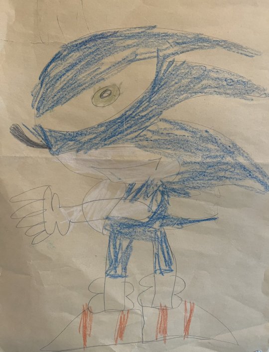

Hope that was helpful and I wish all new artists the best of luck!
103 notes
·
View notes
Note
I am an aspiring author, but I don't have much writing experience. I'm in the process of writing my first graphic novel, which I plan to illustrate as well. I find it hard to put my ideas into words. Do you have any tips? Also, would you say writing fanfiction has helped you become a better writer?
also
hi
i love you
Hey!
I think my biggest tip is to just write, which I know is supremely unhelpful and is akin to saying 'just draw' but it really does help. It doesn't have to be good, it doesn't have to be anything you plan to publish, you just need to find something you enjoy and get words down.
On top of that, I find watching movies to be a really good way of learning to write. I know that might sound weird but it worked out really well for me. You can learn to see the way a plot is formed in a much shorter, simpler example than reading it in a novel, which can then be applied to writing stories/novels/comics etc.
Find a genre you like and stick with it. Absorb as much of it as you can, learn tropes and gimmicks and styles. Learn how people really talk to each other (clue: it isn't zany one liners every five minutes!) and form relationships. Watch things you don't really get and watch things you love. You can learn a lot from both.
My partner jokes that I've been in film school for 10 years because literally ALL I do is watch and analyse films. I never even realised that that was what I doing. I started watching them more intensely when I was kicked out of home as a kid. I had a lot of free time as someone unemployed, mentally ill and lonely, and using that medium helped me create coherent stories in my head for when I wanted to daydream (which I did and still do a LOT). I've written stories since I was like 12 but they never had much structure until I started to subconsciously study examples. I will watch 4 or 5 movies back to back (you don't have to do this by the way, I just like doing it lol) and absorb them. I find that to be much easier in comparison to trying to dissect a long novel that requires a lot of focus in differing areas. Films are just simplified novels.
I do honestly believe that fanfiction is the gateway drug to professional writing and there are plenty of very popular publish pro authors who can prove that. Fanfic is super beneficial, both if you read it and if you write it. It isn't any less valid just because it's fanfiction and anyone who tells you it is is probably very bitter and devoid of joy. I think it's like learning to draw because people often start out wanting to draw their fav characters; it encourages you to work hard because you derive joy from it and that passion is what keeps you going. So if the only thing that inspires you is wanting to write yourself into your favourite piece of media then do it! Create the art you want to see in the world.
And don't be afraid of collaboration. If you have friends/can make friends with people who like the same stuff as you or might be interested in working on something together, don't be afraid to collaborate.
That doesn't mean that you have to get someone to be a partner in a creation, but just it can be useful to get a fresh set of eyes on a work. Like beta reading. Oftentimes, two heads are better than one and working with another person can really lift the parts in which you might be weaker. We all have them and that's human nature. It's not a fault. Share your work with people!
also.
i love you too :)
6 notes
·
View notes
Note
i'd love to learn more about coco and lime's dynamic... the art you've made of them give me annoying bickering siblings energy (compared to mochi and taffy's more softer sibling energy) and i love it so much LMAOO
ITS TRUE in my mind mochi/taffy give off the "siblings who have to have each others back because the world is cruel and cold" dynamic whereas lime and coco have the "asshole siblings fist fighting to sit in the front seat" dynamic LOL!!!!
but their friendship is honestly very funny (if it can be called that). coco straight up thinks theyre cool. shes like "Oh yeah hes my bro" and throws up a peace sign, meanwhile lime cringes in the distance. between her and oscar, coco is WAY more likely to meddle in limochi moments and lime HATES IT !!!!! he just wants some mochi time, and coco is the one thats usually interrupting and/or stealing mochi away for some girl time. HOWEVER coco also then has the Inside Scoop on mochi, so he has no choice but to consult her. as a result, coco is one of the only two people (the other being oscar) that lime actually talks to about mochi (his options are garbage. 50/50 chance that oscar will use the newly acquired information to fuck with you, and coco uses it as blackmail)
i think lime would get along with her more if she didnt meddle in the mochi affairs so much. shes the one thats more likely to try and play matchmaker, and lime wants to kill her every other episode. he just wants Something To Develop(tm) with mochi naturally and casually without coco over there kicking his shin every time mochi mentions shes going to buy snacks or something. "First of all," he aggressively and quietly whispers, "I was gonna buy her snacks anyway, and second you don't have to kick me every fucking time mochi does something!"
as a result, from mochis pov, she'll be talking about something and all of a sudden lime and coco start fucking fighting in the middle of the classroom. coco kicks him and he throws fruit juice on her and it starts a whole thing. mochi doesnt actually even know what triggers it. (she DOES hang out with stray cats a lot, so she figures they just fight randomly sometimes like the cats do LOL)
another thing is coco is notoriously unhelpful when it comes to mochi. she only gives very obvious and straightforward advice that lime is too much of a coward to do. its like "Easy, just tell her you like her." and lime walks away like "Oh great idea, I cant believe I never thought of that. Thanks for nothing."
also during their high school years, as class president she very much sees him as a money-generating asset. "You see, if we hold a school dance and set up a booth where you pay 10 dollars to dance with Lime, then all the girls will come and pay the entrance fee AND pay the dance fee, and since all the girls will be there all the guys will come too so summing up all of that we have--" and she just rambles off not even paying attention to lime yelling that she cant just sell off his body like that without even asking him (he eventually gets roped into doing it against his will)
and the love-hate friendship is also because shes so annoying, but she does things sometimes which lime is actually greatful, like when she convinced mochi to start wearing the short skirt to school. catch them afterwards with coco being like "Hey hey you see that? What do you think? Where's my thank you? I take cash or card for tip." and lime is head in hands, a mix of extreme gratitude and irritation
(also worth mentioning that from cocos pov, lime is excessively selfish with mochi. shes like "Dude, you walk with her to school everyday. You see her after school EVERY DAY. You SLEEP with her EVERY NIGHT. I can't have ONE AFTERNOON for us to get ice cream??" and lime goes "No. I was gonna take her to do that.")
an equally funny dynamic thrown in: oscar the opportunist ripping the rug out from both of them while theyre fighting all the time. goes and gets mochi ice cream while theyre hashing it out. this actually happens more than once, no one really figured out yet why oscar keeps doing this, but i think its because it serves the dual purpose of 1) fucking with lime and/or coco, and 2) doing something nice for mochi, since he knows shes always stressed out. the main time this little thing of his shows up is when mochi off-handedly mentions that no one asked her to prom/winter ball/some dance. immediately coco kicks lime and they start fighting again, and oscar the opportunist (after giving it a few seconds) goes "Why not go with me?"
(when lime (pissed) asks him what the fuck later on, he goes "Well you were taking too long to ask her, plus half chance you actually gather up the guts to do it. This is our last school dance, and I don't want Mochi to miss out just because you didn't get your shit together fast enough. You'll still see her at the dance, I don't see the big deal.") (oscar is good at forcing limes hand)
#bpp#text#lore#the end turned oscar-centric#but a little quirk about him im not sure i mentioned?#i think he does it to fuck with lime#and hes friends with mochi so it doesnt hurt him#oo long post sorry#the inter-guild dynamics beyond mochi and lime are very cool to me
17 notes
·
View notes
Text
tuesday again 4/25/22
where the fuck were we
listening
Tongue by Rêve. i do not care for this latex aurra sing album art, but this instantly went on the "somebody come fuck this (GAY)" playlist. a fun danceable party bop about oral. other than a concerning line regarding "gamey like venison", what more can you ask for. spotify
Yeah Yeah Yeah by Blood Orchid. starts out with some very straightforward drums and then gets SLUDGY. this makes me want to sing along with the chorus with as much vocal fry as i can manage. i think the band is american, but the pronunciation of "yeah" is something i have only heard from posh brits? i think it works here. spotify
Praising You (feat. Fatboy Slim) by Rita Ora. this is somewhere between a cover and a reimagining? fun if you already know and like the original, fun if you don't. short, peppy, got me through a lot of mopping on saturday. spotify
reading
very long title by susan pinsky. checked this out mostly for any advice on moving, which was limited to two paragraphs that said "get rid of everything possible, the most efficient packing is not always the thing that will get you through a move in one piece, hire people to do everything for you if possible". this was unhelpful to me.
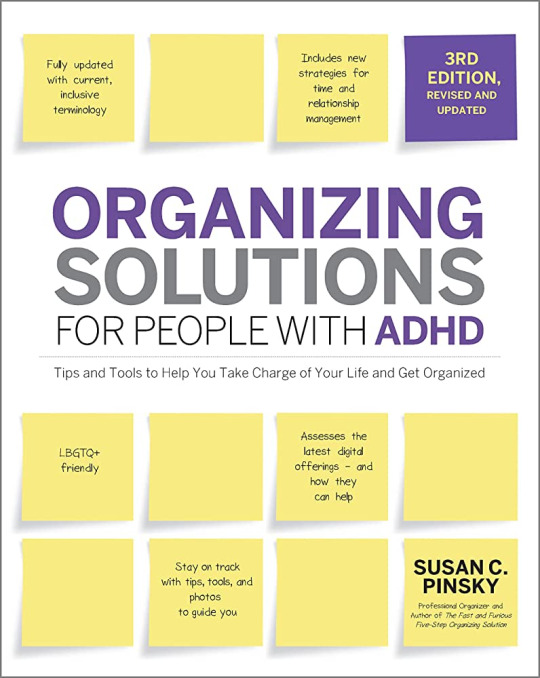
the author is not adhd, but is writing it out of the experience of having an adhd daughter and a ton of clients who probably had adhd. it feels like it is largely geared toward people who have a wife or child with adhd. while the version i read had been updated, it did feel very out of date at several points, especially with regards to calendaring/planning systems and (if possible) forcing everyone to call you at your home phone so you can check your wall calendar that you keep on your wall and not double book yourself. like what.
while i had independently derived some of the specific tips through great trial and error and much of the book simply did not apply to me, it did give some interesting background on why specific things (open storage, clear bins, open shelving, the concept of having one or two shelves free as a staging area in each place you have shelves) work with rather than against us.
i can see this being useful to someone who has recently been diagnosed as an adult, or is managing a family with multiple adhd/otherwise neurodivergent members, but i certainly wouldn't buy it. her big thing is Get The Fuck Rid Of Your Shit while not really providing a lot of pointers on how to go about that, so i could see how pairing this with one of marie kondo's books might be helpful? neither pinsky nor kondo really give a whole lot of advice on like "so you're an adult, here are things adults have in their house to make their lives easier" so perhaps a third unknown book might complete the perfect trilogy. idk man. im cranky her advice about moving was half a page.
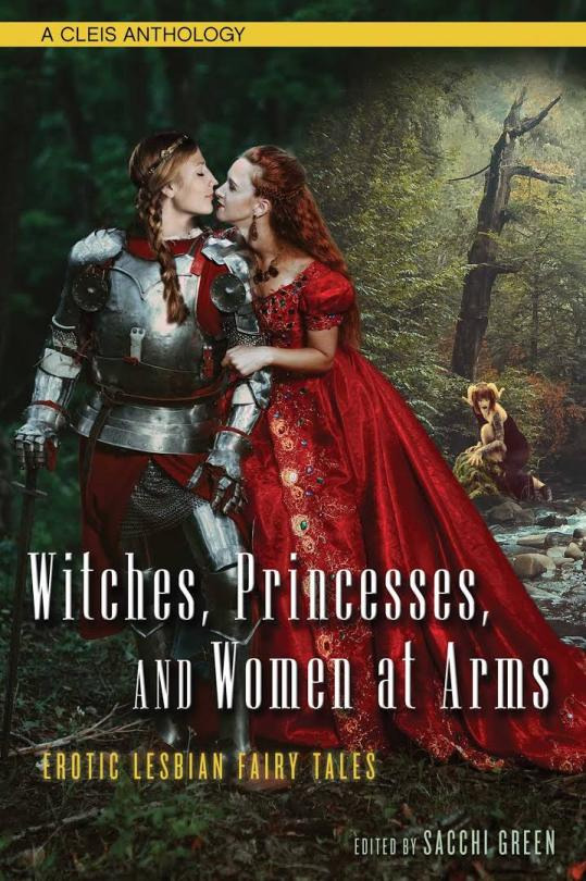
Witches, Princesses, and Women at Arms, a collection of erotic lesbian fairytales edited by Sacchi Green. this was objectively fine. i skipped one completely bc it would have been a fucking hysterical short skit but did NOT translate to the page at all. as is ever the case with anthologies, some of them were decent, some of them not so much, almost none will stick in my brain even though there was some very nice butch representation. the one that does stick in my brain, Woodwitch by M. Birds about a princess trying to break a familial curse re: war, and a witch who follows the army, was memorable more for its leadup and acknowledgement of how a marching army works? like yeah! historically that is how armies move and camp and feed themselves huh, this is surprisingly well-researched for lesbian erotica!
the level of explicit erotica is...sort of on the same level as most modern f/f fic? this came out a good five years ago and people sure are having sex on the page, but there's a lot of metaphor and various other veiled imagery.
unfortunately, i want to read about women gettin absolutely nasty with it. i want to read about a pussy written with the same fervor as the average m/m cock in fanfic.
it's misogyny is what it is.
watching
rewatched For A Few Dollars More (1965, dr. Leone). in my heart he fucked that old man
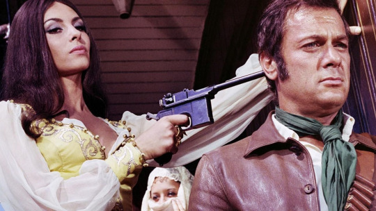
You Can't Win Em All (1970, dir. Collinson) bc a very western-ish screenshot had me absolutely baffled about why a mauser was in a western. this is not a western, this is about some american mercenaries during the 1922 turkish civil war. this is not a very good movie (my main beef is that it spends twenty minutes trying to convince itself why its leads should work together, and the contrivance it lands on isn't particularly compelling or comprehendible after carting through us a whole bunch of other failed inciting incidents). this movie doesn't even manage enjoyably bad, but it sure is a spectacle of a war movie. great calvary columns riding through the prettiest goddamn landscapes you've ever seen. all forms of transportation are covered, including "armored train" and "trio of biplanes". my personal tolerance for exotic travelogue movies is fairly high, yours may not be.
if you want an actual cowboy western with different triple-crossing american mercenaries played by burt lancaster and gary cooper, Vera Cruz (1954, dir. Aldrich) is like a proto-revisionist western? quite a bit darker than i expected for 1) an american western made in 2) 1954
playing
sort of tied in with the making section-- i am deeply unhappy with how much time i am spending with fallou/t 4 bc it is not a game that makes me happy. however, the startup cost to finding a new game that makes me happy is pretty steep. so i spent some time on saturday flinging games into various folders, bc i forgot that was a thing steam lets you do now. maybe a different organizational system will fix me.
do not need to look at again: lots of demos and prologues from my old job, a couple things that aren't on steam anymore, some stuff that came in bundles that i'm not interested in, any strategy games.
done: my time with this game is at an end but i may want to return to a handy list to remind myself of what i have finished. lots of short indie experiences, wolfen/stein the new order, night in the woods, the portals, firewatch, things of this nature
old faithfuls: fnv, fo4, dishonored, sable bc i love simply zooming about.
hard bounce: this is mostly to make myself stop trying to click with hollow knight. i am never going to like fiddly platformers. and that's okay.
try again later: i'm deeply annoyed i'm not clicking with hardspace shipbreaker bc on paper it's the perfect fucking game for me. in practice even after fucking around with all the sensitivities it's still too fiddly for me. i need much, much more forgiving games with a shotgun-close-enough mentality.
making
important moving prep: cleaned out the storage unit that still had the dregs of my last move plus boxes from three grandparents and my mom. this took three full fuckin days bc it was extremely hot, i had to stop to cry a bunch, and a lot of goodwill trips.
the great thing about siblings is that if you've been caretaking a family heirloom that makes you feel weird due to your fractious relationship with the dead person in question, you can foist it off to a sibling who had a completely different less fractious relationship with the dead person in question.
once again i have failed to take a pic of the baby blanket in real daylight but we are slowly chugging along, halfway through repeat 6/10
25 notes
·
View notes
Note
Hi! do you have any advice on looking for/noticing a promising study material and not falling for unhelpful art tips? Ik what I want to improve and study but still catch myself having trouble finding effective and useful content, im afraid of falling for another unpleasant art method and only realize it after a long time
Hey hey, Ohh I have a lot of thoughts on this so I will try to collect them and find the right words. Sorry if this might get longer.
Something important to understand about art tips online is, that they are tips. Never the universal truth. They are posted by artists who are not teachers, but people who draw and found a way that works for themselves. And as many of those art tips are good and might even show important basics, it's based on what the artist knows, what they consider important and what works for them. And, not to forget, what they were able to put into works and what they had time and energy for to put together. They are doing it for free after all!
I'm a self taught artist and a lot of the things I do are not how a classical art education would teach them. I figured out my own ways and found ways and things that work for me. I always try to voice my small art show and tells that way. This is what I do. This is what works for me! It might give a nice insight for others and even help some. But for some it might not. Doesn't mean they are unhelpful! Just that what works for one might not work another.
One of the most controversial art advices is "just draw". And as this is is not always constructive and sure has its flaws I still see a lot of truth in this! I have many young artists ask me things like "how do I draw", "how do I get better". And as learning basics is essential, I feel it's very important to first just draw and explore things. Be free and have fun. Not only does it help to get our muscles going and smooth out our lines and get the whole machine going, but also helps to figure out what we want and what works for us!
You say that you know want to improve and study. This is already great and a very important first step. I would advice to figure out what works for you. Everyone learns differently and has their own approaches. I'm for example are not good with classic studies and book practices. I need to do the thing, draw, look at things and find my own tricks and ways. Puzzle it together myself by drawing the things I like. Studies and where I have to draw what I'm told bore me to death. Others are more technical and need more structure. What works for you?
Either way I would advice to not see internet tutorials as unhelpful, but still be wary of them and not just take everything as word! You can pick your own things together. If you like one thing from a tutorial but the rest doesn't work for you, okay, good, take what you need! Both things together from different tutorials and find out which of them is actual helpful for what you want and need and what works for you. Mix your own ideas into it. Art tips are only that, tips! Take from them what works for you own art method and own style. You know best what works for you. Trust that!
This is me talking from own experiences, but one thing that worked for me is to not look as much as tutorials at all. Rather look at what other artists you like do and try to figure out how they do it or how you could get there. What is something they do you like? Why do you like it and how would this translate this to your style and own art? If you see an artist who does something you like and would like to know you can also ask them how they do it. Again, this will be their way, but this insight might help you to understand how it can be approached and then see how would this work for you. And best is always to ask concrete questions. Not a general "how do I draw" or "how do I get better". This is way too broad and difficult to answer. Size it down to what you actual want to know and ask specifically. Sometimes this can work better than a general art tip.
Of course there are also study books and basic studies collected by people who are art teachers and who have found methods and words that work. Again, not everyone can work with such instructions and books, but for those who can those can be helpful. So if you are someone who works better with methods and constructions it might be worth to find some books and borrow or even buy them and not relying so much on online sources, as those are not filtered and can have everything from good to terrible advice. Or if you found an artist online who shared some helpful things for you, stay there! Find sources and artists you trust and stay with them and don't look too much around for every art tip. Too many might be too much. This is what I mean with not to look at too many tutorials.
All of this is based a lot on own experiences and how I learn. So this might be unhelpful to you too :D or at least take it as one insight and tip only, not the total truth there is.
I wish you all the best on your art journey! And if there is something specific in my art you like and would like to know more about feel free to ask. I can tell you what I do and what works for me :D
67 notes
·
View notes
Text
Tutorial: Making a Gif in Photoshop
(Pinboard of all my Masterposts) (Tutorials Masterpost)
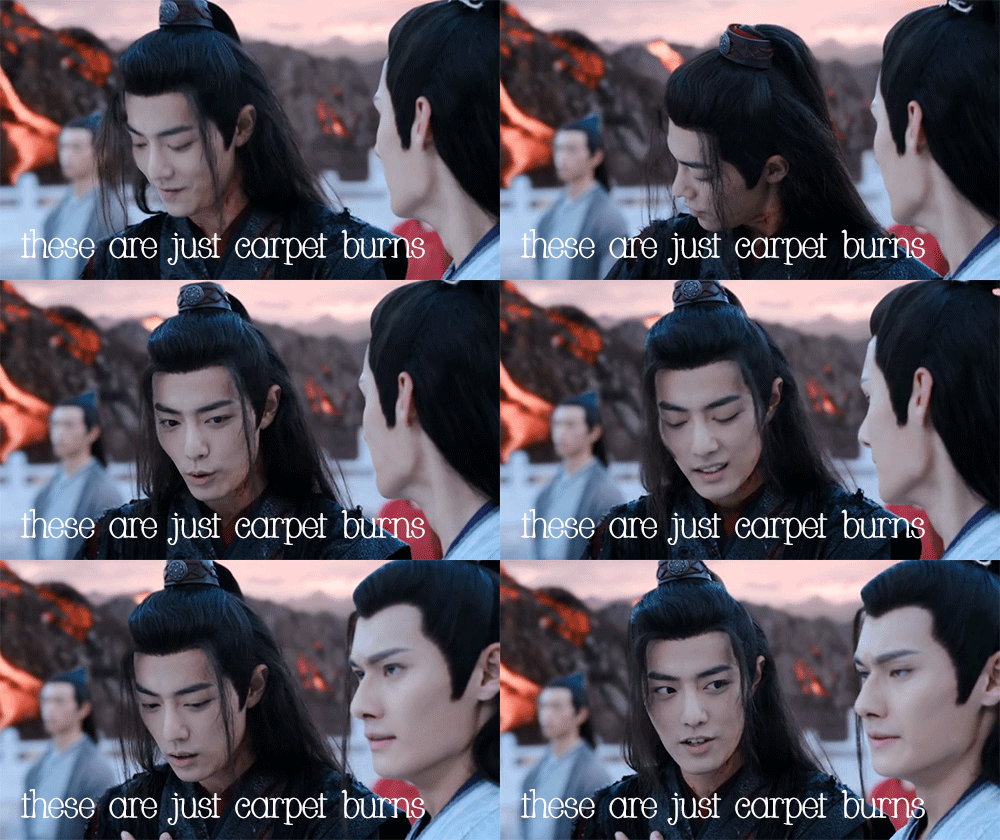
Here’s a beginner’s guide to making gifs in photoshop. I’m going with the assumption that 1. you have Photoshop (I do this in Photoshop CC 2021 at the moment, but this isn’t new functionality, so other recent versions should work similarly.) and 2. You want to be able to upload your gifs on Tumblr.
Note: When I name a menu in bold followed by this arrow thingy --> I am telling you what to select from that menu. If I have two arrow thingies, it’s two menu selections deep. Etc.
Super Basic Stuff
1. Capture a video clip in MP4 format (or another Photoshop-friendly format; I use MP4). There are a lot of ways to do this--google it and you’ll find options.
2. Drag the video clip into your photoshop session.
3. Image Menu-->Image Size-->width 540 pixels, with whatever height the aspect ratio assigns. Tumblr compresses your gifs to 540, so doing it yourself is the best way to avoid icky artifacts. Fun fact: iPad retina displays throw white flashing pixel artifacts that other displays don’t, so you may be making beautiful gifs that secretly look incredibly shitty on an iPad. I learned this the hard way when I got an iPad and looked at some of my posts. I learned the 540px resize tip from the good folks in Tumblr’s pixel art community, which fixes about 95 percent of my gifs. *bows down to pixel artists*
4. File Menu-->Export-->Export for Web. These are my settings.
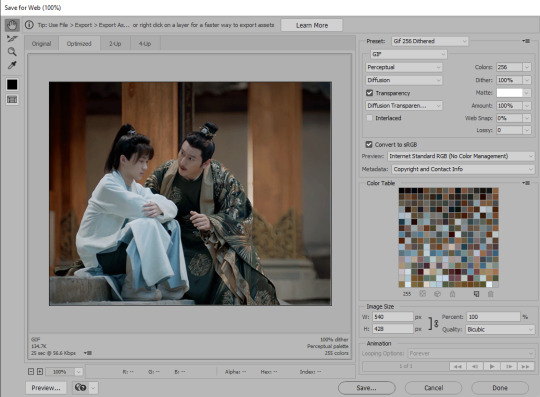
The settings in the top right control the quality of the gif.
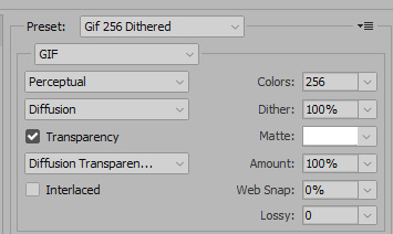
These can be changed around once you get the hang of things, but since this is the super basic version, these are settings I can vouch for. This gets me nice looking gifs without a lot of artifacts. Ignore the preset name; that’s what I call the preset I made for this. On your screen it’ll say “custom” unless you save your own preset. It will remember your settings even if you don’t save a preset.
The size of the gif is at the bottom left. For tumblr, this has to be under 10 meg. UNDER 10 meg, if you make a beautiful gif and save it at 10.0 mb tumblr is very likely to reject it and make you re-save it a few bytes smaller, thanks to rounding.
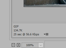
If it’s too big, just cancel and go to step 5.
5. Window menu-->Timeline. In the timeline, you can trim your video by dragging the ends in, or by cutting with the scissors icon and deleting the extra bit. The controls in the timeline are fairly intuitive and limited to just what’s useful unlike premiere pro cough cough.
6. There’s a context menu in the right upper corner of the timeline window. Select that and choose “set timeline frame rate” to speed the whole video up or down. Higher numbers mean more frames overall and a bigger, slower gif. Lower numbers mean fewer frames and smaller, faster gif.
Slightly Less Basic Stuff
(after the cut)
You can convert your video to individual frames by exporting your gif and re-opening the gif, but you’re going to lose quality when you re-save so that’s not ideal. Better is to create a frame animation in the timeline. That has several steps. I’ve recorded an action for it that looks like this:
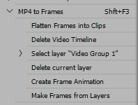
1. Timeline Context Menu-->Convert-->Flatten Frames into Clips. This will make layers out of the individual frames in your timeline video.
2. Timeline Context Menu-->Delete Timeline. This clears the timeline so you can use the layers to make frames.
3. Window Menu-->Layers. Hopefully you already have the layers window open all the time, because it’s a fundamental part of photoshop workflow, but if not, do this to open it.
4. At the bottom of the layers window there is a weird unhelpful video group with a single layer in it, shown in picture. Select it, hit the delete key, and chose “delete group and contents.” Otherwise this will become an annoying blank frame, as I recall.

5. In the middle of the currently-empty timeline window is a button that says “create video timeline” with a dropdown next to it.

Click the dropdown to change the button to “create frame animation,” and then click that. This will create an animation with a single frame.
6. Timeline Context Menu-->Make Frames from Layers. This puts all of your layers into your timeline. Whew! You see why I made an action for these steps.
7. Now you can delete frames from the ends or middle of your animation by selecting them and using the trash can icon on the timeline. Don’t hit “delete” as that will delete the associated layer, potentially, and cause you a headache while you figure out what happened. With a normal aspect ratio for your frame and 540 horizontal pixel width, you should be able to fit around 100 frames into a <10mb gif. It does vary a lot depending on what’s going on in the scene & how much each frame changes from the one before it. And aspect ratio makes a huge difference - big square gifs are beautiful, but can’t fit nearly as many frames into the <10mb limit.
8. If you changed your frame rate and want to introduce a delay between frames, go to Timeline Context Menu-->Select all Frames. This will grab all the frames so you can apply a delay to all of them at once. While they’re selected, choose the delay dropdown from any frame and it will apply to all of them.

If a gif feels like it’s going too fast, I apply a delay of anywhere from 0.04 to 0.07 (using the “other...” option from the dropdown--all of the default delays are too much). That’s when my gif has a frame rate somewhere between 15 and 30 fps. Try some different settings and save the results out. Note: Always check your speed by loading the gif into a draft on Tumblr, since different previewers play things at different speeds, which is super annoying.
9. When you’re satisfied or want to test, repeat step 4 of the Super Basic Stuff section.
Fun with Layers
1. The order of the frames is the opposite of the order of the layers, which doesn’t matter for basic stuff, but when you start messing with adding text, layer effects, etc, this will definitely matter. You can reverse the order of the layers by selecting all of them in the layers window (NOT the frames in the timeline), and then: Layer Menu --> Arrange --> Reverse.
2. To put text on top of the whole sequence, choose the top layer in your layer window and click “text” to add your text. You can change your font, color, and size as much as you want, but you can’t drag your text around after you create it because it will (usually) only move on the current frame. So if you don’t like where it ends up, delete the text layer and try again. I usually keep text centered and add spaces to either end to put it where I want it.
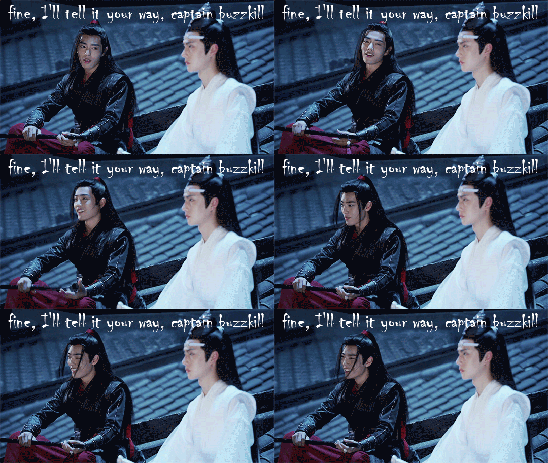
3. To add text in the middle of the sequence, use the timeline to select the frame where you want the text to appear. Then go look at the layers stack; scroll up and down until you see the visible/selected layer. This corresponds to your current frame. Stick your text layer on top of that layer and -- if your arranged your frame order correctly in step 1 -- the text should appear part way through your sequence. For this gif, each “eye contact” is a separate text layer placed a little further down the layer stack.

4. To make text disappear partway through an animation, go to the timeline and select all the frames where you DON’T want the text. Keep them selected, go to your text layer in the layers menu, and hit the eyeball to make it invisible. That should make it invisible just for the selected frames. For this gif, I put all the text layers at the top but changed the visibility for each one to limit it to a particular set of frames.
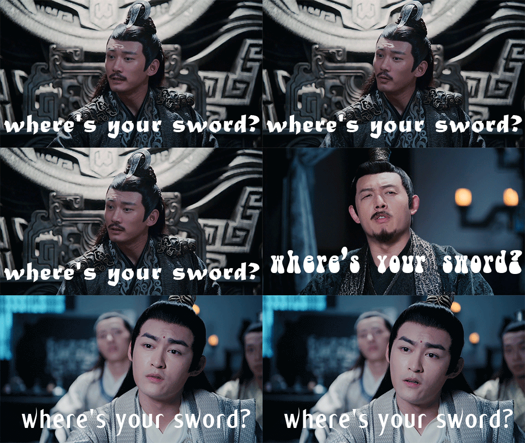
5. To change the brightness of your gifs, select your top layer and go to Layers Menu -->New Adjustment Layer-->Brightness/Contrast. Adjustment layers let you make non-destructive modifications, and they affect all the layers below them so you can change the whole gif at one time.
6. To change the color balance, I like to use: Layers Menu -->New Adjustment Layer-->Selective Color. Within the Selective Color controls, choose “neutrals” and give it some tweaks. As you get the hang of it, you can do a lot more with this, but basic adjustments to the neutrals setting will make a big difference.
7. I use the BW adjustment layer to make black & white gifs - it has more options than simply desaturating - and I use a levels adjustment layer for more nuanced contrast changes than you get with brightness contrast. Hue/Saturation is good for resaturating flashback scenes.
8. Any time you like the effect of an adjustment layer, save it (or a group of them) to a new document by going to the Layers Context Menu-->Duplicate Layers and then choose “New document” in the dialog window. Save your new doc, which will just be the adjustment layer(s). Then you can use these layers on other gifs, rather than constantly recreating your tweaks. When you’re giffing a whole show like I am, you find yourself making the same adjustments over and over anyway, so this is a time saver.
All right, that’s all for now! Other tutorials are linked up at my Tutorials Masterpost. It’s small but it’s growing!
124 notes
·
View notes
Note
i love your art so much! do you have an tips on how you pick your colors?
right now, there's a free-to-read unlocked post on my patreon that links to all the recent art tips ive given. there's one post linked there where i talk about limited palettes + color theory in general, and another one where I talk about color thumbnailing, which is all the advice i have at the moment regarding color
HOWEVER i am seeking to put out more carefully written and in-depth tutorials rather than just answering tumblr asks with whatever offhand advice i have at the moment. to that end i have a google form up (linked on the same patreon post) that's asking people what sort of art advice they want to see from there.
i'm very happy to talk about and share any advice i have, but to be frank there's no way for me to talk about a lot of stuff shortform that isn't grossly reductive and potentially unhelpful. if there's anything specific you - or anyone else - would like to hear about from me, i'd love if you wouldn't mind just filling out that little interest form for me.
#how i pick my colors is a double edged sword of a question because#the real answer is 'i just kind of go hog and toss colors onto there until i decide it looks right'#and i'm only really able to do that because i've done a LOT of color experimenting#so the thing i actually would need to tell other people is a condensed version of ten years of experimenting#which im happy to do and i want to do. but i want to do it right
44 notes
·
View notes
Note
2014
Oooh thanks friend!!
In the winter of 2014, I got my car stuck 3 times in the snow before my father caved and bought me the winter tires that I couldn't really afford on my barely-above-minimum-wage group home job. It was my first winter with my own car, and my first winter driving stick shift in the snow, and my hometown doesn't plow their streets very well. I got extremely good at performing a rolling stop so I wouldn't get stuck at every stop sign, but never quite mastered the art of 'how to drive through an unplowed parking lot from a stand-still.' (Not then, at least. Nearly a decade later it's much easier.)
My dad had to come and rescue me twice, by either driving my car out of the spot itself, or by towing my car out with chains he bought specifically in the name of rescuing me. A kind stranger pushed me out of a parking lot the third time. Notably, because my hometown is small, the same gentleman that was present and giving me unhelpful tips when my dad first got me unstuck was also present when he had to tow me out, in a totally different part of town. Ah, fun times.
The chains still live in my trunk, even though it's a different car now.
Thanks for the ask!! For the curious, send me a year and I'll give you a personal fact about me from that time!
#ask game#about me#rambling#canadian things#snow is hard to drive in y'all#but at least it was good practice??#rip my dignity when driving that year tho
5 notes
·
View notes
Text
Art Advice #7 - How to draw a face (the basics)
Hi all!
This week, as part of my Art Advice Tag, I’ll be giving some advice on how to draw faces!
A note is that this is not going to be a tutorial, but instead a guide on how to learn how to draw a face! I personally find that tutorials aren’t super useful, not to mention that there are thousands of tutorials on drawing already out there. So whether you want to be able to design your own characters, ... or just want to give your stick figures faces, I’m hoping this blog post can help you get on your way to drawing faces!
How to draw a face (the basics) ~
Part 1 - Dreaded Proportions
I think most artists will tell you that proportions are the banes of their existence.
And although I don’t think you necessarily need to stick to them religiously (and it’s important to note that real faces rarely stick to proportions religiously either), I think it is important to have an understanding of them if you want to start drawing faces!

(this is a very basic sketch I did by the way, a quick google will give you versions of this diagram that are a lot more detailed & accurate lol!)
This image shows the general places on a face where features normally sit. So, eyes halfway down the head, corners of the mouth match up with the pupils when staring straight ahead, five eyes can fit between each side of the head, bottom of the nose lies halfway between the eyes and chin, etc.
Top tip! Try not to confuse the top of the head to the hairline, as this can often make a face look too long!
Of course, this becomes more complicated when you want to draw a face from another angle (which I won’t go into for this post).
Face shape, eye size, nose size, etc, can also affect how you approach these rules. So use these proportions more as a guide than anything to follow religiously!
Part 2 - Face Shape
A lot of artists, myself included, gets caught in the ‘same face’ syndrome. Which is basically when all your characters and people you draw end up looking suspiciously alike. (Don’t feel too bad about this, by the way, since even big companies like Disney suffer from this lol!)
A way to prevent this is to diversify your face shapes.

These are a few quick examples, and my biggest piece of advice for this is to practise drawing as wide a range of faces as you can! Pick people of various races, sizes, genders, etc!
This can be as simple as drawing people around you too, friends, family, colleagues, even yourself!
Part 3 - Eyes
Similar to the last point, practising drawing a wide variety of eyes (differing in shape, colour, size, etc) will help you get a better grasp on how to draw them.
Some more specific advise for this would be to map out where the actual eyeball is. This way, you’ll be able to figure out more effectively where to put things like the tear duct!
Another thing to remember is the position of the pupil and iris, which can greatly impact the expression you’re going for. So, exposing more of the whites of the eye will make someone look scared/shocked, whereas less of the iris & pupil visible will look suspicious/shifty.

The image above is a few examples of how to sketch eyes & what to look out for when you’re doing your own drawings!
A final few things I want to comment on here is the position of eyelids, which can also greatly change the overall expression of a character. Eyelids differ from person to person, and can range from double, mono, hooded, deepset, etc. And as with all I’m talking about here, how the eyelid crease looks will change depending on the angle of the face.
Part 4 - Nose
Noses are pretty confusing, if I’m being honest.
One thing I remember learning from school was to use three circles to make up a forward facing nose. A bigger circle for the tip of the nose, and the a smaller one either side for the nostrils. This can help you to get an idea of how big you want your nose to be (and to check it fits with the proportions of the rest of the face).
This method can also help to figure out the specific shape of the nose you want to draw. Placing the central circle lower than the other 2 will give the illusion of a bigger nose, whereas if it’s higher then it would look more like an upturned nose. Just have fun and play around with giving your noses interesting bridges and various sized nostrils, etc!
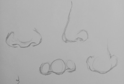
These are a few examples, but there are honestly endless combinations of noses you can experiment with!
Part 5 - Mouth
The first piece of advice I’d give you for drawing mouths, is to draw them in conjunction with the nose. Use the bit between the nose and mouth (which I just found out is called the philtrum lol) as a guide on how big or what shape to do the cupids bow as.
I’d also recommend starting with the corners of the mouth, and then connecting them to for the middle of the mouth. This can help you get an understanding of what kind of expression you want (it often only takes a slight curl of the corner of the mouth in order to create some subtle change in feeling of the character).
And something that I often do, is creating a subtle almost M shape for the centre of the mouth (think almost of a turtles mouth, but less extreme). This can give the lips more of a sense of 3 dimensionality than a simple line.
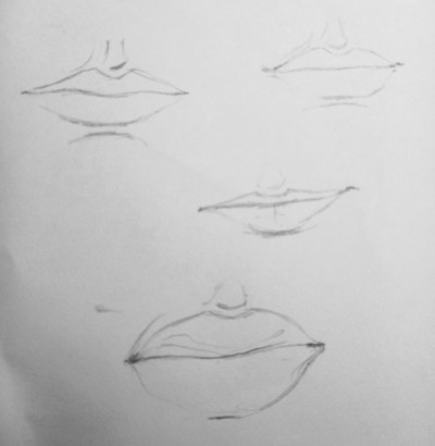
These are just some examples of how I draw lips with no references as a guide. Another point I would suggest is to include the shadow of the lips on the chin, which can also help you to map out the size and shape of the chin itself.
I feel it’s important to note that I’ve only including hints for closed, mostly neutral, expressions. So if you want me to do another blog post talking about expressions (like how to draw smiles, or other open-mouthed expressions) then let me know!
Part 6 - Ears
I’ll admit that ears are not my strong suit, so there isn’t a tonne of advice I can offer here. (I once had an hour long breakdown over how bad my paintings and drawings of ears are lol... I wish I was kidding but I’m not pfft)...

This is a very... unhelpful image lol...
My main advice is to just... look at ears lol... Hopefully you’ll have better luck with them then me!
~
These were all very basic tips for drawing faces, and there were a lot of things that I wasn’t able to go into here, so if anyone wants me to do a more in-depth look into certain aspects (for example, specific features) then just let me know!
As always, I really appreciate everyone who reblogs/likes these posts! <3
#art advice#how to draw a face#art tips#art advice for beginners#artist advice#drawing guide#drawing faces#faces#tutorial#(it's not a tutorial but... shh)#btw to anyone who's ever replied or left nice tags in these posts i wanna say a massive thank you!!!#it's rly heartwarming to know that people have actually found my advice useful lol!!!!!!
66 notes
·
View notes