#my sketching and my rendering style used to look so so different
Explore tagged Tumblr posts
Text

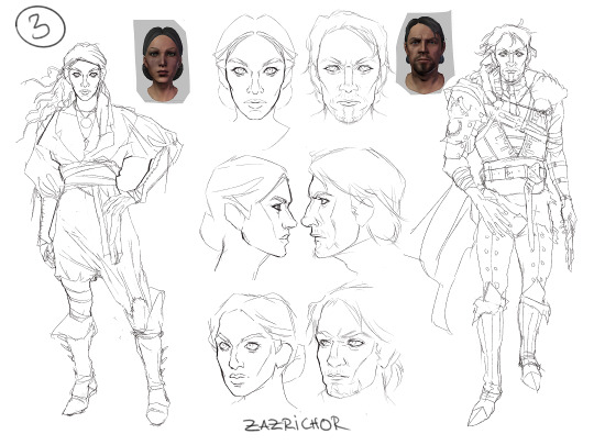


Concept process for my DABB contribution!
(1) I started with some PotC studies, followed by (2) some rough thumbnails. I did a few headshots to get a feel for both of their faces in (3). Afterwards I doodled their getups that were just for fun. I worked on their actual designs in (4). Based on the thumbnails I sketched six concepts. For the eagle eyed: I did use some Black Sails promo material as rough reference.
Link to The Dragon Age Big Bang collection!
#for those that like seeing stuff like this!#art process#zazrichart#dragon age#da fanart#procreate#dragon age fanart#i’m at the point of accepting lines back into my workflow ✌️#my sketching and my rendering style used to look so so different#i’m getting there!!#even though I now have two sketching styles lmao#i don’t like how my sketch brush looks completely different sized down lmao#it’s procreate’s 6B pencil btw#in early december i’ll post a da portrait again#and i PLAN on making something for arcane#it really did me in#mostly in a good way tho
82 notes
·
View notes
Note
Hello :D
I have been following you for the last year or so (a few days after I got my Tumblr lmao) and I absolutely love your art!
I have been wanting to study your art style for a while but don't really know where to start,,,
Could you please show me a small portion of your art process, if it isn't too much trouble of course. Thank you and have a nice day!
hello. oh my god. this took forever to find.
im sorry it took 2 WHOLE FUCKING MONTHS for me to respond to this but i wanted to put it off until i felt happy with my art process again, so here it is
my fall 2024 rendering tutorial!
(this will be very very long)

FLATS AND WHATEVER YOU WANNA DO WITH LINES GIRL. then make sure to recolor the lineart to better match your base. trust me it helps, bold dark lines are Not your best friend when rendering. wait for that post-rendering
i start off with a doodle or a sketch, and then filling it in with flats and other details such as blush

FIGURE OUT YOUR LIGHT SOURCE. FIGURE IT OUT GIRL YOU CAN DO IT you can make it as simple as possible, make it as big as possible, dont even THINK about the details.........just make it really fucking big so you at least know where the shadows and the light goes THEN add smaller shading details LISTEN TO ME. LISTEN TO ME OKAY!!!!!!!!
my key point with this is for you to learn lighting fundamentals.
it's SOOO ANNOYING but alas......they are all correct. it helps a lot.
one thing i also really want to point out is that i like creating a big shadow shape first before fixing up the little details (such as folds and whatever) because it helps me focus on the way the lighting actually works instead of tunnel vision-ing into making the shading make sense on the clothing.

contact shadows (i dont remember if thats what theyre called okay) theyre fucking ugly because im not actually thinking sorry 💔
okay so basically:
contact shadows (if that's what they're called) are the spots in shading and lighting where light will NEVER hit.
shadows are still influenced by the colors and lights around it (it's why a blue shadow and a yellow shadow feel completely different, despite both being shadows) so it's not always COMPLETELY dark.
BUT! there are small points in shadows where light never hits, and they're almost always super dark or pitch black.
it's hard to explain shadow and light so briefly for a tutorial, but you'll notice it when watching fundamental studies and when trying it out for yourself


YES i unclipped the multiply layer YES its ugly and terrifying but it makes coloring the multiply layer easier okay the colors merged w multiply so now it looks cool and has depth overlaying colors that actually make sense
so basically what i did was color the multiply layer that i used to shade the overall drawing
adding a band of red/orange/yellow around where the light hits, and blue where the shadows get big and wide, gives it a fake ambient occlusion effect in the way that a person would get if they stood under the sun with a clear blue sky
the colors don't have to make sense, especially because i never draw backgrounds, but coloring the shadows really help it give a sense of depth and extra subtle detail and effect that just helps make the painting look nicer
around the end, i also put in colors (in an overlay layer with a low opacity brush) that actually make sense in context of the drawing, which is the lit cigarette and the yellow eyelights
mostly because none of the colors were making sense and i needed to actually make use of the lighting that DOES exist in the drawing lol

adding a muddy golden yellow pin light layer (opacity turned down to like 40-50%) to make the light colors less ugly lol
i SWEAR by the fucking pin light layer style. it's so useful and so so underrated.
i used an almost brown-ish gold color on stop of all the layers, and with the pin light layer, it helped make the bright (almost blue-ish) white colors more warm and more yellow. it just helps make things more warm (something i prefer)
i could probably show what it looks like without adjusting the layer opacity to truly show off what i mean (like in the coming section) but i sadly forgot to do that lol


make a layer on top of your drawing with this color in these ranges YES the drawing is fully merged NO don't be afraid, the base was fucking ugly anyway 💔 make this layer into an exclude/exclusion layer style TRUST turn down your exclusion layer opacity from a range of 10% to 40% literally until you're happy with the contrast and the way the color over the drawing. use your eyeballs. i know you can do it im so proud of you
this is pretty self-explanatory instruction-wise, so i'll go into why i do this instead
i really like art that seems like it has low contrast, with almost mid-gray shading and lines. i don't personally use dark and bold lines and shading, unless i find it necessary for the tone of the piece, so using this method helps lower the contrast of the art and make it look "pleasantly muddy" in the way that it's easier and softer on the eyes.
the inverted blue color also helps makes things warmer!
the exclusion layer style is still a bit of a mystery to me but i really like the effect it gives, even if i don't completely get how it works lol
if you want an alternative method to this, and if you have access to it (because i primarily use sai and sai only),
i absolutely encourage you to play around and experiment with gradient maps.
there are so many out there you can make yourself or even get from others that just give the painting an extra amount of depth and color variation. they're SO fun.
personally, if sai2 gets a gradient map update, it's over for y'all it will literally be so over no one will be able to stop me


then i merged everything and actually adjusted the contrast back up because it was looking too muddy for me 💔 but the color adjustments are still there so all hope is not lost here's a comparison of the adjusted contrast in black and white (adjusted on the left) (newly merged layer without adjusting the contrast on the right)
as you can see, i actually turned the contrast back up (despite talking all about how i liked things with less contrast lol)
i wanted to demonstrate that doing adjustments should be done in moderation, and is why i adjust layer opacity often when making color effects
you are free to play around with colors to help your style, but don't lose your initial idea and colors along the way.
you still need to trust your own colors and intuition!
along with that, i just want to say that it's completely okay to change your mind mid-painting, and it's okay to make somewhat drastic changes.
don't be afraid to change things you don't like or change your mind about certain aspects way later on
that's basically the whole thing of this!!! don't be scared!!!

now im gonna hold your hand when i say this..........but you need to learn how to render by yourself. it seems like i can teach you but i literally can't, because rendering is different on every piece and depending on how clean your base is. i have to render A LOT because of how fucking ugly my sketches are LMAO to simplify it, think of it as obsessively cleaning up every detail you can see, but with a color picker and a clean, hard edged brush. if you have shit lineart, you don't have to redraw it cleanly over and over, just paint over it. that's basically what rendering is
THIS especially is where you need to be brave and stop being scared.
like i said, i can't teach you how to render, and it's something you have to discover yourself because rendering is something that will always be personal to every single piece you make. the way you render on every piece is different.
on one piece, you will barely need to render, and on another, rendering is more than half of your ENTIRE process.
don't be afraid to paint over your old art.
rendering is a process that's both very perfectionist yet also very careless.
find your balance and just go for it.

and then that's it……..u did it………..now yuo know how to paint and render. it's literally just layering shading and lighting knowledge until you think it makes sense and looks okay lol additional note: since i render in only one layer (you don't HAVE to do this, but it'll be harder for you…), i also made slight adjustments with the transform (and liquify, if you have it) tool to make things more proportionate. (i drew the head too big lol)

if you compare the finished piece to the final unrendered base, you can see that a LOT changed, including a bit of subtle proportion adjustment.
particularly, the sleeves changed A LOT (because i really didn't like them)
but it's also over all cleaner and more coherent, instead of having haphazard colors and shading just thrown about.
rendering is when you finally use all 100% of your brain to finalize and figure out where the shading should go, where to clean up your lines, where to ERASE or ADD BACK in lines, and make sure all your colors look coherent.
it's not as intimidating as it seems, i only use a hard edged brush with a little bit of color mixing and my color picker.
it's like dragging and dropping colors to cover up mistakes, it's really quite fun when you get used to it
i wish i could explain it clearer but it's hard to describe without visuals!
i hope this helped, and i hope all my yapping isn't annoying (art as a special interest beloved)
have fun studying and trying to render in my art style!
#long post#art tutorial#rendering tutorial#art help#art tips#tutorial#kia doodles shit#artxstic-scr1bbles#tutoriel
192 notes
·
View notes
Note
Oh uh forgot to ask in the previous ask (the one with the digital piece of candy and scurrying and stuff)
How do you draw art so good
Like
Is there a method you use or is that just the style you've gotten over time?
you've activated my trap card
I'm just gonna preface that this tutorial is from someone who was not professionally trained and didn't have a lot of free time for art, so a lot of the tips I have is short cuts I use to get the best results quickly
If you genuinely want to get better at art then please look at references and practice that is always the best
However if you are like me and only really do art for fun but want to go faster then these are for you pfppt
Overall I'd say my style is influenced by speedpaints I would watch when I was younger, I like analyzing how people do things and what makes something look "good" to me
I always recommend watching them because they will often have techniques you've never seen before or do things a certain way that you can try out yourself
I consume good art, it feeds me
but seriously it can be super helpful when developing your own methodology, or just generally trying something new
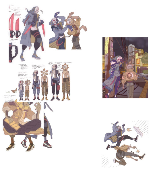
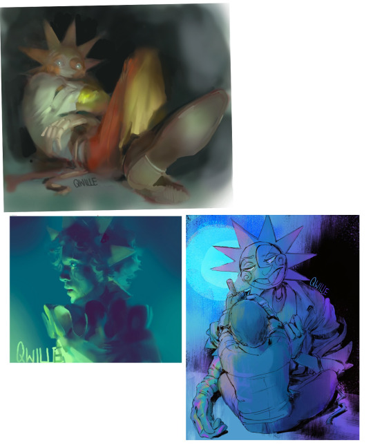
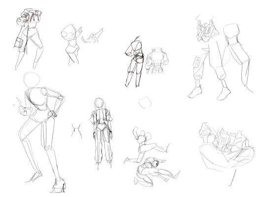
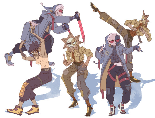
Usually it starts with me pulling some references from artists I really admire and sort of sketching out how they do the things I like
For example 8um8le has like super good anatomy and poses so I focused on trying to replicate how they do that
venemous-qwille is super good at color and pulling focus so that's what I focused on in my study of them
In general I'd say my process is sketch -> silhouette -> color -> shading -> render
I really don't like doing lineart lol

I'd say for the sketch the most important part is using references and just kind of fudging it until it looks correct anatomically/physically
General rule of thumb is spend time on areas of interest, and keep non important areas light (like the stitching on his pants)
I don't do lineart because I think its unnecessary for most paintings I do
I naturally tend to put more time and focus on areas of interest (like hands and feet) and if you use a brush with opacity for the sketch, those areas are naturally going to be darker in the final sketch
Of course this is gonna be different for everyone but it's what works for me
Sometimes I do a really really sketchy layer underneath my sketch/lineart, just so I know where everything is going
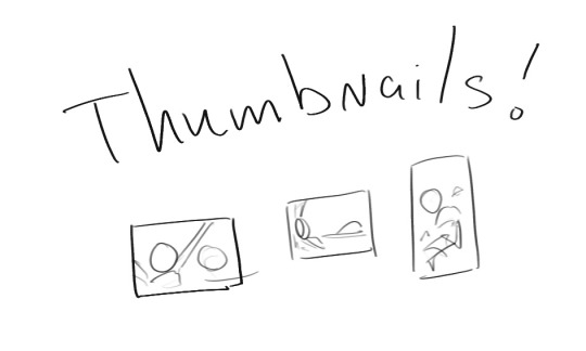
Use thumbnails! They are great to help figure out the general layout of things and what pose I wanna do
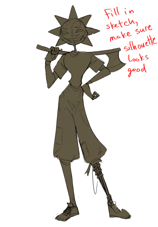
Next is what I call the "silhouette" layer
This is super important for me cause it helps me refine the figure and make sure the pose/anatomy looks correct, also depending on what color I choose for the silhouette helps guide what colors I'm going to use on top
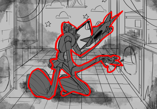
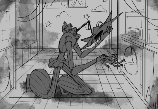
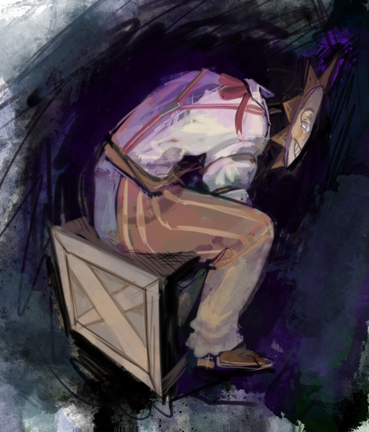
This piece is a good example of how it works. The silhouette shows me how the figure interacts with the background, how the pose looks and if its any good
The silhouette layer doesn't have to be super clean, as long as it follows the sketch decently well and shows where the figure is then its fine
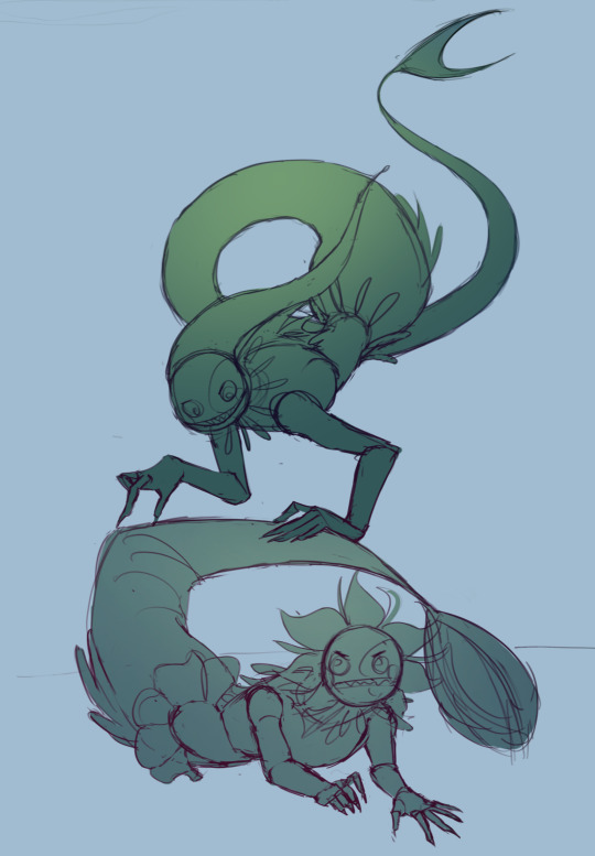
I also sometimes make the silhouette layer multiple colors to help guide shading and vibe
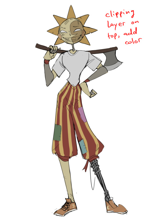
Next is the coloring layer. I usually make this a clipping layer on top of the silhouette layer, or I change the silhouette layer to alpha lock, either way it saves me time on coloring everything in

Sometimes I am super rough with the coloring too, using like an airbrush or my fav watercolor brush just to generically block in color where I want it
Works out cause most objects have like a bounce light to them from surrounding objects, so this is sort of a cheat I use to get that effect without all the work lol
Also don't be afraid to have the lower silhouette layer shining through, having multiple colors sort of subtly shining through the piece helps lots
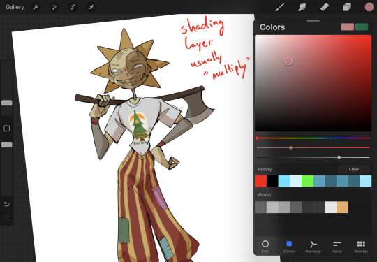
Next is the shading layer, this is usually another clipping layer, usually set to "multiply"
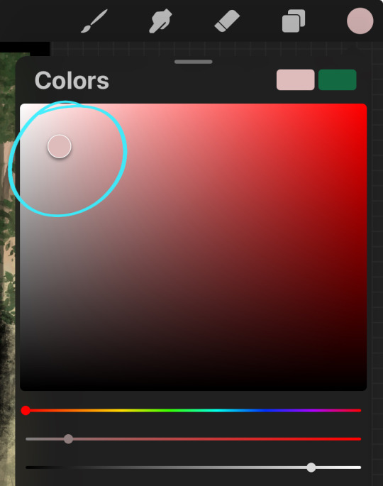
The colors I pick here is usually within this range, any color works, just depends on the piece and vibes.
Since this piece is set in a sunset forest I choose a more desaturated orange for the shading layer
I know there's a whole thing about multiply layer being a crutch (and it kind of it) but it is a useful tool when you just want some darker values across the piece but don't want to go through the process of color picking every single darker shade
Also in my opinion it looks better than picking a darker color and setting it to a lower opacity, idk I just think the color has more "depth"
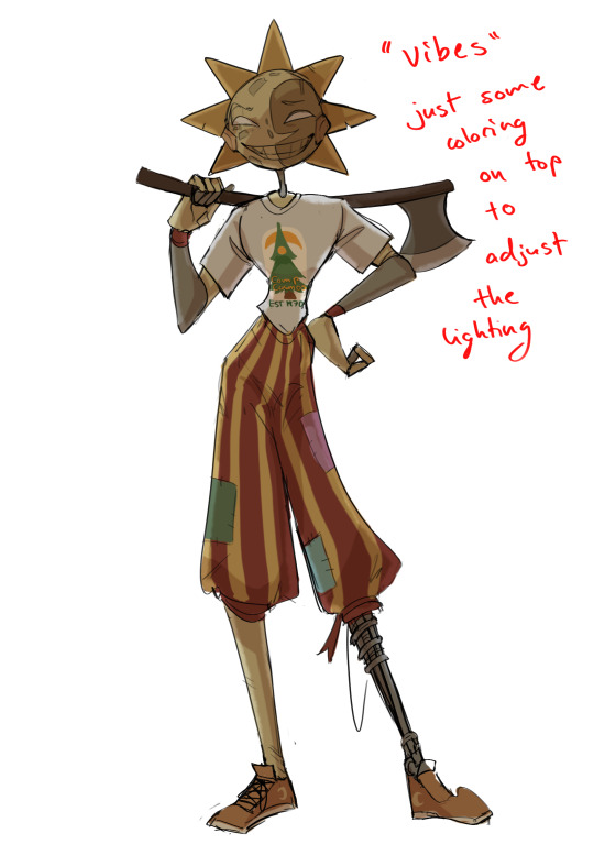
Next is the hardest to explain, sort of the vibes layer
Usually its just a layer of more concentrated color on top of the normal color and I fudge with the settings and values until I get a result I like
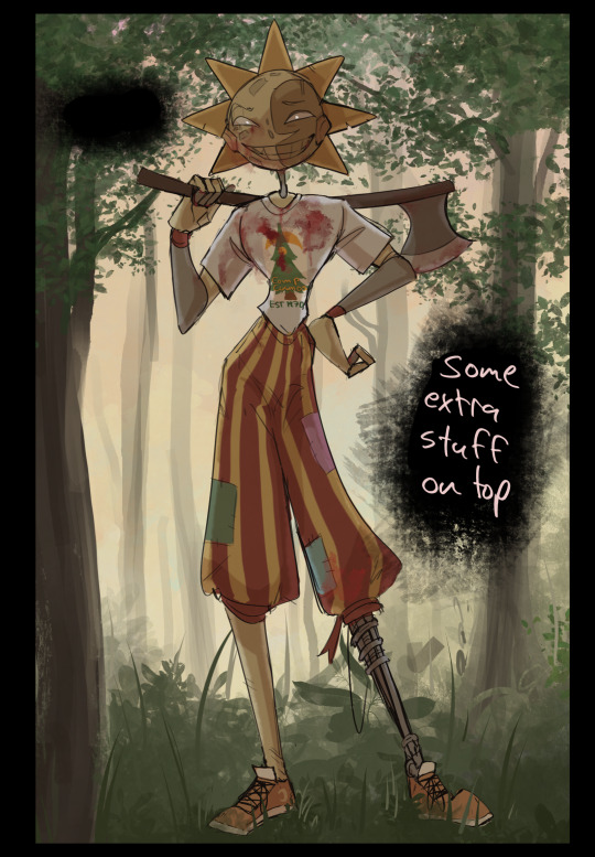
Next is the longest step, is the "extra" or the render stage.
Usually I add a background before this step so that if I need to merge the figure better with the background I can
If I render with a white background but he's supposed to be in a dark forest, its going to mess with the lighting severely
Also this is when I add more "vibe" layers on top to get the figure to match the background better
Backgrounds in general I recommend checking out @/derekdomnicdsouza on instagram he's got lots of great tutorials for breaking down backgrounds simply

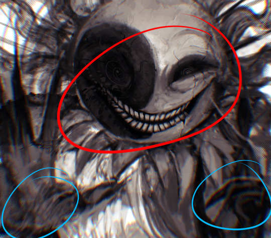
I'd say general rule for the rendering layer is to focus on the areas of interest and spend less time on areas you don't care about
I even blur stuff out on the edges I don't want people to see, partially to save time on fixing mistakes in areas I dont care about (oop), but mainly to help draw the eye to the areas I do want people to focus on

Theoretically parts of the background should like mesh with the characters, parrallel lines are a no no unless they are directing a viewer to look somewhere, things that are perpendicular help bring things together
tbh I'm still not the best at layout and probably need more practice, but overall this is what I like doing
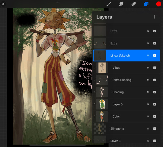
Overall this is what my layer set up ends up being
Sort of a sandwich with the lineart/sketch as the "meat" lol
Color and basic shading below the sketch, clean-up and rendering on top
I like this method cause it's super flexible if I ever want to try something different or try to replicate someone's style
I can make each step less or more messy depending on the end result and can add a lineart layer if need be. Also if there's a part that is straight up not working or needs to be removed its super easy to do cause I can just paint over it on the "extras" layer, color picking from the surrounding area to get the same vibe
Generally rule of thumb for my style is: get the initial layout of colors, form and shading to look good, then the rendering should be smooth sailing
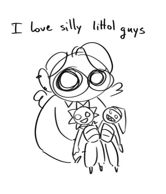
Really the best advice I can give to get better at art is to enjoy what you're doing and become very very obsessed with drawing a silly little guy
You'll eventually get very good at drawing them pfptpf
#sundrop#moondrop#long post#art tutorial#fnaf sun#fnaf moon#I draw them way too much holy guac#ask#this is for you asker#idk if anyone else is interested in this kind of stuff#i apologize for ranting lol#also me struggling to spell silhouette like 15 times
116 notes
·
View notes
Note
Can you share what your art-making process is? What software and tools do you use?? I'm falling in love with your work!!
Thank you, I'm so happy you like my work and are interested in the process. The short answer is I mostly use Adobe Animate.
I hate how I'm using an Adobe product (although I still regard it as a MacroMedia Flash product), but there's just no other software that compares to its jankiness. Perhaps it's just my long familiarity with the program, but nothing I've experienced matches how it simultaneously feels like drawing in MS Paint and using Microsoft PowerPoint vector shapes. The result is something that feels in-between the two; handmade yet computer-generated.
Typically, I'll start with a hand-drawn sketch, often beginning as a thumbnail done with pencil and paper.
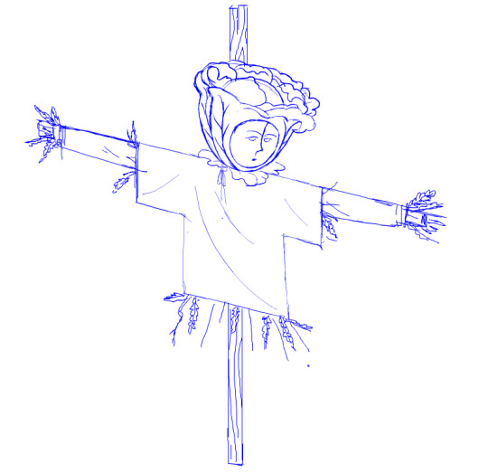
I'll then do a mix of hand drawing and vector shape tool rendering. I use the Paint Brush tool to hand draw strokes, and the line and shape tools mixed with transform to make more geometrically accurate shapes. The design is rendered into divided closed loop shapes, ready to be filled with a solid. The strokes are kept or removed depending on the design.
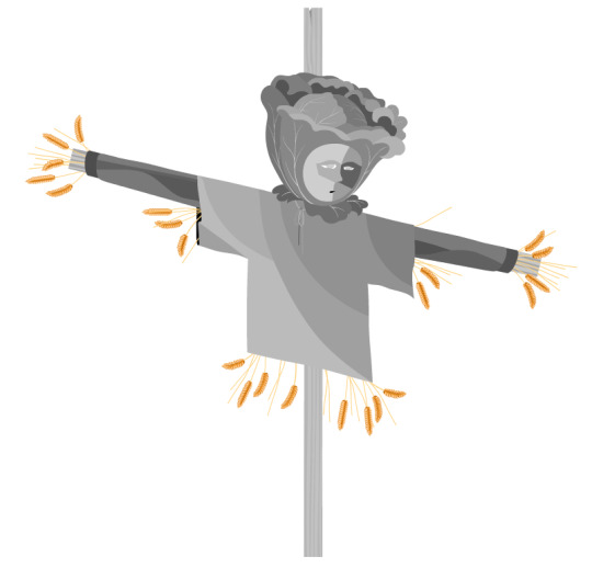
These fill shapes are then either coloured and rendered in Adobe Animate, using fills, gradients, or a more complex process of masks and effects.
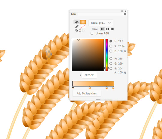
Alternatively, I'll bring all these vector shapes into Photoshop and use them as clipping masks. The vector shapes act like masking taped areas or shields to maintain sharp edges, while the brush is like an atomized airbrush used to build soft volumed forms.
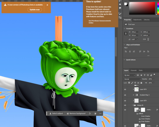
Please excuse all that horrible Adobe Cloud and AI bloatware...
And there we go!
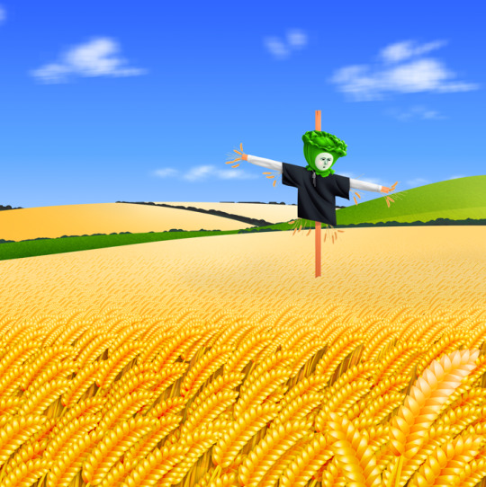
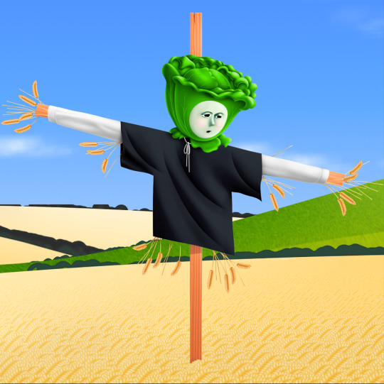
Variations in the process include just using MS Paint, index color in Photoshop, or 3D programs.
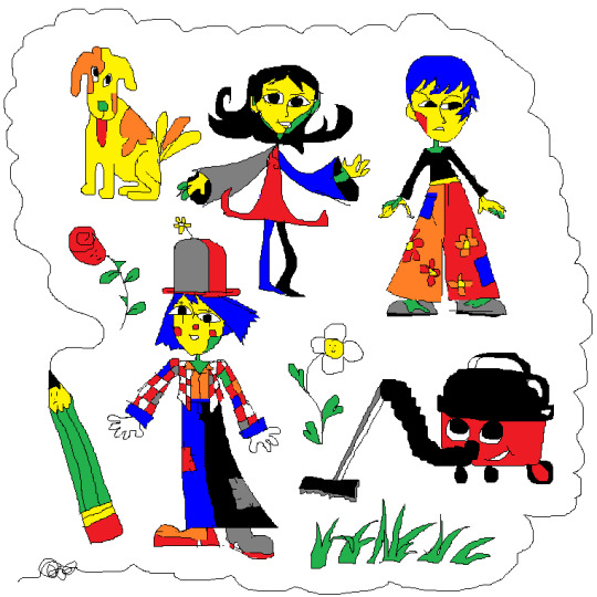
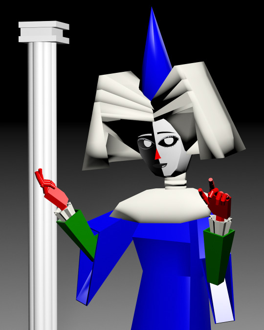
Very old works of mine were almost abstract, just exploring digital mark-making, which was a trend I was following in the mid 2010s that I loved. This kind of stuff.
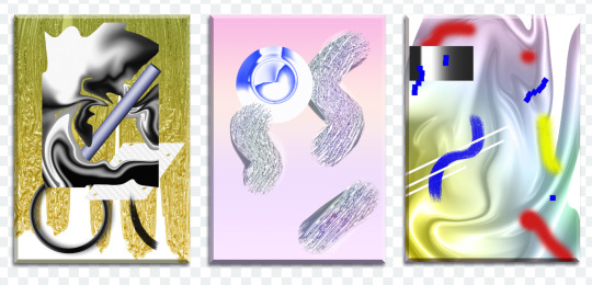
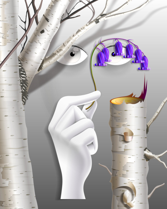
While my current work uses its digital material specificity as an intermediary to the subject in the illustration.
For example, #ersatz.world parodies clip-art and flash edutainment styles but imagines the characters living within that kind of world. The designs are meant to be cute, easy to read, light in computer processing, but also irreverent, janky, and generic too.
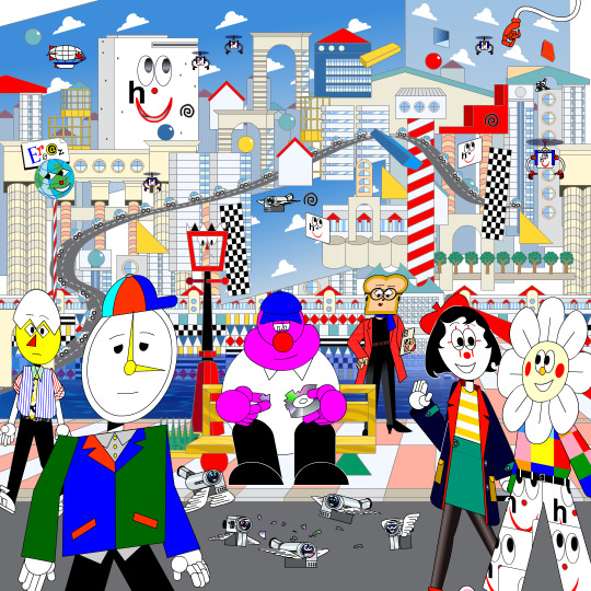
People typically regard this sort of clip art style as ephemeral trash, but I always found them charming. I use Ersatz World primarily as a satire vehicle, parodying educational formats to spoof corporate explainer content and digital media.
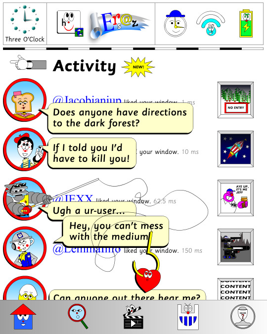
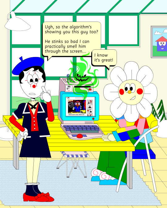
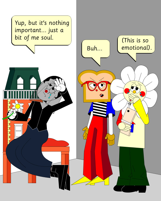
However, part of the problem with Ersatz is I've made it look too polished, complex, and I've grown too attached to the characters, which I imagine is a typical issue with overbuilding a world. So recently, I've made an even jankier Ersatz-like set of characters to play about with, using an even simpler style with less cohesion. I like to try and use slightly different styles and digital material styles to relate to the property at hand.
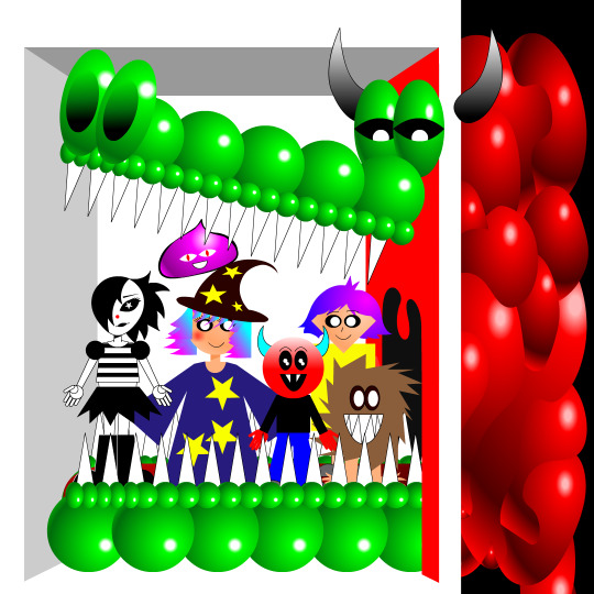
That’s why #autonymus has a bitmap digital material and a denser feel to it. Unlike Ersatz, Autonymus is not meant to be an overt semi-meta fiction. It’s not exactly pixel art, but the pixels are just about visible, as the intention is to create a digital expressionist depth to the setting. Although it’s still stylized and not realistic to our world, I definitely still want to evoke semblances of our world. That’s why there’s attention to landscape, plant life, and implied life beyond what you see in the frame with the characters, etc. But I'm still making a cartoon, and I still want it to feel at ease with itself being a digital material work. Characters are therefore flat, simple, stiff, and the speech style is like a bad Shakespeare parody. I like to balance between ugly and appealing, simple and complex, familiar and unfamiliar.
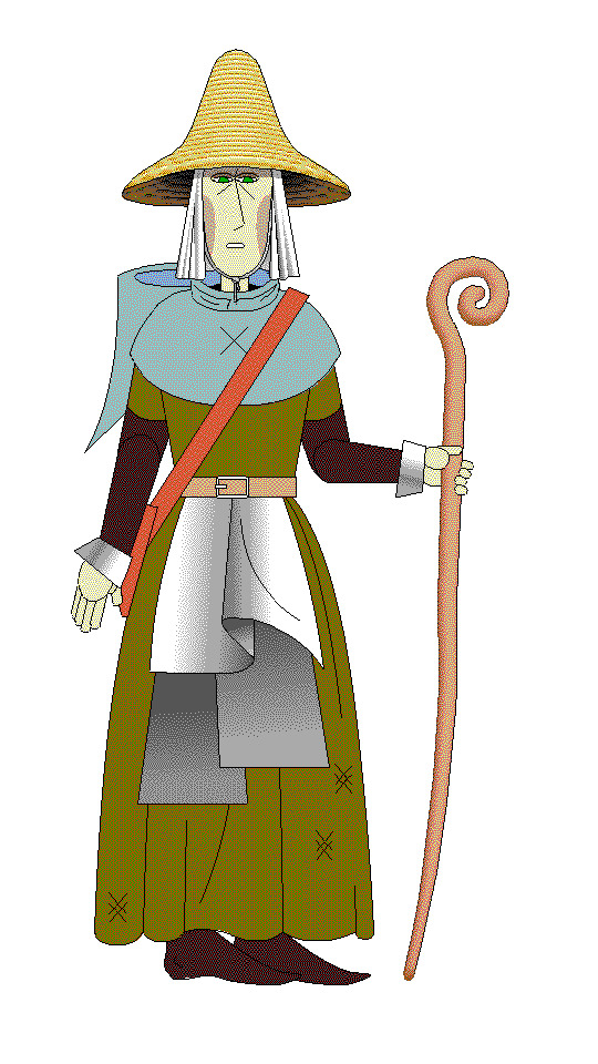
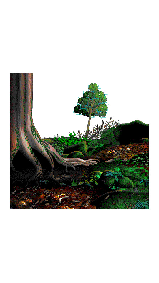
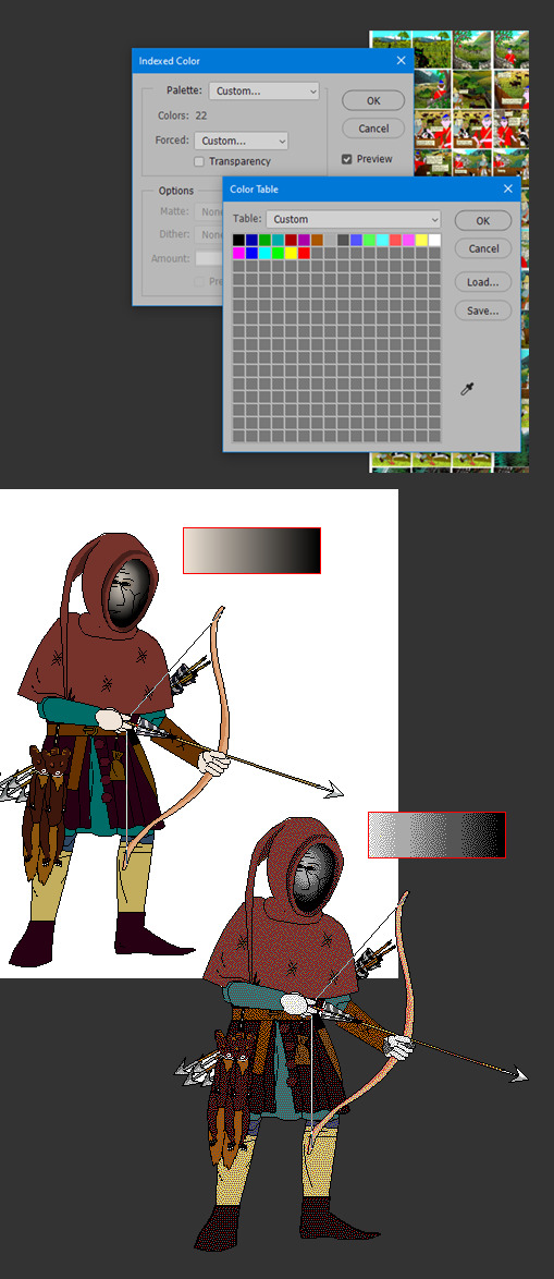
In regard to things like inspiration, references, and my relationship to aesthetic genres; these things certainly factor into my work, perhaps I'm even overtly dependent on them. My work can definitely be post-modernist in method; creating new, ironic, or fragmented interpretations through deconstructing a mix of various styles or methods. But at the same time, I'm still trying to make a digital gestural representation where the aesthetic is driven by my relationship to the software and techniques directly—not simply in an attempt to reference a style. For example, I like drawing lines in sweeping strokes, not to a point of geometric perfection, but just in a way where the curves are smooth and simple. But if I want perfectly curved or straight lines, I'll use the vector tools.
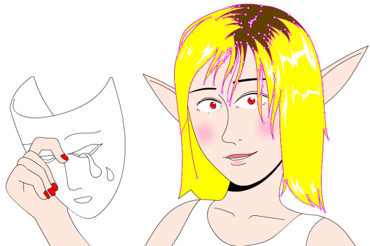
Working this way, you can sort of learn why certain styles and design choices in past vector aesthetics were made, as they would have also needed to make similar choices. That’s why I’m more mindful of using digital material specificity as a foundation to build narrative and subjects upon these days.
For example, genre references like cyberpunk clichés for #cyberhell or late medieval design for #autonymus or 2005 to 2015 era subculture fashion for #gradientgoblinz.
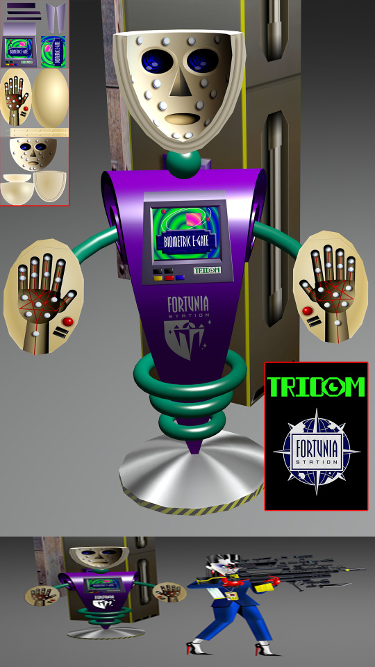
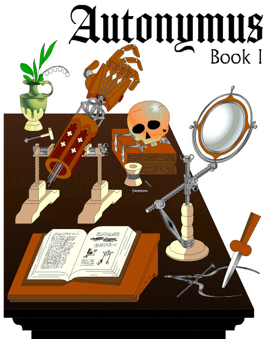
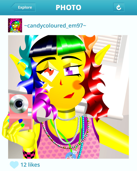
I think it’s important to take inspiration and reference from a wide variety of sources, but I think they’d mean nothing without having something to say or express. Autonymus, although it is a collection of tropes and clichés, isn’t just about that. It’s a story about the tensions of socially constructed systems and how that shapes faith, technology, and the natural world, or at least that's what I'm aiming for anyway.
But despite all that, I think there’s a danger of locking myself into the past by using these methods. For example, using nostalgia and references to past aesthetics can result in just recreating the past in a form of role-play. To avoid that, I try and evoke the past through a messy, inaccurate pastiche rather than caring to accurately re-enact anything. I’m probably not always successful at communicating the deliberateness of this, and it can certainly get very frustrating and pedantic. To be honest, I do kind of hate aesthetic labels (terms like Y2K, global coffee house, utopian scholastic designs from a pre-9/11 world).
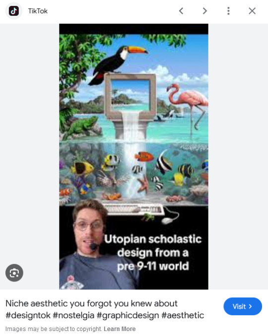
I do not believe that a project aimed solely at mapping history through aesthetic styles is worthwhile. Sure, they can be handy for organizing style trends, but they can also be reductive and ahistoric. Who are these people to define the history of these design eras? The result is a kind of suffocating simulation of design history but removed from context, perfect for moodboardism. I wish it felt more tongue-in-cheek, less absolute of itself in its own practice. Instead, it acts to legitimize and engender those making these labels, almost giving them ownership of the design styles. It’s similar to the logic and process of generative AI and its databases in a way, just done manually.
I’m very inspired by artists like Oneohtrix Point Never in this regard, as I think he’s able to create an aesthetic portal to all kinds of memories, feelings, and worlds reminiscent of the past, while still being in the present. It’s more a reflection of how timelines are messy now, like a memory or dream, rather than an audacity to say the past was actually like that, or to try to actually map some kind of timeline.
I think the benefit of this process is how it avoids the other side of the spectrum—being locked into chasing the cutting edge of digital processes. I don't necessarily think using an old digital process means your work inherits the semiotics of old aesthetics. Non-digital mediums don’t have this issue to this degree, as you can still paint in oils and be considered contemporary, or at least it's not frowned upon to such a degree. And I also don't think anyone in the heyday of Flash ever made work the same as I do, especially as computers are more powerful now so can handle more. I probably shouldn't boast too much about that though, as artists at the time probably just had more sense than to use Flash like a painting program! So then, why is my use of Adobe Animate critiqued as obsolete and an aesthetic dead-end? Because to whose standards is this process obsolete? If you value digital aesthetics as an apparatus in industry practice, then sure, my work is redundant.
But as wonderful as the latest tech can be in creating new aesthetics, I do feel it can be overtly dependent on the trends and directions of tech corporations, and therefore act as an indirect propaganda tool to their hegemony over digital aesthetics, such as the ever-demanding processing power needed for simulated realism. If anything, work that does follow in the direction of the latest tech trends is ironically the quickest to date once the trends move on.
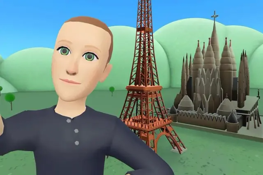
I've noticed I've not really described what my work is about, just the process, in this text. But I don't know, maybe I like Flash because it is regarded as redundant. No one really cares about it, so I feel free to make whatever I want, and can decide on form myself, to my own standards, the quality of my work. As fun as making images is, I find it difficult to put into words what it is exactly I'm expressing in my work, and perhaps that would spoil it anyway.
219 notes
·
View notes
Text
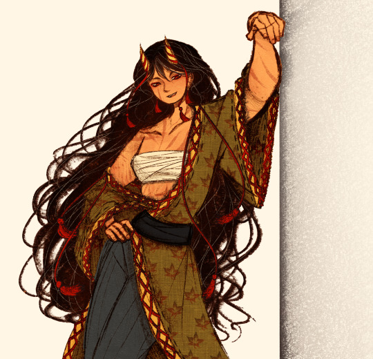
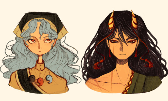
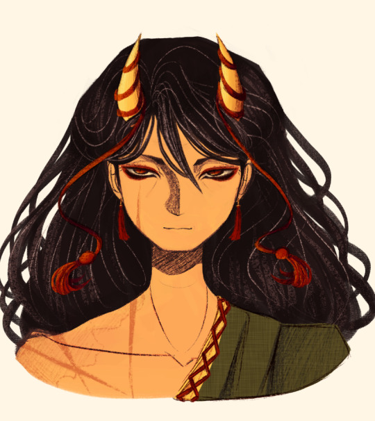
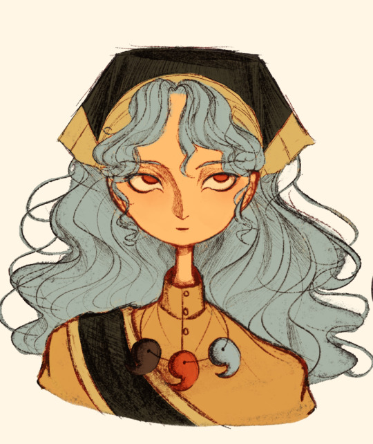
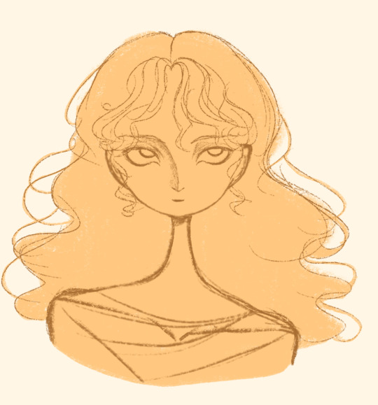
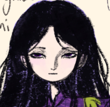
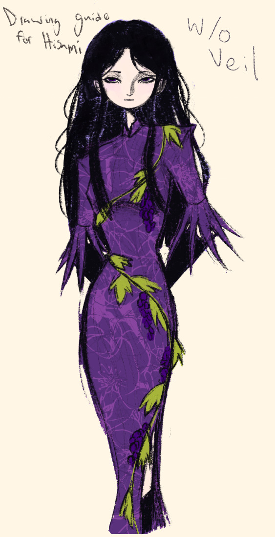
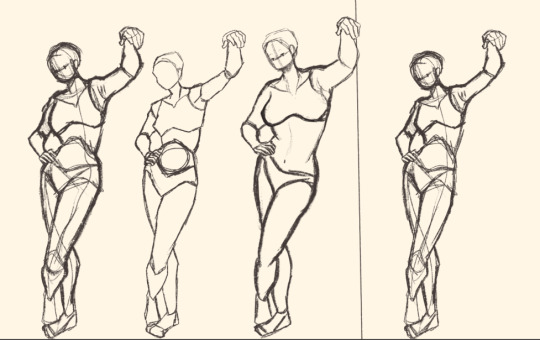
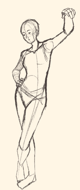
Here's a digital sketch dump of some pose/anatomy practices and some 2hu doodles, I think from now on if I don't have any big final piece to post, I'll just post sketches I liked that I did digitally (might also reblog some drawings of mine that I want more people to see, maybe idk).
Artist's Notes:
Ok so after the recent Hifuu fanart I did, I've been hoping to experiment more with how I draw faces, how I render, as well as how I stylize things. In some of the earlier sketches I did, I had an idea for a pose that I wanted to try drawing, so I took a ref pic of myself doing said pose (the leaning one btw) and then did a sketch over top of it just to get an idea for the shapes, negative space, and silhouette. After that, I wanted to do some simpler breakdowns of the shapes so I can get better at simplifying the body (these ended up being the bottom right sketches in the post). I also did some experimenting with how to push certain parts of said sketches to create a different body type (via liquify and then a more refined version based on that sketch), as well as figuring out what makes a pose feel natural and not stiff. This was also a bit of a foreshortening practice just so I can get more confident with it, and I ended up using the arms from the liquified version for the coloured Zanmu sketch I did since I liked them so much (dw I'll get to that).
The next thing I wanted to try and draw was Hisami, mainly because.... I am very bad at drawing her in my style. Last time I drew her I made her look really creepy and spindly, and it is my headcanon now that she can switch between a more human, and more creepy look whenever she wants. I'm liking where the face is going a lot, might have to refine a few things about it in the future, but it's cute (I also made the blush purple which I think is what I'm gonna do with her face from now on). I also like how her hair in the sketch turned out a lot, but the outfit..... not as much... Ever since I started changing my style to something less cartoony, I've had a hard time drawing her outfit in my style. Especially the flower veil thing she has on, which, I did try to find a way to draw, but I ended up deleting that sketch because I didn't like it. I'm also not a fan of using the colour purple, like, pure purple, magentas are fine, indigos are fine, but not strict purple. I also have a hard time with drawing all the little pattern details on her dress. I also need to find a way to draw the flower veil in a way that looks good because everytime I try it ends up just looking off (very similar to whenever I try to draw Zanmu's blue spears). I think the only solution to this problem is to do what I normally do and make my own version of the outfit, but with adjustments to suit my style while still trying to keep core elements from the original design intact (like I do with Zanmu and Keiki, and yes I am going to get to that Zanmu drawing just gimme a minute).
Ok next up is Keiki, my favourite Touhou character who I haven't drawn since the beginning of the year. Since my style has changed a lot, I wanted to just do a face sketch of her to get a hang of drawing her again, and I..... really really like how it turned out! When I drew her eyes, I realized that a good way of keeping faces too same facey can be via varying the sizes of their pupils, so that's an idea I'm gonna keep in mind from now on. I had a lot of fun with her hair, I initially was gonna do it like how it is in the official art, but I ended up not liking it, so now I'm gonna draw Keiki with wavy heir like this because it's fun and it looks nice. I also included my base sketch for Keiki's face since I was initially struggling with drawing her bandanna, and in the coloured sketch I added some more detail into her hair.
Now to finally talk about the sketches for Zanmu. Good lord was I having a tough time with her face. I also did this sketch before I figured out how I wanted to draw hair, so that's why the rendering on her hair is different (I did this soon after the Hisami sketch actually). Since I changed my art style a lot, I had to find a way to translate her face from my more cartoony style to my more detailed style, so while the face shape, nose shape and mouth was fine, I was really struggling with the eyes. I did get somewhere eventually though, and I am super happy with how it turned out. I wanted to lean more towards the androgynous side of the gender presentation spectrum, mainly because I think that makes sense for her character. Also made sure to include the silver hairs and some wrinkles just to bring some signs of her aging into her face because those are just staple features of how I draw Zanmu at this point lol. You will also notice that I gave her some scars on the right side of her face, and that's because I am a Zanmu-with-scars truther, I fucking love it whenever I see someone give Zanmu visible scars like that it just adds so much omg (I also tried to put a wolf bite mark on her arm in the full body drawing but idk if it reads well). While you can argue that her not having scars sells the idea of her being this "powerful, untouchable mastermind who is impossible to defeat," I'd say that instead of those scars representing times she got injured, they represent everyone who has failed to defeat her.
As I was drawing Zanmu's face, I referenced my sketch of to help with contrasting their features since I made Keiki's face more traditionally feminine. I also didn't mention this in my commentary on Keiki's face because I wanted to save it for here, but giving Zanmu scars also plays into the fact that she used to be human, wheras Keiki doesn't have any scars because she's a god who doesn't follow the rules of normal human biology. Plus I'm thinking about the two of them interacting again (return of Zan/Keik??? (I'm a multishipper btw) maybe???) so drawing their faces together will definitely help me in the future if I wanna draw them together (again, maybe as a ship? I've kinda been ironing out the kinks in their potential interactions (romantic and non-romantic) for a while now so idk maybe expect that in the future lol).
And now for the full body drawing, when I was doing the face sketch I did this little snippet of an outfit, had a vision, and the made it into a reality. I'll admit, part of me was worried that it would end up looking too much like Yuugi's outfits in the spinoffs and mangas, but I feel like I made enough changes to differentiate them. I tried to keep a few of the major details in Zanmu's design (i.e. the red tassles and yellow lining on her shirt) while putting a new spin on it. I also dialed up the scars to 11 since without them the whole thing kinda looked incomplete. Also, while I could say that the leaves on her kimono are "a nod to the fact that technically she should be a tengu because back then people belived that corrupt monks would turn into tengu but no Zanmu is an oni and they're maple leaves because...tengu...ahahahaha" what really ended up happening was that I looked up clothing patterns from Sengoku era Japan, liked the leaves the most because the red picked up on the red from the rest of her design and just ran with it. I also always had the idea to put Zanmu in men's clothing from Sengoku era Japan and while the accurate thing to do would be to put her in a Buddhist's clothes from that era.... from a character standpoint, I don't think Zanmu is pious enough to strictly wear the proper monk uniform, and also since she's basically the king of Hell, she would probably dress herself like royalty from that era. TBH, I probably could've been a bit more historically accurate, but again, this was mainly for conceptual purposes because I had a vision and I needed to see it through.
If I were to draw her in this sort of outfit again, I should probably try and use more references, although now that I look at it, if she were to wear it properly this would maybe, probably look a bit closer to a Kyūtai sugata (a very huge stretch, but it just kinda reminds me of that) just without the layers under and over the main piece of clothing (In the website that I searched up to try and compare the outfit in my sketch to, they name the outfit pieces but don't label them on the image, so I don't know 100% what everything is called) so I will definitely have to use that style of clothing as a reference going forward.
Also, I was kind of inspired by the ToTK design for Ganondorf since I have finished the game a while ago and I absolutely love what they did with his design (it's just so fucking cool omg) and I thought that sort of look would look good on Zanmu, so yeah got some inspo from that.
And those were all the notes for each of the sketches, I'm motivated to draw rn but kinda art blocked, so doing these little coloured sketches helps a lot.
#touhou project#art#fanart#sketches#sketch dump#zanmu nippaku#keiki haniyasushin#hisami yomotsu#touhou 19#touhou 17#unfinished dream of all living ghost#wily beast and weakest creature
344 notes
·
View notes
Text
💜Peepaw Donnie💜


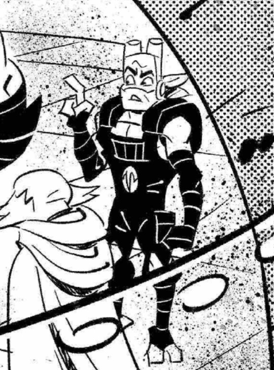
I hate his overalls. I know, I know, I'm a terrible person but WHO . who is in charge of styling these guys cause it isn't donnie!!!! 🙄🙄 but seriously, IM SOOOOOOO EXCITEDDDDDDD!!!!!! RAAHHH first i get fed with jpcc:ct AND NOW A NEW RISE COMIC???!!! RAHHHHHHHHH
I also did cell shading with this! it's my 2nd time (1st here) so i hope it looks okayish 🧿🧿 i probably will not be using it again unless it's for commission. I don't think I should've used a different style of rendering here, but I need to get better at it
Anyway. enjoy the peepaw :3

SKETCHES!!


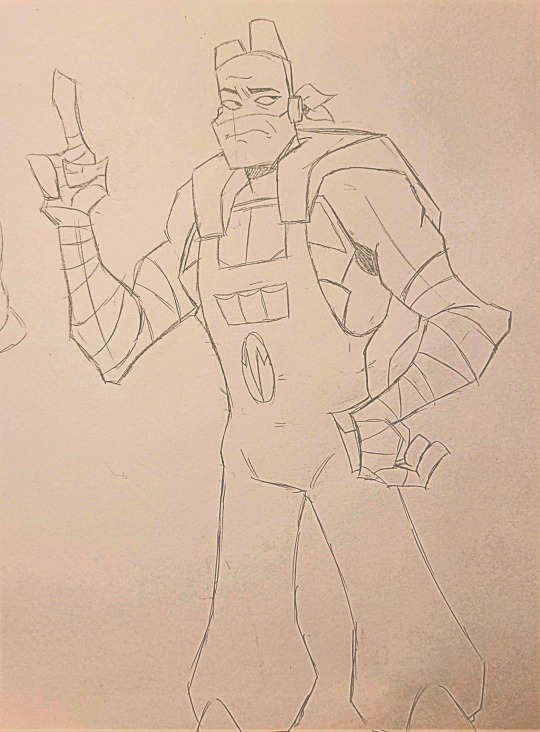

ALT VERSIONS!!!


REBLOGS APPRECIATED 💜🐢
TCEST + PRO/COMSHIP DO NOT INTERACT IN ANY WAY
#rottmnt#rottmnt donnie#tmnt#rottmnt donatello#fregart#rise of the tmnt#rise of the teenage mutant ninja turtles#rottmnt fanart#tmnt 2018#rise tmnt#rottmnt future donnie#rottmnt future au#rottmnt future timeline#future donnie#f!donnie#future donatello#peepaws#peepaw donnie#tmnt 2k18#rise donnie#rise!donnie#freg art
210 notes
·
View notes
Note
Hii, I saw your latest post and your art style is so pretty?? What?? I have a question though. How do you do the paint one? Or rendering in general. Like genuinely, I have a problem with rendering and I can't seem to quite understand it on my own. Do you just start with flat colors? Do you do lineart or colors right after the sketch? Is the "lineart" just added later? Painted over? Erased to give thinner and thicker lines?? I'm really curious!!
hi! im not the best painter tbh! though i do have a background in painting but ill try my best to explain
diff artists have different approaches to how they paint but generally yes, you would start out with big shapes first and then go into the details - work big picture first. like, if you squint and the drawing makes sense in terms of value and colour and shape, youre on the right path.
i can kinda show this with a warmup in-class speedpaint exercise we did a couple weeks ago where we were tasked with painting an eye in about 30 minutes (i was late and only had 20 lol)

luckily ive got the layers for this. i start of with a base layer, kind of like a underpaint layer since that's how i personally learned to paint traditionally. i did have a sketch before laying down this base layer under it but i ended up using it for final rendering details lol
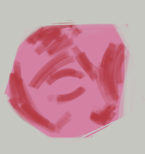
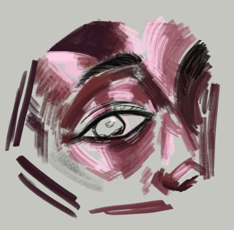
after that i started laying down the big blocks of colour. i wasn't necessarily aiming for complete colour accuracy here, i just wanted to match the value. i chose a pink underlayer to influence my colour choices because the underlayer will peak through the blocks of colour i paint over it
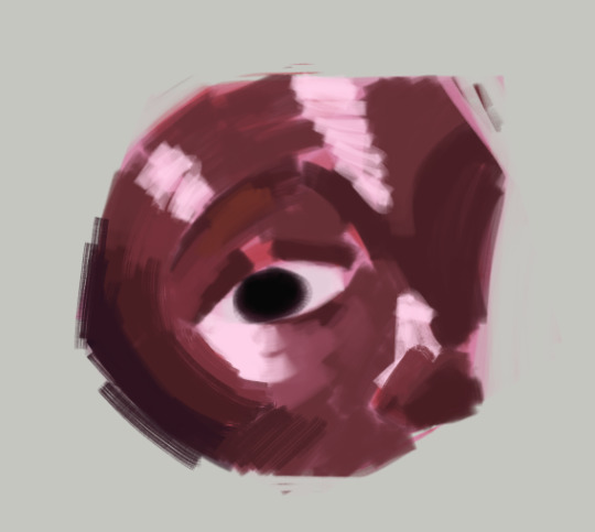
and then (forgive me if this seems like "draw the rest of the owl" in terms of progression) but this is where i started going in with finer detail. i did the rest of the render on the sketch layer i had so you can see some of the lines from the sketch here
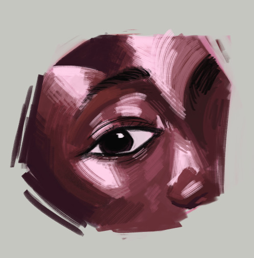
here's the layers completely seperate from each other


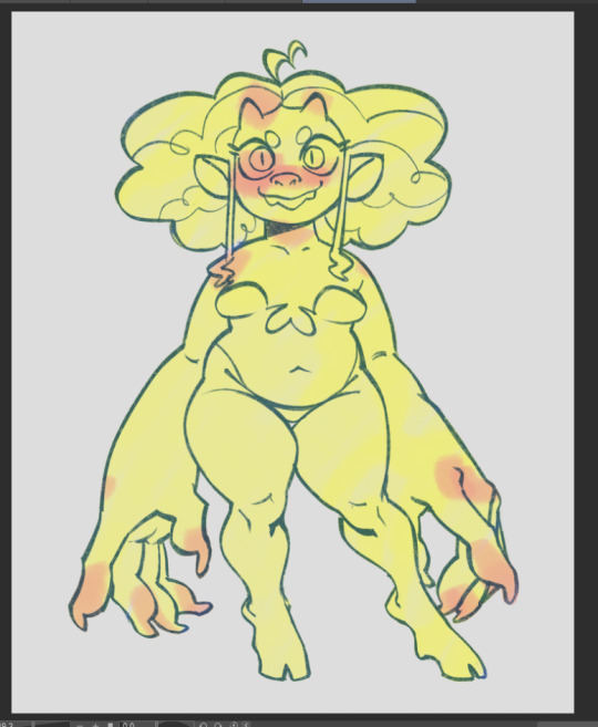
even for the flat colour version of my character, i had an underpaint layer! i used yellow and orange since i wanted her colours to be warm and used a semi-opaque brush to put her colours in rather than using a completely opaque brush
when i wanted to do the painted version, i put the lineart on multiply and reduced the opacity and brushed in some some quick shadows on seperate layer on hard light mode to give me a good base to start painting with

and then i did all the rendering and details on a new layer ontop of everything. i keep the lineart light so i can paint over it easily and also colour pick from it when i want a more distinct line to seperate certain shapes. i unfortunately dont know how to explain this part because a lot of this is intuitive to me and i'm still learning. but you gotta make use of different types of "edges" in painting, and you would generally have more contrast in the focal point of your painting than in other places to draw the eye to that point. i suggest researching the use of edges in painting if you really wanna learn more - because im a terrible teacher haha
for fun here's what the rendering layer for this one looks like on its own and the finished thing for comparison

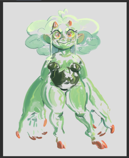
there's other things you need to learn too, like bounce light, atmospheric perspective, ambient occlusion... and colour theory is always important! i could go on for a long time. there's a lot of pieces to the puzzle and it may seem overwhelming but there's tons of resources online and it will all become second nature to you as you keep practicing
uhh hope that helps!
57 notes
·
View notes
Note
Hiii I really love your art and was wondering if you wouldnt mind showing what kind of brushes you use for your recent drawings thank you so much and i look forward to your future arts!
Of course! I've answered this a few times before but have never really tagged it properly, and I also realised that I've never actually explained what I use each brush for so I'll do that now!:

I'm gonna go through each of these brushes in order (and if i remember correctly, I'll link the top two since they arent default CSP brushes). (NOTE: almost all of these brushes have anti-aliasing turned off so that it can look more crispy and pixely!!! there is one exception to this that I will get into)
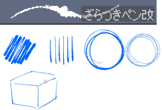
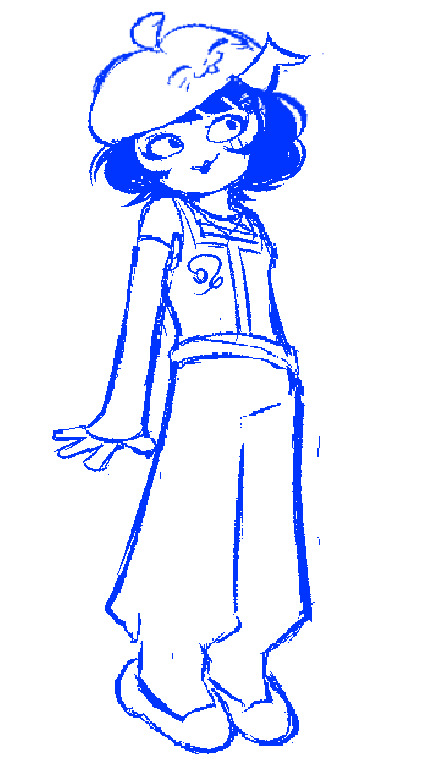
For this brush, I exclusively use it for sketching, it's advertised for inking digital manga panels, but with how the pen pressure is I feel like it adds form to my sketches
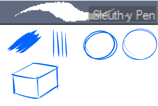

This brush, Sleuth-y Pen, is what I use mostly for MSPFA panels, mostly for lining, but sometimes for sketching too if I'm having a hard time with my usual sketching pen. It's really good if you want to replicate the homestuck style, and good for broad strokes on smaller canvases. The only issue is that the brush isn't great for that style if you use it on a larger canvas (ideally you would want 650 x 450) and can be especially messy if you're trying to get smaller details, such as open mouths, and certain facial details. I use another brush for that, which I will get into soon.
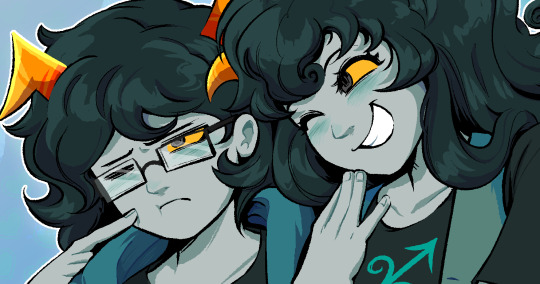
My second use for the sleuthy pen is for lineart on larger canvases in my usual artstyle! It has a texture to it that I like, as I like having my art appear a little rough around the edges, and the issue regarding small details isn't nearly as prominent of a problem
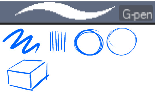
Almost done! Now we have the G-pen, a default CSP brush! This used to be one of my top 2 pens, along with its counterpart "Real G-pen" but nowadays I use it for two things: clean-up during rendering (usually getting those smaller details done that the sleuthy pen has difficulty with) and for doing SOME MSPFA panels (Vast Error, for example)
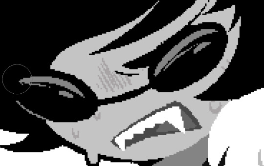
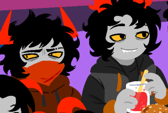
As you can see here, Liaaam's face is a little smoother than the rest of him, that's because I use the G-pen for those details, to keep things a lot cleaner! As for my other use, Vast Error's style from my understanding is a lot more "smooth" and "clean" which is why I exclusively use the G-pen for it, you can also make a lot of thick, juicy brush strokes with it which I feel works really well for the hair and folds in the clothes!
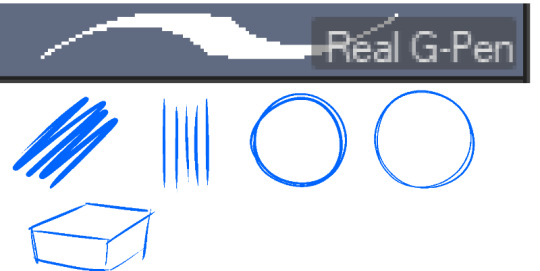
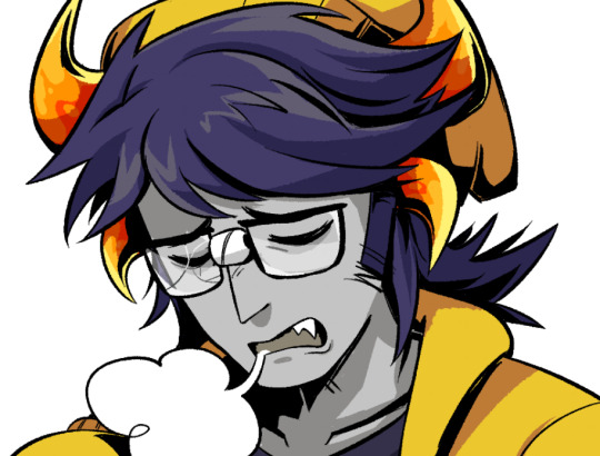
Finally, the Real G-pen, another default. This one is very similar to the last, its only differences are that it's slightly sharper and ever so slightly more messy. It's almost like a medium between the sleuth-y pen, and the g-pen.
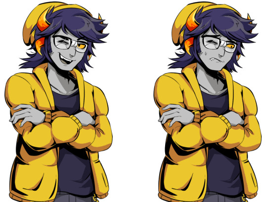
I'll be honest, I don't use this pen much anymore, BUT, I still consistently use it for one thing and one thing only: Friendsim sprites. If you want to make friendsim sprites I highly suggest this pen, and making sure it's set to "weak" antialiasing. If you want to go the extra mile, I like to use a lasso-fill tool to block out shadows in all of my art, although if I'm using a rougher brush I'll usually do that manually. There's also other brushes I've been using more for rendering full pieces, such as a "rake brush" and a "design pencil" with low pressure to get details like blush down without making it too intense. That's basically it! I'll link the brushes below if I can find them: sleuth-y pen textured pen rake brush
58 notes
·
View notes
Text
-FAQ-
Hello! I've gained a whole bunch of followers lately and I've been getting a lot of questions about commissions, what my setup is, what brushes I use, etc, so I thought I'd make a post about it to answer everyone's questions at once !
Putting them under the cut <3
Commissions:
Commission prices are listed in my pinned post. You can send me a private message about your commission idea and we can get to talking :) It is helpful to have enough references handy (character, outfit, descriptions etc)
I am generally a fast drawer but I also have a job and a physical disability so there might be moments I can't work on your commission. But that is never longer than a few days at most.
Payment is upfront, the full amount and via paypal only. I know this might seem a bit scary but unfortunately there are a lot of people who end up not paying for commissions and I want to avoid that.
During the process I will send you frequent updates and will ask for input, to see if it is going in the direction you want. You can ask for changes during the sketching progress but once I've started on line-art and coloring, no big changes will happen. (You can for example ask for a different color for a shirt etc, but not for a different prop or pose or expression)
When it is completed, I will send the drawing to you via email. The drawing will remain mine and it is not to be sold or profited of by the person who commissioned me. If the commission is for something commercial/for selling, that needs to be discussed. I prefer to do drawings only for personal use!
For more questions, my dms/asks are open :)
How long have I been doing digital art:
I've been drawing digitally for about 5 years now i think? But before that I've been drawing and painting traditionally literally since the moment I could pick up a pencil.
Set-up:
It's just me and my ipad and apple pencil laying on my bed. I wouldn't even know where to begin for those whole multi-monitor/screen setups ;-; I draw only with Procreate
Brushes:
I tend to play with different brushes from time to time to get different textures, but generally i use the same few for most of my drawings/styles. My favorite one is the Peppermint Brush, for sketching. I use it in every drawing i make! I always sketch with it, and often do the line-art with it as well! And it makes for a nice textured brush for rendering as well! (i used it for a lot of rendering of the armor in this drawing)
The (procreate) brushes i use a lot are
for medieval style: inking - Ink Bleed (for line-art) artistic - Quoll (for coloring)
for general style: calligraphy - Chalk (coloring/rendering) sketching - Peppermint (line-art/sketching)
for realism: calligraphy - Shale Brush (full rendering) Also using the shale brush for smudging and erasing when drawing realistic
for lineart: smooth pencil from this pack by Heygiudi
How/why do you choose a base color:
I tend to look at a few different things when deciding on a base color/color palette.
the overall color of the reference pic
the color i associate with who or what i am drawing
the feeling/vibe i want to give off with that drawing
color has a BIG impact on the vibe of a drawing, so it is something i keep in mind when im drawing.
Using a color as a base to start, helps a lot with my drawing process. It helps me pick out other colors so they match better. It helps me get light/dark values right. And the chalk brush i use, has gaps between the strokes, so the base color will always come through a little. Having the same color come through in the entire drawing, helps pull all the colors together if that makes sense? I always start with a solid base color when i am painting traditionally as well!
Advice:
PRACTICE!!! just keep drawing and practice. I know this is such generic advice but truly practice is The Way. Learn from other artists but don't compare yourself to them. Everyone's artistic journey is different and there's no "good" or "bad". And most importantly make sure that you have fun when you're making stuff :3
I also learn a lot by studying art I admire and love. Figuring out what it is I like about it. (for example, the line thickness or the shapes or texture etc), and try to incorporate that in my own style in a way that is not directly copying or stealing.
#my art#FAQ#frequently asked questions#art process#art tips#drawing process#procreate#brushes#commission info
782 notes
·
View notes
Text
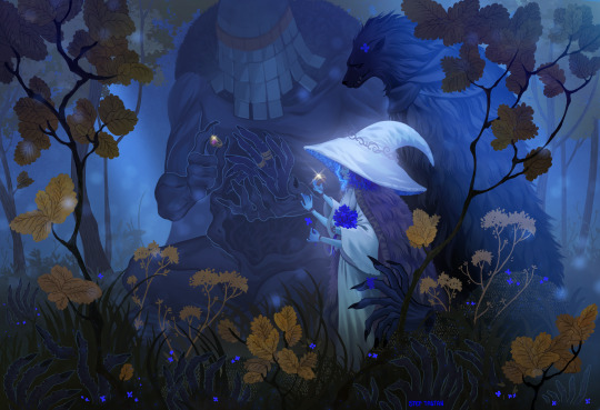
Carian Stroll
“Tell Blaidd, and Iji…I love them.”
Before this piece, I had been wanting for a long time to create my own piece of Elden Ring fanart featuring Ranni. I had tried several sketches unsuccessfully, just wasn’t particularly feeling the ideas I had sketched up until that point.
One day of usual internet scrolling, I stumbled upon this gorgeous piece of art by Shimomura Kanzan.
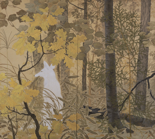
I knew immediately I wanted to do something like this for my Elden Ring fanart. In fact, if you look at this piece, there is tons of inspiration that I drew from the original artwork, such as the style of the yellow leaves and the main subject matter being a prominent silhouette of the brightest value, placed at approximately the bottom third of the image.
The main character is cleverly shrouded amidst various layers of trees and foliage, giving us the impression that we're peeking into candid moment of their life. In the case of the fox, we caught it during a mid-day snack. In the case of Ranni and her party, we caught them in a leisurely stroll, while Iji outfits the dreaded Fingercreepers with their iconic rings.
I wasn't sure if I wanted to capture a happy moment, but Ranni goes as far as to ask us to deliver to Iji and Blaidd the message that she loves them dearly as her quest draws near its end. I would imagine they all must have had fun moments together as a family. Hey, maybe even the hands liked to be around them?
The process
youtube
I started this on my iPad using the procreate app. Sadly the full process is not captured on video, as I switched to Photoshop for the rendering phase of the illustration. This video is a fun window into my chaotic process and how I iterate on the fly on the same canvas. I probably wouldn't do that in a professional setting where you often need to have color keys and iterations to be reviewed and analyzed. I like to I cut myself some slack when doing personal art to keep things fun.
Trying and failing some more
This illustration was not a straightforward path. I haven’t been very diligent about personal art, and at some point I started deviating too much from my reference by adding too many levels of depth to the background and suffocating the piece. I got into a weird loop where I would randomly open the PSD, play around with the values, pushing Iji to the back, then bringing him back, cranking all the levers on Ranni, etc., decide it would look horrible, then begrudgingly determine I’d never complete this image and go on with my life.
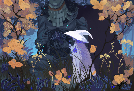
As artists we likely have unfinished work sitting everywhere, be it in our sketchbooks, canvases, or hard drives. But it’s a different kind of sting when you feel like you can’t even nail the fundamentals.
Anyway, so a couple weeks ago, I decided to give it another go, but this time I would get rid of all the unnecessary stuff, even stuff that I had been trying to render for ages. I would not hold on to anything, I would try and recapture what drew me to Kanzan's beautiful painting to begin with.

After it became a matter of pushing and pulling pixels until the image was finished!
That’s about it. I didn’t go crazy in depth but lately I’ve been enjoying reading into artists’ processes and I’d be remiss to not share my own thought process also.
Thank you for viewing!
#elden ring#lunar princess ranni#blaidd the half wolf#war counselor iji#illustration#artists on tumblr#fromsoftware#digital art#video game#fanart#Youtube
640 notes
·
View notes
Note
I am in love with your art style. I love all your jjk art, it’s like stitching back the pieces of my shattered heart. Your art is so soothing and has such a warm feel, I love it. Also if you don’t mind me asking what program do you use for your art, and do you have any tips? I strive to someday create art that gives the same feeling of comfort as yours. Thank you <3
Thank you so much for the kind message! I'm actually in the middle of making another jjk piece but it's been a while so I've been trying to remember and consolidate my process. This ask came at a great time hehe
I use photoshop for most of my art pieces but I think there are a lot of cheaper alternatives (procreate on Ipad, clipstudio paint, medibang etc) that would work just as well. As for tips, I have a technical and an emotional one:
My technical tip would be to use references!! Especially if you're just starting out, it's SO IMPORTANT imo for catching mistakes especially with anatomy, lighting and perspective. And by reference I mean real life photos. I think you can be inspired by other artists' work, but there is the danger of picking up their bad habits if you only use their work for reference. I would recommend sticking mainly to real life and looking to other artists only for resolving specific stylistic details once you have a solid grasp of your fundamentals.


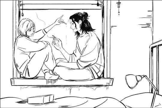
I would start with a rough sketch first of whatever you want to draw and then look for refs that match the mood and tone you want to go for. Get the idea down first and draw from the heart. Then the refs come in to help with the specifics (ex. what a window looks like, how someone would hold a cigarette) The jump from the rough to the clean line version is an amalgamation of all the little things you learn along the way. For example, on one day, I learned that clothing folds usually start at one point and spread out. Then another day, I learned how to do 1 point perspective and so on and so forth. Then all those tidbits slowly add up to help you get better and better.
2. My second tip would be to understand what you want to convey with your artwork. If it's fanart, what about the media that you're interacting with draws you in? It doesn't always need to be a complex answer, sometimes you just want to draw a character because you think they're hot and that's totally valid imo.
I occasionally tutor very young artists and oftentimes, they will tell me that they want to draw like X artist or X painting/piece of media. I always try to encourage them to go deeper. What about that drawing resonates with them and what specifics are occurring in the picture to make them feel that way? For example, I recently realized I love environment heavy drawings not for the background itself but because they ground the characters and seeing them do mundane things makes them feel more real to me.
For the example below, the whole set was to explore friendship and mental health. Sometimes just having someone there who listens and is willing to talk with you can make a huge difference.


Once you know the purpose of your art, then I think it makes the decision making for the rest of the process much easier. What type of lighting scenario conveys support and comfort? I went with dusk. Then I started searching up references for dusk lighting. Couldn't find the ref I actually used for colour but a quick google will show you lots of similar options.
What kind of poses feel in character for Shoko vs Geto? What is the focus of the picture? As much as I love details, I think sometimes they can actually take away from the main message. For example, if I had rendered the lamp on the right a lot more, it would've distracted from the main point of the picture so I tried to keep that and the background in general simple (still something I need to improve on haha).
Then those extra technical things (value structure, cool vs warm light, reflective lighting, connotations behind colours) you pick up along the way are all there to help you better communicate what you want to convey with your art.
Okay I lied one more tip, be patient and learn to appreciate the process. Like with any skill, there are a lot of technical aspects that you have to study and practice. I think because the end result is so visual and easily accessible in comparison to other hobbies/jobs, it really cripples beginners. Even with writing, you won't realize a book is good until you learn how to read. With art, you can resonate with a painting without having drawn a single line yourself.
I think beginners and even professionals see a lot of beautiful finished artwork and get enticed by that only to be discouraged when they find their process/finished work didn't end up the way they wanted it to look. Treat it like you would learning how to write. The fundamentals can be tedious and do take time to drill into your head, but learning them will help you SO MUCH with the creative fun parts. You can't write a poem without first taking the time to learn the alphabet, spelling and grammar. You're also probably going to write a bunch of shitty poems before you write that one good one, but that's okay because each piece lets you experiment and exercise your voice. Art is the same thing, don't rush it! Enjoy the process and celebrate your improvements.
#omg i typed way too much but i have a lot to say!!#thank you for the ask this was actually so therapeutic lmao#ask#my last advice...is to be selective about who you take advice from#so you can just ignore all this or cherry pick what resonates with you and your process
82 notes
·
View notes
Note
Hello Botanica I admire your art so much ❤️ do you mind giving tips on how you improved your art over the years? I would also be delighted if you could show us what your drawing process is like a little bit, if not thats cool too🤗 have a great day!!✨
Hey there! (*waves*) Thank you so much for the love <3 I'd be happy to share some insights on the topics you mentioned! (Sorry that it took a while.)
I think I’ve been drawing for almost 20 years now (Whoa!). Honestly, I don’t even know how I made it through, but ever since I was a kid, I knew art was a necessary part of my life. Looking back now, I’m just glad I stuck with it!
This piece is like a visual timeline of my art evolution. It’s wild to think I went from those super basic kid doodles to the style I have now. Growth is real, y’all!
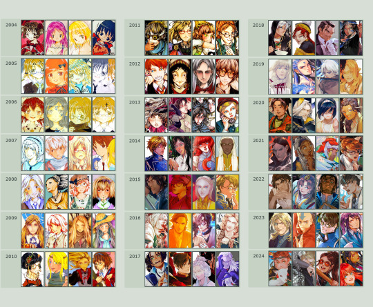
So the tips! (They are mainly for those hobbyist artists, since I don’t have the luck to make it as my career.)
Keep your eyes and mind open to learn from different fields. It’ll spark fresh ideas and enrich your art, but always double-check when diving into unfamiliar territory.
Find tutorials that vibe with you, and collect references IRL.
Use primary sources to avoid distorted or AI-altered refs.
Take your own photos as ref.
Use 3D websites like Sketchfab, Blender for 3D assistance, and posing apps or manikins to help with your art.
Practice consistently. Balance your time between quick sketches and more polished pieces.
Accept where you are now and improve from there. Don't let others' opinions or other artists’ activities throw you off your path.
If art’s your hobby, the goal is to have fun! No pressure to push boundaries unless you’re feeling it.
Let’s move to drawing process. I’ve been doing hand-drawn art for more than a decade, but had to fully switch to digital media after 2016. Now I usually use Procreate for sketches and lines, then use Clip Studio Paint and Photoshop for colors and adjustments.
I’m gonna share two sets of process. One is for generic character art, and the other one is for pieces influenced by environment.
So character art is like:
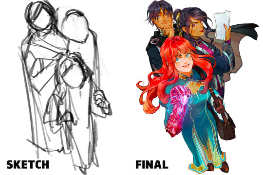
(More under the break.)
Do some (very) rough sketch to locate the characters → Line art
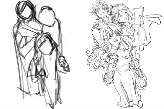
Define coloring section → Do flat basic colors, adjust the tone via gradient map, change line color
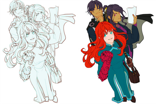
Add more details, use airbrush to shape the volume → Rendering (layer mode: multiply, linear burn)
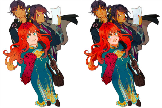
More rendering (layer mode: screen, overlay, soft light) → Post effects
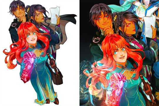
Done!
The next is art influenced by environment:
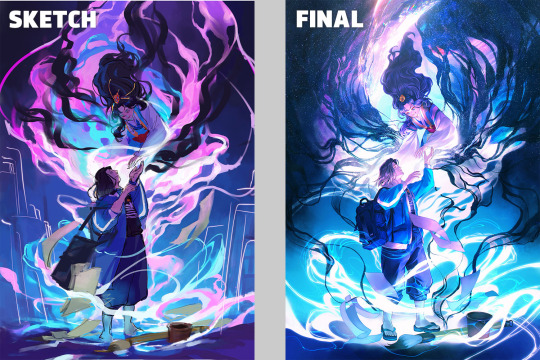
Make a color sketch to set the general tone → Line art
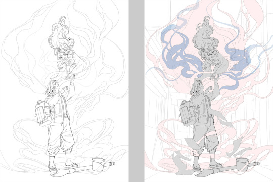
Flat basic colors (background & characters) → Darken the art (layer mode: multiply), add more details
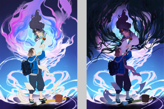
Add more details and begin rendering → More rendering, lighten some parts (layer mode: screen)
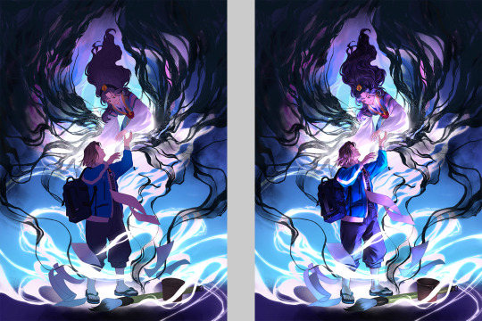
More rendering, use gradient map to adjust the tone → Post effects
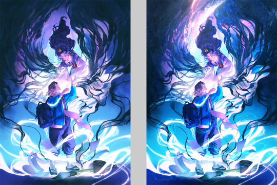
Done!
Wow, this turned into a long post! Hope you found something useful here! Thanks for sticking around till the end! 🙌✨
38 notes
·
View notes
Text

(Click image for better quality!)
Super quick doodles vs. Full sketches!
I wanted to see just the stark differences between my doodles and my render sketches (idk what else to call em LOL) and so I drew this for funsies and to practice my own style! -Anddd to play around with the DCA outfits o3o
vvvv More yapping and Clean Render sketch below! vvvv

The sketch is just cleaned up, not drawn over with lineart, so it's still messy but got that flowy sketchy charm!
Usually Moon is my favorite but that Sun pose and face is just PERFECT. I am so surprised at how I was able to draw that - especially so easily! I was struggling with Moon's face for a bit, so maybe that practice made Sun just come out extra noice!
You'll probably notice some interesting design choices.
Long story short, drawing the ruffles are a bit meh for me, and ironically I don't like drawing necks - which the ruffles hid.
My fix? Put absolutely NOTHING there. Magic✨✨✨
Bendy accordion torso hehe-
The pants have elastic drawstrings for 2 reasons.
1. Ease of access/adjustable. 2. I wear pants like that and they make me happy :3
I also kept forgetting to draw the ribbons, but I decided to play around with the idea of them to see if i could turn it into something fun for me. I turned them more into a wristband with dangling bells - it reminds me of paddle drums! I added them to the bottom of the pants to make the design repeat just a little. :)
Idk what possessed me to draw them so cunty but here we are. o3o
I love the goofy and stylistic mouths I use when I doodle them, but they end up looking like they don't fit right when I render, so unfortunately they disappear for the normal smile...
At least the normal smile is still very charming! ^^
#They are so silly#Why#Sun is so extra in this and I love that for him#This is like... A stylize practice sorta?#All I know is that they're cocky MFS#LOOK AT THE PETTY-#I love the distinction so much lol#Sundrop#Moondrop#FNAF Moon#FNAF Sun#Daycare attendant#DCA fandom#DCA#dca fnaf#fnaf dca#my art
64 notes
·
View notes
Note
I am new to the rdr fandom and have yet to make any art. I want to experiment with a new style, I used to primarily use layer settings for rendering etc. because that was more suited to the fandom I was in at the time. But with rdr I want to make something that has layering with base colors and is reminiscent of paintings, sort of how I see your art, which is why I’d like to ask for advice. How should I make that transition and what are the best ways to learn? (Also if you have time your anatomy is amazing, are there any studies you could suggest?)
On a less formal note your art is extraordinary, I swear it belongs in a museum, though I haven’t started yet you are already a huge inspiration and a motivation for my eventual progression.
Hey welcome to the community! I will detail below.
I would recommend doing small thumbnails of your paintings using your layer modes, the method you are used to. Low resolution, very small, so you can build up comfortably.
Then, use your small thumbnails as some sort of reference and create a higher resolution canvas and paint directly, no color-picking your thumbnail to train observational skills. To realize that the colors and shades and forms can be achieved through direct painting is useful.
Paint simple things at first. Like an apple. Again, no color-picking to apply, but I suggest picking the color and analyzing it and its relationship amongst itself before trying to pick the color without such pixel-perfect help if you are struggling.
imo, the best way to learn, at least for me, is actively observing and questioning the world and its painters' choices of how they have represented it over the years.
How you will think as an artist is crucial. You are to create worlds, things that can exist in nonexistent places, unbelievable creatures, scenarios that never happened etc..... an artist must be present in the world they are creating. We must realize that it is indeed a world, not just a 2d image we are to finish.
Besides the mindset, directly practicing in the form of studies is most useful. Draw everything. Draw your hands, your desk, the trees.
Drawing and painting are one in the same, so it is important to mention drawing and think it equally important. Painting deals with a whole lot.
For anatomy, I highly recommend watching videos of your subjects, not just looking at images. Preferably, real life studies of the subject. If you want to learn animals, say, lion anatomy, there are thousands of lion videos to watch. You can draw while the videos play or pause and rewind, watch frame by frame and question the physics of the movement, guess the next movement of the muscles beneath the fat and skin.
For humans, there are even more videos. I cannot recommend videos enough for studying the anatomy of any creature.
before diving into doing video studies, though, I recommend first doing some small sketches of your subject's skeleton and learn the basic muscles.
you will not know why the lion's lower belly has an indent by the soft skin connecting the leg and torso when it roars and stretches its legs, you will not know that that is the oblique. You will not know why there is a sharp line from the armpit of the human as well as the lion that stretches and leads further into the torso. You will not know that that is the latissimus dorsi and that it's intention is to pull.
It is very important to know these types of core muscles and their functions before doing multiple studies of subjects as they are, when the muscle is covered with fat and fur or clothing.
If you are just wanting to learn human anatomy, I still suggest picking an animal to study, even a bit, too. Humans and many animals share the same set of muscles, just translated and proportioned differently between species. In studying big cats, I learned more about human anatomy and even horses and other animals, too.
Having at least a basic understanding of your subject's skeleton is very important. I say this even more now because I had a friend who was studying horses, not ever looking at the skeleton or muscles, and asked me to critique because she felt it looked wrong.
the horse had odd knees. I told her such. She was very surprised that where I had pointed were the horse's knees.
"Those are knees?!"
If she had looked up an image of a labeled horse skeleton and did some drawings of it before jumping into just studying images she would have known that that little bump was the horse's knee and could not flex how she flexed them.
Thank you so much!! ❤️❤️I wish you the best luck and happy painting!!
39 notes
·
View notes
Text
Wip W- whoa it's been a while
Thanks for everyone who tagged me the last few weeks <3 @theoneandonlysemla @thequeenofthewinter @snowy-weather @skyrim-forever @changelingsandothernonsense
Absolutely loved seeing y'alls WIPs and appreciated that you guys thought of me. I know it's early in the week but imma tag you back if there's anything you're working on atm <3
Also gonna tag @emicat1159 @pocket-vvardvark @edgy-dragon-trash and @nyarevar :D
-
Been working on a lot of writing recently (still nothing that I'm ready to share) but I also started this new painting that I'm having fun with!

It's in the sort of funny pre-render phase where he's just floating in the foreground, and it's been fun bc I'm trying to blend my styles. So I used the rough black and white as a sort of sketch, and then drew and colored over it to set thing up for a more polished render
Also think it'll be cool bc I'm planning on not having a border on this one (because I've gotten a little to used to having that sort of buffer around the drawings and I want to try doing different dimensions). So yeah, fun drawing :D Hoping to make him look pretty evil/unhinged in this one (it's from when he first experiences a bloodmoon).
28 notes
·
View notes
Text
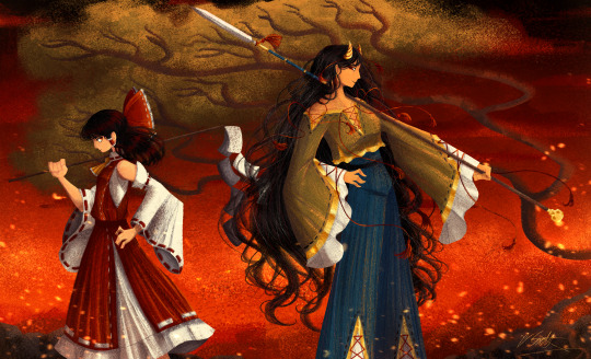
[Click image for better quality]
I FIGURED OUT A WAY TO FUCKING MAKE THE IMAGE SMALLER FOR POSTING ON TUMBLR WITHOUT SACRIFICING THE ACTUAL QUALITY OF THE IMAGE OH MY GOD
Ok so, what I did is go into the clip studio paint file, make a new file, copy and paste the group in the original file, merge everything, get rid of the extra stuff outside of the canvas, and then make the flattened image smaller and crop the canvas. Once you have that, export it and you're done. This helps maintain the actual quality of the image and also helps shrink the file size down to something actually postable (if anyone has a better way of doing this please tell me)
[Edit]: Ok I guess posting something to Tumblr just naturally compresses the image a bit more somehow because I'm looking at it now and zooming in too much makes it a bit blurry so I'm still gonna have to futz around with image quality for future pieces oof
Artist's Note:
I'm so glad I figured out a way to do this because I like working on a big canvas so I can get as much detail in as I possibly can. Only problems are how laggy it gets while drawing lol.
I had an idea for a drawing with Reimu and Zanmu because I really like thinking about their potential dynamic a lot. I also wanted an excuse to draw Zanmu again but in my normal rendering style because last time I drew her she was in my more sketchy style with generally flat colours so I wanted to draw her again. Speaking of, looking at the sketch for this is a jumpscare that I never enjoy seeing, like, man am I glad I didn't use those for my final piece.
Also about her spear. I was originally gonna make it like the ones she had in game, but it kinda threw off the whole piece. It was too big, too blue, and too flat, so I just went "fuck it" and gave her a different one instead. My headcanon justifying this is that the ones she uses in game are for danmaku battles whereas in any other fight she just uses a proper yari, or she still uses the yari and just makes it all glowy to power it up, maybe both lol. I pulled as much inspiration as I could from Sengoku era spears, and even put in some blue into the decorative part of the spear and also added a little skull to pay tribute to the original spear. Also, in my research I saw some art of izanami and izanagi making japan and saw that the yari izanagi has had a little decorative tassley thingy on it so I took some inspo from that and just made it one of Zanmu's tassles (Idk when that art was from or if the spear was still accurate to Sengoku period Japan but hey, probably the same reasons Eirin puts little bow ties on her arrows, it's just for personalization purposes).
I love rendering hair and clothes so much omg, while I like the super curly hair Zanmu, the longer, wavier hair suits her better for this drawing (I imagine it only does that like how Ghibli characters hair moves when they feel angry lol). I love making Zanmu's hair all messy and crazy, as well as giving her grey hairs, this woman has aged like a fine wine. Also, if the hem on the ends of her sleeves, top of her shirt, and her pants look like gold to you, that's because it is! It's fairly light so she's not collapsing under the weight, but it's gold! (I don't care how impractical it is, it's just cool). Not the undershirt though, it's made of a gold fabric. I had a cute idea with Reimu's hair to make it have a red shine to it. I also changed up Reimu's outfit so it isn't just a blob of red. I like it a lot when Reimu's skirt and outfit is segmented into different layers, so I wanted to incorporate that.
I tried to draw their hands differently as well, but IDK how noticeable that is. Also, I am super happy with how the side profiles for the two of them turned out, I used to struggle a lot with how to make the side profile of a character actually look like the character, so I'm really happy that they actually look like themselves.
Also added in the tree and rocks in the background as an homage to Zanmu's character art in Touhou 19, just because I was getting kinda stumped on what to do with the background lol.
In terms of a story idea with Reimu and Zanmu, idk why but the potential plotline of Zanmu wanting to ascend to godhood is so fascinating to me. Like, it is very possible that if she just convinced everyone she was a god (which would be very easy for her to do), she would become one in a heartbeat. Also, if she were to become a god, with her ability to return stuff to nothing, could she hypothetically get similar abilities to (Jojo Part 5 spoiler btw) GER? Like, idk about the death timeloop stuff, but the concept has been haunting me every night as I have been trying to find loopholes in GER's ability for a while now ( for no reason in particular). Back to the main topic, I imagine that she would probably tell Reimu that if she were to become a god she would take over the Hakurei shrine since the god there might as well be dead, and Reimu just says to her, "Over my dead body bitch." Like, I have no idea how to summarize their dynamic but like, it's the type of hero-villain dynamic where the phrase "We're not so different, you and I" would definitely be a phrase said during a fight. I think that if another IN style game were to release, Reimu and Zanmu would be in a team together. They could also have an interesting mentor and pupil kind of dynamic. Can you tell that Zanmu has been charging my mind rent these part few months? Like, instead of living in my head rent free, she kinda just uno reversed the whole situation and now she's the one charging me rent. What happens if I get evicted from my own brain? Actually, scratch that, I don't think I wanna know.
#touhou project#art#fanart#touhou fanart#touhou 19#touhou#東方project#zanmu nippaku#unfinished dream of all living ghost#reimu hakurei#東方
276 notes
·
View notes