#my linework details... my linework secrets... i love telling people all about what i did in a drawing. i leave nothing to mystery
Explore tagged Tumblr posts
Text


#art#traditional art#watercolour#oc art#ocs#oc group: wg#oc: su#first pic was drawn with a different old fountain pen i used to use before i got turned onto pilots#an REALLY old fpr flex nib. it worked alright but that really confirmed the ink was the issue not the pen because#i very much remember how wet this pen could be LOL#second drawing was with india ink which you can see how much darker and richer the lines are <3 my ancient sketchink in my fountain pens#has been. faded slightly with age and dilution with tiny bits of dishsoap etc#the things i do to fountain pen ink. dont worry i use vials to experiment a bit at a time. im doing mad scientist shit to this stuff#anyway yeah the second one i also used a nearly 15 year old dip pen nib WHICH if you dont know you should um#you should replace ur dip pen nibs. they're made to rust and flex out of shape over time. some people say between a few months to a year#depending on the stiffness of the nib and how much usage it gets. honestly i make them last a long time because im that kind of person#BUT i will say. after like 3-4 years of drawing that things done. that things done.#but i wanted to use a really wet really flexible nib and the only super flexy one i had was a super ancient hunt 101 with misaligned tines#used it anyway! it wants me dead but STILL technically functional. technically!#last drawing was drawn with a much newer non-flexible dip nib....#my linework details... my linework secrets... i love telling people all about what i did in a drawing. i leave nothing to mystery#my teachers get really pissed off about it but i looooooove it. you will know what i did in my drawring. you will know.
3 notes
·
View notes
Note
Do you have any tips for making animation-friendly designs? My designs are intentionally accurate to real-life cats, and I love them, but I know they would be super tedious to animate, or even use in a comic! How do you make such simple designs that are still so amazing and beautiful?
Well, it just takes practice and iterations I think! Mostly. But I have a few tips that I fall back on frequently I could share so Here’s my quick hot take on making animation designs:
Simplicity is your friend. I had a professor that used a term “simplexity” to describe the balance needed in order to make a character unique and easily recognizable, but also not hell to render out in a full animation. This is going to mean different things for different productions, for example something on the scale of Disney can have a character like John silver with a multi faceted robot arm whereas if we’re trying to do something low budget (*COUGHforfreeCOUGH*) you’re going to want to minimize the headache people have when drawing your character by leaning into the simple side of this term, so that they don’t want to murder you and will still be your friend after the project is over. (more under the cut!)
So what does this mean exactly? You’ll want to keep the line mileage to a minimum. For cats, this means limit the amount of detail and rendering you give the fur in your linework. I’ve seen Artists who break this rule magnificiently (like Raevi goddaMN GIRL) but for a design it is much easier on artists to streamline down to core body shapes and key character Accents in the fur (like tail shapes, cheek floofs ect). This can be pretty diverse, but I’d minimize it as much as possible (if possible down to three accents, more on this later).
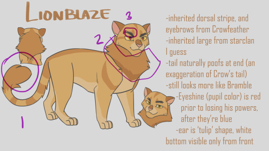
For examples, On lionblazes design (line art only at this point) his Character traits are his tail shape, Mane, and Scribbly eyebrows, all aspects that mean more strokes are being taken and work done, but that are easily recognizable between frames, and artists. I also have brought up Dovewing’s design because it’s more complex in it’s line art, but I could simplify it down even more to just her butt shoulder and ear floofs and still recognize her character silhouette. In fact, paring it down even further would strengthen her recognizability.


The amount of strokes you have people draw in cleanup will drastically change the amount of time it takes to render a character. Between Firestar and Bramblepaw in this shot Bramble easily took twice as long to line (or more!) thanks to his beautiful luscious curls.

Next! Principle I use in simplexity is the rule of three. For whatever reason, the number three is your best friend. It’s not as weirdly symmetrical as two or four, and maintains a unique organic-ness to it without getting carried away by five or seven. Now what am I even talking about? Pretty much everything. This is the secret of markings. This is the secret of character accents. This is the secret of color picking. The Rule of three is your best friend.

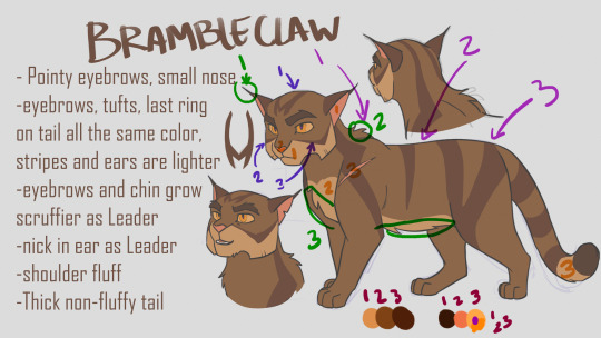
Take Brambleclaw for example. I gave him three stripes/markings on his face, and three on his side. It feels nice and natural and organic, without being overwhelming. I also gave him three specific fur accents in his line art, his ear tips/eyebrows, Belly floof, and shoulder puff. I used the rule of three in picking his colors, three main pelt colors, and three accent colors (eyes are always gonna be more complex if desired, people love rendering the shit out of eyes) and even so, three colors for the eyes. I used his lightest pelt color in only three places, and his Pink color in only three places, and his darkest color in only three places (eyebrows, Tail tip, and if I had thought to write it down, his paw pads). Even his forehead marking has three parts to it. You do it enough and it becomes really natural and subconscious. Of course, like all rules, you can still break it if you need to, but It has been one of my best friends.
Alright last thing to think about for now, (see what I did there? There are more things, but it helps people remember better to learn Three at a Time), are Shapes. Specifically using Simple identifiable shapes when constructing the body or face of your character. This is going to sound similar to the line mileage point, because they are related, but they are different. This is focusing on the macro details of a silhouette whereas Accents are about Micro details. This point also has the added benefit of helping characters look and feel related to each other if you use it potently!
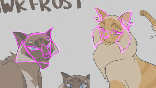
Let’s take Hawkfrost and Mothwing for example. Specifically their faces. Hawk I designed first, and I wanted him to feel dangerous, and maybe a little twisted. So I decided to integrate a lot of triangles into his design because, a triangle’s shape language reads as dangerous. They’re pointy, and sharp, like teeth claws, and knives. We can’t in good conscious put an especially triangular object next to a baby because it inherently feels dangerous. They’ll poke their eye out with that tall prism. Other shapes have their meanings as well, Rectangles (cubes) are sturdy, and circular objects are the opposite of triangles, they’re the shape of eggs, fluffy pillowy things, and babies. They’re inherently safe, and soft.
Pull back from digression. Look at hawkfrost and his triangles. They have sharp claw like tips, which are emphasized even with a noticeable downward curving to their points. This motif is repeated multiple times, in his cheeks, his ears, his eyes, his chin, his nose. This becomes unifying, and inherently feels dangerous and curved, or twisted.

Now look at moth. She has triangles too, but I deliberately went through the effort to make them rounder, softer, inverting the angles of her eyes to feel sad and not cruel. Yet she remains similar in enough ways that she feels related. Her nose curves in a similar downward manner, her ears retain the out down curve without the dangerous point to them. The fur accents of her cheeks add to the roundness, making her feel softer while sharing hawks cheekwings.
Let’s take another example, Bluestar and Snowfur. They are proof that similarities do not have to be reserved to face shapes alone to give that strong feeling of relatedness. In some ways I think theirs is the strongest sibling bond I’ve read in the books, and that obviously translated to how I designed them haha! The idea behind their design was ‘curvy sturdy’ which is reflected in their circular based hourglass figures emphasizing Bluestar’s ‘broad shoulders’. I tried to make their heads more of a squashed circular shape, to give it more sturdy strength while feeling soft and maternal. Her ears are very rounded at the tips, and the particular downward turn is easy to identify and reflect in both cats. Lastly, their square “pants” because let’s be honest, both these she cats wore the pants in their families. There are also enough differences that in pure silhouette you would still be able to tell Snowfurs bushy tail apart from Bluestar’s thinning fur, and snows’ cheekfluffs from blues wide round jaws.

Of course I am not perfect at all of these elements, and there are even more things I could say that make designs unique and easily animatable while also identifiable. If you are looking for more or different suggestions, I liked Tenielle Flowers’ Video she released on the subject: https://www.youtube.com/watch?v=lO-kNlyHn8A .
And good luck!
542 notes
·
View notes
Text
Descendent #3

Descendent #3 Aftershock Comics 2019 Created & Written by Stephanie Phillips Illustrated by Evgeny Bornyakov Coloured by Lauren Affe Lettered by A Larger World’s Troy Peteri What do the Salem witch trials and a missing Senator’s son have in common? The third installment of DESCENDENT investigates the missing link between a mysterious cult and disappearing children. But, as David gets closer to finding out the truth, the cult gets closer to David. Oh, and someone dies. #sorrynotsorry I love Aftershock for the diversity in books that put out and the various genre’s they embrace. For this one Stephanie has found her stride and her voice by combining this kind of secret society older than the country itself and rooted in events that well we are all familiar with. The alternate history aspect is sensational and how it’s been incorporated into this as fact which has been kept secret, hence secret society, and how far reaching it is in the modern government. The idea, the premise of this story and how it’s being executed is something that can be enjoyed immensely. I have been critical in the past of Stephanie’s writing in the past but even then I did see the potential she has and I am so glad to see that it’s coming about. She has structured this extremely well and I am enjoying the whole ebb & flow of the book as we get revelations and information is discovered. That and the story & plot development alongside the pacing which is great and the character development or if you prefer characterisation is right on point where it should be. The story being told in the opening oh yeah that’s this issue’s hook, it is what makes us want to know more and how all this fits into the story. Cotton Mather’s introduction is one that while shouldn’t be a surprise, is a huge one for me and it sets the hair on the back of my neck and arms stand on end in anticipation. There is a sense of sure why not lets say a centuries old cult is kidnapping children and manipulating events. We see this thanks the fact it’s a comic but the characters don’t know it and it will be quite fun to watch the characters try to put all the pieces together. I am telling you I cannot be more impressed with how we see things unfolding here. Evgeny does some wonderful work on the interiors. His creativity and imagination that we see here is amazing and these puritan outfits that open up the book yeah that’s freaking awesome. I am so impressed with his ability to render faces and facial expressions that bring so much emotion to the reader and further the characterisation. The linework is wonderfully done and how it’s varying weights are utilised to create this attention to detail makes this as strong as it is. He has this amazing eye for storytelling as we see through the composition of the panels. From the ice and the amber liquid to the way the hairs in the beard look keep us grounded in this book. The utilisation of page layouts and how we see the angles and perspective here is marvellous. Also the colour work here is sensational and how the colours are utilised to complete facial structure or the folds in the clothing it is really a compliment to the linework as it finishes what we see. This really is such a treat to be reading. It has this whole vibe to it that draws you into the conspiracy that is being laid out before us as if we have that insider feel. With the strength of the storytelling through it’s writing and interior artwork showcase why I love Aftershock and the way that they can see the potential not just in people but their projects as well. Thus introducing the world to some of the most interesting new creators. This is an exceptional book.

0 notes
Text
Conspiracy #3 Denver Airport

Conspiracy #3 Denver Airport Zenescope Entertainment 2018 Written by Hans Rodionoff Illustrated by J.G. Miranda Coloured by Leonardo Paciarotti Lettered by Taylor Esposito of Ghost Glyph Studios There are many stories surrounding the Denver Airport, is it hiding a secret underground base? Does the creepy Mustang statue ward off demons? What secrets does it keep from the outside world? I have to admit that this issue did a lot for me where my mind and thinking are concerned. To be honest I cannot recall hearing anything about the Denver Airport among the conspiracy theories out there in the world. So now I have something new to think about there and that is what you hope a story will do to a reader, open up something new that they didn’t know about. Then add into all that the story itself, the characters we are introduced to and how it all unfolds and this, this one took me by surprise and in the best possible ways! So the Mayor of Denver is meeting up with Senator Muransky. God only knows of what state she represents but I think that’s irrelevant to be honest because she’s here and that’s that. Her son is along with her and he’s one of those characters you instantly fall in love with. He is crazy, opinionated and definitely the epitome of privilege and stereotypes aside his personality is infectious. What Hans does here with him is some of the craziest in-depth and honest approaches I have ever seen and by god it works like a damn charm. I really found myself engrossed in this story. Any time a story can be this honest in its approach and make no bones about Kyle being obsessed with all the conspiracy aspects of the airport as they walk through it makes me incredibly happy. I learned more about the legends behind the airport by reading this than I would’ve imagined was even out there. It also sparked my interest in the airport and I wanna go explore for myself! Yeah, that’s the power of storytelling. Kyle is someone you want to see go through this and find out for himself if the rumours are true and root for him to boot. You want to see him be able to live stream or Instagram live or whichever social media platform it is he uses and tell the world about what’s going on. The interiors from J.G. and Leonardo are spectacular! I so impressed with the linework here from it’s delicate use to its boldness and how they are can be used side by side or even blended to create this magnificent attention to detail really is marvellous. The way we see the entire panels utilised as they are fleshing out the airport and the scenes are so stupendous in how it expands those moments and brings this whole size and scope to the story. The utilisation of the page layouts and how we see the angles and perspective in the panels show us this meticulous eye for storytelling. The colour work here as well is just as impressive in helping to flesh out this story. The writing here is superb and I mean that with all my heart. The way the story unfolds and all the twists and turns that encompass what we see makes this one of the strongest stories of the week. The way we get into the characters and care about what is going to happen to them is insane. Everything and nothing is what it seems to be here and that by the end of the issue we see our intrepid duo talking about these people I sincerely was wanting to see Kyle hook up with them. This series has been nothing if not fascinating and the tension created here to finally see where it’s all going pretty much guarantees that we’re coming back.

0 notes