#my layout for the images messed up? so I had to take screenshots of them grouped. hope they aren't too compressed
Explore tagged Tumblr posts
Visit Tumblr Blog
Explore Tumblr blogs with no restrictions, modern design and the best experience.
Last Seen Tumblr Blogs


Fun Fact
Tumblr was the first site to host the blog for President Barack Obama in 2011.
Text
Chismest Dialogue (Part 2)
Part 1 here. Lotta Lori in this one.
Continuing on, Mirriam has a little more to say, she'll get excited about blasting something if you find Elara after attempting the overseer song.
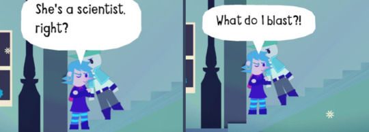
Bard: “I found an astronomer who wants to take down the factory.” Mirriam: “So what do I blast?” Bard: “What?” Mirriam: “She’s a scientist right?” Mirriam: “So she knows where to hit to knock out the whole system!” Mirriam: “What do I blast?!”
Beth's got some things to say about Elara, makes sense, we do have our meetings there.
Hint:
“Lotta fun characters come through here, oh yeah.” “That astronomer from outta town’s always here. Middle of the night.” “Like midnight till 5AM. Always orders the same thing.” “Why? Who knows. Who cares.”

“You part of that group that meets here every night?” “Ain’t gonna lie… you are a very suspicious bunch.” “Don’t bother me none, though.”
Beth and Tanya will gossip about all the recruits as you help them; For Winston:
Beth: “‘Parently the purple whiny guy took up care of the town stray.” Tanya: “WHAAAaaaaat! Ya don’t say…” Tanya: “That punk ain’t cared for a thing in his life, Beth!” Beth: “Just what I heard.”
For Peter/Mirriam:
Beth: "Well, apparently that guy on the roof found himself a girlfriend." Tanya: “Gaaaaaaaaaaasp! Ya don’t say…” Beth: “Something like that, anyway.” Beth: “They go Traipsin’ about at 9PM.” Beth: “Girl’s new in town. Nobody knows her.” Beth: “Never thought I’d see the day…”
Talking to Tanya:
Beth: “Well, the astronomer from outta town is scheming something.” Tanya: “Scheming? Whaddaya mean, Beth?” Beth: “Something big.” Beth: “She’s gonna try to overthrow the factory.” Tanya: “Whaaaaaaat??? That’s crazy talk!”
When you have all the recruits she has more to say to Tanya:
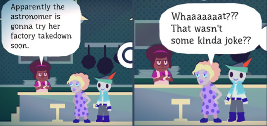

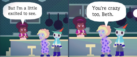
Beth: “Apparently the astronomer is gonna try her factory takedown soon.” Tanya: “Whaaaaaaat??? That wasn’t some kinda joke?” Beth: “Don’t think so. She's crazy.” Tanya: “That’s scary, huh?” Tanya: “What would be left without the factory?” Beth: “No idea.” Beth: “But I'm a little excited to see.” Tanya: “You’re crazy too, Beth.” Tanya: “What else is new.
Katya also appears in the diner around the same time our subterfuge group does.
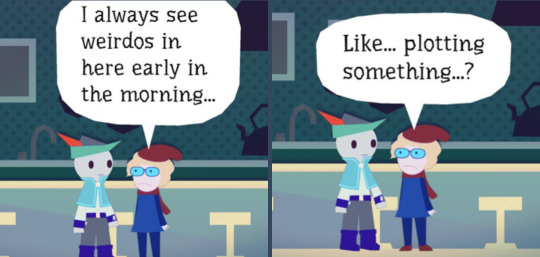
“I always see weirdos here early in the morning…” “Like… plotting something?” “Are you one of them?”
Lori has a lot to say about Elara! Probably meant as tips but she mentions her a LOT.


Hints:
“Oh evenin’…” “Just doin’ my nightly sweeps!” “Us late nighters got a special bond eh?” “Ya ever get a chance to meet the astronomer?” “Never talked to ‘er myself, but i’d give ‘er a knowin’ nod when we pass!”
“Bein’ out as late as me, ya see some funny stuff!” “Like that astronomer from out’a town, eh?” “She goes to Beth's diner every midnight!” “Only time she’s ever in town, don’cha know…”
“Wonder what’s keeping the astronomer up so late…” “She’s not one to stop and chat don’cha know!” “She’s only got eyes for her telescope… or Beth's diner.”
Thats not all, she goes to Beth's diner right after Elara leaves.
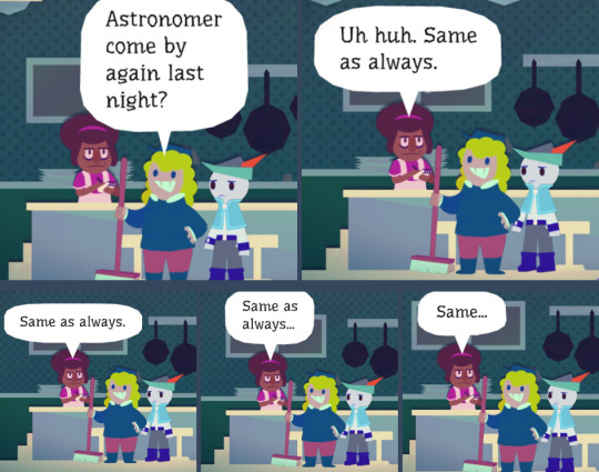

Lori: “Ohai there Beth! Just the usual today.” Beth: “Same as always.” Lori: “Astronomer come by again last night?” Beth: “Uh huh. same as always.” Beth: “Same as always.” Beth: “Same as always…” Beth: “Same…” Beth: “…” Lori: “…”

Lori: “That astronomer gal is just so mysterious, don’cha know…” Lori: “Wonder what she sees up there what with all the smog?” Beth: “I just take orders.” Beth: “Heck if I know.”
Beth: “So how's the weather out there?” Lori: “Ah well. Ya know…” Lori: “Cold.” Beth: “Yeah.”
Thats all for now, If people wanna know about the other npcs in Chismest i'm happy to post them.
#wandersong#wandersong elara#wandersong beth#wandersong lori#my layout for the images messed up? so I had to take screenshots of them grouped. hope they aren't too compressed#long post
11 notes
·
View notes
Note
orv is the first and probably only time i'd ever translate something. i just figured out everything on my own, so it's probably a mess, but here is the stuff i use (under the cut, because it's quite a lot)
for unedited mtl, i take screenshots, upload them to discord, download them on my phone, translate with papago's text on img, and then upload them back to discord to read (you can skip this if you just want to read the images on your phone instead). the translation is rough but it is readable.. though it may take a bit to figure out what terms are which.
make sure the text on the screenshots are spaced out enough (or the ocr will combine lines into a mess), and it'll end up looking something like this


these are the visual settings i use, theme colour doesn't matter but dark mode is easier on the eyes. this takes like.. 5 minutes. it's quite easy (but tedious haha)
now if you want to edit mtl. i'm not sure how it is for others, but it takes me a while. hours to days for a single side story chapter depending on complexity ^^;
while you could just ocr the images to get the text, i've found it to be pretty unreliable. for any sentence that doesn't feel right, i find it easier to just type it out directly into the translator (papago mainly, deepl if the sentence still comes out weird). learning hangul is really not that hard! here's a good video that you can start off with
youtube
and for diphthongs specifically, this video explains it really clearly
youtube
if you'd like to start learning korean, this guy has a lot of good beginner videos too (the playlist is in the description). it's not needed for editing mtl, but knowing basic words and grammar helps a LOT
for typing, i used a website that had the korean keyboard up first. i copied the sentences, very slowly. and eventually i memorized it. at that point i ditched the website and downloaded the korean keyboard layout. for windows at least it's windows key + space to switch language to korean, then right alt to swap between hangul and english, and right ctrl after typing out hangul to bring up hanja
i work with the korean and mtl side by side, and bounce back and forth while going sentence by sentence. sometimes you don't need to do anything other than just rewording the sentence to sound more normal, but when it doesn't make sense that's when i start typing it into the translator
so. you throw a sentence into the translator, and you still can't figure out what it means? mirinae!
this breaks a sentence down, explaining the grammar and you'll be able to tell if there's any words that are werid

here's an example. now when doing this, there might be a word or phrase that stands out. that's probably what's wrong with the sentence. either you typed something wrong, or it's something that a translator can't pick up. google it :) there's probably someone else who already asked what is means, or it's a term that namu.wiki usually has. namuwiki is like a less serious korean wikipedia, but it usually has the terms you need. do look for other sources though, because namuwiki isn't the most accurate sometimes..
add en. in front of a namuwiki link to get a mtled page (example)
if it's a standard word though, just use naver dictionary :)
and for hanja, i look at this as well as googling
if i'm still confused on how a word is used, i'll go to twitter and look at how it's used in different contexts
and finally. keep a note of those terms that are book specific or that the translator have problems picking up. it will help so much when you don't have to go down a hole every time that term comes up again. or just terms that come up a lot. it helps to keep things consistent :)

here's a snippet of my notepad. there's definitely a better way to do this. but i don't feel a need to find anything else right now
how do u set up machine translation?
OK SO
First of all, I downloaded a website translator. I use mate translate, a firefox extension. It's an absolute lifesaver for navigating ANY site not in English.
Using that I made an account on Munpia and bought the sctir chapters as I translated. Munpia doesn't let you select text, so I used an OCR website! (Aka sites to get the text from images)
Now the two that I used were imagetotext, which is quite fast, but likes to fuck up and malfunction, forcing me to restart the process a lot. Bc of that I switched to prepostseo, which works well enough, but does require you to do a captcha test every. single. time. And I am SO FUCKING BAD at those that I went half insane.
So what I would do is to take a screenshot of whatever page I'm on, get the text through the OCR and paste it into Obsidian (I make two separate files for each chapter - RAWs and TLed) until I have the whole chapter.
Now, the formatting does get kinda fucked up. While I use the text on Munpia as a reference, I fix up the formatting of the text.
This is where it gets a little complicated: I like to use Azure to translate. It's a service offered by Microsoft, which includes a translator that, in my experience, is a little better than other machines. And since I don't edit the text this has proven to be VERY useful to me.
But setting up Azure is an absolute bitch and a half so I could also recommend Papago. They include definitions of certain words too, which is really useful. You're just gonna have to do it bit by bit.
Lastly? I recommend learning hangul. It's super fuckin fun (to me, but im a huge nerd) and it will help you with understanding when something's mistranslated a LOT.
The translations are pretty.. Well, they're unedited machine translation. But at least you won't have to wait 12 years for all 870 chapters to get translated. I say that you enjoy the process (It's very very repetitive and I highly recommend putting on a show in the meantime!) and just.. well, just have fun.
I've found that I really enjoy some of the descriptions even when they're not the best. And good grammar gets overestimated anyways. Talk to any older immigrant and they'll tell you the most fantastic stories while inventing sentence structures never before seen (Speaking as a child of immigrants here lol)
And gosh even with the translations being fucked up I've still had so many moments where I got so emotional I cried. The author is a wonderful writer and I can't wait to learn korean enough to be able to read the original text
That's all for now! If it sounds complicated, thats because I do NOT know how to keep myself short ^^
#long post#i just started rambling i'm no expert either#if you have any specific questions feel free to ask#Youtube#ok i did say days but it does depend on my motivation too#orv is like idk average 2k words per chapter and iit's like 8 hours average#but lately there's been a lot of murim terms which makes things hard. i haven't read murim ㅠㅠ#i am very very unfocused though. i get distracted soo easily if it was anyone else they might be able to do it faster#i might take some time to do it but i WILL finish it eventually i am pretty stubborn when it comes to finishing something i've started#... kind of why i have a problem with starting things i feel the need to do it all the way if i ever do start it. and i KNOW that#so i try to limit the things i start. too bad i'm impulsive lmao
47 notes
·
View notes
Text
Bothersome Beams in Sirena’s Sickbay
You know how I’ve drawn a clean layout of the Captain’s Quarters to make it reflect the room as seen on screen by e.g. erasing the false door, adding in furniture and marks for the windows, etc? I've been doing that for a bunch of other places as well (toooootally not because I’m procrastinating the two Deep Dives I should be working on....), and a few days ago I started on sickbay. And now I'm stuck.
I've been staring at this so long my brain is turning to mush, so now you all get to suffer with me!
(Fair warning: there be loads of extremely pedantic observations ahead. I hope you like staring at deck plans :D)

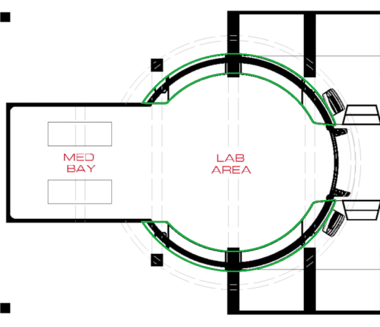
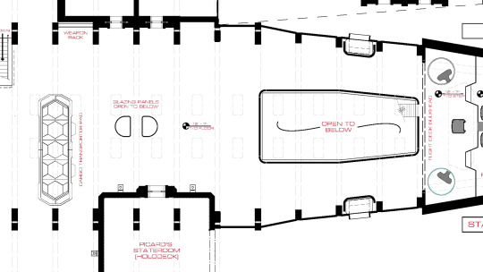
This is the outline of sickbay on the deck plans from the blu-ray Set Me Up featurette:

(For orientation and because it will become important later: The front of the ship is on the right-hand side, the back is on the left.)
A quick reminder of the relevant main features: the round part of sickbay has walls that slope outward towards the top, a counter running along the wall around 2/5 of the way up, and three support beams cutting through the wall and the counter.
(Note that in reality, the beams are all straight across the top; they just appear curved here due to lense distortion.)
Looking at the concentric circles in the outline above, let’s try to figure out what’s what. Easiest: the broken grey lines, i.e. the largest two circles, surely must be where the wall meets the ceiling at its widest extension. (Here marked in blue.)

Next, when we look at the transition between the rectangular alcove at the back of the room (marked “med bay” in the plan) and the round “lab area”, we see that it’s smooth and there is no step in between.

(Again: the walls are straight, not curved, it looks that way because of lense effects.)
Given that and the thickness of the line, I think it’s safe to assume this is the outline of the wall, most likely at floor level:

These, as far as I can tell, are the windows at the front of the room, next to the door.

As you can see, they extend almost to the top of the wall and stop short of the unidentified outer circle. Looking at a screenshot...
...the windows sit right above the counter, so it makes sense that the remaining lines would be the outline of said counter (here in green):
So far so good.
Here’s the rub. I was trying to figure out what the vertical lines dividing the counter next to the support beams might be, when I noticed these four bits:

Those look like the places where the support beams cut through the counter.
That makes sense, right?
As you’ve probably noticed before, these beams run throughout the entire ship. We see them everywhere on the upper and lower deck, they are clearly the skeleton that holds Sirena together. You can tell how important they are to the structural integrity because all the deck plans have these vertical, broken grey lines to indicate where the beams are located.

Now, take another look at the markings where the beam towards the back of the room cuts through the counter (I magnified the one on the bottom left):

As you can see pretty clearly, the marking in the counter doesn’t line up with the normal position of the beams, indicated by the broken grey lines. It isn’t off by much. My rough estimate so far is that the beams are about a foot wide with seven feet between them, so this is a difference of maybe 15cm (~6″, apparently). But something is clearly strange here.
You can tell there’s something different at the back of the room, because where the beams in the middle and front are marked by long rectangles, the one in the back is only a small square. It looks almost as if there was only a single column on either side. If that was the case, it would probably mean that the beam at the back of the room was a fake, not technically connected to the beams at the rest of the ship like the middle and front ones.
But does that mean it was also moved a few centimetres further to the front? This has been driving me nuts.
There are a few possible explanations for what might be happening here.
1. I am wrong about those being the markers for where the beams cut through the counter. That is entirely possible.
2. Some changes were made to the set that aren’t yet reflected in this version of the layout. As I said elsewhere, these plans aren’t quite accurate to the final set in all details (e.g. the two steps between the mess hall and sickbay aren’t marked), so it’s possible that this is some intermediate version where the counter design varies a little from its final configuration.
3. The support beams at the back of sickbay do not line up with the beams in the rest of the ship. The production designers decided that they wanted sickbay to be the exact size we see in the plans, but for some logistical or aesthetic reason, having the beams at the back of the room in the logical position (i.e. parallel to the ones on the upper deck) didn’t work, so they moved them forward a little bit.
I cannot tell you how long I spent over the weekend trying to make heads or tails of this.
At first I thought: Well, obviously the beams must have been moved to the front. The grey line marking where they should be goes right across the front of the rectangular bit of the room. They’d block the way if they were in the “correct” place, right?
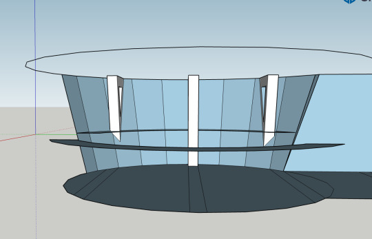
Except I realized my spatial reasoning is woefully inadequate when trying to visualize a round room with sloped walls, so I did the only reasonable thing: I taught myself how to use SketchUp (again) to make a very, very crude 3D sketch of the relevant sections of this room.

Turns out: when you put the beam exactly where it’s supposed to go, it does actually work out okay. I know it’s a little too small here compared to what it should be...

...but that’s probably more due to my estimates for the thickness of the beams and especially the height of the room being off.
I did another version where I moved the beam forward so it sits where the counter is marked on the deck plan, and the difference is pretty negligible:

It looks a little closer to what we see on screen, but again, that’s probably more a miscalculation issue than an honest-to-god result.
As a last-ditch effort I had another look through my screenshot collection. My thinking was that if the beam was moved forward slightly from where it was “supposed” to be, that would mean we’d see more of it.
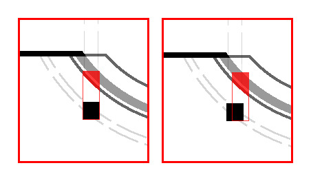
(On the left, the beam lines up with the grey lines. The area where it intersects with the counter (solid red) is smaller than in the right-hand example, where the beam was moved to align with the marking in the counter.)
Likewise, the distance the beams extend under the counter would be different, if not by much.
(The beam on the right is moved slightly towards the middle of the room. You can see that it dips lower than the beam on the left, which is in the “correct” position.)
If this was the case we should be able to see it in the screenshots, right? Except...
This is the view towards the front of the room. It’s difficult to tell with the perspective, but I don’t think there is much of a difference in how far the beam towards the front of the room (far right) and the one at the back of the room (far left) extend below the counter?
Maaayyybe there’s a difference there? But then again, if you compare how far they dip below the tops of the chests of drawers, that seems pretty similar...
And this is the point where I decided this insanity had gone on long enough and I should probably stop before my brain got entirely scrambled (since, sadly, I don’t have an EMH to unscramble it for me).
So, what’s the takeaway here?
1.: Short of somebody from the production team giving confirmation either way, we won’t know what happened here. I might have misread the set plan, the plan might have changed, or the beams might have been moved. It will have to remain a mystery until we get more shots with incontrovertible evidence, or somebody takes a measuring tape to the set and reports back ;9
2.: For the purposes of drawing a layout of sickbay, I’m going to assume the beams are in the correct position, since that makes more sense in-universe. I’ll move the counter markings accordingly. If I have to make a correction to that at some point, at least I have done the legwork and can refer back to this post instead of having to explain the whole issue again.
3.: Yes, I did just spend half the weekend obsessing over 15 centimetres, to the point where I taught myself SketchUp (again) and wrote a way too long blog post (I did warn you ;9 ), only to come to the conclusion that, as we say over here: “Nichts Genaues weiß man nicht.” - I guess we’ll never know. I have absolutely no regrets!
And finally 4.: staring at images of sickbay for hours on end really makes you appreciate just how beautiful that space is. Scroll up again and have a look at the screenshots. The way the circle repeats in the lights and the table and the concentric markings on the floor. The intricate holograms projected by the ceiling lights. The plants and tools all along the counters that give the room so much texture and make it seem like a real, lived-in place. The way the crisp black and white paint on the beams and the gleaming floor contrast with the cared-for but scuffed up plating and worn-off red paint all over the rest of Sirena... I just really love this ship, okay?
Anyway. If you have any thoughts on this, or you’ve noticed something I missed, I’d love to hear about it!
I was about to say “I promise the next post will be shorter”, but who are we kidding? My brain doesn’t do brief. And what is this blog for if not extremely rambly analyses that give us all an excuse to ogle screenshots of La Sirena for a few minutes?
#star trek picard#la sirena#lower deck#sickbay#deck plans#layout#inconsistencies#long post#progress blogging#does it still count as 'progress blogging' if there was no actual progress? 😅#let's maybe emend that to#minimapping#i really hope this was understandable and i didn't butcher too many technical terms#who gave the non-native-speaker with the very shaky grasp of interior design and architectural terms the keys to the mapping blog?#at this point the word 'beam' has lost all meaning to me...#but any weekend that involves staring at pictures of Sirena for hours and yelling observations at my friends is a good weekend!
9 notes
·
View notes
Text
How to avoid stretched images on your desktop Tumblr theme
This is a post originally made by tumblr user fox-orian, who was since deleted. I bookmarked it a few years ago because it’s been an issue I’ve had with blog themes since forever, and I have not been able to find another source. The original post can be found on the web archive, here is just a transcription.
I’m reposting it here as a personal reference for the future and for all those who might need it. Disclaimer, the post is old, and the interface screenshots it shows are outdated. This is purely cosmetic, as the buttons are still the same in function, and the fix still works perfectly to this date (august 2020). However, if someone is interested, I can provide up-to-date footage of the fix using my own blogs as an example!
Pictures on my Tumblr appear all vertically stretched! What do:
So, you make text posts with embedded images to the body and for some annoying reason the images always appear to look horizontally squished (or vertically stretched if you prefer) to fit the width of your layout! It ruins the looks of your posts as well as the content itself! How do you fix this? Turns out it’s ridiculously simple!
Go to your Tumblr Customize page, (you should see it as a button in the upper-right corner of your blog page itself,) and click the “Edit HTML” button.

Now, you should see a huge mess of code. Don’t worry about all of this too much, we’re going to be dealing with 99.98% none of it.
What we’re going to be doing is either adding or editing one parameter of your theme’s CSS section to tell images to automatically resize their vertical dimension based on the width of their container. Thus, maintaining a constrained aspect ratio.
First thing is first, we need to check whether your layout already has the CSS entry. Within the first ¼ of your theme’s coding, there should be a line that has the tag <style type=“text/css”>. This is the start of your CSS. The CSS ends when you find a line further down that contains </style>. Take a quick look through this section to see whether or not it contains an entry called “img” – if it does it would likely be near the beginning.
If this “img” entry already exists, we’re going to add one simple piece of code to it. Within the { } brackets following “img”, add this code (in bold) just before the closing } backet: height:auto;
If this “img” entry does not exist, we’re going to add it by making a new line between any other two entries in the CSS section. Copy and paste the following code (in bold) into that line: img {height:auto;}
*Note about the following bit: My theme thinks it’s being clever by substituting traditional greater-than / lesser-than symbols used for HTML tags with left and right arrows. Please disregard this and read them as normal greater-than/lesser-than symbols. Copying and pasting the code text will still work fine in your theme.*
If for some reason your theme HTML does NOT contain a <style> CSS section at all, we can simply create one. Search the first 1/3 of your theme’s code for the line with </head> in it. This is the end of your <head> section, and where your CSS parameters should be. So, just above the </head> line, add the following code (in bold):
<style type=“text/css”> img {height:auto;} </style>
Hit preview, then save! You’re all set.
So with this simple code fix, your posts can go from looking like this:

to this:

33 notes
·
View notes
Note
hi hi dr paint! it's me again, padawin anon! It's been a few months since i've asked anything but i've improved a lot in my art and am really happy with it. however, i'd like your advice (again)..i was thinking i want to do more backgrounds/illustration like drawings. i think that with patience art comes out better but i'm not sure how to approach a background. mainly, how should someone new to illustration/backgrounds approach it? if that makes sense >
Well hello there partner!
Ooo!! I’d love to see your artwork one of these days!! You’re always welcome to ask me anything!
Backgrounds is a reallY HaRd thing to draw because Its all about space and layout and texture and lighting bleh- One of my best friends actually uses mATH to do her backgrounds- and as a total bafoon like me (who cant read or do math) I go in head first and hope for the best. BUT how I do it is layering! let me break up my newest image to show you what i mean-

I first imagine what do I want the background to be and I wanted it to be a warm sunset- this will set the mood for the entire image!

then I plan what I want to be in the foreground and It’s this drawing of ellie i did (I used alot of references from the new trailer and from horse photographs) After I had a rough idea of what I wanted I then wanted a focus point which helped the rest of the layout- so where did I want the viewer to look the most- ELLIE!!! i want them to look at ellie! so I laid out the buildings and lighting to a focus point-

but before all that collect environmental references! - I tend to enjoy nature so when I go for walks or hiking I take a bunch of pictures to help me out like here! (Lake district from the uk) -


and another great tip! use movies (or video game screenshots- video game graphics are so cinematic and gorgeous nowdays) as a practice reference!!!, I cant sweat this enough movie screenshots are PERFECT for illustrational practice for layout, space, a character in an environment and perspective!


You’d want your character or object to belong in their background, to feel like they are living in it rather than a background to just cover the white space- unless thats what you want then yazee! you can do that! But there is something so enchanting and beautiful seeing a character come alive with an environment and the space around them to tell a story of what is happening. (this is why I’m studying Illustration hh I love a good narrative) It also would help if you grabbed some screenshots and practices and mess around with what you’ve learnt! I’m still learning also but no one really gets it right away so be easy on yourself! : DI hope I was of some help!
56 notes
·
View notes
Text
Final Thoughts on Experience
INTRODUCTION
As a Bachelor of Applied Science candidate, I am more focused on the interface design aspect, mainly dealing with web + mobile design & development. I enjoy creating digital arts with a combination of computer programming in HTML/CSS. My hope is to become a UI/UX developer at a high-tech company like Google, Amazon, or even Yelp. That is why I am thankful to have interned at One Wave Designs during the summer of 2018 from June 1st to August 31st as a Web Design & Development Intern.
INTERNSHIP PROCESS
Learning Experience
As a Yelp Elitist, I searched up the “Best Web Design Company” on Yelp, in which One Wave Designs popped up as the first search with a 5-star rating! I gave it a shot and emailed the President/CEO/Owner of the company, Paul. He responded back asking for my resume and portfolio where I finally got a response a month later that I got the internship position!
During my time as an intern, I was responsible for mainly 3 things: web design & development, layout concepts, and SEOs. I mainly worked on 8 projects in 10 weeks. I learned that SEOs (Search Engine Optimization) is very important in web development because websites with good SEOs will always appear at the top of the search list depending on keywords that you use. For instance, if I were to type “Hawaii Web Design” in Google Search, One Wave Designs will be the first to pop up under all the other Google ads search. I learned how to hyperlink emails (mailto:) and phone numbers (tel:), which are also important factors in SEOs. Hierarchy, or the way you order the sizes of the header and texts, also matters too. When you’re adding images or links, it’s good to add a title or alt texts to increase SEO keyword searches. Lastly, saving/uploading images that are 200K or less is great for websites because it loads a lot faster.
I learned how to use 2 types of content management system (CMS), DNN Software and WordPress. I am very familiar with WordPress, it was my first time hearing about DNN. Unfortunately, though, DNN is not used as often anymore and non-developers are shifting to easy CMS like WordPress.I really liked using DNN because of how much coding is involved, whereas WordPress is almost dragging-and-dropping... this is more ideal for non-coders.
I learned how to use an FTP (File Transfer Protocol) software called FileZilla. This allows me to be flexible and customize a website through HTML/CSS coding. Basically, I can manipulate a style of the website by changing up the codes - which can only be done by FTPing and coding. It’s very confusing to explain and understand... I never heard anything like it before until I interned here! After taking web design & development course here at UHWO, I learned that it’s always a smart idea to make copies of the original files that I’ll be editing incase I mess up the codings. Don’t want to repeat that mistake again because there was a time where I had to reset the entire website and build it from scratch. :(
Layout concepts were the MOST STRESSFUL projects I had to do when I interned here. I honestly kind of dreaded it. Paul hated doing layout concepts too! Which explains why I always worked on them instead of him. These 4 software helped me a great deal when I had to make layout concepts/drafts for potential clients:
WhatTheFont.com
Google Fonts
Pantone Color Picker
iStockPhoto.com
WhatTheFont.com allowed me to upload a screenshot of a word so that it can identify the font types for me. Once it generates a few options of fonts, I’d download them (for free) using Google Fonts. Fonts that I find on Google Fonts are great for websites because it doesn’t have to be embedded. Another thing with the web is determining the color, so that’s why I always use the color picker on the Pantone website. Lastly, copyrights and permissions on images/videos/etc. are always questionable. That’s why I always look up stock photos on iStock since we have a subscription with them anyways.
Discoveries
I feel like I’ve grown as a person over the years. I used to be so shy and quiet, never being the first person to speak or raise my hand. Through this internship among other things, I learned how to speak up and ask questions when I needed to. If this is an unpaid internship that I am devoting much of my time to, I EXPECT to learn quite a few things. It never hurts to ask questions because that’s how you learn -- this is my motto. I learned that I am not that great at criticisms or taking in constructive feedback. I want to learn how to be more patient because there were times I’d get super annoyed when my supervisors would tell me what to do when I’m already doing it or will do it. Also, seeing how much projects I’ve done in such a short time span, I discovered that I am a very quick self-learner. As Paul mentioned, every client will have different expectations when it comes to building their website, which is why he couldn’t help/guide me as much as he should’ve. But in a field like web design/development, everything to customizable and flexible, so there’s never just “one way” to work on every single project.
Sample Work
Here’s a GIF image I found that totally speaks to me when it comes to designing layout concepts: the struggle with making the sizes exact. I was able to learn what the difference is between changing an “image size” and a “canvas size” on Photoshop because of this!

CONCLUSION
I wouldn’t mind working in a place similar to my internship~ I mean, I accepted a job position with One Wave Designs after finishing up my internship hours so that says something :D until this day (December) I am still with them. After 6 months, I learned a lot from working at a small yet successful company. There’s sooOoOoOoo much stress that comes with it. There were several times when Paul would dump a handful of projects on me despite my limited schedule and time constraint. I would lose my cool with him at times, and that’s where I reached my boiling point and told him I had enough. That’s when I discovered how much courage I had. Just a few days ago, I turned in a 30-day resignation letter to him, planning to resign by the end of this year since my last semester of college will be a stressful one yet. After Paul received my letter, he decided to give me a freelance position and allowed me to work whenever I can and work from home instead of in the office (lolol). This is what I’ve always wanted!
To conclude, it was a great experience interning here, but it was even better when I actually got paid. Sometimes I would question whether the amount of work I’m doing would even equate to how much I was getting paid by the hour. Ultimately, I was in it for the long run to build my experience and resume. I finally learned when/where to draw the line, which I should’ve done a lot sooner.
In the end, I learned that it’s good to build relationships with others and never be afraid to ask questions. Since I showed a lot of dedication and commitment when working here, I was able to earn Paul’s trust and was able to get things my way most of the time. I take internship experience very seriously. I’m here to learn so I’m not afraid to ask questions when I need to.
Whoops, forgot to add my presentation slides here: CM 390 Presentation
3 notes
·
View notes
Text
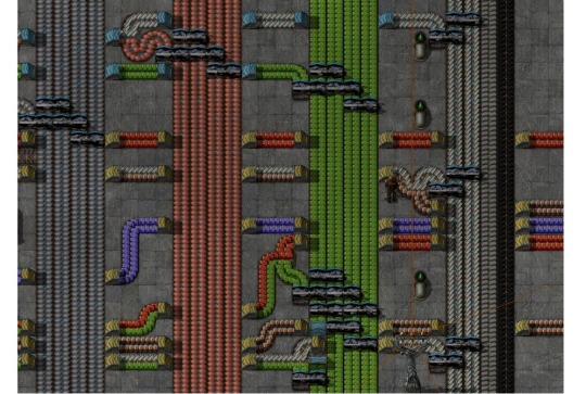
Building a Main Bus

"Main bus" refers to an organized layout for resource transportation. The idea boils down to having several belts full of all the important materials going in one direction, with all the assembly lines to the side of it and branching resources off of the “bus” and into the assemblies, when they are needed.
If you want a bus of your own, the first thing you need to figure out, is where to put your bus. You'll need lots of room in one direction. You should avoid lakes, obviously, but I also like to avoid forests, if possible. They might suck up some of the pollution, but they're a pain to get rid of in early game. I also try to avoid building on top of resource patches (unless it's something you don't need a lot of, like stone). A nice place to start your bus would be the green arrows in this screenshot:

So start by putting down four lanes of belt, leave some space inbetween and place four more. Keep doing this until you have as many as you'd like. I'll tell you about what to put on the bus later. As for the space between the bus, most people leave two spaces, this is enought to let you put an underground in- and output inbetween the lanes. Personally, I like leaving four spaces to have some more room for merging two belts and other spaghetti-ing, but that's just me.
At first, you won’t need all the allocated lanes for each material. So don't bother putting down all 4 lanes as far as you need them. Just put down one at first and then add more if you fell you're getting less throughput than you'd like. You can also use ghost-placing (hold shift while building) or blueprints to plan your bus in the early game. I like to plan how many rows I'd like, blueprint them and then place them down as ghosts so I always know where the belts are supposed to go.
Another nice feature is that you can just put splitters and belts on top of the ghost images without having to deconstruct anything. It can also be a little annoying when you are trying to walk across the lanes with all the belts in place already, because you will keep drifting away. Oh and watch out, as soon as you build your first roboports, your robots will try to grab as much belt as they can find and place it down! Ghost-images are actually construction orders, after all!

Now to grab resources from your bus, just put a splitter down and transport half of the resources off to the side you'd like to build on and use them in your assembly lines. On the way there, you will have to use undergrounds to cross the other lanes of the bus. Note that it’s more efficent to have the line going across use undergrounds, than having them in all four lines of a lane you’re crossing.

But now one of you belts just lost half of it's resources! Unless the assembly lines don't actually use that much and start backing up, which they probably will. But still, the point of the bus is to have large throughput by having several lanes of materials, so you need to rebalance your lanes.
For this, you can use some more splitters. The easiest design is the one on the left, below. Just let the belt split off, then share the content with the belt next to it via splitter and do the same for the line next to it with another splitter before the last one, and so on. This won't balance your lines perfectly, but in most cases it will suffice. If you'd like to properly balance your lines, you can also use belt balancers like the one on the right.

[You can find lots of designs online, for all kinds of balancers. Whether you're looking for 4 to 4, 8 to 3 or 16 to 9, anything's possible. Just search for them, they’re not hard to find. The community has already done a tremendous amount of work on this.]
If you’d like a belt with two items on it, you can simply merge two lines into one. The design below will save a lot of space by having the belt with red chips on them merge into the other one “inside” the bus lane, so it works on a bus with just two spaces between the lanes as well. It will cost you an extra splitter, though. Note how the rebalancing was moved up, till after the undergrounds.

Another tip: I like to keep all my assemblies on just one side of the bus. Just look at the screenshot below; what a mess, right? Now imainge you also had to grab some of the far left material (like iron) and get it to the right side of the bus! This way, there is at least some order in the whole mess, in that you can be sure all your undergrounds move in just one direction. It’s not as bad when you have four spaces between the lanes, but more so when you have just two!
Now, what should you put on the bus? In the end, you have to decide for yourself. People have different playstyles and preferences. But my recommendation is to go with 4 lines of iron, copper, greeen circuits each. Then 2 of steel, plastic and red circuits each. And single belts of blue circuits and batteries. If you're playing the experimental 0.15 version, I would also recommend a belt of coal and stone bricks for (among other things) the new science pack recipe (coal for grenades for military and stone bricks for electric furnaces for production).
You might think about putting gears and copper cable onto the belt, but I would advise against that. They only take half a second each to make and it is usually more than enough to produce them "on demand", locally from plates.
Some products won't be available to you yet, but you can just add them halfway down the line. A classic example would be red circuits. Just split the incoming red chips both ways and let half of them move the other way down the bus. Another idea is to pipe some fluids alongside the belt, to be split off whenever you need them as well! Not all liquids, though. Just acid for batteries and lube for level three belts and electric engines.

Note that maintaining a main bus will require a lot of belt, undergrounds and splitters, so setting up a well working belt array should be one of your top priorities. It's usually the first factory I put on the main bus, after green circuit production (and maybe some extra space to increase said production).
A main bus can be a good way of keeping your factory a little better organized than just having belt spaghetti all over the place. It's certainly not the "end all" of factory layouts. But it can help you to get to the endgame and then using your production capabilities to create a better, more organized endgame factory or megabase.
I've honestly nerver done another game without some kind of bus, after first giving it a try.
7 notes
·
View notes
Text
3D Museum/Gallery Project Process
21.12.18
It was time to start working on my 3D museum/gallery in Unreal Engine. It is my very first project in Unreal, so please excuse me if my subject terminology is off here and there. Also, the project itself may not look great, since I have zero experience with this program, and so I will have to figure most of it out myself.
To start with, here is the drawing I sketched up. It’s what I will be basing my building off of. I detailed this sketch along with a few others about three posts ago, so you can check that out if you want to.

So, first of all, I needed to open a new document, just a plain floor that I can start to build on. Then, I dragged a cube onto it from the geometrical shapes tab on the left. This would be the premise of the entire building, so I wanted to try and stay as close to my sketch as I possibly could. I also chose a simple texture for the starting building. I just chose a kind of brick texture, which I think fits well for now. I also resized the cube. To do this, I used the tab on the right, which when clicking on a shape, lets you view all the information about the dimensions and size etc. There were values of width, height and length. I altered all of these values so that the cube would be much larger.

I was given some tips from my tutor that proved to be incredibly useful to me. One of these tips was that I could check a box while I was on a shape, and then it would essentially turn said shape invisible, and it also cut into other things. This meant that I could put one of these invisible shapes inside of another shape, the starting block, and it would cut into it leaving me with the shape below. I already knew that this tip was going to be very useful for the rest of the build. It was now already starting to look like my sketch, so I was optimistic for the rest of the build.

Next, I messed around with different things, and decided that I wanted the building to be more than just a cube with a glass balcony at the top, so I created another cube of the same size, and then moved it above the original cube. It now looked a lot taller, and more like a skyscraper. Next, I thought it was time to add the glass balcony, so to start with, I made a cube, set the height value to be incredibly low, and made the length and width extend off of the main building. This would be the floor for the balcony. I also changed the whole floor to grass, since it wasn’t just the building that had to look good. I was also just experimenting with textures at this point. This also left the floor under the building the same texture as the rest of the building, which I thought looked good, so I kept it. This happened because the original cut that I did was just above the ground, so there was a bit of excess from the original cube there.

Next, I thought I would skip the glass that went around the edges of the balcony, and decided to work on the giant glass windows on the sides of the lower part of the building. To do this, I made a cube the same size as the starting cube, resized it so that it would fit into the side, with a bit of room around the edges, and then I checked the box in the tab on the right, which made the shape cut into the wall. This would be the area where the window would be placed over. For the window, I just made a cube, resized it to be really slim, and changed the texture to glass. Unfortunately, when I placed the glass over the cut in the wall, it was basically impossible to see, because there was just darkness behind it. You can kind of see what I mean in the screenshot below. For now, I decided to move the glass far away from the wall, so I could work on the inside, where I would need stairs etc.

Next, it was time to work on the glass balcony, which was a very tedious task, but when I finally finished, it looked good. What I did was make an elongated shape, which I did by checking the length of the balcony floor, and set the shape at the same value. Then I thinned it out, and made the height value much lower. I changed the texture to glass—luckily, it was much more obvious that it was glass, since at all angles, you can see the sky behind it, which gets slightly darker. Now I just had to get it exactly right above the floor, as well as right on the edge. It was tedious as I mentioned, and when I’d finally gotten one done, I needed to make the other three too. They kept on going through each other when they reached the corners, so I had to take the length of two of the shapes down a notch, so that they wouldn’t intercept each other.

Now, it was time to add something new. I decided to add some steps leading up to an entrance that would be added later. Luckily, there are pre-made steps, so I took them from the geometric shapes tab, and resized them accordingly, as you can see below. It was a pain to get them to be the same width as the building, but I managed it. Along with this, I changed the floor to be stone again, and also made an outer section, which I would give the water texture. Ever since I first saw this texture, I thought it was really cool, so I wanted to incorporate it into my work somehow, here being perfect I think.

I started to work on the insides of the walls now, where the steps leading above were. This would be difficult for sure, and I may never get it to look good, given my skill level in this program, but I will try my best for now. First of all, I made that entrance, which you can see on the far right on the screenshot below. I just cut into the wall with a shape size I deemed acceptable. I dragged some more steps into the building, under the entrance inside, and then I added some more to around the middle, where the staircase(?) would start. I made some small cubes, and placed them behind the steps. You may have also noticed that I changed the flooring around. I made the floor adjacent to the building all water, and then made another layer which was stone. I made sure that it connected to the steps on the outside, so you can avoid the water. The water, by the way, being very shallow. I then added a final outer layer that was water again. I think it looks alright, maybe I will have to work on it though.

Next, I wanted to work on the top of the building, which would probably house the gallery (maybe, I may still put some in the sides of the walls, which was my original plan). I made two cubes of the same dimensions, and then cut them into the walls, this made it so that there was a space in the center of the cube, and also kept some pillars around the corners, which I think looks really good. I then did what I did earlier, and made some glass to fit into the windows. I left one open, since I would be doing some tests with the playable dummy soon. One other thing I did was completely change the textures of certain aspects. I made the outer walls etc. a smooth white texture, which I think makes it look more modern. I also decided to make the roofs a wooden texture, as well as the floors, which I think looks good for now, but it may need to be changed later. I did keep the inside walls as stone bricks, since nothing else seemed to look right.

Next, I ran the tests that I mentioned in the previous paragraph. I just moved the dummy onto the top floor of the building, since he was just hovering in the abyss, and fell as soon as I clicked play. The whole map played well, which albeit, isn’t really all that important. I did run into a little obstacle however, which was the entrance to the building. The model could fit through it, but it was way too tall. So I had to make it smaller. I kept clicking play over and over, until I got it so that the character fit perfectly through the gap. He can’t jump when he’s in there, and if it were one point shorter, he wouldn’t fit through.

For now, that’s all that I’ve done regarding this project, and I will say that I’m proud of what I’ve done, given that this is my first experience with making a big building in this program. The outer floor kind of looks tacky though, so it may need changing later on. The inside also doesn’t look too good from this angle—I think it’s mainly the stone brick walls that don’t look very appealing, but it’s just that there is no other texture that I feel fits. Anyways, below is a screenshot showing the final building. I will work on this in class after the holidays.

[11.01.19 Update]
After the holidays were over, it was time to work on my building again. I’m pretty much done with the building anyway, so I have just done some final refurbishments. I have made the first water ring on the floor just stone brick, outlined by the white texture and then kept the water on the outside. I raised the glass walls on the balcony, since I felt that they were too low. I also made the balcony floor thicker. I changed the textures throughout as well. The bottom half of the building consists of a greyish texture, whereas the top is comprised of a more cool blue texture. I think they compliment each other nicely, and before, the white was just too much I think. I have also chosen to remove the steps in the indent on the bottom cube, since I just didn’t know were I was going with it, and it just looked really out of place, so I decided to just cut it out. I will just have the necessary information and pictures hang on the wall etc.

Now it was time to import the actual information onto the building. To do this, I would open up Photoshop, then make a wide document, and copy some of the information from my blog post about The Bauhaus, Russian Constructivism and Dadaism, respectively. I made a nice, simple layout with a black block at the top of the document, which held the title of each section. I also added an image corresponding to the theme, like for The Bauhaus, I used a black and white photograph of the school. For the middle section; Russian Constructivism, I thought it would look good if I were to flip the design and have it start with the image, down to the title. It ended up looking good in the end in my opinion. Now to get them onto the building, we had to first save the documents as pngs, and then we would simply click on import in the bar at the bottom of Unreal, and then just drag it from the bar onto whatever you wanted. I made thin plates sticking out of the wall because that’s how I wanted it to be presented. It was really stretched, so I had to resize it so that it fit better.

Tragically, I’ve managed to lose my USB, so I do not have the rest of the project recorded anywhere. Luckily, everything I have done has been screenshotted and written about above.
0 notes
Text
Evaluation
The first brief of unit 11 which was called “Wandering’s” we had to collaborate with the fashion students to create and design a broucher
by using their pictures that had to relate to the poem that we were given, “The ships are laying in the bay, The gulls are swinging around their pears;
My souls eagerly as they desires the margin of the stars, so much do i love wandering, so much i love the sea and sky, That it will be a piteous thing,
in one small grave to lie.” my team had a meeting to discuss what the plan is for the broucher and the first thing we did is split the poem into 4 so that
everyone gets 2 sentences each for each page, from a random selection i got the quote:
“so much do i love wandering, so much i love the sea and sky”.
The colour scheme we were given by the fashion students were black and white with shades of blue.
Not the colour scheme we had all planned on doing but it was something interesting and challenging because using black and white doesnt match with blue
or and green. it is hard on the eye and not confortable to look at, i was looking forward using warm colours and cold colours like blue, yellow, orange red and black
but it didnt go as planned, so I decided to take a different approach instead of typography so I took the more illustrative approach.
After the disappointing pictures that the fashion students sent, it didnt relate to the poem so we had to improvise by researching
into the colour theory and into which emotion does the colours represents. we decided that our primary colour for the broucher
should be blue because blue has relevance to the quote “sea and sky” and Blue calls to mind feelings of calmness or serenity.
It is often described as peaceful, tranquil, secure, and orderly. Blue is often seen as a sign of stability and reliability which is the
emotion that we were trying to portray. another colour that we chose was green because Green is a colour that can evoke powerful emotions.
It is a dominant colour in nature that makes you think of growth. Think of nature and see the incredible variety of shades of green expressing
renewal and life. Green evokes a feeling of abundance and is associated with refreshment and peace. we also agreed on black and white and monitory.
before discussing about the fonts we decided to research into broucher designs on Behance with the same colour scheme as planned for our broucher.
i shared a lot of screenshots and ideas about the broucher design however we couldnt all agree on the same layout because none of us really thought
would fit the theme we were looking for so we came to the conclusion that everyone in our group should make sketches of different layout for the broucher,
i did 5 sketches but the positioning of the layout was all over the place and it didnt have great eye flow for the reader, my initial idea was to create a story with the illustrations like for my quote that i was given i wanted a old ship sailing on a lonely sea with sun gazing down on the boat,
my team had great communication but it wasnt so much about work. after i requested a meeting to talk about the fonts to use to keep it consistent
throughout the broucher we as a group decided on 3 fonts from: http://velvetyne.fr/. we decided to use, format-1452-master, mr_pixel_1.zip
and Solide-Mirage-master. we decided to use velvetyne because it uses a wide range of interesting fonts that are not used as much in designs.
We told Tamsyn that we was having trouble using the pictures that the fashion students sent to us because they were low
quality and has nothing to do with the poem itself, and she suggested us to use a free to use images with high quality from: birminghammuseums.
However we couldnt find any good images to use so we decided to go with the original pictures they send us. from the project started my group
started to become friends and joke around and waste time and we forgot to design the broucher itself so we did it last minute really fast. i started
to panic because i couldnt finish my page on time due to bad time management and we rushed the work and it didnt come to the standard and quality
i was looking for, I'm personally very disappointed with the outcome of our broucher.
Holford drive
The second brief of unit 11 which was called “Holford drive” is about a community about sports on the brief it was requested to create
a broucher and social media like Instagram and website design for them. The first task was to create a studio name as a group, however
that day the team was inactive because some was working on finishing the brief before this one, so i created a name which is
GrateGraphics because its a catchy easy name to remember. i did a lot of experimental work with the logo, went from Grate to
Gr4ate to Gr8 to make the logo simple and easy to recognise, so i decided to stick with Gr8 Grafix.
This brief supposed to be easy because i love marketing and re-branding a brand however, the groups that the teacher
put us in was very disappointing because the whole group apart from Yusuf and i was very inactive and didnt put effort into the
project and that really let me down because me and Yusuf had to work really hard and over worked ourselves to the point
where we just gave up after multiple times of trying to create contact with the team, multiple times tried to make a group call but
no one attended, multiple complaints to Tamsyn about the team isn't working
and she advised us to create a final meeting and give roles to everyone, form then I took control and gave everyone in our group
rolls and the time and date they had to be finished with the tasks I gave them but no one actually did the work I gave them.
this situation really set us back because projects started to climb and we had to finish the presentation for hold ford drive to see.
i did a lot of research into broucher and web designs on behance and shared that with the team which it wasnt seen by them and
started to experimenting with layout and design for broucher, me and Yusuf took control of the project because the team wasnt
being responsive so we chose 2 main colours, navy blue and lime green. navy blue represents hard work and dedication and
its also a rich calming colour with it symbolises some of the activities that holdford drive provide like tennis and yoga.
lime green represents nature and activity it represents movement and sports, we choose lime green because of the activities
they provide like running, football and basketball. one of our team mate said he will work on the broucher so I decided to work on
the presentation and team management which means if anyone needs help with like layout i will fix it for them...
but my team-mate didnt create the broucher design so i had to take control from there and had to put Yusuf in charge of
presentation.
However, projects started overlapping each other because it was only me and Yusuf working on it and put the project on hold.
Branding
For branding i decided to create a clothing brand named Antonios, the reason i created clothing brand its because my dream is to
have my own clothing line in the future, i want my brand to be named Antonios because i want to put my personality in my brand,
i want my brand to be for broken people, the people that hold a lot of emotions in and are afraid of releasing their emotions,
before i research into designs i decided to go outside and take pictures in town of logos and brans and list what i like and dont like
about them. my favourite one was “Coach” because the san- serif font represents growth and heritance. I took inspiration from that logo
and i created my logo ANTONIO with a backwords n to keep it original. what my brand is about? I want my brand to represents your
emotions, for example - broken heart is a design of mine that i created for people who are hurt by others, what my mission is
to make people wear the clothing that they feel like it best represents them. my target audience is the quiet person who would
rather live in his or her own world than reality.
Overview
The biggest problem is the Holford drive, it messed my time management because the team wasnt working together and or at all
and that caused projects to overlap each other and put me in a difficult place because i just gave up, i kept over working myself
with work that i didnt even upload on tumbler. I'm really disappointed with unit 11 outcome because i dont have work to showcase
i kept over working myself and worry about doing the work instead of me actually doing it witch it made me lose work and not
get the merit that I was aiming for.

0 notes
Text
9th May 2017 - A Design Breakthrough
In my last blog post, I spoke about troubles I was having in regards to the designs of the supporting materials for my font. I’d found it rather difficult to come up with a design style that worked well aesthetically and functionally, that suited my font, and that I actually liked. I’m glad to say that today I made a lot of good progress towards my final results, and I’ve come up with a style that meets all of the criteria I just mentioned.
After writing yesterday’s blog post, I continued working on different poster designs into the night. These posters followed the same colour scheme as the ones I posted yesterday, but featured much more experimental compositions. The first one I made is Poster 7, and features the words ‘NEUTRO GROTESK’, I took away the fill colour of these words, just leaving a 2 point stroke outline around the letterforms. I then stacked these words on top of each other over and over again until I had reached the bottom of the page. This created a sort of web effect making much of the type illegible apart from the very top and very bottom words. In my head, the idea seemed pretty cool, but in practice it doesn’t really work at all. Below you can find Poster 7.

I wanted to keep trying more experimental compositions, but this time I wanted something a bit more legible. For Poster 8, I typed out the words ‘NEUTRO GROTESK’, duplicated it, and stacked the two names on top of one another. I left the top name with a black fill, and took away the black fill of the bottom name, leaving only the stroke outline. I then continuously duplicated the two names, and rotated and shrunk them in a way that creates the illusion of a downward spiral from the text. I thought this effect looked much better than the one I had produced in poster 7, but it still didn’t feel right for the font. Below you can find Poster 8.

For Poster 9, I tried a composition that was a bit more traditional and toned down. I used the same colour scheme as the previous two posters, and placed the name, description and character list on the poster. The name has it’s fill colour removed, leaving just a stroke outline. All of the elements in this poster are centred for better clarity. I liked the idea of this poster, but put into practice it just isn’t too exciting, and doesn’t compliment the font at all. This idea could work, but I would definitely need to try it a different way. Below is the 9th Poster in my series of drafts.

I began my day today by doing a quick bit of visual research on International Typographic Style posters, to get some inspiration for colours and compositions when I would attempt creating posters in this style. I then went to coolors.co, and generated a colour scheme that features two tones of white, a yellow, and two tons of black. After having a bit of a mess around in Photoshop with the colours, I’d found that they actually worked really well together, and so I decided to use the colour scheme in my posters. I designed Poster 11 using a very simple composition, made up of two large circles that overlap each other at the centre of the page, with text set in the top-left and bottom-right of the image. The text in the top left reads “NEUTRO GROTESK”, the font’s name, and the text in the bottom-right features a short description of the font. This type of composition and colour scheme looks a hundred times better than what I made yesterday, but it still wasn’t quite there yet. Below is a screenshot of the colour scheme I used, and an image of Poster 11.


For Poster 12, I tried a more geometric composition, using a yellow and black triangle against the white background. I think the more rigid shape of the coloured elements compliments the font’s design better than the circles in Poster 11 did. Again, the colour scheme works brilliantly here. In this poster I included the font’s name and a bit of information about the font; I also added the complete glyph set of the font as the bottom left of the poster felt a bit empty, but after looking back on it, I feel that this addition is too much. Nevertheless, I think that I’ve found the style I want to use for my promotional materials. I just need to keep designing different variations and refine it for my final pieces. Below is Poster 12.

For Poster 13, I tried another variation of the geometric aesthetic, in which I used four slanted shapes, two of the shapes are yellow and the other two are black. I then placed them side by side, with a space cutting the four in half. The tops of these shapes stops about three quarters of the way up the page. In this top quarter, I’ve placed the name of the font, and a small description underneath. This poster is a bit different from the others in that the name of the font is set in all lower-case letters, this better matches the aesthetic of modernist posters of the 20th century, and looks better in my opinion. Below is Poster 13.

I did a test print of Poster 13, just to see if there would be any variance in the colour of the posters from the computer to paper. The colour on the poster actually came out really nice, looking identical to how it appears on my laptop screen; the only problem I had was that the text on the poster was slightly pixelated, but Jake reassured me that this is just a problem with the printer at UCA, and that there’s nothing wrong with the file. As long as the colour comes out the same when I take the poster to the printers, I’ll be happy. Below is an image of the Poster 13 test print.

For Poster 14, I designed a pattern of black and yellow squares that overlap each other in a diagonal orientation. I then placed the name of the font, all set in lower-case, between the yellow squares. With the short description of the font being placed between the black squares. The orientation of these two pieces of text was adjusted to match up with that of the squares. I really love the background I’ve made for this poster, but the text and it’s placement need some small adjustments. I also did a test print of this poster, and the colours came out perfectly. Again, the text was slightly pixelated, but this won’t be a problem when I get the images printed professionally. Below is Poster 14, along with an image of the Poster 14 test print.


Once I got home, I began work on Poster 15. This poster features black rectangles that surround a yellow square, all of the elements in the background are evenly spaced, and are actually quite satisfying to look at. I then placed the name of the font in the bottom left of the yellow square, and the short description in the top left of the yellow square. Just like the last poster, I really like the background of this poster, but the text placement and sizing could be better. Below is Poster 15.

The last poster I designed today was Poster 16. This poster follows the same principles as the others, and features a very geometric layout. The background is diagonally split into black and white, with yellow rectangles coming down from the top of the page at an angle. The ends of the rectangles are rhythmic, and give the illusion that the layout is moving, well for me they do at least. I then placed the name and short description on the white side of the page, at an angle to match with the other elements on this poster. I think the composition of this poster is a bit too complex, and I don’t really like it, but nevertheless it’s a step in the right direction. Tomorrow I’ll be making some more posters, and then I’ll be selecting the final four that I’d like for print. Below is Poster 16.

0 notes
Text
10 Awesome Mac Features You Can Get on Your Windows PC
I’ve been a Mac user for a long time — the last version of Windows I owned was XP. But I recently built up a gaming PC How To Build Your Own PC How To Build Your Own PC It's very gratifying to build your own PC; as well as intimidating. But the process itself is actually quite simple. We'll walk you through everything you need to know. Read More , and the easy choice for the operating system (OS) was Windows 10. Coming back to Microsoft’s OS after many years of Mac-only existence was a little weird, and I found that I missed some surprising little things from macOS.
Here are 10 features that I missed, and, where I could, how I got them back.
1. En- and Em-Dash
For me this is a big one. As a writer and editor, I use both dashes on a regular basis. And just being able to hit Option + – or Option + Shift + – to get them was extremely convenient. Unfortunately, Windows has no native way of inserting these dashes. If you don’t use them very often, you can copy and paste them from somewhere. Or you can rely on your software to insert them for you, but most software isn’t very good at this.
The best way to get around this problem is to use AutoHotKey (AHK). With this app, you can bind specific keystrokes to specific actions. In this case, I used the following code:
!-::– return +!-::— return
Now, when I press Alt + –, I get an en-dash, and when I press Alt + Shift + –, I get an em-dash. On a related note, AutoHotKey is insanely useful — you should definitely be using it to power up your computer 10+ Cool AutoHotkey Scripts & How to Make Your Own 10+ Cool AutoHotkey Scripts & How to Make Your Own AutoHotkey is an easy way to add shortcuts to your computer. You can download ready-to-use scripts or write your own. We show you to become more productive with automated hotkey tasks. Read More .
2. Enter to Rename
I rename files a lot. When I’m working on an article, it’s not a stretch to guess that I could rename up to 15 different files over a short period of time. And so just being able to hit Enter on my Mac to rename a file was great. My finger is already near the key and it’s easy to hit it. In Windows, pressing Enter opens the file. Not helpful.
The best solution? Learn the Windows keyboard shortcuts Windows Shortcuts 101 - The Ultimate Keyboard Shortcut Guide Windows Shortcuts 101 - The Ultimate Keyboard Shortcut Guide With so many shortcuts built into Windows and its software, it might seem impossible to learn them all. Here's the ultimate guide to the most useful keyboard shortcuts. Read More . Once you’ve selected a file, hit F2 to rename it. It’s also possible to use AHK to make any press of Enter while you’re in Windows Explorer to trigger an F2 press, but this seems like more hassle than it’s worth.
3. Command Key Placement
I realize that this is likely just being used to where they keys are. But I grew to really like the placement of the Command key. I could hit it with my thumb, and easily reach to A, L, C, V, T, and the other keys I often used it with. These shortcuts are accessed with the Control key on a PC, which I hit with my last finger instead of my thumb.
Again, it’s probably just because I’m used to the Mac keyboard layout. But it feels really weird, and like it isn’t quite as ergonomic. Possibly because my smallest finger is weaker than my thumb. AutoHotKey comes to the rescue again, enabling me to change the Control and Alt keys on my PC keyboard. I can even change the keycaps on my keyboard so I remember.
Here’s the script:
LCtrl::LAlt return LAlt::LCtrl return
This messes with the traditional Alt + Tab window switcher in Windows, but fixing it in AHK is rather complicated.
4. Fast File Exploration
In Finder, every time you open a folder, the contents are displayed immediately. On a PC, it can take a few seconds. I found this most notable when opening folders to upload images to WordPress. On my Mac, it would take a couple seconds. On the PC, it was closer to 10–15 seconds total. It’s not much, but it was notable.
Turns out Windows optimizes folders for specific types of files, and that optimization can lead to a slow-down when you’re opening them. To get rid of this, right-click on any file, then go to Properties > Customize. Choose General Items instead of whatever option is currently selected, and the load speed will improve.
5. Screenshot Shortcuts
My job requires that I take a lot of screenshots, so being able to hit Command + Shift + 4 or Command + Shift + 5 was a huge help. No need to open a program — just hit the screenshot shortcut How To Take Screenshots On Your Mac: Tips & Tools How To Take Screenshots On Your Mac: Tips & Tools There are many ways to take screenshots with OS X, using both built-in and third-party tools — each with its advantages and disadvantages. Here's everything you need to know. Read More , select what I want, and the file gets saved to the desktop. Couldn’t be easier. Windows’ Snipping Tool is useful, but it still takes a few extra seconds to get it activated.
Many screenshot tools will give you the option of a hotkey for taking a screenshot. I downloaded Lightshot and set Alt + Shift + 4 to take a selection screenshot and Alt + Shift + 5 to capture the whole screen. Much better. (In fact, some of the features are even better than the Mac tool.)
6. Messages
Because I have an iPhone, I use the Messages apps a lot. Being able to text to anyone else with an iPhone directly from my Mac was awesome. But there’s no way to do that from a PC. And as far as I can tell, there’s no good solution, either. I’ve heard of emulating an iPad and using the Messages apps from the desktop, but that seems like overkill.
The best option, if you really need this functionality, is to use a different desktop messaging app WhatsApp Desktop Client for Windows & Mac Is Only Second Best WhatsApp Desktop Client for Windows & Mac Is Only Second Best WhatsApp finally released an official desktop client for Windows and Mac. Notifications and keyboard shortcuts aside, it's identical to WhatsApp Web for your browser. We show you how it works and better alternatives. Read More . Hangouts, WhatsApp, Skype, and other options will work from the Windows desktop. It’s not as nice as using Messages, but there’s just no fix for this one.
7. Notes
Similarly, I use the Notes app on my iPhone a lot. I use it to keep track of board game scores, take notes on things I see, draft documents, and all sorts of other journalistic and personal uses. The ability to access and edit those notes and have them instantly synced between my Mac and my phone was priceless.
The best way I’ve found to do this on my PC is to access Notes via iCloud in a browser. (Go to icloud.com, sign in with your Apple ID, and launch Notes.) It’s not as good as having a separate app, but it’s close. The browser-based version provides the same functionality as the desktop app.
Alternatively, you could switch to Evernote or OneNote Evernote vs. OneNote: Which Note-Taking App Is Right for You? Evernote vs. OneNote: Which Note-Taking App Is Right for You? Evernote and OneNote are amazing note-taking apps. It's hard to pick between the two. We compared everything from interface to note organization to help you choose. What works best for you? Read More for your cross-platform note-taking needs.
8. Spotlight
Although it’s often neglected, Spotlight is one of the Mac’s best features Search More Efficiently In Mac OS X With Our Top Spotlight Tips Search More Efficiently In Mac OS X With Our Top Spotlight Tips Spotlight has been a killer Mac feature for years, with Cupertino regularly schooling Redmond in the art of desktop search. Here are a few tips to help you find more on your Mac. Read More . Not only does it let you search almost everything on your computer, but it’s also a calculator, weather app, unit converter, and more. I use it all the time on my Mac, and I’ve come to appreciate it even more since switching to Windows.
On Windows 10, Cortana serves a similar function. By hitting Win + Q (which isn’t nearly as ergonomic as Command + Space), you can pull up the bar and search for things on your computer or the Windows App Store. You can also do calculations and get weather information, but none of it is quite as slick as Spotlight.
There are some launcher apps that replicate the file-finding and file-opening power of Spotlight (like Launchy and Wox), but Cortana’s close enough for me.
9. Automator
Unjustly neglected, Automator is a hugely powerful tool 10 Automator Apps You Can Create in Under 5 Minutes [Mac] 10 Automator Apps You Can Create in Under 5 Minutes [Mac] Read More in any Mac user’s arsenal. I used it to create a shortcut so that I could right-click on any image file, select an option, and have that image instantly scaled to 670 pixels wide and converted to PNG. I used it all the time, and it saved a huge amount of time over opening the file with Pixelmator, resizing, and exporting it.
For my purposes, Image Resizer is a great replacement. It lets me right-click on an image and select the size I want to scale it to. It’s not quite as fast as the Automator setup I had, but it’s pretty close. It also doesn’t change the format, but I can likely find another solution for that.
10. Quicktime Screen Recording
Using Quicktime to record everything on my screen The 5 Best Screen Recorders for Capturing Mac OS X The 5 Best Screen Recorders for Capturing Mac OS X From Apple's QuickTime to the widely used ScreenFlow, screen recorders are useful for teaching and training purposes, communicating computer problems, and making presentations. Read More was useful a few times for creating demo videos. But it could also record what was happening on the screen of my iPad, a feature that many Mac users might not know about. When you’re in the tech tips business, this is a hugely useful feature.
The Windows 10 Xbox app can be used to record the screen — just hit Win + G to launch the Game Bar Windows 10 Is for Gamers: 6 Features You Will Love Windows 10 Is for Gamers: 6 Features You Will Love You will want to use Windows 10 for gaming! Whether it's streaming your Xbox One games to your PC, using the Xbox app, or enjoying high performance gaming with DirectX 12, Windows 10 enhances your... Read More and start recording. Recording my iPad screen is a bit more difficult, but X-Mirage lets me turn my PC into an AirPlay server. Using that, I can mirror my iOS device screens right on my screen. And X-Mirage has built-in recording capability. Not quite as slick as QuickTime, but it works.
Converting to Windows
Moving from one OS to another is never easy. You’ll always miss familiar features 4 Things About Windows That You'll Miss On A Mac 4 Things About Windows That You'll Miss On A Mac Thinking about switching over to a Mac? It's easy to find faults with Windows. But are you aware of the things you'll miss? Read More or frequently used software The Best Windows Software The Best Windows Software Windows is swimming in a sea of free applications. Which ones can you trust and which ones are the best? If you're unsure or need to solve a specific task, consult this list. Read More .
What are your favorite features on Mac? Have you been able to replicate them in Windows? Share the features you want and your best tips for getting them in the comments below!
0 comments Write a Comment
0 notes