#my icon is very much multicoloured
Explore tagged Tumblr posts
Visit Tumblr Blog
Explore Tumblr blogs with no restrictions, modern design and the best experience.
Last Seen Tumblr Blogs


Fun Fact
Tumblr has 411 employees.
Text

gotta say i love these immediate mixed signals
#fr though. about the response i expected (ie. contradictory)#my icon is very much multicoloured#you4 l0cal 1d10t ar1#transslender#replies
2 notes
·
View notes
Text
I thought I'd wait until the designs for the whole team are revealed but since we got a proper view of Will's look let's have a few words on the reboot already.
Overall: I think the new art style is fine, haters gonna hate. Will having orange hair instead of red isn't really an issue for me either.
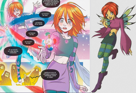
I'm always interested in the henshin look and so far I'm not really into this yet, hopefully it'll grow on me or at least look more interesting in a group of (hopefully) similarly themed but still unique designs. My biggest issue is that it doesn't look very magical, without the twirly patterns the pieces would be normal enough to be worn as a casual outfit at least individually. The symbol on the chest also feels a little unfinished and basic and more like a pin you could get at a comic convention.
As for the wings, I think they're alright but make me think of fairies rather than witches, but to be fair the old ones aren't really witchy either. The old ones are more iconic/memorable though but also a pain to draw.
Also this time around it appears they left out the "the transformed version looks older", which I suppose is fine, the original did actually use it as a plot element and give some character to the girls, but not that much and I really wouldn't care for the discourse.
Regardless Even if I prefer her old look, I think the worst thing they could have done would have been use the same design again, which I don't care for since I've already seen it. And the new look isn't awful so overall feeling positive about this.

Will's love for frogs seems to have survived. She also has freckles which is great.

As for the other girls, I think they look alright too. I prefer Taranee's new hair, Cornelia and Irma haven't changed much (though Cornelia has some moles which is also a nice detail) and as for my fave Hay Lin... I miss the ponytails but as a friend of multicoloured hair I like this too. Dunno about the "Asian girl with a dyed hair streak" trope though but at least if any of the girls were to dye their hair like that I would say Hay Lin would be the most likely one personality wise.
Also since we're changing things around, I wonder if they'll do anything about Hay Lin's name? I hear it's not very Chinese.

Finally Elyon with her "what the hell is going on" design. I really like the old look and the new one is fine as well, it's just strange that she's the only one to get such a huge overhaul, there's nothing left of her old design.
103 notes
·
View notes
Text
Memoirs of a Blogger
After the rain-heavy day that was Tuesday, the 12th of March, the sun was quick to come out on Wednesday, the 13th. And what a glorious day it was! Bleachpanda and I enjoyed another breakfast of grilled cheese toasties at the bakery at our hotel before venturing to Shinjuku station in order to take the train to Skytree. Though we had to transfer once, the ride was fairly smooth and we arrived at Oshiage station shortly after 10 AM.
As we ascended up to the department store to the Skytree counter, I did get distracted by the Kirby cafe, the Pokemon Centre and a ton of other shops including Doraemon and a pop-up store for Poppy Playtime. Not that I play Poppy Playtime but I've definitely been exposed to some of the lore from watching Game Theory on YouTube (it still feels oh so very raw with Matthew Patrick leaving but I think Tom is a suitable replacement). In fact, there was also Poppy Playtime and other indie mascot horror game merchandise in South Korea too.


Once we secured our tickets to go up, bleachpanda and I waited for our allotted time to head up to the observation deck. Once there, it felt like all of Tokyo was laid out beneath our feet. But what was more amazing was the sight of Mount Fuji in the distance.
I'd originally planned to head out to Kawaguchiko to take some scenic shots of the infamous volcano but given how long it would take to get there, I was happy I could cross out seeing Mount Fuji right in the heart of Tokyo.
Still, I wouldn't be opposed to visiting Kawaguchiko or Hakone if I were to head to Japan again. There's something about being surrounded by nature and snapping a shot of an iconic landmark that calls to me. Of course, Mount Fuji is also known for being notoriously elusive even on good days because of cloud cover or fog. So, it was a rare sight indeed for me to glimpse it. Both at the normal observatory and also up high at the Tembo Galleria.
Heck, we even took a photo too! And got mini versions of the tower through the gacha machine. Mine would turn yellow, which, according to the various descriptions of the lighting for Tokyo Skytree is considered a sign of good luck, with its illumination emphasising liveliness.


To commemorate the event of sighting Mount Fuji from on high, bleachpanda and I enjoyed a parfait each at the Sky Tree cafe as we soaked in the sight. After all, we were here on holiday and we didn't have an intense itinerary to hit every stop. And honestly, it works out well. There isn't too much stress and we can go at our own pace to see what we want without feeling the pressure of missing out on something important.
It helped, too, that bleachpanda and I had already visited Japan in the past and felt that some of the sights didn't need another visit.
After we enjoyed our snack at 345 metres above sea level, we returned back down to Earth and tried some shrimp prawn broth ramen before heading to Asakusa.
Asakusa is a historic neighbourhood located in Tokyo and it's a popular tourist destination because of its unique blend of traditional and modern cultures. This was prevalent with the number of street-food stalls, traditional craft shops and rickshaws in the region. It also, more importantly, had areas to rent a kimono.
Since bleachpanda and I had the good fortune to rent a hanbok while we were in South Korea, I couldn't resist the idea of trying on a kimono while here and taking them out for a spin. I went with a tasteful purple kimono with a yellow/ gold obi while bleachpanda wore a multicoloured one with shades of blue, yellow and pink. Once attired, we headed down to Senso-ji temple, visiting the shops and stalls as we did so.
We even, to my surprise, had someone ask if they could take a photo with us. So, if you ever see two Asian ladies and a Latina woman in the heart of Asakusa on social media, it might be the two of us. Indeed, we later spotted the mother and son duo (the son took the photo) as we headed down Nakamise-dori street towards Senso-ji temple.
So, yes, here's ANOTHER photo of the back of my head:


Unfortunately, we weren't able to stay in our kimonos for long and after almost two hours, we had to return to the shop: Silk in order to return them before 5 PM. Afterwards, we were joined by my two Australian friends, who had just missed out on seeing me and bleachpanda rocking our kimonos (although I did send them photos). They were meant to be our professional photographers for the day but alas had got caught up in their own touristy itinerary they had meticulously planned to get the most out of their trip.
And after another wander around Senso-ji temple, the four of us went for dinner at a local restaurant. Full on Italian pizza and pasta, bleachpanda and I called it a night and returned to our hotel. My other two friends would be heading to Hakone the next day and be continuing on their Japan adventure as bleachpanda and mine's was drawing to a close.
Still, the morrow was full of promises to be just as action-packed. And after nearly three weeks overseas, bleachpanda and I would need to dig deep into our energy reserves to keep the momentum going before our inevitable return back home.
A fact which saddened me as I went to bed for the night.
Yokohama, here we come!


2 notes
·
View notes
Text
Midnight Hunt Commanders (and Midnight Hunt Commander)
Another month, another new set release. This time: Innistrad 3 Part 1, Midsommar edition. I’m sure you’ve read all the jokes at this point.
Still, though, I like running through cards like this. I’ve heard some podcasters and other content creators lament the accelerating release pace because it means you only get to do so much “normal” content between set review stuff. But I like set review stuff! One of the handful of upsides of the hypercapitalist nightmare that is WoTC under Hasbro.
Anyway here’s some spooky things you can put in charge of a scary deck.
Adeline, Resplendent Cathar
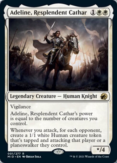
While being strictly inferior to Adeline from Kirby, this card is a surprisingly aggressive beater. She’s going to be attacking for 4 commander damage on turn 4, and that’s assuming no ramp or other creatures on the board. Sure, those tokens are probably going to bite it, but that’s something you can take advantage of! Also, curving her into Cathar’s Crusade is both flavourful and also terrifying. White Token Aggro is far from a new concept, but Adeline is quite the efficient example of the trope.
Lier, Disciple of the Drowned
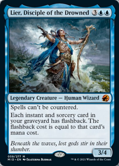
I cannot imagine that many people playing this as the commander. The number one thing you’re going to want to flashback in mono-blue is counterspells, which this card turns off. Sure, there’s some funky things you can do with slow blink effects, but that’s a lot of work for an extra Cancel. With that said, this is going to be in the 99 of so many decks, so I wouldn’t feel bad for Lier.
Gisa, Glorious Ressurector
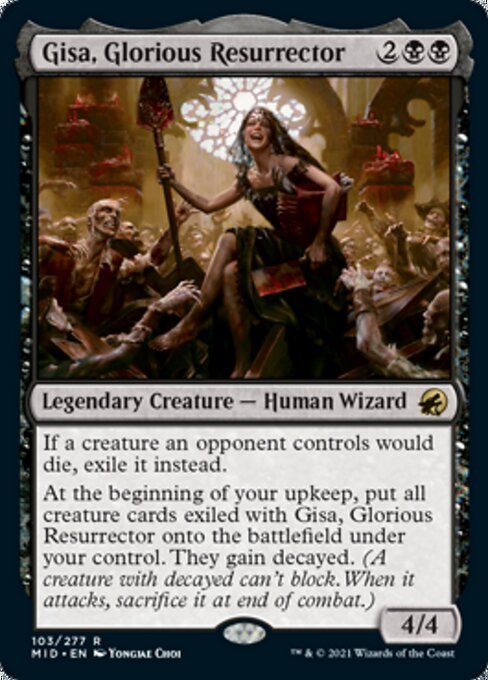
I guess we’re seeing Geralf in the next set? Gisa is super cool- I’m not huge on just having a hate piece in the command zone, but Gisa justifies it by giving you a bunch of value. I’m not sure how I feel about Decayed as a mechanic, but flavour-wise it works really well, and considering how much you can get out of an ETB or just one attack in this format, she’s probably not complaining. I think you really need a haste effect to get the most out of her, though. But she’s cool as heck, another sick card for everybody’s favourite small zombie goth GF.
Gorex, the Tombshell
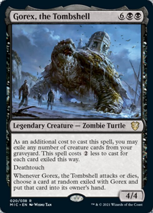
Gorex is interesting, as a pseudo-delve threat that slowly regains the value you put into it, and it is also a giant zombie turtle. On the other hand, it’s not especially interesting. I feel like a lot of these “lieutenant” creatures are really hit or miss, and I’m afraid to say I think this one’s the latter. You can’t even play it with Meandering Towershell!
Jadar, Ghoulcaller of Nephalia
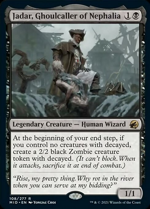
This just kinda feels like a waste of a legendary slot. It’s somewhere between Ophiomancer and Dreadhorde Invasion, but significantly worse than both, and you want to put this in the zone? It’s kind of disappointing, especially considering this dude has been on flavour text since the original Innistrad block. Which was 10 years ago.
Jerren, Corrupted Bishop / Ormendahl, the Corrupter
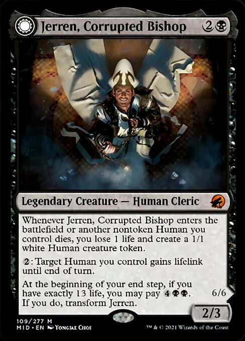
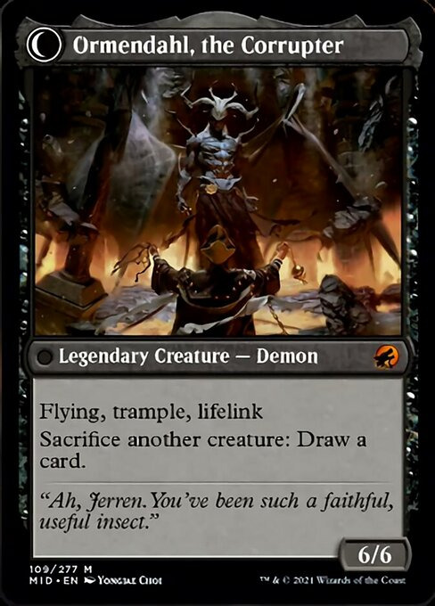
As much as I love Westvale Abbey, the condition to flip Jerren is so utterly specific that I’m not going to bother considering it, so we kind of just have to ignore Ormendahl, powerful as he is. And Jerren isn’t much to write home about either. He wants to be in charge of a Humans deck, clearly, but there’s not really much to support that at all. Like, Xathrid Necromancer and Village Cannibals I guess? Probably taking the pass on this one.
Man there were 4 whole Mono-Black commanders in this one and like one of them is interesting. Gisa’s carrying the colour on her back this time around.
Kurbis, Harvest Celebrant
Kurbis is…eh. The thing with your big +1/+1 counter threats is that damage isn’t usually the thing taking them out, so they’d work better in a deck that tries to distribute the counters more evenly. But then, in order to get much from Kurbis, you’re going to need to shrink them a lot…I honestly can’t see playing this in either maindeck or command zone. It just doesn’t do enough. I do like the “counters equal to mana spent” text on cards like this, at least.
Saryth, the Viper’s Fang
Another 99er. Lot of those this time. Saryth is a great if somewhat awkward way to both abuse and protect things like Circle of Dreams Druid or Faeburrow Elder, or just as another Thousand-Year Elixir for commanders that like tap abilities. But I cannot imagine building this as a commander.
By the way, we’re done with all of the monocoloured commanders. And only 1/3rd of the way through all the cards. I know multicolour is more popular, but this set is kind of dire for those types of decks.
Dennick, Pious Apprentice / Dennick, Pious Apparition
This feels a lot like a fixed Temmet (since the back half gets to deal commander damage) but with a different flavour. He is a card you can get a lot of value from for fairly cheap, seeing as you only pay the tax half the times you’re casting him, and the abilities on both sides are solid enough. I’m not inspired by this commander in basically any way, but he’s pretty much decent on either side and with how cheap he is you could kinda just build the deck however. Sure?
Eloise, Nephalia Sleuth
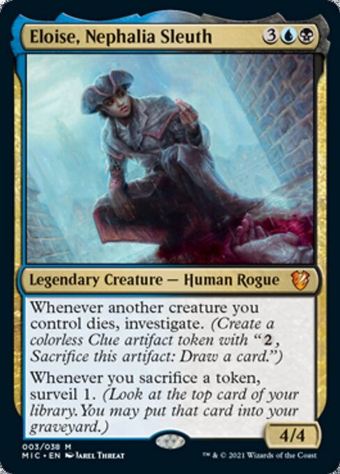
Finally, a commander for the 6 Surveil Matters cards that were in GRN, which admittedly is more than I was expecting. Eloise is both a solid value engine for sacrifice-y decks that only really have had one Dimir commander in the past (that being Kels), and the trigger on the second ability is surprisingly flexible- it’s clearly meant to work with the Clue tokens she makes and the Decayed tokens from the precon, but it works great with Eldrazi Spawn, Treasures, and any other token creatures you’re deciding to churn through for value. The consistency and efficiency this adds to these kinds of decks is super sweet, and I’ve just checked EDHREC and literally nobody has built her. That is shocking to me, frankly, but I’m sure that’ll change.
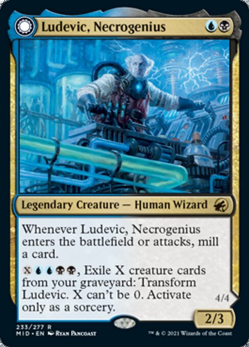
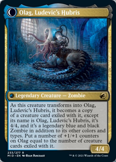
Ludevic, Necrogenius / Olag, Ludevic’s Hubris
I heard y’all wanted a new Ludevic since the old one’s terrible? Fuck you he’s dead now. Ludevic’s front face is extremely uninspired, but the real commander is on the back side- he does at least enable the strategy. Olag is, unfortunately, kind of just a worse Mimeoplasm, something I have a lot of experience with seeing as I have a Mimeoplasm deck. It’s actually not cheaper, seeing as Ludevic is minimum 2+5 versus Mimeo’s 5, and you don’t get to play Green so that’s also worse for you. It does start as a 4/4 base, but you’re not getting smaller than that very often with Mimeoplasm, and unlike that card Olag can’t be used as graveyard hate. Exiling cards from your own graveyard in a graveyard deck feels terrible. The long and short of this is just…play Mimeoplasm. They’re underrated these days.
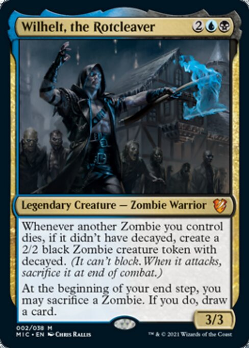
Wilhelt, the Rotcleaver
The first line of text on this dude is super flavourful, I really like the idea of this legion that just keeps getting back up. The second line of text is also really good, seeing as it works with either part of the first half and it generates value in what will be a board-based deck. And while it’s not exactly wrath protection, it does at least give you a pile of bodies for when you do get wrathed, ready to dogpile the guy that dared wipe your board. I’m always hesitant about precon face commanders, because they’re always a little too pushed for my liking, but I really don’t think Wilhelt is fuckbusted- just a very solid commander to helm a solid archetype.
Florian, Voldaren Scion
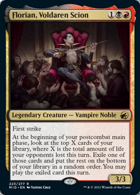
Excuse me, what the fuck is this Vampire doing in my Werewolf set? Get this shit out of here. Florian is an aberration, and also a frustratingly boring one. He takes significant deckbuilding effort to be good, and even then best case scenario it’s an exile-draw impulse once per turn cycle. Rakdos was doing real well for a while, and probably will keep doing well in future considering the next set coming up, so this is a bit of a disappointment.
Tovolar, Dire Overlord / Tovolar, the Midnight Scourge
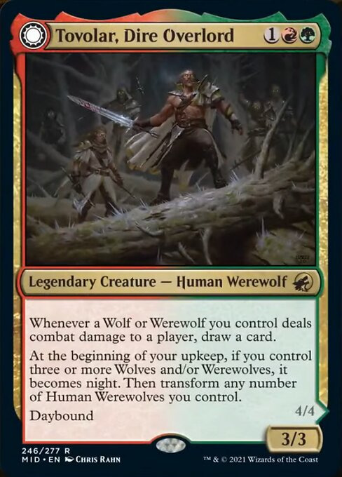
I’ve already spent a bunch of time discussing Werewolves in EDH, so I’ll try to keep this brief. Tovolar is the epitome of “fine, here you go”. He’s a powerful Werewolf commander that compensates for the tribe’s weaknesses, gives you card advantage, and echoes an iconic card from the past. He is unquestionably the best Werewolf to helm your deck of the three total real options. I still kinda think you want Naya for this tribe, but if you don’t want to compromise on synergy or lose this effect (and to be fair it’s a lot) then here he is. It’s hard not to be cynical, seeing as I was one of the people fucking pissed at how nothing Ulrich was, but at least he exists now.
Maybe give us another one in Crimson Vow, WoTC?
Katilda, Dawnhart Prime
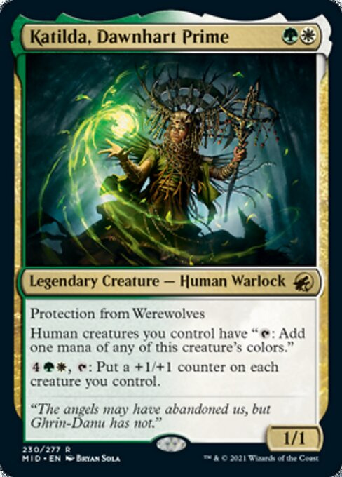
This is kind of interesting, a proper Human tribal commander for GW. Now, unlike previous, where your options were Sigarda 2 in GW (which isn’t very good) and some other stuff like the Kudros for other colour combinations, Midnight Hunt has a couple new options for this exact deck, but at the very least they all do it a little differently. Katilda is effectively a second Cryptolith Rite, but one that gives you something to do with all that excess mana, which is pretty cool and good- decks that need to commit to the board often run out of cards (on account of having things get broken) and this makes sure you always have something to do with that mana. So sure! If you have a haste outlet it makes Increasing Devotion insanely free and that’s super spicy.
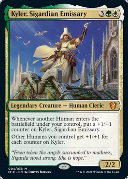
Kyler, Sigardian Emissary
I find this substantially less interesting. Kyler is Thalia’s Lieutenant, but it works a bit better, but also its way more expensive. Anthem commanders are always underwhelming, because the effect is usually mediocre and also you can just…play anthems. But also, it doesn’t take much for this guy to make your team quite big. My biggest issue here is that I just think 5 mana is a lot for an aggressive commander like this, and in order to make him work you need to still be playing things afterwards- so the curve is going to be have to be super wonky.
Leinore, Autumn Sovereign
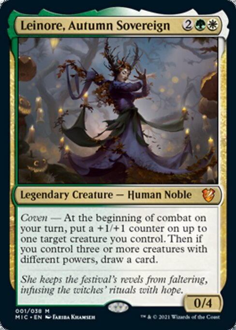
Our other face commander for this set, Leinore is here to support the Coven mechanic, both making it easier to get three creatures with different powers (especially since she has 0 power herself, which is fairly uncommon) and rewarding you for doing so. She’s another card on this list that basically says “meet condition, draw a card every turn”, but at the very least she’s pumping the squad a little at the same time and she’s not super expensive. I think she’s a lot less interesting than the other face commander, Wilhelt, but she’s inoffensive.
Sigarda, Champion of Light
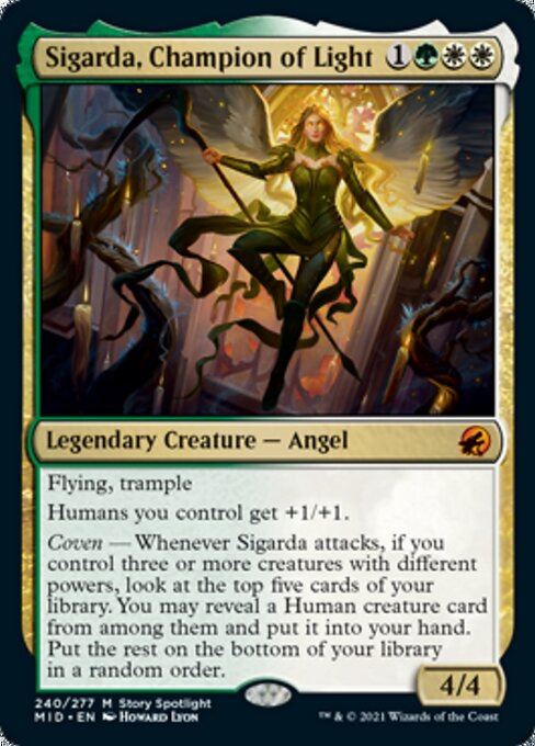
Aside from immediately slamming into my cube, Sigarda part 3 looks a lot like Leinore in just drawing a card if you have Coven once per turn. The upside, Sigarda does a bunch of damage while doing it, and could feasibly finish someone off if necessary. The downside, she needs to get Humans, and she sure as -hell isn’t a Human herself. This off-tribe-ness is supremely awkward for what is effectively a tribal commander, and as a result I would be surprised if she saw much play in the zone. But seriously she’s so much better than the last one holy crap that card was mid.
Liesa, Forgotten Archangel
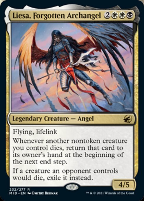
I still don’t know why Liesa is…alive… but here she is again. I wasn’t a huge fan of the first card, and unfortunately the second one doesn’t change that. She takes a classic Orzhov commander in Athreos, removes the fun politics and play angle from it, gets more expensive, gets graveyard hate, and loses indestructible. I imagine some Athreos players will switch over since she guarantees a return, but she’s surprisingly boring for such a potentially interesting character. Liesa was one of the defenders of Innistrad along with her sisters, but one that was willing to actually interact with the darker creatures of her world and try to understand them rather than murdering them on sight. When Avacyn got created, she killed the fuck out of Liesa since that shit’s heresy, apparently, and had her name effectively wiped from the records- that she’s apparently been alive secretly the whole time begs a lot of questions and has a lot of potential flavour that this card does not represent. The card certainly can’t bring itself back from the dead.
Vadrik, Astral Archmage
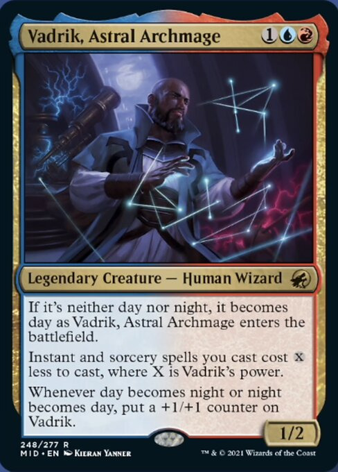
I wasn’t sure about this one, but LoadingReadyRun’s recent deck tech video on it did sell me on it a bit. Vadrik obviously invites comparisons to Mizzix, which is a well-known, kill-on-sight Commander at this point- while I don’t think he’s nearly as powerful as she is, he’s a different flavour of interesting and he is a whole mana cheaper. As well, I do like a lot that he grows himself in the process, giving the deck a board presence that Mizzix’s 2/2 stats don’t really contribute to. I’m still not sure how well day/night will play in the format, but with a deck full of instants you can probably get 2 counters per turn cycle without sacrificing your own tempo, which is decent enough.
Old Stickfingers
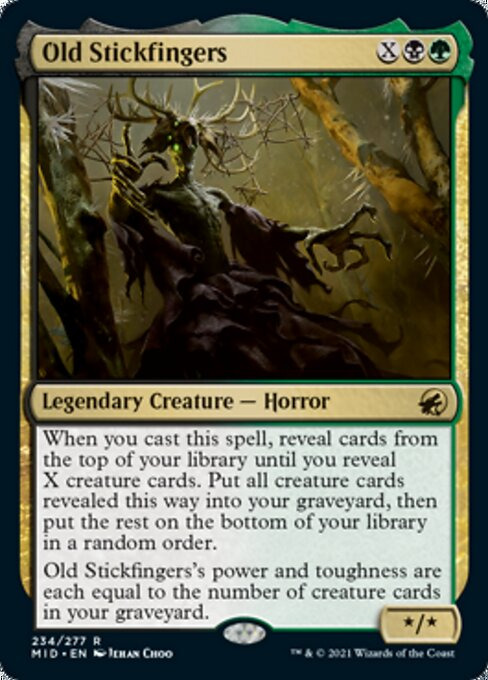
I’m not sure where to be on Stickfingers. I love the flavour of this card, just being a scary forest monster that’s just a new but established in-universe part of the world, much like The Gitrog Monster. The card is kind of medium, though, and its text does really confuse me.
Okay, no, turns out I just misread it completely. You know when your brain just fills in the gaps with what it thinks is right? That’s what I did. I thought Stickfingers looked at the top X and just milled the creatures, but it reveals cards until it hits X creatures, which is muuuuuch better. The X cost effectively does act like it does on many a Hydra, but with added value for the graveyard decks it’s sure to lead. That and it can serve as an effective combo commander- just grab Necrotic Ooze and its combo pieces and some Regrowths and you’re good to go. I don’t think the card is going to be particularly interesting for more casual play, but I can at least admit that it’s much better than I’d assumed.
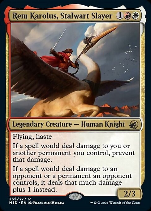
Rem Karolus, Stalwart Slayer
He doesn’t explicitly say as much, but Rem is secretly a spellslinger commander, and one that gives other red decks a lot of trouble with you. Dealing one point of extra damage is rarely going to be game-changing, but it makes many a spell that little bit more efficient, and that prevention ability is the real deal. It’s never that hard to protect a single creature from damage, and if you find a way to do that with Rem, you’re basically immune to damage-based boardwipes, and in a great position to abuse the fuck out of them yourself. The card doesn’t really solve any of Boros’s shortcomings, but it is at least Doing A Thing, which is more than I can say for a lot of the combination’s commanders.
Slogurk, the Overslime
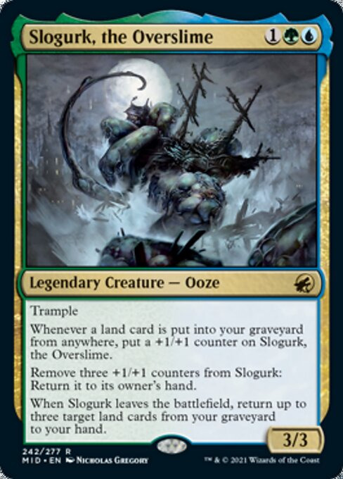
Because Simic didn’t have enough of a lion’s share of the colour pie, here’s Simic doing what is really more of a Golgari or Gruul thing. I don’t hate getting to play with land stuff in blue (beyond Tatyova/Aesi style landfall), but this does feel like an overstepping. Besides the meta angle, the card…I dunno. It’s got a lot going on, but maybe I’m just burned out on playing around lands decks at this point. Slogurk bores me. I do kind of like the idea of hitting yourself with a Traumatize and just killing someone with this, though.
Lynde, Cheerful Tormentor
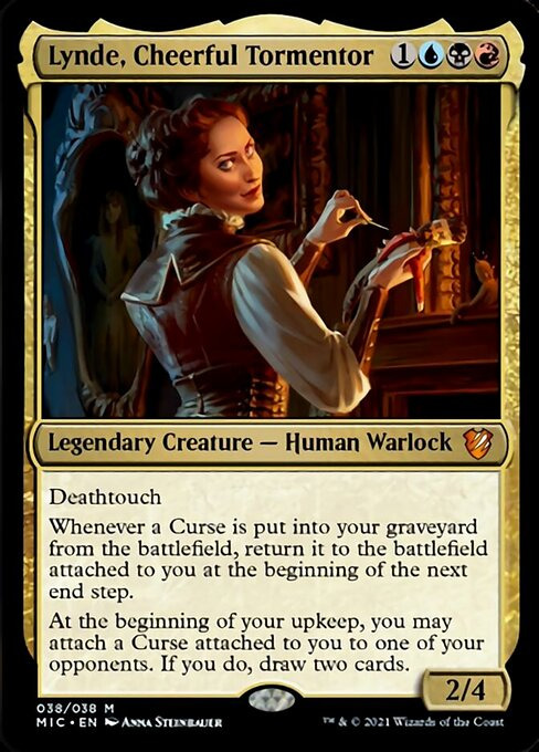
Our closing act is one that is undeniably extremely cool. Not only is Lynde mechanically interesting, she’s also a new character that is tied to the surprisingly popular “unluckiest planeswalker” guy- I guess it might not have been luck this whole time. Curses are a really interesting build-around idea, and considering there are 29 (30 if you include Accursed Witch) of them in Grixis for Lynde to play with at this point, you do actually get to pick and choose a bit. She does somewhat suffer from being in the colours that basically don’t get to really play around with Enchantment synergy, but between her 3 colours I reckon there’s enough to keep her going- you can run some of Theros’s Constellation things. And she’s just….really cool. Putting the curse on you before you get to move it off to someone else feel so playful, the two cards a cackling compensation from this cruel master of cursecraft.
And that’s the lot of them. Unfortunately, much of the Legendary offerings from Innistrad: Midnight Hunt are seriously mediocre. Many of the cards feel more fit for the deck itself than the commanding seat, and a fair few of them don’t even have much going on for that. There are a few real highlights- perhaps me being so into Lynde, Eloise and Gisa says something but I’m refusing to analyse that- but there’s just so many misses that I can’t help but feel underwhelmed. I think it’s somewhat telling of modern Magic design that there are more commanders in this release than were in the previous two Innistrad blocks combined, and yet despite predating the era when legendary creatures were designed for Commander, most of those cards will be better remembered for the format than this new batch.
1 note
·
View note
Note
“It’s a fake article apparently.” The quotes from the parody account are fake, but there is real article about Harry Lambert in The Times.
https://www.thetimes.co.uk/article/meet-harry-lambert-the-a-lists-secret-style-weapon-8ml3q06jl
Meet Harry Lambert, The A List’s Secret Style Weapon
Whether it’s Harry Styles’s internet‑breaking cardigan or Emma Corrin in head‑to‑toe Miu Miu, he’s the stylist responsible for the hottest celeb looks of the moment. So how did a former River Island shopboy become the man influencing the way we dress today?
In February 2020 Harry Lambert was helping Harry Styles get ready to perform on NBC’s Today show. Lambert, an affable, bright-eyed 34-year-old, had been Styles’s stylist for a good five years by then, helping the One Directioner develop a distinct visual brand — and yet Styles still wasn’t quite sure why Lambert was so insistent that he wear a bright, multicoloured patchwork cardigan by JW Anderson.“I remember him saying, ‘OK, I love it, I just don’t know why we’re wearing it for rehearsals,’�� Lambert relays from his east London studio. But the stylist had “a weird feeling”, he says with a little smile. “I was like, ‘Wear it for rehearsal — I promise you.’”The choice of the garment, and the knowledge of when and where to wear it, sums up Lambert’s gifts neatly. Pictures of Styles promptly went viral, so much so that the cardigan became a TikTok craze, with fans trying to replicate the knit at home. By the end of the year the V&A had announced it was buying the original, since it said so much about fashion in 2020. “It makes me a bit giddy, I guess,” says Lambert, to think that this moment he concocted will sit in a national collection for ever.
Right now Lambert can lay claim to being one of the most influential stylists in the world. The Styles collaboration is of course his calling card: a parade of eye-raising and/or mouthwatering outfits that have progressed from a much-memed floral suit at the American Music awards in 2015 to a couple of feather boas at this year’s Grammys and a Gucci women’s handbag at the Brit awards last month. His few other celebrity clients (it’s an elite bunch) include Emma Corrin, who, in the absence of any awards ceremony red carpets to be seen on following her star turn as Princess Diana in The Crown last November, took to Instagram to showcase a series of exciting, adventurous looks; and also her Crown co-star Josh O’Connor. It’s no surprise that, along the way, Lambert has become a name in his own right: his Instagram account boasts more than half a million followers. And to think — the Topman in his hometown of Norwich turned him down for a job as a teenager because “I wasn’t cool enough”, he giggles. He got one instead at River Island, where he was occasionally allowed to style the mannequins in cardigans of a somewhat less avant-garde calibre.Lambert, dressed in shorts, T-shirt and a plaid shirt, is sitting in his whitewashed studio surrounded by clothes racks for each client and mementoes from friends. He was an up-and-coming stylist, with lots of edgy editorial work and a long stint working for Topman’s head office on his CV (the brand did eventually hire him), when industry insiders introduced him to Styles in 2014. The 1D megastar was setting out his solo stall (1D would officially split in 2015) and Lambert brought racks filled with pieces by JW Anderson, Saint Laurent and future long-term collaborator Gucci on the hangers. He got the job the next day.“Harry has always been interested in fashion essentially,” Lambert says. “You could kind of tell already from the way he was dressing and the decisions that he was making with brands. So there’s never been, like, a battle. Everything with Harry is super-collaborative and it’s always been, it sounds cheesy to say, heavenly, but … !”
The two are clearly mates — they call each other Susan and Sue (Lambert is Susan), and a poster from Styles, signed “To Lamby” (his other nickname), has pride of place on Lambert’s desk. From the way he tells it, neither has blinked when it comes to the sexy, campy, gender-twisting work that has made Styles stand out from his peers. Indeed, other boy band veterans — Robbie Williams or Justin Timberlake — never tried anything this visually brave. But Lambert is clear that this isn’t just him dressing a marionette: “I think it’s part of his, you know, part of his character — it’s part of him. I never want it to feel like he’s wearing a costume, I never want to feel like something is wearing him. We’re not doing it for lols — it should feel like part of the performance or part of the whole, you know?”Lambert admits to finding online critique culture overwhelming, but he points out, slightly apologetically, that most them, for him, have been good (no doubt partly thanks to the millions of Styles superfans). “I’m lucky that I have a lot of positive feedback. But when I see something that is negative, you remember that so much more than the positive things. I used to be like, ‘Social media doesn’t bother me,’ but it does kind of f*** with your head.” Still, he’s all for it: “What’s worse — being so boring that nobody talks about you?” As for Corrin, they actually met at a Styles gig and the two became friends before she asked him to work with her for the media blitz for The Crown. “There’s something about her energy that’s just so infectious,” he raves today. Many have loved her appearances in fashion-forward London brands such as Knwls (a stringy black sheer party number, showcased in a lift), or more eccentric insiders like new-era Schiaparelli and Miu Miu. For Lambert, who loves to champion up-and-coming British brands such as Maximilian, SS Daley or his good friend Harris Reed, it was a no-brainer. “There’s a tendency sometimes for young actresses or young talent to make them look older or more ‘mature’. People are trying to hurry them along.” Corrin may be a leading lady already, “but she’s young too, and cool”, he reasons. “We didn’t want it to feel stuffy.”
Being a stylist is a star turn in itself now. In the glory days of the Noughties Rachel Zoe styled the likes of Nicole Richie and Lindsay Lohan in a very Zoe way (big sunglasses, bigger bags, gladiator sandals and anything boho). She has been followed by the likes of Karla Welch, who has put clients such as Tracee Ellis Ross and Elisabeth Moss in considered yet still fashion-forward choices, and the other current hot favourite Law Roach, who earned the respect of the entire world for decking out Céline Dion in Vetements. Lambert’s contribution is to blur not only genders, a bit, but also the distinction between “editorial” (traditionally edgy, fashy) and “red carpet” (which is to say glossy, a bit staid).Lambert finds most red-carpet dressing fearsomely dull, to be clear: “I really cannot see another black tie! Just no. No, thank you.” The last “iconic” red-carpet moment was, he thinks, Rihanna’s omelette dress at the Met Ball, and that was 2015. In fact what has really got him buzzing is RiRi’s latest series of outfits papped as “she comes out of restaurants, goes up escalators … it looks so good”, he says. “It’s better than most of what’s on the red carpet!” Back in Norwich, Lambert had no clue what a stylist was when he was growing up. The child of a policeman dad and a nurse mum, he had an extensive interest in clothes but no knowledge of fashion per se. It was only when he went to study photography at the University for the Creative Arts Rochester, in Kent, that he was alerted to it. He interned at fashion magazines during his summer holidays, then started working for a senior menswear stylist, and then the position at Topman came up. He speaks fondly of home — he says his dad is quite a “flamboyant” dresser, actually — but admits it took everyone a minute to suss out what he does. “Even up until five years ago my parents would tell people, ‘He’s a stylist,’ and they’d say, ‘Oh, he does hair?’
.
1 note
·
View note
Text
if you were around for matrix era you’ll remember everything about that time was bonkers. not only was the entire fandom losing its shit that b.a.p were even back (regardless of our feelings about ts) but also there were kpop fans who had never even heard of bap, having only got into it via BTS’ rise to success, and thought they were a new group????
then yongguk did an interview with a bunch of other group leaders on a music show, and he was so shy and quiet and sweet and said his iconic ‘our team came back’ but people thought he was being tough and scary despite the fact he was probably crying internally.
also junhong for the first time ever had black hair for a comeback and the fandom was split down the middle on ‘finally! he looks so good!’ and ‘who is this man and what has he done with my multicolour son’
not to mention that the general public became suddenly aware that moon jongup is very, very attractive after years of putting him at the bottom of the most-to-least handsome scale
and himchan had gained all this weight back and for once looked healthy and happy and was talking about giving up dieting and eating whatever he wanted
and a whole bunch of people who’d never paid b.a.p much attention before out of nowhere were seeing Youngjae live on stage and losing their minds because they found him so hot
and daehyun had gone from mid-popularity to arguably the most popular member among fans and he looked so delighted all the time that b.a.p were back and he had the tattoo done and
guys it was just a whole hecking good era
643 notes
·
View notes
Text
Manchester’s most famous architecture
I love traveling to other countries and enjoying the architecture which is borne out of other cultures. (See Faris Mousa: More amazing architecture in Rome)
However, I also love my home city of Manchester and I am fortunate that it is filled with its own fantastic buildings which have emerged over the last 1,000 years. Travel is great, but as this great city proves, you don’t always have to go very far to find something new or inspiring.

Here are four of Manchester’s most famous buildings.
Manchester Cathedral
This origins of this cathedral can be traced back to the Saxons, but the building that stands today was constructed over the last few hundred years. Not only is it a beautiful site with much intricate detail, it’s also symbol of Manchester’s resilience: throughout its history it has survived attacks, bombings and plenty more, but it’s still standing strong.
Town Hall
Completed in 1877, Manchester’s town hall is a fantastic example of neogothic work. The clock tower hosts an impressive 23 bells, the largest of which is 8 tonnes and required great engineering minds to hoist into place. The town hall stands grand and proud in the city’s centre, providing a familiar backdrop for many iconic Manchester events, such as the world famous Christmas markets.
Victoria Baths
Manchester’s water palace is in the middle of a restoration project with no known end date. It hasn’t been used for its original purpose in more than 20 years, but the fact that millions has been spent working on the building, and that today it host events ranging from nightclubs to cinema screenings proves how well loved it is by the local population. The multicoloured brickwork facade, stained glass windows and tiled interior are breathtaking and I hope full restoration is completed before too long.
Urbis
The Urbis was built at the turn of the millennium and was one of the showcase pieces of architecture that proved the city was bouncing back from the 1996 bombing. It features a fully glass facade, which gives stunning views of the city for visitors, and a unique sloping design. It forms part of a large communal area which is popular with city residents, and to top it all, the building has hosted the National Football Museum since 2012.
0 notes
Text
Developing And Improving My Origami Packaging
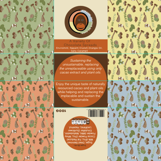
Now that I have critically reflected on my origami packaging at this point in time, I will now be making all these changes that I previously said about and picked up on. To start, I have firstly focused on the back on the design, to which I had added in a barcode and the weight too. I didn't mention this in my previous post as I only just remembered that I needed to add this on for it to become a real product. I did this by simply coping and pasting them from the previous jar labels. I decided to place these in either of the bottom corners as I thought that they wouldn't interfere with the flaps when they fold in. When looking at the back section, I have also changed the orange circle so that its no longer transparent. I have turned the opacity back up to 100%, to which I think this looks a lot more tidier as there wasn't really any need for it to match the jars this closely.
Additionally, the other thing I forgot to mention in the previous post is that the flaps covered up my little icon saying that there's no palm oil in them. This was simply because I forgot that it was there as it was completely covered up. Although, I thought that if I place it on the top left corner flap then this would clearly show this way.

Next, I decided to change the text at the front so that it would actually show the whole phrase this time. While doing this, I chose to slightly adjust the phrase so that it said something different. Instead of it saying ‘A selection of chocolate spreads’, it now says ‘A variety of chocolate spreads’. There was tow reasons for this, one being that this new version as slightly shorter meaning I could fit it on better, but also as I think it just sounds a little better and less predicable. By this I mean that I feel like the word ‘selection’ is used quite a lot of foods, so I wanted a slightly different word that mean the same thing.
Another thing I have chosen to change is the logo, so I have placed in the multicoloured logo as I feel that this just works so much better for many reasons. I then changed the circle around this logo, to the dark brown colour as I feel this gives a strong contrast this way. The reason I was able to use this colour was because I got rid of the rectangle that was going through the logo and circle. This was because this didn't show at all once it was put together so it made no sense to keep it, apart from to match the jars, but the concepts between the two packaging's, doesn't have to be this unified. As well as this, I also got rid of the same rectangle on the back too again for the exact same reason.
After doing all of this, I then remembered that I had to decrease the size of the front and back circles so that they actually fit in, without the flaps covering them. This process was very simple as I just had to hold down ‘shift’ and ‘alt’ for it to size down in the centre.
The other thing I have changed since the last screenshot is I have decided to make the repeat pattern cover the whole of the sides. So instead of it just being on the sides, this way it can show on the flaps as well. I think this small adjustment will make a massive difference as it was slightly annoying before on the position that the pattern stopped. This way, it wont happen this time.
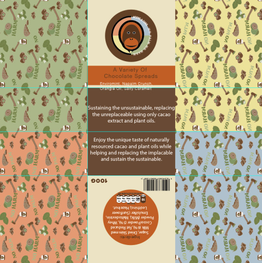
Here, it is now showing where I have thought of a way in which I can make the base of the packaging work, with the orange colour. I mentioned in my previous post that I feel if I use the orange colour in with the dark brown, it will work, although I wasn't too sure on how I wasn't going to resent the orange shade. However, I have thought of using my them of circles to my advance as drawing a circle to fit the whole base but still have the brown showing in places. So this is what I did, where I then felt to have the type written inside this shape. To do this, I needed to copy and paste the circle and then use the ‘type tool’ and click on the shape once it changes to a circle instead of a square. I could then write out my description. Now looking at this, I think this works so much better as it actually has some interest to draw yo in now. At the same time, it has also been kept quite simple. The only other thing I have been able to change is the fonts, to which I separated the two paragraphs by using ‘ Helvetica light oblique’ for the top section and just ‘Helvetica light’ on the second paragraph. From doing this, it has just helped to show a difference, without being too dramatic.
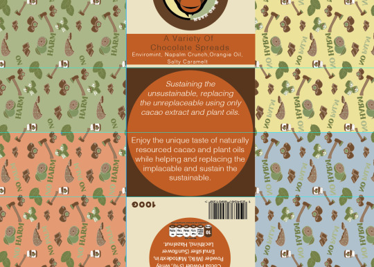
Below is showing the final result from making all these adjustments to my design. From looking at this, I think its been massively improved as everything just looks neater and more in place.
Now moving onto the interior of the design, I realised that I didn't reflect much on the this part, although just from printing it out, I already found one issue. This was that the printer cut off part of my design. This then lead to many problems, one being that the measurements of the packaging is now not 21cm x 21cm. But the worse problem is the fact that it hasn't cut the sides off equally, mainly that one side from the centre is one measurement the other is completely different. This is a problem that I don't think I can fix. Although, when I actually put the packaging together before, it wasn't too bad. I could see that the base of one side wasn't in the centre like it should be.
Another thing I have changed since last time, is the composition. So instead of having the question at the bottom I decided it would make much more sense having it at the top, which I know that I didn't want to do at first as this is quite boring. But when you think about it, everyone will read from top to bottom meaning that they will read ‘no palm’ first, then the information and lastly the title. Whereas the title is what you ned to read first.
As well as this, I edited the logo so that it matches with the exterior now. I have changed the circle so that its showing the quarters with each colour being different.
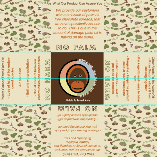
The last adjustment I made was to get rid of the text saying ‘unfold to reveal more’ as like I said before, this seemed very tacky to me. I have then replaced this with an orange circle that is going around the logo. I have drawn the circle so that its fits the base again, as this will then match the other side, where the type is and this same colour theme.
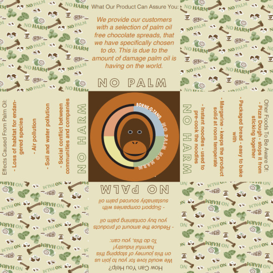
As a result, I have now finally come to a point where I’m very happy with this design, layout and colours. So now, this means I will need to print out my final design onto some more thicker paper as this will then give the final product a more luxury feel. After that I think I will add the same green coloured ribbon that I found when creating my initial origami packaging. This is because green will match with the colour from my repeat pattern and should hopefully compliment with the other colours too. The other colour I could use is white as this would then match with the lids of the jars inside, although to me this shade is a little boring.
0 notes
Text
Doodle in the style of Jon Burgerman
In this lesson, I had drawn a doodle in the style of Jon Burgerman. This was a fun task to do but it was quite stressful as I had not been able to think of many different patterns to create. This didn’t turn out to be much of a setback when it came to editing it as I was permitted to use another person’s doodle as well for my other edit.

To start off with, I had imported the picture into Photoshop where I adjusted the Brightness and Contrast. This was done by going Image -> Adjustments -> Brightness/Contrast. I had slightly upped the Brightness and increased the contrast severely so that the picture would come out in a more bold Black.

With the choice of colours, I had visited Jon’s website and looked through his work until I found a good colour scheme. This was my colour reference for when I would add colour to my work.

Once I had my colour palette sorted out, I began to use the Magic Wand Tool to select a small empty section of work and then used the Gradient Tool to add the colour in. To be able to sample the colours from Jon’s work I had placed it beside my work and used the Eyedropper Tool. At a point, I had to stop using the same colours because they would be too close to each other as I wanted each colour to be a good distance away from every other segment that contained the same colour. This turned out to be difficult to do but I ended up using brighter colours to separate the other ones. This was my outcome for that:

-------------------------------------------------------------------------
The next task involved me using one of my peer’s work to make another edit as this drawing was still in the style of Jon Burgerman. I chose this one because there was a lot more that I could do to it. I was permitted to be able to use their work.

For a start, I had created a second layer in case if I made a mistake that I didn’t notice then I could just erase it off of that layer that I’m on instead of if I made a mistake on the original layer. I upped the brightness and contrast so that the lines would come out more bold.

This was done poorly as I had increased the contrast too much so it had caused the lines to go slightly blue. Nevertheless, I used the Paint Bucket Tool to add several shades of black fill. The change of shade was done by using the Grayscale Slider. This turned out to be partially easy apart from when there were several parts which didn’t have lines joined together. It ended up being an easy fix as all I had to do was switch to the other layer and use the Brush Tool to connect the lines and then fill it back in on the previous layer. This turned out to be my outcome for the different shades of black:

The next thing I did was find a piece of work that I liked from Jon Burgerman and placed it into my work to use it as another colour reference. This time only using one colour.

To place his work onto mine to use as a reference point if I lost the colour, I had to screenshot it and then go onto Photoshop to do it from there. It’s as easy as going to File -> Place Embedded. Then double click on the photo you would want to use.

Now I had the screenshot as a layer that I could turn on and off if I needed to see it and use the Eyedropper Tool on it to get one of the colours from it.

I had picked The Dark Green from the photo to use as a main colour. This time, to change the shade of the colour I used the Brightness Cube.

The Brightness Cube and man other colour options were accessible through the Three Light Grey Lines next to the Swatches tab. I had used the dial on the very right to increase and decrease the brightness of the green to make the artwork look better instead of it being one whole colour. In addition, I personally think the different shades/brightness of one colour can be more eye catching.

I had left some parts white just because it divides the attention from all the green that is present. This was the outcome of the green edit:

For this next part, I had to use all the colours that were on the screenshot that I took to make a multicoloured version of the doodle. This was gonna be used on a mockup that I had chosen.

Firstly, to change the artwork of the skateboard I had found the smart layer that let me change the design that was on it. To change the design of it, I clicked on the little folded paper icon on the bottom right part of the filters photo.

This took me to a separate piece of work which was represented by the smart filter. Afterwards, I put the coloured design on top of the original work, saved it and then closed out of that tab.

This resulted in me being able to change the last two skateboards design.o

For a final design, all I did was invert the original coloured work by doing CMD + I.

I had then used it to make the design for the next two skateboards.

This was my outcome for them skateboards:

0 notes
Photo

Tokio Aoyama
https://www.dazeddigital.com/artsandculture/article/14282/1/tokio-aoyama-visions-of-a-psychedelic-soul
My Evaluation of his work
This artist is also one of my new found favourites. Very surreal and psychedelic work. I am very inspired by this artist however I think I would need more time to create something similar to this artists work. As it’s very detailed and has intense images. You can almost get lost in them if you look at them too long.

Inspired by psychedelia and surrealism, the Japanese pop artist comes to London for a solo expo.
The Japanese psych pop artist Tokio Aoyama lands in London this week for his first exhibition in the UK, courtesy of Ancient Future.A modern day surrealist inspired by everyone from Salvador Dali to Sun Ra, Aoyama has built something of a cult following thanks to his LP sleeves for the likes of Georgia Anne Muldrow.
Like the visionary Mati Klarwein whose afro-futurist murals adorned Miles Davis LP’s Bitches Brew and Live Evil, Aoyama’s work resides beyond the doors of perception, where cosmic vibrations and the mysteries of the natural world arouse a kaleidoscope of lysergic imagery.
While his vibrant otherworldly art is indebted to both psychedelia and surrealism, it also reaches much further back to the ancient spiritual arts of the East. Looking to the past to navigate the future, Aoyama’s paintings also take from the cut and paste aesthetic of the b-boys who have inspired him.
And it is the music of black America that provides the subject for much of his art, from skateboard sketches of icons like Gil Scott Heron to a stunning canvas of De La Soul. To see inside the multicoloured mind’s eye of this most exploratory of artists head down to the Hoxton Gallery.

Interviewer: The great surrealists like Dali have obviously inspired you but I also see in your work touches of Mati Klarwein. Was he a conscious influence and if so how?
Tokio Aoyama: Yes, I am influenced a lot by Klarwien. The first time I saw his art was on Miles Davis' Bitches Brew album. I thought wow… I had never seen that type of art before. I felt that his paintings were spiritual and had a story to tell. The colours and imagery he used had a real personal message for me. His paintings are beautiful but at the same time have an ugly element. He makes fantastic paintings combining these two extremes.

Interviewer: Timothy Leary told Klarwein that based on the character of his paintings he didn’t need psychedelics. Is that something you can associate with?
Tokio Aoyama: For sure… I don’t need psychedelics to paint. What I paint isn’t what I see on psychedelics. It’s not like I take them then decide what I am going to paint next. When I did take them it was just to relax and cleanse myself.
0 notes
Text
HOW TO SEE TORONTO’S TOP ATTRACTIONS IN 48 HOURS

Toronto's been my home base for the last 4 years. And also while I may not have stepped foot in the city before relocating there in September 2013, I have actually definitely taken my role as a full time tourist pretty seriously in Canada's amusement capitol! Throughout my time in Toronto, I've uncovered a few secret bars, discovered some impressive gluten-free & vegan eats, and also learned the streets inside and out.
Over the past couple of weeks, I've put together a 48-hour itinerary for every one of Toronto's top tourist attractions for first-timers. After showing around my city to a couple of out-of-town visitors, I have my tour guide down pat and I thought I would certainly challenge myself to make this itinerary extremely reliable to maximize your time in Toronto!
I've additionally consisted of some tips concerning Toronto transit passes, essential courtesies as well as various other general Toronto ideas at the end of this post to make your trip a little bit simpler. And there are also some recommendations for some all-day tasks in case you require to plan for a third day in the 6ix.
So without more so long, below's just how you can see Toronto's leading tourist attractions in two days!
A 48-Hour Overview to Toronto's Leading Tourist attractions
Day 1
Starving Musician
Address: 810 University Street
Hours: 9 am-- 6 pm daily
Start your early morning at one of Toronto's brunch staples: Starving Artist. Known for its waffles, you can have a pleasant or savoury breakfast to load you up for your day ahead. My individual favourite is the Starving 4 Waffles covered with strawberries. The gluten-free as well as vegan waffles have a slight banana preference from the banana in the batter, so pleasant garnishes make the ideal pairing! It features fruit as well as your choice of salad or maple-baked beans.
There are also options like chicken and also waffles, or eggs benedict waffles for your omnivorous buddies!
Keep in mind: This is a cash-only facility. $20 is sufficient to cover a solitary morning meal with a coffee. They also have an ATM on website, in case you're like me and forget these points all the time.
Ossington Laneway
Instructions: Starving Artist to Ossington Laneway
Walk time: About 15 minutes
After a filling up breakfast, stroll down one of Toronto's the majority of famous roads- Ossington Method. Lined with attractive store fronts, one-of-a-kind breweries and also regional cafe, the appeal of this method will capture your heart!
Continue down Ossington up until you're virtually at Queen Road. Transform right, and also become the alley between Queen and also Humbert Streets. This is one of Toronto's graffiti treasures. As opposed to dealing with tags with white paint, Toronto police collaborated with the city of Toronto to create attractive street art along the Ossington Laneway! Since then, it's come to be the very best spot to see promising street musicians in Toronto!
Queen Street West
After scoping out Ossington Laneway as well as breaking some pictures, proceed East along Queen Road West. With a lot of special secondhand as well as document shops, delicious restaurants, the beautiful Trinity Bellwoods Park, and enjoyable road art, it's the best method to connect with the neighborhood Toronto scene. A few of my favorite shops are The Paper Area (straight throughout from Trinity Bellwoods park), Mother Loves Vintage, Black Market, as well as Anthropologie (not a Toronto business, however this particular area is stunning)!
Graffiti Street
Instructions: Ossington Laneway to Graffiti Street
Stroll time: About 20 minutes
As you proceed roaming down Queen Street West, take a mild detour at Portland Street (at the Loblaws) to Hurry Lane, the street way running beside Queen Street. The whole alleyway is lined with some of the city's finest graffiti! And it's so iconic to Toronto thanks to Canadian comic Rick Mercer who would certainly film his political tirades in these alleys.
Khao San Road
Address: 11 Charlotte Road (instructions from Graffiti Street right here).
Hours: Monday- Saturday 11:30 -2:30 pm and 5-10 pm; Sunday 5-10 pm.
As soon as you have your fill of Instagram-worthy images from Graffiti Street, make your means over to Khao San Roadway for some scrumptious gluten-free and vegan Thai food! Unlike a lot of Thai dining establishments, who have shrimp paste in many things, Khao San Road has actually committed gluten-free as well as vegan menus with a lot of choices.
I highly suggest their gluten-free and also vegan fresh rolls as a starter. They're packed with carrot, lettuce, thai basil, mint, and fresh baked peanuts covered in rice paper, as well as a chilli tamarind dipping sauce! They likewise have a broad variety of curries, noodle as well as signature meals for mains. I went with the vegan green curry (gaeng kaew wan) when I went and I was not disappointed.
If you're fatigued of flavor, don't worry- you can choose anywhere between non-spice (0) and melt your challenge (11 ).
City Hall.
Instructions: Khao San Road to Town Hall.
Walk time: Little under 20 mins.
After refuelling with some tasty Thai food, make your way back approximately Queen Street West and also continue strolling eastern up until you struck the row of food vendors aligned beyond Nathan Phillips Square, also called the balcony beyond Toronto's Town hall!
During the summer months, the structure has a gorgeous water feature before the iconic multicoloured Toronto indication. And also once the city ices up over in cold weather, you can rent skates for $10 simply outside the rink! And in case you're questioning what the attractive structure next door is, it's Toronto's old city hall!
Eaton Centre.
Instructions: Town Hall to Eaton Centre.
Stroll time: 4 mins.
Found at the crossways of Queen Street West and also the longest street in The United States and Canada, Yonge Road, the Eaton Centre is Toronto's only downtown shopping mall. If you remain in Toronto throughout the ramp up to the holidays, it's most definitely worth appearing even just to see the mall's decorations!
Fun fact: The Eaton Centre was named after Eaton's department store, which was once Canada's largest outlet store. The chain store and also its catalogue played such an essential function in Canadian background, that it's memory lives on in among Canada's most well well-known children's tales: The Hockey Coat by Roch Provider.
Yonge-Dundas Square.
As soon as you walk through the Eaton Centre, you can exit on the main degree into Yonge-Dundas Square. Called Toronto's "Times Square," the square holds many concerts, demonstrations, buskers as well as-- naturally-- signboards. While it might not be as huge as Times Square, it's most definitely worth the stop off.
Kensington Market.
Directions: Yonge-Dundas Square to Kensington Market.
Stroll time: About 20 minutes.
Continue West along Dundas Road up until you strike Spadina Opportunity and also you'll strike Kensington Market! Situated in the heart of Chinatown, this hip area is recognized for its fusion food, street art, buskers, cheap consumes, pre-owned clothing stores, and funky bars!
Insect Dining establishment.
Instructions: Kensington Market to Grasshopper.
Walk time: Regarding 6 minutes.
Located nearby from the Northern idea of Kensington Market, Insect Dining establishment is a gluten-free as well as vegan foodie's desire! Start with a scrumptious offering of their sesame french fries, which are deep fried in sesame oil. For a primary, I extremely advise both the miso veggie dish as well as the mushroom 'n rice bowl. They're both unbelievable filling therefore delicious that I can never choose in between the two! (Luckily, my boyfriend wants to get both so we can go halfsies!) And also if you're still feeling peckish after dinner, I highly advise their cashew cookie! It's the excellent amount of wonderful to round off your meal!
Cold Tea.
After a tasty supper at Insect, head back right into Kensington Market to among Toronto's much-loved secret bars! This location is definitely off the visitor radar, as many Torontonians don't also understand where it is! Head down the hallway to the right of Kensington Shopping mall, until you get to the blinking traffic signal. During the week there's no line, so it looks a bit sketchy, but trust me it deserves it! (I won't spoil the shock when you initially stroll within, but it'll be the strangest bar experience you'll have in Toronto!).
Day 2.
Hibiscus.
Address: 238 Augusta Avenue.
Hours: Tuesday-Friday 11:30 -6 pm; Weekend break 11:30 -9 pm; Closed Mondays.
Day 2 starts off once more in Kensington Market at one of my preferred gluten-free and also vegan brunch places in the city! With plenty of vegan alternatives, Hibiscus is a wonderful location to obtain a filling breakfast. I highly suggest obtaining among their cold matchas to go along with their vegan mozzarella, tomato, basil, spinach as well as mushroom buckwheat crepe that comes topped with zucchini and also avocado. It's virtually unsubstantiated that these large crepes are vegan as well as gluten-free! And also if you're not in the state of mind for crepes, their quinoa salad and also everyday soup are always a hit!
CN Tower.
Directions: Hibiscus to CN Tower.
Hrs: 9 am-- 10:30 pm.
Admission: $36 per grownup.
After a filling up breakfast, make your way over to among Toronto's the majority of legendary landmarks-- the CN Tower. Integrated in 1973, the CN Tower held the title of the tallest freestanding framework worldwide for 31 years. Standing at 553 metres tall (1,812 feet or 147 storeys), you can see the entire Greater Toronto Location and also have an outstanding sight of the Billy Diocesan Airport out on Toronto Island. If you're lucky, you can see part of a Blue Jay's game over at the Rogers Centre! At the lower observation deck, you can walk the CN Tower as well as snap selfies on the glass floor. (If you're brave, do a little jump on the glass flooring!) There's likewise the choice to go to their higher observation deck or, for adventurers, you can stroll along the edge of the tower for an additional expense.
Union Station.
Directions: CN Tower to Union Station by means of COURSE.
Stroll time: 5 mins.
When you have actually had your fill of Toronto up in the sky, come back to road level as well as head over to among Toronto's earliest structures, Union Station. The station connects all significant trains in midtown Toronto including TTC (downtown Toronto transportation), the GO Train (attaching the GTA to Toronto) and also VIA Rail (Canada's nationwide rail service). The structure is currently going through indoor renovations, yet will certainly soon consist of a shopping centre inside. Nevertheless, the beaux-arts architecture of the station is certainly an amazing consider Canada's history!
Gooderham Building.
Instructions: Union Station to Gooderham Building.
Stroll time: About 10 mins.
From Union station, proceed strolling eastern along Front Street past the Hockey Hall of Fame (in case you doubted just how much Canadians enjoy hockey) towards its junction with Wellington Road. There you'll discover one more New york city City look-alike! The Gooderham Building is Toronto's Apartment Iron Structure doppelgänger! It's a cross in between Romanesque Rebirth and French Gothic style and also by far among my most preferred structures in the city!
Planta Burger.
Directions: Gooderham Structure to Planta Burger.
Walk time: Regarding 10 minutes.
After checking out several of Toronto's a lot of iconic structures, get a fast lunch break at one of the city's up as well as coming plant-based restaurant chains! Planta Burger turned up this summer after the large success of its original Planta dining establishment in Yorkville. The burger patties are nut-free as well as gluten-free, and also there is the gluten-free option of a collard green cover. Try The golden state bunless hamburger option, and also for the complete burger joint impact, add some fries as well as a strawberry mylkshake!
St. James Park.
Instructions: Planta Hamburger to St. James Park.
Walk time: About 8 minutes.
After lunch, take a soothing walk over to St. James Park. Situated alongside among Toronto's oldest churchgoers, the park uses unbelievably manicured gardens as well as a stunning gazebo. Delight in the flowers and citizens grabbing lunch before rushing back to the workplace. St. James Park is really one of the most attractive parks in the city!
St. Lawrence Market.
Instructions: St. James Park to St. Lawrence Market.
Walk time: 2 mins.
Hrs: Tuesday-Thursday 8 am-- 6 pm; Friday 8 am-- 7 pm; Saturday 5 am-- 5 pm; Closed Sunday & Monday.
Simply southern of St. James Park is just one of Toronto's many renowned markets, the St. Lawrence Market! The domed structure was first built in the city given that 1803, with a 2nd structure homes what once was Toronto Municipal government erected in 1845. It was named the world's best food market by National Geographic in 2012 for its wide variety of meats, cheeses, produce as well as plenty of neighborhood vendors offering classic Canadian souvenirs. Sadly, there aren't numerous gluten-free or vegan choices, but it's certainly worth checking out!
Ethiopiques.
Instructions: St. Lawrence Market to Ethiopiques.
Stroll time: Concerning 15 minutes.
As soon as you're done checking out the St. Lawrence Market location as well as are ready for dinner, head over to one of Toronto's best Ethiopian-owned dining establishments, Ethiopiques! As Toronto is one of the most multicultural city in the world with majority its occupants birthed outside of Canada, I would extremely advise attempting foods from various societies while you're visiting! Ethiopiques deals gluten-free injera and also a big vegan plate, which offers example sizes of its several vegan dishes. A single person plate might quickly feed two individuals if you were still a bit complete from lunch.
Distillery District.
Directions: Ethiopiques to Distillery Area.
Hrs: Monday-Wednesday 10 am-- 7 pm; Thursday- Saturday 10 am-- 8 pm; Sunday 11 am-- 6 pm.
Admission: FREE (Examine Xmas Market for admission from mid-November with December).
An excellent method to end the evening is in the romantic Distillery District. Previously called Gooderham & Worts Distillery-- who started their financially rewarding windmill service to transform grain right into flour-- the Distillery District is recognized for its uncommonly premium Victorian industrial structures. It has since ended up being house to a number of local dining establishments and stores, including Toronto-made apparel, jewellery, knick knacks as well as vintages!
Around the holidays, the Distillery Area Xmas Market pops up as well as Torontonians flood to the happy historic premises! With mulled white wine under big space heaters, a variety of handmade wooden accessories and also carollers, it's the best way to start the holiday celebrations in Toronto!
Other Tips To See Toronto's Top Tourist attractions.
Toronto City Tips.
That needs a North Celebrity when Toronto's obtained a South Post? The CN Tower shows up from almost every corner of the 6ix, and unless you have actually taken a trip south of Front Street, it's the south tip of the city. I used it practically such as a compass throughout my time in the city. Follow roadway policies when walking or on the escalator. I can not emphasize this point enough. Torontonians are busy individuals and will probably either call out "Excuse me" in an upset voice or will certainly huff as they walk you on a hectic sidewalk. If you're not in a rush, stick to the appropriate side of the escalator or pathway to appease the residents.
Transportation.
Toronto is most definitely a walking city. Throughout my four years there, it was my primary mode of transportation. Please bring comfortable walking shoes for your trip.
Public transit is $3.25 per adult. Toronto Transportation Compensation (TTC) accepts coins, Presto cards and symbols (to be eliminated soon) on all streetcars, buses and also metro stops. New TTC streetcars and all metro stops accept credit cards.
On weekend breaks, a single day pass ($ 11) covers two grownups and also up to four children under the age of 19. Throughout the week, grownups must pay individually for the solitary day pass or for a single-use pass. This is readily available for purchase only at subway terminals.
FOR THIS TRAVEL PLAN: I would certainly NOT advise getting a day pass for Day 1, as all locations are within a 20 minute stroll of one another at the most. Day 2 would certainly be an optional day pass, as there are three 'trips' that are thirty minutes or more apart by public transit (totalling to $9.75 per adult). If you feel you would certainly take public transportation a 4th time that day, you're better off with a day pass as opposed to paying the $3.25 single-use pass.
More of Toronto's Leading Tourist attractions (Day 3 possibilities).
Where are Toronto's many Instagrammable graffiti places?
Toronto also warm to manage? Cool off at these 3 Toronto beaches!
What's Toronto's favourite means to leave the city during summertime? Have A Look At Toronto Island right here!
Gluten-free & vegan in Toronto? NOT A PROBLEM. (Like actually. At all.) Below are my 7 favourite brunch spots to begin your time off right!
Make use of the warm temperatures and admire the Greater Toronto Location's charm at the Scarborough Bluffs!
Who recognized Toronto had a castle?! Venture a bit north in the city for a stunning journey via time at Casa Loma!
Seeking to knock back some neighborhood brewskies on the affordable? Check out some of Toronto's best dive bars!
Go out to Niagara Falls for the day! With 7 various methods to see one of Canada's best wonders, it's impossible to leave dissatisfied! Optional: Stop off at one of Niagara's several wineries, consisting of an ice winery- a Canadian specialized.
The post “ HOW TO SEE TORONTO’S TOP ATTRACTIONS IN 48 HOURS “ was appeared first on the full time tourist
The IV Lounge - IV Therapy Toronto Drip Clinic
0 notes
Text
11Qs (get to know the blogger)
tagged by @thedirevvolf! thanks <3
RULES:
1. post the rules
2. answer the questions given to you by the tagger
3. write 11 questions of your own
4. tag 11 people
RAZAN’S QS
1) what is your biggest pet peeve?
i don’t know if i have one absolute biggest pet peeve! i’ve got a lot of pet peeves. but people making fun of ESL speakers is at the top of that list, for sure
2) grab the nearest book and open to page 394 (if theres no such number then page 100) and write out the first paragraph.
(hey so i cheated a little for this q since i’m using my dad’s room atm, and he doesn’t keep books here. i went into my room and picked up the first book there.)
((the first book to meet my eyes, a graphic novel, didn’t have page numbers. the second one my eyes landed on was a manga, but hey at least it had page numbers in it, so i hope this is okay too.))
- And what about you, Sayu?
- Who, me?
(yeah, it was Death Note, don’t judge... i’m actually surprised myself, that the first books i grabbed are both graphic novels, since there are easily 10 proper novels in my cubbyhole)
3) what is your guilty pleasure?
uhh... staying up way past bedtime to read nsfw fics i guess?? or just in general consuming media that i find intriguing, but whose morals i object to, i guess
4) languages you would like to learn?
spanish and german! (i’ve started basic spanish classes before but never followed through so it’d be good to pick it back up! it’s more for practical reasons, whilst german is just... there as something of a challenge to kill time with :P)
ASL would be a nice option too.
5) a country you’d like to visit?
hmm. i guess Poland? (for Auschwitz if nothing else, which is basic, i know...)
for the longest time i also wanted to go see the multicoloured pools in Sichuan, but technically that’s part of the country that i’m already living in, and secondly, they’re all gone after the earthquake, so i guess they don’t count.
6) favorite non european/american food?
i really like mochi! whether as savoury cakes baked and dipped in cheese, or just as part of a dessert. it’s nice.
i also like eggettes... because i’m a HongKonger and i’m basic...
7) if your icon is the protagonist of the last show you watched trying to save you, how screwed are you?
uhm, the last proper show i watched was Netflix’s A Series of Unfortunate Events, and since the icon is a ectoplasmic version of me, i’m not sure how that’s gonna work. maybe i get an interdimensional guardian spirit from a parallel universe?? definitely could use some divine intervention facing off a baddie like Count Olaf
8) name a villain you would like to be and mention why.
well, does Harley Quinn count? cause she sure has a lot of fun in her post-Joker era!
or maybe someone that’s ultimately harmless, like Megamind? idk, i’m not much on the evil alignment.
9) a special skill you wish you had?
what would count as a special skill though? ‘cause whether it be a sports-related skill or an artistic skill, it’s to do with how much training you put in, and hence it’s not really that special? but if i could have a skill without having to invest all the hardwork in i guess i’ll go for flexibility and other gymnastics-related abilities!
10) a fictional world you’d like to live in? why?
gee, most fictional worlds are actually shitty, danger-ridden places, that’s why stories and adventures happen in the first place. but i guess i wouldn’t mind going to Hogwarts :’) it’s cliched as hell, but don’t deny you haven’t thought of this before!!
11) favorite quote?
“ The law doesn't protect people. People protect the law. People have always detested evil and sought out a righteous way of living. Their feelings, the accumulation of those peoples feelings are the law. They're neither the provisions, nor the system. They're the fragile and irreplaceable feelings that everyone carries in their hearts. ” (Tsunemori Akane in Psycho-Pass S1)
to be honest, there are very many quotes that i like for different reasons (maybe they’re motivational, maybe they hold some gem of wisdom or truth), but because i’m a broken record that likes declaring her love for Akane’s character a lot i’m settling for a Psycho-Pass quote, lol
and i tag: @amanythingbutdead @alius-alia @delivrygod @transboynoriaki @kcgane @lux-mea-lex @moonshapedhouse @lawlietismyfavorite @wiltingboy @lawliette @lawliet-is-l-a-sexy @drawthelinestoallconstellations
Q’S FOR MY MUTUALS
1: what’s a nickname that your parents / relatives / someone close to you has given you?
2: what’s the weirdest dream you’ve ever had?
3: have you ever met someone famous?
4: do you believe in ghosts / the supernatural?
5: do you brush your teeth before or after breakfast?
6: top 5 movies?
7: favourite smell / flavour in the world?
8: favourite place in the world?
9: dream job?
10: top 5 things on your bucket list?
#hey so you don't have to do this if you don't want to!#also other people are welcome to do this#tag meme#food ment#long post
2 notes
·
View notes
Video
youtube
Trimmz NS-2019 rechargeble Hair trimmer for men 19 speed adjustment and choice between 0.4mm-8.5mm berad trimmer for men blue, red multicolour https://amzn.to/32oKIwr #HairTrimmer #Trimmer #BeardTrimmer https://amzn.to/32oKIwr - Trimmz NS-2019 rechargeble Hair trimmer for men 19 speed adjustment and choice between 0.4mm-8.5mm berad trimmer for men blue, red multicolour Awesome Good Better quality make more efficient battery Best trimmer in this Price, easy to use, easy to clean, cuts smoothly, nice adjustment, you can style your beard like a professionals.... overall nice product in this price than that of other. This product is same as that of Phillips trimmer but without water proof capability. Its shown on the owner that battery goes for a day but it will not. It last in upto 40-45 minutes. It has different modes as in Phillips trimmer. Very much cheap compared to Phillips. Go for it. Hello I am Pankaj Kumar I need some of your product as free sample for review Product details:-this product is better quality and good condition working condition is easy easy and easy clean and operate easily I used that trimmer last sunday.and I really like it.i bought it for my brother and he really like it easy to use and good product Nice trimmer cutting very well. One of the best trimmer I used two three trimmer but this one is one good. With a one year warranty. Best Click Link In Description For Purchase Online with Discount. Subscribe my channel and hit bell icon for future Discounts and Reviews of Amazon Products. https://amzn.to/32oKIwr As an Amazon Associate I earn from qualifying purchases. Thank you for your support. by Amazon Discounts
0 notes
Photo


MY TOP TEN FAVOURITE SHOES👠❤️ 1)Nike High Tops I bought these when high tops were all the rage in 2011. The multicolour style and general misfit characteristics suit me down to the ground. With me it is either 95 different colours or just black. These have such a sentimental place in my heart and like my Mammy says “you never grow out of shoes”. 2)Black Converse These should be a staple in everyone’s wardrobe! They go with everything and you can dress them up or down. I love converse and I have over 10 pairs but they are just the ideal shoe- stylish and comfortable. Plus, if you don’t want to buy the real thing Primark or many other shops do fabulous dupes. 3)Nude Heels It seemed like every fashion icon had a pair of nude heels so I thought I should get in on the action! Nude heels are a must! They obviously go with everything because they are nude and despite buying this pair in Primark, they look luxurious and expensive. And if you’re crafty, just paint the soles red and pretend they are Louboutins! 4)Uggs- Real/Fake Everyone should have uggs, especially if your feet are always cold like mine. Again you can dress uggs up or down, plus its like a warm fluffy hug for your feet! I love my pair from Primark but I also love stealing my sister’s real uggs! 5)Chelsea Boot I got this pair from Primark and honestly they are the most comfortable boots I’ve ever worn. They basically go with anything- leggings, dungarees and jeans. I borrow my Mammy’s black pair all the time, like if I’m going for a more formal look. 6)My Mammy’s Silver Shoes My Mammy has an impressive collection of shoes and fortunately we are the same shoe size. I wore these shoes to my prom with her bag that matches them perfectly. They’re so beautiful and comfortable. Also, I feel I can walk better in heels with an ankle strap. There is also a vintage vibe which I love! 7)Pink Nikes The best thing about these is the fact that I got them for very cheap in a sale in the children’s department! My favourite thing about these shoes is the colour. This bright pink just makes me smile as it has always been my favourite colour. Personally I don’t find these nikes that comfortable for long term walking/running, but I still love them. 8)Yellow Converse Another bargain! I got these in Marshalls in Canada and they are my favourite converse. I always wanted yellow converse but I could never find them! I love pairing these with denim and a really colourful outfit. I find high top converse so much more comfortable than regular converse. Yellow just makes me happy and the fact that they are kinda vintage is a bonus! 9)Black “Docs” These aren’t actually real Doc Martens, they are dupes from Dunnes. I got them for much cheaper than real docs in the children's department and they are much more comfortable than the real thing in my opinion. I wear them with everything, especially in the winter. They got me through a snowstorm and a flood, so they have practical benefits too! 10)Champion Runners These saved my feet in Canada. I was wearing nikes all day, everyday and my feets were in bits from all the walking. I went into a super cheap shoe store in Canada, bought two pairs and changed into them immediately. Even nearly a year on they are still as comfortable. #blogger #irishblogger #newpost #ireland #treatyourself #shoes #shoelover #converse #primark #champion #championshoes #CBLTLIFESTYLEBLOG
0 notes
Photo


Week 02: Facebook Redesign After replicating our Facebook profile from last week, this time we were required to redesign the screens that we’d cloned previously. With my group, we decided to focus on redesigning the profile as we now had a better understanding of the features from cloning our own profiles the week before, it made the task easier to recreate a new layout for the app. As a group, we inputted our new ideas together about what features we thought could be improved along with new ways to change up the app design and make it different from the existing app. We then considered how certain aspects of the elements like the typeface, colour palette and icons could affect the user’s experience when functioning the app. After further discussion, we gave feedback each other’s design ideas and combined what we thought were our favourite ones to form the final redesign. We agreed that the most used feature was the Notifications bar and it sounded like a convenient and good idea to minimise all the buttons and just have one pop up menu in the corner rather than having the whole bar at the bottom on the page for a cleaner look. Doing this makes it easier and more functional for the user to tap to as it’s usually where your thumb hovers over. The notification bubble will only pop out when the user needs to access the other features like accepting a friend request or checking the market so it creates extra space on the screen and allows more photos or posts to be viewed. We also changed one of the notification icons. To us the Market Place icon with the house icon in the original app didn’t represent the market well enough to us. So we opted for a more simple and easily understandable design with a price tag shape with the dollar $ sign over it. I felt that it easily translated to the element’s function so even for international users who don’t speak English, they would be able to tell that it’s a feature where you buy/ sell items. For the overall layout structure, we didn’t want to swap around too much as the information hierarchy was already in the right order. We didn’t really like how the size of the text about the profile background section took up so much space as it looked like it was over-powering the icons next to it, so we decreased the font size and centred it for a more minimalistic look. From the profile we also moved the Post, Update Info, Activity Log and More elements to either side of the profile picture to create more space for the public/ tagged images to be viewed which gives the user more information to take in at first glance without needing to scroll a lot. Colour-wise, we replaced the blue with a more bright, fun orange shade as it gives off a friendlier impression for users in comparison to the normal dull looking Facebook blue shade, that tends to represent a formal/ serious feeling. Orange also isn’t a colour that any of the current trending apps have such as; Facebook being blue, Youtube being red, Instagram being multicoloured, etc. To build upon the audience appeal, we decided to have rounded corners on the buttons and a circular profile picture and cover photo. Rather than having a straight line to seperate sections, we changed it to dashed/ dotted lines as it looked cute and gave a more ‘soft’ look. In terms of the font, we decided on Futura Medium as the header to match with the audience friendly look, as well as Avenir Medium for the Sub Heading then Avenir Light as the buttons/ body text since it’s a font that’s easy to read and it’s just an iconic typeface. Overall, we were very happy with our Facebook app redesign as it’s a new playful, fun and unique look especially with the vibrant colour that you normally wouldn’t expect from Facebook in comparison to the existing design.
0 notes
Text
Here is Düsseldorf, a cutting-edge city with an amazing collection of buildings created by internationally acclaimed architects.
An important shipping port city from the late Roman Empire all the way until the Second World War. However, the second half of the 20th Century was not that fertile for Düsseldorf as the manufacturing and transport economy declined. Nowadays, Düsseldorf harbour replaced the former warehouses and silos with some spectacular postmodern architecture turning it into one the most modern and attractive part of the city. Or at least it is for me as the area which has been remodelled the most to relaunch it as a district of technological innovation.
Here you can find a selection of the most recent architecture of Düsseldorf. The most famous buildings in the new harbour surely are three twisted constructions designed by the Canadian architect Frank Gehry, spiralling and stretching up high in his well-recognisable Deconstructivist style.
Enjoy this architecture guide of Düsseldorf and make good use out of it.
Ps. as you can see from these photos down below it’s an absolute must to stroll along the banks of the river Rhine until you get to the Media Harbour during sunset.
NEUER ZOLLHOF |FRANK GEHRY|
Known even as ‘the Gehry’s buildings’, these three contrasting buildings are an iconic landmark in Düsseldorf’s architecture scene. All together they appear like a sinuous sculpture whilst the different facade cladding – white plaster, red brick and stainless steel – give each building its own identity.
Fun fact: originally the architectural design competition for the site was won by Zaha Hadid however never commissioned due to the project’s high cost.
FRANK GEHRY
Gehry-Bauten, Neuer Zollhof 3, 40221 Düsseldorf
To know more about Frank Gehry check even
FONDATION LOUIS VUITTON in Paris
DANCING HOUSE in Prague
RHINE TOWER |HARALD DEILMANN|
The Rhine Tower, designed by Harald Deilmann and inaugurated in 1981, is surely the most known landmark of Düsseldorf and still remains its highest building. This concrete telecommunications tower is also the largest digital clock in the world conceived as a light installation. So you can see yellow lights which are arranged in a vertical line and indicate the time while the hours, minutes and seconds are divided by horizontal red lights. At the height of 172 metres an observation deck allows you a great view of the city so don’t miss that! Plus the restaurant ‘Top 180’ rotates around the shaft of the tower once every hour. How cool is that!
RHEINTURM
Stromstraße 20, 40212 Düsseldorf
RHEINKNIEBRÜCKE BRIDGE
The Rheinkniebrücke bridge is a beautiful cable-stayed bridge over the Rhine in the Harbour district. Built in 1969, based on plans by Friedrich Tamms it is one of the most photographed landmarks of the city.
COLORIUM |WILL ALSOP|
Un post condiviso da Steven 👁📷 I see what I see (@nlsteven) in data: 26 Feb 2017 alle ore 02:18 PST
If you keep walking in Mediahafen you can’t visually miss Colorium. The curtain wall of this tower is formed of a multicoloured patchwork of glass panels that turns it into a mosaic artwork. And if you know other Will Alsop’s realisations you can notice that he frequently uses primary, bright colours on its facades (check his CHIPS building in Manchester). It is an office development but you can take the lift up to the View restaurant to enjoy a nice view over the Harbour.
MELIA HOTEL | THE VIEW RESTAURANT
WILL ALSOP
Speditionstraße 9, 40221 Düsseldorf
HYATT REGENCY |JSK ARCHITECTS|
HYATT REGENCY HOTEL
Speditionstraße 19, 40221 Düsseldorf
GAP 15 |JSK ARCHITECTS|
Graf-Adolf-Platz 15, 40213 Düsseldorf
KÖ GALERIE
So many places to stop for some shopping. As usual don’t forget to look up, look at staircases and escalators!
KÖ GALERIE
Königsallee 60, 40212 Düsseldorf
K-21 |KIESSLER+PARTNER|
Added in 2002, this new museum is dedicated to modern and contemporary art. The glazed domed roof that you can see even from the entrance hall is just beautiful. The art installation ‘in orbit’ of Tomás Saraceno surely is its highlight!
K-21
KIESSLER+PARTNER
Ständehausstraße 1, 40217 Düsseldorf
DERAG LIVINGHOTEL DE MEDICI
Just a quick suggestion for everyone who likes staircases, Renaissance period inspired.
DERAG LIVINGHOTEL DE MEDICI
Mühlenstraße 31, 40213 Düsseldorf
DÜSSELDORF CENTRAL STATION
KÖ-BOGEN |DANIEL LIBESKIND|
Kö-Bogen is another architectural landmark in the city. It’s a multi-use complex with plenty of retail spaces, offices, restaurants and even beautifully designed green courtyards. Well it’s easy to notice its main feature. One of its facades is literally defined by cuts, as the established Daniel Libeskind signature style. This action creates geometrical patterns that are filled with plants creating a sort of hanging mini-gardens.
KÖ-BOGEN
DANIEL LIBESKIND
Königsallee 2, 40212 Düsseldorf
To know more about Daniel Libeskind check even
IMPERIAL WAR MUSEUM in Manchester
DREISCHEIBENHAUS |HPP ARCHITECTS|
An administrative tower born as ThyssenKrupp headquarters that became an icon of German post-war modernism architecture. It’s simple in its compact and slim floor plan with a very striking and sleek curtain wall façade and a stainless steel cladding on the sides. In 2011 HPP Architects was commissioned for its refurbishment that led the firm to win the MIPIM Award 2015 in the Best Refurbished Building Category. Plus I’ve been lucky enough to get to see the entire city of Düsseldorf from its roof terrace and the view is just amazing, specially looking over Kö–Bogen.
DREISCHEIBENHAUS
HPP ARCHITECTS
Dreischeibenhaus, August-Thyssen-Straße 1, 40211 Düsseldorf
SCHAUSPIELHAUS |BERNHARD PFAU|
Un post condiviso da 📍Paris | NANCY (@_nancy0_0) in data: 7 Mag 2017 alle ore 01:45 PDT
SCHAUSPIELHAUS
TONHALLE |HPP ARCHITECTS|
The Tonhalle is a stunning concert hall which was originally constructed as a planetarium by German architect Wilhelm Kreis. Converted later in the 1970s and renovated by Hentrich-Petschnigg & Partner (HPP) Architects to give it a more modern feel and solve some acoustic problems. Unfortunately I can’t show you my photos but check the links below to see the interiors. It’s unbelievably beautiful. Just so you know, the Tonhalle was awarded as Building of the Year in 2009.
TONHALLE
HPP ARCHITECTS
Ehrenhof 1, 40479 Düsseldorf
ROCHUS KIRCHE
ROCHUS KIRCHE
Rochusmarkt 5, 40479 Düsseldorf
Lastly I want to thank VISIT DÜSSELDORF for their kindness and for being so welcoming. Go and check more travel details on their page.
Now a couple of things I want to ask you.
First of all, have you been in Düsseldorf? If so let me know writing a comment down here. I want to know what you think of it.
And if you know the city maybe you even know other interesting or remarkable places that I should add?
I collected here everything regarding architecture to visit that you wouldn’t normally find in an ordinary travel guide. My intention is to make it useful for all the architecture lovers out there so if you have suggestions just write me and let me know.
Lastly it would be very much appreciated if you can share it with anyone you think may be interested in having a look at this guide.
DÜSSELDORF | GERMANY | – ARCHITECTURE CITY GUIDE Here is Düsseldorf, a cutting-edge city with an amazing collection of buildings created by internationally acclaimed architects.
0 notes