#most of my sketchbook is just. me. in different hairstyles and eye shapes trying to nail down how to represent myself
Explore tagged Tumblr posts
Text
I have a turbulent sense of self so I only draw myself to try and mitigate that.
#butchy babbles#most of my sketchbook is just. me. in different hairstyles and eye shapes trying to nail down how to represent myself#which is probably part of why i'm so hesitant to share my art bc ohhh the borderline guy is obsessed with himself. go figure.#aggghhhhh
0 notes
Note
Who is your favorite dä member to draw?
Hello and sorry for a late answer! I have been thinking about my answer despite not answering earlier :D
So, I think I have to answer: Bela. Mainly because I have drawn him more often than what I have drawn the other two, and his face just is... easier to draw? Like, his face is naturally very asymmetrical so when drawing him, the bigger challenge is to not draw everything too symmetrically! Usually it's extremely difficult to draw e.g. two exactly the same looking and same sized eyes, but his eyes are not the exact same shape or position even IRL so it's kinda easier to draw both eyes the same way they are in the photo. Cos you're, like, drawing two different things instead of a mirrored copy of something you already drew.
I know I don't know how to stop repeating things but I am bad with words so I usually say everything 3-4 times before I feel I have written everything so that it can be understood correctly.
So yeah, Bela's face is already quite unique the way it's easy to pick up certain features that will make the drawing immediately look like him. Whereas Farin has very... almost basic looking face? Like, he does't look like he came from a factory that produces German men but his face is still symmetric and "normal" enough to make it REALLY difficult to draw! There aren't any very strong features with his face that you could use with a drawing.
Think it this way: when drawing a caricature of someone, it's so much easier to draw a caricature of Bela or Rod than of Farin, because a caricature of Farin could be basically anyone unless you give him some charasteristic emotion like a really wide teeth-grin, or the eyebrow thing he often does. But with Bela and Rod you can just draw them with a poker face and it will still look like them because of the tiny characteristics of their faces. Those are the things that are missing from Farin's face and that's why drawing him is very difficult because the drawings always simultaneously look and don't look like him. A drawing of Bela or Rod could still look different but you would still be able to tell who it is.
When I'm drawing my comics, I usually have lots of fun drawing Bela because there is always a new different hairstyle that I can try to learn to draw :D For Farin it's always the exact same hairstyle, just a bit longer sometimes. And Rod is still bit difficult for me to draw and I actually should practice drawing him into my sketchbook at some point to really find the things I need to focus on to make the character look like Rod. Right now I don't feel like that looks much like Rod, you can mainly tell it only because Bela and Farin are there as well, and he's definitely not how I would draw Sahnie. (In fact, I don't think I have ever even drawn Sahnie?)
But I also have to say that I haven't really drawn Rod that many times in general. I haven't done a single photorealism drawing of him? But I have done several portraits of Bela, as well as of Bela and Farin together. This year I did draw one in my new semi-realistic style which I think turned out pretty nicely! Especially for it being the first time I have drawn Rod for something else than just for my comics. Also, I did some eye sketches with fineliners this year and I was surprised how Rod's eyes were actually the easiest to draw and it was the first time I had tried drawing even something slightly realistic of Rod. But the man also has some facial features that are great for caricature type drawing! Which is why he might be the easiest of them to draw, probably have to try doing a pencil portrait at some point, just out of curiosity!
But the question was not about whose face is the easiest to draw, but whom I like to draw the most. And like I already said there - I think I have to say: Bela. The amount of times I have drawn him tells something already :D And I really like drawing light colored eyes! I also used to like drawing hair and it was always the easiest for me to do when it's black, but last and this year I also learnt some new tricks and now I actually find the light colored hair easier to draw than dark or black hair :D It's because with these new methods, black or dark hair it's actually difficult to make it look like it was 3-dimensional instead of a just... a black blob of void. Whereas with blonde hair I can just add graphite, blend it and then "draw" on it with a pencil eraser and I get a nice, realistic looking blonde hair.
But enough of that. Each of them has pros and cons when drawing and some are easier for comics than others, but I usually have most fun when drawing Bela, and usually it talks half or third the time than what I use for drawing Farin.
Almost forgot: thanks for the ask! I hope you got your answer XD
2 notes
·
View notes
Text
2020 Megaman Valentine’s Day Contest - Cat. 1 (Talent) Results!
Thank you to everyone again for your patience! This is getting posted way later than I wanted to. As much as I try to keep it short and sweet, I never do, so bear with my walls of text.
For the talent category this year, the theme was about killing Mega Man with kindness. More specifically, entrants had to create their own original love/Valentine’s-themed Robot Master or equivalent boss character that was created to defeat Mega Man with the power of love! Even though the theme title and concept alluded more to the classic Robot Master character contests, designs for any series were acceptable. But other than one Navi and one Reploid entry, everyone stuck to a Classic-series themed creation. So you were all pretty consistent!
There were a total of 16 entries for this category this year. Thank you all for your participation! It was extremely hard to choose winners for this category, because you all had really clever and creative concepts based off of this theme. So thank you for thinking up such clever and cool characters!!
Also thanks to Reploid 21XX for the coloring book prizes and for some additional insight.
Again, raffle prize winners will be contained in both posts, so keep an eye out between your name and your art. Not all raffle prize winners are contained in this post. I’ll be contacting all winners soon enough, so sit tight! Might be late after work tonight, so don’t panic if you don’t hear from me right after this is posted.
Your category winners and full gallery of entries are right here, after the break:
Category 1 (Talent) - Dr. Wily’s Greatest Creation: Killing Mega Man With Kindness
[Full Talent Gallery]
1.) @mo-sketchbook:
*For coming in 1st, mo-sketchbook has won $100 via Paypal, or a prize of their choice up to that value AND a Rockman 7 Coloring Book.*
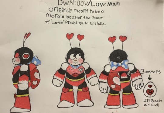
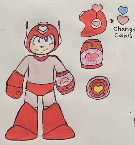
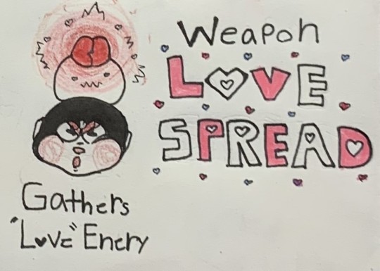
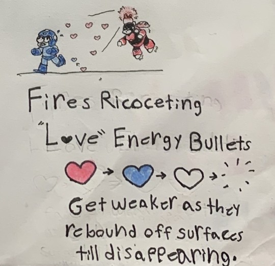
First and foremost, I appreciate all the effort you put into covering so many aspects of your creation, from the various design viewpoints, weapon get form for Mega Man, and showing the weapon in action. I really loved all the things you integrated into the design to give off the feeling that it is a love-based character. The “love bug” form, cherub-like Heat/Plug-type facial features, and how you utilized hearts in different ways for his design and powers.
I’m no Keiji Inafune, but I feel like this is a concept he would greenlight, in terms of it following his Robot Master design formula. It doesn’t need to be super detailed or flashy, but still fits the mold very well! The thought of the hearts missing their target and love energy then getting weaker is actually pretty clever, too. Cute, and I wuv it.
2.) @peachycircuits:
*For coming in 2nd, peachy has won $50 via Paypal, or a prize of their choice up to that value AND a Rockman 7 Coloring Book*
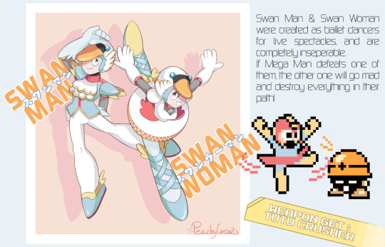
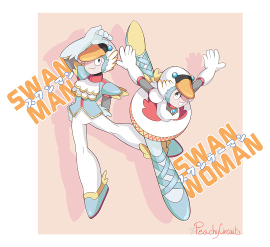
As usual, on the technical side of things, your art is one of the more polished and clean entries of the bunch. Combining a couple different aspects - swans as a creature known as a symbol of love, bonded for life like in marriage, and turning that into an inseparable pair of Robot Masters, was a clever way to think about your design, in terms of the theme of this category.
And then echoing that with the iconic Swan Lake, making them ballet dancers, is like taking Tundra Man and Gemini Man’s concept up another notch. Plus, not gonna lie, amused seeing Mega Man getting equipped with a tutu. LOL So even if it’s not as heart-themed as most of the other entries, I totally liked how you thought outside the box a little bit for this.
3.) Komito Amae:
*For coming in 3rd, Komito has won $25 via Paypal, or a prize of their choice up to that value*

I figured a cupid-styled arrow theme would pop up in a bunch of entries, but your Reploid, Beta, here caught my eye. Both in terms of the hearts, arrows and wings incorporated into her armor, and the pretty sweet looking buster that she and X both have equipped.
While I’m not sure how it would play out in the game, I think it would be interesting to suddenly take control of random enemies in a stage, and be able to change perspective as them for a short time, after you have shot them. Whether it would be to take out an enemy horde, or perform a task X can’t that the enemy could, it would be different! Can’t see it quite having the same powerful effect on a Maverick boss, but it’s certainly neat to think about how that could work!
And the rest of the wonderful entries, in alphabetical order by alias:
@autobot-bumblebee:
*Raffle Prize Winner* Dreamwave Comics: Issue 4 Page 15

I’m sorry you didn’t win a cash prize this time! Please don’t take me hostage! I totally loved the creative vintage chocolate factory mascot backstory, along with making your entry like an Ariga-styled character sheet page. Certainly get that retro feel with her clothing design. Her rose blade kinda reminds me of other hand-turned-blade-like-weapon characters, such as Alan Gabriel in the Big O or Ed transmuting one in FMA. Which is always a snazzy transformation for a robot!
@drewblossom:
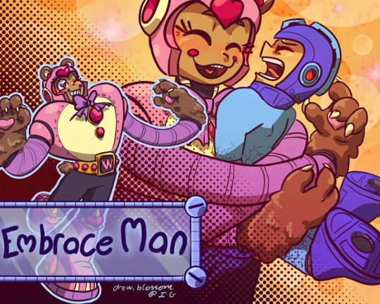
In all honesty, if I hadn’t placed you in the humor category, I think this would have very likely been somewhere in the top 3 for this category. A cuddly teddy bear with a massive Ariga-Quick Man-sized heart for a chest, extending flailing tube arms, who just wants to hug Mega Man to death is so amusing and awesome of a design. Hugs for everyone!
FluffyFrostyFury:
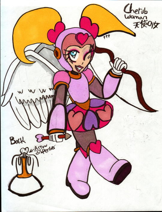
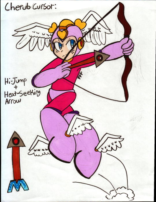
Your take of heat-seeking arrows and the added high jump powers were certainly a different take compared to the other cupid-styled creations. Definitely would be nice gameplay bonuses when equipped. I like how Mega Man also has the wings sprout out of his head, to mimic Cherub Woman’s pigtails, rather than the usual spot you would assume, on his back.
HealerCharm:
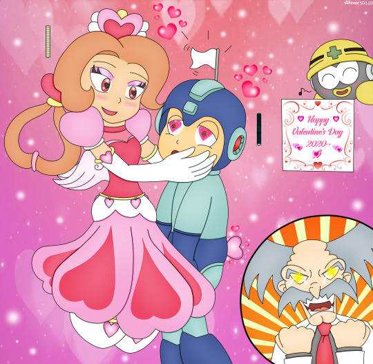
Hahaha, I love how your creation has caused Mega Man to wave the white flag after falling in love...wait, it isn’t White Day, and he should be giving her a gift if it was! XD Her hair tied up into a heart was a creative touch, much like how her dress flows into all those heart shapes. Adorable!
@inanehipsterslang:
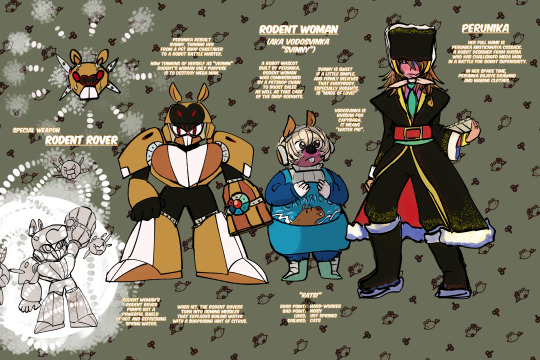
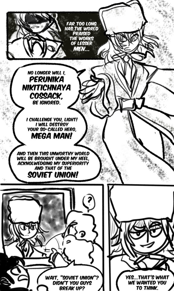
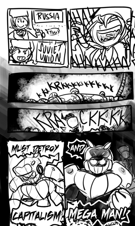
Um, can...can I count on you to vote for Bernie this election year?
Remember kids, it’s what’s on the inside that counts, looks don’t matter. Everyone deserves love, even those you consider ‘vermin.’ This was certainly an unexpected take on the theme, and gave me a good laugh, too. ‘Boiling-hot water...with a hint of citrus!’ It burns, but it smells so lemony-fresh!! XD But the two different moves fit together well, to protect and attack.
I like how you still incorporated a heart shape into Rodent Woman’s design with, both in her chest shape and the “nostril” area which is echoed in the Rodent Rover. And also props for giving her the non-armor form, unique compared to other entries.
Mattasaurs:
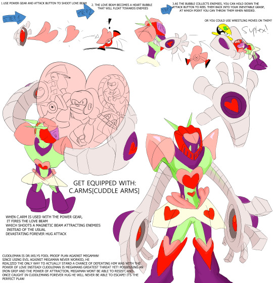
On the one hand, your design feels so different for a Robot Master, and maybe more Navi-like. But then I get the Astro/Galaxy-type eye vibe, and sort of a Plant Man~ish body with Devil hands feel, and see how it’d fit into Classic. It’s a unique look, and I liked it the more I inspected it. I really do love the idea of the heart bubble entrapping more and more enemies, and the big ol’ group hug ending up bursting their love bubble. It’s a different concept that stood out!
Minnie:
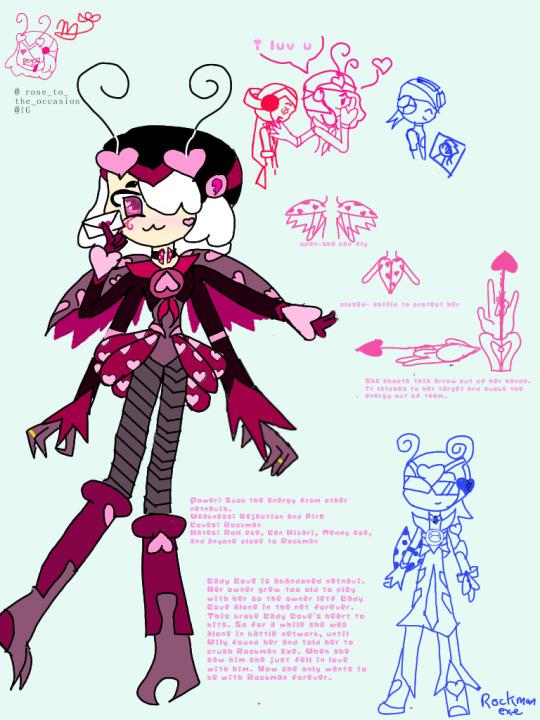
Our Navi of the bunch combined the love bug and cupid design, but your concept changed up the attack to suck out the energy of it’s target. Which almost made me think she should have an arrow-like mosquito nose, to feast on her target that way. XD I liked your wing shield concept and RiCO-styled skirt of hearts. Rock gets some cool shades in his Love Soul/Cross form, and I get the ProtoSoul vibe, with the shield transferring to his arm as well.
@pstart:
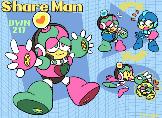
Another Heat/Plug-type design Share Man looks cute and sleepy, but is also “clumsy and weak.” His ability is to share body parts, so “the danger is in him sharing his less than ideal parts with his opponents.” It’s a totally neat concept, to see Mega Man lose his buster almost by accident, and now be powerless to stop Share Man. His split color scheme drives home the concept that his parts might not all be his own, and sort of a Frankenstein bot at times. Props to that idea!
While his weapon gives Mega Man the power to make enemies docile and sleepy, I really almost want to see Mega Man get dumb parts of enemies, too! Helmet switched to a Met helmet, Batton wings, a big Suzy eye! It’s now I’ve got your power...but...but what am I supposed to do with it? XD
RetroNinjin:
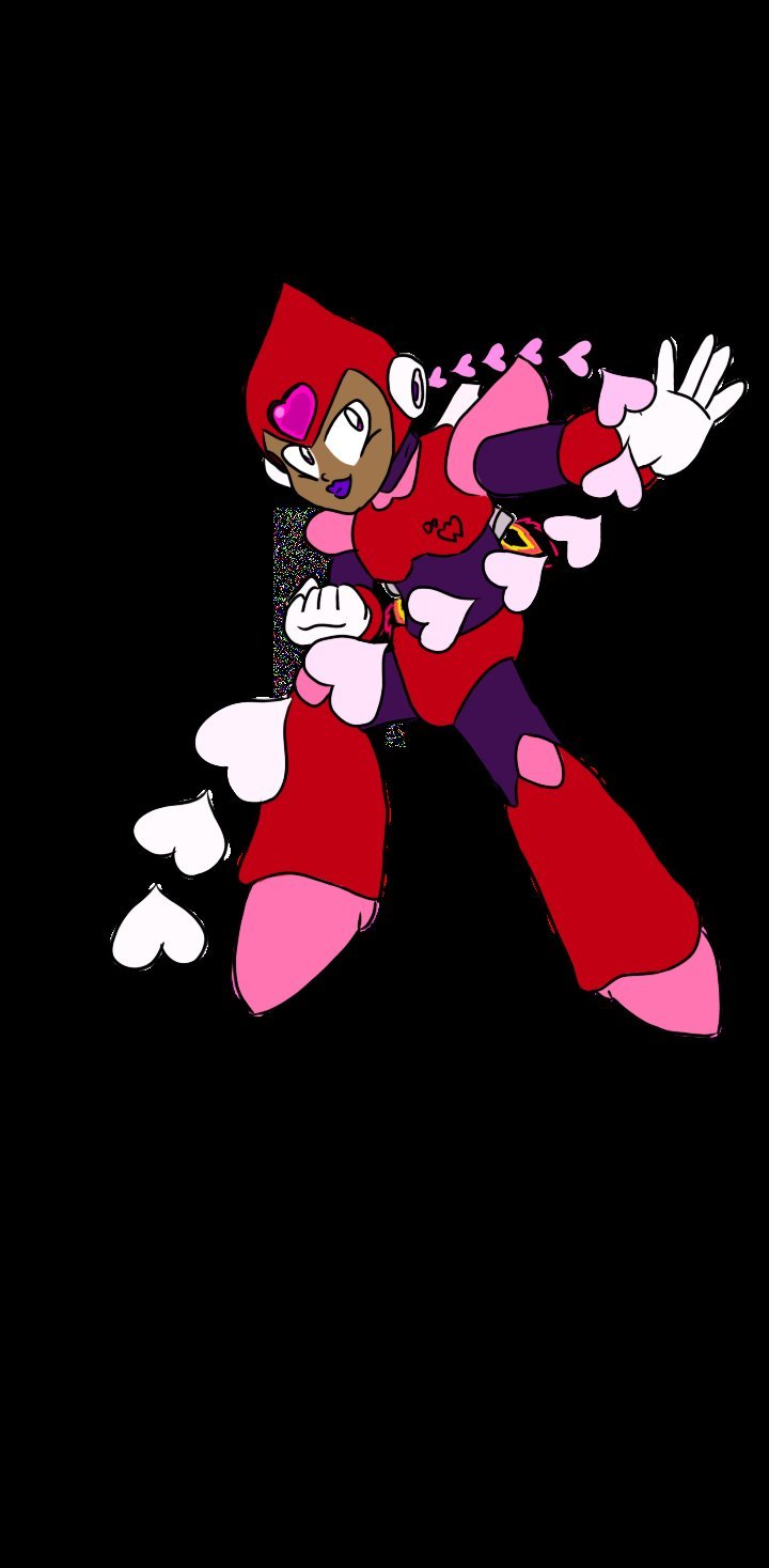
Unlike most others, your entry pushed the heart theme heavily in her armor design around the entire head and shoulder parts, so I definitely felt the love vibe. The color scheme fits well. Just would have liked to have had seen a little more information about her attack and concept.
RoninApprentice:
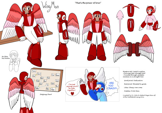
Mega Man having a “Wing Man” to set him up is a hilarious and clever idea! I give you kudos for thinking outside the box a bit on your concept and theme here. The shipping chart certainly drives the idea home, too. You still give him a classy/formal look, and keep the wing man aviation origin apparent in his attack style. Certainly a different idea having the heart bowtie transfer to Rock’s helmet in the form change, but it really doesn’t look that bad there, opposed to around his neck like it would be normally.
@star-crossed-swords:
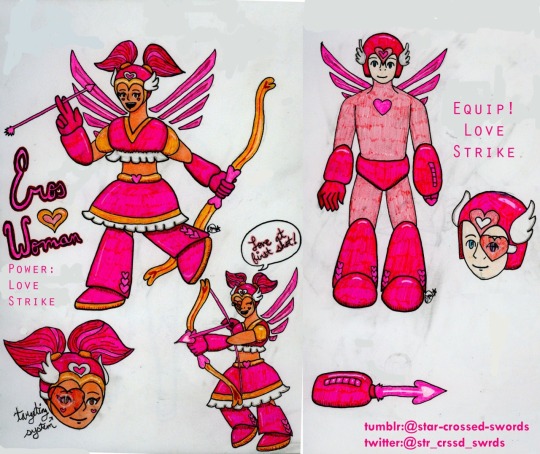
Different from the other cupid concepts, Eros Woman utilizes a Search-Man like targeting system to hit her targets. I like the heart scope addition over her and Rock’s eye when they go into firing mode. You took a different approach to the wing concept compared to others, echoing Cinnamon’s hairstyle in many respects. But it certainly fits with the rest of her design nicely, and looks good for Mega Man’s equipped form.
@star-shaped-soul:
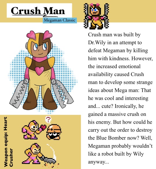
Love that you were able to both include a drawing and your own sprite, to mix in with the weapon equip ones. That is one powerful crush Mega Man has on his enemies now! I feel bad for Crush Man with how big and heavy those snare trap hands of his are. This seems like a Robot Master too cute for Wily to design; more like he stole him and added horrible, cruel hands onto him! This is taking a crush on someone to a whole different level! XD
Yuri Kadry:
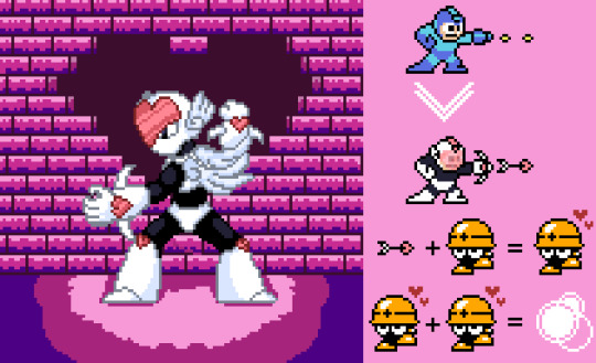
When equipped with Cupid Man’s power, I like the visor Mega Man gets. I think this is also a clever use of the weapon, having enemies shot attracted to one another, causing them to collide into each other. Well thought out! Love the original sprite art, and he stands out nicely against the pinks and purples in the background.
20 notes
·
View notes
Text
Character Design Lesson
Assignments I’ve found online:
From Cedric’s Blog-O-Rama
Lesson 1: Fat Joe
You are to design a concept sketch of Fat Joe based on the play, The Long Voyage Home. Take it as far as you like. Description: SCENE—The bar of a low dive on the London water front—a squalid, dingy room dimly lighted by kerosene lamps placed in brackets on the walls At the far end of the bar stands Fat Joe, the proprietor, a gross bulk of a man with an enormous stomach. His face is red and bloated, his little piggish eyes being almost concealed by rolls of fat. The thick fingers of his big hands are loaded with cheap rings and a gold watch chain of cable-like proportions stretches across his checked waistcoat.
Lesson 2: Silhouettes
Our assignment was to take Dr. Jeckyll and Mr. Hyde, and fill a page with little thumbnail silhouettes. We were told to play with shapes, trying to find a simple and clear design for the character. The good thing about doing fast little thumbnails is it forces you to think in broad, general terms and not get hung up on the details. When you are just concerned with the overall shape, your thought process can flow and brainstorm. The goal isn’t to do terrific sketches, its to get a lot of ideas onto the paper so that later you can develop the best ones. It’s a great exercise and I highly recommend it. In the future I hope to make it part of my process when designing characters for clients projects.
Lesson 3: Portrait Study
We were given photos of four different men. First, we had to do a straight-forward sketch of the person, not really pushing the shapes or getting too cartoony. Just do a standard portrait. Then, after finishing the portrait sketch, immediately put it away and get rid of the photo. From memory, draw the person again using three different shapes: a circle, a square, and a triangle.
The goal was not to do a dead-on likeness and squeeze it into the shape, because that would be almost impossible. Rather, we were to take the features that defined that person (i.e. eyes wide apart, big chin, small pointy nose, whatever) and play with those features within the shapes to create three new characters.
Lesson 4: Jekyll and Hyde
Last week we were told to choose one of two stories (Dr. Jeckyll and Mr. Hyde, or Oliver Twist), and start thinking about designs for the main characters. Our first step was to fill up at least one page with thumbnail silhouettes of possible designs, thinking about what we could say about the character with just the overall shape. Stephen then critiqued our thumbnails and told us which ones were the strongest. As the course progresses, we will continue to develop our character(s).
Lesson 5: Hand-y Drawing Exercise
Part 1 was to sketch a page of hands.
Next to the face, the hands are the most expressive part of the body, and therefore one of the most important features in any drawing. Its easy to get lazy with the hands, because they can be so stinkin’ hard to draw. I think there are two reasons so many artists struggle:
1. Hands are incredibly complex. I think there’s something like 27 bones in the hand and 15 joints, not to mention all the little muscles, tendons, etc.
2. Hands are always moving, and they can move a zillion different ways. There is no “standard” hand pose.
Stephen spent a significant portion of his video lecture analyzing the hand and pointing out how to break it down into manageable parts to make it easier to draw. Then he told us to go draw a page of hands, using either our own hands or photos for reference.
Lesson 6: Jekyll and Hyde Clean-Up
Our assignment was to choose one design from our “Jeckyll and Hyde” work and ink it up. Inking is not my strong point, especially digital inking on the Cintiq. The Cintiq is superbly fabulous and awesome….except when it comes to inking. I just can’t seem to get the same line quality that I could on paper, which makes my lines look even more mediocre than they normally would be. Maybe I just need to practice it more.
As part of the class, Stephen gives each student one-on-one feedback on their assignments via internet video. Here’s some pointers he’s given me on my assignments, which I tried to incorporate into this final design:
• Watch out for “parallels” (lines and/or shapes in the design that run parallel to each other).
• Push your shapes more. Use more extreme angles, greater size contrasts, broader curves, etc.
• Work on thinking through the understructure of the drawing (especially in your legs and hands). Don’t just use blobby shapes, make sure there is a real skeleton with real muscles underneath.
• Keep your sizes/proportions consistent (i.e. both hands the same size, both arms the same length, etc.)
• Let your design “breathe”. Pull your arms and legs out and away from the body for clearer poses. Spread out your facial features more (I tend to bunch them up a bit).
Lesson 7: Turnarounds
This week’s assignment was to do rough turnarounds of our character.
In animation, once a character design is approved the next step is to create “turnaround” drawings. The purpose is to make sure the storybaord artists, animators, and/or computer modellers can re-create the character accurately. Turnarounds are a tedious but essential part of any character designer’s job. For major characters, there are generally four to five drawings that need to be done: Front View, 3/4 Front View, Side View, 3/4 Back View, and/or Back View. For minor characters, usually only a Front 3/4 View and a Back 3/4 View are needed.
Turnarounds can be quite challenging. It’s relatively easy to do just one drawing of a character. But drawing the same character from other angles can complicate things. The most common difficulty for the artist is making sure that the character looks appealing and consistent from all angles. Easier said than done.
Turnarounds will also reveal any flaws or weakneses in the design. You may sketch a character that looks great from the side view, but draw him again from the front view and he may suddenly flatten out and get boring.
A good designer must also think about functionality. In animation a character can have crazy proportions, but he/she must still be able to act expressively and perform common tasks. For example, did you know Charlie Brown can only touch his nose if you look at him from the front? If you look at him from the side, his arms are too short to reach around his big head.
The best way to do turnarounds is to start with a 3/4 view and then spin him around in your mind to get the other views.
Lesson 8: Attitudes and Expressions
This week’s lesson was all about model sheets, specifically attitudes and expressions.
A “model sheet” is a page of drawings that animators and storyboard artists will use as a guide when animating a character. A good model sheet will give a sense of both the personality of the character (i.e. how does he react to certain situations?) and the physicality of the character (i.e. how does he walk, move, etc.).
Our assignment was to create a model sheet for our character, consisting of two parts:
1. Six standard expressions (anger, surprise, sadness, happiness, fear, and disgust);
2. Two full-body attitude drawings, which could be whatever we wanted. The only rule was that they give a sense of the character’s personality and/or response to a given situation. I chose to depict Dr. Jeckyll before and after drinking the potion that transforms him into a big, ugly, hulking monster.
Lesson 9: The Importance of Sketchbooks
We had to go to a busy public place and fill a page with observational sketches. The Mall of America is near my house, so I went there to sketch the above page.
I can’t over-emphasize the importance of keeping a daily sketchbook. The only way to get better at drawing is to draw. As Stephen likes to say, “A page a day keeps the competition away”.
A sketchbook isn’t for polished drawings. Rather, it’s a private place where you can stay loose, experiment, stretch yourself, and make mistakes. Lots of them! (Mistakes are the best teachers). If you want to keep growing as an artist, the worst thing you can do is fill your sketchbook with things you already know how to draw.
Going to a busy place to draw real live people is something you should do regularly. (Stephen fills a page every day over his lunch hour). Most people don’t sit still for very long, so it forces you to stay loose, think fast and make bold decisions, which over time will increase your confidence. Don’t sweat the details; focus on the essence of a pose (which can usually be captured in just a few lines). Try to capture the overall physical attitude of the person, which is the foundation that breathes life into a drawing. You can always go back and flesh out the details later.
In his lecture, Stephen talked about what a character designer should focus on as he sketches the people around him (i.e. balance, gesture, line of action, negative space, rhythm, attitude, etc.) He also talked about not just seeing, but studying what you draw. Observe the different ways people walk, talk, and gesture. Notice body types, hairstyles, and clothing choices. Study how fabric clings and hangs around the body, how people position their legs when they sit, how they lean when they carry things, how their posture changes with their attitude (i.e. excited, bored, annoyed, etc.) These are the things that give your drawings personality and character.
Stephen also talked about “frankensteining”, that is, assembling parts of several people into one character. You might start to draw a man reading the paper, but as soon as you rough in his body pose he gets up to leave. Don’t abandon your drawing. Add the profile from another person, maybe the hair from a third person, etc. Frankensteining keeps you from getting frustrted when your models keep moving (or leaving) in mid-drawing, and you might be pleasantly surprised at the new character you’ve created.
The point is that you keep drawing, keep experimenting, keep learning.
Lesson 10: Memory Sketching
“Memory sketching” is an exercise designed to strengthen your observation muscles. It works like this:
Go to a place where there are a lot of people (i.e. a mall, airport, coffee shop, etc.). Choose someone in the crowd to draw. Before you pick up your pencil, spend a few moments studying everything about them (their clothing, their posture, their face, the way they do their hair, their height….everything). Don’t look at them for longer than one or two minutes. If they haven’t walked away by then, turn and face the other direction.
Now, close your eyes and continue to study them in your mind. Analyze as much as you can remember. What was that hairstyle again? How far apart were the eyes? What color were the shoes? What was with that funny walk? (Don’t peek. It will completely destroy the purpose of the exercise.)
Finally, when you’ve got your target burned into your brain and you’ve thought everything through, THEN pick up your pencil to draw. And again, no peeking.
Lesson 11: Fat Joe
Our very first assignment was to design a character based on Fat Joe from the play The Long Voyage Home. We were given this description:
SCENE—The bar of a low dive on the London water front—a squalid, dingy room dimly lighted by kerosene lamps placed in brackets on the walls At the far end of the bar stands Fat Joe, the proprietor, a gross bulk of a man with an enormous stomach. His face is red and bloated, his little piggish eyes being almost concealed by rolls of fat. The thick fingers of his big hands are loaded with cheap rings and a gold watch chain of cable-like proportions stretches across his checked waistcoat.
Now, nine weeks later, we were asked to return to that assignment and do it again, this time with clean-up and color. Since this was our last class, it was a chance to apply everything we’d learned.
0 notes