#more work sketches but loosely gathered into a narrative this time
Explore tagged Tumblr posts
Text

Sketch collage inspired by the 1897-1899 Belgian Antarctic Expedition, after reading Madhouse at the End of the Earth (Julian Sancton, 2021) and My Life as an Explorer (Roald Amundsen, 1927)
#my art#roald amundsen#frederick cook#polar exploration#polar#more work sketches but loosely gathered into a narrative this time
424 notes
·
View notes
Text
25/09/2020

Today, I spent the majority of my time analysing and looking over my main artistic influences. My social media is saturated with work that constantly inspires me, so I collected these artists into a collage. I realised that I greatly appreciated, and am drawn to character designs more than I am drawn to full pieces with fully rendered backgrounds. If I were to pursue a 2D type project with characters included, I would perhaps render more simplistic backgrounds to give the character emphasis.
The few ideas I am currently playing around with are
Visual Novel
Motion Comic
Dating Simulator Concept (Art bible?)
World Building Book
Game Manual’
For now, I am going to continue sketching characters and possibly trying to come up with a story. I find my process works best when coming up with a loose story, and creating character concepts around that.
I have been toying with the idea of sun and moon characters, possibly a love story through a motion comic? I have experimented with the concept of love stories and LGBT themes through my animations previously, and found it incredibly fun to work with and portray, particularly my own experiences. A motion comic could be high beneficial to me as it would entail character designs, environment designs, narrative design and editing/post production work.
I know that my area for improvement lies within my environmental art skills, and it is something I want to get better at. But I’m still unsure of what I wish my specialisation to me. - Something involved with narrative, I am sure of that, at least, but still unsure of which specific division to go into. I may have to gather some advice on this.
1 note
·
View note
Photo

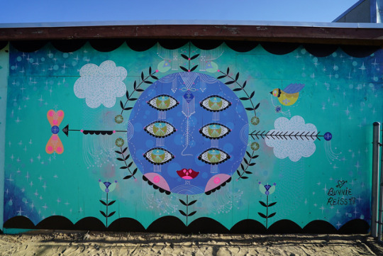
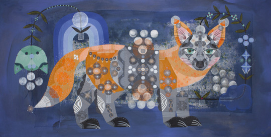
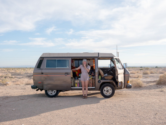
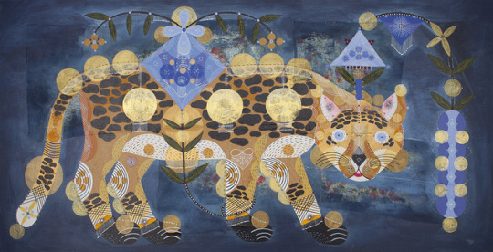
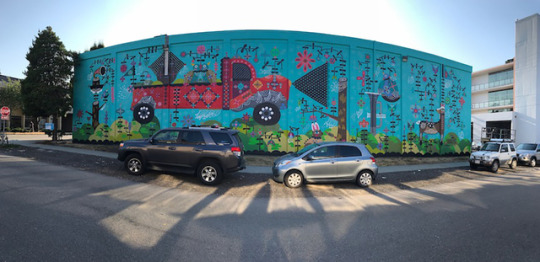
ART SCHOOL | INTERVIEW WITH BUNNIE REISS
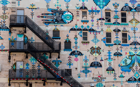
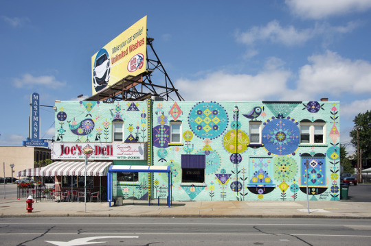
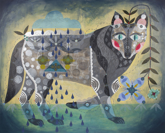
A combination of folk art, psychedelia, nature, magic, stars and animals, the artworks by LA based artist Bunnie Reiss imagines a visual language and beauty that is both narrative and full of storytelling. Bunnie’s large scale murals have been and are still popping up all over Los Angeles, so we wanted to catch up with this talented lady to find out more about how she got interested in art, the subjects and themes of her work, and what she’s got coming up the rest of the year!
Photographs courtesy of the artist | Portrait by Tod Seelie
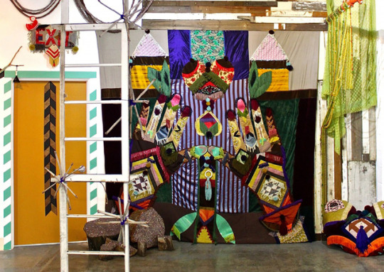
Could you introduce yourself to everybody? I’m Bunnie Reiss, muralist, installation artist and painter, living and working in Los Angeles. My work is a combination of folk art from my eastern European background, places I’ve traveled around the world, psychedelic dreams, strange imaginary worlds, nature, magic, the stars and animals.
I’ve worked really hard to create a fairly diverse career that includes painting huge 9-story buildings, designing custom patterns for fashion icons like Isabel Marant, building large space boats that float on imaginary clouds, and writing/illustrating children’s books. It keeps me crazy busy, and I am grateful to be living such a full life.
I own a 5 acre property in Landers, just outside of Joshua Tree, where we go for breaks from crazy city life and often gather with many of my artist friends. It’s super magical and I love it out there. I also have a very small Maine Coone kitty named Robert Plant that I treat like a dog and comes everywhere with me ;)
How did you first find yourself creating art or being interested in art? I was a tiny rebel with a large imagination, and I kinda knew from the beginning that I didn’t fit in. There are no other artists in my family, and I was definitely the odd ball. Art was, like most misunderstood kids, the only thing that felt really good to me. I loved museums, fashion, weird books and storytelling. There seemed to be huge worlds that were out there, and I had zero fear in discovering them. Recently a family friend sent a package with tons of drawings and art I did for her when I was a child, and it’s amazing to see the same imagery I use now in many of the funny things I drew as a kid.
How would you describe your work to someone who perhaps is just coming across it for the very first time? What would you want that person to maybe take away from it? As I mentioned above, my work is crazy combo of different things: Eastern European folk art, nature, imaginary worlds, psychedelic landscapes, animals. I have worked hard on my own visual language, my own dictionary, and continue to do so. It is an ever expanding vocabulary that I hope will keep growing until the day I die. I always want people to feel like they have a sense of place, that they can feel good, even for just a brief moment in the day (which is actually a tall order for most people). I want people’s imagination to go crazy when they see one of my murals!
What are your favorite things to paint or draw in your works? I absolutely love painting animals. They are my top. And hands are right below that.
In your various works you often paint portraits of animals, hands, mythical creatures and the natural world. Tell us about your subjects and themes you explore in your works? I have fairly consistent imagery, but the conversations are always different. For instance, the children’s book I wrote and illustrated a few years ago, The Cosmic Child, was actually about Plato’s Cosmology and the idea that we have a twin star in the universe. It was a book about never feeling alone. I like taking my simple imagery and combining it with complicated stories. It adds a layer of honesty and vulnerability. I am currently working on a new book about climate change, that will consist of 50 animal portraits. I decided that instead of trying to explain why climate change is such an important issue, I am using the idea of irreversible loss to describe what is might feel like to loose entire species. Visual art is so interesting because you don’t often get the back-story about why someone has made what they have made, but you can usually feel the emotion behind it. That to me is really successful, thoughtful work.
When your working developing a new painting or piece, how does it begin - take us from sketchbook, to color choices, to finished painting? I an an avid sketchbook user, and I tend to try and do as many drawings as possible, with no specific direction. It take the pressure off of things having to be ‘something’ and keeps things really interesting. When I’m ready to work on a body, I look back over the sketchbooks to see if there is a connection to any of the drawings. Sometimes I go back to sketchbooks from 5 years ago! Sometimes entire sketchbooks become dedicated to one idea. This process allows for a very organic build of my paintings. I am almost always looking at animal references, old quilts and folk art, and reading about magic symbols and the universe. All of my paintings and murals come from my sketchbooks, and are often repainted over and over again in different ways or patterns. I like exploring how many times I can do a single image and make it look unique. My color palette is fairly consistent, and I will push on darker or lighter themes (navy blues vs pastels), depending on what the mood I’m working with is. I like painting on antique papers and things that already have energy living in them, and my colors will be based off of the color of the papers. Mural walls are treated similarly, where I’m often trying to preserve and enhance the architecture of the building. I generally try and tie in my murals with something local, like an animal that is native, a myth about the city, the state flower, etc. It’s really fun and usually feels like some kind of treasure map where I’m unearthing weird facts about the places I paint.
What’s a typical day in the studio for you like? And what are you currently working on in or out of the studio? I try and keep regular day hours as often as possible in my studio, because if I don’t I sorta become a vampire who stays up all night and sleeps all day. I bring Robert Plant, my kitty, with me and he’s always around when I’m working. Sometimes I have to ‘clean’ all day long in order to actually get to painting. Sometimes I have to organize and move things around, or do other weird stuff, in order to get things going. It all depends on my mood. I just wrapped a bunch of paintings for my last show at KP Projects in Los Angeles, and that particular body of work will continue for a while. It’s mostly portraits of animals that are extinct or close to extinction, and ties into my book as well. I am always working on mural concepts, and there are tons of drawings and sketches on my walls that may or may not turn into murals. I also quilt sometimes and love to sew, especially when I am not feeling very inspired to paint. Murals and other public work can be fairly demanding, and quilting helps me to recoup when I have wrapped a big project and need to take a little break from painting.
How do you unplug yourself so to speak? What do you do to center or re-focus yourself if you find yourself stressed out about deadlines, art shows, and the sort? It’s definitely challenging, especially when you live in such a wild city like Los Angeles. I am so grateful to have a property in the desert, and I will often go out there for a few days to unplug and just be in the quiet. The stars are amazing, and laying on my deck and staring up at the sky does wonders for my brain. I also love to ride my bike and will sometimes go out on night rides, which tends to help me refocus and feel like I’m back in my body. When I have time, surfing is the absolute best! Painting, especially big things, takes you out of your physical body and puts you in a deep space of meditation. You are usually on a large lift, far away from anyone, concentrating but also kinda in a trance. You don’t really feel much of anything. When you finish a large project, you feel everything come back into you, and it can be overwhelming and exhausting. It’s imparitive that you find outlets that really help you to keep going at a healthy pace without getting to rundown.
What inspires you and your art? What are things that influence what you do and what you make? My imagination keeps me really busy, but reading Popular Science, going to libraries and book stores, walking in neighborhoods that I’m unfamiliar with, and traveling to countries where I do not speak the language keep me filled with information. I love architecture and looking at buildings, I get obsessed with walls I want to paint and will sometimes drive by to visit them. Going out in nature and just listening to the trees speaking to each other is pretty amazing.
Not only do you create painting, but you have been doing large scale mural works for quite a bit. How did that start and how different is it for you compared to works on paper or canvas? What do you like about muraling and what do you find to be the most challenging part of it? I lived in the Bay Area for a long time (well over a decade) and space was always an issue. I loved painting big, but hated trying to store anything after I was finished. I would also get fairly lonely working in my studio for long hours, and liked interaction, but a very specific kinds. Public art and mural painting solved a lot of these problems. I could paint HUGE and leave it, walk away, never look at it again. It was a freedom that I loved, and the very special was to interact with people and neighborhoods. At the time, it was so unique and didn’t compare to anything I had ever done. This was a long time ago, and I still feel exactly the same way. There is no better way to understand a community, a city, a neighborhood, then painting outside and really being a part of it. And people are so happy and grateful that you are adding something beautiful to their neighborhood. I also love that murals are free for people to look at, and so many demographics are affected by the work. You never know who will see it and be inspired. It’s powerful and humbling at the same time, mostly because the work is incredibly physical. It sometimes feels like you are running a marathon, painting for 12-15 hours a day, dealing with weather and trouble-shooting all kinds of strange things that can happen with different kinds of walls. I love big boom lifts, dancing and singing when I am way up high with my headphones on. I have such a great time when I am painting a monster wall in the sun! I can’t stand painting in the cold ;)
What’s been one of your most rewarding projects? And what kind of challenges did you face and how did you overcome them? This past year I was invited by the United Nations to paint a mural in Mexico City on climate change. It was amazing! I painted at the largest market in Mexico, and it was nuts. So much going on around me, so much pollution mixed with sun blasting a huge wall for more than half the day. I loved it, but it was also pretty crazy.
Since we call this feature, Art School, what tip do you have for artists and folks interested in becoming an artist? Work hard, harder than you ever thought you could work, but also work smart. You have a very long career, and lots of time to develop your own style and really build your craft. There is no rush, and your work will be that much better if you take the time to really develop who you are as an artist. Also, ask for help. Reach out to other artists and see if they need help. Be an active community member and don’t isolate yourself too much in the studio. Have fun! Travel the world ;)
Who are some important artists, past or present, you are inspired by? Remedios Varo Johannes Vermeer Louise Bourgeois Antoni Gaudi Shel Silverstein
So we gotta ask what are your FAVORITE Vans? The Era.
What do you have planned for the coming up? What are you looking forward to starting? Mural season is in full-swing, and it’s going to get really busy, with murals everything month until the end of the year. I am working super hard on my climate change book, and putting together a few projects that will tie in with that project. (and maybe a book tour). I continue to build up my desert property, and love that I can put energy into it slowly and really make it a life-long art project. I am working on expanding my mural practice into 3D objects, mosaics tiles, furniture and playgrounds. My murals are only one part of a much larger puzzle that I am putting together, and soon you will get to see entire worlds built by me. It’s an exciting time!!
FOLLOW BUNNIE | WEBSITE | INSTAGRAM
#Art#Vans#Vans Art#Art School#Interview#Bunnie Reiss#painting#muralist#mural#female artist#creativity#inspiration
9 notes
·
View notes
Photo


Overview
An intensive and productive week on the course, I wanted to put a focus on the narrative research essay task and balance this academic written nature of the project with the medium of stop motion animation. Additionally, I took the time to develop my skills within Maya: re-attempting the Flying Saucers task at home and playing around with the animation workspace. Whilst I was unable to make any significant progress on my digital metamorphosis project and the animated sketchbook assignment, I instead took the time to undertake extensive research into my chosen film of Into the Spider-Verse, alongside producing a range of stop motion iterations and preparations for the ‘box lift’ task.
As a result, I’ve been able to make a series of stop motion animations that go beyond the limitations of the brief, adding a sense of narrative and interaction between off-screen characters and am confident that I’ll be able to begin work on the first draft of my essay next week. With juggling several projects at a time, as I am now, it’s important to be able to focus on particular assignments. Splitting my time between these briefs has been difficult, but I feel like I’m working to strike a balance between my ambitions for each assignment and the limited time I have left.
Narrative Research This week, I was able to decide on an analytical direction for my essay and gather a range of research sources in preparation for the drafting process. My initial idea was to analyse the plot of Into the Spider-Verse, exploring how the creators not only presented an updated take on the Hero’s Journey storyline, but also told a refreshing new version of the classic Peter Parker Spider-Man origin story we all know.
Despite this, I realised that the film’s use of this hero narrative is nothing ground-breaking or particularly new. Rather, what makes Into the Spider-Verse rather of academic study is the animation and visual language: an experimental, alternative approach to animated filmmaking, which is already making waves in the industry. Instead of taking a theoretical approach into my chosen film, I began researching into the comic-inspired aesthetic and crisp, stuttery style of CG animation.
The film represents a ‘break-through’ in animated storytelling, pilling compositional and aesthetic inspiration from it’s comic book source material, adapting dynamic storytelling poses and graphic printing techniques to the animation. In my research for this essay, I wanted to take a look behind the scenes and how this new visual language came to be. Looking through the Art of Into the Spider-Verse book, and trawling through countless interviews, online articles and really anything I could find on the process and film itself led me to the work of visionary Alberto Mielgo, the 2012 Disney experiment Paper Man and how the filmmakers created the signature ‘crunchy’ animation style.
Having completed this extensive research into my chosen film, I’ve reached a place where I’m ready to begin the drafting process. With my own question and a range of research sources ranging from the academic literature of Paul Wells to videos breaking down the animation process of Into the Spider-Verse, next week I will begin writing my essay. My aim is to have a completed draft ready for my individual tutorial, in which I will likely be reducing the word count.
Digital Principles This week, I put a major focus on other projects - taking the time to produce iterations and further develop on the other tasks. As a result, I didn’t really have time to make any significant progress or development in this project.
Stop Motion This week, we were given our second stop motion exercise: to animate a character lifting up a box. With this task, I’m considering all of the basic principles of animation: specifically timing, anticipation and follow through - additionally to staging the sequence properly.
To begin the week, I took the time to prepare for this week’s stop motion task in a depth I’ve never really done before. Producing my own reference footage and sketching from this has allowed my poses to have an authenticity to them, and I was able to act out a range of characters and situations in the process. Having this additional research and preparation in the filmed reference has given me a solid understanding of the action I will animate.
For my first attempt at this task, I experimented with working from this live-action reference. Whilst this allowed me to see the filmed reference poses directly in Dragon Frame, this method of working also posed several problems - and ultimately resulted in a lacking first iteration. The armature’s movement jolted from one pose to another, the staging of the sequence was ineffective and the timing of the motion was simply wrong.
My main take away from the initial attempt was to consider the posing of my armature more - take the time to make sure the pose is correct, and easily understood by the audience. A second idea was to exercise some restraint on the movement and timing: to take multiple frames with little movement, as stillness can be just as effective as motion. On the flip side of this, I also wanted to explore how to create a fast motion, considering making larger moves between frames to believably communicate a quick movement.
With this in mind, I hired out the Stop Motion Studio in my own time and developed on the task, producing two more attempts. In comparison, these were much more successful and interesting than my first test. Taking the time to develop upon the tasks set in the workshop has allowed me to produce stop motion outcomes of a far higher quality and ambition as it lifts the pressure of time off my shoulders. With my own schedule, I was able to really get lost in the work, and allow me to present a more ambitious attempt at character performance and begin to hint at a narrative beyond simply the action itself.
Next week, we will be exploring a more complex stop motion sequence: having a character walk on screen, and visibly change their expression and emotion. In preparation for this, I will begin recording my own live action reference to get a better understanding of the movements and posing and produce a few storyboard iterations of the sequence.
Animated Sketchbook This week, I put a major focus on other projects - taking the time to produce iterations and further develop on the other tasks. As a result, I didn’t really have time to make any significant progress or development on this project.
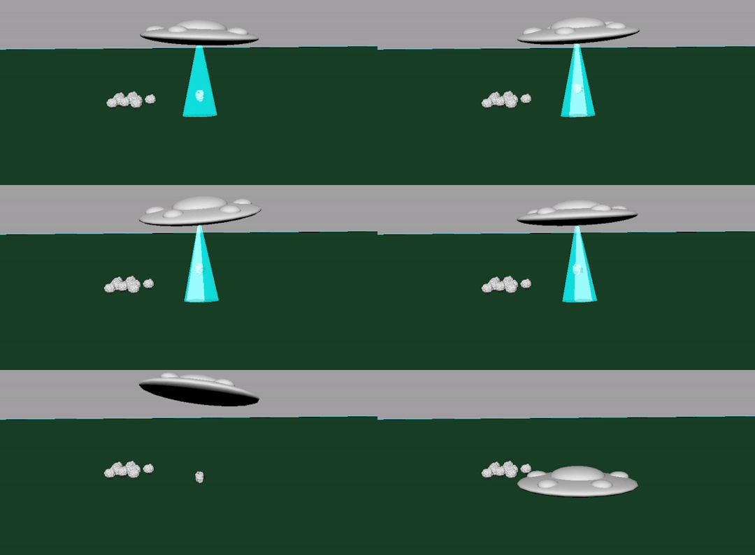
Digital 3D This week, I took it upon myself to develop upon the previous Flying Saucer task, downloading Maya to use at home and rebuilding the sequence from scratch, using a more planned-out approach. With a humorous direction (the sheep is too heavy for the UFO, which then crashes), I sketched out quick, loose ideas for the sequence. Alongside these preliminary sketches, I also explored Pixar’s approach to the task, Lifted, which also presents a light-hearted take on an alien abduction. With this, I knew I wanted to follow a comical direction that works to effectively subvert the audience’s expectations.
Overall, this represents a far more exciting and successful response to the task. Through iterative development and my own perseverance with Maya, I have been able to challenge myself to create an ‘engaging, successful’ CG animation that puts a new, comic spin on the farm animal abduction’ plot in this short sequence. Something I am going to put a focus on is iterative development on my practical exploration: this was the main point in the feedback of my previous unit, and it’s something I’m constantly considering moving forward. Here, iterations have allowed me to explore and further flesh out this simple CG sequence, and complete an animation (that, whilst simple in composition) demonstrates my new understanding of Maya as an animation and modelling program.
Additionally, we were also set a new task within Maya: taking the focus away from animation, were challenged to explore the modelling potential of the 3D software. Firstly, we were introduced to the Modelling workspace - as we explored the various tools to edit and change an existing shape. This provided us with a range of tools, allowing us to extrude, edit and bevel surfaces of shapes in order to create new, more exciting ones.
Initially, I struggled with this process: but after spending time trying to get to grips with the extrusion tool and asking for feedback, I was able to get a basic understanding of the modelling process and produced a pencil in response. It’s not exactly visually impressive or appealing, but I see the value in this task as a way to introduce the basic foundations of more complex 3D modelling.
The final task was a little more demanding: in the limited time remaining, we were to produce a 3D radio. After experiencing several technical difficulties with the program, I managed to create a basic box-radio following the steps described by our tutor. What I’m finding is the luxury of time with learning these processes: the sessions, whilst helpful, are ultimately too short and fast-paced for me to properly grasp an understanding of the Maya processes. I am somewhat struggling with the modelling side of things, however, I want to develop this understanding and take the opportunity to explore the digital learning world of Linkedin Learning, something our tutor suggested in the session.
In my own time, I managed to complete the radio and add some colour - adding life to the object that I couldn’t really see beforehand. I’m also interested in the potential of rendering this object and seeing how it could move too. Perhaps it squashes and stretches whilst listening to music? It’s a small motion, but I feel like it would be a good independent development of this session and a way for me to add an understanding of the basic principles to my Digital 3D work.
#ba1b:weeklysummary#ba1b:introtostopmotion#ba1b:introto3d#ba1b:narrativetheory#ba1b:animatedsketchbook#ba1b:digitalprinciples
1 note
·
View note
Text
A Brief tl;dr
This is probably a lot to say for 20 unfinished webcomic pages and I know I can be fairly long-winded so if you just wanna skip ahead and click through the pictures I’ve put up, I understand.
The TL;DR is
Hello and welcome to Mage Punk Archives! My name is Tables and this is some of the work that I’ve done over the last few years and what I’ve been up to in my little corner of the world. This is the third and last of a series of posts, outlining a number of updates that I completed on the site.
Included are some of my inspirations and a little of what I’ve learned so far about myself as an ever growing artist up to this point.
After this, I want to keep the content more focused on the actual art and story.
I’ll post to this site as often as I am able.
Thanks for reading!
***
Long Ago, Before the miracle of handheld internet searches and Instagram
When I was but a young, internet webling, I was heavily into shitty online flash games and looking for anything even remotely related to my interests at the time. From Mario and Sonic to various comics, videos games, anime and things never to be said aloud (pornpornporn). My love of the likes of Super Mario Bros and Sonic the Hedgehog (big fandoms for me at the time) would later lead me to sprite comics. Today, my feelings for the little hodge podge collage strips of old video game sprite sheets and backgrounds are a little mixed.
(They were beautiful and I’m gonna make one someday)
Then, in Highschool, I took a basic Web Design class. It was a VVoid World Web of Notepad and Internet Explorer where a kindly old crone passed on to those of us there, some knowledge of the ancient runic language which forms the foundations of the World Wide Web: HTML. Tables, frames, css, oh my! This knowledge would eventually prove invaluable.
Throughout our studies we were occasionally allowed to venture out into the Wider World Web. It was during these little adventures and travels across the Web that I happened upon the magical land of Webcomics. It was also during this time that I began break free of the enchantment of sprites. Even though I would probably never return to them, they would always hold a special place in my heart.
The Internet is for [Comics]
Webcomics – Synonymous with “Masochism”
At first, I had no idea just how grueling webcomics could be. Most webcomic artists pump out pages one to three times a week. At the time I got into them, MegaTokyo, then still partially a video game webcomic, was just releasing its third printed book; 2-3 updates a week with a loosely set schedule. Evan Dahm was wrapping up his surreal fantasy epic, Rice Boy; with updates consistently going up Monday, Wednesday, and Friday. The various sprite and drawn webcomics that I was following at the time were updating all the time. Seeing all the great work going up, I felt encouraged to try it myself.
I drew these closer to the end of my junior year of high school.
Desu
Taking major inspiration from a lot of the manga and anime that I was enjoying then, I used pen and ink to make my comic pages. I liked working in black and white because it felt direct and skipping on color made it easier to finish faster. I figured I could work faster if I didn’t have to worry about the extra step. When I did want to use color, as is typical for the early pages of a new manga, I used markers.
At the time, I had no idea that mangakas used assistants. That’s messed up.
Not to say that it was completely unrealistic, but back in the real world I could only average one black and white page a week. If even. The spider webs I was drawing all over were so that I wouldn’t have to use a ruler to draw my panel proper borders. I thought it gave the comic an “old archive”. In the end, I concluded that the spider webs should have their place and not be all over.
This time, I decided to work a little more carefully and deliberately.
Moving Forward
It was going pretty well but by the time page 7 rolled around, it was time for midterms and I had become too self-conscious and uncomfortable with the way I was drawing my comic pages then. Then, it was time to take finishing high school seriously and before I knew it, I was a freshman at The Art Institute of Fort Lauderdale. I did a lot of growing in the next four years that I attended there. Unfortunately, I never revisited those pages. Instead, near the end of my sophomore year, I took a Sequential Art class where the Final was a full-color, 5-page comic.
These are the ink-wash versions of the 7-page Final that I submitted. I’d originally colored them digitally to meet project requirements but I don’t want to post those just yet..
In the End
I wasn’t satisfied. The truth was that I waited until the last minute, rushed it, and over-reached on a re-draw that wasn’t much fun for me to work on. During the course of that Sequential Art class my professor turned my attention to artists like Moebius and Mike Mignola. I also came across Katsuya Terada’s stuff around this time.
And school went on…
I worked on Mage Punk when I could between assignments.
Between thinking I could possibly work on a for-print comic…
…and a webcomic at the same time.
The End was Near
Most of these were actually made towards the end of my four years at Ai. Those of us graduating were tasked with compiling our work from the years past in accordance with the requirements for obtaining our degrees. I believe that we were given two semesters to gather our pieces and do any revisions to previous works to get them up to date with the rest of the portfolio piece. Illustration Graduates at AiFL were typically required to gather a required selection of their work into an on-demand printed book. The year that I graduated, my department decided to change things around a little. Specifically, we were given the option to collect the requirement work into a plain black binder portfolio and make the printed book more geared towards our pursuits. I opted to make a Mage Punk/Orbyss Archives “Zine” as my main portfolio piece.
And Then College was Over
I drew a few more pages of the comic until I became employed full-time. These days, there aren’t enough free hours in my days for me to keep up with any typical webcomic’s update schedule so for a long while I stopped working on the comic altogether. I’m squeezing as much work out of every second that I’m not there; with whatever energy I can muster. This includes planning, writing, sketching and drawing. Before I got back to work on the site, I was posting fairly regularly to my Twitter and Instagram; those posts took time to do as well.
Most of this post was written in separate sessions on my commutes to work.
“Shortcuts”
Even though I always wanted to present Mage Punk as a webcomic, I always worked on it like it would go to print eventually. This created a confusing mindset for me when working on the comic, where I had to work on a whole book, but I have to rush to finish every page. If I wanted to put out pages more frequently I took shortcuts at any point I could to be done with them. Even if I created a good buffer of finished pages, I’d still run into that same pitfall eventually. I wasn’t enjoying my project because of a pressure I applied on myself to finish it in a way I wasn’t necessarily comfortable with. I didn’t even get that much done in the end.
It’s important that I work on it at a pace that lets me show the best of my ability. I would love it if I could be properly finished with the pages before I post them but if I wait before it’s all good and done I’ll just never get around to posting anything, forever floating, aimlessly, throughout creative internet limbo.
Instead, if I have to work on my comic in piecemeal, I’ll just post it up in piecemeal. Mage Punk will still be presented as a webcomic but, until the end of the book is done, certain changes are still a possibility. Editing is an important part of producing any book and I’m going to make its presentation reflect that.
Cue Rhidiculous shouting “I told you so!” from some nearby bushes.
A Webcomic in Presentation Only?
Those Two Images are the Same Page
Instead of trying to finish things at breakneck speeds, I’m going to work on the comics at a more reasonable pace. I’ll try to work on it mainly Chapter to chapter instead of page to page like how a webcomic normally is done (buffers aside) This gives me the opportunity to take a step back and get a broader look at the story while still putting out content in enjoyable chunks.
It’s difficult for me to wrap my head around drawing a comic on a start-to-finish, page-by-page basis. While I was working on the later pages in the chapter I kept finding myself jumping around and making changes to previous pages to make some things more consistent with later parts of the story. Instead of working page-by-page, I was editing the chapter as a whole to try to strengthen the narrative I’m trying to tell.
To that end, I still want to present it on this site as a webcomic; if only in name and archive.
The Process
At the VERY longtime behest of my editor, I’ll be presenting the comic as a work in progress at various points in the following production stages.
Writing
I’ll post dialog excerpts here and there. Nothing that can spoil the story too much.
This step will be kept largely behind the scenes.
Thumbnails
I do these on index cards in ballpoint pen to figure out the sequence of events that I most prefer.
This is the step where I’m prone to overloading a page with information.
First Drafts
Full size roughs of the earlier thumbnails. This step helps me get a better sense of how crowded or unbalanced a page might be early on.
This step also helps to prune out any strenuous scenes or dialog that could otherwise have their own pages.
If it isn’t working visually at this point, it’s not going to work in the next step.
Pencils
This is where the real drawing happens. Drawings in this step are made by either digital or traditional means depending on when or where I’m working.
Inking
This step is exactly like the drawing step but in pen and ink. Despite my affinity for real pen and ink, I’ll mainly be working this step digitally.
Color
This step is wrought with indecision but it also one of the faster, more fun steps to do.
Lettering
I’ve removed the dialog from all the pages currently up, opting to keep that out until a chapter is completed; it’s the thing I’m likeliest to change the most frequently until the end.
All lettering is currently done digitally but I’m considering the possibility of hand lettering.
Drawing dialog can be quite fulfilling but it takes a lot of practice.
Editing
This part will be happening all throughout. Page re-orders, panel redraws, changes in dialog.
Until the book is done.
Here We Are
I’ve already made some revisions to a handful of the pages that are already up; if you browse through the comics you can see the revisions noted in the comic descriptions. I’ll make blog posts for any major revisions or series of revisions that I do. I have a few ideas for some smaller projects that I can work on while I work on Mage Punk. Whether they be illustrations, stories, or even mini-comics like this silly thing down here.
Moving on
I might have also mentioned before that I have a few other drawings that I wanted to make for the site. In particular I have a neat idea for some social media icon illustrations. I wanna make something that takes advantage of what I’ve learned with using CSS. It’s nothing too fancy.
All that said, future posts will be a bit more brief than these last three were. I’d much rather write and post about the work itself, but I feel like I’ve hit a personal milestone and felt the need to ramble on about it a little.
Until next time,
Thanks for reading!
The Big Site Update (Part 3) A Brief tl;dr This is probably a lot to say for 20 unfinished webcomic pages and
1 note
·
View note
Text
Final Evaluation
Overall, I had have a better liking to this project in comparison to the previous module despite it being all from home. I have picked up a range of CAD skills from tutorials which I have never done professionally. Choosing a trend and creating new ideas based of the skills I had learnt seemed much easier than last time also. I think was because we had the guidance of the WGSN website and having to base our work around their forecasts. I knew I wanted to do something 70s inspired as I have always had an interest to this era and it was important I chose something that liked so I was motivated to push myself to do better work. Towards the end of the last module I found myself rushing my work and creating half hearted outcomes which I didn't want to occur again so it was important I thought of which specific trend I wanted to do earlier on. I enjoyed the trend Woodstock spirit and started to create mood boards related to this report quite early on in this project. As I began to get more comfortable with CAD work, I then gained a liking to Psychedelic Trails which is what sparked my idea of combining the two.
I decided to combine the two as I felt I could do this well with the skills I had learnt. It was also easier to perform as these trend reports fell under the same trend ‘Euphoric’. They both have the same message which was to boost moods with the bright prints and happy slogans. However taking this information I wanted to push myself further and focus on the uplifting feelings that may occur mentally. I discovered similarities between the two trends where they discussed the heavy influence of these trends and I noticed forms of escapism were mentioned. This includes drug related feelings which was common in Woodstock as well as the new digital expressions of people which was in the Psychedelic Trails report. I wanted to focus my work on escapism as had only recently heard of this term of what I believe people go through frequently. This resonates with me as I feel as though I escape from reality often whether that is reading or typically being on my phone. I find that when I come out of this “hallucination” I don't even realise how time has passed and what may have changed in the environment around me which is quite scary when you think about it especially when being on your phone. These zones in which I have fallen into have defiantly caused some problems in life and I have realized that escapism happens when I am bored of my current lifestyle. For example; I remember once I was waiting at a bus stop waiting for my school bus and to pass time I decided to scroll on my phone. Falling into this temporary form of escape, which makes you loose the concept of time, I didn't realise the bus was due and not until it actually drove past me! This temporary escape resulted in my being late to school. When I develop these thoughts further and how escapism could effect a person, it leads me wondering if its any different for men. I knowing briefly how society works and how men are portrayed. I questioned whether escapism is more of a common form for them as I think men don't express their emotions as much which could result in them wanted an antidote in times of boredom like this. This is where my interest in creating this trend for menswear came about. I realised that majority of the male figures in my life have never opened up to be emotionally which I presume this is due to societies impact of having to stay preserved and strong for others and not just them not wanted to talk to be about their emotions. I believe these elements which I had gathered in my mind related to one another nicely and pushed me to base my work around this. I wanted to express the stages of escapism from zoning out to the feeling the temporary shift has through each key pages in my lookbook. For example; the colour palette page would involve bright, vibrant colours and prints that would energize the mind and reflect the feelings a person may go through when falling into this temporary distraction. This would compare to the material and key garment page which will be much more darker with the help of certain material and garments which conveys the mundane and repetitive lifestyle someone may live which urges them to seek in escape. I was surprised that I wanted to extend the trend to this extent rather than keeping it simple and following one WGSN, nevertheless I enjoyed this work despite giving myself more work which I had to include.
Reflecting on the work I have produced I am proud of the work I have done as I had no idea how to use both of these software apps before starting this project. If I was to compare my notes which I had written at the start of this module explaining what I wanted to conclude, I honestly don't think I have executed them to the full extent I wanted. I think I should've included some better imagery explaining men's mental health rather than letting the reader assume where this idea ties into the trend. I find it difficult sometimes to remember that this work is to be seen by a blind eye and this person has no knowledge of what they are looking at so I find it hard to separate the two and make my work as clear as possible throughout the whole module. I think some work is better than others for example; I love my narrative which you may have guessed however I don't enjoy the following 5 pages after which is disappointing for me because I had high hopes for this. Despite these cons I think I have achieved the other points such as the psychedelia concept well. It was difficult not to make every page “trippy” as this is what everyone resembles when thinking about psychedelia so it was important I modernized it a little bit with the help of designers collections and other imagery such as my scanned sketches. I think I would improve a lot of things if I were to do this project again such as reminding myself not to get to caught up in spending too long on a page. I think if I kept re reading my trend idea more frequently than I did I would've been able to portray my concept much better than I did. Despite these dislikes, they have made me more aware and alert of what to expect in my branding and communication course which I have much more experience with. I excited for the next module and pushing myself further with the knowledge I have learnt so far
0 notes
Text
Art Plan:The Forgotten Chronicles
Final Work: ‘The Forgotten Chronicles’
CONCEPT Use the space below to write a description of the concept of the artwork and how it relates to your practice.
I wanted to create a space to present my ‘archive’ of sensory collections. This would have incorporated a multiple of textures noises and ‘bits’, ranging between sounds, words, music- lights, mirrors, projections- films, photographs and sculptures. The archive presented is wanting to form a sensory experience within ‘looking’ at the home and the outside. There is a temporal importance to my practice through the use of light and the fragile beauty of depicting decayed ‘bodies’. Through non real visuals of very real things the piece would reflect my interest in wanting to make art that sounds tactile, smells nostalgic and tastes as potent as it looks. Through varying pieces of tech equipment, shelves and holes I planned on making an interactive ‘third space’ where by the viewers would be submersed in what what is beyond visual. This would be loosely narrated by my experience of hospitalised bodies, my collections of special fruits and what these sight impairments have left me with. Thus, reflecting my interest in relational aesthetic art.
I intended to make a series of different spaces, with each one acting like a chapter to a book.
Dramatic stillness, chaotic movement, swirley motion in the steps through a street-less road and the cold air of an empty boat. These chapters would visit multiple places in memories. Following footsteps through the textures of a video projected onto dirt. The concept of this work revolves around the merging dysfunction of these archival parts, the claustrophobic darkness where structures are incoherent. Yet gentle silk waves pour on a bed of milk. It reflects my practices integral relationship with space and the questioning behind experiencing art or words as my ironic love for the things that are visual or written has been changed. Thus the work I vision, questions how we see, why we un-see what may be right before us in the mundane and in this, hopefully, the audience would taste, smell, feel the weight of their clothes, the importance of noise and perhaps ‘see’.
With access to equipment and facilities through this installation, I could see this work beyond a specific exhibition space, possibly as a download for listeners to experience in unusual or possibly comfortable places; barns, rivers or under beds: ‘Digital Books: for Visual Listeners- The Forgotten Chronicles’?
PROGRESS & PLANNING: DESCRIPTION Use the space below to write a description of the progress and planning you had undertaken for the artwork prior to the closure of facilities.
I spent the beginning of this module collecting and gathering to widen my archive, listening for noises, drying my fruits and mending broken or lost parts. Once my archive began to formulate I created two experimental installations using a project space at Spike Island, speaker and cable equipment, a projector, lighting. I also used my studio space to create the fruits used for these and the computer and technology software to edit and record sound and film. I also used tech support through fabrications where I was beginning to earn how to professionally edit film and sound using the UWE tech software.
My vision for these narratives in space was coming to life, I had booked out three sessions using different spaces at Spike Island with different equipment. I visioned using a project space once or twice a week to continually experiment with the curating of these through making supportive material through out the rest of the year to develop these ideas into a refined series of chapters. I was going to book a session in the sound room at Bower Ashton using the Foley studio as I did an Induction at the beginning of this module. Looking back on my daily plan made for this module I wanted to make sculptural textures in fabrications to emulate tactile photographs... Objects, imprints, castings and metal works for people to hold and smell.
PROGRESS & PLANNING: DOCUMENTATION AND EVIDENCE Use the space below to insert photographic evidence or drawn plans of the progress and planning you had undertaken for the artwork prior to the closure of facilities. Add pages as necessary.
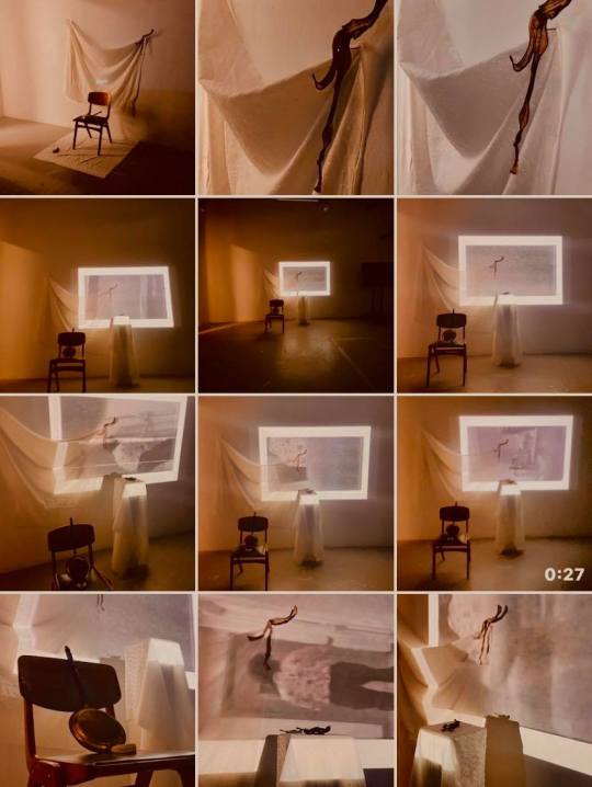
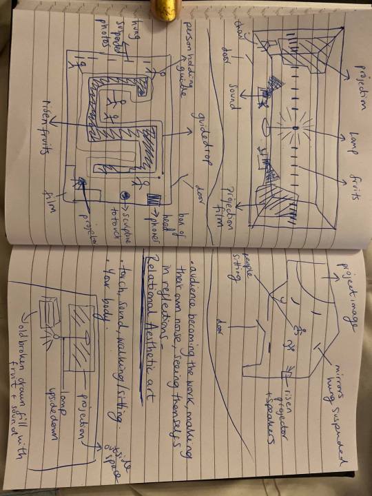

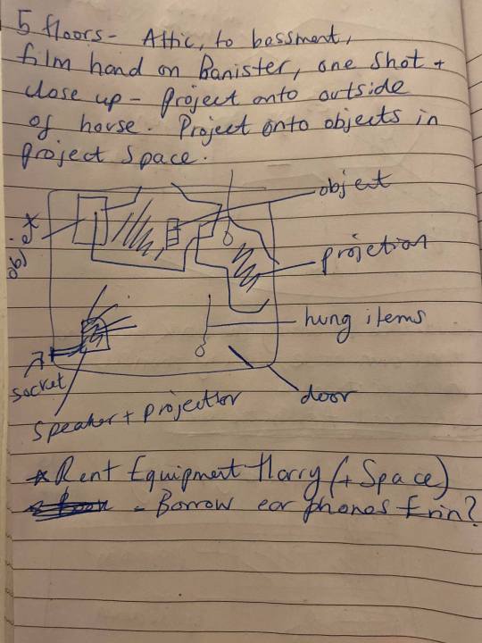

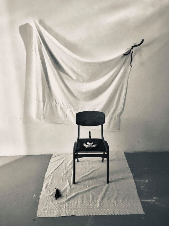
ARTWORK VISUALISATIONS
Use the space below to insert visualisations of the final artwork – these can be photoshop images, exports from programmes such as Blender or other digital programmes, stills from films, photo-collages or simply drawings. Add pages as necessary.
The following link is a space to try emulate ways I might show this archive in installations/chapters. All of it is made using DIY, de-skilled tech as I used by mobile phone for this entire submission. My phone broke 2/3′s into the lock down so I was unable to continue working this way as I couldn’t create any more experimental films or sounds. Something else I would like to highlight is the difficulty I have in representing my visions for this as the impact of seeing my ‘plans’ on a digital screen give very different connotations to my ideal conceptual aesthetic; of natural decay, raw intensity and subtle fragility. The work becomes less soft although I do believe the works themselves are interesting and reflective of the narrative I aim to form.
Basing my ideas of written sketches as seen in the ‘progress and planning’ section, I would have used technology and space to curate and edit these archival parts. I wanted to create an outdoor exhibit for the final chapter using tunnels or boats.
I have coded some texts into brail, and I would have liked to have used an invigilator/ guide, for the installations to describe the visual work for some works in more detail, although the point of this series is to try bright to light the other sensory aspects around vision through descriptive, plosive words and ‘polemical’ textures.
Thus, I have also seen the Publication task as a way to showcase these fragments best as possible due to the many constraints. I think the relationship between the works in the publication best display my hopes for what I would created at Spike.
Please press ‘present slide’ top right corner.
https://docs.google.com/presentation/d/11eSkcloFUwJSoA4gq0459Kbj8spTAgY121Plj2JSeK4/edit?usp=sharing
INSTALLATION: TECHNICAL REQUIREMENTS
Use the list below to describe the technical requirements of the work. Highlight the answers as relevant.
(Please circle Yes or No)
Electrical points Yes No
If Yes, how many points required? On average, two on either sides of the space with at least 2 extension cables
Wall - based Yes No. Wall and floor.
If Yes, what is required approx. length and height of space? Large scale projections, dimensions variable, I would use a whole room for documentation then for the submission I would have ideally had an entire wall including part floor and ceiling.
Is the work exceptionally heavy? Yes No. Speakers, mirrors and projectors
Floor - based Yes No
If Yes, approximately how much floor space is required? 3 plinths, and the length of one project space wall to inhibit disrupting the projector.
Do you require dark space? Yes No
Do you require equipment to be provided by UWE? Yes No
(Please tick ‘no’ if you can provide yourself)
Please detail what equipment is required : two speakers, cables, extensions leads, projectors 2 ideally if not more, 3 plinths, headphones, nails and hammer, paint rollers for set up, safety cable covers, lighting.
If you require monitors, data projectors or slide projectors, how will they be installed?
The projector would sit on a low level plinth angled upwards, distorted and overplayed with a second or third projector, spanning across wall space floor space and ceiling space. The cables would be neatly kept under a wire safety holder and the plinth would be positioned near a socket to stop cables running through the room. Other than that, it is difficult to say as I have not been able to experiment with this, I think If i was to have the psychical space and the time the work would change as it grew.
Does your work have an audio element? Yes No
INSTALLATION: VISUALISATIONS / REFERENCES
Use the space below to insert visualisations that help the assessors understand how you would install the work. You can use images of other artists work to help provide a context for your intentions and choices. Add pages as necessary.

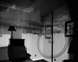

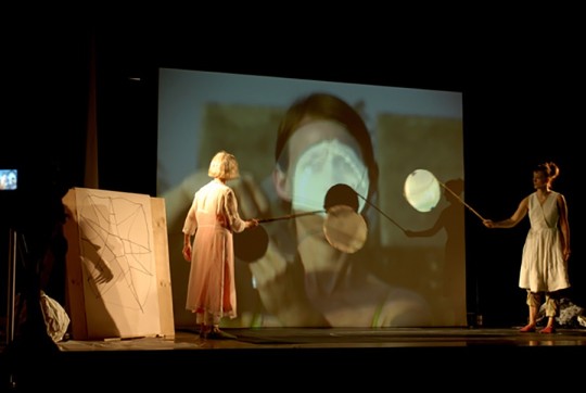


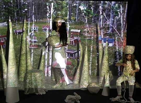
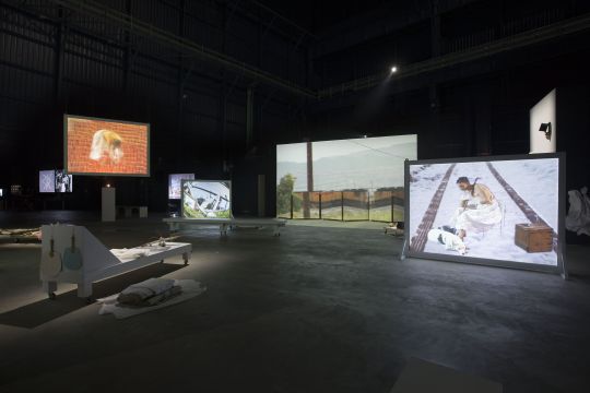
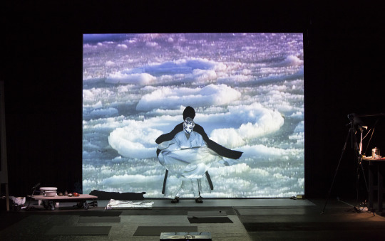
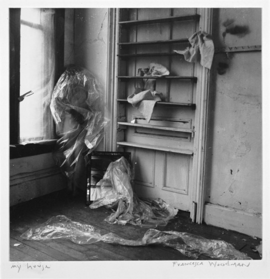

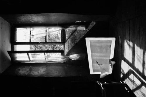
Home Experiments
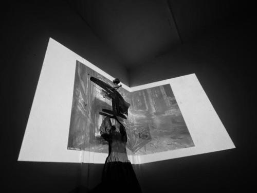
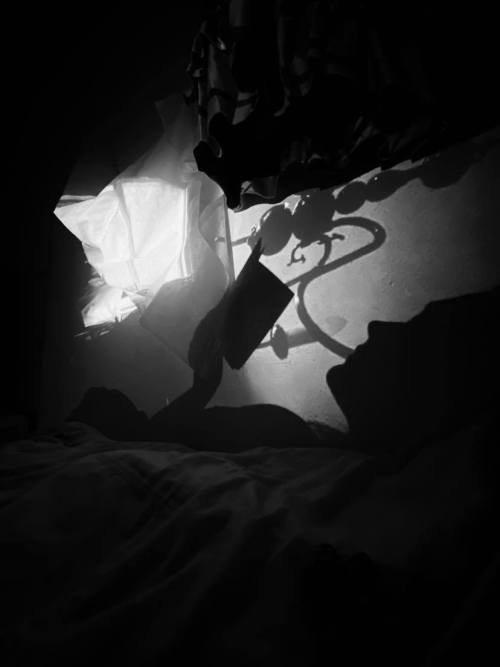
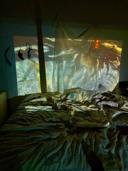
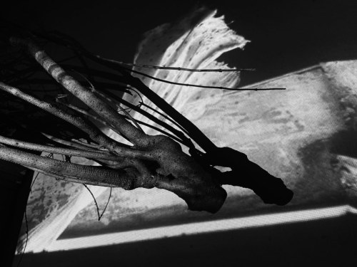


0 notes
Photo

'Chit Chat' Project Proposal
The project proposal gave me an opportunity to discuss and evaluate my influence of the project so far, having completed a series of set workshops, mind maps and spring board. I have been given the time to evaluate and discuss a chosen idea for me to begin my personal experimentations rather than just specialist developments.
Broken down into three main components, the rationale, project concept and evaluation discusses what I hope to portray within my work offering examples to who I could research and include throughout my own progressional developments. Considering the 4D animation route I hope to pursue.
The rationale breaks down the key processes and techniques that will help me with my designated project, summarizing the skills I have learnt and acquired and how I could translate them towards my own final major project. This segment of the project proposal gives me the opportunity to reflect on my previous projects, challenging myself to identify what I could work on as an artist and what I could push further to pursue my ideas to a higher standard.
Rationale - Reviewing my progression of the course, I have developed a range of techniques that blend both analogue and digital processes through exciting methods of problem solving. Throughout Term 2, I really enjoyed the challenge of seamlessly working between 2D and 3D processes. This showed me how I can incorporate transferable skills throughout my passion of character design and animation.
During my final major project I want to return to this work style as this pathway allows me to explore narrative and audience interaction with longer term aspirations to convey emotion through character. As I have learnt the importance of showcasing the journey and open ended opportunities for my project to evolve.
Highlighting the context of my project the project concept discusses how and why I will be tackling this topic as a subject, dedicating the final 11 weeks of the course to a subject I hope to work on and expand my skills within. Demonstrating why it would be appropriate for my to expand my skills within these specialist areas considering the direction of further education I hope to pursue after this course.
Project Concept - The context of my project ‘Chit Chat’ will investigate the relationship between character and audience through visual and audible elements. My main focus will be questioning the importance of audio to build character, investigating the impact of sound and speech to create a conversation.
Using audio within my work will challenge me to produce a 4D outcome Primary research will heavily influence the evolution of my project as I to develop my observational skills for inspiration. This will derive from narratives and character designs that are taken from the world around me. Using real-life conversations to inspire the topics I discuss throughout my work.
My initial investigations have been mainly around the use of character in film, specifically artists that portray character through animation. The works of Laika Studios, Aardman Animation and Wes Anderson all manage to portray typically unorthodox characters through the use of stop-motion. Having analysed their work I have decided I need to produce some observational character sketches drawing from life, using pencil, pen, and more loose materials based on the expressive works of local artist Sam Elston, to develop a sense of proportion and scale.
I hopefully want to continue my experiments by generating a collection of refined character that can be translated into three dimensions. Challenging myself to work with a process outside my comfort zone to create an articulated stop-motion puppet.
This will allow me to have a range of outcomes based on peer and industry responses that I can review and consider as developments to the project ‘Chit Chat’.
Evaluation - Over the course of the previous projects evaluating utilises the opportunity to add value to the successes and areas for improvement of my work. This process allows me to look at the work of others and reflect upon the benefits of someone giving me honest and constructive feedback. Peer reviews can be challenging though as there can be a possible bias to what we produce through our friends sugar coating any areas for improvement. This is why I plan on contacting industry professionals from artists that influence my work as they would not only reflect upon visual appeal but question the value of my work.
The project proposal as a whole gave me the opportunity to highlight and discuss my ideas in a concise and formal format. Without the rambling and fluff I usually include, this unit challenged me to work within set limitations to convey my intentions with clarity. I believe I effectively communicated how I hope to explore my project giving me the opportunity to dive into new processes and techniques that I hope to develop on in further education.
With enough diversity and room to evolve my ideas , giving me the opportunity to produce a range of outcomes that fit the needs of the brief I have set myself. In the upcoming weeks I hope to expand upon my experimentations discussing and responding to my finalised idea focusing on an audience I can respond towards and their specified needs.
Potential Actions:
Respond to my project proposal through observational drawing, going out in public recording conversations through figure.
Consider a range of artists / designers I could respond to gathering primary and secondary research that could push my project further.
0 notes
Text
Animation Week 4: Review
In our last week of working on traditional animation techniques, I’m looking at the Basic Principles of Animation in more depth and exploring the idea of anthropomorphism in animation.

Dynamics
This week in Dynamics, I explored the animation principles of Anticipation and follow through, in the form of a jumping animation. We spoke about how important the Basic Principles of Animation are to an animator, and that they make it as easy as possible for the audience to know what is happening on screen. Anticipation describes the movement a subject makes just before the actual action, as it gathers force. This is used to prepare the audience for an action - giving them a visual clue and makes the action appear more realistic. However, just as energy is required to start a movement, energy is also required to stop a movement. Parts of the subject will often continue to move after the main action has finished, and the centre of mass has stopped moving.
The animation by Alan Becker demonstrated this in a clear and exciting way, through his own digitally drawn examples. After this visual explanation, we were set the task of creating a simple character animation of a jump across the screen, and to consider anticipation and follow through principles in the process. The main ideas for this task was to concentrate on timing and spacing, and to allow the subject to maintain their mass during the jump. When I was working, I wanted to embrace the ideas of exaggeration, emphasising the character’s direction of mass through the jump. To begin with, I worked loosely and roughly, sketching out the character and figuring out the centre of mass before adding any characterful details or limbs.

The first test I produced wasn’t that successful, I felt. The jump, as a whole, feels rushed, and the character is moving as if on a treadmill. There’s not enough time in this test for the audience to see the anticipation for the jump, and then most importantly, the follow through action - a visual reference to the ‘superhero landing’ pose from countless comic book characters. After speaking to my peers, it was suggested that I simply add more inbetweens to show the landing more.

After this feedback, I went back and added several more in-betweens, resulting in a much more successful and appealing jump sequence. The character maintains a consistent mass, and the improved timing allows the superhero landing to conclude the sequence. If I were to develop this sequence, I would want to add more exaggerated movements to the sequence - have my character visibly wind up in preparation for the jump, like a spring.

Finally, the week ended with the briefing of our Dynamic Animation exercise, in which we are tasked with selecting a pair of dynamics concepts and develop a short animation exercise of 50-75 frames that emphasising these dynamics. It was suggested that alongside choosing one pair of dynamics, that we try to include as many animation principles as we can. This week, the task was to create three possible options for my dynamic animation, using a provided storyboard. I was able to develop three potential ideas, however I am particularly engaged by the ideas of Squash and Stretch, and Impact and Reaction. I feel that these will provide me the most exciting opportunities for a quick animation, that not only demonstrates these principles but also engages the audience in the process. We also had the opportunity to present our storyboards to our peers, in order to gauge an initial reaction on what works well and what could be a challenge. Next week, I hope to develop these ideas into a finalised storyboard and move onto digital animation.

Character Research
This week in our Character Research lecture, we explored the concept of the Animal Human Divide and anthropomorphism: the act of giving human characteristics and personalities to inanimate objects, animals and gods. As a craft, animation is obsessed with animals. We spoke about why this is, how early animators preferred to draw animals because they were less confident that human characters would engage an audience, and how animators tended to prefer to draw characters that cannot be done in live action film. Animals appeal to a young demographic, using simple characters to engage a child-friendly audience ensures good ratings and thus, success. Using animals as our characters also allows our sequences (and narratives) to be universal: we all know what a duck looks like, and this allows for more storytelling opportunity too, looking at more allegorical and metaphorical stories - we can tell stories about events, people or things without directly referencing them. The animated adaption of Animal Farm was shown as an example of this, an animated satire of the events leading up to the Russian Revolution of 1917.

I found this lecture to be important and useful to my own character research as I’m exploring the character of Mr Fox, an anthropomorphic character from Wes Anderson’s stop motion feature Fantastic Mr Fox. We spoke about how using animals as characters not only allows the audience to engage with them (supposedly) easier than human characters, but it also allows us a template for personality. For example, Mr Fox is a cunning, planning chicken poacher who loves his family. The fox, in our culture, has always been a symbol of sly and cunning - a master planner. My character exemplifies this idea. Next week, I am going to produce a list of research topics and ideas to explore for this essay, using the 2 Page Technique we discussed earlier.
1 note
·
View note