#mm-hmm mm-hmm
Explore tagged Tumblr posts
Text
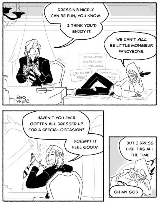

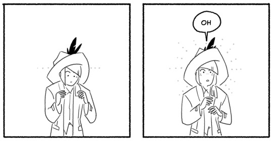
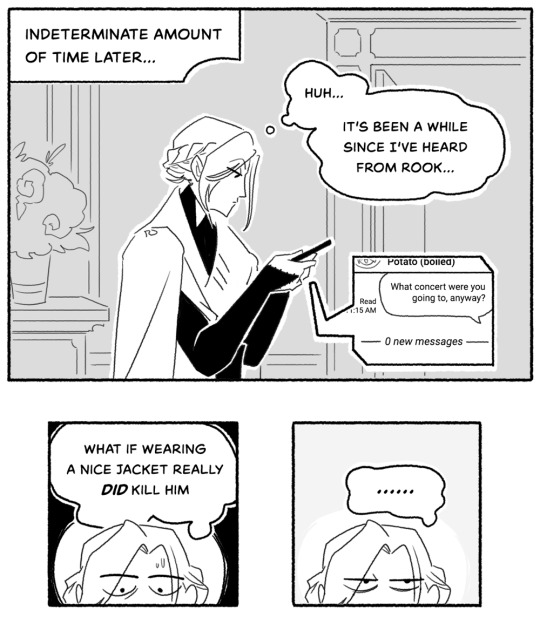
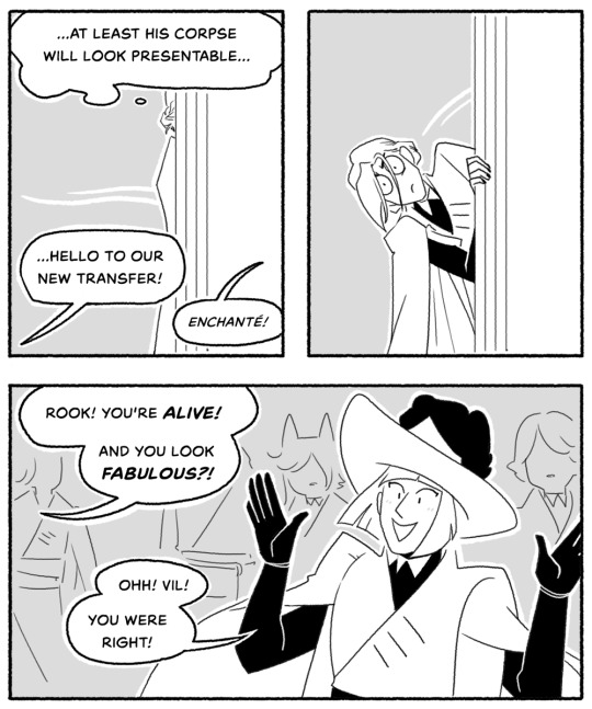
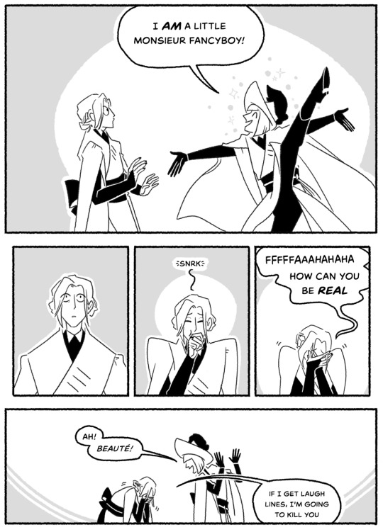
the recent resurgence in episode 6 talk has led me to reminiscing about Rook's absolutely buckwild backstory. man tries on a nice jacket exactly once and immediately re-evaluates his entire life.
(this has actually been sitting around for a few days because I keep second-guessing it, so uhhh sorry if it's weird! I can't tell anymore!)

#art#twisted wonderland#twisted wonderland episode 6 spoilers#twisted wonderland book 6 spoilers#<- gonna keep tagging for a bit for people who haven't finished it yet#me drawing pre-pomification rook: mm-hmm. yes. applejack.#i saw someone once refer to rook's backstory as b*mboficiation and it has haunted me ever since#it's no wonder vil thinks he can reform epel. look at what he's already done.
9K notes
·
View notes
Text


Jes Jespipat as Tyme and Job Yosatorn as Den in 4 Minutes ep 03
#4 minutes#4 minutes the series#jes jespipat#job yosatorn#asianlgbtqdramas#uservix#userrlaura#esmetracks#userspicy#userrlana#khaotunq#*#*4m#i just thought this exchange was so fun. especially the 'you're being a pain in the ass' 'mm hmm' bit#we love a pair of long-suffering homoerotic besties
250 notes
·
View notes
Text
“Don’t get me excited.”
#no thoughts just he looks insanely good in that shirt….#truly hugging his torso mm hmm#and the way the fabric criss crosses with the motion of his walking#ANYWAY#im sooooo normal about it!#callum turner#divine (2020)#post
168 notes
·
View notes
Text
what was and what is

#art#my art#the legend of zelda#loz#tloz#majoras mask#ocarina of time#loz mm#loz oot#link#young link#i don't have many visual oot link hcs hmm#anyways look at them ahh#time needs some rendering on his hair touched up
130 notes
·
View notes
Text
agnes montague is living evidence that even within a coffee shop au the characters of tma could not find happiness
#jonny trying to subliminally message the audience:#no matter where you put these bitches it wouldn't work. you shouldn't even try#the fix-it fic writers who make sure agnes is alive and well and dating gertrude:#mm-hmm ok. go fuck yourself#tma#the magnus archives#agnes montague#jack barnabas
148 notes
·
View notes
Text
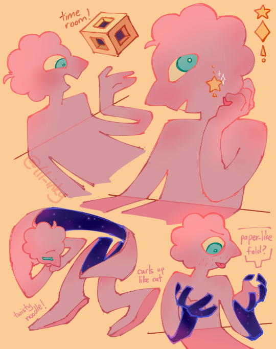
funky wall man hello there 🟨
#AM FINALLY FREE TO DOODLE ON THE TAB#prismo likers let’s goooooooo#fionna and cake#adventure time#prismo#prismo the wishmaster#inky doods#my art#trying to get the hang of doodling him before moving onto more…pressing matters#(eyes the prohibitedwish hole)#mm hmm yep#we’re once again falling deep for another one lads
628 notes
·
View notes
Text


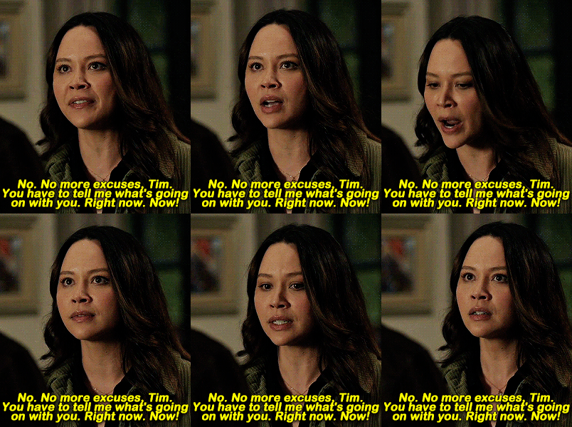

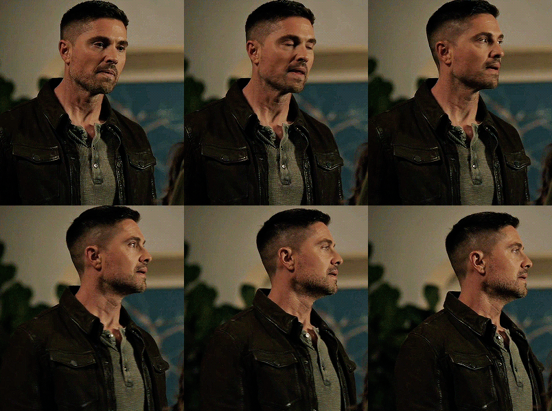
5x6 | 6x6
159 notes
·
View notes
Text


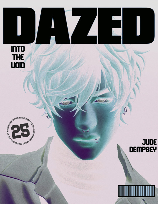
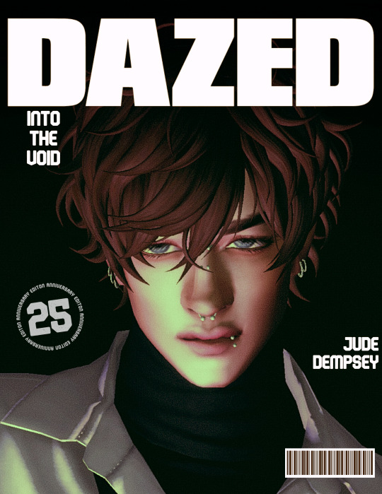
Jude for Dazed - May 2024 Issue x
#sims 4#the sims 4#ts4#sims#simblr#s4#sim: jude#eeeee#this was just fun random editing#also testing out lighting by ir7770 !!! was so fun#I took SO many pics but these r the 2 that won#the inverted looked too cool to not include ok#planning to do more stuff like thissss movie posters n whatnot with my ocs#but im so close to finishing school!! then its time for more story wooo!!!#“into the void” is prolly their next single or smthn.. was just a vibe when I made this#still haven't come up with a band name for him & bear but I WILL EVENTUALLY...#they def struggled w a name too and changed it a few times before one stuck#I imagine they pinned names on the wall and threw darts to choose lmao#I wanted to include bear in this but I am still struggling finding the right mm hair for him... he'll get his own version soon enough#also Jude last name reveal ig#I never posted it I dont think.. hmm
139 notes
·
View notes
Note
I was wanting to try doing an art piece in the style of the signature spell poster art pieces you create. But I’m not really the best at coming up with a composition for such a thing.
Do you have a process for how you come up with the compositions for them?
oh, awesome! it is an INCREDIBLY enjoyable style to work in; I hope you have fun with it! :D
I'm not great at putting my thought/art process into words, so my apologies if this doesn't make a lot of sense, but I'll try! my first step is always to do a LOT of thumbnails to figure out both the idea and how I want to show it; not trying to do a real sketch or anything, just little doodles to figure out what exactly I'm trying to portray. (I also call these "garbage passes" because they're not meant to be any good, they're just there to throw things out. aha. ha. ...anyway.) I think it's important during that first stage to really focus on the idea and the layout and not to get too bogged down in the actual drawing yet!
I tend to save my final thumbnails, so I'll use 'em as examples (I posted the ones up through episode 5 here if you're interested!) (and, uhhh, spoilers through episode 5 also in this post, hopefully that won't be an issue!)
the main thing I try to think about in composition is balance -- not necessarily in terms of symmetry, but in where each element is placed and how much space it's taking up. remember, empty space is still space! it's also really important to think about the parts that don't have anything in them, as much as the parts that do!
personally, I like to divide things up roughly by both halves and by thirds -- there's a lot more in-depth info out there on why the "rule of thirds" in particular works well visually, but in short, our brains tend to focus on things that are placed closer to imaginary division lines, instead of in the exact center of an image. so even when I'm doing something that is very centered and symmetrical, I try to keep that in mind and generally aim around those for landmarks like faces/eyes (or...where they would be, anyway) and other focal points.
it's not a formula of "the character's face should be in this division of this grid" or anything, more like "our minds like to focus on these areas, let's think about how to use that", if that makes sense! and of course rules are made to be broken, art is lawless anarchy, and so on. but it can be a good starting place for deciding where you want to put things!
(blue - thirds, red - half)
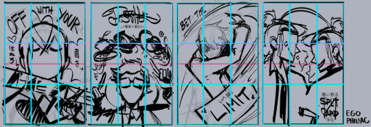
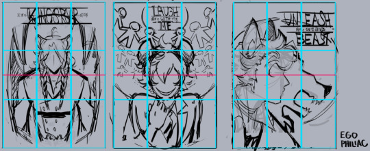
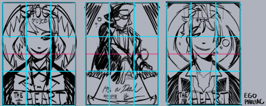
and against the finished versions, because they do usually end up changing a lot (including the empty space of the border):
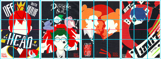
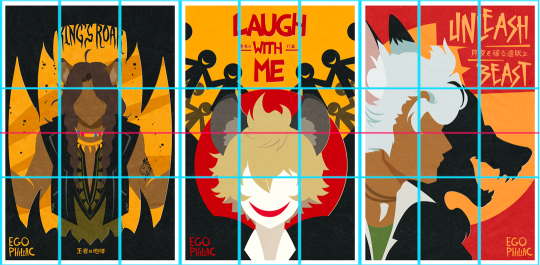
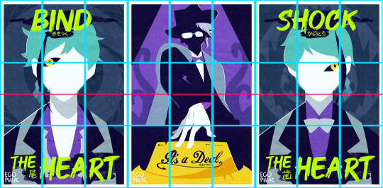
(...these actually lined up a lot better than I thought they would. :') it makes me look like I do things way more intentionally than I do.)
other stuff I just try to keep in mind is that our eyes like following arcs and paths, which can be a good way to guide the eye:
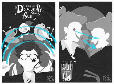
and frame and control the focus:

honestly, composition is one of those things I feel like I struggle with a lot, so I'm not sure how much of this is helpful or actually makes sense outside of my head. but hopefully it helps a little! it's all just stuff to think about while drawing and not anything hard-and-fast, so don't, like, stress out about making sure things are lining up exactly on the thirds or anything. again, it's more "our brains think these are the dopest parts of the rectangle" than anything else! take advantage of the cool parts of the rectangle!
NOW GO HAVE FUN DRAWING seriously though, it is always super cool that other people like this idea and style enough to want to do it themselves and for other/their own characters! thank you! ❤️❤️❤️
#art#sketch#twisted wonderland#...technically i guess? it's not about twst but there is twst art present anyway#i did have a few more examples but then i wasn't sure if you were cool with episode 7 spoilers. whoops. 🫠#many other people have explained the rule of thirds and directional flow way better than me and i apologize#it is so hard to put things into words i am so sorry#me: the...you know...the lines...they sort of converge? like a triangle?#the internet: mm-hmm. yes. go on.#me: (sweating) the...the triangle points here...because it...it has a point.#the internet: it's doing better than you are then#genuinely shocked at how well some of these line up though#uh. i mean. actually it was all totally intentional and i put actual thought into it! NOT an accident at all!#my eyes darting back and forth shiftily are just ✨following the paths✨
433 notes
·
View notes
Text

20/10 stars little guy
#me (scrounging undetected autist whose ideal fashion sense is ''if i have to be seen at all: shrouded'') seeing encanto the other month.....#and on top of it all i LOVE slice of life. encanto being so focused on What It's About that there's so much of that + character / dynamic#also part of what i loved abt pixar luca. ppl like ''simple story but not a problem :)'' like YEAH thank god it's Also so slice of lifey#2021 what a year lol. though again i only Just saw encanto....tfw Studio Creative Control backs off a bit more than usual: Joy & Wonders#anyway i knew going in bruno wasn't an antagonist (fine if he was though b/c slay & b/c scapegoats can do whatever they want)#knew i'd love him b/c again Scapegoat shows up & i'm the Amazing Showstopping Totally Unique Never The Same gif on loop#but what a delight even beyond those expectations lol. love again how Focused the movie is on What It's About & Thee Points it makes#the Characters / Dynamics & the Metaphor & the plot stays right with all of that. the focus & importance re: thee scapegoats....#& bruno being disabled like whole layer of Yay Yay Yay spamming. that even when He's Back we're reminded he's not ''normal now'' or w/e#(i.e. presenting that as The Good Ending for the disabled outcast. vs just being embraced as part of the group again & accepted As He Is)#meanwhile was like hmm chat is there queercoding do we think? like is he queer: Yes. but is there coding? hmm#sure isn't cishet coded though. but i was also having the thought like fellas is it gay to [higher tenor tessitura or w/e] lol#made me go ''do i know this voice? ok do i know this name / face / actor? (i have never seen anything ever / bad w/names/faces/voices)''#indeed was like yeah haven't seen this; heard of this; seen it once ages ago no way i remember more than like 0.6 details#then from ''ohh haha I'm A Mammal That Cares....yeah i hear that'' to ''omg CHI-CHI RODRIGUEZ???? ;;0;;'' waaah fantastic revelation lmao#also the way Literal Future Seer ability was externalized to make it more wrangleable for plot is so impressive & fun & excellent#got a lot of [i like this thing i saw a lot] i got to say....guess i can do that w/the sideblog i made for one drawing i made last night#encanto 2021#bruno madrigal#also the way bruno is so Nervous + Hiding / Bold + Big Personality like yes ha ha ha Yes....tamped down as ''too much'' experience#also the [stuttering stumbling muttering mumbling] line: i fr nigh wept upon going back over a moment like what am i hearing here?#& realizing the answer was: it's bruno quietly stuttering a moment during this one line (& then (& then (& then)) i saw you) ;;;mm;;;#hang onnn....the first scapegoat who's driven off being Disabled is so real so ;m; that again they're like so he got Weirder; Okay ;;m;;#that we get jorge thumbs up nobody having an Aside to be like [ugh; this guy] or Anything. augh always have too much to say for 30 tags#fabric drape there sure not accurate but i was like okay if i try to really reference that i'm not getting this done tonight
48 notes
·
View notes
Text
In The Bracebridge Dinner episode, instead of playing Björk’s Human Behaviour, they should’ve gone with Venus as a Boy — the obvious counterpart to Rory’s Girl from Mars.
#they were cowards!#the lyrics are honestly perfect for Jess (and Literati)#maybe it would’ve been a little too early because they hadn’t gotten together yet#but it could be good foreshadowing mm-hmm#(don’t take this too seriously I’m just joking around 😂 … but think about it 👀)#literati#jess mariano#rory gilmore#gilmore girls#bjork#*
32 notes
·
View notes
Text
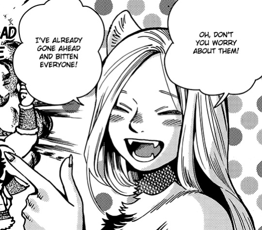
blessed scylla marcille
#marcille donato#dungeon meshi#uploads#i rly liked my old icon still but i saw this panel and was like hmmm mm oho oh hmm
61 notes
·
View notes
Text
WAIT WHAT
#HOLY SHIT#SHE WAS DOWN THERE THE WHOLE TIME???#his terse little 'MM-HMM' when vax left is KILLING ME#the legend of vox machina#percahlia#percy de rolo#percival fredrickstein von musel klossowski de rolo iii#vex'ahlia#aj watches vox machina#aj watches
31 notes
·
View notes
Text

67 notes
·
View notes
Text
forever grateful jared padalecki has long hair for his role for sam winchester.
#supernatural#sam winchester#sam#spn#jared padalecki#like they look so pretty with long hair#AND WHEN HE'S BLOODY mm-hmm
41 notes
·
View notes
Text

Awesome superhero design
good colors
Cool summoning lightswords
tall and pretty
nice ass
this is clearly a good unit, y'all just don't know how to play the game obviously

no really it's pretty sick looking sword design
22 notes
·
View notes