#might do more sprites idk
Explore tagged Tumblr posts
Text
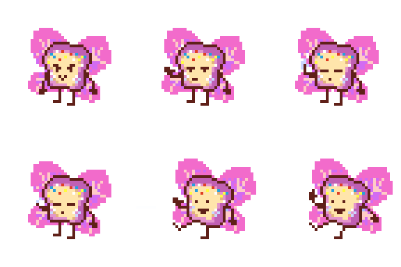
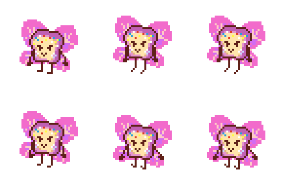
@lilybug-02 get sprited nerd (the wings are meant to be transparent but I guess that didnt come across on the export... Damn) Gonna go sleep now cos it's late
#whats ur otp mine is me and drawing lilybug fanart when i should be asleep#might do more sprites idk#i just felt like doing these ones lmao#honestly wasnt sure what to do for the attack animation but the finger gun felt easy and silly so i went with it#i imagine it would only really be used as a special attack in the boss fight#as opposed to the regular attack would would probably be the idle animation#probably a more magical attack in there as well#plus one where fairy bread just fucking charges across the battle box dropping down stars beneath them or something
94 notes
·
View notes
Text

who up vasting they error rn !? !? (/J) (lazy ahh doodles)
#me when i don't know wtf i'm doing#binged the entire thing recently and so far it's really good#does that mean i have any clue how to write the characters?#n o .#i probably butchered them idk#also slight ellsee design errors cuz my only 2 references were the lil game sprite of her and my brain 😔#it's ok tho the murrit doodle is the only one that matters here (/J)#might draw vast error more actually who knows 👀#but for now have these#vast error#arcjec voorat#ellsee raines#murrit turkin#dismas mersiv (by technicality. if you squint REALLY hard.)#my art#digital art#doodle#art
45 notes
·
View notes
Text

Max when the contraption he built specifically for Jimmy to throw knives at Duncan is used by Jimmy to throw knives at Duncan:
#cw violence#cw implied violence#cw knife#max design pro#mdp max#mdp jimmy#mdp duncan#mdp bully#mdp triflethumb#yes im into max design pro. feel free to block me#it just fascinates me okay#that aside: holy shit i wasnt expecting triflethumb to be canonized. ESPECIALLY NOT LIKE THIS???#and its interesting that “the end of twiddlefinger” is happening at the same time#i guess one of the monkey brothers just gotta be evil lol#i wonder if triflethumb will attack max? and how he will deal with that?#weve still yet to see the full end of the tf saga/who shot max so it might lead more into that#but yeah anyways this channel is fucking insane#and i do think max was kinda stupid in this short#i get that he was upset that jimmy was getting corrupted more than anything but idk man#if u dont want ur brother to become murderous maybe dont encourage him to throw knives at people? just a thought#though... maybe twiddle was actually the one who made jimmy do that? and max only snapped into consciousness after the fact?#i know it was maxs regular sprite but still. idk maybe he just went dormant somehow#quamais rambles
26 notes
·
View notes
Note
Y'know what- That's fair. Glitch City wouldn't be a very comfortable place to be in, would it?
But now I'm kinda curious... If you're in Gen 1 Viridian City like you said, then how is the Pokemon Center not all broken and corrupted? Is Glitch City like- I don't really know how to phrase this- Contained??
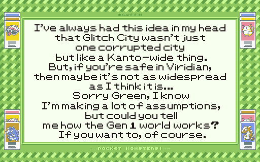
I've always had this idea in my head that Glitch City wasn't just one corrupted city but like a Kanto-wide thing. But, if you're safe in Viridian, then maybe it's not as widespread as I think it is... Sorry Green, I know I'm making a lot of assumptions, but could you tell me how the Gen 1 world works? If you want to, of course.

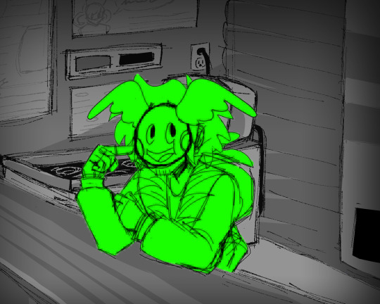
"Hoo boy, well, I'll try to explain all I can, Also, Don't worry 'bout it, make as many assumptions as you want, hell you can even be assumptive about me if ya want, I'm just here to entertain you after all, Aren't I?"

"Anyways, Lets take these in chunks!"

"No, no, you're right, The Gen-One Kanto was broken into rotting pixels and bits.
Buuuuut, as ya know, there's more than one cartridge- more than one game for the first gen too. Did'ja think every version of Kanto was like that buggy mess?"
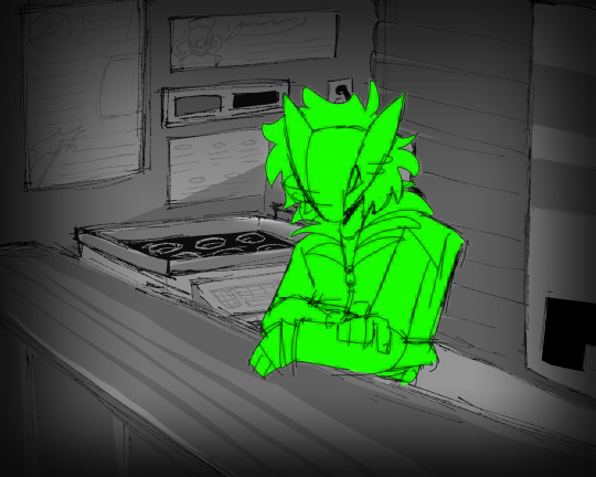
"Nah.."

"Just two!"


"Though, technically I would say yes to this, it is at least somewhat contained. Hell every god's gotta have a couple handfuls of eternity prisons where it keeps its least favored. Some get mountain, some get graves, some get depressed, Some get Bitrot."
"If ya want more info on the world though, you're gonna have t' ask fer more specifics, can't just dump a mile-long history lecture."
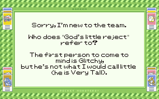
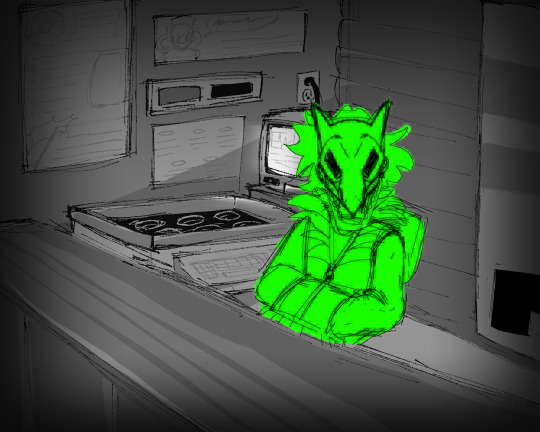
"Yes, I'm referring to Reddo, though you're right, there are many rejects 'round here."
"I disagree though I think he is little. Sure he may be tall but he's practically a skeleton. I can break him like a twig. And have broken him like a twig."


"Nah, as I said, not gonna spend my time in a bitrot hell prison if I don't gotta.
My Kanto's just empty and abandoned for a different reason. Last time I saw a person here was.."
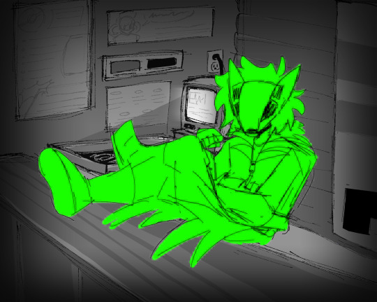
"It was...er..."
"hm. Maybe it was when I..."


"Yeah.. Yeah, it was...."

He shrugs.


"Oh nah they're just some part of me or somethin or other. I don't think I got the like. carving-painting-other skill bull to do that anyways. I just take the textures and my sprite does its work for me."
FIRST | PREV | NEXT
#mn asks#missing numbers#green midori#cam 0 - hijacked#((dear god i am never doing this many images again))#((ffs i might as well make him some little talking sprites dear god.))#((sorry for all the other asks taking so long i got too ambitious with my art ill probably lean more into the narrative side more))#((aka more writing and descriptions lol))#((also hi third off the styles im doing for this may be very inconsistent for now. im working on learning the original pkmn artstyle))#((same with colors but generally i think his bright green works idk.))
16 notes
·
View notes
Text
the five and a half minute hallway
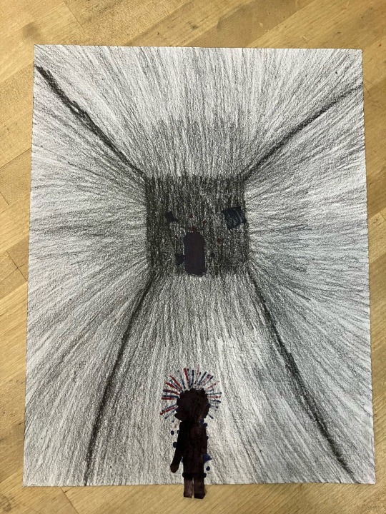
made this at the mix lab at the science museum
navidson is a cutout that i glued onto the main sheet of paper
all of the colors were done in alcohol(?) markers on the backside, so that they would bleed through
i got to tell other people there about house of leaves while i drew it :3 also there was a kitten named mcdonalds sprite
if any of the people who were there see this (which i doubt they will) and have pictures of mcdonalds sprite please add pictures of him i didnt get to take any bcus i didnt want to photograph any of the people who held him without permission and my anxious ass was not asking to take pictures of people holding a cat
reblogs > likes!
#🩵#mcdonalds sprite was such a good kitten#i hope he finds a nice home#with someone who has plenty of money to buy him all the nicest things#he was so fcuking tiny……#ANYWAYS the drawing#its currently hanging on my wall in my room#right next to my miku calendar#i might need to move it next year if i get a full size miku calendar but for now its fine#ok tags time no more rambling#bludraws094#art#traditional art#my art#fanart#fan art#house of leaves#hol#do people tag house of leaves like that#idfk#remembered something i dont wanna put in the main post: i wish i brought my copy of house of leaves with me#its hard to explain the formatting without it#ok back to tags#. nvm idk what else to tag this#read house of leaves. unless you are under the age of like. id say fourteen? ive met some fourteen year olds who read worse shit#it contains a few moments of heavy nsft. some of which i skipped over due to being a prude#and there was one encoded message in the letters from johnnys mom i stopped decoding bcus i decided i was better off staying curious#but other than that its a great book
15 notes
·
View notes
Text

so uh
rant in tags
@speeeeeb includes updates abt lapfox fusions!!!1!11!
@grapefanta8669 also monster kokichi art is coming soon!!!1!1! :3
#tbh i might like stop posting for a while or all together bc like#school is insanely stressful#and like i’m genuinely getting more tired each day#and i’m sorry for like not posting so much#and i’m honestly don’t wanna do really rude but#i’m honestly really sad and a little pissed off at the fact that one of my MOST POPULAR oumota sprite edits got only like#10 notes???#idk#but like#the fact that my old one got like#49?? 46?? notes#and my remake that i spend 2 HOURS ON got only 10 likes#and i’m honestly really sad#but like i don’t wanna force people to like my shit bc that’s honestly really mean and i don’t wanna be a really mean person on here#and i also don’t wanna ask for likes/rb#lapfox fusions are taking awhile and i’m sorry if they take soooo fucking long#school is really draining me and i apologize if i don’t post a lot#but yeah#if i don’t post for like a long ass time it’s probably me not having the energy#also speeeb ur really cool and thanks so much for the whole “renichi name idea!!#thank you to the people who actually really like my shit and i’ll continue doing what i like to make people happy!!!#but like yeah#school has been kicking my ass#like a lot#but eventually i’ll start making some art again and HOPEFULLY it can get some attention ykyk??#ALSO#ash (my cool ass moot) ur welcome for all the monster kokichi fanart i gave you!! and i’d be happy to give you some more!! ur rlly cool man
5 notes
·
View notes
Photo
This isn't a drawing, but I'm having a lot of fun with sprite edits again, so I did a sprite edit of your Terezi design


awhile back i made a series where i redesigned the main homestuck cast, here they are for tumblr !! feel free to draw them if u want, permission isn’t needed!
1K notes
·
View notes
Text


Sprites for 100% orange juice modding +hyper card art
Low quality phone footage of a mod working below
Again don’t know how to record my laptop
#my art#mia/ini#telma warne#ori blume#mallow cuniculus#100% orange juice#q#… idk I have all this art might as well post it#this is what I’ve been doing in terms of art lol#… I have at least two more characters I want to mod in#yeah I’ve been using the hyper card art for my icon#also these are really small canvases because it would look wonky if I didn’t make it the same soze as the actual sprites#I play this game with my brother who introduced me to it and taught me how to mod it
0 notes
Text
HOW TO JUMALANPELKO CLANGEN


Once I get my clangen working again (My computer really said NUH UH to it after the update and ive been too lazy to try again) i will play Jumalanpelko with it.
I have done it once before. And no i dont mean with the og characters.
If someone wants to try these are the """rules""" of how I played it (feel free to do whatever you want tho):
-No leader/if there is a leader they only have one life (just kill the bitch 8 times)
-no healer/Suncat is the only healer (it is more fun if suncat is warrior tho) we are here living on the edge
-When a suncat is around a year old you kill them and choose a kitten to be the next suncat.
-the new suncat has to still have the kitten sprite to be fit to be a suncat (if you want to you can change this up. Like maybe the apprentices can also become suncats but they wont live to be a year old? Idk up to you)
-it is up to you how you want the Suneve to happen. Like if you want it to be super strict (aka suncat is 1 year and there are no kittens? Cult is dead, game over) you can! If you dont want to, then dont!
-If you want to, you can give rules to how long a suncat can live depending on their sex and fur color (like maybe full sun furred female can live 12 moons, partly sun furred female 11, sun furred male 9... ect. It is up to you)
-Guard is chosen as a kitten and trained by one of the senior guards
-Guard is made suncat's mentor OR you just put them always on the same patrol (you can choose what kinda of rules you want to give for patrols. Can suncats go for patrols? Do you have to proceed? Up to you!)
-You can give cats nicknames! It is not easy without the names (i didnt have names and i was very much going WHO???? the whole game)
-If you want you can make one cat and make them Her. Just make it so that She cant have kittens (or maybe you want She kittens i dont know you) and code Her back to life every time She dies lmao. I didnt do this but it would be funny.
EDIT: you might want to let suncats live 2 years or more, it can become pretty annoying to change the suncat every few moons
Like i said, feel free to do whatever you want!
ALSO IF YOU DO THIS PRETTY PLS TELL ME HOW IT GOES YOU CAN SEND AN ASK OR WHATEVER
151 notes
·
View notes
Text
i am... cooking. cooking i am.

Gemini pixel sprite might make more, might make animations idk
low-key hate pixel art the more i do it lol
#if the quality is shit the file is like 100 x 150 pixels#so i had to take a ss#i can't make it any better#i tried#sams#sun and moon show#sams fanart#laes#lunar and earth show#laes fanart#tsbs#the security breach show#gemini#sams gemini#laes gemini#gemini fanart#art
260 notes
·
View notes
Text

Guess which dumbass forgets not everyone uses dark mode~
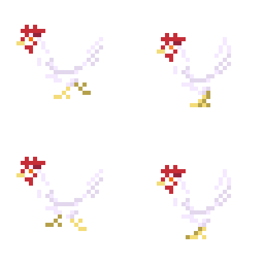
8Bit Leghorn is coming for your toes
#idk how people function on Bad Eye Hurt Mode but to each their own#i'm supposed to be doing so many other things right now why am i like this#need to get into pixel art more#makenna made a thing#chickens#tiny fluffy dinosaurs#the BEST animals#8bit#sprite art#leghorn#the way i need a chicken rpg videogame#in the style of stardew or smth#this might just be what gets me to learn code#chickenblr#birdblr#artblr#artists on tumblr#gif
65 notes
·
View notes
Note
OKOKOK FOR THE SPRITE REQUEST THING. you can do as little or as many of these as you want but the king candy design ones are FUCKING ADORBS like they’re all so precious but you did do well at translating him into pixel details???
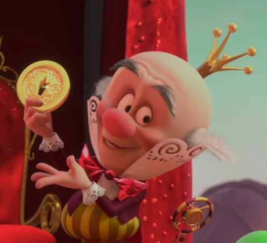


couple of poses i LOVE of his that i pulled from my photos (you can do the second one as either kc or turbo).I Love Him. also i’d love to see a king candy version of the classic turbotastic pose too i thinkit would be cute
also i’d love to see if you’ve tried to do his cybug form 0_0 that would be INSANE
ALSO BTW IF YOUVE EVER DONE MORE THAN THE MOST RECENT ONE EVER PLZZZ let me know cuz i scrolled the blog a bit and idk but i would love to see any and all work/art you’ve done of him
OK i hope this isn’t too much SORRY IM SO RAMBLY 🫡

first two screenshots!! didn't do the last one because rotating the face is by far The hardest thing to do with these and there's a fair bit of foreshortening so honestly... unfortunately, may not be worth it.
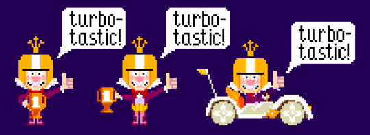
here are some turbo-tastic poses though! there are three in the little cutscene we get so i did all of them, ended up being easy enough to edit. they're a fair bit different from the have some candy pose i did earlier, as i figured that for this request i might as well try to get it as classic as possible
cy-bug form is a challenge i might undertake on my own time ;) but definitely not something that falls under the scope of what i've been doing with these requests.
when it comes to sprites i've done so far, i can compile all the posts here:
1 2 3 4 5
and while in general my blog is pretty unorganized, i want to keep my wreck it ralph stuff on my main, and since it's my current hyperfix, my #lucky doodles tag is pretty reliable for finding sprites i've done before!
154 notes
·
View notes
Note
idk if you have seen the #womeninmenfilelds trending going on. but i can’t help but to think of y/n doing it with svech. he gives off fuckboy vibes so he will probably do something fuckboish and y/n would do an uno reverse and do something similar and he will just be like wtf
⁎⠀┉⠀author's note: #womeninmalefields
⁎⠀┉⠀word count: 0.5k.

You strutted into the dimly lit bar, the clack of your stilettos echoing through the narrow hallway. The air had the scent of spilled beer and the faint waft of nachos. Your eyes scanned the room, searching for the familiar face among the rowdy patrons. You spotted him in the corner, hunched over the bar, nursing a pint of something frothy and chilled. Andrei. The six-foot-two Russian tower of muscle and nerves who had somehow wormed his way into your heart and your bed.
He glanced up, noticing your entrance, and you watched as his eyes grew wide, a hint of a smile playing on his lips. You couldn't help but smile back, despite the conversation the two of you were about to have. Walking over, you slid onto the barstool next to him, crossing your legs and leaning an elbow on the counter. The bartender nodded in your direction, and you ordered a Sprite.
"Hey, Svechy," you said, your voice dripping with sarcasm. "Miss me?"
Andrei looked over, his cheeky grin widening. "Always," he said, his Russian accent thick as ever. He took a sip of his beer, his eyes never leaving yours. You rolled your eyes but couldn't hide the smile that was tugging at the corners of your mouth.
"So," you began, twirling the straw in your drink as it arrived, "I've been thinking about what you said."
Andrei put down his pint, his expression suddenly earnest. "And?"
You sighed, your smile fading into a faux look of contemplation. "I'm still not ready for a relationship, hun."
The silence between the two of you was as cold as the drink in your hand. Andrei's eyes searched yours, looking for any sign of wavering in your resolve. "Why not?" he asked, his voice low and curious.
You took a deep breath, preparing yourself for the inevitable conversation. "It's not that I don't like you, Andrei. It's just… I've been down this road before. It never ends well for me." You took a sip of your Sprite, the bubbles fizzling against your teeth. "I'm not ready to risk what we have over a relationship that might not work out."
Andrei's face fell, and you could see the hurt in his eyes. He was quiet for a moment, then leaned closer, his voice barely above a whisper. "But we've been acting like a couple for months now. I thought you felt the same way."
You suppressed a smug smile, but you held firm. "I know, but that doesn't mean I'm ready to put a label on it. We have fun, and that's enough for me."
Andrei's gaze dropped to the bar, his thumb tracing the condensation on his glass. "But I want more," he murmured.
Your heart skipped a beat. You had been expecting this, but hearing it out loud was still jarring. You placed a comforting hand on his arm, feeling the warmth of his skin through his sleeve. "I know," you said gently. "But you're a big boy, and you knew the deal when we started this. No strings, remember?"
Andrei nodded, looking up at you with a mix of frustration and sadness. "But things change, kisa. Feelings change."
"I know they do, Andrei, but that doesn't mean we should rush into something just because we're comfortable." You took another sip of your drink, the carbonation bubbling to the surface. "Let's just keep doing what we're doing, okay?"
80 notes
·
View notes
Text
Ask Comp 17/12
Anonymous asked: re: your responsive timeline theory: "There is nowhere, however huge the multiverse is, where Sam Vimes as he is now has murdered Lady Sybil. But the theory is quite clear. It says that if anything could happen without breaking any physical laws, it must happen. But it hasn't… So what people do matters! People invent other laws. What they do is important… It means the multiverse isn't infinite and people's choices are far more vital than they think." - night watch you and pterry seem to be on similar pages about this lol
Oh, nice! That's one of my favorite moments in all of Discworld, and I've brought it up before when discussing Paradox Space.
I'm pretty sure I was thinking about it when I came up with Responsive Timeline in the first place. Having someone reference it in an ask is a fun way to bring things full-circle.
@necrowyrm asked: Welcome Baaaaaaaack!!!!!!!! @whyequalsemexplusbee asked: I've literally had this date marked on my calendar, Act 6 by the new year let's goooooooo! @goldsleeps asked: it's very nice to have your particular pale green showing up on my dash again. @skaiamechanic asked: I am so happy to see your notifications again whenever you post. Welcome back, you're one of the main reasons I'm still on Tumblr, and good luck getting to Act 6! @elkian asked: Welcome back! I'm hype to see you post again :D good luck with your goal, but please take care of yourself! @nebularious asked: On the 1st day of Christmas, thewertsearch gave to me!
Thanks, everyone! I'm happy to be back, and I'm finding I have a lot more energy after taking a little break. Onwards to Act 6, indeed!
@morganwick asked: There literally, actually is a Burger King less than 40 minutes from Rose's house. That may sound simple and obvious, but when fans figured that out after this ran it practically blew their minds.
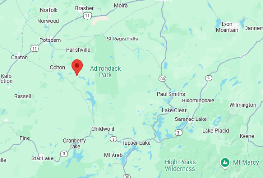
Her area is fairly remote - but there's a limit to how remote you can really be when you're living in the state of New York, right?
(^ she knows nothing about US geography)
@animation-recaps-by-sean asked: The troll sprites didn't automatically die at the end of the game, it's implied that Jack hunted them down and killed them
Wait, really? I had a little search through the comic there, but I can't find any statements implying that this is the case, unless they're in a walkaround somewhere.
Maybe I missed it - if so, send me a link and I'll take a look!
@catlikeascendant asked: idk if you go here but are there any ships you are interested in/think will be canonized? like it or not, it is a pretty important part of the story!
Thewertsearch dot tumblr dot com is a certified Rosemary nation. That's the only ship I'm really ride-or-die for, and the only one I am absolutely 100% sure will be canonized.
If you're interested, I made a full list of my ships back at the end of Hivebent, which I still mostly stand by - although I might need to rethink the ones involving Gamzee, specifically.
@relaxxattack asked: it’s so crazy that your “jump back in” point is perhaps the most fast paced and high stakes part of the entire comic. i absolutely love this arc, but i do NOT envy having to grapple with it directly after a hiatus!
I know, right?
Honestly, it's probably a good thing. The pacing is really energizing me - I haven't been able to blog at this pace since early Hivebent.
@morganwick asked: "The terms of a God Tier permadeath are defined according to the case of the individual - which implies that Heroic and Just are subjective, even to Sburb. It sounds like there might not be any ironclad rules, and that everyone's ruling works differently." Or as another liveblogger put it, when she got to the line in question: "In other words, 'by Andrew Hussie'."
Heh. That's what it ultimately boils down to, doesn't it?
I can grumble about 'canon' and 'meta shenanigans' until I'm blue in the face - but at the end of the day, the story will go in the direction that Hussie wants it to go. No ifs, ands or buts.
@krixwell asked: I actually think the "no lying" thing is essential to making Doc Scratch as intimidating as he is. He makes it pretty clear that (assuming it's real) it's a self-imposed challenge �� he's handicapping his own manipulation just for fun, and he's still massively confident that what he's doing will work out exactly how he wants it to anyway. Normally such hubris would be a surefire sign of a character's imminent downfall, but because he's near-omniscient, we the readers know that his confidence isn't unfounded. We know he has very solid reasons to believe his main designs cannot not succeed, even with dark pockets here and there. I just think it does a fantastic job at selling the idea that his designs are inevitability itself, his guidance hopeless to struggle against, his words the rails on the one way track of the alpha timeline.
Hm. I do like that, I have to say.
It's fun picking away at Scratch's chatlogs, trying to find statements that are technically 'false' - but the fact that he presents himself as truthful and yet succeeds in his manipulations anyway is very strong characterization. And it's that much stronger if Hussie's intention was that Scratch really, truly never lies.
85 notes
·
View notes
Text
ok trying baking soda and apple cider vinegar bloat holy shit
first off baking soda-mixed it with water, drank it with a straw cause that shit nasty and it can bypass your tongue easier. Just a tiny bit, not even a quarter teaspoon. Drinking it I started feeling bloated, but I wasn’t sure if that was just from drinking a lot of liquid yknow? Or from the acid already in my stomach? But then then apple cider vinegar, just a little, also mixed with water. The effect was literally instant. It was like a stretching sensation, like when you puff your belly out to make it larger, but it’s not you doing something, it’s something doing it to you. It felt really good tbh 👉👈 like I can’t puff out my belly any more 😳 rubbing it feels incredible too 😖 all gurgly and gassy >.<
And I was like “is this healthy and ok” and the answer’s yeah cause baking soda is basically what’s in Tums, and people drink apple cider vinegar just for funsies, and they’re neutralizing each other anyways. OBVIOUSLY don’t do it every day, cause too much baking soda can be bad for you and cause your stomach to over-produce acid but again, ur putting more acid in legit right after ur putting in the base so ur making up for it. Idk which would be better to consume first, maybe ACV first so the reaction is more dramatic and all at once?? Ugh organic chemistry coming in clutch fr 😎😎😎 but it’s better for you and more ..scientifically accurate (?) than like coke and mentos, or banana and sprite, although arguably a briefer experience. idk tbh I haven’t tried the others 🤔🤔🤔🤔 anyways that’s my review 9/10 stars, losing one only bc it was so short (might also be a benefit tho in certain circumstances) ⭐️⭐️⭐️⭐️⭐️⭐️⭐️⭐️⭐️
#belly expansion#full belly#round tummy#swollen belly#belly k!nk#big stomach#cute belly#sexy belly#stuffed full#stuffed stomach#bloated gut#liquid bloat#bloated tummy#bloated stomach#bloatedgirl#bloating kink#bloatedtummy#inflated belly#im bloated#feeling bloated#so bloated#bloated burps#belly noises#gassy belly#gurgling belly#stomach gurgling#sneap speaks
507 notes
·
View notes
Note

Yes.

SMILES it’s just a couple things really but so. sweet has four fingers, in their concept art, in All their other sprites, in official art, but mistakenly their falling backwards sprite has five ! capn is the one with five fingers ! that is such a well spirited hand though. im not gonna talk about the anatomical errors here like their head looking really big/not centered on their body i understand it’s probably for visual clarity. (capns dancing/jumping sprites have a similar issue where his head is smaller than his regular idle animation. the middle of the jump his head is Very small.) but then their falling forwards sprite the headband of their headphones isn’t Across the the back of their head, maybe it’s meant to read like it’s fallen to rest across their shoulders since the sprite work Is different, it’s not a case of just copying those same pixels, but idk, it kinda reads to me like they forgot, i don’t see why they’d Make the choice of it being across their shoulders. also in that first sprite in the lineup here ⬆️ there’s a stray white pixel above the hand by their face. again i say this all with so much love. sprite art is hard and so is animating and i imagine sprite animation is the worst time of your life

also here’s their whole section of the sprite sheet for viewing fun. they had a whole walk cycle that went unused ! even one at an angle ! the other two don’t have this and I’d love to know why, maybe bc sweet was planned to do something that required a walk cycle that was scrapped(maybe when they were following you around at the beginning of the chapter?, or this might be For something in a later chapter, or maybe this was just done for fun ! i do feel like maybe they’re all just in their Idle Animations bc it was funnier/more fitting for them as characters
66 notes
·
View notes