#might attempt to redraw one of these with an improved version of the style
Explore tagged Tumblr posts
Text
I've started my annual Ninjago rewatch and have been reminded of the lack of ghost!Cole content so here's things I drew last year
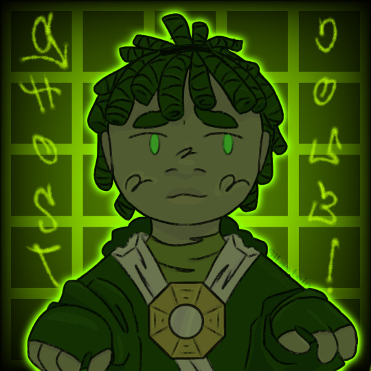
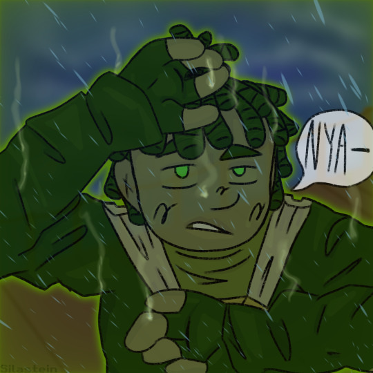
2nd one was created because I realized that there's no way ghost!Cole didn't die from the amount of water whipping everywhere when Nya unlocked her full potential
#i have no idea what this art style was but it wa used for these 2 drawings and then never used again#might attempt to redraw one of these with an improved version of the style#idk#ninjago#cole ninjago#cole brookstone#ghost cole#ninjago possession
110 notes
·
View notes
Text
Any longtime followers of my blog will know that posts centered around sprite art that I create are relatively commonplace, and how could they not be? I am an enthusiast of all things classic, and given that one of my very first posts on this blog was indeed a pair of custom sprites, I've really begun to focus on getting better and better at spriting, and I feel like it would be reasonable to say that the improvement is obvious! For those of you that don't know, my first piece of sprite art that I've uploaded here is this one in particular— custom sprites of Shovel Knight and King Knight that I had created back around February of 2020. I liked making the sprites a whole lot, and eventually decided that I would follow suit and make resprites of the remainder of the Order of No Quarter! Looking back on the sprites, they were indeed pretty sweet for their time, but now that I've been working on improving in terms of spriting, I was convinced that I could do a lot better with a few of the knights... some way more than others. So, around July of last year, I started to create a revised version of my Order of No Quarter resprites, going as far as to respriting some members entirely to better fit their actual designs, and almost a year later...

I finally have everyone completed!
My original plan for going about showcasing each individual knight was to have three versions of each knight's sprite: their original Shovel of Hope sprite, my first remake, and my more recent remake. While it would be a good visual on how far I've come, I felt like it would be a smidge redundant, so I've decided to show each knight's original Shovel of Hope sprite with my most recent remakes, linking to the first remake for each. With that out of the way, let's steel our shovels and dive right in!

Some followers may recognize this resprite of King Knight since I've actually shown it at the end of last year, on King of Cards' first anniversary! Between then and now, there weren't a whole lot of fixes made to King Knight's resprite save for a few shading touchups here or there, but I'm still really proud of this sprite in particular simply because of how better his cape looks compared to how I sprited it in 2020!

Now we're getting to the good stuff! My initial resprite of Specter Knight was a bit all over the place— I found his hood particularly hard to recreate (Plus I wasn't too fond of it at the time, I much preferred how it looks in his campaign's artwork) so I just ended up designing his hood after how it looks in Specter of Torment, which resulted in a serious mismatch in style. Specter Knight was definitely one of the harder knights to revisit, as I was a little nervous that I wouldn't be able to get his hood to look right, but I'm more than happy with what I ended up with— even his scythe looks better!

My biggest goal when remaking Plague Knight's sprite was to pretty much redo their entire head to better fit their artwork, and while I did achieve this to a certain point in my first attempt, my second iteration of Plague Knight was more focused on fixing their hood and making their pose less static (Compared to my first version of the sprite, that is). I remember having a bit of trouble remaking Plague Knight's mask in a way to where it wouldn't be too big, but I do love the fruits of my labor!

Mole Knight is one of the few members of the Order of No Quarter that has more than two resprite iterations; with this most recent version, he has had three; the original resprite, one that fixed a few things, and the one you see above. This new version has a lot of shading fixes, as well as redrawn claws; he's certainly a whole lot shinier! Speaking of knights that had more than two resprite iterations...

Treasure Knight, too, had three resprite iterations, one of them I didn't even post to my blog. It was essentially just the previous resprite but with a redrawn head and shoulderpads, looking a whole lot closer to his Shovel of Hope sprite while being way shorter than my first version. It was just about the final version of my resprite of him, but I ended up redrawing his head again so it would look closer to how it looks in Shovel of Hope's artwork. It took a tiny bit getting used to but I'm particularly proud of Treasure Knight's resprite!

I think Tinker Knight's resprite is the one I'm the most proud of. Not only is it an immense improvement over my original resprite, but I was able to make him look closer to his actual design as well as packing in a WHOLE lot more detail— and he's only a few pixels taller than his OG sprite! You can probably imagine that it took a long while to achieve that level of detail and not have the end result be too big!

Something that always kind of off-put me was how little Propeller Knight looks in his original sprite when he's flying. I think it's unanimously agreed upon by the SK community that he's quite tall, so when I resprited him for the first time, I opted to fix that... and made him a little too tall. As a result, Propeller Knight was redrawn entirely while making sure the height wasn't as ridiculously lanky as my first attempt all while maintaining a fair level of detail and color fixes, and if I may, the end result is, as Propeller himself might say, magnifique!

And finally, Polar Knight. Really, since my first resprite of him, not a whole lot has changed save for a few color fixes and additional details. Since there isn't really a whole lot of official art of Polar Knight that doesn't depict him in a bizarre pose, I couldn't really take any pose liberties and ended up sticking with the original posture; it might look like a bigger version of Polar's SoH sprite, and while it technically is, there's still a great deal of small changes throughout! After all this time, it feels nice to finally be able to upload these new iterations of previous sprite recreations, and while this post was a long time coming, I hope you enjoyed the sprites and the readups for each one because a LOT of effort was put into every pixel of this!
#Shovel Knight#King Knight#Specter Knight#Plague Knight#Mole Knight#Treasure Knight#Tinker Knight#Propeller Knight#Polar Knight#Sprite Art#OC#Long Post#Coolness#No seriously. I could have made this post like last year if I wanted to.#But there were just so many things that I knew that I could do better hence having not actually making this post until now#Really the only reason I hadn't shown these sprites sooner is because of Specter Knight#I thought that I had to redraw him entirely and I wasn't looking forward to redrawing everything under the hood#Though I ended up using the original resprite's body as a base and fixed it up accordingly... then things went smoothly!#Some of these guys have no right to have certain attributes to be so tough to sprite. But I stuck to my goal and achieved it!#I am SO proud of these!!
26 notes
·
View notes
Note
I hope this isn't rude to ask or anything - if it is, I apologize! But you wouldn't happen to have a version 1 of the demo for Beauty and the War, would you? My reasoning is that I would like to compare both versions, so I can see the progress, and I'd truly appreciate a link of some sort to the first version!
Hello, Anonymous!
Don't worry, this isn't rude at all. I don't happen to have a link on hand at the moment. Before, I noticed having it up was confusing to some players, leading them to assume that the finalized version of the game would look like what it does in early development, so I went ahead and removed it. However, I may consider re-uploading it in the future!
If it helps, here’s some of my older works from version 1 of the demo that I found:

This was Ambrosia's 1st demo sprite (well, it didn't have this black-and-white scheme in the game - it was just for this image). At the time, I was going for a more anime-fied look. I'm still going for that angle but with a more mature touch.
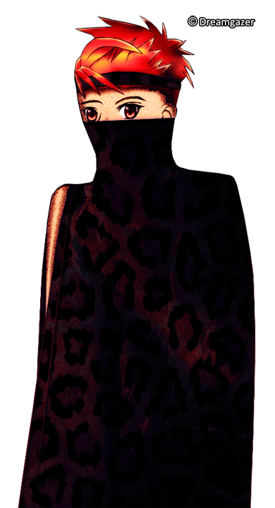
Here's Chase's 1st demo sprite. At the time, I was in a bit of a hurry so I put a collar around half his face to draw less expressions. This was definitely not a complete version of his sprite and was missing a whole lot of elements.

The prologue was completely different. This is a low-res preview featuring King Barium of the Vi, all dressed in armor and engaged in battle with the other clans. This was from Prince Alexandrite's perspective. In case you're wondering, that flash of movement in the background is a bunch of arrows shooting across the snowy sky.
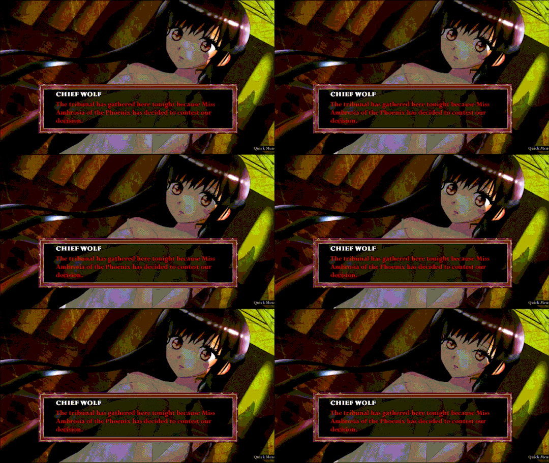
Over here, I was attempting a manga-esque dialogue bubble. This is another low-res preview.
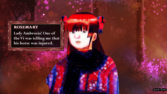
Same here. This was until I decided I wanted to make it look subtitled like an animated film, which would also create a more cohesive look once everything comes together. My colors back then were also quite...vibrant.
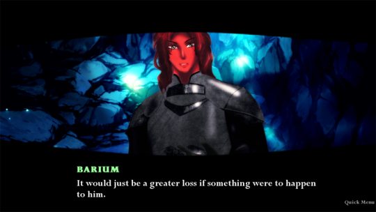
Here's King Barium unmasked.

There's the manga-esque think bubble - swath? - again.

And here's my super old promo for the game! Back when I just called it War (X Playing Pieces). Then it changed to Beauty and the War (X Playing Pieces) based on a recommendation by the Magic Mirror (that is to say, he thought War sounded too masculine and wouldn't draw in players who could've enjoyed the fairytale aspects, romance, etc.). In case anyone's wondering what's up with this long title, I would suggest seeing it like this - Beauty and the War is the first in the X Playing Pieces series (much like how Game of Thrones is the first book in A Song of Ice and Fire series).
Anyway, this features Onyx intimidatingly carrying Ambrosia in a blood-stained dress. I still like the design concept I made for this. But looking at it, I kind of want to redraw it since I would like to think I improved since then.
Based off answers to the survey linked in the new demo, I believe my changes were...liked by some and debated by others? Some prefer the more straightforward/cute anime-ish style I was going for back then. But I ultimately think the new style - once I show you how it looks all polished - fits the story and its tone so much more.
There was a handful that preferred this old prologue as well, but the majority vastly appreciated the new one, where X made it easier for players to grasp Virgo Island. However, that doesn't mean the old prologue has completely vanished. You might find it somewhere else in the game...
As I mentioned earlier, I'll consider re-uploading the first version in the future. But one thing I can do now is show more previews of how the game's progress is coming along! Stay tuned for that.
Other than that, I'll be visiting the Discord today (May 21, 2021) around 8:20 PM (PST)! I'm hoping to get our planned D&D session (that takes place on Virgo Island!) underway. But I'm also open to questions and/or just shooting the breeze with anyone who cares to do so.
Thanks for asking about this, Anonymous! It was actually kind of fun digging out screenshots of my old work because it gives me that creative drive of wanting to do better than what I did before. (And I still totally want to re-draw that promo. That's going on my hopeful to-do list!) Hope this was also able to give you some basis for comparison between demo versions, too! If you'd like to see more screenshots, I might be able to scrounge up others. Just let me know.
Have a great rest of the day!
15 notes
·
View notes
Photo
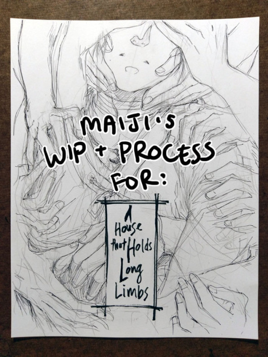
Process and wip images for A House That Holds Long Limbs
You can read the pages for part 1 here (full complete version will be linked from YYH North Bound master post whenever it’s done.)
Every so often I get questions about how I work, and I also enjoy reading about how other creators make things, so perhaps this might be interesting and useful to somebody out there too. I’ve talked about my process before but never really documented and shared it WHILE working on a project, so here you can see some of my thinking and decision-making (and poor habits lol) a bit more immediately, alongside screenshots, photos and scans.
Very long, everything is below the cut, and apologies to people on mobile and anywhere else this goofs up.
One question I get a lot is “do you start with words or pictures when creating a comic?” I jump between both a lot. That said, I tend to lean more heavily on words when documenting ideas in the early stages of a project. This is because, for me:
Words pack a lot of punch in conveying detail quickly. They work better when I need to quickly communicate something extremely specific to future me. I’m a sloppy drawer, so my sketches tend to make future me squint and go, “What the hell was this supposed to be?!”
A great deal of my thinking and planning is done during crowded commutes. It’s more convenient to jot notes on my phone than to whip out my sketchbook and a pen.
(For a while I thought it’d be awesome to have some sort of app where I can type notes AND have an accompanying thumbnail sketch, and be able to drag them around or break them out into more or fewer pages. At one point years ago I thought about creating a custom app... but ultimately too lazy/busy and my current process works well enough. If anyone wants to take this idea and run with it, please feel free to do so and just let me know about it so I can try it haha.)
I usually start with a few lines summarizing the gist of the idea, enough that’s recognizable and I don’t forget the important things to build off from. From there, I start point-form outlining the stuff that needs to happen, structuring them into key scenes/parts. These scenes are not always fleshed out in order - I just add to them whenever I have ideas for that part.
Long Limbs, for example, had a progression like this:
Overall story idea: “horror story with rokurokubi, key plot point(s) happens, the end.” (There was a bit more detail than this, obviously, but we’re avoiding spoilers here.)
Initial description for Part 1 of the story: “Hokushin lured to go to somewhere. Separated from Raizen. HOW??????”
After letting it simmer for while, a solution: “Hokushin annoyed at Raizen. Opportunity for him to get away and go do his own thing.”
Gradually more detail: “Stranger invites him to go to this place to look into something/maybe has a paid job that needs to be done and Raizen is busy goofing off or whatever.”
Problem. I couldn’t resolve this chain of thought to my satisfaction. What kind of task/job can someone convince Hokushin to do on his own when he doesn’t know this person/it seems questionable? And how long will the conversation need to run to establish this as believable?
This was starting to get convoluted and I was getting annoyed because it was turning into a burden in being able to continue the story AND IT WASN’T EVEN THAT IMPORTANT. I decided to abandon this path of thinking, and left the entire story for a while.
Much later (like months?), I had an idea: “Mysterious person drops something, piques Hokushin’s curiosity.” Aha! Hokushin’s own initiative. Simple and plausible enough. HOORAY NO MORE THINKING. LET’S DRAW.
Then I realized, oh shoot, I need to figure out who this mysterious person is and what they dropped. More time passes. And so on… in between I’m always working on other things, so there’s no real creator’s block - at some point I start thinking about this comic again, and ideas work themselves out to some decent level of satisfaction and link together. Thanks subconscious!
Eventually, enough key scenes are fleshed out that I feel confident enough to turn this into a real thing. At present, for example, not all scenes in Long Limbs are totally worked out, but I’ve got enough that I ran ahead with Part 1.
Screenshot of the Google Docs notes/script for Part 1:
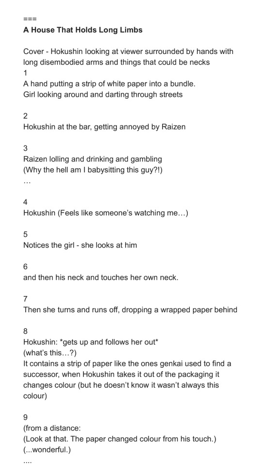
This is a close-to-final version. The === on top is just to separate this from notes on other stories or ideas. This is the beginning of the document, but this document actually includes many other notes and stories for North Bound. I delete them as I finish and post the pages. Every so often I wonder if I should bother keeping them, but they’ve been refined throughout the process and usually don’t bear much resemblance to the original jotted notes anymore. Long Limbs was originally planned to be a later story in North Bound, but I got especially excited about it and fleshed it out further than the others. When I reviewed the earlier stories, I didn’t think there’d be a big continuity or reader experience issue if this was finished and posted first. So I moved the messy notes for this story to the top of the document.
The page breakdown for the script is done by me generally picturing in my head how I might want the scene to go and how much action I might be able to fit on the page for good effect. I’ll sometimes start paginating without thumbnails, and sometimes will do both side by side (thumbnail and update pagination in tandem).
As you might imagine, pagination frequently changes. For example, you’ll see the script above is 9 pages instead of 10.
The original script for this section was broken up into maybe 4-6 pages, with 5-7 being more condensed.
When I started thumbnailing, I found it felt too cluttered and moved too fast.
So I stretched out the part of Hokushin and the mystery girl exchanging glances, and added pages to be able to create a (hopefully) more cinematic feel and really focus on the reason they catch each other’s eye - the bandages on their necks.
I then went back to the Google Doc and updated the script to line it up better.
I was also tweaking the dialogue at the same time and didn’t want to forget any key phrasing I liked. Dialogue is another thing I get really hung up over, often changing words up to the last second. (Sometimes this is because I messed up the size of the speech bubble, if I’m lettering on the computer...)
Thumbnails:
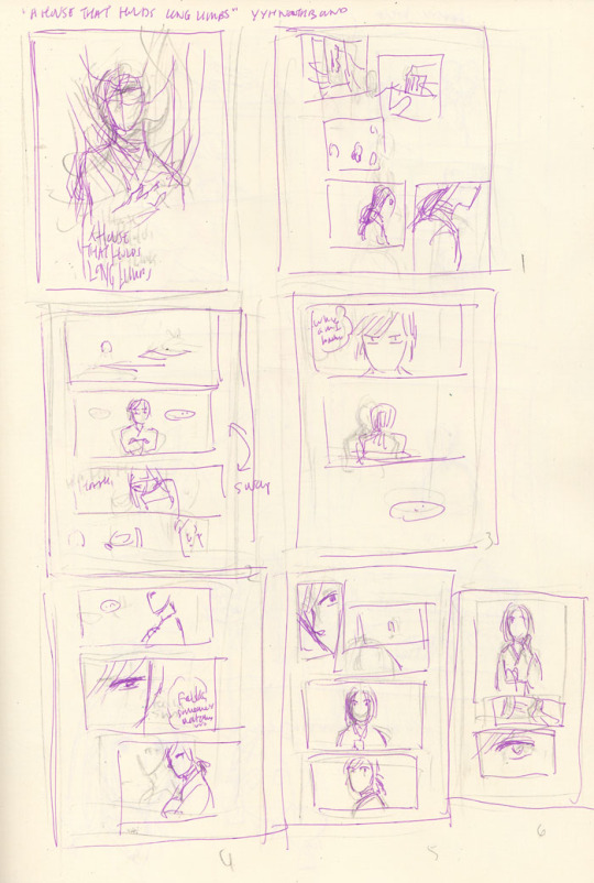
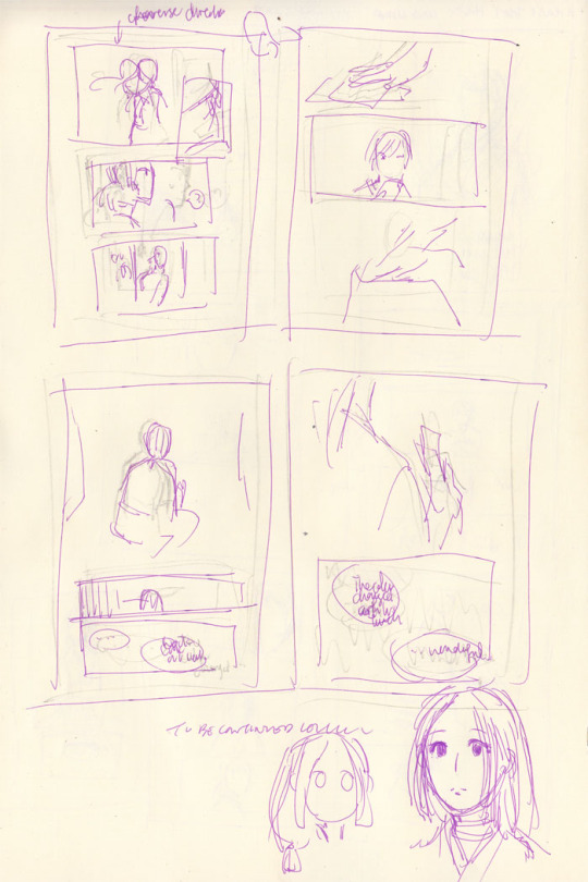
Pretty close to the final in this case - mainly because the sequence is pretty simple and straightforward and not many people are involved. I keep my thumbnails very crappy and rough so that I don’t get upset later when I can’t redraw something as good as the thumbnail. Bottom right was a quick attempt at designing the mystery girl.
Once I think the thumbnails are good enough - translation: I get impatient and just want to start drawing - I proceed to pencils for the actual page.
Throughout all this, I’m repeatedly reviewing script and thumbnail and playing sequences out in my head and then trying to figure out how to better direct the “camera” and the action. I may go back to the script and the thumbnails even as I’m finetuning the actual page if I encounter issues. You can see in both the script and the thumbnails that there are still deviations in the dialogue and the art from the final. Here are a few examples:
Page 3: The panels were originally 1) the setting, 2) Hokushin with his arms folded, 3) Raizen laughing, 4) we see that Hokushin is watching Raizen. After reviewing the thumbnail, I felt it’d be a better setup to flow into the scene if I switched panels 2 and 3. That’s closer to how you’d experience it in real life, or how it might be directed in a shot sequence: you enter an area/place, you hear the sound of some guy’s loud laughter filling the air, then the camera zooms up to the annoyed expression of this one particular dude and you see he’s staring at the laughing guy. Moving from bigger ambience to smaller details around the room.
Page 7: The girl was originally turning in the other direction (hard to tell because I redrew it right on top of the original sketch lol). However, this meant all the directional action would be pointing to the right - Hokushin is facing the right, and when he leaves the bar he’s angling towards the right side of the page. Facing the direction that readers will read in gives a sense of driving the action forward, while facing the opposite direction provides a bit of a mental stop. (This is something from Scott McCloud that always stuck with me.) So, I flipped the girl around.
Page 8: Script has Hokushin going “What’s this?”. When thumbnailing, I thought, “obviously it’s self-evident he’s wondering what this is when he picks it up”. It added nothing to the panel, and the speech or thought bubble would have interrupted the smooth action of him picking up the paper. So, axed.
The damn friggin’ bar and gambling: You’ll see the script mention this, and at one point I actually had the guy standing across from Raizen saying “Is this guy drunk?” I’m actually not sure if they’re in a bar or if Raizen is drinking, but neither were important to the actual story because I just needed Raizen and Hokushin to be in a place where Raizen could hang out with humans and be stupid. So I dropped these details. This is mainly because I ran into historical research problems about bars and alcohol during the Kamakura period (more on that near the end of this post), and this was the only way to stop myself from getting hung up on trying to make it “perfect” and “correct” and just get it done.
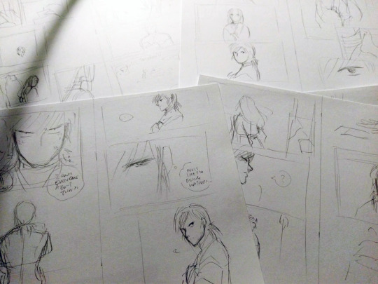
Drawing the actual pages. This part is fun!
Inking the actual pages. THIS PART IS NOT FUN :(
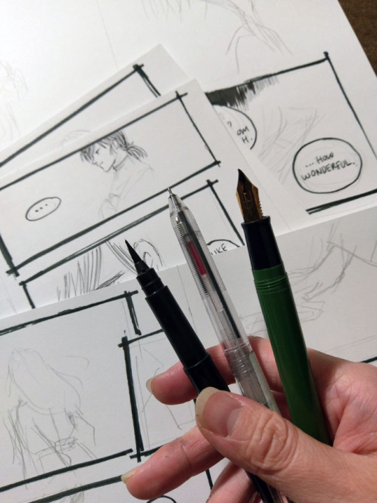
I don’t have very steady hands and I get very anxious about messing things up, so inking always takes me the longest. (I also get distracted easily, e.g., ink two lines and then surf tumblr for ten minutes lol). I’ve improved a lot since I started drawing comics much more frequently a couple years ago, and my choice of tools and style has helped a lot (I lean to variable lines and sketchy style, which is more forgiving than, say, a very precise art style with fixed-width pens) but I still get nervous at this stage.
I’m very lazy so I usually stick with one tool for inking. For Long Limbs I tried to effort more and actually used three. Right to left: Sailor fude de mannen for panel borders and text, Muji pen for artwork (0.4 because that was the only size available at the store when I went to get my refill), Pentel pocket brush for filling in blacks. I refill the fude de mannen and the pocket brush with fountain pen inks.
I usually ink panel borders first, then speech bubbles, then everything else. I hop all over the place and pages are generally in varying stages of completion. I also sometimes add in some more text lines because it seems like a good idea at the time - Hokushin’s complaint on page 3 about how he should have left Raizen when he got into a fight with a fish-seller in a previous story, for example. Sometimes these work, sometimes I regret it later and edit it on the computer.
Cover thumbnails and pencil sketch:
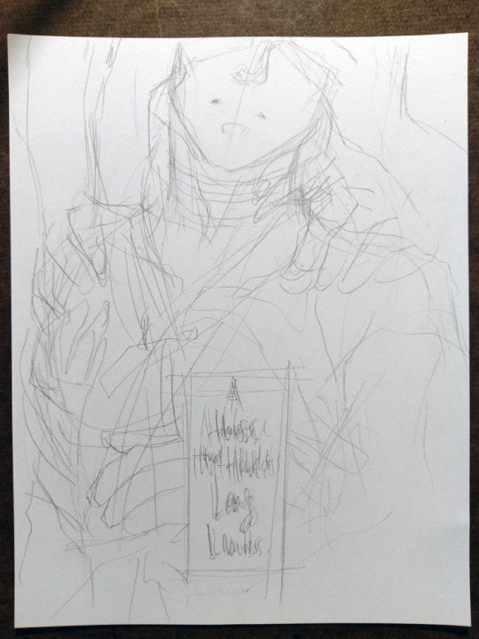
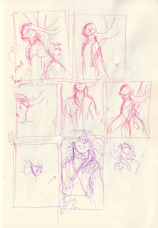
The one in the page thumbnails was the original idea, but then I thought, “seems kinda cliched. Can I get a more interesting angle where he’s not looking straight at the viewer?” (OK, his eyes are covered, but you know what I mean.) I quickly tried a few other angles and compositions, didn’t like them and ended up going with pretty much the original idea, but more zoomed in.
In the thumbnails, you can see all my little x’s indicating “ehhhh I don’t like this”. I wanted something with a particular mood/atmosphere especially with all the hands and arms, and I was conflicted between zooming out (for more environment and more arms, and the focus on the “long limbs” part of the title) or having a tighter, more close up shot. Ultimately I think the latter works better as it conveys a sense of claustrophobia, and it’s more intimate which supports the idea of psychological horror. ALSO IT’S SEXY (maybe???). The end.
Other random thoughts:
I took a lot of heart/inspiration/motivation from Togashi’s last few volumes of Yu Yu Hakusho to keep the backgrounds as lazy - I mean sparse - as possible and also speech bubbles over plain backgrounds lmao. I think it takes a lot of confidence (or maybe laziness) to be so minimalist and restrained, and it’s an impressive and economical way of working. I was always impressed that when reading those pages of his for the first time, the lack of detail never really bothered me - you had everything you needed for your brain to comfortably fill in the gaps and complete the sense of narrative and story progression, and there are still visual flourishes when the situation calls for it. So I’m trying to bring a bit of that tighter philosophy in.
Research. I struggle a LOT with not getting bogged down by details, especially when it’s something “just” for fun or “just” a fancomic. I have very lovely and helpful friends and family who every so often patiently allow me to whine and bounce things off of them, help me look things up, and/or tell me when I’m getting myopic about stuff. For all the North Bound comics, finding quick and useful historical references for the time period has been a challenge. There’s a ton about aristocracy and warriors but very little about the ordinary/common people, not surprisingly. I frequently question my instincts about what makes sense because I tend to automatically draw on similar/equivalent Chinese culture (there was certainly lots of cross-over, but not always appropriate/relevant) or Edo period references (wrong time frame! Too far in the future). I often end up losing a ton of time trying to find something with roundabout searches, and then give up and look at other comics I have close enough to the time period. And then referencing those and compounding whatever historical errors they have in them. (e.g., “Well if it was good enough for Osamu Tezuka’s Phoenix it’s good enough for this rando fancomic!”) I just would like historical/subject matter experts to know I did try...
#yu yu hakusho#comics#hokushin#raizen#fanart#process#wip#art by Maiji/Mary Huang#sketches#art supplies#yyh north bound
9 notes
·
View notes
Text
Evaluation of Process
Throughout Unit 2 I’ve learnt lots of new skills and a brief understanding of different programs such as Maya & ZBrush. This is my first time creating a character so I was also developing my own personal work flow through this Unit.
Preproduction
I started my process with preproduction specifically creating mind maps of different ideas for both my protagonist and antagonist. I knew I wanted to create characters that would be used in my game next year so they both needed to suit the setting of the game.
I feel mind maps are a great way of organizing my ideas and I will definitely continue to use them as part of my creative process. It really helps to have a clear map of the initial idea and then branch off. Before creating a character, you want to have a solid concrete idea of exactly what you’re creating so it’s important to get your preproduction done right to not waste time.
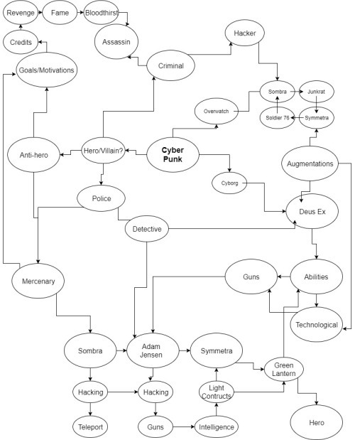
In my mind map I looked at possible motivations, attacks and backgrounds for my character. I also related my ideas to existing characters in pop culture and games and took inspiration from them. I really liked using the mind map and it helped me narrow down an exact idea for my character. I personally like to have a clear idea in my head before I begin drawing my character to save time.
Once I had settled on an idea for my character I began searching tags I’d used in my mind map and used Pinterest to create mood boards. It was great having visual references for my ideas and seeing what other people tend to use. This was also the part of the process where I decided to base the character’s weapons around the “Player 1 & 2” Pink and blue arcade guns.
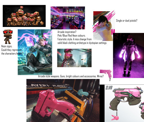
This is just one of four different mood boards that I created. I added small annotation to point out points I liked about the images and went into more detail about them on my blog post. Mood boards are seen commonly in the industry especially when creating concept art for characters.
After creating mood boards I went into Photoshop to begin the concept art. I’m quite familiar with Photoshop so I was able to get right into finding a pose and body type that I liked. I decided to settle on a smaller body type instead of the large bulky muscular male you typically see in video games. This is just because I’ve planned for his attacks to be quite mobile and feel it’ll work better for the animation.
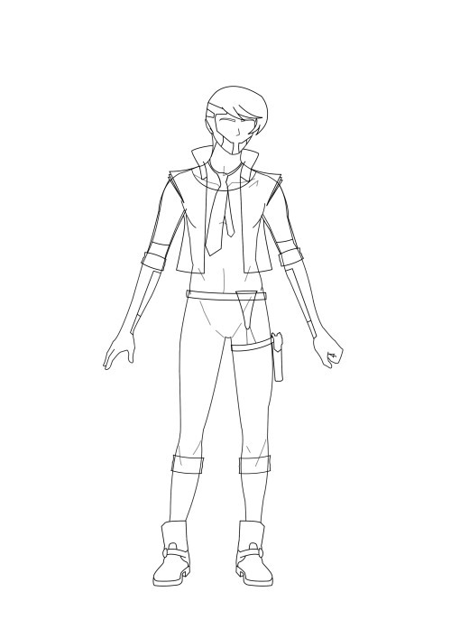
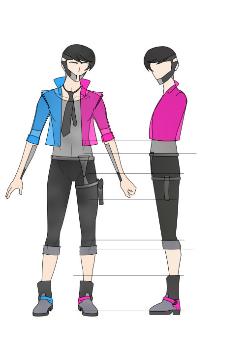
This simple turnaround helped a lot later on the in the modelling process as I was able to open the PNGs into the image plane on Maya. I can’t imagine modelling without a reference open directly in Maya and this is something I’ll probably always use in the future. I really enjoyed using Photoshop and it’s definitely my go to program when doing anything art related. Since I created this art a few months ago and have been practicing almost daily I found my drawing and Photoshop skills have improved a lot since then. Over the summer I plan on going back over and redrawing my character to create higher quality art. I’ll also begin the process of drawing different poses to show off his personality and possible animation ideas. This will help a lot next year when we begin to animate our character in UE4 and work on creating our game prototype. My game design document already has a list of attack ideas but it’ll be nice to have concept art included.
In a VICE interview with Bill Petras (Art director for Overwatch) and Arnold Tsang (Character-concept artist) they spoke about their role as artists in the games development and the importance of concept art.
“One of the main jobs that we do as art directors is having a vision for what the game looks like, of what the heroes look like, the feeling of the animation, the color palette, and the architecture of the buildings of the world.” And often that means putting ink to paper: “A lot of times the art directors themselves will do a painting of a concept to show a vision to the team. That’s step one.” –Bill Petras
Arnold Tsang speaks about how the concept art is important for making the vision and idea of the game clear to the other developers.
“Early on, our first job is to inspire and rally the team behind our vision. The development of the style guide is a huge first step in getting our feet on the ground for Overwatch.” Setting down the core of the game’s look is an incredibly important part of the early process. “After we had the core tenets in place,” says Tsang, “we worked with the engineers and some of the animators to start to realize that content and make visual targets that start to realize what we set out to do in the style guide. And we saw how things worked in the game engine, and how these characters moved and acted.” –Arnold Tsang
When we have an idea in our head it might be obvious to us what the character looks and moves like but to others it’s not clear at all so concept art is integral for making that vision clearer to others. In the industry where you have specialised modellers, programmers and animators it’s important everyone is on the same wavelength. You wouldn’t start building a game without a games design document and you wouldn’t start creating a character without completing preproduction.
Maya
When I finished preproduction I moved into the next stage of modelling my character in Maya. I also installed the student version at home so I can continue working on my model outside of college. I opened the turnaround images and began shaping from a simple cube. There are plenty of different methods of creating a character and everyone has a different workflow but I decided to stick with this recommended method as it’s good for beginners like myself. I extruded and multi cut the shape to create a simple humanoid shape and then started adding finer details such as clothing later on. I had to go back a few times to recreate certain sections of the model. I had issues with multi-facing where Maya placed faces underneath faces and I had to slowly go through the whole model deleting these issues. It was also a challenge dealing with edge loops and topology. I’ve never dealt with it before so it was a lot of trial and error figuring out what works.
My main issue with modelling is I chose to create an organic human shaped character but my result was a lot blockier and square especially in the waist/torso area.
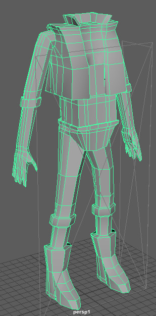
Even with some adjustments I wasn’t 100% happy with my result. I also struggled a lot on the fingers as they were too sharp and pointed and almost resembled claws. I used MudBox which detected errors in my model so I could go back into Maya and fix them. This however was a difficult process as I had to go back and remodel entire sections again. I was getting frustrated with my model and did quite a large rework.
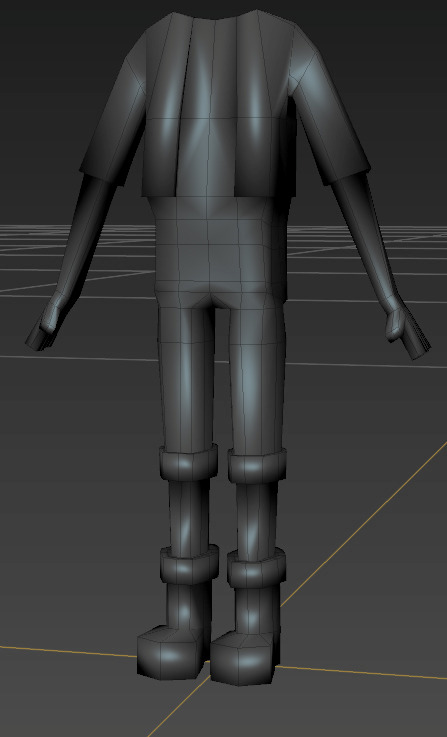
This model although fixed is a lot less detailed and not what I envisioned for my character. I decided instead of beginning again I’ll just begin the UV process as that will take a while and I was beginning to run out of time. I repeated my preproduction and modelling process with my villain character. I found the second time around was considerably quicker as I wasn’t relearning all the hotkeys and jargon.
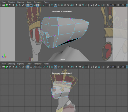
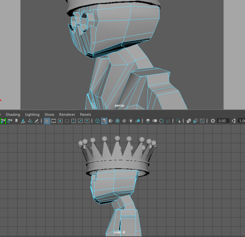
A huge mistake I made with my first UVs was doing the front, back and side as three large chunks. I didn’t fully understand how the UVs related to the texture maps and so I didn’t see how much of an issue the overlap caused until I placed the image onto the UV. You can see the grey areas where the black pants and grey accents share a UV and cause issues. I had to delete these UVs and looked into other methods.
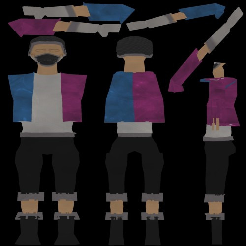
I used planar mapping and unfolding the different pieces of my model to create clear separate sections. This thankfully allowed me to avoid the same mistake I made without any overlap.
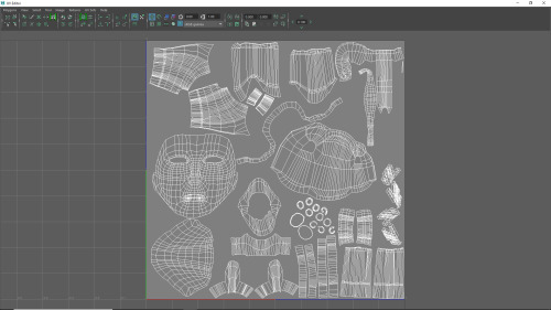
The UV process was a long task but essential for creating a character. I now have a better understanding of how to do it and how it relates to textures and painting the character later on. In the future I’ll be a lot quicker at the process. Like most of Maya it was simply a learning curve but the best way of learning a new program is by practice.
ZBrush
The next step after finishing my UVs was exporting my model as an OBJ and opening it in ZBrush. I decided to keep the Hair and Eyes as separate subtools.
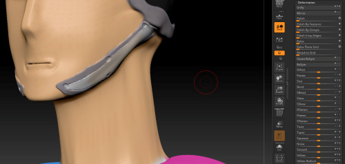
My first attempt at Polypainting was rough as I didn’t fully understand the tools and brushes I was using. I looked at different methods online and went back over my model. I found the ZBrush youtube channel as a great resource as they do really quick tutorials on the different tools in ZBrush.
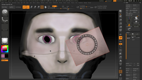
The spotlight is a really powerful tool that allows you to paint directly onto the model with other images. You can scale, rotate and adjust these images and apply them directly onto the model with total control. I was using a tablet too so the amount of pressure I applied also determined how strong the brush was. I saw the potential with the insane detail you could put into the skin with ZBrush. I’m not going for a super realistic human character though so I didn’t want to add loads of blemishes so just simple colours and blush was enough for me.
My favourite tools and brushes in ZBrush was the DamStandard, Curve and Curvepinch brushes. This was useful for creating folds around the eyes and also definition on the welded sections of the face. I spent a lot of time experimenting with different brushes but next time I create a character. Surface, Noise Editor and the Deformation tools were also great ways of quickly editing large portions of the model.
Because I like Photoshop so much I decided to go back on the hair and see if I could try a different method of texturing them. I opened the UV as a png and a simple hair texture with Photoshop brushes.
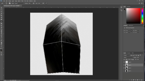
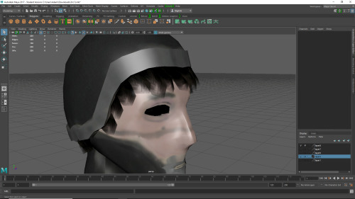
I like the different layers of opacity and think it looks more interesting than just block opaque colour. I’ll probably stick to ZBrush in the future however as it’s a much more powerful tool than Photoshop.
I was able to create the texture maps from Polypaint and then create Normal maps directly in ZBrush. If I wanted to neaten up or edit my textures, I could open the JPEG directly in Photoshop and paint on that.
Conclusion
I really enjoyed this Unit. I found it really interesting to go from having a character concept to a 3D model. It was my first time ever modelling something as complex as a character and I’m really proud it’s my own original idea and not an already existing character.
I didn’t have much trouble preproduction with generating ideas and creating mind maps/mood boards. The majority of my issues this Unit came in the production phase but that was mainly due to inexperience and some issues with the programs. I have however begun to enjoy using ZBrush after painting my character.
I got quite frustrated at points as I felt I wasn’t at the quality I wanted. I’m still not happy with the end product but I now have a much better understanding of the tools and programs and know I could work at a faster pace. I’m planning over the summer to do a full rework of my hero character.
As my game concept has changed my characters have changed slightly. I want to go for simpler cartoony proportions for my hero instead of realistic. I think this style would suit my game better. I also think a more cartoony player character will blend better with my very wacky cartoony robot villain. At the moment they contrast and look like they’re from different games.
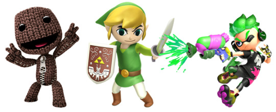
I’m excited to redesign my character and think this will a much better style for my game concept. I think it’ll also be great for creating fun dynamic animations as the games attacks and mechanics I have planned are very fast paced and colourful.
0 notes
Text
Evaluation
For our final project, we had to pick one piece of work from the I Want I Want exhibition to focus on for our own works, and to create a flipbook inspired by it or even based off it. At first, I was fascinated by Rachel Mclean’s film ‘Feed Me’, and ended up visiting the gallery twice in the first week to make sure I saw all of it. I was very drawn to it as it reminded me of the kind of strange warped films I was raised with such as ‘The Dark Crystal’ and ‘Labyrinth’. I was very inspired by it, and came up with the idea of inviting a viewer in, much like the ‘houses’ within the gallery, to then expose them as a voyeur, with a focus on spyware in laptops, using laptop cameras to film people’s private lives. Also inspired by (but coming from a very different perspective) Black Mirror season 3, episode ‘Shut up and Dance’ featuring an incident with laptop hacking trolls. It’s something I’ve always been aware of, and many people within my age group are too, lots of people nowadays have the camera covered when not being used with a ‘just in case’ mentality (I do too). Initially I realised, this idea was quite big. It was going to involve a lot of research, a lot of time, and a lot of materials that I wasn’t sure I would have access to while at university. I was also unsure about what sort of artistic processes I wanted to use for it, not knowing how I wanted to actually draw the ‘film’, and what ways would work best with the dark theme. It was difficult to decide whether I wanted it to be realistic which would be harder hitting, or more cartoonish, which might not be dramatic enough. I realised while getting frustrated trying to force it, that it wasn’t what I wanted to do and that maybe the reason I was struggling with it so much was because I was uncomfortable with doing something so negative. I was going against my personal beliefs about technology and its uses by humanity. In one of my earlier projects I learnt the hard way that I shouldn’t force a project and I shouldn’t be anxious about changing my idea if it isn’t right, as it wastes time and when I rush a project it shows, and I don’t enjoy it. Creating work that I enjoy always means I put more effort into it, and I find that I’m more satisfied with the final product if I liked the initial idea. So, I approached my second idea with a lot more confidence and as a result it all worked a lot faster. A change in my personal life inspired my new idea. After discovering I would be meeting a very important friend I’ve never met, but known for nearly 4 years now it occurred to me that social media has played an important part in my life. Keeping me in contact with my friends while at university too. This felt more important to me to portray in amongst all the negative themed works surrounding technology. After some research into the style of illustration I was looking for, collecting artists such as Rebecca Mock and Boulet, I created some quick sketches that consecutively lead me to my final design. It was this point that I decided while I wanted to make a digital version, I still wanted to retain the look of the initial sketch, with its simplistic and honest style. After making a coloured digital version of the sketch I was most happy with, I thought about the different ways I could animate it. I already have some knowledge of animation, having been keen to try it on a bigger scale than 8bit style gifs for a long time. Because of this, I knew I was going to use Photoshop’s timeline feature, and make a frame-by-frame animation. I used the workshops by the tutors to help inspire what the process was like, and got stuck in as fast as possible. It took a few tries to get the animation to a point I felt it looked the most effective, and I had to redraw some sections of the initial image to get it to work properly, without jumping too much, though some clipping/jumping within the animation added to the hand-drawn nature of it. I felt like this was a good contrast to the bright colours with their high contrast and how technology is usually considered stiff. It gave the final result more humanity and a natural feel that was a good representation of the emotion I wanted to get across. In the end a combination of my processes, design choices and my eagerness to create it made the project fly by, and I truly enjoyed this project. It felt like the right way to end my first year; with a complete accumulation of everything I’d learned in a project I truly enjoyed, with an outcome I can be proud of. One of the things I wish I could have improved on is including a decent quality film of my flipbook, but while trying to edit several attempts that all decreased in quality to the point they were unreadable when I tried to save them I sort of realised that flipbooks have to be experienced by the person holding it, and I’d never be satisfied with a video. I was really happy with the final design of the book however, and I’m proud to have it at the gallery. I feel like this project was a really good opportunity to produce something well developed, suitable for a final project. I also wish I’d had more contact with the gallery and with Jonathan Sleigh for feedback, and I will be trying harder to open up about my work with other people in future projects. However, this was definitely my favourite project from this year, and I found it very rewarding.
0 notes